20 Best New Sites, June 2021
Original Source: https://www.webdesignerdepot.com/2021/06/20-best-new-sites-june-2021/
 Ever since online stores first emerged they’ve faced one big challenge compared to their real world rivals; yes, it’s convenient to shop wherever, whenever you want, and delivery options permitting, buy from anyone anywhere in the world. But it’s a minimal experience compared to the fuller sensory experience of shopping in the real world.
Online stores can only access our sight and hearing, whereas physical shops can engage all our senses. How can a website compete with the experience created by walking into a physical space where lighting, layout, decor, and background audio are all carefully designed to create an appropriate atmosphere; where you can touch fabrics to check how they feel, try clothes or shoes on without having to buy them first? How do you sell scented products without allowing them to be smelled?
In this month’s round-up, we see a few different approaches to solving this dilemma, sites that focus the copy, visual, and auditory, to work on the imagination.
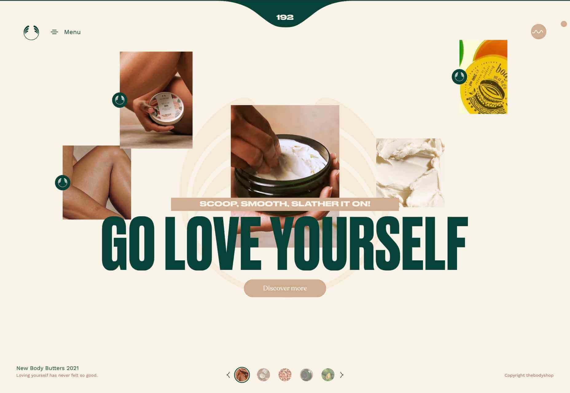
Go Love Yourself
This microsite to advertise The Body Shop body butters, uses sensuous imagery and video to create an atmosphere of indulgence while also offering comprehensive product information.
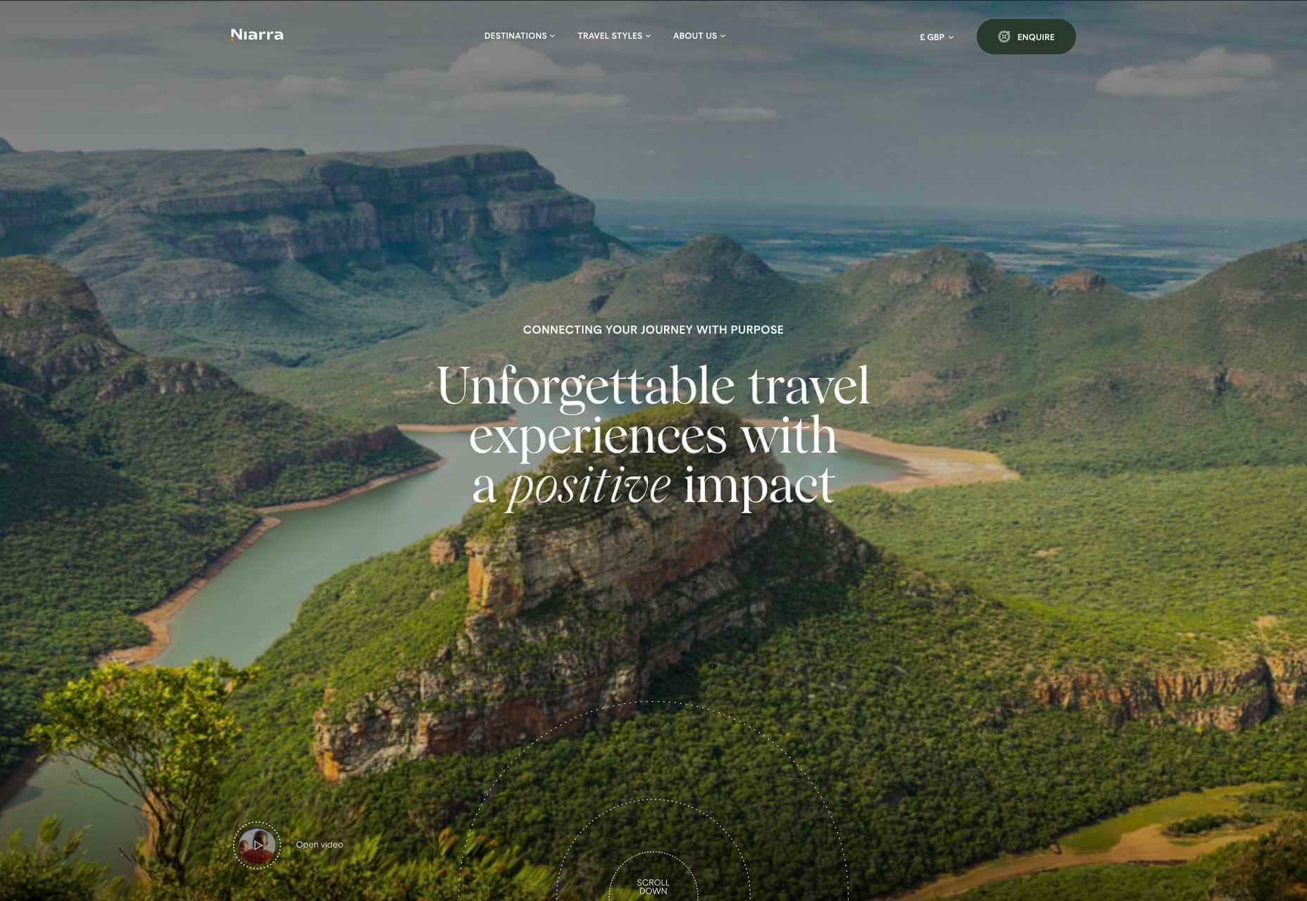
Niarra Travel
Sustainable, bespoke travel agency Niarra Travel makes good use of some beautiful photography. The background color scheme of earthy greens and neutrals fits both the luxury and eco-conscious aspects of the company.
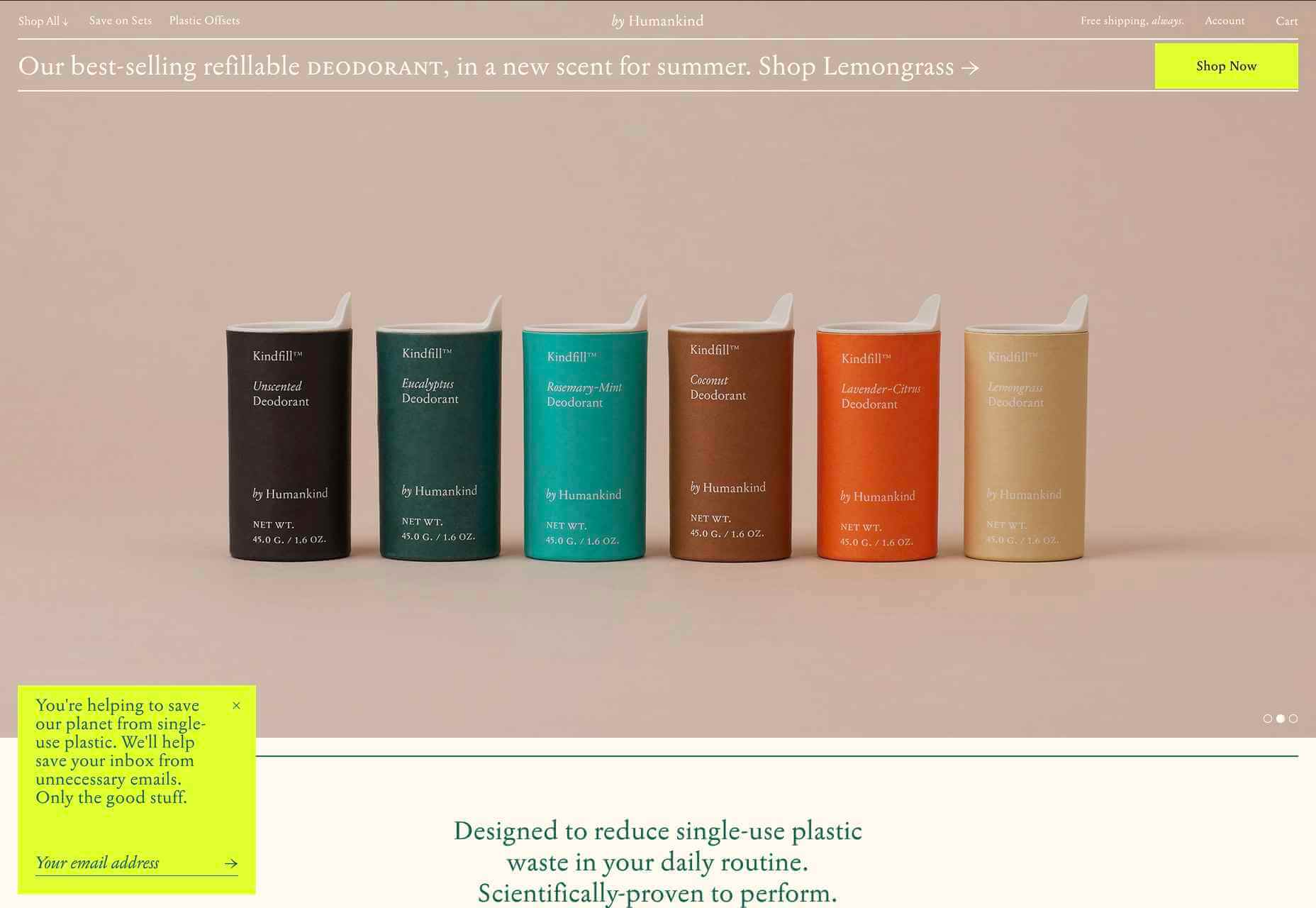
by Humankind
by Humankind is a personal care brand making toiletries from natural ingredients. The focus of their pitch is reducing plastic waste. The site is appropriately sparse, with simple product shots and mostly warm neutral colors.
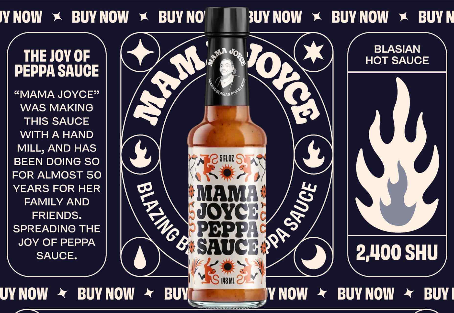
Mama Joyce Peppa Sauce
This one-page site for Mama Joyce Peppa Sauce is big and bold. Lots of scrolling type and vintage style illustration. You don’t need to look for a ‘buy now’ because the cursor itself is it. Click almost anywhere, and two bottles of sauce go into your cart.
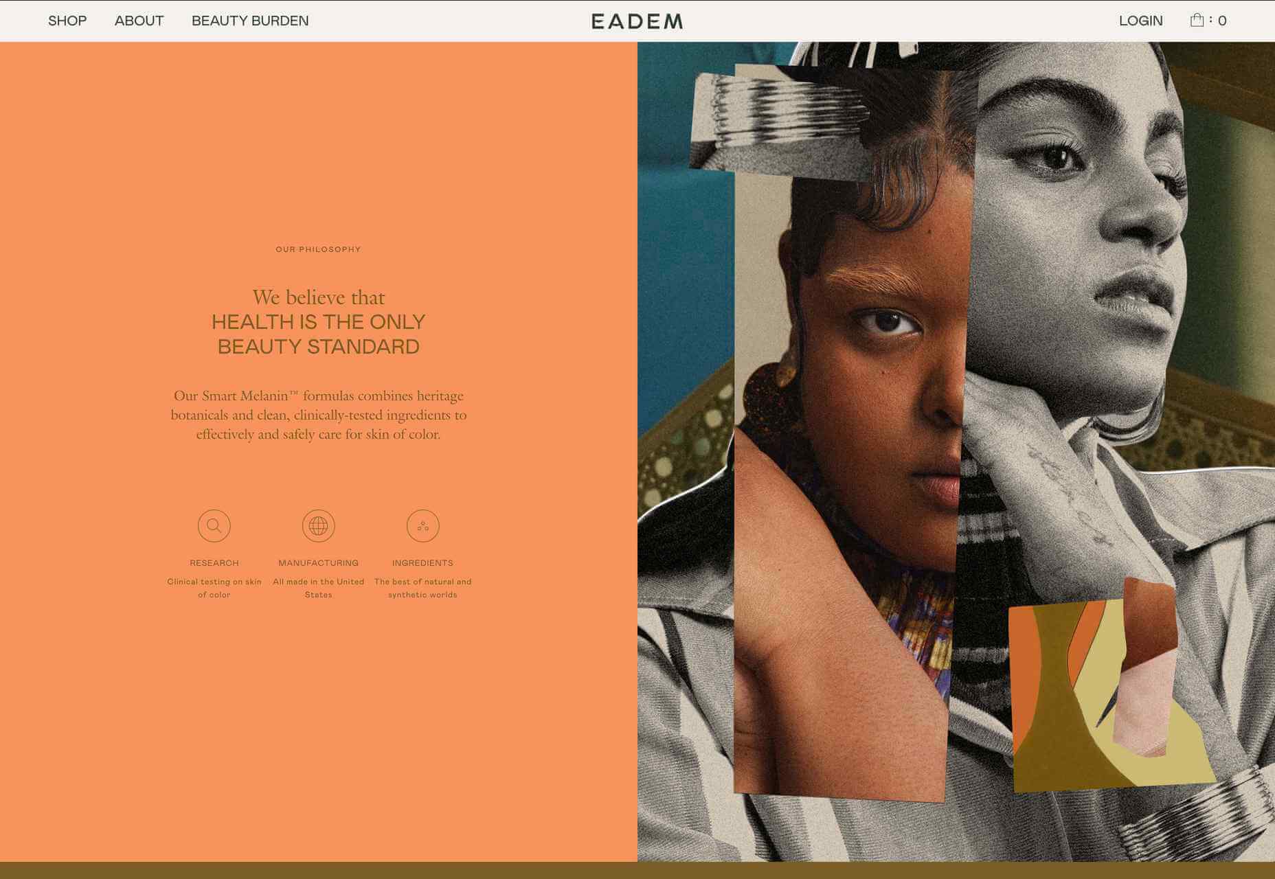
Eadem
Eadem is a beauty company for women of color — their flagship product is a serum that fades dark spots without bleaching. Pinks and dark golds contrasted with fresher oranges and pale greens create a color scheme that feels rich but not heavy.
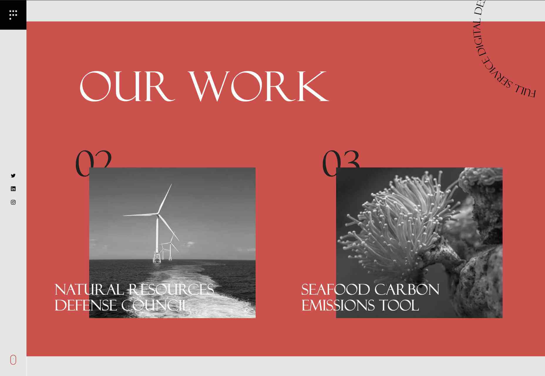
Pact Media
Pact Media is a full-service digital design agency whose work mainly focuses on agencies, businesses, and organizations involved in conservation. Large type and greyscale with red accents create a strong feel, while color on image rollover adds extra impact.
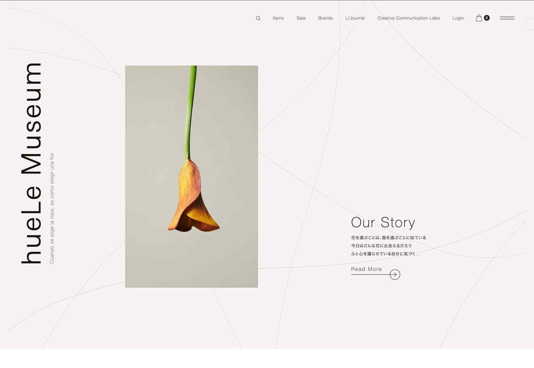
hueLe Museum
hueLe Museum is a collection of clothing brands. The philosophy behind it equates choosing clothes to choosing flowers, and there are some beautiful flower images. There is a sense of tranquility to the site, and it is even better on mobile.
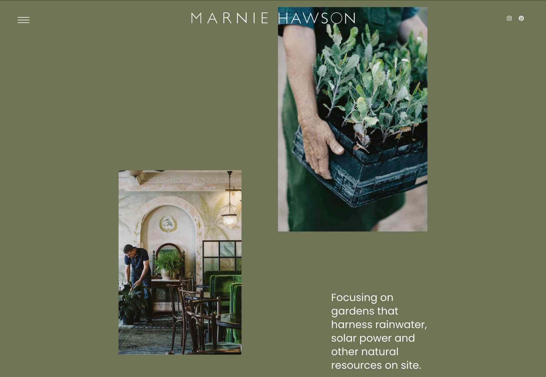
Marnie Hawson
Photographer Marnie Hawson’s portfolio site is clean and simple, with a warm green (again) background and an engaging asymmetrical grid layout.
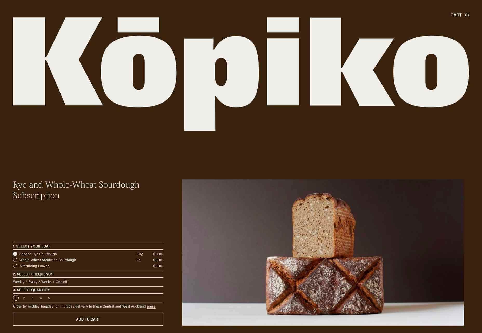
Kōpiko
Kōpiko is a micro-bakery that offers a sourdough delivery subscription service to its local area. It makes and sells only two products, and the single-page site is suitably simple. Putting the subscription form above the product and company information gets to the point without seeming pushy.
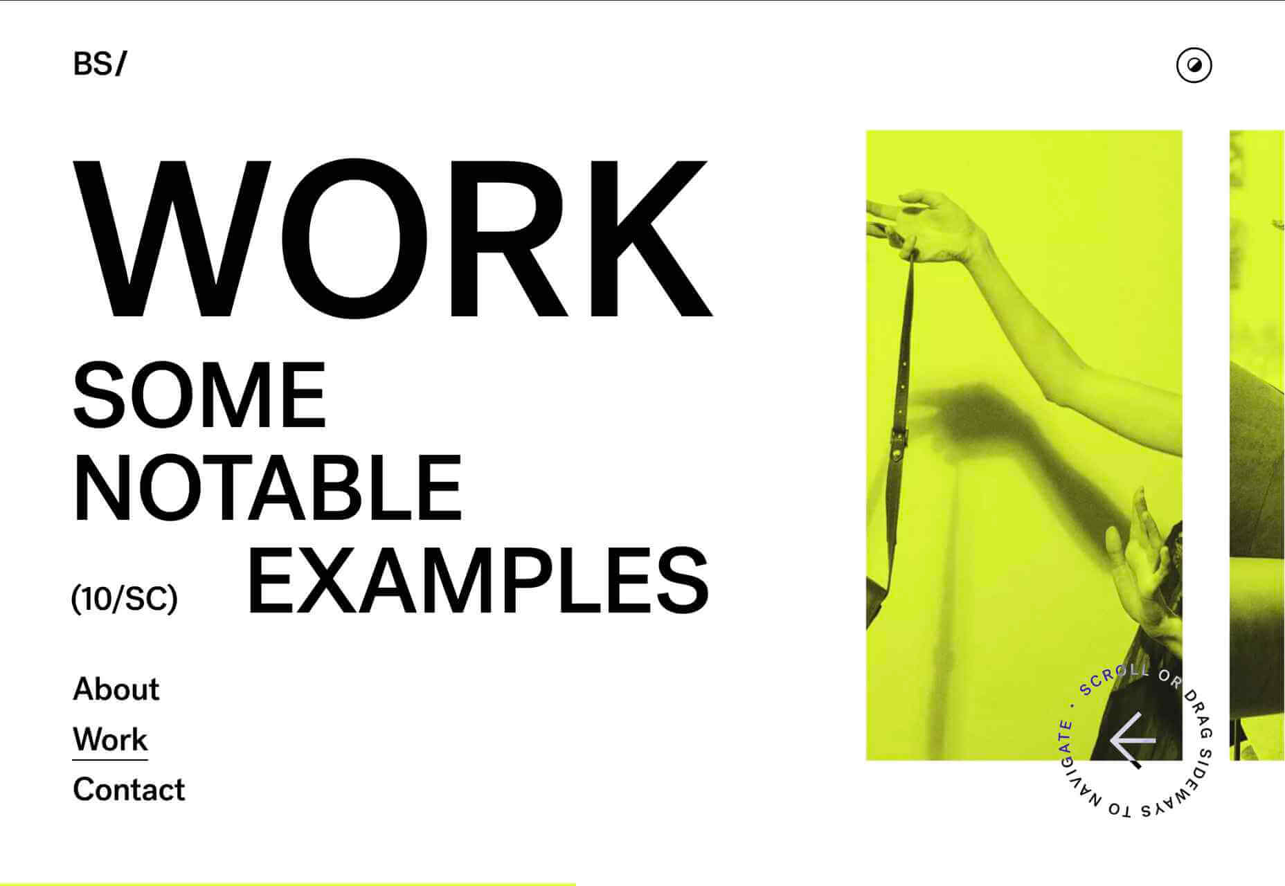
Banila Studio
Banila Studio is a branding and design studio in Basque Country. This is a nice example of sideways scrolling, and the alternate color scheme option is a fun touch.
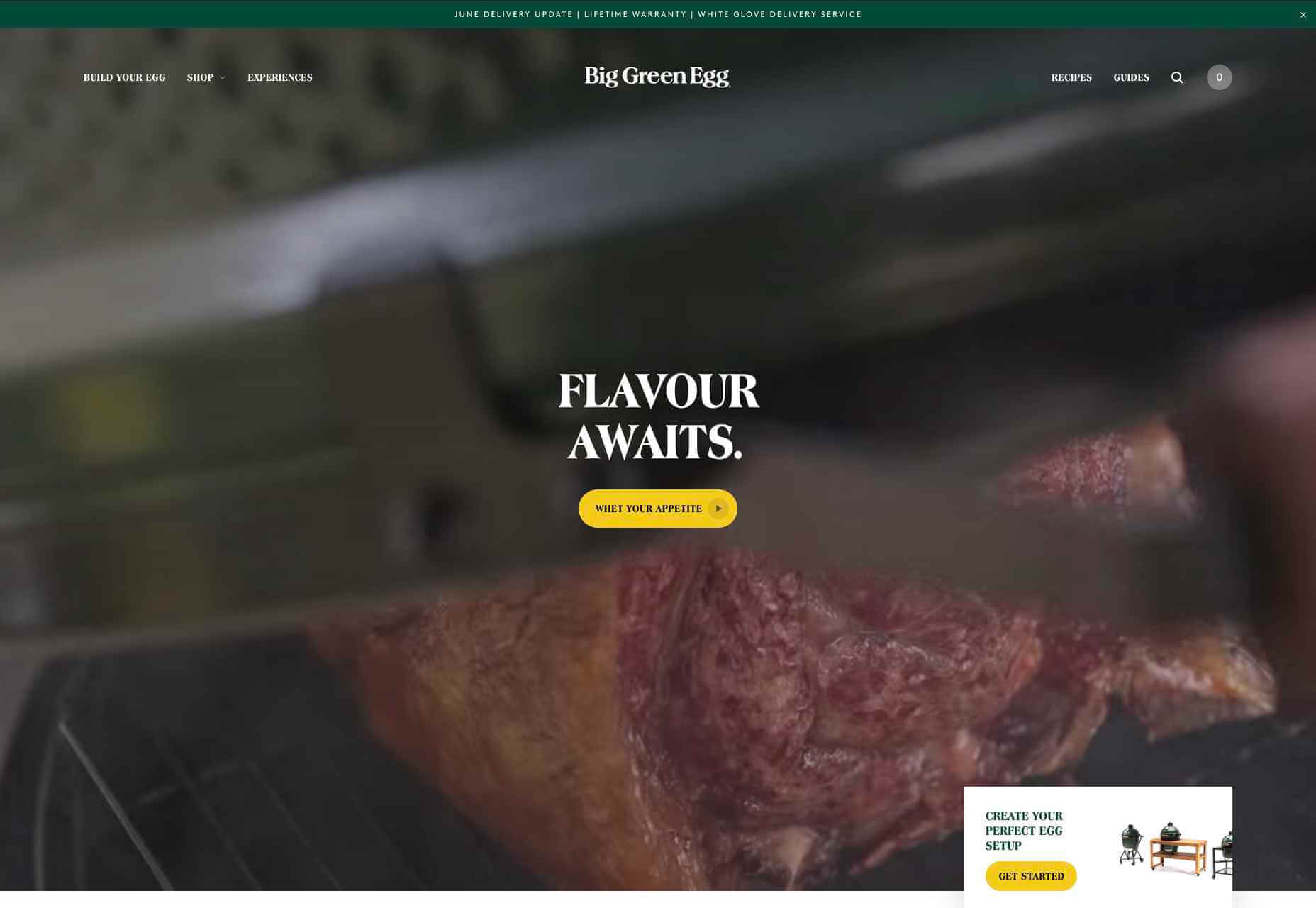
Big Green Egg
Big Green Eggs are high-end barbecue/outdoor ovens. Lots of high-quality food photography is the key here, along with a clear build-your-own setup process.
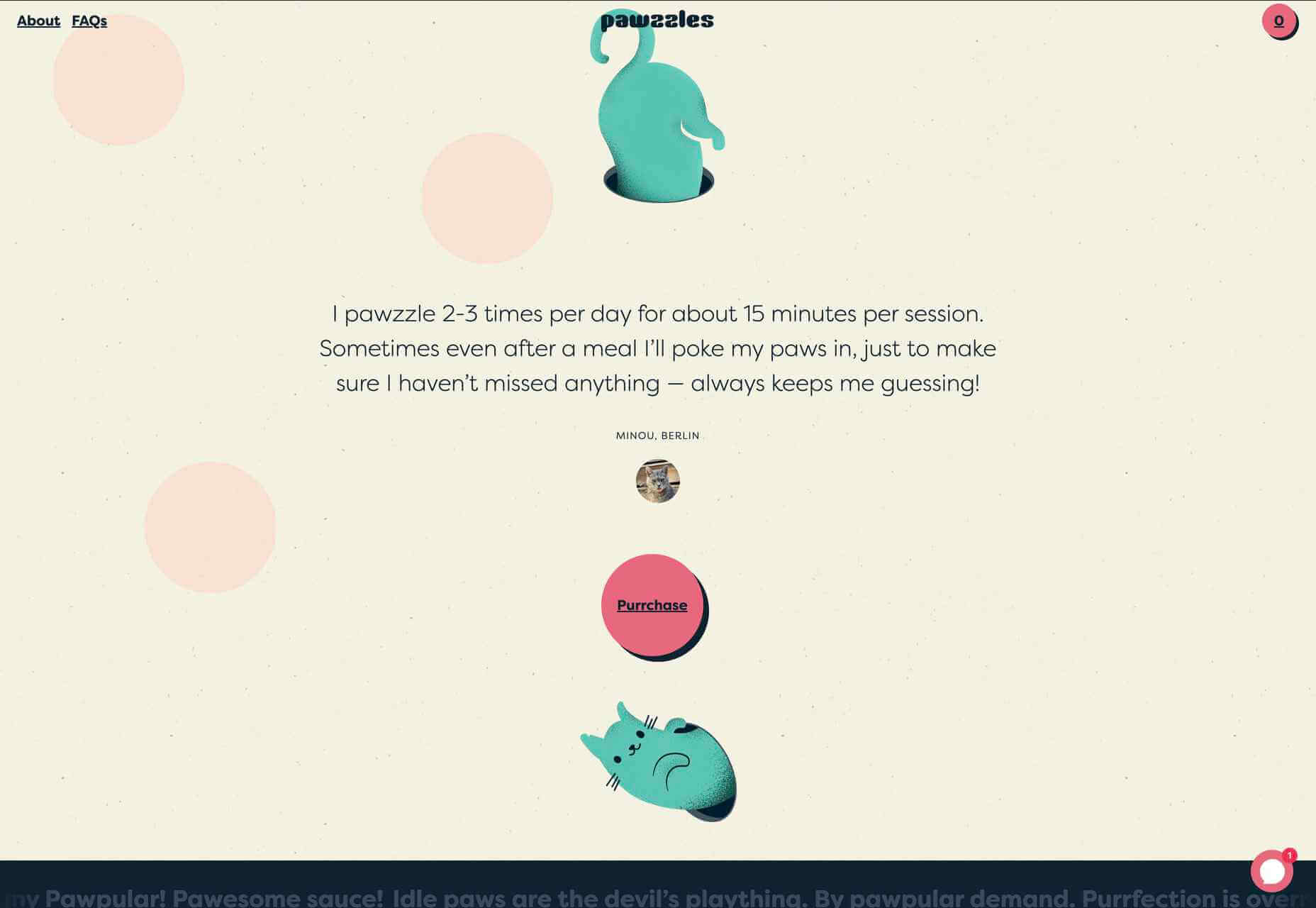
Pawzzles
Pawzzles is a puzzle feeder toy for cats, and yes, there is a cat video. This has a fun feel, with some rather sweet illustrations and lots of silly puns. By cat lovers, for cat lovers.
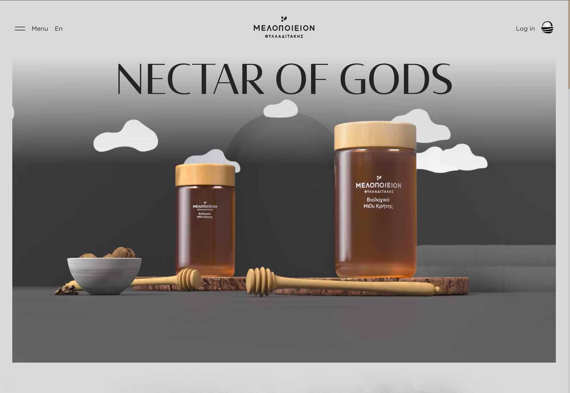
Melopeion Organic Thyme Honey
The choice of display type on this site — crucially one that works well for both the latin and greek alphabets — emphasizes the Cretan origin of Melopeion honey. The illustrations are appealing, and the shopping basket icon is an especially nice detail.
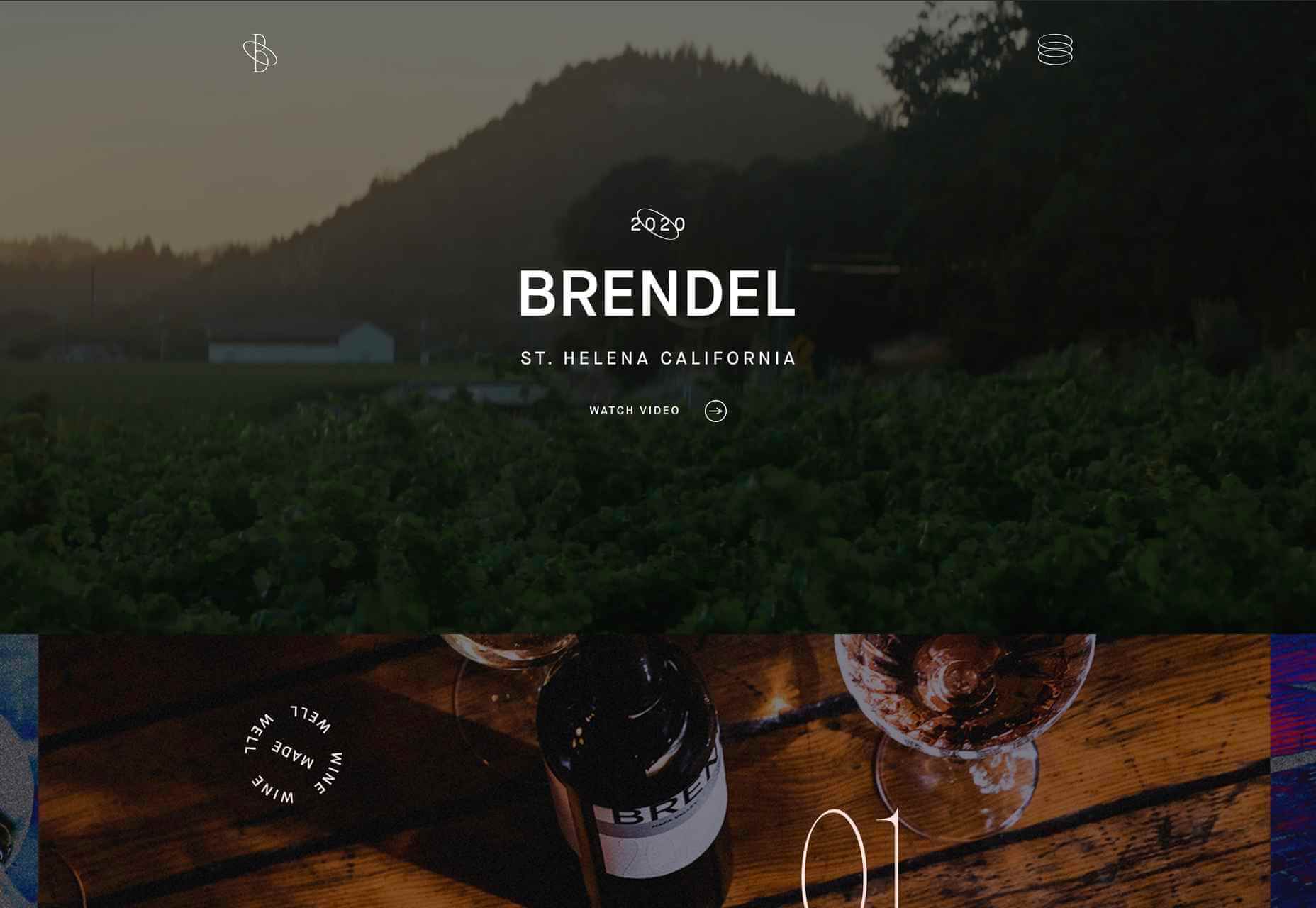
Brendel Wines
This site for Brendel Wines is all about photography, large background photographs, and video, as well as product shots. More specifically, the lighting in the images creates an atmosphere, a sense of warm summer evenings.
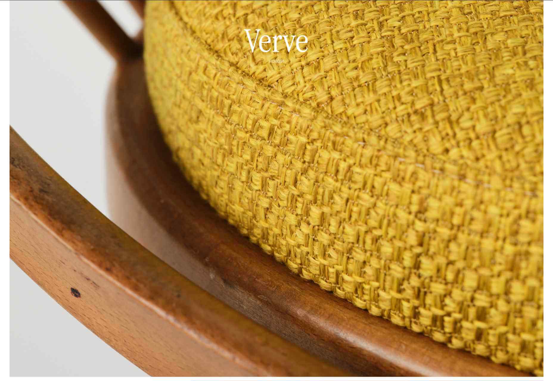
imNativ
imNativ is an upholstery fabric: not the most exciting product to present enticingly. Some good, close-up photographs and well-styled images of the fabrics in use make them desirable.
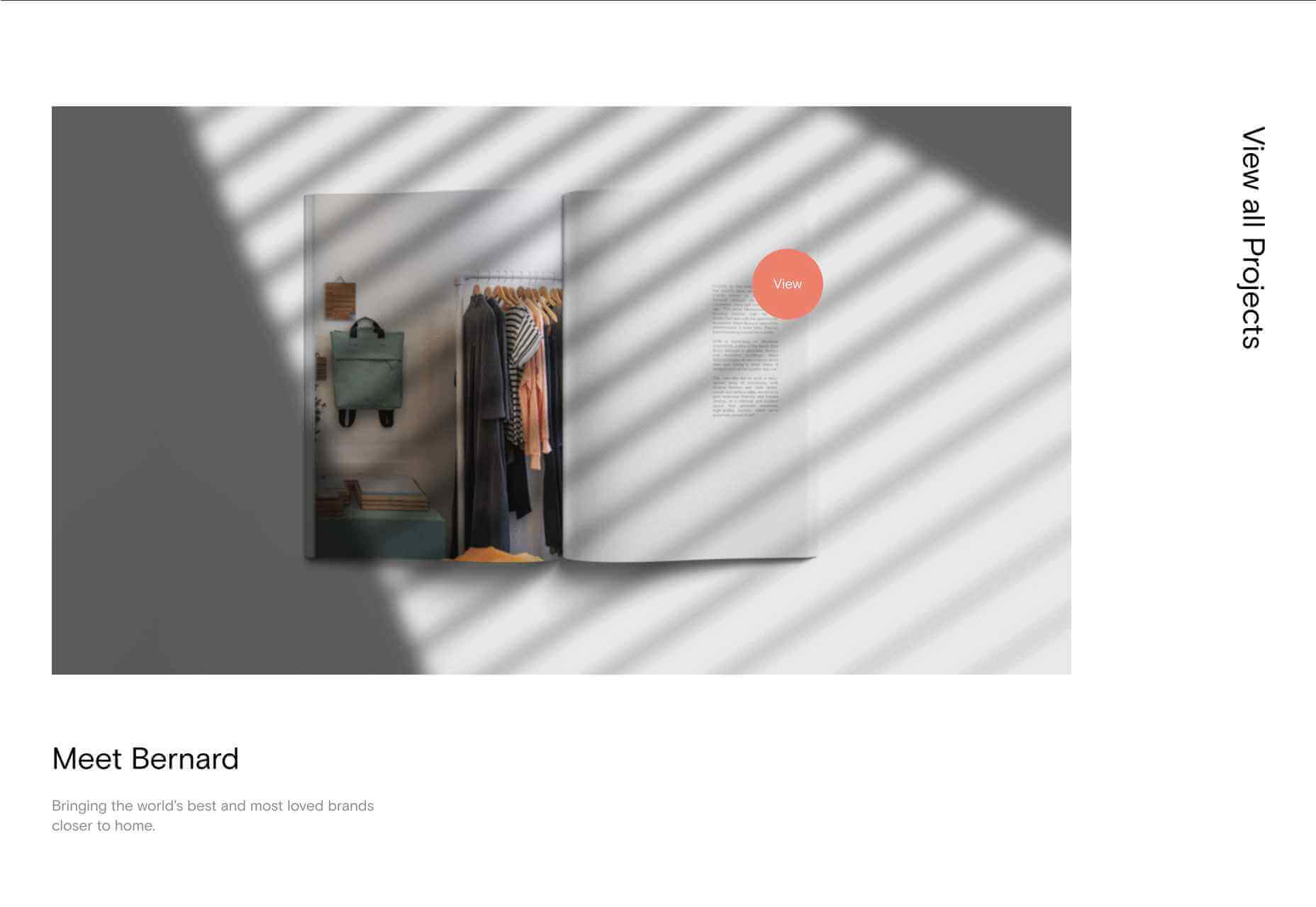
Thursday Studio
Thursday design studio has produced a very pleasing, clean site for their own portfolio. The split-screen scrolling that changes to sideways scrolling on mobile is especially nice.
HALEYS Beauty
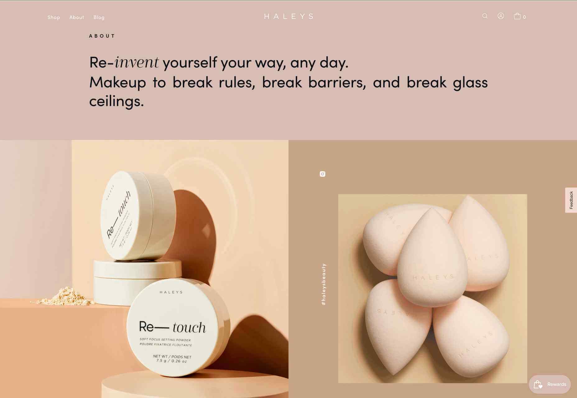
HALEYS Beauty uses a soft, powdery color palette and a clear, well-spaced grid, which gives it a modern, feminine feel.
Wookmama
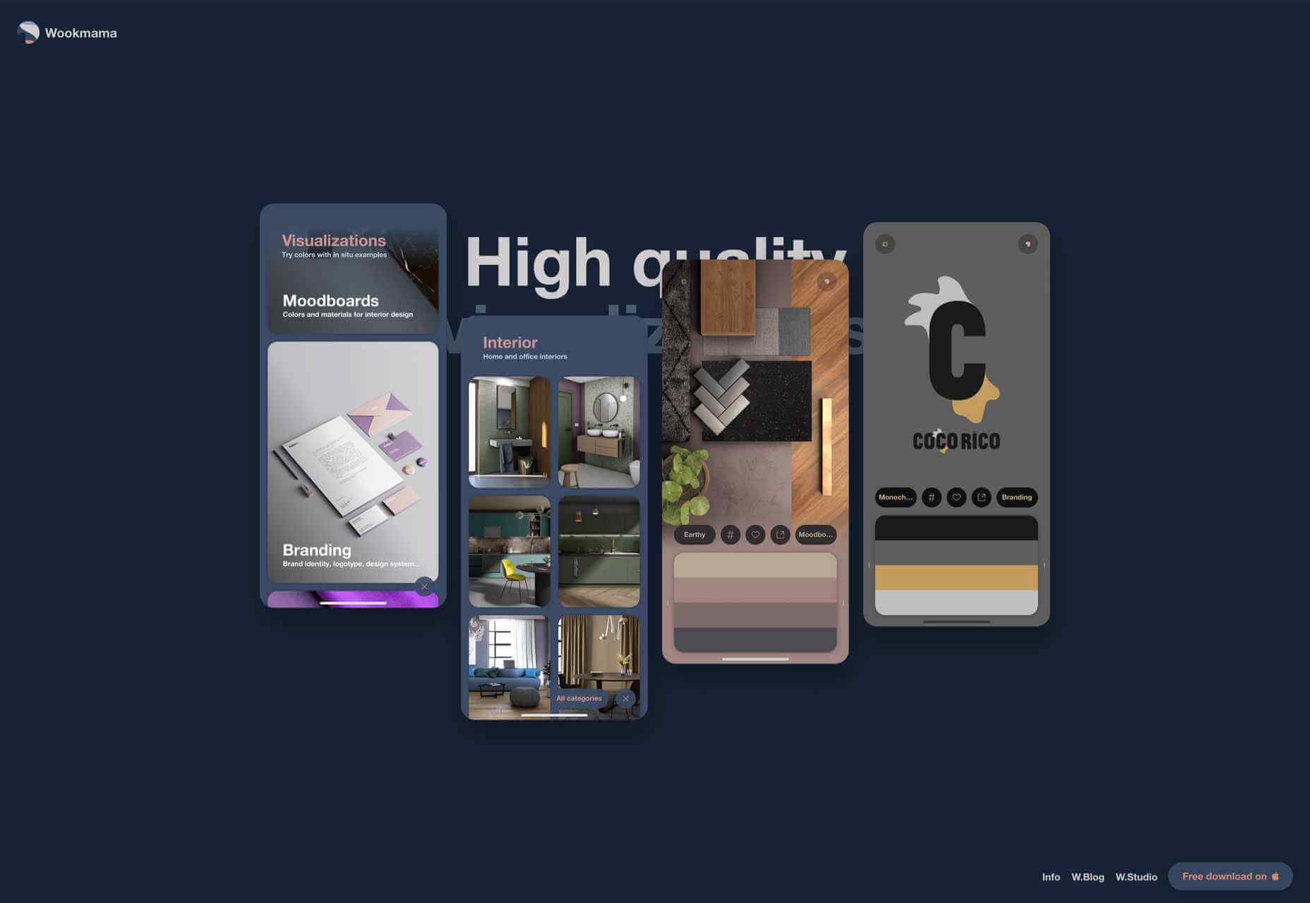
The Wookmama app is a color visualizer which displays palettes and applies those palettes to real-world images. Colour is, as one would hope, used well here, along with plenty of screen mock-ups.
Planet of Lana
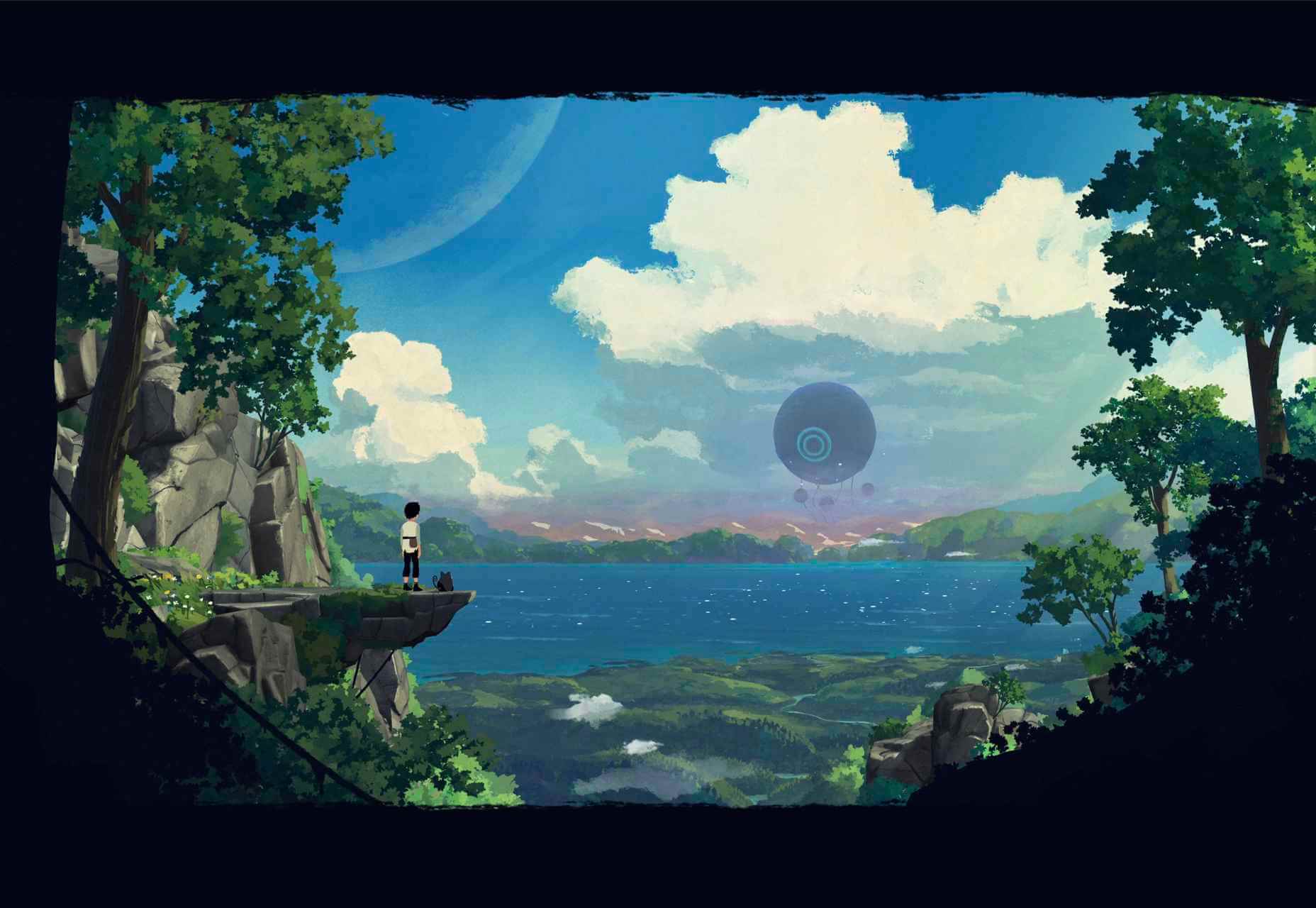
Planet of Lana is the first game from Wishfully Studios, due for release in 2022. This teaser web page really allows the game illustrations to do the talking.
The Future of Office
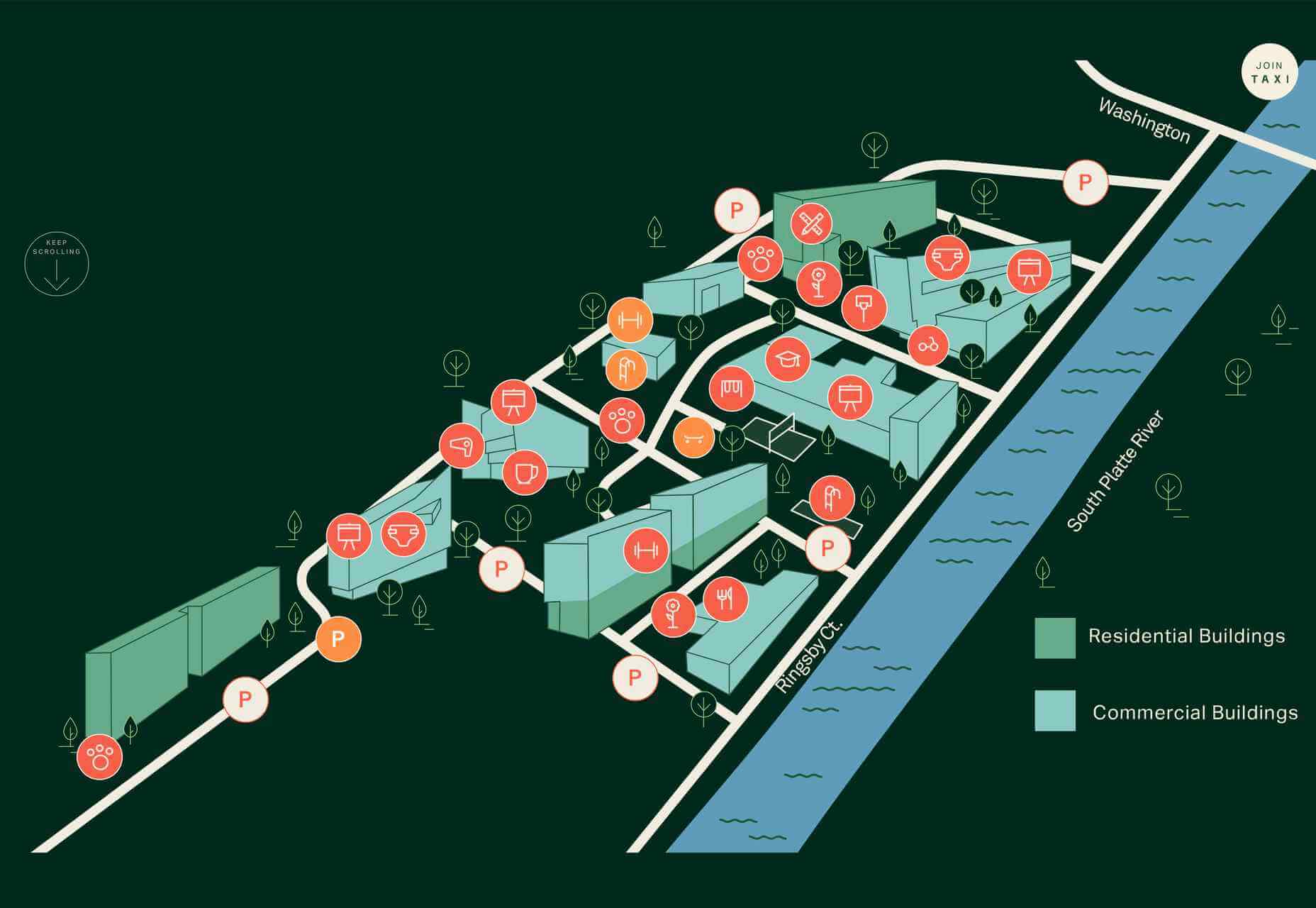
The Future of Office is a sales site for office space to rent. It has a fresh, airy feel which reflects the open, minimal aesthetic of the spaces on offer.
Source
p img {display:inline-block; margin-right:10px;}
.alignleft {float:left;}
p.showcase {clear:both;}
body#browserfriendly p, body#podcast p, div#emailbody p{margin:0;}
The post 20 Best New Sites, June 2021 first appeared on Webdesigner Depot.

Leave a Reply
Want to join the discussion?Feel free to contribute!