Adobe Fresco review
Original Source: http://feedproxy.google.com/~r/CreativeBloq/~3/d2ckugSuddo/adobe-fresco
Adobe Fresco is a great new drawing app, which mimics some of the best elements of other fine art programs (we're looking at you, Procreate) for iPad. However, there's no doubt the app is marred by its pricing and subscription model, and is slightly underwhelming when compared to other established desktop software.
It falls particularly shot in its most talked about selling point, the much-hyped ‘Live Brushes’. For those new to art apps and programs, Fresco’s new ‘living’ brushes will seem wondrous and an exciting party piece as they aim to replicate real world mediums. However, there are a number of other, more professional programs available for tablets that do the job better, and therefore whether Fresco gets a spot in our best apps for iPad still remains to be seen.
At £10 a month, Adobe Fresco is unfortunately a high price for hobby artists and non-Adobe users in a busy and established market where one off app payments are the norm. But for Creative Cloud subscribers, it’s another fine tool alongside its Adobe app family.
Adobe Fresco review: Interface
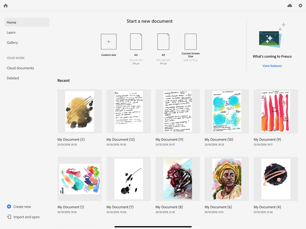
Fresco’s interface is simple and intuitive
Fresco’s interface is simple and intuitive, making it easy enough for beginners to get cracking on the canvas quickly, yet offers enough controls for pros to feel this is attempting to be a serious program for them too.
There's no doubt Fresco is geared towards Creative Cloud users, with Cloud documents seamlessly bridging computers through to Fresco, integrating its workflow with Photoshop and Illustrator by mixing both raster and vector brushes.
The Home screen is simple, if a little stark, but everything is easily laid out meaning you can get to work swiftly. Recent work, an online gallery of other Fresco community users, tutorials and options to create new or import/open other files are all clearly written out and not hidden behind odd icons as many programs do.
Once you have a new canvas open, the simplicity continues with all elements being quite self-explanatory and shouldn’t be daunting for new doodlers and feel second nature for photoshop users. The UI is customisable to your workflow, including full-screen mode, which clears the screen so it’s just you and your masterpiece. All brush panels can be grabbed and docked where you need them, again to aid in setting up your space just as you like it so as not to detract from your creative experience.
Adobe Fresco review: Live Brushes
Oil painting and watercolours are a tactile, messy pastime and effuse memories of classroom mishaps and the pungent whiff of turps. They are hands on, visceral and at times an absolute swine to control. It is this malleable evocative danger that makes them so appealing to artists and why most digital art programs miss the mark widely by being too synthetic or not blending colours well with paint sitting flatly in layers.
I have been using digital painting programs for five or six years now as a portrait illustrator, and whilst Fresco is a great start (the watercolour brushes are particularly good), it does feel a little underbaked.
First-time users and onlookers will no doubt watch on in awe as the paint mix and watercolour bleed into one another on their iPad screens for the first time. However, if you're experienced with the best digital art software, it will feel much like a polished but basic option.
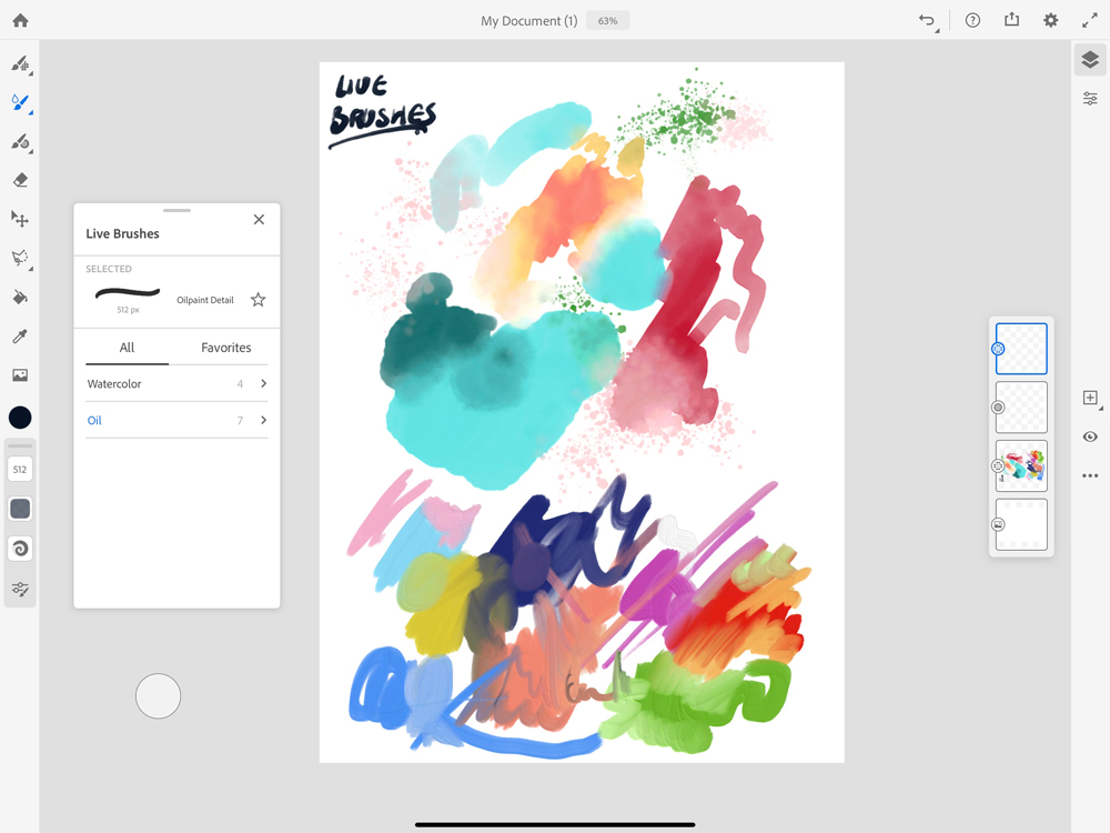
The live brushes were the main selling point of Adobe Fresco, but they’re being done better elsewhere
Despite Fresco’s fun and easy-to-use nature, when one delves deeper it’s clear these brushes need more work and options to truly make them living like other apps such as ArtRage and the watercolours dripping with life in Expresii and Rebelle as they blend, spread and interact with textures and the tilting and wetness of paper in a far more believable and unharnessed manner. The Adobe oil brushes lack depth, sheen, lighting and texture and, as such, produce artwork that seems a little dead or fake next to it’s real life counterparts.
There is only one option for canvas texture, which can be togelled on or off. The lack of paper textures, which should affect the paints flow and drag, result in a uniformity that is more digital than (Edgar) Degas. Flow is determined by pressure alone and not by how much paint is on the brush, subsequently the paint strokes never run out unless you lift the stylus off the screen, meaning those beautiful mistakes and thick splodges of real oils etc can’t be achieved.
There is no palette knife (as can be found in Artrage) to cut into the chunky paint and imitate the visceral strokes of Francis Bacon or German expressionists etc. Maybe we were expecting too much from a fledging app and should be more patient to wait for future updates? However the live brushes were the main selling point of Fresco and, in truth, these features have been already done better elsewhere.
Adobe Fresco review: Pixel Brushes
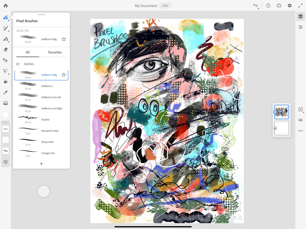
Adobe Fresco has a fantastic selection of pixel brushes
Although normal raster brushes are seen as a staple of any art app, this is where Adobe Fresco has made the best start. The brush collection out of the box is wide and varied for all drawing and illustration styles, from comic and inking, through to chalk and painting.
Each brush feels well thought out and works very well with a plethora of options, including smoothing, hardness, shape dynamics, scattering and blending. Each can be tweaked to suit most styles and the ability to import Photoshop brushes makes this area of Fresco exciting and shows a clear path for future development which could perhaps, in time, rival Procreate. That said, the lack of text and animation options means, for many creatives, Fresco will still have to buddy up with other programs to finish the job.
Adobe Fresco: Raster, Live Brushes and Vector in one illustration
The option to blend vector, live and pixel brushes is excellent, and the way Fresco automatically picks a new layer when doing so is very welcome for artists who tend to get into the flow of the piece and forget to do anything with layers until it’s too late.
This feature will no doubt be very popular with artists who have to switch between apps continuously. This pixel/vector trick isn’t a new one and has been seen in Affinity art programs, but the addition of the Live brushes does set Fresco apart. If Adobe can build on this feature and add more depth to the live brushes along with more vector controls and brushes it could truly start to become a daily driver for creatives.
Adobe Fresco review: Touch Shortcut
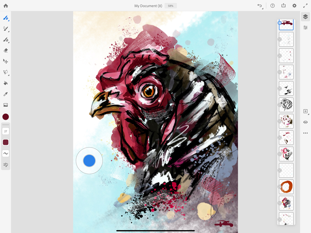
The touch shortcut button is a new handy feature from Adobe
The touch shortcut button is a new handy feature from Adobe, which when held down temporarily changes the action of the tool in use. When used with the Pixel Brush, it erases using the current brush selection, with the Live Brushes it paints with clear colour and alters many more options with selections and layers.
The button can be pushed around the screen to suit your preference and works well, though can feel a little alien and jarring to more traditional artists who want all the creativity to come working with one hand. The actions can be learned in the handy help area signposted by the question mark in the top right, which offers simple instructions to learn the new gestures and tools on offer – great for new users.
Adobe Fresco review: Brush Preview and recent colour palette
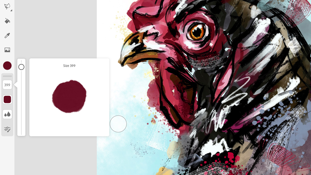
Fresco not only offers a window in which you can see the changes you make to the brush
Making changes to default brushes can be daunting, especially as so many programs don’t offer a preview of what your stroke will look like when used. Fresco not only offers a fantastic window in which you can see the changes to the brush as you tweak the parameters, but you can also have a quick doodle in the window to test it out for yourself without having to apply direct to your artwork.
Fresco also displays your recent colour choices from a drop-down tab in the colour wheel. For artists who tend to neglect an illustrations overarching colour palette until they've got started and felt their way around the painting, this tool is invaluable. No more trying to eyedrop tiny flecks of colour already used. More programs need these kind of time-saving features.
Adobe Fresco review: Editing and pro level tools
As you’d expect on any self-respecting art new program, the usual suspects of draggable layers, masking, selection tools and blending options are all here. As a more traditional thinking artist, I don’t have too much use for many of these apart from the layer rejigging and blending options, but all worked well when tested.
Adobe Fresco review: Saving and exporting your masterpiece
So you’ve finished your illustration, but what next? Pushing the Publish and export button at top of the screen opens up various options to suit all needs. Users can quickly export their work as a snapshot jpg (this can be changed to suit your most frequently used file type), which can then be saved or shared swiftly.
For more formal saving of your work hit the Publish and Export button and select export as to choose from various levels of quality PNG, JPG, PSD and PDF files. Your artwork can also be exported direct to Behance. Every stroke of your art is recorded in Fresco and this too can be exported from this area and works fantastically well, again drawing parallels with Procreate but falls slightly short in missing choice of replay length.
Adobe Fresco review: Should you buy it?
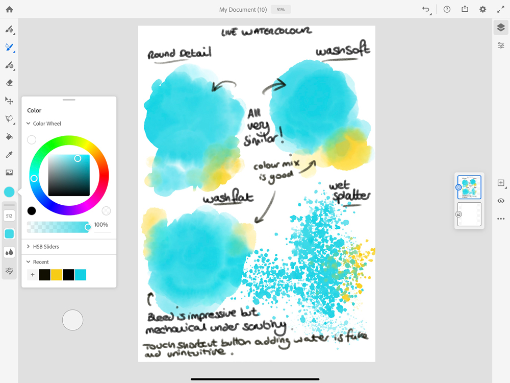
There’s no software that currently emulates watercolours as well as Adobe Fresco
If Fresco was a one-off payment of £6.99, we would not be having the discussion about buying it or not, it would be a no-brainer. A fine, fun tool to have, which could be invaluable for many and handy for others.
However, with the £10-a-month subscription model, this is too much for most when a creative may only need one killer brush or feature within it. This will obviously change as Adobe develops Fresco but right now it's just awesome for CC users, rather than an invaluable one-stop tool for all.
The features and presentation of Fresco are all well executed and bode well for future evolution, and as previously mentioned, there's no software that currently emulates watercolours as well. However, there are a plethora of desktop applications which do the living paint trick far better and with more professional results.
This leads us to wonder who is Fresco for? It lacks the depth and options in its current iteration to fully satisfy all professional illustrators but many hobbyists will find it works just fine for them. With Procreate 5 on the horizon, Fresco needs to ramp up the features swiftly to bring on board animators, concept artists and oil portrait artists as currently, as a non-Creative Cloud subscriber, there just isn’t enough in there to draw me away from Artrage on Surface Pro and Procreate on my iPad.
All the right elements are there for Adobe to develop upon and creative a powerful tool, which can appeal to all so although its currently a little underwhelming in certain areas, it's exciting to think what the future holds for Fresco and its growing community.


Leave a Reply
Want to join the discussion?Feel free to contribute!