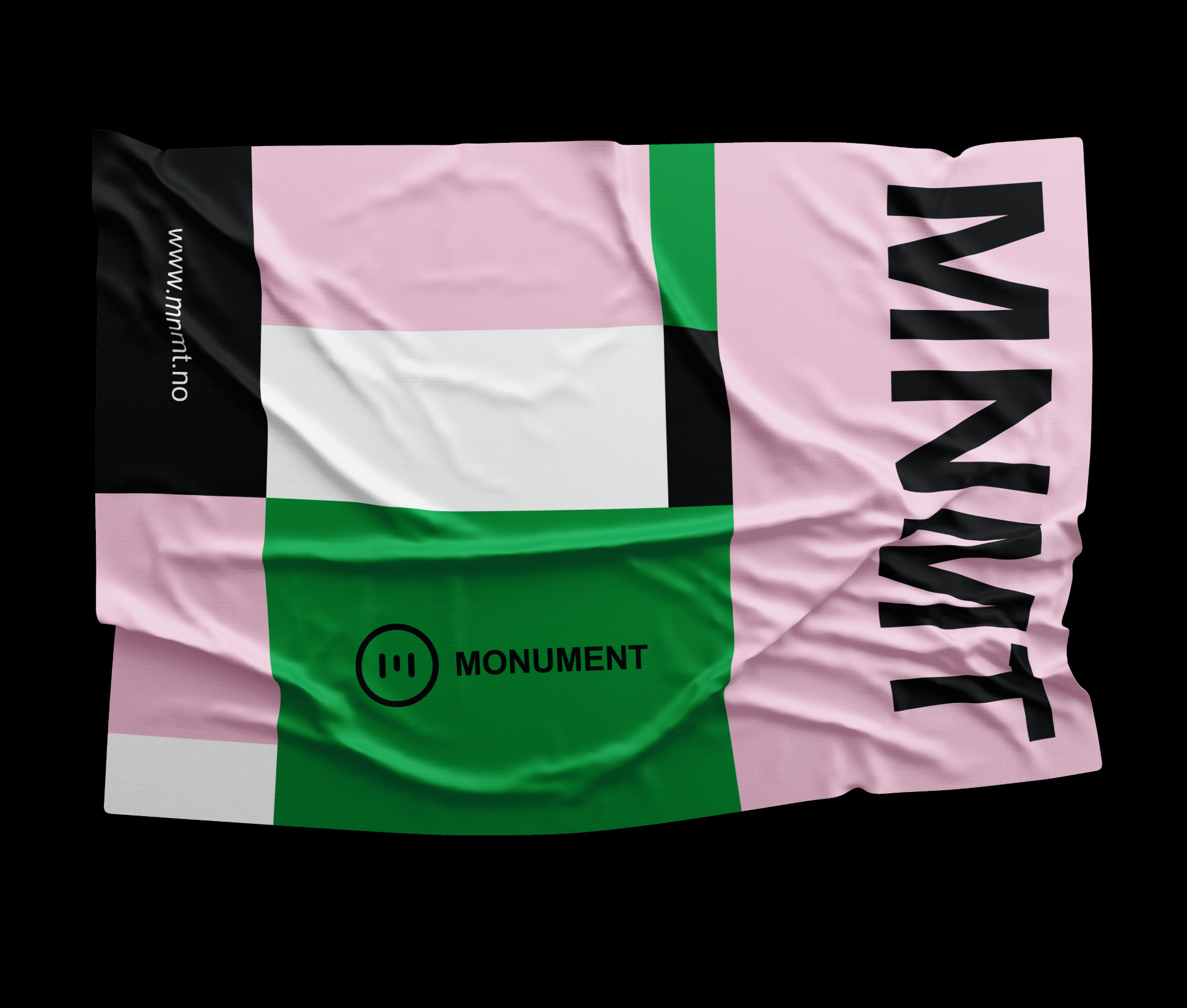
Visual Identity Inspiration: Monument
Original Source: http://feedproxy.google.com/~r/abduzeedo/~3/Er3ny0UjZqg/visual-identity-inspiration-monument
Visual Identity Inspiration: Monument

abduzeedoMay 02, 2019
Umer Ahmed shared an incredible visual identity project he worked for Monument, which was built around an online magazine (www.mnmt.no), a wide range of informative and entertaining podcasts, event series and club culture.
They aim to support the vast underground realm of Techno music by highlighting festivals, clubs and artists you otherwise wouldn’t hear about anywhere else.
Today, Monument is the only online platform that focuses exclusively on Techno music, its sub-genres, and the culture surrounding it, giving Monument the advantage to dig deep into underground stories and music to be shared worldwide with other electronic music enthusiasts. As a dedicated and inspirational platform Monument wanted a visual identity that appealed to the hardcore fans and the new audience who want to expand their music library.
Monument focuses on delivering uncompromising content, and to come across as an inspiring collective to their team members and their supporters. With this insight, the identity was built with minimal design elements while still creating room to experiment.
Old-school DIY rave flyers and posters inspire the color pink, while the color green is inspired by the nature where several events (raves) take place.
Redesigned logo features an experimental typographic hierarchy, obscure illustration style and minimal colors are the primary identity elements that express Monuments true values through diverse execution.
Logo features an experimental typographic hierarchy, obscure illustration style
Visual Identity
For more information check out:
www.mnmt.no
www.instagram.com/mnmt.no

Leave a Reply
Want to join the discussion?Feel free to contribute!