20 Best New Portfolios, February 2019
Original Source: https://www.webdesignerdepot.com/2019/02/20-best-new-portfolios-february-2019/
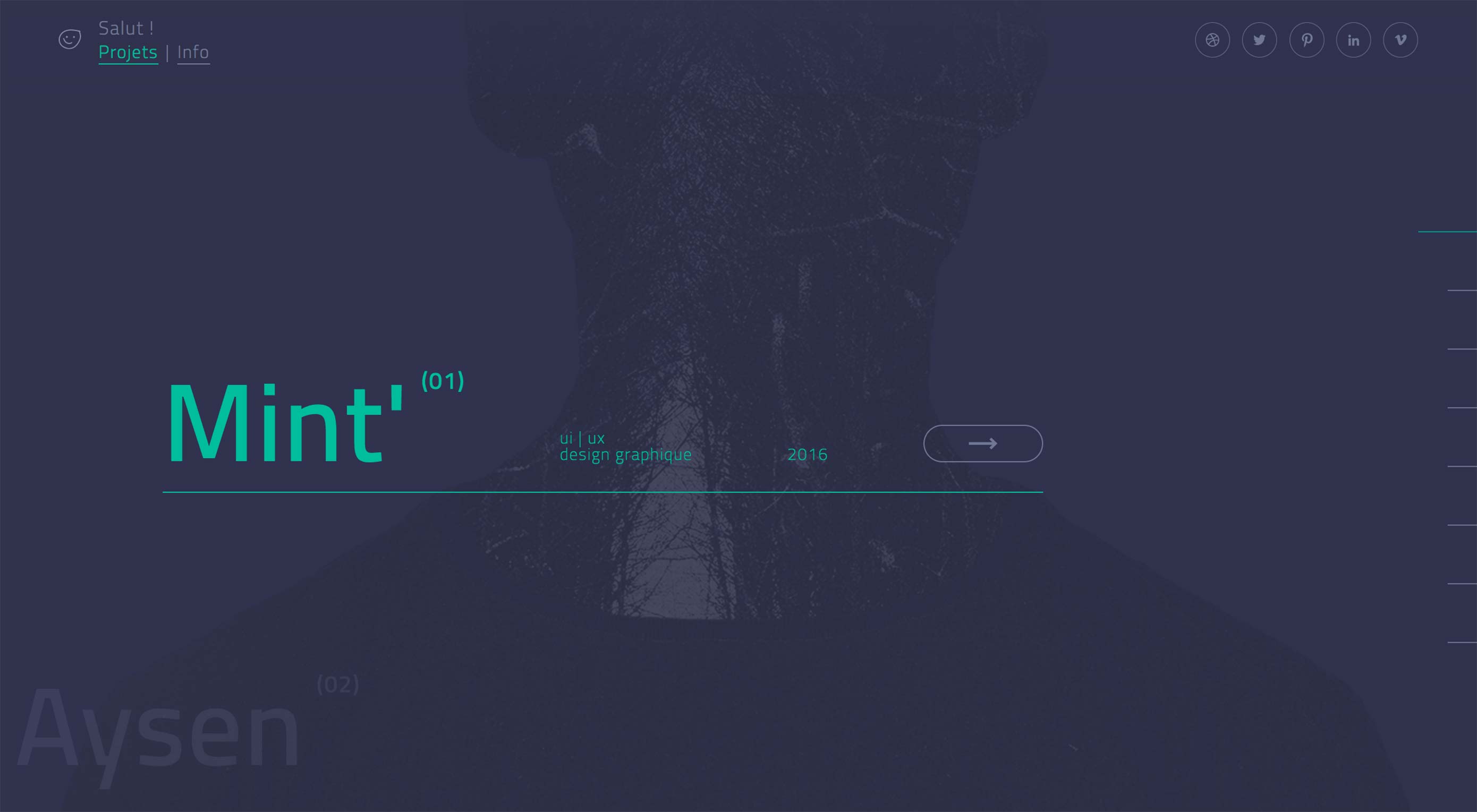 Welcome back, Readers! It’s February, and I don’t think I have a single pink or chocolate-themed site anywhere in the mix. Ah well…
I really shouldn’t have typed that. Now I want to either eat some peanut-butter and chocolate goodies, or base a design on that color scheme. I probably will.
Anyway, we’ve got a generally mixed bag of portfolios for you to check out, with a number of aggressively monochromatic designs in there. Enjoy!
Note: I’m judging these sites by how good they look to me. If they’re creative and original, or classic but really well-done, it’s all good to me. Sometimes, UX and accessibility suffer. For example, many of these sites depend on JavaScript to display their content at all; this is a Bad Idea , kids. If you find an idea you like and want to adapt to your own site, remember to implement it responsibly.
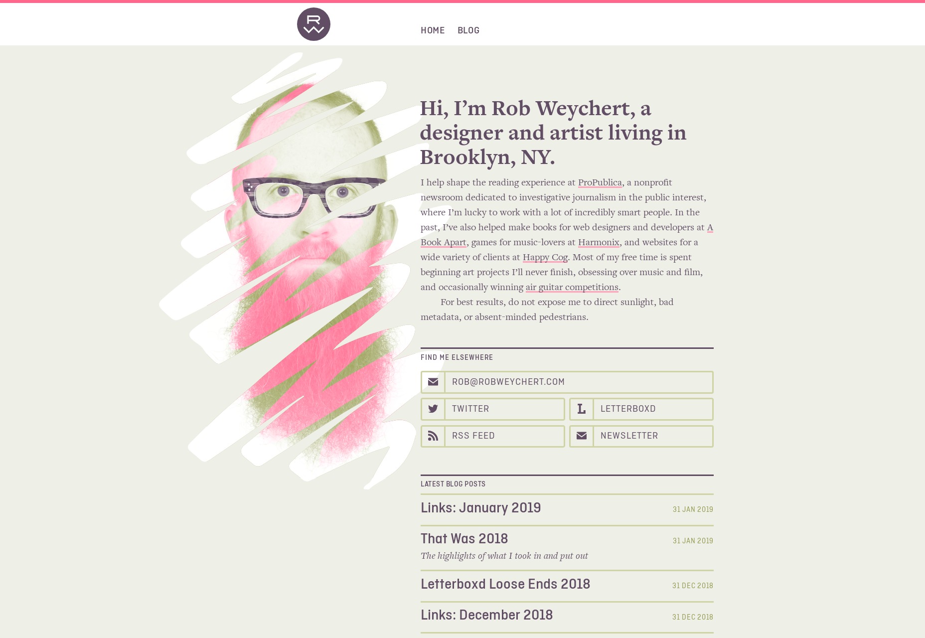
Rob Weychert
Rob Weychert’s portfolio may not be new as such, but I just found it… and probably should have found it sooner. He used to be a designer at Happy Cog, and is now at ProPublica, so you should expect earthy tones and fantastic typography. He sells his expertise mostly through his client list and his extensive blog, using the “go look at my work, it’s super famous” approach to marketing.
Well, it works.
Platform: Static Site (as far as I can tell)
Transatlantic Film Orchestra
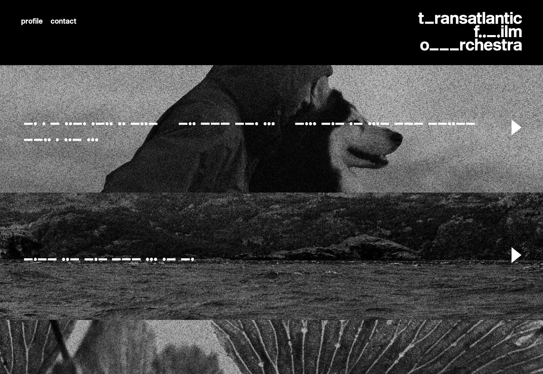
The Transatlantic Film Orchestra do exactly what you think they do. Music for video. And on their website, they do it right: no music plays when you load the site. All you get is a calm, dark, and monochromatic one-page portfolio.
I do particularly like the implementation of the audio players, though. The Morse code, the grainy photos, it all works.
Platform: WordPress
Ramon Gilabert
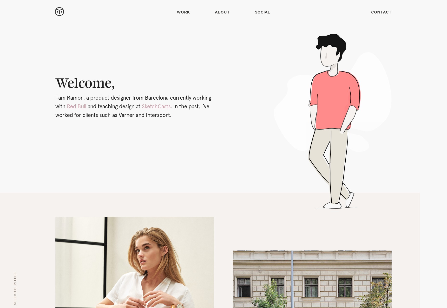
Ramon Gilabert’s portfolio brings us a calming and classic minimalist design combined with some beautifully-used SVG graphics. Mind you, it’s a little confusing when you click on the “social” link in the navigation, as the social links are practically hidden at the bottom, on the right, and on their side. Otherwise, it’s a beautiful and charming design.
Platform: Static Site
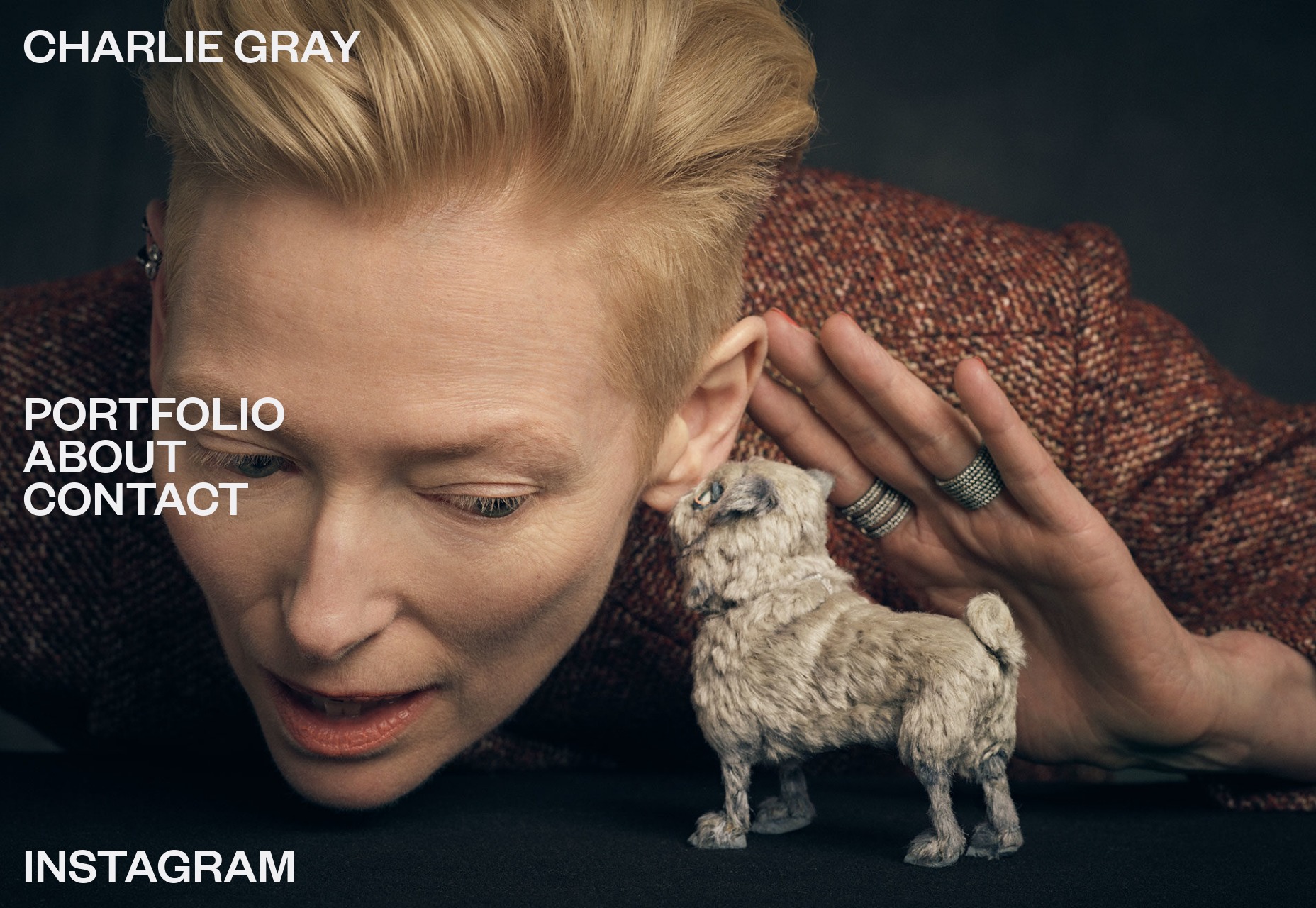
Charlie Gray
Charlie gray’s portfolio is full of cinematic-looking photography and Hollywood celebrities, so this layout that feels like a cross between a magazine layout and a PowerPoint is actually right on the money. I’d almost be disappointed if a site like this wasn’t loaded down with a bit too much JS.
In the end, it’s the images that sell everything anyway.
Platform: WordPress
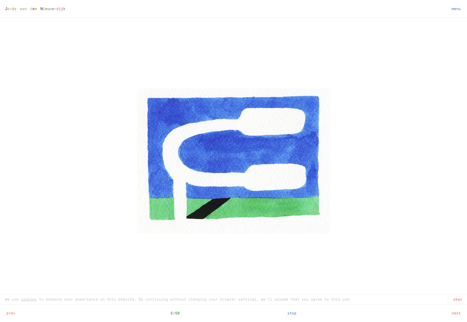
Jordy van den Nieuwendijk
This portfolio is pretty much an art gallery, and it embraces the theme with a full-screen slideshow on the home page, lots of white space, and monospaced type. It’s a classic approach and it hold up well in this case.
Platform: Static Site
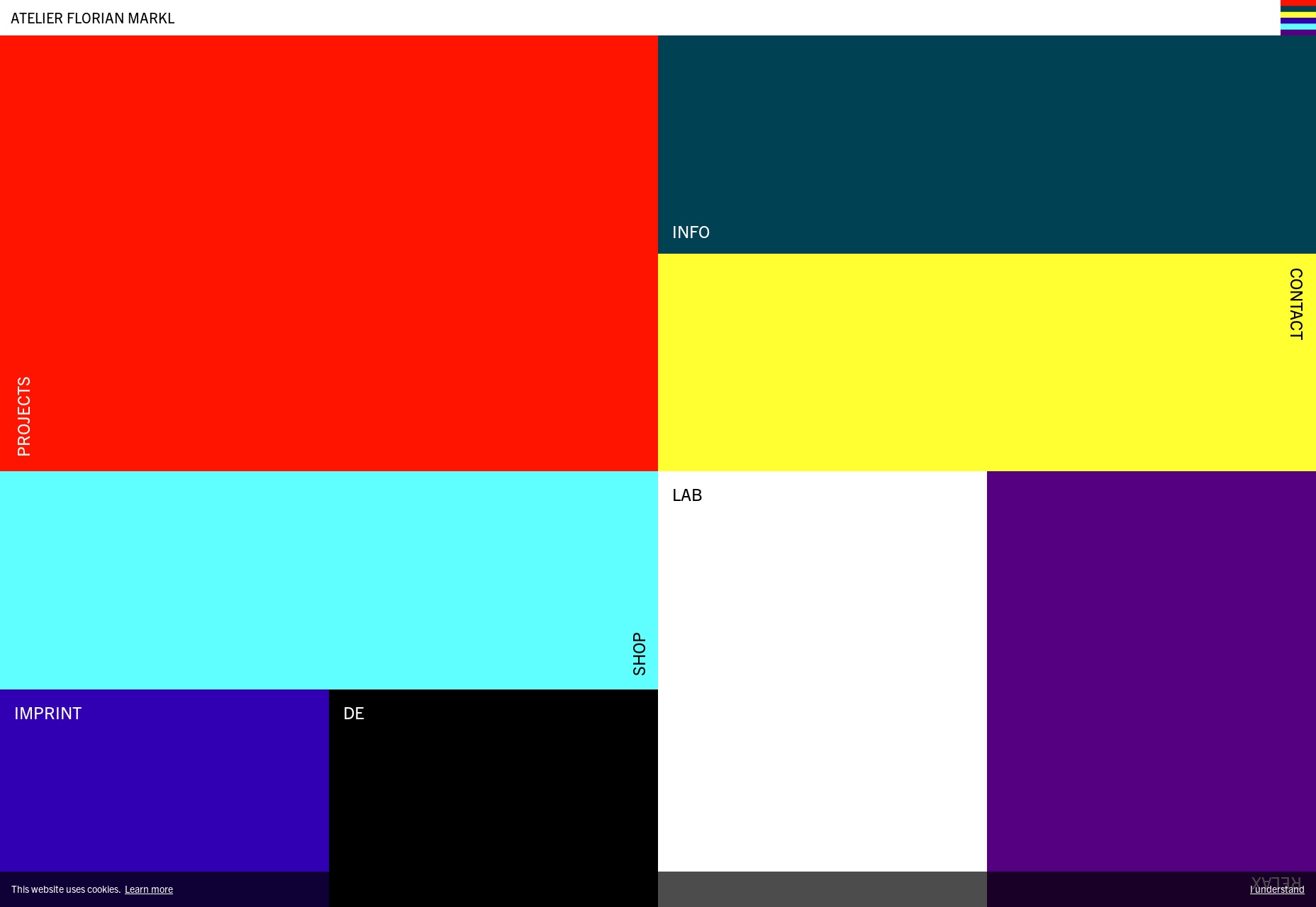
Atelier Florian Markl
Atelier Florian Markl has taken the inherent “blockiness” of web design and absolutely run with it. The theme of the day is rectangles and bold colors. You might have a hard time seeing anything, but once your eyes adjust to the glare, you won’t forget this highly modernist design in a hurry.
Platform: Joomla
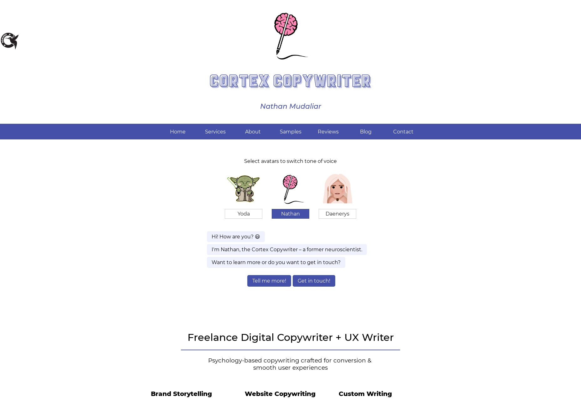
Nathan Mudaliar
Nathan Mudaliar’s copywriting portfolio may not be the fanciest out there, but it is a master class in showcasing your work creatively. There’s a sort of conversational bit of UI where he showcases his work in different “voices”, interactive examples of his copywriting techniques, and more.
It’s a bit hard sell, perhaps, but you can’t argue with results.
Platform: Static site
WebinWord
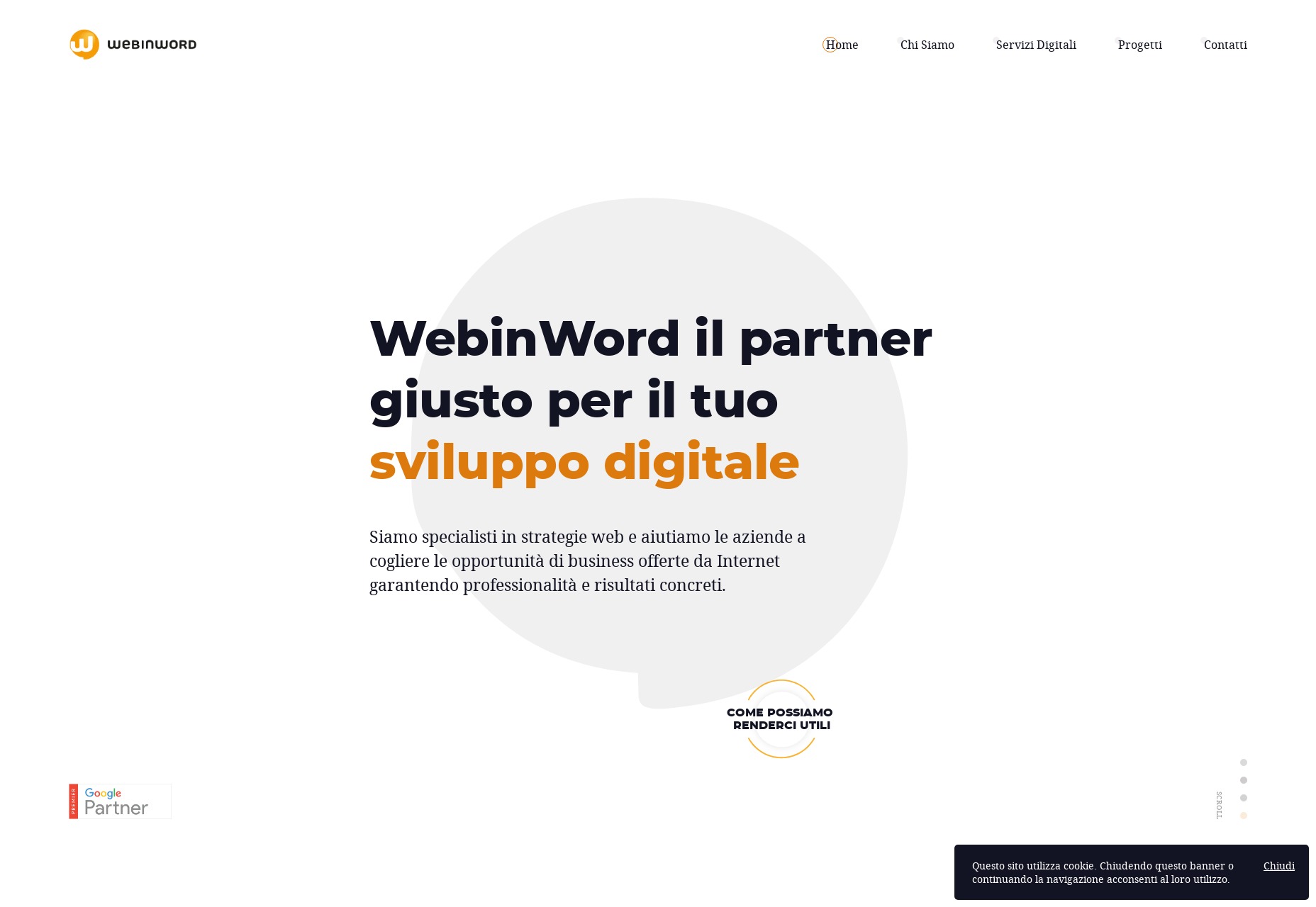
WebinWord know how to to stick to a theme. This minimal-ish but highly animated site manages to use the shape of their logo mark all over just about every page. And weirdly enough, it works.
Platform: WordPress
Okalpha
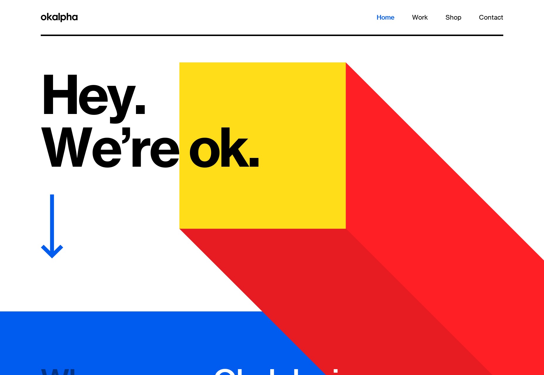
Okalpha goes right for bright colors and pseudo-3D graphics to catch your attention. Honestly, they’re using the same colors and shapes people have been using on us since we were toddlers, so why wouldn’t it work? Slightly kid-ish or not, I think it works.
Platform: Custom CMS (Probably)
Makoto Hirao
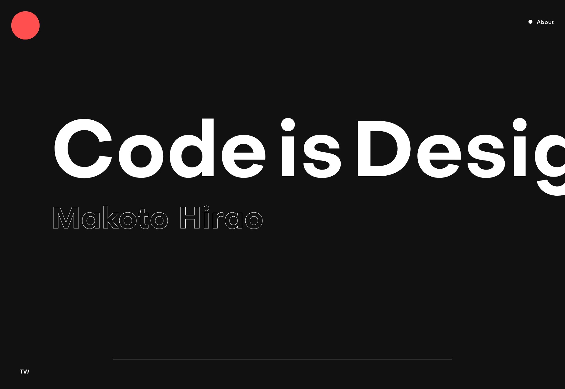
Makoto Hirao’s portfolio is ticking a lot of boxes for me, including great type, good use of imagery, and a horizontal home page layout that I actually really like, and that feels intuitive.
My only real criticism would the the usual one about JS dependence.
Platform: Custom CMS
Lydia Amaruch
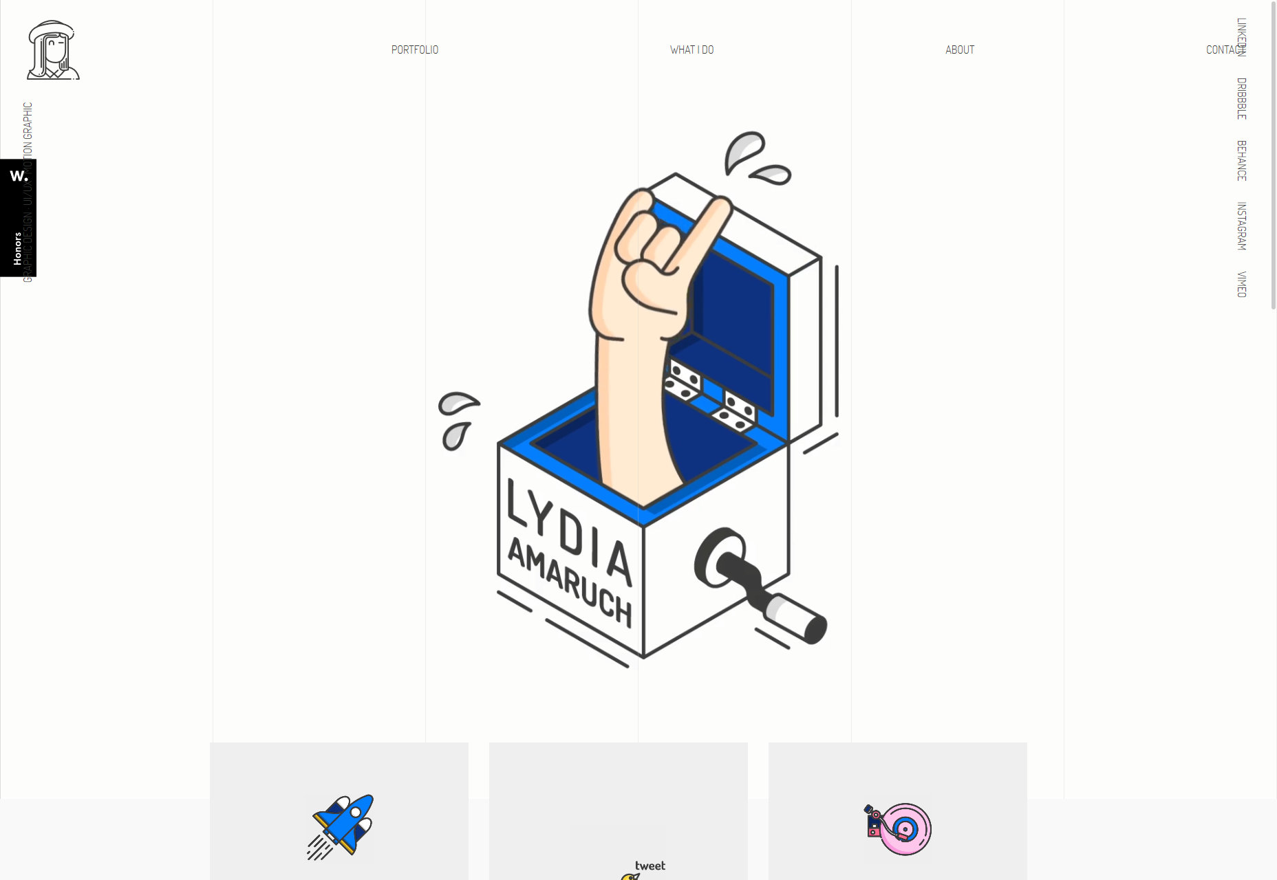
Lydia Amaruch brings us a beautiful grid-themed portfolio (I am, as always, a sucker for this look) combined with some fantastic illustrations, and decidedly modernist layout. Some bits are weirdly low-contrast, but it’s a darned pretty site overall.
Platform: Static Site
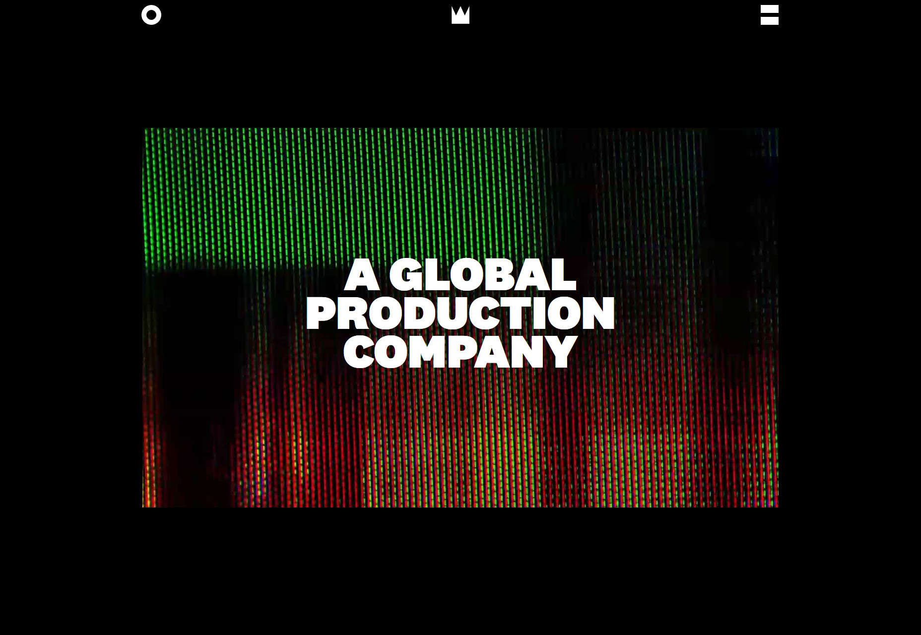
The Sweetshop
The Sweetshop, being a video production company, naturally puts a lot of video front and center with the dark layout you’d expect. But even so, their typography game is surprisingly strong, and there’s not a serif in sight. Even their press releases look pretty.
Platform: WordPress
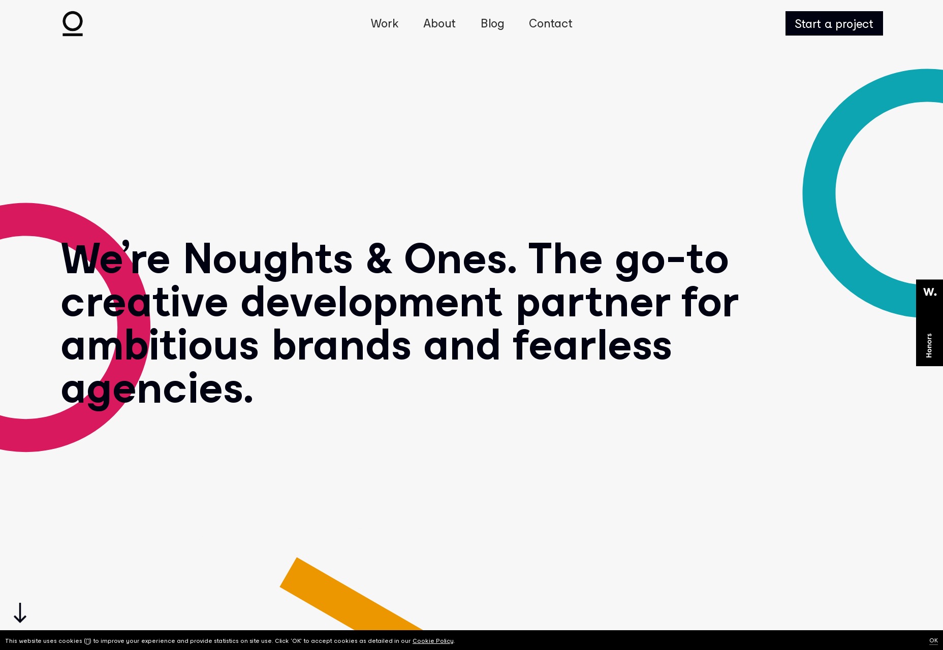
Noughts & Ones
Noughts and Ones is another agency that’s sticking to their theme, with their branding being a big part of their site’s aesthetic. Other than that, it’s pretty classic minimalism. I personally adore their footer.
Is that a weird thing to say?
Platform: Squarespace
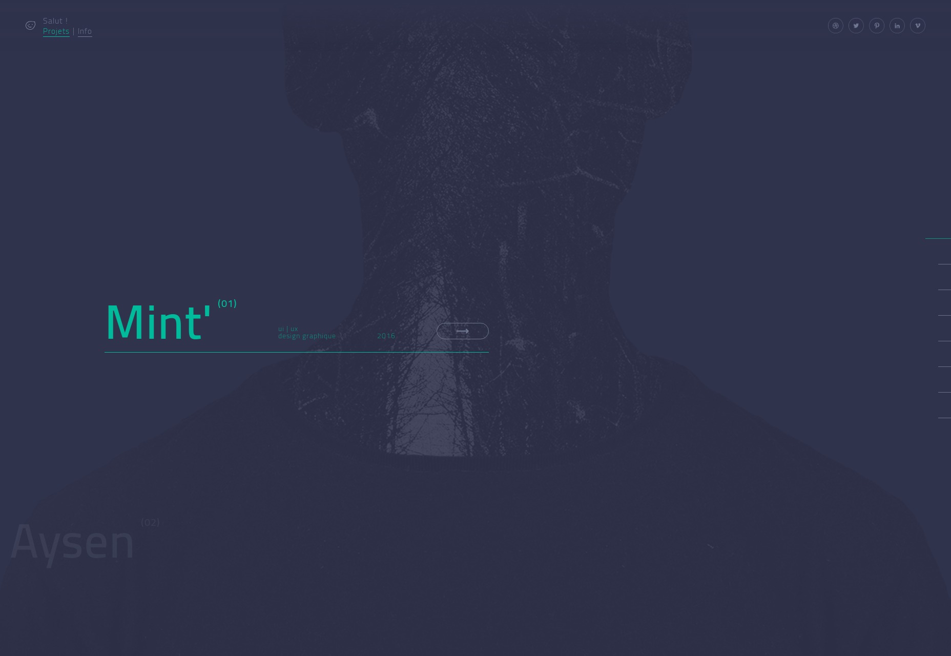
Margaux Leroy
If I had to describe Margaux Leryo’s portfolio—and I do, that’s my job—I’d call it a fusion of ‘90s era futurist design with more modern trends. It’s dark, it’s sleek, and some of the text might be a little too small and low-contrast.
Why did we think text would be that small in the future anyway? Did we think everyone would have augmented eyes?
Anyway, flaws aside, it looks fantastic.
Platform: Static Site (as far as I know)
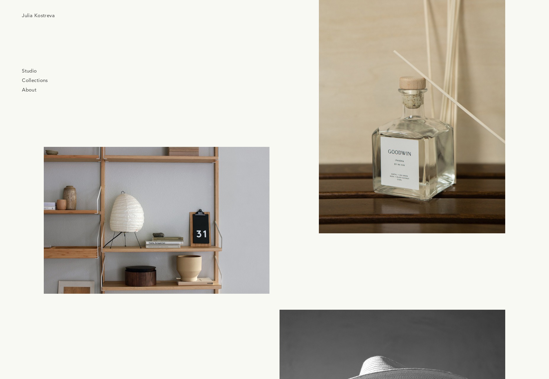
Julia Kostreva
Julia Kostreva’s portfolio keeps it simple with some pseudo-asymmetry and soft tones. As a branding designer, she lets that branding work do, well, most of the work. And it works.
Platform: Squarespace
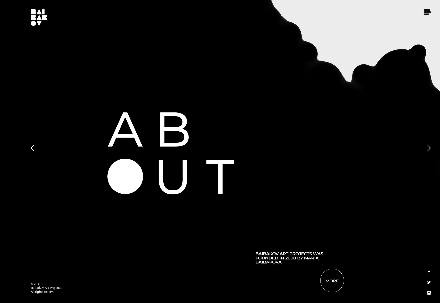
Baibakov Art Projects
Baibakov Art Projects takes the monochromatic to another level, and the animations are only sometimes in the way. It’s tall, dark, and elegant, like the work it features. Fantastic use of asymmetry, too.
Platform: Static Site
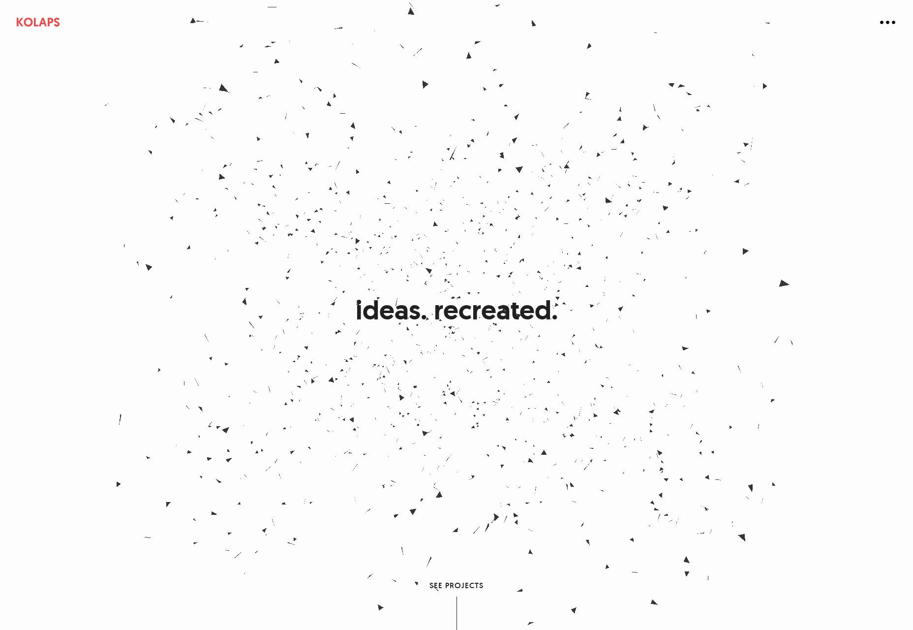
Kolaps
Kolaps has a decidedly modernist design that feels at once very “business-friendly” and quite eye-catching. It’s classic minimalism come back again with a touch of sci-fi futurism and particle effects.
Platform: Custom CMS (I think)
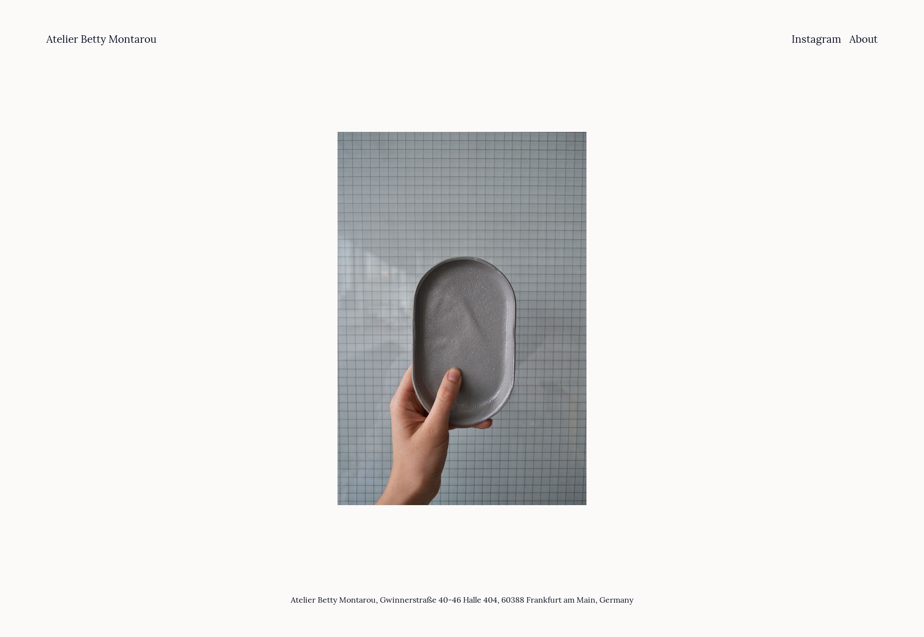
Betty Montarou
Betty Montarou’s portfolio is kept dead simple with a sort of “click to collage” method of showing off her work. It keeps the whole experience down to about two pages, and only shows off the very best of what she does.
Platform: Static Site
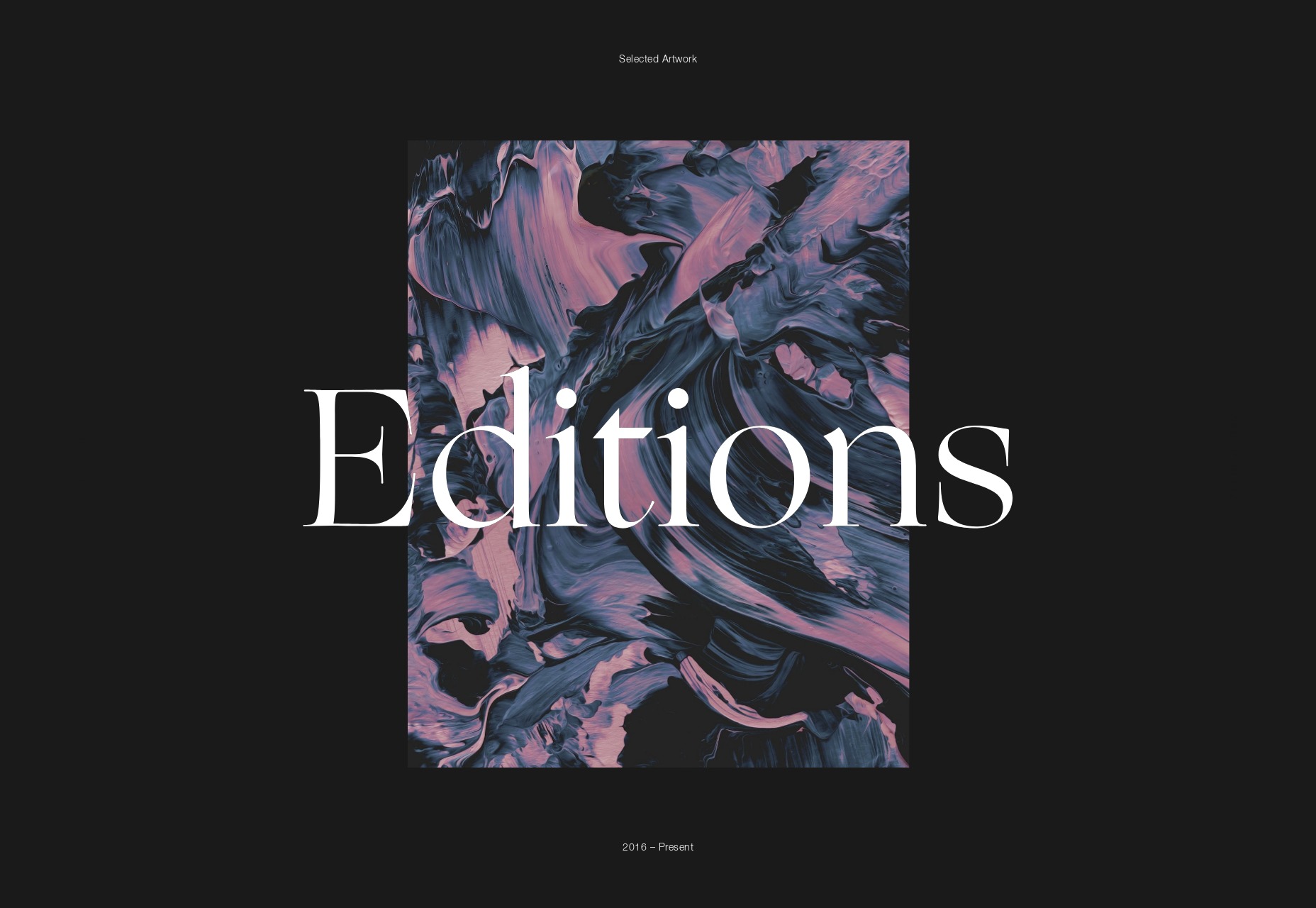
Jordan Sowers
Jordan Sower’s portfolio is another artsy one that sort of mimics the art gallery aesthetic a little. Still, it’s pretty. It’s interesting in that it functions as a portfolio and a store at the same time, but the store is kept almost hidden unless you actually click a link to buy something. It’s a store without the hard sell, and so it’s free to be artistic in its own right.
Platform: Static Site
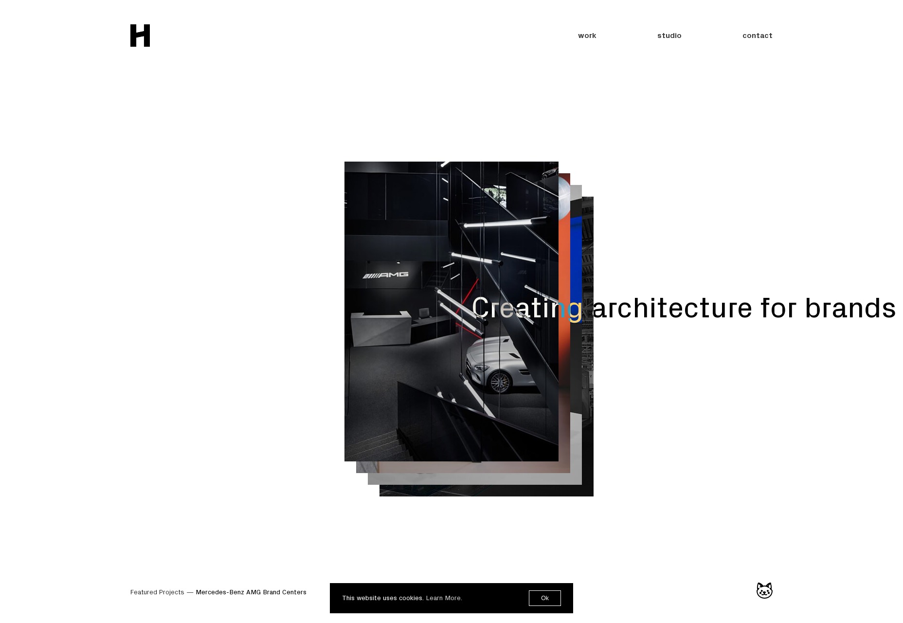
Heller
And finishing off our list we have another monochromatic design with Heller. It’s modern, it’s pretty, and it has an interesting approach to the collage patterns we see everywhere. This one is definitely going for a futurist feel, even as it’s grounded in the trends of yester-month.
I like the horizontal swipe-in animation they use for images. I mean, if you’re going to animate everything, why not give it that Star WarsTM feel?
Platform: Static Site
Add Realistic Chalk and Sketch Lettering Effects with Sketch’it – only $5!
![]()
Source
p img {display:inline-block; margin-right:10px;}
.alignleft {float:left;}
p.showcase {clear:both;}
body#browserfriendly p, body#podcast p, div#emailbody p{margin:0;}


Leave a Reply
Want to join the discussion?Feel free to contribute!