7 Fantastic Landing Page Designs
Original Source: http://feedproxy.google.com/~r/1stwebdesigner/~3/epPUen7TDQk/
What is a landing page? Knowing this can help you generate leads and retain more customers when you design a website. Simply put, a landing page is where someone “lands” after clicking on a search result, call to action, or advertisement. These pages have one core focus: converting people into customers. Any page on your site can be a landing page for certain search terms.
These awesome landing pages are a great source of inspiration when you’re trying to improve your own. Take a look and see why they work so well!
Spotify
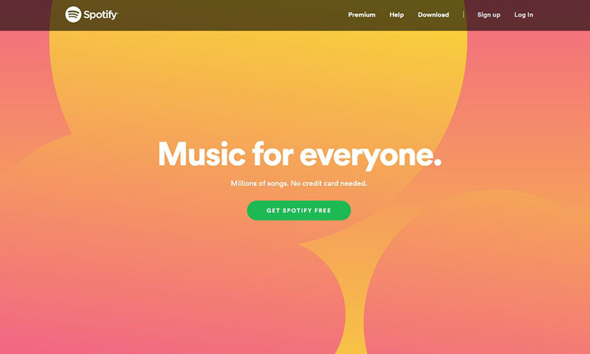
If you’re going to make your homepage your landing page, take a tip from Spotify. While navigational elements exist, they’re overshadowed by the huge background banner and noticeable button asking you to register. The pitch may be only three sentences long, but it says all it needs to.
Netflix
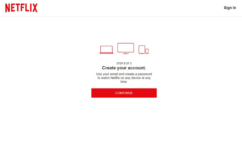
Netflix opens with an absolutely huge call to action button that’s just begging to be clicked on. When you do, you’re taken to a clean page, free of distractions but for a simple footer. Walking through the sign-up process doesn’t take long, and it even saves your progress if you leave the page.
Mango Languages
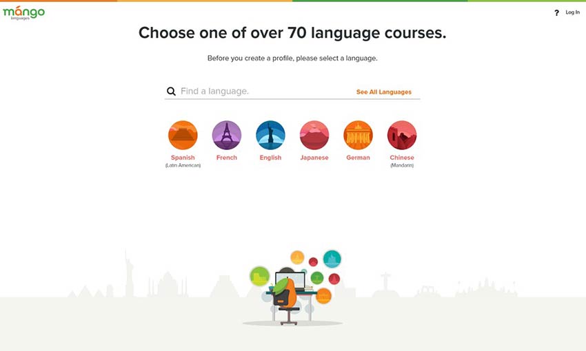
Mango Languages does a great job on its landing pages. The sign-up link is very prominent and posted multiple times on the homepage. Clicking it leads you to a page free of distracting navigation. Just choose your language and sign up!
Web Profits
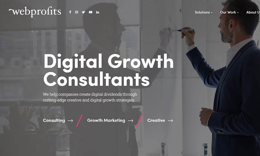
Sometimes it’s impossible to condense your landing page down to a single action for users to take. The best thing you can do is make the distinction clear, and that’s what Web Profits does. The homepage is very simple with just three distinct links. Click one, and you’ll be directed to a landing page more suited to what you’re looking for. The page may be long, but the inclusion of at least four identical CTAs makes sure there’s always a button in sight when you’re ready to get started.
Google Store
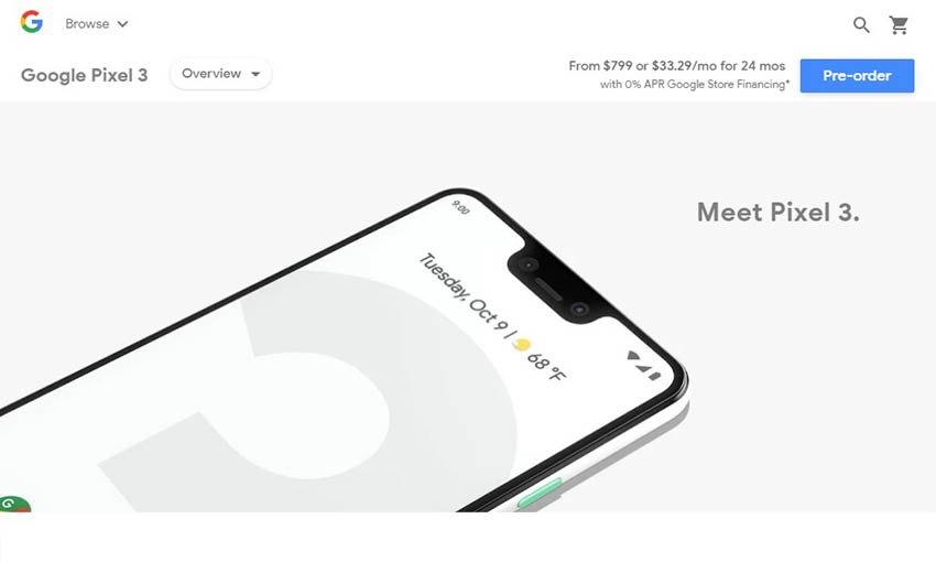
Google’s full-screen, animated page already does a great job putting the focus on the products. Click one of the calls to action and you’ll be presented with a page that gets right to the point. Pricing and order buttons are always visible in the header as you scroll through videos and feature lists. And, advertisements for other products are kept at the bottom of the page.
Upwork
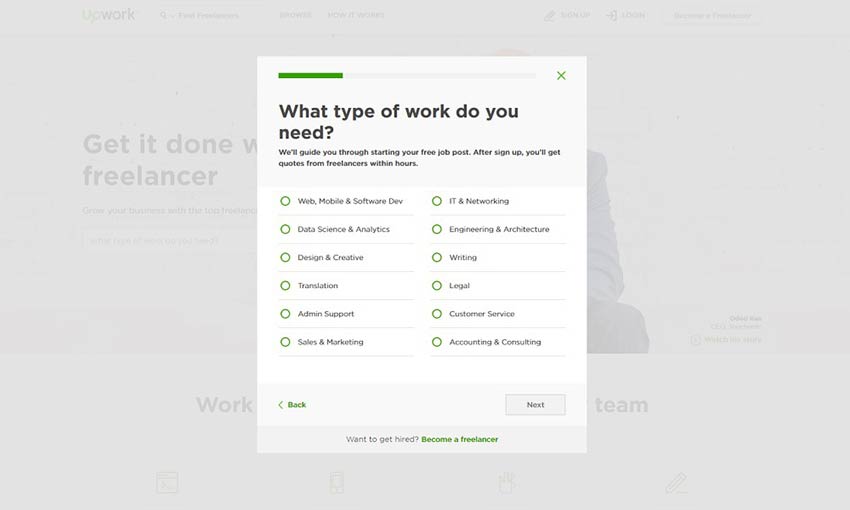
When you’re creating a landing page, it’s extremely important that you waste no time. Upwork’s sign-up dialogue exemplifies this quality. An eye-grabbing header and title draw your eye towards the Get Started button, which immediately begins walking you through creating a job post and the sign-up process. You may only have a few seconds to grab a visitor’s attention, so make sure you waste no time. This is also a fantastic example of above-the-fold content, with the site features all being below it and the important CTA above.
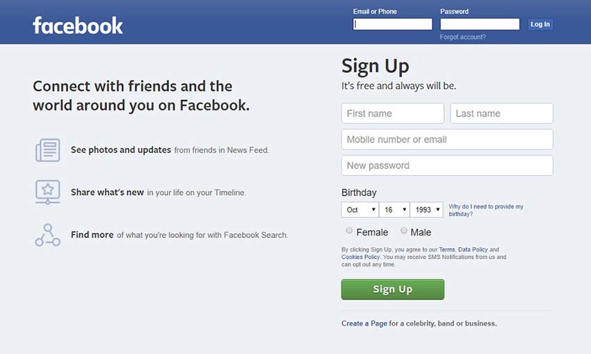
If you visit Facebook without an account, they keep their pitch simple. With three concise bullet points explaining what the site is and an obvious sign-up form right on the page, it’s easy for anyone to get started. They also keep the form short and leave the in-depth questions for later, which is a good practice.
Design Great Landing Pages
The best landing pages are concise, have few distractions, and get the visitor to take the action you want them to take. Remember that when you’re designing your next landing page for your email campaign or advertising banner! Make your argument short, compelling and tailored to the audience likely to click on the landing page. Accomplish that and you’ll be converting in no time.


Leave a Reply
Want to join the discussion?Feel free to contribute!