How to Run a Heuristic UX Evaluation
Original Source: http://feedproxy.google.com/~r/1stwebdesigner/~3/z1N9WV8rgV4/
User experience development and optimization is a broad field. There are many facets of web design to consider in the development of a website. The factors affecting user experience, or UX, span from content production and page layout to website interactions.
Being able to identify usability issues with a user interface is called heuristics. It encompasses broad, qualitative rules that help determine the usability of your website and the overall experience your visitors are having.
The UX Designer Toolbox
Unlimited Downloads: 500,000+ Wireframe & UX Templates, UI Kits & Design Assets

DOWNLOAD NOW
To ensure better performance, designers use a heuristic evaluation, which is a way to test the overall UX of your site and if the site has usability issues. Your website’s UX is important and can have a big impact on your business and the success of your website.

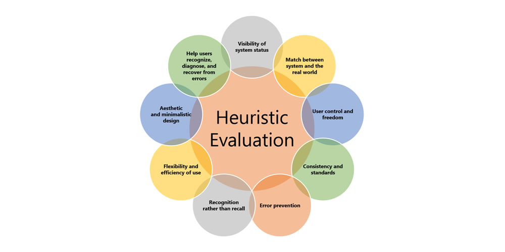
Image via UsabilityGeek.com
A heuristic evaluation is different than user-testing because you are utilizing usability professionals instead of users. Sometimes, this approach is referred to as an expert review since you are getting professional feedback about your UX.
There are over 200 criteria that can be used when a site is being evaluated. Most businesses will determine the specific probes they want to be included in the evaluation. Many experts base their questions and responses on Jacob Neilson’s 10 Heuristics for User Interface Design.
Here is a closer look at those 10 heuristics:
1. Visibility of System Status
The system or website should always keep users in the loop about what is going on. This information is given to users through feedback in a reasonable time.
2. Match Between System and the Real World
The website should cater to a specific audience. The language used through phrases, words, and concepts should be relatable to that specific audience and fit into their worldview.
3. User Control and Freedom
Users will inevitably click on something by mistake, leading them to a page they don’t want to be on. An exit or return option should be available to them for a quick return.
4. Consistency and Standards
Platform conventions have been put in place, so your users do not have to wonder what your website means. Most users are familiar with these conventions. If your site is consistent, it should be easy for users to navigate and know what steps to take to reach a goal.
5. Error Prevention
Evaluators check for situations that could lead to an error page for your user. A good error message will send readers back to where they belong. An even better solution is removing any error-prone conditions on your website.
6. Recognizing Rather than Recalling
Your website should not require its users to remember information. Objects, actions, and options should always be visible, allowing them to keep up with your website’s dialogue without missing a beat.
7. Flexibility and Efficiency of Use
Accelerators are often used to speed up the process and interaction between experienced users and your website. This means that no matter the level of expertise of your user, your site will function at the same speed.
8. Aesthetic and Minimal Design
There should be no fluff or irrelevant information on your website. The design should be aesthetically pleasing and seamlessly incorporate relevant content and information for your users.
9. Helps Users Recognize, Diagnose, and Recover from Errors
Error messages should never include code and should simply explain the problem to users. It should suggest a quick solution that is easy for the user to follow.
10. Help and Documentation
It is most effective to have a system or website that does not require any help or documentation. If your system does require it, it should be easy to find, read, and carry out.
How to Run Your Evaluation
Planning and running your heuristic evaluation can be a long process.
Companies with expansive resources should hire at least three usability experts to perform the evaluation. Your team will decide upon the guidelines to be used during the evaluation, and then each expert will evaluate the site separately. Someone who is comfortable with the site should be available to the experts to answer any questions and record the process.

Before You Start
It is important to have a clear focus of who your users are before you begin the evaluation process. Develop personas or story maps for your users and make sure your website design caters to those individuals.
Consider the different tasks your users do when they are visiting your website. Most businesses prefer to rank these activities in order of importance. Take these tasks and relate them to the guidelines that will be given to the evaluators.
Develop a Method
After you have determined your guidelines and tasks the experts should be evaluating for, develop a method. Your evaluation method will include a system of severity codes the evaluators will be basing their responses on. Once the guidelines and methods are in place and your experts have been trained on them, it is time to run the evaluation.
Write a Report
When the heuristic evaluation is over, it is time to study the responses and write a report on the findings. Just like data, here’s where you gather the intel and analyze it. At this point, you can show developers the problems your users may have and come up with solutions for them.
Though you offer a written report, present your findings in person, if possible. This evaluation was done to test the functionality and UX of your website, and those who are involved in the process need to fully understand the findings – some of that may mean face-to-face interaction.
You will be reporting to the team of developers and key stakeholders in the business, so present the information tactfully and make it clear the recommendations for changes are for the betterment of the business.
Your report should include a list of the specific heuristics that were used in the evaluation. This will show the starting point that gave you your results. Explain who the experts are and their backgrounds to the group.
List the issues you discovered with the most important first. Then, give the audience solutions to how these problems can be fixed efficiently.
Your findings and report may mean some extra work for the developers, so give them as much information as possible about the findings so they understand how the UX is being affected and what they can do to fix it.
Can You Run a Heuristic Evaluation Without Experts?
Small start-ups or freelance web developers may not be able to afford a team of experts to evaluate their web design. In these situations, a more informal method called the heuristic markup can be helpful. This method does not provide professional results but can still be beneficial when testing your usability and UX.
Using this process, you set aside a few hours to walk through the website. Try to separate yourself from the development and act as a member of your target audience.
Keep in mind one of the personas developed for the business and perform the tasks as you imagine they would. Keep notes of your experiences as you move your way through the website, keeping track of areas where you got stumped or see a potential problem.
Insight Into UX Can Boost Your Website’s Traffic
Sometimes, why a website works well for a demographic can be a mystery, and these heuristic evaluations take some of the guesswork out of the process. Regardless of the size of your business, a heuristic evaluation of your website allows you to gain knowledge and experience about what your users are seeing.
Their experience on your website determines how long they stay, if they buy your product or service, and whether they return. Conducting an evaluation is the best way to discover potential problems and develop the best UX for your visitors.

Leave a Reply
Want to join the discussion?Feel free to contribute!