15 Inspirational Examples of Minimal Web Design
Original Source: http://feedproxy.google.com/~r/1stwebdesigner/~3/uhBoQDKCBTs/
Considering that the current philosophy of UI design is “less is more,” the expected rise in popularity of minimalism has reached an all-time high amongst web designers, especially in the last couple of years. But, perhaps unknowingly, its appeal to users has also grown.
The principles of minimalism in web design are that a website (and other mediums as well) should be stripped down to their bare bones, while carefully making use of whitespace and improving readability with clearer typography. When implemented correctly, the result will allow users to focus on what’s truly important without being distracted by non-essential elements.
While this may sound easy, it can be difficult deciding what the truly important elements are and what’s little more than decoration. It can also be risky. Accidentally removing a seemingly innocuous element could be deemed critical by the user and could result in the wrong message (or worse, no message at all) being delivered to your target audience.

Source: Rotate°
If you think about the logistics, it makes sense that minimalism appeals to users: the less fluff on the site, the less you have to think about. When there are just a few links or blocks of text, and the point of interest is directly in front of you, you can let your mind rest for a bit – relax, and the website will spoon feed you just what you need.
This collection features fifteen websites that have been designed using the minimalistic principles mentioned above. Some of the sites have also been influenced by many of the popular web design trends we have seen over that past year or so, like flat design, yet still retain a look and feel that can only be described as minimal. Here are the beautifully designed sites:
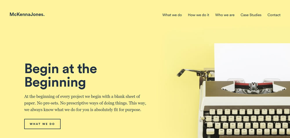
Source: McKennaJones.co.uk
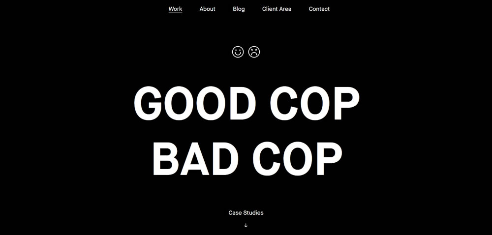
Source: Good Cop Bad Cop
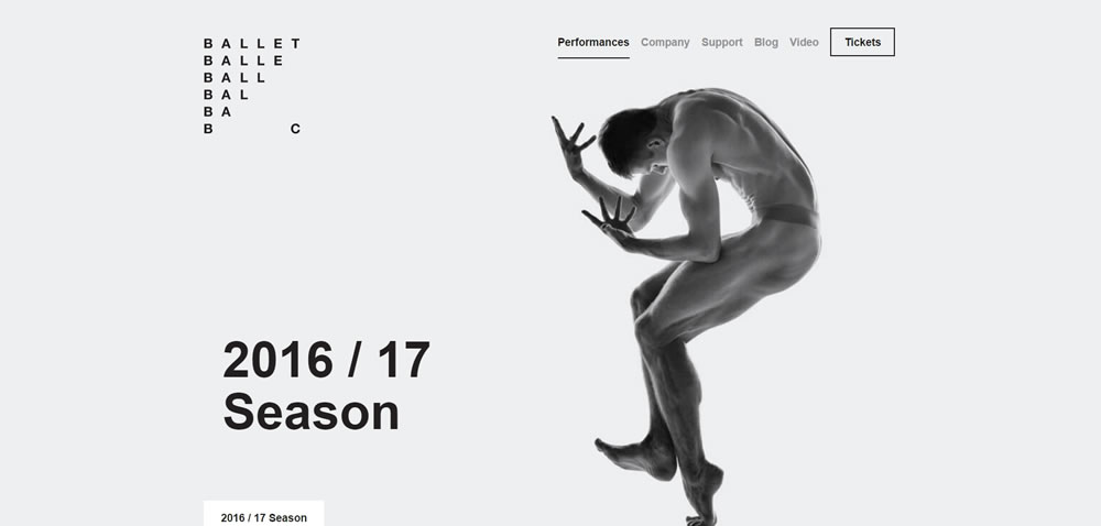
Source: Ballet BC
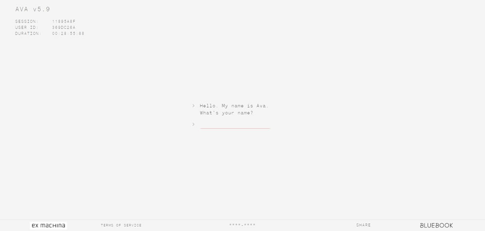
Source: Ava Sessions
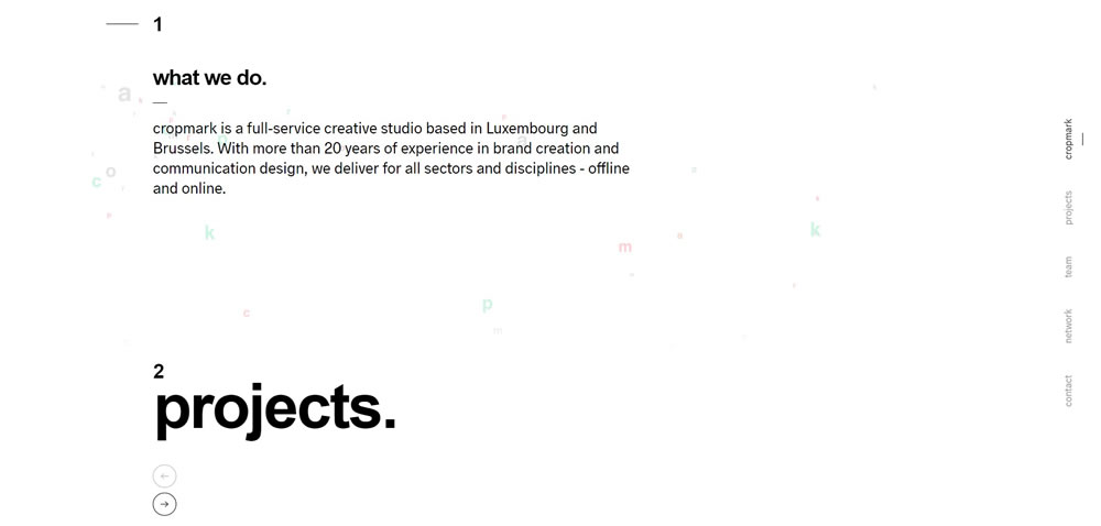
Source: Cropmark

Source: Mike Guss

Source: Inside Discovery

Source: GSArora
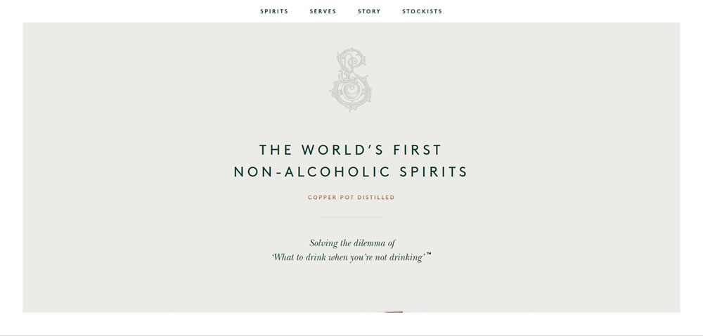
Source: Seedlip
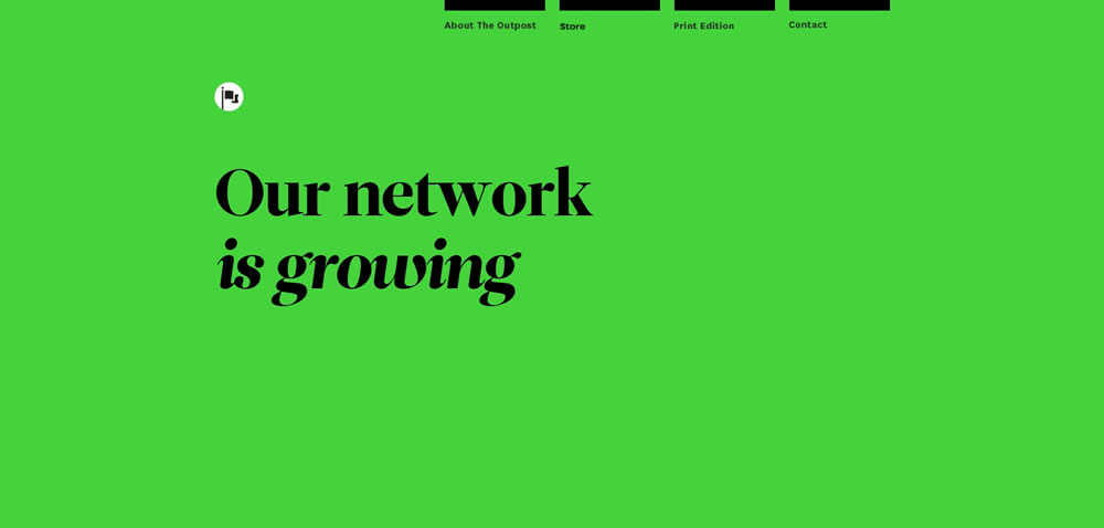
Source: The Outpost
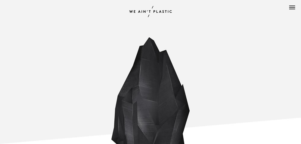
Source: We Ain't Plastic
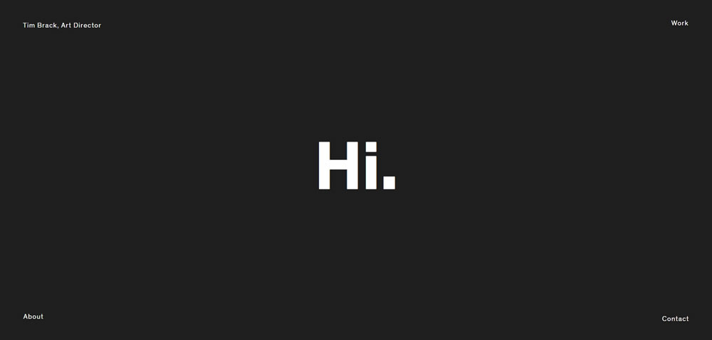
Source: Tim Brack
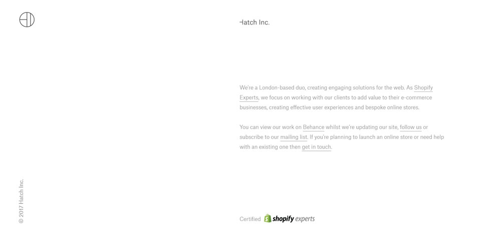
Source: Hatch Inc.
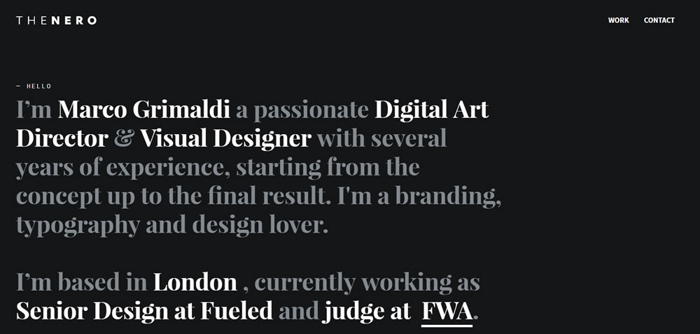
Source: The Nero Design
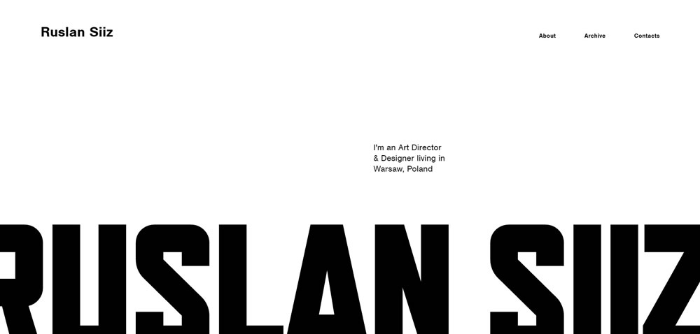
Source: Ruslan Siiz
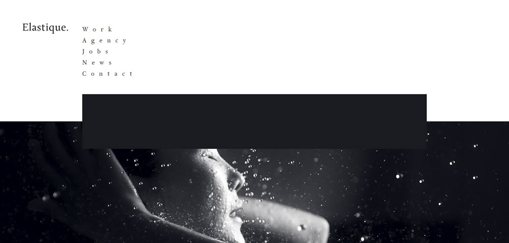
Source: Elastique
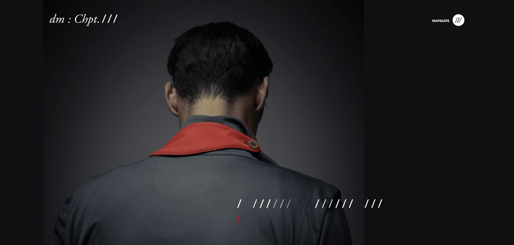
Source: Chapter 3
Finshed
Minimalism isn’t the miracle solution that you can slap on every single project. There’s a time and place for everything; the time is now, but you need to carefully decide the place.

Leave a Reply
Want to join the discussion?Feel free to contribute!