Creative Examples of 404 Web Page Designs
Original Source: http://feedproxy.google.com/~r/1stwebdesigner/~3/rFQyt7UZYC8/
Despite search engines getting better at indexing websites, and sites paying extra attention to broken links through dedicated plugins and services, 404 pages are still an integral part of the modern web.
As hard as companies and sites try to avoid issuing broken links and sending visitors to redundant pages, there will always be a certain few that slip through. As such, it’s important to have a 404-page design to both redirect the user to a different page and to make light of the error through humor or playful, creative design.
In this article, we are going to compile a selection of some of the most creative 404 web page designs for your inspiration.
Android

One of the more extravagant 404-page designs, the Android team has devised a game to include on the page. It’s beautifully put together and offers a fun and creative take on what is possible.
Ueno
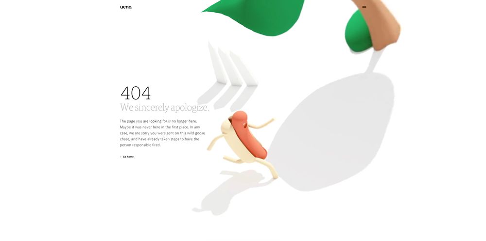
Using a beautiful motion graphic background, Ueno’s 404 page is simple but extremely fun and comical. Every aspect remains on-brand, from the graphics to the typography.
One Shared House
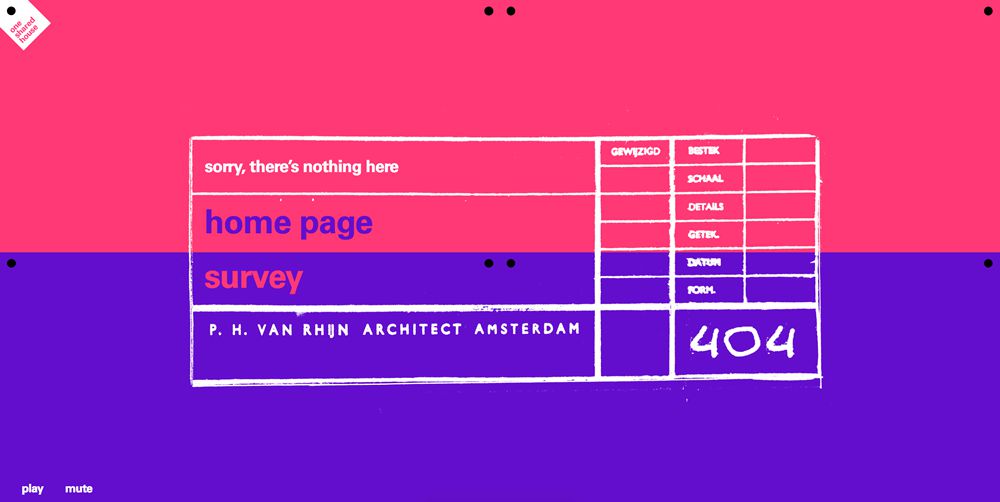
Using a hand-drawn style grid upon a two-tone background, this example offers two options for users landing on the page. They can navigate to the homepage or head to the survey page.
Rezo Zero
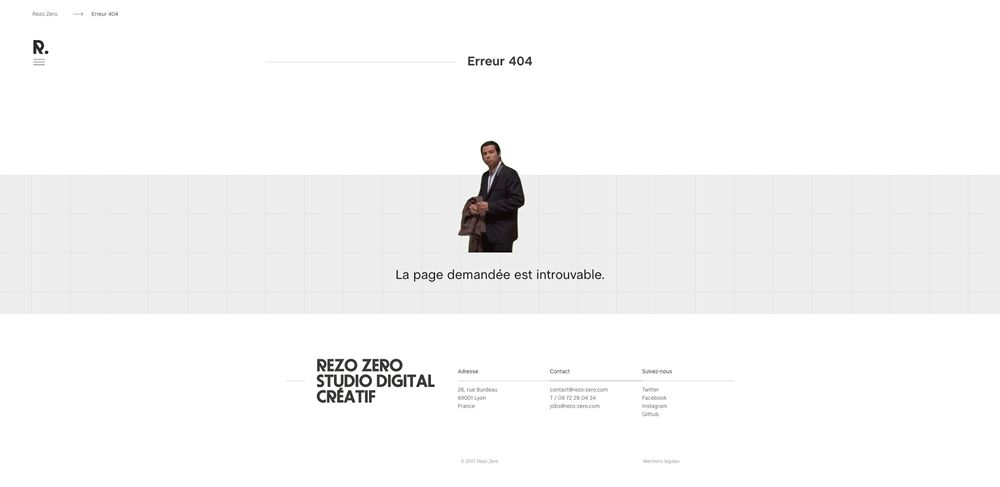
Rezo Zero’s design uses a clever film reference to Pulp Fiction, with a comical and confused-looking John Travolta GIF.
New Yorker
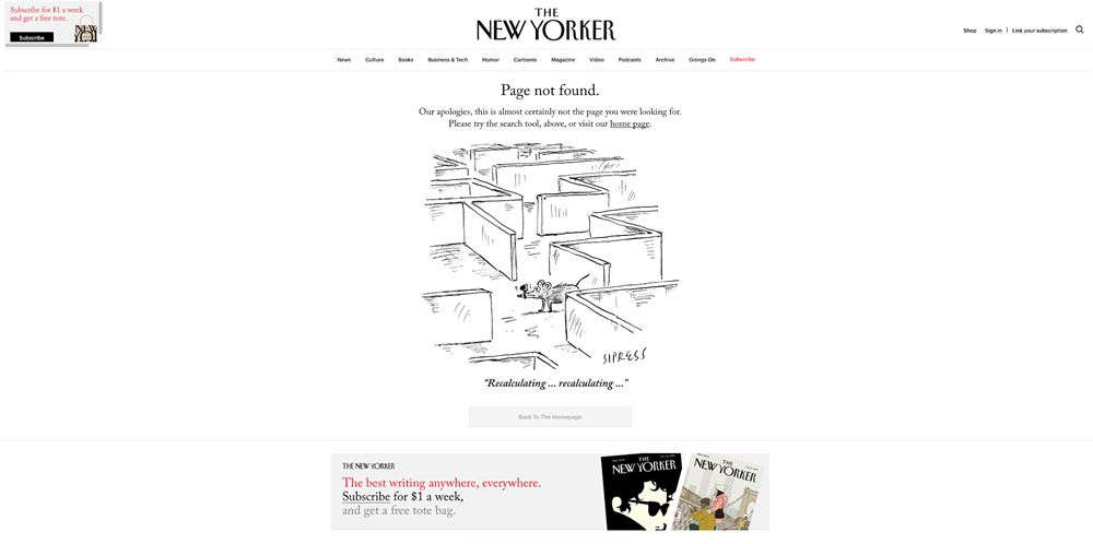
The New Yorker has included a custom illustration on their 404-page design. It shows a mouse lost in a maze, poking fun at the error while still offering the usual navigation areas and product upsells.
Cooklet
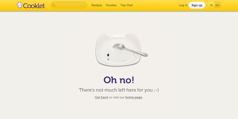
What better graphic to include for a cookery site, than an empty plate? It’s a simple but very clever example of what can be achieved on even the most basic of 404-page designs.
Dropbox
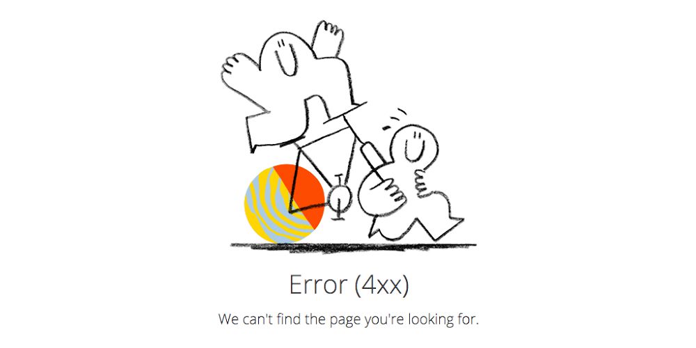
Utilizing illustration graphics from their rebrand, Dropbox presents a simple but playful design with clear navigation links for users to continue on their way.
Airbnb
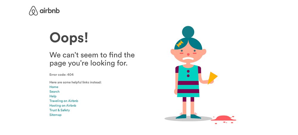
Similar to Dropbox, Airbnb combines a simple on-brand illustration with a clear message and useful links for the user. The illustration again has a comedic element to poke fun at the error.

Leave a Reply
Want to join the discussion?Feel free to contribute!