Designing a Great Logo: Tips & Mistakes to Avoid
Original Source: http://justcreative.com/2017/10/22/logo-design-tips-mistakes/
This article was contributed by Krzysztof Gilowski.
Although the recipe for a perfect logo does not exist, the knowledge of the features that distinguish legendary designs from the average ones, will allow you to get closer to greatness.
In this article you will get to know the rules that underlie the designs of some of the most valuable brands in the world.
Recognizability is everything
The best logo designs communicate the whole brand image in no time. Lego embodies the joy of children playing with toys. The Mercedes’ logo expresses luxury with an elegant typeface and a geometric abstract symbol.

The most famous logos have a story to tell and that makes them unique.
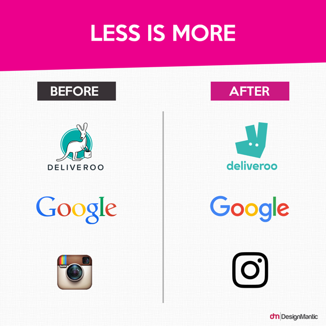
Simplicity is the key to success

What do the world’s most recognizable logos have in common? The McDonald’s “M”, Nike’s swoosh, or the Apple’s apple with a bite (or byte) taken out of it? They are all extremely simple.
“The only mandate in logo design is that they be distinctive, memorable and clear.”
-Paul Rand
A good logo is original, but it is not exaggerated. An extremely complex logotype will not make your brand look sophisticated. It will only mean that the designer did not understand the meaning of simplicity.
Versatility – saving your nerves and money

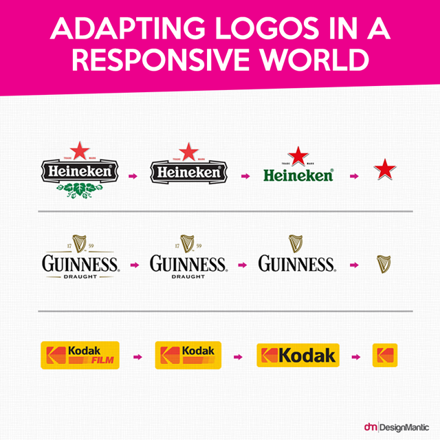
A logo should present itself well in every possible format: small and large; in black and white (positive / negative); vertically and horizontally. It must be equally effective displayed on a variety of media – smartphones, tablets, computer screens and printed advertising.
Make sure the logo is recognizable after reversing the colors and decreasing the size. Check out how it looks on a stamp and on a truck. Don’t be afraid to make different versions of your logo (aka responsive logos).
A good logo must be timeless
The most beautiful and effective logo is not based on the current trends in the market. These are timeless pieces of work. Their authors, thanks to their experience in design, can predict whether the logo will still be valid in 10, 20 or 50 years.
The BMW’s logo is an example of such a graphic sign. The original logo was designed in 1916 and has changed very little ever since. The style keeps being altered according to the era but the concept remains the same. See more logo evolutions here.

6 rules followed by logo designers
Start with black and white

In the early stages of the design the colors are of secondary importance. Moreover, they can draw people’s attention away from the logo itself. Most of the recognizable logos start with black and white drawings and sketches.
Use three colors at most
Examples of valuable logos that would break this rule are rare. Do not try to make an exception here – reality shows that it does not pay off. Paradoxically, a timeless logo that would be memorable is very simple and minimal colors.
Use the right colors depending on the mood you want to create. Learn color psychology.

Use one or two fonts
To keep your logo clear and transparent, you may want to limit your design to one or two types of fonts. Depending on the nature of your business, use fonts with sharp or soft lines. See here for great font combinations.
Choose practicality over originality
Your logo has to be easily remembered. Accept the principle that a graphic design should be easy to describe on the phone.
A good logo should be easy to describe on the phone.
Something that will stay in someone’s memory should not be very complicated. Always choose practicality over originality.
Below you can see a case study of 1500 people attempting to draw logos from memory. It’s difficult!

Avoid unnecessary details
Remove anything that is unnecessary from your design. The ideal logo is not the one that cannot have anything added to it. The best one is the one that cannot have a single element removed from it.
Do not use ready-made graphics
Under no circumstances, create a logo with ready-made items (stock graphics, cliparts, pre-made designs). Creating your logo from ready-made templates and pictures makes your logo non-unique and replicable. Not to mention that a part of your logo may be legally used in your competitors’ graphics.

4 major characteristics of projects that lack professionalism
If you are looking for a logo design, the following tips will help you evaluate the effectiveness of your designer’s work.
Materials full of defects
The files with logo designs that you receive from your designer should not contain any technical imperfections. The curves should not overlap and should be as smooth as possible and the nodal points should be minimized. If the logo is symmetrical, then the symmetry should be perfect such as below.
Remember that the presentation of a logotype in a different scale, such as zooming and placing it on a truck, will expose all of its possible errors and defects.
Below is a logo by that has been designed by Jeroen van Eerden with a grid system to avoid these defects.

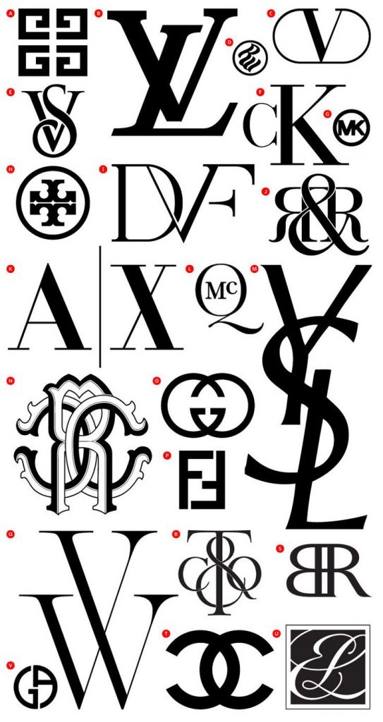
Monogram as a starting point
An inexperienced designer often cannot resist the temptation to create a logo based on the company’s initials (for example, the name “Great Company” would create the logo form ‘G’ and ‘C’).
While this seems like a good idea, it’s hard to build company’s credibility or convey branding information with that kind of logo. It’s quite common in the fashion industry although they have huge marketing budgets. Monograms do not work for all industries.

Shortening the name to acronym
It is often a mistake to try to shorten the name of a new company to acronym size. Yes, this is an effective strategy, as demonstrated by the IBM’s, KFC’s, or AOL’s logos. However, the names of these companies became acronyms only after many years of market presence and costly exposure.
Using graphics programs does not guarantee quality
A logo created in Photoshop or Gimp may not be usable when you want to engrave it or significantly enlarge it. A professional logo should look just as good on different devices, but a raster logo (presenting the image with a pixel grid) does not assure that effect.
A vector logo (which defines points mathematically) created in software such as Adobe Illustrator or Corel Draw will provide appropriate image reproduction on any scale – without the loss of quality.
Do you have any further logo design tips or mistakes to avoid?
—
About the author: Krzysztof Gilowski is CEO at Juicy – a company that creates memorable brands for small companies. Check out their guide on designing a restaurant logo on their blog.


Leave a Reply
Want to join the discussion?Feel free to contribute!