10 Ways to Increase Interactivity in Your Emails
Original Source: http://justcreative.com/2017/11/06/10-ways-to-increase-interactivity-in-your-emails/
This article was contributed by Kevin George.
Emails are constantly evolving. What began as an interdepartmental communication channel is now a vital marketing tool to reach the masses. Unlike a social post which is lost in a sea of updates, your emails reach your subscribers’ inbox, ready to be opened and read.
But the steps every email goes through are almost similar. Your subscriber receives your email, opens it, spends roughly 8 seconds to go through it, decides to either respond or move to the next email and repeats the same steps. Every email marketer struggles to make their emails interesting enough for their subscriber to spend more time and this increased time spent can be really pivotal in converting them into customers.
To make any email engaging, you have two options:
Make your email content engaging
Make, how your email content is presented, engaging
Email marketers have been using best practices and experimenting with email elements such as layouts, colors, email copy, visually appealing hero images, since long. Now, what if we tweaked the method of presenting the above-stated email elements so that your subscribers interact with your emails to unfold the message?
See here for the anatomy of the perfect email and how to use personalization in email.
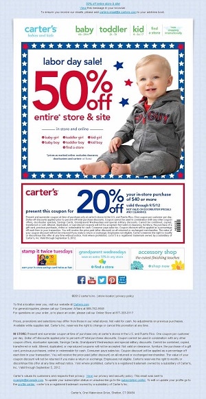
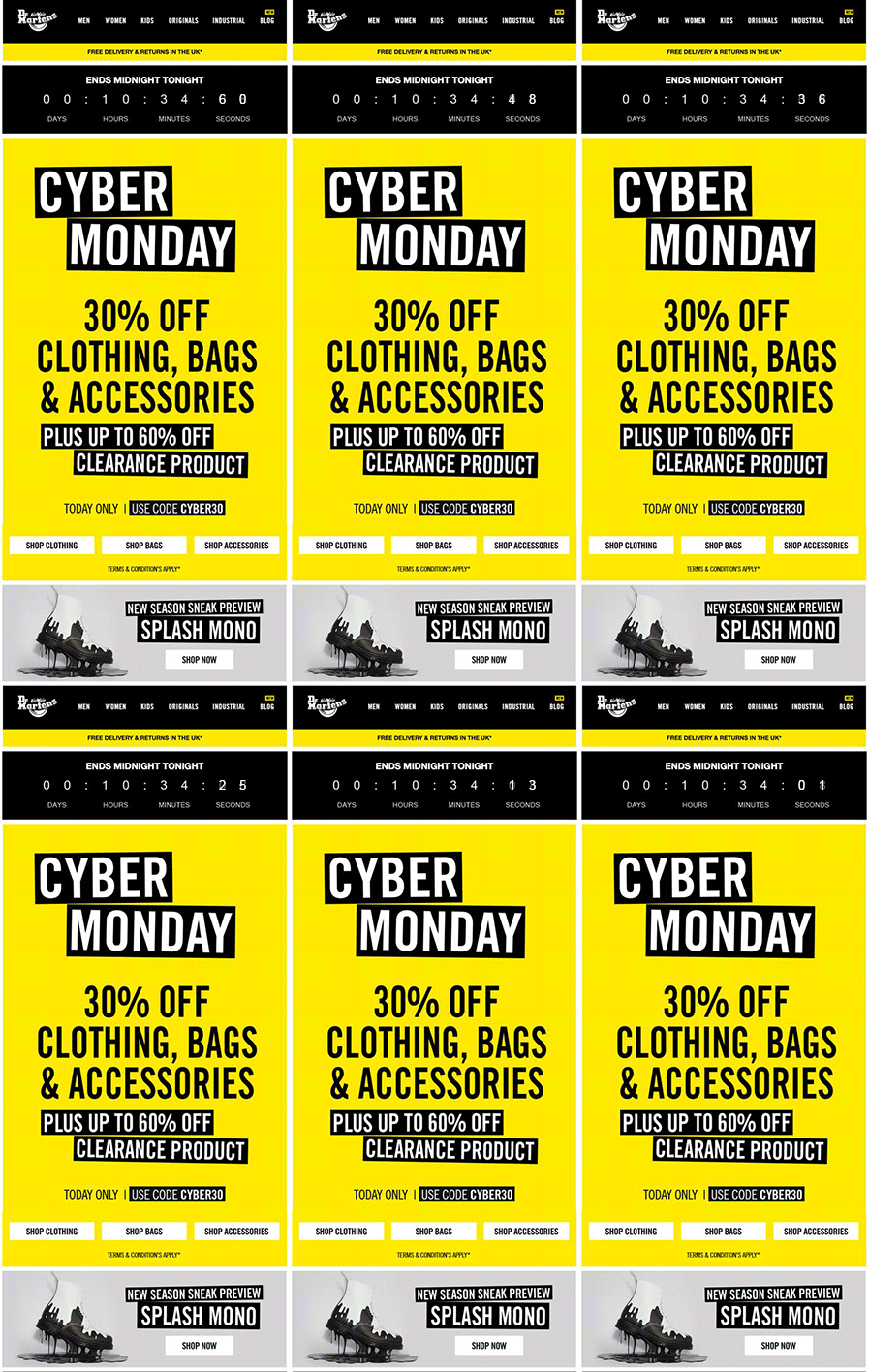
Would you like to remind your subscriber about limited sale via text (a) or have a countdown timer (b) in your emails?
Presenting Interactivity in Emails…
Ever since the amalgamation of CSS (Cascading Style Sheets) into HTML emails, the scope for including keyframe animation in emails became possible. Using keyframe, any specific element from an email can be moved, expanded, reduced, flipped, etc. The end result is super amazing elements that change according to the user interactions.
We shall look into some of the interactive email elements that are being included by brands to make their emails STAND OUT. With some minor exceptions, the below stated interactive email elements are supported well in most of the widely used email clients.
Countdown Timer
Countdown, in any form, triggers the fear of missing out in the minds of the reader. Leveraging this sense of urgency, email marketers use countdown timers in their sale promotion/ announcement By using CSS, you can enable the timer to countdown from the time the email was opened to the deadline time. Unfortunately, this is currently only supported in Apple devices and Thunderbird, but fortunately for the non-supporting email clients, a GIF of the countdown timer can be a good fallback option.
The E-commerce industry can use countdown timers to depict the expiry of an ongoing offer or even for the abandoned products in the cart.

In the above example, the countdown is right in the first fold.
Scope of Application:
Ecommerce sites can create ‘limited period’ urgency while offering discounts on different products and in their cart abandonment emails.
Attendees to an event can be sent reminder by event companies
Automobile industry can send emails to enthusiasts with a countdown before the launch of a new car model.
Navigation Menu
Most of the brands now feature a navigation menu in the header or footer of the email. But when the email is opened on a mobile device, the content stacks up to make the email unintentionally long. This can be overcome by hiding the navigation menu within a collapsible menu so that only those interested can click on it. Moreover, the navigation when placed at the footer, shall not force the email content to shift down, as with the case in the navigation menu on the top.
This is compatible currently on Android native and Apple’s Native email clients.
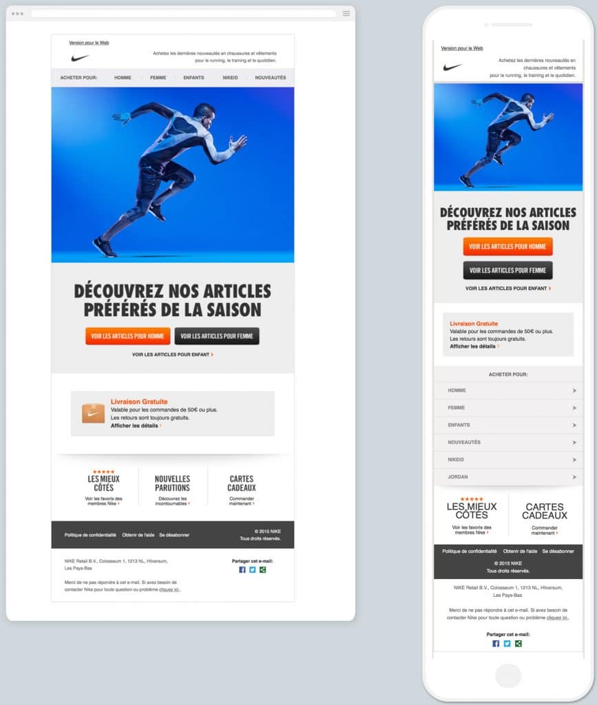
As you can observe, in the above email the mobile layout features the navigation menu at the bottom
Scope of Application:
Links to extensive tour options can be offered by brands in Travel and hospitality services, neatly tucked behind menus within emails.
E-commerce websites can provide links to different product sections to showcase new product launches, recommendations and cross selling within the navigation menu.
Rotating Banner
When you need to showcase different products or variation of the same product, stacking them into columns is not a very wise decision in terms of email length. In such cases, integrating all the images into a rotating banner can be really helpful. Rotating banners automatically loop between different images, separated by a preset time interval – one image at a time. This doesn’t require any manual input from the user’s end and it keeps on running in a loop, being especially helpful when viewing on mobile devices.
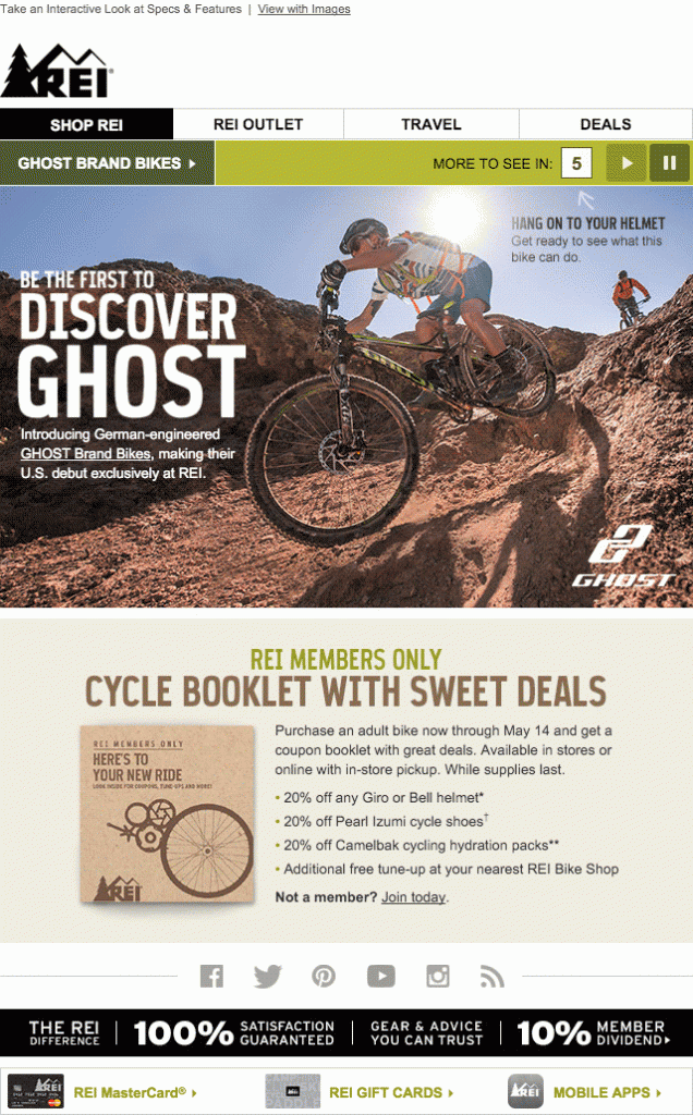
Adventure Gear retailer REI’s email features a rotating banner at email header explaining their featured product
Scope of Application:
Tour and travel companies can showcase various tour packages in limited space.
Academic and educational institutes can have a slideshow of their awards and achievements.
Sliders
Counterpart of rotating banners, sliders perform a similar function but the only difference is that in sliders the subscribers can rotate the banner in either direction, based on their interaction. Moreover, you can have separate CTA buttons for individual frames to help monitor user interactions.

Home Automation Nest email features the slider showcasing their products.
Scope of Application:
Technological companies can display their products/services offerings, customer feedbacks, etc. through a slider.
Retailers can show all their newly launched products in one email, courtesy sliders in email.
Scratch & Flip Effect
For a dramatic effect, coupon codes in emails can be hidden behind a silver strip that a subscriber needs to virtually scratch or click in order to reveal. This is helpful in creating a sense of mystery and raises the subscriber’s curiosity level.
In desktop, both effects will work well in Apple Mail & Thunderbird; in mobile devices, it will work in native apps only.

EmailMonks have implemented a flip in their email for Easter offer
Scope of Application:
E-commerce websites can create some drama by sending a coupon code that is revealed by a scratch effect and flip-flop a product’s image and information.
For a research company, providing stats and a brief about a research can be done successfully through a flip effect.
Accordion Effect
You can reduce the overall email length by hiding the email content behind tabs. When the subscriber clicks a tab, the content expands and any other tab shall get collapsed automatically. Really helpful when you need to share secondary information on a single product that’ll remain hidden until tapped. Although supported in desktop clients, its applications are best enjoyed in emails opened in mobile devices.

In the above email, the content is neatly stacked into tabs when viewed in the mobile layout
Scope of Application:
Publishers and bloggers can implement accordion to accommodate more content in their email newsletter.
eCommerce retailers can provide secondary information about a product that’ll remain hidden until tapped.
Integrated Forms

Instead of redirecting your subscribers to a landing page, you can embed in-line forms within your emails for lead generation purposes. By having an integrated form in email, you increase the form filling efficiency manifold. But what needs to be noted is that only Text box, Paragraph, Checkboxes, and Radio Buttons are supported currently.
These come very handy when you need to conduct surveys or collect feedbacks. The data collected in the form field can be redirected to any search engine or your website database to enable search right from your email.
Scope of Application:
E-commerce websites, in their post purchase email, can add a form in which the customer can review the product.
Restaurant owners can send promotional emails to get subscribers for filling form to process the specific order or for reviewing their experiences.
Tooltips

Similar to the tooltips you encounter on websites and desktop applications, you can integrate a tooltip within an email. This can be really helpful for e-commerce emails, where subscribers can get additional information about a specific product by clicking or tapping on the overlay. Combined with embedded forms in emails, it can be used to provide helpful information.
Scope of Application:
Apparel and retail stores can show elaborate information on their products when the user clicks on the tooltip box.
Tourism companies can share the details about amazing destinations with related package details displayed on correct word.
Video
The most engaging content since the popularity of Youtube and Snapchat, you can even include a video that is embedded in the email. Upon user interaction, the video can play right inside the email. Currently supported in Apple devices, Outlook for Mac and Android native clients.
In the above email, Eurostar has added a rotating banner using GIF as well as an embedded video right in their email.
Wrapping Up
Email marketing still manages to bring the highest ROI, and innovations such as these interactive elements, keep email at the top as the preferred marketing tool by most marketers. Moreover, those with non-supporting email clients are not left in the dark since all the above interactive emails designs come bundled with appropriate fallbacks in order to not ruin the user experience.
Have you ever received or sent any interactive email? Share your experience in the comments below.
—
About the author: Kevin, the Head of Marketing at EmailMonks – one of the fastest growing Email design and coding companies, specializes in crafting beautiful email templates, PSD to HTML email conversion and free master email templates. He loves gadgets, bikes, jazz, and breathes ‘email marketing’.

Leave a Reply
Want to join the discussion?Feel free to contribute!