Stunning Examples of Interaction in Mobile App Design
Original Source: http://feedproxy.google.com/~r/1stwebdesigner/~3/c085adpBZ6Y/
Visual appeal aside, effective interaction design can lead to significant improvements in the user experience of your mobile product.
Taking the iOS or Android operating systems, you can see that almost every action is executed by some type of interaction. Whether this interaction comes in animation terms, or tangible feedback such as a taptic engine, the possibilities are never ending.
Example #1 – Siren
Siren uses many different interaction animations in its app design. The first of which are the elements that move with varying delays to produce something of a ‘wave’ effect when you swipe left or right.
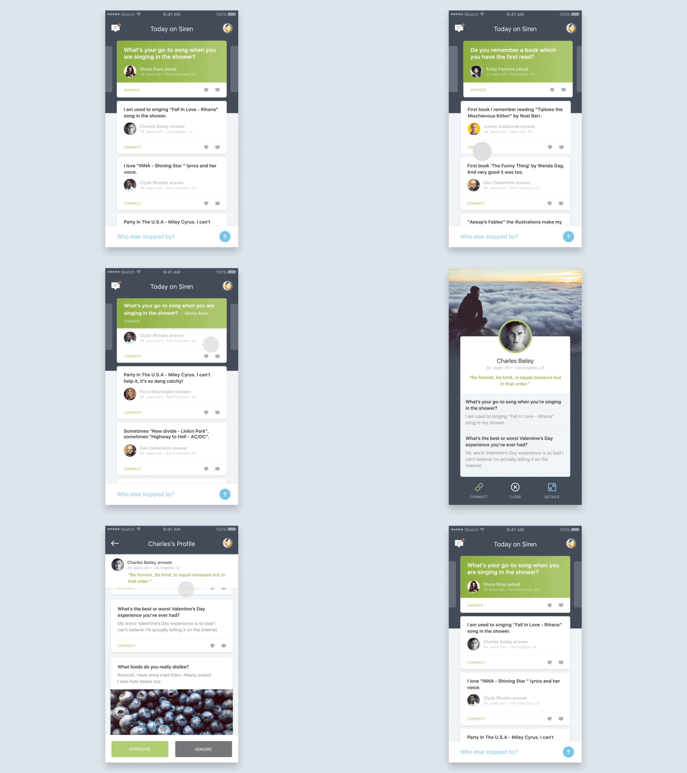
This provides additional feedback to the user as to the overall structure and flow of the main page. The app also utilizes shrinking elements to expand the interaction area of the interface, while ensuring critical information always remains on show.
Example #2 – B&O Play
The B&O Play app implements a series of satisfying transitional effects upon interaction with scrolling, color choice, and selection.
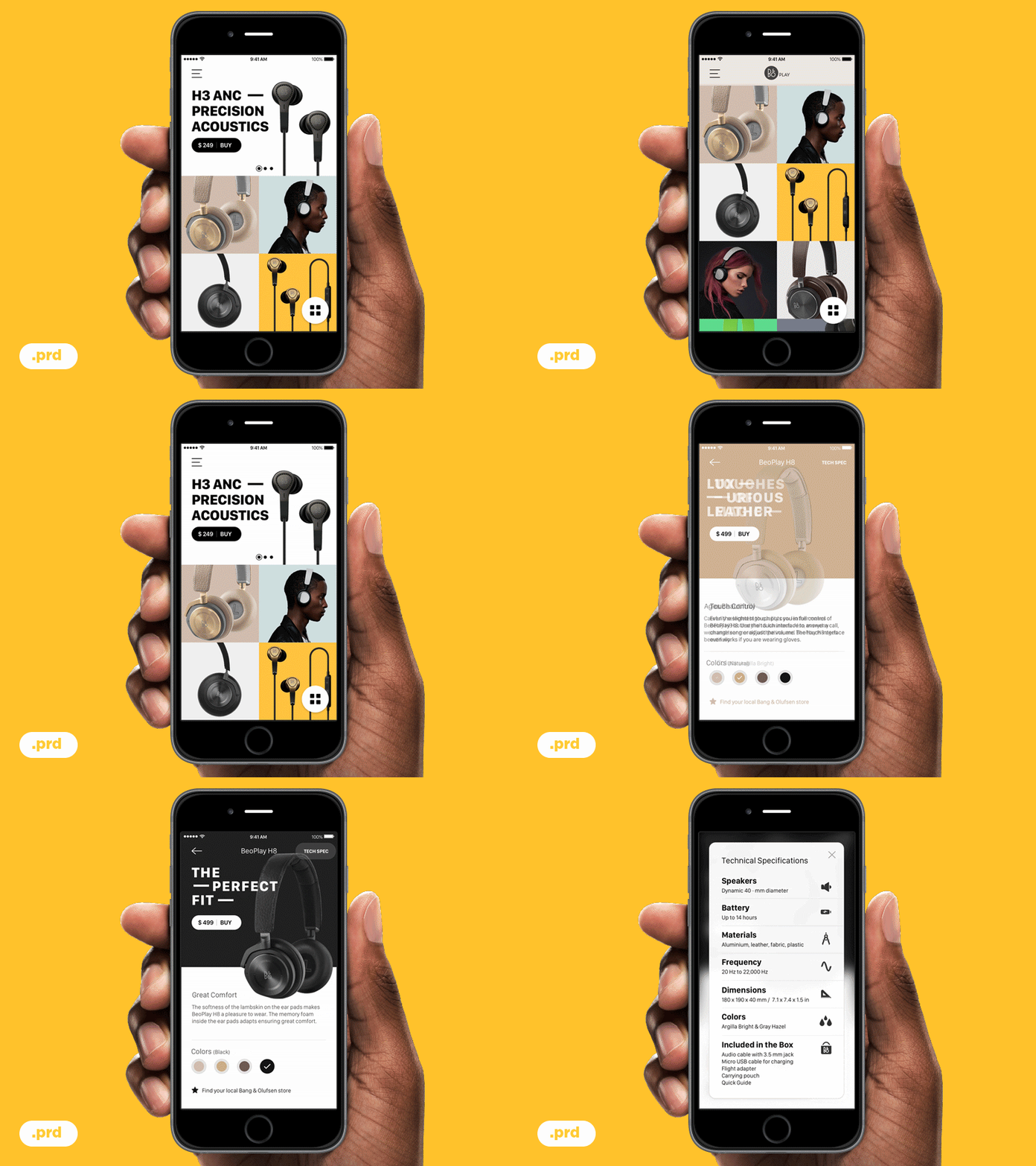
There are a number of effects for each interaction, including delayed horizontal motion, icon pops, and even visual feedback in the form of attaching imagery to the scroll area when a user has scrolled to the top of the list.
It uses these effects subtly, with precision and restraint, resulting in one of the finest examples around.
Example #3 – Bthere
Bthere’s app is a delightful example of interaction design in order to entice the user through the onboarding process – something that is typically a somewhat tedious part of the user experience
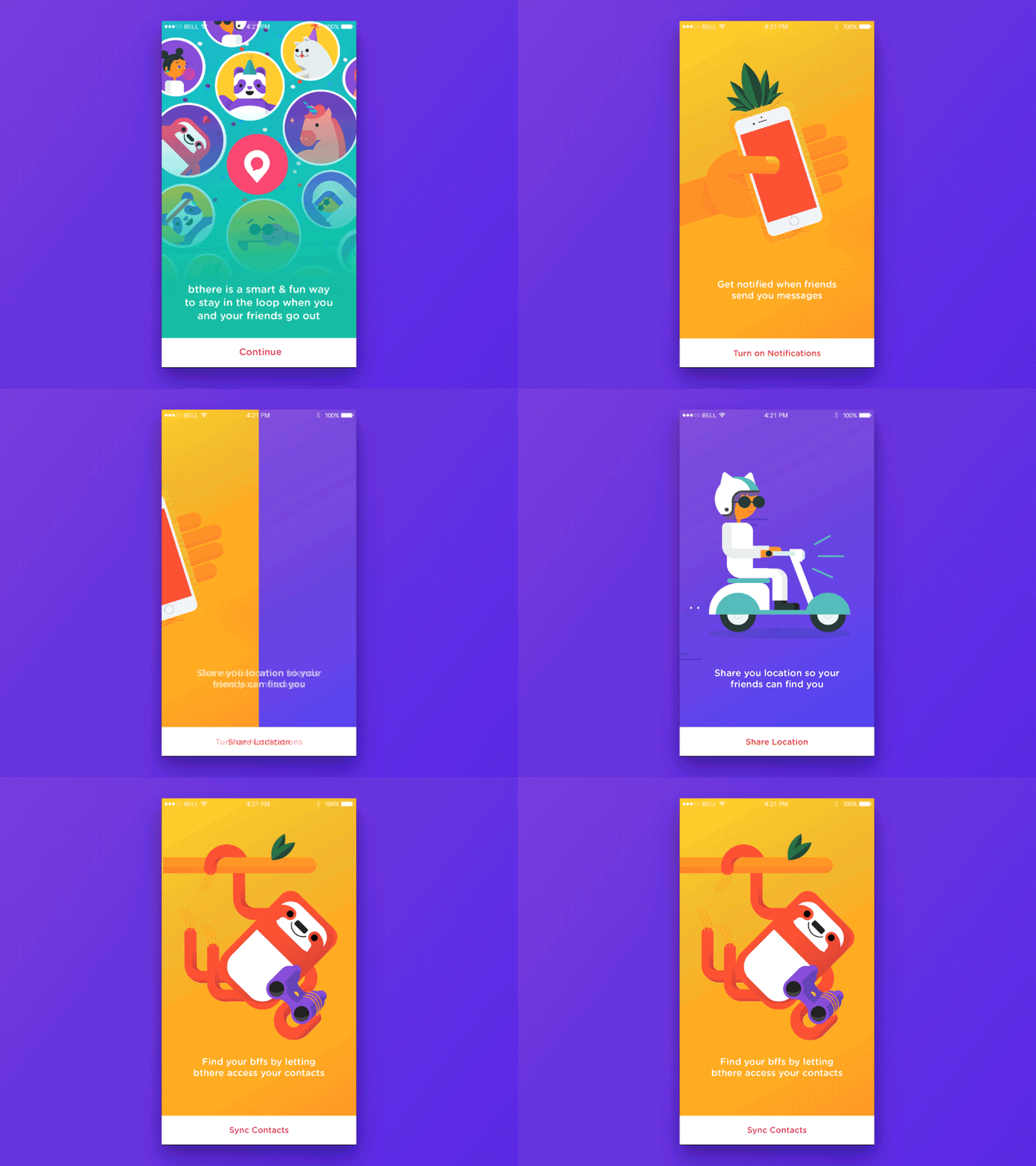
By animating the icon transitions and background colors, as well as the individual icon elements themselves (including the scooter’s exhaust!), Bthere has conveyed the fun and light-heartedness of their brand effectively, while likely improving user conversion and retention upon download of the app.
Example #4 – Housing
Housing uses subtle interactions throughout their app. Upon adding a new feature, whereby the user could call an Uber to a viewing, the design team needed to find an unobtrusive way in which to bring attention to this new addition.
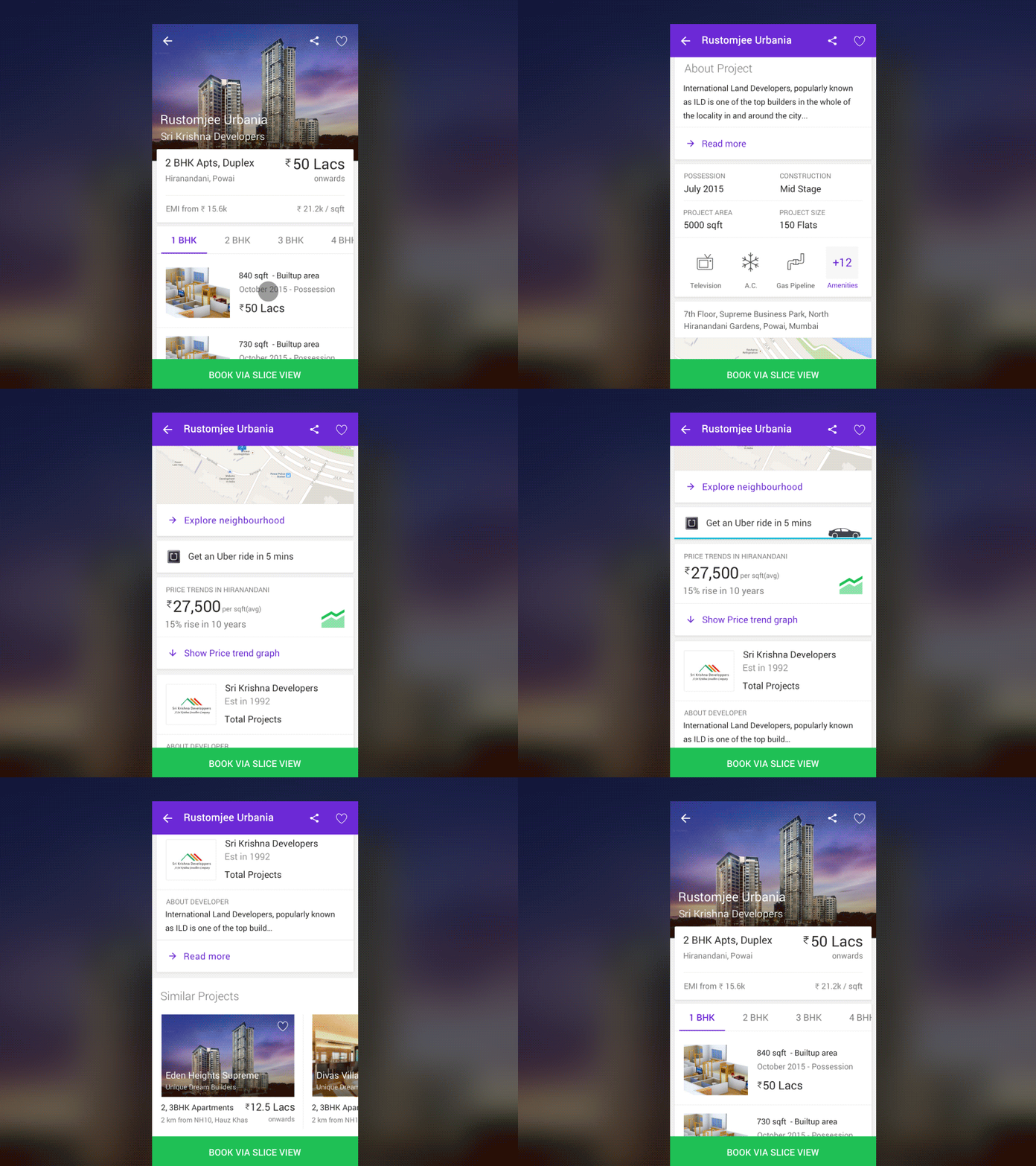
The result, as shown above, is enough to grab the user’s attention momentarily, while not being in-the-face of the user. The execution of both icon design and color combines effectively to improve conversions as well as visual appeal.
Example #5 – Neighborhood
The final example, Neighborhood, implements interaction design in almost every aspect of the app, throughout icons, popover elements, messages, and panning.
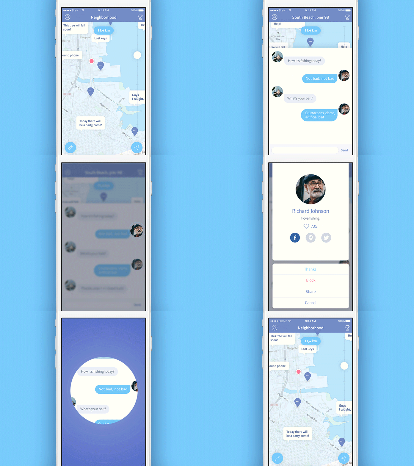
The attention to detail in every step of the design has lead to some visually satisfying results, including a user menu that is somewhat reminiscent of Facebook’s chat heads.
Overall, it results in a cohesive user experience with plenty of visual feedback and easy-to-use features.
Finished
As 2017 gets underway, the abundance of tools now available to designs and developers, should see some even more spectacular and unique results in mobile app interaction design throughout this year.
Which interactions would you like to see more of in 2017? Share them below in the comments!

Leave a Reply
Want to join the discussion?Feel free to contribute!