25 Inspiring Examples of Ultra Minimal Web Design
Original Source: https://line25.com/articles/25-inspiring-examples-of-ultra-minimal-web-design
Sometimes, less means a whole lot more! Get inspired by these ultra minimal web design examples and discover what makes them stand out.
The latest web designs with loud colors, trendy headers, and stunning imagery are indeed attractive, but sometimes it’s nice to admire the everlasting style of minimalist design. The ultra minimal websites in this list focus on composition and typography to create stripped back, naked designs that are just as beautiful as those full of glamour.
If you feel the need to change things up and try something new, here are 25 inspiring examples of ultra minimal web design. Browse through this selection and discover new web designs.
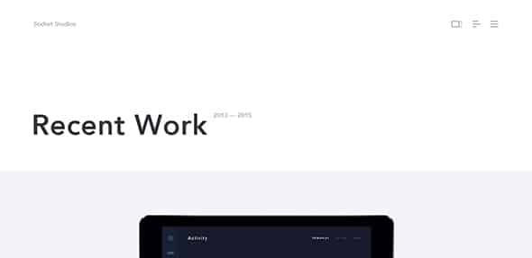
Socket Studios
Nowadays we don’t need so many words to express ourselves. A good picture placed in the right place provides us with all the information we need to draw our own conclusions. This web design is the perfect example for this.
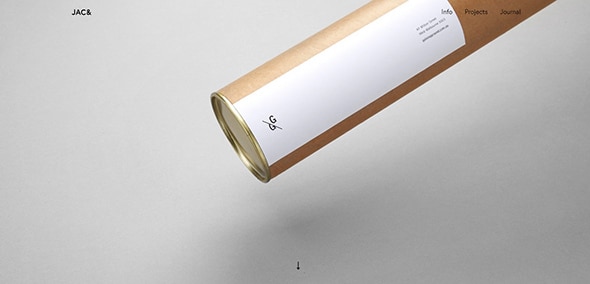
Jac in a Box
This website is a great inspiration and a place to rest the eyes in the pastel colors after a busy day of hyper advertised sites and streets!
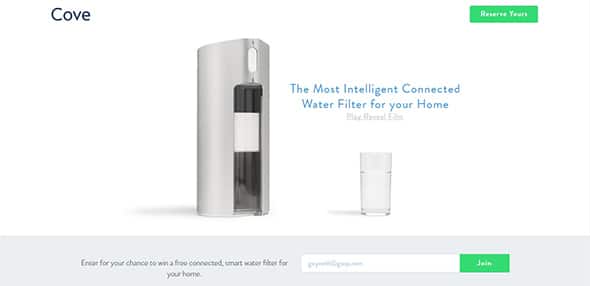
Cove
All you need is within reach on the first page. No complicated menus, no submenus, no advertising and the message becomes very clear to everybody!
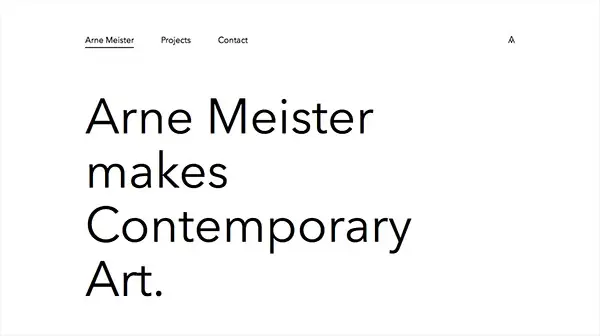
Arne Meister Contemporary Art
This is an excellent minimal web design example which focuses on large, bold typography while making the best use of white space.
Ape Unit
The color changing for each topic and the picture fading in the background really captures the interest of the viewer, shifting the focus from one topic to another.
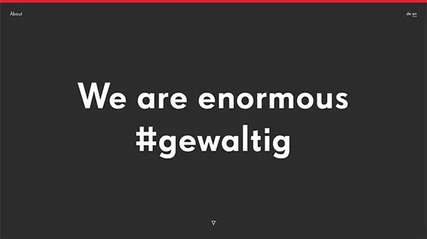
Italic Studio
This site has a beautiful expression which is obtained through a minimalistic design. The use of neat animations is a great way to make this design pop!
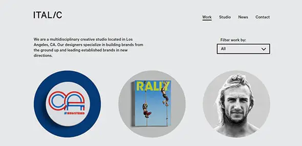
Ten & Bourne
If you are tired by information crowded websites then this minimal web design will sooth your eyes. Check out this minimal presentation and discover its full features.
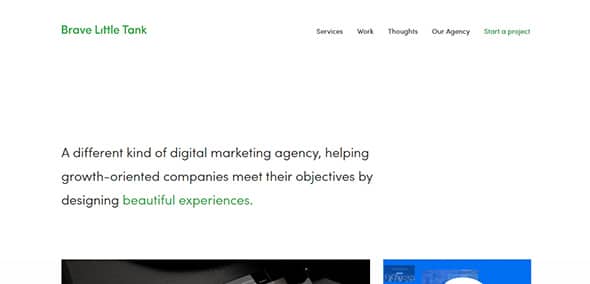
Wingmen
Enjoy the unique design of this website and the creative navigation. This minimal web design has a beautiful home page with an eye-catching animation effect.
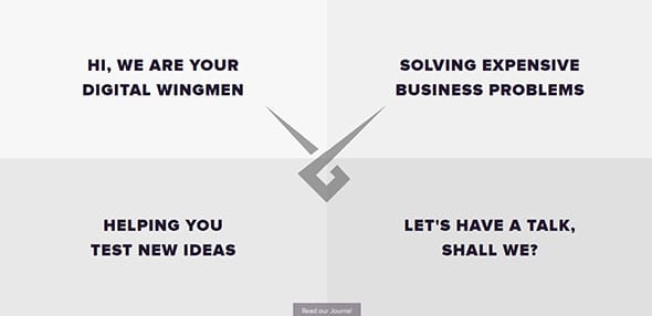
Derek Boateng
Get inspired by this awesome website which takes the minimal design very seriously. This website includes beautiful geometrical elements and lovely colors.
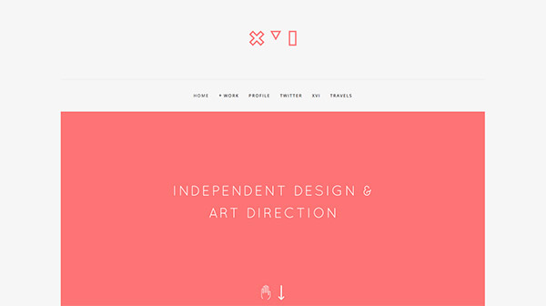
Oh My! Digital Design Studio
Elegant website design which is a great example of a minimalistic and professional design. This website has an exceptional animated background which gets your attention.

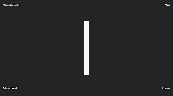
Alexander Collin
The minimalistic design, as well as the contrast between black & white, makes this design stand out. Browse to unveil the full layout.
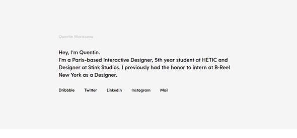
Quentin Morisseau Interactive Designer
Another online portfolio presented in a unique manner, a list of projects differentiated between the great public and the close friends with password protected works.
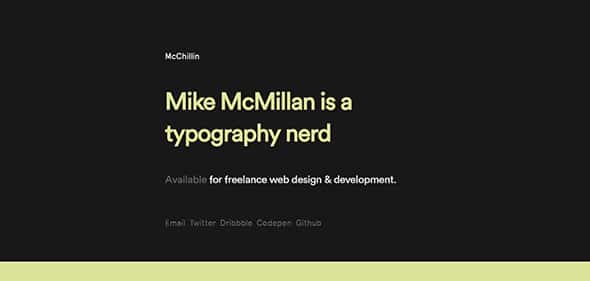
McChillin Chicago Web Design & Web Development
This website has a beautiful minimalistic design which stands out thanks to the continuous color changing font and background.
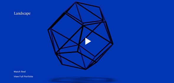
Landscape – An Independent Design Studio
An animated background design can really make your design stand out. This portfolio website has a creative minimalistic design with a creative layout.
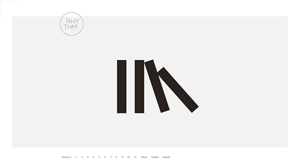
RHYTHM Design Studies
Here is another excellent example of a professional website with a minimalistic design. It’s a one-page website with a creative navigation.
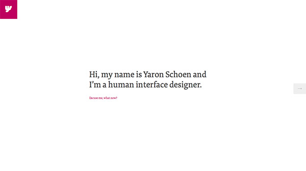
Yaron Schoen
You only need a message and a creative way to showcase it to the public. This minimalistic website also includes a full-screen menu design which can be accessed from the sticky logo design on the top left.
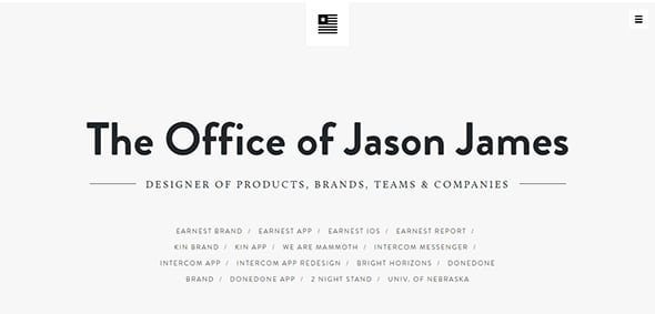
The Office of Jason James
A minimalistic design can say a lot about your website. This is a stunning portfolio website which uses a side menu and a creative clean design.
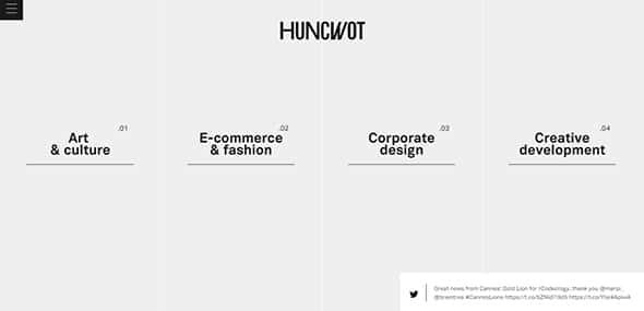
Huncwot
Sometimes a surprise in your design can keep your users engaged and connected. This website has a grid layout which comes to life when hovered over.
Omar Folgheraiter Web & Graphic
Minimalistic or not, a successful website requires powerful features to ensure its success. This layout includes a parallax scrolling effect, a well-designed timeline, and other great features.

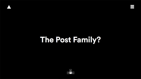
The Post Family
Discover the full layout of this minimalistic website. It begins with a black & white screen which showcases a big heading, the menu, and the logo design. Also, you can navigate through the site using your keyboard.
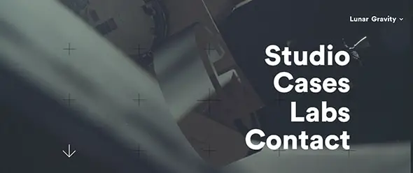
Lunar Gravity
This website includes a neat parallax effect which makes everything come to life, giving another dimension to the entire layout.
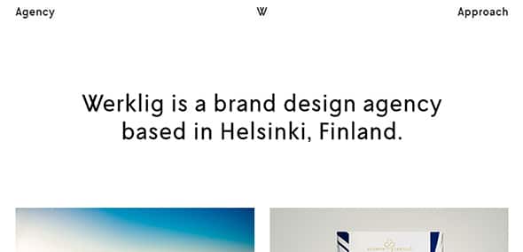
Werklig Brand Design Agency
You can express more with less! This website uses a white background and a grid layout to showcase each project.
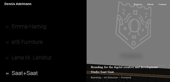
Dennis Adelmann
Enjoy this minimalistic design and get inspired by this creative way of showcasing each project.
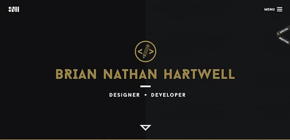
Brian Nathan Hartwell
This website is well-organized into a grid layout which includes a certain project. Each one has an amazing animation which comes to life when hovered over.
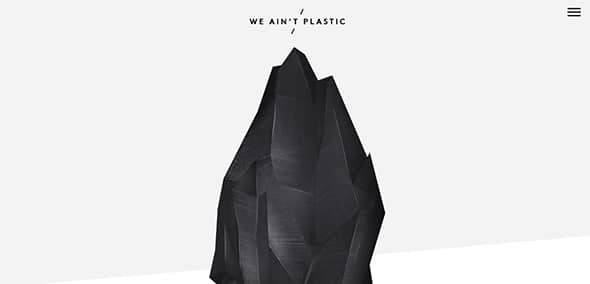
We Ain’t Plastic
With a minimalistic design, a soft colored background ordered content and soft animations, this website will definitely get your attention.
The post 25 Inspiring Examples of Ultra Minimal Web Design appeared first on Line25.

Leave a Reply
Want to join the discussion?Feel free to contribute!