Wood Textures in Web Design: Showcase of 15 Websites
Original Source: https://line25.com/articles/30-web-designs-that-make-wood-textures-cool-again
This post rounds up a showcase of web designs that are all helping make the wood texture cool again. Wood textures in web design aren’t anything new, actually, they were pretty trendy after the days of “web 2.0” until they kind of lost their coolness.
Recently though, we’ve begun to see wood textures make a return in website designs and iPhone and iPad app interfaces. There are many styles, depending on what you are looking for. These websites will definitely inspire your future designs, making things even more professional.
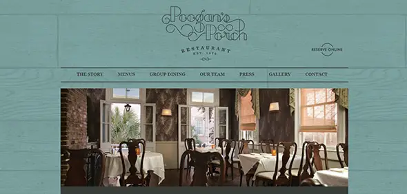
Poogan’s Porch Restaurant
This website uses a teal-colored wooden background which makes the photos and texts really stand out. The site has a friendly atmosphere, perfect for a family restaurant.
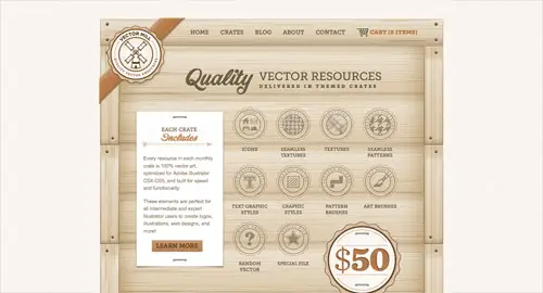
Vector Mill
This website has a simple layout with a beige background for the website, plus a light wooden colored textured background for the content block. it has an overall vintage style.
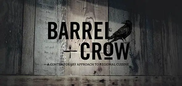
Barrel and crow
This website is a perfect example of how to use wooden backgrounds in modern web design. It also uses another popular trend – large, bold typography on the homepage.
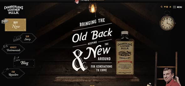
Leathermilk
This retro-themed, dark website design uses subtle wood textures that pair nicely with the vintage style and realistic images.
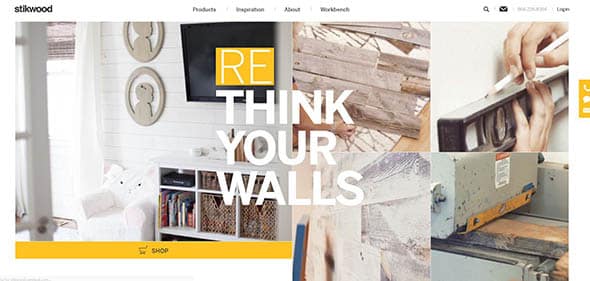
Stikwood
This website doesn’t use wood textures as background, but it has plenty of wood elements in the photos. The slider is perfect for this kind of small online shop.
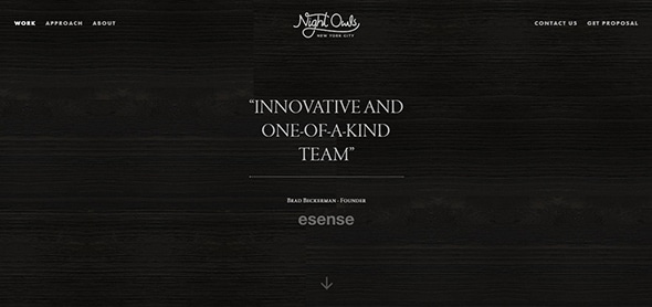
Night Owl Interactive
You could barely tell, but this website has a very dark wood texture as background. The texture is very subtle and looks modern.
Voltage new media
Here’s an example of how to incorporate realistic wood images into your design. This image is perfect to be used as a background.

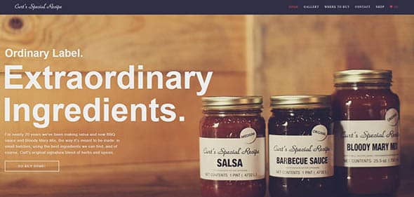
Curts
Here’s another example of how wood photos can be used as backgrounds. This adds a homemade atmosphere to the whole website.
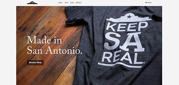
Keepsareal.com
Instead of showcasing their products on a plain white background, this apparel online shop decided to use dark wood textures instead. It looks really good!
Taptaptap
Here’s a unique way of featuring your social media accounts – use a light wooden background for the icons!

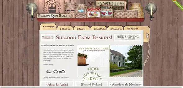
Sheldonfarmbaskets
This website’s theme is “countryside” and it’s perfectly created using old/aged wood textures as backgrounds, plus some realistic, 3D objects.
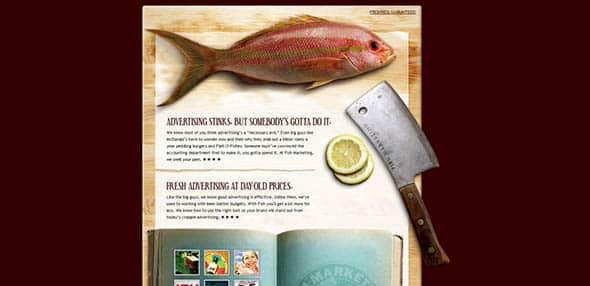
Fishmarketing
This simple website design successfully combines realistic objects, with wood textures.
Domino Box App
This is the presentation website for an app. It combines cardboard textures with wood backgrounds and looks really good, matching the app’s style.

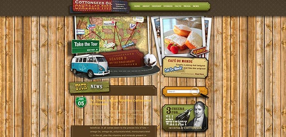
Cottonseedoiltour
This wood background may be too harsh, but it really matches the website’s niche and overall style.
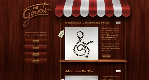
Fine Goods Market
Here’s another great example of how to use dark, wood backgrounds in web design. It also uses realistic 3D images and texts.
The post Wood Textures in Web Design: Showcase of 15 Websites appeared first on Line25.


Leave a Reply
Want to join the discussion?Feel free to contribute!