6 of the best new portfolio sites
Original Source: http://feedproxy.google.com/~r/CreativeBloq/~3/YHOZbqHSNkM/6-of-the-best-new-portfolio-sites
Having a well-curated collection of your finest work on show is the surest way to impress people with your portfolio, but never underestimate the power of displaying it in the best possible way. To really turn heads, it pays to spend time – or money, if you're not that technically inclined – on building a portfolio website that takes full advantage of the latest trends and technology.
And if you're not sure what approach you should take with your site, you've come to the right place. We've found six of the most best new portfolio sites around, each of which do things in their own individual way and look stunning while they're doing it. Read on for a delicious helping of portfolio inspiration. You can also check out our general post of more inspirational design portfolios.
6 big portfolio trends of 2019
01. Hello Monday
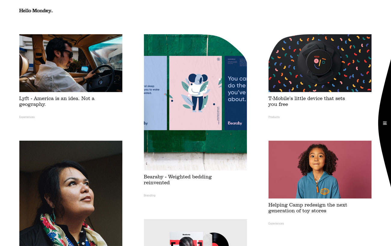
We could play with these squishy thumbnails for hours
It's hard not to love Hello Monday's mission: to make Mondays better for everyone. This creative studio has an eight-point code of honour that starts off with the simple commitment to being nice, and its portfolio site is equally delightful.
We love the squishy thumbnail images on the index page, and the way in which you can drag the edges inward until they finally snap back into place. Every project page is packed with detail and lovely big images, and if you need to know even more, many of them have a little 'In depth' link that makes an even more detailed case study slide into view.
02. Antidote
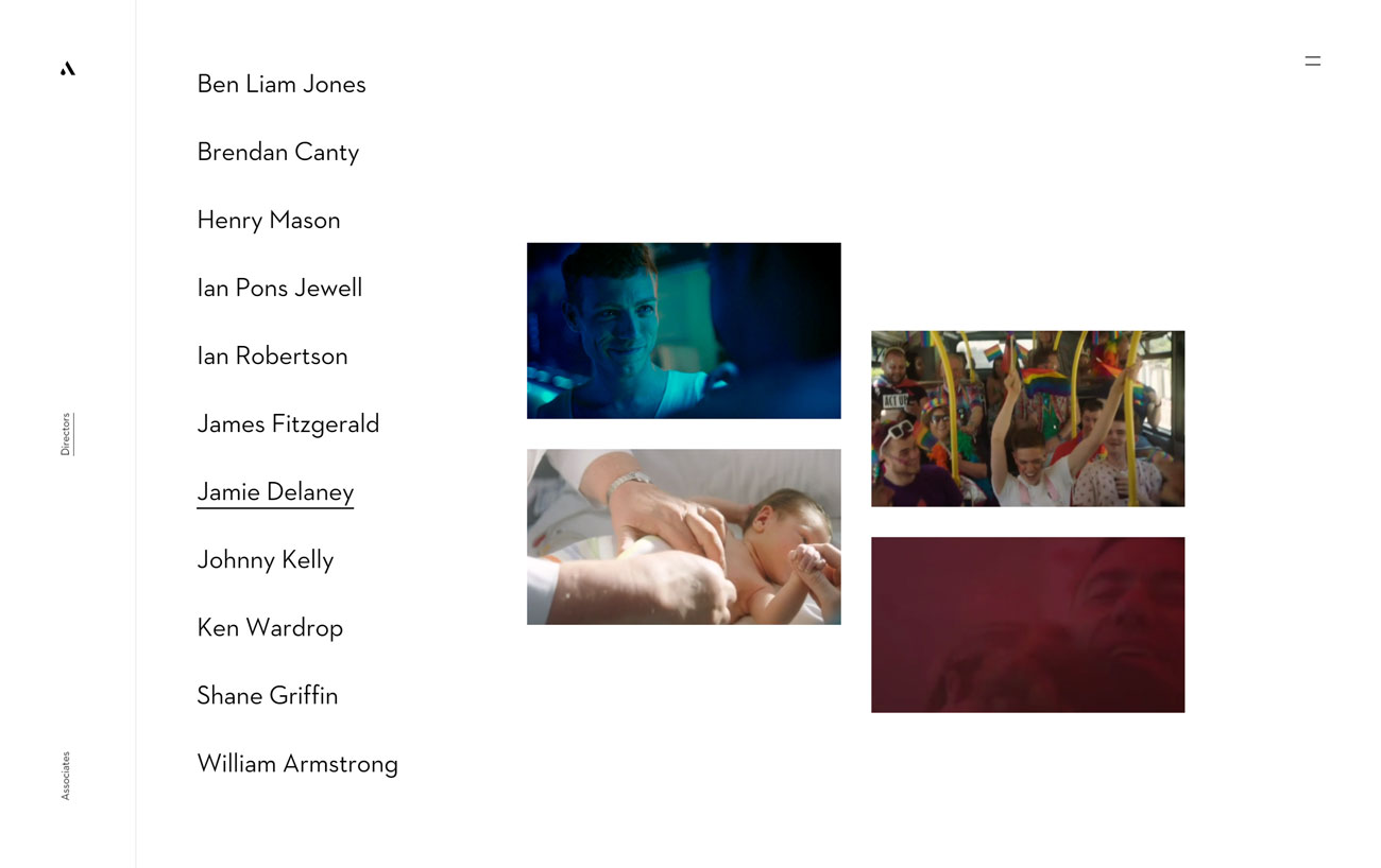
Antidote’s animated thumbnails tell you exactly what each director is about
Antidote is a Dublin-based agency that specialises in high-end commercials, and its portfolio site's designed for instant visual appeal. Rather than drop a big mission statement in front of you – the kind that every scrolls straight past to get to the good stuff – it puts its directors front and centre; a simple list of names, each one bringing up a set of animated thumbnails as you mouse over them.
It's an effective way to get an instant taste of each director's style, and clicking through takes you a page of massive animated previews that you can click to see the full videos. Further written details are available, but overall Antidote's counting on showing, rather than telling, and it's a brilliant strategy.
03. Design Embraced
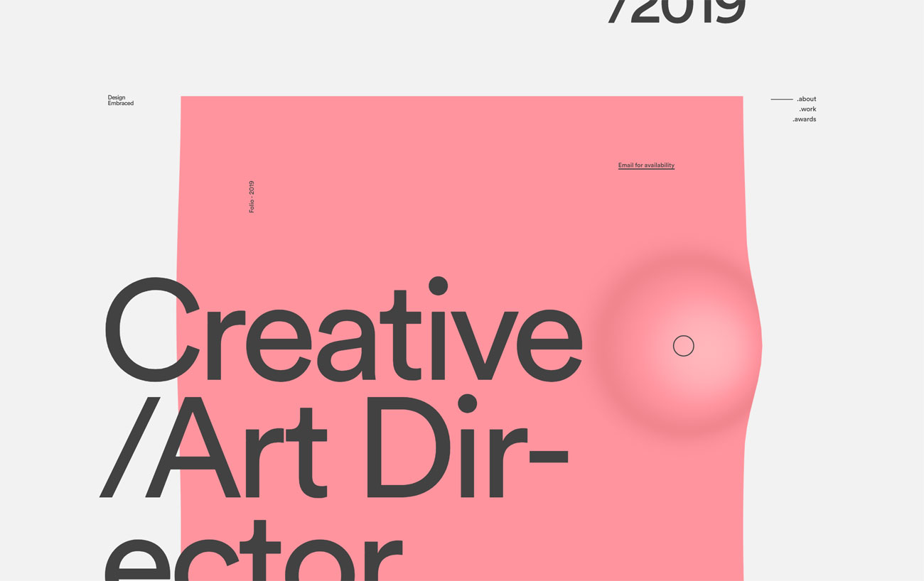
Design Embraced’s portfolio is full of lovey eye candy
As seen on Hello Monday's portfolio site, getting some movement into your page designs by deforming the edges of images is a great, on-trend look, and it's one that freelancer Anthony Goodwin, under the name Design Embraced, uses to excellent effect.
As you scroll through his portfolio the assorted images ripple gently and zoom in slightly as you mouse over them; clicking activates a transition in which the thumbnail expands into the centre of the screen and the page loads behind it. Mesmerising stuff.
04. Headless Horse
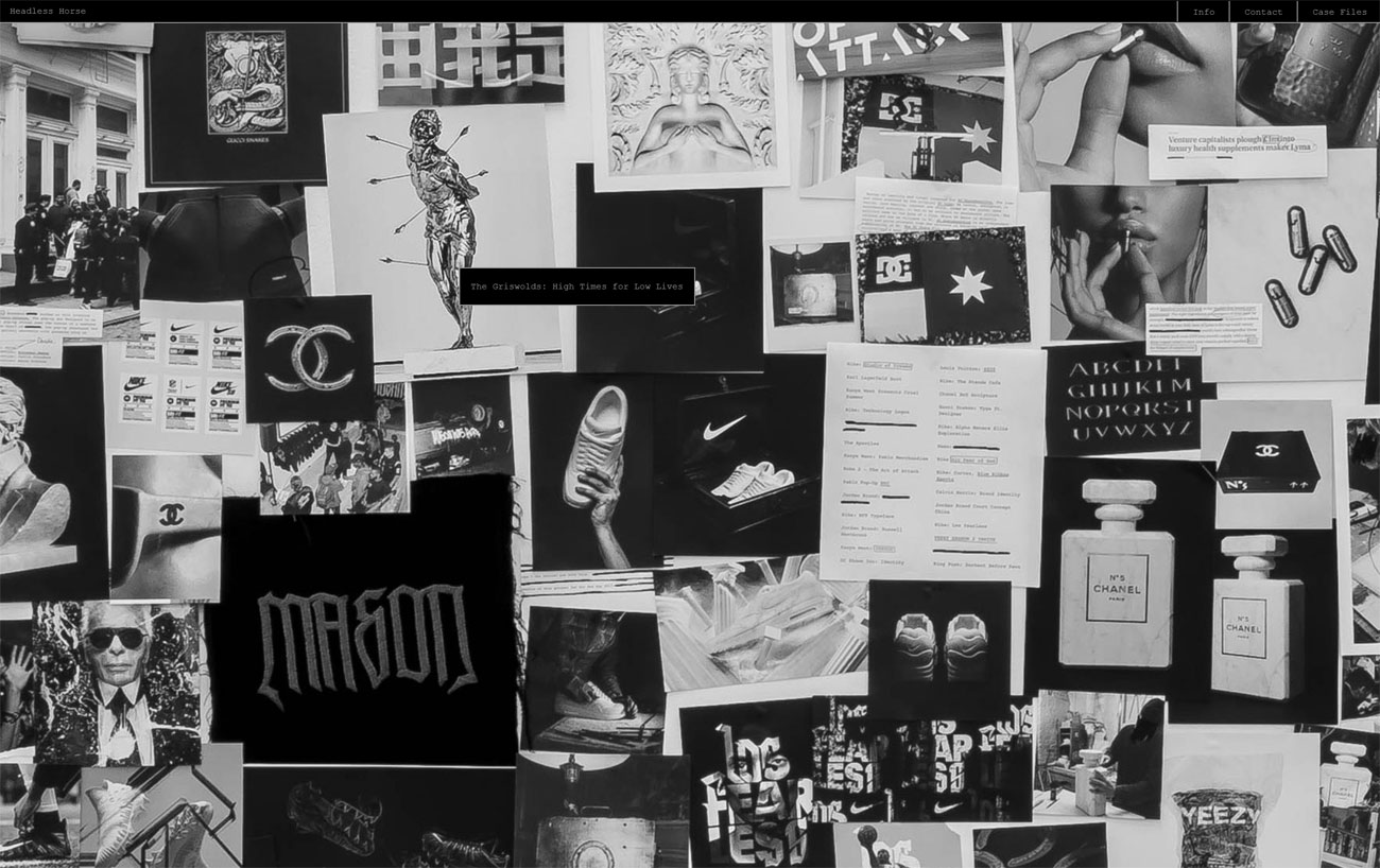
Come for the horses, stay for the massive portfolio gallery
A glorious combination of cutting-edge technology and old-school styling, Headless Horse's portfolio site opens with full-screen video of a pack of horses, over which there's a simple text interface asking: Initiate system? Typing 'yes' takes you to the main portfolio, but there's fun to be had from typing 'no' and seeing what happens next.
Once you've finished playing with the text interface, the portfolio itself takes the form of a massive black-and-white photo of pictures pinned to a wall; click on each one to see Headless Horse's various projects in depth.
05. Jamie Hunter
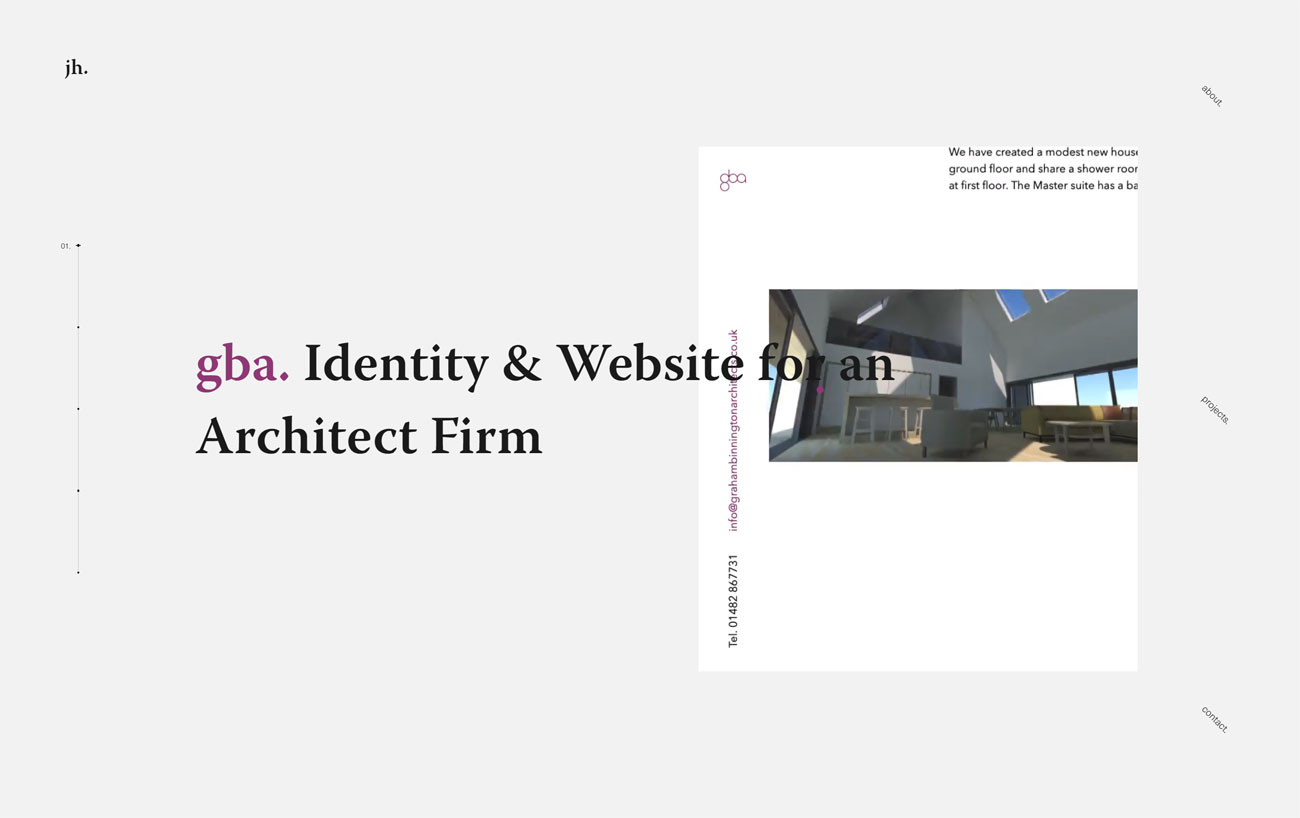
Jamie Hunter’s minimal portfolio makes a big impact with a light touch
Berlin-based Jamie Hunter describes himself as a holistic design and development person, and his beautifully minimal portfolio site does a splendid job of showcasing his work. Its index page does the job with a combination of kinetic typography and animated video loops of each project – along with plenty of white space to let the work breathe.
While there are only a few non-agency projects on display (he notes that a most of freelancing is agency work covered by NDAs), each one is displayed thoughtfully, with a detailed case study and enough enticing browser effects to leave you in no doubt as to his abilities.
06. Tangent
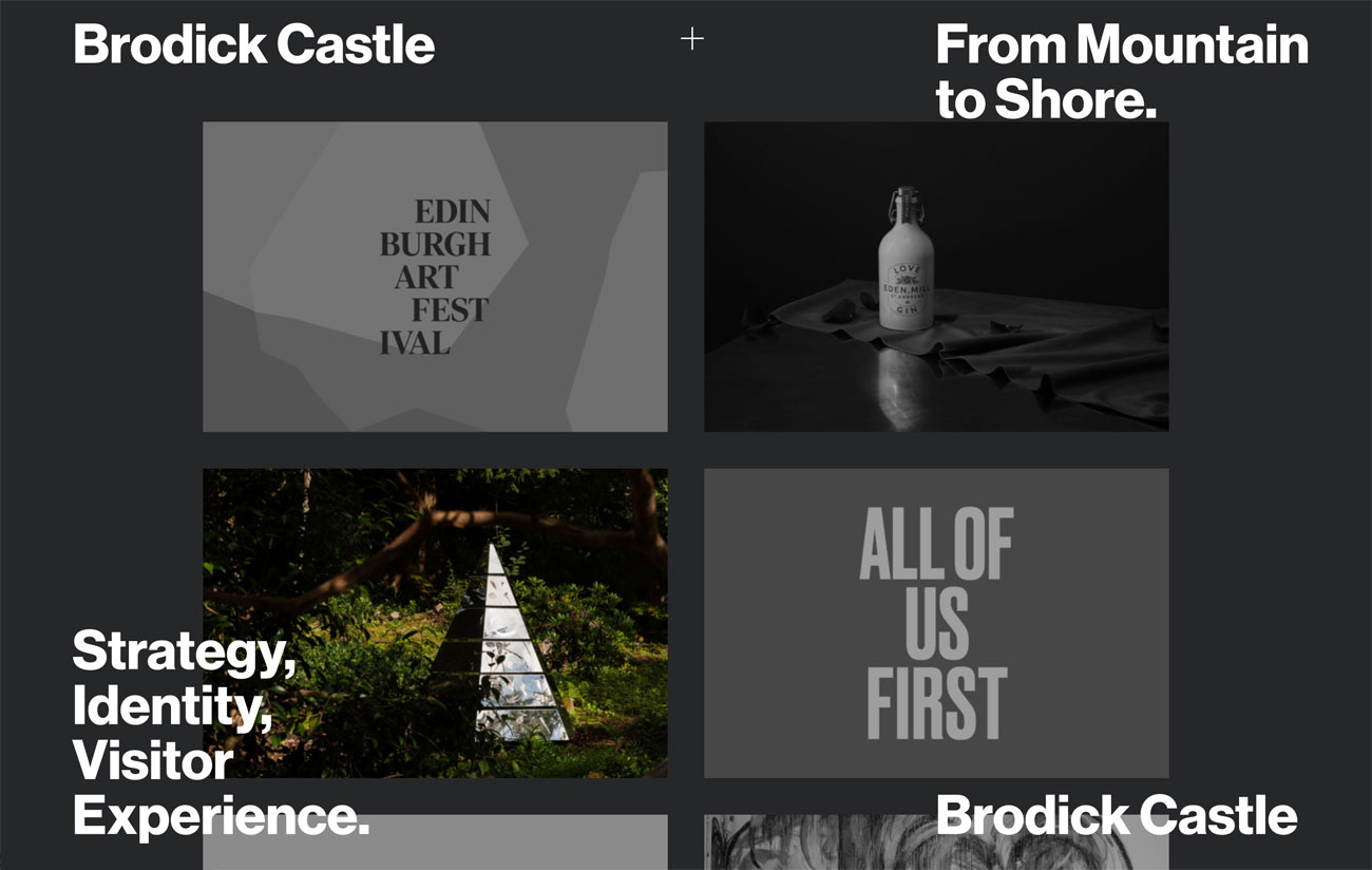
Tangent takes a clever approach to luring you in to inspect its work
Finally, we absolutely adore Tangent's approach to showcasing its work on its portfolio site. An identity and art direction studio based in Glasgow, it lures you in with a gallery of big black and white thumbnails; mousing over the thumbnails turns them full colour, and the briefest details of the project – the client's name and the nature of their business, and the work that Tangent did for them – appear in the four corners of the window in big, bold Helvetica.
Clicking through takes you to long case studies that are all about the full-screen imagery laced with short chunks of explanatory text; the perfect way to get a feel for each piece of work.
Related articles:
The wrong way to build a portfolio7 free portfolio hosting options for designersHow to refine your design portfolio

Leave a Reply
Want to join the discussion?Feel free to contribute!