37 beautiful band logo designs to be inspired by
Original Source: http://feedproxy.google.com/~r/CreativeBloq/~3/P-TvMXgw3xM/band-logo-12121502
What makes a great logo design for a band? A clever concept and the ability to become just as iconic as the music is a good start, but originality is just as important.
From hard rock to pop, we've picked some of our favourite band logo designs – including some old favourites as well as some newcomers. Be inspired by these beautiful band logos, all of which boast stand-out quality.
01. Run the Jewels
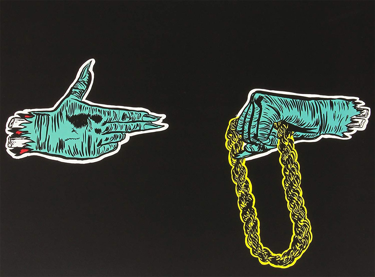
RTJ’s logo has been through a few revisions over the years
Hip hop supergroup Run the Jewels have grabbed plenty of headlines over the past few years with their first album and various tracks released for free online, all of them featuring a variation on the same logo: a pair of hands, one in the shape of a gun and the other clutching a thick gold chain. It's the work of artist Nicholas Gazin, and RTJ's El-P revealed the thinking behind it over on Instagram in 2015; he published a screenshot of an email to Gazin in which he explains that the gun hand is robbing the hand holding the chain.
02. Ho99o9
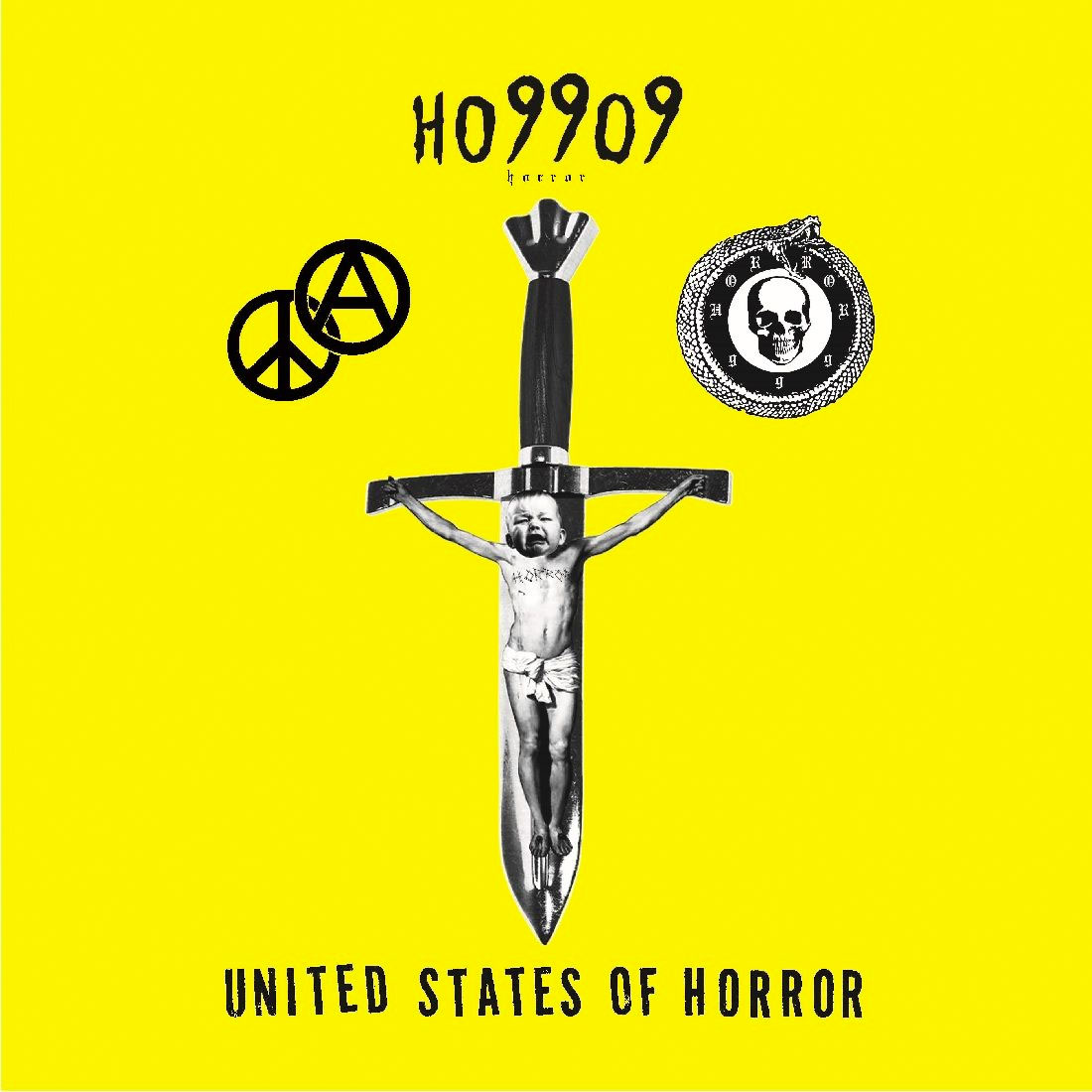
Ho9909 = horror
We weren't sure what to make of Ho99o9's name when we first saw it; were they supposed to be called Hoggog or something? But no, the nines in their name are there instead of the letter r, and it's really Horror. We're not sure why exactly, but we do know that it fits perfectly with their slightly terrifying DIY hardcore punk/hip hop mashup aesthetic.
03. The Monkees
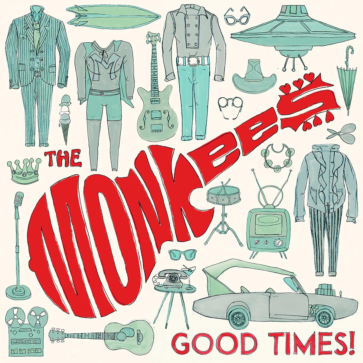
The classic Monkees logo still looks good, 50 years later
Infamously manufactured for TV, The Monkees still had a bunch of great tunes – thanks to a roster of top songwriters and session musicians – and a fantastic guitar-shaped logo, conceived by the show's publicity man and drawn for $75 by Nick LoBianco. It's stood the test of time, still looking fresh on the cover of 2016's Good Times, the band's first album in 20 years.
04. Unkle
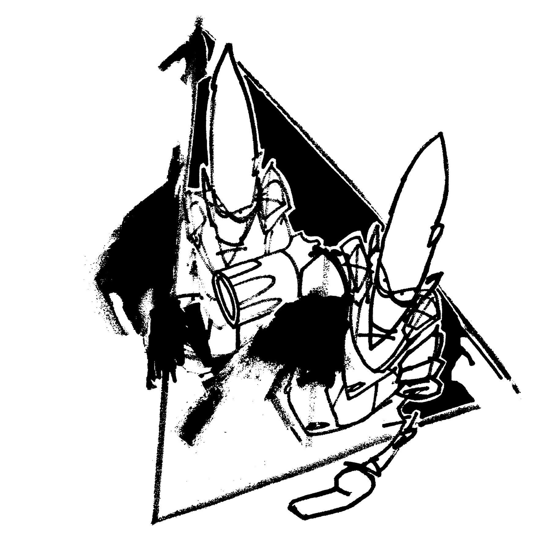
Graffiti artist Futura 2000 helped define much of Unkle’s visual identity
American graffiti artist Futura 2000 (now known as plain Futura) had form as an illustrator and graphic designer for music, most notably for his work on The Clash's Combat Rock. But it was his work for James Lavelle's Mo' Wax records that really launched his design career, and which also led to him creating the logo and other imagery for Lavelle's Unkle project. The two scratchy, pointy-headed alien figures are a perfect match for the first Unkle album, Psyence Fiction.
05. Adam and the Ants
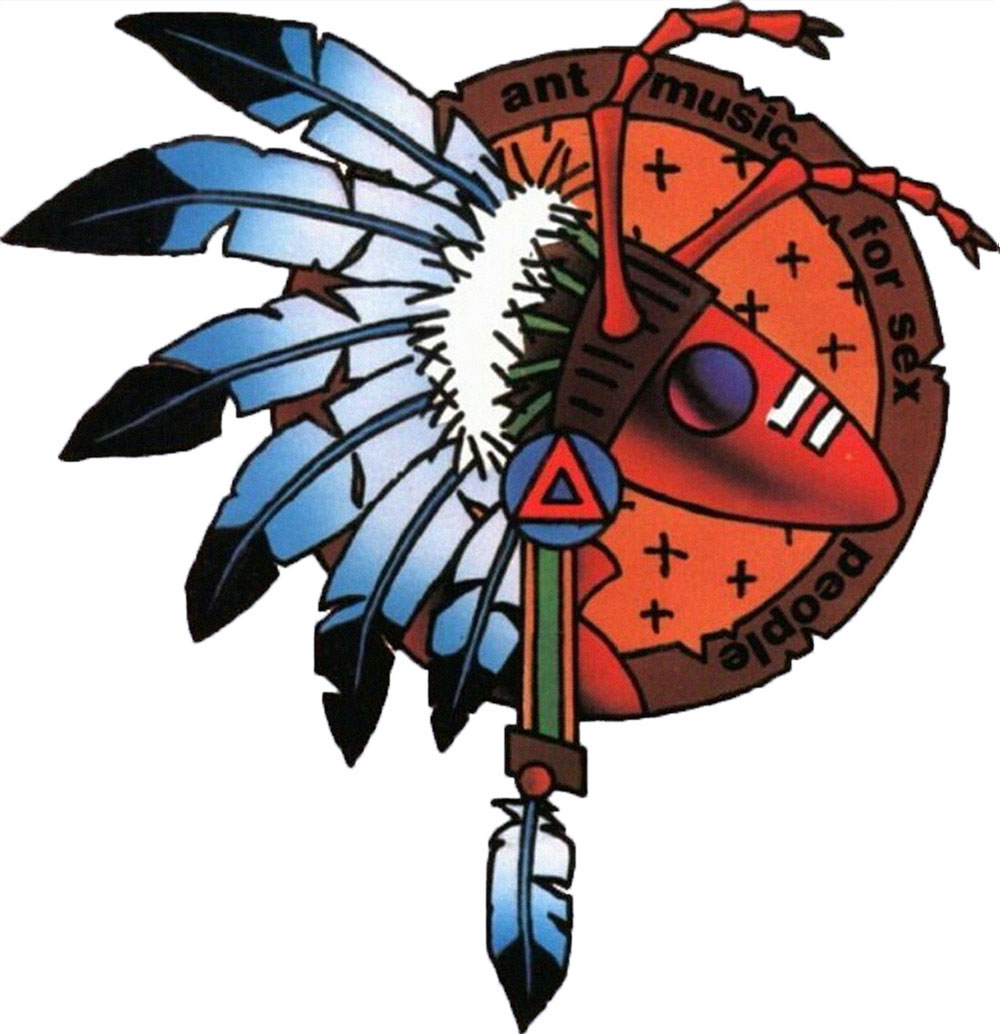
Danny Kleinman went on to create the title sequences for James Bond films
Adam Ant, with his background of art school and the DIY punk ethos, always had a keen interest in getting his band's image right. From his early punk singles, for which he drew the cover artwork himself, through to his later chart toppers, he'd mastermind powerful, eye-catching looks, and this Adam and the Ants logo, designed by Danny Kleinman and known as the Warrior Ant, is a corker.
06. The Doors
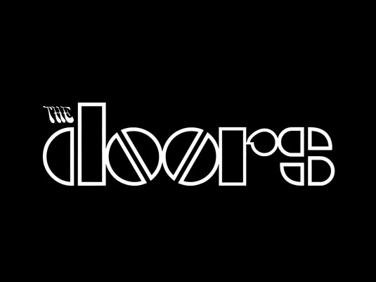
The reflective “o” of The Doors’ typography remains iconic
Simple and iconic. This bold, geometric design with the tiny, psychedelic and italicised 'THE' is perhaps one of the most recognised band logotypes in the world. Perfectly summing up the trippy, hippie counter-culture of the late '60's, The Doors didn't need a symbol or an image. Their typographic design remains just as fresh to new eyes today as it did to the kids of the swinging sixties.
07. Dream Theater

Dream Theater kept hold of their majesty logo, even with a new vocalist and band name
Progressive metal band, Dream Theater's "majesty symbol" is a reimagining of Mary, Queen of Scots' mark. Designed by former vocalist, Charlie Dominici, when the band was still known as Majesty (hence the symbol's title) the band kept the logo and it has gone on to feature on nearly every Dream Theater release.
08. The Dead Kennedys

An iconic punk symbol that is as easily graffitied as an anarchy sign
Designed by artist Winston Smith, the Dead Kennedys DK logo is a perfect example of simple, easily imitable graphic design. Singer Jello Biafra is quoted as saying, "I wanted to make sure it was something simple and easy to spray-paint so people would graffiti it all over the place."
After showing it to Smith, he "came back with a bunch of designs that had the circle and slightly 3D-looking letters and he had ones with different patterns behind it. I liked the one with bricks, but ultimately I thought simple red behind it was the boldest and the best."
09. Gorillaz
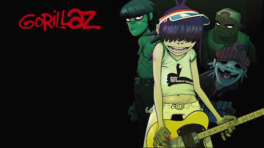
Gorillaz are virtual, and arguably the entire band is a logo for their creators’ project
This entire band is arguably a logo, a brand and no doubt a great achievement in design. However, the graffiti-styled typeface is a recognisable testiment to how simply you can sum up your band, just by picking the right font. This typographic post-apocalyptic street art homage encapsulates the political aesthetics that Damon Albarn and Jamie Hewlett were so keen to capture.
10. Nirvana

The Nirvana logo is easily one of the most recognisable in the music industry
One of the most recognisable logos in music history, the Nirvana logo design has been a common sight T-shirts for over two decades. Featuring an Onyx typeface and a smiley face – said to be inspired by a strip club in Seattle – the juxtaposing colours make this an iconic band logo design.
11. Weezer
The logo design was created by the band’s drummer
Designed by the band's drummer, Patrick Wilsen, in 1993, the Weezer logo was originally in lower case. The 'flying W' used the Futura Medium font before a few alterations were made. Fans are known to recreate this logo design at shows using hand signals, proving its worth and success in creating a brand for the band.
12. Jurassic 5
The band logo perfectly encorporates the ‘J’ and ‘5’ into the design
Perfectly encorporating both the 'J' and the '5' to portray Jurassic 5, this is an epic hip-hop logo that allows the design to be featured on a range of records thanks to its circular design. Designed by band member Charlie "Chali 2na" Stewart, it's been produced in a wide range of colours for much of the band's merchandise and remains a strong contender as one of the best band logos.
13. Public Image Ltd
Dennis Morris created the logo for the band back in 1979
Renowned photographer Dennis Morris was responsible for the design of Public Image Ltd's logo. Known for photographing The Sex Pistols and Bob Marley, Morris created this band logo design back in 1979. He also produced the iconic Metal Box packaging for the band, which is still regarded as one of the best album artworks of all time.
14. The KLF
Perfectly shaped for vinyl, this is the perfect logo for the acid house group
Situationist pranksters and acid house pioneers, the KLF also had a razor-sharp eye for iconography, which manifested itself in their record covers, their videos, their legendary Top of the Pops performances and, of course, their logos. Their pyramid blaster logo, perfectly shaped for vinyl, is a masterpiece; naturally, both Bill Drummond and Jimmy Cauty of the KLF now work as artists.
15. Metallica
The Metallica logo showcases everything that a metal logo should be
Created by Turner Duckworth, the famous Metallica logo got a redesign back in 2008. Based on the band's original version from 1981, Duckworth also designed the identity and packaging for the band's album Death Magnetic. Like countless other metal bands, Metallica's own take on the metal aesthetic is something that their fans cherish; whether it be in the form of tattoos or scrawlings on school books.
16. Sunn O)))

A member of Sunn is responsible for the band’s art direction
As one half of the seismic drone-rock band Sunn O))), not only does Stephen O'Malley help to make some fantastic music – he also oversees the design and art direction of their releases. The visual is an important component to Sunn's music and O'Malley has certainly triumphed with this long-standing, striking logo.
17. Kavinsky
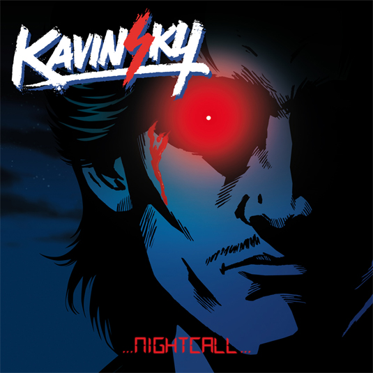
Kavinsky is known for his electro 80s-inspired music
Making music reminiscent of '80s film soundtracks, French producer Vincent Belorgey – quite aptly – appeared on the opening credits for Nicolas Winding Refn’s movie Drive. It's easy to see why then, that his logo also evokes the sense of '80s movies; with it's retro-like font, it's the perfect accompaniment to his music.
18. Foo Fighters
Another instantly recognisable band logo from The Foo Fighters
Another perfect example of a band logo that has proved popular with fan's tattoos, The Foo Fighters logo comprises of a circle motif containing two interlocking 'Fs' and the band's name in a slightly rounded and compact typeface. This is among the most popular and instantly recognisable logos in rock music.
19. The Ramones
A longtime friend of the band designed the iconic logo
The Ramones' logo was designed by New York City artist Arturo Vega, a longtime friend who lived with several members of the band. It's proof that when you get a band logo right, it can go on to become one of the most iconic brands in the world. Basing it on The Presidential Seal, Vega wanted the design to portray an 'All-American Band’.
20. The XX
The logo was created by one-time art student and band member Romy Madley Croft
This is a relatively new kid on the block, but boy, does it work. Bursting onto the music scene in 2009 with their self-titled debut album, the black and white 'X' across the front sleeve was just as eye-catching as the music was enticing.
This latest variation of the logo was designed by band member Romy Madley Croft; a one-time art student who used oil imagery to create the affect within the letter. This band logo is a perfect example branding that will continue to work through each album release.
21. Black Flag
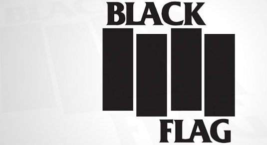
The logo was designed by Raymond Pettibon, who also came up with the band’s name
This has to be one of the most iconic band logos of all time. Created for Black Flag by guitarist and chief songwriter Greg Ginn's brother Raymond Pettibon, he once stated in an interview that the black flag design was designed to represent anarchy. The four black bars combined with the bold typography make for a solid band logo.
22. Run DMC
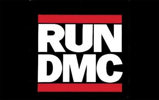
The infamous logo is one of the only band logos to feature on a pair of Adidas sneakers
Run DMC broke barriers in music, which almost everyone in music today benefits from. Their logo is still one of the most prolific to ever grace the music industry and continues to adorn the chests and feet of hip-hop lovers across the globe. The solid typography and three-part colour scheme makes it infinitely timeless and it's also one of the only band logos to feature on a pair of Adidas sneakers.
23. Nine Inch Nails

The typography is said to be inspired by a Talking Heads album cover
Designed by frontman Trent Reznor and Gary Talpas, the Nine Inch Nails logo is simplicity at its best. Featuring the letters set inside a thick border, the black and white creation first appeared on the band's debut album Down in it, which was released in 1989.
It's said to be inspired by Tibor Kalman's typography on the Talking Heads album Remain in Light.
24. Daft Punk

Daft Punk use some punky influence for their logo design
Evoking an extremely ‘punky’ look, the electronic duo produced one of the most well-known logos within the dance music scene. Designed by band member Guillaume Emmanuel “Guy-Manuel” de Homem-Christo, the logo ties in with the stand-out ethos of the pair. Using bold colours and textures, Daft Punk’s visuals are just as important as their tunes.
25. Public Enemy

It was announced today that the group are to be inducted into the Rock & Roll hall of fame
Another hip-hop gem in our list, this logo for Public Enemy was designed by Chuck D back in 1986. It was tightened up ahead of the release of Yo! Bum Rush The Show in 1987 by New York artist Eric Haze.
Many claim the target to be a state trooper but it is in fact a silhouette of a B-boy. It was also announced in 2013 that the group were to be added to the Rock & Roll hall of fame.
26. The Streets
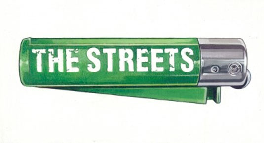
The gritty typography effortlessly complements the lighter image
It may not be as iconic as our other inclusions but we just had to feature this logo from British group The Streets. Evoking the exact feel and message of their debut album Original Pirate Material, the gritty typography effortlessly complements the lighter image. There's been a few variations throughout their career but we love this original design.
27. Rolling Stones
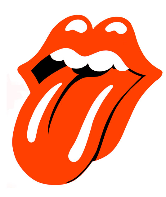
The logo is said to be influenced by Mick Jagger’s huge lips
How could we not include this infamous logo from the rock legends themselves, The Rolling Stones? Created by John Pasche in 1971, the designer is said to have been influenced by Mick Jagger's appearance for the logo, stating that his lips were the first thing you noticed about him. The eye-popping offering has continued to work well for the band, who have been working in music for over 50 years.
28. Wu-Tang Clan

By sticking with their original band logo, the group are instantly recognisable
The Wu-Tang ‘W’ is one of the most distinguishable logos in hip-hop culture, with its members adorning the ‘W’ on everything from clothing to chains, but it is most prominent on dozens of their album covers. Created by DJ and producer Mathematics, the band have stuck by the original design throughout their expansive career.
29. Yes
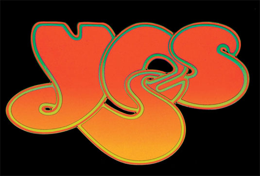
A logo that perfectly sums up the music scene in the ’70s
English artist and graphic designer Roger Dean created this iconic, bubbly logo, which first debuted on the band's 1972 LP Close to the Edge. He also crafted Yes' album artwork and stage shows; solidifying the band's brand throughout the ages. It has had a variant of colours but that never makes the typography any less engaging. This is a logo that perfectly sums up the 1970s.
30. Buzzcocks
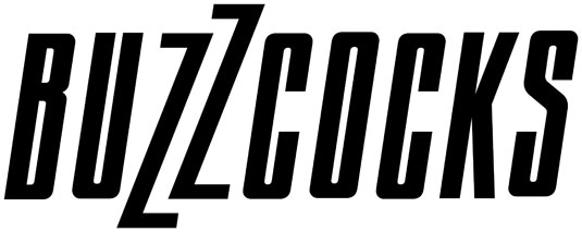
Malcolm went on to work with the band for several years after designing the logo in 1977
An simple yet instantly recognisable band logo, this one was created by Malcolm Garrett in early 1977. He went on to work with the band for several years throughout their career, creating visuals for promotional material. The fast, edgy and disjointed typography is the perfect personification of one of the greatest British bands.
31. Aphex Twin
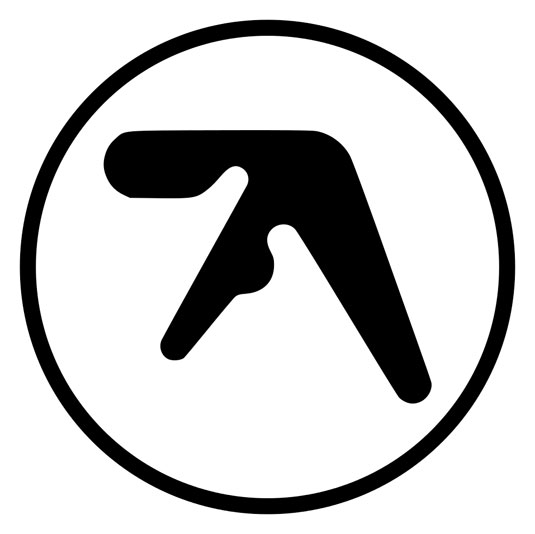
Paul ‘Terratag’ Nicholson was working with alien ‘vibes’ at the time of this logo creation
First appearing on the 1992 release of Xylem Tube, Richard D. James aka Aphex Twin has continued to use the logo throughout his impressive career. Designed by Paul 'Terratag' Nicholson, the logo evokes an unsettling yet beautiful image that wholly coincides with the impeccable music of Aphex Twin.
32. Death From Above 1979
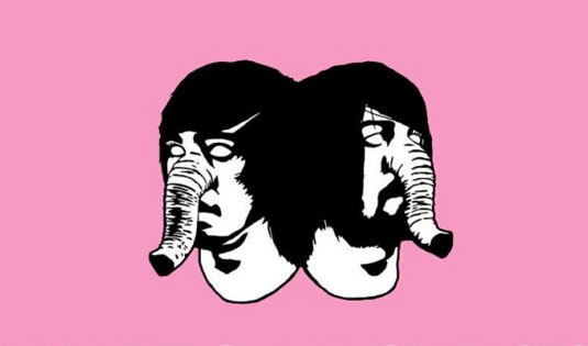
There’s no need for a name with this bold band logo design
An eye-popping and graphic design delight, this logo for Death From Above 1979 has graced the covers, stage shows, banners and posters for the noise rock duo since the beginning of their career. The bold choice of colour makes it a logo with a difference, with no need for a name as the logo is instantly recognisable.
33. Justice
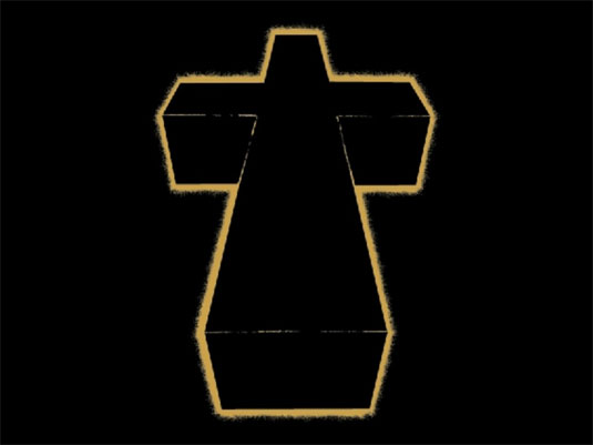
Choosing such a universal image for your band’s logo is a dangerous path!
Choosing to use such a universal symbol as your band's logo is a dangerous path. However, this creation for French electronic duo Justice just seems to work.
Band member Gaspard Augé once stated that the influence for the decision was 'that a music venue is like a church in that everyone is gathering together and focusing on one point.' The logo has adorned the band's live shows and album covers, becoming almost as synonymous as their songs.
34. Radiohead
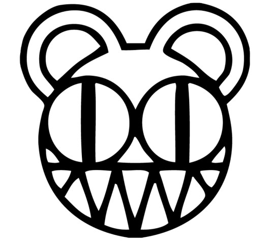
The logo was created for the release of Kid A
Radiohead haven't really had a regular band logo throughout their career but this is one that truly stands out (and adorns many a fan's body.) Designed by artist Stanley Donwood and Thom Yorke, the 'modified bear' was created for the release of Kid A.
The name of the bear either ironically or purposely contributes to the influx of modern art without meaning, without complexity, and without use. If Radiohead's career is anything to go by, we're guessing it's on the ironic side of things.
35. Devin Townsend Project

Less is more with this band logo design
A simple, typography-based logo design, this creation for the Devin Townsend Project combines the three initials of the band's name in two swoops. This band logo was added to the list on the suggestion of one of our Twitter followers. It was designed by Travis Smith and show us that sometimes less is more when it comes to band logos.
36. Outkast
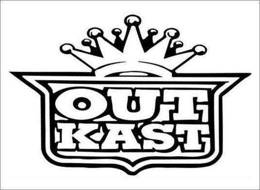
The band refer to their logo in their song Morris Brown
The final hip-hop logo in our list, this creation for the duo evokes the fun aspect of their music. Featuring graffiti-like font complete with a crest and crown, the pair even comment on the logo during their song Morris Brown, stating "OutKast royalty by design of logo. Wanna count it out loud?"
37. Misfits
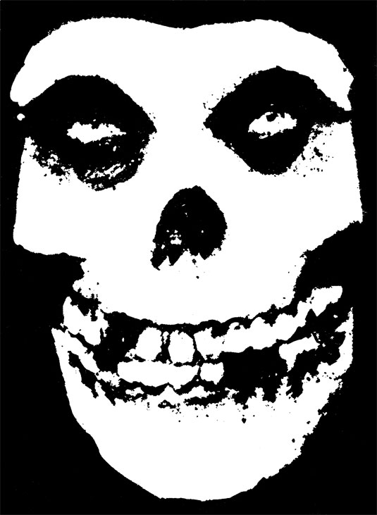
This is a band logo that has stood the test of time
The Misfits' skull logo first appeared on the Horror Business single, based on a poster for The Crimson Ghost. It proved so popular that the image quickly became the mascot for the band and has been used frequently on the band's releases and merchandise ever since.
Related articles:
Quiz – guess the logo, can you identify these brands?The 27 greatest animated music videosThe best logos of all time

Leave a Reply
Want to join the discussion?Feel free to contribute!