3 Essential Design Trends, July 2021
Original Source: https://www.webdesignerdepot.com/2021/07/3-essential-design-trends-july-2021/
 This month, you will either love or hate the featured design trends.
The common theme among them is a strong design element that can create distinct emotional connections. They range from interesting monotone color choices to brutalist examples to AI-inspired faces and design elements.
Here’s what’s trending in design this month.
1. Interesting Monotone Color Palettes
Monotone color palettes aren’t something that we usually call a trending design theme because mono patterns are almost always in style. What makes these monotone website designs interesting is color choice.
The trend is to use a pretty unconventional color choice for monotone color palettes. For example, would you start the design process thinking of an all-mauve, canary yellow, or purple aesthetic?
For most designers, those probably aren’t the first choices. But, conversely, the outcome of those decisions is rather stunning in each of the examples below, whether you love the color choices or not.
What works (and what might fall short) with each of these trending examples:
Wookmama: This mauve color scheme might be the first one you’ve encountered? It uses varying hues that are pretty in-your-face. It works because the concept behind the website is to create custom color schemes. The challenge lies in contrast and that there’s not a lot of distinction between hues in the mono scheme.

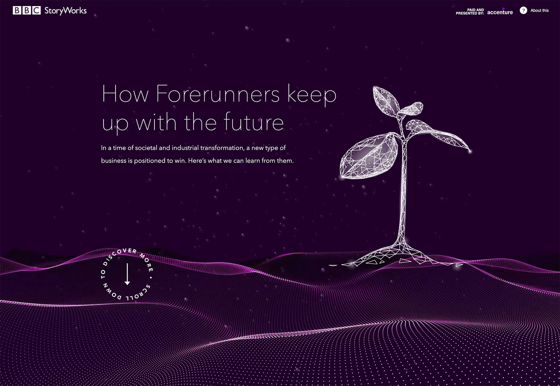
BBC Storyworks: The deep purple color palette with pinkish highlights is bright and readable, despite the dark background. White text and elements with smooth animation bring out the regality of the color choice. The challenge with this color is that purple often has strong emotional associations for individuals (good and bad), and you don’t know what “baggage” users might bring to the design.

Yellow Pony: This design is incredibly bright and has some brutalist undertones. What makes this color choice work is that it stops you in your tracks. You can’t help but look at the bright yellow and oddly-colored pony. The challenge, like with Wookmama, is contrast. There’s also a lot going on here with the bright color.

2. Fairly Brutal Black and White
Brutalism and brutalist design themes seem to keep ebbing and flowing. Understandably, it seems like, as a whole, designers can’t quite decide how they feel about this overall visual theme.
This trio of fairly brutal designs shares more than starkness in technique. They also feature distinct black and white color schemes and animation.
Put it all together, and the overall theme is maybe more “fairly brutal” than straight brutalist, re-emphasizing the hesitancy with the trend.
What’s nice about each of these designs is that they feel special and content-focused. This is a little in contrast with some other brutalist designs that are so stark and harsh that it can be hard to figure out what you are supposed to do with the website or what information is most important.
The other interesting thing here is that while all three websites have a similar design theme, they are nothing alike. (Personally, I find this type of brutalism and the included animation a lot easier to understand and digest. It uses the harsh feeling that you want to associate with the style but adds an element of comprehension that’s incredibly valuable.)
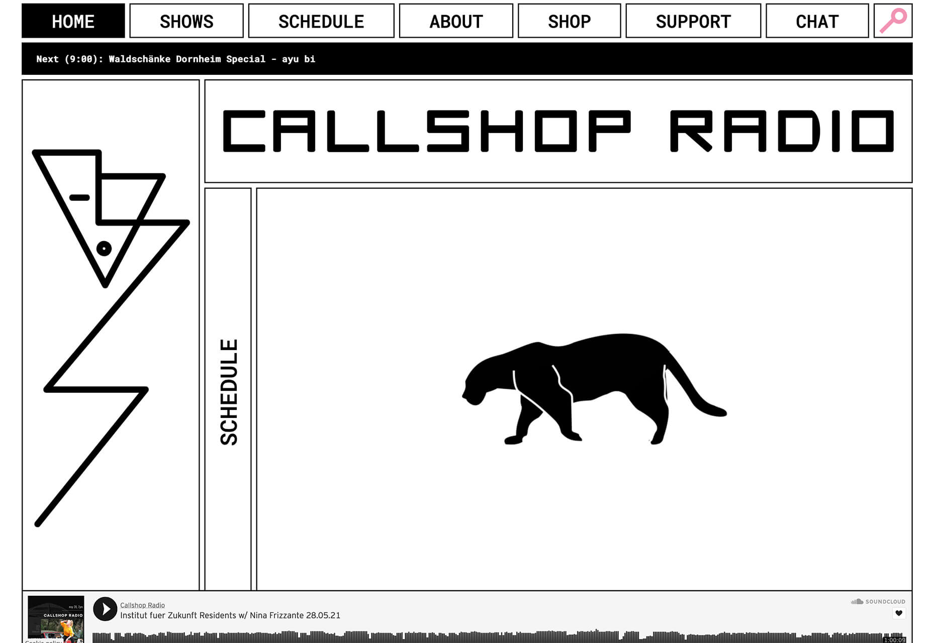
Callshop Radio uses an almost magazine theme style, block design with big buttons, a simple animation, and flash of color.

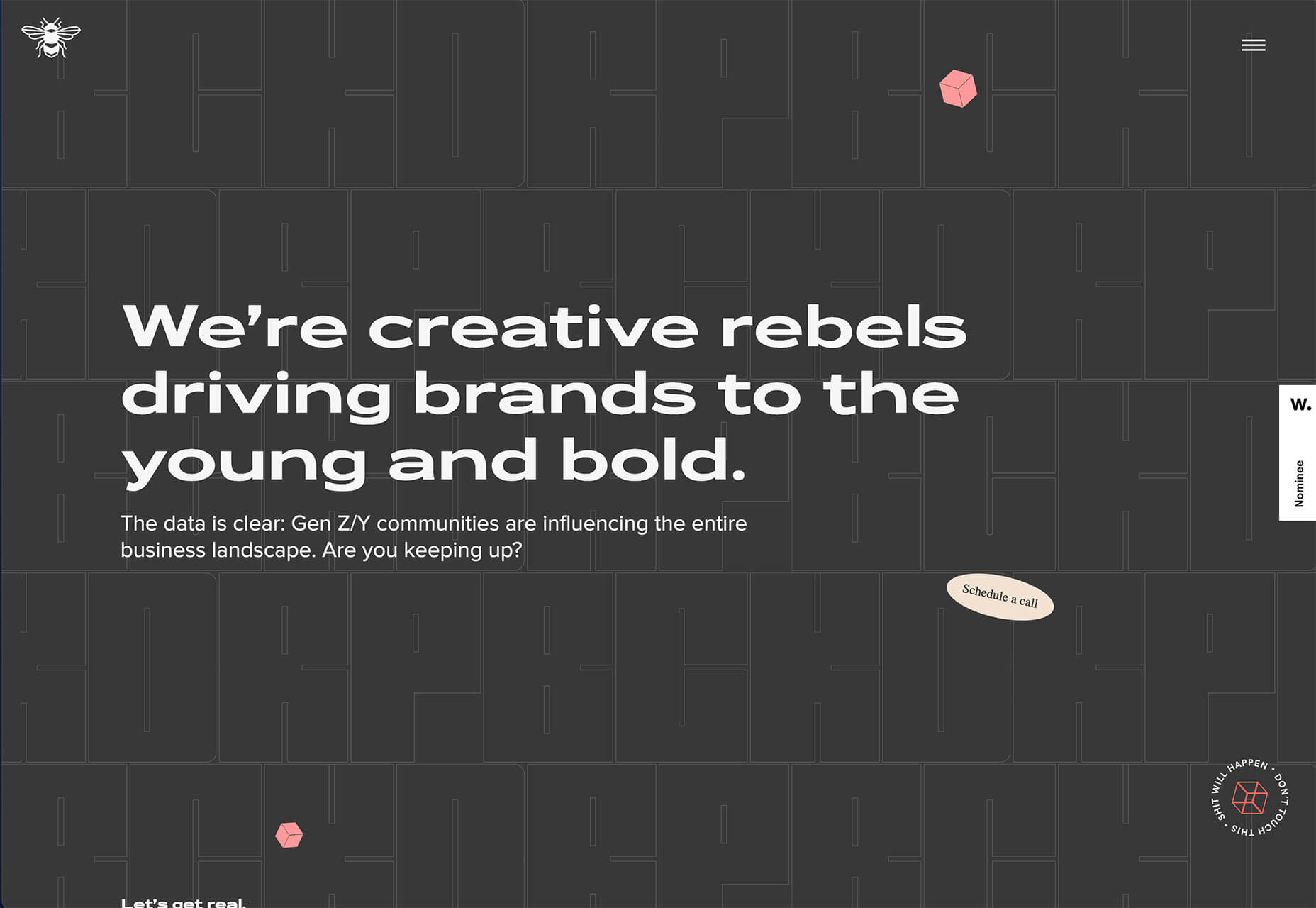
BCKDRP features a more subtle richer, almost black background with blocky type and accented color without the harshness often associated with brutal styles.

Vision Get Wild may be the closest to true brutalism, but the animated element in the center of the screen has a simple softness that lightens the entire feel.

3. Futuristic Faces
The final trending design element this month is a fun take on faces. There’s a movement happening with a futuristic or artificial intelligence/cyborg-inspired look to the people featured in the designs.
It’s hard to say where this design inspiration is coming from, but it is fun to look at with so many ways to play the style. The other commonality seems to be the dominant use of female faces.
These computer-generated images start with photos that are brightened and smoothed so that all imperfections are lost. The faces have no lines, color that might not look 100% natural, and enhanced features that may or may not be realistic.
You aren’t quite sure if you are looking at a face from a video game or image in many instances.
The types of websites that are using this design trend are similar in content and fashion, art, gaming, portfolios, and AI themes, among the most popular.
The true common thread is imagination. This type of design element can’t come to fruition without a strong vision and the ability to see the vision through creation.
These examples use progressively more futuristic variations of the trend:
HueLe Museum: The least AI-looking of the examples, has imagery with super bright light on faces to remove lines and imperfections so that the models almost the look of mannequins.

Jenny Lin: The portfolio design shows the designer in a style representing her work with a headshot that features an augmented reality, or digital design feel with an almost plastic-looking, on-the-verge of cartoon style.

Ruby9100m: The imagery here is full-on futuristic. From coloring to facial features to an almost Frankenstein-pieced-together look, nothing about this image insists on reality. (Did you notice the blue hand?)

Conclusion
This month’s design trends are a lesson in experimentation and evolution of other visual concepts. They also create an immediate impact on you in terms of emotion because of strong design choices.
Trends like these tend to come and go quickly; nevertheless, it will be interesting to see how they evolve.
Source
p img {display:inline-block; margin-right:10px;}
.alignleft {float:left;}
p.showcase {clear:both;}
body#browserfriendly p, body#podcast p, div#emailbody p{margin:0;}
The post 3 Essential Design Trends, July 2021 first appeared on Webdesigner Depot.

Leave a Reply
Want to join the discussion?Feel free to contribute!