25 Web Designs with a Clear and Concise Elevator Pitch
Original Source: https://line25.com/articles/25-web-designs-with-a-clear-and-concise-elevator-pitch
The concept of the elevator pitch has become a popular feature in web design. Bold statements that introduce and describe a company or individual now dominate the mastheads of agency and portfolio sites.
In today’s web design showcase, we present 25 great examples of websites that successfully explain what they’re all about in a clear and concise statement. See how they use white space, typography, and color to ensure their message gets across.
Get inspired by these web designs with a clear and concise elevator pitch and see what new things you can learn and then apply in your own projects.
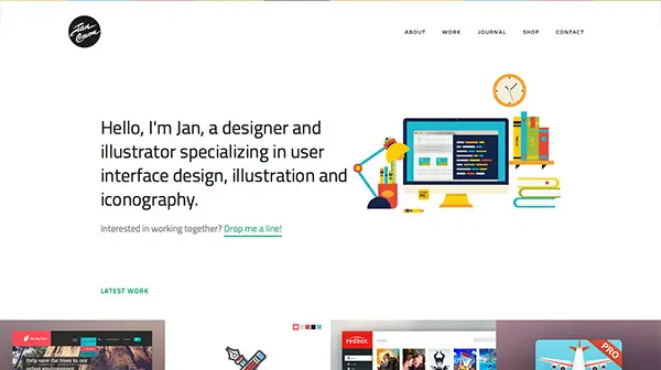
Jan Cavan
Saying as little as possible and not leaving anything to wonder, this artist combines useful information with a short portfolio to make everyone interested in their work.
Boomerang
Another great example of elevator pitch translated into a stunning website. This design uses the first page to make a resume about the company, who they are and what services they provide and also their best clients, to give credibility and to build up trust.

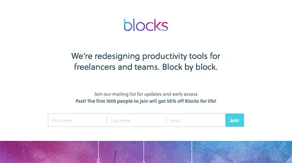
Blocks
Get inspired by this website which uses the concept of elevator pitch along with some funny creative animated graphics!
Talk PR
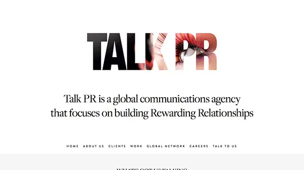
This website incorporates the elevator pitch concept into every topic in their menu. You can grasp at a glance their message by browsing rapidly through the contents.
A Collective
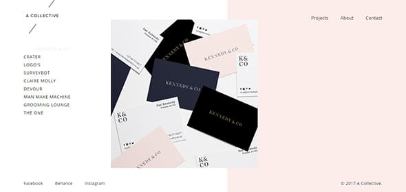
This creative studio’s website has a simple but very effective design which allows you to quickly get the information. Also, this design includes a creative side menu which is within reach at all times, for easy navigation.
Matt Carvalho
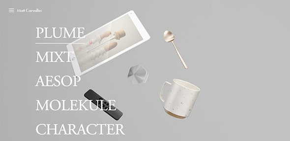
Take a look at the combination between large and small fonts with expressive images which were used to attract site visitor’s attention.
Static Interactive
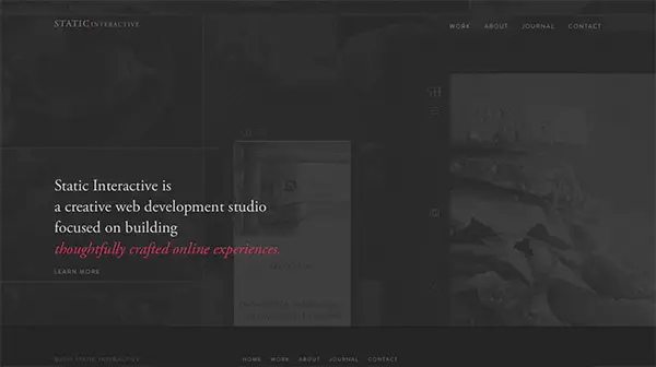
The semi-transparent overlay gives the website a sense of mystery. You can take a glimpse at what lays behind it but you need to take further action to completely see the design.
The Infantree
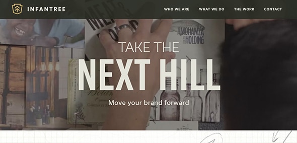
This creative website design will definitely get your attention with its looks and features. Neat features like the video background, full-screen layout make it more appealing and user-friendly.
Raygun
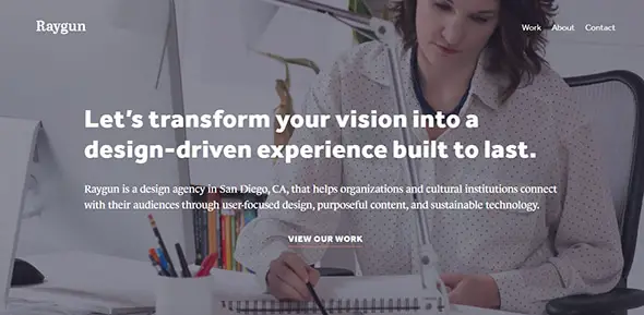
A beautiful parallax effect has always helped to improve the overall design. This elegant characteristic makes any website look modern. Moreover, the responsive design assures you that the website will display perfectly on any screen size.
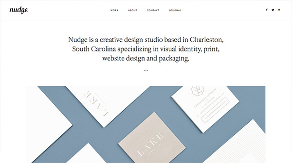
Nudge
This minimalistic website has a creative layout with a grid organization. Also, on hover, the images get a semi-transparent color overlay which displays further information about each item.
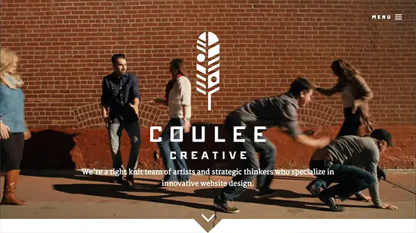
Coulee Creative
This website design will definitely get your attention. With the stunning video background from the homepage, parallax effect on different sections, beautiful typography, etc. there’s a lot to handle with this design.
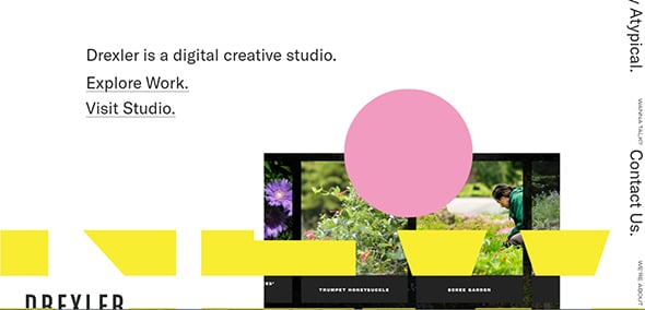
Drexler
This website stands out thanks to the unique menu which is displayed in a continuous movement on the right side of the layout. This creative agency also includes animated elements, a complex design with overlay items which you can see when your begin to scroll down.
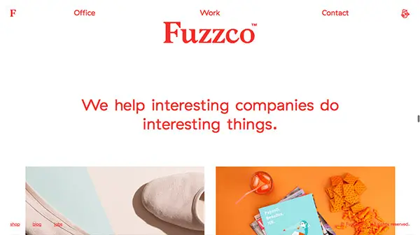
Fuzzco
This is an outstanding website design which has a very creative manner to showcase its content. Even without taking any action, the design continuously moves from bottom-up. You can select which area you want to view by using the scroll.
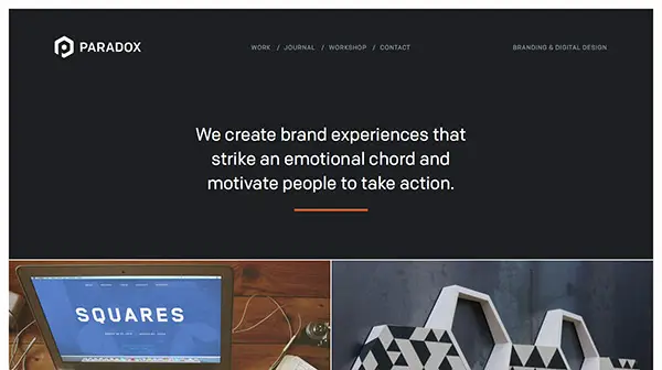
Paradox Design Studio
Here you have a lovely website with a well-thought design. The information is organized and everything is accessible, with some animated effects that will get your attention.
Romsey Web Design
This website includes many great features that help improve the overall design. For instance, there’s a beautiful video background, animated effects, neat overlays, lovely fonts, and more.
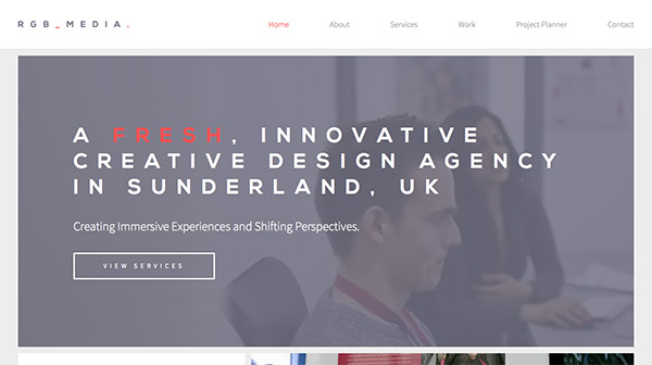
RGB MEDIA
There’s much to say about this website design. It includes lots of user-friendly features that make it more accessible. The fixed menu design, big headings, concise information, organized layout, responsive design, etc. are some of its features.
Simple Focus
This is a minimalistic website with a well-organized structure in clear sections. It includes beautiful animations which unveil when scrolling down.

Navy Design
This bold design will definitely get your attention with the help of the colored background and the big heading. The overall design has a clear organization, everything is within reach, accessible.

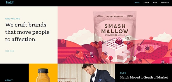
Hatch
This is a creative website design which has a lovely grid organization. This full-screen layout will surely get your attention with the stunning high-quality graphics and subtle animations.
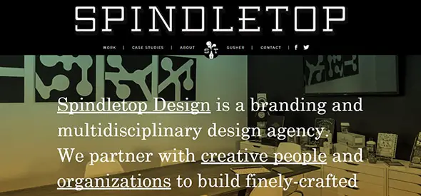
Spindletop
A parallax effect will definitely make a website stand out. Also, the responsive layout makes it display perfectly, regardless of the screen size.
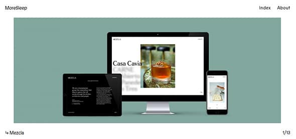
MoreSleep
This is a one-page layout design which has a creative slider gallery. Have a look and see what new things you can learn and use in your future designs.
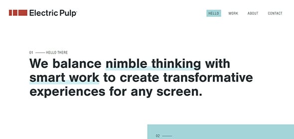
Electric Pulp
The designer used lots of overlayed elements to create a special design. This includes text, colors, images, etc. Also, the fixed header design makes your navigation accessible at all times.
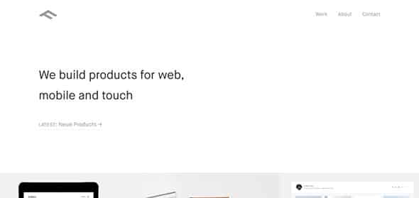
Finely
This is a minimalistic website which makes good use of the white space, in order to get the message across.
Startup X – Perfect Pitch Deck PowerPoint Template
This stunning template can be used to create your own website with a clear pitch design. This pre-designed layout will assure you that your message will definitely get across.

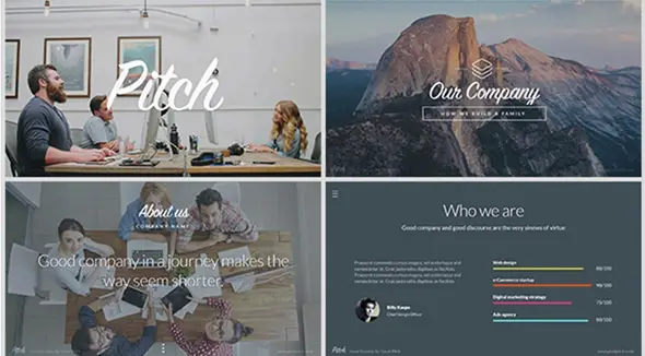
Pitch – Modern PowerPoint Presentation Template
This is an excellent presentation template which you can quickly customize and showcase it to your clients.
The post 25 Web Designs with a Clear and Concise Elevator Pitch appeared first on Line25.

Leave a Reply
Want to join the discussion?Feel free to contribute!