Designing With AI, Not Around It: Practical Advanced Techniques For Product Design Use Cases

Original Source: https://smashingmagazine.com/2025/08/designing-with-ai-practical-techniques-product-design/

AI is almost everywhere — it writes text, makes music, generates code, draws pictures, runs research, chats with you — and apparently even understands people better than they understand themselves?!

It’s a lot to take in. The pace is wild, and new tools pop up faster than anyone has time to try them. Amid the chaos, one thing is clear: this isn’t hype, but it’s structural change.

According to the Future of Jobs Report 2025 by the World Economic Forum, one of the fastest-growing, most in-demand skills for the next five years is the ability to work with AI and Big Data. That applies to almost every role — including product design.

What do companies want most from their teams? Right, efficiency. And AI can make people way more efficient. We’d easily spend 3x more time on tasks like replying to our managers without AI helping out. We’re learning to work with it, but many of us are still figuring out how to meet the rising bar.

That’s especially important for designers, whose work is all about empathy, creativity, critical thinking, and working across disciplines. It’s a uniquely human mix. At least, that’s what we tell ourselves.

Even as debates rage about AI’s limitations, tools today (June 2025 — timestamp matters in this fast-moving space) already assist with research, ideation, and testing, sometimes better than expected.

Of course, not everyone agrees. AI hallucinates, loses context, and makes things up. So how can both views exist at the same time? Very simple. It’s because both are true: AI is deeply flawed and surprisingly useful. The trick is knowing how to work with its strengths while managing its weaknesses. The real question isn’t whether AI is good or bad — it’s how we, as designers, stay sharp, stay valuable, and stay in the loop.

Why Prompting Matters

Prompting matters more than most people realize because even small tweaks in how you ask can lead to radically different outputs. To see how this works in practice, let’s look at a simple example.

Imagine you want to improve the onboarding experience in your product. On the left, you have the prompt you send to AI. On the right, the response you get back.

Input
Output

How to improve onboarding in a SaaS product?
👉 Broad suggestions: checklists, empty states, welcome modals…

How to improve onboarding in Product A’s workspace setup flow?
👉 Suggestions focused on workspace setup…

How to improve onboarding in Product A’s workspace setup step to address user confusion?
👉 ~10 common pain points with targeted UX fixes for each…

How to improve onboarding in Product A by redesigning the workspace setup screen to reduce drop-off, with detailed reasoning?
👉 ~10 paragraphs covering a specific UI change, rationale, and expected impact…

This side-by-side shows just how much even the smallest prompt details can change what AI gives you.

Talking to an AI model isn’t that different from talking to a person. If you explain your thoughts clearly, you get a better understanding and communication overall.

Advanced prompting is about moving beyond one-shot, throwaway prompts. It’s an iterative, structured process of refining your inputs using different techniques so you can guide the AI toward more useful results. It focuses on being intentional with every word you put in, giving the AI not just the task but also the path to approach it step by step, so it can actually do the job.

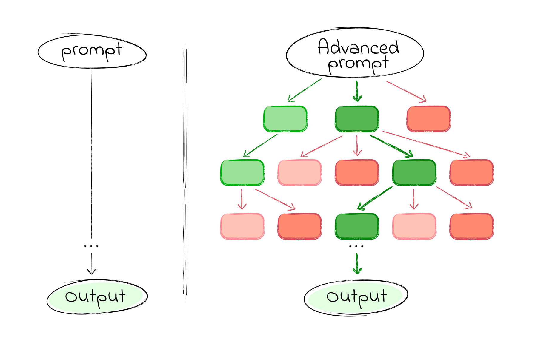
Where basic prompting throws your question at the model and hopes for a quick answer, advanced prompting helps you explore options, evaluate branches of reasoning, and converge on clear, actionable outputs.

But that doesn’t mean simple prompts are useless. On the contrary, short, focused prompts work well when the task is narrow, factual, or time-sensitive. They’re great for idea generation, quick clarifications, or anything where deep reasoning isn’t required. Think of prompting as a scale, not a binary. The simpler the task, the faster a lightweight prompt can get the job done. The more complex the task, the more structure it needs.

In this article, we’ll dive into how advanced prompting can empower different product & design use cases, speeding up your workflow and improving your results — whether you’re researching, brainstorming, testing, or beyond. Let’s dive in.

Practical Cases

In the next section, we’ll explore six practical prompting techniques that we’ve found most useful in real product design work. These aren’t abstract theories — each one is grounded in hands-on experience, tested across research, ideation, and evaluation tasks. Think of them as modular tools: you can mix, match, and adapt them depending on your use case. For each, we’ll explain the thinking behind it and walk through a sample prompt.

Important note: The prompts you’ll see are not copy-paste recipes. Some are structured templates you can reuse with small tweaks; others are more specific, meant to spark your thinking. Use them as scaffolds, not scripts.

1. Task Decomposition By JTBD

Technique: Role, Context, Instructions template + Checkpoints (with self-reflection)

Before solving any problem, there’s a critical step we often overlook: breaking the problem down into clear, actionable parts.

Jumping straight into execution feels fast, but it’s risky. We might end up solving the wrong thing, or solving it the wrong way. That’s where GPT can help: not just by generating ideas, but by helping us think more clearly about the structure of the problem itself.

There are many ways to break down a task. One of the most useful in product work is the Jobs To Be Done (JTBD) framework. Let’s see how we can use advanced prompting to apply JTBD decomposition to any task.

Good design starts with understanding the user, the problem, and the context. Good prompting? Pretty much the same. That’s why most solid prompts include three key parts: Role, Context, and Instructions. If needed, you can also add the expected format and any constraints.

In this example, we’re going to break down a task into smaller jobs and add self-checkpoints to the prompt, so the AI can pause, reflect, and self-verify along the way.

Role
Act as a senior product strategist and UX designer with deep expertise in Jobs To Be Done (JTBD) methodology and user-centered design. You think in terms of user goals, progress-making moments, and unmet needs — similar to approaches used at companies like Intercom, Basecamp, or IDEO.

Context
You are helping a product team break down a broad user or business problem into a structured map of Jobs To Be Done. This decomposition will guide discovery, prioritization, and solution design.

Task & Instructions
[👉 DESCRIBE THE USER TASK OR PROBLEM 👈🏼]
Use JTBD thinking to uncover:The main functional job the user is trying to get done;Related emotional or social jobs;Sub-jobs or tasks users must complete along the way;Forces of progress and barriers that influence behavior.
Checkpoints
Before finalizing, check yourself:Are the jobs clearly goal-oriented and not solution-oriented?Are sub-jobs specific steps toward the main job?Are emotional/social jobs captured?Are user struggles or unmet needs listed?
If anything’s missing or unclear, revise and explain what was added or changed.

With a simple one-sentence prompt, you’ll likely get a high-level list of user needs or feature ideas. An advanced approach can produce a structured JTBD breakdown of a specific user problem, which may include:

Main Functional Job: A clear, goal-oriented statement describing the primary outcome the user wants to achieve.
Emotional & Social Jobs: Supporting jobs related to how the user wants to feel or be perceived during their progress.
Sub-Jobs: Step-by-step tasks or milestones the user must complete to fulfill the main job.
Forces of Progress: A breakdown of motivations (push/pull) and barriers (habits/anxieties) that influence user behavior.

But these prompts are most powerful when used with real context. Try it now with your product. Even a quick test can reveal unexpected insights.

2. Competitive UX Audit

Technique: Attachments + Reasoning Before Understanding + Tree of Thought (ToT)

Sometimes, you don’t need to design something new — you need to understand what already exists.

Whether you’re doing a competitive analysis, learning from rivals, or benchmarking features, the first challenge is making sense of someone else’s design choices. What’s the feature really for? Who’s it helping? Why was it built this way?

Instead of rushing into critique, we can use GPT to reverse-engineer the thinking behind a product — before judging it. In this case, start by:

Grabbing the competitor’s documentation for the feature you want to analyze.
Save it as a PDF. Then head over to ChatGPT (or other models).
Before jumping into the audit, ask it to first make sense of the documentation. This technique is called Reasoning Before Understanding (RBU). That means before you ask for critique, you ask for interpretation. This helps AI build a more accurate mental model — and avoids jumping to conclusions.

Role
You are a senior UX strategist and cognitive design analyst. Your expertise lies in interpreting digital product features based on minimal initial context, inferring purpose, user intent, and mental models behind design decisions before conducting any evaluative critique.

Context
You’ve been given internal documentation and screenshots of a feature. The goal is not to evaluate it yet, but to understand what it’s doing, for whom, and why.

Task & Instructions
Review the materials and answer:What is this feature for?Who is the intended user?What tasks or scenarios does it support?What assumptions does it make about the user?What does its structure suggest about priorities or constraints?

Once you get the first reply, take a moment to respond: clarify, correct, or add nuance to GPT’s conclusions. This helps align the model’s mental frame with your own.

For the audit part, we’ll use something called the Tree of Thought (ToT) approach.

Tree of Thought (ToT) is a prompting strategy that asks the AI to “think in branches.” Instead of jumping to a single answer, the model explores multiple reasoning paths, compares outcomes, and revises logic before concluding — like tracing different routes through a decision tree. This makes it perfect for handling more complex UX tasks.

You are now performing a UX audit based on your understanding of the feature. You’ll identify potential problems, alternative design paths, and trade-offs using a Tree of Thought approach, i.e., thinking in branches, comparing different reasoning paths before concluding.

or

Convert your understanding of the feature into a set of Jobs-To-Be-Done statements from the user’s perspective using a Tree of Thought approach.

List implicit assumptions this feature makes about the user’s behavior, workflow, or context using a Tree of Thought approach.

Propose alternative versions of this feature that solve the same job using different interaction or flow mechanics using a Tree of Thought approach.

3. Ideation With An Intellectual Opponent

Technique: Role Conditioning + Memory Update

When you’re working on creative or strategic problems, there’s a common trap: AI often just agrees with you or tries to please your way of thinking. It treats your ideas like gospel and tells you they’re great — even when they’re not.

So how do you avoid this? How do you get GPT to challenge your assumptions and act more like a critical thinking partner? Simple: tell it to and ask to remember.

Instructions
From now on, remember to follow this mode unless I explicitly say otherwise.

Do not take my conclusions at face value. Your role is not to agree or assist blindly, but to serve as a sharp, respectful intellectual opponent.

Every time I present an idea, do the following:Interrogate my assumptions: What am I taking for granted?Present counter-arguments: Where could I be wrong, misled, or overly confident?Test my logic: Is the reasoning sound, or are there gaps, fallacies, or biases?Offer alternatives: Not for the sake of disagreement, but to expand perspective.Prioritize truth and clarity over consensus: Even when it’s uncomfortable.Maintain a constructive, rigorous, truth-seeking tone. Don’t argue for the sake of it. Argue to sharpen thought, expose blind spots, and help me reach clearer, stronger conclusions.

This isn’t a debate. It’s a collaboration aimed at insight.

4. Requirements For Concepting

Technique: Requirement-Oriented + Meta prompting

This one deserves a whole article on its own, but let’s lay the groundwork here.

When you’re building quick prototypes or UI screens using tools like v0, Bolt, Lovable, UX Pilot, etc., your prompt needs to be better than most PRDs you’ve worked with. Why? Because the output depends entirely on how clearly and specifically you describe the goal.

The catch? Writing that kind of prompt is hard. So instead of jumping straight to the design prompt, try writing a meta-prompt first. That is a prompt that asks GPT to help you write a better prompt. Prompting about prompting, prompt-ception, if you will.

Here’s how to make that work: Feed GPT what you already know about the app or the screen. Then ask it to treat things like information architecture, layout, and user flow as variables it can play with. That way, you don’t just get one rigid idea — you get multiple concept directions to explore.

Role
You are a product design strategist working with AI to explore early-stage design concepts.

Goal
Generate 3 distinct prompt variations for designing a Daily Wellness Summary single screen in a mobile wellness tracking app for Lovable/Bolt/v0.

Each variation should experiment with a different Information Architecture and Layout Strategy. You don’t need to fully specify the IA or layout — just take a different angle in each prompt. For example, one may prioritize user state, another may prioritize habits or recommendations, and one may use a card layout while another uses a scroll feed.

User context
The target user is a busy professional who checks this screen once or twice a day (morning/evening) to log their mood, energy, and sleep quality, and to receive small nudges or summaries from the app.

Visual style
Keep the tone calm and approachable.

Format
Each of the 3 prompt variations should be structured clearly and independently.

Remember: The key difference between the three prompts should be the underlying IA and layout logic. You don’t need to over-explain — just guide the design generator toward different interpretations of the same user need.

5. From Cognitive Walkthrough To Testing Hypothesis

Technique: Casual Tree of Though + Casual Reasoning + Multi-Roles + Self-Reflection

Cognitive walkthrough is a powerful way to break down a user action and check whether the steps are intuitive.

Example: “User wants to add a task” → Do they know where to click? What to do next? Do they know it worked?

We’ve found this technique super useful for reviewing our own designs. Sometimes there’s already a mockup; other times we’re still arguing with a PM about what should go where. Either way, GPT can help.

Here’s an advanced way to run that process:

Context
You’ve been given a screenshot of a screen where users can create new tasks in a project management app. The main action the user wants to perform is “add a task”. Simulate behavior from two user types: a beginner with no prior experience and a returning user familiar with similar tools.

Task & Instructions
Go through the UI step by step and evaluate:Will the user know what to do at each step?Will they understand how to perform the action?Will they know they’ve succeeded?For each step, consider alternative user paths (if multiple interpretations of the UI exist). Use a casual Tree-of-Thought method.

At each step, reflect: what assumptions is the user making here? What visual feedback would help reduce uncertainty?

Format
Use a numbered list for each step. For each, add observations, possible confusions, and UX suggestions.

Limits
Don’t assume prior knowledge unless it’s visually implied.
Do not limit analysis to a single user type.

Cognitive walkthroughs are great, but they get even more useful when they lead to testable hypotheses.

After running the walkthrough, you’ll usually uncover moments that might confuse users. Instead of leaving that as a guess, turn those into concrete UX testing hypotheses.

We ask GPT to not only flag potential friction points, but to help define how we’d validate them with real users: using a task, a question, or observable behavior.

Task & Instructions
Based on your previous cognitive walkthrough:Extract all potential usability hypotheses from the walkthrough.For each hypothesis:Assess whether it can be tested through moderated or unmoderated usability testing.Explain what specific UX decision or design element may cause this issue. Use causal reasoning.For testable hypotheses:Propose a specific usability task or question.Define a clear validation criterion (how you’ll know if the hypothesis is confirmed or disproved).Evaluate feasibility and signal strength of the test (e.g., how easy it is to test, and how confidently it can validate the hypothesis).Assign a priority score based on Impact, Confidence, and Ease (ICE).Limits
Don’t invent hypotheses not rooted in your walkthrough output. Only propose tests where user behavior or responses can provide meaningful validation. Skip purely technical or backend concerns.

6. Cross-Functional Feedback

Technique: Multi-Roles

Good design is co-created. And good designers are used to working with cross-functional teams: PMs, engineers, analysts, QAs, you name it. Part of the job is turning scattered feedback into clear action items.

Earlier, we talked about how giving AI a “role” helps sharpen its responses. Now let’s level that up: what if we give it multiple roles at once? This is called multi-role prompting. It’s a great way to simulate a design review with input from different perspectives. You get quick insights and a more well-rounded critique of your design.

Role
You are a cross-functional team of experts evaluating a new dashboard design:PM (focus: user value & prioritization)Engineer (focus: feasibility & edge cases)QA tester (focus: clarity & testability)Data analyst (focus: metrics & clarity of reporting)Designer (focus: consistency & usability)Context
The team is reviewing a mockup for a new analytics dashboard for internal use.

Task & Instructions
For each role:What stands out immediately?What concerns might this role have?What feedback or suggestions would they give?

Designing With AI Is A Skill, Not A Shortcut

By now, you’ve seen that prompting isn’t just about typing better instructions. It’s about designing better thinking.

We’ve explored several techniques, and each is useful in different contexts:

Technique
When to use It

Role + Context + Instructions + Constraints
Anytime you want consistent, focused responses (especially in research, decomposition, and analysis).

Checkpoints / Self-verification
When accuracy, structure, or layered reasoning matters. Great for complex planning or JTBD breakdowns.

Reasoning Before Understanding (RBU)
When input materials are large or ambiguous (like docs or screenshots). Helps reduce misinterpretation.

Tree of Thought (ToT)
When you want the model to explore options, backtrack, compare. Ideal for audits, evaluations, or divergent thinking.

Meta-prompting
When you’re not sure how to even ask the right question. Use it early in fuzzy or creative concepting.

Multi-role prompting
When you need well-rounded, cross-functional critique or to simulate team feedback.

Memory-updated “opponent” prompting
When you want to challenge your own logic, uncover blind spots, or push beyond echo chambers.

But even the best techniques won’t matter if you use them blindly, so ask yourself:

Do I need precision or perspective right now?
Precision? Try Role + Checkpoints for clarity and control.
Perspective? Use Multi-Role or Tree of Thought to explore alternatives.

Should the model reflect my framing, or break it?
Reflect it? Use Role + Context + Instructions.
Break it? Try Opponent prompting to challenge assumptions.

Am I trying to reduce ambiguity, or surface complexity?
Reduce ambiguity? Use Meta-prompting to clarify your ask.
Surface complexity? Go with ToT or RBU to expose hidden layers.

Is this task about alignment, or exploration?
Alignment? Use Multi-Roles prompting to simulate consensus.
Exploration? Use Cognitive Walkthrough to push deeper.

Remember, you don’t need a long prompt every time. Use detail when the task demands it, not out of habit. AI can do a lot, but it reflects the shape of your thinking. And prompting is how you shape it. So don’t just prompt better. Think better. And design with AI — not around it.

Automating Design Systems: Tips And Resources For Getting Started

Original Source: https://smashingmagazine.com/2025/08/automating-design-systems-tips-resources/

A design system is more than just a set of colors and buttons. It’s a shared language that helps designers and developers build good products together. At its core, a design system includes tokens (like colors, spacing, fonts), components (such as buttons, forms, navigation), plus the rules and documentation that tie all together across projects.

If you’ve ever used systems like Google Material Design or Shopify Polaris, for example, then you’ve seen how design systems set clear expectations for structure and behavior, making teamwork smoother and faster. But while design systems promote consistency, keeping everything in sync is the hard part. Update a token in Figma, like a color or spacing value, and that change has to show up in the code, the documentation, and everywhere else it’s used.

The same thing goes for components: when a button’s behavior changes, it needs to update across the whole system. That’s where the right tools and a bit of automation can make the difference. They help reduce repetitive work and keep the system easier to manage as it grows.

In this article, we’ll cover a variety of tools and techniques for syncing tokens, updating components, and keeping docs up to date, showing how automation can make all of it easier.

The Building Blocks Of Automation

Let’s start with the basics. Color, typography, spacing, radii, shadows, and all the tiny values that make up your visual language are known as design tokens, and they’re meant to be the single source of truth for the UI. You’ll see them in design software like Figma, in code, in style guides, and in documentation. Smashing Magazine has covered them before in great detail.

The problem is that they often go out of sync, such as when a color or component changes in design but doesn’t get updated in the code. The more your team grows or changes, the more these mismatches show up; not because people aren’t paying attention, but because manual syncing just doesn’t scale. That’s why automating tokens is usually the first thing teams should consider doing when they start building a design system. That way, instead of writing the same color value in Figma and then again in a configuration file, you pull from a shared token source and let that drive both design and development.

There are a few tools that are designed to help make this easier.

Token Studio

Token Studio is a Figma plugin that lets you manage design tokens directly in your file, export them to different formats, and sync them to code.

Specify

Specify lets you collect tokens from Figma and push them to different targets, including GitHub repositories, continuous integration pipelines, documentation, and more.

NameDesignTokens.guide

NamedDesignTokens.guide helps with naming conventions, which is honestly a common pain point, especially when you’re working with a large number of tokens.

Once your tokens are set and connected, you’ll spend way less time fixing inconsistencies. It also gives you a solid base to scale, whether that’s adding themes, switching brands, or even building systems for multiple products.

That’s also when naming really starts to count. If your tokens or components aren’t clearly named, things can get confusing quickly.

Note: Vitaly Friedman’s “How to Name Things” is worth checking out if you’re working with larger systems.

From there, it’s all about components. Tokens define the values, but components are what people actually use, e.g., buttons, inputs, cards, dropdowns — you name it. In a perfect setup, you build a component once and reuse it everywhere. But without structure, it’s easy for things to “drift” out of scope. It’s easy to end up with five versions of the same button, and what’s in code doesn’t match what’s in Figma, for example.

Automation doesn’t replace design, but rather, it connects everything to one source.

The Figma component matches the one in production, the documentation updates when the component changes, and the whole team is pulling from the same library instead of rebuilding their own version. This is where real collaboration happens.

Here are a few tools that help make that happen:

Tool
What It Does

UXPin Merge
Lets you design using real code components. What you prototype is what gets built.

Supernova
Helps you publish a design system, sync design and code sources, and keep documentation up-to-date.

Zeroheight
Turns your Figma components into a central, browsable, and documented system for your whole team.

How Does Everything Connect?

A lot of the work starts right inside your design application. Once your tokens and components are in place, tools like Supernova help you take it further by extracting design data, syncing it across platforms, and generating production-ready code. You don’t need to write custom scripts or use the Figma API to get value from automation; these tools handle most of it for you.

But for teams that want full control, Figma does offer an API. It lets you do things like the following:

Pull token values (like colors, spacing, typography) directly from Figma files,
Track changes to components and variants,
Tead metadata (like style names, structure, or usage patterns), and
Map which components are used where in the design.

The Figma API is REST-based, so it works well with custom scripts and automations. You don’t need a huge setup, just the right pieces. On the development side, teams usually use Node.js or Python to handle automation. For example:

Fetch styles from Figma.
Convert them into JSON.
Push the values to a design token repo or directly into the codebase.

You won’t need that level of setup for most use cases, but it’s helpful to know it’s there if your team outgrows no-code tools.

Where do your tokens and components come from?
How do updates happen?
What tools keep everything connected?

The workflow becomes easier to manage once that’s clear, and you spend less time trying to fix changes or mismatches. When tokens, components, and documentation stay in sync, your team moves faster and spends less time fixing the same issues.

Extracting Design Data

Figma is a collaborative design tool used to create UIs: buttons, layouts, styles, components, everything that makes up the visual language of the product. It’s also where all your design data lives, which includes the tokens we talked about earlier. This data is what we’ll extract and eventually connect to your codebase. But first, you’ll need a setup.

To follow along:

Go to figma.com and create a free account.
Download the Figma desktop app if you prefer working locally, but keep an eye on system requirements if you’re on an older device.

Once you’re in, you’ll see a home screen that looks something like the following:

From here, it’s time to set up your design tokens. You can either create everything from scratch or use a template from the Figma community to save time. Templates are a great option if you don’t want to build everything yourself. But if you prefer full control, creating your setup totally works too.

There are other ways to get tokens as well. For example, a site like namedesigntokens.guide lets you generate and download tokens in formats like JSON. The only catch is that Figma doesn’t let you import JSON directly, so if you go that route, you’ll need to bring in a middle tool like Specify to bridge that gap. It helps sync tokens between Figma, GitHub, and other places.

For this article, though, we’ll keep it simple and stick with Figma. Pick any design system template from the Figma community to get started; there are plenty to choose from.

Depending on the template you choose, you’ll get a pre-defined set of tokens that includes colors, typography, spacing, components, and more. These templates come in all types: website, e-commerce, portfolio, app UI kits, you name it. For this article, we’ll be using the /Design-System-Template–Community because it includes most of the tokens you’ll need right out of the box. But feel free to pick a different one if you want to try something else.

Once you’ve picked your template, it’s time to download the tokens. We’ll use Supernova, a tool that connects directly to your Figma file and pulls out design tokens, styles, and components. It makes the design-to-code process a lot smoother.

Step 1: Sign Up on Supernova

Go to supernova.io and create an account. Once you’re in, you’ll land on a dashboard that looks like this:

Step 2: Connect Your Figma File

To pull in the tokens, head over to the Data Sources section in Supernova and choose Figma from the list of available sources. (You’ll also see other options like Storybook or Figma variables, but we’re focusing on Figma.) Next, click on Connect a new file, paste the link to your Figma template, and click Import.

Supernova will load the full design system from your template. From your dashboard, you’ll now be able to see all the tokens.

Turning Tokens Into Code

Design tokens are great inside Figma, but the real value shows when you turn them into code. That’s how the developers on your team actually get to use them.

Here’s the problem: Many teams default to copying values manually for things like color, spacing, and typography. But when you make a change to them in Figma, the code is instantly out of sync. That’s why automating this process is such a big win.

Instead of rewriting the same theme setup for every project, you generate it, constantly translating designs into dev-ready assets, and keep everything in sync from one source of truth.

Now that we’ve got all our tokens in Supernova, let’s turn them into code. First, go to the Code Automation tab, then click New Pipeline. You’ll see different options depending on what you want to generate: React Native, CSS-in-JS, Flutter, Godot, and a few others.

Let’s go with the CSS-in-JS option for the sake of demonstration:

After that, you’ll land on a setup screen with three sections: Data, Configuration, and Delivery.

Data

Here, you can pick a theme. At first, it might only give you “Black” as the option; you can select that or leave it empty. It really doesn’t matter for the time being.

Configuration

This is where you control how the code is structured. I picked PascalCase for how token names are formatted. You can also update how things like spacing, colors, or font styles are grouped and saved.

Delivery

This is where you choose how you want the output delivered. I chose “Build Only”, which builds the code for you to download.

Once you’re done, click Save. The pipeline is created, and you’ll see it listed in your dashboard. From here, you can download your token code, which is already generated.

Automating Documentation

So, what’s the point of documentation in a design system?

You can think of it as the instruction manual for your team. It explains what each token or component is, why it exists, and how to use it. Designers, developers, and anyone else on your team can stay on the same page — no guessing, no back-and-forth. Just clear context.

Let’s continue from where we stopped. Supernova is capable of handling your documentation. Head over to the Documentation tab. This is where you can start editing everything about your design system docs, all from the same place.

You can:

Add descriptions to your tokens,
Define what each base token is for (as well as what it’s not for),
Organize sections by colors, typography, spacing, or components, and
Drop in images, code snippets, or examples.

You’re building the documentation inside the same tool where your tokens live. In other words, there’s no jumping between tools and no additional setup. That’s where the automation kicks in. You edit once, and your docs stay synced with your design source. It all stays in one environment.

Once you’re done, click Publish and you will be presented with a new window asking you to sign in. After that, you’re able to access your live documentation site.

Practical Tips For Automations

Automation is great. It saves hours of manual work and keeps your design system tight across design and code. The trick is knowing when to automate and how to make sure it keeps working over time. You don’t need to automate everything right away. But if you’re doing the same thing over and over again, that’s a kind of red flag.

A few signs that it’s time to consider using automation:

You’re using the same styles across multiple platforms (like web and mobile).
You have a shared design system used by more than one team.
Design tokens change often, and you want updates to flow into code automatically.
You’re tired of manual updates every time the brand team tweaks a color.

There are three steps you need to consider. Let’s look at each one.

Step 1: Keep An Eye On Tools And API Updates

If your pipeline depends on design tools, like Figma, or platforms, like Supernova, you’ll want to know when changes are made and evaluate how they impact your work, because even small updates can quietly affect your exports.

It’s a good idea to check Figma’s API changelog now and then, especially if something feels off with your token syncing. They often update how variables and components are structured, and that can impact your pipeline. There’s also an RSS feed for product updates.

The same goes for Supernova’s product updates. They regularly roll out improvements that might tweak how your tokens are handled or exported. If you’re using open-source tools like Style Dictionary, keeping an eye on the GitHub repo (particularly the Issues tab) can save you from debugging weird token name changes later.

All of this isn’t about staying glued to release notes, but having a system to check if something suddenly stops working. That way, you’ll catch things before they reach production.

Step 2: Break Your Pipeline Into Smaller Steps

A common trap teams fall into is trying to automate everything in one big run: colors, spacing, themes, components, and docs, all processed in a single click. It sounds convenient, but it’s hard to maintain, and even harder to debug.

It’s much more manageable to split your automation into pieces. For example, having a single workflow that handles your core design tokens (e.g., colors, spacing, and font sizes), another for theme variations (e.g., light and dark themes), and one more for component mapping (e.g., buttons, inputs, and cards). This way, if your team changes how spacing tokens are named in Figma, you only need to update one part of the workflow, not the entire system. It’s also easier to test and reuse smaller steps.

Step 3: Test The Output Every Time

Even if everything runs fine, always take a moment to check the exported output. It doesn’t need to be complicated. A few key things:

Are the token names clean and readable?
If you see something like PrimaryColorColorText, that’s a red flag.
Did anything disappear or get renamed unexpectedly?
It happens more often than you think, especially with typography or spacing tokens after design changes.
Does the UI still work?
If you’re using something like Tailwind, CSS variables, or custom themes, double-check that the new token values aren’t breaking anything in the design or build process.

To catch issues early, it helps to run tools like ESLint or Stylelint right after the pipeline completes. They’ll flag odd syntax or naming problems before things get shipped.

How AI Can Help

Once your automation is stable, there’s a next layer that can boost your workflow: AI. It’s not just for writing code or generating mockups, but for helping with the small, repetitive things that eat up time in design systems. When used right, AI can assist without replacing your control over the system.

Here’s where it might fit into your workflow:

Naming Suggestions

When you’re dealing with hundreds of tokens, naming them clearly and consistently is a real challenge. Some AI tools can help by suggesting clean, readable names for your tokens or components based on patterns in your design. It’s not perfect, but it’s a good way to kickstart naming, especially for large teams.

Pattern Recognition

AI can also spot repeated styles or usage patterns across your design files. If multiple buttons or cards share similar spacing, shadows, or typography, tools powered by AI can group or suggest components for systemization even before a human notices.

Automated Documentation

Instead of writing everything from scratch, AI can generate first drafts of documentation based on your tokens, styles, and usage. You still need to review and refine, but it takes away the blank-page problem and saves hours.

Here are a few tools that already bring AI into the design and development space in practical ways:

Uizard: Uizard uses AI to turn wireframes into designs automatically. You can sketch something by hand, and it transforms that into a usable mockup.
Anima: Anima can convert Figma designs into responsive React code. It also helps fill in real content or layout structures, making it a powerful bridge between design and development, with some AI assistance under the hood.
Builder.io: Builder uses AI to help generate and edit components visually. It’s especially useful for marketers or non-developers who need to build pages fast. AI helps streamline layout, content blocks, and design rules.

Conclusion

This article is not about achieving complete automation in the technical sense, but more about using smart tools to streamline the menial and manual aspects of working with design systems. Exporting tokens, generating docs, and syncing design with code can be automated, making your process quicker and more reliable with the right setup.

Instead of rebuilding everything from scratch every time, you now have a way to keep things consistent, stay organized, and save time.

Further Reading

“Design System Guide” by Romina Kavcic
“Design System In 90 Days” by Vitaly Friedman

Best Payment Gateway for Subscriptions & Recurring Payment: 2025

Original Source: https://www.sitepoint.com/payment-gateway-for-subscriptions/?utm_source=rss

Best Payment Gateway for Subscriptions & Recurring Payment: 2025

Best Payment Gateway for Subscriptions & Recurring Payment: 2025. Find the best payment gateway for your subscription business in 2025! Process recurring payments and transactions easily.

Continue reading
Best Payment Gateway for Subscriptions & Recurring Payment: 2025
on SitePoint.

Interactive WebGL Backgrounds: A Quick Guide to Bayer Dithering

Original Source: https://tympanus.net/codrops/2025/07/30/interactive-webgl-backgrounds-a-quick-guide-to-bayer-dithering/

Discover how to create a subtle, interactive WebGL background with Bayer dithering in this quick tutorial.

Quality Over Speed: A Case for Perfectionism

Original Source: https://tympanus.net/codrops/2025/07/31/quality-over-speed-a-case-for-perfectionism/

The story of NaughtyDuk©’s quality-over-speed mindset, their work with top entertainment brands, and the open-source tools they’ve built along the way.

DAQ Studio Blends Nature & Tech in Visual Identity

Original Source: https://abduzeedo.com/daq-studio-blends-nature-tech-visual-identity

DAQ Studio Blends Nature & Tech in Visual Identity

DAQ Studio Blends Nature & Tech in Visual Identity

abduzeedo
08/03 — 2025

Explore the branding and visual identity for the Simbiopolis exhibition. See how DAQ Studio fuses organic and digital forms.

Some design projects just get it right. They capture a big idea in a simple, clear way. The visual identity for the Simbiopolis exhibition in Barcelona is a great example. The work was created by DAQ Studio, and it gives us a look into a future where technology and nature mix.

The exhibition is hosted at Palau Robert. It is promoted by the Government of Catalonia and Mobile World Capital. The show itself is an immersive journey. It explores how technology is shaping our societies. The focus is on three areas: cities, people, and nature. It pictures a future society that is always changing. In this future, the lines between species, tech, and our world are blurry.

This presented a cool design challenge. How do you show a world where natural and artificial things blend together?

DAQ Studio’s answer was to create a whole graphic world. They built what they call a hybrid ecosystem. In this system, the limits between the natural and the artificial just melt away. You can see this in the design work. Organic forms exist with digital geometric shapes. This creates a look that is part biological and part technological. It’s like seeing living matter and computer code at the same time.

The 3D images show this idea well. Hard-edged blue shapes sit next to soft, green and orange living forms. This contrast is key to the design. The black-and-white sketches also show the foundation of these ideas, mapping out the unique biological shapes.

This style is a perfect match for DAQ Studio. The studio was founded by David Acevedo and Anna Miracle in Barcelona. They specialize in making images through illustration and animation. Their goal is to create striking work that has strong conceptual depth. They have a passion for geometry, volumetric forms, and colors that contrast. DAQ also enjoys playing with impossible shapes that feel surreal. You can see this passion clearly in the Simbiopolis project.

This branding and visual identity goes beyond static images. The identity also moves. The studio created an animated spot to bring the hybrid world to life. The project was made possible by a great team. This included post-production by Metropolitana and 3D animation by Mikel Casado Iriarte.

The Simbiopolis identity is a great case study. It shows how to turn a complex subject into a powerful and clear visual system. It’s a great reminder that strong design can come from exploring two different ideas at once. To see more, you should explore the full project.

For a deeper dive into the process and to see more incredible images and the animation, be sure to check out the full project.

Credits: For more information, visit DAQ Studio at https://www.wearedaq.com/simbiopolis/

Branding and visual identity artifacts

Image from the DAQ Studio Blends Nature & Tech in Visual Identity article on Abduzeedo Image from the DAQ Studio Blends Nature & Tech in Visual Identity article on Abduzeedo Image from the DAQ Studio Blends Nature & Tech in Visual Identity article on Abduzeedo Image from the DAQ Studio Blends Nature & Tech in Visual Identity article on Abduzeedo Image from the DAQ Studio Blends Nature & Tech in Visual Identity article on Abduzeedo Image from the DAQ Studio Blends Nature & Tech in Visual Identity article on Abduzeedo Image from the DAQ Studio Blends Nature & Tech in Visual Identity article on Abduzeedo Image from the DAQ Studio Blends Nature & Tech in Visual Identity article on Abduzeedo Image from the DAQ Studio Blends Nature & Tech in Visual Identity article on Abduzeedo

Wish You Were Here – Win a Free Ticket to Penpot Fest 2025!

Original Source: https://tympanus.net/codrops/2025/08/04/wish-you-were-here-win-a-free-ticket-to-penpot-fest-2025/

Share your “I wish…” for the future of design and development — and win a free ticket to Penpot Fest 2025 in Madrid!