Angular Signals: A New Mental Model for Reactivity, Not Just a New API

Original Source: https://www.sitepoint.com/angular-signals-a-new-mental-model/?utm_source=rss

Discover how Angular Signals revolutionize data flow with reactive variables, not streams. Learn production gotchas, when to choose Signals over RxJS, and real-world patterns

Continue reading
Angular Signals: A New Mental Model for Reactivity, Not Just a New API
on SitePoint.

6 Cursor AI Tips You Should Know

Original Source: https://www.hongkiat.com/blog/essential-cursor-editor-tips/

Cursor is a code editor designed to help you write code faster and more efficiently. It uses AI assistants that understand your code, offers smart suggestions, generates code snippets, and even helps fix bugs.

To make the most of Cursor, it’s important to use it effectively. In this article, we’ll share practical tips and tricks to boost your workflow and get the best results in this AI-powered code editor.

Ready to boost your productivity? Here are some practical ways to get the most out of Cursor.

1. Use the Cursor CLI

The cursor CLI is a command-line tool for Windows, macOS, and Linux that allows you to interact with the Cursor editor directly from your terminal. To install the CLI, you can launch the command palette with Cmd/Ctrl+P, and select the Shell Command: Install “cursor” command menu, as follows:

Installing Cursor CLI command through command palette

It works similarly to the code CLI for VSCode. It allows you, for example, to create, manage, and open projects in the Cursor editor without leaving the command line.

In addition to project management, the CLI also helps you handle extensions in Cursor. You can list installed extensions, update them, or uninstall ones you no longer need with simple commands.

Here are a few examples of how you can use the cursor CLI:

Open current directory in Cursor editor:

cursor .

Add folder to the last active window:

cursor –add site

List currently installed extensions:

cursor –list-extensions

Using the CLI is particularly useful especially if you frequently or prefer working in the Terminal, as it could help making your development process more efficient.

2. Use Context

The chat feature in Cursor allows you to interact with the AI assistant directly. You can ask questions, request code changes, and get suggestions that you can apply with a single click.

One important thing to remember is that Cursor works best when you provide the right context. The more relevant details you include, the better its responses will be.

A great way to do this is by tagging relevant files using @. This helps the AI understand your code better and give more precise suggestions.

For example, if you want to create a test for a class, you can tag the file.

Using @ symbol to tag files in Cursor chat for context

This way it can understand better what the code is about and thus can also provide more accurate responses. If you’re happy with it, you can simply click on the Apply option. It also understands where to put it in the directory, as we can see below:

Applying AI-generated code suggestion in Cursor editor

3. Use Image for Context in Chat

Furthermore, one of the cool things about Cursor chat is that you’re able to include image as context. You can do so by drag-n-drop the image on the chat box.

When an image is included, it can analyze it alongside the provided text, enabling it to generate more relevant and accurate code. This is particularly useful for tasks that require visual cues, such as updating user interfaces or replicating design elements from mockups.

In this example, we will use it to generate an SVG.

Using drag and drop image feature in Cursor chat

It’s pretty handy!

But it’s important to note that results may vary depending on the image’s complexity and the task. It can still struggle with finer details.

4. Use Custom Rules

Cursor also ships with a feature called Rules for AI.

This feature allows you to define rules for the AI to follow when suggesting or generating codes. You can define the format, naming conventions, best practices for your project, or apply rules for specific files.

This is super helpful if you’re working with a team and need everyone to follow the same coding rules, or if you just have a personal way of doing things. It can save you time, avoid unnecessary edits, and get suggestions that fit your workflow perfectly.

So, to set up the rules, you can go to the Settings > Cursor Settings > Rules. Click on the + Add new rule. Then, you will need to add the name, description, and optionally attach a file to the rule.

Creating new AI rule in Cursor settings

Now, it’s time to set up your rules.

If you’re just getting started, keep it simple. Don’t try to define every rule at once. Focus on the most important ones first. Then, test how the AI responds and refine your rules as needed to get the best results.

Here is an example of how we can describe the rule:

Setting up PSR-12 coding standards in Cursor AI rules

This will ensure the AI assistant would follow PSR-12 convention when generating PHP codes with few exceptions, and also apply specific rule to a one specific file.

5. Use Notepads

Another feature in Cursor that can make your workflow even more efficient is Notepads. By default, this feature might be hidden in the editor, but you can enable it by right-clicking on the Primary Sidebar on the right side and selecting Notepads from the menu.

Enabling Notepads feature in Cursor sidebar

Now, you can find Notepads in the Cursor sidebar. Create a new one with a clear name, add your content using plain text or markdown.

You can add for example the write down the project architecture decisions, recording development guidelines and best practices, and helping maintain consistency across your codebase.

If you frequently use certain code snippets, Notepads can act as a handy place to store reusable templates. It’s also great for keeping frequently referenced documentation, like API details, troubleshooting steps, or internal workflows.

Here is an example where we define the architecture decisions for the Frontend projects:

Frontend architecture decisions documented in Cursor Notepad

Now, you can refer your Notepads in Chat or in Composer (Agent) in Cursor, using @Notepads.

Referencing Notepad content in Cursor chat

6. Documentation Integration

Cursor, like any AI assistant or tool, works best when it has the right context, such as relevant documentation, to guide its responses.

In Cursor, you can add and reference external documentation directly in the editor to give the AI assistant access to important resources.

By default, Cursor already includes a wide range of official documentation, covering frameworks like WordPress, Laravel, Vue, React, Angular, and many more. If the documentation you need isn’t available, you can easily add it by providing a URL. This is especially useful for including internal team documentation. As long as the content is publicly accessible, Cursor can fetch and use it.

To includes documentation as reference, you can type @docs in the chat box, and then you can search for the documentation you need.

Searching for documentation using @docs command in Cursor

In this example, I add the reference to the WordPress official docs and ask Cursor to create a post type.

Creating WordPress custom post type using documentation reference

Cursor is quite smart that it defined the post type with a class with proper name, add it in proper directory, set the private option to false and add all translatable labels with the correct text domain.

Wrapping Up

Cursor is a powerful AI assistant that can help you write code faster, and improve your workflow. In this article, we’ve explored some of the tips and tricks that can help you get the most out of Cursor. Hopefully, you’ve found them useful and can apply them to your own projects.

The post 6 Cursor AI Tips You Should Know appeared first on Hongkiat.

CSS Cascade Layers Vs. BEM Vs. Utility Classes: Specificity Control

Original Source: https://smashingmagazine.com/2025/06/css-cascade-layers-bem-utility-classes-specificity-control/

CSS is wild, really wild. And tricky. But let’s talk specifically about specificity.

When writing CSS, it’s close to impossible that you haven’t faced the frustration of styles not applying as expected — that’s specificity. You applied a style, it worked, and later, you try to override it with a different style and… nothing, it just ignores you. Again, specificity.

Sure, there’s the option of resorting to !important flags, but like all developers before us, it’s always risky and discouraged. It’s way better to fully understand specificity than go down that route because otherwise you wind up fighting your own important styles.

Specificity 101

Lots of developers understand the concept of specificity in different ways.

The core idea of specificity is that the CSS Cascade algorithm used by browsers determines which style declaration is applied when two or more rules match the same element.

Think about it. As a project expands, so do the specificity challenges. Let’s say Developer A adds .cart-button, then maybe the button style looks good to be used on the sidebar, but with a little tweak. Then, later, Developer B adds .cart-button .sidebar, and from there, any future changes applied to .cart-button might get overridden by .cart-button .sidebar, and just like that, the specificity war begins.

I’ve written CSS long enough to witness different strategies that developers have used to manage the specificity battles that come with CSS.

/* Traditional approach */
#header .nav li a.active { color: blue; }

/* BEM approach */
.header__nav-item–active { color: blue; }

/* Utility classes approach */
.text-blue { color: blue; }

/* Cascade Layers approach */
@layer components {
.nav-link.active { color: blue; }
}

All these methods reflect different strategies on how to control or at least maintain CSS specificity:

BEM: tries to simplify specificity by being explicit.
Utility-first CSS: tries to bypass specificity by keeping it all atomic.
CSS Cascade Layers: manage specificity by organizing styles in layered groups.

We’re going to put all three side by side and look at how they handle specificity.

My Relationship With Specificity

I actually used to think that I got the whole picture of CSS specificity. Like the usual inline greater than ID greater than class greater than tag. But, reading the MDN docs on how the CSS Cascade truly works was an eye-opener.

There’s a code I worked on in an old codebase provided by a client, which looked something like this:

/* Legacy code */
#main-content .product-grid button.add-to-cart {
background-color: #3a86ff;
color: white;
padding: 10px 15px;
border-radius: 4px;
}

/* 100 lines of other code here */

/* My new CSS */
.btn-primary {
background-color: #4361ee; /* New brand color */
color: white;
padding: 12px 20px;
border-radius: 4px;
box-shadow: 0 2px 5px rgba(0,0,0,0.1);
}

Looking at this code, no way that the .btn-primary class stands a chance against whatever specificity chain of selectors was previously written. As far as specification goes, CSS gives the first selector a specificity score of 1, 2, 1: one point for the ID, two points for the two classes, and one point for the element selector. Meanwhile, the second selector is scored as 0, 1, 0 since it only consists of a single class selector.

Sure, I had some options:

I could use !important on the properties in .btn-primary to override the ones declared in the stronger selector, but the moment that happens, be prepared to use it everywhere. So, I’d rather avoid it.
I could try going more specific, but personally, that’s just being cruel to the next developer (who might even be me).
I could change the styles of the existing code, but that’s adding to the specificity problem:

#main-content .product-grid .btn-primary {
/* edit styles directly */
}

Eventually, I ended up writing the whole CSS from scratch.

When nesting was introduced, I tried it to control specificity that way:

.profile-widget {
// … other styles
.header {
// … header styles
.user-avatar {
border: 2px solid blue;
&.is-admin {
border-color: gold; // This becomes .profile-widget .header .user-avatar.is-admin
}
}
}
}

And just like that, I have unintentionally created high-specificity rules. That’s how easily and naturally we can drift toward specificity complexities.

So, to save myself a lot of these issues, I have one principle I always abide by: keep specificity as low as possible. And if the selector complexity is becoming a complex chain, I rethink the whole thing.

BEM: The OG System

The Block-Element-Modifier (BEM, for short) has been around the block (pun intended) for a long time. It is a methodological system for writing CSS that forces you to make every style hierarchy explicit.

/* Block */
.panel {}

/* Element that depends on the Block */
.panel__header {}
.panel__content {}
.panel__footer {}

/* Modifier that changes the style of the Block */
.panel–highlighted {}
.panel__button–secondary {}

When I first experienced BEM, I thought it was amazing, despite contrary opinions that it looked ugly. I had no problems with the double hyphens or underscores because they made my CSS predictable and simplified.

How BEM Handles Specificity

Take a look at these examples. Without BEM:

/* Specificity: 0, 3, 0 */
.site-header .main-nav .nav-link {
color: #472EFE;
text-decoration: none;
}

/* Specificity: 0, 2, 0 */
.nav-link.special {
color: #FF5733;
}

With BEM:

/* Specificity: 0, 1, 0 */
.main-nav__link {
color: #472EFE;
text-decoration: none;
}

/* Specificity: 0, 1, 0 */
.main-nav__link–special {
color: #FF5733;
}

You see how BEM makes the code look predictable as all selectors are created equal, thus making the code easier to maintain and extend. And if I want to add a button to .main-nav, I just add .main-nav__btn, and if I need a disabled button (modifier), .main-nav__btn–disabled. Specificity is low, as I don’t have to increase it or fight the cascade; I just write a new class.

BEM’s naming principle made sure components lived in isolation, which, for a part of CSS, the specificity part, it worked, i.e, .card__title class will never accidentally clash with a .menu__title class.

Where BEM Falls Short

I like the idea of BEM, but it is not perfect, and a lot of people noticed it:

The class names can get really long.

<div class=”product-carousel__slide–featured product-carousel__slide–on-sale”>
<!– yikes –>
</div>

Reusability might not be prioritized, which somewhat contradicts the native CSS ideology. Should a button inside a card be .card__button or reuse a global .button class? With the former, styles are being duplicated, and with the latter, the BEM strict model is being broken.
One of the core pains in software development starts becoming a reality — naming things. I’m sure you know the frustration of that already.

BEM is good, but sometimes you may need to be flexible with it. A hybrid system (maybe using BEM for core components but simpler classes elsewhere) can still keep specificity as low as needed.

/* Base button without BEM */
.button {
/* Button styles */
}

/* Component-specific button with BEM */
.card__footer .button {
/* Minor overrides */
}

Utility Classes: Specificity By Avoidance

This is also called Atomic CSS. And in its entirety, it avoids specificity.

<button class=”bg-red-300 hover:bg-red-500 text-white py-2 px-4 rounded”>
A button
</button>

The idea behind utility-first classes is that every utility class has the same specificity, which is one class selector. Each class is a tiny CSS property with a single purpose.

p-2? Padding, nothing more. text-red? Color red for text. text-center? Text alignment. It’s like how LEGOs work, but for styling. You stack classes on top of each other until you get your desired appearance.

How Utility Classes Handle Specificity

Utility classes do not solve specificity, but rather, they take the BEM ideology of low specificity to the extreme. Almost all utility classes have the same lowest possible specificity level of (0, 1, 0). And because of this, overrides become easy; if more padding is needed, bump .p-2 to .p-4.

Another example:

<button class=”bg-orange-300 hover:bg-orange-700″>
This can be hovered
</button>

If another class, hover:bg-red-500, is added, the order matters for CSS to determine which to use. So, even though the utility classes avoid specificity, the other parts of the CSS Cascade come in, which is the order of appearance, with the last matching selector declared being the winner.

Utility Class Trade-Offs

The most common issue with utility classes is that they make the code look ugly. And frankly, I agree. But being able to picture what a component looks like without seeing it rendered is just priceless.

There’s also the argument of reusability, that you repeat yourself every single time. But once one finds a repetition happening, just turn that part into a reusable component. It also has its genuine limitations when it comes to specificity:

If your brand color changes, which is a global change, and you’re deep in the codebase, you can’t just change one and have others follow like native CSS.
The parent-child relationship that happens naturally in native CSS is out the window due to how atomic utility classes behave.
Some argue the HTML part should be left as markup and the CSS part for styling. Because now, there’s more markup to scan, and if you decide to clean up:

<!– Too long –>
<div class=”p-4 bg-yellow-100 border border-yellow-300 text-yellow-800 rounded”>

<!– Better? –>
<div class=”alert-warning”>

Just like that, we’ve ended up writing CSS. Circle of life.

In my experience with utility classes, they work best for:

Speed
Writing the markup, styling it, and seeing the result swiftly.
Predictability
A utility class does exactly what it says it does.

Cascade Layers: Specificity By Design

Now, this is where it gets interesting. BEM offers structure, utility classes gain speed, and CSS Cascade Layers give us something paramount: control.

Anyways, Cascade Layers (@layers) groups styles and declares what order the groups should be, regardless of the specificity scores of those rules.

Looking at a set of independent rulesets:

button {
background-color: orange; /* Specificity: 0, 0, 1 */
}

.button {
background-color: blue; //* Specificity: 0, 1, 0*/
}

#button {
background-color: red; /* Specificity: 1, 0, 0 */
}

/* No matter what, the button is red */

But with @layer, let’s say, I want to prioritize the .button class selector. I can shape how the specificity order should go:

@layer utilities, defaults, components;

@layer defaults {
button {
background-color: orange; /* Specificity: 0, 0, 1 */
}
}

@layer components {
.button {
background-color: blue; //* Specificity: 0, 1, 0*/
}
}

@layer utilities {
#button {
background-color: red; /* Specificity: 1, 0, 0 */
}
}

Due to how @layer works, .button would win because the components layer is the highest priority, even though #button has higher specificity. Thus, before CSS could even check the usual specificity rules, the layer order would first be respected.

You just have to respect the folks over at W3C, because now one can purposely override an ID selector with a simple class, without even using !important. Fascinating.

Cascade Layers Nuances

Here are some things that are worth calling out when we’re talking about CSS Cascade Layers:

Specificity is still part of the game.
!important acts differently than expected in @layer (they work in reverse!).
@layers aren’t selector-specific but rather style-property-specific.

@layer base {
.button {
background-color: blue;
color: white;
}
}

@layer theme {
.button {
background-color: red;
/* No color property here, so white from base layer still applies */
}
}

@layer can easily be abused. I’m sure there’s a developer out there with over 20+ layer declarations that’s grown into a monstrosity.

Comparing All Three

Now, for the TL;DR folks out there, here’s a side-by-side comparison of the three: BEM, utility classes, and CSS Cascade Layers.

Feature
BEM
Utility Classes
Cascade Layers

Core Idea
Namespace components
Single purpose classes
Control cascade order

Specificity Control
Low and flat
Avoids entirely
Absolute control due to Layer supremacy

Code Readability
Clear structure due to naming
Unclear if unfamiliar with the class names
Clear if layer structure is followed

HTML Verbosity
Moderate class names (can get long)
Many small classes that adds up quickly
No direct impact, stays only in CSS

CSS Organization
By component
By property
By priority order

Learning Curve
Requires understanding conventions
Requires knowing the utility names
Easy to pick up, but requires a deep understanding of CSS

Tools Dependency
Pure CSS
Often depends of third-party e.g Tailwind
Native CSS

Refactoring Ease
High
Medium
Low

Best Use Case
Design Systems
Fast builds
Legacy code or third-party codes that need overrides

Browser Support
All
All
All (except IE)

Among the three, each has its sweet spot:

BEM is best when:
There’s a clear design system that needs to be consistent,
There’s a team with different philosophies about CSS (BEM can be the middle ground), and
Styles are less likely to leak between components.

Utility classes work best when:
You need to build fast, like prototypes or MVPs, and
Using a component-based JavaScript framework like React.

Cascade Layers are most effective when:
Working on legacy codebases where you need full specificity control,
You need to integrate third-party libraries or styles from different sources, and
Working on a large, complex application or projects with long-term maintenance.

If I had to choose or rank them, I’d go for utility classes with Cascade Layers over using BEM. But that’s just me!

Where They Intersect (How They Can Work Together)

Among the three, Cascade Layers should be seen as an orchestrator, as it can work with the other two strategies. @layer is a fundamental tenet of the CSS Cascade’s architecture, unlike BEM and utility classes, which are methodologies for controlling the Cascade’s behavior.

/* Cascade Layers + BEM */
@layer components {
.card__title {
font-size: 1.5rem;
font-weight: bold;
}
}

/* Cascade Layers + Utility Classes */
@layer utilities {
.text-xl {
font-size: 1.25rem;
}
.font-bold {
font-weight: 700;
}
}

On the other hand, using BEM with utility classes would just end up clashing:

<!– This feels wrong –>
<div class=”card__container p-4 flex items-center”>
<p class=”card__title text-xl font-bold”>Something seems wrong</p>
</div>

I’m putting all my cards on the table: I’m a utility-first developer. And most utility class frameworks use @layer behind the scenes (e.g., Tailwind). So, those two are already together in the bag.

But, do I dislike BEM? Not at all! I’ve used it a lot and still would, if necessary. I just find naming things to be an exhausting exercise.

That said, we’re all different, and you might have opposing thoughts about what you think feels best. It truly doesn’t matter, and that’s the beauty of this web development space. Multiple routes can lead to the same destination.

Conclusion

So, when it comes to comparing BEM, utility classes, and CSS Cascade Layers, is there a true “winning” approach for controlling specificity in the Cascade?

First of all, CSS Cascade Layers are arguably the most powerful CSS feature that we’ve gotten in years. They shouldn’t be confused with BEM or utility classes, which are strategies rather than part of the CSS feature set.

That’s why I like the idea of combining either BEM with Cascade Layers or utility classes with Cascade Layers. Either way, the idea is to keep specificity low and leverage Cascade Layers to set priorities on those styles.

5 AI-Powered Tools to Automate Your Browser Tasks

Original Source: https://www.hongkiat.com/blog/best-ai-tools-browser-automation/

AI has transformed how we interact with the web such as how we could handle some browser tasks. From data extraction and form submissions to workflow automation, AI-powered tools can handle these processes easily.

So instead of manually clicking through pages or copying information, you can use these tools to automate these tasks to save time and streamline your workflow.

In this article, we’ve curated and tested some of the browser automation tools available today. If you’re a developer, researcher, or business professional, I’m sure you’ll appreciate these tools as they can help you work more efficiently.

Without further ado, let’s check them out.

1. BrowserUse

BrowserUse is an open-source tool designed to enable AI agents to interact with web browsers. This allows the AI agents to perform tasks within the browser environment, such as navigating websites, extracting information, and interacting with the webapps.

BrowserUse AI-powered browser automation tool

It supports various models including OpenAI, Antrhopic, Gemini, DeepSeek, and even Ollama.

You can use it for a wide range of tasks, from web scraping, making a purchase, applying for a job, sending email, saving files, and a lot more. And as it is backed with Playwright, it is compatible with all the browsers that Playwright supports including Chromium, Firefox, and Safari.

BrowserUse provides a number of examples and use cases in their repository, which you can learn or take an inspiration from. Below is an example how it can apply for a job for you.

Pros

Supports multiple AI models including Ollama.
Compatible with all browsers supported by Playwright.

Cons

Requires Python, and some other technical knowledge to set up and use

2. Stagehand

Stagehand is an AI-powerd web browsing framework designed to simplify and improve browser automation tasks.

Stagehand AI-powered browser automation framework

It allows you to convert natural language instructions into headless browser operations more efficiently. This not only reduces the complexity traditionally associated with browser automation but also could speed up your development workflows.

Stagehand also runs with Playwright under the hood. But what makes it different is that it provides an easy to follow API in JavaScript which makes it easier to integrate with your existing JavaScript-based projects.

You can use it to automate a wide range of tasks, from web scraping to testing and monitoring. Checkout how easy it is to use it.

Pros

Easy to install with NPX package
Easy to use API in JavaScript
Supports a wide range of browser automation tasks

Cons

Only supports OpenAI and Anthropic AI models

3. Skyvern

Skyvern is a tool that use LLMs and computer vision to automate workflows across various browsers.

Skyvern AI-powered browser automation with computer vision

It comes with several AI agents designed to handle different tasks:

The 2FA Agent, which is capable of handling two-factor authentication
The Auto-complete Agent, which is capable of filling out forms with dynamic auto-complete features
The Data Extraction Agent, which is to extract information on the website like text and table and organize them in proper formatting.
The Interactable Element Agent, which capable of parsing the HTML to identify elements like buttons, links, and input fields that can be interacted with.
The Password Agent, which is capable of managing sensitive inputs such as usernames and password

It combines prompts, computer vision, and these intelligent agents to analyze and interact with web pages in real time. This allows it to navigate and automate tasks on websites it has never seen before without needing custom code by mapping visual elements to the actions required for a given workflow.

It supports a wide range of AI models, including OpenAI, Anthropic, AWS Bedrock, and it will soon also include Ollama, and Gemini.

Pros

An advanced tool that comes with anti-bot detection mechanisms, proxy network, and CAPTCHA solving to allow you to complete more complicated workflows.
Supports various different AI models.
Provides a user-friendly interface to create and manage the automatic workflows.
Backed with Playwright under the hood, which allows it to work with different browsers including Chrome, Firefox, and Safari.

Cons

Requires some technical knowledge to use it on self-host setup.

4. Shortest

Shortest is an open-source, AI-powered testing framework that allows you to write end-to-end tests using plain English instruction.

Shortest AI-powered end-to-end testing framework

This allows you to focus on describing your test scenarios, while Shortest handles the implementation details. For example, using the shortest function, you can specify actions like logging into an application with a username and password.

import { shortest } from ‘@antiwork/shortest’

shortest(‘Login to the app using email and password’, {
username: process.env.GITHUB_USERNAME,
password: process.env.GITHUB_PASSWORD
})

It is built on top of Playwright, and provides seamless GitHub integration for continuous integration and deployment workflows.

See how it works in action below.

Pros

Designed specifically for E2E testing
Provides JavaScript API
Seamless Github and Playwright integration, which makes it easier to adopt it, if you’re already using these tools

Cons

It’s designed only for automating E2E testing. If you’re looking to automate other browser tasks, you might want to consider other tools

5. Automa

Automa is a free, open-source browser extension designed to automate various web tasks such as auto-filling forms, taking screenshots, scraping data from websites, and downloading assets.

Automa browser extension for task automation

Automating browser tasks is pretty simple.

It provides a user-friendly, low-code interface that allows you to create automation workflows by connecting different blocks. It also has a workflow recording feature that captures your actions automatically, and the marketplace features numerous shared workflows that you can add and customize to suit your needs.

Even though it is not an AI-powered tool per se, it’s the ease of use that makes it on the list, and it also provides a custom block where you can put your own functions to integrate with AI services such as OpenAI, Claude, or DeepSeek.

It is available both for Chrome and Firefox browsers, and you can install it directly from their respective extension stores.

Pros

Comes as browser extensions. It’s very easy to install it.
Provides a user-friendly interface to create automation workflows
Supports custom blocks to integrate with external AI services

Cons

Since it’s not an AI-powered tool per se, it might not be as advanced as other tools on the list

Wrapping Up

AI-powered tools can help you automate your browser tasks, saving you time and streamlining your workflow. In this article, we’ve curated some of the best AI-powered tools available today that are free and open-source.

Give them a try and see how they can help you work more efficiently.

The post 5 AI-Powered Tools to Automate Your Browser Tasks appeared first on Hongkiat.

What I Wish Someone Told Me When I Was Getting Into ARIA

Original Source: https://smashingmagazine.com/2025/06/what-i-wish-someone-told-me-aria/

If you haven’t encountered ARIA before, great! It’s a chance to learn something new and exciting. If you have heard of ARIA before, this might help you better understand it or maybe even teach you something new!

These are all things I wish someone had told me when I was getting started on my web accessibility journey. This post will:

Provide a mindset for how to approach ARIA as a concept,
Debunk some common misconceptions, and
Provide some guiding thoughts to help you better understand and work with it.

It is my hope that in doing so, this post will help make an oft-overlooked yet vital corner of web design and development easier to approach.

What This Post Is Not

This is not a recipe book for how to use ARIA to build accessible websites and web apps. It is also not a guide for how to remediate an inaccessible experience. A lot of accessibility work is highly contextual. I do not know the specific needs of your project or organization, so trying to give advice here could easily do more harm than good.

Instead, think of this post as a “know before you go” guide. I’m hoping to give you a good headspace to approach ARIA, as well as highlight things to watch out for when you undertake your journey. So, with that out of the way, let’s dive in!

So, What Is ARIA?
ARIA is what you turn to if there is not a native HTML element or attribute that is better suited for the job of communicating interactivity, purpose, and state.

Think of it like a spice that you sprinkle into your markup to enhance things.

Adding ARIA to your HTML markup is a way of providing additional information to a website or web app for screen readers and voice control software.

Interactivity means the content can be activated or manipulated. An example of this is navigating to a link’s destination.
Purpose means what something is used for. An example of this is a text input used to collect someone’s name.
State means the current status content has been placed in and controlled by states, properties, and values. An example of this is an accordion panel ​​that can either be expanded or collapsed.

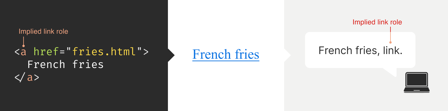
Here is an illustration to help communicate what I mean by this:

The presence of HTML’s button element will instruct assistive technology to report it as a button, letting someone know that it can be activated to perform a predefined action.
The presence of the text string “Mute” will be reported by assistive technology to clue the person into what the button is used for.
The presence of aria-pressed=”true” means that someone or something has previously activated the button, and it is now in a “pushed in” state that sustains its action.

This overall pattern will let people who use assistive technology know:

If something is interactive,
What kind of interactive behavior it performs, and
Its current state.

ARIA’s History

ARIA has been around for a long time, with the first version published on September 26th, 2006.

ARIA was created to provide a bridge between the limitations of HTML and the need for making interactive experiences understandable by assistive technology.

The latest version of ARIA is version 1.2, published on June 6th, 2023. Version 1.3 is slated to be released relatively soon, and you can read more about it in this excellent article by Craig Abbott.

You may also see it referred to as WAI-ARIA, where WAI stands for “Web Accessibility Initiative.” The WAI is part of the W3C, the organization that sets standards for the web. That said, most accessibility practitioners I know call it “ARIA” in written and verbal communication and leave out the “WAI-” part.

The Spirit Of ARIA Reflects The Era In Which It Was Created

The reason for this is simple: The web was a lot less mature in the past than it is now. The most popular operating system in 2006 was Windows XP. The iPhone didn’t exist yet; it was released a year later.

From a very high level, ARIA is a snapshot of the operating system interaction paradigms of this time period. This is because ARIA recreates them.

The Mindset

Smartphones with features like tappable, swipeable, and draggable surfaces were far less commonplace. Single Page Application “web app” experiences were also rare, with Ajax)-based approaches being the most popular. This means that we have to build the experiences of today using the technology of 2006. In a way, this is a good thing. It forces us to take new and novel experiences and interrogate them.

Interactions that cannot be broken down into smaller, more focused pieces that map to ARIA patterns are most likely inaccessible. This is because they won’t be able to be operated by assistive technology or function on older or less popular devices.

I may be biased, but I also think these sorts of novel interactions that can’t translate also serve as a warning that a general audience will find them to be confusing and, therefore, unusable. This belief is important to consider given that the internet serves:

An unknown number of people,
Using an unknown number of devices,
Each with an unknown amount of personal customizations,
Who have their own unique needs and circumstances and
Have unknown motivational factors.

Interaction Expectations

Contemporary expectations for keyboard-based interaction for web content — checkboxes, radios, modals, accordions, and so on — are sourced from Windows XP and its predecessor operating systems. These interaction models are carried forward as muscle memory for older people who use assistive technology. Younger people who rely on assistive technology also learn these de facto standards, thus continuing the cycle.

What does this mean for you? Someone using a keyboard to interact with your website or web app will most likely try these Windows OS-based keyboard shortcuts first. This means things like pressing:

Enter to navigate to a link’s destination,
Space to activate buttons,
Home and End to jump to the start or end of a list of items, and so on.

It’s Also A Living Document

This is not to say that ARIA has stagnated. It is constantly being worked on with new additions, removals, and clarifications. Remember, it is now at version 1.2, with version 1.3 arriving soon.

In parallel, HTML as a language also reflects this evolution. Elements were originally created to support a document-oriented web and have been gradually evolving to support more dynamic, app-like experiences. The great bit here is that this is all conducted in the open and is something you can contribute to if you feel motivated to do so.

ARIA Has Rules For Using It

There are five rules included in ARIA’s documentation to help steer how you approach it:

Use a native element whenever possible.
An example would be using an anchor element (<a>) for a link rather than a div with a click handler and a role of link.
Don’t adjust a native element’s semantics if at all possible.
An example would be trying to use a heading element as a tab rather than wrapping the heading in a semantically neutral div.
Anything interactive has to be keyboard operable.
If you can’t use it with a keyboard, it isn’t accessible. Full stop.
Do not use role=”presentation” or aria-hidden=”true” on a focusable element.
This makes something intended to be interactive unable to be used by assistive technology.
Interactive elements must be named.
An example of this is using the text string “Print” for a button element.

Observing these five rules will do a lot to help you out. The following is more context to provide even more support.

ARIA Has A Taxonomy

There is a structured grammar to ARIA, and it is centered around roles, as well as states and properties.

Roles

A Role is what assistive technology reads and then announces. A lot of people refer to this in shorthand as semantics. HTML elements have implied roles, which is why an anchor element will be announced as a link by screen readers with no additional work.

Implied roles are almost always better to use if the use case calls for them. Recall the first rule of ARIA here. This is usually what digital accessibility practitioners refer to when they say, “Just use semantic HTML.”

There are many reasons for favoring implied roles. The main consideration is better guarantees of support across an unknown number of operating systems, browsers, and assistive technology combinations.

Roles have categories, each with its own purpose. The Abstract role category is notable in that it is an organizing supercategory not intended to be used by authors:

Abstract roles are used for the ontology. Authors MUST NOT use abstract roles in content.

<!– This won’t work, don’t do it –>
<h2 role=”sectionhead”>
Anatomy and physiology
</h2>

<!– Do this instead –>
<section aria-labeledby=”anatomy-and-physiology”>
<h2 id=”anatomy-and-physiology”>
Anatomy and physiology
</h2>
</section>

Additionally, in the same way, you can only declare ARIA on certain things, you can only declare some ARIA as children of other ARIA declarations. An example of this is the the listitem role, which requires a role of list to be present on its parent element.

So, what’s the best way to determine if a role requires a parent declaration? The answer is to review the official definition.

States And Properties

States and properties are the other two main parts of ARIA‘s overall taxonomy.

Implicit roles are provided by semantic HTML, and explicit roles are provided by ARIA. Both describe what an element is. States describe that element’s characteristics in a way that assistive technology can understand. This is done via property declarations and their companion values.

ARIA states can change quickly or slowly, both as a result of human interaction as well as application state. When the state is changed as a result of human interaction, it is considered an “unmanaged state.” Here, a developer must supply the underlying JavaScript logic to control the interaction.

When the state changes as a result of the application (e.g., operating system, web browser, and so on), this is considered “managed state.” Here, the application automatically supplies the underlying logic.

How To Declare ARIA

Think of ARIA as an extension of HTML attributes, a suite of name/value pairs. Some values are predefined, while others are author-supplied:

For the examples in the previous graphic, the polite value for aria-live is one of the three predefined values (off, polite, and assertive). For aria-label, “Save” is a text string manually supplied by the author.

You declare ARIA on HTML elements the same way you declare other attributes:

<!–
Applies an id value of
“carrot” to the div
–>
<div id=”carrot”></div>

<!–
Hides the content of this paragraph
element from assistive technology
–>
<p aria-hidden=”true”>
Assistive technology can’t read this
</p>

<!–
Provides an accessible name of “Stop”,
and also communicates that the button
is currently pressed. A type property
with a value of “button” prevents
browser form submission.
–>
<button
aria-label=”Stop”
aria-pressed=”true”
type=”button”>
<!– SVG icon –>
</button>

Other usage notes:

You can place more than one ARIA declaration on an HTML element.
The order of placement of ARIA when declared on an HTML element does not matter.
There is no limit to how many ARIA declarations can be placed on an element. Be aware that the more you add, the more complexity you introduce, and more complexity means a larger chance things may break or not function as expected.
You can declare ARIA on an HTML element and also have other non-ARIA declarations, such as class or id. The order of declarations does not matter here, either.

It might also be helpful to know that boolean attributes are treated a little differently in ARIA when compared to HTML. Hidde de Vries writes about this in his post, “Boolean attributes in HTML and ARIA: what’s the difference?”.

Not A Whole Lot Of ARIA Is “Hardcoded”

In this context, “hardcoding” means directly writing a static attribute or value declaration into your component, view, or page.

A lot of ARIA is designed to be applied or conditionally modified dynamically based on application state or as a response to someone’s action. An example of this is a show-and-hide disclosure pattern:

ARIA’s aria-expanded attribute is toggled from false to true to communicate if the disclosure is in an expanded or collapsed state.
HTML’s hidden attribute is conditionally removed or added in tandem to show or hide the disclosure’s full content area.

<div class=”disclosure-container”>
<button
aria-expanded=”false”
class=”disclosure-toggle”
type=”button”>
How we protect your personal information
</button>
<div
hidden
class=”disclosure-content”>
<ul>
<li>Fast, accurate, thorough and non-stop protection from cyber attacks</li>
<li>Patching practices that address vulnerabilities that attackers try to exploit</li>
<li>Data loss prevention practices help to ensure data doesn’t fall into the wrong hands</li>
<li>Supply risk management practices help ensure our suppliers adhere to our expectations</li>
</ul>
<p>
<a href=”/security/”>Learn more about our security best practices</a>.
</p>
</div>
</div>

A common example of a hardcoded ARIA declaration you’ll encounter on the web is making an SVG icon inside a button decorative:

<button type=”button>
<svg aria-hidden=”true”>
<!– SVG code –>
</svg>
Save
</button>

Here, the string “Save” is what is required for someone to understand what the button will do when they activate it. The accompanying icon helps that understanding visually but is considered redundant and therefore decorative.

Declaring An Aria Role On Something That Already Uses That Role Implicitly Does Not Make It “Extra” Accessible

An implied role is all you need if you’re using semantic HTML. Explicitly declaring its role via ARIA does not confer any additional advantages.

<!–
You don’t need to declare role=”button” here.
Using the <button> element will make assistive
technology announce it as a button. The
role=”button” declaration is redundant.
–>
<button role=”button”>
Save
</button>

You might occasionally run into these redundant declarations on HTML sectioning elements, such as <main role=”main”>, or <footer role=”contentinfo”>. This isn’t needed anymore, and you can just use the <main> or <footer> elements.

The reason for this is historic. These declarations were done for support reasons, in that it was a stop-gap technique for assistive technology that needed to be updated to support these new-at-the-time HTML elements.

Contemporary assistive technology does not need these redundant declarations. Think of it the same way that we don’t have to use vendor prefixes for the CSS border-radius property anymore.

Note: There is an exception to this guidance. There are circumstances where certain complex and complicated markup patterns don’t work as expected for assistive technology. In these cases, we want to hardcode the implicit role as explicit ARIA to ensure it works. This assistive technology support concern is covered in more detail later in this post.

You Don’t Need To Say What A Control Is; That Is What Roles Are For

Both implicit and explicit roles are announced by screen readers. You don’t need to include that part for things like the interactive element’s text string or an aria-label.

<!– Don’t do this –>
<button
aria-label=”Save button”
type=”button”>
<!– Icon SVG –>
</button>

<!– Do this instead –>
<button
aria-label=”Save”
type=”button”>
<!– Icon SVG –>
</button>

Had we used the string value of “Save button” for our Save button, a screen reader would announce it along the lines of, “Save button, button.” That’s redundant and confusing.

ARIA Roles Have Very Specific Meanings

We sometimes refer to website and web app navigation colloquially as menus, especially if it’s an e-commerce-style mega menu.

In ARIA, menus mean something very specific. Don’t think of global or in-page navigation or the like. Think of menus in this context as what appears when you click the Edit menu button on your application’s menubar.

Using a role improperly because its name seems like an appropriate fit at first glance creates confusion for people who do not have the context of the visual UI. Their expectations will be set with the announcement of the role, then subverted when it does not act the way it is supposed to.

Imagine if you click on a link, and instead of taking you to another webpage, it sends something completely unrelated to your printer instead. It’s sort of like that.

Declaring role=”menu” is a common example of a misapplied role, but there are others. The best way to know what a role is used for? Go straight to the source and read up on it.

Certain Roles Are Forbidden From Having Accessible Names

These roles are caption, code, deletion, emphasis, generic, insertion, paragraph, presentation, strong, subscript, and superscript.

This means you can try and provide an accessible name for one of these elements — say via aria-label — but it won’t work because it’s disallowed by the rules of ARIA’s grammar.

<!– This won’t work–>
<strong aria-label=”A 35% discount!”>
$39.95
</strong>

<!– Neither will this –>
<code title=”let JavaScript example”>
let submitButton = document.querySelector(‘button[type=”submit”]’);
</code>

For these examples, recall that the role is implicit, sourced from the declared HTML element.

Note here that sometimes a browser will make an attempt regardless and overwrite the author-specified string value. This overriding is a confusing act for all involved, which led to the rule being established in the first place.

You Can’t Make Up ARIA And Expect It To Work

I’ve witnessed some developers guess-adding CSS classes, such as .background-red or .text-white, to their markup and being rewarded if the design visually updates correctly.

The reason this works is that someone previously added those classes to the project. With ARIA, the people who add the content we can use are the Accessible Rich Internet Applications Working Group. This means each new version of ARIA has a predefined set of properties and values. Assistive technology is then updated to parse those attributes and values, although this isn’t always a guarantee.

Declaring ARIA, which isn’t part of that predefined set, means assistive technology won’t know what it is and consequently won’t announce it.

<!–
There is no “selectpanel” role in ARIA.
Because of this, this code will be announced
as a button and not as a select panel.
–>
<button
role=”selectpanel”
type=”button”>
Choose resources
</button>

ARIA Fails Silently

This speaks to the previous section, where ARIA won’t understand words spoken to it that exist outside its limited vocabulary.

There are no console errors for malformed ARIA. There’s also no alert dialog, beeping sound, or flashing light for your operating system, browser, or assistive technology. This fact is yet another reason why it is so important to test with actual assistive technology.

You don’t have to be an expert here, either. There is a good chance your code needs updating if you set something to announce as a specific state and assistive technology in its default configuration does not announce that state.

ARIA Only Exposes The Presence Of Something To Assistive Technology

Applying ARIA to something does not automatically “unlock” capabilities. It only sends a hint to assistive technology about how the interactive content should behave.

For assistive technology like screen readers, that hint could be for how to announce something. For assistive technology like refreshable Braille displays, it could be for how it raises and lowers its pins. For example, declaring role=”button” on a div element does not automatically make it clickable. You will still need to:

Target the div element in JavaScript,
Tie it to a click event,
Author the interactive logic that it performs when clicked, and then
Accommodate all the other expected behaviors.

This all makes me wonder why you can’t save yourself some work and use a button element in the first place, but that is a different story for a different day.

Additionally, adjusting an element’s role via ARIA does not modify the element’s native functionality. For example, you can declare role=”image” on a div element. However, attempting to declare the alt or src attributes on the div won’t work. This is because alt and src are not supported attributes for div.

Declaring an ARIA Role On Something Will Override Its Semantics, But Not Its Behavior

This speaks to the previous section on ARIA only exposing something’s presence. Don’t forget that certain HTML elements have primary and secondary interactive capabilities built into them.

For example, an anchor element’s primary capability is navigating to whatever URL value is provided for its href attribute. Secondary capabilities for an anchor element include copying the URL value, opening it in a new tab or incognito window, and so on.

These secondary capabilities are still preserved. However, it may not be apparent to someone that they can use them — or use them in the way that they’d expect — depending on what is announced.

The opposite is also true. When an element has no capabilities, having its role adjusted does not grant it any new abilities. Remember, ARIA only announces. This is why that div with a role of button assigned to it won’t do anything when clicked if no companion JavaScript logic is also present.

You Will Need To Declare ARIA To Make Certain Interactions Accessible

A lot of the previous content may make it seem like ARIA is something you should avoid using altogether. This isn’t true. Know that this guidance is written to help steer you to situations where HTML does not offer the capability to describe an interaction out of the box. This space is where you want to use ARIA.

Knowing how to identify this area requires spending some time learning what HTML elements there are, as well as what they are and are not used for. I quite like HTML5 Doctor’s Element Index for upskilling on this.

Certain ARIA States Require Certain ARIA Roles To Be Present

This is analogous to how HTML has both global attributes and attributes that can only be used on a per-element basis. For example, aria-describedby can be used on any HTML element or role. However, aria-posinset can only be used with article, comment, listitem, menuitem, option, radio, row, and tab roles. Remember here that these roles can be provided by either HTML or ARIA.

Learning what states require which roles can be achieved by reading the official reference. Check for the “Used in Roles” portion of each entry’s characteristics:

Automated code scanners — like axe, WAVE, ARC Toolkit, Pa11y, equal-access, and so on — can catch this sort of thing if they are written in error. I’m a big fan of implementing these sorts of checks as part of a continuous integration strategy, as it makes it a code quality concern shared across the whole team.

ARIA Is More Than Web Browsers

Speaking of technology that listens, it is helpful to know that the ARIA you declare instructs the browser to speak to the operating system the browser is installed on. Assistive technology then listens to what the operating system reports. It then communicates that to the person using the computer, tablet, smartphone, and so on.

A person can then instruct assistive technology to request the operating system to take action on the web content displayed in the browser.

This interaction model is by design. It is done to make interaction from assistive technology indistinguishable from interaction performed without assistive technology.

There are a few reasons for this approach. The most important one is it helps preserve the privacy and autonomy of the people who rely on assistive technologies.

Just Because It Exists In The ARIA Spec Does Not Mean Assistive Technology Will Support It

This support issue was touched on earlier and is a difficult fact to come to terms with.

Contemporary developers enjoy the hard-fought, hard-won benefits of the web standards movement. This means you can declare HTML and know that it will work with every major browser out there. ARIA does not have this. Each assistive technology vendor has its own interpretation of the ARIA specification. Oftentimes, these interpretations are convergent. Sometimes, they’re not.

Assistive technology vendors also have support roadmaps for their products. Some assistive technology vendors:

Will eventually add support,
May never, and some
Might do so in a way that contradicts how other vendors choose to implement things.

There is also the operating system layer to contend with, which I’ll cover in more detail in a little bit. Here, the mechanisms used to communicate with assistive technology are dusty, oft-neglected areas of software development.

With these layers comes a scenario where the assistive technology can support the ARIA declared, but the operating system itself cannot communicate the ARIA’s presence, or vice-versa. The reasons for this are varied but ultimately boil down to a historic lack of support, prioritization, and resources. However, I am optimistic that this is changing.

Additionally, there is no equivalent to Caniuse, Baseline, or Web Platform Status for assistive technology. The closest analog we have to support checking resources is a11ysupport.io, but know that it is the painstaking work of a single individual. Its content may not be up-to-date, as the work is both Herculean in its scale and Sisyphean in its scope. Because of this, I must re-stress the importance of manually testing with assistive technology to determine if the ARIA you use works as intended.

How To Determine ARIA Support

There are three main layers to determine if something is supported:

Operating system and version.
Assistive technology and version,
Browser and browser version.

1. Operating System And Version

Each operating system (e.g., Windows, macOS, Linux) has its own way of communicating what content is present to assistive technology. Each piece of assistive technology has to accommodate how to parse that communication.

Some assistive technology is incompatible with certain operating systems. An example of this is not being able to use VoiceOver with Windows, or JAWS with macOS. Furthermore, each version of each operating system has slight variations in what is reported and how. Sometimes, the operating system needs to be updated to “teach” it the updated AIRA vocabulary. Also, do not forget that things like bugs and regressions can occur.

2. Assistive Technology And Version

There is no “one true way” to make assistive technology. Each one is built to address different access needs and wants and is done so in an opinionated way — think how different web browsers have different features and UI.

Each piece of assistive technology that consumes web content has its own way of communicating this information, and this is by design. It works with what the operating system reports, filtered through things like heuristics and preferences.

Like operating systems, assistive technology also has different versions with what each version is capable of supporting. They can also be susceptible to bugs and regressions.

Another two factors worth pointing out here are upgrade hesitancy and lack of financial resources. Some people who rely on assistive technology are hesitant to upgrade it. This is based on a very understandable fear of breaking an important mechanism they use to interact with the world. This, in turn, translates to scenarios like holding off on updates until absolutely necessary, as well as disabling auto-updating functionality altogether.

Lack of financial resources is sometimes referred to as the disability or crip tax. Employment rates tend to be lower for disabled populations, and with that comes less money to spend on acquiring new technology and updating it. This concern can and does apply to operating systems, browsers, and assistive technology.

3. Browser And Browser Version

Some assistive technology works better with one browser compared to another. This is due to the underlying mechanics of how the browser reports its content to assistive technology. Using Firefox with NVDA is an example of this.

Additionally, the support for this reporting sometimes only gets added for newer versions. Unfortunately, it also means support can sometimes accidentally regress, and people don’t notice before releasing the browser update — again, this is due to a historic lack of resources and prioritization.

The Less Commonly-Used The ARIA You Declare, The Greater The Chance You’ll Need To Test It

Common ARIA declarations you’ll come across include, but are not limited to:

aria-label,
aria-labelledby,
aria-describedby,
aria-hidden,
aria-live.

These are more common because they’re more supported. They are more supported because many of these declarations have been around for a while. Recall the previous section that discussed actual assistive technology support compared to what the ARIA specification supplies.

Newer, more esoteric ARIA, or historically deprioritized declarations, may not have that support yet or may never. An example of how complicated this can get is aria-controls.

aria-controls is a part of ARIA that has been around for a while. JAWS had support for aria-controls, but then removed it after user feedback. Meanwhile, every other screen reader I’m aware of never bothered to add support.

What does that mean for us? Determining support, or lack thereof, is best accomplished by manual testing with assistive technology.

The More ARIA You Add To Something, The Greater The Chance Something Will Behave Unexpectedly

This fact takes into consideration the complexities in preferences, different levels of support, bugs, regressions, and other concerns that come with ARIA’s usage.

Philosophically, it’s a lot like adding more interactive complexity to your website or web app via JavaScript. The larger the surface area your code covers, the bigger the chance something unintended happens.

Consider the amount of ARIA added to a component or discrete part of your experience. The more of it there is declared nested into the Document Object Model (DOM), the more it interacts with parent ARIA declarations. This is because assistive technology reads what the DOM exposes to help determine intent.

A lot of contemporary development efforts are isolated, feature-based work that focuses on one small portion of the overall experience. Because of this, they may not take this holistic nesting situation into account. This is another reason why — you guessed it — manual testing is so important.

Anecdotally, WebAIM’s annual Millions report — an accessibility evaluation of the top 1,000,000 websites — touches on this phenomenon:

Increased ARIA usage on pages was associated with higher detected errors. The more ARIA attributes that were present, the more detected accessibility errors could be expected. This does not necessarily mean that ARIA introduced these errors (these pages are more complex), but pages typically had significantly more errors when ARIA was present.

Assistive Technology May Support Your Invalid ARIA Declaration

There is a chance that ARIA, which is authored inaccurately, will actually function as intended with assistive technology. While I do not recommend betting on this fact to do your work, I do think it is worth mentioning when it comes to things like debugging.

This is due to the wide range of familiarity there is with people who author ARIA.

Some of the more mature assistive technology vendors try to accommodate the lower end of this familiarity. This is done in order to better enable the people who use their software to actually get what they need.

There isn’t an exhaustive list of what accommodations each piece of assistive technology has. Think of it like the forgiving nature of a browser’s HTML parser, where the ultimate goal is to render content for humans.

aria-label Is Tricky

aria-label is one of the most common ARIA declarations you’ll run across. It’s also one of the most misused.

aria-label can’t be applied to non-interactive HTML elements, but oftentimes is. It can’t always be translated and is oftentimes overlooked for localization efforts. Additionally, it can make things frustrating to operate for people who use voice control software, where the visible label differs from what the underlying code uses.

Another problem is when it overrides an interactive element’s pre-existing accessible name. For example:

<!– Don’t do this –>
<a
aria-label=”Our services”
href=”/services/”>
Services
</a>

This is a violation of WCAG Success Criterion 2.5.3: Label in Name, pure and simple. I have also seen it used as a way to provide a control hint. This is also a WCAG failure, in addition to being an antipattern:

<!– Also don’t do this –>
<a
aria-label=”Click this link to learn more about our unique and valuable services”
href=”/services/”>
Services
</a>

These factors — along with other considerations — are why I consider aria-label a code smell.

aria-live Is Even Trickier

Live region announcements are powered by aria-live and are an important part of communicating updates to an experience to people who use screen readers.

Believe me when I say that getting aria-live to work properly is tricky, even under the best of scenarios. I won’t belabor the specifics here. Instead, I’ll point you to “Why are my live regions not working?”, a fantastic and comprehensive article published by TetraLogical.

The ARIA Authoring Practices Guide Can Lead You Astray

Also referred to as the APG, the ARIA Authoring Practices Guide should be treated with a decent amount of caution.

The Downsides

The guide was originally authored to help demonstrate ARIA’s capabilities. As a result, its code examples near-exclusively, overwhelmingly, and disproportionately favor ARIA.

Unfortunately, the APG’s latest redesign also makes it far more approachable-looking than its surrounding W3C documentation. This is coupled with demonstrating UI patterns in a way that signals it’s a self-serve resource whose code can be used out of the box.

These factors create a scenario where people assume everything can be used as presented. This is not true.

Recall that just because ARIA is listed in the spec does not necessarily guarantee it is supported. Adrian Roselli writes about this in detail in his post, “No, APG’s Support Charts Are Not ‘Can I Use’ for ARIA”.

Also, remember the first rule of ARIA and know that an ARIA-first approach is counter to the specification’s core philosophy of use.

In my experience, this has led to developers assuming they can copy-paste code examples or reference how it’s structured in their own efforts, and everything will just work. This leads to mass frustration:

Digital accessibility practitioners have to explain that “doing the right thing” isn’t going to work as intended.
Developers then have to revisit their work to update it.
Most importantly, people who rely on assistive technology risk not being able to use something.

This is to say nothing about things like timelines and resourcing, working relationships, reputation, and brand perception.

The Upside

The APG’s main strength is highlighting what keyboard keypresses people will expect to work on each pattern.

Consider the listbox pattern. It details keypresses you may expect (arrow keys, Space, and Enter), as well as less-common ones (typeahead selection and making multiple selections). Here, we need to remember that ARIA is based on the Windows XP era. The keyboard-based interaction the APG suggests is built from the muscle memory established from the UI patterns used on this operating system.

While your tree view component may look visually different from the one on your operating system, people will expect it to be keyboard operable in the same way. Honoring this expectation will go a long way to ensuring your experiences are not only accessible but also intuitive and efficient to use.

Another strength of the APG is giving standardized, centralized names to UI patterns. Is it a dropdown? A listbox? A combobox? A select menu? Something else?

When it comes to digital accessibility, these terms all have specific meanings, as well as expectations that come with them. Having a common vocabulary when discussing how an experience should work goes a long way to ensuring everyone will be on the same page when it comes time to make and maintain things.

macOS VoiceOver Can Also Lead You Astray

VoiceOver on macOS has been experiencing a lot of problems over the last few years. If I could wager a guess as to why this is, as an outsider, it is that Apple’s priorities are focused elsewhere.

The bulk of web development efforts are conducted on macOS. This means that well-intentioned developers will reach for VoiceOver, as it comes bundled with macOS and is therefore more convenient. However, macOS VoiceOver usage has a drastic minority share for desktops and laptops. It is under 10% of usage, with Windows-based JAWS and NVDA occupying a combined 78.2% majority share:

The Problem

The sad, sorry truth of the matter is that macOS VoiceOver, in its current state, has a lot of problems. It should only be used to confirm that it can operate the experience the way Windows-based screen readers can.

This means testing on Windows with NVDA or JAWS will create an experience that is far more accurate to what most people who use screen readers on a laptop or desktop will experience.

Dealing With The Problem

Because of this situation, I heavily encourage a workflow that involves:

Creating an experience’s underlying markup,
Testing it with NVDA or JAWS to set up baseline expectations,
Testing it with macOS VoiceOver to identify what doesn’t work as expected.

Most of the time, I find myself having to declare redundant ARIA on the semantic HTML I write in order to address missed expected announcements for macOS VoiceOver.

macOS VoiceOver testing is still important to do, as it is not the fault of the person who uses macOS VoiceOver to get what they need, and we should ensure they can still have access.

You can use apps like VirtualBox and Windows evaluation Virtual Machines to use Windows in your macOS development environment. Services like AssistivLabs also make on-demand, preconfigured testing easy.

What About iOS VoiceOver?

Despite sharing the same name, VoiceOver on iOS is a completely different animal. As software, it is separate from its desktop equivalent and also enjoys a whopping 70.6% usage share.

With this knowledge, know that it’s also important to test the ARIA you write on mobile to make sure it works as intended.

You Can Style ARIA

ARIA attributes can be targeted via CSS the way other HTML attributes can. Consider this HTML markup for the main navigation portion of a small e-commerce site:

<nav aria-label=”Main”>
<ul>
<li>
<a href=”/home/”>Home</a>
<a href=”/products/”>Products</a>
<a aria-current=”true” href=”/about-us/”>About Us</a>
<a href=”/contact/”>Contact</a>
</li>
</ul>
</nav>

The presence of aria-current=”true” on the “About Us” link will tell assistive technology to announce that it is the current part of the site someone is on if they are navigating through the main site navigation.

We can also tie that indicator of being the current part of the site into something that is shown visually. Here’s how you can target the attribute in CSS:

nav[aria-label=”Main”] [aria-current=”true”] {
border-bottom: 2px solid #ffffff;
}

This is an incredibly powerful way to tie application state to user-facing state. Combine it with modern CSS like :has() and view transitions and you have the ability to create robust, sophisticated UI with less reliance on JavaScript.

You Can Also Use ARIA When Writing UI Tests

Tests are great. They help guarantee that the code you work on will continue to do what you intended it to do.

A lot of web UI-based testing will use the presence of classes (e.g., .is-expanded) or data attributes (ex, data-expanded) to verify a UI’s existence, position and states. These types of selectors also have a far greater likelihood to be changed as time goes on when compared to semantic code and ARIA declarations.

This is something my coworker Cam McHenry touches on in his great post, “How I write accessible Playwright tests”. Consider this piece of Playwright code, which checks for the presence of a button that toggles open an edit menu:

// Selects an element with a role of button
// that has an accessible name of “Edit”
const editMenuButton = await page.getByRole(‘button’, { name: “Edit” });

// Requires the edit button to have a property
// of aria-haspopup with a value of true
expect(editMenuButton).toHaveAttribute(‘aria-haspopup’, ‘true’);

The test selects UI based on outcome rather than appearance. That’s a far more reliable way to target things in the long-term.

This all helps to create a virtuous feedback cycle. It enshrines semantic HTML and ARIA’s presence in your front-end UI code, which helps to guarantee accessible experiences don’t regress. Combining this with styling, you have a powerful, self-contained system for building robust, accessible experiences.

ARIA Is Ultimately About Caring About People

Web accessibility can be about enabling important things like scheduling medical appointments. It is also about fun things like chatting with your friends. It’s also used for every web experience that lives in between.

Using semantic HTML — supplemented with a judicious application of ARIA — helps you enable these experiences. To sum things up, ARIA:

Has been around for a long time, and its spirit reflects the era in which it was first created;
Has a governing taxonomy, vocabulary, and rules for use and is declared in the same way HTML attributes are;
Is mostly used for dynamically updating things, controlled via JavaScript;
Has highly specific use cases in mind for each of its roles;
Fails silently if mis-authored;
Only exposes the presence of something to assistive technology and does not confer interactivity;
Requires input from the web browser, but also the operating system, in order for assistive technology to use it;
Has a range of actual support, complicated by the more of it you use;
Has some things to watch out for, namely aria-label, the ARIA Authoring Practices Guide, and macOS VoiceOver support;
Can also be used for things like visual styling and writing resilient tests;
Is best evaluated by using actual assistive technology.

Viewed one way, ARIA is arcane, full of misconceptions, and fraught with potential missteps. Viewed another, ARIA is a beautiful and elegant way to programmatically communicate the interactivity and state of a user interface.

I choose the second view. At the end of the day, using ARIA helps to ensure that disabled people can use a web experience the same way everyone else can.

Thank you to Adrian Roselli and Jan Maarten for their feedback.

Further Reading

“What the Heck is ARIA? A Beginner’s Guide to ARIA for Accessibility,” Kat Shaw
“Accessibility APIs: A Key To Web Accessibility,” Léonie Watson & Chaals McCathie Nevile
“Semantics to Screen Readers,” Melanie Richards
“What ARIA does not do,” Steve Faulkner
“What ARIA still does not do,” stevef
“APG support tables — why they matter,” Michael Fairchild
“ARIA vs HTML,” Adrian Roselli

Editorial Design: '100 Beste Plakate 24' Showcase

Original Source: https://abduzeedo.com/editorial-design-100-beste-plakate-24-showcase

Editorial Design: ‘100 Beste Plakate 24’ Showcase

abduzeedo
06/12 — 2025

Explore “100 Beste Plakate 24,” a stunning yearbook by Tristesse and Slanted Publishers. Dive into cutting-edge editorial design and visual identity.

Design enthusiasts, get ready to dive into the latest from the German-speaking design scene. The “100 Beste Plakate 24” yearbook offers a compelling showcase of contemporary graphic design. It’s more than just a collection; it’s a deep exploration of visual identity and editorial design.

This yearbook, published by Slanted Publishers and edited by 100 beste Plakate e. V. and Fons Hickmann, is a testament to the power of impactful poster design. The design studio Tristesse from Basel took the reins for the overall concept, delivering a fresh and cheeky aesthetic that makes the “100 best posters” feel like leading actors on a vibrant stage. Their in-house approach to layout, typography, and photography truly shines.

Unpacking the Visuals

The book’s format (17×24 cm) and 256 pages allow for large-format images, providing ample space to appreciate each poster’s intricate details. It includes detailed credits, content descriptions, and creation contexts. This commitment to detail in the editorial design elevates the reading experience.

One notable example within the yearbook is the “To-Do: Diplome 24” poster campaign by Atelier HKB. Designed under Marco Matti’s project management, this series features twelve motifs for the Bern University of the Arts graduation events. These posters highlight effective graphic design and visual communication. Another standout is the “Rettungsplakate” by klotz-studio für gestaltung. These “rescue posters,” printed on actual rescue blankets, address homelessness in Germany. The raw, impactful visual approach paired with a tangible medium demonstrates powerful design with a purpose.

Beyond the Imagery

Beyond the stunning visuals, the yearbook offers insightful essays and interviews on current poster design trends. The introductory section features jury members, their works, and statements on the selection process, alongside forewords from the association president and jury chair. This editorial content offers valuable context and insights into the evolving landscape of graphic design.

The book’s concept playfully questions the seriousness and benevolence of the honorary certificates awarded to the winning designers. This subtle irony adds a unique layer to the publication, transforming it from a mere compilation into a thoughtful commentary on the design world itself. It’s an inspiring showcase of the cutting edge of contemporary graphic design.

The Art of Editorial Design

“100 Beste Plakate 24” is a prime example of exceptional editorial design. It’s not just about compiling images; it’s about curating a narrative. The precise layout, thoughtful typography choices, and the deliberate flow of content all contribute to a cohesive and engaging experience. This book highlights how editorial design can transform a collection of works into a compelling story, inviting readers to delve deeper into each piece.

The attention to detail, from the softcover with flaps to the thread-stitching and hot-foil embossing, speaks volumes about the dedication to craftsmanship. This is where illustration, graphic design, and branding converge to create a truly immersive experience.

Final Thoughts

This yearbook is a must-have for anyone passionate about graphic design and visual identity. It offers a fresh perspective on contemporary poster design, highlighting both aesthetic excellence and social relevance. The detailed insights into the design process and the designers’ intentions make it an invaluable resource. Pick up a copy and see how impactful design can be.

You can learn more about this incredible work and acquire your copy at slanted.de/product/100-beste-plakate-24.

Editorial design artifacts

Best Crypto Payments Gateways in 2025

Original Source: https://www.sitepoint.com/best-crypto-payments-gateways-in-2024/?utm_source=rss

Read Best Crypto Payments Gateways in 2025 and learn Web with SitePoint. Our web development and design tutorials, courses, and books will teach you HTML, CSS, JavaScript, PHP, Python, and more.

Continue reading
Best Crypto Payments Gateways in 2025
on SitePoint.

Society6 vs Etsy: Which Is Better?

Original Source: https://ecommerce-platforms.com/articles/society6-vs-etsy

If you’re trying to sell art prints, posters, or merch online, there’s a high chance you’ve run into these two: Society6 and Etsy.

Quick answer?

If you want full control, build a brand, and scale over time, Etsy wins hands down.
But if you just want to upload art and not worry about a thing, Society6 is less effort but lower reward.

Let me walk you through it — from someone who’s been selling on both for over a decade.

Society6 vs Etsy: Full Feature Comparison Table

FeatureSociety6Etsy (with POD integration)Platform TypePrint-on-demand marketplaceCustomisable ecommerce marketplaceSetup TimeSuper fast (15–30 mins)Moderate (2–5 hours with integrations)Ease of UseVery easy, no tech skills neededSteeper learning curve, more toolsCustom Storefront❌ No – generic product pages✅ Yes – full store brandingProduct Range~80+ products (home decor, wall art, furniture)Unlimited via Printful, Printify, Gelato, etc.Design ControlVery limited – upload onlyFull control over product mockups, descriptions, listingsBranding❌ None – no email list, no logo, no customisation✅ Full control over branding and marketingCustomer Ownership❌ None – you never see the buyer✅ Yes – you get buyer data, can retargetProfit MarginsLow (e.g. $3–5 on a $25 print)Higher (e.g. $10–15 on a $25 print)FeesNo upfront or listing fees$0.20 listing + 6.5% transaction + 3% payment feesTraffic SourceBuilt-in marketplace trafficBuilt-in traffic + SEO + Etsy AdsMarketing Tools❌ None – no email, coupons, analytics✅ Coupons, email, abandoned cart, SEO, adsSEO OptionsNoneFull control over titles, tags, categoriesCustomer SupportHandled by Society6You or your POD partner handles supportFulfilmentHandled entirely by Society6Handled by POD partner (e.g. Printful)Payment HandlingSociety6 pays you royaltiesEtsy takes payments via Stripe or Etsy PaymentsPayout TimeMonthly (Net-30)Weekly or faster (via Etsy Payments)International ShippingYes (Society6 fulfils globally)Yes (depends on POD partner)Mobile AppNo seller appEtsy Seller App availableAnalytics & Insights❌ None✅ Built-in analytics, external tracking supportedSupport QualityMinimal – hard to reachResponsive through Etsy + POD platformIdeal ForArtists who want passive incomeSellers building a brand and long-term store

What Are They? Let’s Set the Stage

When you’re first getting into print-on-demand, the platform you choose shapes everything — how much control you have, how you brand yourself, and what kind of customers you attract.

Society6 is a print-on-demand marketplace built specifically for artists.

You upload your artwork, choose the products you want it printed on — like prints, mugs, pillows, or even furniture — and Society6 takes care of the rest.

No need to manage inventory, customer support, or fulfilment. It’s plug-and-play, which makes it incredibly beginner-friendly. But you’re operating within their ecosystem — your store isn’t really yours.

Etsy, on the other hand, wasn’t designed for POD — it’s a massive global marketplace for handmade, vintage, and custom goods.

But with the rise of integrations like Printful, Printify, Gelato, and Gooten, Etsy has become a powerful POD platform.

You get the benefit of Etsy’s built-in traffic while running a storefront that’s fully branded and tailored to your vision.

Here’s how the two compare at a glance:

FeatureSociety6EtsyBuilt-in PODYesNo (requires integration)Custom StorefrontNoYesBrandingLimitedFull controlPOD Product Range80+ SKUsUnlimited (via integrations)

If you’re looking to keep things simple, Society6 is the clear winner for getting started fast. No tech setup. No fulfilment. No headaches.

But if you’re serious about creating a brand, setting your own prices, and building long-term equity in your business, Etsy gives you far more flexibility and control.

It takes more upfront effort, but you’re building something that’s actually yours.

Verdict:
Society6 is the easiest to start. But Etsy’s flexibility gives you way more power in the long run.

Setup: Getting Started Without Losing Your Mind

When you’re just starting out, setup time matters. Some platforms let you get selling within the hour, others feel like setting up a full ecommerce business — because you are.

Society6 setup? Took me 15 minutes, max. It’s built for speed and simplicity.

Here’s how it works:

Upload your art files (they’ll walk you through sizing)

Choose which products to apply your designs to — posters, canvases, throw pillows, bath mats, etc.

Add a title, tags, and categories

There’s no storefront to design. No shipping settings to mess with. No need to connect a domain or payment processor.

Everything’s handled for you. You’re basically renting space on Society6’s marketplace.

Etsy setup? It’s a real project — not hard, but definitely more involved.

You’ll need to:

Create a seller account and set up your payment and billing details

Design your storefront — banner image, logo, shop description

Pick your print-on-demand partner (I use Printful and Printify the most)

Connect the integration app

Sync your products, set your prices, choose your mockups

Configure shipping settings, taxes, return policies

That’s a lot of steps compared to Society6. But this is also where you start owning your brand.

StepSociety6Etsy with PODAccount CreationSimpleRequires business detailsStore DesignNot applicableFull custom brandingProduct SetupBuilt-in interfaceSync via Printful/PrintifyTime to Launch15–30 minutes2–5 hours (or more)

Verdict:
Society6 wins on ease. It’s great if you want to get up and running without any hassle.
But if you’re in it for the long haul and want control over your branding, Etsy is worth the extra effort.

Design, Branding & Store Control

If you care about building a real brand — something customers remember and come back to — this section matters more than anything.

This is where Society6 falls flat. You’re basically listing your art in a massive catalogue.

No storefront. No brand identity. You can’t control how your products are presented beyond the title, tags, and a short description.

Here’s what you don’t get with Society6:

No logo or custom header

No control over layout or page design

No ability to build an email list

No connection to your social media

You’re just another artist in a sea of listings

You’re dependent on Society6’s algorithm and promotions. And if your product doesn’t get featured or picked up by search? You vanish.

With Etsy? It’s a whole different game.

Upload your logo, create a custom banner, and write your shop bio

Control your product titles, descriptions, and tags for SEO

Choose your product photography and set up custom mockups

Build an email list using integrations like Klaviyo or Mailchimp

Drive traffic through your Instagram, Pinterest, TikTok, and link your shop

It feels like your shop, because it actually is. You’re not just selling prints — you’re building a business.

Here’s a side-by-side breakdown:

FeatureSociety6EtsyLogo & BrandingNoYesCustom Store DesignNoFull design controlEmail List IntegrationNot availableSupported via integrationsSocial Media ConnectionsNoYes – connect and drive trafficCustomer RelationshipAnonymousYou can build direct relationships

Verdict:
Etsy dominates here. If you’re building a real business, this stuff isn’t optional — it’s essential.

Fees & Profit Margins: Who’s Taking the Bigger Cut?

This is where things start to separate pretty clearly — and where your actual income gets decided.

Here’s the kicker: margins. You could sell the same $25 print on both platforms, but what you keep can vary wildly.

Society6 works on a royalty-based model. That means they set the retail price for most products, and you get a small cut — usually fixed.

The only exception is art prints, where you can adjust your markup.

Here’s how it breaks down:

Art prints: You choose your markup (e.g. add $5–$10 on top of the base)

Other products: Fixed royalty (often $1–$4, sometimes even less)

You can’t see the full breakdown of production costs — it’s baked into their pricing

So while it’s passive and low-maintenance, the payout per sale is very limited.

Etsy, on the other hand, puts you in control. You set your prices based on your POD partner’s base cost (like Printful or Printify), and Etsy takes its cut through fees.

Here’s what you’ll pay on Etsy:

Listing fee: $0.20 per item

Transaction fee: 6.5% of the sale price

Payment processing fee: Around 3% + $0.25 (depends on your location)

Optional Etsy Ads: If you want to boost visibility

So if you sell a $25 print on Etsy through Printful (base cost around $11), you’re walking away with roughly $10–$13 profit per sale — more than double what you’d earn on Society6.

PlatformCost to CustomerYou EarnFees & CostsSociety6$25~$3–$5Hidden production cost, fixed royaltiesEtsy + Printful$25~$10–$13$0.20 listing + 6.5% transaction + ~3% payment fee

This matters a lot if you’re doing volume. That $7–$10 difference per sale adds up fast.

Verdict:
Etsy gives you better profit margins — if you’re willing to do a bit more work upfront.

You control pricing, you see your costs, and you actually keep most of what you earn.

Society6? Easier, but less money in your pocket.

Traffic & Discovery: Who Brings the Buyers?

This is the part most new sellers overlook — but it’s everything.

Society6 brings built-in traffic. People go there looking for art and home goods.

They might type in something like “cool abstract posters,” and if your design matches the keywords, you could show up in search.

But here’s the catch:

You’re one of thousands of artists

Listings are controlled by their algorithm

If you’re not featured or trending, your visibility tanks

Society6’s traffic is passive — it comes to you, but only if the algorithm likes your stuff that week.

Etsy? Same idea, much bigger playground.

Over 90 million active buyers

Strong organic search engine presence

High-intent shoppers looking for unique, creative products

But Etsy gives you tools that Society6 doesn’t. On Etsy, you can:

Run Etsy Ads to boost visibility in search

Optimise your listings with targeted keywords for SEO (titles, tags, descriptions)

Build repeat traffic by growing your brand and fan base

Connect your store to social platforms and drive external traffic

You’re not just waiting for Etsy to feature you — you’re building momentum yourself.

FeatureSociety6EtsyBuilt-in Marketplace TrafficYesYesSEO ControlNoFull control (titles, tags, URLs)Paid AdsNoYes – Etsy AdsExternal MarketingLimited to noneFull access (social, email, blogs)Long-Term VisibilityAlgorithm-dependentBrand-driven + SEO-scalable

Verdict:
Etsy wins on scalable traffic.

Society6 can give you a little passive exposure, but Etsy hands you the tools to grow visibility over time — if you’re willing to market smart and play the long game.

Product Variety & Print Quality

When it comes to what you can actually sell, both platforms offer a lot — but in very different ways.

Society6 has a built-in catalogue of over 80+ unique products. And they’re not just the usual T-shirts and mugs. You’ll find:

Rugs

Shower curtains

Furniture like credenzas and side tables

Wall tapestries

Throw pillows, coasters, and comforters

It’s quirky, artsy, and product development is handled entirely by them. You just upload your designs and apply them to the available templates.

The catch? You’re limited to what they offer — no way to go outside their range or use a third-party fulfiller.

Etsy with POD integrations? Pretty much endless.

What you can sell depends on your print-on-demand provider. For example:

Printful: Clothing, posters, hats, bags, wall art, embroidery, stickers

Printify: Phone cases, mugs, canvas prints, pet products, puzzles

Gelato: Posters, calendars, books, and more (with global fulfilment)

Gooten: Home decor, travel bags, and niche items

That flexibility means you can test product types fast, respond to trends, and even switch suppliers if needed.

Print Quality?
Both platforms can be hit or miss, depending on the item and production partner.

Society6 uses its own network of third-party manufacturers. Some users report great quality, others mention poor colour accuracy or inconsistent packaging.

Etsy POD quality depends entirely on your provider. In my experience:

Printful is excellent — consistent colours, reliable fulfilment

Printify can vary by supplier (they use a large network)

Best approach? Order samples before you commit

Here’s how the two stack up:

FeatureSociety6Etsy with PODProduct Variety80+ built-in SKUsUnlimited (varies by provider)Unique Product TypesRugs, furniture, tapestriesApparel, accessories, decor, giftsCustom Supplier OptionsNo – Society6 onlyYes – choose among Printful, etc.Print Quality ControlMixed – you have no controlHigher – depends on chosen providerSample OrdersNot availableAvailable through most POD partners

Verdict:
Etsy wins on flexibility. You can sell almost anything, test fast, and change suppliers as needed.

But Society6 wins on unique SKUs — it’s the only place I know where you can sell a credenza with your artwork on it.

Marketing Tools

This is where the difference between the two platforms becomes night and day — especially if you’re thinking long-term.

Society6 gives you… nothing.

And I mean that literally. There’s no built-in marketing dashboard. No tools for capturing leads. No way to re-engage past buyers.

You list your designs and hope the platform features you or that someone stumbles across your work.

What’s missing:

No email collection or campaigns

No analytics dashboard

No discount codes or promotions

No control over retargeting or ad spend

If you want traffic or repeat business, you’ll have to send it there yourself — but you can’t track or retarget those visitors. It’s a closed ecosystem.

Etsy? Total opposite.

While it’s not a full-blown marketing suite, Etsy gives you just enough to build and scale real growth.

Here’s what you get out of the box:

Discount codes for promotions, seasonal sales, or rewarding return buyers

Email campaign tools (via integrations like Mailchimp or Etsy’s built-in messages)

Abandoned cart recovery — Etsy emails potential buyers who left items behind

SEO customisation — you control listing titles, tags, categories, and meta descriptions

Etsy Ads to promote your listings across Etsy’s search and platform

And if you’re looking to level up, you can plug into serious marketing tools:

Google Analytics for tracking store performance and user behaviour

Pinterest Ads for visual product discovery

Klaviyo or Mailchimp to build automated email flows, abandoned cart sequences, and product recommendations

Here’s how they compare:

FeatureSociety6EtsyDiscount & Promo CodesNoYesEmail MarketingNoYes – via integrationsAbandoned Cart RecoveryNoYes – built-inSEO OptimisationNoFull control over listingsPaid AdsNoEtsy Ads availableAnalyticsBasic sales data onlySupports Google Analytics & third-party toolsRetargeting & RemarketingNoPossible with external tools

Verdict:
If you’re serious about building a brand and driving repeat sales, Etsy wins by miles.

Society6 just isn’t built for sellers who want control over growth or strategy — it’s more of a passive listing platform.

Etsy gives you the tools to actually market, scale, and turn visitors into long-term buyers.

Support & Fulfilment

This part comes down to how hands-on you want to be after the sale is made.

Fulfilment and customer service can either be fully automated or a shared responsibility — depending on the platform.

Society6 handles everything.

Once someone places an order, Society6 takes over. They:

Print and ship the product

Deal with customer emails

Handle returns, replacements, and tracking

Manage delays or damaged goods

It’s a true “set it and forget it” model. You don’t interact with the customer at all.

While that’s convenient, it also means you can’t build customer relationships or directly resolve any issues — you’re completely out of the loop.

Etsy? It depends on how you’ve set things up.

If you’re using a POD partner like Printful or Printify, they handle:

Printing and fulfilment

Shipping (with tracking)

Some support, like replacing damaged items

But you’re still the storefront owner — so customers come to you when there’s a problem. That means:

You write and manage your shop’s policies

You’re the first line of communication for complaints, refunds, or questions

You may need to coordinate between the customer and your POD provider

It’s more work, but it also gives you flexibility and control over how issues are handled.

FeatureSociety6Etsy with POD PartnerOrder FulfilmentFully handled by Society6Managed by POD provider (e.g. Printful)Customer SupportSociety6 responds directlyYou respond, POD helps in backgroundReturns & RefundsManaged by Society6You manage or coordinate with supplierShipping & TrackingIncluded, automatedProvided by POD partnerSeller InvolvementNoneMedium – depends on setup

Verdict:
Society6 is more passive — you don’t lift a finger after the sale.

But with Etsy, you sacrifice ease for flexibility. You get to decide how your business responds, what your return policy looks like, and how customer service is handled.

For brand builders, that trade-off is often worth it.

Final Verdict: Which One Should You Use?

At the end of the day, choosing between Society6 and Etsy comes down to what you’re trying to build.

If you’re just dipping your toes into print-on-demand and want something passive with zero setup headaches, Society6 is an easy entry point.

It’s hands-off, low effort, and doesn’t require marketing or tech skills.

But if you’re here to build a real business — one with repeat customers, a strong brand, and scalable revenue — Etsy is where that happens.

You’ll have to put in more work upfront, but the long-term control and profitability make it worth it.

Here’s how I recommend thinking about it:

Use CaseMy RecommendationTotal beginner, no audience, no time to marketSociety6Want to build a brand, grow traffic, scale salesEtsyWant to test and build at the same timeUse both — start with Society6, scale Etsy

Here’s what I do:

I use Society6 to test low-effort designs. It’s a sandbox — I throw some artwork up, see what gets traction, and move on. I don’t expect big returns from it, but it’s a nice passive add-on.

But 90% of my energy goes into my Etsy store. That’s where I’ve built my customer base, my brand, and my income.

It’s also where I have the most control — and that control is everything when you’re playing the long game.

If you’re serious about print-on-demand and want to create something that lasts, Etsy’s the one to back.

The post Society6 vs Etsy: Which Is Better? appeared first on Ecommerce-Platforms.com.

Best Crypto Payment Gateway for High Risk

Original Source: https://www.sitepoint.com/integrating-payments-in-high-risk-environments/?utm_source=rss

Best Crypto Payment Gateway for High Risk. Accept cryptocurrency payments with the best crypto payment gateway. Find reliable cryptocurrency payment processors.

Continue reading
Best Crypto Payment Gateway for High Risk
on SitePoint.

Collaboration: The Most Underrated UX Skill No One Talks About

Original Source: https://smashingmagazine.com/2025/06/collaboration-most-underrated-ux-skill/

When people talk about UX, it’s usually about the things they can see and interact with, like wireframes and prototypes, smart interactions, and design tools like Figma, Miro, or Maze. Some of the outputs are even glamorized, like design systems, research reports, and pixel-perfect UI designs. But here’s the truth I’ve seen again and again in over two decades of working in UX: none of that moves the needle if there is no collaboration.

Great UX doesn’t happen in isolation. It happens through conversations with engineers, product managers, customer-facing teams, and the customer support teams who manage support tickets. Amazing UX ideas come alive in messy Miro sessions, cross-functional workshops, and those online chats (e.g., Slack or Teams) where people align, adapt, and co-create.

Some of the most impactful moments in my career weren’t when I was “designing” in the traditional sense. They have been gaining incredible insights when discussing problems with teammates who have varied experiences, brainstorming, and coming up with ideas that I never could have come up with on my own. As I always say, ten minds in a room will come up with ten times as many ideas as one mind. Often, many ideas are the most useful outcome.

There have been times when a team has helped to reframe a problem in a workshop, taken vague and conflicting feedback, and clarified a path forward, or I’ve sat with a sales rep and heard the same user complaint show up in multiple conversations. This is when design becomes a team sport, and when your ability to capture the outcomes multiplies the UX impact.

Why This Article Matters Now

The reason collaboration feels so urgent now is that the way we work since COVID has changed, according to a study published by the US Department of Labor. Teams are more cross-functional, often remote, and increasingly complex. Silos are easier to fall into, due to distance or lack of face-to-face contact, and yet alignment has never been more important. We can’t afford to see collaboration as a “nice to have” anymore. It’s a core skill, especially in UX, where our work touches so many parts of an organisation.

Let’s break down what collaboration in UX really means, and why it deserves way more attention than it gets.

What Is Collaboration In UX, Really?

Let’s start by clearing up a misconception. Collaboration is not the same as cooperation.

Cooperation: “You do your thing, I’ll do mine, and we’ll check in later.”
Collaboration: “Let’s figure this out together and co-own the outcome.”

Collaboration, as defined in the book Communication Concepts, published by Deakin University, involves working with others to produce outputs and/or achieve shared goals. The outcome of collaboration is typically a tangible product or a measurable achievement, such as solving a problem or making a decision. Here’s an example from a recent project:

Recently, I worked on a fraud alert platform for a fintech business. It was a six-month project, and we had zero access to users, as the product had not yet hit the market. Also, the users were highly specialised in the B2B finance space and were difficult to find. Additionally, the team members I needed to collaborate with were based in Malaysia and Melbourne, while I am located in Sydney.

Instead of treating that as a dead end, we turned inward: collaborating with subject matter experts, professional services consultants, compliance specialists, and customer support team members who had deep knowledge of fraud patterns and customer pain points. Through bi-weekly workshops using a Miro board, iterative feedback loops, and sketching sessions, we worked on design solution options. I even asked them to present their own design version as part of the process.

After months of iterating on the fraud investigation platform through these collaboration sessions, I ended up with two different design frameworks for the investigator’s dashboard. Instead of just presenting the “best one” and hoping for buy-in, I ran a voting exercise with PMs, engineers, SMEs, and customer support. Everyone had a voice. The winning design was created and validated with the input of the team, resulting in an outcome that solved many problems for the end user and was owned by the entire team. That’s collaboration!

It is definitely one of the most satisfying projects of my career.

On the other hand, I recently caught up with an old colleague who now serves as a product owner. Her story was a cautionary tale: the design team had gone ahead with a major redesign of an app without looping her in until late in the game. Not surprisingly, the new design missed several key product constraints and business goals. It had to be scrapped and redone, with her now at the table. That experience reinforced what we all know deep down: your best work rarely happens in isolation.

As illustrated in my experience, true collaboration can span many roles. It’s not just between designers and PMs. It can also include QA testers who identify real-world issues, content strategists who ensure our language is clear and inclusive, sales representatives who interact with customers on a daily basis, marketers who understand the brand’s voice, and, of course, customer support agents who are often the first to hear when something goes wrong. The best outcomes arrive when we’re open to different perspectives and inputs.

Why Collaboration Is So Overlooked?

If collaboration is so powerful, why don’t we talk about it more?

In my experience, one reason is the myth of the “lone UX hero”. Many of us entered the field inspired by stories of design geniuses revolutionising products on their own. Our portfolios often reflect that as well. We showcase our solo work, our processes, and our wins. Job descriptions often reinforce the idea of the solo UX designer, listing tool proficiency and deliverables more than soft skills and team dynamics.

And then there’s the team culture within many organisations of “just get the work done”, which often leads to fewer meetings and tighter deadlines. As a result, a sense of collaboration is inefficient and wasted. I have also experienced working with some designers where perfectionism and territoriality creep in — “This is my design” — which kills the open, communal spirit that collaboration needs.

When Collaboration Is The User Research

In an ideal world, we’d always have direct access to users. But let’s be real. Sometimes that just doesn’t happen. Whether it’s due to budget constraints, time limitations, or layers of bureaucracy, talking to end users isn’t always possible. That’s where collaboration with team members becomes even more crucial.

The next best thing to talking to users? Talking to the people who talk to users. Sales teams, customer success reps, tech support, and field engineers. They’re all user researchers in disguise!

On another B2C project, the end users were having trouble completing the key task. My role was to redesign the onboarding experience for an online identity capture tool for end users. I was unable to schedule interviews with end users due to budget and time constraints, so I turned to the sales and tech support teams.

I conducted multiple mini-workshops to identify the most common onboarding issues they had heard directly from our customers. This led to a huge “aha” moment: most users dropped off before the document capture process. They may have been struggling with a lack of instruction, not knowing the required time, or not understanding the steps involved in completing the onboarding process.

That insight reframed my approach, and we ultimately redesigned the flow to prioritize orientation and clear instructions before proceeding to the setup steps. Below is an example of one of the screen designs, including some of the instructions we added.

This kind of collaboration is user research. It’s not a substitute for talking to users directly, but it’s a powerful proxy when you have limited options.

But What About Using AI?

Glad you asked! Even AI tools, which are increasingly being used for idea generation, pattern recognition, or rapid prototyping, don’t replace collaboration; they just change the shape of it.

AI can help you explore design patterns, draft user flows, or generate multiple variations of a layout in seconds. It’s fantastic for getting past creative blocks or pressure-testing your assumptions. But let’s be clear: these tools are accelerators, not oracles. As an innovation and strategy consultant Nathan Waterhouse points out, AI can point you in a direction, but it can’t tell you which direction is the right one in your specific context. That still requires human judgment, empathy, and an understanding of the messy realities of users and business goals.

You still need people, especially those closest to your users, to validate, challenge, and evolve any AI-generated idea. For instance, you might use ChatGPT to brainstorm onboarding flows for a SaaS tool, but if you’re not involving customer support reps who regularly hear “I didn’t know where to start” or “I couldn’t even log in,” you’re just working with assumptions. The same applies to engineers who know what is technically feasible or PMs who understand where the business is headed.

AI can generate ideas, but only collaboration turns those ideas into something usable, valuable, and real. Think of it as a powerful ingredient, but not the whole recipe.

How To Strengthen Your UX Collaboration Skills?

If collaboration doesn’t come naturally or hasn’t been a focus, that’s okay. Like any skill, it can be practiced and improved. Here are a few ways to level up:

Cultivate curiosity about your teammates.
Ask engineers what keeps them up at night. Learn what metrics your PMs care about. Understand the types of tickets the support team handles most frequently. The more you care about their challenges, the more they’ll care about yours.
Get comfortable facilitating.
You don’t need to be a certified Design Sprint master, but learning how to run a structured conversation, align stakeholders, or synthesize different points of view is hugely valuable. Even a simple “What’s working? What’s not?” retro can be an amazing starting point in identifying where you need to focus next.
Share early, share often.
Don’t wait until your designs are polished to get input. Messy sketches and rough prototypes invite collaboration. When others feel like they’ve helped shape the work, they’re more invested in its success.
Practice active listening.
When someone critiques your work, don’t immediately defend. Pause. Ask follow-up questions. Reframe the feedback. Collaboration isn’t about consensus; it’s about finding a shared direction that can honour multiple truths.
Co-own the outcome.
Let go of your ego. The best UX work isn’t “your” work. It’s the result of many voices, skill sets, and conversations converging toward a solution that helps users. It’s not “I”, it’s “we” that will solve this problem together.

Conclusion: UX Is A Team Sport

Great design doesn’t emerge from a vacuum. It comes from open dialogue, cross-functional understanding, and a shared commitment to solving real problems for real people.

If there’s one thing I wish every early-career designer knew, it’s this:

Collaboration is not a side skill. It’s the engine behind every meaningful design outcome. And for seasoned professionals, it’s the superpower that turns good teams into great ones.

So next time you’re tempted to go heads-down and just “crank out a design,” pause to reflect. Ask who else should be in the room. And invite them in, not just to review your work, but to help create it.

Because in the end, the best UX isn’t just what you make. It’s what you make together.

Further Reading On SmashingMag

“Presenting UX Research And Design To Stakeholders: The Power Of Persuasion,” Victor Yocco
“Transforming The Relationship Between Designers And Developers,” Chris Day
“Effective Communication For Everyday Meetings,” Andrii Zhdan
“Preventing Bad UX Through Integrated Design Workflows,” Ceara Crawshaw