Fostering An Accessibility Culture

Original Source: https://smashingmagazine.com/2025/04/fostering-accessibility-culture/

A year ago, I learned that my role as an accessibility engineer was at risk of redundancy. It was a tough moment, both professionally and personally. For quite some time, my mind raced with guilt, self-doubt, plain sadness… But as I sat with these emotions, I found one line of thought that felt productive: reflection. What did I do well? What could I have done better? What did I learn?

Looking back, I realized that as part of a small team in a massive organization, we focused on a long-term goal that we also believed was the most effective and sustainable path: gradually shaping the organization’s culture to embrace accessibility.

Around the same time, I started listening to “Atomic Habits” by James Clear. The connection was immediate. Habits and culture are tightly linked concepts, and fostering an accessibility culture was really about embedding accessibility habits into everyone’s processes. That’s what we focused on. It took us time (and plenty of trial and error) to figure this out, and while there’s no definitive playbook for creating an accessibility program at a large organization, I thought it might help others if I shared my experiences.

Before we dive in, here’s a quick note: This is purely my personal perspective, and you’ll find a bias towards culture and action in big organizations. I’m not speaking on behalf of any employer, past or present. The progress we made was thanks to the incredible efforts of every member of the team and beyond. I hope these reflections resonate with those looking to foster an accessibility culture at their own companies.

Goals Vs. Systems

To effectively shape habits, it’s crucial to focus on systems and processes (who we want to become) rather than obsessing over a final goal (or what we want to achieve). This perspective is especially relevant in accessibility.

Take the goal of making your app accessible. If you focus solely on achieving compliance without changing your systems (embedding accessibility into processes and culture), progress will be temporary.

For example, you might request an accessibility audit and fix the flagged issues to achieve compliance. While this can provide “quick” results, it’s often a short-lived solution.

Software evolves constantly: features are rewritten, old code is removed, and new functionality is added. Without an underlying system in place, accessibility issues can quickly resurface. Worse, this approach may reinforce the idea that accessibility is something external, checked by someone else, and fixed only when flagged. Not to mention that it becomes increasingly expensive the later accessibility issues are addressed in the process. It can also feel demoralizing when accessibility becomes synonymous with a long list of last-minute tickets when you are busiest.

Despite this, companies constantly focus on the goal rather than the systems.

“Accessibility is both a state and a practice.”

— Sommer Panage, SwiftTO talk, “Building Accessibility into Your Company, Team, and Culture”

I’ll take the liberty of tweaking that to an aspirational state. Without recognizing the importance of the practice, any progress made is at risk of regression.

Instead, I encourage organizations to focus on building habits and embedding good accessibility practices into their workflows. A strong system not only ensures lasting progress but also fosters a culture where accessibility becomes second nature.

What Is Your Actual Goal?

That doesn’t mean goals are useless — they’re very effective in setting up direction.

In my team, we often said (only half-jokingly) that our ultimate goal was to put ourselves out of a job. This mindset reflects an important principle: accessibility is a cross-organizational responsibility, not the task of a single person or team.

That’s why, in my opinion, focusing solely on compliance rather than culture transformation (or prioritizing the “state” of accessibility over the “practice”) is a flawed strategy.

The real goal should be to build a user-centric culture where accessibility is embedded in every workflow, decision, and process. By doing so, companies can create products where accessibility is not about checking boxes and closing tickets but delivering meaningful and inclusive experiences to all users.

How Do We Get There?

Different companies (of various sizes, structures, and cultures) will approach accessibility differently, depending on where they are in their journey. I still have to meet, though, an accessibility team that ever felt they had enough resources. This makes careful resource allocation a cornerstone of your strategy. And while there’s no one-size-fits-all solution, shifting left (addressing issues earlier in the development process) tends to be the most effective approach in most cases.

Design Systems

If your company has a design system, partnering with the team that owns it can be one of your biggest wins. Fixing a single component used across dozens of places improves the experience everywhere it’s used. This approach scales beautifully.

Involvement in foundational decisions and discussions, like choosing color palettes, typography, and component interactions, and so on, can also be very valuable. Contributing to documentation and guidelines tailored to accessibility can help teams across the organization make informed decisions.

For a deeper dive, I recommend Feli Bernutz’s excellent talk, “Designing APIs: How to Ensure Accessibility in Design Systems.”

Still, I would encourage everyone to strive to change that mindset.

Doing accessibility for economic or legal reasons is valid, but it can lead to perverse incentives, where the bare minimum and compliance become the strategy, or where teams constantly need to prove their return on investment.

It is better to do it for the “wrong” reasons than not to do it at all. But ultimately, those aren’t the reasons we should be doing it.

The “13 Letters” podcast opened with an incredibly interesting two-part episode featuring Mike Shebanek. In it, Mike explains how Apple eventually renewed its commitment to accessibility because, in the state of Maine, schools were providing Macs and needed a screen reader for students who required one. It seems like a somewhat business-driven decision. But years later, Tim Cook famously stated, “When we work on making our devices accessible by the blind, I don’t consider the bloody ROI.” He also remarked, “Accessibility rights are human rights.”

That’s the mindset I wish more CEOs and leaders had. It is a story of how a change of mindset from “we have to do it” to “it is a core part of what we do” leads to a lasting and successful accessibility culture. Going beyond the bare minimum, Apple has become a leader in accessibility. An innovative company that consistently makes products more accessible and pushes the entire industry forward.

The Good News

Once good habits are established, they tend to stick around. When I was let go, some people (I’m sure trying to comfort me) said the accessibility of the app would quickly regress and that the company would soon realize their mistake. Unexpectedly for them, I responded that I actually hoped it wouldn’t regress anytime soon. That, to me, would be the sign that I had done my job well.

And honestly, I felt confident it wouldn’t. Incredible people with deep knowledge and a passion for accessibility and building high-quality products stayed at the company. I knew the app was in good hands.

But it’s important not to fall into complacency. Cultures can be taken for granted, but they need constant nurturing and protection. A company that hires too fast, undergoes a major layoff, gets acquired, experiences high turnover, or sees changes in leadership or priorities… Any of these can pretty quickly destabilize something that took years to build.

Wrapping Up

This might not be your experience, and what we did may not work for you, but I hope you find this insight useful. I have, as they say, strong opinions, but loosely held. So I’m looking forward to knowing what you think and learning about your experiences too.

There’s no easy way or silver bullet! It’s actually very hard! The odds are against you. And we tend to constantly be puzzled about why the world is against us doing something that seems so obviously the right thing to do: to invite and include as many people as possible to use your product, to remove barriers, to avoid exclusion. It is important to talk about exclusion, too, when we talk about accessibility.

“Even though we were all talking about inclusion, we each had a different understanding of that word. Exclusion, on the other hand, is unanimously understood as being left out (…) Once we learn how to recognize exclusion, we can begin to see where a product or experience that works well for some might have barriers for someone else. Recognizing exclusion sparks a new kind of creativity on how a solution can be better.”

— Kat Holmes

Something that might help: always assume goodwill and try to meet people where they are. I need to remind myself of this quite often.

“It is all about understanding where people are, meeting them where they’re at (…) People want to fundamentally do the right thing (…) They might not know what they don’t know (…) It might mean stepping back and going to the fundamentals (…) I know some people get frustrated about having to re-explain accessibility over and over again, but I believe that if we are not willing to do that, then how are we gonna change the hearts and minds of people?”

— Jennison Asuncion

I’d encourage you to:

If you haven’t, just start. No matter what.
Play the long game, and focus more on systems and processes than just goals.
Build a network: rally allies around you and secure buy-in from leadership by showing that accessibility is not extra work; if considered after the fact, they’re actually missed steps.
Shift left and be strategic: reflect on where your limited resources can have the biggest, most lasting impact.
Be persistent. Be resilient.

But honestly, anything you can do is progress. And progress is all we need, just for things to be a little better every day. Your job is incredibly important. Thanks for all you do!

Accessibility: This is the way!

Lines of Emotion: Branding Mental Health Care

Original Source: https://abduzeedo.com/lines-emotion-branding-mental-health-care

Lines of Emotion: Branding Mental Health Care

abduzeedo
04/20 — 2025

Lotipa Studio crafts elegant branding and visual identity for Dr. Mirielly Datsch, using lines to represent emotional health.

Hey design folks! Ever think about how branding works in really sensitive fields, like mental health? It’s a tricky balance. You need trust, professionalism, and a touch of warmth. We stumbled upon a great example: the branding and visual identity for Dr. Mirielly Datsch, a psychiatrist focused on emotional health, beautifully executed by Lotipa Studio. Let’s dive in.

The Challenge: Humanizing Emotional Health

Dr. Datsch’s mission is clear: provide humanized, competent, and serious care for emotional well-being. Her approach is integrative, prioritizing confidentiality, elegance, and exclusivity. So, how do you translate that into a visual language? Lotipa Studio took on this challenge, aiming to create a brand that felt both sophisticated and deeply caring.

Core Idea: Lines as Emotional Symbols

The standout feature of this project is the use of lines. Simple, right? But the execution is clever. Lotipa Studio uses lines in various forms – straight, curved, zigzagging, even intersecting – as the central graphic element.

According to the project details on Behance, these lines aren’t just decorative; they “symbolize states of spirit and emotions, telling stories of overcoming and transformation.” It’s a subtle yet powerful way to represent the complex journey of emotional health without being overly literal or clinical. This visual metaphor runs through the entire branding system.

Crafting the Visual Identity

Beyond the core concept, the supporting elements build a cohesive experience:

Editorial Style: The overall feel borrows from editorial graphic design. It’s clean, structured, and focuses on clarity. Think high-end magazine layout meets healthcare communication. This approach lends an air of sophistication and seriousness appropriate for Dr. Datsch’s practice.
Color Palette: The colors chosen are soft and calming, aiming for tranquility and confidence. Think muted tones that feel serene, possibly with small, strategic pops of more intense color to guide the eye or highlight key info. This avoids the starkness often associated with medical branding.
Typography: The typefaces strike a balance between personality and readability. They feel modern and elegant, reflecting professionalism, but also welcoming and easy to read. Good typography is crucial when communicating important health information.
Layouts: Information is presented clearly. Lotipa Studio focused on structured layouts with ample white space, making brochures, web pages, and other materials feel accessible and uncluttered.

Consistent Care, Everywhere

A strong branding and visual identity project needs consistency. Lotipa Studio ensured the design translated seamlessly from printed materials like brochures and stationery to digital platforms, including social media graphics and the website. This consistency reinforces the brand’s core values – care, elegance, competence – at every touchpoint.

The imagery used complements the text, often chosen to evoke feelings of hope, care, and healing, further supporting the brand’s humanized approach. It’s not just about looking good; it’s about communicating the essence of Dr. Datsch’s mission effectively.

Takeaway

What Lotipa Studio achieved here is a thoughtful branding and visual identity system that truly reflects the client’s values. It navigates the sensitive nature of emotional health care with elegance and clarity. The use of abstract lines to symbolize complex emotions is a smart, artistic solution. It’s a reminder that great design can communicate deep ideas with subtlety and grace. Definitely worth checking out their full project for more inspiration.

Designed by: Lotipa Studio (@lotipastudio) Based on the project description available on Behance: Mirielly Datsch :: Behance

Branding and visual identity artifacts

What Does It Really Mean For A Site To Be Keyboard Navigable

Original Source: https://smashingmagazine.com/2025/04/what-mean-site-be-keyboard-navigable/

Efficient navigation is vital for a functional website, but not everyone uses the internet the same way. While most visitors either scroll on mobile or click through with a mouse, many people only use their keyboards. Up to 10 million American adults have carpal tunnel syndrome, which may cause pain when holding a mouse, and vision problems can make it difficult to follow a cursor. Consequently, you should keep your site keyboard navigable to achieve universal appeal and accessibility.

Understanding Keyboard Navigation

Keyboard navigation allows users to engage with your website solely through keyboard input. That includes using shortcuts and selecting elements with the Tab and Enter keys.

There are more than 500 keyboard shortcuts among operating systems and specific apps your audience may use. Standard ones for web navigation include Ctrl + F to find words or resources, Shift + Arrow to select text, and Ctrl + Tab to move between browser tabs. While these are largely the responsibilities of the software companies behind the specific browser or OS, you should still consider them.

Single-button navigation is another vital piece of keyboard navigability. Users may move between clickable items with the Tab and Shift keys, use the Arrow keys to scroll, press Enter or Space to “click” a link, and exit pop-ups with Esc.

The Washington Post homepage goes further. Pressing Tab highlights clickable elements as it should, but the first button press brings up a link to the site’s accessibility statement first. Users can navigate past this, but including it highlights how the design understands how keyboard navigability is a matter of accessibility.

You should understand how people may use these controls so you can build a site that facilitates them. These navigation options are generally standard, so any deviation or lack of functionality will stand out. Ensuring keyboard navigability, especially in terms of enabling these specific shortcuts and controls, will help you meet such expectations and avoid turning users away.

Why Keyboard Navigation Matters In Web Design

Keyboard navigability is crucial for a few reasons. Most notably, it makes your site more accessible. In the U.S. alone, over one in four people have a disability, and many such conditions affect technology use. For instance, motor impairments make it challenging for someone to use a standard mouse, and users with vision problems typically require keyboard and screen reader use.

Beyond accounting for various usage needs, enabling a wider range of control methods makes a site convenient. Using a keyboard rather than a mouse is faster when it works as it should and may feel more comfortable. Considering how workers spend nearly a third of their workweek looking for information, any obstacles to efficiency can be highly disruptive.

Falling short in these areas may lead to legal complications. Regulations like the Americans with Disabilities Act necessitate tech accessibility. While the ADA has no binding rules for what constitutes an accessible website, it specifically mentions keyboard navigation in its nonbinding guidance. Failing to support such functionality does not necessarily mean you’ll face legal penalties, but courts can use these standards to inform their decision on whether your site is reasonably accessible.

In 2023, Kitchenaid faced a class-action lawsuit for failing to meet such standards. Plaintiffs alleged that the company’s site didn’t support alt text or keyboard navigation, making it inaccessible to users with visual impairments. While the case ultimately settled out of court, it’s a reminder of the potential legal and financial repercussions of overlooking inclusivity.

Outside the law, an inaccessible site presents ethical concerns, as it shows preferential treatment for those who can use a mouse, even if that’s unintentional. Even without legal action, public recognition of this bias may lead to a drop in visitors and a tainted public image.

Elements Of A Keyboard-Navigable Site

Thankfully, ensuring keyboard navigability is a straightforward user experience design practice. Because navigation is standard across OSes and browsers, keyboard-accessible sites employ a few consistent elements.

Focus Indicators

Web Accessibility In Mind states that sites must provide a visual indicator of elements currently in focus when users press Tab. Focus indicators are typically a simple box around the highlighted icon.

These are standard in CSS, but some designers hide them, so avoid using outline:0 or outline:none to limit their visibility. You can also increase the contrast or change the indicator’s color in CSS.

The CNN Breaking News homepage is a good example of a strong focus indicator. Pressing Tab immediately brings up the box, which is bold enough to see easily and even uses a white border when necessary to stand out against black or dark-colored site elements.

Logical Tab Order

The order in which the focus indicator moves between elements also matters. Generally speaking, pressing the Tab key should move it from left to right and top to bottom — the same way people read in English.

A few errors can stand in the way. Disabled buttons disrupt keyboard navigation flow by skipping an element with no explanation or highlighting it without making it clickable. Similarly, an interface where icons don’t fall in a predictable left-to-right, top-to-bottom order will make logical tab movement difficult.

The Sutton Maddock Vehicle Rental site is a good example of what not to do. When you press Tab, the focus indicator jumps from “Contact” to the Facebook link before going backward to the Twitter link. It starts at the right and moves left when it goes to the next line — the opposite order of what feels natural.

Skip Navigation Links

Skip links are also essential. These interactive elements let keyboard users jump to specific content without repeated keystrokes. Remember, these skips must be one of the first areas highlighted when you press Tab so they work as intended.

The HSBC Group homepage has a few skip navigation links. Pressing Tab pulls up three options, letting users quickly jump to whichever part of the site interests them.

Keyboard-Accessible Interactive Elements

Finally, all interactive elements on a keyboard-navigable site should be accessible via keystrokes. Anything people can click on or drag with a cursor should also support navigation and interaction. Enabling this is as simple as letting users select all items with the Tab or Arrow keys and press them with Space or Enter.

Appropriately, this Arizona State University page on keyboard accessibility showcases this concept well. All drop-down menus are possible to open by navigating to them via Tab and pressing Enter, so users don’t need a mouse to interact with them.

How to Test for Keyboard Navigability

After designing a keyboard-accessible UX, you should test it to ensure that it works properly. The easiest way to do this is to explore the site solely with your keyboard. The chart below outlines the criteria to look for when determining whether your site is legitimately keyboard navigable.

Keyboard Navigable
Not Keyboard Navigable

Clickable Elements
All elements are reachable through the keyboard and open when you press Enter.
Only some elements are possible to reach through the keyboard. Some links may be broken or not open when you press Enter.

Focus Indicators
Pressing Tab, Space, or Enter brings up a focus indicator that is easy to see in all browsers.
Focus indicators may not appear when pressing all buttons. The box may be hard to see or only appear in some browsers.

Skip Navigation Links
Pressing Tab for the first time pulls up at least one skip link to take users to much-visited content or menus. Continuing to press Tab moves the focus indicator past these links to highlight elements on the page as normal.
No skip links appear when pressing Tab for the first time. Alternatively, they appear after moving through all other elements. Skip links may not be functional.

Screen Reader Support
Screen readers can read each element when highlighted with the focus indicator.
Some elements may not encourage any action from screen readers when highlighted.

The Web Content Accessibility Guidelines outline two test rules to verify keyboard navigability:

The first ensures all interactive elements are accessible via the Tab key,
The second checks for keyboard scroll functionality.

Employ both standards to review your UX before making a site live.

Typical issues include the inability to highlight elements with the Tab key or things that don’t fall in a natural order. You can discover both problems by trying to access everything with your keyboard. However, you may prefer to conduct a navigability audit through a third party. Many private companies offer these services, but you can also use the Bureau of Internet Accessibility for a basic WCAG audit.

Make Your Site Keyboard Navigable Today

Keyboard navigability ensures you cater to all needs and preferences for an inclusive, accessible website design. While it’s straightforward to implement, it’s also easy to miss, so remember these principles when designing your UX and testing your site.

WCAG provides several techniques you can employ to meet keyboard accessibility standards and enhance your users’ experience:

Technique G90, for keyboard-triggered event handlers
Technique G202, for general keyboard functionality
Technique H91, for forming controls and links in HTML

Follow these guidelines and use WCAG’s test rules to create an accessible site. Remember to re-check it every time you add elements or change your UX.

Additionally, consider the following recommended reads to learn more about keyboards and their role in accessibility:

“A Guide To Keyboard Accessibility: HTML And CSS (Part 1),” Cristian Díaz
“A Guide To Keyboard Accessibility: JavaScript (Part 2),” Cristian Díaz
“A Complete Guide To Mechanical Keyboards,” Ben Frain
“UX Improvements For Keyboard Accessibility,” Vitaly Friedman
“I Used The Web For A Day With Just A Keyboard,” Chris Ashton

User-friendliness is an industry best practice that demonstrates your commitment to inclusivity for all. Even users without disabilities will appreciate intuitive, efficient keyboard navigation.

Why Every Web Designer Secretly Hates Their Past Work

Original Source: https://webdesignerdepot.com/why-every-web-designer-secretly-hates-their-past-work/

Every web designer cringes at their past work, realizing that what once seemed like a masterpiece has aged into an unrecognizable mess of bad typography and questionable UX choices. This inevitable shame is actually a sign of growth—proof that skills evolve, trends shift, and today’s brilliant design will eventually become tomorrow’s regret.

How to Start a Shopify Store in Japan in 2025

Original Source: https://ecommerce-platforms.com/articles/how-to-start-a-shopify-store-in-japan

If you’re thinking about launching an online store in Japan, Shopify is one of the best platforms to do it with.

Whether you’re based in Tokyo or shipping from another country, Shopify gives you the tools to set up a store fast — but doing it right in Japan takes more than just translating a site or importing a few products.

Here’s what you actually need to know if you want to start a Shopify store in Japan that gets traffic, earns trust, and makes money.

Why Start a Shopify Store in Japan?

Japan is one of the world’s most developed ecommerce markets — but also one of the most unique.

Here’s why it’s worth it:

Japan’s ecommerce market is worth $194.4 billion USD

Online shopping is part of everyday life for most people in Japan

Shopify’s support for Japan has grown rapidly, including Shopify Payments and Japanese language features

Big local marketplaces (Rakuten, Amazon Japan) dominate, but Shopify gives you more control and better margins

But here’s the catch: Japanese buyers expect clean design, fast delivery, and solid customer service.

So while the opportunity is there, it’s not plug-and-play.

Step 1: Set Up Your Shopify Store (The Right Way)

Choosing Your Shopify Plan

Shopify works the same in Japan as it does globally. You can pick from:

PlanBest ForMonthly Cost (USD)BasicNew stores with few staff$39ShopifyGrowing stores with team members$105AdvancedHigh-volume businesses$399

Shopify also offers a Starter Plan ($5/month) if you only want to sell through links and social media. But if you’re planning a full site, go with Basic or higher.

Language Settings

To serve Japanese customers, make sure your store is fully translated.

Use Weglot or Langify to translate your entire store to Japanese

You can also manually edit product titles, descriptions, and checkout language

Shopify allows you to set up multi-language SEO using Hreflang tags

Important: Don’t rely on auto-translate tools only. Use a native speaker if possible, especially for product pages and policies.

Step 2: Pick What to Sell

You’re going wide, so you’re not locked into one product category. But it’s still worth looking at what sells well in Japan — and why certain products outperform others.

Some categories are consistently strong performers, while others depend heavily on presentation, cultural fit, and how well you manage customer expectations.

Popular Niches in Japan

CategoryExample ProductsBuyer TrendsSkincare & BeautyMoisturisers, sheet masks, cleansersHigh trust needed, product reviews matterFashionStreetwear, minimalist basicsLocalised branding winsFitness & WellnessHome workout gear, supplementsClean, simple sites perform bestHome GoodsKitchen tools, decor, small electronicsEco-friendly angle works wellStationery & ToysKids’ toys, planners, cute accessories“Kawaii” branding resonates

What Works and Why

1. Skincare & Beauty Japan’s beauty market is huge — it’s one of the most advanced in the world. But it’s trust-based, not trend-based.

If you’re selling skincare or cosmetics:

Focus on proof (before-after photos, user reviews, ingredient breakdowns)

Japanese shoppers are ingredient-aware and care about quality over hype

Be extremely clear on how to use the product — step-by-step visuals help a lot

Cultural insight: Packaging matters. Even if your formula is solid, you’ll lose sales if the product looks cluttered or cheap.

2. Fashion The Japanese fashion market blends minimalism, streetwear, and smart-casual styles. It’s not about big logos — it’s about clean fits and unique textures.

Tips:

Use Japanese models or styled shoots that reflect local aesthetics

Offer detailed sizing guides in cm, not inches

Uniqlo-style product layouts convert better than flashy fashion shots

Japan is big on seasonal collections. Highlighting spring/summer vs autumn/winter isn’t just for fashion brands — even basic T-shirts and socks are marketed seasonally.

3. Fitness & Wellness There’s been a boom in fitness gear since the pandemic. Home gym setups, yoga mats, adjustable dumbbells, and healthy snacks are solid sellers.

But remember:

Japan is a space-conscious country. Compact and foldable items are preferred.

Clean, natural branding works better than bold, aggressive styles (think Muji, not GNC)

Supplement buyers are more cautious — they’ll check labels, expiry dates, and instructions carefully. Include this info visibly on the product page.

4. Home Goods The Japanese home is small, clean, and highly functional. This creates demand for products that organise, simplify, or beautify everyday life.

Winning angles:

Multi-purpose items (e.g., a coffee mug that doubles as a steamer)

Items that “create peace” — like scent diffusers or desk organisers

Compact appliances (rice cookers, electric kettles, humidifiers)

Sustainability is a big plus. Wooden or eco-branded items get more attention than plastic or disposable ones.

5. Stationery & Toys “Kawaii” culture (cute, playful, soft design) is still huge, especially for younger demographics and parents.

For toys and stationery:

Emphasise design, collectibility, and cuteness

Japanese parents look for safety and educational value

Think: pastel highlighters, animal-shaped pencil cases, or toys that promote creativity

You can also tap into anime/manga fandoms if your brand fits — but be careful with licensing.

Want to Sell Globally While Targeting Japan?

That works too.

If you’re fulfilling from outside Japan, you’re not locked out. But it’s key to:

Be transparent with shipping times and customs duties

Translate everything clearly (don’t use auto-translate for delivery info)

Show prices in Japanese Yen (JPY) or enable a currency switcher

Offer Japanese payment options (like PayPay or konbini)

Japanese shoppers won’t tolerate mystery. If they don’t know exactly when and how something’s arriving, they’ll drop off. Localisation isn’t optional here — it’s a dealbreaker.

Step 3: Set Up Payments for Japanese Customers

Getting paid is key — but Japan doesn’t operate the same way as Western countries.

You can’t just enable Stripe or PayPal and expect conversions. Japanese shoppers are used to having multiple payment choices, and trust is tied closely to how — and where — they pay.

In Japan, payment flexibility = trust.

What Works in Japan

Payment MethodWhy It MattersNotesShopify PaymentsAccepts major credit cards in YenSupported in Japan, smooth setupPayPayJapan’s most popular mobile walletWorks like Venmo, huge for mobile shoppersKonbini PaymentsPay in cash at convenience stores like 7-Eleven or LawsonCritical for non-card shoppers, very Japan-specificRakuten PayBacked by one of Japan’s top ecommerce playersBoosts credibility with local buyersPayPalTrusted globally, still widely usedGood fallback for international users

Let’s break these down further so you know what to expect.

Shopify Payments

This is your base payment setup — and yes, it works in Japan.

Accepts Visa, Mastercard, Amex, JCB, and Apple Pay

Charges fees in line with Shopify’s global pricing

Payouts go to your local or international bank account, depending on setup

You’ll need to set your store currency to JPY and input your legal business info

Pro tip: If you’re a foreigner selling in Japan but don’t have a Japanese entity, Shopify still lets you use Payments in most cases. Just check eligibility first.

PayPay

PayPay is everywhere in Japan — taxis, restaurants, vending machines, and now ecommerce.

Over 60 million users in Japan

Customers link it to their bank account or credit card

Especially popular among mobile-first shoppers and Gen Z

To enable PayPay on your Shopify store:

Use a third-party payment gateway like SB Payment Service or GMO Epsilon

Some apps allow PayPay integration through Shopify’s custom payment settings

You may need a Japanese business registration to get fully verified, depending on the processor

This one’s worth the extra setup effort — conversion rates go up just by offering PayPay as a checkout option.

Konbini Payments (コンビニ決済)

This is uniquely Japanese — and essential.

Konbini = convenience stores. Shoppers can:

Buy online

Get a payment slip

Walk to 7-Eleven, FamilyMart, or Lawson

Pay cash at the counter

Why does this exist? Not everyone in Japan uses credit cards. And a lot of shoppers, especially older users, prefer cash payments for security.

To offer konbini payments:

Use SB Payment Service or Komoju

These integrate with Shopify as custom payment gateways

You’ll need to display clear instructions in Japanese during checkout

Yes, it takes extra steps to set up. But it unlocks access to a huge portion of the population.

Rakuten Pay & PayPal

These aren’t mandatory, but they boost trust.

Rakuten Pay taps into shoppers already using Rakuten’s marketplace — one of Japan’s biggest platforms

It allows users to pay with Rakuten points, which is a massive loyalty driver in Japan

PayPal is still seen as trustworthy and useful for both locals and expats

Both are enabled through Shopify’s third-party payment provider options and are pretty straightforward to configure.

How to Set It All Up

Here’s a simple path to get your payments working the right way:

Go to Settings > Payments in your Shopify dashboard

Enable Shopify Payments for card processing in JPY

Add PayPal and Shop Pay for ease

Use SB Payment Service, Komoju, or GMO Epsilon to enable:

PayPay

Konbini payments

Rakuten Pay (optional but helpful)

Use a Japanese-friendly translation app to make sure all checkout pages are crystal clear

Final Tips on Payments in Japan

Always show prices in JPY — this adds instant credibility

Include taxes and fees upfront; Japanese users expect transparent pricing

Show trust badges for each payment option on the checkout page

Make sure your checkout flow is mobile-optimised — over 70% of ecommerce traffic in Japan is mobile

Also, be aware: chargebacks are rare in Japan, but delays in payment processing (especially with konbini) can affect cash flow. Build that into your planning if you’re operating at scale.

Step 3: Set Up Payments for Japanese Customers

Getting paid is key — but Japan doesn’t operate the same way as Western countries.

You can’t just enable Stripe or PayPal and expect conversions. Japanese shoppers are used to having multiple payment choices, and trust is tied closely to how — and where — they pay.

In Japan, payment flexibility = trust.

What Works in Japan

Payment MethodWhy It MattersNotesShopify PaymentsAccepts major credit cards in YenSupported in Japan, smooth setupPayPayJapan’s most popular mobile walletWorks like Venmo, huge for mobile shoppersKonbini PaymentsPay in cash at convenience stores like 7-Eleven or LawsonCritical for non-card shoppers, very Japan-specificRakuten PayBacked by one of Japan’s top ecommerce playersBoosts credibility with local buyersPayPalTrusted globally, still widely usedGood fallback for international users

Shopify Payments

Accepts Visa, Mastercard, Amex, JCB, and Apple Pay

Payouts in JPY to your business or personal account

Store currency must be set to JPY

PayPay

Over 60 million users

Perfect for mobile-first customers

Set up using a gateway like SB Payment Service

PayPay integration increases checkout conversion rates, especially for younger buyers.

Konbini Payments (コンビニ決済)

Still heavily used by shoppers who prefer cash

Available via Komoju, GMO Epsilon, or SB Payment

Customers pay in person at a store after placing the order online

Important: Show crystal-clear instructions on how konbini works, in Japanese.

Rakuten Pay & PayPal

Rakuten Pay gives you access to users with Rakuten accounts and points

PayPal is trusted by both locals and expats

These are optional but help boost trust signals, especially on higher-ticket items.

How to Set It All Up

Go to Settings > Payments in your Shopify dashboard

Enable Shopify Payments for cards

Add PayPal for flexibility

Use apps like SB Payment, Komoju, or GMO Epsilon for:

PayPay

Konbini

Rakuten Pay

Translate the checkout process clearly using Weglot or Langify

Final Tips

Show prices in JPY

Include taxes and duties upfront

Add trust badges for each method (especially PayPay and konbini)

Test your mobile checkout — 70%+ of traffic in Japan is mobile

Step 4: Logistics and Shipping in Japan

Fast, predictable delivery is expected in Japan.

If your store can’t offer this, you’ll lose trust quickly. Japanese shoppers are used to precision. If you say two days, it better be two days.

Best Fulfilment Options

OptionUse CaseKey NotesYamato TransportDomestic deliveries within JapanKnown for speed and reliabilitySagawa ExpressDomestic courier alternativeCost-effective for large parcelsJapan PostLetters, small packages, low-volumeAffordable but slightly slowerShip&coSyncs Shopify orders with local carriersMakes label printing & fulfilment easyRakuten Super LogisticsFor high-volume, Japan-based fulfilmentFull warehousing + delivery solution

If you’re outside Japan:

Use FedEx or DHL Express for international orders

Be upfront with delivery times and customs details

Consider storing inventory in Japan via 3PL providers for better customer experience

Tips for Handling Returns and Customer Service

Japan has low return rates, but when it happens, speed and politeness matter

Include a return slip and clear instructions in Japanese

Offer customer service through LINE, email, or even phone if you want to stand out

Step 5: Legal and Compliance Basics

Even if you’re running a small operation, Japan expects transparency.

What You Must Include

Business Info: Full name, physical address, phone number, business hours

Tokushoho (特定商取引法に基づく表記): A legally required disclosure page under Japan’s Specified Commercial Transactions Act

Clear Returns Policy: In Japanese, with timelines and fees (if any)

Shipping Timeframes: Be specific — “Ships within 2 business days” is standard

Product-Specific Requirements

Product TypeRequirementSupplements/FoodsMust meet food safety compliance, may need import approvalSkincare/CosmeticsNotification to PMDA (Pharmaceutical and Medical Device Agency)ElectronicsSome items require PSE certificationToys for KidsNeed to meet local safety standards

You don’t need a full Japanese business license to get started — but if you’re scaling, it’s smart to set up a Yugen Kaisha (LLC equivalent) or work with a local partner.

Step 6: Japanese SEO and Marketing

Just launching the store won’t bring traffic. You need search visibility — and in Japan, that means native content, local signals, and avoiding Western-style “hard sell” tactics.

Search Engines That Matter

Google Japan: Still #1, but you’ll be competing against heavy localisation

Yahoo! Japan: Especially strong with users aged 40+

To show up:

Use native Japanese keywords, not just translated English

Optimise for long-tail searches (e.g. “天然素材のコーヒーフィルター”)

Set up hreflang tags to avoid content confusion between Japanese/English pages

What Japanese SEO Likes

Clear navigation

Lightweight design

Detailed product descriptions

FAQ pages in Japanese

Structured data and schema

Make sure your site is fully mobile-optimised, as over 70% of Japanese shoppers browse on their phones.

Step 7: Build Trust and Boost Conversion Rates

In Japan, trust is everything. People don’t buy from unknown stores without solid proof that you’re legitimate.

What Helps Conversion

Display real reviews, ideally from Japanese customers

Offer free returns or exchanges if possible

Use SSL certificates, trust badges, and payment icons

Show company info and business hours clearly

Add These to Build Confidence

Detailed sizing charts with measurements in cm

Shipping info on every product page

Contact form with a message like: “We reply within 24 hours”

Translation that feels native, not robotic

Japanese customers aren’t impulsive — they prefer safe decisions. Help them feel confident, and your conversion rate will climb.

Step 8: Marketing Your Store in Japan

Now that everything’s set up, it’s time to drive traffic. Japan is a mobile-first, trust-heavy market — so your approach needs to reflect that.

Best Channels to Use

ChannelWhy It WorksNotesLINE90%+ of Japan uses it dailyUse for promotions, loyalty programsInstagramVisual discovery + brand credibilityEspecially good for fashion/beautyGoogle ShoppingHigh-intent trafficNeeds Japanese-language product feedRakuten AdsHigh exposure if you’re on RakutenBoost visibility across JapanAffiliate BlogsLocal influencers, microbloggersTrusted by niche audiences

Tactics That Work

Run LINE Ads and collect subscribers early

Offer limited-time bundles and gifts with purchase

Partner with micro-influencers who can create content in Japanese

Promote via email marketing in Japanese (Mailchimp + Weglot can help)

Don’t skip on seasonal campaigns — think New Year, Golden Week, Obon, and Christmas.

FAQs

Can I run a Shopify store in Japan without speaking Japanese?
Yes, but you’ll need a translator or an app like Weglot for critical pages. Native content always wins.

What’s the best payment method for Japanese buyers?
PayPay and konbini payments. Credit cards are used, but not by everyone.

Can I dropship to Japan from outside the country?
You can, but be honest about delivery times and make sure your returns policy is easy to find.

Do I need a Japanese business license to sell there?
Not at the start, but if you’re going to scale, it’s smart to set up a local entity or work with a Japanese partner.

Final Thoughts

Starting a Shopify store in Japan is one of those plays that feels hard upfront, but once you localise properly and earn trust, it opens up long-term growth from a loyal, high-spending audience.

No shortcuts. No copy-paste sites.

Do it right, and it works.

Want help scaling this the right way?

The post How to Start a Shopify Store in Japan in 2025 appeared first on Ecommerce-Platforms.com.

Cheetos Pants Ad Campaign: Style & (Fun)ction

Original Source: https://abduzeedo.com/cheetos-pants-ad-campaign-style-function

Cheetos Pants Ad Campaign: Style & (Fun)ction

abduzeedo
04/14 — 2025

Cheetos tackles the Cheetle problem with stylish orange pants. An ad campaign merging fashion, function & fun. By BBDO.

Let’s be honest. We’ve all been there. Elbow-deep in a bag of Cheetos, enjoying that cheesy goodness, only to face the inevitable dilemma: the dreaded Cheetle fingers. That bright orange dust gets everywhere. Do you wipe it on your jeans? A napkin? Lick it off? It’s a messy situation.

Well, the Cheetos brand, known for its playful mischief, just dropped a surprisingly practical, and frankly, hilarious solution. Meet Cheetos Pants.

Fashion Meets Function (and Fun)

Created in collaboration with ad agencies Impact BBDO and BBDO NY, these aren’t just any orange trousers. This ad campaign delivers a piece of apparel designed with a specific purpose.

First, the color. It’s the exact Pantone shade of orange as the iconic snack. Instantly recognizable. Bold. Unapologetic.

Second, the genius part: the texture. Integrated onto the thighs are panels made of a towel-like material. Yes, you read that right. They are specifically designed as dedicated Cheetle-wiping zones. Wipe away without a second thought. Problem solved.

But the design thinking didn’t stop there. The pockets are perfectly sized to hold a bag of Cheetos Crunchy. Because, of course, they are. It’s this blend of humor, brand identity, and genuine utility that makes the concept shine.

Design Collaboration

Cheetos didn’t just slap some fabric together. They brought in some serious design talent to ensure the pants were both functional and genuinely fashion-forward.

The BBDO team collaborated globally with Max Siegelman and Karoline Spenning of the fashion label Siegelman Stable. They also worked alongside noted designer Zang Toi, founder of the House of Toi. This collaboration elevates the project from a simple gimmick to a considered piece of design, bridging the gap between snack culture and streetwear.

More Than Just Pants: The Campaign

The Cheetos Pants launched as a limited-edition item, available on a first-come, first-serve basis via cheetospants.com. This creates hype and exclusivity, classic tactics for a buzzworthy campaign.

But what if you miss out? Cheetos and BBDO thought of that too. The website also cleverly curates a collection of other orange pants available for purchase across the internet from various brands and designers. It essentially turns every pair of orange pants online into a potential Cheetle-wiper, extending the campaign’s reach and humor beyond their own product. It’s a smart way to keep the conversation going.

This ad campaign is a great example of thinking outside the (snack) box. It takes a common, relatable problem tied directly to the product experience and turns it into a tangible, shareable, and slightly absurd solution. It’s memorable, engaging, and perfectly captures the playful spirit of the Cheetos brand.

It makes you wonder: what other everyday problems could be solved with a bit of clever design and a willingness to not take things too seriously?

Credited Agency: BBDO (Impact BBDO and BBDO NY)

Ad campaign stills

Fresh Resources for Web Designers and Developers (March 2025)

Original Source: https://www.hongkiat.com/blog/designers-developers-monthly-03-2025/

It’s time for our monthly roundup! We’ve got a collection of the best new web development tools, resources, and frameworks for our fellow web developers. This month, we’ve got quite a handful of AI-powered tools, everything from open-source AI platforms to chat UIs and AI-powered browsers.

So, without further ado, let’s get started!

Fresh Resources for Web Designers and Developers (February 2024)

.no-js #ref-block-post-73306 .ref-block__thumbnail { background-image: url(“https://assets.hongkiat.com/uploads/thumbs/250×160/designers-developers-monthly-02-2025.jpg”); }

Fresh Resources for Web Designers and Developers (February 2024)

It’s time for our monthly roundup! We’ve gathered a bunch of useful resources for our fellow web developers,… Read more

Lynx.js

Lynx.js is an open-source app development framework created by ByteDance, the company behind TikTok. It allows you to build cross-platform mobile applications using web technologies while delivering a native-like experience on iOS and Android. Unlike some frameworks, Lynx supports standard CSS which makes it a lot more flexible.

It also boasts a dual-threaded UI rendering engine and Rust-based tooling that provide smoother performance and faster launch times compared to alternatives like React Native and Flutter.

Lynx.js app development interface
Laravel Starter Kits

Laravel 12 introduces starter kits for React, Vue, and Livewire, built with Tailwind CSS and featuring authentication, registration, settings, and best practices.

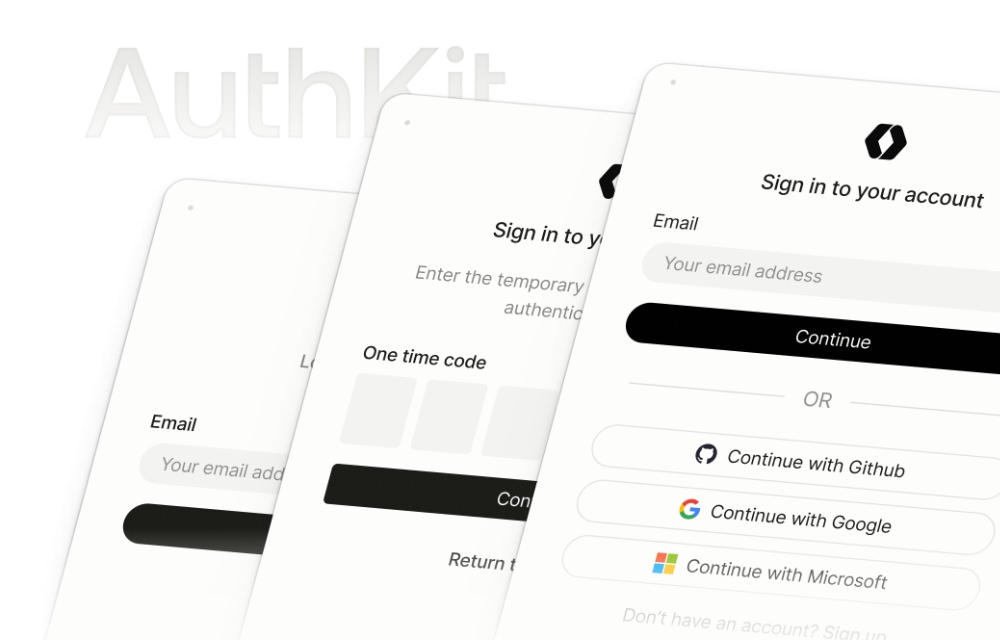
Each of these Starter Kits support GitHub, Google, Microsoft, Apple ID, passkeys, and SSO login via a WorkOS AuthKit. The React and Vue kits use Inertia, TypeScript, and Shadcn UI, while Livewire features Livewire Volt and Flux UI. It’s fully customizable, and can help you streamline your development workflows with modern tools.

Laravel Starter Kits dashboard
HuggingFace Course

The Hugging Face Course is a free, open-source resource that teaches how to use Transformers for natural language processing (NLP) and beyond. It covers key tools like Transformers, Datasets, Tokenizers, and Accelerate, along with the HuggingFace Hub.

All content is open with complete code examples available in the huggingface/notebooks directory in their repository. A great resource for anyone looking to get started with LLMs and other NLP models.

Hugging Face Course interface
LibreChat.ai

LibreChat is an open-source AI chat platform that supports multiple AI providers, custom APIs, and advanced features like multimodal chat, conversation search, and prompt templates.

With a ChatGPT-inspired UI, customization options, and authentication support (OAuth, Azure AD). It’s a great tool if you’re looking to build chatbots and conversational AI applications.

LibreChat AI platform
ReactBits

ReactBits is an open-source library of animated React components that you can use to improve your web applications with dynamic UI elements. It provides over 60 customizable components, including text animations and interactive elements.

It supports JavaScript libraries, TypeScript, vanilla CSS, and Tailwind CSS. A great resource for adding flair to your projects without starting from scratch.

ReactBits animated components
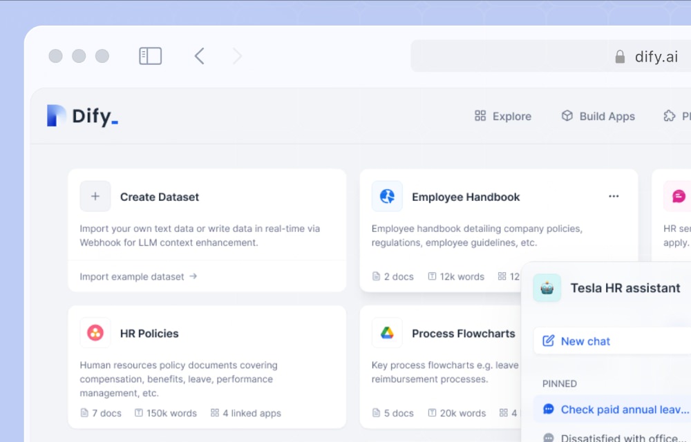
Dify

Dify is an open-source platform for developing LLM applications. It provides AI workflow orchestration, RAG pipelines, and agent-based automation.

On top of that, it also provides a visual interface for designing AI workflows, managing models, and monitoring performance. A great tool for building and deploying LLM applications with ease.

Dify LLM platform
VLLM

vLLM is an open-source library that optimizes LLM inference for better efficiency, scalability, and memory management. Supporting models like Llama 3 and Mistral, it simplifies deployment with an OpenAI-compatible API and seamless Hugging Face integration.

It makes high-performance AI serving more accessible and cost-effective.

vLLM optimization tool
RAGFLow

RAGFlow is an open-source tool that helps AI answer questions more accurately by pulling information from documents, tables, and other data sources. It uses a smart system to understand complex queries, refine searches, and provide reliable answers with citations.

With features like no-code editing and database integration, It makes it easier for you to build AI-powered search tools without needing advanced technical skills.

RAGFlow document search
Cherry Studio

Cherry Studio is a multi-platform AI desktop application that allows you to switch between different Large Language Models (LLMs) like OpenAI, Gemini, and Anthropic while also supporting local models like DeepSeek R1.

It comes with some notable features including document processing, translation, and data visualization tools. A great all-in-one solution for working with LLMs, and a must-have for anyone working with AI models on a regular basis.

Cherry Studio AI app
CopilotKit

CopilotKit is an open-source framework that simplifies adding AI-powered features to your apps. You can add things like in-app chatbots, AI suggestions, and automated actions.

It seamlessly integrates with Large Language Models through the React component it provides. With CopilotKit, you can improve your applications with AI without building everything from scratch.

CopilotKit AI framework
SuperAGI

SuperAGI is an open-source framework for building and managing autonomous AI agents. It provides a user-friendly interface, workflow management tools, and SDKs for Python and Node.js.

So it’s easier to integrate it into your existing Python and Node.js applications. An overall powerful tool that simplifies AI agent development, and that can help you create smarter, more efficient automation.

SuperAGI agent platform
DocsGPT

DocsGPT is an open-source AI tool designed to help users find reliable answers from documentation while avoiding AI hallucinations. It supports various file formats including PDF and DOCX, and integrates with web data sources for comprehensive information retrieval.

The tool works with LLMs like Ollama and offers pre-built chat widgets, bots, and secure Kubernetes deployment. It’s particularly useful for building AI-powered search engines and chatbots for private documents, making documentation access more efficient and accurate.

DocsGPT documentation tool
WebLLM

WebLLM is a JavaScript package that enables in-browser AI chat functionality without requiring server support. It leverages WebGPU for hardware acceleration, ensuring smooth performance even for complex AI tasks.

Supporting models like Llama, Mistral, and Gemma, WebLLM enables real-time streaming responses. With its plug-and-play setup available via NPM, Yarn, or CDN, and support for Web Workers, it’s an ideal solution for developers looking to build AI applications that run directly in the browser.

WebLLM browser AI
MastraAI

MastraAI is an open-source TypeScript framework developed by the creators of Gatsby, designed for building AI applications and workflows. It provides comprehensive tools for AI agent development and workflow graphs.

The framework supports Retrieval-Augmented Generation (RAG) and deployment on platforms like Vercel and Cloudflare Workers. With built-in evaluation metrics for assessing AI output, MastraAI is an ideal choice for developers seeking to integrate AI into applications with minimal complexity.

MastraAI workflow tool
HuggingFace Chat UI

The HuggingFace Chat UI is an open-source chat interface built with SvelteKit that powers the HuggingChat app. It serves as a customizable reference UI for generative AI applications, supporting open-source models like Falcon and BLOOM.

With minimal setup requirements, users can deploy it on Hugging Face Spaces. The UI boasts key features including multi-turn conversation history, function calling, web search, multimodal support, and optional OpenID authentication, making it a versatile solution for AI chat applications.

HuggingFace Chat UI
LangFuse

LangFuse is an open-source tool designed to help developers build and improve AI applications powered by LLMs. It provides comprehensive tracking of AI model performance, including cost and speed metrics, while helping identify and fix issues.

The tool also facilitates AI prompt management, version testing, and user feedback collection. With compatibility for popular AI frameworks like LangChain and LlamaIndex, LangFuse is a valuable resource for teams aiming to create more reliable AI-powered applications.

LangFuse LLM monitor
BentoML

BentoML is an open-source tool that simplifies the process of turning machine learning models into production-ready APIs. It handles complex tasks like packaging, deployment, and scaling, allowing developers to focus on building AI applications.

Whether deploying on cloud platforms or local environments, BentoML streamlines the process, making it faster and more accessible. This tool is particularly valuable for teams looking to deploy machine learning models without getting bogged down in infrastructure complexities.

BentoML model deployment
WrenAI

WrenAI is an open-source AI agent designed to help data teams interact with their data using natural language. It enables users to generate Text-to-SQL queries, charts, reports, and business intelligence insights with ease.

The tool integrates with multiple LLMs, including OpenAI, Google Gemini, Anthropic, and DeepSeek. By eliminating the need to learn complex query languages or BI tools, WrenAI makes data analysis more accessible to teams of all technical levels.

WrenAI data analysis
Steel Browser

Steel Browser is an open-source tool designed to simplify the development of AI applications that interact with the web. It provides a secure, containerized browser environment with full control using tools like Puppeteer and Playwright.

The browser supports session management, proxies, Chrome extensions, and includes anti-detection features. These capabilities make tasks like web scraping, automation, and AI-driven browsing more reliable and easier to implement.

Steel Browser automation
LIDA

Microsoft LIDA is an AI-powered tool that automates the generation of visualizations and infographics. It’s compatible with any programming language and can perform data summarization, chart suggestion, and infographic creation.

Beyond creating new visuals, LIDA can also enhance existing ones. As a powerful data visualization tool, it enables users to transform raw data into clear, meaningful visuals without requiring extensive technical expertise.

Microsoft LIDA visualizer

The post Fresh Resources for Web Designers and Developers (March 2025) appeared first on Hongkiat.

Nite Riot: Minimalism Gets a Wild Side

Original Source: https://tympanus.net/codrops/2025/04/15/nite-riot-minimalism-gets-a-wild-side/

When a client like Nite Riot walks through the (digital) door, you don’t play it safe. You go all in.

Native Design Tokens: The Foundation of Consistent, Scalable, Open Design

Original Source: https://tympanus.net/codrops/2025/04/14/native-design-tokens-the-foundation-of-consistent-scalable-open-design/

Explore how structured design decisions are transforming design systems through Penpot’s native tokens, real-world workflows, and open standards.

Black Mirror's fictional retro game Thronglets is now real. Here's how to play it

Original Source: https://www.creativebloq.com/entertainment/movies-tv-shows/black-mirrors-fictional-retro-game-thronglets-is-now-real-heres-how-to-play-it

The Netflix series breaks the fourth wall again.