Look Closer, Inspiration Lies Everywhere (February 2025 Wallpapers Edition)
Original Source: https://smashingmagazine.com/2025/01/desktop-wallpaper-calendars-february-2025/
As designers, we are always on the lookout for some fresh inspiration, and well, sometimes, the best inspiration lies right in front of us. With that in mind, we embarked on our wallpapers adventure more than thirteen years ago. The idea: to provide you with a new batch of beautiful and inspiring desktop wallpapers every month. This February is no exception, of course.
The wallpapers in this post were designed by artists and designers from across the globe and come in versions with and without a calendar for February 2025. And since so many unique wallpaper designs have seen the light of day since we first started this monthly series, we also added some February “oldies but goodies” from our archives to the collection — so maybe you’ll spot one of your almost-forgotten favorites in here, too?
This wallpapers post wouldn’t have been possible without the kind support of our wonderful community who tickles their creativity each month anew to keep the steady stream of wallpapers flowing. So, a huge thank-you to everyone who shared their designs with us this time around! If you too would like to get featured in one of our next wallpapers posts, please don’t hesitate to submit your design. We can’t wait to see what you’ll come up with! Happy February!
You can click on every image to see a larger preview.
We respect and carefully consider the ideas and motivation behind each and every artist’s work. This is why we give all artists the full freedom to explore their creativity and express emotions and experience through their works. This is also why the themes of the wallpapers weren’t anyhow influenced by us but rather designed from scratch by the artists themselves.
Submit your wallpaper design! ??
Feeling inspired? We are always looking for creative talent and would love to feature your desktop wallpaper in one of our upcoming posts. Join in ↬
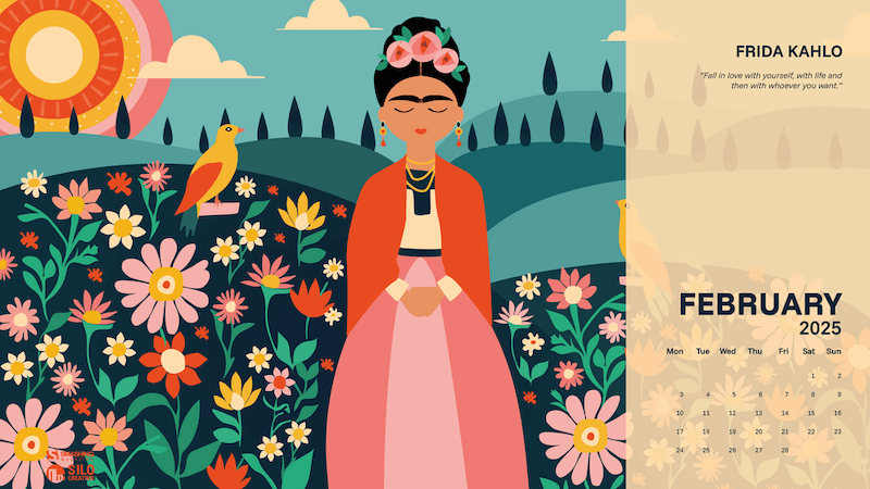
Fall In Love With Yourself
“We dedicate February to Frida Kahlo to illuminate the world with color. Fall in love with yourself, with life and then with whoever you want.” — Designed by Veronica Valenzuela from Spain.
preview
with calendar: 640×480, 800×480, 1024×768, 1280×720, 1280×800, 1440×900, 1600×1200, 1920×1080, 1920×1440, 2560×1440
without calendar: 640×480, 800×480, 1024×768, 1280×720, 1280×800, 1440×900, 1600×1200, 1920×1080, 1920×1440, 2560×1440
Sweet Valentine
“Everyone deserves a sweet Valentine’s Day, no matter their relationship status. It’s a day to celebrate love in all its forms — self-love, friendship, and the love we share with others. A little kindness or just a little chocolate can make anyone feel special, reminding us that everyone is worthy of love and joy.” — Designed by LibraFire from Serbia.

preview
with calendar: 640×480, 800×480, 800×600, 1024×768, 1024×1024, 1152×864, 1280×720, 1280×800, 1280×960, 1280×1024, 1400×1050, 1440×900, 1600×1200, 1680×1050, 1680×1200, 1920×1080, 1920×1200, 1920×1440, 2560×1440
without calendar: 640×480, 800×480, 800×600, 1024×768, 1024×1024, 1152×864, 1280×720, 1280×800, 1280×960, 1280×1024, 1400×1050, 1440×900, 1600×1200, 1680×1050, 1680×1200, 1920×1080, 1920×1200, 1920×1440, 2560×1440
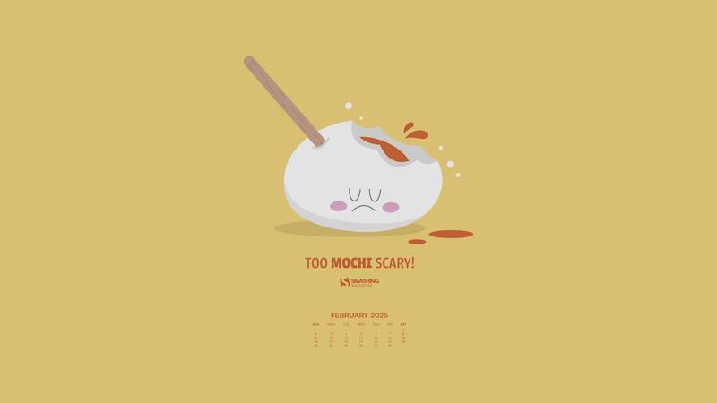
Mochi
Designed by Ricardo Gimenes from Spain.
preview
with calendar: 640×480, 800×480, 800×600, 1024×768, 1024×1024, 1152×864, 1280×720, 1280×800, 1280×960, 1280×1024, 1366×768, 1400×1050, 1440×900, 1600×1200, 1680×1050, 1680×1200, 1920×1080, 1920×1200, 1920×1440, 2560×1440, 3840×2160
without calendar: 640×480, 800×480, 800×600, 1024×768, 1024×1024, 1152×864, 1280×720, 1280×800, 1280×960, 1280×1024, 1366×768, 1400×1050, 1440×900, 1600×1200, 1680×1050, 1680×1200, 1920×1080, 1920×1200, 1920×1440, 2560×1440, 3840×2160
Cyber Voodoo
Designed by Ricardo Gimenes from Spain.

preview
with calendar: 640×480, 800×480, 800×600, 1024×768, 1024×1024, 1152×864, 1280×720, 1280×800, 1280×960, 1280×1024, 1366×768, 1400×1050, 1440×900, 1600×1200, 1680×1050, 1680×1200, 1920×1080, 1920×1200, 1920×1440, 2560×1440, 3840×2160
without calendar: 640×480, 800×480, 800×600, 1024×768, 1024×1024, 1152×864, 1280×720, 1280×800, 1280×960, 1280×1024, 1366×768, 1400×1050, 1440×900, 1600×1200, 1680×1050, 1680×1200, 1920×1080, 1920×1200, 1920×1440, 2560×1440, 3840×2160
Pop Into Fun
“Blow the biggest bubbles, chew on the sweetest memories, and let your inner kid shine! Celebrate Bubble Gum Day with us and share the joy of every POP!” — Designed by PopArt Studio from Serbia.

preview
with calendar: 320×480, 640×480, 800×480, 800×600, 1024×768, 1024×1024, 1152×864, 1280×720, 1280×800, 1280×960, 1280×1024, 1400×1050, 1440×900, 1600×1200, 1680×1050, 1680×1200, 1920×1080, 1920×1200, 1920×1440, 2560×1440
without calendar: 320×480, 640×480, 800×480, 800×600, 1024×768, 1024×1024, 1152×864, 1280×720, 1280×800, 1280×960, 1280×1024, 1400×1050, 1440×900, 1600×1200, 1680×1050, 1680×1200, 1920×1080, 1920×1200, 1920×1440, 2560×1440
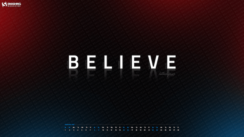
Believe
“‘Believe’ reminds us to trust ourselves and our potential. It fuels faith, even in challenges, and drives us to pursue our dreams. Belief unlocks strength to overcome obstacles and creates possibilities. It’s the foundation of success, starting with the courage to believe.” — Designed by Hitesh Puri from Delhi, India.
preview
with calendar: 1280×800, 1280×960, 1280×1024, 1366×768, 1400×1050, 1440×900, 1600×1200, 1680×1050, 1680×1200, 1920×1080, 1920×1200, 1920×1440, 2560×1440
without calendar: 1280×800, 1280×960, 1280×1024, 1366×768, 1400×1050, 1440×900, 1600×1200, 1680×1050, 1680×1200, 1920×1080, 1920×1200, 1920×1440, 2560×1440
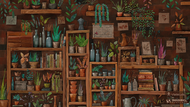
Plants
“I wanted to draw some very cozy place, both realistic and cartoonish, filled with little details. A space with a slightly unreal atmosphere that some great shops or cafes have. A mix of plants, books, bottles, and shelves seemed like a perfect fit. I must admit, it took longer to draw than most of my other pictures! But it was totally worth it. Watch the making-of.” — Designed by Vlad Gerasimov from Georgia.
preview
without calendar: 800×480, 800×600, 1024×600, 1024×768, 1152×864, 1280×720, 1280×800, 1280×960, 1280×1024, 1366×768, 1400×1050, 1440×900, 1440×960, 1600×900, 1600×1200, 1680×1050, 1680×1200, 1920×1080, 1920×1200, 1920×1440, 2560×1440, 2560×1600, 2880×1800, 3072×1920, 3840×2160, 5120×2880
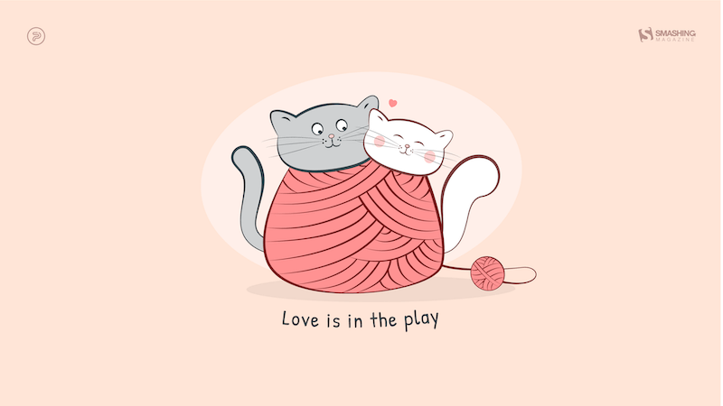
Love Is In The Play
“Forget Lady and the Tramp and their spaghetti kiss, ’cause Snowflake and Cloudy are enjoying their bliss. The cold and chilly February weather made our kitties knit themselves a sweater. Knitting and playing, the kitties tangled in the yarn and fell in love in your neighbor’s barn.” — Designed by PopArt Studio from Serbia.
preview
without calendar: 320×480, 640×480, 800×480, 800×600, 1024×768, 1024×1024, 1152×864, 1280×720, 1280×800, 1280×960, 1280×1024, 1366×768, 1400×1050, 1440×900, 1600×1200, 1680×1050, 1680×1200, 1920×1080, 1920×1200, 1920×1440, 2560×1440
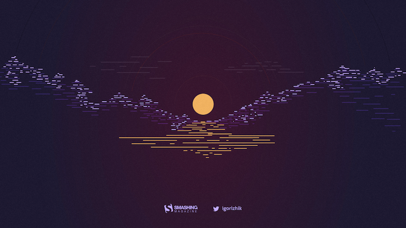
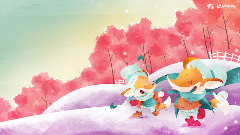
Farewell, Winter
“Although I love winter (mostly because of the fun winter sports), there are other great activities ahead. Thanks, winter, and see you next year!” — Designed by Igor Izhik from Canada.
preview
without calendar: 1024×768, 1024×1024, 1152×864, 1280×720, 1280×800, 1280×960, 1280×1024, 1400×1050, 1440×900, 1600×1200, 1680×1050, 1680×1200, 1920×1080, 1920×1200, 1920×1440, 2560×1440, 2560×1600
True Love
Designed by Ricardo Gimenes from Spain.
preview
without calendar: 640×480, 800×480, 800×600, 1024×768, 1024×1024, 1152×864, 1280×720, 1280×800, 1280×960, 1280×1024, 1366×768, 1400×1050, 1440×900, 1600×1200, 1680×1050, 1680×1200, 1920×1080, 1920×1200, 1920×1440, 2560×1440, 3840×2160
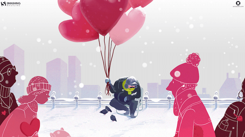
Balloons
Designed by Xenia Latii from Germany.
preview
without calendar: 320×480, 640×480, 800×480, 800×600, 1024×768, 1152×864, 1280×720, 1280×800, 1280×960, 1280×1024, 1366×768, 1400×1050, 1440×900, 1600×1200, 1680×1050, 1680×1200, 1920×1080, 1920×1200, 1920×1440, 2560×1440
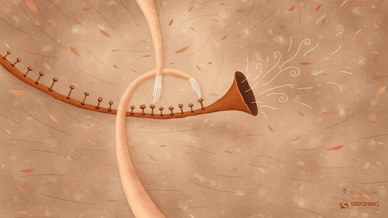
Magic Of Music
Designed by Vlad Gerasimov from Georgia.
preview
without calendar: 800×480, 800×600, 1024×600, 1024×768, 1152×864, 1280×720, 1280×800, 1280×960, 1280×1024, 1366×768, 1400×1050, 1440×900, 1440×960, 1600×900, 1600×1200, 1680×1050, 1680×1200, 1920×1080, 1920×1200, 1920×1440, 2560×1440, 2560×1600, 2880×1800, 3072×1920, 3840×2160, 5120×2880
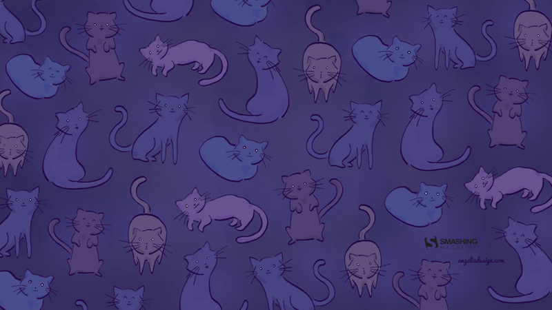
Febpurrary
“I was doodling pictures of my cat one day and decided I could turn it into a fun wallpaper — because a cold, winter night in February is the perfect time for staying in and cuddling with your cat, your significant other, or both!” — Designed by Angelia DiAntonio from Ohio, USA.
preview
without calendar: 320×480, 800×480, 1024×768, 1024×1024, 1152×864, 1280×720, 1280×1024, 1366×768, 1400×1050, 1440×900, 1600×1200, 1680×1200, 1920×1080, 1920×1200, 1920×1440, 2560×1440
Dog Year Ahead
Designed by PopArt Studio from Serbia.

preview
without calendar: 320×480, 640×480, 800×480, 800×600, 1024×768, 1024×1024, 1152×864, 1280×720, 1280×800, 1280×960, 1280×1024, 1366×768, 1400×1050, 1440×900, 1600×1200, 1680×1050, 1680×1200, 1920×1080, 1920×1200, 1920×1440, 2560×1440
Good Times Ahead
Designed by Ricardo Gimenes from Spain.
preview
without calendar: 640×480, 800×480, 800×600, 1024×768, 1024×1024, 1152×864, 1280×720, 1280×800, 1280×960, 1280×1024, 1366×768, 1400×1050, 1440×900, 1600×1200, 1680×1050, 1680×1200, 1920×1080, 1920×1200, 1920×1440, 2560×1440, 3840×2160
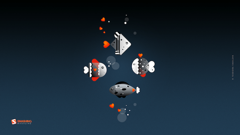
Romance Beneath The Waves
“The 14th of February is just around the corner. And love is in the air, water, and everywhere!” — Designed by Teodora Vasileva from Bulgaria.
preview
without calendar: 640×480, 800×480, 800×600, 1024×768, 1280×720, 1280×960, 1280×1024, 1400×1050, 1680×1050, 1680×1200, 1920×1080, 1920×1200, 1920×1440, 2560×1440
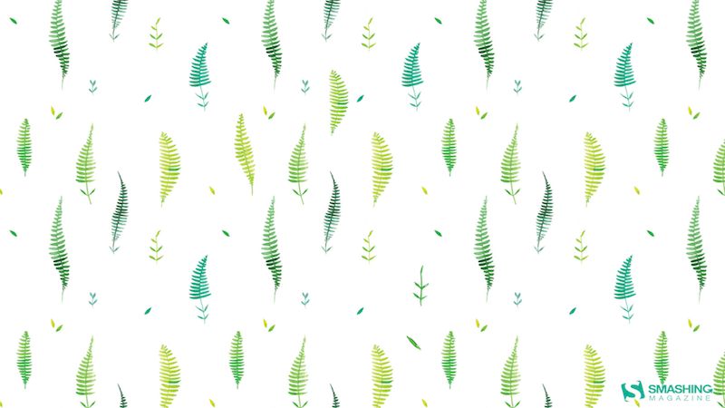
February Ferns
Designed by Nathalie Ouederni from France.
preview
without calendar: 320×480, 1024×768, 1280×1024, 1440×900, 1680×1200, 1920×1200, 2560×1440
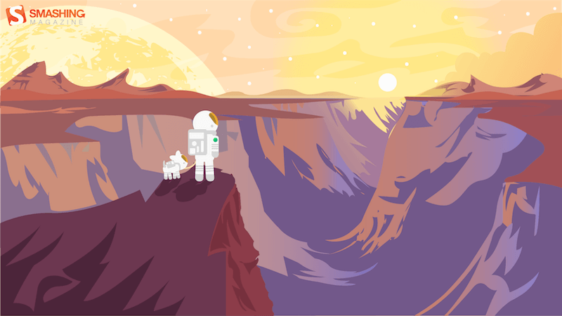
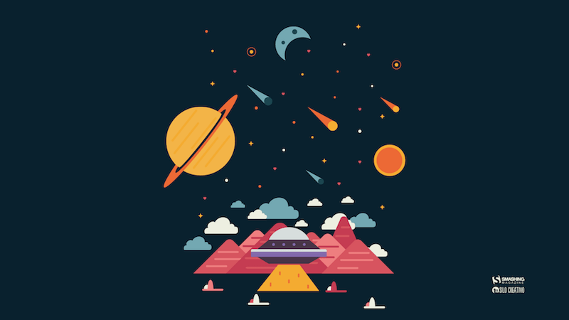
The Great Beyond
Designed by Lars Pauwels from Belgium.
preview
without calendar: 800×600, 1024×768, 1024×1024, 1152×864, 1280×720, 1280×800, 1280×960, 1280×1024, 1366×768, 1400×1050, 1440×900, 1600×1200, 1680×1050, 1680×1200, 1920×1080, 1920×1200, 1920×1440, 2560×1440
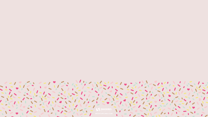
It’s A Cupcake Kind Of Day
“Sprinkles are fun, festive, and filled with love… especially when topped on a cupcake! Everyone is creative in their own unique way, so why not try baking some cupcakes and decorating them for your sweetie this month? Something homemade, like a cupcake or DIY craft, is always a sweet gesture.” — Designed by Artsy Cupcake from the United States.
preview
without calendar: 320×480, 640×480, 800×600, 1024×768, 1152×864, 1280×800, 1280×1024, 1366×768, 1440×900, 1600×1200, 1680×1200, 1920×1200, 1920×1440, 2560×1440
Snow
Designed by Elise Vanoorbeek from Belgium.
preview
without calendar: <a href=”https://smashingmagazine.com/files/wallpapers/feb-15/snow/nocal/feb-15-snow-nocal-1024×768.jpg title=”Snow – 1024×768″>1024×768, <a href=”https://smashingmagazine.com/files/wallpapers/feb-15/snow/nocal/feb-15-snow-nocal-1152×864.jpg title=”Snow – 1152×864″>1152×864, <a href=”https://smashingmagazine.com/files/wallpapers/feb-15/snow/nocal/feb-15-snow-nocal-1280×720.jpg title=”Snow – 1280×720″>1280×720, <a href=”https://smashingmagazine.com/files/wallpapers/feb-15/snow/nocal/feb-15-snow-nocal-1280×800.jpg title=”Snow – 1280×800″>1280×800, <a href=”https://smashingmagazine.com/files/wallpapers/feb-15/snow/nocal/feb-15-snow-nocal-1280×960.jpg title=”Snow – 1280×960″>1280×960, <a href=”https://smashingmagazine.com/files/wallpapers/feb-15/snow/nocal/feb-15-snow-nocal-1440×900.jpg title=”Snow – 1440×900″>1440×900, <a href=”https://smashingmagazine.com/files/wallpapers/feb-15/snow/nocal/feb-15-snow-nocal-1600×1200.jpg title=”Snow – 1600×1200″>1600×1200, <a href=”https://smashingmagazine.com/files/wallpapers/feb-15/snow/nocal/feb-15-snow-nocal-1680×1050.jpg title=”Snow – 1680×1050″>1680×1050, <a href=”https://smashingmagazine.com/files/wallpapers/feb-15/snow/nocal/feb-15-snow-nocal-1920×1080.jpg title=”Snow – 1920×1080″>1920×1080, <a href=”https://smashingmagazine.com/files/wallpapers/feb-15/snow/nocal/feb-15-snow-nocal-1920×1200.jpg title=”Snow – 1920×1200″>1920×1200, <a href=”https://smashingmagazine.com/files/wallpapers/feb-15/snow/nocal/feb-15-snow-nocal-1920×1440.jpg title=”Snow – 1920×1440″>1920×1440, <a href=”https://smashingmagazine.com/files/wallpapers/feb-15/snow/nocal/feb-15-snow-nocal-2560×1440.jpg title=”Snow – 2560×1440″>2560×1440, <a href=”https://smashingmagazine.com/files/wallpapers/feb-15/snow/nocal/feb-15-snow-nocal-1366×768.jpg title=”Snow – 1366×768″>1366×768, <a href=”https://smashingmagazine.com/files/wallpapers/feb-15/snow/nocal/feb-15-snow-nocal-2880×1800.jpg title=”Snow – 2880×1800″>2880×1800
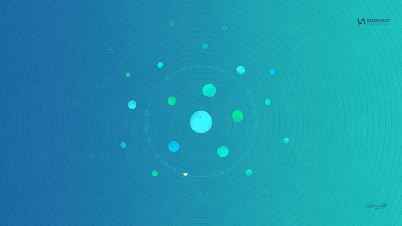
Share The Same Orbit!
“I prepared a simple and chill layout design for February called ‘Share The Same Orbit!’ which suggests to share the love orbit.” — Designed by Valentin Keleti from Romania.
preview
without calendar: 320×480, 640×480, 800×480, 800×600, 1024×768, 1024×1024, 1152×864, 1280×720, 1280×800, 1280×960, 1280×1024, 1366×768, 1400×1050, 1440×900, 1600×1200, 1680×1050, 1680×1200, 1920×1080, 1920×1200, 1920×1440, 2560×1440
Dark Temptation
“A dark romantic feel, walking through the city on a dark and rainy night.” — Designed by Matthew Talebi from the United States.
preview
without calendar: 1400×1050, 1440×900, 1600×1200, 1680×1050, 1680×1200, 1920×1080, 1920×1200, 1920×1440, 2560×1440
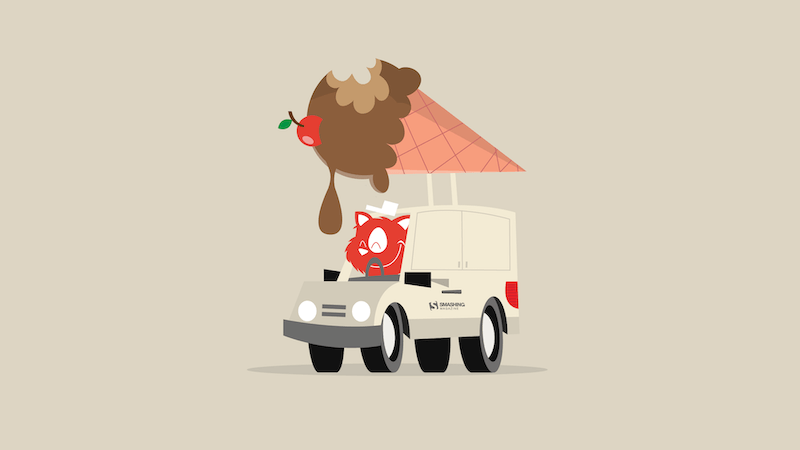
Ice Cream Love
“My inspiration for this wallpaper is the biggest love someone can have in life: the love for ice cream!” — Designed by Zlatina Petrova from Bulgaria.
preview
without calendar: 320×480, 640×480, 800×480, 800×600, 1024×768, 1024×1024, 1152×864, 1280×720, 1280×800, 1280×960, 1280×1024, 1400×1050, 1440×900, 1600×1200, 1680×1050, 1680×1200, 1920×1080, 1920×1200, 1920×1440, 2560×1440
Lovely Day
Designed by Ricardo Gimenes from Spain.
preview
without calendar: 320×480, 640×480, 800×480, 800×600, 1024×768, 1024×1024, 1152×864, 1280×720, 1280×800, 1280×960, 1280×1024, 1366×768, 1400×1050, 1440×900, 1600×1200, 1680×1050, 1680×1200, 1920×1080, 1920×1200, 1920×1440, 2560×1440
Time Thief
“Who has stolen our time? Maybe the time thief, so be sure to enjoy the other 28 days of February.” — Designed by Colorsfera from Spain.

preview
without calendar: 320×480, 640×480, 800×480, 800×600, 1024×768, 1024×1024, 1152×864, 1260×1440, 1280×720, 1280×800, 1280×960, 1280×1024, 1400×1050, 1440×900, 1600×1200, 1680×1050, 1680×1200, 1920×1080, 1920×1200, 1920×1440, 2560×1440
In Another Place At The Same Time
“February is the month of love par excellence, but also a different month. Perhaps because it is shorter than the rest or because it is the one that makes way for spring, but we consider it a special month. It is a perfect month to make plans because we have already finished the post-Christmas crunch and we notice that spring and summer are coming closer. That is why I like to imagine that maybe in another place someone is also making plans to travel to unknown lands.” — Designed by Verónica Valenzuela from Spain.
preview
without calendar: 800×480, 1024×768, 1152×864, 1280×800, 1280×960, 1440×900, 1680×1200, 1920×1080, 2560×1440
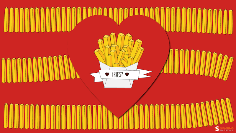
French Fries
Designed by Doreen Bethge from Germany.
preview
without calendar: 320×480, 640×480, 800×480, 800×600, 1024×768, 1024×1024, 1152×864, 1280×720, 1280×800, 1280×960, 1280×1024, 1366×768, 1400×1050, 1440×900, 1600×1200, 1680×1050, 1680×1200, 1920×1080, 1920×1200, 1920×1440, 2560×1440
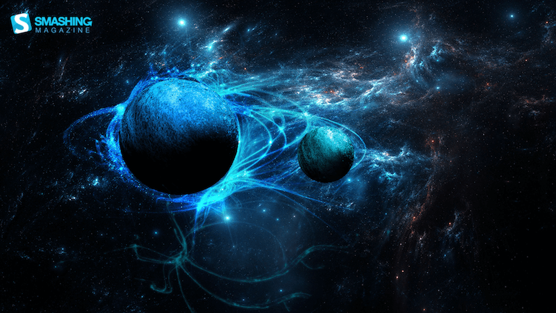
Frozen Worlds
“A view of two frozen planets, lots of blue tints.” — Designed by Rutger Berghmans from Belgium.
preview
without calendar: 1280×800, 1366×768, 1440×900, 1680×1050, 1920×1080, 1920×1200, 2560×1440
Out There, There’s Someone Like You
“I am a true believer that out there in this world there is another person who is just like us, the problem is to find her/him.” — Designed by Maria Keller from Mexico.

preview
without calendar: 320×480, 640×480, 640×1136, 750×1334, 800×480, 800×600, 1024×768, 1024×1024, 1152×864, 1242×2208, 1280×720, 1280×800, 1280×960, 1280×1024, 1366×768, 1400×1050, 1440×900, 1600×1200, 1680×1050, 1680×1200, 1920×1080, 1920×1200, 1920×1440, 2560×1440, 2880×1800
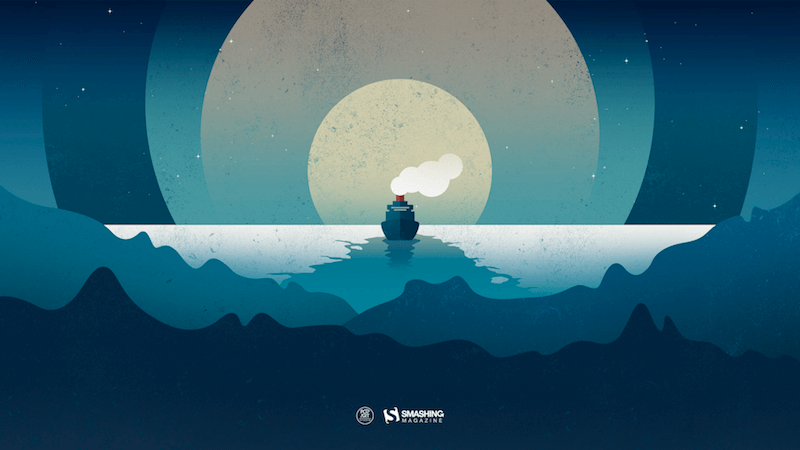
“Greben” Icebreaker
“Danube is Europe’s second largest river, connecting ten different countries. In these cold days, when ice paralyzes rivers and closes waterways, a small but brave icebreaker called Greben (Serbian word for ‘reef’) seems stronger than winter. It cuts through the ice on Đerdap gorge (Iron Gate) — the longest and biggest gorge in Europe — thus helping the production of electricity in the power plant. This is our way to give thanks to Greben!” — Designed by PopArt Studio from Serbia.
preview
without calendar: 320×480, 640×480, 800×480, 800×600, 1024×768, 1024×1024, 1152×864, 1280×720, 1280×800, 1280×960, 1280×1024, 1366×768, 1400×1050, 1440×900, 1600×1200, 1680×1050, 1680×1200, 1920×1080, 1920×1200, 1920×1440, 2560×1440
Sharp
“I was sick recently and squinting through my blinds made a neat effect with shapes and colors.” — Designed by Dylan Baumann from Omaha, NE.
preview
without calendar: 320×480, 640×480, 800×600, 1024×1024, 1280×1024, 1600×1200, 1680×1200, 1920×1080, 1920×1440, 2560×1440
On The Light Side
Designed by Ricardo Gimenes from Spain.

preview
without calendar: 640×480, 800×480, 800×600, 1024×768, 1024×1024, 1152×864, 1280×720, 1280×800, 1280×960, 1280×1024, 1366×768, 1400×1050, 1440×900, 1600×1200, 1680×1050, 1680×1200, 1920×1080, 1920×1200, 1920×1440, 2560×1440, 3840×2160, printable PDF
Febrewery
“I live in Madison, WI, which is famous for its breweries. Wisconsin even named their baseball team “The Brewers.” If you like beer, brats, and lots of cheese, it’s the place for you!” — Designed by Danny Gugger from the United States.

preview
without calendar: 320×480, 1020×768, 1280×800, 1280×1024, 1136×640, 2560×1440
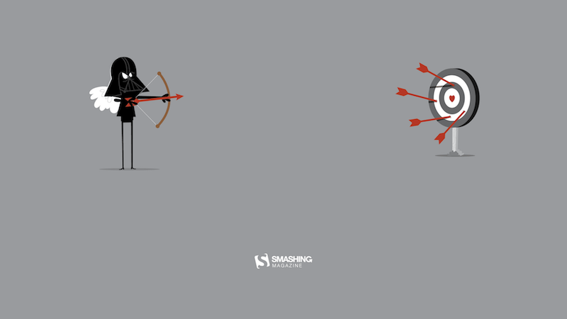
Love Angel Vader
“Valentine’s Day is coming? Noooooooooooo!” — Designed by Ricardo Gimenes from Spain.
preview
without calendar: 320×480, 640×960, 1024×768, 1024×1024, 1280×800, 1280×960, 1280×1024, 1366×768, 1400×1050, 1440×900, 1600×1050, 1600×1200, 1680×1050, 1680×1200, 1920×1080, 1920×1200, 1920×1440, 2560×1440, 2880×1800
Made In Japan
“See the beautiful colors, precision, and the nature of Japan in one picture.” — Designed by Fatih Yilmaz from the Netherlands.
preview
without calendar: 1280×720, 1280×960, 1400×1050, 1440×900, 1600×1200, 1680×1200, 1920×1080, 1920×1440, 2560×1440, 3840×2160
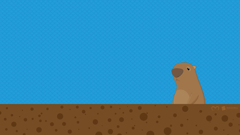
Groundhog
“The Groundhog emerged from its burrow on February 2. If it is cloudy, then spring will come early, but if it is sunny, the groundhog will see its shadow, will retreat back into its burrow, and the winter weather will continue for six more weeks.” — Designed by Oscar Marcelo from Portugal.
preview
without calendar: 1280×720, 1280×800, 1280×960, 1280×1024, 1440×900, 1680×1050, 1920×1080, 1920×1200, 2560×1440

