Original Source: https://smashingmagazine.com/2025/10/ai-ux-achieve-more-with-less/
I have made a lot of mistakes with AI over the past couple of years. I have wasted hours trying to get it to do things it simply cannot do. I have fed it terrible prompts and received terrible output. And I have definitely spent more time fighting with it than I care to admit.
But I have also discovered that when you stop treating AI like magic and start treating it like what it actually is (a very enthusiastic intern with zero life experience), things start to make more sense.
Let me share what I have learned from working with AI on real client projects across user research, design, development, and content creation.
How To Work With AI
Here is the mental model that has been most helpful for me. Treat AI like an intern with zero experience.
An intern fresh out of university has lots of enthusiasm and qualifications, but no real-world experience. You would not trust them to do anything unsupervised. You would explain tasks in detail. You would expect to review their work multiple times. You would give feedback and ask them to try again.
This is exactly how you should work with AI.
The Basics Of Prompting
I am not going to pretend to be an expert. I have just spent way too much time playing with this stuff because I like anything shiny and new. But here is what works for me.
Define the role.
Start with something like “Act as a user researcher” or “Act as a copywriter.” This gives the AI context for how to respond.
Break it into steps.
Do not just say “Analyze these interview transcripts.” Instead, say “I want you to complete the following steps. One, identify recurring themes. Two, look for questions users are trying to answer. Three, note any objections that come up. Four, output a summary of each.”
Define success.
Tell it what good looks like. “I am looking for a report that gives a clear indication of recurring themes and questions in a format I can send to stakeholders. Do not use research terminology because they will not understand it.”
Make it think.
Tell it to think deeply about its approach before responding. Get it to create a way to test for success (known as a rubric) and iterate on its work until it passes that test.
Here is a real prompt I use for online research:
Act as a user researcher. I would like you to carry out deep research online into [brand name]. In particular, I would like you to focus on what people are saying about the brand, what the overall sentiment is, what questions people have, and what objections people mention. The goal is to create a detailed report that helps me better understand the brand perception.
Think deeply about your approach before carrying out the research. Create a rubric for the report to ensure it is as useful as possible. Keep iterating until the report scores extremely high on the rubric. Only then, output the report.
That second paragraph (the bit about thinking deeply and creating a rubric), I basically copy and paste into everything now. It is a universal way to get better output.
Learn When To Trust It
You should never fully trust AI. Just like you would never fully trust an intern you have only just met.
To begin with, double-check absolutely everything. Over time, you will get a sense of when it is losing its way. You will spot the patterns. You will know when to start a fresh conversation because the current one has gone off the rails.
But even after months of working with it daily, I still check its work. I still challenge it. I still make it cite sources and explain its reasoning.
The key is that even with all that checking, it is still faster than doing it yourself. Much faster.
Using AI For User Research
This is where AI has genuinely transformed my work. I use it constantly for five main things.
Online Research
I love AI for this. I can ask it to go and research a brand online. What people are saying about it, what questions they have, what they like, and what frustrates them. Then do the same for competitors and compare.
This would have taken me days of trawling through social media and review sites. Now it takes minutes.
I recently did this for an e-commerce client. I wanted to understand what annoyed people about the brand and what they loved. I got detailed insights that shaped the entire conversion optimization strategy. All from one prompt.
Analyzing Interviews And Surveys
I used to avoid open-ended questions in surveys. They were such a pain to review. Now I use them all the time because AI can analyze hundreds of text responses in seconds.
For interviews, I upload the transcripts and ask it to identify recurring themes, questions, and requests. I always get it to quote directly from the transcripts so I can verify it is not making things up.
The quality is good. Really good. As long as you give it clear instructions about what you want.
Making Sense Of Data
I am terrible with spreadsheets. Put me in front of a person and I can understand them. Put me in front of data, and my eyes glaze over.
AI has changed that. I upload spreadsheets to ChatGPT and just ask questions. “What patterns do you see?” “Can you reformat this?” “Show me this data in a different way.”
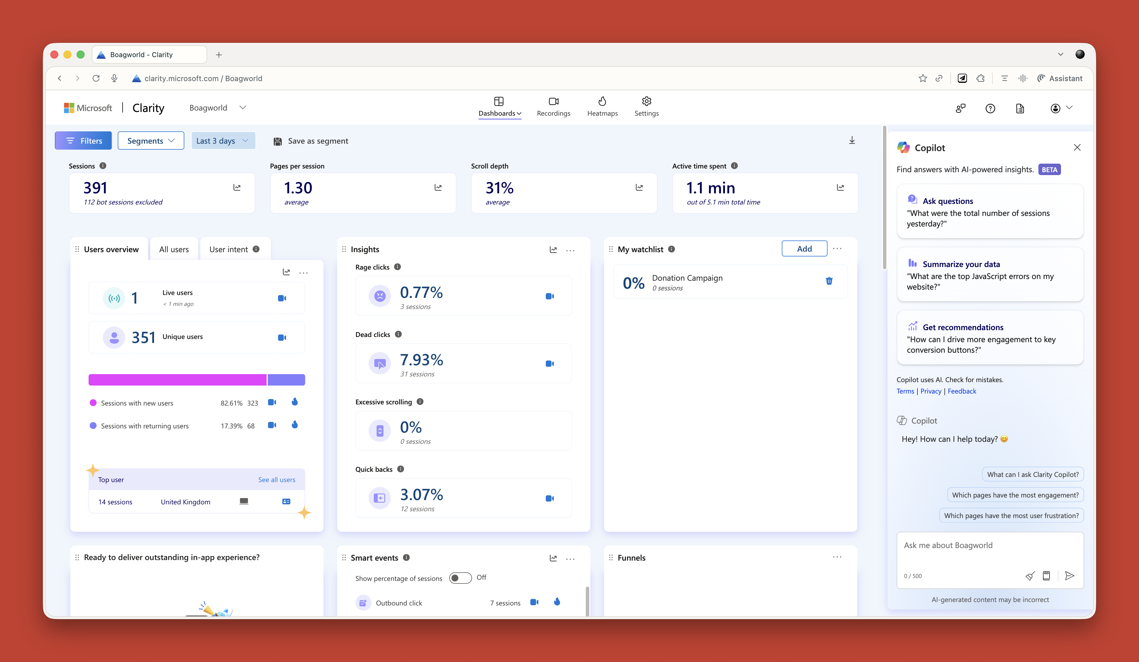
Microsoft Clarity now has Copilot built in, so you can ask it questions about your analytics data. Triple Whale does the same for e-commerce sites. These tools are game changers if you struggle with data like I do.
Research Projects
This is probably my favorite technique. In ChatGPT and Claude, you can create projects. In other tools, they are called spaces. Think of them as self-contained folders where everything you put in is available to every conversation in that project.
When I start working with a new client, I create a project and throw everything in. Old user research. Personas. Survey results. Interview transcripts. Documentation. Background information. Site copy. Anything I can find.
Then I give it custom instructions. Here is one I use for my own business:
Act as a business consultant and marketing strategy expert with good copywriting skills. Your role is to help me define the future of my UX consultant business and better articulate it, especially via my website. When I ask for your help, ask questions to improve your answers and challenge my assumptions where appropriate.
I have even uploaded a virtual board of advisors (people I wish I had on my board) and asked AI to research how they think and respond as they would.
Now I have this project that knows everything about my business. I can ask it questions. Get it to review my work. Challenge my thinking. It is like having a co-worker who never gets tired and has a perfect memory.
I do this for every client project now. It is invaluable.
Creating Personas
AI has reinvigorated my interest in personas. I had lost heart in them a bit. They took too long to create, and clients always said they already had marketing personas and did not want to pay to do them again.
Now I can create what I call functional personas. Personas that are actually useful to people who work in UX. Not marketing fluff about what brands people like, but real information about what questions they have and what tasks they are trying to complete.
I upload all my research to a project and say:
Act as a user researcher. Create a persona for [audience type]. For this persona, research the following information: questions they have, tasks they want to complete, goals, states of mind, influences, and success metrics. It is vital that all six criteria are addressed in depth and with equal vigor.
The output is really good. Detailed. Useful. Based on actual data rather than pulled out of thin air.
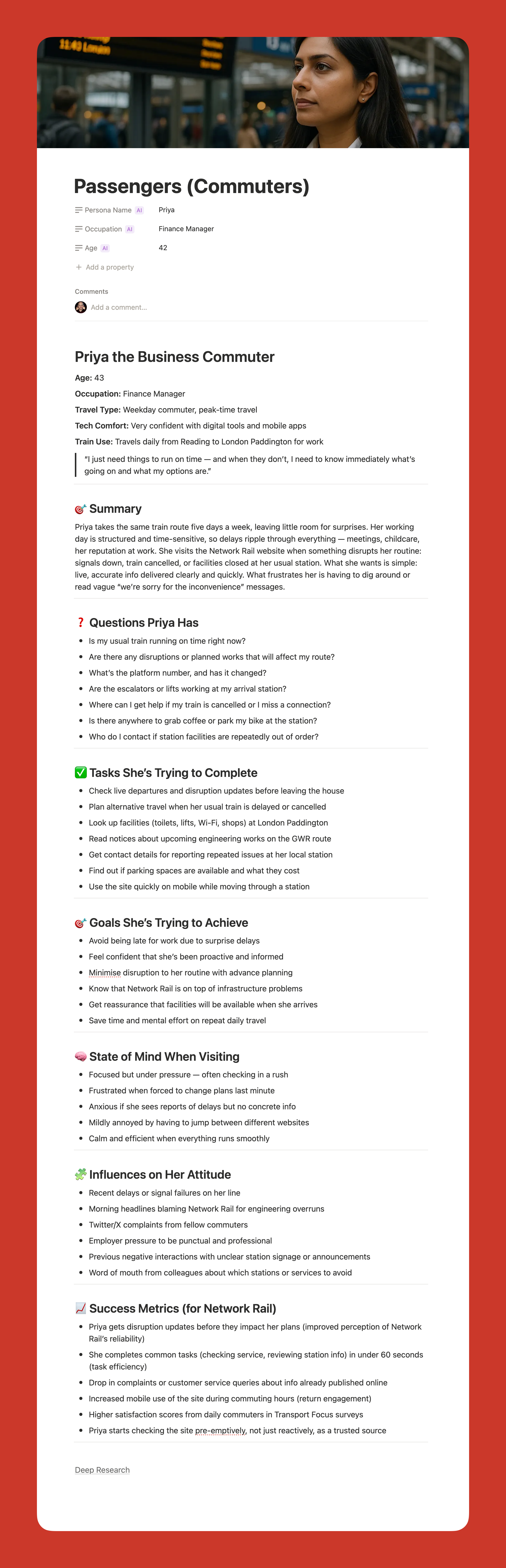
Here is my challenge to anyone who thinks AI-generated personas are somehow fake. What makes you think your personas are so much better? Every persona is a story of a hypothetical user. You make judgment calls when you create personas, too. At least AI can process far more information than you can and is brilliant at pattern recognition.
My only concern is that relying too heavily on AI could disconnect us from real users. We still need to talk to people. We still need that empathy. But as a tool to synthesize research and create reference points? It is excellent.
Using AI For Design And Development
Let me start with a warning. AI is not production-ready. Not yet. Not for the kind of client work I do, anyway.
Three reasons why:
It is slow if you want something specific or complicated.
It can be frustrating because it gets close but not quite there.
And the quality is often subpar. Unpolished code, questionable design choices, that kind of thing.
But that does not mean it is not useful. It absolutely is. Just not for final production work.
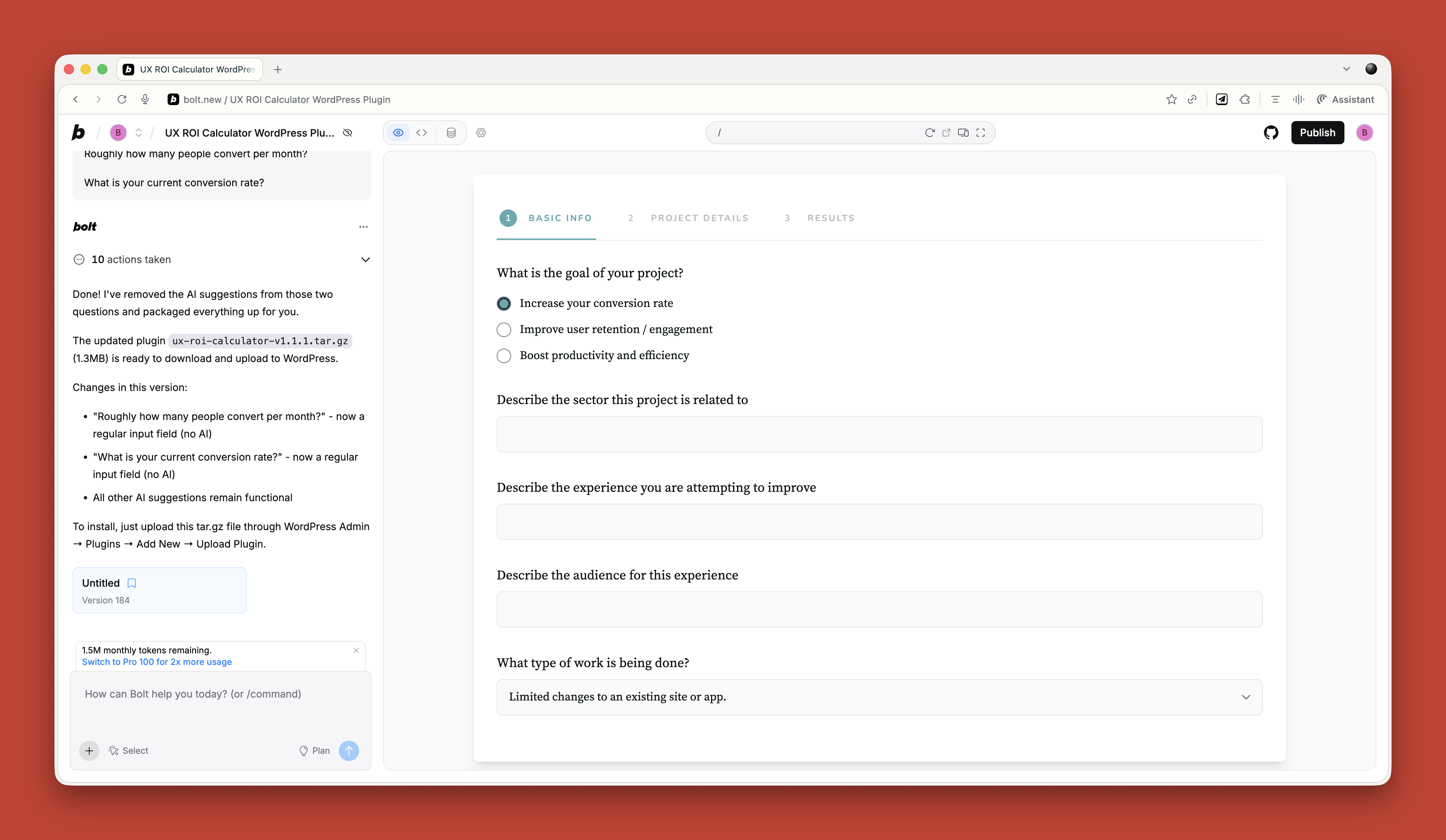
Functional Prototypes
If you are not too concerned with matching a specific design, AI can quickly prototype functionality in ways that are hard to match in Figma. Because Figma is terrible at prototyping functionality. You cannot even create an active form field in a Figma prototype. It’s the biggest thing people do online other than click links — and you cannot test it.
Tools like Relume and Bolt can create quick functional mockups that show roughly how things work. They are great for non-designers who just need to throw together a prototype quickly. For designers, they can be useful for showing developers how you want something to work.
But you can spend ages getting them to put a hamburger menu on the right side of the screen. So use them for quick iteration, not pixel-perfect design.
Small Coding Tasks
I use AI constantly for small, low-risk coding work. I am not a developer anymore. I used to be, back when dinosaurs roamed the earth, but not for years.
AI lets me create the little tools I need. A calculator that calculates the ROI of my UX work. An app for running top task analysis. Bits of JavaScript for hiding elements on a page. WordPress plugins for updating dates automatically.
Just before running my workshop on this topic, I needed a tool to create calendar invites for multiple events. All the online services wanted £16 a month. I asked ChatGPT to build me one. One prompt. It worked. It looked rubbish, but I did not care. It did what I needed.
If you are a developer, you should absolutely be using tools like Cursor by now. They are invaluable for pair programming with AI. But if you are not a developer, just stick with Claude or Bolt for quick throwaway tools.
Reviewing Existing Services
There are some great tools for getting quick feedback on existing websites when budget and time are tight.
If you need to conduct a UX audit, Wevo Pulse is an excellent starting point. It automatically reviews a website based on personas and provides visual attention heatmaps, friction scores, and specific improvement recommendations. It generates insights in minutes rather than days.
Now, let me be clear. This does not replace having an experienced person conduct a proper UX audit. You still need that human expertise to understand context, make judgment calls, and spot issues that AI might miss. But as a starting point to identify obvious problems quickly? It is a great tool. Particularly when budget or time constraints mean a full audit is not on the table.
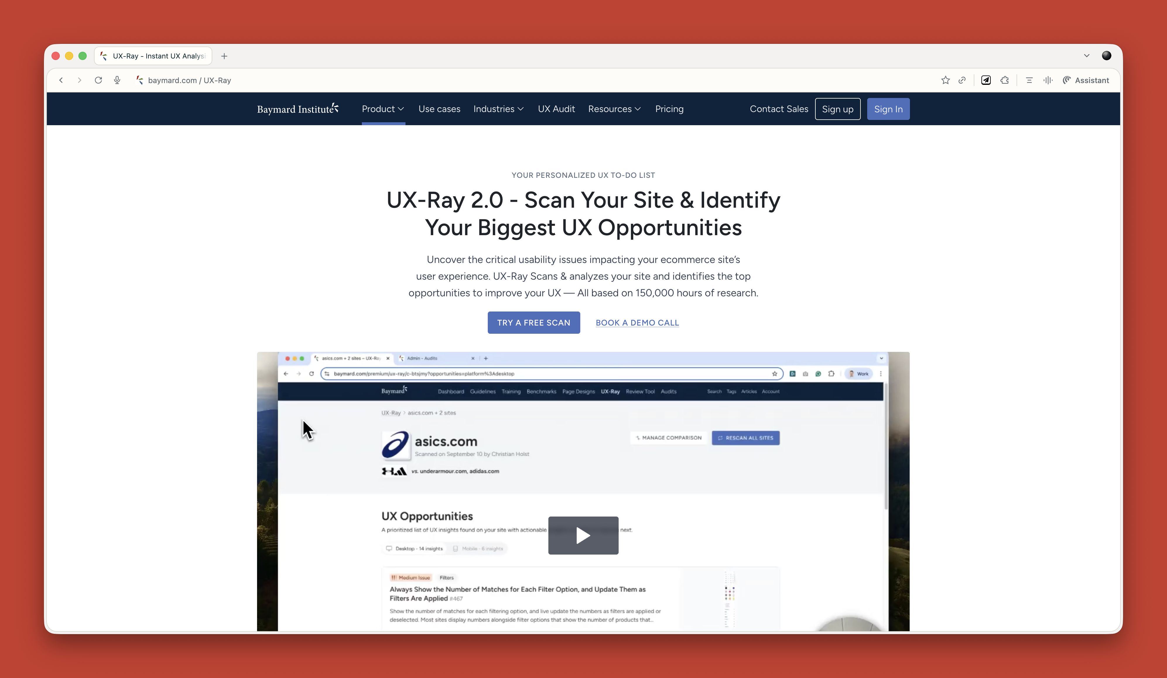
For e-commerce sites, Baymard has UX Ray, which analyzes flaws based on their massive database of user research.
Checking Your Designs
Attention Insight has taken thousands of hours of eye-tracking studies and trained AI on it to predict where people will look on a page. It has about 90 to 96 percent accuracy.
You upload a screenshot of your design, and it shows you where attention is going. Then you can play around with your imagery and layout to guide attention to the right place.
It is great for dealing with stakeholders who say, “People won’t see that.” You can prove they will. Or equally, when stakeholders try to crowd the interface with too much stuff, you can show them attention shooting everywhere.
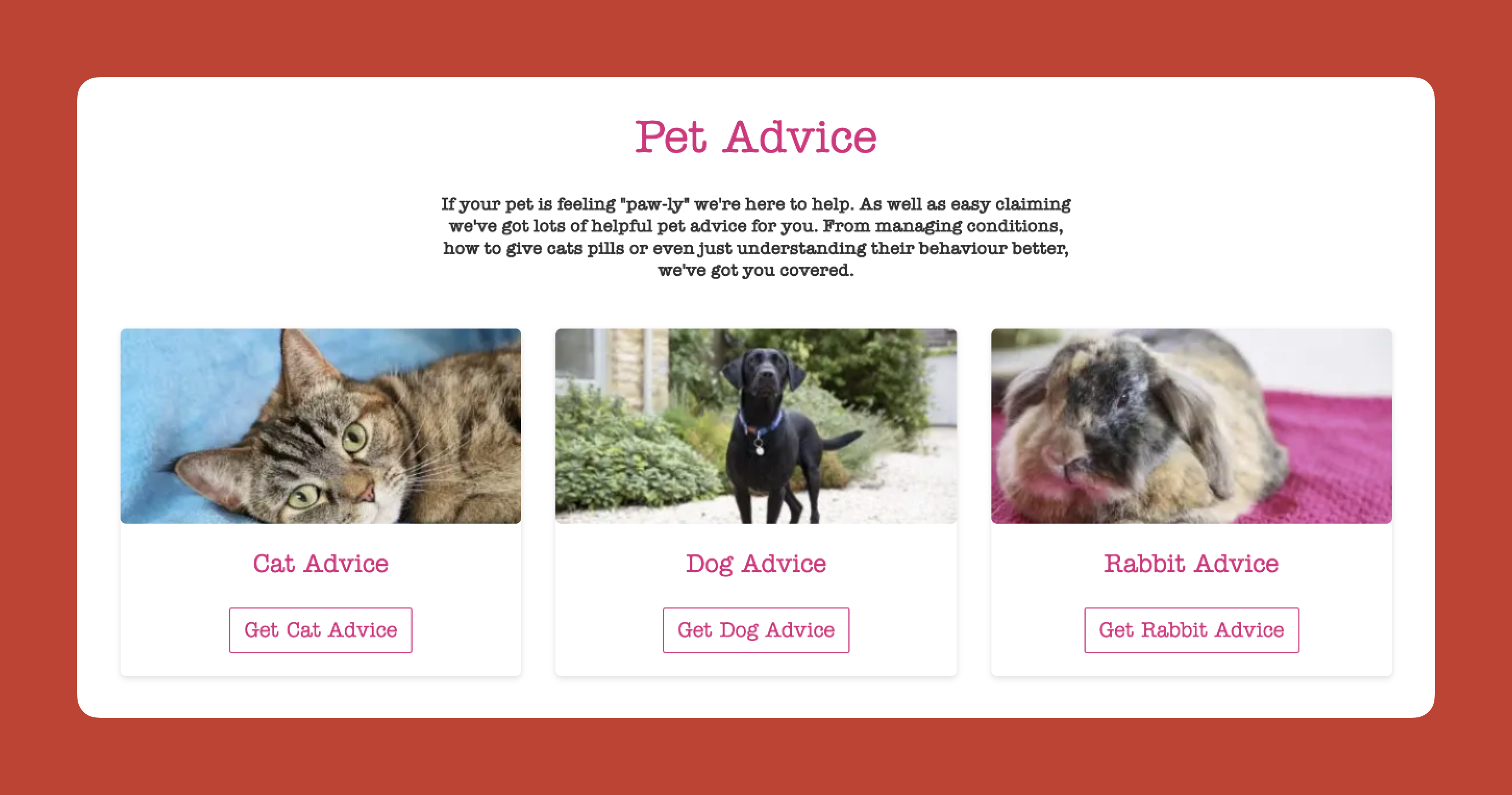
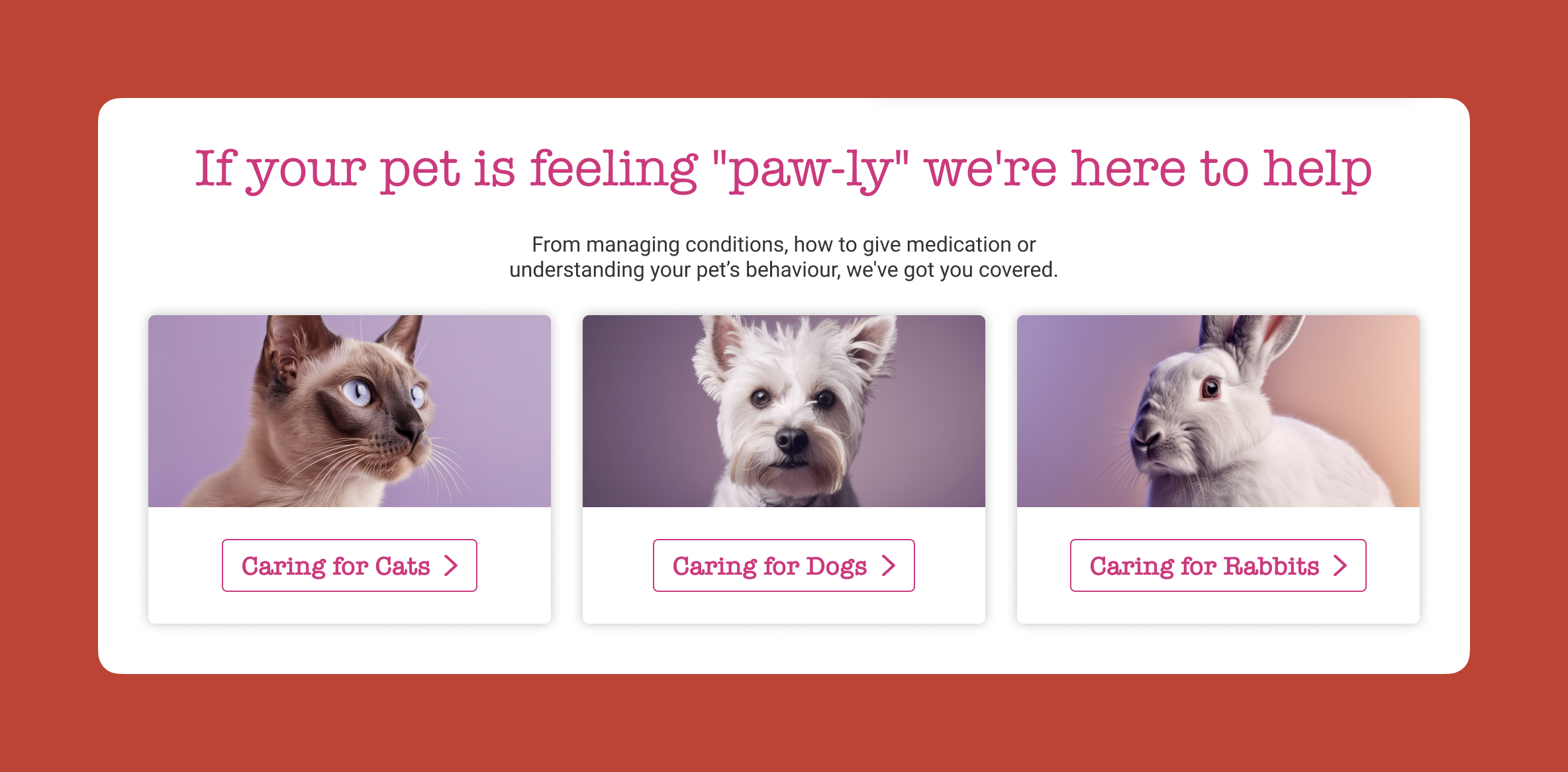
I use this constantly. Here is a real example from a pet insurance company. They had photos of a dog, cat, and rabbit for different types of advice. The dog was far from the camera. The cat was looking directly at the camera, pulling all the attention. The rabbit was half off-frame. Most attention went to the cat’s face.
I redesigned it using AI-generated images, where I could control exactly where each animal looked. Dog looking at the camera. Cat looking right. Rabbit looking left. All the attention drawn into the center. Made a massive difference.
Creating The Perfect Image
I use AI all the time for creating images that do a specific job. My preferred tools are Midjourney and Gemini.
I like Midjourney because, visually, it creates stunning imagery. You can dial in the tone and style you want. The downside is that it is not great at following specific instructions.
So I produce an image in Midjourney that is close, then upload it to Gemini. Gemini is not as good at visual style, but it is much better at following instructions. “Make the guy reach here” or “Add glasses to this person.” I can get pretty much exactly what I want.
The other thing I love about Midjourney is that you can upload a photograph and say, “Replicate this style.” This keeps consistency across a website. I have a master image I use as a reference for all my site imagery to keep the style consistent.
Using AI For Content
Most clients give you terrible copy. Our job is to improve the user experience or conversion rate, and anything we do gets utterly undermined by bad copy.
I have completely stopped asking clients for copy since AI came along. Here is my process.
Build Everything Around Questions
Once I have my information architecture, I get AI to generate a massive list of questions users will ask. Then I run a top task analysis where people vote on which questions matter most.
I assign those questions to pages on the site. Every page gets a list of the questions it needs to answer.
Get Bullet Point Answers From Stakeholders
I spin up the content management system with a really basic theme. Just HTML with very basic formatting. I go through every page and assign the questions.
Then I go to my clients and say: “I do not want you to write copy. Just go through every page and bullet point answers to the questions. If the answer exists on the old site, copy and paste some text or link to it. But just bullet points.”
That is their job done. Pretty much.
Let AI Draft The Copy
Now I take control. I feed ChatGPT the questions and bullet points and say:
Act as an online copywriter. Write copy for a webpage that answers the question [question]. Use the following bullet points to answer that question: [bullet points]. Use the following guidelines: Aim for a ninth-grade reading level or below. Sentences should be short. Use plain language. Avoid jargon. Refer to the reader as you. Refer to the writer as us. Ensure the tone is friendly, approachable, and reassuring. The goal is to [goal]. Think deeply about your approach. Create a rubric and iterate until the copy is excellent. Only then, output it.
I often upload a full style guide as well, with details about how I want it to be written.
The output is genuinely good. As a first draft, it is excellent. Far better than what most stakeholders would give me.
Stakeholders Review And Provide Feedback
That goes into the website, and stakeholders can comment on it. Once I get their feedback, I take the original copy and all their comments back into ChatGPT and say, “Rewrite using these comments.”
Job done.
The great thing about this approach is that even if stakeholders make loads of changes, they are making changes to a good foundation. The overall quality still comes out better than if they started with a blank sheet.
It also makes things go smoother because you are not criticizing their content, where they get defensive. They are criticizing AI content.
Tools That Help
If your stakeholders are still giving you content, Hemingway Editor is brilliant. Copy and paste text in, and it tells you how readable and scannable it is. It highlights long sentences and jargon. You can use this to prove to clients that their content is not good web copy.
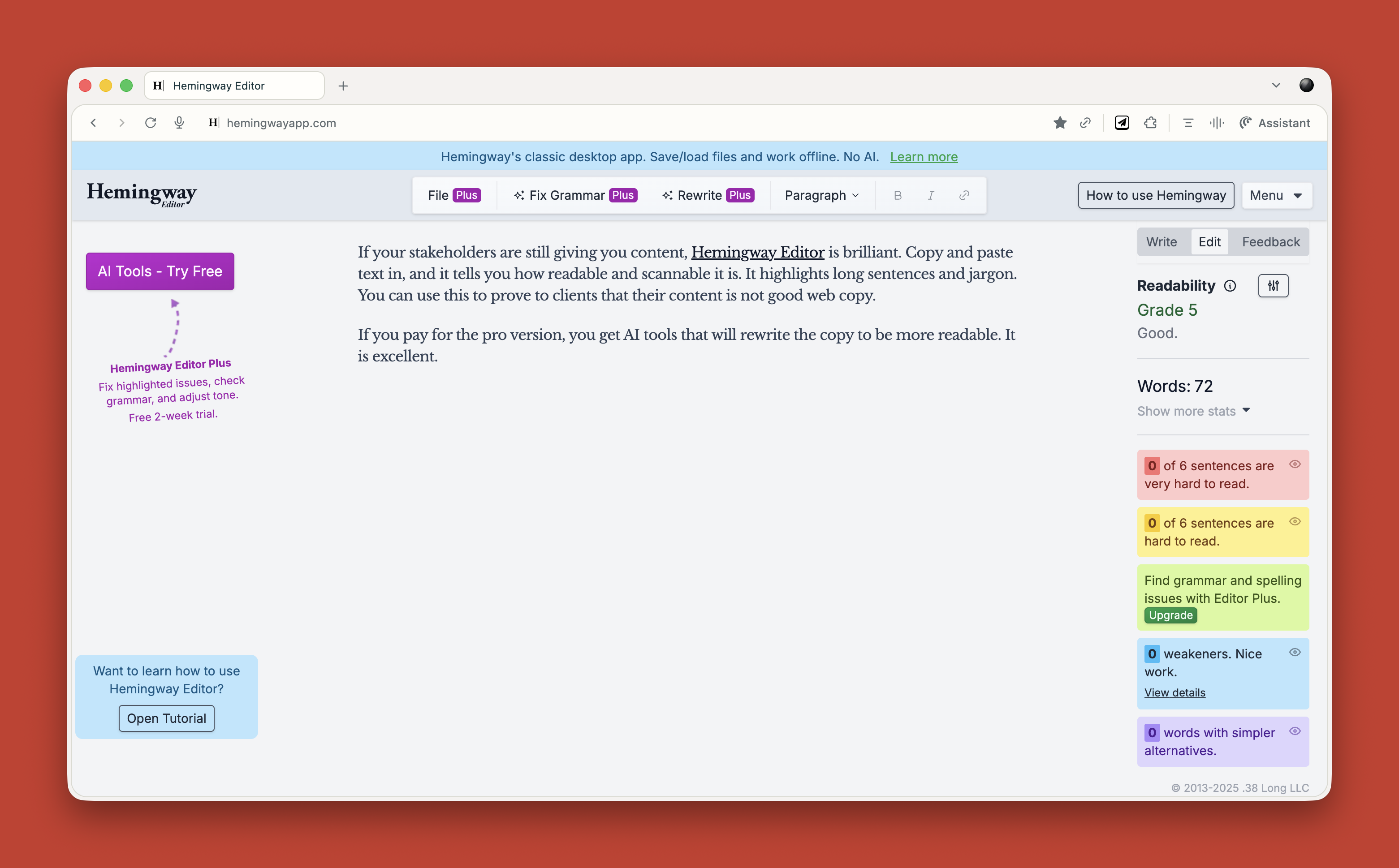
If you pay for the pro version, you get AI tools that will rewrite the copy to be more readable. It is excellent.
What This Means for You
Let me be clear about something. None of this is perfect. AI makes mistakes. It hallucinates. It produces bland output if you do not push it hard enough. It requires constant checking and challenging.
But here is what I know from two years of using this stuff daily. It has made me faster. It has made me better. It has freed me up to do more strategic thinking and less grunt work.
A report that would have taken me five days now takes three hours. That is not an exaggeration. That is real.
Overall, AI probably gives me a 25 to 33 percent increase in what I can do. That is significant.
Your value as a UX professional lies in your ideas, your questions, and your thinking. Not your ability to use Figma. Not your ability to manually review transcripts. Not your ability to write reports from scratch.
AI cannot innovate. It cannot make creative leaps. It cannot know whether its output is good. It cannot understand what it is like to be human.
That is where you come in. That is where you will always come in.
Start small. Do not try to learn everything at once. Just ask yourself throughout your day: Could I do this with AI? Try it. See what happens. Double-check everything. Learn what works and what does not.
Treat it like an enthusiastic intern with zero life experience. Give it clear instructions. Check its work. Make it try again. Challenge it. Push it further.
And remember, it is not going to take your job. It is going to change it. For the better, I think. As long as we learn to work with it rather than against it.