Art Storefronts vs Squarespace: Which is Best for Artists?

Original Source: https://ecommerce-platforms.com/articles/art-storefronts-vs-squarespace

Art Storefronts vs Squarespace: Which is best? Ultimately, it all depends on the type of business you want to run. Squarespace is a straightforward website builder, with beautiful templates, and plenty of handy tools if you want to sell things like courses, memberships, and subscriptions. However, while Squarespace advertises itself as a website builder intended for creators it’s not focused exclusively on artists.

It’s also not the most robust ecommerce platform I’ve ever used. In fact, when you dive in and actually set up an account with Squarespace, you’ll find a lot of missing ecommerce capabilities. There’s no “wish list” feature, the inventory management tools are very basic, and Squarespace doesn’t even have its own dedicated payment processor (though it integrates with others).

Art Storefronts is the only ecommerce solution I’ve seen so far actually designed to help artists promote and sell their products. It’s a specialized solution, combining website design with ecommerce, print-on-demand, and specialized services.

Let’s dive into the comparison.

Quick Verdict

Overall, if you’re looking for a simple website builder with great templates, and flexible selling options, Squarespace is probably the better pick.

It’s definitely more versatile, allowing companies to sell everything from physical products, to services, and subscriptions. It’s also a little easier to navigate, the platform if you’re a complete beginner.

However Art Storefronts is by far the better solution for artists. It has more advanced ecommerce capabilities, a unique print-on-demand solution built-in, and gives you access to specialists who can help you build, optimize, and advertise your store.

Art Storefronts Pros and Cons

Pros 👍
Cons 👎

Pros 👍

Unique print on demand solution built-in
End-to-end support with web design and marketing
Comprehensive lead capture and marketing tools
Unique artist-focused capabilities and merchandising tools
Online and offline selling options
Powerful AI capabilities

Cons 👎

Can be quite expensive
Niche focus (specially designed for artists)
Slightly more complex setup process

Squarespace Pros and Cons

Pros 👍
Cons 👎

Pros 👍

Beautiful range of templates and themes
Very easy to use interface for beginners
Options to sell physical and digital products, and services
Integrated appointment booking tools
Versatile range of integrations
Good SEO performance

Cons 👎

Very few advanced features for artists
Limited inventory management
Basic POD features (through integrations)

Art Storefronts vs Squarespace: Feature Comparison

Both Art Storefronts and Squarespace offer access to website building and ecommerce tools, but they’re very different beneath the surface. Art Storefronts is a comprehensive solution designed specifically to address the needs of artists. Squarespace is more of a catch-all platform that allows you to sell virtually anything, but gives you very few advanced tools.

Website Design Features

Squarespace has an excellent reputation as one of the best website design platforms, and its easy to see why. Not only can you choose from a huge range of professionally-designed templates for your Squarespace store, but you can customize those templates however you like.

Squarespace’s design tools are extremely easy to use, and don’t impose any limitations on how many pages, blogs, or galleries you can create. Plus, if you’re having a hard time building the perfect store, Squarespace allows you to use AI to create a template instead.

However, even though I love Squarespace’s templates and design tools, I do think Art Storefronts is a better website builder overall. It gives you all of the same features as Squarespace, including beautiful, responsive templates you can customize based on your needs.

Beyond that, though, Art Storefronts comes with a few extra features that really take your web design capabilities to the next level. You can create pop-up lead capture tools with marketing automation and user targeting built-in. You can also design augmented reality experiences for customers that allow them to view what your products will look like on their walls.

Although the platform is a little trickier to navigate, Art Storefronts does give you the option to have a team design your store for you. You’d need to upgrade to the Enterprise version of Squarespace, or hire a designer to get the same experience from them.

Ecommerce and Art Selling Features

As I mentioned before, Squarespace is a decent ecommerce platform. It integrates with a range of payment processing solutions. Plus, it allows you to sell virtually any kind of product, from physical and digital products, to subscriptions, memberships, and courses.

If you’re a service-focused business, Squarespace is definitely a good choice, with it’s integrated appointment booking tools. You can also take advantage of some omnichannel sales features, such as the ability to sell on social media, or through a point-of-sale system (with Square).

However, when it comes to actually selling art, Art Storefronts gives you so much more functionality. First, Art Storefronts will actually create your art for you.

While you can integrate with Printful to get a similar experience using SquareSpace, Art Storefront’s print on demand services are much more advanced. They can create framed pieces, canvases, and prints in a wider range of sizes than most POD companies, and even design catalogs for you.

On top of that, you get a bunch of tools from Art Storefronts that help you increase sales, such as:

Art Buyer AI: An intelligent tool that offers insights into your customers.

Unique merchandizing options: Such as live 3D and augmented reality previews, and 360-degree merchandising videos.

Upselling and cross–selling tools: Like automatically suggested bundles, recently viewed product carousels, automated art upsells, and dynamic merch positioning.

In simple terms, Squarespace might be better for selling courses and subscriptions, but it doesn’t hold a candle to Art Storefronts in terms of art selling features.

Marketing and Business Growth

When it comes to marketing and growing your business, Squarespace is a bit of a letdown. It does give you access to a great blogging functionality, so you can invest in content marketing. Plus, the templates you’ll access on Squarespace are optimized for technical SEO.

However, there are no particularly advanced marketing tools. You can create email campaigns (though I’d recommend using a third-party app for this), design trackable links for social media campaigns, and use pop-up and announcement bars on your website. That’s about it.

The best feature Squarespace gives you to grow your business, in my opinion, is the ability to sell subscriptions and memberships to customers.

Again, Art Storefronts is a lot more advanced. It allows you to earn the trust of your customers with 3rd party badges from recommended art associations. There’s an integrated pop-up lead capture tool included on all websites, and you get a SEO-ready blog for content marketing.

There are AI tools like the Art Copilot to help you create personalized marketing campaigns, and an integrated CRM system for tracking customer relationships. Plus, the Art Storefronts team will build entire marketing campaigns for you, as well as providing you with art-selling best practice guides, webinars, courses, and playbooks.

Plus, Art Storefronts allows customers to create favorites lists, share pages with friends via email with a single click, and view products in augmented reality. On top of that, you get access to email marketing tools and integrations with social media platforms.

Art Storefronts vs Squarespace: Pricing and Fees

While Art Storefronts is the more advanced ecommerce solution for artists overall, Squarespace does have an edge from a pricing perspective. The platform follows a simple subscription model, with prices ranging from around $16 to $49 per month.

Notably, you will need at least a “Business” plan to sell through Squarespace, which starts at $23 per month, with transaction fees of 3%. If you want to avoid transaction fees, you’ll need the Commerce Basic ($36 per month) or Advanced ($65 per month) plan.

This pricing does make Squarespace a bit more expensive than some of the other ecommerce platforms I’ve used in the past, but it’s still relatively affordable, particularly for those who would need to access add-ons for other platforms (like Shopify) to sell courses and subscriptions.

The main problem with Art Storefronts is that there aren’t any direct pricing plans to choose from. You can only get a price for the platform when you contact the team and request a demo. They’ll ask you specifically what services and support you’re going to need, and give you a custom quote.

From what I can tell reading other user reviews online, you’ll spend around $3,000+ to set your store up initially, then there are extra monthly fees to pay for hosting and support. There are also hefty fees for a lot of the services you might want to access.

I should note, however, that while the pricing for Art Storefronts might be high, you are getting an enterprise-level experience. If you really want to scale and grow your art business, it could be worth paying a little extra.

Read more:

Squarespace Pricing Plans (2024) – Which Squarespace Pricing Plan Should I Pick?

Squarespace Ecommerce Review (2024) – 11 Pros and Cons of Using Squarespace

Art Storefronts vs Squarespace: The Verdict

Ultimately, if you’re looking for the best ecommerce platform for artists, and you’re not worried about pricing, Art Storefronts is the better choice, hands down. It’s the far more advanced platform, packed with unique tools that will help you to promote, create, and sell more art.

It’s also the better option in terms of customer service and support, offering end-to-end assistance with everything from web design to marketing.

Alternatively, if you’re just looking for an affordable, relatively versatile, and easy-to-use ecommerce platform, without the extra bells and whistles, Squarespace is still a good choice. Personally, though, I’d recommend it more to people selling courses and subscriptions than established artists.

The post Art Storefronts vs Squarespace: Which is Best for Artists? appeared first on Ecommerce Platforms.

If I Was Starting My Career Today: Thoughts After 15 Years Spent In UX Design (Part 2)

Original Source: https://smashingmagazine.com/2024/08/thoughts-after-15-years-spent-ux-design-part2/

In the previous article in my two-part series, I have explained how important it is to start by mastering your design tools, to work on your portfolio (even if you have very little work experience — which is to be expected at this stage), and to carefully prepare for your first design interviews.

If all goes according to plan, and with a little bit of luck, you’ll land your first junior UX job — and then, of course, you’ll be facing more challenges, about which I am about to speak in this second article in my two-part article series.

In Your New Junior UX Job: On the Way to Grow

You have probably heard of the Pareto Rule, which states that 20% of actions provide 80% of the results.

“The Pareto Principle is a concept that specifies that 80% of consequences come from 20% of the causes, asserting an unequal relationship between inputs and outputs. The principle was named after the economist Vilfredo Pareto.”

— “The Pareto Principle, a.k.a. the Pareto Rule”

This means that some of your actions will help you grow much faster than others.

But before we go into the details, let’s briefly consider the junior UX designer path. I think it’s clear that, at first, juniors usually assist other designers with simple but time-consuming tasks. Then, the level of complexity and your responsibilities start increasing, depending on your performance.

So, you got your first design job? Great! Here are a few things you can focus on if you want to be growing at a faster pace.

Chase For Challenges

The simple but slow way to go is to do your work and then wait until your superiors notice how good you are and start giving you more complex tasks. The problem is that people focus on themselves too much.

So, to “cut some corners,” you need to actively look for challenges. It’s scary, I know, but remember, people who invented any new groundbreaking UX approach or a new framework you see in books and manuals now used their intuition first. You have the whole World Wide Web full of articles and lectures about that. So, define the skill you want to develop, spend a day reading about this topic, find a real problem, and practice. Then, share what you did and get some feedback. After a few iterations, I bet you will be assigned the first real task for your practice!

Use Interfaces Consciously

Take the time to look again at the screenshot of the Amazon website (from Part One):

User interfaces didn’t appear in their present form right from the start. Instead, they evolved to their current state over the span of many years. And you all were part of their evolution, albeit passively — you registered on different websites, reset your passwords quite a few times, clicked onboarding screens, filled out short and long web forms, used search, and so on.

In your design work, all tasks (or 99% of them, at least at the beginning) will be based on those UX patterns. You don’t need to reinvent the bicycle; you only need to remember what you already know and pay attention to the details while using the interfaces of the apps on your smartphone and on your computer. Ask yourself:

Why was this designed this way?
What is not clear enough for me as a user?
What is thought out well and what is not?

All of today’s great design solutions were built based on common sense and then documented so that other people can learn how to re-use this knowledge. Develop your own “common sense” skill every day by being a careful observer and by living your life consciously. Notice the patterns of good design, try to understand and memorize them, and then implement and rethink them in your own work.

I can also highly recommend the Smart Interface Design Patterns course with Vitaly Friedman. It provides guidelines and best practices for common components in modern interfaces. Inventing a new solution for every problem takes time, and too often, it’s just unnecessary. Instead, we can rely on bulletproof design patterns to avoid issues down the line. This course helps with just that. In the course, you will study hundreds of hand-picked examples, from complex navigation to filters, tables, and forms, and you will work on actual real-life challenges.

Learn How to Present Your Work

The ability to convey complex thoughts and ideas in the form of clear sentences defines how effectively you will be able to interact with other people.

This is a core work skill — a skill that you’ll be actually using your whole life, and not only in your work. I have written about this topic in much detail previously:

“Good communication is about sharing your ideas as clearly as possible.”

— “Effective Communication For Everyday Meetings” (Smashing Magazine)

In my article, I have described all the general principles that apply to effective communication, with the most important being: to develop a skill, you need to practice.

As a quick exercise, try telling your friends about the work you do and not to be boring while explaining the details. You will feel that you are on the right track if they do not try to change the topic and instead ask you additional questions!

Gather Feedback

Don’t wait for your yearly review to hear about what you were doing right and wrong. Ask people for feedback and suggestions, and ask them often.

To help them start, first, tell them about your weak side and ask them to tell you their own impressions. Try encouraging them to expand their input and ask for recommendations on how you could fix your weaknesses. Don’t forget to tell them when you are trying to apply their suggestions in practice. After all, these people helped you become better, so be thankful.

Learn Business

I see a lot of designers trying to apply all of their experience to every project, and they often complain that it doesn’t work — customers refuse to follow the entire classical UX process, such as defining User Personas, creating the Information Architecture (IA), outlining the customer journey map, and so on. Sometimes, it happens because clients don’t have the time and budget for it, or they don’t see the value because the designer can’t explain it in a proper way.

But remember that many great products were built without using all of today’s available and tested UX approaches &mdahs; this doesn’t mean those approaches are useless. But initially, there was only common sense and many attempts to get better results, and only then did someone describe something as a working approach and specify all the details. So, before trying to apply any of these UX techniques, think about what you need to achieve. Is there any other way to get there within your time and budget?

Learn how the business works. Talk to customers in business language and communicate the value you create and not the specific approach, framework, or tool that you’ll be using.

“Good UX design is where value comes into the picture. We add value when we transform a product or service from delivering a poor experience to providing a good experience.”

— “The Value of Great UX,” by Jared Spool

Learn How to Make Interfaces Nice-looking

Yes, user experience should be first, but let’s be honest — we also love nice things! The same goes for your customers; they can’t always see the UX part of your work but can always say whether the interface is good-looking. So, learn the composition and color theory, use elegant illustrations and icons, learn typography, and always strive to make your work visually appealing. Some would say that it’s not so important, but trust me, it is.

As an exercise, try to copy the design of a few beautifully looking interfaces. Take a look at an interface screen, then close it and try to make a copy of it from memory. When you are done, compare the two and then make a few more adjustments in order to have as close a copy of the interface as possible. Try to understand why the original was built the way it is. I bet this process of reproducing an interface will help you understand many things you haven’t been noticing before.

Save the People’s Time and Efforts

Prepare to get some new tasks in advance. Create a list of questions, and don’t forget to ask about the deadlines. Align your plan and the number of iterations so people know precisely what and when to expect from you. Be curious (but not annoying) by asking or sending questions every few hours (but try to first search for the answers online). Even if you don’t find the exact answer, it’ll help you formulate the right questions better and get a better view of the “big picture.” Remember, one day, you will get a task directly from the customer, so fetching the data you need to complete tasks correctly is an excellent skill to develop.

Structurize Your Knowledge and Create a Learning Plan

When you are just beginning to learn, too many articles about UX design will look like absolute “must-reads” to you. But you will drown in the information if you try to read them all in no particular order. Better, instead of just trying to read everything, try first to find a mentor who will help you build a learning plan and will advise you along the way.

Another good way to start is to complete a solid UX online course. If you can’t, take the learning program of any popular UX course out there and research the topics from the course’s list one by one. Also, you can use such a structured list (going from easier to more complex UX topics) for filtering articles you are going to read.

There are many excellent courses out there, and here are a few suggestions:
“Selection of free UX design courses, including those offering certifications,” by Cheshta Dua
In this article, the author shares a few free UX design courses which helped her get started as a UX designer.
“Best free UX design courses — 2024,” by Cynthia Vinney (UX Design Institute)
This is a comparison of a few free UX design courses, both online and in-person.
“The 10 Best Free UX Design Courses in 2024,” by Rachel Meltze (CareerFoundry)
A selection of free UX design courses — using these you can learn the fundamentals of UX design, the tools designers use, and more about the UX design career path.
“The HTML/CSS Basics (.dev),” by Geoff Graham
The Basics is an excellent online course that teaches the basic principles of front-end development. It’s a good “entry point” for those just coming into front-end development or perhaps for someone with experience writing code from years ago who wants to jump into modern-day development.

Practice, Practice, Practice

Bruce Lee once said:

“I fear not the man who has practiced 10,000 kicks once, but the man who has practiced one kick 10,000 times.”

— Bruce Lee

You may have read a lot about some new revolutionary UX approaches, but only practicing allows you to convert this knowledge into a skill. Our brain continually works to clear out unnecessary information from our memory. Therefore, actively practicing the ideas and knowledge that you have learned is the only way to signal to your brain that this knowledge is essential to be retained and re-used.

On a related note, you will likely remember also the popular “10,000-hour rule,” which was popularized by Malcolm Gladwell’s bestseller book Outliers).

As Malcolm says, the rule goes like this: it takes 10,000 hours of intensive practice to achieve mastery of complex skills and materials, like playing the violin or getting as good as Bill Gates at computer programming. Turns out, practice is important, and it’s surprising how much time and effort it may take to master something complicated. But later research also suggests that someone could practice for thousands of hours and still not be a master performer. They could be outperformed by someone who practiced less but had a teacher who showed them just what to focus on at a key moment in their practice.

So, remember my advice from the previous section? Try to find a mentor because, as I said earlier, learning and practicing with a mentor and a good plan will often lead to better results.

Conclusion

Instead of a conclusion (or trying to give you the answer to the ultimate question of life, the universe, and everything), only a few final words of advice.

Remember, there doesn’t exist a single correct way to do things because there are no absolute criteria to define “things done properly.” You can apply all your knowledge and required steps in the classical design process, and the product may fail.

At the same time, someone could quickly develop a minimum viable product (MVP) without using all of the standard design phases — and still conquer the market. Don’t believe me?

The first Apple iPhone, introduced 17 years ago, didn’t have even a basic copy/paste feature yet we all know how the iPhone conquered the world (and it’s not only the iPhone, there are many other successful MVP examples out there, often conceived by small startups). It’s because Apple engineers and designers got the core product design concept right; they could release a product that didn’t yet have everything in it.

So yes, you need to read a lot about UX and UI design, watch tutorials, learn the design theory, try different approaches, speak to the people using your product (or the first alpha or beta version of it), and practice. But in the end, always ask yourself, “Is this the most efficient way to bring value to people and get the needed results?” If the answer is “No,” update your design plan. Because things are not happening by themselves. Instead, we, humans, make things happen.

You are the pilot of your plane, so don’t expect someone else to care about your success more than you. Do your best. Make corrections and iterate. Learn, learn, learn. And sooner or later, you’ll reach success!

Further Reading

A Selection Of Design Resources (Part One, Part Two)

Photoshop CS Down & Dirty Tricks, a book by Scott Kelby
Bestselling author Scott Kelby shares an amazing collection of Photoshop tricks, including how to create the same exact effects you see every day in magazines, at the movies, on the Web, and more. These are real-world techniques, the same ones you see used by leading Photoshop photographers, designers, and special effect masters.
“Why Designers Aren’t Understood,” by Vitaly Friedman (Smashing Magazine)
How do we conduct UX research when there is no or only limited access to users? Here are some workarounds to run UX research or make a strong case for it. (This article is an upcoming part of the “Smart Interface Design Patterns.” — Editor’s Note)
“UXchallenge,” by Yachin You
This website will help you learn how to solve real problems that customers face and present case studies that are related to these problems.
“Kano analysis: The Kano model explained” (Qualtrics)
Kano analysis (also known as the “Customer Delight vs. Implementation Investment” approach) is a tool that helps you enhance your products and services based on customer emotions. This guide will help you understand what is Kano analysis and how you can use it in practice.
“Kano Model: What It Is & How to Use It to Increase Customer Satisfaction” (Userpilot)
The Kano model uses quick and powerful data analysis to design your product roadmap. In this article, you will learn a brief history of the Kano model, a practical explanation of how it works, five categories of potential customer reactions to new features, and a four-step process for effective Kano analysis.
“The Pareto Principle” (Investopedia)
The Pareto Principle is a concept that specifies that 80% of consequences come from 20% of the causes, asserting an unequal relationship between inputs and outputs. Named after the economist Vilfredo Pareto, this principle serves as a general reminder that the relationship between inputs and outputs is not balanced. The Pareto Principle is also known as the Pareto Rule or the 80/20 Rule.
“Figma Portfolio Templates & Examples” (UX Crush)
A curated selection of portfolio templates for Figma Design.
“How to Define a User Persona,” by Raven Veal (CareerFoundry)
As you break into a career in UX, user personas are one tool you’ll certainly want to have available as you gather user research and find design solutions to solve problems and create more human-friendly products and experiences.
“How to design a customer journey map,” by Emily Stevens (UX Design Institute)
A customer journey map is a visual representation of how a user interacts with your product. This detailed guide will teach you how to create such a customer journey map.
“Building Components For Consumption, Not Complexity” (Part 1, Part 2),” by Luis Ouriach (Smashing Magazine)
In this two-part series of articles, Luis shares his experience with design systems and how you can overcome the potential pitfalls, starting from how to make designers on your team adopt the complex and well-built system that you created to what are the best naming conventions and how to handle the auto-layout of components, indexing/search, and more.
“Effective Communication For Everyday Meetings,” by Andrii Zhdan (Smashing Magazine)
Before any meeting starts, we often have many ideas about what to say and how it should go. But when the meeting happens, reality may “crash” all of our plans. This article is about conducting productive meetings. The author will give you a step-by-step guide on preparing a solid meeting structure that will let you follow the original plan and reach the meeting goals.
“The Value of Great UX,” by Jared Spool
This crossover from poor UX design to good UX design is where value comes into the picture. We add value when we transform a product or service from delivering a poor experience to providing a good experience.
“How Designers Should Ask For (And Receive) High-Quality Feedback,” by Andy Budd (Smashing Magazine)
Designers often complain about the quality of feedback they get from senior stakeholders. In this article, Andy Budd shares a better way of requesting feedback: rather than sharing a linear case study that explains every design revision, the first thing to do would be to better frame the problem.
“Designing A Better Design Handoff File In Figma,” by Ben Shih (Smashing Magazine)
Practical tips to enhance the handoff process between design and development in product development, with provided guidelines for effective communication, documentation, design details, version control, and plugin usage.
“The HTML/CSS Basics (.dev),” by Geoff Graham
The Basics is an online course that teaches the basic principles of front-end development, focusing specifically on HTML and CSS. A good “entry point” for those just coming into front-end development and perhaps for someone with experience writing code years ago who wants to jump into modern-day development.
“Selection of free UX design courses, including those offering certifications,” by Cheshta Dua
In this article, the author shares a few free UX design courses that helped her get started as a UX designer.
“Best free UX design courses — 2024,” by Cynthia Vinney (UX Design Institute)
Check this comparison of several free UX design courses currently on the market, both online and in-person.
“The 10 Best Free UX Design Courses in 2024,” by Rachel Meltze (CareerFoundry)
A selection of free UX design courses where you can learn the fundamentals of UX design, the tools designers use, and the UX design career path. This guide provides a range of courses, from micro-tutorials to full-featured UI/UX courses.
“Researcher Behind ‘10,000-Hour Rule’ Says Good Teaching Matters, Not Just Practice,” by Jeffrey Young (EdSurge Magazine)
It takes 10,000 hours of intensive practice to achieve mastery of complex skills and materials, like playing the violin or getting as good as Bill Gates at computer programming. Turns out, a study also shows that there’s another important variable that Gladwell originally didn’t focus on: how good a student’s teacher is.
“An Apple engineer details why the first iPhone didn’t have copy and paste,” by Filipe Espósito (9to5Mac)
Apple introduced the first iPhone 17 years ago, and a lot has changed since then, but it’s hard to believe that long ago, the iPhone didn’t even have copy-and-paste options. Now, former Apple software engineer Ken Kocienda has revealed details about why the first iPhone didn’t have such features.
“Fifteen examples of successful MVPs,” Ross Krawczyk (RST Software)
Startups need to get their products to the market faster than ever in an increasingly competitive world. The minimum viable product is the way to achieve this, but you must be really able to provide the right key features that give value to a wide customer base in order to attract clients and investors on time.

Branding a New Family Identity: GAIA's Empowering Approach

Original Source: https://abduzeedo.com/branding-new-family-identity-gaias-empowering-approach

Branding a New Family Identity: GAIA’s Empowering Approach
Branding a New Family Identity: GAIA's Empowering Approach

abduzeedo0813—24

Explore how GAIA’s branding gives people agency over fertility, redefining family identity.

GAIA, designed by Ragged Edge, is a powerful example of branding that challenges societal norms around family and fertility. The branding initiative aimed to dismantle the traditional stigma associated with fertility choices, offering an inclusive and empowering visual identity.

Ragged Edge’s approach to GAIA’s branding was about creating more than just a logo or a tagline—it was about crafting a brand that would resonate on a deeply personal level with its audience. The concept of family is central to GAIA’s identity, but it’s a family with no fixed form. This flexibility is at the heart of the brand, offering individuals the agency to define their own family structures without being confined by conventional expectations.

GAIA’s branding is visually striking, with a focus on soft, yet assertive design elements that convey warmth, inclusivity, and empowerment. The visual identity includes a cohesive color palette, modern typography, and dynamic patterns that reflect the diversity of families and the fluidity of the concept itself. These elements come together to create a brand that feels approachable yet strong, aligning perfectly with GAIA’s mission to support people in their fertility journeys.

The brand artifacts—ranging from digital assets to physical touchpoints—serve as a constant reminder of the brand’s core message: that family can be what you make it. The branding extends beyond mere visuals, embedding itself into the company’s communications strategy and customer interactions. This holistic approach ensures that every touchpoint with the brand reinforces the message of empowerment and agency.

In conclusion, GAIA’s branding, crafted by Ragged Edge, exemplifies how thoughtful design can be used to challenge societal norms and empower individuals. By focusing on inclusivity and flexibility, the brand successfully creates a new narrative around fertility and family, making it a standout example in the field of branding and visual identity.

For more information make sure to check out Ragged Edge at raggededge.com

Branding and visual identity artifacts
art direction  brand identity branding  custom type healthcare logo Packaging pregnancy tone of voice graphic design art direction  brand identity branding  custom type healthcare logo Packaging pregnancy tone of voice graphic design art direction  brand identity branding  custom type healthcare logo Packaging pregnancy tone of voice graphic design art direction  brand identity branding  custom type healthcare logo Packaging pregnancy tone of voice graphic design art direction  brand identity branding  custom type healthcare logo Packaging pregnancy tone of voice graphic design art direction  brand identity branding  custom type healthcare logo Packaging pregnancy tone of voice graphic design art direction  brand identity branding  custom type healthcare logo Packaging pregnancy tone of voice graphic design art direction  brand identity branding  custom type healthcare logo Packaging pregnancy tone of voice graphic design art direction  brand identity branding  custom type healthcare logo Packaging pregnancy tone of voice graphic design art direction  brand identity branding  custom type healthcare logo Packaging pregnancy tone of voice graphic design art direction  brand identity branding  custom type healthcare logo Packaging pregnancy tone of voice graphic design art direction  brand identity branding  custom type healthcare logo Packaging pregnancy tone of voice graphic design art direction  brand identity branding  custom type healthcare logo Packaging pregnancy tone of voice graphic design art direction  brand identity branding  custom type healthcare logo Packaging pregnancy tone of voice graphic design art direction  brand identity branding  custom type healthcare logo Packaging pregnancy tone of voice graphic design art direction  brand identity branding  custom type healthcare logo Packaging pregnancy tone of voice graphic design art direction  brand identity branding  custom type healthcare logo Packaging pregnancy tone of voice graphic design

45 Visual Studio Code Shortcuts for Boosting Your Productivity

Original Source: https://www.sitepoint.com/visual-studio-code-keyboard-shortcuts/?utm_source=rss

VS Code Keyboard Shortcuts for Boosting Your Productivity

Discover the most helpful Visual Studio Code shortcuts for efficient coding. Boost your productivity with these VS Code keyboard hotkeys and run commands effortlessly.

Continue reading
45 Visual Studio Code Shortcuts for Boosting Your Productivity
on SitePoint.

Designer Spotlight: Vladimir Biondić

Original Source: https://tympanus.net/codrops/2024/08/09/designer-spotlight-vladimir-biondic/

Explore the visionary artistry of Vladimir Biondic, an independent Serbian art director and designer with over a decade of experience in web and branding design.

FlyHire App Design: Reimagining Freelance Marketplaces

Original Source: https://abduzeedo.com/flyhire-app-design-reimagining-freelance-marketplaces

FlyHire App Design: Reimagining Freelance Marketplaces

abduzeedo0809—24

Discover how FlyHire’s innovative app design streamlines the freelance hiring process. With a focus on user experience, FlyHire makes finding the perfect freelancer as easy as a swipe. Explore the design choices that set this app apart.

In the ever-evolving landscape of freelance platforms, a new contender is making waves with its fresh approach to UI/UX. FlyHire, designed by Ronas IT, aims to simplify the way freelancers and employers connect.

The app’s core innovation lies in its search functionality. Borrowing a page from popular dating apps, FlyHire lets users swipe through potential matches. This intuitive approach eliminates tedious scrolling and filtering, making the process of finding the right freelancer feel effortless and even enjoyable.

FlyHire’s design choices reflect a deep understanding of its target audience: tech-savvy, independent professionals who value efficiency and aesthetics. The app employs a striking combination of light and dark themes, with vibrant yellow accents and calming neutrals. Rounded corners and card-based layouts contribute to a modern, visually appealing interface.

Beyond its sleek appearance, FlyHire prioritizes user experience at every turn. The streamlined onboarding process gets users started quickly, while clear navigation and intuitive icons guide them through the app’s features. By focusing on simplicity and ease of use, FlyHire ensures that both freelancers and employers can find what they need without frustration.

While FlyHire’s design is undeniably eye-catching, it never sacrifices functionality for style. The app’s layout is carefully structured to present essential information at a glance, allowing users to make informed decisions quickly. Whether you’re a freelancer looking for your next gig or an employer seeking specialized talent, FlyHire’s thoughtful design makes the process feel seamless and efficient.

FlyHire is more than just a freelance marketplace; it’s a reimagining of how these platforms can look and function. By combining innovative design with user-centric features, FlyHire sets a new standard for the industry. This is one app that both freelancers and employers will want to swipe right on.

App design and UI/UX artifacts

app design mobile app application Marketplace Freelance UI ux user interface user experience

app design mobile app application Marketplace Freelance UI ux user interface user experience

app design mobile app application Marketplace Freelance UI ux user interface user experience

app design mobile app application Marketplace Freelance UI ux user interface user experience

app design mobile app application Marketplace Freelance UI ux user interface user experience

app design mobile app application Marketplace Freelance UI ux user interface user experience

app design mobile app application Marketplace Freelance UI ux user interface user experience

app design mobile app application Marketplace Freelance UI ux user interface user experience

app design mobile app application Marketplace Freelance UI ux user interface user experience

app design mobile app application Marketplace Freelance UI ux user interface user experience

app design mobile app application Marketplace Freelance UI ux user interface user experience

app design mobile app application Marketplace Freelance UI ux user interface user experience

app design mobile app application Marketplace Freelance UI ux user interface user experience

app design mobile app application Marketplace Freelance UI ux user interface user experience

app design mobile app application Marketplace Freelance UI ux user interface user experience

app design mobile app application Marketplace Freelance UI ux user interface user experience

app design mobile app application Marketplace Freelance UI ux user interface user experience

For more information make sure to check out ronasit.com

Exciting New Tools for Designers, August 2024

Original Source: https://www.webdesignerdepot.com/tools-for-designers-august-2024/

Welcome to the August toolbox. We’ve found goodies for designers, developers, project managers, domain admins, and those of you who wear all of these hats.

Google Cloud Is the New Way to the Cloud

Original Source: https://www.sitepoint.com/google-cloud-the-new-way-to-the-cloud/?utm_source=rss

Google Cloud Is the New Way to the Cloud

Explore Google Cloud’s powerful and versatile services, from AI to data storage, for businesses and developers. Get started for free.

Continue reading
Google Cloud Is the New Way to the Cloud
on SitePoint.

If I Was Starting My Career Today: Thoughts After 15 Years Spent In UX Design (Part 1)

Original Source: https://smashingmagazine.com/2024/08/thoughts-after-15-years-spent-ux-design-part1/

My design career began in 2008. The first book that I read on the topic of design was Photoshop Tips And Tricks by Scott Kelby, which was a book about a very popular design tool, but not about user experience (UX) design itself. Back at the time, I didn’t know many of the approaches and techniques that even junior designers know today because they weren’t invented yet, and also because I was just beginning my learning journey and finding my way in UX design. But now I have diverse experience; I’m myself hiring designers for my team, and I know much more.

In my two-part series of articles, I’ll try to share with you what I wish I knew if I was starting my career today.

“If you want to go somewhere, it is best to find someone who has already been there.”

— Robert Kiyosaki

The two-part series contains four sections, each roughly covering one key stage in your beginner career:

Master Your Design Tools
Work on Your Portfolio
Preparing for Your First Interviews: Getting a First Job
In Your New Junior UX Job: On the Way to Grow

I’ll cover the first three topics in this first article and the fourth one in the second article. In addition, I will include very detailed Further Reading sections at the end of each part.

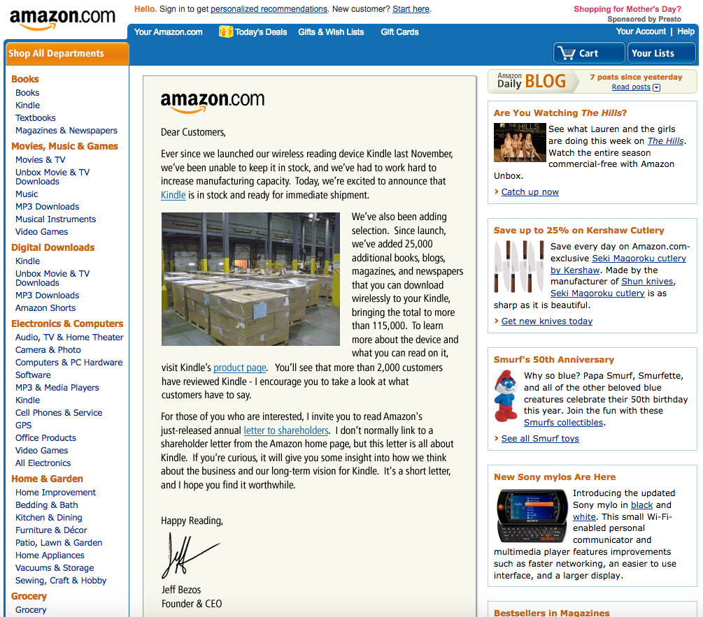
When you’re about to start learning, every day, you will receive new pieces of evidence of how many things you don’t know yet. You will see people who have been doing this for years and you will doubt whether you can do this, too. But there is a nuance I want to highlight: first, take a look at the following screenshot:

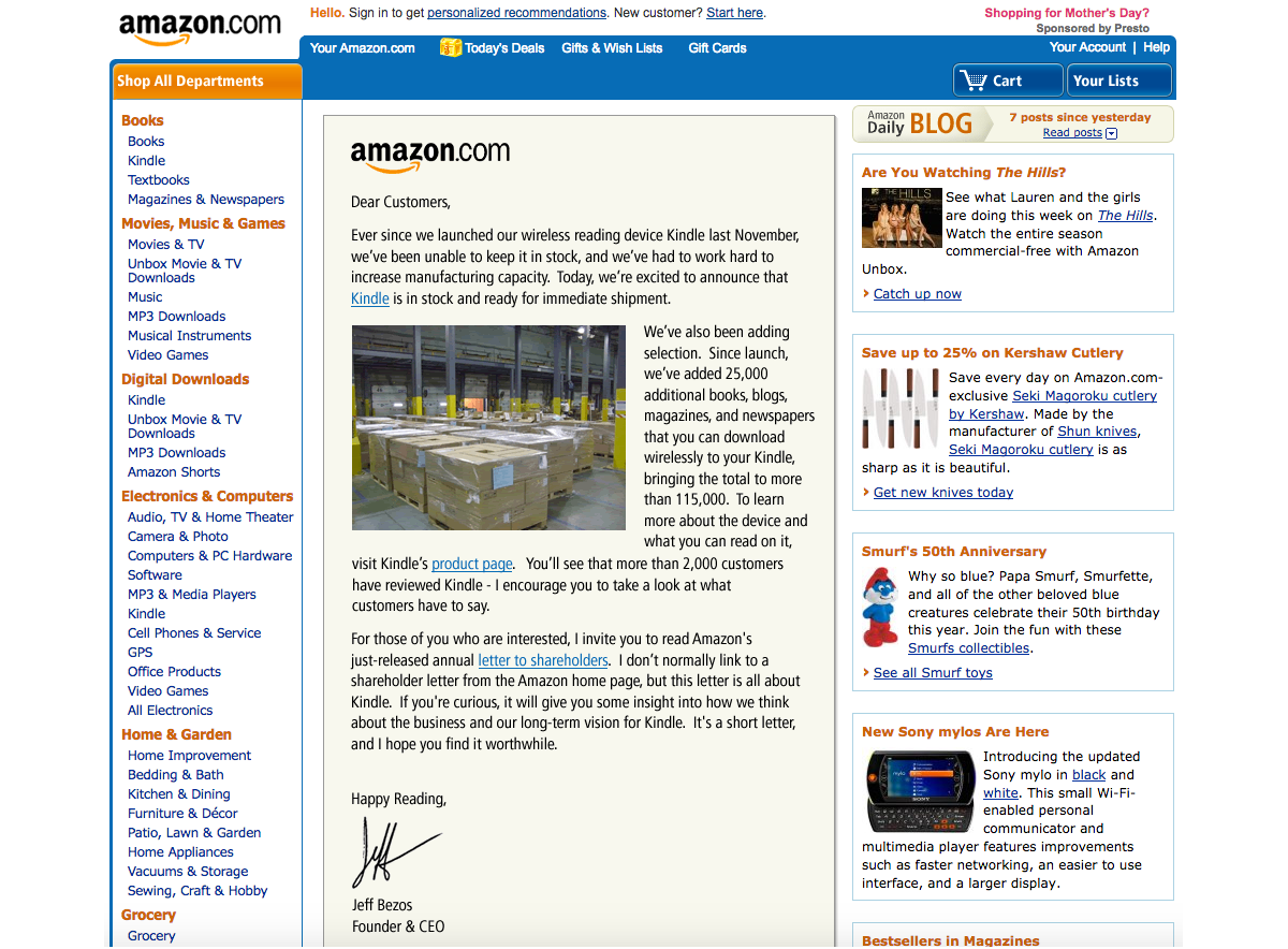
This is the Amazon website in 2008 when I was about to start my design career and received my first paycheck as a beginner designer.

And this is how Amazon looked like even earlier, in 2002:

Source: versionmuseum.com. (Large preview)

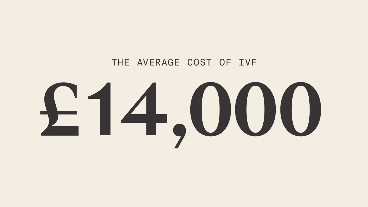
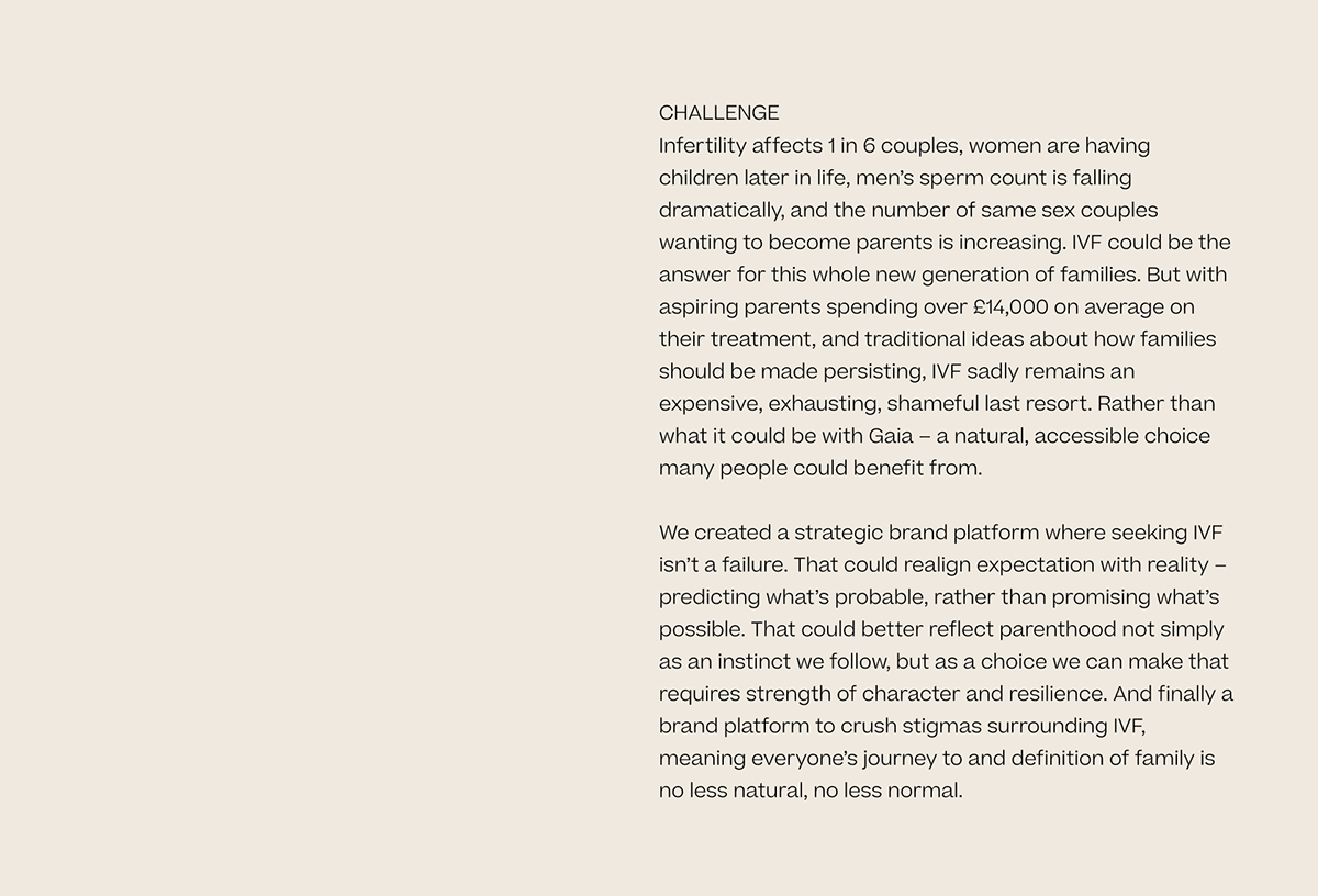
In 2002, Amazon made 3.93 billion US dollars in profits. I dare say they could have hired the very best designers at the time. So today, when you speak to a designer with twenty years of experience and think, “Oh, this designer must be on a very high level now, a true master of his craft,” remind yourself about the state of UX design that existed when the designer’s career was about to start, sometime in the early 2000s!

A lot of the knowledge that I have learned and that is over five years old is outdated now, and the learning complexity only increases every year.

It doesn’t matter how many years you have been in this profession; what matters are the challenges you met in the last few years and the lessons you’ve learned from them.

Are you a beginner or an aspiring user interface/user experience designer? Don’t be afraid to go through all the steps in your UX design journey. Patience and a good plan will let you become a good designer faster than you think.

“The best time to start was yesterday. The next best time is now.”

— H. Jackson Brown, Jr.

This was the more philosophical part of my writing, where I wanted to help you become better motivated. Now, let’s continue with the more practical things and advice!

Getting Started: Master Your Design Tools

When I was just beginning to learn, most of us did our design work in Adobe Photoshop.

In Photoshop, there were no components, styles, design libraries, auto layouts, and so on. Every screen was in another PSD file, and even making rounded corners on a rectangle object was a difficult task. Files were “heavy,” and sometimes I needed to wait thirty or more seconds to open a file and check what screen was inside while changing a button’s name or label in twenty separate PSD files (each containing only one design screen, remember?) could take up to an hour, depending on the power of your computer.

There were many digital design tools at the time, including Fireworks — which some professionals considered superior to Photoshop, and for quite a few reasons — but this is not the main point of my story. One way or another, Photoshop back then became very popular among designers and we all absolutely had to have it in our toolset, no matter what other tools we also needed and used.

Now computers are much faster, and our design tools have evolved quite a bit, too. For example, I can apply multiple changes to multiple design screens in just a few seconds by using Figma components and a proper structure of the design file, I can design/prototype responsive designs by using auto-layout, and more.

In one word, knowing your design tool can be a real “superpower” for junior UX designers — a power that beginners often ignore. When you know your tool inside-out, you’ll spend less time on the design routine and you’ll have more time for learning new things.

Master your tool(s) of choice (be it Figma Design or Illustrator, Sketch, Affinity Designer, Canva, Framer, and so on) in the most efficient way, and free up to a couple of extra hours every day for reading, doing tutorials, or taking longer breaks.

Learn all the key features and options, and discover and remember the most important hotkeys so you’ll be working without the need to constantly reach for your mouse and navigate the “web” of menus and sub-menus. It’s no secret that we, designers, mostly learn through doing practical tasks. So, imagine how much time it would save you within a few years of your career!

Also, it’s your chance: developers are rolling out new features for beginner designers and pro designers simultaneously, but junior designers usually have more time to learn those updates! So, be faster and get your advantage!

Getting Started: Work On Your Portfolio

You need to admit it: your portfolio (or, to put it more precisely, the lack of it) will be the main pain point at the start.

You may hear sometimes statements such as: “We understand that being a junior designer is not about having a portfolio…” But the fact is that we all would like to see some results of your work, even if it is your very early work on a few design projects or concepts. Remember, if you have something to show, this would always be a considerable advantage!

I have heard from some juniors that they don’t want to invest time in their portfolio because this work is not payable and it’s time-consuming. But sitting and waiting and getting rejected again and again is also time-consuming. And spending a few of your first career years in the wrong company is also time-consuming (and disappointing, too). So my advice is to spend some time in advance on showcasing your work and then get much better results in the near future.

In case you need some extra motivation, here is a quote from Muhammad Ali, regarded as one of the most significant sports figures of the 20th century:

“I hated every minute of training, but I said to myself, ‘Do not quit. Suffer now and live the rest of your life as a champion.’”

— Muhammad Ali

Ready to fire but have no idea where to start? Here are a few options:

Find a popular product with a rather difficult-to-use or not very elegant interface and research what the users of this product are complaining about the most. Then, as an exercise, design a few interface screens for this product, with their core features explained, publish them on social media, and tag that company. (This approach may not always work, but it’s worth a try.)
Sign up for and actively participate in hackathons. As a result, it’s possible that you may get not just a few screens redesigned in Figma but a real working product you can show (and be proud of). Also, you can meet nice people there who may recommend you if you apply for a job at one of the companies they work for.
Complete UXchallenge challenges and present how you solved them on LinkedIn.
Note: You’re not limited to LinkedIn, of course; you can also use Instagram, Facebook, Behance, Dribbble, and so on. But keep in mind that many recruiters prefer LinkedIn.
Pick up a website that you use often and check whether it meets the “Ten Usability Heuristics for User Interface Design.” Create a detailed report that lists everything that can be (re)designed better. Publish the report on LinkedIn and also send it to the company that made this website. Don’t forget to tell them why you did that report for their website specifically and that you’re learning UX design, practicing, and actively looking for a job.
Visit some popular developer conferences where you would be one of the only designers attending. Talk to people and propose your help for their startups. Who knows, you may become the co-creator of some future cool startup!
Choose an area where digitalization hasn’t propagated yet and create a design concept using very modern technologies. For instance, people have been growing plants for thousands of years, but data analysis and visualization dramatically changed the efficiency of that process only lately. The agricultural industry has undergone a remarkable transformation thanks to UX design — a crucial element in ensuring that agricultural applications are not just functional but also intuitive and user-friendly. From precision farming to crop monitoring systems, digital tools have revolutionized the way farmers manage their operations.
Note: You can check the following article for details: “The Evolution of UX Design in Agricultural Applications.”

Don’t wait until someone hands you your chance on a “silver platter.” There are many projects that need the designer’s hands and help but can’t get such help yet. Assist them and then show the results of your work in your first portfolio. It gives you a huge advantage over other candidates who haven’t worked on their portfolios yet!

Preparing For Your First Interviews: Getting A First Job

From what I’ve heard, getting the first job is the biggest problem for a junior designer, so I will focus on this part in more detail.

Applying For A Job

To reach the goal, you should formulate it correctly. It’s already formulated in this case, but most candidates understand it wrong. The right goal here is to be invited to an interview — not to get an offer right now or tell everything about your life in the CV document. You just need to break through the first level of filtering.

Note: Some of these tips are for absolute beginners. Do they sound too obvious to you? Apologies if so. However, all of them are based on my personal experience, so I think there are no tips that I should omit.

Send your CV and motivational letter (if required in the job description) from the correct email address. It’s always strange to receive a job application from an email such as ‘sad.batman2006@gmail.com’. Seniors are always responsible for the tasks that junior designers complete, and we want to know that you are a seriously-minded and responsible person to help us do our work. Small details, such as the email address you would use to get in touch, do matter.
Use your real name. I’ve had cases where people have used different names in their emails and CVs. I think it’s too obvious why this will look very strange, so I won’t spend time describing it in detail.
Skill representations. Use the well-accepted standards. I have seen some CVs created with the help of services such as CV Maker where skills (level of English, how well you know Figma, Illustrator, and other design tools, and so on) were represented as loaders or diagrams. But there are existing standards, so use them in order to be understood better. For instance, if you describe your level of English knowledge, use the CEFR levels (A1/A2, B1/B2, C1/C2). Don’t make people interpret a diagram instead.
Check/proofread the text in your email, CV, and portfolio. We expect that you may not know everything about design, but spelling errors don’t demonstrate exactly your desire to learn and your attention to detail. You can use Grammarly or ChatGPT to check your text, but you should not try to substitute your thoughts with some AI-“generated” ideas. Also, make sure to structure well the content of your CV and to format it properly.
Read the job description carefully, find matches with your skills, and reflect these in the CV. Recruiters cannot review all the CVs thoroughly. Remember, the goal is to break through the first level of filtering — the recruiter is not a designer and can’t evaluate you and your skills. However, the recruiter can decide whether your CV is relevant to the job description, so it’s very important to tweak the CV by making sure you mention all the skills that you possess and that match the ones found in the specific job description.
Don’t count solely on the job application form posted on the company’s website. There were cases when I had no reply after filling out and submitting the official application form but then got an offer after trying to reach a recruiter from that company directly on LinkedIn or via some other available communication channel. So don’t be shy to get in touch directly.
Avoid using PDF documents for portfolios or anything else that people need to download before opening. The more time it takes to open and review your portfolio, the less time people will spend checking what’s in it. A link to your portfolio on the web will always work better, and it’s also a much more professional approach! You can use platforms such as Behance (or similar), or you can create your case studies in Figma and paste the shareable link into your CV.

Note: There are many ways to show your portfolio, and Figma is only one of them. For ideas, you can check “Figma Portfolio Templates & Examples” (a curated selection of portfolio templates for Figma). Or even better, you can self-host your portfolio on your own domain and website; however, this may require some more advanced technical skills and knowledge, so you can leave this idea for later.

Completing A Test Task

The test task aims to assess what we can expect from you in the workplace. And this is not just about the quality of your design skills — it’s also about how you will communicate with others and how you will be able to propose practical solutions to problems.

What do I mean by “practical solutions”? In the real world, designers always work within certain limitations (constraints), such as time, budget, team capacity, and so on. So, if you have some bright ideas that are likely very hard to implement, keep these for the interview. The test task is a way to show that you are someone who can define the correct problems and do the proper work, e.g. find the solutions to them.

A few words of advice on how to do exactly that:

If you have a chance to speak to the target audience, do it, especially if the test task is to make an existing product better. You don’t have to do complete research, but if it’s a popular product that everyone uses, you can ask your friends about their experience of using it. If it’s not, check what people say on Reddit, in reviews on the Apple App Store, or on Google Play. Find video reviews of this product on YouTube and analyze the comments under the video. Also, take a look at similar products and what people say about them. Defining real problems is a key skill for designers.
Note: How can we we conduct UX research when there is no or only limited access to users? Vitaly Friedman outlines a few excellent strategies in his article on this topic: “Why Designers Aren’t Understood.”
Prioritize features that you see and can reflect on in the test task. You can use the Kano model or another framework, but don’t skip this step! It is sometimes puzzling to see candidates spending a lot of time on dark mode UI mockups but failing to work on the required key features instead.
Note: The Kano Analysis model is a tool that enables you to understand how customer emotional responses to products or features can be measured and explored.
If you need more time, say so. It also will show what your behavior will be when working on a real project. Speaking about the problem at the last moment can bring big troubles to the team. Also — happened in my practice in a few cases — it’s strange to hear:
“I didn’t fully complete the test task because I was busy.”
OK, if you are too busy (with other things?), then we will have to interview some other candidates.
My advice is to show dedication and focus toward your current job application assignment.

In some cases, the candidates try to go the “extra mile” by doing more things than were initially asked of them, but with lower quality. Unfortunately, It doesn’t work this way. Instead, you need to do less but better. Of course, there could be exclusions in some cases, like when you do sketching and prototyping, where showing rough ideas is perfectly OK. So, try to find the balance between the volume and quality of your work. Showing many (but weak) mockups in order to impress with the volume of your work (instead of the quality) is not a good idea.
Sometimes, we ask to redesign a screen as a test task. This is not about using better/shinier UI components. Instead, try to understand the user goals on that screen and then think about the most suitable UI components that you can use to serve these user goals.

Recommendations For The Interview

The interview is the most challenging part because the most optimal way to prepare for it depends on the specific company where you’re applying for the job and the interviewer’s experience. But there are still a few “universal” things you can do in order to increase your chances:

If I was restricted to giving only one piece of advice, I would say: Be sincere! It’s not an exam, so don’t try to guess the answer if you don’t know it. No one knows everything, and it’s OK — be honest and it will pay off.
Research the company and the role before the interview. Check the company’s portfolio, cases, products, and so on, and even look up the names and titles of designers working there.
Note: It will help a lot if the company has an About → The Team page on its website; but if not, using LinkedIn will probably help, too.) When you have researched the role in detail, it will help you define which of your skills will be a good match and you could then highlight them during the interview.
The core questions in a UX design interview are not a secret. Usually, it’s about the design phases, your experience, hobbies, motivation, and so on. Work on these questions and clarify the answers before going to the interview. Just write them down and read them out loudly. Try to check how it sounds. Converting your design experience into exact words requires brain energy, especially if somebody in front of you is waiting for the answer, so do it beforehand, and you’ll feel much better prepared — and calmer.
Listen carefully to the questions you are being asked. Ask the interviewer to clarify if you do not understand a question completely. It’s always weird when the candidate gives an answer that is not related to the question you asked.
Don’t be late. Do your best to be on time.
If it’s an online interview, check the time zones, the communication tools, and everything else. There’s nothing worse than starting Zoom (or another app that you know you’ll need) at the last minute and discovering that it needs an urgent update. Precious minutes will be lost during the update process while the other party will be patiently waiting for you to come online. And you better also check your headphones, microphone, camera, and Bluetooth connection before the start of the meeting.
Similarly, if it’s an in-person interview, plan your trip in advance and add some extra time for something unexpected; better if you arrive early than late. The problem is not only about wasting someone’s time; it’s about your emotional balance. If you are late, you will be nervous and make mistakes that you otherwise wouldn’t.

Don’t look for a job in the companies of your dreams right from the start. First, pass a few interviews with other companies, get feedback, do some retrospectives, gain some real experience, and be prepared to show your best when you get your chance.
Be yourself, but also clearly communicate who you are going to be as people with goals and a plan always make a better impression. Most companies don’t hire juniors — they hire future middle-level and senior designers. And if you feel a certain company where you’re applying for a job would not support you in this way, better try another one. The first few years are the foundation of your future career, so do your best to get into a company where you can grow as a designer.

Conclusion

Thank you for following me so far! Hopefully, you have learned your design tools, worked on your portfolio, and prepared meticulously for your first interviews. If all goes according to plan, sooner or later, you’ll get your first junior UX job. And then you’ll face more challenges, about which I will speak in detail in the second part of my two-part article series.

But before that, do check Further Reading, where I have gathered a few resources that will be very useful if you are just about to begin your UX design career.

Further Reading

Basic Design Resources

“UX Crash Course: 31 Fundamentals,” Joel Marsh
“UX Crash Course: 30 Stupid Questions,” Joel Marsh
“UX Crash Course: User Psychology,” Joel Marsh
“What’s The Perfect Design Process?,” Vitaly Friedman
“10 Usability Heuristics for User Interface Design,” Jakob Nielsen
“10 Advanced Tips For A Design Portfolio,” Slava Shestopalov

A List of Design Resources from the Nielsen Norman Group

Context Methods, Kate Moran and Mayya Azarova
Design Pattern Guidelines, Samhita Tankala and Alita Joyce
Design Thinking, Kate Moran and Megan Brown
DesignOps, Kate Kaplan
Facilitation, Kate Kaplan
Information Architecture, Page Laubheimer
Intranet & Enterprise Design, Kara Pernice
Lean & Agile, Anna Kaley
Mobile UX, Raluca Budiu
Omnichannel & Customer Experience, Kim Salazar
Personas, Kate Kaplan
Psychology for UX, Tanner Kohler
ResearchOps, Kate Kaplan
Remote Usability Testing, Kate Moran
Service Design, Sarah Gibbons
UX Basics, Tim Neusesser
UX Careers, Taylor Dykes
UX Mapping Methods, Kate Kaplan
UX Stakeholders, Sarah Gibbons
UX Writing, Anna Kaley
Qualitative Usability Testing, Kate Moran
Quantitative Research, Kate Moran
Visual Design in UX, Kelley Gordon

Hilarious AI prompts discovered inside Apple Intelligence

Original Source: https://www.creativebloq.com/ai/hilarious-ai-prompts-discovered-inside-apple-intelligence

Is Apple’s iPhone AI feeling a little insecure?