Integrating Image-To-Text And Text-To-Speech Models (Part 2)

Original Source: https://smashingmagazine.com/2024/08/integrating-image-to-text-and-text-to-speech-models-part2/

In Part 1 of this brief two-part series, we developed an application that turns images into audio descriptions using vision-language and text-to-speech models. We combined an image-to-text that analyses and understands images, generating description, with a text-to-speech model to create an audio description, helping people with sight challenges. We also discussed how to choose the right model to fit your needs.

Now, we are taking things a step further. Instead of just providing audio descriptions, we are building that can have interactive conversations about images or videos. This is known as Conversational AI — a technology that lets users talk to systems much like chatbots, virtual assistants, or agents.

While the first iteration of the app was great, the output still lacked some details. For example, if you upload an image of a dog, the description might be something like “a dog sitting on a rock in front of a pool,” and the app might produce something close but miss additional details such as the dog’s breed, the time of the day, or location.

The aim here is simply to build a more advanced version of the previously built app so that it not only describes images but also provides more in-depth information and engages users in meaningful conversations about them.

We’ll use LLaVA, a model that combines understanding images and conversational capabilities. After building our tool, we’ll explore multimodal models that can handle images, videos, text, audio, and more, all at once to give you even more options and easiness for your applications.

Visual Instruction Tuning and LLaVA

We are going to look at visual instruction tuning and the multimodal capabilities of LLaVA. We’ll first explore how visual instruction tuning can enhance the large language models to understand and follow instructions that include visual information. After that, we’ll dive into LLaVA, which brings its own set of tools for image and video processing.

Visual Instruction Tuning

Visual instruction tuning is a technique that helps large language models (LLMs) understand and follow instructions based on visual inputs. This approach connects language and vision, enabling AI systems to understand and respond to human instructions that involve both text and images. For example, Visual IT enables a model to describe an image or answer questions about a scene in a photograph. This fine-tuning method makes the model more capable of handling these complex interactions effectively.

There’s a new training approach called LLaVAR that has been developed, and you can think of it as a tool for handling tasks related to PDFs, invoices, and text-heavy images. It’s pretty exciting, but we won’t dive into that since it is outside the scope of the app we’re making.

Examples of Visual Instruction Tuning Datasets

To build good models, you need good data — rubbish in, rubbish out. So, here are two datasets that you might want to use to train or evaluate your multimodal models. Of course, you can always add your own datasets to the two I’m going to mention.

Vision-CAIR

Instruction datasets: English;
Multi-task: Datasets containing multiple tasks;
Mixed dataset: Contains both human and machine-generated data.

Vision-CAIR provides a high-quality, well-aligned image-text dataset created using conversations between two bots. This dataset was initially introduced in a paper titled “MiniGPT-4: Enhancing Vision-Language Understanding with Advanced Large Language Models,” and it provides more detailed image descriptions and can be used with predefined instruction templates for image-instruction-answer fine-tuning.

There are more multimodal datasets out there, but these two should help you get started if you want to fine-tune your model.

Let’s Take a Closer Look At LLaVA

LLaVA (which stands for Large Language and Vision Assistant) is a groundbreaking multimodal model developed by researchers from the University of Wisconsin, Microsoft Research, and Columbia University. The researchers aimed to create a powerful, open-source model that could compete with the best in the field, just like GPT-4, Claude 3, or Gemini, to name a few. For developers like you and me, its open nature is a huge benefit, allowing for easy fine-tuning and integration.

One of LLaVA’s standout features is its ability to understand and respond to complex visual information, even with unfamiliar images and instructions. This is exactly what we need for our tool, as it goes beyond simple image descriptions to engage in meaningful conversations about the content.

Architecture

LLaVA’s strength lies in its smart use of existing models. Instead of starting from scratch, the researchers used two key models:

CLIP VIT-L/14
This is an advanced version of the CLIP (Contrastive Language–Image Pre-training) model developed by OpenAI. CLIP learns visual concepts from natural language descriptions. It can handle any visual classification task by simply being given the names of the visual categories, similar to the “zero-shot” capabilities of GPT-2 and GPT-3.
Vicuna
This is an open-source chatbot trained by fine-tuning LLaMA on 70,000 user-shared conversations collected from ShareGPT. Training Vicuna-13B costs around $300, and it performs exceptionally well, even when compared to other models like Alpaca.

These components make LLaVA highly effective by combining state-of-the-art visual and language understanding capabilities into a single powerful model, perfectly suited for applications requiring both visual and conversational AI.

Training

LLaVA’s training process involves two important stages, which together enhance its ability to understand user instructions, interpret visual and language content, and provide accurate responses. Let’s detail what happens in these two stages:

Pre-training for Feature Alignment
LLaVA ensures that its visual and language features are aligned. The goal here is to update the projection matrix, which acts as a bridge between the CLIP visual encoder and the Vicuna language model. This is done using a subset of the CC3M dataset, allowing the model to map input images and text to the same space. This step ensures that the language model can effectively understand the context from both visual and textual inputs.
End-to-End Fine-Tuning
The entire model undergoes fine-tuning. While the visual encoder’s weights remain fixed, the projection layer and the language model are adjusted.

The second stage is tailored to specific application scenarios:

Instructions-Based Fine-Tuning
For general applications, the model is fine-tuned on a dataset designed for following instructions that involve both visual and textual inputs, making the model versatile for everyday tasks.
Scientific reasoning
For more specialized applications, particularly in science, the model is fine-tuned on data that requires complex reasoning, helping the model excel at answering detailed scientific questions.

Now that we’re keen on what LLaVA is and the role it plays in our applications, let’s turn our attention to the next component we need for our work, Whisper.

Using Whisper For Text-To-Speech

In this chapter, we’ll check out Whisper, a great model for turning text into speech. Whisper is accurate and easy to use, making it perfect for adding natural-sounding voice responses to our app. We’ve used Whisper in a different article, but here, we’re going to use a new version — large v3. This updated version of the model offers even better performance and speed.

Whisper large-v3

Whisper was developed by OpenAI, which is the same folks behind ChatGPT. Whisper is a pre-trained model for automatic speech recognition (ASR) and speech translation. The original Whisper was trained on 680,000 hours of labeled data.

Now, what’s different with Whisper large-v3 compared to other models? In my experience, it comes down to the following:

Better inputs
Whisper large-v3 uses 128 Mel frequency bins instead of 80. Think of Mel frequency bins as a way to break down audio into manageable chunks for the model to process. More bins mean finer detail, which helps the model better understand the audio.
More training
This specific Whisper version was trained on 1 million hours of weakly labeled audio and 4 million hours of pseudo-labeled audio that was collected from Whisper large-v2. From there, the model was trained for 2.0 epochs over this mix.

Whisper models come in different sizes, from tiny to large. Here’s a table comparing the differences and similarities:

Size
Parameters
English-only
Multilingual

tiny
39 M

base
74 M

small
244 M

medium
769 M

large
1550 M

large-v2
1550 M

large-v3
1550 M

Integrating LLaVA With Our App

Alright, so we’re going with LLaVA for image inputs, and this time, we’re adding video inputs, too. This means the app can handle both images and videos, making it more versatile.

We’re also keeping the speech feature so you can hear the assistant’s replies, which makes the interaction even more engaging. How cool is that?

For this, we’ll use Whisper. We’ll stick with the Gradio framework for the app’s visual layout and user interface. You can, of course, always swap in other models or frameworks — the main goal is to get a working prototype.

Installing and Importing the Libraries

We will start by installing and importing all the required libraries. This includes the transformers libraries for loading the LLaVA and Whisper models, bitsandbytes for quantization, gtts, and moviepy to help in processing video files, including frame extraction.

#python
!pip install -q -U transformers==4.37.2
!pip install -q bitsandbytes==0.41.3 accelerate==0.25.0
!pip install -q git+https://github.com/openai/whisper.git
!pip install -q gradio
!pip install -q gTTS
!pip install -q moviepy

With these installed, we now need to import these libraries into our environment so we can use them. We’ll use colab for that:

#python
import torch
from transformers import BitsAndBytesConfig, pipeline
import whisper
import gradio as gr
from gtts import gTTS
from PIL import Image
import re
import os
import datetime
import locale
import numpy as np
import nltk
import moviepy.editor as mp

nltk.download(‘punkt’)
from nltk import sent_tokenize

# Set up locale
os.environ[“LANG”] = “en_US.UTF-8”
os.environ[“LC_ALL”] = “en_US.UTF-8”
locale.setlocale(locale.LC_ALL, ‘en_US.UTF-8’)

Configuring Quantization and Loading the Models

Now, let’s set up a 4-bit quantization to make the LLaVA model more efficient in terms of performance and memory usage.

#python

# Configuration for quantization
quantization_config = BitsAndBytesConfig(
load_in_4bit=True,
bnb_4bit_compute_dtype=torch.float16
)

# Load the image-to-text model
model_id = “llava-hf/llava-1.5-7b-hf”
pipe = pipeline(“image-to-text”,
model=model_id,
model_kwargs={“quantization_config”: quantization_config})

# Load the whisper model
DEVICE = “cuda” if torch.cuda.is_available() else “cpu”
model = whisper.load_model(“large-v3”, device=DEVICE)

In this code, we’ve configured the quantization to four bits, which reduces memory usage and improves performance. Then, we load the LLaVA model with these settings. Finally, we load the whisper model, selecting the device based on GPU availability for better performance.

Note: We’re using llava-v1.5-7b as the model. Please feel free to explore other versions of the model. For Whisper, we’re loading the “large” size, but you can also switch to another size like “medium” or “small” for your experiments.

To get our assistant up and running, we need to implement five essential functions:

Handling conversations,
Converting images to text,
Converting videos to text,
Transcribing audio,
Converting text to speech.

Once these are in place, we will create another function to tie all this together seamlessly. The following sections provide the code that defines each function.

Conversation History

We’ll start by setting up the conversation history and a function to log it:

#python

# Initialize conversation history
conversation_history = []

def writehistory(text):
“””Write history to a log file.”””
tstamp = datetime.datetime.now().strftime(“%Y%m%d_%H%M%S”)
logfile = f'{tstamp}_log.txt’
with open(logfile, ‘a’, encoding=’utf-8′) as f:
f.write(text + ‘n’)

Image to Text

Next, we’ll create a function to convert images to text using LLaVA and iterative prompts.

#python
def img2txt(input_text, input_image):
“””Convert image to text using iterative prompts.”””
try:
image = Image.open(input_image)

if isinstance(input_text, tuple):
input_text = input_text[0] # Take the first element if it’s a tuple

writehistory(f”Input text: {input_text}”)
prompt = “USER: <image>n” + input_text + “nASSISTANT:”
while True:
outputs = pipe(image, prompt=prompt, generate_kwargs={“max_new_tokens”: 200})

if outputs and outputs[0][“generated_text”]:
match = re.search(r’ASSISTANT:s*(.*)’, outputs[0][“generated_text”])
reply = match.group(1) if match else “No response found.”
conversation_history.append((“User”, input_text))
conversation_history.append((“Assistant”, reply))
prompt = “USER: ” + reply + “nASSISTANT:”
return reply # Only return the first response for now
else:
return “No response generated.”
except Exception as e:
return str(e)

Video to Text

We’ll now create a function to convert videos to text by extracting frames and analyzing them.

#python
def vid2txt(input_text, input_video):
“””Convert video to text by extracting frames and analyzing.”””
try:
video = mp.VideoFileClip(input_video)
frame = video.get_frame(1) # Get a frame from the video at the 1-second mark
image_path = “temp_frame.jpg”
mp.ImageClip(frame).save_frame(image_path)
return img2txt(input_text, image_path)
except Exception as e:
return str(e)

Audio Transcription

Let’s add a function to transcribe audio to text using Whisper.

#python
def transcribe(audio_path):
“””Transcribe audio to text using Whisper model.”””
if not audio_path:
return ”

audio = whisper.load_audio(audio_path)
audio = whisper.pad_or_trim(audio)
mel = whisper.log_mel_spectrogram(audio).to(model.device)
options = whisper.DecodingOptions()
result = whisper.decode(model, mel, options)
return result.text

Text to Speech

Lastly, we create a function to convert text responses into speech.

#python
def text_to_speech(text, file_path):
“””Convert text to speech and save to file.”””
language = ‘en’
audioobj = gTTS(text=text, lang=language, slow=False)
audioobj.save(file_path)
return file_path

With all the necessary functions in place, we can create the main function that ties everything together:

#python

def chatbot_interface(audio_path, image_path, video_path, user_message):
“””Process user inputs and generate chatbot response.”””
global conversation_history

# Handle audio input
if audio_path:
speech_to_text_output = transcribe(audio_path)
else:
speech_to_text_output = “”

# Determine the input message
input_message = user_message if user_message else speech_to_text_output

# Ensure input_message is a string
if isinstance(input_message, tuple):
input_message = input_message[0]

# Handle image or video input
if image_path:
chatgpt_output = img2txt(input_message, image_path)
elif video_path:
chatgpt_output = vid2txt(input_message, video_path)
else:
chatgpt_output = “No image or video provided.”

# Add to conversation history
conversation_history.append((“User”, input_message))
conversation_history.append((“Assistant”, chatgpt_output))

# Generate audio response
processed_audio_path = text_to_speech(chatgpt_output, “Temp3.mp3”)

return conversation_history, processed_audio_path

Using Gradio For The Interface

The final piece for us is to create the layout and user interface for the app. Again, we’re using Gradio to build that out for quick prototyping purposes.

#python

# Define Gradio interface
iface = gr.Interface(
fn=chatbot_interface,
inputs=[
gr.Audio(type=”filepath”, label=”Record your message”),
gr.Image(type=”filepath”, label=”Upload an image”),
gr.Video(label=”Upload a video”),
gr.Textbox(lines=2, placeholder=”Type your message here…”, label=”User message (if no audio)”)
],
outputs=[
gr.Chatbot(label=”Conversation”),
gr.Audio(label=”Assistant’s Voice Reply”)
],
title=”Interactive Visual and Voice Assistant”,
description=”Upload an image or video, record or type your question, and get detailed responses.”
)

# Launch the Gradio app
iface.launch(debug=True)

Here, we want to let users record or upload their audio prompts, type their questions if they prefer, upload videos, and, of course, have a conversation block.

Here’s a preview of how the app will look and work:

Looking Beyond LLaVA

LLaVA is a great model, but there are even greater ones that don’t require a separate ASR model to build a similar app. These are called multimodal or “any-to-any” models. They are designed to process and integrate information from multiple modalities, such as text, images, audio, and video. Instead of just combining vision and text, these models can do it all: image-to-text, video-to-text, text-to-speech, speech-to-text, text-to-video, and image-to-audio, just to name a few. It makes everything simpler and less of a hassle.

Examples of Multimodal Models that Handle Images, Text, Audio, and More

Now that we know what multimodal models are, let’s check out some cool examples. You may want to integrate these into your next personal project.

CoDi

So, the first on our list is CoDi or Composable Diffusion. This model is pretty versatile, not sticking to any one type of input or output. It can take in text, images, audio, and video and turn them into different forms of media. Imagine it as a sort of AI that’s not tied down by specific tasks but can handle a mix of data types seamlessly.

CoDi was developed by researchers from the University of North Carolina and Microsoft Azure. It uses something called Composable Diffusion to sync different types of data, like aligning audio perfectly with the video, and it can generate outputs that weren’t even in the original training data, making it super flexible and innovative.

ImageBind

Now, let’s talk about ImageBind, a model from Meta. This model is like a multitasking genius, capable of binding together data from six different modalities all at once: images, video, audio, text, depth, and even thermal data.
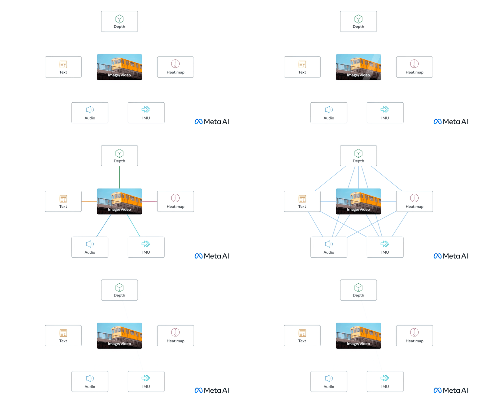
Source: Meta AI. (Large preview)

ImageBind doesn’t need explicit supervision to understand how these data types relate. It’s great for creating systems that use multiple types of data to enhance our understanding or create immersive experiences. For example, it could combine 3D sensor data with IMU data to design virtual worlds or enhance memory searches across different media types.

Gato

Gato is another fascinating model. It’s built to be a generalist agent that can handle a wide range of tasks using the same network. Whether it’s playing games, chatting, captioning images, or controlling a robot arm, Gato can do it all.

The key thing about Gato is its ability to switch between different types of tasks and outputs using the same model.

GPT-4o

The next on our list is GPT-4o; GPT-4o is a groundbreaking multimodal large language model (MLLM) developed by OpenAI. It can handle any mix of text, audio, image, and video inputs and give you text, audio, and image outputs. It’s super quick, responding to audio inputs in just 232ms to 320ms, almost like a real conversation.

There’s a smaller version of the model called GPT-4o Mini. Small models are becoming a trend, and this one shows that even small models can perform really well. Check out this evaluation to see how the small model stacks up against other large models.

Conclusion

We covered a lot in this article, from setting up LLaVA for handling both images and videos to incorporating Whisper large-v3 for top-notch speech recognition. We also explored the versatility of multimodal models like CoDi or GPT-4o, showcasing their potential to handle various data types and tasks. These models can make your app more robust and capable of handling a range of inputs and outputs seamlessly.

Which model are you planning to use for your next app? Let me know in the comments!

This tiny indie team's Unreal Engine 5 RPG looks spectacular

Original Source: https://www.creativebloq.com/3d/video-game-design/this-tiny-indie-teams-unreal-engine-5-rpg-looks-spectacular

New Clair Obscur: Expedition 33 features immersive and surreal environments.

Things to Consider While Developing an eCommerce App in 2024

Original Source: https://www.hongkiat.com/blog/successful-ecommerce-app-guide/

Want to create a successful eCommerce app that generates high conversion rates and satisfies your customers? Well, your search ends here. Take a look at this detailed article.

In this comprehensive guide, we will share valuable tips, tricks, and best practices to help you build an outstanding eCommerce app.

Get ready to elevate your eCommerce app to new heights with our ultimate guide.

Table of Content

Why Building an eCommerce App Is Important?
Understanding the Key Features of a Successful eCommerce App
Researching Your Target Audience and Competition
Choosing the Right Platform for Your eCommerce App
Designing a User-Friendly and Visually Appealing App Interface
Implementing Secure Payment Gateways and Data Protection Measures
Optimizing Your App for Search Engines and App Stores
Utilizing Push Notifications and In-App Messaging for Customer Engagement
Testing and Optimizing Your eCommerce App for Performance and Usability
Interesting Stats on the eCommerce Industry Worldwide
Conclusion

Why Building an eCommerce App Is Important?
EcommerceEcommerce

Freepik

In today’s digital world, having a strong online presence is crucial for any eCommerce business. While a well-designed website is essential, a dedicated eCommerce app can significantly expand your reach, allowing access to a global customer base beyond local boundaries.

Building an eCommerce app offers numerous advantages that can greatly boost your sales, enhance customer engagement, and drive overall business growth.

Here are some of the core benefits of having an eCommerce app:

Increasing Preference for Mobile Shopping

With over 70% of online shopping now being conducted on mobile devices, the preference for mobile shopping continues to grow. This trend highlights the importance of optimizing eCommerce apps for mobile users to capture and retain this significant portion of the market.

Seamless and Personalized Shopping Experience

Customers today expect a seamless experience when browsing, searching, and purchasing products on the go. A dedicated eCommerce app provides a tailored user experience, allowing for easier navigation and a more personalized shopping journey, which can lead to higher customer satisfaction and retention.

Enhanced Features and Functionalities

Modern eCommerce apps are equipped with enhanced features such as push notifications, in-app messaging, and location-based services. These functionalities help engage customers in real-time, offer timely updates, and create a more interactive and dynamic shopping experience.

Improved Customer Engagement and Connectivity

Staying connected with customers is key to driving repeat business. Through an eCommerce app, businesses can promote new products and offers directly to their users, while also providing personalized recommendations based on their shopping habits. This increased connectivity helps build stronger relationships with customers.

Increased Engagement and Personalization

By leveraging personalized content and targeted marketing strategies, eCommerce apps can expand their customer base and achieve higher conversion rates. This level of personalization not only improves customer engagement but also contributes to the overall success and growth of the eCommerce business.

To streamline the app development process and deliver a high-quality user experience, consider using a Bootstrap Admin Template. These templates offer pre-designed components and a responsive layout, making it easier to build a professional and attractive eCommerce app that meets modern standards and customer expectations.

Understanding the Key Features of a Successful eCommerce App
Successful-ecommerce-appSuccessful-ecommerce-app

freeCodeCamp

Building a successful eCommerce app requires a deep understanding of the key features and functionalities that customers expect. These features not only enhance the user experience but also contribute to the overall success and profitability of your app.

User-Friendly and Intuitive Interface

An eCommerce app must have easy navigation to allow users to move effortlessly through the app. Quick product search functionality is essential for helping users find what they’re looking for without frustration.

A seamless purchase process, combined with a clean and visually appealing design, enhances the overall user experience. Additionally, a well-organized product catalog and a straightforward checkout process contribute to a user-friendly interface, ensuring that customers can complete their purchases smoothly and efficiently.

A Robust Product Search and Filtering System

A robust product search and filtering system is critical for improving the shopping experience. This feature allows for easy product searches, enabling users to filter items by categories, brands, or specific attributes. Sorting results based on individual preferences further enhances usability, allowing for quick product discovery.

Moreover, a well-designed search and filtering system can reduce cart abandonment by helping users find exactly what they want with minimal effort.

Secure and Convenient Payment Options

Providing a variety of payment methods, including credit/debit cards, mobile wallets, and digital payment platforms, is essential for accommodating different customer preferences. Implementing robust security measures ensures the protection of customer data, which is crucial for maintaining trust.

Overall, offering secure and convenient payment options contributes to a safe and trustworthy shopping experience, encouraging customers to complete their purchases with confidence.

You can explore eCommerce examples for inspiration.

Researching Your Target Audience and Competition
Shopping ConceptShopping Concept

Freepik

Before you start building your eCommerce app, it’s crucial to research your target audience and understand their needs, preferences, and pain points. This research will help you design an app that resonates with your customers and gives you a competitive edge in the market.

How to Do It?

Analyze Customer Base: Gather demographic (age, gender, location, income) and psychographic (interests, values, shopping behavior) data to create user personas.
Study Competition: Analyze key players’ eCommerce apps to identify successful features, shortcomings, and opportunities for differentiation.
Gather User Feedback: Conduct surveys, focus groups, or interviews to understand customer pain points, preferences, and expectations. Use these insights to inform app design and features.

Choosing the Right Platform for Your eCommerce App

Choosing the right platform for your eCommerce app is crucial for its success, influencing the development process, features, and user experience.

There are many eCommerce platforms out there that you can consider, such as:

Squarespace: Best Overall E-Commerce Platform
Square Online: Best for Omnichannel Selling
Ecwid: Best for Existing Sites
Shopify: Best for Dropshipping
Wix: Best Drag-and-Drop Editor
Weebly: Best Value
BigCommerce: Best for Boosting Sales
WooCommerce: Best for Versatility
Big Cartel: Best for Creatives

Parameters to Consider When Choosing the Best Platform for Your App:

Compatibility: Integrates with existing systems (CMS, inventory, payment gateways).
Scalability: Handles growth and allows adding features easily.
User-Friendliness: Offers an intuitive interface and robust development tools.
Ease of Use: User-friendly interface and intuitive design.
Customization: Flexibility in design and functionality.
Payment Options: Variety and security of payment gateways.
SEO Features: Tools to optimize for search engines.
Mobile Optimization: Responsive design for mobile devices.
Customer Support: Availability and quality of support services.
Cost: Pricing structure and overall affordability.
Security: Robust security measures and compliance standards.

Designing a User-Friendly and Visually Appealing App Interface
Successful-ecommerce-appSuccessful-ecommerce-app

Blinkist

The design of your eCommerce app is a critical factor in its success. A well-designed, user-friendly interface can not only enhance the overall customer experience but also increase conversion rates and customer loyalty.

As shown in the image above, Blinkist has used brand colors to add appeal and convey brand value. Its sleek, minimalistic interface focuses on core features, with intuitive navigation that makes it easy for users to find what they need.

To achieve similar results:

Prioritize simplicity and ease of use: Ensure a clean, uncluttered layout with intuitive navigation, prominent search functionality, and a streamlined checkout process.
Maintain visual appeal: Use consistent branding, color schemes, typography, and imagery that resonate with your target audience. This builds trust and recognition. Utilize UI Kits to streamline your design process.
Use responsive design principles: Deliver a user-friendly experience across all devices and screen sizes, improving accessibility and overall user experience.

Implementing Secure Payment Gateways and Data Protection Measures

Ensuring the security and privacy of your customers’ personal and financial information is of utmost importance when building an eCommerce app. Customers expect a safe and trustworthy shopping experience, and any breach of their data can have severe consequences for your business.

Use a PCI-Compliant Gateway: Ensure end-to-end encryption, tokenization, and fraud detection.
Encrypt Data: Apply strong encryption for storage and transmission.
Implement Access Controls: Use role-based access and multi-factor authentication.
Update Security Protocols: Regularly apply security patches.
Perform Security Audits: Conduct vulnerability assessments and breach tests.
Communicate Privacy Policies: Clearly inform customers about data protection practices.
Maintain Transparency: Provide updates on security measures and incidents.

Optimizing Your App for Search Engines and App Stores

In the competitive world of eCommerce apps, being discoverable is vital for driving traffic and increasing your customer base. Optimizing your app for search engines and app stores can significantly improve its visibility and help you attract the right audience.

When it Comes to Search Engine Optimization (SEO)

Focus on optimizing your app’s metadata, including the title, description, and keywords.
Conduct thorough keyword research to identify the terms and phrases your target audience uses to search for products or services like yours.
Utilize these keywords strategically throughout your app’s metadata to improve its ranking in search engine results.

Additionally, consider creating a dedicated landing page for your eCommerce app, complete with engaging content, visuals, and calls to action. This landing page can be optimized for search engines to drive more traffic to your app, increasing downloads and conversion rates.

When it Comes to App Store Optimization (ASO)

Pay close attention to your app’s title, icon, screenshots, and reviews.
Use catchy titles and icons that accurately represent your brand and offerings.
Craft compelling app descriptions that highlight your app’s key features and benefits.
Encourage your customers to leave reviews, as these can significantly impact your app’s visibility and download rates.

Utilizing Push Notifications and In-App Messaging for Customer Engagement

Keeping your customers engaged and informed is crucial for the success of your eCommerce app.

Push notifications and in-app messaging are powerful tools that can help you stay connected with your customers, promote new products and offers, and drive repeat business.

Push Notifications

Push notifications are a powerful tool to grab attention with timely updates about sales, new products, or personalized recommendations.

However, it is essential to strike a balance in frequency and content to avoid overwhelming customers, which can lead to app fatigue and reduced engagement.

In-App Messaging

In-app messaging allows you to deliver contextual, interactive content while customers are actively using your app.

This can include product recommendations, educational content, or feedback requests, all of which help to maintain engagement and ensure that your messages are well-received by users.

Personalize Notifications and Messages

Personalizing notifications and messages based on a user’s browsing and purchasing history, as well as their app usage patterns, can significantly enhance customer engagement.

By tailoring content to individual preferences and behaviors, you can boost conversion rates and create a more satisfying user experience.

Testing and Optimizing Your eCommerce App for Performance and Usability

Ensuring the performance and usability of your eCommerce app is crucial for providing a seamless customer experience. Regular testing and optimization should be integral to your app development and maintenance.

Conduct usability testing to identify pain points in your app’s user experience. This includes user testing sessions and collecting feedback through in-app surveys and reviews. Use these insights to improve your app’s design and functionality.

Monitor performance metrics such as load times, crash rates, and battery usage. Optimize code, use caching and compression, and optimize media assets to provide fast performance across all devices and network conditions.

Interesting Stats on the eCommerce Industry Worldwide
88% Consumers Hate Bad UX

Studies show that 88% of online consumers are less likely to return to a site after a bad user experience. This highlights the importance of delivering a seamless and enjoyable user experience to retain customers.

[Source: Sweor]

Up to 200% Better Conversion Rates

A seamless and intuitive interface can improve conversion rates by up to 200%. Investing in user-friendly design and functionality is key to maximizing sales and customer satisfaction.

[Source: Forrester Research]

94% of First Impressions Are Design-Related

Design is crucial to eCommerce success, with 94% of first impressions being design-related. A visually appealing website creates a positive initial impact on visitors.

[Source: ResearchGate]

86% Pay More for Better UX

Customer experience is directly tied to brand loyalty, with 86% of buyers willing to pay more for a better user experience. Focusing on customer satisfaction builds lasting relationships and drives repeat business.

[Source: Walker Information]

Over 5 Billion Global Internet Users

As of 2024, there are over five billion internet users globally, providing unparalleled opportunities for eCommerce businesses to connect with customers worldwide.

[Source: Internet World Stats]

3 Trillion USD in eCommerce Sales

Global retail eCommerce sales are projected to exceed 3 trillion U.S. dollars in 2024, highlighting the growing dominance of eCommerce in the retail sector.

[Source: Statista]

50.6% of Consumers Motivated by Free Shipping

Free shipping is the top motivator for online shopping, cited by 50.6% of consumers. Understanding consumer preferences like this helps reduce cart abandonment and increase sales.

[Source: SellersCommerce]

These statistics emphasize the critical importance of user experience, design, and customer loyalty in the success of eCommerce businesses globally.

Conclusion

Remember, the work doesn’t end once your eCommerce app is launched. Continuous monitoring, testing, and optimization are essential for maintaining a competitive edge and ensuring the ongoing success of your app.

Stay agile, adaptable, and responsive to your customers’ needs, and your eCommerce app will continue to be a valuable asset for your business.

Continuous testing and optimization are crucial as your app evolves. Regularly update your app based on customer feedback, industry trends, and new technologies to keep it relevant and engaging.

So, review the above points regularly. I hope you find this article helpful.

The post Things to Consider While Developing an eCommerce App in 2024 appeared first on Hongkiat.

Generating Unique Random Numbers In JavaScript Using Sets

Original Source: https://smashingmagazine.com/2024/08/generating-unique-random-numbers-javascript-using-sets/

JavaScript comes with a lot of built-in functions that allow you to carry out so many different operations. One of these built-in functions is the Math.random() method, which generates a random floating-point number that can then be manipulated into integers.

However, if you wish to generate a series of unique random numbers and create more random effects in your code, you will need to come up with a custom solution for yourself because the Math.random() method on its own cannot do that for you.

In this article, we’re going to be learning how to circumvent this issue and generate a series of unique random numbers using the Set object in JavaScript, which we can then use to create more randomized effects in our code.

Note: This article assumes that you know how to generate random numbers in JavaScript, as well as how to work with sets and arrays.

Generating a Unique Series of Random Numbers

One of the ways to generate a unique series of random numbers in JavaScript is by using Set objects. The reason why we’re making use of sets is because the elements of a set are unique. We can iteratively generate and insert random integers into sets until we get the number of integers we want.

And since sets do not allow duplicate elements, they are going to serve as a filter to remove all of the duplicate numbers that are generated and inserted into them so that we get a set of unique integers.

Here’s how we are going to approach the work:

Create a Set object.
Define how many random numbers to produce and what range of numbers to use.
Generate each random number and immediately insert the numbers into the Set until the Set is filled with a certain number of them.

The following is a quick example of how the code comes together:

function generateRandomNumbers(count, min, max) {
// 1: Create a Set object
let uniqueNumbers = new Set();
while (uniqueNumbers.size < count) {
// 2: Generate each random number
uniqueNumbers.add(Math.floor(Math.random() * (max – min + 1)) + min);
}
// 3: Immediately insert them numbers into the Set…
return Array.from(uniqueNumbers);
}
// …set how many numbers to generate from a given range
console.log(generateRandomNumbers(5, 5, 10));

What the code does is create a new Set object and then generate and add the random numbers to the set until our desired number of integers has been included in the set. The reason why we’re returning an array is because they are easier to work with.

One thing to note, however, is that the number of integers you want to generate (represented by count in the code) should be less than the upper limit of your range plus one (represented by max + 1 in the code). Otherwise, the code will run forever. You can add an if statement to the code to ensure that this is always the case:

function generateRandomNumbers(count, min, max) {
// if statement checks that count is less than max + 1
if (count > max + 1) {
return “count cannot be greater than the upper limit of range”;
} else {
let uniqueNumbers = new Set();
while (uniqueNumbers.size < count) {
uniqueNumbers.add(Math.floor(Math.random() * (max – min + 1)) + min);
}
return Array.from(uniqueNumbers);
}
}
console.log(generateRandomNumbers(5, 5, 10));

Using the Series of Unique Random Numbers as Array Indexes

It is one thing to generate a series of random numbers. It’s another thing to use them.

Being able to use a series of random numbers with arrays unlocks so many possibilities: you can use them in shuffling playlists in a music app, randomly sampling data for analysis, or, as I did, shuffling the tiles in a memory game.

Let’s take the code from the last example and work off of it to return random letters of the alphabet. First, we’ll construct an array of letters:

const englishAlphabets = [
‘A’, ‘B’, ‘C’, ‘D’, ‘E’, ‘F’, ‘G’, ‘H’, ‘I’, ‘J’, ‘K’, ‘L’, ‘M’,
‘N’, ‘O’, ‘P’, ‘Q’, ‘R’, ‘S’, ‘T’, ‘U’, ‘V’, ‘W’, ‘X’, ‘Y’, ‘Z’
];

// rest of code

Then we map the letters in the range of numbers:

const englishAlphabets = [
‘A’, ‘B’, ‘C’, ‘D’, ‘E’, ‘F’, ‘G’, ‘H’, ‘I’, ‘J’, ‘K’, ‘L’, ‘M’,
‘N’, ‘O’, ‘P’, ‘Q’, ‘R’, ‘S’, ‘T’, ‘U’, ‘V’, ‘W’, ‘X’, ‘Y’, ‘Z’
];

// generateRandomNumbers()

const randomAlphabets = randomIndexes.map((index) => englishAlphabets[index]);

In the original code, the generateRandomNumbers() function is logged to the console. This time, we’ll construct a new variable that calls the function so it can be consumed by randomAlphabets:

const englishAlphabets = [
‘A’, ‘B’, ‘C’, ‘D’, ‘E’, ‘F’, ‘G’, ‘H’, ‘I’, ‘J’, ‘K’, ‘L’, ‘M’,
‘N’, ‘O’, ‘P’, ‘Q’, ‘R’, ‘S’, ‘T’, ‘U’, ‘V’, ‘W’, ‘X’, ‘Y’, ‘Z’
];

// generateRandomNumbers()

const randomIndexes = generateRandomNumbers(5, 0, 25);
const randomAlphabets = randomIndexes.map((index) => englishAlphabets[index]);

Now we can log the output to the console like we did before to see the results:

const englishAlphabets = [
‘A’, ‘B’, ‘C’, ‘D’, ‘E’, ‘F’, ‘G’, ‘H’, ‘I’, ‘J’, ‘K’, ‘L’, ‘M’,
‘N’, ‘O’, ‘P’, ‘Q’, ‘R’, ‘S’, ‘T’, ‘U’, ‘V’, ‘W’, ‘X’, ‘Y’, ‘Z’
];

// generateRandomNumbers()

const randomIndexes = generateRandomNumbers(5, 0, 25);
const randomAlphabets = randomIndexes.map((index) => englishAlphabets[index]);
console.log(randomAlphabets);

And, when we put the generateRandomNumbers`()` function definition back in, we get the final code:

const englishAlphabets = [
‘A’, ‘B’, ‘C’, ‘D’, ‘E’, ‘F’, ‘G’, ‘H’, ‘I’, ‘J’, ‘K’, ‘L’, ‘M’,
‘N’, ‘O’, ‘P’, ‘Q’, ‘R’, ‘S’, ‘T’, ‘U’, ‘V’, ‘W’, ‘X’, ‘Y’, ‘Z’
];
function generateRandomNumbers(count, min, max) {
if (count > max + 1) {
return “count cannot be greater than the upper limit of range”;
} else {
let uniqueNumbers = new Set();
while (uniqueNumbers.size < count) {
uniqueNumbers.add(Math.floor(Math.random() * (max – min + 1)) + min);
}
return Array.from(uniqueNumbers);
}
}
const randomIndexes = generateRandomNumbers(5, 0, 25);
const randomAlphabets = randomIndexes.map((index) => englishAlphabets[index]);
console.log(randomAlphabets);

So, in this example, we created a new array of alphabets by randomly selecting some letters in our englishAlphabets array.

You can pass in a count argument of englishAlphabets.length to the generateRandomNumbers function if you desire to shuffle the elements in the englishAlphabets array instead. This is what I mean:

generateRandomNumbers(englishAlphabets.length, 0, 25);

Wrapping Up

In this article, we’ve discussed how to create randomization in JavaScript by covering how to generate a series of unique random numbers, how to use these random numbers as indexes for arrays, and also some practical applications of randomization.

The best way to learn anything in software development is by consuming content and reinforcing whatever knowledge you’ve gotten from that content by practicing. So, don’t stop here. Run the examples in this tutorial (if you haven’t done so), play around with them, come up with your own unique solutions, and also don’t forget to share your good work. Ciao!

Montreal's Canal de Lachine 4.0: Where Heritage Meets Innovative Branding

Original Source: https://abduzeedo.com/montreals-canal-de-lachine-40-where-heritage-meets-innovative-branding

Montreal’s Canal de Lachine 4.0: Where Heritage Meets Innovative Branding
Montreal's Canal de Lachine 4.0: Where Heritage Meets Innovative Branding

abduzeedo0828—24

Featuring’s branding for Montreal’s Canal de Lachine 4.0 economic development hub marries historical elements with a forward-thinking vision. Discover how design fosters growth in this unique urban space.

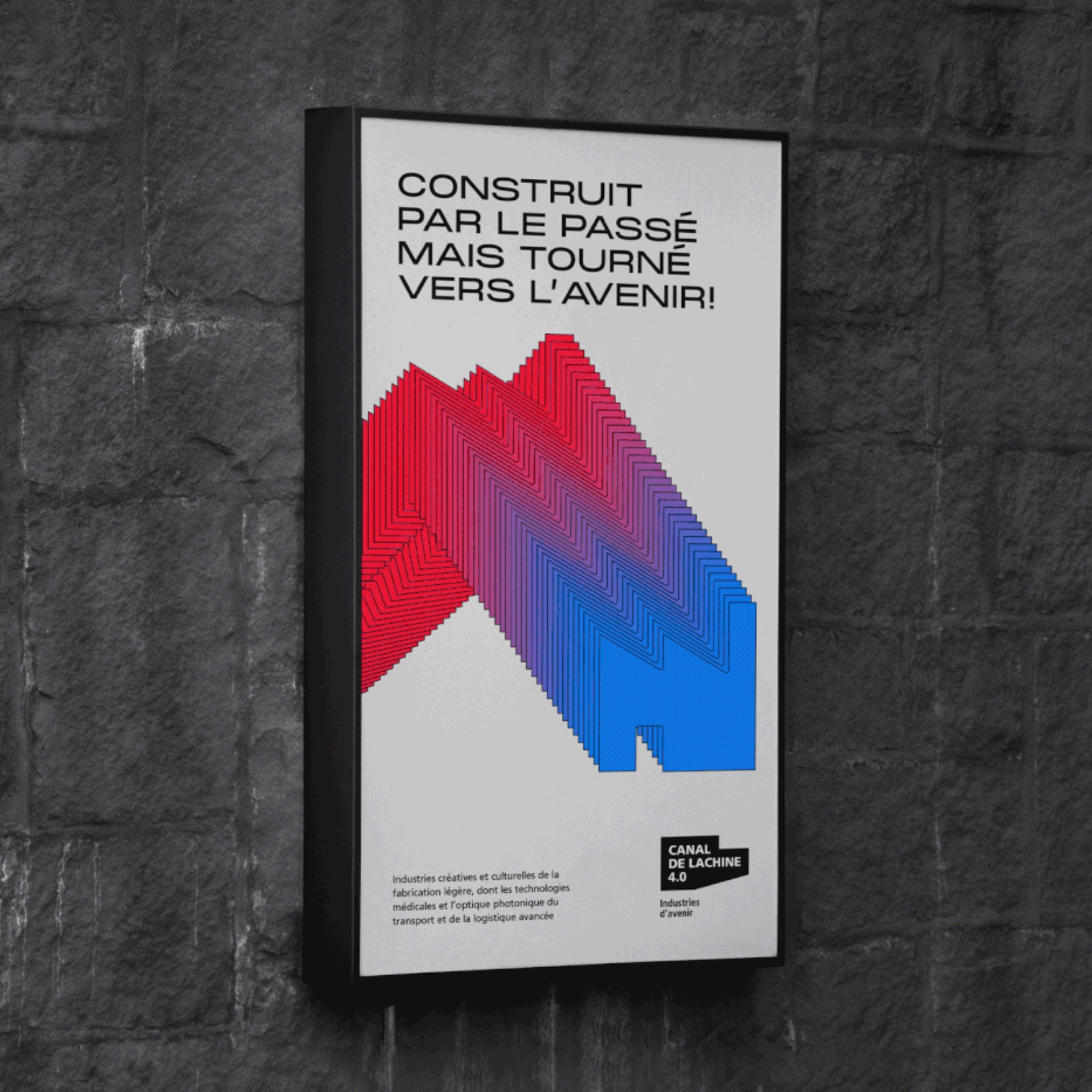
Montreal’s Canal de Lachine 4.0 is more than an economic development hub; it’s a bridge between the city’s storied past and its innovative future. This vision is captured beautifully in the branding and graphic identity crafted by Featuring, a design agency known for its thoughtful and impactful work.

The challenge was to create a visual language that aligns with Montreal’s economic hubs while reflecting the unique character of Canal de Lachine 4.0. Featuring’s solution is a harmonious blend of heritage and progress.

The design uses brick red and an industrial icon to evoke the area’s rich industrial history. This nod to the past is balanced by vibrant green, symbolizing sustainability and the area’s evolution towards a greener future. The typography is clean and modern, hinting at innovation and technology.

A recurring motif is the flowing blue line representing the Lachine Canal itself. This symbolizes both the area’s industrial heritage and its ongoing transformation, connecting past, present, and future.

Featuring’s design is more than just aesthetics; it’s a strategic tool for attracting businesses and talent. The strong visual identity communicates the area’s unique value proposition: a place where history and innovation converge, fostering growth in industries like creative arts, manufacturing, and technology.

This project is a testament to the power of branding and web design. It shows how design can capture the essence of a place, tell its story, and contribute to its economic development. Featuring’s work for Canal de Lachine 4.0 is a shining example of design that’s not only beautiful but also meaningful and effective.

Branding and web design artifacts

branding web design identité visuelle Illustrator brand identity Logo Design identity graphisme direction artistique Logotype visual identitybranding web design identité visuelle Illustrator brand identity Logo Design identity graphisme direction artistique Logotype visual identitybranding web design identité visuelle Illustrator brand identity Logo Design identity graphisme direction artistique Logotype visual identitybranding web design identité visuelle Illustrator brand identity Logo Design identity graphisme direction artistique Logotype visual identitybranding web design identité visuelle Illustrator brand identity Logo Design identity graphisme direction artistique Logotype visual identitybranding web design identité visuelle Illustrator brand identity Logo Design identity graphisme direction artistique Logotype visual identitybranding web design identité visuelle Illustrator brand identity Logo Design identity graphisme direction artistique Logotype visual identitybranding web design identité visuelle Illustrator brand identity Logo Design identity graphisme direction artistique Logotype visual identitybranding web design identité visuelle Illustrator brand identity Logo Design identity graphisme direction artistique Logotype visual identitybranding web design identité visuelle Illustrator brand identity Logo Design identity graphisme direction artistique Logotype visual identitybranding web design identité visuelle Illustrator brand identity Logo Design identity graphisme direction artistique Logotype visual identity

Credits

Client : Ville de Montréal, PME MTL
Agence : Featuring
Direction de création : Karl-Frédéric Anctil
Direction artistique / motion : Lou Tondellier
Web : TREIZE
Service-conseil : Laurianne Bonnici

A Comprehensive Guide to Understanding TypeScript Record Type

Original Source: https://www.sitepoint.com/typescript-record-type-comprehensive-guide/?utm_source=rss

A Comprehensive Guide to Understanding TypeScript Record Type

Learn why the Record type is so useful for managing and structuring object types in TypeScript.

Continue reading
A Comprehensive Guide to Understanding TypeScript Record Type
on SitePoint.

I’ve Tested and Reviewed Shopify vs Shopware

Original Source: https://ecommerce-platforms.com/articles/shopify-vs-shopware

Shopify vs Shopware: Which should you choose? I’ve said many times that Shopify is my favorite ecommerce platform, and that’s still true. It’s a fantastic solution for omnichannel selling, and it’s one of the most flexible platforms out there, thanks to its comprehensive app store.

However, Shopware is a fierce contender. After testing the platform, I was extremely impressed by the incredible themes, the versatility offered, and even Shopware’s new AI and spatial tools.

Here, I’ll walk you through everything you need to know about both platforms, to ensure you can make the right decision for your business.

Quick Verdict, Pros and Cons

It’s a tough call, but I’d still give Shopify the trophy here for a couple of reasons. First, Shopware is very expensive, as it’s intended for companies with ultra-advanced ecommerce needs. The cutting-edge AI and 3D capabilities are amazing, but you’ll pay a lot for them.

Secondly, I find Shopify much easier to use overall. You really need a dedicated IT team to master Shopware.

Shopify Pros and Cons

Pros 👍
Cons 👎

Pros 👍

Omnichannel sales with an included POS
Easy-to-use platform with a smaller learning curve
Lots of flexibility via apps and integrations
Well-designed themes, and convenient editing tools
Integrated AI features and 3D capabilities
Excellent business and inventory management
Cheaper pricing than Shopware.

Cons 👎

Transaction fees for third-party gateways
Fewer unique features

Shopware Pros and Cons

Pros 👍
Cons 👎

Pros 👍

Advanced AI and spatial features
Excellent customer experience and marketing
Great inventory and order management
Enhanced workflow automation
Omnichannel and headless commerce
B2B and B2C selling
Integrations, apps-and add-ons

Cons 👎

Steeper learning curve
More expensive pricing

Shopify vs Shopware: Pricing and Fees

I’ll start by looking at the pricing of both platforms, as that’s one of the biggest areas where the differences between Shopify and Shopware stand out. While Shopify does support enterprise-level customers with Shopify Plus, and offers a lot of the same features as Shopware in that plan (including headless commerce), it supports smaller businesses too.

Shopify Pricing

Shopify offers a variety of fixed-cost monthly subscription plans. If you don’t need a full website, you can choose the Starter plan for $5 per month, although I’d really only recommend that to influencers selling merch online.

The central plans start at $39 per month for Shopify Basic, $105 per month for Shopify, and $399 per month for Shopify Advanced. The more you spend, the more staff accounts and features you’ll get. Shopify Advanced even unlocks extra features within Shopify POS.

Shopify Plus, which starts at $2,300 per month, allows companies to unlock a lot of the extra features they might find on Shopware, such as headless commerce, advanced automation, and additional AI powered tools. Notably, you will have to pay transaction fees on Shopify too, if you choose to use anything other than Shopify Payments.

MORE: Shopify Pricing Guide

Shopware Pricing

Shopware exclusively targets larger companies with unique ecommerce requirements. The platform’s cheapest plan, “Rise”, starts at $600 per month, depending on the functionality you need. Although this is over 10 times the price of Shopify’s cheapest plan, it’s worth noting you get a lot more 3D capabilities, AI tools, and automation options.

Both of Shopware’s other plans are “custom priced”. The “Evolve” plan includes advanced CX features and comprehensive B2C and B2B capabilities. The “Beyond” plan includes all of Shopware’s unique features, as well as advanced customer support.

I couldn’t find a lot of information about transaction fees with Shopware, so that may be something you’ll want to ask about when you contact its sales team.

MORE: Shopware Review

Core Features Winner: Shopify

Although Shopware is a far more advanced ecommerce platform overall, it does have a lot of features in common with Shopify, including support for omnichannel selling, automated workflows, and headless commerce, though most of the advanced features are locked to Shopify Plus.

Website Design and Themes

I’ve always been a big fan of Shopify’s themes. Both the free and premium options look fantastic, and they’re always mobile responsive, and designed to load pages quickly. The editor you’ll use on Shopify might not be as straightforward as the ones on some alternative platforms, like Wix, but it’s pretty simple to start customizing your store.

You also get a built-in blog (coming soon on Shopware), as well as SEO features baked into your store building solution. Shopware also has fantastic themes, that seem to be professionally designed to enhance your brand’s appearance, regardless of what your niche or industry might be.

The visual page builder is pretty easy to use, with drag-and-drop functionality. However, if you want to make more granular changes to your store, you might need to consider working with a developer or designer. The 3D or “spatial” capabilities on Shopware are amazing, but they definitely require a lot more technical knowledge.

These allow you to create augmented reality experiences, 3D images of products, scenes, and immersive elements for metaverse shopping.

Sales Channels and Ecommerce

As mentioned above, both Shopware and Shopify support omnichannel selling. They offer access to unlimited sales channels, allowing you to sell on social media, marketplaces, and even through brick-and-mortar locations.

Interestingly, Shopify has its own POS solution built into the platform (the Lite version is included on most plans). Shopware has an integrated POS too, but it’s powered by Pickware.

I love the fact that both of these platforms allow you to create localized experiences for international customers, with instant language translation. They also both support B2B capabilities, but you’ll need a Shopify Plus plan to access this function with Shopify, and a “custom priced” plan from Shopware to unlock anything beyond “gross/net price display”.

Business Management and Integrations

Shopware and Shopify both offer excellent tools to help you manage all kinds of business functions. I think Shopware’s customer management features are a little more impressive, with built-in cross-selling and social shopping capabilities. You’ll need integrations to access these capabilities with Shopify, which could add to your monthly costs.

Inventory and order management on both platforms is pretty similar. However, Shopware allows you to sell digital products without the need for an app or add-on (That’s not the case with Shopify). Shopify’s inventory management tools and shipping tools are a little easier to use in my opinion.

I also like the fact that Shopify makes it extremely easy to integrate with dropshipping and print on demand platforms. However, Shopware does give you the option to allow customers to “personalize” their products with their name, or an image.

Both companies also offer automatic tax calculation, and shipping calculation options (depending on the plan you choose). They also both integrate with a wide range of third-party platforms. Shopify does have an easier to use app market, however, while Shopware requires you to take an API-first approach to connecting your tools.

Marketing, Reporting and Analytics

Shopify and Shopware both enhance marketing campaigns in various ways. They both allow you to showcase product reviews on your website, host promotions, use gift cards, and create voucher codes. They also both support cross-selling and upselling, although you’ll need an app to use these features on Shopify, whereas it’s built-in on Shopware.

Both platforms are SEO friendly too, however, I think Shopware does a little more to boost your rankings, with rich snippets, canonical tags, and other unique features. I like Shopify’s built-in reporting tools better than the options you get on Shopware, however.

With Shopify, you can easily track everything from inventory numbers, to purchasing trends and cashflow. With Shopware, you’ll need to rely a little more on add-ons and integrations to unlock in-depth customizable reports. On the plus side, some reporting tools are free to add to your store, which means at least you won’t have extra fees to worry about.

AI Capabilities

Here’s where Shopware really has an edge over Shopify, at least for now. Shopify has been investing a lot in AI tools in recent years, with it’s Shopify Magic solution, and Shopify Sidekick. With Magic, you can create unique product pages, edit images, produce content, and even generate FAQ pages.

With Sidekick, you’ll have access to a convenient bot that can guide you through the process of optimizing and improving your store’s performance, or tracking inventory. Shopify is adding more AI features to its platform, but Shopware’s AI tools are a lot more robust.

One of the core features you’ll get on all plans is the “AI Copilot”, which can classify customers, create content for shopping experiences, pick keywords for images, create custom checkout messages, and so much more. Shopware also provides AI search capabilities, text to image creation, AI-enhanced spatial encounters, and scene editors.

MORE: The Ultimate Guide to Shopify Magic

Customer Support

Finally, Shopify wins again in the realm of customer support. Although it can take a while for someone to get back to you depending on a range of factors, you’ll be able to reach out to the team via chat, email, and even on the phone on a 24/7 basis.

There’s also a fantastic online community, and Shopify creates plenty of resources to guide you through building your store.

Shopware’s customer support can be excellent, but it’s not a 24/7 service. If you’re on the Rise plan, you’ll only get support between 9am and 5pm, and it can take up to 8 hours to get a response. You also only get email support.

On more advanced plans, the hours the support team is available will increase, but you’ll need the “Beyond” plan for full 24/7 service, phone support, and personal onboarding. On the plus side, there is a community forum available, and plenty of self-help resources.

Shopify vs Shopware: The Final Verdict

Overall, Shopware is an incredibly impressive platform, perfect for companies that want to build unique and advanced experiences for online customers. It soars ahead of Shopify in terms of AI features, spatial capabilities, and powerful customer management.

However, Shopify is a lot easier to use for beginners, and offers more affordable plans to companies that aren’t at the “Enterprise” level yet. It’s also a more flexible platform in my opinion, making it easier to scale and optimize your store over time.

The post I’ve Tested and Reviewed Shopify vs Shopware appeared first on Ecommerce Platforms.

Turning Rejection into Fuel: Your Guide to Creative Resilience

Original Source: https://www.webdesignerdepot.com/turning-rejection-into-fuel/

Rejection sucks. And for some reason, it’s always unexpected, which makes it feel like an ambush. Being creative is about making yourself vulnerable, and that’s why rejection hurts so much.

20 Best New Websites, August 2024

Original Source: https://www.webdesignerdepot.com/best-websites-august-2024/

Welcome to our collection of sites to inspire you this month.

Mastering Typography In Logo Design

Original Source: https://smashingmagazine.com/2024/08/mastering-typography-in-logo-design/

Typography is much more than just text on a page — it forms the core of your design. As a designer, I always approach selecting types from two angles: as a creative adventure and as a technical challenge.

Choosing the right typeface for a company, product, or service is an immensely important task. At that moment, you’re not only aligning with the brand’s identity but also laying the foundation to reinforce the company or service’s brand. Finding the right typeface can be a time-consuming process that often begins with an endless search. During this search, you can get tangled up in the many different typefaces, which, over time, all start to look the same.

In this article, I aim to provide you with the essential background and tools to enhance your typography journey and apply this knowledge to your logo design. We will focus on three key pillars:

Font Choice
Font Weight
Letter Spacing

We will travel back in time to uncover the origins of various typefaces. By exploring different categories, we will illustrate the distinctions with examples and describe the unique characteristics of each category.

Additionally, we will discuss the different font weights and offer advice on when to use each variant. We will delve into letter-spacing and kerning, explaining what they are and how to effectively apply them in your logo designs.

Finally, we will examine how the right typeface choices can significantly influence the impact and success of a brand. With this structured approach, I will show you how to create a logo that is not only expressive but also purposeful and well-thought-out.

Understanding Typography in Logo Design

From the invention of the Gutenberg press in the mid-15th century through the creation of the first Slab Serif in 1815 and the design of the first digital typeface in 1968, the number of available fonts has grown exponentially. Today, websites like WhatFontIs, a font finder platform, catalogs over a million fonts.

So, the one downside of not being born in the 15th century is that your task of choosing the right font has grown enormously. And once you’ve made the right choice out of a million-plus fonts, there are still many pitfalls to watch out for.

Fortunately for us, all these fonts have already been categorized. In this article, we refer to the following four categories: serif, sans serif, script, and display typefaces. But why do we have these categories, and how do we benefit from them today?

Each category has its specific uses. Serif typefaces are often used for books due to their enhancement of readability on paper, while sans serif typefaces are ideal for screens because of their clean lines. Different typefaces also evoke different emotions: for example, script can convey elegance, while sans serif offers a more modern look. Additionally, typeface categories have a rich history, with Old Style Serifs inspired by Roman inscriptions and Modern Serifs designed for greater contrast.

Today, these categories provide a fundamental basis for choosing the right typeface for any project.

As mentioned, different typefaces evoke different emotions; like people, they convey distinct characteristics:

Serif fonts are seen as traditional and trustworthy;
Sans Serif fonts are seen as modern and clear;
Script fonts can come across as elegant and/or informal depending on the style;
Display fonts are often bold and dynamic.

Historically, typefaces reflected cultural identities, but the “new typography” movement sought a universal style. Designers emphasized that typefaces should match the character of the text, a view also supported by the Bauhaus school.

Different Fonts And Their Characteristics

We have touched upon the history of different typeface categories. Now, to make a good font choice, we need to explore these categories and see what sets them apart, as each one has specific characteristics. In this article, we refer to the following four categories:

Let’s take a closer look at each category.

A serif typeface is a typeface that features small lines or decorative elements at the ends of the strokes. These small lines are called “serifs”.

A sans-serif typeface is a typeface that lacks the small lines or decorative elements at the ends of the strokes, resulting in a clean and modern appearance. The term “sans-serif” comes from the French word “sans,” meaning “without,” so sans-serif translates to “without serif.”

A script typeface is a typeface that mimics the fluid strokes of handwriting or calligraphy, featuring connected letters and flowing strokes for an elegant or artistic appearance.

A display typeface is a typeface designed for large sizes, such as headlines or titles, characterized by bold, decorative elements that make a striking visual impact.

Typeface Persona in Practice

Experts link typeface characteristics to physical traits. Sans serif faces are perceived as cleaner and more modern, while rounded serifs are friendly and squared serifs are more official. Light typefaces are seen as delicate and feminine, and heavy ones are seen as strong and masculine. Some typefaces are designed to be child-friendly with smoother shapes. Traditional serifs are often considered bookish, while sans serifs are seen as modern and no-nonsense.

Based on the provided context, we can assign the following characteristics per category:

Serif: Bookish, Traditional, Serious, Official, Respectable, Trustworthy.
Sans Serif: Clean, Modern, Technical, No-nonsense, Machine-like, Clear.
Script: Elegant, Informal, Feminine, Friendly, Flowing.
Display: Dramatic, Sophisticated, Urban, Theatrical, Bold, Dynamic.

Let me provide you with a real real-life logo example to help visualize how different typeface categories convey these characteristics.

We’re focusing on ING, a major bank headquartered in the Netherlands. Before we dive into the logo itself, let’s first zoom in on some brand values. On their website, it is stated that they “value integrity above all” and “will not ignore, tolerate, or excuse behavior that breaches our values. To do so would break the trust of society and the trust of the thousands of colleagues who do the right thing.”

Given the strong emphasis on integrity, trust, and adherence to values, the most suitable typeface category would likely be a serif.

The serif font in the ING logo conveys a sense of authority, professionalism, and experience associated with the brand.

Let’s choose a different font for the logo. The font used in the example is Poppins Bold, a geometric sans-serif typeface.

The sans-serif typeface in this version of the ING logo conveys modernity, simplicity, and accessibility. These are all great traits for a company to convey, but they align less with the brand’s chosen values of integrity, trust, and adherence to tradition. A serif typeface often represents these traits more effectively. While the sans-serif version of the logo may be more accessible and modern, it could also convey a sense of casualness that misaligns with the brand’s values.

So let’s see these traits in action with a game called “Assign the Trait.” The rules are simple: you are shown two different fonts, and you choose which font best represents the given trait.

Understanding these typeface personas is crucial when aligning typography with a company’s brand identity. The choice of typeface should reflect and reinforce the brand’s characteristics and values, ensuring a cohesive and impactful visual identity.

We covered a lot of ground, and I hope you now have a better understanding of different typeface categories and their characteristics. I also hope that the little game of “Assign the Trait” has given you a better grasp of the differences between them. This game would also be great to play while you’re walking your dog or going for a run. See a certain logo on the back of a lorry? Which typeface category does it belong to, and what traits does it convey?

Now, let’s further explore the importance of aligning the typeface with the brand identity.

Brand Identity and Consistency

The most important aspect when choosing a typeface is that it aligns with the company’s brand identity. We have reviewed various typeface options, and each has its unique characteristics. You can link these characteristics to those of the company.

As discussed in the previous section, a sans-serif is more “modern” and “no-nonsense”. So, for a modern company, a sleek sans-serif typeface often fits better than a classic Serif typeface. In the previous section, we examined the ING logo and how the use of a sans-serif typeface gave it a more modern appearance, but it also reduced the emphasis on certain traits that ING wants to convey with its brand.

To further illustrate the impact of typeface on logo design, let’s explore some more ‘extreme’ examples.

Our first ‘Extreme’ example is Haribo, which is an iconic gummy candy brand. They use a custom sans-serif typeface.

Let’s zoom in on a couple of characteristics of the typeface and explore why this is a great match for the brand.

Playfulness: The rounded, bold shapes give the logo a playful and child-friendly feel, aligning with its target audience of children and families.
Simplicity: The simple, easily readable sans-serif design makes it instantly recognizable and accessible.
Friendliness: The soft, rounded edges of the letters convey a sense of friendliness and positivity.

The second up is Fanta, a global soft drink brand that also uses a custom sans-serif typeface.

Handcrafted, Cut-Paper Aesthetic: The letters are crafted to appear as though they’ve been cut from paper, giving the typeface a distinct, hand-made look that adds warmth and creativity.
Expressive: The logo design is energetic and packed with personality, perfectly embodying Fanta’s fun, playful, and youthful vibe.

Using these ‘extreme’ cases, we can really see the power that a well-aligned typeface can have. Both cases embody the fun and friendly values of the brand. While the nuances may be more subtle in other cases, the power is still there.

Now, let’s delve deeper into the different typefaces and also look at weight, style, and letter spacing.

Elements of Typography in Logo Design

Now that we have a background of the different typeface categories, let’s zoom in on three other elements of typography in logo design:

Typefaces
Weight and Style
Letter-spacing

Typefaces

Each category of typefaces has a multitude of options. The choice of the right typeface is crucial and perhaps the most important decision when designing a logo. It’s important to realize that often, there isn’t a single ‘best’ choice. To illustrate, we have four variations of the Adidas logo below. Each typeface could be considered a good choice. It’s crucial not to get fixated on finding the perfect typeface. Instead, ensure it aligns with the brand identity and looks good in practical use.

These four typefaces could arguably all be great choices for the Adidas brand, as they each possess the clean, bold, and sans-serif qualities that align with the brand’s values of innovation, courage, and ownership. While the details of typeface selection are important, it’s essential not to get overly fixated on them. The key is to ensure that the typeface resonates with the brand’s identity and communicates its core values effectively. Ultimately, the right typeface is one that not only looks good but also embodies the spirit and essence of the brand.

Let’s zoom in on the different weights and styles each typeface offers.

Weight and Style

Each typeface can range from 1 to more than 10 different styles, including choices such as Roman and Italic and various weights like Light, Regular, Semi-Bold, and Bold.

Personally, I often lean towards a Roman in Semi-Bold or Bold variant, but this choice heavily depends on the desired appearance, brand name, and brand identity. So, how do you know which font weight to choose?

When to choose bold fonts

Brand Identity
If the brand is associated with strength, confidence, and modernity, bold fonts can effectively communicate these attributes.
Visibility and Readability
Bold fonts are easy to read from a distance, making them perfect for signage, billboards, and other large formats.
Minimalist Design
Using bold fonts in minimalist logos not only ensures that the logo stands out but also aligns with the principles of minimalism, where less is more.

Letter-spacing & Kerning

An important aspect of typography is overall word spacing, also known as tracking. This refers to the overall spacing between characters in a block of text. By adjusting the tracking in logo design, we can influence the overall look of the logo. We can make a logo more spacious and open or more compact and tight with minimal adjustments.

Designer and design educator Ellen Lupton states that kerning adjusts the spacing between individual characters in a typeface to ensure visual uniformity. When letters are spaced too uniformly, gaps can appear around certain letters like W, Y, V, T, and L. Modern digital typefaces use kerning pairs tables to control these spaces and create a more balanced look.

Tracking and kerning are often confused. To clarify, tracking (letter-spacing) adjusts the space between all letters uniformly, while kerning specifically involves adjusting the distance between individual pairs of letters to improve the readability and aesthetics of the text.

In the example shown below, we observe the concept of kerning in typography. The middle instance of “LEAF” displays the word without any kerning adjustments, where the spacing between each letter is uniform and unaltered.

In the first “LEAF,” kerning adjustments have been applied between the letters ‘A’ and ‘F’, reducing the space between them to create a more visually appealing and cohesive pair.

In the last “LEAF,” kerning has been applied differently, adjusting the space between ‘E’ and ‘A’. This alteration shifts the visual balance of the word, showing how kerning can change the aesthetics and readability of text (or logo) by fine-tuning the spacing between individual letter pairs.

Essential Techniques for Selecting Typefaces
Matching Typeface Characteristics with Brand Identity

As we discussed earlier, different categories of typefaces have unique characteristics that can align well with, or deviate from, the brand identity you want to convey. This is a great starting point on which to base your initial choice.

Inspiration

A large part of the creative process is seeking inspiration. Especially now that you’ve been able to make a choice regarding category, it’s interesting to see the different typefaces in action. This helps you visualize what does and doesn’t work for your brand. Below, I share a selection of my favorite inspiration sources:

Fonts in Use
MaxiBestOf
Typewolf
Savee
Font in Logo

Trust the Crowd

Some typefaces are used more frequently than others. Therefore, choosing typefaces that have been tried and tested over the years is a good starting point. It’s important to distinguish between a popular typeface and a trendy one. In this context, I refer to typefaces that have been “popular” for a long time. Let’s break down some of these typefaces.

Helvetica

One of the most well-known typefaces is Helvetica, renowned for its intrinsic legibility and clarity since its 1957 debut. Helvetica’s tall x-height, open counters, and neutral letterforms allow it to lend a clean and professional look to any logo.

Some well-known brands that use Helvetica are BMW, Lufthansa, and Nestlé.

Futura

Futura) has been helping brands convey their identity for almost a century. Designed in 1927, it is celebrated for its geometric simplicity and modernist design. Futura’s precise and clean lines give it a distinctive and timeless look.

Some well-known brands that use Futura are Louis Vuitton, Red Bull, and FedEx.

That said, you naturally have all the creative freedom, and making a bold choice can turn out fantastic, especially for brands where this is desirable.

Two’s Company, Three’s a Crowd

Combining typefaces is a challenging task. But if you want to create a logo with two different typefaces, make sure there is enough contrast between the two. For example, combine a serif with a sans-serif. If the two typefaces look too similar, it’s better to stick to one typeface. That said, I would never choose more than two typefaces for your logo.

Let’s Build a Brand Logo

Now that we’ve gone through the above steps, it seems a good time for a practical example. Theory is useful, but only when you put it into practice will you notice that you become more adept at it.

TIP: Try creating a text logo yourself. First, we’ll need to do a company briefing where we come up with a name, define various characteristics, and create a brand identity. This is a great way to get to know your fictional brand.

Bonus challenge: If you want to go one step further, you can also include a logo mark in the briefing. In the following steps, we are going to choose a typeface that suits the brand’s identity and characteristics. For an added challenge, include the logo mark at the start so the typeface has to match your logo mark as well. You can find great graphics at Iconfinder.

Company Briefing

Company Name: EcoWave

Characteristics:

Sustainable and eco-friendly products.
Innovative technologies focused on energy saving.
Wide range of ecological solutions.
Focus on quality and reliability.
Promotion of a green lifestyle.
Dedicated to addressing marine pollution.

Brand Identity: EcoWave is committed to a greener future. We provide sustainable and eco-friendly products that are essential for a better environment. Our advanced technologies and high-quality solutions enable customers to save energy and minimize their ecological footprint. EcoWave is more than just a brand; we represent a movement towards a more sustainable world with a special focus on combating marine pollution.

Keyword: Sustainability

Now that we’ve been briefed, we can start with the following steps:

Identify key characteristics: Compile the top three defining characteristics of the company. You can add related words to each characteristic for more detail.
Match the characteristics: Try to match these characteristics with the characteristics of the typeface category.
Get inspired: Check the suggested links for inspiration and search for Sans-Serif fonts, for example. Look at popular fonts, but also search for fonts that fit what you want to convey about the brand (create a mood board).
Make a preliminary choice: Use the gathered information to make an initial choice for the typeface. Adjust the weight and letter spacing until you are satisfied with the design of your logo.
Evaluate your design: You now have the first version of your logo. Try it out on different backgrounds and photos that depict the desired look of the company. Assess whether it fits the intended identity and whether you are satisfied with the look. Not satisfied? Go back to your mood board and try a different typeface.

Let’s go over the steps for EcoWave:

1. Sustainable, Trustworthy, Innovative.

2. The briefing and brand focus primarily on innovation. When we match this aspect with the characteristics of typefaces, everything points to a Sans-Serif font, which offers a modern and innovative look.

3. Example Mood Board

4. Ultimately, I chose the IBM Plex Sans typeface. This modern, sans-serif typeface offers a fresh and contemporary look. It fits excellently with the innovative and sustainable characteristics of EcoWave. Below are the steps from the initial choice to the final result:

IBM Plex Sans Regular

IBM Plex Sans Bold

IBM Plex Sans Bold & Custom letter-spacing

IBM Plex Sans Bold & Custom edges

5. Here, you see the typeface in action. For me, this is a perfect match with the brand’s identity. The look feels just right.

Expert Insights and Trends in Typographic Logo Design

Those interested in typography might find ‘The Elements of Typographic Style’ by Robert Bringhurst insightful. In this section, I want to share an interesting part about the importance of choosing a typeface that suits the specific task.

“Choose faces that suit the task as well as the subject. You are designing, let us say, a book about bicycle racing. You have found in the specimen books a typeface called Bicycle, which has spokes in the O, an A in the shape of a racing seat, a T that resembles a set of racing handlebars, and tiny cleated shoes perched on the long, one-sided serifs of ascenders and descenders, like pumping feet on the pedals. Surely this is the perfect face for your book?

Actually, typefaces and racing bikes are very much alike. Both are ideas as well as machines, and neither should be burdened with excess drag or baggage. Pictures of pumping feet will not make the type go faster, any more than smoke trails, pictures of rocket ships, or imitation lightning bolts tied to the frame will improve the speed of the bike.

The best type for a book about bicycle racing will be, first of all, an inherently good type. Second, it will be a good type for books, which means a good type for comfortable long-distance reading. Third, it will be a type sympathetic to the theme. It will probably be lean, strong, and swift; perhaps it will also be Italian. But it is unlikely to be carrying excess ornament or freight and unlikely to be indulging in a masquerade.”

— Robert Bringhurst

As Robert Bringhurst illustrates, choosing a typeface should be appropriate not only for the subject but also for the specific task. What lessons can we draw from this for our typeface choice in our logo?

Functional and Aesthetic Considerations

The typeface must be legible in various sizes and on different mediums, from business cards to billboards. A well-designed logo should be easy to reproduce without loss of clarity.

Brand Identity

Suppose we have a brand in the bicycle industry, an innovative and modern company. In Robert Bringhurst’s example, we choose the typeface Bicycle, which, due to its name, seems to perfectly match bicycles. However, the typeface described by Robert is a serif font with many decorative elements, which does not align with the desired modern and innovative look of our brand. Therefore, this would be a mismatch.

Trends
“Styles come and go. Good design is a language, not a style.”

In this part, we discuss some new trends. However, it is also important to highlight the above quote. The basic principles we mention have been applicable for a long time and will continue to be. It can be both fun and challenging to follow the latest trends, but it is essential to integrate them with your basic principles.

Minimalism and Simplicity

Minimalism in Logo Design remains one of the major trends this year. The most characteristic aspect of this style is to limit the logo to the most essential elements. This creates a clear and timeless character. In typography, this is beneficial for readability and, at the same time, effectively communicating the brand identity in a timeless manner. We also see this well reflected in the rebranding of the fast-food chain Ashton.

Customization and Uniqueness

Another growing trend is customization in typography, where designers create personalized typefaces or modify existing typefaces to give the brand a unique look. This can range from subtle adjustments in letterforms to developing a completely custom typeface. Such an approach can contribute to a distinctive visual identity. A good example of this can be seen in the Apex logo, where the ‘A’ and ‘e’ are specifically adjusted.

Conclusion

We now know that choosing the right typeface for a logo goes beyond personal taste. It has a significant impact on how powerful and recognizable a brand becomes. In this article, we have seen that finding the perfect typeface is a challenge that requires both creativity and a practical approach. With a strong focus on three key aspects:

Font choice,
Font weight,
Letter spacing.

We have seen that finding the right typeface can be a quest, and personal preferences certainly play a role, but with the right tools, this process can be made much easier. The goal is to create a logo that is not only beautiful but also truly adds value by resonating with the people you want to reach and strengthening the brand’s key values.

We also looked at how trends can influence the longevity of your logo. It is important to be trendy, but it is equally important to remain true to timeless principles.

In summary,

Truly understanding both the technical details and the emotional impact of typefaces is enormously important for designing a logo. This knowledge helps to develop brands that not only look good but also have a deeper strategic impact — a strong brand.

And for those of you who are interested in diving deeper, I’ve tried to capture the fundamentals we’ve discussed in this article, focusing on good typeface choices, font weights, and letter spacing in a tool huisstijl. While it’s not perfect yet, I hope it can help some people create a simple brand identity that they love.