Top 4 Methods to Spoof Location on iPhone

Original Source: https://www.hongkiat.com/blog/spoof-location-iphone-methods/

Do you ever feel like taking a digital break from being constantly pinned on the map? Whether it’s family or friends keeping tabs through the Find My app, sometimes you just need a moment of privacy – or perhaps you’re planning a surprise and need to keep your actual whereabouts under wraps.

Well, this post is all about that. Read on to find out more!

Advanced Method: Use Spoofing Software

The first method on our list involves using the iMyFone AnyTo app. This software allows you to spoof your location easily, without needing much technical knowledge. Importantly, there’s no need to jailbreak your iPhone.

Here’s a guide on how to use iMyFone AnyTo to achieve this:

Download iMyFone AnyTo for your operating system and install it on your computer.
Open iMyFone AnyTo and click “Get Started.” Connect your iPhone to your computer using an original or MFi-certified cable. Make sure to trust the computer on your iPhone and enter your passcode if needed.
iMyFone AnyTo Get Started screeniMyFone AnyTo Get Started screen
Select the cable connection for stability. Ensure your iPhone doesn’t lock automatically by setting Auto-Lock to “Never” under Settings > Display & Brightness > Auto-Lock.
Once your device is connected, a map will appear. Enter the Teleport Mode, type the name or coordinates of your desired location, or simply pin a location on the map.
iMyFone AnyTo Teleport ModeiMyFone AnyTo Teleport Mode
Click the “Move” button to update your location to the new destination.

Once you’ve set your desired fake location or route, all location-based apps on your iPhone, including Find My, will reflect this change. This ensures that any app that uses your location data will now show your new, spoofed location.

Additional Features of iMyFone AnyTo

Beyond simply changing your location, iMyFone AnyTo also lets you design custom routes and easily revert to your original location.

Creating a Route

Two-Spot Mode: Transition from your current spot to a chosen destination with customized movements to simulate realistic travel patterns.
Creating a route using Two-Spot Mode in iMyFone AnyToCreating a route using Two-Spot Mode in iMyFone AnyTo
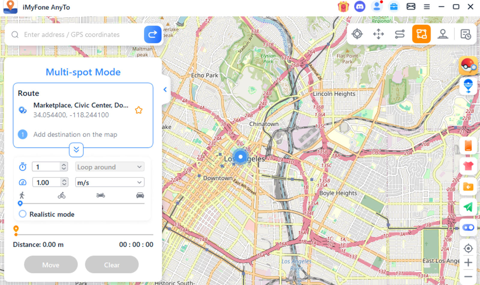
Multi-Spot Mode: Design a route involving multiple stops, enhancing the realism of your movement simulation.
Simulating movement across multiple spots using iMyFone AnyToSimulating movement across multiple spots using iMyFone AnyTo

Resetting Your Location

To revert to your original location, simply click the “Reset Location” button on the software’s dashboard. Should your location not update immediately, a restart of your device will ensure the changes take effect.

Here’s a video to learn more about the app:

Method 2: Disable “Share My Location”

Turning off your shared location is perhaps the easiest method to hide your device’s location. By disabling this feature, anyone you have previously shared your location with will no longer be able to see it. Follow these steps to turn off “Share My Location” on your iPhone:

Navigate to the Settings app.
Scroll to “Privacy & Security” and select it.
At the top, tap “Location Services.”
Find and tap “Share My Location.”
Switch the toggle to off.

Method 3: Enable Airplane Mode

Enabling Airplane Mode is perhaps a more straightforward approach to hiding your location and requires fewer steps compared to disabling “Share My Location.”

When Airplane Mode is activated, your iPhone disconnects from all networks, effectively freezing your last known location. To resume normal tracking, simply swipe down and turn off Airplane Mode.

Method 4: Use Another Apple Device

If you have an additional Apple device, you can configure it to share its location instead of your primary iPhone.

Here’s how to set it up:

Open the Find My app on the secondary device.
Tap the “Me” tab at the bottom right corner.
Enable location sharing from this device, not your primary iPhone.

By doing this, the location displayed to others will be that of the secondary device, allowing you to maintain privacy about your actual whereabouts.

Conclusion

There you have it – four discreet ways to freeze your location on an iPhone. These methods allow you to effectively freeze or spoof your iPhone’s location without raising suspicions.

Quick fixes like turning off “Share My Location” or enabling Airplane Mode are simple yet effective; for other scenarios, such as creating a route, an app like iMyFone AnyTo may come in handy.

The post Top 4 Methods to Spoof Location on iPhone appeared first on Hongkiat.

10 Alternative Frameworks to Laravel

Original Source: https://www.hongkiat.com/blog/laravel-alternatives/

While Laravel is popular for its rich features and ease of use, there are many other PHP frameworks that might better suit your needs.

In this article, we will explore 10 great alternatives to Laravel, each with its own unique strengths and features. Whether you’re looking for something lightweight, highly customizable, or built for high performance, I believe there’s an option here for you.

Without further ado, let’s jump in to see the full list.

FrameworkX
FrameworkX logoFrameworkX logo

FrameworkX is a lightweight PHP microframework created by Christian Luck, designed for building high-performance, real-time applications. It uses an event-driven, non-blocking architecture based on ReactPHP components, making it ideal for high-concurrency and real-time updates such as chat apps and live notifications.

Unlike Laravel, FrameworkX is minimalistic and doesn’t include built-in features like an ORM, templating engine, or expressive helper functions. This minimalism provides flexibility, allowing you to choose and integrate your own preferred libraries for templating, database abstraction, and other functionalities.

Check out our post on how to get started with FrameworkX.

PHP Minimum Requirement: 7.1

PROS

High-performance and real-time capabilities
Lightweight and minimalistic
Event-driven architecture based on ReactPHP components

CONS

Requires more manual integration to incorporate other features
Less expressive syntax compared to Laravel
Requires some getting used to if you are not familiar with event-driven architecture

Visit FrameworkX

CodeIgniter
CodeIgniter logoCodeIgniter logo

CodeIgniter is a lightweight PHP framework originally developed by EllisLab and now maintained by the CodeIgniter Foundation. Similar to Laravel, it follows a more structured architecture and offers many essential features for an MVC framework.

However, it lacks some of Laravel’s expressive syntax, like the Eloquent ORM and built-in front-end integrations. Despite this, its simplicity makes it easy to pick up for developers with fair experience in PHP, object-oriented programming, and MVC concepts.

PHP Minimum Requirement: 8.1

PROS

Lean, minimal, and easy to learn
Good documentation and community support
Built-in page cache module

CONS

Smaller ecosystem compared to Laravel
No built-in ORM
No built-in templating engine like Blade
Lack of expressive syntax
Lack of built-in front-end integration

Visit CodeIgniter

Laminas
Laminas logoLaminas logo

Laminas, formerly known as Zend Framework, is a PHP framework designed for enterprise-grade applications. It offers a collection of professional PHP packages for developing web applications and services. These components are framework-agnostic and comply with PSR (PHP Standard Recommendations), so they can be used outside Laminas.

Laminas differs significantly from Laravel. While Laravel focuses on developer experience, rapid development, and includes full-stack features built-in like Eloquent ORM and Blade, Laminas offers a more modular approach. It provides more flexibility but may require more configuration and setup time compared to Laravel.

PHP Minimum Requirement: 8.1.0

PROS

Highly modular and customizable
Strong focus on security and enterprise-level features
Scalable and suitable for large-scale applications
First-party ecosystem: Mezzio, API Tools, and MVC framework

CONS

Less expressive syntax
No built-in CLI, ORM, and templating engine
May require more manual integration for some of its components

Visit Laminas

Slim
Slim framework logoSlim framework logo

Slim is a PHP micro-framework developed by Josh Lockhart that focuses on essentials like routing, middleware, and HTTP request handling.

Unlike Laravel’s full-stack approach, Slim does not include a full MVC layer, a native template engine, or a database abstraction layer, so you’ll need to use your own preferred libraries and components if you need one.

This minimal footprint, however, makes Slim a great choice if you’re looking to create lightweight RESTful APIs or microservices.

PHP Minimum Requirement: 8.1

PROS

Lightweight and fast
Simple and easy to use
Ideal for small to medium-sized projects and APIs
Extensible with middleware and third-party components

CONS

Limited built-in features compared to full-stack frameworks
Requires additional libraries for ORM and templating engine

Visit Slim

Nette
Nette framework logoNette framework logo

Nette is a mature and feature-rich PHP framework created by David Grudl. It offers a comprehensive set of tools and components for building web applications, including a powerful templating engine called Latte, forms handling, database abstraction, and many other components.

Nette differs from Laravel in its focus. While Laravel prioritizes developer experience with features like Eloquent ORM, Blade, and the Artisan CLI included and pre-configured, Nette provides its first-party components separately. This allows you to choose which tools and libraries you’d need to include in your project. Despite its modularity, it provides a base application or skeleton to help you quickly start your projects.

PHP Minimum Requirement: 8.1

PROS

Matured and battle-tested framework, built since 2004
Comprehensive set of tools and components for building websites
Provides base or skeleton with flexible structure
Powerful templating engine: Latte
Good documentation and community support

CONS

Less opinionated than Laravel
Requires more manual configuration and setup
Smaller ecosystem compared to Laravel

Visit Nette

Phalcon
Phalcon framework logoPhalcon framework logo

Phalcon is a unique PHP framework. Unlike the others, it is delivered as a C extension. Designed to optimize speed by bypassing PHP’s interpreter and leveraging lower-level system resources directly, it includes full-stack features like a first-party ORM library, router, caching, and more.

Phalcon sets itself apart from Laravel with its architecture as a C extension. Unlike Laravel, which is implemented purely in PHP, Phalcon requires installing a PHP extension, so you need to be comfortable with commands like apt and PHP .ini configuration files to enable the extension. I think Phalcon is ideal for projects where performance is critical and can handle heavy workloads with minimal overhead.

PHP Minimum Requirement: 8.0

PROS

High performance due to its nature as a C extension
Full-stack features included like ORM, caching, dependency injection, i18n, templating engine, and router

CONS

Requires installing a PHP extension, which can be overwhelming for beginners
Much smaller ecosystem compared to Laravel

Visit Phalcon

Yii2
Yii2 framework logoYii2 framework logo

Yii2 is a PHP framework created by Qiang Xue, offering extensive features like an ORM, RESTful API, debugging tools, a boilerplate generator, and much more.

Yii2, I think, is quite similar to Laravel in its approach and principles. Unlike some frameworks where features are in separate modules, Yii2 has them built-in and pre-configured with MVC architecture. It also provides a starter kit with basic interfaces and functionality, similar to Laravel Breeze. Additionally, Yii2 also provides solid first-party modules like the Mailing module, i18n module, Docker for localhost, a first-party templating engine, and front-end integration with Bootstrap.

PHP Minimum Requirement: 7.3

PROS

Support for PHP 7.3, if you still need it
One of the earliest frameworks in PHP. It’s solid and battle-tested
First-party modules and tools included and pre-configured
Gii, one of its unique features to generate codes
Great documentation and community support

CONS

Smaller ecosystem compared to Laravel
Less expressive syntax compared to Laravel
Has a somewhat unusual namespacing pattern

Visit Yii2

Spiral
Spiral framework logoSpiral framework logo

Spiral is a high-performance PHP framework developed by the team at Spiral Scout. It is built around RoadRunner, a PHP application server written in Go, which enables it to handle heavy workloads efficiently and reduce the overhead that may commonly occur in traditional PHP applications.

Spiral uses a classic MVC approach and features a routing system similar to Laravel. However, it exclusively runs with RoadRunner, offering twice the performance out of the box compared to typical PHP MVC frameworks. It also includes components like JOBS, Worker, and BirdDog, specifically optimized for RoadRunner, leading to more optimized and faster applications.

PHP Minimum Requirement: 8.1

PROS

High performance due to its integration with RoadRunner
General-purpose framework that allows you to build MVC, CQRS, Event-Driven, and CLI apps
First-party ORM library, CycleORM, which I think looks neat!

CONS

Some learning curves, probably requires learning RoadRunner and how it works
Smaller ecosystem compared to Laravel

Visit Spiral

Neutomic
Neutomic framework logoNeutomic framework logo

Neutomic is a lightweight PHP framework designed for environments that require long-running processes. Built on top of RevoltPHP, Neutomic supports event-driven, non-blocking I/O operations, making it efficient for handling concurrent tasks.

Neutomic differs from Laravel in its use of an event-driven, non-blocking architecture, while Laravel uses a traditional synchronous design by default. Neutomic requires third-party libraries for features like ORM and templating, whereas Laravel includes these features built-in. To get started with an example of a Neutomic application, you can check out the skeleton repository at neutomic/skeleton.

PHP Minimum Requirement: 8.3

PROS

Lightweight and minimalistic
High-performance and efficient for handling concurrent tasks
Event-driven architecture based on RevoltPHP and Amp components

CONS

Requires more manual integration to incorporate other features, but it provides a skeleton to help you get started
Less expressive syntax compared to Laravel
Requires some getting used to if you are not familiar with event-driven architecture

Visit Neutomic

The post 10 Alternative Frameworks to Laravel appeared first on Hongkiat.

Top 7 WordPress Plugins for 2024: Enhance Your Site's Performance

Original Source: https://www.webdesignerdepot.com/top-7-wordpress-plugins/

WordPress is a hands-down favorite of website designers and developers. Renowned for its flexibility and ease of use, WordPress offers a vast array of tools to select from. Including an ecosystem of plugins designers/developers can put to use to enhance the flexibility of any WordPress website.

Useful Customer Journey Maps (+ Figma & Miro Templates)

Original Source: https://smashingmagazine.com/2024/07/customer-journey-maps-figma-miro-templates/

User journey maps are a remarkably effective way to visualize the user’s experience for the entire team. Instead of pointing to documents scattered across remote fringes of Sharepoint, we bring key insights together — in one single place.

Let’s explore a couple of helpful customer journey templates to get started and how companies use them in practice.

This article is part of our ongoing series on UX. You might want to take a look at Smart Interface Design Patterns 🍣 and the upcoming live UX training as well. Use code BIRDIE to save 15% off.

AirBnB Customer Journey Blueprint

AirBnB Customer Journey Blueprint (also check Google Drive example) is a wonderful practical example of how to visualize the entire customer experience for two personas, across eight touch points, with user policies, UI screens and all interactions with the customer service — all on one single page.

Now, unlike AirBnB, your product might not need a mapping against user policies. However, it might need other lanes that would be more relevant for your team. For example, include relevant findings and recommendations from UX research. List key actions needed for the next stage. Include relevant UX metrics and unsuccessful touchpoints.

Whatever works for you, works for you — just make sure to avoid assumptions and refer to facts and insights from research.

Spotify Customer Journey Map

Spotify Customer Journey Blueprint (high resolution) breaks down customer experiences by distinct user profiles, and for each includes mobile and desktop views, pain points, thoughts, and actions. Also, notice branches for customers who skip authentication or admin tasks.

Getting Started With Journey Maps

To get started with user journey maps, we first choose a lens: Are we reflecting the current state or projecting a future state? Then, we choose a customer who experiences the journey — and we capture the situation/goals that they are focusing on.

Next, we list high-level actions users are going through. We start by defining the first and last stages and fill in between. Don’t get too granular: list key actions needed for the next stage. Add the user’s thoughts, feelings, sentiments, and emotional curves.

Eventually, add user’s key touchpoints with people, services, tools. Map user journey across mobile and desktop screens. Transfer insights from other research (e.g., customer support). Fill in stage after stage until the entire map is complete.

Then, identify pain points and highlight them with red dots. Add relevant jobs-to-be-done, metrics, channels if needed. Attach links to quotes, photos, videos, prototypes, Figma files. Finally, explore ideas and opportunities to address pain points.

Free Customer Journey Maps Templates (Miro, Figma)

You don’t have to reinvent the wheel from scratch. Below, you will find a few useful starter kits to get up and running fast. However, please make sure to customize these templates for your needs, as every product will require its own specific details, dependencies, and decisions.

User Journey Map Template (Figma), by Estefanía Montaña B.
Customer Journey Mapping (PDF), by Taras Bakusevych
End-To-End User Experience Map (Figma), by Justin Tan
Customer Journey Map Template (Figma), by Ed Biden
Customer Journey Map Template (Miro), by Matt Anderson
Customer Journey Map (Miro), by Hustle Badger
Customer Experience Map Template (Miro), by Essense
The Customer Journey Map (Miro), by RSPRINT

Wrapping Up

Keep in mind that customer journeys are often non-linear, with unpredictable entry points and integrations way beyond the final stage of a customer journey map. It’s in those moments when things leave a perfect path that a product’s UX is actually stress-tested.

So consider mapping unsuccessful touchpoints as well — failures, error messages, conflicts, incompatibilities, warnings, connectivity issues, eventual lock-outs and frequent log-outs, authentication issues, outages, and urgent support inquiries.

Also, make sure to question assumptions and biases early. Once they live in your UX map, they grow roots — and it might not take long until they are seen as the foundation of everything, which can be remarkably difficult to challenge or question later. Good luck, everyone!

Meet Smart Interface Design Patterns

If you are interested in UX and design patterns, take a look at Smart Interface Design Patterns, our 10h-video course with 100s of practical examples from real-life projects — with a live UX training later this year. Everything from mega-dropdowns to complex enterprise tables — with 5 new segments added every year. Jump to a free preview. Use code BIRDIE to save 15% off.

Meet Smart Interface Design Patterns, our video course on interface design & UX.

Jump to the video course →

100 design patterns & real-life
examples.
10h-video course + live UX training. Free preview.

Revitalizing Freeda Language School’s Branding and Visual Identity

Original Source: https://abduzeedo.com/revitalizing-freeda-language-schools-branding-and-visual-identity

Revitalizing Freeda Language School’s Branding and Visual Identity

abduzeedo0703—24

Discover how Freeda Language School’s updated branding and visual identity reflect a vibrant, engaging learning experience.

Freeda Language School, a renowned institution in Barcelona, recognized the need for a refreshed visual identity after a decade. Designer Ilía Tuma took on this challenge, collaborating closely with Freeda’s team to modernize their brand. This article explores the new branding and visual identity that encapsulate Freeda’s dynamic spirit and commitment to engaging education.

Freeda’s original visual identity, crafted ten years ago, no longer reflected the school’s evolving ethos and vibrant student experience. As a former student, Ilía Tuma saw the opportunity to infuse the brand with elements that emphasize humanity, friendliness, and an engaging learning environment. The goal was to create a design that resonates with modern students while preserving the essence of Freeda.

Collaborative Design Process

The redesign process was a collaborative effort between Tuma and the Freeda team. This close cooperation ensured that the new visual identity would authentically reflect the school’s values and vision. The team aimed to create a brand that is not only modern and inviting but also inspiring and effective in conveying Freeda’s educational mission.

Key Elements of the New Visual Identity

1. Friendly Illustrations: The updated identity features illustrations that capture the essence of the student experience at Freeda. These visuals add a personal and welcoming touch, making the brand feel more relatable and engaging.

2. Expressive Colors: A vibrant color palette was chosen to reflect the dynamic and energetic atmosphere of the school. These colors help convey a sense of enthusiasm and joy in learning, aligning with Freeda’s commitment to a positive educational journey.

3. Modern Typography: The typography used in the new branding is both expressive and modern, enhancing the brand’s unique character. It ensures readability and adds a contemporary flair to the overall design.

4. Dynamic Design System: The new design system is versatile and cohesive, allowing for consistent application across various platforms and materials. This ensures that Freeda’s visual identity remains strong and recognizable in all contexts.

The updated visual identity for Freeda Language School not only modernizes the brand but also reinforces its commitment to providing a joyful and effective educational experience. The new design makes learning at Freeda both inviting and inspiring, appealing to students from around the world.

Looking ahead, this revitalized brand identity aligns seamlessly with Freeda’s vision for the future. It positions the school as a leader in language education, ready to continue attracting and inspiring students globally. The collaboration between Ilía Tuma and Freeda exemplifies how thoughtful design can enhance and elevate an educational brand.

Branding and visual identity artfiacts

Artifact from the Revitalizing Freeda Language School’s Branding and Visual Identityarticle on AbduzeedoArtifact from the Revitalizing Freeda Language School’s Branding and Visual Identityarticle on AbduzeedoArtifact from the Revitalizing Freeda Language School’s Branding and Visual Identityarticle on AbduzeedoArtifact from the Revitalizing Freeda Language School’s Branding and Visual Identityarticle on AbduzeedoArtifact from the Revitalizing Freeda Language School’s Branding and Visual Identityarticle on AbduzeedoArtifact from the Revitalizing Freeda Language School’s Branding and Visual Identityarticle on AbduzeedoArtifact from the Revitalizing Freeda Language School’s Branding and Visual Identityarticle on AbduzeedoArtifact from the Revitalizing Freeda Language School’s Branding and Visual Identityarticle on AbduzeedoArtifact from the Revitalizing Freeda Language School’s Branding and Visual Identityarticle on AbduzeedoArtifact from the Revitalizing Freeda Language School’s Branding and Visual Identityarticle on AbduzeedoArtifact from the Revitalizing Freeda Language School’s Branding and Visual Identityarticle on AbduzeedoArtifact from the Revitalizing Freeda Language School’s Branding and Visual Identityarticle on AbduzeedoArtifact from the Revitalizing Freeda Language School’s Branding and Visual Identityarticle on AbduzeedoArtifact from the Revitalizing Freeda Language School’s Branding and Visual Identityarticle on AbduzeedoArtifact from the Revitalizing Freeda Language School’s Branding and Visual Identityarticle on AbduzeedoArtifact from the Revitalizing Freeda Language School’s Branding and Visual Identityarticle on AbduzeedoArtifact from the Revitalizing Freeda Language School’s Branding and Visual Identityarticle on AbduzeedoArtifact from the Revitalizing Freeda Language School’s Branding and Visual Identityarticle on AbduzeedoArtifact from the Revitalizing Freeda Language School’s Branding and Visual Identityarticle on AbduzeedoArtifact from the Revitalizing Freeda Language School’s Branding and Visual Identityarticle on AbduzeedoArtifact from the Revitalizing Freeda Language School’s Branding and Visual Identityarticle on AbduzeedoArtifact from the Revitalizing Freeda Language School’s Branding and Visual Identityarticle on AbduzeedoArtifact from the Revitalizing Freeda Language School’s Branding and Visual Identityarticle on AbduzeedoArtifact from the Revitalizing Freeda Language School’s Branding and Visual Identityarticle on AbduzeedoArtifact from the Revitalizing Freeda Language School’s Branding and Visual Identityarticle on AbduzeedoArtifact from the Revitalizing Freeda Language School’s Branding and Visual Identityarticle on Abduzeedo

For more information make sure to check out Ilía Tuma website at tuma.world

Contrado Print on Demand Review: The Complete Guide for 2024

Original Source: https://ecommerce-platforms.com/articles/contrado-review

In today’s Contrado review, I’ll be taking a behind-the-scenes look at one of the top print-on-demand alternatives to Printify and Printful for UK sellers.

Contrado is a fantastic solution for creative entrepreneurs and individuals who need help designing unique fabrics, clothing, accessories, and even home and wall art.

Alongside offering rapid production times of just 1-2 days, Contrado also produces sustainable and ethical goods, that align with the priorities of today’s consumers.

Here, I’ll guide you through what you can accomplish with Contrado as a print-on-demand business, the pricing for its products and services, and more.

Quick Verdict

I consider Contrado to be an excellent print on demand solution for creators in the UK. It offers more than 450 products to choose from, an easy-to-use design tool, and exceptional high-quality fabrics.

Plus, it promises rapid production and delivery times, making it easy to delight your customers. The biggest downside is its limited integrations with ecommerce platforms.

What is Contrado and How Does it Work?

Contrado is a print on demand company that allows creators to design custom fabrics, home products, clothing, and accessories, and outsource production and fulfillment to their UK-based team.

Like most POD companies, Contrado doesn’t impose any minimum order quantities on creators. All products are produced “on demand” when your customer places an order.

Currently, Contrado has more than 450 products to choose from, including sustainable and eco-friendly items, and it offers access to an excellent, easy-to-use design tool. It can also offer rapid production and fulfillment times, getting some products to customers in around 5 business days.

With Contrado, you don’t have to pay a monthly fee or even sign up for an account to use the service. You can simply choose the product you want to customize from the company’s collection, and click “start design” to begin customizing your product.

Notably, although Contrado is based in the UK, it does offer worldwide delivery to a range of countries, including the USA. Plus, there’s an “artist marketplace”, where users can list their products alongside other items from independent creators. This means you don’t necessarily need to create your own store to start selling.

How Much Does it Cost?

Contrado doesn’t charge any monthly fees to creators. You don’t even need to sign up for an account to start creating products. All you pay for is the base price of your item, any customization costs, and the shipping fees (if you’re not charging those to your customers).

From what I could see, Contrado’s prices are a little higher than what you might expect from most print on demand companies. I think the reason for this is that Contrado specializes in “all over print”, which means you get more “premium” looking items.

The price of a t-shirt, for instance, starts at around $38.95, although Contrado does regularly offer discounts on some of its products. Additionally, there are volume and wholesale discounts available, as well as the option to get 20% off if you’re a student.

Delivery prices also vary depending on where you are in the world. If you’re based in the UK, prices start at £2.49 for tracked, standard shipping (1-3 days). There’s also the option for next-day delivery, Saturday deliveries, and click and collect.

If your customers are in the US, however, standard delivery starts at $9.95 (2-4 days), or you can upgrade to express delivery for $15.94.

Design Tools and Features

Creating a custom product with Contrado is pretty straightforward. All you need to do is visit the website, and click on the item you want to customize. Virtually all of Contrado’s products are sustainably printed, and can include a custom label for branding.

Once you click the “Start Design” button on the product page, you’ll automatically be taken to Contrado’s simple design tool. You can choose the fit of your product, packaging options, design options, thread colors, and even add your own label:

There’s also some handy design tools, including a library of clip art and pattern options to choose from. Once you’ve chosen your design, you can experiment with text and placement, then preview your design and add it to your cart.

Notably, there’s not much of a “mockup generator” available here. You can see a 360-degree image of your product, but you can’t see it in “lifestyle” photos like you’d be able to with something like Printful.

Once you’ve completed your design, you can add it to your shopping bag, and choose your delivery options. It’s as simple as that.

Alongside simple design tools, Contrado also offers access to a few extra features, such as:

Standard and express delivery options.

Custom packaging and label printing

A profit calculator to help you choose the right product prices

Product Options and Quality

In terms of product options, Contrado offers around 450 products to customize. There’s even the option to print your own fabrics if you want to create products from scratch yourself. With fabric printing, you also have a range of printing methods to choose from, such as reactive printing, pigment printing, and sublimation printing.

You can also design custom labels, swatch packs and color charts, leather and card swing tags, transfer paper designs, and more. Some of the popular products offered by Contrado include:

Wall art and wallpaper (framed prints, canvas prints, and metal prints)

Kitchen and dining products (cookware, glassware, kitchen accessories)

Home furnishings (bedding, blankets, rugs, curtains, and stationery)

Women’s clothing (Tops, t-shirts, dresses, footwear, swimwear, and more)

Men’s clothing (T-shirts, jackets, footwear, sportswear, and button-up shirts)

Kid’s accessories (Baby sleeping bags, blankets, teddy bears, and bids)

Women’s accessories (purses, wallets, leather bags, socks, and scarves)

Men’s accessories (Ties, wallets, suitcases, pocket squares, cufflinks)

Contrado actually offers a wide selection of unique products you won’t find from more print on demand vendors, making it an excellent way to differentiate yourself in the growing market. However, the prices for those products are pretty high.

From what I can tell, Contrado uses exceptional high-quality materials, and sustainable inks for all of its products. It also has excellent reviews for crisp, clean, and beautiful prints.

However, there’s no option to order a discounted sample of your products, which makes it difficult to verify the quality for yourself.

Contrado Selling Options and Integrations

Unfortunately, I couldn’t find many ways to actually connect your Contrado products to third-party marketplaces and ecommerce platforms. The only integration I could find was one for Shopify, which allows you to automatically add the products from your Contrado account to Shopify, and use the solution for automated dropshipping.

Outside of using Shopify with Contrado, the only way to order and sell products is to purchase them through Contrado directly and ship them straight to your customer. This means you’ll need to place every order manually, which can be time consuming as your business starts to scale.

Notably, however, you can purchase products wholesale, or in bulk, for a discount, so there is an option to purchase more products yourself, store them and ship them to your customers manually, but this might not be an appealing choice for those who want the simplicity of the standard print on demand experience.

Alternatively, you can always use the Contrado marketplace to showcase your products alongside other creators, but this does mean you’ll have to compete for attention against other sellers.

Contrado Customer Support

Like most print on demand vendors, Contrado offers a few options for customer support. First, there’s a basic help center where you can find some information about connecting Contrado to Shopify, managing products, and automating certain aspects of your POD business.

You can also connect with the team directly through their live chat feature, check your order status on the website, and reach out via phone, between the hours of 6pm to 2:30am EST.

Unfortunately, there’s no 24/7 support option, which might be a problem, particularly if you’re located outside of the UK, where the opening hours are a little unusual. Still, if you do manage to catch the team online, then you should expect an answer to your questions pretty quickly.

Pros and Cons

Pros:

Easy to use and intuitive design tools

Wide range of unique product options

Exceptional printing and production quality

Lots of printing options

Plenty of branding solutions (such as custom labels)

Rapid fulfillment and delivery times

Cons:

Expensive pricing for most products

Shipping options can vary outside of the UK

Limited customer support outside of the UK

Not many integration options

Contrado Review: The Verdict

Ultimately, I think Contrado is an excellent solution or print on demand sellers in the UK that want access to high-quality and unique products, produced and delivered rapidly to customers. It also has excellent design tools and resources that make it easy to launch your POD brand.

However, it does have some downsides, such as expensive product pricing, and limited integrations with platforms outside of Shopify.

If you’re located outside of the UK, or you want to sell your products on a range of different channels, I’d recommend considering options like Printful or Printify instead. Those companies can also offer slightly cheaper products, although it’s worth noting that the product quality for any POD provider can vary.

The post Contrado Print on Demand Review: The Complete Guide for 2024 appeared first on Ecommerce Platforms.

Gigabyte Aorus CO49DQ review: this gaming monitor is bigger than big

Original Source: https://www.creativebloq.com/tech/monitors/gigabyte-aorus-co49dq-review-this-gaming-monitor-is-bigger-than-big

Big, bright and rather beautiful, this ultrawide monitor is a desk-filling delight.

How To Improve Your Microcopy: UX Writing Tips For Non-UX Writers

Original Source: https://smashingmagazine.com/2024/06/how-improve-microcopy-ux-writing-tips-non-ux-writers/

Throughout my UX writing career, I’ve held many different roles: a UX writer in a team of UX writers, a solo UX writer replacing someone who left, the first and only UX writer at a company, and even a teacher at a UX writing course, where I reviewed more than 100 home assignments. And oh gosh, what I’ve seen.

Crafting microcopy is not everyone’s strong suit, and it doesn’t have to be. Still, if you’re a UX designer, product manager, analyst, or marketing content writer working in a small company, on an MVP, or on a new product, you might have to get by without a UX writer. So you have the extra workload of creating microcopy. Here are some basic rules that will help you create clear and concise copy and run a quick health check on your designs.

Ensure Your Interface Copy Is Role-playable
Why it’s important:
To create a friendly, conversational experience;To work out a consistent interaction pattern.

When crafting microcopy, think of the interface as a dialog between your product and your user, where:

Titles, body text, tooltips, and so on are your “phrases.”
Button labels, input fields, toggles, menu items, and other elements that can be tapped or selected are the user’s “phrases.”

Ideally, you should be able to role-play your interface copy: a product asks the user to do something — the user does it; a product asks for information — the user types it in or selects an item from the menu; a product informs or warns the user about something — the user takes action.

For example, if your screen is devoted to an event and the CTA is for the user to register, you should opt for a button label like “Save my spot” rather than “Save your spot.” This way, when a user clicks the button, it’s as if they are pronouncing the phrase themselves, which resonates with their thoughts and intentions.

Be Especially Transparent And Clear When It Comes To Sensitive Topics
Why it’s important: To build trust and loyalty towards your product.

Some topics, such as personal data, health, or money, are extremely sensitive for people. If your product involves any limitations, peculiarities, or possible negative outcomes related to these sensitive topics, you should convey this information clearly and unequivocally. You will also need to collaborate with your UX/UI Designer closely to ensure you deliver this information in a timely manner and always make it visible without requiring the user to take additional actions (e.g., don’t hide it in tooltips that are only shown by tapping).

Here’s a case from my work experience. For quite some time, I’ve been checking homework assignments for a UX writing course. In this course, all the tasks have revolved around an imaginary app for dog owners. One of the tasks students worked on was creating a flow for booking a consultation with a dog trainer. The consultation had to be paid in advance. In fact, the money was blocked on the user’s bank card and charged three hours before the consultation. That way, a user could cancel the meeting for free no later than three hours before the start time. A majority of the students added this information as a tooltip on the checkout screen; if a user didn’t tap on it, they wouldn’t be warned about the possibility of losing money.

In a real-life situation, this would cause immense negativity from users: they may post about it on social media, and it will show the company in a bad light. Even if you occasionally resort to dark patterns, make sure you can afford any reputational risks.

So, when creating microcopy on sensitive topics:

Be transparent and honest about all the processes and conditions. For example, you’re a fintech service working with other service providers. Because of that, you have fees built into transactions but don’t know the exact amount. Explain to users how the fees are calculated, their approximate range (if possible), and where users can see more precise info.
Reassure users that you’ll be extremely careful with their data. Explain why you need their data, how you will use it, store and protect it from breaches, and so on.
If some restrictions or limitations are implied, provide options to remove them (if possible).

Ensure That The Button Label Accurately Reflects What Happens Next
Why it’s important:
To make your interface predictable, trustworthy, and reliable;To prevent user frustration.

The button label should reflect the specific action that occurs when the user clicks or taps it.

It might seem valid to use a button label that reflects the user’s goal or target action, even if it actually happens a bit later. For example, if your product allows users to book accommodations for vacations or business trips, you might consider using a “Book now” button in the booking flow. However, if tapping it leads the user to an order screen where they need to select a room, fill out personal details, and so on, the accommodation is not booked immediately. So you might want to opt for “Show rooms,” “Select a rate,” or another button label that better reflects what happens next.

Moreover, labels like “Buy now” or “Book now” might seem too pushy and even off-putting (especially when it comes to pricey products involving a long decision-making process), causing users to abandon your website or app in favor of ones with buttons that create the impression they can browse peacefully for as long as they need. You might want to let your users “Explore,” “Learn more,” “Book a call,” or “Start a free trial” first.

As a product manager or someone with a marketing background, you might want to create catchy and fancy button labels to boost conversion rates. For instance, when working on an investment app, you might label a button for opening a brokerage account as “Become an investor.” While this might appeal to users’ egos, it can also come across as pretentious and cheap. Additionally, after opening an account, users may still need to do many things to actually become investors, which can be frustrating. Opt for a straightforward “Open an account” button instead.

In this regard, it’s better not to promise users things that we can’t guarantee or that aren’t entirely up to us. For example, in a flow that includes an OTP password, it’s better to opt for the “Send a code” button rather than “Get a code” since we can’t guarantee there won’t be any network outages or other issues preventing the user from receiving an SMS or a push notification.

Finally, avoid using generic “Yes” or “No” buttons as they do not clearly reflect what happens next. Users might misread the text above or fail to notice a negation, leading to unexpected outcomes. For example, when asking for a confirmation, such as “Are you sure you want to quit?” you might want to go with button labels like “Quit” and “Stay” rather than just “Yes” and “No.”

Tip: If you have difficulty coming up with a button label, this may be a sign that the screen is poorly organized or the flow lacks logic and coherence. For example, a user has to deal with too many different entities and types of tasks on one screen, so the action can’t be summarized with just one verb. Or perhaps a subsequent flow has a lot of variations, making it hard to describe the action a user should take. In such cases, you might want to make changes to the screen (say, break it down into several screens) or the flow (say, add a qualifying question or attribute earlier so that the flow would be less branching).

Make It Clear To The User Why They Need To Perform The Action
Why it’s important:
To create transparency and build trust;To boost conversion rates.

An ideal interface is self-explanatory and needs no microcopy. However, sometimes, we need to convince users to do something for us, especially when it involves providing personal information or interacting with third-party products.

You can use the following formula: “To [get this], do [this] + UI element to make it happen.” For example, “To get your results, provide your email,” followed by an input field.

It’s better to provide the reasoning (“to get your results”) first and then the instructions (“provide your email” ): this way, the guidance is more likely to stick in the user’s memory, smoothly leading to the action. If you reverse the order — giving the instructions first and then the reasoning — the user might forget what they need to do and will have to reread the beginning of the sentence, leading to a less smooth and slightly hectic experience.

Ensure The UI Element Copy Doesn’t Explain How To Interact With This Very Element
Why it’s important:
If you need to explain how to interact with a UI element, it may be a sign that the interface is not intuitive;Risk omitting or not including more important, useful text.

Every now and then, I come across meaningless placeholders or excessive toggle copy that explains how to interact with the field or toggle. The most frequent example is the “Search” placeholder for a search field. Occasionally, I see button labels like “Press to continue.”

Mobile and web interfaces have been around for quite a while, and users understand how to interact with buttons, toggles, and fields. Therefore, explanations such as “click,” “tap,” “enter,” and so on seem excessive in most cases. Perhaps it’s only with a group of checkboxes that you might add something like “Select up to 5.”

You might want to add something more useful. For example, instead of a generic “Search” placeholder for a search field, use specific instances a user might type in. If you’re a fashion marketplace, try placeholders like “oversized hoodies,” “women’s shorts,” and so on. Keep in mind the specifics of your website or app: ensure the placeholder is neither too broad nor too specific, and if a user types something like you’ve provided, their search will be successful.

Stick To The Rule “1 Microcopy Item = 1 Idea”
Why it’s important:
Not to create extra cognitive load, confusion, or friction;To ensure a smooth and simple experience.

Users have short attention spans, scan text instead of reading it thoroughly, and can’t process multiple ideas simultaneously. That’s why it’s crucial to break information down into easily digestible chunks instead of, for example, trying to squeeze all the restrictions into one tooltip.

The golden rule is to provide users only with the information they need at this particular stage to take a specific action or make a decision.

You’ll need to collaborate closely with your designer to ensure the information is distributed over the screen evenly and you don’t overload one design element with a lot of text.

Be Careful With Titles Like “Done,” “Almost There,” “Attention,” And So On
Why it’s important:
Not to annoy a user;To be more straightforward and economical with users’ time;Not to overuse their attention;Not to provoke anxiety.

Titles, written in bold and larger font sizes, grab users’ attention. Sometimes, titles are the only text users actually read. Titles stick better in their memory, so they must be understandable as a standalone text.

Titles like “One more thing” or “Almost there” might work well if they align with a product’s tone of voice and the flows where they appear are cohesive and can hardly be interrupted. But keep in mind that users might get distracted.

Use this quick check: set your design aside for about 20 minutes, do something else, and then open only the screen for which you’re writing a title. Is what happens on this screen still understandable from the title? Do you easily recall what has or hasn’t happened, what you were doing, and what should be done next?

Don’t Fall Back On Abstract Examples
Why it’s important:
To make the interface more precise and useful;To ease the navigation through the product for a user;To reduce cognitive load.

Some products (e.g., any B2B or financial ones) involve many rules and restrictions that must be explained to the user. To make this more understandable, use real-life examples (with specific numbers, dates, and so on) rather than distilling abstract information into a hint, tooltip, or bottom sheet.

It’s better to provide explanations using real-life examples that users can relate to. Check with engineers if it’s possible to get specific data for each user and add variables and conditions to show every user the most relevant microcopy. For example, instead of saying, “Your deposit limit is $1,000 per calendar month,” you could say, “Until Jan 31, you can deposit $400 more.” This relieves the user of unnecessary work, such as figuring out the start date of the calendar month in their case and calculating the remaining amount.

Try To Avoid Negatives
Why it’s important:
Not to increase cognitive load;To prevent friction.

As a rule of thumb, it’s recommended to avoid double negatives, such as “Do not unfollow.” However, I’d go further and advise avoiding single negatives as well. The issue is that to decipher such a message, a user has to perform an excessive logical operation: first eliminating the negation, then trying to understand the gist.

For example, when listing requirements for a username, saying “Don’t use special characters, spaces, or symbols” forces a user to speculate (“If this is not allowed, then the opposite is allowed, which must be…”). It can take additional time to figure out what falls under “special characters.” To simplify the task for the user, opt for something like “Use only numbers and letters.”

Moreover, a user can easily overlook the “not” part and misread the message.

Another aspect worth noting is that negation often seems like a restriction or prohibition, which nobody likes. In some cases, especially in finance, all those don’ts might be perceived with suspicion rather than as precaution.

Express Action With Verbs, Not Nouns
Why it’s important:
To avoid wordiness;To make text easily digestible.

When describing an action, use a verb, not a noun. Nouns that convey the meaning of verbs make texts harder to read and give off a legalistic vibe.

Here are some sure signs you need to paraphrase your text for brevity and simplicity:

Forms of “be” as the main verbs;
Noun phrases with “make” (e.g., “make a payment/purchase/deposit”);
Nouns ending in -tion, -sion, -ment, -ance, -ency (e.g., cancellation);
Phrases with “of” (e.g., provision of services);
Phrases with “process” (e.g., withdrawal process).

Make Sure You Use Only One Term For Each Entity
Why it’s important: Not to create extra cognitive load, confusion, and anxiety.

Ensure you use the same term for the same object or action throughout the entire app. For example, instead of using “account” and “profile” interchangeably, choose one and stick to it to avoid confusing your users.

The more complicated and/or regulated your product is, the more vital it is to choose precise wording and ensure it aligns with legal terms, the wording users see in the help center, and communication with support agents.

Less “Oopsies” In Error Messages
Why it’s important:
Not to annoy a user;To save space for more important information.

At first glance, “Oops” may seem sweet and informal (yet with an apologetic touch) and might be expected to decrease tension. However, in the case of repetitive or serious errors, the effect will be quite the opposite.

Use “Oops” and similar words only if you’re sure it suits your brand’s tone of voice and you can finesse it.

As a rule of thumb, good error messages explain what has happened or is happening, why (if we know the reason), and what the user should do. Additionally, include any sensitive information related to the process or flow where the error appears. For example, if an error occurs during the payment process, provide users with information concerning their money.

No Excessive Politeness
Why it’s important: Not to waste precious space on less critical information.

I’m not suggesting we remove every single “please” from the microcopy. However, when it comes to interfaces, our priority is to convey meaning clearly and concisely and explain to users what to do next and why. Often, if you start your microcopy with “please,” you won’t have enough space to convey the essence of your message. Users will appreciate clear guidelines to perform the desired action more than a polite message they struggle to follow.

Remove Tech Jargon
Why it’s important:
To make the interface understandable for a broad audience;To avoid confusion and ensure a frictionless experience.

As tech specialists, we’re often subject to the curse of knowledge, and despite our efforts to prioritize users, tech jargon can sneak into our interface copy. Especially if our product targets a wider audience, users may not be tech-savvy enough to understand terms like “icon.”

To ensure your interface doesn’t overwhelm users with professional jargon, a quick and effective method is to show the interface to individuals outside your product group. If that’s not feasible, here’s how to identify jargon: it’s the terminology you use in daily meetings among yourselves or in Jira task titles (e.g., authorization, authentication, and so on), or abbreviations (e.g., OTP code, KYC process, AML rules, and so on).

Ensure That Empty State Messages Don’t Leave Users Frustrated
Why it’s important:
For onboarding and navigation;To increase discoverability of particular features;To promote or boost the use of the product;To reduce cognitive load and anxiety about the next steps.

Quite often, a good empty state message is a self-destructing one, i.e. one that helps a user to get rid of this emptiness. An empty state message shouldn’t just state “there’s nothing here” — that’s obvious and therefore unnecessary. Instead, it should provide users with a way out, smoothly guiding them into using the product or a specific feature. A well-crafted empty message can even boost conversions.

Of course, there are exceptions, for example, in a reactive interface like a CRM system for a restaurant displaying the status of orders to workers. If there are no orders in progress and, therefore, no corresponding empty state message, you can’t nudge or motivate restaurant workers to create new orders themselves.

Place All Important Information At The Beginning
Why it’s important:
To keep the user focused;Not to overload a user with info;Avoid information loss due to fading or cropping.

As mentioned earlier, users have short attention spans and often don’t want to focus on the texts they read, especially microcopy. Therefore, ensure you place all necessary information at the beginning of your text. Omit lead-ins, introductory words, and so on. Save less vital details for later in the text.

Ensure Title And Buttons Are Understandable Without Body Text
Why it’s important:
For clarity;To overcome the serial position effect;To make sure the interface, the flow, and the next steps are understandable for a user even if they scan the text instead of reading.

There’s a phenomenon called the serial position effect: people tend to remember information better if it’s at the beginning or end of a text or sentence, often overlooking the middle part. When it comes to UX/UI design, this effect is reinforced by the visual hierarchy, which includes the bigger font size of the title and the accentuated buttons. What’s more, the body text is often longer, which puts it at risk of being missed. Since users tend to scan rather than read, ensure your title and buttons make sense even without the body text.

Wrapping up

Trying to find the balance between providing a user with all the necessary explanations, warnings, and reasonings on one hand and keeping the UI intuitive and frictionless on the other hand is a tricky task.

You can facilitate the process of creating microcopy with the help of ChatGPT and AI-based Figma plugins such as Writer or Grammarly. But beware of the limitations these tools have as of now.

For instance, creating a prompt that includes all the necessary details and contexts can take longer than actually writing a title or a label on your own. Grammarly is a nice tool to check the text for typos and mistakes, but when it comes to microcopy, its suggestions might be a bit inaccurate or confusing: you might want to, say, omit articles for brevity or use elliptical sentences, and Grammarly will identify it as a mistake.

You’ll still need a human eye to evaluate the microcopy &mdahs; and I hope this checklist will come in handy.

Microcopy Checklist

General

✅ Microcopy is role-playable (titles, body text, tooltips, etc., are your “phrases”; button labels, input fields, toggles, menu items, etc. are the user’s “phrases”).

Information presentation & structure

✅ The user has the exact amount of information they need right now to perform an action — not less, not more.
✅ Important information is placed at the beginning of the text.
✅ It’s clear to the user why they need to perform the action.
✅ Everything related to sensitive topics is always visible and static and doesn’t require actions from a user (e.g., not hidden in tooltips).
✅ You provide a user with specific information rather than generic examples.
✅ 1 microcopy item = 1 idea.
✅ 1 entity = 1 term.
✅ Empty state messages provide users with guidelines on what to do (when possible and appropriate).

Style

✅ No tech jargon.
✅ No excessive politeness, esp. at the expense of meaning.
✅ Avoid or reduce the use of “not,” “un-,” and other negatives.
✅ Actions are expressed with verbs, not nouns.

Syntax

✅ UI element copy doesn’t explain how to interact with this very element.
✅ Button label accurately reflects what happens next.
✅ Fewer titles like “done,” “almost there,” and “attention.”
✅ “Oopsies” in error messages are not frequent and align well with the brand’s tone of voice.
✅ Title and buttons are understandable without body text.

Headings

✅ The main article heading is an h1 — a level 1 heading. Use level 2 and level 3 headings to break up your text.

Images

✅ Standard images need to be at least 800px wide. We also have the option of full-width images for very detailed views. If using Dropbox Paper or Google Docs, add your images inline, but please also add them to the list at the end of this template so we can be sure we have them all in high-resolution format.

Tales Of An Eternal Summer (July 2024 Wallpapers Edition)

Original Source: https://smashingmagazine.com/2024/06/desktop-wallpaper-calendars-july-2024/

For many of us, July is the epitome of summer. The time for spending every free minute outside to enjoy the sun and those seemingly endless summer days, be it in a nearby park, by a lake, or on a trip exploring new places. So why not bring a bit of that summer joy to your desktop, too?

For this month’s wallpapers post, artists and designers from across the globe once again tickled their creativity to capture the July feeling in a collection of desktop wallpapers. They all come in versions with and without a calendar for July 2024 and can be downloaded for free — as it has been a Smashing tradition for more than 13 years already. A huge thank-you to everyone who submitted their artworks this month — this post wouldn’t exist without you!

As a little bonus goodie, we also compiled a selection of July favorites from our wallpapers archives at the end of this post. So maybe you’ll discover one of your almost-forgotten favorites in here, too? Have a fantastic July, no matter what your plans are!

You can click on every image to see a larger preview,
We respect and carefully consider the ideas and motivation behind each and every artist’s work. This is why we give all artists the full freedom to explore their creativity and express emotions and experience through their works. This is also why the themes of the wallpapers weren’t anyhow influenced by us but rather designed from scratch by the artists themselves.
Submit a wallpaper!
Did you know that you could get featured in our next wallpapers post, too? We are always looking for creative talent.

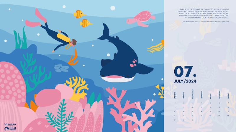
Diving Among Corals

“The long-awaited vacation is coming closer. After working all year, we find ourselves with months that, although we don’t stop completely, are lived differently. We enjoy the days and nights more, and if we can, the beach will keep us company. Therefore, we’ll spend this month in Australia, enjoying the coral reefs and diving without limits.” — Designed by Veronica Valenzuela from Spain.
preview
with calendar: 640×480, 800×480, 1024×768, 1280×720, 1280×800, 1440×900, 1600×1200, 1920×1080, 1920×1440, 2560×1440
without calendar: 640×480, 800×480, 1024×768, 1280×720, 1280×800, 1440×900, 1600×1200, 1920×1080, 1920×1440, 2560×1440

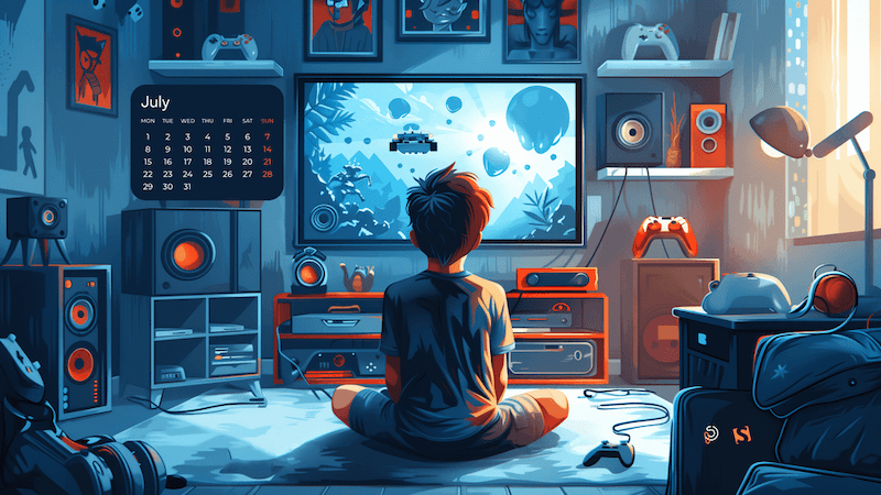
Level Up

“Join gamers worldwide on National Video Game Day to honor the rich history and vibrant culture of gaming. Enjoy exclusive discounts on top titles, participate in exciting online tournaments, and dive into special events featuring your favorite games. Whether you’re a casual player or a dedicated enthusiast, there’s something for everyone to celebrate on this epic day!” — Designed by PopArt Studio from Serbia.
preview
with calendar: 320×480, 640×480, 800×480, 800×600, 1024×768, 1024×1024, 1152×864, 1280×720, 1280×800, 1280×960, 1280×1024, 1400×1050, 1440×900, 1600×1200, 1680×1050, 1680×1200, 1920×1080, 1920×1200, 1920×1440, 2560×1440
without calendar: 320×480, 640×480, 800×480, 800×600, 1024×768, 1024×1024, 1152×864, 1280×720, 1280×800, 1280×960, 1280×1024, 1400×1050, 1440×900, 1600×1200, 1680×1050, 1680×1200, 1920×1080, 1920×1200, 1920×1440, 2560×1440

Bigfoot And The Little Girl

“This heartwarming moment captures an unlikely friendship of a gentle Bigfoot and an adorable little girl set against the backdrop of a magical and serene evening in nature.” — Designed by Reethu M from London.

preview
with calendar: 320×480, 640×480, 800×480, 800×600, 1024×768, 1024×1024, 1152×864, 1280×720, 1280×800, 1280×960, 1280×1024, 1366×768, 1400×1050, 1440×900, 1600×1200, 1680×1050, 1680×1200, 1920×1080, 1920×1200, 1920×1440, 2560×1440
without calendar: 320×480, 640×480, 800×480, 800×600, 1024×768, 1024×1024, 1152×864, 1280×720, 1280×800, 1280×960, 1280×1024, 1366×768, 1400×1050, 1440×900, 1600×1200, 1680×1050, 1680×1200, 1920×1080, 1920×1200, 1920×1440, 2560×1440

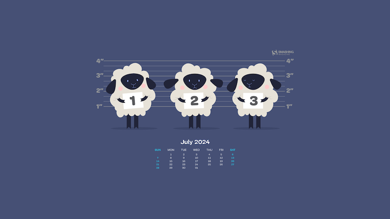
Good Night

Designed by Ricardo Gimenes from Sweden.
preview
with calendar: 640×480, 800×480, 800×600, 1024×768, 1024×1024, 1152×864, 1280×720, 1280×800, 1280×960, 1280×1024, 1366×768, 1400×1050, 1440×900, 1600×1200, 1680×1050, 1680×1200, 1920×1080, 1920×1200, 1920×1440, 2560×1440, 3840×2160
without calendar: 640×480, 800×480, 800×600, 1024×768, 1024×1024, 1152×864, 1280×720, 1280×800, 1280×960, 1280×1024, 1366×768, 1400×1050, 1440×900, 1600×1200, 1680×1050, 1680×1200, 1920×1080, 1920×1200, 1920×1440, 2560×1440, 3840×2160

Full Buck Moon

“July is the month of the full buck moon, named after the fact that many deer regrow their antlers around this time. It is also when the United States celebrate their Independence Day with fireworks and fun. I decided to combine these aspects into a magical encounter during the fourth of July. It takes place in a field of larkspur which is a flower associated with July.” — Designed by Quincy van Geffen from the Netherlands.

preview
with calendar: 1440×900, 1600×1200, 1680×1050, 1680×1200, 1920×1080, 1920×1200, 1920×1440, 2560×1440
without calendar: 1440×900, 1600×1200, 1680×1050, 1680×1200, 1920×1080, 1920×1200, 1920×1440, 2560×1440

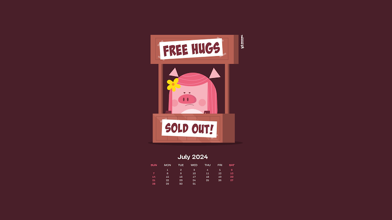
No More Hugs

Designed by Ricardo Gimenes from Sweden.
preview
with calendar: 640×480, 800×480, 800×600, 1024×768, 1024×1024, 1152×864, 1280×720, 1280×800, 1280×960, 1280×1024, 1366×768, 1400×1050, 1440×900, 1600×1200, 1680×1050, 1680×1200, 1920×1080, 1920×1200, 1920×1440, 2560×1440, 3840×2160
without calendar: 640×480, 800×480, 800×600, 1024×768, 1024×1024, 1152×864, 1280×720, 1280×800, 1280×960, 1280×1024, 1366×768, 1400×1050, 1440×900, 1600×1200, 1680×1050, 1680×1200, 1920×1080, 1920×1200, 1920×1440, 2560×1440, 3840×2160

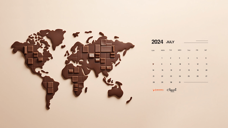
Celebrating World Chocolate Day

“World Chocolate Day, celebrated on July 7th, invites chocolate lovers worldwide to indulge in their favorite treat. Commemorating chocolate’s introduction to Europe, this day celebrates its global popularity. Enjoy dark, milk, or white chocolate, bake delicious desserts, and share the sweetness with loved ones.” — Designed by Reethu M from London.
preview
with calendar: 320×480, 640×480, 800×480, 800×600, 1024×768, 1024×1024, 1152×864, 1280×720, 1280×800, 1280×960, 1280×1024, 1366×768, 1400×1050, 1440×900, 1600×1200, 1680×1050, 1680×1200, 1920×1080, 1920×1200, 1920×1440, 2560×1440
without calendar: 320×480, 640×480, 800×480, 800×600, 1024×768, 1024×1024, 1152×864, 1280×720, 1280×800, 1280×960, 1280×1024, 1366×768, 1400×1050, 1440×900, 1600×1200, 1680×1050, 1680×1200, 1920×1080, 1920×1200, 1920×1440, 2560×1440

Birdie July

Designed by Lívi Lénárt from Hungary.

preview
without calendar: 800×600, 1024×1024, 1152×864, 1280×960, 1280×1024, 1600×1200, 1920×1080, 2560×1440

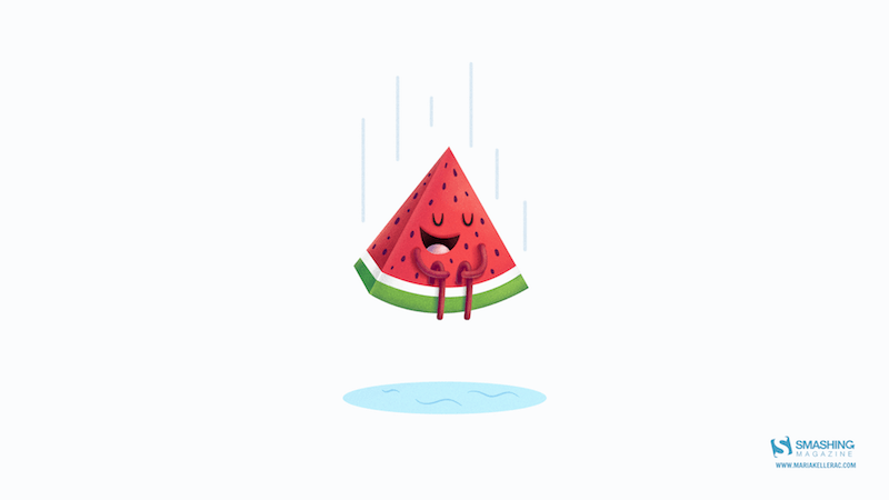
Summer Cannonball

“Summer is coming in the northern hemisphere and what better way to enjoy it than with watermelons and cannonballs.” — Designed by Maria Keller from Mexico.
preview
without calendar: 320×480, 640×480, 640×1136, 750×1334, 800×480, 800×600, 1024×768, 1024×1024, 1152×864, 1242×2208, 1280×720, 1280×800, 1280×960, 1280×1024, 1366×768, 1400×1050, 1440×900, 1600×1200, 1680×1050, 1680×1200, 1920×1080, 1920×1200, 1920×1440, 2560×1440, 2880×1800

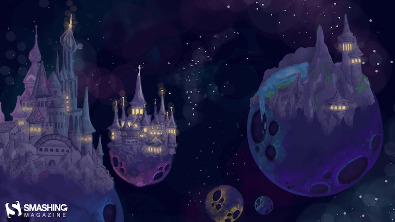
In Space

Designed by Lieke Dol from the Netherlands.
preview
without calendar: 1280×800, 1280×960, 1280×1024, 1400×1050, 1440×900, 1600×1200, 1680×1050, 1680×1200, 1920×1080, 1920×1200, 1920×1440, 2560×1440

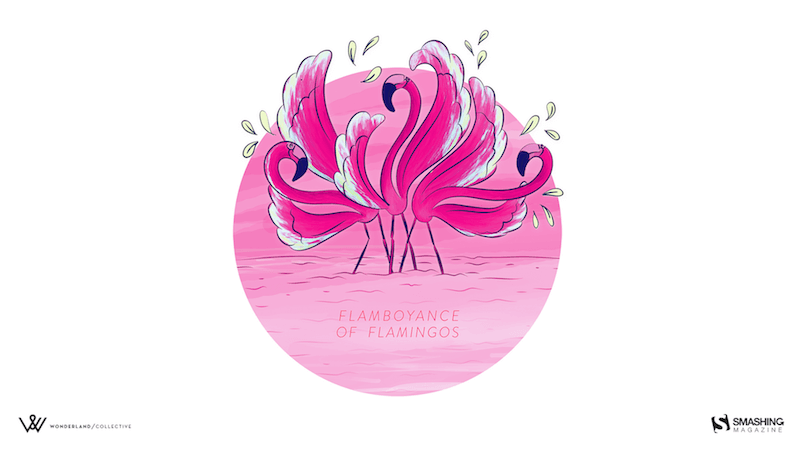
A Flamboyance Of Flamingos

“July in South Africa is dreary and wintery so we give all the southern hemisphere dwellers a bit of color for those gray days. And for the northern hemisphere dwellers a bit of pop for their summer!” — Designed by Wonderland Collective from South Africa.
preview
without calendar: 320×480, 800×600, 1024×768, 1280×960, 1680×1050, 1920×1200, 2560×1440

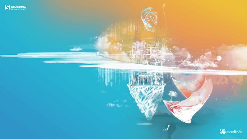
Eternal Summer

“And once you let your imagination go, you find yourself surrounded by eternal summer, unexplored worlds, and all-pervading warmth, where there are no rules of physics and colors tint the sky under your feet.” — Designed by Ana Masnikosa from Belgrade, Serbia.
preview

without calendar: 320×480, 640×480, 800×480, 800×600, 1024×768, 1024×1024, 1152×864, 1280×720, 1280×800, 1280×960, 1280×1024, 1400×1050, 1440×900, 1600×1200, 1680×1050, 1680×1200, 1920×1080, 1920×1200, 1920×1440, 2560×1440

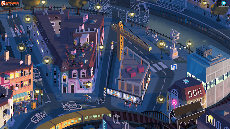
Day Turns To Night

Designed by Xenia Latii from Germany.
preview
without calendar: 320×480, 640×480, 800×480, 800×600, 1024×768, 1152×864, 1280×720, 1280×800, 1280×960, 1280×1024, 1366×768, 1400×1050, 1440×900, 1600×1200, 1680×1050, 1680×1200, 1920×1080, 1920×1200, 1920×1440, 2560×1440

Tropical Lilies

“I enjoy creating tropical designs. They fuel my wanderlust and passion for the exotic, instantaneously transporting me to a tropical destination.” — Designed by Tamsin Raslan from the United States.

preview
without calendar: 320×480, 640×480, 800×480, 800×600, 1024×768, 1024×1024, 1152×864, 1280×720, 1280×800, 1280×960, 1280×1024, 1440×900, 1440×1050, 1600×1200, 1680×1050, 1680×1200, 1920×1080, 1920×1200, 1920×1440, 2560×1440

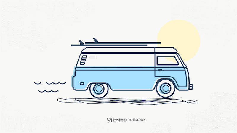
Road Trip In July

“July is the middle of summer, when most of us go on road trips, so I designed a calendar inspired by my love of traveling and summer holidays.” — Designed by Patricia Coroi from Romania.
preview
without calendar: 640×1136, 1024×768, 1280×800, 1280×1024, 1366×768, 1920×1080, 1920×1200, 2560×1440

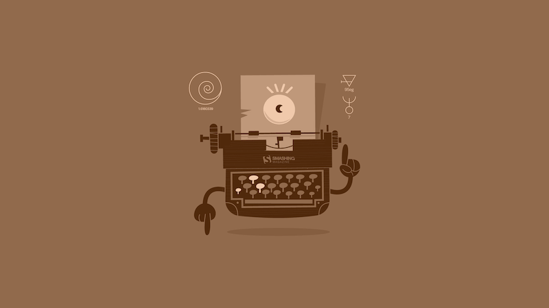
The Ancient Device

Designed by Ricardo Gimenes from Sweden.
preview
without calendar: 640×480, 800×480, 800×600, 1024×768, 1024×1024, 1152×864, 1280×720, 1280×800, 1280×960, 1280×1024, 1366×768, 1400×1050, 1440×900, 1600×1200, 1680×1050, 1680×1200, 1920×1080, 1920×1200, 1920×1440, 2560×1440, 3840×2160

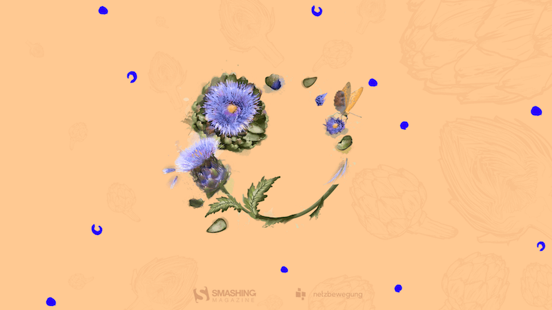
Taste Like Summer

“In times of clean eating and the world of superfoods there is one vegetable missing. An old, forgotten one. A flower actually. Rare and special. Once it had a royal reputation (I cheated a bit with the blue). The artichocke — this is my superhero in the garden! I am a food lover — you too? Enjoy it — dip it!” — Designed by Alexandra Tamgnoué from Germany.
preview
without calendar: 320×480, 640×480, 800×600, 1024×768, 1152×864, 1280×720, 1280×800, 1280×960, 1280×1024, 1440×900, 1440×1050, 1600×1200, 1680×1050, 1680×1200, 1920×1080, 1920×1200, 1920×1440, 2560×1440

Island River

“Make sure you have a refreshing source of ideas, plans and hopes this July. Especially if you are to escape from urban life for a while.” — Designed by Igor Izhik from Canada.

preview
without calendar: 1024×768, 1024×1024, 1152×864, 1280×720, 1280×800, 1280×960, 1280×1024, 1400×1050, 1440×900, 1600×1200, 1680×1050, 1680×1200, 1920×1080, 1920×1200, 1920×1440, 2560×1440

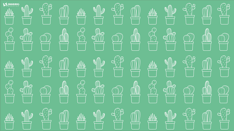
Cactus Hug

Designed by Ilaria Bagnasco from Italy.
preview
without calendar: 320×480, 800×600, 1024×1024, 1280×800, 1280×1024, 1366×768, 1440×900, 1600×1200, 1680×1050, 1920×1080, 1920×1200, 2560×1440, 2560×1600

Under The Enchanting Moonlight

“Two friends sat under the enchanting moonlight, enjoying the serene ambiance as they savoured their cups of tea. It was a rare and precious connection that transcended the ordinary, kindled by the magic of the moonlight. Eventually, as the night began to wane, they reluctantly stood, their empty cups in hand. They carried with them the memories and the tranquility of the moonlit tea session, knowing that they would return to this special place to create new memories in the future.” — Designed by Bhabna Basak from India.

preview
without calendar: 1440×900, 1600×1200, 1680×1050, 1680×1200, 1920×1080, 1920×1200, 1920×1440, 2560×1440

DJ Little Bird

Designed by Ricardo Gimenes from Sweden.

preview
without calendar: 640×480, 800×480, 800×600, 1024×768, 1024×1024, 1152×864, 1280×720, 1280×800, 1280×960, 1280×1024, 1366×768, 1400×1050, 1440×900, 1600×1200, 1680×1050, 1680×1200, 1920×1080, 1920×1200, 1920×1440, 2560×1440, 3840×2160

Heated Mountains

“Warm summer weather inspired the color palette.” — Designed by Marijana Pivac from Croatia.

preview
without calendar: 320×480, 640×480, 800×480, 800×600, 1024×768, 1024×1024, 1152×864, 1280×720, 1280×800, 1280×960, 1280×1024, 1366×768, 1400×1050, 1440×900, 1600×1200, 1680×1050, 1680×1200, 1920×1080, 1920×1200, 1920×1440, 2560×1440

July Flavor

Designed by Natalia Szendzielorz from Poland.
preview
without calendar: 540×960, 600×800, 1366×768, 1440×900, 1600×1200, 1920×1080, 1920×1200, 2560×1440, 2880×1800

Summer Heat

Designed by Xenia Latii from Berlin, Germany.
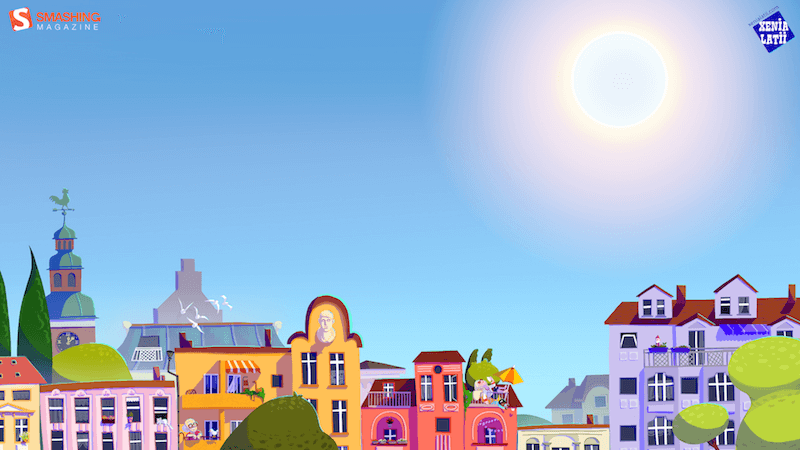
preview
without calendar: 640×480, 800×480, 800×600, 1024×768, 1152×864, 1280×720, 1280×800, 1280×960, 1280×1024, 1366×768, 1400×1050, 1440×900, 1600×1200, 1680×1050, 1680×1200, 1920×1080, 1920×1200, 1920×1440, 2560×1440

Mason Jar

“Make the days count this summer!” — Designed by Meghan Pascarella from the United States.
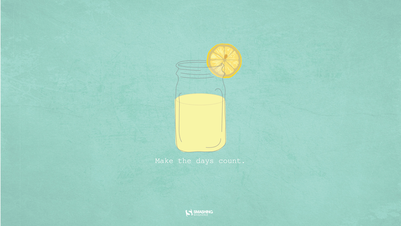
preview
without calendar: 1280×800, 1366×768, 1440×900, 1680×1050, 1920×1080, 1920×1200, 2560×1440, 2880×1800

Summer Essentials

“A few essential items for the summertime weather at the beach, park, and everywhere in-between.” — Designed by Zach Vandehey from the United States.
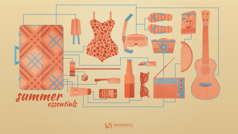
preview
without calendar: 1024×768, 1440×900, 1600×1200, 1920×1200, 2560×1440

Captain Amphicar

“My son and I are obsessed with the Amphicar right now, so why not have a little fun with it?” — Designed by 3 Bicycles Creative from the United States.

previewwithout calendar: 1280×720, 1280×800, 1280×960, 1280×1024, 1400×1050, 1440×900, 1600×1200, 1680×1050, 1680×1200, 1920×1080, 1920×1200, 1920×1440, 2560×1440

Hotdog

Designed by Ricardo Gimenes from Sweden.

preview
without calendar: 640×480, 800×480, 800×600, 1024×768, 1024×1024, 1152×864, 1280×720, 1280×800, 1280×960, 1280×1024, 1366×768, 1400×1050, 1440×900, 1600×1200, 1680×1050, 1680×1200, 1920×1080, 1920×1200, 1920×1440, 2560×1440, 3840×2160

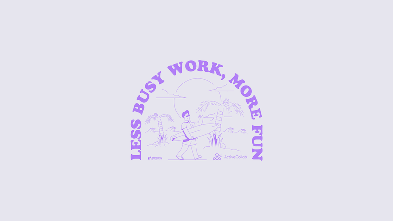
Less Busy Work, More Fun!

Designed by ActiveCollab from the United States.
preview
without calendar: 1080×1920, 1400×1050, 1440×900, 1600×1200, 1920×1080, 1920×1200, 1920×1440, 2560×1440, 3840×2160

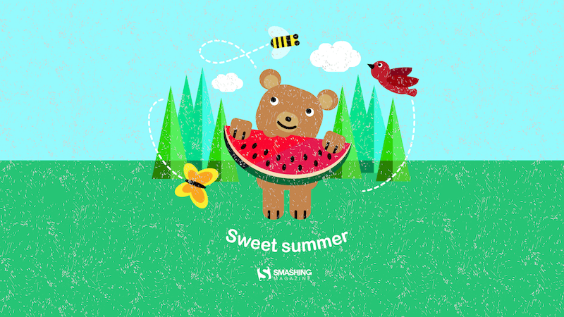
Sweet Summer

“In summer everything inspires me.” — Designed by Maria Karapaunova from Bulgaria.
preview
without calendar: 320×480, 640×480, 800×480, 800×600, 1024×768, 1024×1024, 1152×864, 1280×720, 1280×800, 1280×960, 1280×1024, 1366×768, 1440×900, 1440×1050, 1600×1200, 1680×1050, 1680×1200, 1920×1080, 1920×1200, 1920×1440, 2560×1440

Fire Camp

“What’s better than a starry summer night with an (unexpected) friend around a fire camp with some marshmallows? Happy July!” — Designed by Etienne Mansard from the UK.

preview
without calendar: 320×480, 640×480, 800×480, 800×600, 1024×768, 1024×1024, 1152×864, 1280×720, 1280×800, 1280×960, 1280×1024, 1366×768, 1440×900, 1440×1050, 1600×1200, 1680×1050, 1680×1200, 1920×1080, 1920×1200, 1920×1440, 2048×1536, 2560×1440

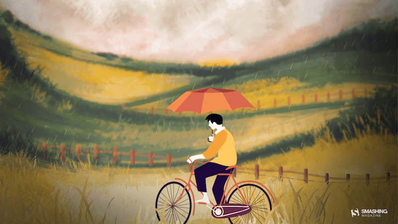
Riding In The Drizzle

“Rain has come, showering the existence with new seeds of life. Everywhere life is blooming, as if they were asleep and the falling music of raindrops have awakened them. Feel the drops of rain. Feel this beautiful mystery of life. Listen to its music, melt into it.” — Designed by DMS Software from India.
preview
without calendar: 320×480, 640×480, 800×480, 800×600, 1024×768, 1024×1024, 1152×864, 1280×720, 1280×800, 1280×960, 1280×1024, 1366×768, 1400×1050, 1440×900, 1600×1200, 1680×1050, 1680×1200, 1920×1080, 1920×1200, 1920×1440, 2560×1440

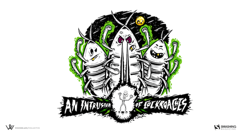
An Intrusion Of Cockroaches

“Ever watched Joe’s Apartment when you were a kid? Well, that movie left a soft spot in my heart for the little critters. Don’t get me wrong: I won’t invite them over for dinner, but I won’t grab my flip flop and bring the wrath upon them when I see one running in the house. So there you have it… three roaches… bringing the smack down on that pesky human… ZZZZZZZAP!!” — Designed by Wonderland Collective from South Africa.
preview
without calendar: 320×480, 800×600, 1024×768, 1280×960, 1680×1050, 1920×1200, 2560×1440

July Rocks!

Designed by Joana Moreira from Portugal.

preview
without calendar: 320×480, 1024×768, 1280×1024, 1920×1080

Frogs In The Night

“July is coming and the nights are warmer. Frogs look at the moon while they talk about their day.” — Designed by Veronica Valenzuela from Spain.

preview
without calendar: 640×480, 800×480, 1024×768, 1280×720, 1280×800, 1440×900, 1600×1200, 1920×1080, 1920×1440, 2560×1440

Essential Plugins for WordPress Developers: Top Picks for 2024

Original Source: https://www.sitepoint.com/top-wordpress-developer-plugins/?utm_source=rss

Essential Plugins for WordPress Developers Top Picks for 2024

A review of top WordPress developer plugins in 2024 for crafting perfect websites, booking pages, and more.

Continue reading
Essential Plugins for WordPress Developers: Top Picks for 2024
on SitePoint.