Building a Strong Brand Presence on Amazon

Original Source: https://designrfix.com/blog/building-a-strong-brand-presence-on-amazon

In today’s digital marketplace, establishing a strong brand presence on Amazon is crucial for success. As the largest online retailer, Amazon offers immense opportunities for brands to reach millions of customers. However, with this opportunity comes fierce competition. To stand out, brands must implement strategic approaches to enhance visibility, credibility, and customer loyalty. This blog […]

2-Page Login Pattern, And How To Fix It

Original Source: https://smashingmagazine.com/2024/06/2-page-login-pattern-how-fix-it/

Why do we see login forms split into multiple screens everywhere? Instead of typing email and password, we have to type email, move to the next page, and then type password there. This seems to be inefficient, to say the least.

Let’s see why login forms are split across screens, what problem they solve, and how to design a better experience for better authentication UX (video).

This article is part of our ongoing series on design patterns. It’s also an upcoming part of the 10h-video library on Smart Interface Design Patterns 🍣 and the upcoming live UX training as well. Use code BIRDIE to save 15% off.

The Problem With Login Forms

If there is one thing we’ve learned over the years in UX, it’s that designing for people is hard. This applies to login forms as well. People are remarkably forgetful. They often forget what email they signed up with or what service they signed in with last time (Google, Twitter, Apple, and so on)

One idea is to remind customers what they signed in with last time and perhaps make it a default option. However, it reveals directly what the user’s account was, which might be a privacy or security issue:

What if instead of showing all options to all customers all the time, we ask for email first, and then look up what service they used last time, and redirect customers to the right place automatically? Well, that’s exactly the idea behind 2-page logins.

Meet 2-Page-Logins

You might have seen them already. If a few years ago, most login forms asked for email and password on one page, these days it’s more common to ask only for email first. When the user chooses to continue, the form will ask for a password in a separate step. Brad explores some problems of this pattern.

A common reason for splitting the login form across pages is Single Sign-On (SSO) authentication. Large companies typically use SSO for corporate sign-ins of their employees. With it, employees log in only once every day and use only one set of credentials, which improves enterprise security.

The UX Intricacies of Single Sign-On (SSO)

SSO also helps with regulatory compliance, and it’s much easier to provision users with appropriate permissions and revoke them later at once. So, if an employee leaves, all their accounts and data can be deleted at once.

To support both business customers and private customers, companies use 2-step-login. Users need to type in their email first, then the validator checks what provider the email is associated with and redirects users there.

Users rarely love this experience. Sometimes, they have multiple accounts (private and business) with one service. Also, 2-step-logins often break autofill and password managers. And for most users, login/pass is way faster than 2-step-login.

Of course, typically, there are dedicated corporate login pages for employees to sign in, but they often head directly to Gmail, Figma, and so on instead and try to sign in there. However, they won’t be able to log in as they must sign in through SSO.

Bottom line: the pattern works well for SSO users, but for non-SSO users, it results in a frustrating UX.

Alternative Solution: Conditional Reveal of SSO

There is a way to work around these challenges (see the image below). We could use a single-page look-up with email and password input fields as a default. Once a user has typed in their email, we detect if the SSO authentication is enabled.

If Single Sign-On (SSO) is enabled for that email, we show a Single Sign-On option and default to it. We could also make the password field optional or disabled.

If SSO isn’t enabled for that email, we proceed with the regular email/password login. This is not much hassle, but it saves trouble for both private and business accounts.

Key Takeaways

🤔 People often forget what email they signed up with.
🤔 They also forget the auth service they signed in with.
🤔 Companies use Single Sign-On (SSO) for corporate sign-in.
🤔 Individual accounts still need email and password for login.
✅ 2-step login: ask for email, then redirect to the right service.

✅ 2-step-login replaces “social” sign-in for repeat users.
✅ It directs users rather than giving them roadblocks.
🤔 Users still keep forgetting the email they signed in with.
🤔 Sometimes, users have multiple accounts with one service.
🚫 2-step logins often break autofill and password managers.
🚫 For most users, login/pass is way faster than 2-step-login.

✅ Better: start with one single page with login and password.
✅ As users type their email, detect if SSO is enabled for them.
✅ If it is, reveal an SSO-login option and set a default to it.
✅ Otherwise, proceed with the regular password login.
✅ If users must use SSO, disable the password field — don’t hide it.

Wrapping Up

Personally, I haven’t tested the approach, but it might be a good alternative to 2-page logins — both for SSO and non-SSO users. Keep in mind, though, that SSO authentication might or might not require a password, as sometimes login happens via Yubikey or Touch-ID or third parties (e.g., OAuth).

Also, eventually, users will be locked out; it’s just a matter of time. So, do use magic links for password recovery or access recovery, but don’t mandate it as a regular login option. Switching between applications is slow and causes mistakes. Instead, nudge users to enable 2FA: it’s both usable and secure.

And most importantly, test your login flow with the tools that your customers rely on. You might be surprised how broken their experience is if they rely on password managers or security tools to log in. Good luck, everyone!

Useful Resources

When To Use A Two-Page Login, by Josh Wayne
Don’t Get Clever With Login Forms, by Brad Frost
Why Are Email And Password On Two Different Pages?, by Kelley R.
Six Simple Steps To Better Authentication UX, by yours truly

Meet Smart Interface Design Patterns

If you are interested in similar insights around UX, take a look at Smart Interface Design Patterns, our 10h-video course with 100s of practical examples from real-life projects — with a live UX training later this year. Everything from mega-dropdowns to complex enterprise tables — with 5 new segments added every year. Jump to a free preview.

Meet Smart Interface Design Patterns, our video course on interface design & UX.

Jump to the video course →

100 design patterns & real-life
examples.
10h-video course + live UX training. Free preview.

A Better Google Analytics Alternative

Original Source: https://1stwebdesigner.com/best-google-analytics-alternative/

Fullres

Our recent migration to GA4 left a lot to be desired and led us to explore for better google analytics alternatives. We tried just about everything out there, including Plausible, Fathom, and several others, all with their own pros and cons. The biggest hurdles were: limited features and higher costs.

That’s why we were so excited when we stumbled across Fullres recently. Not only do they have the best pricing around but they’re bundling multiple tools we use—ad revenue, analytics, web vitals—all into a single platform. Usually, you have to subscribe to multiple services and jump between browser tabs to see that amount of data together. Looking at their roadmap, there’s a lot more coming too.

Fullres also stood out with their quick 5-second installation setup. You get instant access to audience statistics in a GDPR-compliant manner and built-in Web Vitals data to continuously improve key metrics such as First Contentful Paint (FCP), Largest Contentful Paint (LCP), and other more.

For those who found the switch to GA4 challenging, Fullres is worth a try. It’s currently invite-only, so join the waitlist as soon as possible to get early access.

What Are CSS Container Style Queries Good For?

Original Source: https://smashingmagazine.com/2024/06/what-are-css-container-style-queries-good-for/

We’ve relied on media queries for a long time in the responsive world of CSS but they have their share of limitations and have shifted focus more towards accessibility than responsiveness alone. This is where CSS Container Queries come in. They completely change how we approach responsiveness, shifting the paradigm away from a viewport-based mentality to one that is more considerate of a component’s context, such as its size or inline-size.

Querying elements by their dimensions is one of the two things that CSS Container Queries can do, and, in fact, we call these container size queries to help distinguish them from their ability to query against a component’s current styles. We call these container style queries.

Existing container query coverage has been largely focused on container size queries, which enjoy 90% global browser support at the time of this writing. Style queries, on the other hand, are only available behind a feature flag in Chrome 111+ and Safari Technology Preview.

The first question that comes to mind is What are these style query things? followed immediately by How do they work?. There are some nice primers on them that others have written, and they are worth checking out.

But the more interesting question about CSS Container Style Queries might actually be Why we should use them? The answer, as always, is nuanced and could simply be it depends. But I want to poke at style queries a little more deeply, not at the syntax level, but what exactly they are solving and what sort of use cases we would find ourselves reaching for them in our work if and when they gain browser support.

Why Container Queries

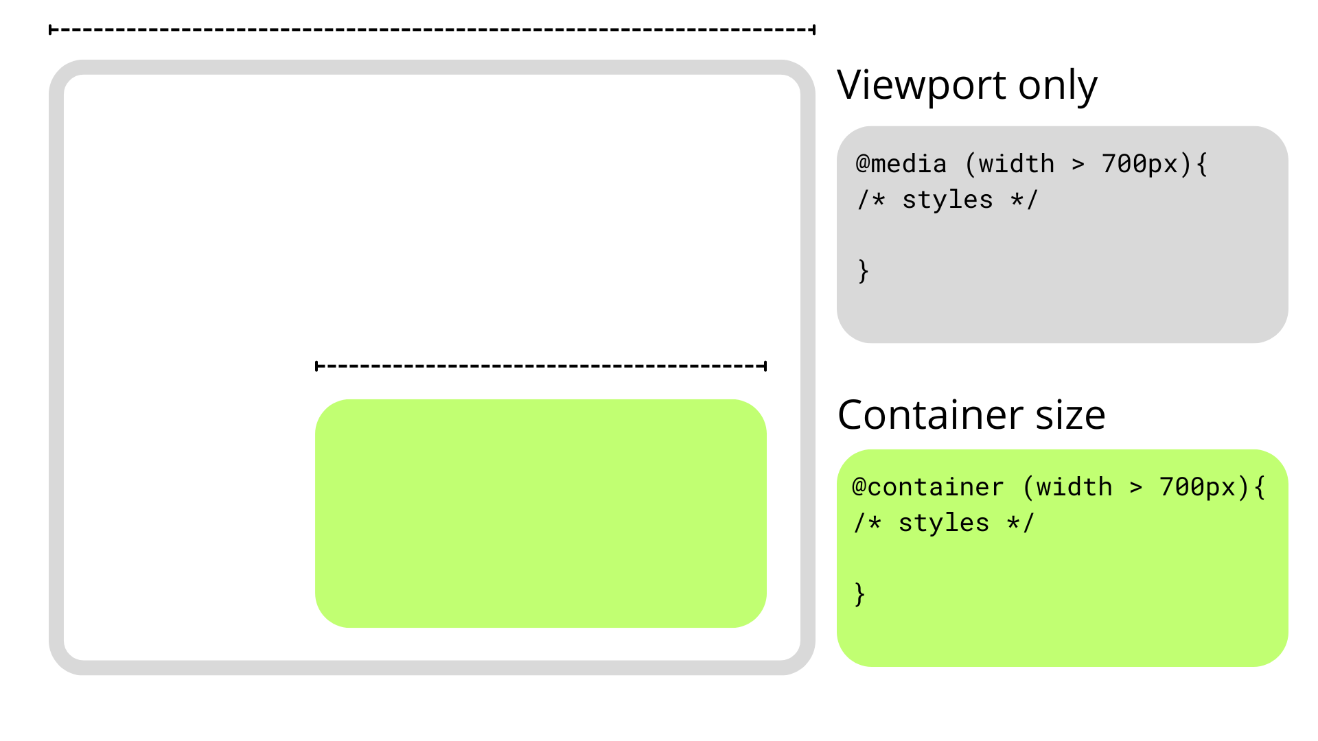
Talking purely about responsive design, media queries have simply fallen short in some aspects, but I think the main one is that they are context-agnostic in the sense that they only consider the viewport size when applying styles without involving the size or dimensions of an element’s parent or the content it contains.

This usually isn’t a problem since we only have a main element that doesn’t share space with others along the x-axis, so we can style our content depending on the viewport’s dimensions. However, if we stuff an element into a smaller parent and maintain the same viewport, the media query doesn’t kick in when the content becomes cramped. This forces us to write and manage an entire set of media queries that target super-specific content breakpoints.

Container queries break this limitation and allow us to query much more than the viewport’s dimensions.

How Container Queries Generally Work

Container size queries work similarly to media queries but allow us to apply styles depending on the container’s properties and computed values. In short, they allow us to make style changes based on an element’s computed width or height regardless of the viewport. This sort of thing was once only possible with JavaScript or the ol’ jQuery, as this example shows.

As noted earlier, though, container queries can query an element’s styles in addition to its dimensions. In other words, container style queries can look at and track an element’s properties and apply styles to other elements when those properties meet certain conditions, such as when the element’s background-color is set to hsl(0 50% 50%).

That’s what we mean when talking about CSS Container Style Queries. It’s a proposed feature defined in the same CSS Containment Module Level 3 specification as CSS Container Size Queries — and one that’s currently unsupported by any major browser — so the difference between style and size queries can get a bit confusing as we’re technically talking about two related features under the same umbrella.

We’d do ourselves a favor to backtrack and first understand what a “container” is in the first place.

Containers

An element’s container is any ancestor with a containment context; it could be the element’s direct parent or perhaps a grandparent or great-grandparent.

A containment context means that a certain element can be used as a container for querying. Unofficially, you can say there are two types of containment context: size containment and style containment.

Size containment means we can query and track an element’s dimensions (i.e., aspect-ratio, block-size, height, inline-size, orientation, and width) with container size queries as long as it’s registered as a container. Tracking an element’s dimensions requires a little processing in the client. One or two elements are a breeze, but if we had to constantly track the dimensions of all elements — including resizing, scrolling, animations, and so on — it would be a huge performance hit. That’s why no element has size containment by default, and we have to manually register a size query with the CSS container-type property when we need it.

On the other hand, style containment lets us query and track the computed values of a container’s specific properties through container style queries. As it currently stands, we can only check for custom properties, e.g. –theme: dark, but soon we could check for an element’s computed background-color and display property values. Unlike size containment, we are checking for raw style properties before they are processed by the browser, alleviating performance and allowing all elements to have style containment by default.

Did you catch that? While size containment is something we manually register on an element, style containment is the default behavior of all elements. There’s no need to register a style container because all elements are style containers by default.

And how do we register a containment context? The easiest way is to use the container-type property. The container-type property will give an element a containment context and its three accepted values — normal, size, and inline-size — define which properties we can query from the container.

/* Size containment in the inline direction */
.parent {
container-type: inline-size;
}

This example formally establishes a size containment. If we had done nothing at all, the .parent element is already a container with a style containment.

Size Containment

That last example illustrates size containment based on the element’s inline-size, which is a fancy way of saying its width. When we talk about normal document flow on the web, we’re talking about elements that flow in an inline direction and a block direction that corresponds to width and height, respectively, in a horizontal writing mode. If we were to rotate the writing mode so that it is vertical, then “inline” would refer to the height instead and “block” to the width.

Consider the following HTML:

<div class=”cards-container”>
<ul class=”cards”>
<li class=”card”></li>
</ul>
</div>

We could give the .cards-container element a containment context in the inline direction, allowing us to make changes to its descendants when its width becomes too small to properly display everything in the current layout. We keep the same syntax as in a normal media query but swap @media for @container

.cards-container {
container-type: inline-size;
}

@container (width < 700px) {
.cards {
background-color: red;
}
}

Container syntax works almost the same as media queries, so we can use the and, or, and not operators to chain different queries together to match multiple conditions.

@container (width < 700px) or (width > 1200px) {
.cards {
background-color: red;
}
}

Elements in a size query look for the closest ancestor with size containment so we can apply changes to elements deeper in the DOM, like the .card element in our earlier example. If there is no size containment context, then the @container at-rule won’t have any effect.

/* 👎
* Apply styles based on the closest container, .cards-container
*/
@container (width < 700px) {
.card {
background-color: black;
}
}

Just looking for the closest container is messy, so it’s good practice to name containers using the container-name property and then specifying which container we’re tracking in the container query just after the @container at-rule.

.cards-container {
container-name: cardsContainer;
container-type: inline-size;
}

@container cardsContainer (width < 700px) {
.card {
background-color: #000;
}
}

We can use the shorthand container property to set the container name and type in a single declaration:

.cards-container {
container: cardsContainer / inline-size;

/* Equivalent to: */
container-name: cardsContainer;
container-type: inline-size;
}

The other container-type we can set is size, which works exactly like inline-size — only the containment context is both the inline and block directions. That means we can also query the container’s height sizing in addition to its width sizing.

/* When container is less than 700px wide */
@container (width < 700px) {
.card {
background-color: black;
}
}

/* When container is less than 900px tall */
@container (height < 900px) {
.card {
background-color: white;
}
}

And it’s worth noting here that if two separate (not chained) container rules match, the most specific selector wins, true to how the CSS Cascade works.

So far, we’ve touched on the concept of CSS Container Queries at its most basic. We define the type of containment we want on an element (we looked specifically at size containment) and then query that container accordingly.

Container Style Queries

The third value that is accepted by the container-type property is normal, and it sets style containment on an element. Both inline-size and size are stable across all major browsers, but normal is newer and only has modest support at the moment.

I consider normal a bit of an oddball because we don’t have to explicitly declare it on an element since all elements are style containers with style containment right out of the box. It’s possible you’ll never write it out yourself or see it in the wild.

.parent {
/* Unnecessary */
container-type: normal;
}

If you do write it or see it, it’s likely to undo size containment declared somewhere else. But even then, it’s possible to reset containment with the global initial or revert keywords.

.parent {
/* All of these (re)set style containment */
container-type: normal;
container-type: initial;
container-type: revert;
}

Let’s look at a simple and somewhat contrived example to get the point across. We can define a custom property in a container, say a –theme.

.cards-container {
–theme: dark;
}

From here, we can check if the container has that desired property and, if it does, apply styles to its descendant elements. We can’t directly style the container since it could unleash an infinite loop of changing the styles and querying the styles.

.cards-container {
–theme: dark;
}

@container style(–theme: dark) {
.cards {
background-color: black;
}
}

See that style() function? In the future, we may want to check if an element has a max-width: 400px through a style query instead of checking if the element’s computed value is bigger than 400px in a size query. That’s why we use the style() wrapper to differentiate style queries from size queries.

/* Size query */
@container (width > 60ch) {
.cards {
flex-direction: column;
}
}

/* Style query */
@container style(–theme: dark) {
.cards {
background-color: black;
}
}

Both types of container queries look for the closest ancestor with a corresponding containment-type. In a style() query, it will always be the parent since all elements have style containment by default. In this case, the direct parent of the .cards element in our ongoing example is the .cards-container element. If we want to query non-direct parents, we will need the container-name property to differentiate between containers when making a query.

.cards-container {
container-name: cardsContainer;
–theme: dark;
}

@container cardsContainer style(–theme: dark) {
.card {
color: white;
}
}

Weird and Confusing Things About Container Style Queries

Style queries are completely new and bring something never seen in CSS, so they are bound to have some confusing qualities as we wrap our heads around them — some that are completely intentional and well thought-out and some that are perhaps unintentional and may be updated in future versions of the specification.

Style and Size Containment Aren’t Mutually Exclusive

One intentional perk, for example, is that a container can have both size and style containment. No one would fault you for expecting that size and style containment are mutually exclusive concerns, so setting an element to something like container-type: inline-size would make all style queries useless.

However, another funny thing about container queries is that elements have style containment by default, and there isn’t really a way to remove it. Check out this next example:

.cards-container {
container-type: inline-size;
–theme: dark;
}

@container style(–theme: dark) {
.card {
background-color: black;
}
}

@container (width < 700px) {
.card {
background-color: red;
}
}

See that? We can still query the elements by style even when we explicitly set the container-type to inline-size. This seems contradictory at first, but it does make sense, considering that style and size queries are computed independently. It’s better this way since both queries don’t necessarily conflict with each other; a style query could change the colors in an element depending on a custom property, while a container query changes an element’s flex-direction when it gets too small for its contents.

But We Can Achieve the Same Thing With CSS Classes and IDs

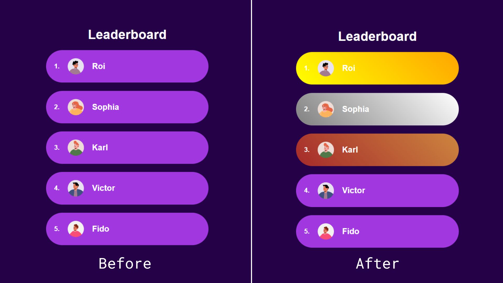
Most container query guides and tutorials I’ve seen use similar examples to demonstrate the general concept, but I can’t stop thinking no matter how cool style queries are, we can achieve the same result using classes or IDs and with less boilerplate. Instead of passing the state as an inline style, we could simply add it as a class.

<ol>
<li class=”item first”>
<img src=”…” alt=”Roi’s avatar” />
<h2>Roi</h2>
</li>
<li class=”item second”><!– etc. –></li>
<li class=”item third”><!– etc. –></li>
<li class=”item”><!– etc. –></li>
</ol>

Alternatively, we could add the position number directly inside an id so we don’t have to convert the number into a string:

<ol>
<li class=”item” id=”item-1″>
<img src=”…” alt=”Roi’s avatar” />
<h2>Roi</h2>
</li>
<li class=”item” id=”item-2″><!– etc. –></li>
<li class=”item” id=”item-3″><!– etc. –></li>
<li class=”item” id=”item-4″><!– etc. –></li>
<li class=”item” id=”item-5″><!– etc. –></li>
</ol>

Both of these approaches leave us with cleaner HTML than the container queries approach. With style queries, we have to wrap our elements inside a container — even if we don’t semantically need it — because of the fact that containers (rightly) are unable to style themselves.

We also have less boilerplate-y code on the CSS side:

#item-1 {
background: linear-gradient(45deg, yellow, orange);
}

#item-2 {
background: linear-gradient(45deg, grey, white);
}

#item-3 {
background: linear-gradient(45deg, brown, peru);
}

See the Pen Style Queries Use Case Replaced with Classes [forked] by Monknow.

As an aside, I know that using IDs as styling hooks is often viewed as a no-no, but that’s only because IDs must be unique in the sense that no two instances of the same ID are on the page at the same time. In this instance, there will never be more than one first-place, second-place, or third-place player on the page, making IDs a safe and appropriate choice in this situation. But, yes, we could also use some other type of selector, say a data-* attribute.

There is something that could add a lot of value to style queries: a range syntax for querying styles. This is an open feature that Miriam Suzanne proposed in 2023, the idea being that it queries numerical values using range comparisons just like size queries.

Imagine if we wanted to apply a light purple background color to the rest of the top ten players in the leaderboard example. Instead of adding a query for each position from four to ten, we could add a query that checks a range of values. The syntax is obviously not in the spec at this time, but let’s say it looks something like this just to push the point across:

/* Do not try this at home! */
@container leaderboard style(4 >= –position <= 10) {
.item {
background: linear-gradient(45deg, purple, fuchsia);
}
}

In this fictional and hypothetical example, we’re:

Tracking a container called leaderboard,
Making a style() query against the container,
Evaluating the –position custom property,
Looking for a condition where the custom property is set to a value equal to a number that is greater than or equal to 4 and less than or equal to 10.
If the custom property is a value within that range, we set a player’s background color to a linear-gradient() that goes from purple to fuschia.

This is very cool, but if this kind of behavior is likely to be done using components in modern frameworks, like React or Vue, we could also set up a range in JavaScript and toggle on a .top-ten class when the condition is met.

See the Pen Style Ranged Queries Use Case Replaced with Classes [forked] by Monknow.

Sure, it’s great to see that we can do this sort of thing directly in CSS, but it’s also something with an existing well-established solution.

Separating Style Logic From Logic Logic

So far, style queries don’t seem to be the most convenient solution for the leaderboard use case we looked at, but I wouldn’t deem them useless solely because we can achieve the same thing with JavaScript. I am a big advocate of reaching for JavaScript only when necessary and only in sprinkles, but style queries, the ones where we can only check for custom properties, are most likely to be useful when paired with a UI framework where we can easily reach for JavaScript within a component. I have been using Astro an awful lot lately, and in that context, I don’t see why I would choose a style query over programmatically changing a class or ID.

However, a case can be made that implementing style logic inside a component is messy. Maybe we should keep the logic regarding styles in the CSS away from the rest of the logic logic, i.e., the stateful changes inside a component like conditional rendering or functions like useState and useEffect in React. The style logic would be the conditional checks we do to add or remove class names or IDs in order to change styles.

If we backtrack to our leaderboard example, checking a player’s position to apply different styles would be style logic. We could indeed check that a player’s leaderboard position is between four and ten using JavaScript to programmatically add a .top-ten class, but it would mean leaking our style logic into our component. In React (for familiarity, but it would be similar to other frameworks), the component may look like this:

const LeaderboardItem = ({position}) => {
<li className={item ${position &gt;= 4 && position &lt;= 10 ? “top-ten” : “”}} id={item-${position}}>
<img src=”…” alt=”Roi’s avatar” />
<h2>Roi</h2>
</li>;
};

Besides this being ugly-looking code, adding the style logic in JSX can get messy. Meanwhile, style queries can pass the –position value to the styles and handle the logic directly in the CSS where it is being used.

const LeaderboardItem = ({position}) => {
<li className=”item” style={{“–position”: position}}>
<img src=”…” alt=”Roi’s avatar” />
<h2>Roi</h2>
</li>;
};

Much cleaner, and I think this is closer to the value proposition of style queries. But at the same time, this example makes a large leap of assumption that we will get a range syntax for style queries at some point, which is not a done deal.

Conclusion

There are lots of teams working on making modern CSS better, and not all features have to be groundbreaking miraculous additions.

Size queries are definitely an upgrade from media queries for responsive design, but style queries appear to be more of a solution looking for a problem.

It simply doesn’t solve any specific issue or is better enough to replace other approaches, at least as far as I am aware.

Even if, in the future, style queries will be able to check for any property, that introduces a whole new can of worms where styles are capable of reacting to other styles. This seems exciting at first, but I can’t shake the feeling it would be unnecessary and even chaotic: styles reacting to styles, reacting to styles, and so on with an unnecessary side of boilerplate. I’d argue that a more prudent approach is to write all your styles declaratively together in one place.

Maybe it would be useful for web extensions (like Dark Reader) so they can better check styles in third-party websites? I can’t clearly see it. If you have any suggestions on how CSS Container Style Queries can be used to write better CSS that I may have overlooked, please let me know in the comments! I’d love to know how you’re thinking about them and the sorts of ways you imagine yourself using them in your work.

How To Hack Your Google Lighthouse Scores In 2024

Original Source: https://smashingmagazine.com/2024/06/how-hack-google-lighthouse-scores-2024/

This article is a sponsored by Sentry.io

Google Lighthouse has been one of the most effective ways to gamify and promote web page performance among developers. Using Lighthouse, we can assess web pages based on overall performance, accessibility, SEO, and what Google considers “best practices”, all with the click of a button.

We might use these tests to evaluate out-of-the-box performance for front-end frameworks or to celebrate performance improvements gained by some diligent refactoring. And you know you love sharing screenshots of your perfect Lighthouse scores on social media. It’s a well-deserved badge of honor worthy of a confetti celebration.

Just the fact that Lighthouse gets developers like us talking about performance is a win. But, whilst I don’t want to be a party pooper, the truth is that web performance is far more nuanced than this. In this article, we’ll examine how Google Lighthouse calculates its performance scores, and, using this information, we will attempt to “hack” those scores in our favor, all in the name of fun and science — because in the end, Lighthouse is simply a good, but rough guide for debugging performance. We’ll have some fun with it and see to what extent we can “trick” Lighthouse into handing out better scores than we may deserve.

But first, let’s talk about data.

Field Data Is Important

Local performance testing is a great way to understand if your website performance is trending in the right direction, but it won’t paint a full picture of reality. The World Wide Web is the Wild West, and collectively, we’ve almost certainly lost track of the variety of device types, internet connection speeds, screen sizes, browsers, and browser versions that people are using to access websites — all of which can have an impact on page performance and user experience.

Field data — and lots of it — collected by an application performance monitoring tool like Sentry from real people using your website on their devices will give you a far more accurate report of your website performance than your lab data collected from a small sample size using a high-spec super-powered dev machine under a set of controlled conditions. Philip Walton reported in 2021 that “almost half of all pages that scored 100 on Lighthouse didn’t meet the recommended Core Web Vitals thresholds” based on data from the HTTP Archive.

Web performance is more than a single core web vital metric or Lighthouse performance score. What we’re talking about goes way beyond the type of raw data we’re working with.

Web Performance Is More Than Numbers

Speed is often the first thing that comes up when talking about web performance — just how long does a page take to load? This isn’t the worst thing to measure, but we must bear in mind that speed is probably influenced heavily by business KPIs and sales targets. Google released a report in 2018 suggesting that the probability of bounces increases by 32% if the page load time reaches higher than three seconds, and soars to 123% if the page load time reaches 10 seconds. So, we must conclude that converting more sales requires reducing bounce rates. And to reduce bounce rates, we must make our pages load faster.

But what does “load faster” even mean? At some point, we’re physically incapable of making a web page load any faster. Humans — and the servers that connect them — are spread around the globe, and modern internet infrastructure can only deliver so many bytes at a time.

The bottom line is that page load is not a single moment in time. In an article titled “What is speed?” Google explains that a page load event is:

[…] “an experience that no single metric can fully capture. There are multiple moments during the load experience that can affect whether a user perceives it as ‘fast’, and if you just focus solely on one, you might miss bad experiences that happen during the rest of the time.”

The key word here is experience. Real web performance is less about numbers and speed than it is about how we experience page load and page usability as users. And this segues nicely into a discussion of how Google Lighthouse calculates performance scores. (It’s much less about pure speed than you might think.)

How Google Lighthouse Performance Scores Are Calculated

The Google Lighthouse performance score is calculated using a weighted combination of scores based on core web vital metrics (i.e., First Contentful Paint (FCP), Largest Contentful Paint (LCP), Cumulative Layout Shift (CLS)) and other speed-related metrics (i.e., Speed Index (SI) and Total Blocking Time (TBT)) that are observable throughout the page load timeline.

This is how the metrics are weighted in the overall score:

Metric
Weighting (%)

Total Blocking Time
30

Cumulative Layout Shift
25

Largest Contentful Paint
25

First Contentful Paint
10

Speed Index
10

The weighting assigned to each score gives us insight into how Google prioritizes the different building blocks of a good user experience:

1. A Web Page Should Respond to User Input

The highest weighted metric is Total Blocking Time (TBT), a metric that looks at the total time after the First Contentful Paint (FCP) to help indicate where the main thread may be blocked long enough to prevent speedy responses to user input. The main thread is considered “blocked” any time there’s a JavaScript task running on the main thread for more than 50ms. Minimizing TBT ensures that a web page responds to physical user input (e.g., key presses, mouse clicks, and so on).

2. A Web Page Should Load Useful Content With No Unexpected Visual Shifts

The next most weighted Lighthouse metrics are Largest Contentful Paint (LCP) and Cumulative Layout Shift (CLS). LCP marks the point in the page load timeline when the page’s main content has likely loaded and is therefore useful.

At the point where the main content has likely loaded, you also want to maintain visual stability to ensure that users can use the page and are not affected by unexpected visual shifts (CLS). A good LCP score is anything less than 2.5 seconds (which is a lot higher than we might have thought, given we are often trying to make our websites as fast as possible).

3. A Web Page Should Load Something

The First Contentful Paint (FCP) metric marks the first point in the page load timeline where the user can see something on the screen, and the Speed Index (SI) measures how quickly content is visually displayed during page load over time until the page is “complete”.

Your page is scored based on the speed indices of real websites using performance data from the HTTP Archive. A good FCP score is less than 1.8 seconds and a good SI score is less than 3.4 seconds. Both of these thresholds are higher than you might expect when thinking about speed.

Usability Is Favored Over Raw Speed

Google Lighthouse’s performance scoring is, without a doubt, less about speed and more about usability. Your SI and FCP could be super quick, but if your LCP takes too long to paint, and if CLS is caused by large images or external content taking some time to load and shifting things visually, then your overall performance score will be lower than if your page was a little slower to render the FCP but didn’t cause any CLS. Ultimately, if the page is unresponsive due to JavaScript blocking the main thread for more than 50ms, your performance score will suffer more than if the page was a little slow to paint the FCP.

To understand more about how the weightings of each metric contribute to the final performance score, you can play about with the sliders on the Lighthouse Scoring Calculator, and here’s a rudimentary table demonstrating the effect of skewed individual metric weightings on the overall performance score, proving that page usability and responsiveness is favored over raw speed.

Description
FCP (ms)
SI (ms)
LCP (ms)
TBT (ms)
CLS
Overall Score

Slow to show something on screen
6000
0
0
0
0
90

Slow to load content over time
0
5000
0
0
0
90

Slow to load the largest part of the page
0
0
6000
0
0
76

Visual shifts occurring during page load
0
0
0
0
0.82
76

Page is unresponsive to user input
0
0
0
2000
0
70

The overall Google Lighthouse performance score is calculated by converting each raw metric value into a score from 0 to 100 according to where it falls on its Lighthouse scoring distribution, which is a log-normal distribution derived from the performance metrics of real website performance data from the HTTP Archive. There are two main takeaways from this mathematically overloaded information:

Your Lighthouse performance score is plotted against real website performance data, not in isolation.
Given that the scoring uses log-normal distribution, the relationship between the individual metric values and the overall score is non-linear, meaning you can make substantial improvements to low-performance scores quite easily, but it becomes more difficult to improve an already high score.

Read more about how metric scores are determined, including a visualization of the log-normal distribution curve on developer.chrome.com.

Can We “Trick” Google Lighthouse?

I appreciate Google’s focus on usability over pure speed in the web performance conversation. It urges developers to think less about aiming for raw numbers and more about the real experiences we build. That being said, I’ve wondered whether today in 2024, it’s possible to fool Google Lighthouse into believing that a bad page in terms of usability and usefulness is actually a great one.

I put on my lab coat and science goggles to investigate. All tests were conducted:

Using the Chromium Lighthouse plugin,
In an incognito window in the Arc browser,
Using the “navigation” and “mobile” settings (apart from where described differently),
By me, in a lab (i.e., no field data).

That all being said, I fully acknowledge that my controlled test environment contradicts my advice at the top of this post, but the experiment is an interesting ride nonetheless. What I hope you’ll take away from this is that Lighthouse scores are only one piece — and a tiny one at that — of a very large and complex web performance puzzle. And, without field data, I’m not sure any of this matters anyway.

How to Hack FCP and LCP Scores

TL;DR: Show the smallest amount of LCP-qualifying content on load to boost the FCP and LCP scores until the Lighthouse test has likely finished.

FCP marks the first point in the page load timeline where the user can see anything at all on the screen, while LCP marks the point in the page load timeline when the main page content (i.e., the largest text or image element) has likely loaded. A fast LCP helps reassure the user that the page is useful. “Likely” and “useful” are the important words to bear in mind here.

What Counts as an LCP Element

The types of elements on a web page considered by Lighthouse for LCP are:

<img> elements,
<image> elements inside an <svg> element,
<video> elements,
An element with a background image loaded using the url() function, (and not a CSS gradient), and
Block-level elements containing text nodes or other inline-level text elements.

The following elements are excluded from LCP consideration due to the likelihood they do not contain useful content:

Elements with zero opacity (invisible to the user),
Elements that cover the full viewport (likely to be background elements), and
Placeholder images or other images with low entropy (i.e., low informational content, such as a solid-colored image).

However, the notion of an image or text element being useful is completely subjective in this case and generally out of the realm of what machine code can reliably determine. For example, I built a page containing nothing but a <h1> element where, after 10 seconds, JavaScript inserts more descriptive text into the DOM and hides the <h1> element.

Lighthouse considers the heading element to be the LCP element in this experiment. At this point, the page load timeline has finished, but the page’s main content has not loaded, even though Lighthouse thinks it is likely to have loaded within those 10 seconds. Lighthouse still awards us with a perfect score of 100 even if the heading is replaced by a single punctuation mark, such as a full stop, which is even less useful.

This test suggests that if you need to load page content via client-side JavaScript, we‘ll want to avoid displaying a skeleton loader screen since that requires loading more elements on the page. And since we know the process will take some time — and that we can offload the network request from the main thread to a web worker so it won’t affect the TBT — we can use some arbitrary “splash screen” that contains a minimal viable LCP element (for better FCP scoring). This way, we’re giving Lighthouse the impression that the page is useful to users quicker than it actually is.

All we need to do is include a valid LCP element that contains something that counts as the FCP. While I would never recommend loading your main page content via client-side JavaScript in 2024 (serve static HTML from a CDN instead or build as much of the page as you can on a server), I would definitely not recommend this “hack” for a good user experience, regardless of what the Lighthouse performance score tells you. This approach also won’t earn you any favors with search engines indexing your site, as the robots are unable to discover the main content while it is absent from the DOM.

I also tried this experiment with a variety of random images representing the LCP to make the page even less useful. But given that I used small file sizes — made smaller and converted into “next-gen” image formats using a third-party image API to help with page load speed — it seemed that Lighthouse interpreted the elements as “placeholder images” or images with “low entropy”. As a result, those images were disqualified as LCP elements, which is a good thing and makes the LCP slightly less hackable.

View the demo page and use Chromium DevTools in an incognito window to see the results yourself.

This hack, however, probably won’t hold up in many other use cases. Discord, for example, uses the “splash screen” approach when you hard-refresh the app in the browser, and it receives a sad 29 performance score.

Compared to my DOM-injected demo, the LCP element was calculated as some content behind the splash screen rather than elements contained within the splash screen content itself, given there were one or more large images in the focussed text channel I tested on. One could argue that Lighthouse scores are less important for apps that are behind authentication anyway: they don’t need to be indexed by search engines.

There are likely many other situations where apps serve user-generated content and you might be unable to control the LCP element entirely, particularly regarding images.

For example, if you can control the sizes of all the images on your web pages, you might be able to take advantage of an interesting hack or “optimization” (in very large quotes) to arbitrarily game the system, as was the case of RentPath. In 2021, developers at RentPath managed to improve their Lighthouse performance score by 17 points when increasing the size of image thumbnails on a web page. They convinced Lighthouse to calculate the LCP element as one of the larger thumbnails instead of a Google Map tile on the page, which takes considerably longer to load via JavaScript.

The bottom line is that you can gain higher Lighthouse performance scores if you are aware of your LCP element and in control of it, whether that’s through a hack like RentPath’s or mine or a real-deal improvement. That being said, whilst I’ve described the splash screen approach as a hack in this post, that doesn’t mean this type of experience couldn’t offer a purposeful and joyful experience. Performance and user experience are about understanding what’s happening during page load, and it’s also about intent.

How to Hack CLS Scores

TL;DR: Defer loading content that causes layout shifts until the Lighthouse test has likely finished to make the test think it has enough data. CSS transforms do not negatively impact CLS, except if used in conjunction with new elements added to the DOM.

CLS is measured on a decimal scale; a good score is less than 0.1, and a poor score is greater than 0.25. Lighthouse calculates CLS from the largest burst of unexpected layout shifts that occur during a user’s time on the page based on a combination of the viewport size and the movement of unstable elements in the viewport between two rendered frames. Smaller one-off instances of layout shift may be inconsequential, but a bunch of layout shifts happening one after the other will negatively impact your score.

If you know your page contains annoying layout shifts on load, you can defer them until after the page load event has been completed, thus fooling Lighthouse into thinking there is no CLS. This demo page I created, for example, earns a CLS score of 0.143 even though JavaScript immediately starts adding new text elements to the page, shifting the original content up. By pausing the JavaScript that adds new nodes to the DOM by an arbitrary five seconds with a setTimeout(), Lighthouse doesn’t capture the CLS that takes place.

This other demo page earns a performance score of 100, even though it is arguably less useful and useable than the last page given that the added elements pop in seemingly at random without any user interaction.

Whilst it is possible to defer layout shift events for a page load test, this hack definitely won’t work for field data and user experience over time (which is a more important focal point, as we discussed earlier). If we perform a “time span” test in Lighthouse on the page with deferred layout shifts, Lighthouse will correctly report a non-green CLS score of around 0.186.

If you do want to intentionally create a chaotic experience similar to the demo, you can use CSS animations and transforms to more purposefully pop the content into view on the page. In Google’s guide to CLS, they state that “content that moves gradually and naturally from one position to another can often help the user better understand what’s going on and guide them between state changes” — again, highlighting the importance of user experience in context.

On this next demo page, I’m using CSS transform to scale() the text elements from 0 to 1 and move them around the page. The transforms fail to trigger CLS because the text nodes are already in the DOM when the page loads. That said, I did observe in my testing that if the text nodes are added to the DOM programmatically after the page loads via JavaScript and then animated, Lighthouse will indeed detect CLS and score things accordingly.

You Can’t Hack a Speed Index Score

The Speed Index score is based on the visual progress of the page as it loads. The quicker your content loads nearer the beginning of the page load timeline, the better.

It is possible to do some hack to trick the Speed Index into thinking a page load timeline is slower than it is. Conversely, there’s no real way to “fake” loading content faster than it does. The only way to make your Speed Index score better is to optimize your web page for loading as much of the page as possible, as soon as possible. Whilst not entirely realistic in the web landscape of 2024 (mainly because it would put designers out of a job), you could go all-in to lower your Speed Index as much as possible by:

Delivering static HTML web pages only (no server-side rendering) straight from a CDN,
Avoiding images on the page,
Minimizing or eliminating CSS, and
Preventing JavaScript or any external dependencies from loading.

You Also Can’t (Really) Hack A TBT Score

TBT measures the total time after the FCP where the main thread was blocked by JavaScript tasks for long enough to prevent responses to user input. A good TBT score is anything lower than 200ms.

JavaScript-heavy web applications (such as single-page applications) that perform complex state calculations and DOM manipulation on the client on page load (rather than on the server before sending rendered HTML) are prone to suffering poor TBT scores. In this case, you could probably hack your TBT score by deferring all JavaScript until after the Lighthouse test has finished. That said, you’d need to provide some kind of placeholder content or loading screen to satisfy the FCP and LCP and to inform users that something will happen at some point. Plus, you’d have to go to extra lengths to hack around the front-end framework you’re using. (You don’t want to load a placeholder page that, at some point in the page load timeline, loads a separate React app after an arbitrary amount of time!)

What’s interesting is that while we’re still doing all sorts of fancy things with JavaScript in the client, advances in the modern web ecosystem are helping us all reduce the probability of a less-than-stellar TBT score. Many front-end frameworks, in partnership with modern hosting providers, are capable of rendering pages and processing complex logic on demand without any client-side JavaScript. While eliminating JavaScript on the client is not the goal, we certainly have a lot of options to use a lot less of it, thus minimizing the risk of doing too much computation on the main thread on page load.

Bottom Line: Lighthouse Is Still Just A Rough Guide

Google Lighthouse can’t detect everything that’s wrong with a particular website. Whilst Lighthouse performance scores prioritize page usability in terms of responding to user input, it still can’t detect every terrible usability or accessibility issue in 2024.

In 2019, Manuel Matuzović published an experiment where he intentionally created a terrible page that Lighthouse thought was pretty great. I hypothesized that five years later, Lighthouse might do better; but it doesn’t.

On this final demo page I put together, input events are disabled by CSS and JavaScript, making the page technically unresponsive to user input. After five seconds, JavaScript flips a switch and allows you to click the button. The page still scores 100 for both performance and accessibility.

You really can’t rely on Lighthouse as a substitute for usability testing and common sense.

Some More Silly Hacks

As with everything in life, there’s always a way to game the system. Here are some more tried and tested guaranteed hacks to make sure your Lighthouse performance score artificially knocks everyone else’s out of the park:

Only run Lighthouse tests using the fastest and highest-spec hardware.
Make sure your internet connection is the fastest it can be; relocate if you need to.
Never use field data, only lab data, collected using the aforementioned fastest and highest-spec hardware and super-speed internet connection.
Rerun the tests in the lab using different conditions and all the special code hacks I described in this post until you get the result(s) you want to impress your friends, colleagues, and random people on the internet.

Note: The best way to learn about web performance and how to optimize your websites is to do the complete opposite of everything we’ve covered in this article all of the time. And finally, to seriously level up your performance skills, use an application monitoring tool like Sentry. Think of Lighthouse as the canary and Sentry as the real-deal production-data-capturing, lean, mean, web vitals machine.

And finally-finally, here’s the link to the full demo site for educational purposes.

UI Interactions & Animations Roundup #44

Original Source: https://tympanus.net/codrops/2024/06/06/ui-interactions-animations-roundup-44/

Check out our latest motion design collection, featuring the best selections from Dribbble to spark your creativity.

How to Reduce The Carbon Footprint of Your Website

Original Source: https://www.webdesignerdepot.com/reduce-website-carbon-footprints/

On average, a web page produces 4.61 grams of CO2 for every page view; for whole sites, that amounts to hundreds of KG of CO2 annually.

Exciting New Tools for Designers, June 2024

Original Source: https://www.webdesignerdepot.com/exciting-new-tools-for-designers-june-2024/

In this month’s roundup of the best tools for web designers and developers, we’ll explore a range of new and noteworthy tools designed to enhance various aspects of your daily tasks. Whether you’re looking to balance your work and life more effectively, find inspiration for web interactions, or streamline your development process, there’s something here for everyone. Enjoy!

Collective #845

Original Source: https://tympanus.net/codrops/collective/collective-845/

Three.js Shading Language * New magic for animations in CSS * Progressively Enhanced Popover Toggletips