Shopify Subscriptions App Review: The Complete Guide

Original Source: https://ecommerce-platforms.com/articles/shopify-subscriptions-app-review

In this Shopify Subscriptions app review, I’ll be taking a comprehensive look at Shopify’s new native solution selling “subscriptions” to customers online.

Before 2024, if you wanted to update your business model to sell subscriptions (and earn recurring revenue), you would have needed to install a third-party app on the Shopify app store, such as Recharge subscriptions or Subify.

Now, you can access the Shopify Subscriptions app natively within your Shopify store.

That means it’s easier than ever to take advantage of the growing interest in subscription-based services and products.

So, what is the Shopify Subscriptions app, and how does it work?

Here’s everything you need to know.

Quick Verdict

The Shopify Subscriptions app is a convenient way to take your business to the next level by offering subscription pricing models.

It’s completely free to use if you already have a Shopify account, and is extremely straightforward. I’d definitely recommend trying this app out before you consider using a third-party integration for subscription selling.

What is Shopify Subscriptions App?

Shopify Subscriptions is a simple and convenient solution that allows companies on Shopify to sell subscriptions for products and services.

It was introduced by Shopify (alongside a range of other updates to the ecommerce platform) in the company’s “Winter 2024 Editions”.

Before this app was introduced, you could still sell subscriptions through Shopify, using third-party apps. However, the native solution (built into your Shopify admin dashboard), is a free option, available to anyone who:

Has a Shopify subscription plan

Uses either Shopify Payments, PayPal Express, Authorize.Net or Stripe

Has a Shopify Online Store 2.0 setup.

With Shopify Subscriptions, you can build and manage flexible subscriptions without leaving your admin environment.

You can even offer multiple different subscription plans to your customers, and choose various frequencies for deliveries, as well as discount options to increase sales.

Go to the top

Shopify Subscriptions App Review: The Features

Shopify designed its native Subscriptions app to be as straightforward and convenient as possible for business owners.

After all, research shows that the subscription ecommerce market is expected to reach a value of over $450 billion by 2025, and Shopify knows plenty of business owners want to take advantage of the growing landscape.

The app is a little basic compared to some of the other comprehensive third-party subscription apps I’ve tried, but the solution does allow you to:

Create auto-billed subscriptions that renew every week, month or year.

Entice customers to sign up for subscriptions with custom discounts.

Modify, pause, skip, resume and cancel subscription plans.

Enable customers to manage their own subscriptions through customer accounts.

Display a simple “subscription” widget on your product pages.

Showcase subscription details in the cart and thank-you pages.

Send emails to customers about their subscription orders, with customizable templates.

Access reporting tools to view metrics on active, paused, and cancelled subscriptions

You can also easily transfer existing subscription contracts you’ve set up with third-party tools to Shopify Subscriptions, so there’s not much work to do if you’re migrating.

Go to the top

Ease of Use: How Simple is the App

One of the first things I noticed about the Shopify Subscriptions app is how simple it is to use. If you meet with Shopify’s eligibility requirements (mentioned above), all you need to do is install the app from the Shopify app store, and you can start building subscription plans in seconds.

From your Shopify admin, you’ll see the “Subscriptions” option on your menu.

Clicking on that, followed by “Plans”, will take you to a page where you can design as many subscription plans as you want.

You’ll be able to add a dollar or percentage-based discount to subscriptions, and select all the products you want to include in your subscription from your Shopify inventory.

Plus, you can offer customers a range of “delivery frequency” options to choose from.

Users can also create subscription plans from the “Products” page on Shopify, by clicking “Add Purchase option” under “Purchase Options”.

So, updating your existing pages is extremely straightforward.

Notably, however, you will need to update your theme with the Shopify Theme editor to add the Subscriptions widget to your product pages.

Fortunately, Shopify offers step-by-step instructions on how to do that here.

From within your Shopify admin you can also:

Configure settings for how often to “retry” a default payment method if a payment fails.

Access a Subscription management URL to share with your customers, so they can customize and manage their subscriptions themselves.

Set up custom notifications with email templates to keep customers updated on their subscriptions.

Allow customers to skip a subscription order temporarily, or pause their subscription.

Go to the top

The Shopify Subscriptions Customer Experience

One thing I really do like about the Shopify Subscriptions app, is that it allows you to give your customers full control over their subscription experience.

All you need to do is to set up an account with your store, then log in through the “new customer accounts” solution.

Users can also click on the “Manage your subscription” link in your store’s email notifications, or click on a “customer accounts” URL you share with them.

From their accounts, customers can click on the “Subscriptions” tab to:

View past orders and order information.

Edit their payment information or add new payment methods.

Edit or update their shipping address.

Skip an upcoming delivery.

Pause or resume subscription services.

Cancel their subscription.

The experience is very straightforward, and everything looks and feels “native” to your Shopify store, so you can ensure you’re delivering a consistent “branded” experience.

Go to the top

Shopify Subscription Analytics

Though Shopify’s analytics and reporting tools are some of the best in the ecommerce market, the dedicated analytics for the Subscriptions app are a little basic.

Currently, you can’t dive too deep into your data. All you can do is view the average performance of your subscriptions over time.

When you click on “Performance” on the Shopify Subscriptions app home page, you’ll be able to see your number of active, cancelled, and paused subscriptions over the last 7, 30, or 90 days.

You can also check your total subscription revenue, for insights into how effective your subscription strategy is.

Go to the top

How Much Does the Shopify Subscriptions App Cost?

As mentioned above, the Shopify Subscriptions app is completely free to use. However, you do need a Shopify account, and a Shopify Starter plan won’t cut it, as you won’t have access to all of the Shopify store building tools.

This means you’ll need at least a “Basic Shopify” plan, which starts at $39 per month, or $29 per month when you pay for your subscription annually.

You also need to be using Shopify Payments, or an approved payment processor with your store (so there will be payment processing fees).

Still, Shopify Subscriptions is a cheaper option than installing most third-party subscription apps on the Shopify app store.

For instance, the top-rated Recharge Subscription app will cost you $99 per month on top of your Shopify plan for the Standard service, or $499 per month for the Pro plan.

Go to the top

Shopify Subscription App Review: The Verdict

If you’re looking for a way to increase customer lifetime value, and access more predictable revenue for your ecommerce store, the Shopify Subscriptions app is a great solution.

It’s free to use if you already have a Shopify plan, and it’s extremely straightforward.

However, it’s worth noting this solution is still relatively basic compared to most third-party subscription apps you can use with Shopify.

You may still want to consider exploring your options if you need more advanced features and functionality.

However, there’s always a chance Shopify could update the solution and add more features at a later date. At this point, the Subscriptions app is still pretty new.

FAQ

Does Shopify have its own subscription app?

Yes, the Shopify Subscriptions app, released in 2024, allows companies to build and manage subscription options for customers from within their Shopify admin. The app is free to use, provided you already have a Shopify ecommerce plan.

How do I create a subscription plan on Shopify?

All you need to do to create a subscription plan on Shopify is install the Subscriptions app, then click the “Subscriptions” option in your Shopify admin. From there you can create and modify subscription options. You can also create a subscription option from a Shopify product page.

How do I view subscription plans on Shopify?

Once you’ve installed the Shopify subscription app, click on “Subscriptions” in the Shopify admin then click on “Plans”. You’ll be able to view all of your available plans here, create a new subscription plan, and edit the details of your existing subscription offers.

The post Shopify Subscriptions App Review: The Complete Guide appeared first on Ecommerce Platforms.

Tools and Strategies for Efficient Web Project Management

Original Source: https://www.sitepoint.com/efficient-web-project-management-tools-strategies/?utm_source=rss

Tools and Strategies for Efficient Web Project Management

Learn about web development workflow and tools and strategies that can help a team manage its projects more efficiently and effectively.

Continue reading
Tools and Strategies for Efficient Web Project Management
on SitePoint.

ChatGPT Plugins for Marketing Success

Original Source: https://www.sitepoint.com/chatgpt-plugins-marketing-success/?utm_source=rss

ChatGPT Plugins in Marketing Success

Learn about ChatGPT plugins and how they help businesses engage, create, manage, and analyze, benefiting efficiency, engagement, and more.

Continue reading
ChatGPT Plugins for Marketing Success
on SitePoint.

Shouter App Design: Mastering UI/UX in Service Marketplace

Original Source: https://abduzeedo.com/shouter-app-design-mastering-uiux-service-marketplace

Shouter App Design: Mastering UI/UX in Service Marketplace

abduzeedo0307—24

Dive into the Shouter app’s UI/UX design journey, a marketplace connecting users with local services, crafted by Lorenzo Rodriguez. Discover app design brilliance.

In the digital age, finding local help for everyday tasks has transformed with Shouter, a mobile app designed by the talented Lorenzo Rodriguez. Shouter simplifies the process of connecting individuals seeking assistance with tasks such as moving, cleaning, and painting, to skilled local service providers. This 2024 project not only emphasizes functionality but also showcases a seamless integration of UI and UX design principles, marking a milestone in service marketplace app design.

Rodriguez’s approach to Shouter’s app and web design is meticulous, focusing on creating an intuitive user interface (UI) that harmonizes with an engaging user experience (UX). The visual aesthetics, developed in collaboration with TakeOne and BWD, are not just about creating a good-looking app but about fostering a community-centric platform where tasks are effortlessly shared and solved.

The color scheme, typography, and layout choices reflect a deep understanding of the target audience’s needs and preferences. By prioritizing clarity and ease of navigation, Rodriguez ensures that users of all technical backgrounds can navigate the app with ease, enhancing the overall user satisfaction and engagement.

Shouter’s design philosophy goes beyond aesthetics. It’s about crafting an ecosystem where each design decision contributes to a frictionless interaction between the app’s functionalities and its users. The focus on community building through design is evident in how tasks are presented and communicated within the app, promoting a sense of trust and reliability among its users.

For brands and designers seeking inspiration in the UI/UX space, Shouter stands as a beacon of how app design can be leveraged to create meaningful connections in the digital marketplace. Rodriguez’s work on Shouter not only elevates the app’s visual and functional aspects but also sets a benchmark in designing for community engagement and support.

In conclusion, Shouter’s app design is a testament to the power of thoughtful UI and UX design in creating platforms that not only look great but also fulfill a vital community service, seamlessly connecting individuals to the local help they need.

App design and UI/UX artifacts

UI UX UX/UX pink brand app design

UI UX UX/UX pink brand app designUI UX UX/UX app design pink branding Web Design  Marketplace branding  pink brand identity tasks app local services shouterUI UX UX/UX pink brand app designUI UX UX/UX app design pink branding Web Design  Marketplace branding  pink brand identity tasks app local services shouterUI UX UX/UX app design pink branding Web Design  Marketplace branding  pink brand identity tasks app local services shouterUI UX UX/UX app design pink branding Web Design  Marketplace branding  pink brand identity tasks app local services shouterUI UX UX/UX app design pink branding Web Design  Marketplace branding  pink brand identity tasks app local services shouterUI UX UX/UX app design pink branding Web Design  Marketplace branding  pink brand identity tasks app local services shouterUI UX UX/UX app design pink branding Web Design  Marketplace branding  pink brand identity tasks app local services shouterUI UX UX/UX app design pink branding Web Design  Marketplace branding  pink brand identity tasks app local services shouterUI UX UX/UX app design pink branding Web Design  Marketplace branding  pink brand identity tasks app local services shouterUI UX UX/UX app design pink branding Web Design  Marketplace branding  pink brand identity tasks app local services shouterUI UX UX/UX pink brand app designUI UX UX/UX app design pink branding Web Design  Marketplace branding  pink brand identity tasks app local services shouterUI UX UX/UX app design pink branding Web Design  Marketplace branding  pink brand identity tasks app local services shouterUI UX UX/UX marketplace service app designUI UX UX/UX marketplace service app designUI UX UX/UX marketplace service app designUI UX UX/UX marketplace service app design

Credits

Client: Shouter
Service: App Design, Web Design
Year: 2024
Design by Lorenzo
Visuals: TakeOne, BWD

For more information make sure to check out Lorenzo Rodriguez website and Behance.

Building a Memorable E-Commerce Brand: The Canary Identity

Original Source: https://abduzeedo.com/building-memorable-e-commerce-brand-canary-identity

Building a Memorable E-Commerce Brand: The Canary Identity

abduzeedo0304—24

Explore the innovative branding and visual identity of Canary, a fictional e-commerce brand designed to empower entrepreneurs with premium digital and print marketing tools.

In the competitive landscape of e-commerce, establishing a distinctive brand identity is crucial for capturing attention and fostering loyalty. Adrien Porcher’s project on Behance, Canary, exemplifies how thoughtful design can elevate a brand above the fray, providing entrepreneurs with the tools they need to thrive.

Canary is not just another name in the e-commerce arena. It stands out as a fictional brand committed to empowering business owners. By offering high-quality marketing materials, from digital assets to printed products like business cards, posters, and promotional items, Canary ensures that every entrepreneur has access to affordable, yet premium tools to promote their ventures.

Porcher’s design approach for Canary is a masterclass in branding and visual identity. It showcases a keen understanding of the essentials of e-commerce marketing, blending aesthetics with functionality. The Canary brand identity is meticulously crafted to resonate with its target audience, embodying professionalism, creativity, and accessibility.

This project is a beacon for designers and business owners alike, illustrating the power of branding in the digital age. Porcher’s work highlights the importance of a cohesive visual identity that speaks directly to the audience’s needs and aspirations. The choice of colors, typography, and imagery all work in harmony to create a brand experience that is both engaging and memorable.

For those looking to enhance their branding and visual identity, Canary’s design project serves as an inspiring benchmark. It demonstrates the impact of combining digital and print marketing tools in a cohesive brand strategy. This approach not only enhances visibility but also builds a strong foundation for customer relationships.

By focusing on the essentials of design and marketing, Canary sets a new standard for e-commerce brands. It’s a vivid reminder that at the heart of every successful venture lies a powerful brand identity, one that effectively communicates its values and vision to the world.

Branding and visual identity artifacts

brand identity Brand Design branding  logo Logo Design visual identity brand brandmark identity personal branding

brand identity Brand Design branding  logo Logo Design visual identity brand brandmark identity personal brandingbrand identity Brand Design branding  logo Logo Design visual identity brand brandmark identity personal brandingbrand identity Brand Design branding  logo Logo Design visual identity brand brandmark identity personal brandingbrand identity Brand Design branding  logo Logo Design visual identity brand brandmark identity personal brandingbrand identity Brand Design branding  logo Logo Design visual identity brand brandmark identity personal brandingbrand identity Brand Design branding  logo Logo Design visual identity brand brandmark identity personal brandingbrand identity Brand Design branding  logo Logo Design visual identity brand brandmark identity personal brandingbrand identity Brand Design branding  logo Logo Design visual identity brand brandmark identity personal brandingbrand identity Brand Design branding  logo Logo Design visual identity brand brandmark identity personal brandingbrand identity Brand Design branding  logo Logo Design visual identity brand brandmark identity personal brandingbrand identity Brand Design branding  logo Logo Design visual identity brand brandmark identity personal branding

For more information make sure to check out Adrien Porcher website and Behance.

Modern CSS Tooltips And Speech Bubbles (Part 1)

Original Source: https://smashingmagazine.com/2024/03/modern-css-tooltips-speech-bubbles-part1/

In a previous article, we explored ribbon shapes and different ways to approach them using clever combinations of CSS gradients and clip-path(). This time, I’d like to explore another shape, one that you’ve likely had to tackle at least once in your front-end life: tooltips. You know what we’re talking about, those little things that look like speech bubbles from comic books. They’re everywhere in the wild, from a hover effect for buttons to the text messaging app on your phone.

The shapes may look easy to make in CSS at first glance, but it always ends with a lot of struggles. For example, how do you adjust the position of the tail to indicate whether the tooltip is coming from a left, right, or center position? There are plenty of considerations to take into account when making tooltips — including overflowage, collision detection, and semantics — but it’s the shape and direction of the tail that I want to focus on because I often see inflexible fixed units used to position them.

Forget what you already know about tooltips because in this article, we will start from zero, and you will learn how to build a tooltip with minimal markup powered by modern CSS that provides flexibility to configure the component by adjusting CSS variables. We are not going to build one or two shapes, but… 100 different shapes!

That may sound like we’re getting into a super-long article, but actually, we can easily get there by adjusting a few values. In the end, you will have a back pocket full of CSS tricks that can be combined to create any shape you want.

And guess what? I’ve already created an online collection of 100 different tooltip shapes where you can easily copy and paste the code for your own use, but stay with me. You’re going to want to know the secret to unlocking hundreds of possibilities with the least possible code.

We’ll start with the shapes themselves, discussing how we can cut out the bubble and tail by combining CSS gradients and clipping. Then, we’ll pick things back up in a second article dedicated to improving another common approach to tooltips using borders and custom shapes.

The HTML

We’re only working with a single element:

<div class=”tooltip”>Your text content goes here</div>

That’s the challenge: Create hundreds of tooltip variations in CSS with only a single element to hook into in the HTML.

A Simple Tooltip Tail

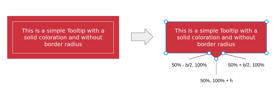
I’m going to skip right over the basic rectangular shape; you know how to set a width and height (or aspect-ratio) on elements. Let’s start with the simplest shape for the tooltip’s tail, one that can be accomplished with only two CSS properties:

.tooltip {
/* tail dimension */
–b: 2em; /* base */
–h: 1em; /* height*/

border-image: fill 0 // var(–h)
conic-gradient(#CC333F 0 0); /* the color */
clip-path:
polygon(0 100%, 0 0, 100% 0, 100% 100%,
calc(50% + var(–b) / 2) 100%,
50% calc(100% + var(–h)),
calc(50% – var(–b) / 2) 100%);
}

The border-image property creates an “overflowing color” while clip-path defines the shape of the tooltip with polygon() coordinates. (Speaking of border-image, I wrote a deep-dive on it and explain how it might be the only CSS property that supports double slashes in the syntax!)

The tooltip’s tail is placed at the bottom center, and we have two variables to control its dimensions:

We can do the exact same thing in more intuitive ways, like defining a background and then border (or padding) to create space for the tail:

background: #CC333F;
border-bottom: var(–h) solid #0000;

…or using box-shadow (or outline) for the outside color:

background: #CC333F;
box-shadow: 0 0 0 var(–h) #CC333F;

While these approaches are indeed easier, they require an extra declaration compared to the single border-image declaration we used. Plus, we’ll see later that border-image is really useful for accomplishing more complex shapes.

Here is a demo with the different directions so you can see how easy it is to adjust the above code to change the tail’s position.

We can fix this by setting limits to some values so the tail never falls outside the container. Two points of the polygon are concerned with the fix.

This:

calc(var(–p) + var(–b) / 2) 100%

…and this:

calc(var(–p) – var(–b) / 2) 100%

The first calc() needs to be clamped to 100% to avoid the overflow from the right side, and the second one needs to be clamped to 0% to avoid the overflow from the left side. We can use the min() and max() functions to establish the range limits:

clip-path:
polygon(0 100%, 0 0, 100% 0, 100% 100%,
min(100%, var(–p) + var(–b) / 2) 100%,
var(–p) calc(100% + var(–h)),
max(0%, var(–p) – var(–b) / 2) 100%);

Adjusting The Tail Shape

Let’s integrate another variable, –x, into the clip-path() and use it to adjust the shape of the tail:

.tooltip {
/* tail dimension */
–b: 2em; /* base */
–h: 1em; /* height*/

–p: 50%; /* tail position */
–x: -2em; /* tail shape */

border-image: fill 0 // 9999px
conic-gradient(#CC333F 0 0); /* the color */
clip-path:
polygon(0 100%, 0 0, 100% 0, 100% 100%,
min(100%, var(–p) + var(–b) / 2) 100%,
calc(var(–p) + var(–x)) calc(100% + var(–h)),
max(0%, var(–p) – var(–b) / 2) 100%);
}

The –x variable can be either positive or negative (using whatever unit you want, including percentages). What we’re doing is adding the variable that establishes the tail’s shape, –x, to the tail’s position, –p. In other words, we’ve updated this:

var(–p) calc(100% + var(–h))

…to this:

calc(var(–p) + var(–x)) calc(100% + var(–h))

And here is the outcome:

The tooltip’s tail points in either the right or left direction, depending on whether –x is a positive or negative value. Go ahead and use the range sliders in the following demo to see how the tooltip’s tail is re-positioned (–p) and re-shaped (–x) when adjusting two variables.

Note that I have updated the border-image outset to an impractically large value (9999px) instead of using the –h variable. The shape of the tail can be any type of triangle and can take a bigger area. Since there’s no way for us to know the exact value of the outset, we use that big value to make sure we have enough room to fill the tail in with color, no matter its shape.

Does the outset concept look strange to you? I know that working with border-image isn’t something many of us do all that often, so if this approach is tough to wrap your head around, definitely go check out my border-image article for a thorough demonstration of how it works.

Working With Gradients

Most of the trouble starts when we want to color the tooltip with a gradient instead of a flat color. Applying one color is simple — even with older techniques — but when it comes to gradients, it’s not easy to make the tail color flow smoothly into the container’s color.

But guess what? That’s no problem for us because we are already using a gradient in our border-image declaration!

border-image: fill 0 // var(–h)
conic-gradient(#CC333F 0 0);

border-image only accepts gradients or images, so to produce a solid color, I had to use a gradient consisting of just one color. But if you change it into a “real” gradient that transitions between two or more colors, then you get your tooltip gradient. That’s all!

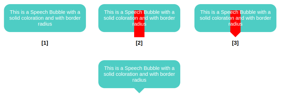
We start by declaring a background and border-radius on the .tooltip. Nothing fancy. Then, we move to the border-image property so that we can add a bar (highlighted in red in the last figure) that slightly overflows the container from the bottom. This part is a bit tricky, and here I invite you to read my previous article about border-image to understand this bit of CSS magic. From there, we add the clip-path and get our final shape.

.tooltip {
/* triangle dimension */
–b: 2em; /* base */
–h: 1em; /* height */

–p: 50%; /* position */
–r: 1.2em; /* the radius */
–c: #4ECDC4;

border-radius: var(–r);
clip-path: polygon(0 100%, 0 0, 100% 0, 100% 100%,
min(100%, var(–p) + var(–b) / 2) 100%,
var(–p) calc(100% + var(–h)),
max(0%, var(–p) – var(–b) / 2) 100%);
background: var(–c);
border-image: conic-gradient(var(–c) 0 0) fill 0/
var(–r) calc(100% – var(–p) – var(–b) / 2) 0 calc(var(–p) – var(–b) / 2)/
0 0 var(–h) 0;
}

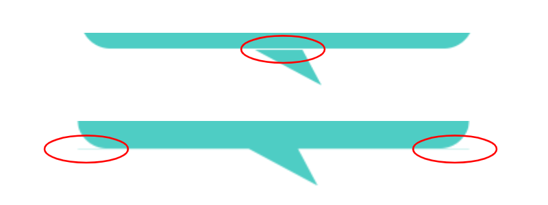
This visual glitch happens when the border-image overlaps with the rounded corners. To fix this, we need to adjust the border-radius value based on the tail’s position (–p).

We are not going to update all the radii, only the bottom ones and, more precisely, the horizontal values. I want to remind you that border-radius accepts up to eight values — each corner takes two values that set the horizontal and vertical directions — and in our case, we will update the horizontal value of the bottom-left and bottom-right corners:

border-radius:
/* horizontal values */
var(–r)
var(–r)
min(var(–r),100% – var(–p) – var(–b)/2) /* horizontal bottom-right */
min(var(–r),var(–p) – var(–b)/2) /* horizontal bottom-left */
/
/* vertical values */
var(–r)
var(–r)
var(–r)
var(–r)

All the corner values are equal to –r, except for the bottom-left and bottom-right corners. Notice the forward slash (/), as it is part of the syntax that separates the horizontal and vertical radii values.

Now, let’s dig in and understand what is happening here. For the bottom-left corner, when the position of the tail is on the right, the position (–p) variable value will be big in order to keep the radius equal to the radius (–r), which serves as the minimum value. But when the position gets closer to the left, the value of –p decreases and, at some point, becomes smaller than the value of –r. The result is the value of the radius slowly decreasing until it reaches 0. It adjusts as the position updates!

I know that’s a lot to process, and a visual aid usually helps. Try slowly updating the tail’s position in the following demo to get a clearer picture of what’s happening.

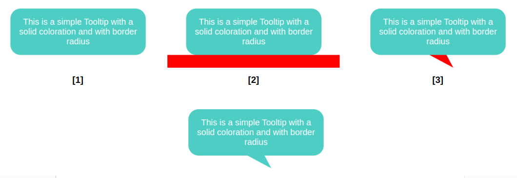
This time, the border image creates a horizontal bar along the bottom that is positioned directly under the element and extends outside of its boundary so that we have enough color for the tail when it’s closer to the edge.

.tooltip {
/* tail dimension */
–b: 2em; /* base */
–h: 1.5em; /* height */

–p: 50%; /* position */
–x: 1.8em; /* tail position */
–r: 1.2em; /* the radius */
–c: #4ECDC4;

border-radius: var(–r) var(–r) min(var(–r), 100% – var(–p) – var(–b) / 2) min(var(–r), var(–p) – var(–b) / 2) / var(–r);
clip-path: polygon(0 100%, 0 0, 100% 0, 100% 100%,
min(100%, var(–p) + var(–b) / 2) 100%,
calc(var(–p) + var(–x)) calc(100% + var(–h)),
max(0%, var(–p) – var(–b) / 2) 100%);
background: var(–c);
border-image: conic-gradient(var(–c) 0 0) 0 0 1 0 / 0 0 var(–h) 0 / 0 999px var(–h) 999px;
}

That’s why I do not use this approach when working with a simple isosceles triangle. This said, the method is perfectly fine, and in most cases, you may not see any visual glitches.

Putting Everything Together

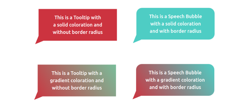
We’ve looked at tooltips with tails that have equal sides, ones with tails that change shape, ones where the tail changes position and direction, ones with rounded corners, and ones that are filled in with gradients. What would it look like if we combined all of these examples into one mega-demo?

We can do it, but not by combining the approaches we’ve covered. We need another method, this time using a pseudo-element. No border-image for this one, I promise!

.tooltip {
/* triangle dimension */
–b: 2em; /* base */
–h: 1em; /* height */

–p: 50%; /* position */
–r: 1.2em; /* the radius */

border-radius: var(–r) var(–r) min(var(–r), 100% – var(–p) – var(–b) / 2) min(var(–r), var(–p) – var(–b) / 2) / var(–r);
background: 0 0 / 100% calc(100% + var(–h))
linear-gradient(60deg, #CC333F, #4ECDC4); /* the gradient */
position: relative;
z-index: 0;
}
.tooltip:before {
content: “”;
position: absolute;
z-index: -1;
inset: 0 0 calc(-1*var(–h));
background-image: inherit;
clip-path:
polygon(50% 50%,
min(100%, var(–p) + var(–b) / 2) calc(100% – var(–h)),
var(–p) 100%,
max(0%, var(–p) – var(–b) / 2) calc(100% – var(–h)));
}

The pseudo-element is used to create the tail at the bottom and notice how it inherits the gradient from the main element to simulate a continuous gradient that covers the entire shape.

Another important thing to note is the background-size declared in the .tooltip. The pseudo-element is covering a bigger area due to the negative bottom value, so we have to increase the height of the gradient so it covers the same area.

Can you figure it out? The code for all of them is included in my tooltip collection if you need a reference, but do try to make them yourself — it’s good exercise! Maybe you will find a different (or perhaps better) approach than mine.

I love these delightful 2024 Oscar nominee illustrations

Original Source: https://www.creativebloq.com/news/olly-gibbs-oscars-poster

Olly Gibbs does it again.