How To Create A Star Rating System In WordPress With CSS and ACF

Original Source: https://1stwebdesigner.com/how-to-create-a-star-rating-system-in-wordpress-with-css-and-acf/

I recently had a request from a WordPress client for a star rating widget of sorts, so I thought I would share the solution I came up with using Advanced Custom Fields (ACF) and CSS. There are no images involved – just pure CSS plus Unicode stars and a handy range slider on the back end so the client can easily enter a rating anywhere from 0 to 5 in steps of 0.1. Thanks to a nice example I found on CodePen (seen below), the front end elements were easy and simple, utilizing CSS custom properties and variables in a compact code. Connecting this to ACF so the client could easily edit their ratings brought it all together in a quick solution that I have not seen elsewhere, thus the idea to make it available here in case anyone else is looking for something similar. Ready to dig in?

UNLIMITED DOWNLOADS: 500,000+ WordPress & Design Assets

Sign up for Envato Elements and get unlimited downloads starting at only $16.50 per month!

DOWNLOAD NOW

Coding The Stars

See the Pen
Tiny but accessible 5 star rating by Fred Genkin (@FredGenkin)
on CodePen.0


As you can see from the above CodePen, there is not much involved, yet it is a cleverly coded idea. This is taken from a great tutorial over on CSS Tricks, called “Five Methods for Five-Star Ratings”. The HTML below utilizes a custom CSS property (–rating) and makes no calls to the server while maintaining accessibility.

<div class="stars" style="–rating: 2.3;" aria-label="Rating of this product is 2.3 out of 5."></div>

The property is actually a conversion from a value to a percentage that’s handled in CSS using the calc() function:

–percent: calc(var(–rating) / 5 * 100%);

Then the filling of the stars based on the rating/percentage is done using a linear-gradient background that creates hard color stops at the percentage points that are designated.

background: linear-gradient(90deg,
var(–star-background) var(–percent),
var(–star-color) var(–percent)
);

In the CodePen example, the author uses CSS variables for the star size, color, and background. You can go this route if you want to be able to change those elements easily, or you can just code them in yourself if you have no plans to change them down the road.

background: linear-gradient(90deg,
#fc0 var(–percent),
#fff var(–percent)
);

Once the stars code is done, we can now make it work with the ACF range slider.

ACF Range Field

I’m assuming you are already familiar with Advanced Custom Fields, since you arrived at this article with it in the title. If not, you can learn more about the plugin here.

For our use case, we want to create a Range field so the client can select a range from 0 to 5 in steps of 0.1, enabling them to set the star rating at 4.7, for example.

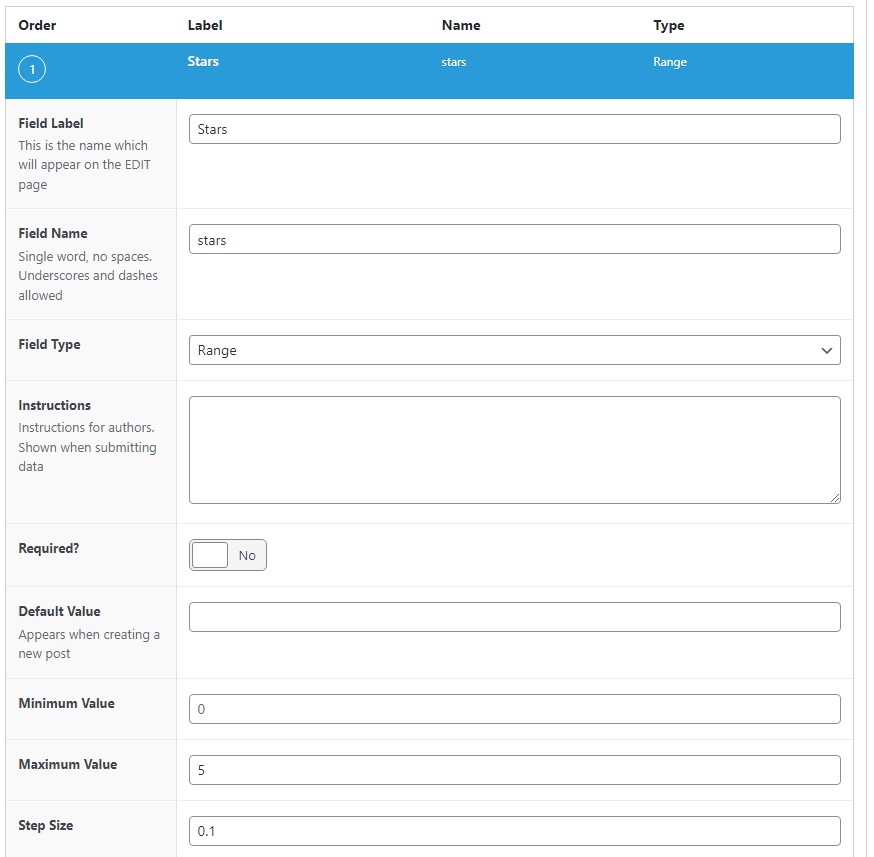
In the WordPress backend, navigate to Custom Fields > Add New to create a new field group, then give it a title and click the button labeled Add Field to create the new field. Add the Field Label (we’re using “Stars” in our example), select the Range field type, set the Maximum Value to 5, and the Step Size to 0.1. You can make any other edits you see fit, but these are the minimum to get this working the way we want it to work.

Star Rating field

After saving your changes, you can now edit whatever page, post, or template PHP file in which you want to show the star rating by entering the following code:

<?php
$stars = get_field(‘stars’);
if($stars) echo ‘<div class="stars" style="–rating: ‘. $stars .’" aria-label="Rating of this product is ‘. $stars .’ out of 5."></div>’;
?>

This code replaces the HTML we were originally using, and now it will show the rating that is set on the backend when the Range field is updated. Pretty simple, right?

Star Rating Range Slider

For reference, here’s the complete CSS that will make the magic happen (derived from the SCSS in the CodePen).

.stars {
–percent: calc(var(–rating) / 5 * 100%);
display: inline-block;
font-size: 60px;
font-family: Times;
line-height: 1;
}
.stars::before {
content: ‘★★★★★’;
letter-spacing: 2px;
background: -webkit-gradient(linear, left top, right top, from(#fc0), to(#fff));
background: linear-gradient(90deg, #fc0 var(–percent), #fff var(–percent));
-webkit-background-clip: text;
-webkit-text-fill-color: transparent;
}


Courses app by Architechpro OÜ Review

Original Source: https://ecommerce-platforms.com/articles/courses-app-by-architechpro-ou-review

E-learning is a booming industry. In fact, the market hit record growth in 2020, reaching $250 billion. With the innovation of AI, augmented learning, and the increasing popularity of SaaS, more and more companies are looking to integrate e-learning into their business strategy.

That said, if you’re a Shopify store owner, you might already sell digital products online. However, regardless of what you’re currently selling, publishing e-learning materials is an excellent way to:

Establish yourself as an authority in your nicheUpsell your servicesGenerate more revenueAdd value to your brandDiversify your product offering

So whether you’re looking for an engaging way to communicate how customers can make the most out of your services or want to monetize your knowledge, e-learning could be the solution.

So, how do you publish your own e-learning materials?

The answer: using a Shopify plugin like Courses app by Architechpro OÜ. This app is explicitly designed to make it easier for eCommerce store owners to sell online lessons, tutorials, webinars, memberships, manuals, etc. In addition, Courses app by Architechpro OÜ enables you to manage your e-learning materials using your Shopify admin panel as a learning management system.

So, in this review, we’ll take you through this app’s features, skills, and benefits.

There’s lots to cover, so let’s begin!

What Makes a Great Online Learning Platform?

In short, a good online learning platform provides everything you need to make it easy for customers to consume your educational content. It should also provide ways to establish a rapport with your students. For instance, offering students the ability to message or chat with you, network with you and each other via a forum, or providing direct feedback on their work.

Needless to say, high-quality eLearning systems boast other key hallmarks. So, let’s dig into what these are and how the Courses app by Architechpro OÜ facilitates them.
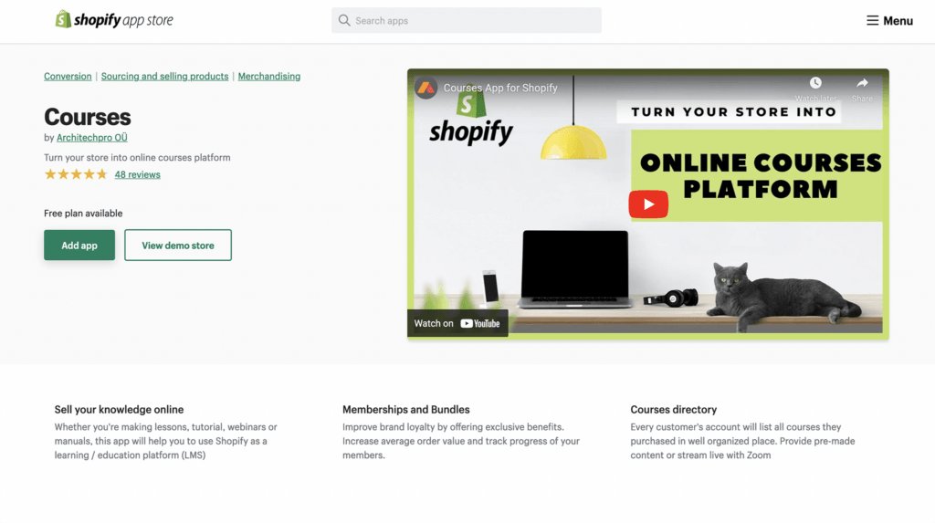
Architechpro Ou Review - homepage

A User-Friendly Interface

A user-friendly interface means different things to students and teachers. However, these two sides of the same coin have a few things in common. Namely, it’s vital that the interface is easy to navigate, clean and modern-looking, and doesn’t confuse users with endless navigational links and buried functionality.

For many students, online learning can be a new experience, making it more useful if they have easy access to the resources they need and that access to your online course feels intuitive. This includes a simple log-in process, clear navigation, and straightforward access to relevant and engaging learning materials.

Fortunately, the Courses App by ArchitechPro OÜ is super simple for students to navigate thanks to its clearly signposted in-app directions. Students can also easily track course progress from the convenience of their dashboard and restart the course from where they left off.

Also, thanks to the tags at the top of the dashboard it’s quick and easy to search and filter all available courses.

On the teacher’s side of things similarly Courses app by Architechpro OÜ makes it easy to control the learning experience. With just a few clicks you can easily enable quizzes, create courses, manage memberships, and more.

Flexible and Responsive Design

Learners want to be able to log into your course at any time, from anywhere – so it’s essential your e-learning software enables you to provide this service. In other words, offering users cloud-based content that’s accessible via their mobile devices and/or computers is imperative.
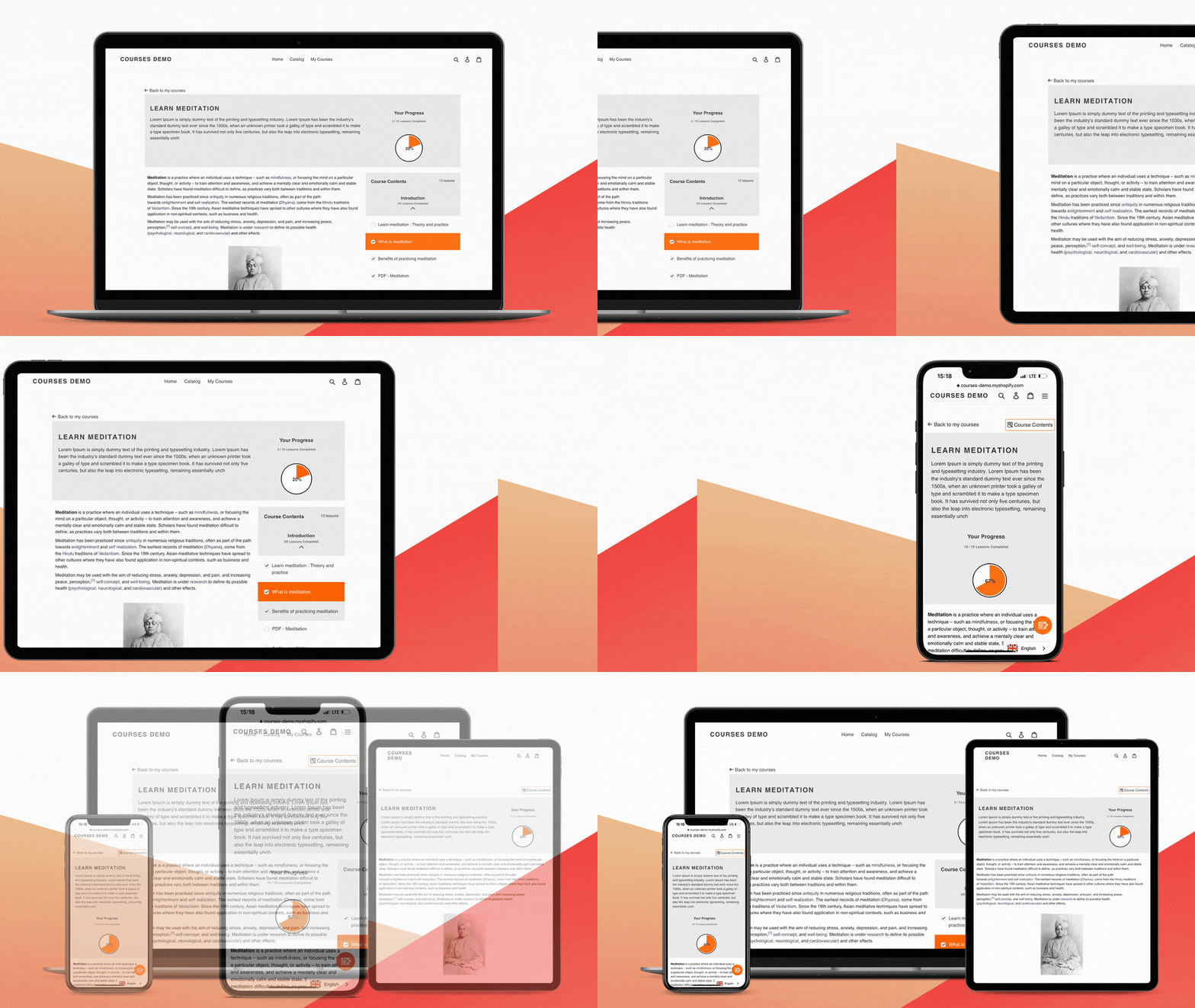
Courses app by Architechpro OÜ is as responsive as your Shopify store, meaning the design of your course platform will work on any sized device and scale efficiently. Providing users have an internet connection they can log in from any device, allowing them to truly learn while they’re on the go!

Offering Students a Diverse Range of Resources

Needless to say, that for students, access to the right educational materials is the cornerstone of their learning experience.

Depending on the subject matter and your teaching style, you may wish to provide learners with anything from simple Word documents to PDFs, audio files, or videos.

According to VARK, there are four primary styles of learning. These include:

Visual – Learning through video, watching examples, etc.Auditory – Listening to someone explain, listening to songs, etc.Reading and Writing – Learning through textKinesthetic – Learning through doing

In light of that, being able to provide students with varied resources is essential. Courses app by Architechpro OÜ enables you to upload different types of lessons, including text, videos, Zoom live webinars, and quizzes.

Progress Tracking

For students and teachers alike, being able to track your learners’ progress is invaluable. When students have access to their grades, module completion certificates, progress tracking bars, etc. it can work to spur them on to complete the entirety of the course.

On the flip side, for teachers, tracking course progress provides an insight into how engaged students are. Are students completing the full courses? Or do they drop off at a specific section or lesson? This data can help course creators to improve their content and better engage with students.

Courses app by Architechpro OÜ offers progress tracking with its visual progress bar. On a similar note, to help students monitor their progress you can also award certificates to learners when they meet certain milestones. On top of that, you can also set quizzes to test your students and track their scores.

Admin Made Easy

When you’re creating and selling online courses and other learning materials, the last thing you want to consider is the admin-side of things. This is why you want a platform that makes it easy to process and upload new learners, keep track of payments, and manage your course materials.

Fortunately, with Courses app by Architechpro OÜ course management is made easy. You have access to everything you need using one handy ‘clipboard’. This page is the hub of your LMS, liking to all your key sections, including courses, settings, certificates, and students. It also has links to helpful tutorials outlining how to make the most of your admin status.

Social Learning Tools

It’s a widely held belief that learning is done best when students and peers can reflect on their work and share ideas together. For example, it’s predicted that in the workplace, 70% of learning happens through experience, and 20% through social learning with colleagues and friends.

With eLearning, unfortunately, this collaborative approach can sometimes be a roadblock. However, thanks to the modern miracle that is social media, you can establish online learning communities just as you would in a traditional classroom.

Courses app by Architechpro OÜ supports social learners with their Facebook Comments integration. This makes it easy to engage and monitor your learning community on Facebook.

Go to the top

illustration of a cat climbing a ladder

Courses app by Architechpro OÜ Pricing

You can add Courses by ArchitechPro OÜ to your Shopify account for free with their Demo plan. This allows you to add up to five lessons to your store and cater to an unlimited number of students. You also get access to course progress tracking, and you can customize the app with your choice of color.

After that, there are three premium plans to choose from.

The Basic plan for $29.99 per month: You can create up to 20 lessons per store, drag and drop content, and add limited-time course access.The Professional plan for $49.99 per month: This allows you to create 100 lessons per store and add quizzes.The Enterprise plan for $199.99 per month: This lets you create unlimited lessons and you can build product bundles, memberships, and custom certificates. The Enterprise plan, unlike the others, can also be billed yearly for a slightly reduced price of $2,000 ($166.67 per month).

In our opinion, its pricing is one of the app’s greatest limitations. Vital marketing and student engagement features are locked behind major paywalls.

Go to the top

illustration of a cat climbing a ladder

Installing Courses app by Architechpro OÜ

First things first, you’ll need to install the Courses by Architechpro OÜ app.

Follow these steps for your installation.

Locate the plugin on Shopify’s app store – for your ease, you can find the listing here.Click ‘Add App’If you already have a Shopify account, this should bring up a box with your Shopify account details. Select the account you wish to add the app to.This should then redirect you to the courses area of the Apps section of your Shopify Admin area.

Courses app by Architechpro OÜ also enables you to “Upload from SCORM File.” A SCORM file is a series of technical qualities for products offering e-learning. It provides the necessary communication structures and data capabilities for online learning to work well with a Learning Management System.

SCORM files come in especially useful if you’re migrating course content over from another platform. Other learning platforms may allow you to export your content as a SCORM file, which you can upload to Architechpro OÜ following the steps below:

Click the blue Create Courses option in the top right-hand corner.This should cause a pop-up to appear displaying various course creation options. Go to the bottom and choose the Upload From Scorm File link, highlighted in blue.Now, upload your SCORM File for installation.It’s imperative you wait until the success note pop-up appears. Only then has your file been uploaded to your Courses app.Finally, go back to My Courses and double-check your file has uploaded successfully.

For a more in-depth tutorial on uploading a SCORM file, Architechpro OÜ provides a full step-by-step guide.

Go to the top

illustration of a cat climbing a ladder

How Do You Create Lessons and Educational Content Using Courses app by Architechpro OÜ?

The good news is that adding course content is a breeze. Follow the steps below to build your first lesson:

Once you’ve successfully downloaded the Courses App and created your first course, you’ll want to start adding content. First, click on the course you want to edit.In the center of the page is a ‘Create Section’ option, click on it.A pop-up will appear where you can name the section.Once saved, this section will appear in your course summary.Now you have the option to create content for your section, including text, video, file upload, audio, and quizzes. It’s worth noting that audio and video can be embedded with Vimeo links rather than being uploaded directly to the platform, which some users have pointed out is inconvenient.

Membership and Bundles

Offering membership products and bundles of products/services is a great way to boost revenue.

There’s no shortage of companies that have made use of product bundling. For instance, Hydrant increased its total sales by 40% when they introduced product bundles, and Nintendo sold 100,000 units when they sold games and consoles bundled together, as opposed to a 20% decrease when they only bundled games.

The bottom line: If the price is right, bundling products can encourage bargain hunters to spend more than they would have done.

Now for online memberships. From the customer’s perspective with online memberships, they get access to exclusive content and special features. On the flip side of the coin, customers pay fixed-term contracts, which means a predictable income – win-win!

It’s worth noting that both bundles and membership functionality are only available on the Enterprise plan.

Course Style

From this section, you can customize your course aesthetic. For example, you can change things like the accent color of course. This affects the color of the progress bar, buttons, and the highlighting of the section the student’s on. Alternatively, if you have the coding skills, you can delve into the CSS code for more granular customization.

Course Certificates

As we’ve already touched on, completion certificates are brilliant for helping learners track their progress and generating a sense of excitement over your educational materials.

To add course certificate, head to the ‘Certificates’ dashboard. From here you can create certificates for specific achievements, milestones, and quizzes. When a student reaches the threshold to be awarded a certificate, the certificate is then emailed to the student as a PDF attachment.

To create a certificate, just follow the prompts outlined on the page. It’s worth noting you can add logos and imagery to your certificates to ensure consistent branding with every interaction students have with your e-learning business.

Buttons

Adding buttons to your course might seem like a daunting task for those who aren’t great with technology; however, with Courses by ArchitechPro OÜ, it couldn’t be easier.

If you click onto the ‘Settings’ page in your dashboard, you’ll see options to add features like;

A ‘My Courses’ buttonA ‘Menu’ itemA ‘My Courses’ link

The ‘My Courses’ button enables a direct link from your eCommerce Site to your eLearning page, which makes incorporating eLearning into the eCommerce brand incredibly easy.

Go to the top

illustration of a cat climbing a ladder

Courses app by Architechpro OÜ Pros and Cons

Before we wrap up, here’s our final overview of the pros and cons of the Courses App by Architechpro OÜ.

Pros 👍
Cons 👎

Pros 👍

The app integrates directly with Shopify, allowing for a seamless user experience.
Creating courses is very simple; no technical knowledge is required.
You can accommodate unlimited students
The app tracks course progress with a progress bar
You can add video, audio, image, or text content to your lessons
There’s a free demo plan available
Students can access course content on the go with responsive mobile design
The platform integrates with Facebook Comments, making it easy to cultivate a sense of community using Facebook.
There are no extra commission per order, just the monthly subscription price

Cons 👎

Major features are locked away behind paywalls. You can’t access membership and product bundling features until you pay for the Enterprise plan, and even quizzes only get unlocked with the Professional Plan.
There are very few course customization options
Compared to other online learning platforms in this price range, Architechpro OÜ has rather limited features. For instance, it doesn’t come with its own learning community features, advanced quizzes, or grading.

Go to the top

illustration of a cat climbing a ladder

Are You Ready to Start Using Courses app by Architechpro OÜ?

In summary, Courses app by Architechpro OÜ enables you to offer learning materials on your Shopify store. It provides a seamless experience for both you and your students. The app’s biggest strength is its native Shopify integration, enabling sellers to manage important customer details from one place. Its customer support is also reportedly excellent.

However, where the app falls flat is its lack of complexity and customizability. There are very few design options to make your course platform look like your own, and the student engagement features are limited to the basics. All in all, the Premium version might be too expensive a monthly investment considering how few features it unlocks. You only unlock quizzes and 100 lessons by spending $49.99 per month. Not to mention, custom certificates only become available with the Enterprise plan for $199.99 per month.

For anyone serious about online courses, we recommend checking out other LMS and bracing the slightly added difficulty of managing such a platform alongside your Shopify store. However, if the convenience of a fully integrated LMS app appeals to you, test Courses app by Architechpro OÜ with its free plan to get a feel for whether this platform meets your needs.

We’d love to hear what you think! Tell us in the comments below how you’d rate the Courses app by Architechpro OÜ.

The post Courses app by Architechpro OÜ Review appeared first on Ecommerce Platforms.

Best Electric Callus Removers

Original Source: https://www.designsauthority.com/best-electric-callus-removers-review/

Want smooth and nice-looking feet? Then, it is time to replace your pumice stone with an electric callus remover. Callus shavers also known as foot scrubbers are super handy devices used to remove dry cracked skin and calluses. Feet and hands might develop patches of hard skin which may get painful if cracked a condition … Read more

The post Best Electric Callus Removers appeared first on DesignrFix.

14 Best YouTube Channels for Designers in 2022

Original Source: https://www.webdesignerdepot.com/2022/04/14-best-youtube-channels-for-designers-in-2022/

Whether you are looking for comprehensive tutorials on UX design or professional courses on topics like logo design, video or photo editing, there’s the perfect YouTube channel for you as a designer.

The best thing about YouTube is that you do not have to be a professional to jump into a video tutorial and gain the knowledge you need. There are many people who have become experts in, say, Photoshop by watching many hours of YouTube videos.

In 2022, there are established and emerging channels that you, as a designer, can use to get inspired and fix problems in your workflow.

Let us take a look at our 14 favorite YouTube channels for designers:

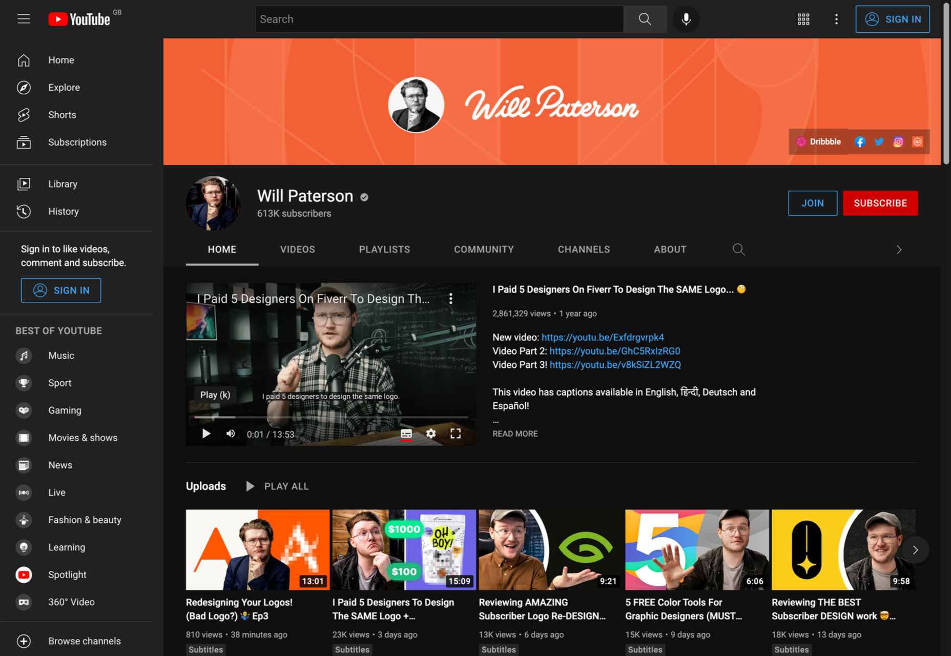
1. Will Paterson

Subject: Logo design, hand lettering, Illustrator tutorials 

Subscribers: 608K

Creator: Will Paterson

Are you looking for a YouTube channel that will help you improve your logo designs and entertain you at the same time? If so, Will Paterson is the channel for you. Whether you are a professional designer or a beginner, this channel has everything you need: from logo design and Illustrator tutorials to product reviews and vlogs; nothing is left out.

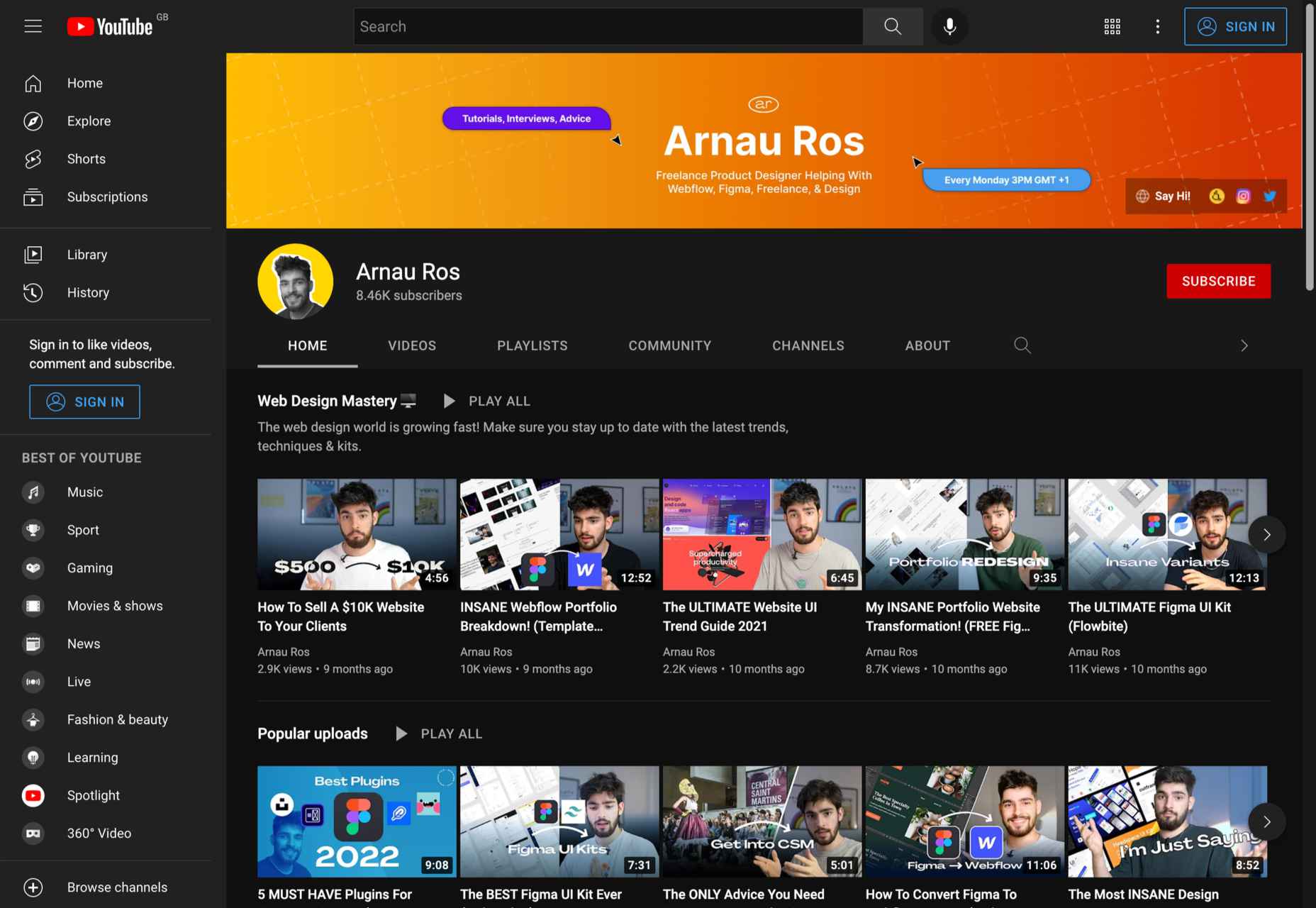
2. Arnau Ros

Subject: Web design (UI, UX), Freelancing, Figma tutorials

Subscribers: 7.7K

Creator: Arnau Ros

In about a year, Arnau Ros has managed to become one of our favorite YouTube channels. In a few words, Arnau is a very talented freelance product designer. He has published numerous videos on how to use Figma, one of the most popular problem-solving platforms for designers.

And that’s not all. Arnau has created a series of videos that will help you get started in the world of freelancing from scratch as a new designer.

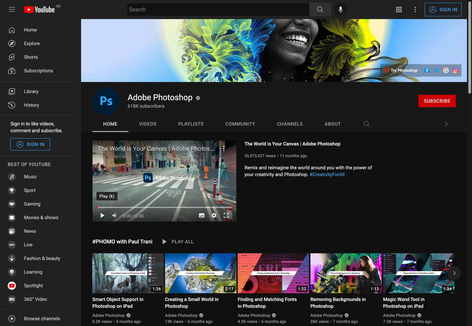
3. Adobe Photoshop

Subject: Photoshop tutorials 

Subscribers: 618K

Creator: Adobe

Although there are numerous YouTube channels that offer top-notch Photoshop tutorials, the official Adobe Photoshop channel should not be underestimated. Adobe has created a quick start guide for most Photoshop features, toolboxes, etc. So if you need to quickly complete a task in Photoshop, this is the perfect channel for you.

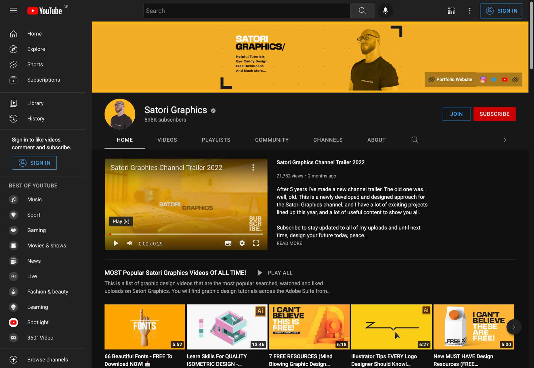
4. Satori Graphics

Subject: Freelancing, Graphic design guides (fonts, plugins, techniques, etc.)

Subscribers: 884K

Creator: Tom Cargill

From career development videos to poster and type designs to workflow tutorials, Satori Graphics has it all. We highly recommend this channel for beginners and designers who want to master Illustrator and create a top-notch portfolio for their design work.

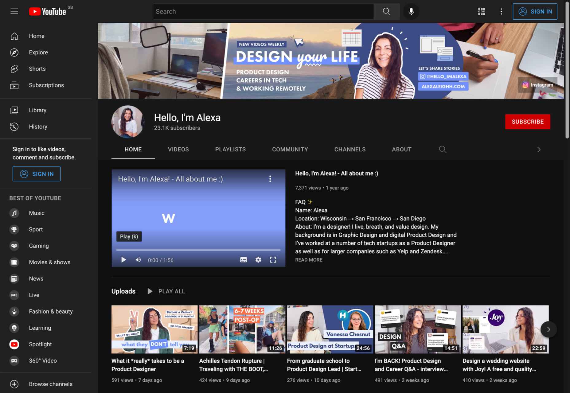
5. Hello, I’m Alexa

Subject: Freelancing, UX design, vlogs

Subscribers: 23K

Creator: Alexa Herasimchuk

Alexa’s YouTube channel is a great choice if you are a UX designer and want inspiration. What we love about Alexa is that her channel covers everything a UX and product designer needs to know. Be sure to check out the fascinating video discussions with other designers that she has uploaded.

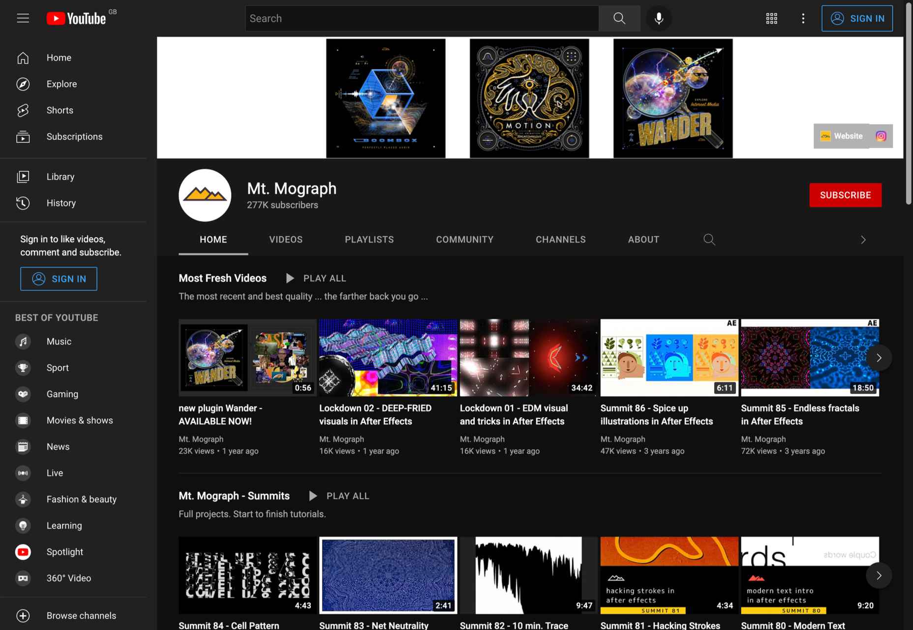
6. Mt. Mograph

Subject: 3D animation, motion graphics guides, Adobe After Effects

Subscribers: 277K

Creator: Mt. Mograph co.

For more than 3 years, Mt. Mograph has been one of the most popular YouTube channels for graphic designers. The channel is especially popular among creatives who want to learn more about 3D animation, geometric motion, and need the best After Effects tutorials.

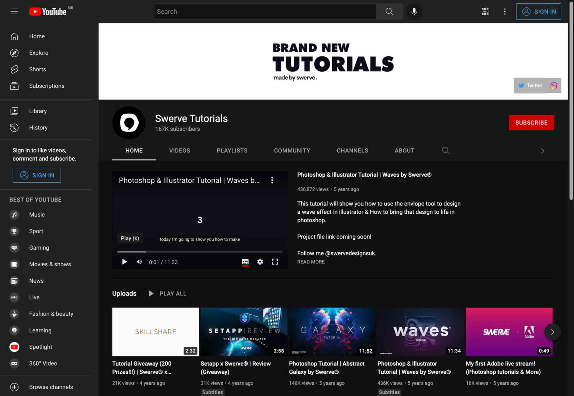
7. Swerve Tutorials

Subject: Photo editing, motion graphics

Subscribers: 167K

Creator: Swerve

Swerve has created some of the most comprehensive how-to videos for Photoshop, Illustrator, and Motion Graphics. The channel’s speed art videos are extremely inspiring. Even though the channel is not constantly updated, it already contains many videos that you should definitely watch.

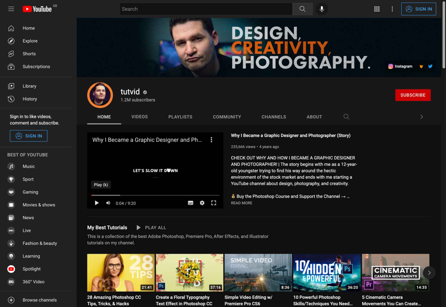
8. Tutvid

Subject: Graphic design software (Illustrator), Photo and video editing (Photoshop, Premiere, Lightroom) 

Subscribers: 1.19M

Creator: Nathaniel Dodson

Tutvid needs no introduction. With more than 1 million subscribers, this has been one of the most popular YouTube channels for creatives for years. When it comes to tutorials about Adobe Creative Cloud software, nothing beats this channel.

If you are looking for comprehensive tutorials on Adobe Photoshop, Illustrator, Lightroom, and Premiere, Nathaniel Dodson is your man.

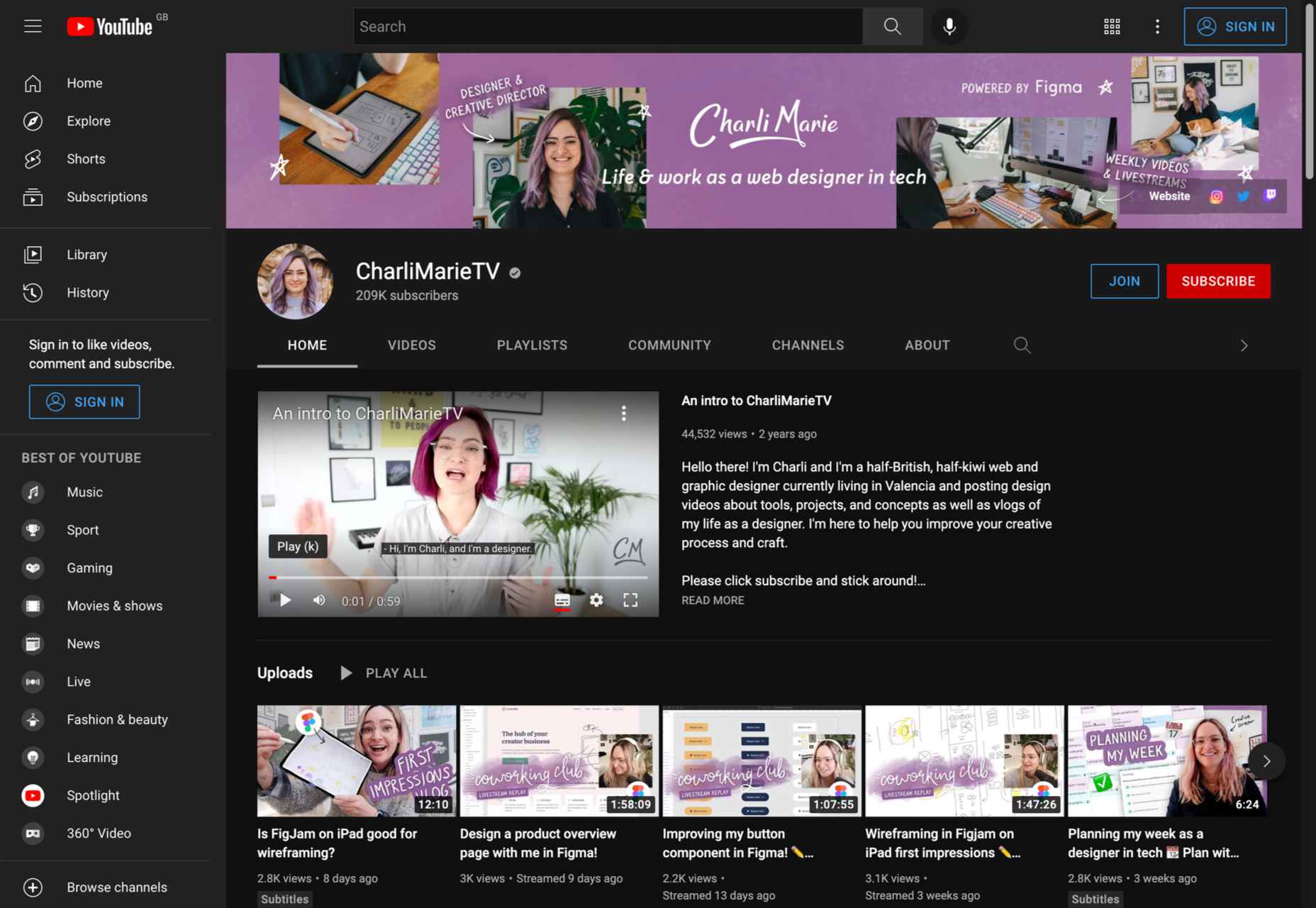
9. CharliMarieTV

Subject: Freelancing, web development, chats and vlogs

Subscribers: 209K

Creator: Charli Prangey

If you are not yet familiar with the digital nomad lifestyle, be sure to check out the CharliMarieTV channel. Charli is a freelance web designer and entrepreneur who has created some of the best videos on website design, coding, remote work, and more.

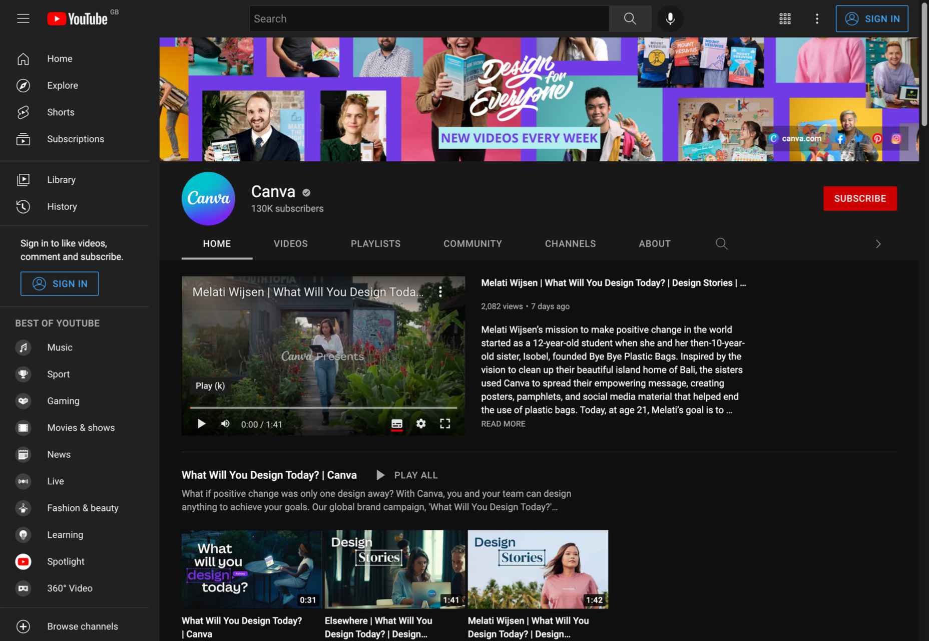
10. Canva

Subject: Canva tutorials

Subscribers: 126K

Creator: Canva 

Canva is a popular web-based graphic design platform. Like the official Adobe Photoshop channel, this is the best way to quickly learn how to use Canva software. In addition to quick tutorials, this channel includes videos with all the important software updates and in-depth Canva workshops.

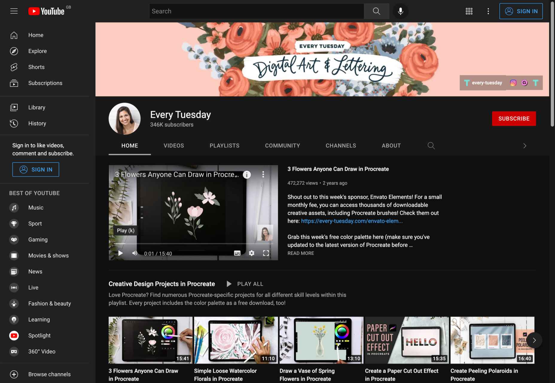
11. Every Tuesday

Subject: Graphic design guides for Procreate

Subscribers: 345K

Creator: Teela Cunningham

When it comes to Procreate tutorials, there’s nothing better than Every Tuesday. The channel has different playlists for beginners, intermediate and professional creatives. From hand lettering projects to watercolor flowers to digital gouache, you’ll find everything you need to master Procreate on Teela’s channel.

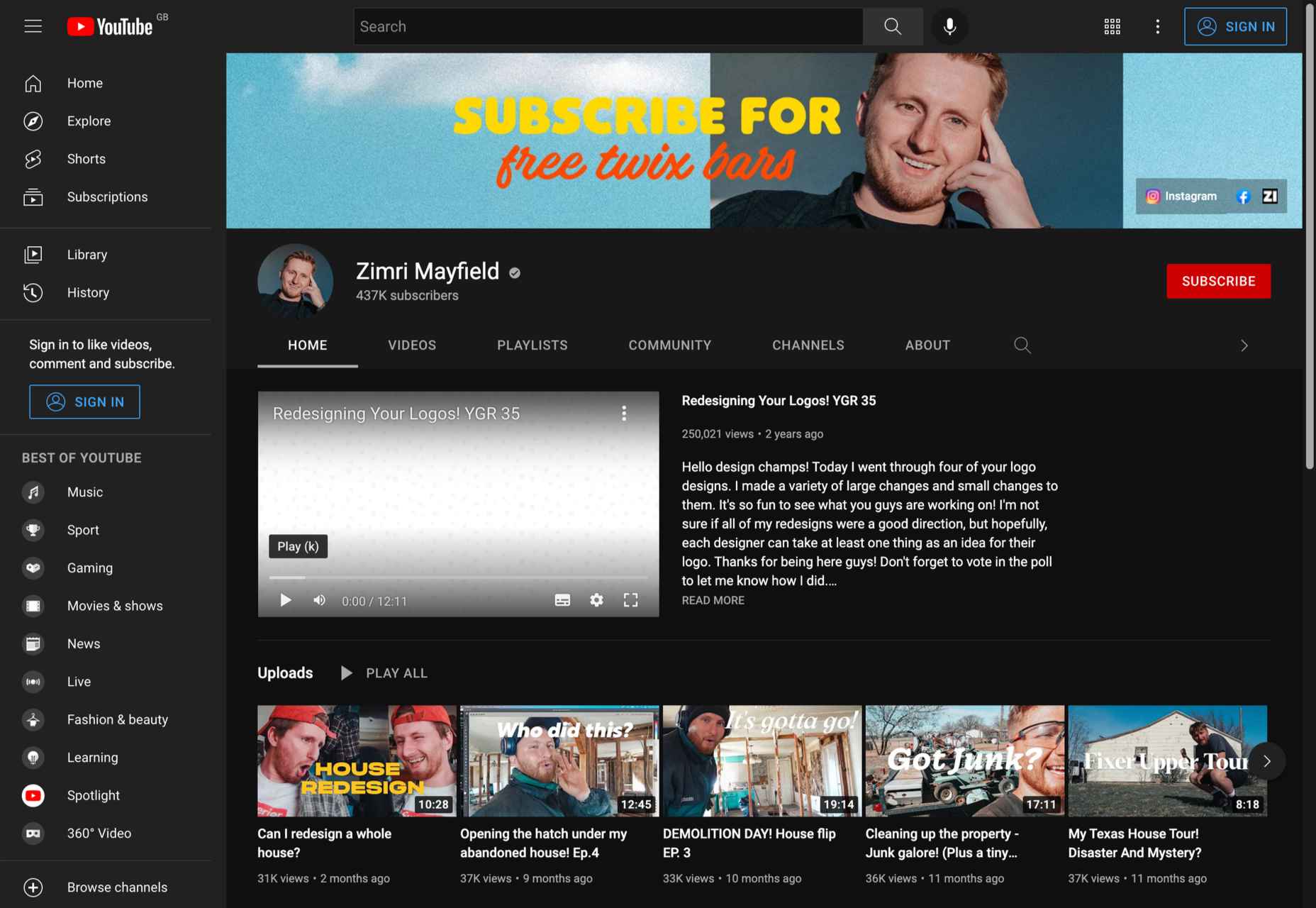
12. Zimri Mayfield

Subject: Logo design tutorials, vlogs, logo redesign

Subscribers: 437K

Creator: Zimri Mayfield

Those of you who love logo designs probably already know all about Zimri Mayfield’s channel. Professionalism and a great sense of humor are combined in one of the most inspiring YouTube channels for designers.

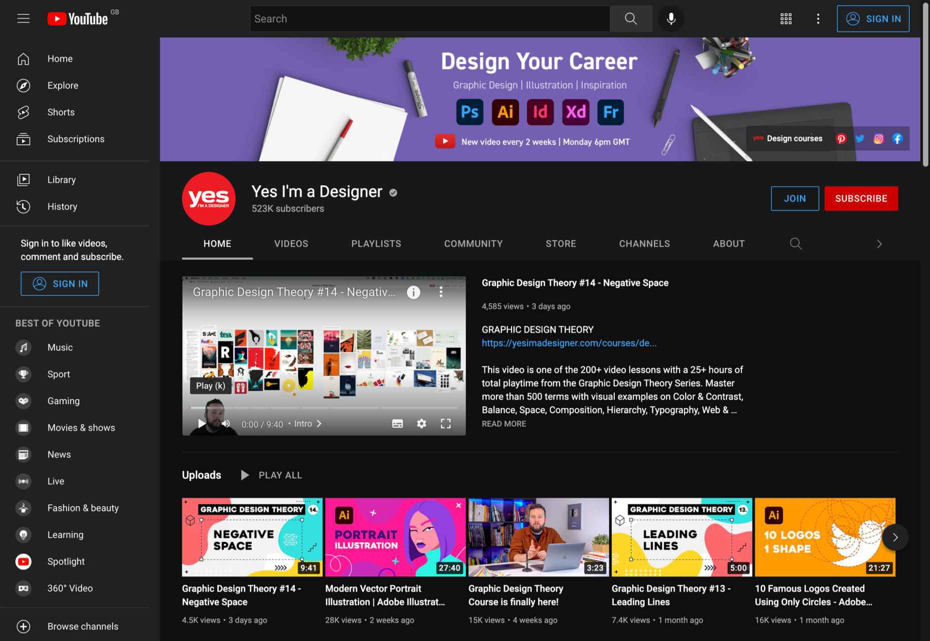
13. Yes I’m a Designer

Subject: Adobe creative cloud tutorials

Subscribers: 517K

Creator:  Martin Perhiniak

As a certified Adobe design master and instructor, Martin Perhiniak has created a must-follow channel on YouTube. From basic Photoshop and Illustrator tutorials to advanced masking tutorials, you’ll find it all at Yes I’m a Designer.

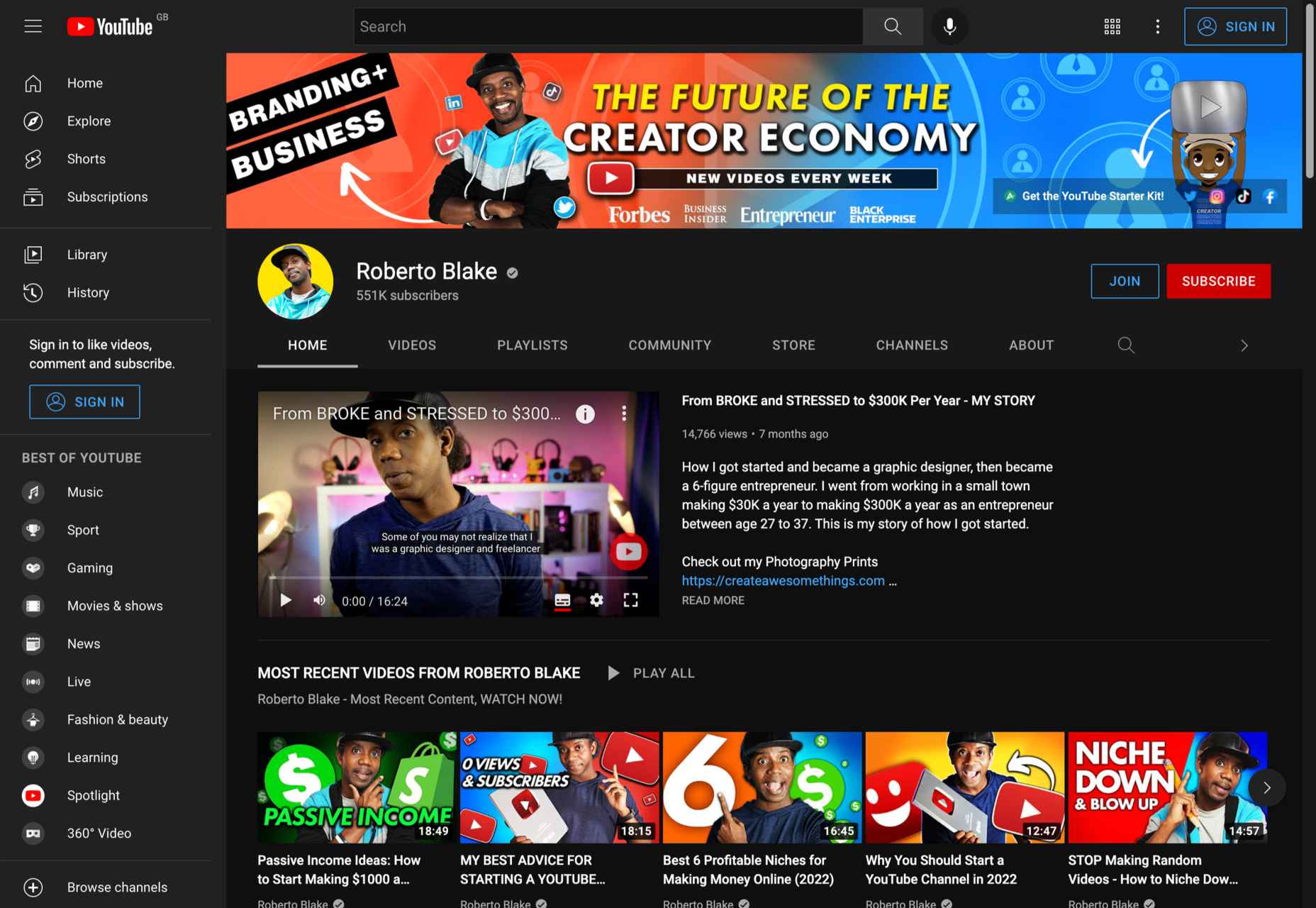
14. Roberto Blake

Subject: Adobe tutorials, brand/business development

Subscribers: 549K (as of March 2022)

Creator: Roberto Blake

If you are looking for something more than graphic design tutorials, our last suggestion is perfect. Roberto Blake has created numerous Photoshop, Dreamweaver, Illustrator, and Indesign tutorials, but also gives numerous talks and shares his knowledge on video marketing and brand development.

Wrap Up

Although there are numerous YouTube channels for designers, these are our absolute favorites. Of course, that does not mean there are not more equally successful and inspiring designers on YouTube. Made by Mighty,  Sketch Together and Ch-Ch-Check It are just a few more examples of great YouTube video creators if you search for a specific topic.


Featured image via Unsplash.

Source

p img {display:inline-block; margin-right:10px;}
.alignleft {float:left;}
p.showcase {clear:both;}
body#browserfriendly p, body#podcast p, div#emailbody p{margin:0;}

The post 14 Best YouTube Channels for Designers in 2022 first appeared on Webdesigner Depot.

Collective #707

Original Source: https://tympanus.net/codrops/collective/collective-707/

Inspirational Website of the Week: Six

A super slick design with sharp typography and great layouts. Our pick this week.

Check it out

Collective 668 image

Our Sponsor
Instant websites for your clients with Divi Layout Packs

With the Divi Layout Packs you’ll get world-class designs ready to be used for your client projects.

Check it out

Three-gpu-pathtracer

An epic path tracing renderer and utilities for Three.js built on top of three-mesh-bvh. By Garrett Johnson.

Check it out

Picture perfect images with the modern <img> element

Addy Osmani writes about how important images are and how they can affect your web app’s performance more than any other part of your code.

Read it

Building a dialog component

A foundational overview of how to build color-adaptive, responsive, and accessible mini and mega modals with the <dialog> element. By Adam Argyle.

Read it

Home sweet homepage

The fantastic journey of growing up online by Sailor Mercury.

Check it out

Ideal SVG exports

A random collection of opinions on how design tools should export SVGs.

Check it out

CSS :has() A Parent Selector Now

Matthias Ott explains how the :has() selector works and shows how it’s not only useful as a parent selector.

Read it

Reasonable Colors

Reasonable Colors is an open-source color system for building accessible, nice-looking color palettes.

Check it out

JavaScript function composition: What’s the big deal?

An article by James Sinclair explains what the big deal with function composition is.

Read it

CSS Parent Selector

A deep-dive into the CSS :has parent selector with some use-cases and examples. By Ahmad Shadeed.

Read it

The struggle of using native emoji on the web

Nolan Lawson on the miserable state of Emoji support in browser.

Read it

Just a Calendar

Just a no nonsense calendar made by Shrikant Sharat Kandula.

Check it out

Chalk.ist

A tool to turn your source code into beautiful images.

Check it out

Lexical

Lexical is an extensible text editor framework that provides excellent reliability, accessibility and performance.

Check it out

CryptoFont

Crisp webfont icons and SVG logos of many cryptocurrencies.

Check it out

The complete guide to protecting your APIs with OAuth2 (part 1)

A deep dive into the complex OAuth2, the most popular specifications for API authentication. By Dan Moore.

Read it

Eight Colors

Eight Colors is a block shifting game where the goal is to shift circular blocks to reach the target. Made by Shubham Jain.

Check it out

Dave Seidman

Dave Seidman’s portfolio has a cool project slideshow with a 3D shape in a polygonal look that morphs into another one.

Check it out

How to Fix Your Low-Contrast Text

Learn how to solve 30% of the web’s accessibility defects with just the help of a calculator. By Ben Myers.

Read it

From Our Blog
Creating a Fluid Distortion Animation with Three.js

A coding session where you’ll learn how to create the interactive liquid-like effect from the PixiJS website using Three.js.

Check it out

From Our Blog
On-Scroll Text Repetition Animation

An on-scroll animation that shows repeated fragments of a big text as seen on the website of Dr. Dabber.

Check it out

The post Collective #707 appeared first on Codrops.

Splitting Large XML File into Multiple Smaller Files

Original Source: https://www.hongkiat.com/blog/split-large-xml/

Many users have encountered issues with huge XML files and look for ways to lower the size of the XML files. The best way to solve this problem is to split XML files into smaller ones. In this…

Visit hongkiat.com for full content.

How to Sync MetaMask Mobile App With Chrome Extension

Original Source: https://www.hongkiat.com/blog/sync-metamask-mobile-and-browser/

MetaMask, if you don’t already know, is a private crypto wallet to store and swap your cryptocurrencies and NFTs. It is available as a browser extension (for Chrome, Firefox, Brave, and Edge),…

Visit hongkiat.com for full content.

Best Print on Demand Sites for Artists

Original Source: https://ecommerce-platforms.com/articles/best-print-on-demand-sites-for-artists

The best print on demand sites for artists provide creative professionals with everything they need to turn their talent into a profession. Rather than having to produce prints, canvasses, and countless other products manually, artists can use print on demand solutions to minimize costs and stress.

Print on demand sites for artists are ideal for keeping costs low, and helping professionals to reach a range of people, thanks to their flexible shipping solutions. The question is, which POD sites are best-suited to the needs of an artistic professional?

Today, we’re going to be looking at some of the best print on demand sites artists can use for their business needs.

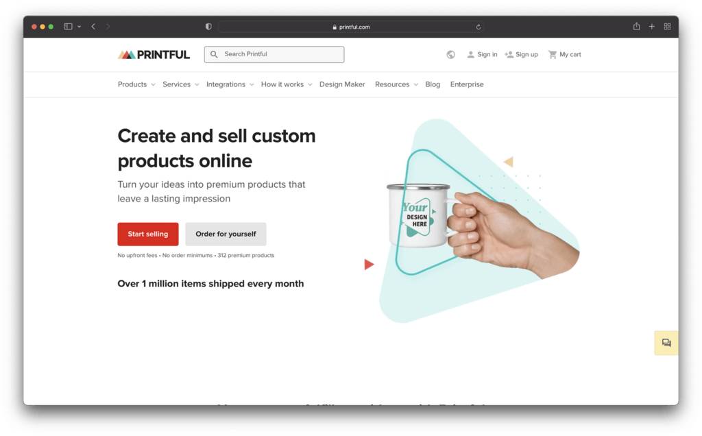
1. Printful

printful - Best print on demand sites for artists

As one of the better-known print on demand solutions on the web today, Printful is a top choice for all kinds of creative professionals. With this POD technology, artists can turn their creations into a wide range of products, with the opportunity to visualize what those items might look like in advance with a handy mock-up generator.

One of Printful’s major selling points is its versatility. Artists can create everything from mugs and prints, to clothing, with production tools like cut and sew, embroidery, and sublimination. At the same time, you also get a super-simple backend environment to make starting up your business simple.

Printful integrates easily with your existing online store, and you can add branded labels and unique packaging inserts into your product shipments. Overall, the experience is straightforward, flexible, and perfect for business leaders of all sizes.

Pricing

Printful keeps things simple with absolutely no monthly or setup fees to worry about, and no unexpected expenses. The amount you spend depends on what kind of products you’re making for your customers. It’s worth considering the branding options you choose as carefully as possible, as different customizations can lead to extra expenses.

Pros 👍
Cons 👎

Pros 👍

Tons of branding and customization options.
Excellent range of products for artists.
Handy mock-up generator built-in.
Worldwide fulfilment centers with great support.
Integrates easily with existing website builders.

Cons 👎

Slight learning curve initially.
Profit margins could be higher in some cases.

Further reading 📚

Printful Review (Apr 2022): Higher Quality Printing and Dropshipping

Printful Alternatives (Apr 2022): Best Solutions Reviewed

Printful Pricing (Apr 2022): How Much Does Printful Cost?

How to Start a POD Store with Shopify and Printful – Step by Step Guide

Go to the top

illustration of a cat climbing a ladder

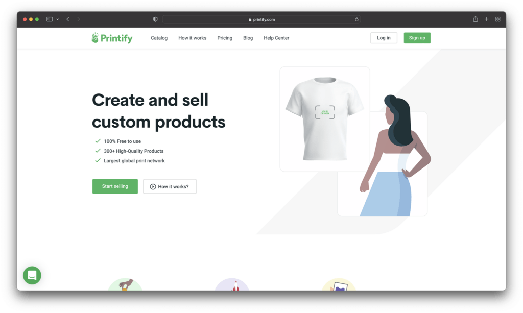
2. Printify

printify - Best print on demand sites for artists

Printify often ranks among the likes of Redbubble and Printful as a well-known solution for POD selling. If you’re looking for Print on Demand companies with a wide range of product options to offer, Printify is a great choice. You can use this providers tools to add your art to a range of everything from knitted beanies, to bobble hats, and shirts.

Printify makes it quick and easy to add customizations to wall art and clothing on-demand products, with a range of production processes. You can also order samples at a discount to check the quality of anything you produce, before selling it online.

Printify can integrate with a range of storefront platforms and website builders and allows you to sell your product across a variety of channels. The back-end is also extremely easy to use, so you don’t have to spend days learning before you can design your custom products.

Printify is a straightforward and powerful tool for independent artists who want to add POD functionality to their own store.

Pricing

Printify’s free version works just like other POD solutions. Rather than paying monthly subscription fees or set up prices, you just pay for the base price of your items, like a tote or sweater, as well as the costs of accessing a quality printing partner to produce your items.

There is a “Premium” service from Printify, however, if you want to add creations from other artists to your own designs. You can also get discounts on the base price of your products with this service, which means you can make more profit by setting your own prices. Premium starts at $29 per month.

Pros 👍
Cons 👎

Pros 👍

Excellent premium service
Great for adding POD to your own website
Lots of product options
Fantastic quality for the variety of products
Great for high-volume selling

Cons 👎

Some limitations on t-shirt design branding
Some vendors may be less reliable

Further reading 📚

Printify Review (Apr 2022): Easy and Quick Way to Create Products With Your Designs

How to Use Printify With Shopify (The Ultimate Guide)

The Best Printify Alternatives for Print on Demand in 2022

Go to the top

illustration of a cat climbing a ladder

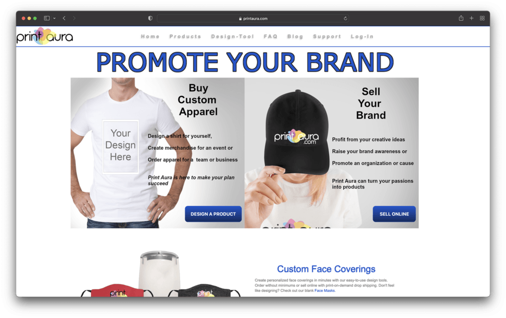
3. Print Aura

print aura - Best print on demand sites for artists

A leading innovator in print on demand technology, Print Aura is excellent for artists looking to monetize their works online. The affordable and easy-to-use software is great for beginners, with lots of product options to choose from, including aprons, mugs, hats, and prints.

Print Aura creates your items in as little time as possible, usually within 5 days, so you can get your items to customers as quickly as possible. There’s also a very straightforward back-end environment, so you won’t have to spend forever learning how to use the technology.

While Print Aura doesn’t have quite as many advanced tools as some other market leaders, it’s still a great pick for artists looking to grow online. There’s global and US shipping, as well as fantastic order support, and a mock-up tool for your designs. Print Aura also has a wide range of how-to guides, and amazing customer support options available.

Pricing

Similar to most POD services for artists, the price you pay for your Print Aura creations will depend on the kind of items you’re going to be shipping to customers. Simpler items with basic customizations are far less expensive than complex designs.

Pros 👍
Cons 👎

Pros 👍

Plenty of branding and customization options.
Mockup generator to help you see what your designs will look like.
Track customer items easily for better service.
No minimum order requirements.
High quality range of product options.

Cons 👎

Slightly slow customer service.
Higher shipping costs for some items.

Go to the top

illustration of a cat climbing a ladder

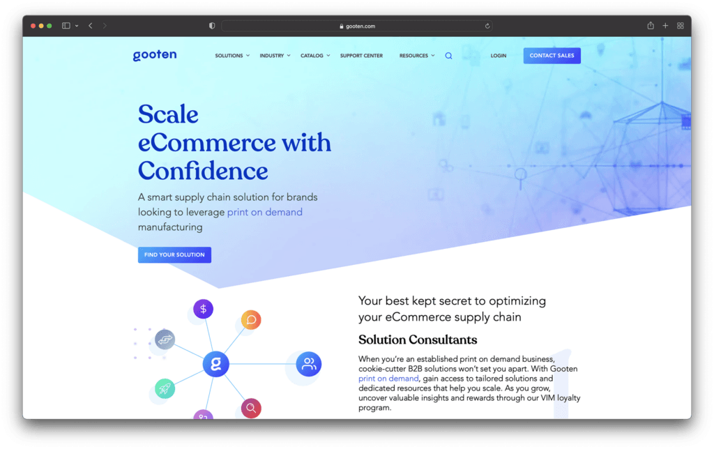
4. Gooten

gooten - Best print on demand sites for artists

Another example of a popular and easy-to-use solution for print on demand selling, Gooten offers a range of services to get you started online. You can add your artistic designs to a range of attractive products and sell your art to other creators to use on their products too. Alternatively, you could partner with other artists to create a larger portfolio.

Gooten makes it quick and simple to start selling, with plenty of tools, like a convenient mockup generator to show you what products will look like when they’re done, and automated order tracking. There are over 150 product options to choose from, and you can integrate the app with leading website designing tools like WooCommerce and Shopify.

As an extra bonus, Gooten offers some fantastic service. You can send your products to over 70 global routing locations, and access production times as low as two days. You’ll also be able to get quick assistance from the team if anything goes wrong.

Pricing

Like the majority of POD solutions, pricing for Gooten depends almost exclusively on what you want to sell. There aren’t any set-up fees or monthly expenses. However, you will need to pay for the price of the item, the shipping costs, and the extra costs of branding and customization.

Pros 👍
Cons 👎

Pros 👍

Excellent range of products to choose from
Lots of great tools like a mockup generator
Global shipping and fast shipping times.
Automated order tracking.
Integration with top website builders.

Cons 👎

Some product prices can be high.
No marketing tools available.

Further reading 📚

Gooten Review (Apr 2022): Everything You Need to Know

Gooten vs Printful (Apr 2022): The Battle of the POD Companies

Go to the top

illustration of a cat climbing a ladder

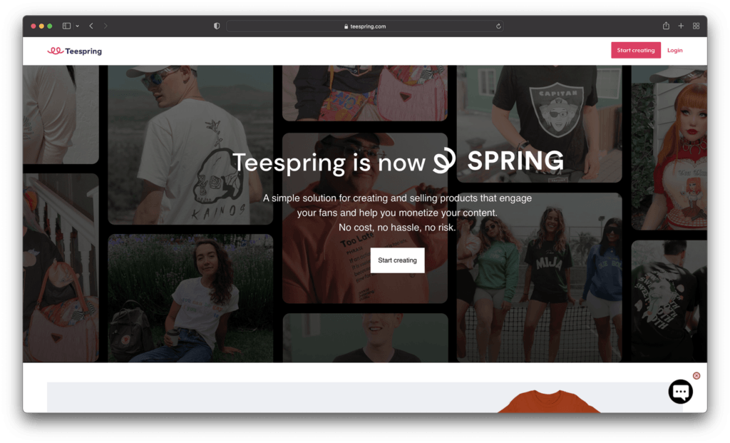
5. Teespring

teespring homepage - Best print on demand sites for artists

Excellent for artists looking to transform their designs into t-shirts, apparel, and other common items, Teespring is easy to use, and packed with famous brands and influencers already. To begin with, Teespring focused almost entirely on the creation of custom t-shirts. However, today’s users can access a wider selection of amazing products.

Like many POD companies, TeeSpring simplifies the process of building a great business. You can use your mock-up generator to estimate what items might look like before they reach your online store, and there are tons of ways to make your products stand out.

You can cross-sell your products across a variety of channels, download mockup images to use for your marketing and promotion, and even donate profits to charity. Users can also add multiple people to the same Teespring account, which is great if you want to get other people involved in selling your artwork online. Teespring also has access to a handy boosted network, which helps you reach existing customers.

Pricing: Teespring’s pricing will depend on the specific customizations you want to make to your products, what kind of items you’re selling, and where you’re going to be shipping too. Certain features, like ultra-fast shipping, do require a higher payment.

Pros 👍
Cons 👎

Pros 👍

Lots of product options to choose from.
Marketing assistance with the boosted network.
Straightforward ordering and fulfilment.
Easy to use mock-up generator.
Rush shipping options.

Cons 👎

Slight learning curve for beginners.
Limitations for customization.

Further reading 📚

Printful vs Teespring (Apr 2022): Which One Is the Absolute Best?

Go to the top

illustration of a cat climbing a ladder

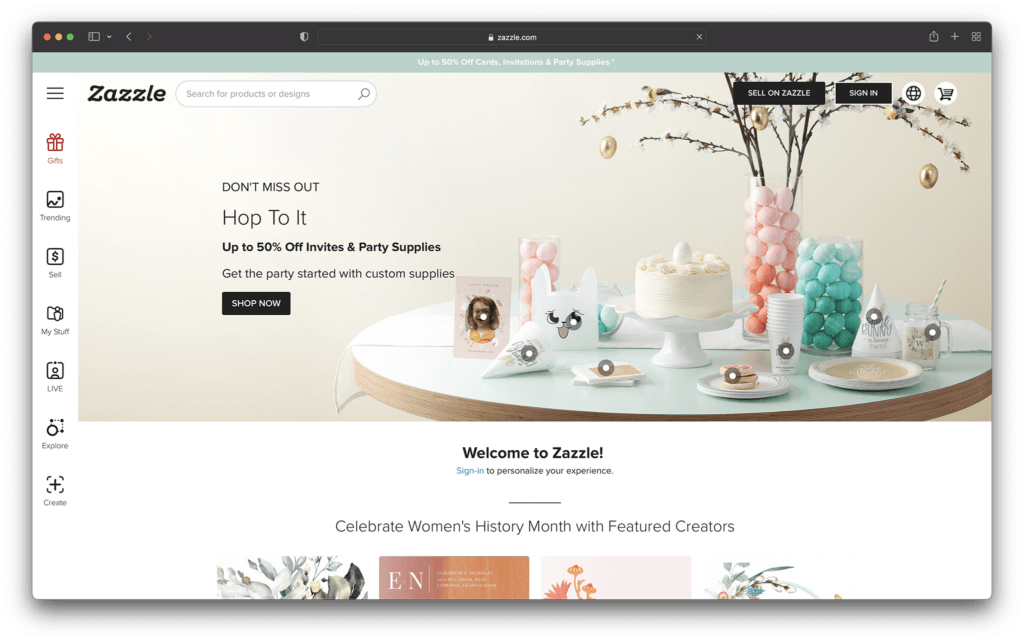
6. Zazzle

zazzle homepage - Best print on demand sites for artists

If creating your own website seems to come with too many upfront costs and stress, then you could take a different approach to selling your art online. Zazzle allows you to sell your solution to a range of potential customers through a convenient marketplace. You can design and sell products or you can simply upload your own designs into the marketplace for other people to use.

If the idea of creating unique products doesn’t appeal to you as much as simply selling your artwork, then Zazzle could be the ideal alternative. There are tutorials on the Zazzle website to help you understand how everything works. However, as an artist, you’ll essentially be charging other people to use your creations in their products.

There’s no need to spend time building your own storefront or designing phone cases and other custom products for your business model. Zazzle allows you to focus on simply bringing attention to your artwork, and helping other people sell their print on demand products.

Pricing:

For artists, graphic designers, and photographers, there’s no charge to get started with the Zazzle ecosystem. You can upload and sell your artwork on hundreds of products for free, or simply offer your products to other companies. The great thing about Zazzle is you have the freedom to set your own royalty rates, so there’s no limit on what you can earn.

Zazzle can help you to reach millions of shoppers worldwide, with minimal setup costs and stress.

Pros 👍
Cons 👎

Pros 👍

Excellent if you don’t want to make products
Choose your own royalties
Easy access to a huge audience
No upfront costs to sign up
Earn a reputation online

Cons 👎

No way to set up your own website
Can be confusing at first

Go to the top

illustration of a cat climbing a ladder

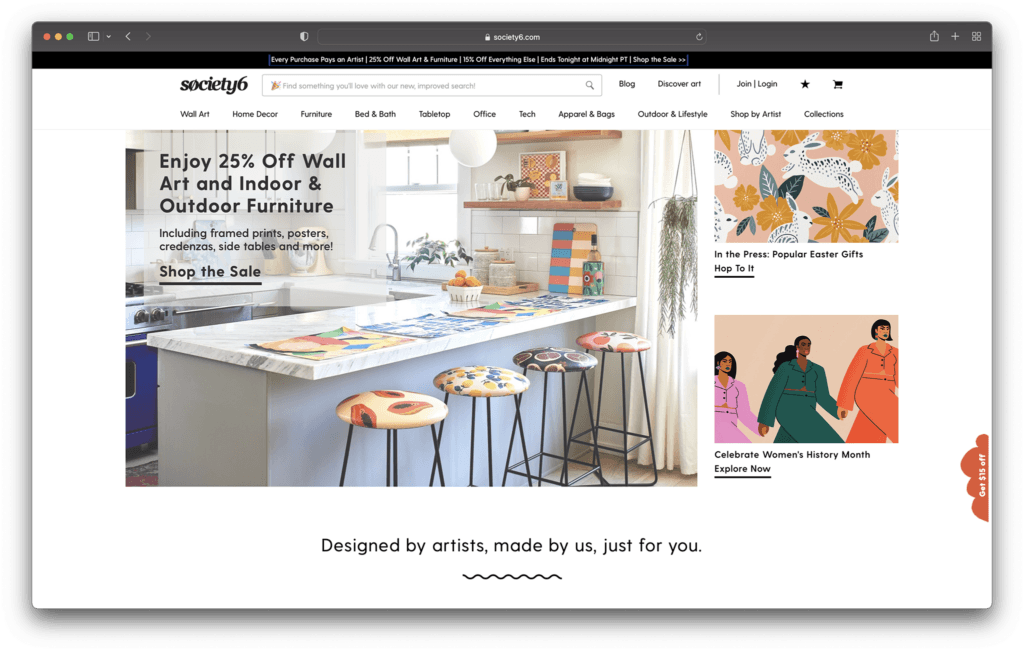
7. Society6

society6 - Best print on demand sites for artists

Finally, one of the top print on demand solutions for companies who want to sell high-quality products fast, without the fuss, Society6 is a great choice. This print on demand platform is actually a marketplace, similar to some of the other leading tools online today. You get your items listed alongside other professionals on the same platform.

The great thing about using an online marketplace, is you can focus more on building your dropshipping product portfolio, and less on attracting customers to your site through social media and content marketing. There’s already an audience waiting to access your products.

The pre-existing audience means you get an experience similar to selling on Etsy, but like with other print on demand services, you don’t have to make your products yourself. You can create everything from hoodies to stickers and art prints with the help of the available production marketplace.

Pricing:

While there’s no cost to sign up with Society6, it’s worth remembering that you will have limited access to the amount of cash you can make, Society6 determines your profit margin after taking their own cut of the profits. This means you usually end up with about 10% of the retail price overall.

Pros 👍
Cons 👎

Pros 👍

Easy to sell to a range of existing customers
Create everything from home décor to t-shirts
Sell to customers around the world
Free to upload and share your art with no monthly fees
High-quality products

Cons 👎

No brand building opportunities
Profit margins can be quite low

Further reading 📚

Society6 Review: Everything You Need to Know

Printful vs Society6: Which is Better? (Apr 2022)

Go to the top

illustration of a cat climbing a ladder

The Best POD for Artists

There are endless ways to sell your art online today, from tools like Sunfrog, Spreadhsirt, Cafepress, Threadless, and Teepublic, to marketplaces like eBay and Merch by Amazon. With print on demand websites, it’s never been easier to make a name for yourself as a professional artist. However, you will need to take your time to find the platform best suited to your needs.

Take a look at some of the options available online today, and consider experimenting with things like the mockup generators and free demos before you dive in. Remember, your POD provider will make a huge difference to how much of a profit you can make.

The post Best Print on Demand Sites for Artists appeared first on Ecommerce Platforms.
How to Write Good Code: 10 Beginner-friendly Techniques for Instant Results

Original Source: https://www.sitepoint.com/how-to-write-good-code/?utm_source=rss

As a beginner developer, improving your code skills is probably one of your top priorities. But where do you start? With so much information out there, it can be tough to know which techniques are worth learning and which ones will actually help you write better code.  In this blog post, we’ll share 10 beginner-friendly […]

Continue reading
How to Write Good Code: 10 Beginner-friendly Techniques for Instant Results
on SitePoint.

Case Study: Redesigning Todoist for Android

Original Source: https://www.webdesignerdepot.com/2022/04/case-study-redesigning-todoist-for-android/

Todoist is a to-do list app that 25 million people rely on every day to keep their lives organized. As part of the Doist design team’s goals for 2021, we aimed to redesign the Todoist Android app to take advantage of the latest Google Material Design guidelines.

In this post, we cover the design decisions and processes behind redesigning the Todoist Android app for Material Design. We explore the Design and Android team’s collaboration practices that brought the app update to life, which resulted in winning the Material Design Award 2021 in the large screen category. Let’s get started!

Opportunity

When we started the project, our design implementation on Android was ready for a major overhaul. The last milestone redesign on Android was initiated after the release of the first Material Design guidelines in 2016. Since then the team successfully worked on continuous improvements to the Android app, but we saw the opportunity to improve Todoist on Android on a more holistic level.

We set out to clean up instances of older UI components, colors, and text styles and update them with the latest Material Design components. We observed that some interactions and navigational patterns had become inconsistent with what users were expecting on newer Android devices and were eager to modernize this experience. With new hardware and software changes in mind, we set out to make the experience on larger phones and tablets even better, so Todoist could take full advantage of the latest generation of devices. Material 2 and 3 provided an incredible new framework to rethink the current app experience. With this in mind, we set out to challenge what a modern Android app should look like and innovate on top of the default user experience.

Solution

The team set itself the goal of redesigning our Todoist Android app and aspiring to make it the best-designed productivity app on Android. The project was ambitious and scheduled to take several months to complete. We set ourselves the following targets while working on the project:

Review the current implementation and older design specs.
Study the latest Material Design Guidelines and assess what is relevant for our project.
Research great Material Design apps and case studies and learn from their execution.
Define the new Todoist Android app design language and document the changes.
Design and development work together to assess the proposed solution and implementation.
Test an early version of the new app internally to gather feedback and make adjustments.
Invite beta testers to the new app to gather feedback and make adjustments.
Refine the app and address core issues before launching to the public.

Review

The project was kicked off by reviewing the current Todoist Android app implementation, noting down what areas needed to be fixed and what was up to date. While reviewing, we took screenshots of the app implementation for reference. This way we could easily see the current state of the app and compare it to the new design proposals that would be created. Once the review process was finalized, we had a comprehensive overview of the current state of the app and the layout, component, and styling changes we wanted to make.

Study

We continued the project by studying the latest Material Design Guidelines, assessing the components and practices that were most relevant to Todoist.

When the project kicked off in February 2021, Material 2 was the most recent version of their design system. Since Material 2 had already been released for quite some time, we anticipated that design changes to Material would be announced soon at the Google I/O event in May 2021. Rather than wait, because we expected the changes to be iterative, we pushed ahead with our work.

We identified 25 components and UI patterns that we wanted to change across the app. The changes included buttons, forms, menus, sheets, navigation drawer, app bar, system bars, text and color styles, and more. We started by creating a table view in a Dropbox Paper document with the component changes and references links to Google’s Material Design Guidelines.

This components list was a starting point for discussion to plan the scope and complexity of the changes. Close async discussions between the design and development team in Twist and Dropbox Paper comments helped us make decisions about scope and complexity early on and set a solid foundation for the project.

Research

In the initial Material Design study, we also researched inspiring Material Design apps, Material studies, Play Store apps, and Google Workspace apps to learn from their execution.

We started out by studying the Material Design Award Winners 2020 and tested out the products that were showcased. The showcased winners struck a good balance between implementing the Material Design Guidelines while maintaining their own product’s brand within the system. This balance between Google’s guidelines and the Todoist brand was also key for us to get right and so we strived to find this mix across the work we created and implemented in the project.

Along with the MDA winners, we researched the Material Studies that Google produced to showcase what apps could look like with branding and Material Design guidelines applied. It was a great reference to see how far components could be customized while maintaining the core platform principles. The Reply case study in particular offered valuable insight to us as its content type and layout came closest to Todoist. It showcased how components like the app bar, navigation drawer, and large screen layouts worked while being customized.

We continued our research by searching the Google Play store for inspiring app examples. Google Tasks, Press, Periodic Table, and Kayak stood out to us as the level of polish and quality of the apps were on par with the experience we were aspiring to create.

Sometime later in the project when Material You was released (more on that later), we stumbled upon the Google Workspace apps blog post which previewed Material 3 changes that Google was introducing to their own products. It offered a great glimpse at what was to come before the Material 3 Design Guidelines were officially released. This post sparked new internal discussions and further design explorations that we considered for future Todoist Android updates.

Design Spec

As we started to define the new Todoist Android app design language and document the changes, we opted to create a design framework, focusing on creating components rather than designing every screen in the app. This allowed us to consistently apply the design system in the app. We did so by using the previously defined component list that we created during the review and study process.

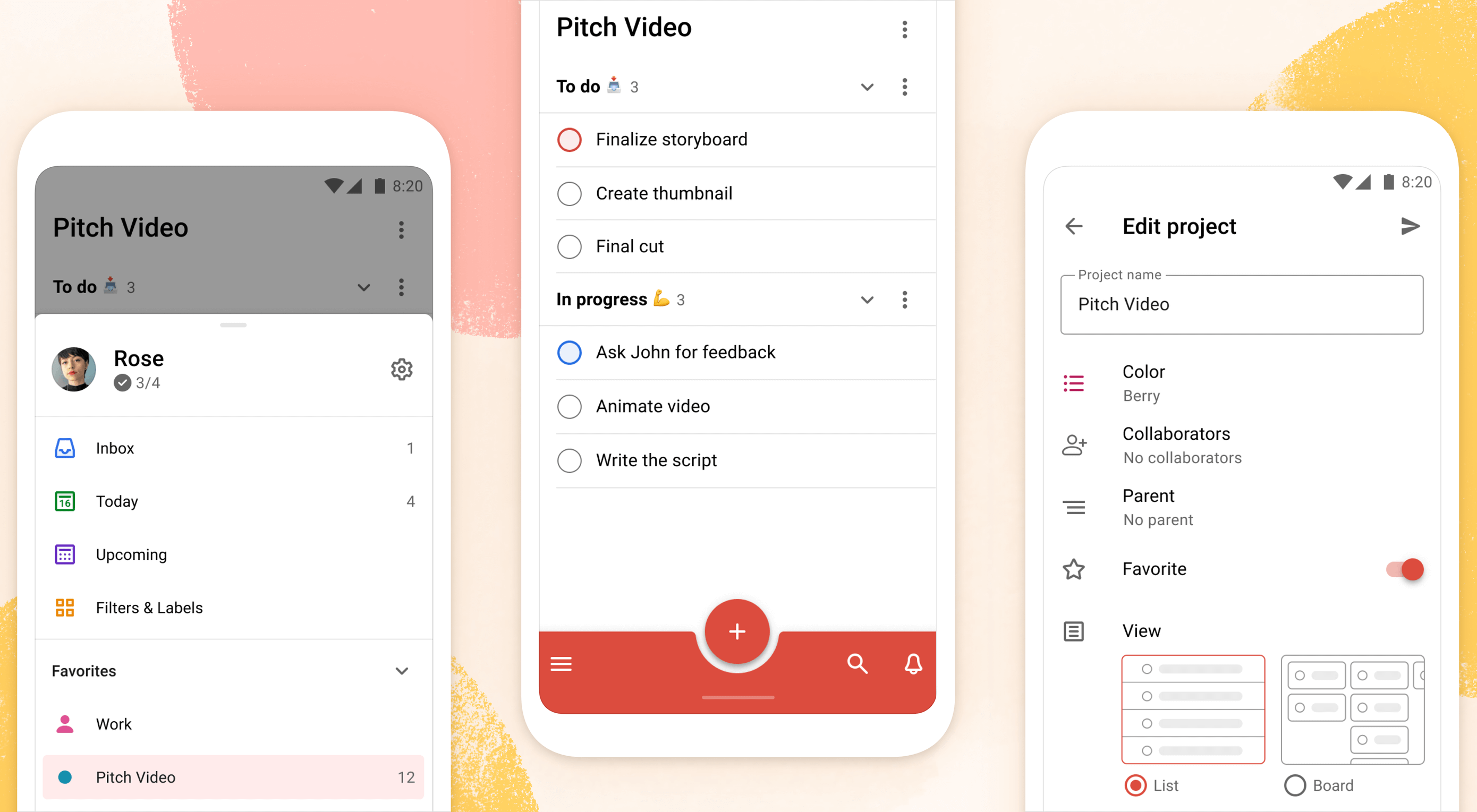
Core screens from different areas of the app were chosen to demonstrate how the components could be applied. We chose to mock up the Todoist project view, navigation drawer menu, project view edit screen, settings, and project detail view, among others. These screens gave us a good overview of how buttons, forms, drawers, lists, and other components would work together and in different states; selected, pressed, disabled, etc.

During the project, we were transitioning our Doist design system to Figma and started creating our first components in the new Doist Product Android Library. We started by using some components from the Material Design UI kit – Components library from the official Google Figma resource file and added them to our Doist design system. We then continued to build up the Product Android Library file with our Todoist-specific components such as task list & board views, detail views, sheets, colors, typography, etc.

We continued by documenting color and typography changes that were based on the Material Design guidelines. The design team opted to implement a new Design Token framework that would share the same values between our design system and the development implementation. The development team would output the values they had in the current implementation and the design team would analyze which values were needed and which could be merged, changed, or deleted. This informed the new Design Token color and typography system which we then documented and discussed with the team to implement. Later in the project, we were happy to see a similar token system introduced by Material 3 in the latest guidelines which validated our thinking and principles behind the new design system.

The design documentation expanded to hold other edge-case mockups that could sit alongside the design system. We documented different responsive screen experiences between phones and tablets against the previous implementation. Additional sections were created to document the motion that should be used for certain components and screens by referencing existing Material Design guidelines examples or prototyping custom motion in Principle and After Effects. The design spec also touched on haptic feedback that should appear on touch targets, how dark mode should work across the new components, documenting Todoist themes within the new design language, and more.

Design Implementation

At Doist, the benefit of the squad is that cross-team collaboration is built into the make-up of the team. Designers, developers, support, and product managers work together in a squad to deliver the project. This close collaboration from the start is key to bridging the gap between scope, estimations, design, development, and delivery. The squad discussed their findings on a daily basis and came up with the best plan of action together.
Designers started by creating components in Figma and shared them with developers in Dropbox Paper. We used screenshots to document the current implementation next to the new designs and linked to the default Google Material Design components. This allowed the team to compare all references in one place. Developers shared their feedback, adjustments would be brainstormed together as the designs were iterated.
Designers on the project would share their work in progress on a weekly basis with the rest of the design team in a design review Twist thread. Here details about the designs were discussed, alternatives mocked up and bigger picture plans made. Design reviews brought up topics like FAB (Floating Action Button) placement, theme options, accent color usage on components, consistency with other platforms, navigation options, and shadow elevation. After thorough discussions and alternative mockups were presented, the design team aimed to find the right balance between Material Design and Todoist brand guidelines. The development team, also part of the design reviews, gave their feedback on the solution and raised technical complexities early on.

Eventually, the design was stabilized and consistencies updated across components and mockups. The design spec was kept up to date so the development team could always review the latest designs in Figma.

Testing

As soon as the development process started, the Android team provided early screenshots and videos in Twist threads while they were implementing the design spec. This practice allowed us to review the app implementation early and often. Designers could review the development work and share feedback in Twist, which resulted in getting the implementation to a high quality. Alongside Twist discussions, the team set up a Todoist project to track ongoing issues and fix bugs. Designers logged new issues, developers would solve them and share the new implementation for designers to review.

When the team had the first stable version of the Android app, we shared it internally at Doist to get more insight and feedback. Other Doisters could access the redesign via a feature flag that could be turned on in the app settings and test the new version for however long they wanted. The feature flag system allowed people to give us early feedback on the design decisions we made and report bugs. Feedback was submitted by the wider team through a dedicated Twist thread and designers and developers could discuss how best to address the feedback during the active project implementation.

After we refined the app implementation further and addressed early feedback we opened up the app update to our beta users. Here users had access to the new Android redesign and were able to give us feedback. Our support team gathered feedback and shared it with us in a dedicated Twist thread. The squad aimed to analyze every comment and looked for patterns where we could make tweaks and improvements to the user experience.

As part of these tweaks, we made changes to how the bottom bar and navigation drawer worked. Some users reported frustrations with the way the new bottom navigation and menu drawer worked. In its first implementation, the drawer was half raised when opened and had to be swiped up to be raised again to see the full content list. This was an issue for some users as it was slower to get to the content below the list. So we decided to fully raise the drawer by default when opening. We also made it easier to open the navigation drawer by sliding up from the bottom app bar. This was a small shortcut but it enabled users to get to their content faster.

Material You

While we were in the testing phase and about to wrap up the project, Google unveiled Material You, and sometime later the Material 3 Guidelines were published. With the newly announced resources, we went back to study the latest guidelines and references we could find to see where the Todoist Android app redesign fits in and which adjustments we might need to make now or in the future.

Dynamic Color was a big new feature that was announced as part of the Material You update. As Todoist supports many different themes the Material You Dynamic Color feature seemed like a good fit for our product. We decided to prioritize this feature and implement Dynamic Color light and dark themes as part of our Todoist theme settings options.

To implement Dynamic Color, the development team started off by creating a demo prototype that utilized the Dynamic Color system and showcased how we could select from a range of color choices that the system defined based on the wallpaper choice. From there, we tried to incorporate system behavior in our design mockups. We designed a range of different color mockups and components to see which ones could fit with which components. We then came up with a color system that worked for the Todoist app and the new themes. These new Dynamic Color themes would sit alongside our current theme options in the Todoist app settings. From here users could choose between Dynamic Color Light and Dark themes.

Along with Dynamic Color, the team also created a customizable bottom app bar, allowing users to set up the app in a way that’s most convenient to their workflow. The location of the Dynamic Add Button can be changed to the center, left, or right corner of the screen. The order of the Menu, Search, and Notification buttons can be rearranged to best fit the ergonomics of the user’s dominant (left or right) hand and optimize their navigation patterns.

Launch

As critical beta feedback was addressed and stability tweaks were made, the squad felt ready to release the new Todoist Android app to the public. The team logged the issues that could not immediately be addressed for future reviews and updates.

The design and marketing team readied the launch by creating What’s New banner artwork and copy that are displayed within the app when launching the update. The Doist marketing team also created release notes and shared the app update announcements on our social channels. The brand and product design team worked together to create custom image assets and copy that summarised the project work in a simple and beautiful way.

What’s Next: Material 3

After a successful launch of the redesigned Todoist for Android app, Google contacted Doist to announce that Todoist was selected as the Material Design Award 2021 winner in the Large Screen category. The team was excited to be recognized for their hard work and it felt like we achieved the goal we had set out to accomplish.

Internally, designers and developers continued to study and discuss the Material 3 updates. The design team started exploring mockups and design changes inspired by Material 3 and Google’s Workspace app updates. Some of our current Todoist explorations include changing the FAB styling, updating the app bar, further removing elevation shadows, and more. Here is a preview of what a future Todoist update could look like.

We hope these insights into Doist’s design process and collaboration practices have sparked your interest. Thank you for reading and stay tuned for future design updates!

Takeaways

Study the Material guidelines, Material Design winners, Material studies, and Google Workspace apps to make informed design decisions when designing your next product or app update.
Evaluate which Material Design components and practices are right for you and implement them into your product.
Carefully balance the Material Design guidelines with your brand guidelines to create a unique and consistent experience between your product and the platform it lives on.
Collaborate with your Android developers early and often to ship app updates efficiently and increase the design implementation quality.
Use design components and build a design system along with practical mockups to create an efficient design spec.
Consider how the latest Android features fit into your product and which have the most impact on your users before deciding to implement them.
Test and review builds with your internal team and external beta users to get valuable feedback and make adjustments before releasing them to the public.
Create announcement artwork to showcase your latest app or feature update along with a clear description to share in-app and on social media.

Source

p img {display:inline-block; margin-right:10px;}
.alignleft {float:left;}
p.showcase {clear:both;}
body#browserfriendly p, body#podcast p, div#emailbody p{margin:0;}

The post Case Study: Redesigning Todoist for Android first appeared on Webdesigner Depot.