The Best Free Tailwind CSS Components For 2022

Original Source: https://1stwebdesigner.com/the-best-free-tailwind-css-components-for-2022/

If you’re a web developer/designer and haven’t already heard about or tried Tailwind CSS, it’s likely you have been living under a rock! First released as an alpha in 2017 and now in version 3, the utility-first CSS framework for rapidly building custom designs is all the rage these days. It seems we don’t see a day go by without at least one new article published about this unique offering in the world of web design (see some examples in our weekly roundups of articles).

One of the best parts of the Talwind CSS ecosystem is the components that can greatly speed up your development process by dropping them into your project and modifying as needed. You can find and use headings, navigation, data display, lists, forms, buttons, and even full page layouts, plus much more – all great starting points for various needs you will have in your projects.

In this post, we’re going to show you all of the free Tailwind CSS component resources we could find, to save you time next time you’re looking to include components in your projects.

Your Web Designer Toolbox
Unlimited Downloads: 500,000+ Web Templates, Icon Sets, Themes & Design Assets


DOWNLOAD NOW


Tailwindcomponents.com
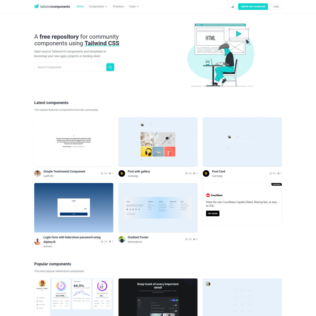
Tailwindcomponents.com - Free Tailwind CSS components

A repository for community components and templates, easily searchable, beautifully designed and organized, and completely free!

gust ui
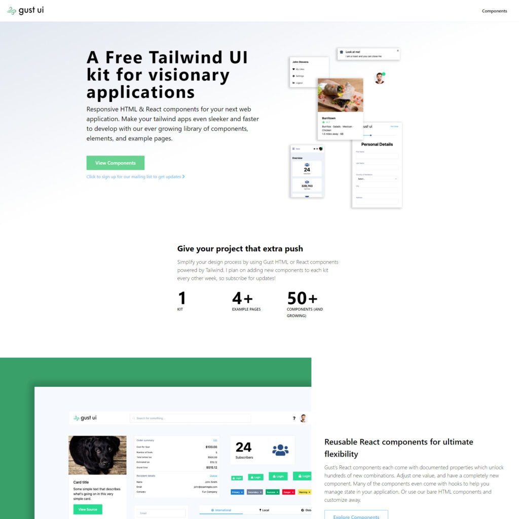
gust ui - Free Tailwind CSS Components

Responsive HTML & React components for your next web application. Make your Tailwind CSS apps even sleeker and faster to develop with our ever growing library of components, elements, and example pages.

Float UI
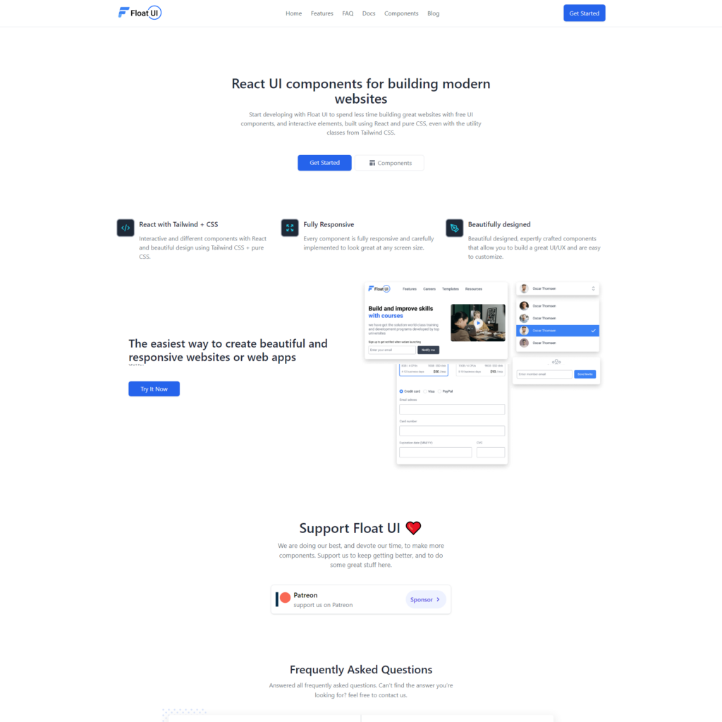
Float UI - Free Tailwind CSS Components

Interactive and different components with React and beautiful design using Tailwind CSS + pure CSS. Every component is fully responsive and carefully implemented to look great at any screen size. Beautifully designed, expertly crafted components that allow you to build a great UI/UX and are easy to customize.

Tail-kit
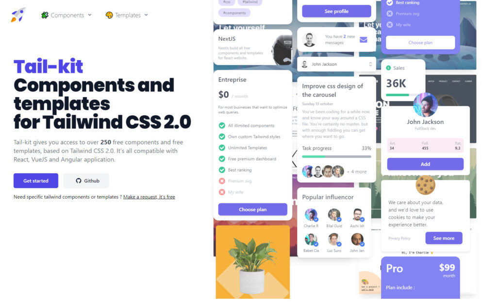
Tail-kit - Free Tailwind CSS Components

Tail-kit gives you access to over 250 free components and free templates, based on Tailwind CSS 2.0, all compatible with React, VueJS and Angular applications.

Tailwind Awesome
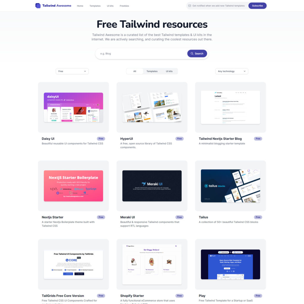
Tailwind Awesome

Tailwind Awesome is a curated list of the best Tailwind templates & UI kits in the internet. They say they are actively searching, and curating the coolest resources out there. They have all kinds of resources, along with a large section of free components.

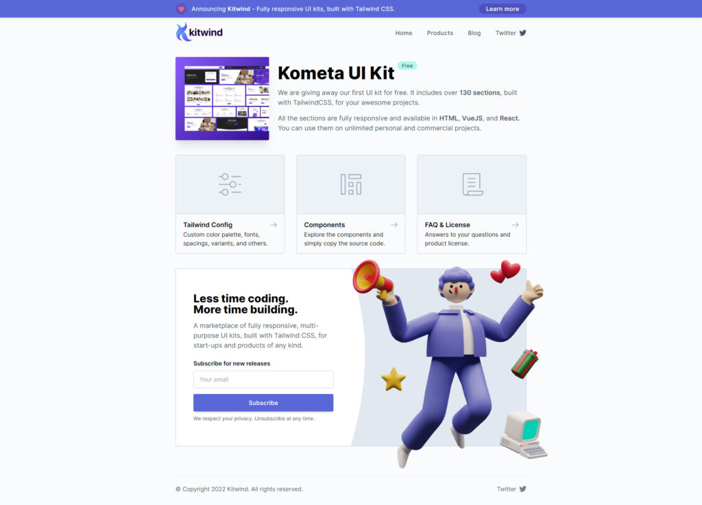
Kometa UI Kit
Kometa UI Kit - Free Tailwind CSS Components

The folks at kitwind released this free UI kit with over 130 sections, all fully responsive and available in HTML, VueJS, and React.

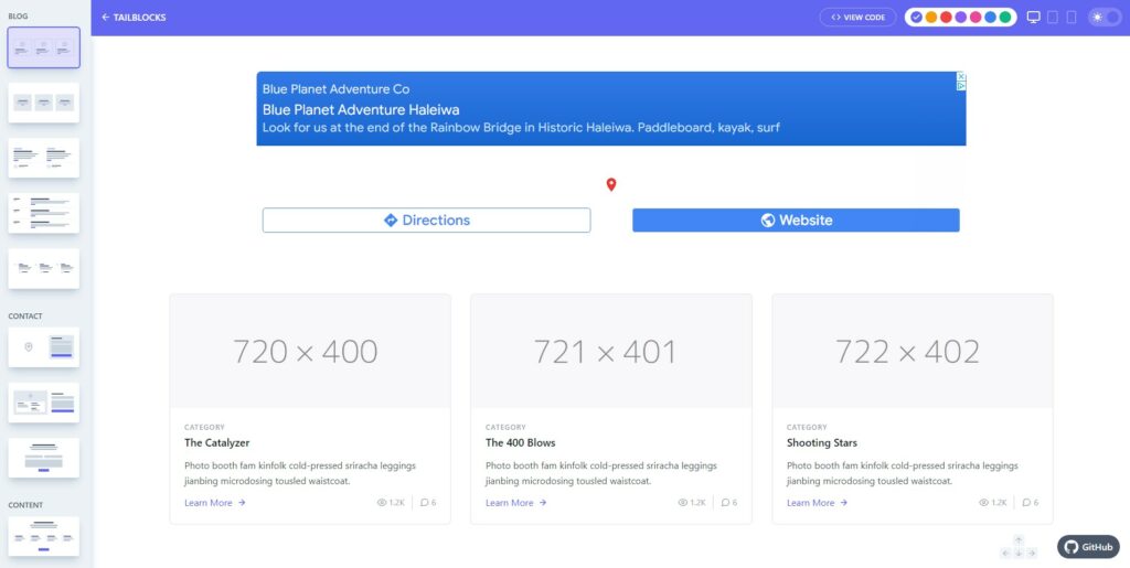
Tailblocks
Tailblocks - Free Tailwind CSS Components

A collection of blocks built in Tailwind CSS, with HTML you can easily copy and paste into your own project.

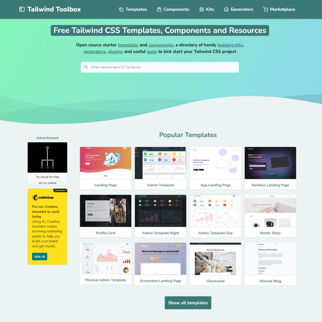
Tailwind Toolbox
Tailwind Toolbox

Open source starter templates and components, a directory of handy building kits, generators, plugins and useful tools to kick start your Tailwind CSS project.

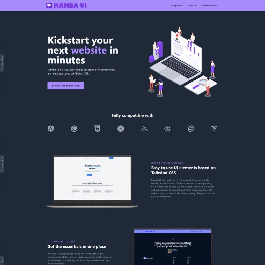
Mamba UI
Mamba UI - Free Tailwind CSS Components

Mamba UI is a free, open-source collection of 100+ UI components and templates based on Tailwind CSS. Everything is modular and customizable to fit your brand. From blogs to portfolios to online stores, you can quickly create a variety of layouts that look great on any screen.

HyperUI
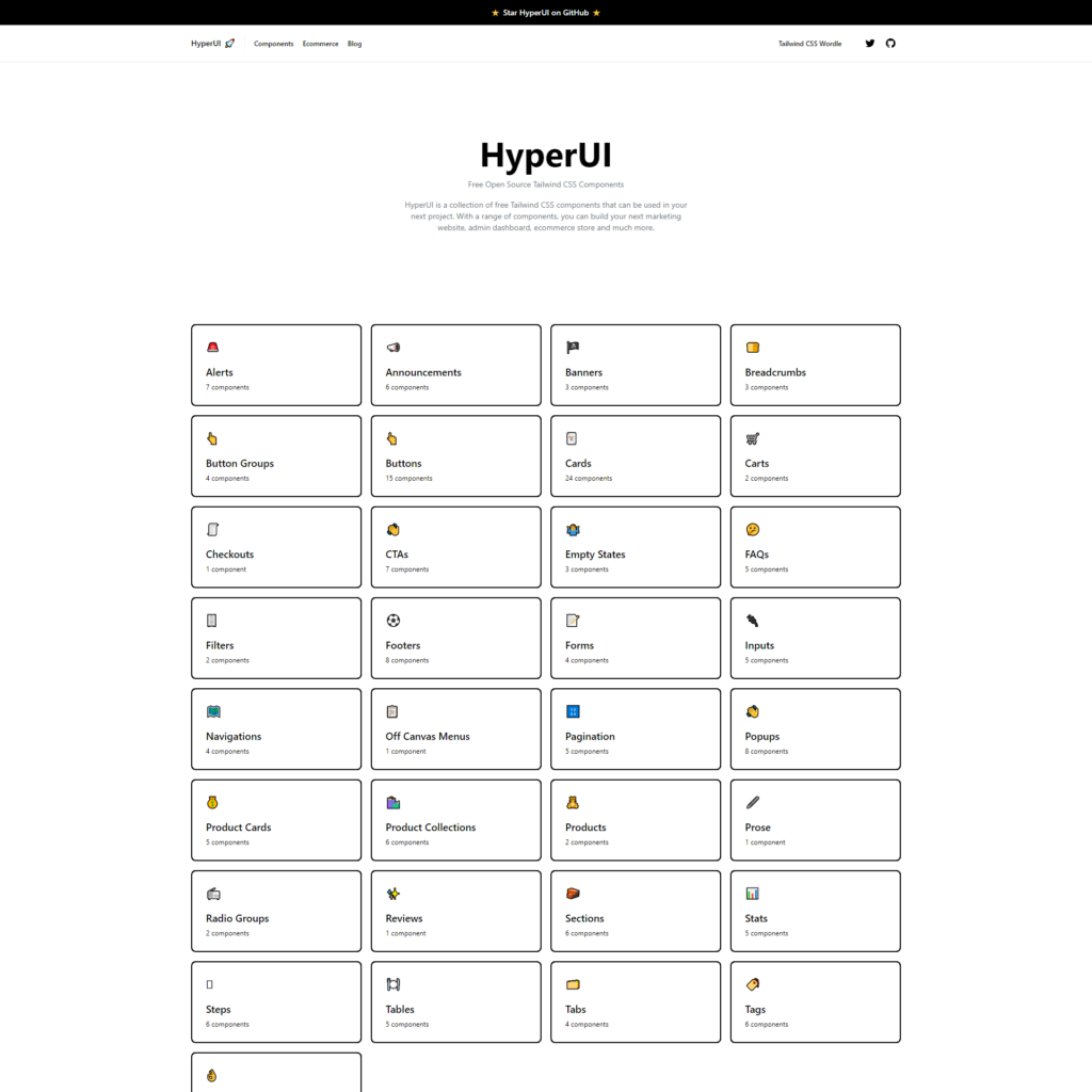
HyperUI - Free Tailwind CSS Components

HyperUI is a collection of free Tailwind CSS components that can be used in your next project. With a range of components, you can build your next marketing website, admin dashboard, ecommerce store and much more.

Headless UI
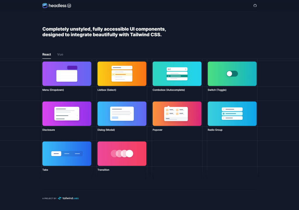
Headless UI - Free Tailwind CSS Components

Completely unstyled, fully accessible UI components, designed to integrate beautifully with Tailwind CSS.

daisyUI
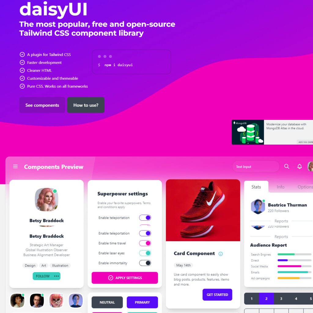
daisyUI - Free Tailwind CSS Components

daisyUI adds classes to Tailwind CSS for all common UI components, with low CSS specificity so you can customize everything using Tailwind CSS utility classes. Highly customizable.

Flowbite
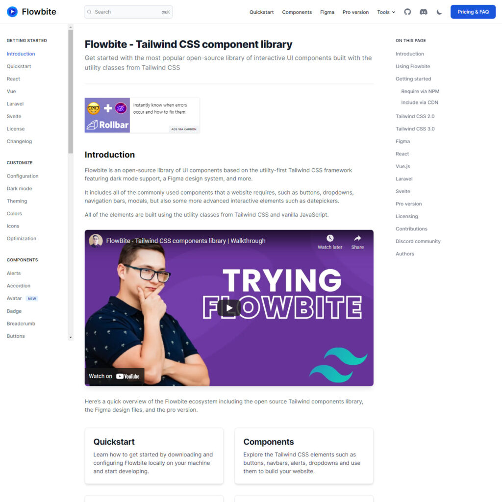
Flowbite - Free Tailwind CSS Components

Flowbite is an open-source library of UI components based on the utility-first Tailwind CSS framework featuring dark mode support, a Figma design system, and more. It includes all of the commonly used components that a website requires, such as buttons, dropdowns, navigation bars, modals, but also some more advanced interactive elements such as datepickers.

Tailwind Starter Kit
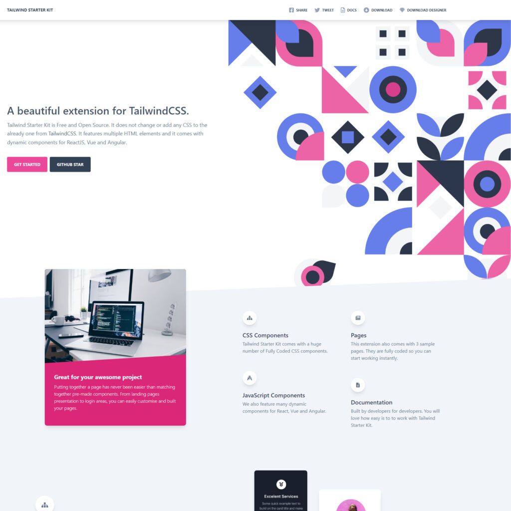
Tailwind Starter Kit - Free Tailwind CSS Components

Tailwind Starter Kit is a free and open source extension. It does not change or add any CSS to the already one from Tailwind CSS. It features multiple HTML elements and it comes with dynamic components for ReactJS, Vue and Angular.

PostSrc
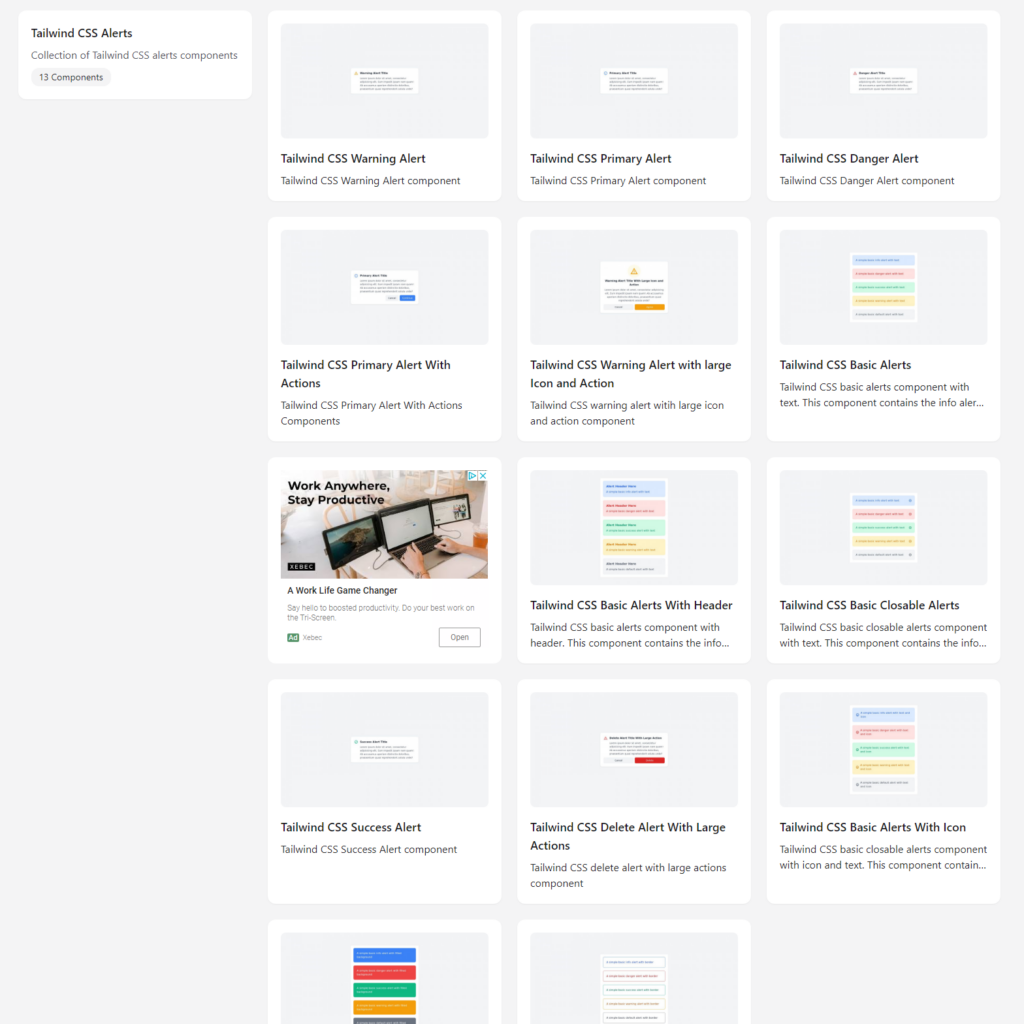
PostSrc - The Best Free Tailwind CSS Components For 2022

From alerts to avatars, badges to breadcrumbs, social share box to tabs, PostSrc has a nice collection of components ready to use for free.

Tailwind Elements
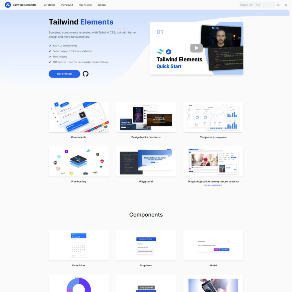
 

Tailwind Elements - The Best Free Tailwind CSS Components For 2022

Tailwind Elements are Bootstrap components recreated with Tailwind CSS, but with better design and more functionalities. Over 500+ UI components.

lofi ui
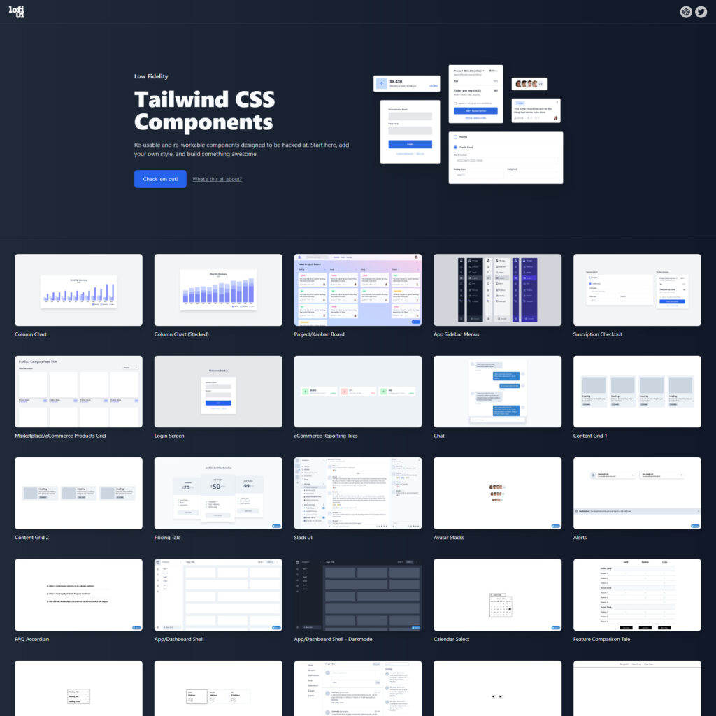
lofi ui - The Best Free Tailwind CSS Components For 2022

Lofi ui is a library of low fidelity web app components. The components are built to be as efficient as possible in their HTML structure and rely on only just enough CSS, via Tailwind CSS, to render them functional. Think of these components as head-start on building and styling a component exactly as you need.

Designers Should Code: Build an App From Scratch

Original Source: https://www.webdesignerdepot.com/2022/05/designers-should-code-build-an-app-from-scratch/

A breakdown of a simple app, from UI design to deployment, that shows off why coding is a magic tool for designers.
Figma, Adobe XD, Photoshop, Wacom Tablet, sketchbook… all tools for interfaces and web designers, yes? Take 2 minutes, and try to remember why you want to become a designer and why you enjoy designing stuff.

Chances are it’s because you like to create; you’re a creative person. Maybe you started with artistic experiences as a child, then turned that creative energy into problem-solving while continuing to express it visually: You became a designer, a creative problem solver.

Today, I’ll try to show you how coding is an underrated tool to express your creative problem-solving mindset by building a real SVG generator from scratch. So let’s get into it!

Step 1: Don’t get an idea; solve a problem

We didn’t go into deep business considerations here, but seeing problems you face and deciding to solve them yourself is a great way to start.

During client work, I needed some SVG waves for illustrations. So I looked for a wave generator: There were a ton of wavy colorful wave generators with parametric inputs but no simple, perfect sine waves generator. I decided to draw it on my math tool GeoGebra and then export it to SVG.

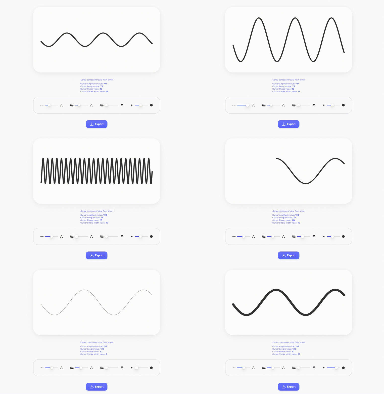
Okay, but not fast. And we like to get our jobs done quickly. But wait… Why don’t we create a perfect sine waves generator? Without equations & boring math software to open, just a curve and an export button. You got it, now let’s design it.

Quick tips: If you are looking for a problem, look for memes in your field. They always show a deep, painful, well-known problem.

Step 2: Design the solution simple as possible

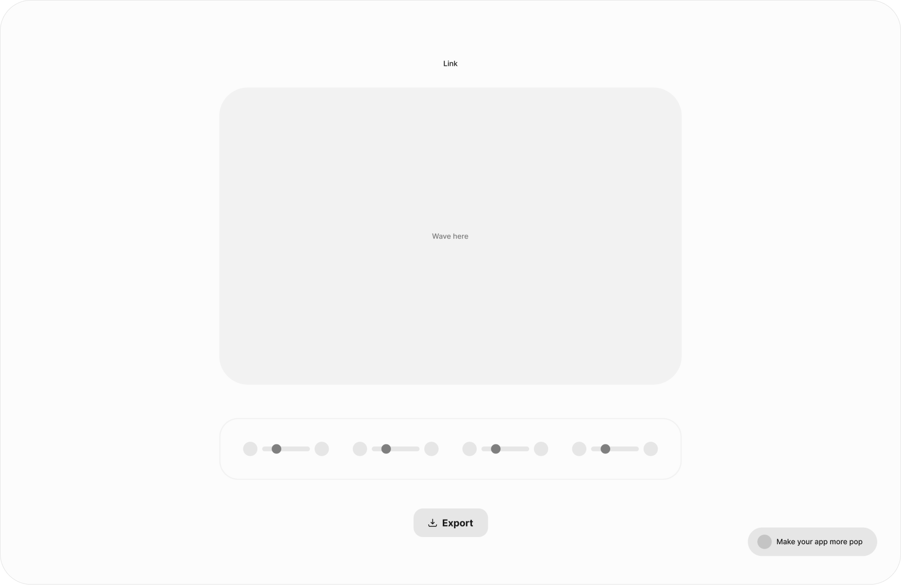
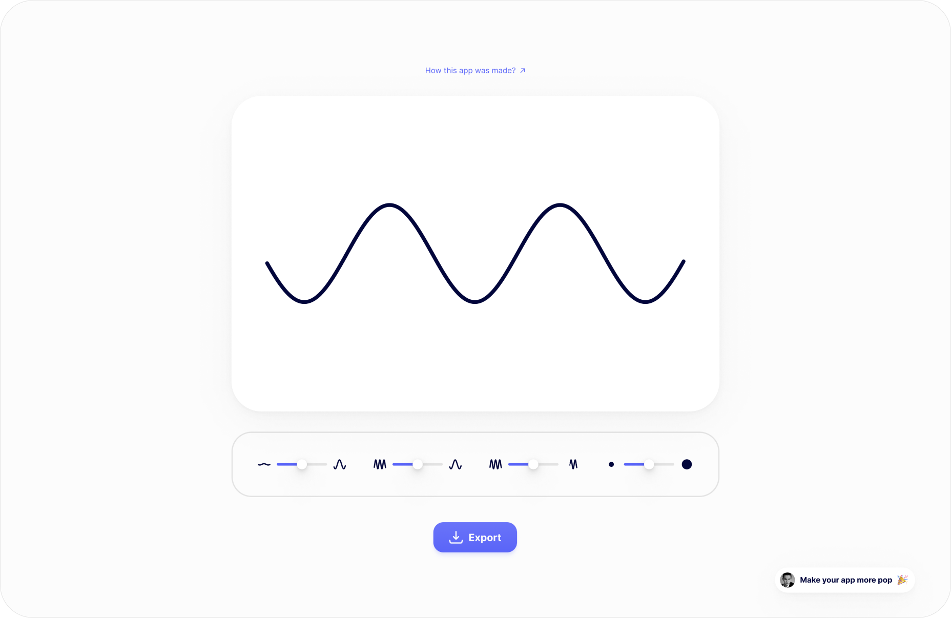
Two main rules: First rule, think about who will use it; the second rule, predict what they expect from how it works. So who? Front-end developers. What are they waiting for? A curve that can be edited with direct feedback and an export button.

Wireframe design

High-Fi design

A quick tip: You can grab the Figma design of the app for more technical tips on the design.

Step 3: Build it for real

As a designer, stopping at step two is perfectly fine. But imagine if you could build what you design! You already know you can create everything you want.

You can see coding as a way to translate your UI that will surely end with a .com application that is usable by everyone. This is why “best languages” don’t matter; coding is just a tool to express your creativity and build stuff for others. And as a designer, a creative person, this might sound…interesting.

UI to functionnal app

UI to functional app

Every web app interface can be translated from UI design to code with HTML/CSS/JS. There is how we can see the role of each of those 3 “languages”:

HTML: I want a button.

CSS: I want my button to look rounded.

JS: I want something to happen when I click on my button.

To build our app, I’ll use Svelte. Svelte is a JavaScript compiler that allows us to use all those three “languages” in one place. So, let’s see how code can translate our UI to functional things.

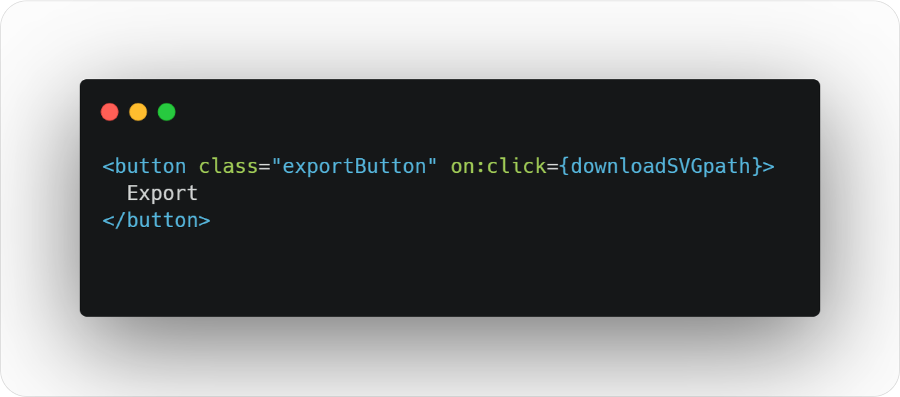
HTML button code

“Hey web browser, I want a button named “exportButton” and everything in a function named “downloadSVGpath” to be carried out when someone clicks on the button 🙂 Thanks”

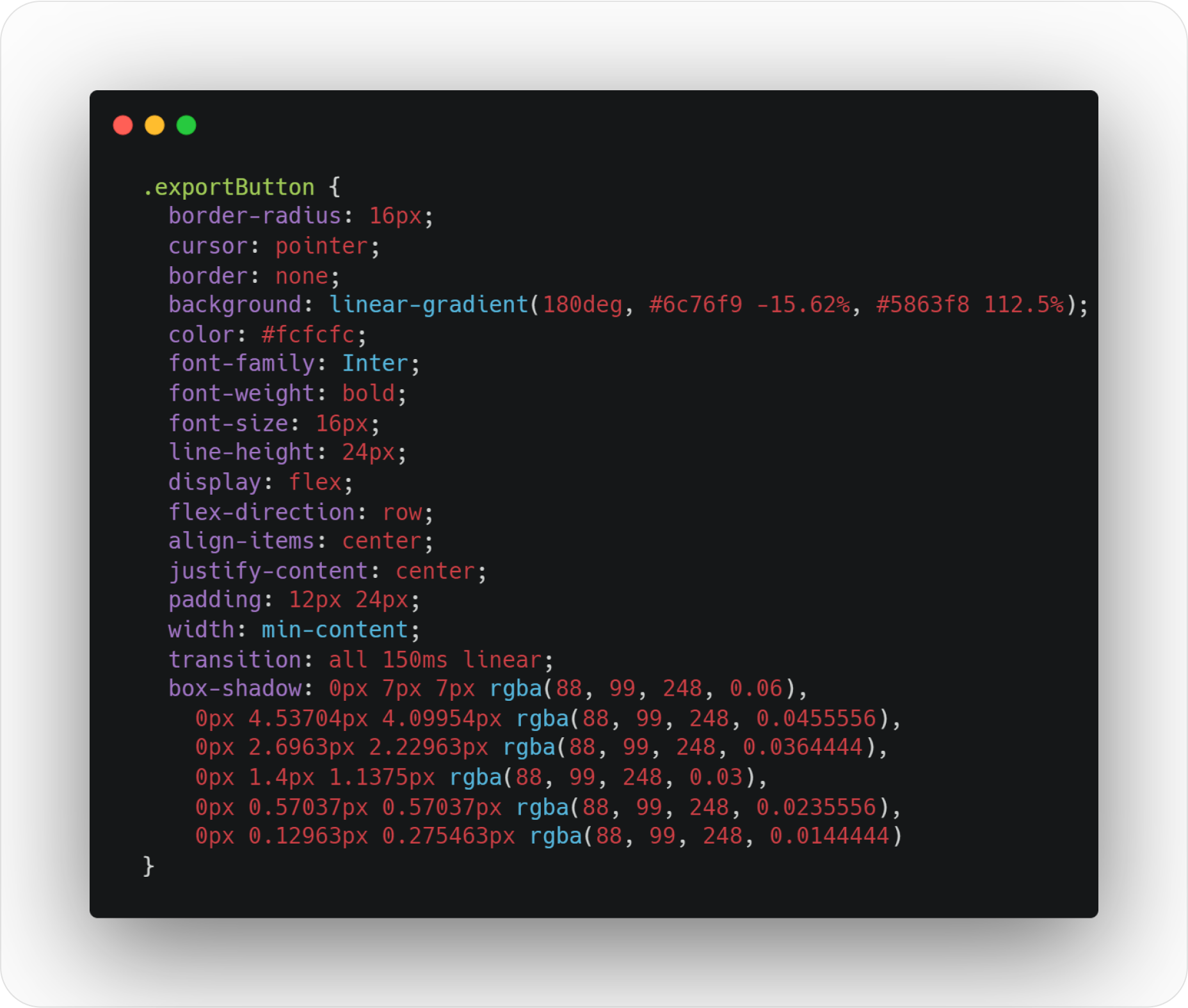
CSS style button code

“Hey web browser, I want you to apply these style rules to my basic HTML button: I want a beautiful rounded corner at 16px, a mouse pointer when we hover it, I don’t want any borders, but I want a cool color gradient as a background color. Then, I want the font inside the button to have its color set to #fcfcfc and use the Inter typeface (bold, please). Like my Figma design, I also want to center stuff in the button and add padding. Oh, and add a subtle shadow 🙂 Thanks.”

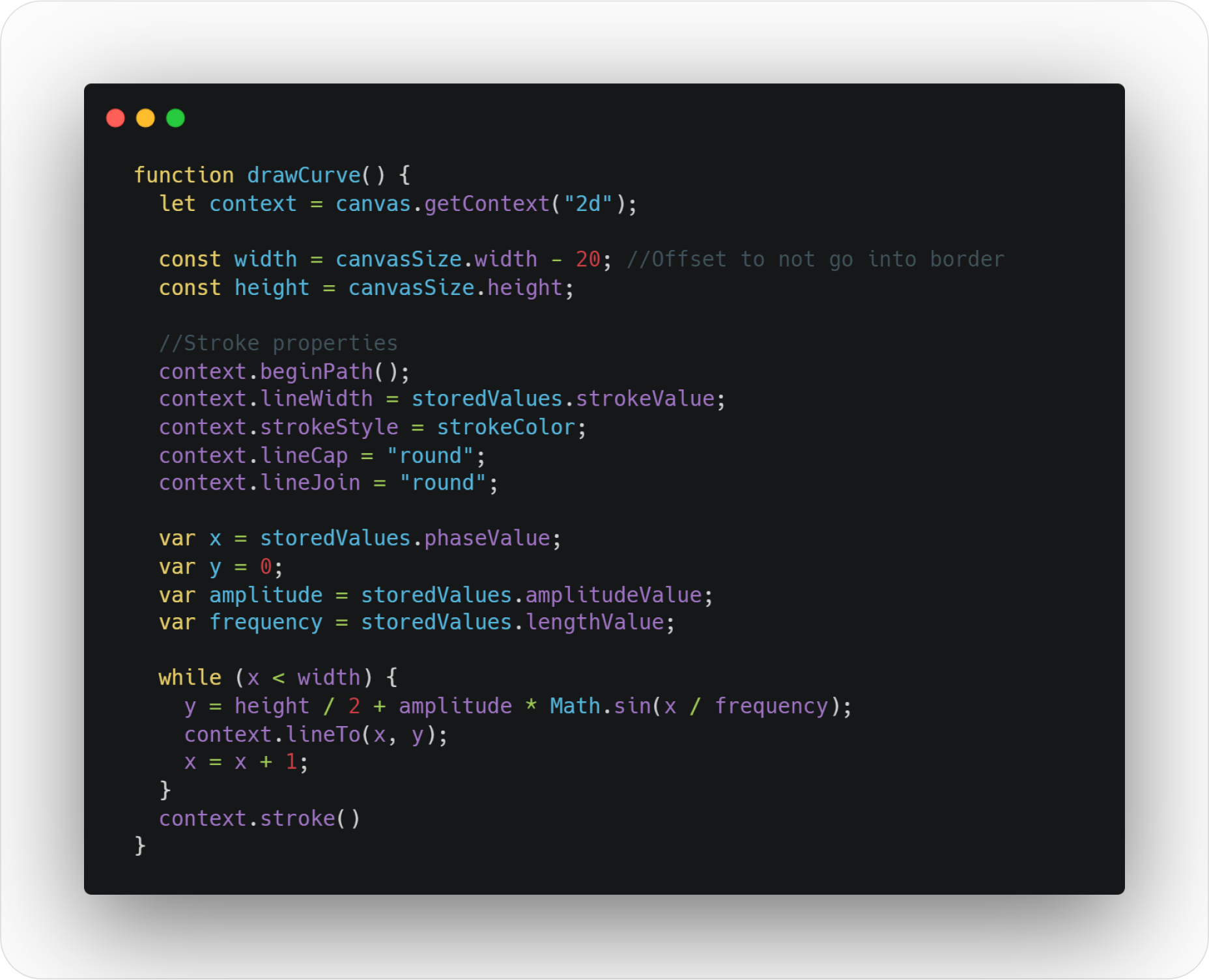
Drawing SVG curve function

“Hey, web browser, each time our slider moves, I want to run this function: I want you to draw a curve inside a frame that I have defined inside my HTML code. I also want my curve stroke to look rounded at each cap and have a color and width I’ve defined inside variables. You will take the sine function parameters from the stored values of the sliders. Finally, while your x variable hasn’t reached the total width in the x-axis of our frame, you will solve the y-axis point position of the sine equation and draw the curve 🙂 Thanks.”

Quick tips: You can grab the source code files of the app to explore them.

Summary

Coding is just a tool that allows us to translate our very visual metaphors into something that everybody can use. How cool is that?!
Coding helps us to envision our design goals and forces us to see beyond the visual range: how is my button will be supposed to work? How does it look when hovering? How my popup modal can be designed for mobile devices?
Coding allows us to create the weird idea we designed “just for fun” instead of pushing the design case study into our portfolio under the “personal project” tag.
Coding shows us how much work is required to achieve what we designed. So we can better understand our design clients’ needs, challenges, and resource management.
Coding is flexible. You can replicate the Netflix website pixel perfect with pure HTML/CSS, the Vue Framework, or any other Web framework.

Source

p img {display:inline-block; margin-right:10px;}
.alignleft {float:left;}
p.showcase {clear:both;}
body#browserfriendly p, body#podcast p, div#emailbody p{margin:0;}

The post Designers Should Code: Build an App From Scratch first appeared on Webdesigner Depot.

Create Stunning Infographic With These Great Tips And Tutorials

Original Source: https://www.designsauthority.com/infographic-tutorials-tips/

Infographics are where data and information meet design. These graphic visual representations are able to quickly and effectively share knowledge with your audience. In Today’s post, you will learn how to create a stunning infographics with these very useful tutorials and articles. They will arm you with all the latest techniques and information to help … Read more

The post Create Stunning Infographic With These Great Tips And Tutorials appeared first on Designs Authority.

How to Learn JavaScript Fast: Six Simple Mind Tricks

Original Source: https://www.sitepoint.com/how-to-learn-javascript-fast/?utm_source=rss

Learning always takes more time than we’d like. If you’re learning JavaScript, these six mental tricks will help you get there faster.

Continue reading
How to Learn JavaScript Fast: Six Simple Mind Tricks
on SitePoint.

10 Cool Pure CSS Scrolling Text Animations

Original Source: https://1stwebdesigner.com/10-cool-pure-css-scrolling-text-animations/

Scrolling text on a website is almost as old as the internet. You may remember the days when marquees with horizontal scrolling text were all the rage, and we (some of us) thought it was one of the coolest things we’d seen on a website. Many years later we have left that, along with a collection of other relatively silly “web tricks”, behind, as technology and web development evolved into what we have to work with today. Now we no longer need Flash or some other bulky, clunky tools or code to make this happen.

In this post, we’ll show you a collection of scrolling text animations that are coded with only CSS – no JavaScript or anything else needed! Let’s take a look at some of the different ways this fun effect can be accomplished.

UNLIMITED DOWNLOADS: 500,000+ WordPress & Design Assets

Sign up for Envato Elements and get unlimited downloads starting at only $16.50 per month!

DOWNLOAD NOW


Hidden & scrolling text

Not just vertically scrolling, but also hidden. Hover over the window to check out this effect.

See the Pen
Hidden & scrolling text by Avaz Bokiev (@samarkandiy)
on CodePen.0


Breaking News Modal

A slow horizontal scrolling effect for breaking news.

See the Pen
Breaking News Scrolling Text Modal by KB (@notkieran)
on CodePen.0


Vertical scrolling word

A clean, smooth animation replacing a word in a line of text.

See the Pen
Vertical scrolling text by Azri Kahar (@azrikahar)
on CodePen.0


HTML marquee Tag

This one is so old school looking it’s a little painful.

See the Pen
HTML <marquee> Tag by Erna Ayuning Nareswari (@ashavenger)
on CodePen.0


Scrolling In A Window

A rotating words vertical scrolling effect.

See the Pen
Scrolling Text Window by Andretti Brown (@andrettibrown)
on CodePen.0


Horizontal scrolling animation

Another marquee effect very similar to the “good old days”.

See the Pen
Horizontal scrolling animation by VERDIEU Steeve (@flatpixels)
on CodePen.0


CSS3 Marquee

And yet another simple marquee effect.

See the Pen
CSS3 Marquee by Svetlin Yankulov (@Yankulov)
on CodePen.0


Moving Text – CSS Animation Setup w/ Marquee Tag

Multiple lines scrolling horizontally in different speeds and directions.

See the Pen
Moving Text – CSS Animation Setup w/ Marquee Tag by Chris Drinkut (@ChrisDrinkut)
on CodePen.0


Vertical Text Scroll

A combination of some previous examples, this one rotates through words vertically scrolling into view.

See the Pen
Vertically-scrolling Text by Matt Soria (@poopsplat)
on CodePen.0


Star Wars 3D Intro in CSS3

No collection would be complete without the Star Wars intro scrolling!

See the Pen
Star Wars 3D Intro in CSS3 by Scott Bram (@scottbram)
on CodePen.0


The Rise of GameFi in the Crypto World

Original Source: https://www.hongkiat.com/blog/gamefi/

Traditional games have given us such marvelous opportunities and endless enjoyment in exchange for our time and money. But things are about to change because GameFi is now a thing, and they will soon…

Visit hongkiat.com for full content.

The Easiest Way to Animate WordPress Websites: BeBuilder + Lottie

Original Source: https://www.sitepoint.com/the-easiest-way-to-animate-wordpress-websites-bebuilder-lottie/?utm_source=rss

The Easiest Way to Animate WordPress Websites: BeBuilder + Lottie

Lottie animation is the newest and most effective way to animate websites. Learn why Lottie with BeTheme creates better user experiences.

Continue reading
The Easiest Way to Animate WordPress Websites: BeBuilder + Lottie
on SitePoint.

10 Easy Ways To Graphic Design Without Even Thinking About It

Original Source: https://www.designsauthority.com/10-easy-ways-graphic-design-thinking/

A proper graphic design can enhance your business overnight. Now, the graphic designers have multitude of tools, which they are ready to master. It does not matter whether they are using Photoshop or Illustrator, it is mandatory for them to learn ways to use the tools well, for better results. And with little help, they … Read more

The post 10 Easy Ways To Graphic Design Without Even Thinking About It appeared first on Designs Authority.

15 Modal / Popup Windows Created With Only CSS

Original Source: https://1stwebdesigner.com/15-modal-popup-windows-created-with-only-css/

Do you need a modal popup on your website when a user clicks a link or button? We typically see these in use for logins, newsletter signups, advertising, and more. Most often they are created using a bit of JavaScript trickery, but these days they can relatively easily be coded with only CSS. In this post we’ll show you 15 examples of various ways this can be accomplished. Let’s have a look!

The UX Designer Toolbox

Unlimited Downloads: 500,000+ Wireframe & UX Templates, UI Kits & Design Assets
Starting at only $16.50 per month!


DOWNLOAD NOW


CSS Responsive Modal

This responsive example adjusts to the browser size and goes full screen on smaller devices.

See the Pen
CSS Responsive Modal by Thom Griggs (@thomgriggs)
on CodePen.0


CSS Modal

This example includes some smooth animations on open and close actions.

See the Pen
CSS Modal by Pete Nawara (@petebot)
on CodePen.0


CSS Modal :target Selector

A clever use of the :target selector to open a popup simply by toggling it’s opacity.

See the Pen
CSS Modal :target Selector by Jake Albaugh (@jakealbaugh)
on CodePen.0


Pure CSS Modal Box

Interesting use of labels and inputs to create a modal popup.

See the Pen
Pure CSS modal box by Kasper Mikiewicz (@Idered)
on CodePen.0


Pure CSS Modal

A really nice animation to open a full screen modal popup.

See the Pen
Pure CSS Modal by Mark Holmes (@SMLMRKHLMS)
on CodePen.0


Pure CSS Modal Popup

Another use of a label and input to utilize the checked state to show the modal.

See the Pen
Pure CSS modal by Austin Lord (@ohnoitsaustin)
on CodePen.0


Pure CSS Modals

Four different entry and exit animations are shown in this example.

See the Pen
Pure CSS Modals by Akshay (@akzhy)
on CodePen.0


Pure CSS Modal

Smooth animations highlight this example.

See the Pen
Pure CSS Modal – #15 by Ivan Grozdic (@ig_design)
on CodePen.0


Three CSS Modals

Three variations of background opacity are in this example.

See the Pen
CSS Modals (Modal v2) by Abubaker Saeed (@AbubakerSaeed)
on CodePen.0


CSS3 Modal Example

This modal popup slides up when it’s opened.

See the Pen
css3 modal example by Felipe Nunes (@willpower)
on CodePen.0


Pure CSS Modal window / Login & Sign up / Tabs / All Responsive

There is a LOT going on with this one, including tabs on the modal popup and responsive design throughout.

See the Pen
Pure CSS Modal window / Login & Sign up / Tabs / All Responsive by Andrew (@AndrewBeznosko)
on CodePen.0


CSS Modal

Another example using the :target selector, with a slide down modal entrance.

See the Pen
Css Modal by Jon Ander Pérez (@JonAnderDev)
on CodePen.0


Pure CSS modal dialog with sliding content

A somewhat simple setup, but with a content slider in it.

See the Pen
Pure CSS Modal + Slider by Marvin Orendain (@marv117)
on CodePen.0


CSS Modal Boxes for all browsers

A version that goes deep into older browser support.

See the Pen
CSS Modal Boxes for all browsers by Patrick (@cara-tm)
on CodePen.0


Modal (CSS Only)

For our final selection, we have a pretty standard modal popup with a smooth animated entrance and exit.

See the Pen
Modal (CSS only) by Simon (@Index)
on CodePen.0


Illustrator 3D Textured Text Effect Tutorial For Beginners

Original Source: https://www.designsauthority.com/illustrator-3d-textured-text-effect-tutorial-beginners/

One way to really make flyers and brochures stand out is with a 3D text effect on the front/cover. A text with a 3D effect added really pops off the page and draws the eye. Adding your own 3D effect to text is not as difficult as it may sound, especially if you can follow … Read more

The post Illustrator 3D Textured Text Effect Tutorial For Beginners appeared first on Designs Authority.