How to use variables in CSS

Original Source: https://www.sitepoint.com/how-to-use-variables-in-css/?utm_source=rss

CSS Variables

Learn how to use CSS variables (custom properties) to make it easier to manage colors, fonts, size, and animations, consistently across web applications.

Continue reading
How to use variables in CSS
on SitePoint.

Collective #714

Original Source: https://tympanus.net/codrops/collective/collective-714/

Inspirational Website of the Week: Custo

Perfectly smooth animations with typography that just works. Our pick this week.

Get inspired

Collective 713 item image
This content is sponsored via BuySellAds

Build websites faster with Divi Cloud

Divi Cloud is like Dropbox for your Divi websites: save something to Divi Cloud and it becomes available on all of your and your clients’ websites while you build them.

Check it out

A three.js Competition

Tiiny Host’s three.js competition has started! Upload and host your web project and show off your WebGL skills!

Check it out

AutoAnimate

A zero-config, drop-in animation utility that automatically adds smooth transitions to your web app.

Check it out

Sliderland

A minimalist creative coding playground, using only HTML sliders. Make animations using math!

Check it out

IndigoStack

The native macOS app which promises to revolutionise the way you configure and run local web servers on your Mac.

Check it out

Customizing Color Fonts on the Web

WebKit now supports CSS @font-palette-values which can be used to access predefined color palettes of color fonts.

Read it

PushIn.js

In case you didn’t know about it: PushIn.js is a lightweight parallax effect, built with JavaScript, that simulates an interactive dolly-in or push-in animation on a webpage.

Check it out

A calendar and weather forecast in the terminal

A couple of cool terminal tricks to get calendars and the weather, plus how to assign aliases and pass arguments to bash functions. By Jamie Smith.

Read it

Tetra

Tetra is a full stack reactive component framework for Django using Alpine.js.

Check it out

Can I Devtools?

Can I DevTools is like Can I Use but for the browser devtools. Created and curated by Pankaj Parashar.

Check it out

Top games + source code from Gamedev.js Jam 2022

The best 13 entries from the Gamedev.js Jam 2022.

Check it out

Processing Arrays non-destructively: `for-of` vs. `.reduce()` vs. `.flatMap()`

Axel Rauschmayer looks at look at three ways of processing Arrays and shows how to use the features.

Read it

Drawing with CSS: Anime Character

Alvaro Montoro explains how to draw an anime character with HTML and CSS from scratch.

Read it

Pure CSS image zoom

Some amazing CSS magic by Jhey: a thread on how to pull off a pure CSS image zoom using CSS primitives.

Check it out

Plantarium

Plantarium is an amazing tool for the procedural generation of 3D plants. Made by Max Richter.

Check it out

How I Built an “OS” with React for My Portfolio Website

Dustin Brett discusses how he made his website look and feel like an Operating System with JavaScript.

Watch it

Scroll Btween

Tween any CSS values on any DOM element in relation with its position on the viewport. No dependencies.

Check it out

The Modern JavaScript Tutorial

Freshly updated: Simple, but detailed explanations with examples and tasks, including: closures, document and events, object oriented programming and more.

Check it out

Building a static website using Iles.js

In this tutorial by Clara Ekekenta you will learn how to code a static website in Vuejs using Iles.js.

Read it

Cool CSS Hover Effects That Use Background Clipping, Masks, and 3D

Temani Afif finalizes his series on hover effects and shows how to code complex CSS hover animations.

Read it

Arctype SQL Client

Arctype is a fast and easy-to-use database client for writing queries, building dashboards, and sharing data with your team.

Check it out

State is hard: why SPAs will persist

Nolan Lawson shares some thoughts why Single-Page Apps still persist.

Read it

Star Wars Scene Transition Effects in CSS

Learn how to create those wipe transitions from Star Wars movies in CSS.

Read it


From Our Blog

Scroll Animation Ideas for Image Grids

Some ideas for scroll animations on image grids using the ScrollTrigger plugin of GSAP and the new smooth scroll library Lenis by Studio Freight.

Check it out


From Our Blog

Coding an Infinite Slider using Texture Recursion with Three.js

A coding session where you’ll learn how to recreate the infinite image slider from tismes.com using Three.js.

Check it out


From Our Blog

Inspirational Websites Roundup #38

A new hand-picked selection of fresh websites for your inspiration.

Check it out

The post Collective #714 appeared first on Codrops.

Alvor branding and visual identity

Original Source: https://abduzeedo.com/alvor-branding-and-visual-identity

Alvor branding and visual identity

abduzeedo0603—22

Operating for more than 20 years in the agriculture market and a reference in its region, Mafra (SC), Brazil, Alvor is a company that specialized in increasing soil productivity through services such as Topography and Precision Farming. The company that until then used another name needed to reposition itself, and invited me to create its new name, brand and visual identity.

“We understood that it would be ideal to respect the tradition and good perception already created about the company in the last 20 years, but we needed to modernize the language through a more welcoming and friendly tone. The name had to be short and objective, and the brand had to be able to convey the ideas of precision. Although being fully inserted in the rural environment, it could not fail to be technological and modern.”

The logo represents the perspective of a field with the sun on the horizon, something that connects directly with the name, Alvor, synonymous with dawn, the first light of the day. Also, it represents the fields, organic fibers and the letter A, from Alvor.

The patterns represents the fields divisions seen from the sky. All of this together manages to convey the feeling of a friendly environment, a fundamental concept for the brand. And, in addition, it is a brand whose universe is easily distinguishable. It’s easy to look at the elements of the identity and understand what it’s about.

In the end we have a strong and striking brand, with a consistent and consolidated identity system for easy maintenance and reproduction of the brand.

Credits

Design Direction: Walter Mattos
Graphic Design: Walter Mattos, Iure Figueira
Naming: Batiza Naming

For more information check out Walter Mattos on:

Behance
Website

Scroll Animation Ideas for Image Grids

Original Source: https://tympanus.net/codrops/2022/05/31/scroll-animation-ideas-for-image-grids/

Today I’d love to share some experimental scroll animations with you! The idea is simple: when scrolling a grid of images, animate the images that enter or leave the viewport in an interesting and creative way 🙂

For these effects I’m using the super helpful ScrollTrigger plugin of GSAP and the new smooth scroll library Lenis by the amazing folks of Studio Freight.

When scrolling a grid layout, we can move, scale or rotate the images, there’s really endless possibilities! In this demo, we squeeze them:

In the following demo we add a 3D rotation effect, creating the illusion of something like a roll:

I really hope you enjoy this set of experiments and find it useful for your projects!

Thanks for checking by 🙂

The post Scroll Animation Ideas for Image Grids appeared first on Codrops.

Apple might finally release the MacBook of our dreams next month

Original Source: https://www.creativebloq.com/news/wwdc-macbook-air

WWDC is looking good.

The Charity Poster

Original Source: https://abduzeedo.com/charity-poster

The Charity Poster
The Charity Poster

abduzeedo0527—22

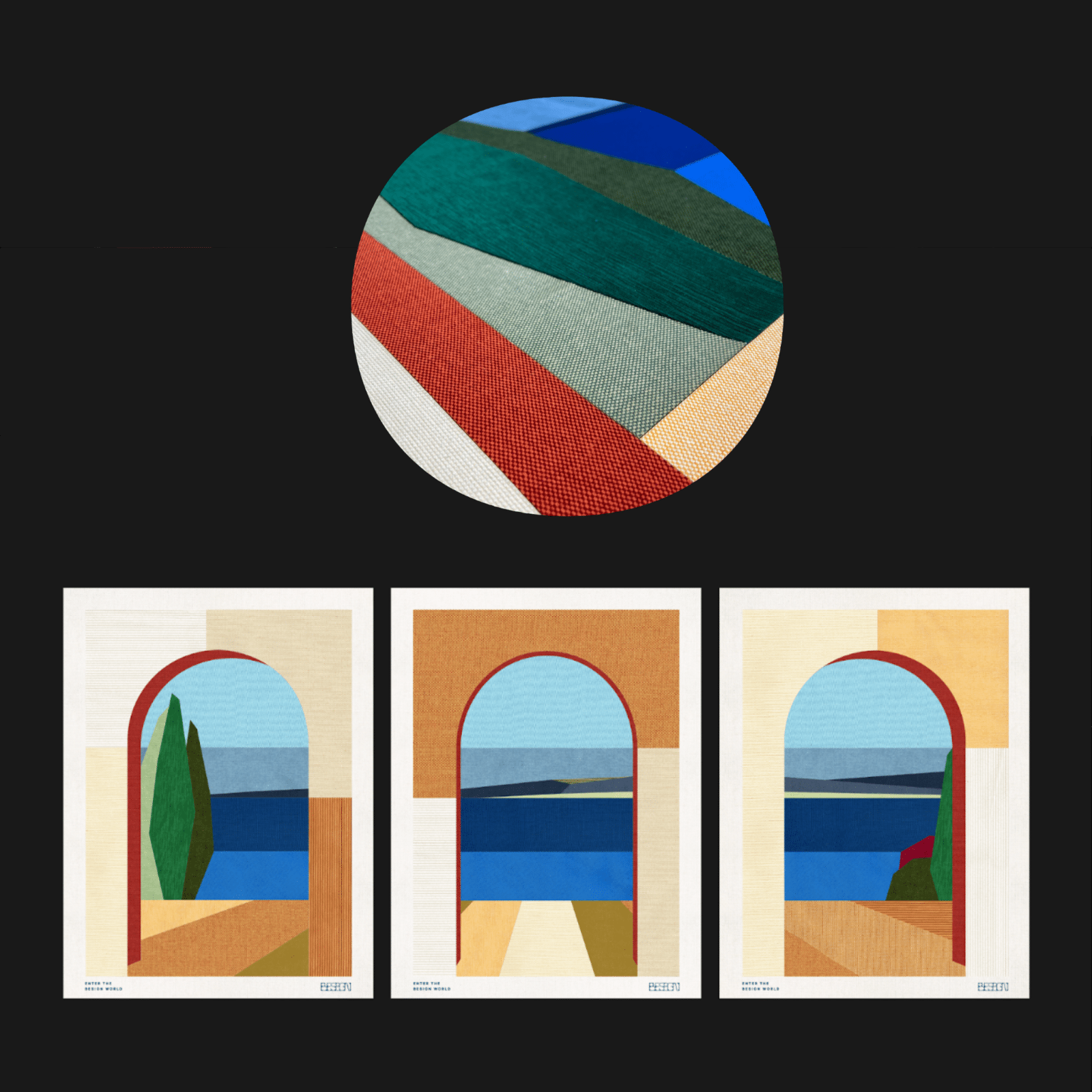
Lucia Sellier, Dragon Rouge, Besign School shared a design project inspired by the landscapes of Cagnes-sur-mer, these posters made of 17 upcycled pieces of fabric, have a dual purpose. 

First of all it carries a powerful message, to raise awareness for the 17 SDG of the United Nation, pillars of the education provided at BESIGN School. Second, it brings to life what the essence of the school is: Design & Sustainability powered by and for Humanity. 

Enter the Besign world

Idea

BESIGN collaborated with the artist Lucia Sellier to create -for the first time- three fabric minimalist handcrafted graphic posters inspired by Cagnes-sur-mer landscape (where the school is based) and the BESIGN new visual identity. Each poster is made of 17 upcycled pieces of natural fabric locally sourced -one for each sustainable development goals- to help understand what sustainability is really about.

The posters were digitized, and used on the BESIGN website, and social media to encourage people to donate to an NGO related to these goals: Resto du coeur for the Goal N°2 zero hunger, Red Cross for the Goal N°3 Good Health , etc.

The beauty of the landscape and its carefully handcrafted illustration invite people to enter into the BESIGN world.

To draw attention, the physical posters were displayed in several places from School, students fair to Cagne-sur-mer city hall.

Execution

Simplicity is really hard.

Stylize a selected Cagne-sur-mer picture to its minimum, to create a graphic composition, but trying to keep enough perspective and depth. Here the biggest challenge was to have only 17 pieces for each poster.
 Make sure that we have the right colors to keep the magic of the landscape and invite the viewer to dive into the poster. 
Source and select the right upcycled natural fabric (mainly linen and cotton). The artist works with a limited amount of type of fabric texture to make sure that there is an homogenized feel and it makes each of the artwork more unique. « I love the alive aspect of the fabric, depending on the light, the exposition, the time of the day, it will never look the same. There is always something new to find out, an allure, a bit like a piece of clothe » said Lucia Sellier.
Select and link a NGO for each Sustainable goal to donate to.

Result

Three Beautifully crafted posters that bring to life the essence of the BESIGN school: (Design + Sustainability) powered by/for Human.

This project sparked reflection among BESIGN students and highlighted the power of design and its essential usefulness in today’s challenges. The posters raise awareness of the 17 SDGs and highlight them among everyone. It allows BESIGN, the sustainable design school, to attract the inspired minds of tomorrow. 

Louis Nègre, Mayor of Cagnes-sur-mer, through an exhibition, will spread the message among the citizens of Cagnes-sur-mer.

Jean-Christophe Combe, Managing Director of the Red Cross, reinforces his desire to use design as a tool to raise awareness about humanitarian actions.

And finally we hope that people will be generous enough to donate for one or several NGO’s to help the world to be better.

For more information make sure to check out the full project.

Creating an Infinite Distorted Slider with PixiJS and Bézier Curves

Original Source: https://tympanus.net/codrops/2022/05/23/creating-an-infinite-distorted-slider-with-pixijs-and-bezier-curves/

In this new ALL YOUR HTML coding session we’ll be replicating the amazing fluid slider from Yuto Takahashi’s website, using PixiJS, Bézier curves and little bit of GLSL.

This coding session was streamed live on May 23, 2022.

Check out the live demo (desktop only).

Image credit goes to https://www.instagram.com/tre.zen/

Support: https://www.patreon.com/allyourhtml

Setup: https://gist.github.com/akella/a19954…

The post Creating an Infinite Distorted Slider with PixiJS and Bézier Curves appeared first on Codrops.

The best online coding courses in {year}

Original Source: https://www.creativebloq.com/web-design/online-coding-courses-11513890

Learn to code with the best online coding courses.

COLLINS modernizes CNET beyond tech with editorial-first reimagined brand identity

Original Source: https://abduzeedo.com/collins-modernizes-cnet-beyond-tech-editorial-first-reimagined-brand-identity

COLLINS modernizes CNET beyond tech with editorial-first reimagined brand identity

abduzeedo0525—22

In the constant frenzy to publish what’s new and exciting, many outlets have forgotten the purpose of journalism — to share useful information. But CNET is different. Among its competitors, CNET has stayed committed to sifting through the noise in the digital world, elevating what’s important and making it applicable. And in an increasingly noisy space, CNET realized its unique type of service journalism extended beyond tech — so they tapped COLLINS to craft a new brand strategy, story and identity to transform it from a tech-review site to an editorial-first brand people trust for its useful information as much as its expertise.

To craft CNET’s new approach, COLLINS combined design elements of the non-partisan “golden age” of the press from the 1950s-1970s with bold surrealism to spark audience’s imaginations about what they can achieve with CNET’s coverage. The new comprehensive identity includes custom illustration styles, engaging motion graphics and new site navigation that highlights the breadth and depth of CNET’s expertise across many categories. The logo heralds a new and open editorial experience that allows its content and stories — in any media channel — to have a sense of importance without crowding each other out.

For more information and to see the full case study check out COLLINS website