How to Map Texture to a 3D Face with Three.js

Original Source: https://tympanus.net/codrops/2022/07/04/how-to-map-texture-to-a-3d-face-with-three-js/

In this new ALL YOUR HTML coding session you’ll learn how to wrap a texture on a shape. The shape will be a 3D face and we’ll use Three.js.

Original website: https://www.zikd.space

This coding session was streamed live on July 3, 2022.

Check out the live demo.

Support: https://www.patreon.com/allyourhtml

Setup: https://gist.github.com/akella/a19954…

The post How to Map Texture to a 3D Face with Three.js appeared first on Codrops.

This HP Envy 2-in-1 laptop is less than $500 in 4th July sale deal

Original Source: https://www.creativebloq.com/news/july-4-sale-hp-laptop

Hurry, this deal ends today.

How to Find Out Who Blocked You on Facebook

Original Source: https://www.hongkiat.com/blog/find-out-who-blocked-you-facebook/

Has it ever happened to you that you were not able to see a particular friend’s updates on your Facebook feed or perhaps you could not find their name via Facebook search? Well, a simple…

Visit hongkiat.com for full content.

3 Essential Design Trends, July 2022

Original Source: https://www.webdesignerdepot.com/2022/06/3-essential-design-trends-july-2022/

There are a lot of dark, retro vibes trending in website design right now. Although there are still some light projects popping up – including a pastel trend below – a lot of what we are seeing has a quite moody feel.

Here’s what’s trending in design this month.

Pastel Color Palettes

Let’s start with the trend with a lighter feel – pastel color palettes. While much of the web is trending toward dark aesthetics, there’s a segment that’s going in the exact opposite direction. Those sites feature soft, pastel color palettes that serve as a balance to all the super dark websites out there.

One thing about this website design trend is that it jumps out because of the stark contrast with all of the dark color palettes out there.

Each of these designs seems to use a pastel color palette as the basis for a background. A blur effect is paired with the colors to use pastels in a way that has a natural feel without appearing too feminine or light.

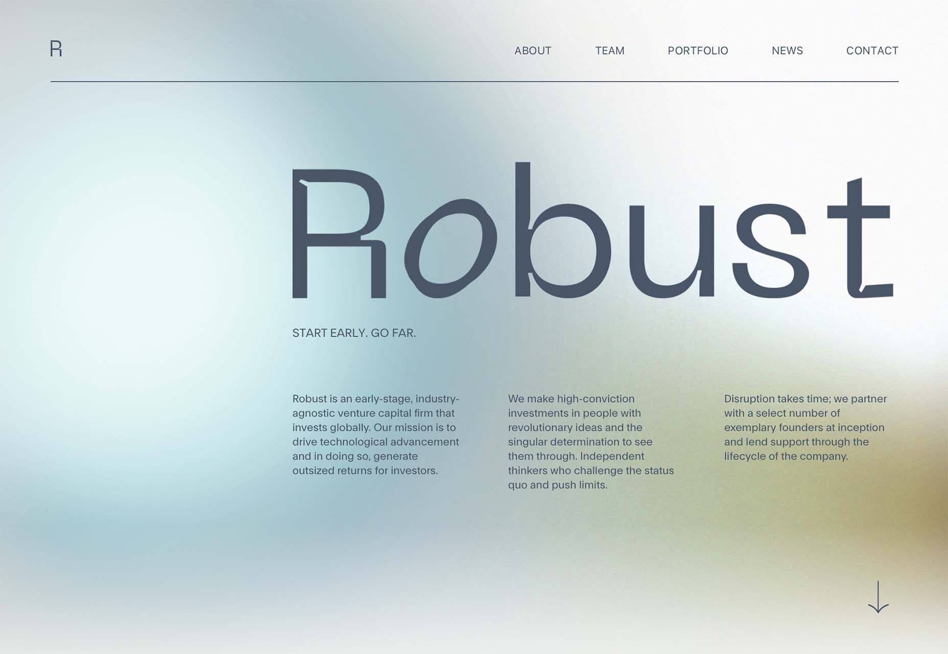
Robust uses blue and earth tones for a pastel background that feels modern and strong when paired with the hard-edged headline font.

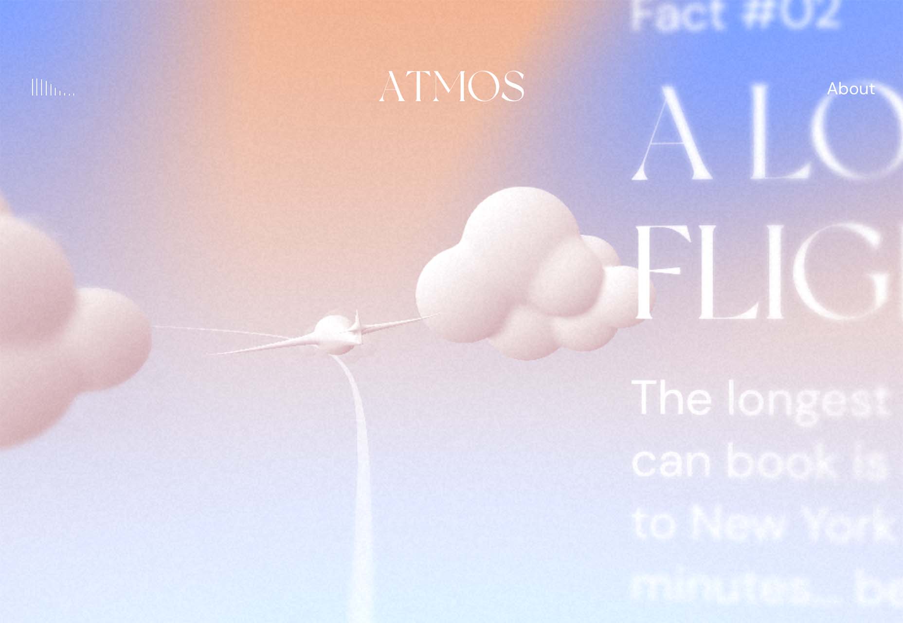
Atmos uses a light pastel theme that takes you through the clouds with blues, and pinks, and purples. The pastel color scheme works well with the content which is airline-themed and makes you feel like you are flying through the sky. The colors are also soft enough to provide an easy reading experience.

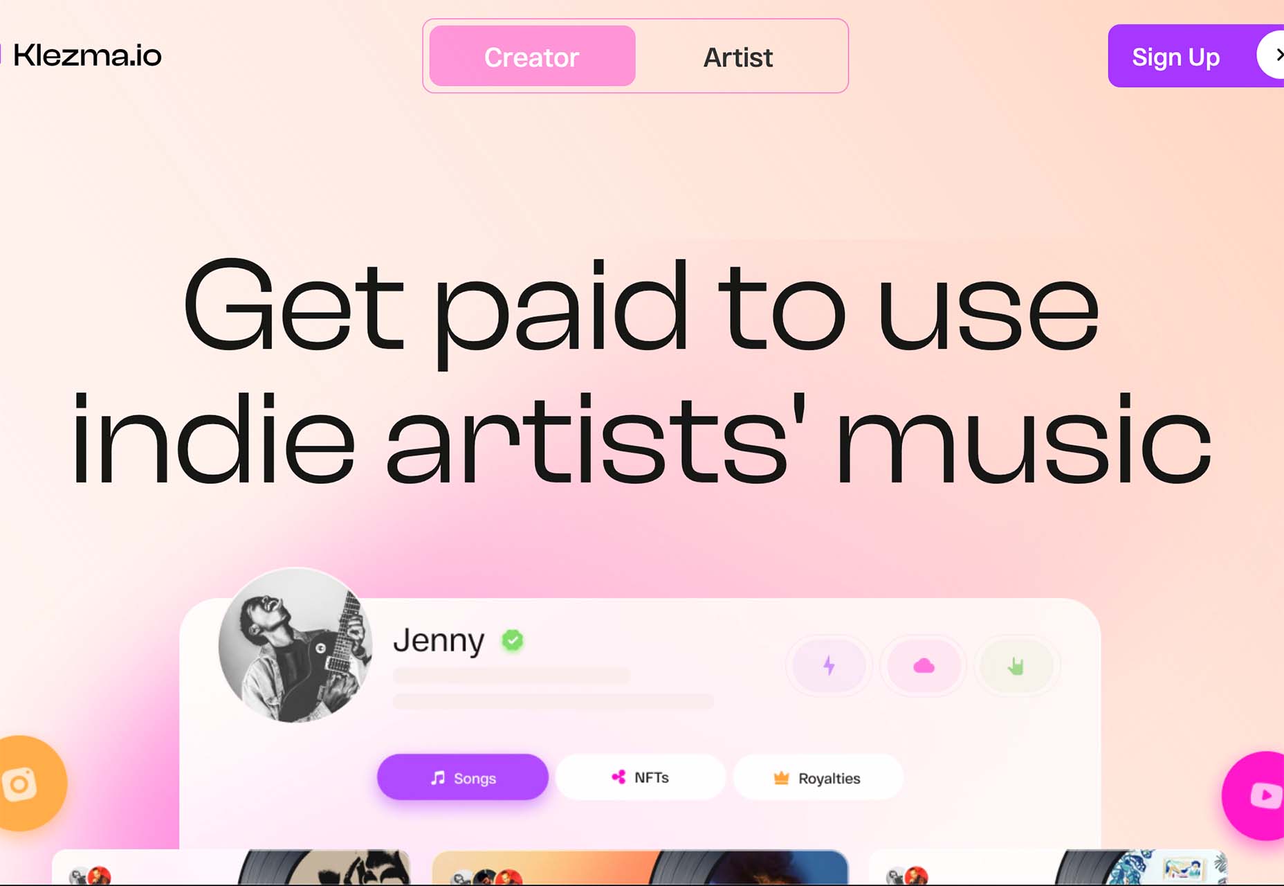
Klezma is another design with the same pastel background with graduated color. The peach tones are fairly neutral and give plenty of room to the content.

Fonts with a Distinct Retro Look

Every one of these websites uses a typeface with a similar look and feel. This retro headline style is trending in a major way.

The best way to use this design element is for short words. This typeface design isn’t meant for a lot of words or when readability is a high priority.

This style is all about creating a specific kind of vibe for your website. The typefaces in this trend have a quite retro look and feel with an almost 1960s or ’70s feel to them. The rest of the design mimics this feel as well with colors and surrounding elements that contribute to the overall look.

A couple of common elements here include the use of all capitals font sets and letterforms that include odd shapes and lines.

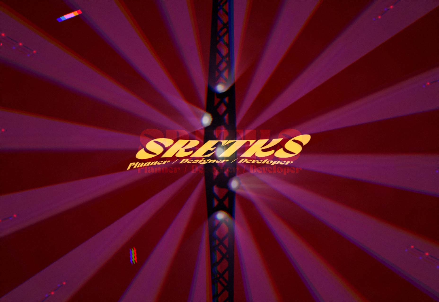
Sretks not only uses a retro typeface but bends and twists it a bit too to add to the old-school feel. The background color helps add to the groovy vibe.

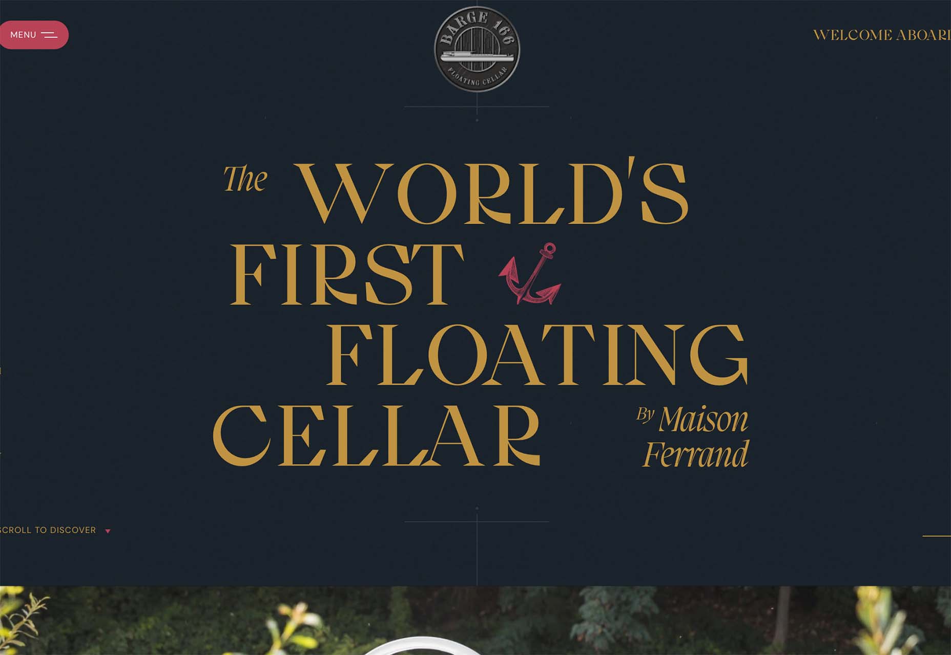
Barge 166 uses a retro typeface with the same design feel as the other examples but with a sharper, more serif-style edge. It’s easier to read but still carries a retro look and feel. Use a typeface similar to this if you want to capture that retro font style for a trending look while maintaining as much readability as possible. This option works best for multiple lines of words in a large size.

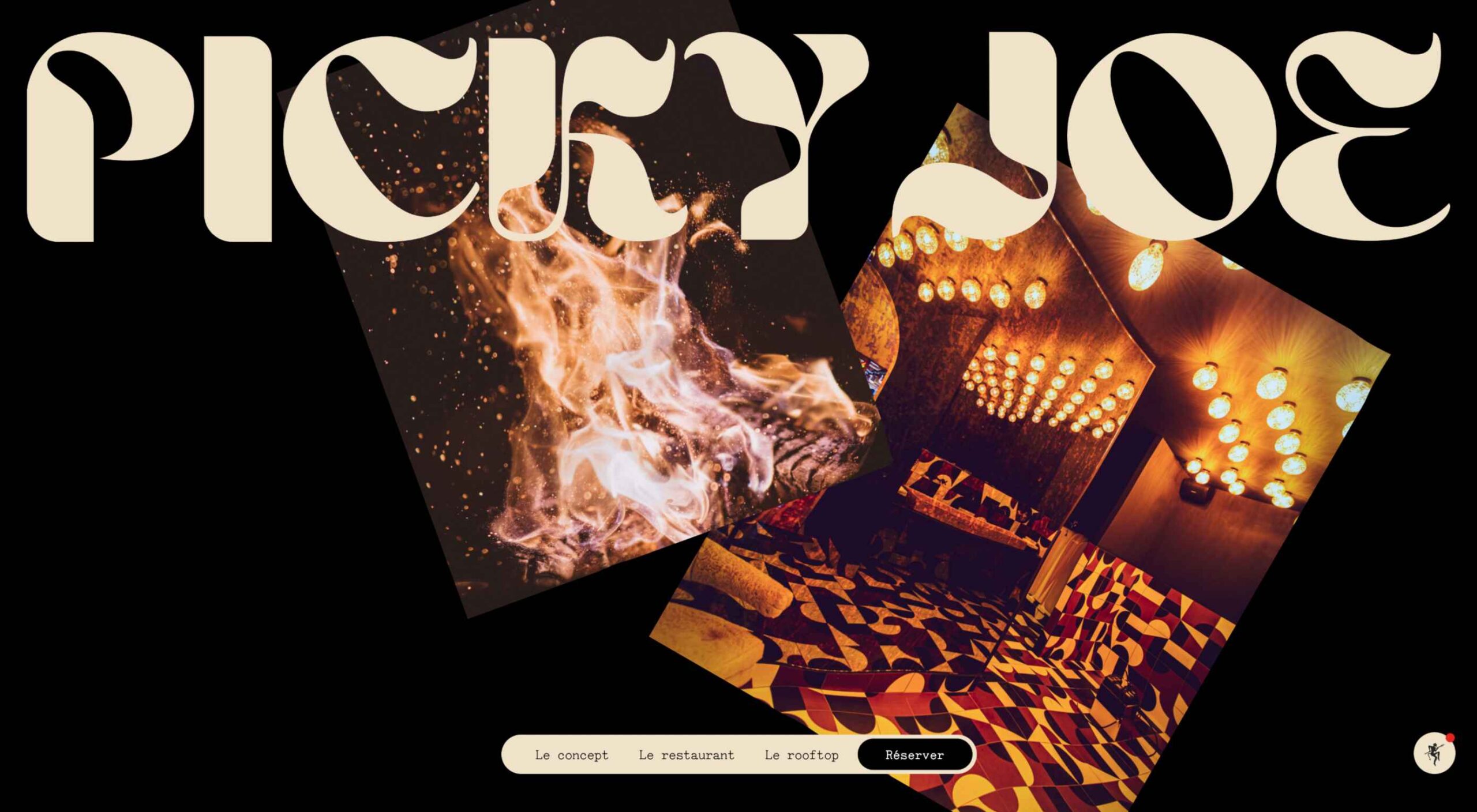
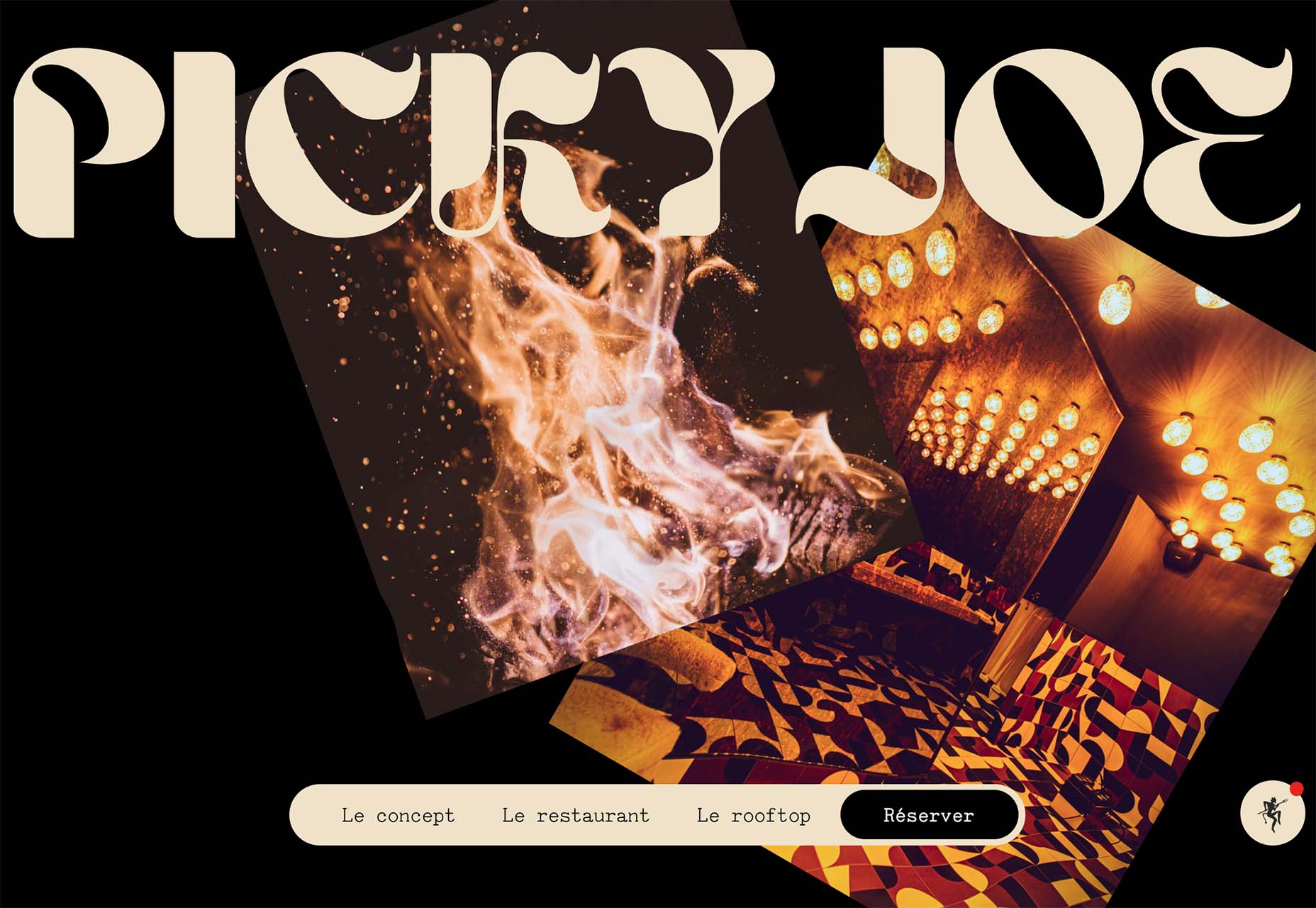
Picky Joe uses a retro typeface with rounded letters and a bit of a tilt to the characters to create a distinct feel. This is definitely a style that has to be used sparingly but can be a fun option, depending on the content of your website design.

Dark “Product” Sites

Dark mode design is probably the biggest design trend of 2022. Everywhere you look, websites are using dark color palettes and styles. Designers are creating more projects with a dark/light toggle so users can control their experience.

This visual concept is carried over to website designs that feature products as well. This is one of the last places the dark aesthetic had not touched. It’s been a bit of an unwritten rule that product images should be on white or light backgrounds to help make them easy to see and inspect digitally.

This design trend bucks that idea and features products on dark backgrounds – some with so little contrast that you almost have a hard time seeing the products. (Maybe these brands are banking on the idea that you already know them or are selling a lifestyle product.)

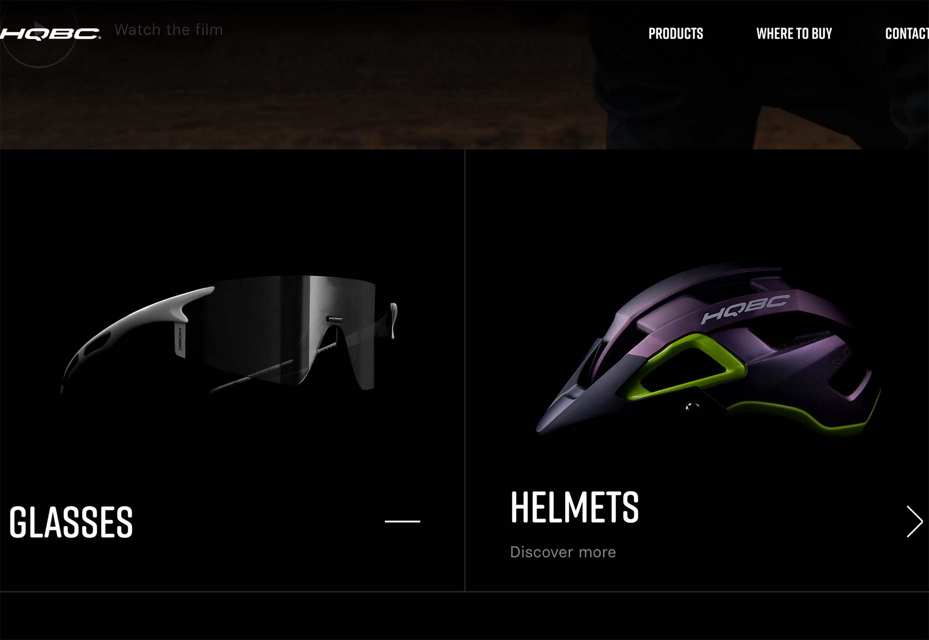
HQBC sells bike accessories such as glasses and helmets and the site has a sleek look and feel. You know it is cool from the second you land on it. The question though – is there enough visual information with the dark background to help you make a purchase? This design probably works because it only encourages you to find a physical location to make a purchase rather than buy online.

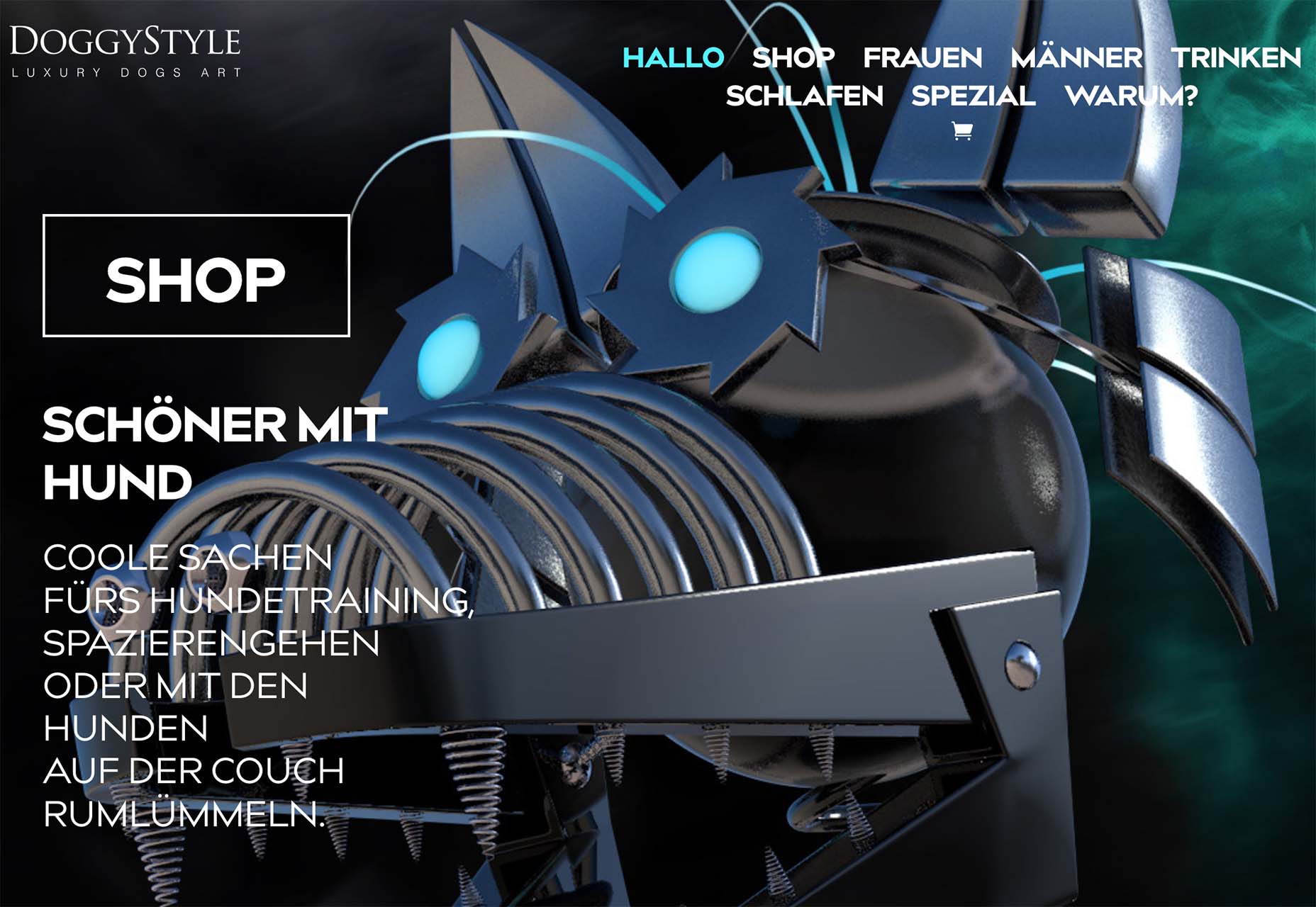
Doggystyle Shop also banks on the idea of you knowing the shopping experience or brand when you arrive. What the design does do though is put products on white backgrounds after you have clicked through far enough to make a commitment to buy. This helps you see the product well one final time before making a purchase. (The challenge is that it is three to four clicks in for the most part.)

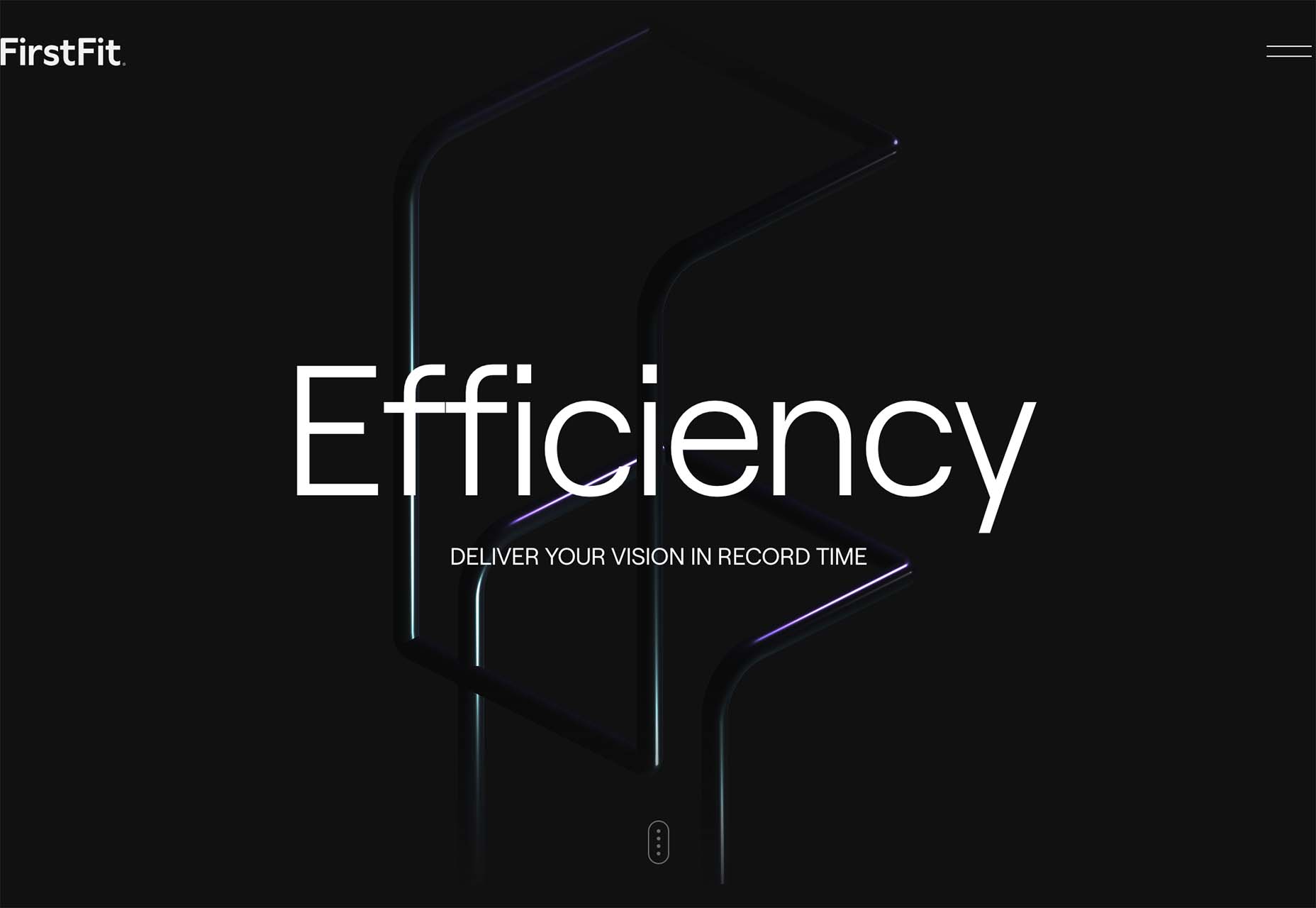
FirstFit uses the design trend in a way that’s similar to the first example. They are showing a product, but not actually trying to convert sales on the website. Other links take you to more product information and content – using a lighter background and color scheme – and the dark background with the product serves mostly as a highly visual landing page that will help entice users to learn more. When it comes to dark mode and products, this seems to be the best option for most website designs.

Conclusion

The state of the world around us and our emotions can play hard into websites and other design projects. Some of the darker elements that are popular now may be a reflection of that or it could be more of a lean into dark mode schemes.

Either way, the web has a pretty dark feel right now.

Source

p img {display:inline-block; margin-right:10px;}
.alignleft {float:left;}
p.showcase {clear:both;}
body#browserfriendly p, body#podcast p, div#emailbody p{margin:0;}

The post 3 Essential Design Trends, July 2022 first appeared on Webdesigner Depot.

SVG Loading Animations

Original Source: https://1stwebdesigner.com/svg-loading-animations-2/

Nobody likes to wait for your web page to load, so of course we want to make the time go by easier with animation. In this post we have provided you with some examples and code for ways to do this via SVG loading animations. Have a look and start using them in your projects today!

Your Web Designer Toolbox
Unlimited Downloads: 500,000+ Web Templates, Icon Sets, Themes & Design Assets


DOWNLOAD NOW

SVG Loader Animation

Here are 10 different examples, from the simple to the more complex.

See the Pen
SVG Loader Animation by Nikhil Krishnan (@nikhil8krishnan)
on CodePen.0

Animated – SVG Loader

A clever change of pace from the rotating circle, this animation combines multiple circles rotating back and forth.

See the Pen
Animated – SVG Loader by Steven Roberts (@matchboxhero)
on CodePen.0

SVG Page Load Animations

Three of the more typical, simple loading animations.

See the Pen
SVG Page Load Animations by Bridget Reed (@BridgetCReed)
on CodePen.0

SVG Loader

Here’s a complex, very specific loader that you could use all or parts of to make it your own.

See the Pen
SVG Loader by Swarup Kumar Kuila (@uiswarup)
on CodePen.0

Animated SVG Loader

This is a fun, somewhat mesmerizing loader with several moving parts.

See the Pen
Animated SVG Loader by Tony (@thgaskell)
on CodePen.0

Electric SVG Loader

Very different from the flatter animations, here’s an electric rotating ring.

See the Pen
Electric SVG Loader by Shaw (@shshaw)
on CodePen.0

CSS3 + SVG loader animation

A cute cartoon plane flying through the clouds while the page loads.

See the Pen
CSS3 + SVG loader animation by lionelB (@lionelB)
on CodePen.0

SVG ∞ loader (no JS, cross-browser, minimal code)

A literally infinite animation.

See the Pen
SVG ∞ loader (no JS, cross-browser, minimal code) by Ana Tudor (@thebabydino)
on CodePen.0

UXBOX pencil loader

Here’s another change of pace from the norm – a rotating pencil!

See the Pen
UXBOX pencil loader by elhombretecla (@elhombretecla)
on CodePen.0

SVG Spinner / Loader

A clever combination of the word loading and a circle spinner.

See the Pen
SVG Spinner / Loader by Marcus Hall (@flurrd)
on CodePen.0

Animated Gradient SVG Loader

Another very specific animation that you can use for inspiration or edit to make it your own.

See the Pen
Animated Gradient SVG Loader by Paul Thomas (@motionimaging)
on CodePen.0

Triangle SVG Loader (pure css)

For our last example we have a simple single line triangle loader.

See the Pen
Triangle SVG Loader (pure css) by Dominic Kolbe (@dominickolbe)
on CodePen.0


Volumetric Light Rays with Three.js

Original Source: https://tympanus.net/codrops/2022/06/27/volumetric-light-rays-with-three-js/

In this new ALL YOUR HTML coding session we’ll be decompiling volumetric light rays and recreating them with fragment shaders and Three.js.

Original website: https://moonfall.oblio.io/desktop/

Agency: https://oblio.io/

This coding session was streamed live on June 19, 2022.

Check out the live demo.

Support: https://www.patreon.com/allyourhtml

Setup: https://gist.github.com/akella/a19954…

The post Volumetric Light Rays with Three.js appeared first on Codrops.

Top 10 Best Printer for Graphic Designer Reviews

Original Source: https://designrfix.com/reviews/best-printer-for-graphic-designer

Graphic designers are constantly using printers to create their artwork. The best printer for a graphic designer will depend on your budget and what you need the printer for. There are many different types of printers, so it is crucial to understand their differences to find one that suits your needs. This article will explore…

The post Top 10 Best Printer for Graphic Designer Reviews appeared first on DesignrFix.

Designing Cross-Cultural Websites

Original Source: https://tympanus.net/codrops/2022/06/13/designing-cross-cultural-websites/

As the world continues to become more interconnected, so too grows the need for designers to consider how their designs impact the digital experience of those who engage with it. Take buying a phone for example. Buying an iPhone 13 will always result in the same end product; an iPhone 13. However, the digital journey that a user in England experiences in comparison with a user in China may very well differ substantially. The content will be translated into the appropriate language, colours and copy justification will need to be considered for cultural nuance, and the site itself will need to rank on SERPs (Search Engine Results Pages) across different countries.

When researching options to ensure your business can receive the most inclusive website possible, looking into how cross-cultures are also implemented can feel like an intimidating feat. Creative Brand Design, a leading web design agency, has curated a few tools and resources that you can use to help you understand what localisation is and how it’s used in the context of your web design.

“Localization is more than just writing your content in multiple languages. You need a strategy to determine what localization to send, and code to do it.” – Sam Richard

Creating a culturally inclusive site goes far beyond changing the language used.

What is localisation?

Localisation is the practice of adapting a website to meet the needs and expectations of multiple target cultures such as English and Chinese. When undertaking the localisation of any given website, some key things need to be considered before you put your fingers to the keyboard:

Cultural nuance and client segmentsColour psychology in relation to the cultures you’re targetingLinguistic differencesImageryTypography 

Cultural Nuance and Client Segments

Photography by Haseeb Jamil

Considering cultural nuance when designing a localised website is key. Understanding the markets that you are looking to target is the first step to understanding how they behave and what they’re looking for.

If you already have an established product, marketing strategy and design in an existing country, use your current marketing and design strategies as a base to build from.

In the UK and United States, they don’t typically put an enormous amount of pressure on getting married, settling down, having children, or living with/away from parents. However, they do encourage establishing a good education, exploring the world, travelling, socialising and nights out with friends.

Other cultures will value settling down, getting married, having a stable and secure career and looking after parents as soon as possible. You can use this research to inform the type of imagery and marketing you will use throughout your website design to encourage action from your users. A picture of marital, familial bliss may not be so attractive to a young, university-leaving customer in the UK or the US, but it might be the cultural and societal ideal for a university leaver in other cultures. 

Cultural Colour Psychology 

red boat near mosque paintingPhotography by Mg Cthu

This is a bigger player than you might think. In Europe for example they see yellow to be a happy, exciting and joyful colour. It evokes feelings of happiness and pictures of sunshiny days and flowering daffodils. However, if your website and branding is heavily yellow leaning and you are looking to break through into the Latin market, you may want to reconsider or adapt how you use that yellow throughout your branding. Latin cultures may associate yellow with mourning, loss and times of grieving. In Eastern and Asian cultures, yellow is often worn by, and reserved for, members of the ruling class; it is believed to be sacred.

Offending your prospective clients before you’ve even had the chance to say ‘hello, there!’ does not make for a successful design strategy.

Language & Linguistics

Image by Eugenia Shustikova

The translation is one aspect of localisation and probably one of the most fundamental – without being fully understood by the audience, you stand no chance of succeeding in any international market.

Believe it or not, Google translate is not your friend. We all had it hammered into us in language classes in school, and I’m here to tell you that your teacher was right – sorry! Google translate is not a reliable source of translation and can often result in causing accidental offences!

Hiring a reputable translator, preferably with your target language as their mother tongue, is an excellent place to start when it comes to translation. Why is this third on the list if it’s so important? Well, because very simply, hiring a good translator isn’t always very cheap. Understanding your client base and how they want to be spoken to and how they want to engage with your content will help to keep revisions of your content – and therefore translations – to a minimum.

More commonly, English speaking companies are opting for using “they/them” pronouns in their marketing and advertising materials to avoid offending or excluding anyone who might be reading their content. Your product may be specifically female/male targeted and this may not be appropriate in your target market’s culture. You will need to consider the genders of certain words (for example German, French, Italian and Spanish languages all use gendered pronouns for objects and people alike) and make sure that they’re appropriately used throughout your content.

Ensuring that your language is appropriate for your audience, correctly written, and well structured will also help to boost your SEO rankings in your new market’s SERPs. 

Visual Elements
MacBook Pro showing vegetable dishImage by Igor Miske

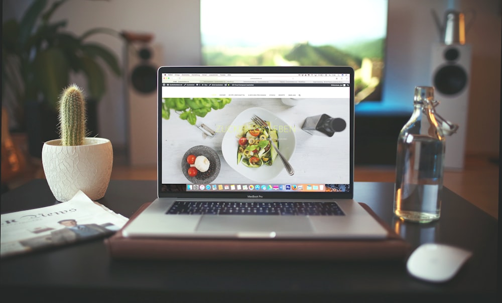
They say a picture is worth a thousand words, and as it tends to be one of the first things people look at when a page loads it’s essential to make sure that it sets the right tone and thoughts for the site.

For example, a single slice of bacon could be mouthwatering for some, but highly offensive and derogatory to those where eating pork is prohibited.

Also, it’s worth considering how a person is represented in the image when designing a product for a specific culture. Although it may seem obvious to some – make sure that the image you include accurately represents the people of that specific culture.

The last thing you would want to end up doing is accidentally offending someone due to poor research or consideration! 

Different Fonts

Image by Mika Baumeister

‘It’s not what you say it’s how you say it’ – especially when it comes to font styles. Languages such as Chinese, Japanese, and Hebrew or just some of the more visually detailed languages with varying ligatures often use more pixels than the Latin alphabet we are used to.

When translating from one language to another you could encounter a variety of different issues such as text expansion or decrease! By this, we refer to the amount of space different languages take up.

Take Creative Brand Design’s name for example. In English it is a three-word name, however when translated into languages such as Polish, Chinese, or German you can see there are varying amounts of space required or even different ligatures. –

Polish: Kreatywne projektowanie marki
Chinese: 創意品牌設計
German: Kreatives markendesign
Italian: Design creativo del marchio

“Without the right font for the right language, the design of an app can quickly be destroyed.” – Google on Noto fonts

If you’re looking for a font that would harmonise across any written language Google has answered your question! Noto was released in over 1000 different languages to help.

Localising your text elements

Photography by Marco Zuppone

One thing that is worth bearing in mind is how each text appears on the page. For the majority of western languages such as Spanish, English and French, we read from left to right. However, there are many languages that are written from right to left and even further still some languages such as Japanese read vertically from top-down.

As you can imagine – changing the layout to account for this can have extreme implications! So if you are looking at localising your design, it’s worth keeping in mind how the design itself will be affected by the change of language!

Conclusion

No matter how you look at it – culture is complex. It differs from one part of the world to the next and even sometimes within the same country, and just like language it’s ever-evolving and changing.

At its core, it boils down to scalability. Designing and building features with scalability in mind can help navigate some of the hurdles when looking at localising your website and products.

The post Designing Cross-Cultural Websites appeared first on Codrops.

How to Remove Objects From the Background in Photoshop

Original Source: https://www.hongkiat.com/blog/ps-remove-object-backrground/

During graphic designing, there often comes a time when you find an image really suitable for your project save for that one object. If you’re facing such a situation, then take a look at this…

Visit hongkiat.com for full content.