Gatsby Serverless Functions And The International Space Station

Original Source: https://smashingmagazine.com/2021/07/gatsby-serverless-functions-international-space-station/

Gatsby recently announced the launch of Functions which opens up a new dimension of possibilities — and I for one couldn’t be more excited! With Gatsby now providing Serverless Functions on Gatsby Cloud (and Netlify also providing support via @netlify/plugin-gatsby), the framework that was once misunderstood to be “just for blogs” is now more than ever, (in my opinion) the most exciting technology provider in the Jamstack space.

The demo in this article is the result of a recent project I worked on where I needed to plot geographical locations around a 3D globe and I thought it might be fun to see if it were possible to use the same technique using off-planet locations. Spoiler alert: It’s possible! Here’s a sneak peek of what I’ll be talking about in this post, or if you prefer to jump ahead, the finished code can be found here.

Getting Started

With Gatsby Functions, you can create more dynamic applications using techniques typically associated with client-side applications by adding an api directory to your project and exporting a function, e.g.

|– src
|– api
— some-function.js
|– pages

// src/api/some-function.js
export default function handler(req, res) {
res.status(200).json({ hello: `world` })
}

If you already have a Gatsby project setup, great! but do make sure you’ve upgraded Gatsby to at least version v3.7

npm install gatsby@lastest –save

If not, then feel free to clone my absolute bare-bones Gatsby starter repo: mr-minimum.

Before I can start using Gatsby Functions to track the International Space Station, I first need to create a globe for it to orbit.
Step 1: Building The 3D Interactive Globe

I start by setting up a 3D interactive globe which can be used later to plot the current ISS location.

Install Dependencies
npm install @react-three/fiber @react-three/drei three three-geojson-geometry axios –save

Create The Scene

Create a new file in src/components called three-scene.js

// src/components/three-scene.js
import React from ‘react’;
import { Canvas } from ‘@react-three/fiber’;
import { OrbitControls } from ‘@react-three/drei’;

const ThreeScene = () => {
return (
<Canvas
gl={{ antialias: false, alpha: false }}
camera={{
fov: 45,
position: [0, 0, 300]
}}
onCreated={({ gl }) => {
gl.setClearColor(‘#ffffff’);
}}
style={{
width: ‘100vw’,
height: ‘100vh’,
cursor: ‘move’
}}
>
<OrbitControls enableRotate={true} enableZoom={false} enablePan={false} />
</Canvas>
);
};

export default ThreeScene;

The above sets up a new <Canvas /> element and can be configured using props exposed by React Three Fibre.

Elements that are returned as children of the canvas component will be displayed as part of the 3D scene. You’ll see above that I’ve included <OrbitControls /> which adds touch/mouse interactivity allowing users to rotate the scene in 3D space

Ensure ThreeScene is imported and rendered on a page somewhere in your site. In my example repo I’ve added ThreeScene to index.js:

// src/pages/index.js
import React from ‘react’;

import ThreeScene from ‘../components/three-scene’;

const IndexPage = () => {
return (
<main>
<ThreeScene />
</main>
);
};

export default IndexPage;

This won’t do much at the moment because there’s nothing to display in the scene. Let’s correct that!

Create The Sphere

Create a file in src/components called three-sphere.js:

// src/components/three-sphere.js
import React from ‘react’;

const ThreeSphere = () => {
return (
<mesh>
<sphereGeometry args={[100, 32, 32]} />
<meshBasicMaterial color=”#f7f7f7″ transparent={true} opacity={0.6} />
</mesh>
);
};

export default ThreeSphere;

If the syntax above looks a little different to that of the Three.js docs it’s because React Three Fibre uses a declarative approach to using Three.js in React.

A good explanation of how constructor arguments work in React Three Fibre can be seen in the docs here: Constructor arguments

Now add ThreeSphere to ThreeScene:

// src/components/three-scene.js
import React from ‘react’;
import { Canvas } from ‘@react-three/fiber’;
import { OrbitControls } from ‘@react-three/drei’;

+ import ThreeSphere from ‘./three-sphere’;

const ThreeScene = () => {
return (
<Canvas
gl={{ antialias: false, alpha: false }}
camera={{
fov: 45,
position: [0, 0, 300]
}}
onCreated={({ gl }) => {
gl.setClearColor(‘#ffffff’);
}}
style={{
width: ‘100vw’,
height: ‘100vh’,
cursor: ‘move’
}}
>
<OrbitControls enableRotate={true} enableZoom={false} enablePan={false} />
+ <ThreeSphere />
</Canvas>
);
};

export default ThreeScene;

You should now be looking at something similar to the image below.

Not very exciting, ay? Let’s do something about that!

Create The Geometry (To Visualize The Countries Of Planet Earth)

This next step requires the use of three-geojson-geometry and a CDN resource that contains Natural Earth Data. You can take your pick from a full list of suitable geometries here.

I’ll be using admin 0 countries. I chose this option because it provides enough geometry detail to see each country, but not so much that it will add unnecessary strain on your computer’s GPU.

Now, create a file in src/components called three-geo.js:

// src/components/three-geo.js
import React, { Fragment, useState, useEffect } from ‘react’;
import { GeoJsonGeometry } from ‘three-geojson-geometry’;
import axios from ‘axios’;

const ThreeGeo = () => {
const [isLoading, setIsLoading] = useState(true);
const [geoJson, setGeoJson] = useState(null);

useEffect(() => {
axios
.get(
‘https://d2ad6b4ur7yvpq.cloudfront.net/naturalearth-3.3.0/ne_110m_admin_0_countries.geojson’
)
.then((response) => {
setIsLoading(false);
setGeoJson(response.data);
})
.catch((error) => {
console.log(error);
throw new Error();
});
}, []);

return (
<Fragment>
{!isLoading ? (
<Fragment>
{geoJson.features.map(({ geometry }, index) => {
return (
<lineSegments
key={index}
geometry={new GeoJsonGeometry(geometry, 100)}
>
<lineBasicMaterial color=”#e753e7″ />
</lineSegments>
);
})}
</Fragment>
) : null}
</Fragment>
);
};

export default ThreeGeo;

There’s quite a lot going on in this file so I’ll walk you through it.

Create an isLoading state instance using React hooks and set it to true. This prevents React from attempting to return data I don’t yet have.
Using a useEffect I request the geojson from the CloudFront CDN.
Upon successful retrieval I set the response in React state using setGeoJson(…) and set isLoading to false
Using an Array.prototype.map I iterate over the “features” contained within the geojson response and return lineSegments with lineBasicMaterial for each geometry
I set the lineSegments geometry to the return value provided by GeoJsonGeomtry which is passed the “features” geometry along with a radius of 100.

(You may have noticed I’ve used the same radius of 100 here as I’ve used in the sphereGeometry args in three-sphere.js. You don’t have to set the radius to the same value but it makes sense to use the same radii for ThreeSphere and ThreeGeo.

If you’re interested to know more about how GeoJsonGeometry works, here’s the open-source repository for reference: https://github.com/vasturiano/three-geojson-geometry. The repository has an example directory however, the syntax is slightly different from what you see here because the examples are written in vanilla JavaScript not React.

Combine The Sphere And Geometry

Now it’s time to overlay the geometry on top of the blank sphere: Add ThreeGeo to ThreeScene

// src/components/three-scene.js
import React from ‘react’;
import { Canvas } from ‘@react-three/fiber’;
import { OrbitControls } from ‘@react-three/drei’;

import ThreeSphere from ‘./three-sphere’;
+ import ThreeGeo from ‘./three-geo’;

const ThreeScene = () => {
return (
<Canvas
gl={{ antialias: false, alpha: false }}
camera={{
fov: 45,
position: [0, 0, 300]
}}
onCreated={({ gl }) => {
gl.setClearColor(‘#ffffff’);
}}
style={{
width: ‘100vw’,
height: ‘100vh’,
cursor: ‘move’
}}
>
<OrbitControls enableRotate={true} enableZoom={false} enablePan={false} />
<ThreeSphere />
+ <ThreeGeo />
</Canvas>
);
};

You should now be looking at something similar to the image below.

Now that’s slightly more exciting!

Step 2: Building A Serverless Function
Create A Function

This next step is where I use a Gatsby Function to request data from Where is ISS at, which returns the current location of the International Space Station.

Create a file in src/api called get-iss-location.js:

// src/api/get-iss-location.js
const axios = require(‘axios’);

export default async function handler(req, res) {
try {
const { data } = await axios.get(
‘https://api.wheretheiss.at/v1/satellites/25544’
);

res.status(200).json({ iss_now: data });
} catch (error) {
res.status(500).json({ error });
}
}

This function is responsible for fetching data from api.whereistheiss.at and upon success will return the data and a 200 status code back to the browser.

The Gatsby engineers have done such an amazing job at simplifying serverless functions that the above is all you really need to get going, but here’s a little more detail about what’s going on.

The function is a default export from a file named get-iss-location.js;
With Gatsby Functions the filename becomes the file path used in a client-side get request prefixed with api, e.g. /api/get-iss-location;
If the request to “Where is ISS at” is successful I return an iss_now object containing data from the Where is ISS at API and a status code of 200 back to the client;
If the request errors I send the error back to the client.

Step 3: Build The International Space Station
Creating The ISS Sphere

In this next step, I use Gatsby Functions to position a sphere that represents the International Space Station as it orbits the globe. I do this by repeatedly calling an axios.get request from a poll function and setting the response in React state.

Create a file in src/components called three-iss.js

// src/components/three-iss.js
import React, { Fragment, useEffect, useState } from ‘react’;
import * as THREE from ‘three’;
import axios from ‘axios’;

export const getVertex = (latitude, longitude, radius) => {
const vector = new THREE.Vector3().setFromSpherical(
new THREE.Spherical(
radius,
THREE.MathUtils.degToRad(90 – latitude),
THREE.MathUtils.degToRad(longitude)
)
);
return vector;
};

const ThreeIss = () => {
const [issNow, setIssNow] = useState(null);

const poll = () => {
axios
.get(‘/api/get-iss-location’)
.then((response) => {
setIssNow(response.data.iss_now);
})
.catch((error) => {
console.log(error);
throw new Error();
});
};

useEffect(() => {
const pollInterval = setInterval(() => {
poll();
}, 5000);

poll();
return () => clearInterval(pollInterval);
}, []);

return (
<Fragment>
{issNow ? (
<mesh
position={getVertex(
issNow.latitude,
issNow.longitude,
120
)}
>
<sphereGeometry args={[2]} />
<meshBasicMaterial color=”#000000″ />
</mesh>
) : null}
</Fragment>
);
};

export default ThreeIss;

There’s quite a lot going on in this file so I’ll walk you through it.

Create an issNow state instance using React hooks and set it to null. This prevents React from attempting to return data I don’t yet have;
Using a useEffect I create a JavaScript interval that calls the poll function every 5 seconds;
The poll function is where I request the ISS location from the Gatsby Function endpoint (/api/get-iss-location);
Upon successful retrieval, I set the response in React state using setIssNow(…);
I pass the latitude and longitude onto a custom function called getVertex, along with a radius.

You may have noticed that here I’m using a radius of 120. This does differ from the 100 radius value used in ThreeSphere and ThreeGeo. The effect of the larger radius is to position the ISS higher up in the 3D scene, rather than at ground level — because that’s logically where the ISS would be, right?
100 has the effect of the sphere and geometry overlapping to represent Earth, and 120 for the ISS has the effect of the space station “orbiting” the globe I’ve created.

One thing that took a bit of figuring out, at least for me, was how to use spherical two dimensional coordinates (latitude and longitude) in three dimensions, e.g. x,y,z. The concept has been explained rather well in this post by Mike Bostock.

The key to plotting lat / lng in 3D space lies within this formula… which makes absolutely no sense to me!

x=rcos(ϕ)cos(λ)
y=rsin(ϕ)
z=−rcos(ϕ)sin(λ)

Luckily, Three.js has a set of MathUtils which I’ve used like this:

Pass the latitude, longitude and radius into the getVertex(…) function
Create a new THREE.Spherical object from the above named parameters
Set the THREE.Vector3 object using the Spherical values returned by the setFromSpherical helper function.

These numbers can now be used to position elements in 3D space on their respective x, y, z axis — phew! Thanks, Three.js!

Now add ThreeIss to ThreeScene:

import React from ‘react’;
import { Canvas } from ‘@react-three/fiber’;
import { OrbitControls } from ‘@react-three/drei’;

import ThreeSphere from ‘./three-sphere’;
import ThreeGeo from ‘./three-geo’;
+ import ThreeIss from ‘./three-iss’;

const ThreeScene = () => {
return (
<Canvas
gl={{ antialias: false, alpha: false }}
camera={{
fov: 45,
position: [0, 0, 300]
}}
onCreated={({ gl }) => {
gl.setClearColor(‘#ffffff’);
}}
style={{
width: ‘100vw’,
height: ‘100vh’,
cursor: ‘move’
}}
>
<OrbitControls enableRotate={true} enableZoom={false} enablePan={false} />
<ThreeSphere />
<ThreeGeo />
+ <ThreeIss />
</Canvas>
);
};

export default ThreeScene;

Et voilà! You should now be looking at something similar to the image below.

The poll function will repeatedly call the Gatsby Function, which in turn requests the current location of the ISS and re-renders the React component each time a response is successful. You’ll have to watch carefully but the ISS will change position ever so slightly every 5 seconds.

The ISS is traveling at roughly 28,000 km/h and polling the Gatsby Function less often would reveal larger jumps in position. I’ve used 5 seconds here because that’s the most frequent request time as allowed by the Where is ISS at API

You might have also noticed that there’s no authentication required to request data from the Where is ISS at API. Meaning that yes, technically, I could have called the API straight from the browser, however, I’ve decided to make this API call server side using Gatsby Functions for two reasons:

It wouldn’t have made a very good blog post about Gatsby Functions if i didn’t use them.
Who knows what the future holds for Where is ISS at, it might at some point require authentication and adding API keys to server side API requests is pretty straightforward, moreover this change wouldn’t require any updates to the client side code.

Step 4: Make It Fancier! (Optional)

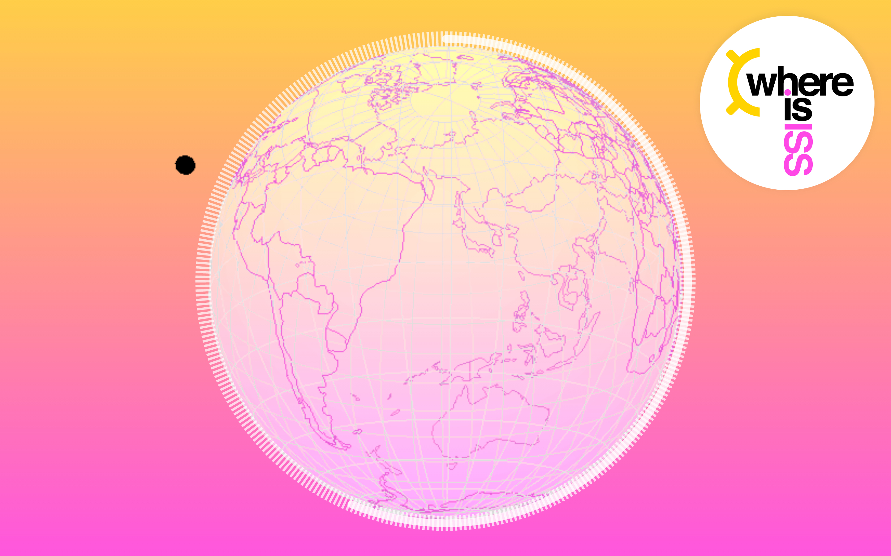
I’ve used the above approach to create this slightly more snazzy implementation: https://whereisiss.gatsbyjs.io,

In this site I’ve visualized the time delay from the poll function by implementing an Svg <circle /> countdown animation and added an extra <circle /> with a stroke-dashoffset to create the dashed lines surrounding it.

Step 5: Apply Your New Geo Rendering Skills In Other Fun Ways!

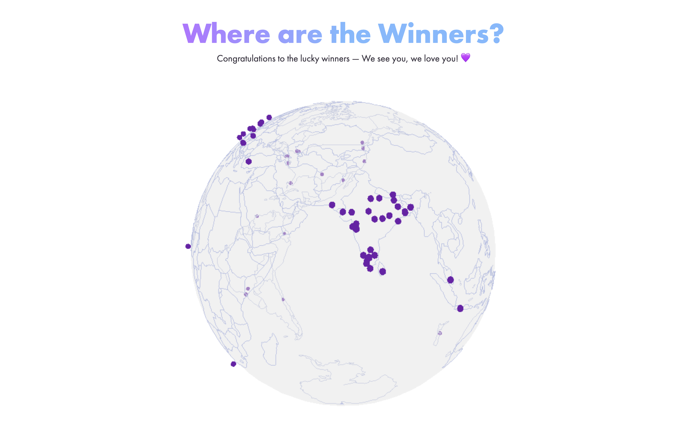
I recently used this approach for plotting geographical locations for the competition winners of 500 Bottles: https://500bottles.gatsbyjs.io. A limited edition FREE swag giveaway I worked on with Gatsby’s marketing team.

You can read all about how this site was made on the Gatsby blog: How We Made the Gatsby 500 Bottles Giveaway

In the 500 Bottles site I plot the geographical locations of each of the competition winners using the same method as described in ThreeIss, which allows anyone visiting the site to see where in the world the winners are.
Closing Thoughts

Gatsby Functions really open up a lot of possibilities for Jamstack developers and never having to worry about spinning up or scaling a server removes so many problems leaving us free to think about new ways they can be used.

I have a number of ideas I’d like to explore using the V4 Space X API’s so give me a follow if that’s your cup of tea: @PaulieScanlon

Further Reading

If you’re interested in learning more about Gatsby Functions, I highly recommend Summer Functions, a five week course run by my good chum Benedicte Raae.
In a recent FREE Friday night Summer Functions webinar we created an emoji slot machine which was super fun:
Build an emoji slot machine with a #GatsbyJS Serverless Function · #GatsbySummerFunctions
You might also be interested in the following episode from our pokey internet show Gatsby Deep Dives where Kyle Mathews (creator of Gatsby) talks us through how Gatsby Functions work:
Gatsby Serverless Functions ? — Are we live? with Kyle Mathews
If you’re interested in learning more about Gatsby I have a number of articles and tutorials on my blog: https://paulie.dev, and please do come find me on Twitter if you fancy a chat: @PaulieScanlon

I hope you enjoyed this post. Ttfn ?!

Finarte — Branding and Visual Identity

Original Source: http://feedproxy.google.com/~r/abduzeedo/~3/rSpqYx3WLbM/finarte-branding-and-visual-identity

Finarte — Branding and Visual Identity

abduzeedo07.23.21

FIB | Fábrica de Ideias Brasil shared a beautiful branding and visual identity for Finarte, a Brazilian company established with the objective of helping collectors to better manage their art patrimony by offering credit products, insurance and valuation services. Thus, collectors can better understand the economic value of their works of art, protect this important asset and manage it more dynamically, having access to liquidity to meet other needs and opportunities or even to acquire new works. FIB was responsible for the visual identity and contact points. The concept of the logo and visual identity refers to the movement of money, an analogy to the income of capital through art.

art patrimony coin money collectors insurance

art patrimony coin money collectors insurance

Credits

Project Manager: Mariana Jorge e Ivy Miranda
Visual Identity: Thiago Limón
Interface site: Gabriel Catte

For more information make sure to check out:

Behance
Website


 7 Top Multipurpose WordPress Themes You Should Check Out

Original Source: https://www.webdesignerdepot.com/2021/07/7-top-multipurpose-wordpress-themes-you-should-check-out/

You have been looking for a theme for your website. You haven’t yet settled on all the design details or come across a specialty theme that appears to have what you might need. Then, a multipurpose theme would be a wise choice.

Multipurpose WordPress themes have become extremely popular because of the flexibility they offer. Also, because of their relative ease of use and the powerful tools, you will usually find built into them.

With a good multipurpose theme at your fingertips, you are usually in a position to build anything. You can build a simple personal blogging site or a complex multifunctional site for a client. To make life a little easier, most multipurpose WordPress themes have features to help you get started quickly and in the right direction.

Here is a superb collection of 7 of the top multipurpose WordPress themes on the market today. These themes can help you build virtually any kind of website.

1. Betheme – Website Builder for WordPress with 600+ Pre-Built Websites

BeTheme has long been one of the most popular multipurpose WordPress themes. Not content to rest on their laurels, BeTheme’s authors took suggestions from their customers and created a better builder.

The Live Builder is 60% faster. Its UI is so intuitive that you won’t waste time learning how to use it. It features exciting new and powerful capabilities and performs familiar page-building features better than ever.

With the Live Builder, you can –

Edit live content visually without switching between backend and frontend; you can view an element and customize it simultaneously.
Use the Revisions feature to create, save, and restore what you want; no more lost changes thanks to the Autosave, Update, Revision, and Backup options.
Access the Pre-built Sections Library: find the section or block you need and add it to your page.
Select from the large and diverse selection of Items; categories include typography, boxes, blocks, design elements, loops, etc., to help you create exactly what you have in mind.

Click on the banner to learn more.

2. Total WordPress Theme

The introduction emphasized the ease of use and flexibility most multipurpose themes provide. Total has both in abundance thanks to its drag and drop frontend page builder and hundreds of built-in styling options.

Highlights include –

An advanced version of the WPBakery page builder.
40+ single click importable demos, 100+ page-building modules, and 500+ styling settings to help you create exactly what you want.
Dynamic Template and Pre-styled Theme Cards to tailor dynamic templates for your posts.
Templatera and Slider Revolution plugins plus full WooCommerce compatibility.
A selection of developer-friendly hooks, filters, and snippets for future theme customization.

Even though Total was designed with perfection in mind, or perhaps because of it, it is the right choice if you need to get a high-quality website up and running in a short period of time. Total’s 47,000+ customers seem to agree.

Click on the banner to learn more.

3. Avada Theme

The fact that Avada is the all-time best-selling WordPress theme with more than 450,000 sales to date might be all the reason you need to choose it, but there are plenty of other good reasons for doing so as well.

For example –

Avada’s drag and drop page builder, together with the Fusion Page and Fusion Theme options, makes building a website quick and easy.
Single-click import demos, stylish design elements, and pre-built websites are there to help speed up your project’s workflow and impart a high level of quality to the finished product.
Avada’s Dashboard organizes your work, and its Dynamic Content System gives you maximum flexibility and full control over your project.

Click on the banner to find out more about this fast, responsive, and WooCommerce-compatible theme.

4. Uncode – Creative Multiuse & WooCommerce WordPress Theme

Uncode will be an ideal choice for building creative, magazine, and blogging websites and for building agency sites as well. This fast, sleek, pixel-perfect multipurpose theme has sold more than 80,000 copies to date.

Uncode’s impressive features include –

More than 450 Wireframe section templates that can easily be modified and combined.
A Frontend Editor on steroids coupled with the WooCommerce custom builder.
A “must-see” gallery of user-created websites.

5. TheGem – Creative Multi-Purpose High-Performance WordPress Theme

TheGem is literally a Swiss Army knife of website building tools that make it ideal for creating business, portfolio, shop, and magazine websites.

Among the many gems included in the package are these –

The popular and industry-leading WPBakery and Elementor front-end page builders.
400+ beautiful pre-built websites and templates together with 300+ pre-designed section templates.
A splendid collection of WooCommerce templates for shop-building projects.

6. Impeka – Creative Multipurpose WordPress Theme

With Impeka, flexibility is almost an understatement. This intuitive, easy-to-work-with multipurpose theme gives beginners and advanced users alike complete freedom to dream up their ideal website and then make it happen – and fast.

You can –

Choose among the Enhanced WPBakery, Elementor, and Gutenberg page builders.
Select from 50 handcrafted design elements and Impeka’s 10 custom blocks.

Impeka is perfect for building every website type, from blogging and online stores to commercial businesses and corporations.

7. Blocksy – Gutenberg WordPress Theme

Blocksy is a blazing fast and lightweight WordPress theme that was built with the Gutenberg editor in mind and is seamlessly integrated with WooCommerce.

Blocksy is responsive, adaptive, translation ready, and SEO optimized.
Blocksy plays well with all the popular WordPress page builders, including Elementor, Beaver Builder, and Brizy.

This popular multipurpose WordPress theme can be used to create any type of website in no time.

Of all the design choices a WordPress user needs to make, choosing a WordPress theme for the task at hand is perhaps the most important.

That choice, more often than not, involves a multipurpose theme. Most multipurpose WordPress themes are extremely flexible. So, you can avoid the tedious and time-consuming task of trying to find exactly the right one for your niche and for the job.

Multipurpose themes work for any website niche and offer whatever an admin might need.

Choose one from these 7 Best Multipurpose WordPress Themes, and you should be able to create your website with relative ease.

Source

p img {display:inline-block; margin-right:10px;}
.alignleft {float:left;}
p.showcase {clear:both;}
body#browserfriendly p, body#podcast p, div#emailbody p{margin:0;}

The post  7 Top Multipurpose WordPress Themes You Should Check Out first appeared on Webdesigner Depot.

Making Your Mark: 6 Tips for Infusing Brand Essence into Your Website 

Original Source: https://www.webdesignerdepot.com/2021/07/making-your-mark-6-tips-for-infusing-brand-essence-into-your-website/

What makes a company special? There are hundreds of organizations out there selling fast food, but only one McDonalds. You’ve probably stumbled across dozens of technology companies too, but none of them inspire the same kind of loyalty and commitment as Apple. So why do people fall in love with some companies more than others?

Most of the time, it comes down to one thing: brand essence. Your brand essence, or brand identity, represents all of the unique components of your business that separate it from the competition. It’s not just about your logo or the brand colors you choose for your website. Your brand essence entails all of the visual assets you use and those less tangible concepts like brand values and personality.

When your customers decide which companies to buy from, they’re not just looking for another dime-a-dozen venture with the cheapest products. Instead, your audience wants to buy from a business that they feel connected with. That’s where your brand comes in.

Infusing brand essence into your website helps give your digital presence that extra touch that differentiates you from other similar companies.

So, how do you get started?

What is Brand Essence?

Your brand essence is a collection of core characteristics responsible for defining your brand. More than just a single asset, your essence encompasses everything from your unique tone of voice, from your brand image, your message, and even what you stand for.

More than just a single asset, your essence encompasses everything

When you’re trying to boost your chances of sales, a brand essence helps build a kind of affinity with your customers. Your clients see aspects of your character that they can relate to, such as a modern and playful image or a commitment to sustainable practices. It’s that affinity that convinces your customer to choose your company instead of your competition time after time.

Your website is one of the first places that your customer will visit when looking for answers. They might happen across your site when searching for a key phrase on Google or stumble onto it from social media. When they arrive on your product or home page, everything there should help them make an immediate emotional connection.

The only problem?

It’s challenging to portray a unique brand identity through a standard website template. If your site looks the same as a dozen other online stores, how can you convince your customers that you’re better?

Why Your Website Needs Brand Essence

First impressions are a big deal.

In a perfect world, your visitors would land on your website and instantly fall in love with what they find there. So everything from the unique design of your homepage to the pictures on your product pages should delight and impress your audience.

Unfortunately, if just one element is wrong, then you could also make the wrong impression entirely on your customers too. Adding elements of brand essence to your site will:

Build trust with your audience: Your brand should be a consistent component of everything your business does, from selling products to interacting with customers. When your consumers land on your website, everything from your logo to your chosen colors should remind them of who you are and what you stand for. This consistency will lead to better credibility for your business. 
Make you stand out: How many other companies just like yours are on the internet today? Your brand essence helps to differentiate you as special by showing what’s truly unique about you. It’s a chance to remind your audience of your values and make them forget all about your competitors. 
Create an emotional connection: Brand essence that shows off your unique values, mission, and personality will help create an emotional link with your audience. Remember, people fall in love with the human characteristics behind your brand!

Easy Ways to Add Brand Essence to your Website

Since there are so many elements that add up to a strong brand essence, there are also a variety of ways you can add your brand to your website. Whether it’s using specific colors to elicit an emotional response from your fans or adding your unique tone of voice into content, there’s no shortage of ways to show off what makes you special.

1. Use Your Brand Colors Carefully

Brand colors are an important part of your brand essence. Walk into Target, and the bright shades of red will instantly energize you. Likewise, when you see a McDonalds, that golden arch logo might instantly remind you of joy and nourishment.

Color psychology plays a significant role in every brand asset you create, from the packaging you choose for your products to the shades in your logo. With that in mind, you should be using your colors effectively on your website too. Stick with the same selection of shades in every digital environment online.

For instance, the Knotty Knickers company uses different shades of pink and white to convey feelings of femininity and comfort. Not only is the website packed with this color, but the company also follows through with similar shades on its social media pages too.

Everything from the highlights on the Knotty Kickers Insta to the decorations in their images feature the soft tones of pink that make the company recognizable.

Remember, consistent use of color is psychologically proven to help improve recognition by up to 80%. So let your colors shine through.

2. Know Your Type

Your colors are just one component of your brand essence.

Fonts and typography are other components that your customers use to recognize and understand your business. There are many different styles of font, and new ones appear all the time. However, your company should have a specific selection of fonts that it uses everywhere.

If you have a typeface logo, then you might have one specific kind of font for this, like Original Stitch’s logo here:

On top of that, you may also use one font for the “heading” text on your website and something slightly different for the body text. Your heading and body text need to be extremely clear and easy to read on any device if you want to appeal to your target audience.

However, there’s more to getting your fonts right than choosing something legible. The fonts you pick need to say something about your company and what it stands for. For example, the modern sans-serif font of Original Stitch’s website conveys a sense of forward-thinking cleanliness and style.

The fonts feel trendy and informal, perfect for a luxury fashion company. Alternatively, a serif font like Garamond might look more formal and professional. So what do you want your customers to think and feel when they see your typography?

3. Know Your Images

Stock images look out-of-touch, cliché, and fake. If you cover your website in images like that, then you’re not going to earn the respect of your customers. Instead, it’s up to you to ensure that every graphic on your website conveys the sentiment and personality of your brand.

Bringing your brand essence into your website design means thinking about how you can convey your values in every element of that site. From the photos of your team that show the real humans behind your products and services to the pictures that you use on your product pages, choose your graphics wisely. If you have dedicated brand colors, you can even include these in your photos.

Of course, the most valuable graphic on your website should always be your logo. This is the thing that you need to include on all of your website pages to ensure that your audience knows who they’re shopping with. So ensure that no matter how much visual content you have on your page, your logo still stands out.

Firebox places its logo at the top of the page in the middle of your line of sight, no matter where you go on the website. This ensures that the logo is the thing that instantly grabs attention and reminds consumers of where they are.

Remember to ensure that each of the images you do include in your website is surrounded by plenty of white space so that your customers can see them properly too.

4. Use the Right Tone of Voice

It’s easy to get stuck focusing on things like logos and colors when you’re trying to make your brand essence shine through in your website. However, one of the most common things that your customer will recognize you by is your tone of voice.

Your brand tone of voice is what gives the content you share online personality and depth. It can come through in the kind of words you use, including slang and colloquialisms. In addition, you can add humor to your voice (if it’s appropriate) and even include emojis if that makes sense for your brand.

With formal words, you can make sure that you come across as reliable, dependable, and sophisticated. With informal words, you’re more likely to convince your audience that you’re friendly and relatable. Sticking with the Firebox example, look at how the company writes its product descriptions.

Everything from the length of the sentences to the humor in the tone of voice helps to convey something unique about the brand.

Like all of the elements that bring your brand essence into your website, your tone of voice must remain consistent wherever your customers see it. Make sure that your customer service agents know how to use your voice in chat with customers and that you include that personality on social media too.

5. Focus on Your Message

The tone of voice and personality that you showcase in your website and content is crucial to driving success for your business. However, under all of that, the most important thing to do is ensure you’re sending the right message. In other words, what do you want your customers to think and feel when they land on your website?

If your whole message is that you can make great skincare easy to obtain without asking people to compromise on animal safety, this should be the first thing that comes across when someone arrives on your homepage. That’s why Lush combines clean, simple web pages with credibility-boosting badges that tell customers everything they need to know instantly.

Ensuring that your message can come across correctly means learning how to use all the different brand assets you rely on consistently and effectively. Everything from the colors on your website to how you place trust badges along the bottom of every page makes a difference to how significant and believable your message is.

Notably, when you know what your core message is, it’s important to repeat it. That means that you don’t just talk about what your ideals and values are on your homepage. You also include references to your message on every product page and the “About” page too. Lush has an entire “ethical charter” on its website, where you can learn more about its activities.

Having a similar component included within your web design could be an excellent way to confirm what your most crucial considerations are for your customers.

6. Never Copy the Competition

Exploring other website designs and ideas created by your competitors is one of the easiest ways to get inspiration. Competitive analysis gives you an insight into the trends and design strategies that are more likely to work for your target audience. It’s also an opportunity for you to learn from your competitors’ wrongs and what they’re doing right.

However, it would be best if you never allowed your initial research and exploration to go too far. In other words, when you see something great that your competitor is doing, don’t just copy and paste it onto your own website. This is more likely to remind your customers of the other company and send them to that brand than it is to improve your reputation.

Instead, focus on making your website unique to you. If you’re having trouble with this, then start by looking at your About page. How would you describe your background and your mission as a business to someone who has never heard of you before? What makes your company different from all of the other organizations out there?

Take the unique features that you rave about on your About page and the personality you try to convey through your employees and bring it into the rest of your website design. The whole point of bringing brand essence into your web design strategy is that it helps to differentiate you from the other companies out there.

It’s a good idea to protect any assets that other people might try to steal from you too. Copyrighting your logo, your name, and other essential components of your brand will stop people in your industry from treading on your toes too much.

Make the Most of Your Brand Essence

Your website is one of the most valuable tools that you’ll have as a brand. It’s an opportunity for you to share your products and services with the world, capture the attention of your target audience, and potentially make sales too. However, it’s important not to forget that your website is also a chance for you to demonstrate what your brand is truly all about.

Through your brand essence, you can share the unique values and messages that make your company special. But, more importantly, you can use those components to build a deeper relationship with your audience – the kind of connection that leads to dedicated repeat customers and brand loyalty. People connect with other people – after all, not just faceless corporations.

Once you’ve identified your brand essence, the next step is to make sure that you know how to connect with your customers consistently. Every aspect of your website, application, social media pages, and anything else you make for your business sends the same message.

Source

p img {display:inline-block; margin-right:10px;}
.alignleft {float:left;}
p.showcase {clear:both;}
body#browserfriendly p, body#podcast p, div#emailbody p{margin:0;}

The post Making Your Mark: 6 Tips for Infusing Brand Essence into Your Website  first appeared on Webdesigner Depot.

6 Resources For JavaScript Code Snippets

Original Source: http://feedproxy.google.com/~r/1stwebdesigner/~3/vFCNSyyCZSg/

When it comes to writing JavaScript (or any other code, for that matter) you can save a lot of time by not trying to reinvent the wheel – or coding something that is common enough that it has already been written countless times. In these instances it is helpful to have a list of collections of commonly (or sometimes not so commonly) used scripts or snippets you can refer to or search through to find what you need to either get your code started or solve your whole problem.

That is why we’ve put together this list of collections of JavaScript snippets so you can bookmark and refer back to them whenever you are in need. Here are six useful resources for Javascript code snippets.

The UX Designer Toolbox

Unlimited Downloads: 500,000+ Wireframe & UX Templates, UI Kits & Design Assets
Starting at only $16.50 per month!


DOWNLOAD NOW


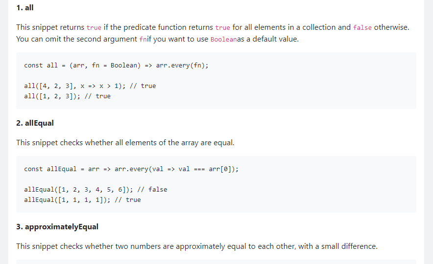
30 seconds of code

This JavaScript snippet collection contains a wide variety of ES6 helper functions. It includes helpers for dealing with primitives, arrays and objects, as well as algorithms, DOM manipulation functions and Node.js utilities.

30 seconds of code - JavaScript snippets

JavaScriptTutorial.net

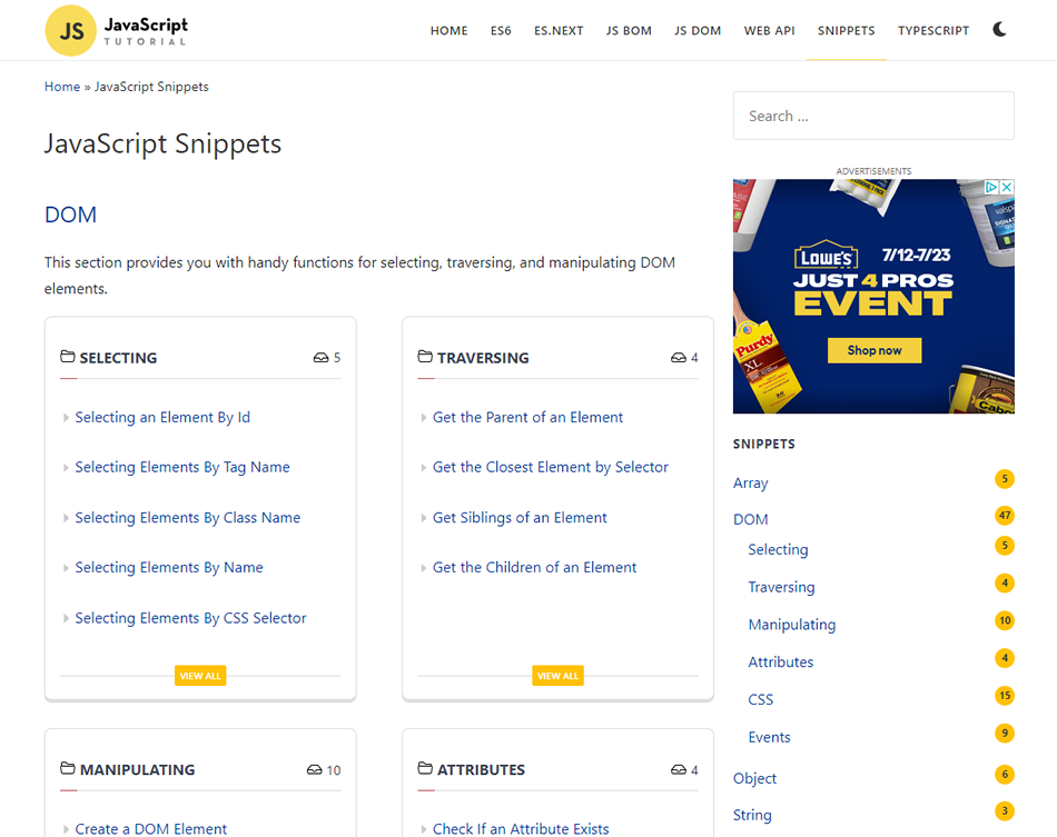
This website has a section that provides you with handy functions for selecting, traversing, and manipulating DOM elements.

JavaScript Tutorial snippets

HTMLDOM.dev

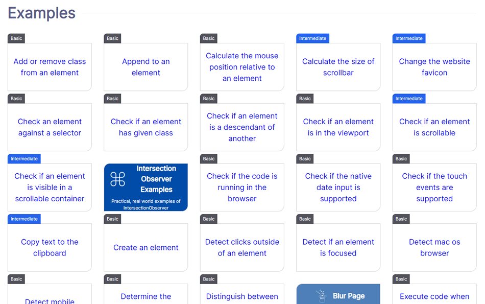
This website focuses on scripts that manage HTML DOM with vanilla JavaScript, providing a nice collection of scripts that do just that.

HTMLDOM.dev

The Vanilla JavaScript Toolkit

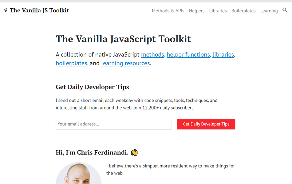
Here’s a collection of native JavaScript methods, helper functions, libraries, boilerplates, and learning resources.

Vanilla JavaScript Toolkit

CSS Tricks

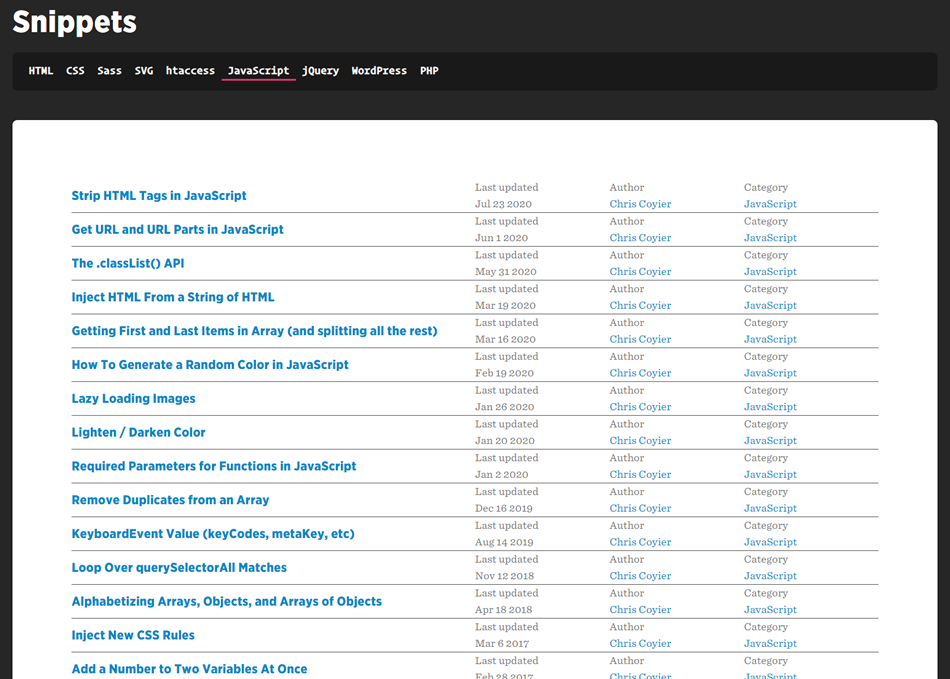
CSS Tricks has a nice collection of all different kinds of code snippets, including this great list of JS snippets.

CSS Tricks snippets

Top 100 JavaScript Snippets for Beginners

Focusing on beginners, and a bit dated, but this list is still a worthwhile resource to keep in your back pocket.

Topp 100 Scripts for beginners

We hope you find this list helpful in your future projects. Be sure to check out all of the other JavaScript resources we have here at 1stWebDesigner while you’re at it!


How to create a realistic 3D sculpture

Original Source: http://feedproxy.google.com/~r/CreativeBloq/~3/s1TxoNFeJN4/3d-sculpture

Discover the creative process for a 3D sculpture with photorealistic detail.

Creating a Typography Motion Trail Effect with Three.js

Original Source: http://feedproxy.google.com/~r/tympanus/~3/LHLmzKgp7-0/

Framebuffers are a key feature in WebGL when it comes to creating advanced graphical effects such as depth-of-field, bloom, film grain or various types of anti-aliasing and have already been covered in-depth here on Codrops. They allow us to “post-process” our scenes, applying different effects on them once rendered. But how exactly do they work?

By default, WebGL (and also Three.js and all other libraries built on top of it) render to the default framebuffer, which is the device screen. If you have used Three.js or any other WebGL framework before, you know that you create your mesh with the correct geometry and material, render it, and voilà, it’s visible on your screen.

However, we as developers can create new framebuffers besides the default one and explicitly instruct WebGL to render to them. By doing so, we render our scenes to image buffers in the video card’s memory instead of the device screen. Afterwards, we can treat these image buffers like regular textures and apply filters and effects before eventually rendering them to the device screen.

Here is a video breaking down the post-processing and effects in Metal Gear Solid 5: Phantom Pain that really brings home the idea. Notice how it starts by footage from the actual game rendered to the default framebuffer (device screen) and then breaks down how each framebuffer looks like. All of these framebuffers are composited together on each frame and the result is the final picture you see when playing the game:

So with the theory out of the way, let’s create a cool typography motion trail effect by rendering to a framebuffer!

Our skeleton app

Let’s render some 2D text to the default framebuffer, i.e. device screen, using threejs. Here is our boilerplate:

const LABEL_TEXT = 'ABC'

const clock = new THREE.Clock()
const scene = new THREE.Scene()

// Create a threejs renderer:
// 1. Size it correctly
// 2. Set default background color
// 3. Append it to the page
const renderer = new THREE.WebGLRenderer()
renderer.setClearColor(0x222222)
renderer.setClearAlpha(0)
renderer.setSize(innerWidth, innerHeight)
renderer.setPixelRatio(devicePixelRatio || 1)
document.body.appendChild(renderer.domElement)

// Create an orthographic camera that covers the entire screen
// 1. Position it correctly in the positive Z dimension
// 2. Orient it towards the scene center
const orthoCamera = new THREE.OrthographicCamera(
-innerWidth / 2,
innerWidth / 2,
innerHeight / 2,
-innerHeight / 2,
0.1,
10,
)
orthoCamera.position.set(0, 0, 1)
orthoCamera.lookAt(new THREE.Vector3(0, 0, 0))

// Create a plane geometry that spawns either the entire
// viewport height or width depending on which one is bigger
const labelMeshSize = innerWidth > innerHeight ? innerHeight : innerWidth
const labelGeometry = new THREE.PlaneBufferGeometry(
labelMeshSize,
labelMeshSize
)

// Programmaticaly create a texture that will hold the text
let labelTextureCanvas
{
// Canvas and corresponding context2d to be used for
// drawing the text
labelTextureCanvas = document.createElement('canvas')
const labelTextureCtx = labelTextureCanvas.getContext('2d')

// Dynamic texture size based on the device capabilities
const textureSize = Math.min(renderer.capabilities.maxTextureSize, 2048)
const relativeFontSize = 20
// Size our text canvas
labelTextureCanvas.width = textureSize
labelTextureCanvas.height = textureSize
labelTextureCtx.textAlign = 'center'
labelTextureCtx.textBaseline = 'middle'

// Dynamic font size based on the texture size
// (based on the device capabilities)
labelTextureCtx.font = `${relativeFontSize}px Helvetica`
const textWidth = labelTextureCtx.measureText(LABEL_TEXT).width
const widthDelta = labelTextureCanvas.width / textWidth
const fontSize = relativeFontSize * widthDelta
labelTextureCtx.font = `${fontSize}px Helvetica`
labelTextureCtx.fillStyle = 'white'
labelTextureCtx.fillText(LABEL_TEXT, labelTextureCanvas.width / 2, labelTextureCanvas.height / 2)
}
// Create a material with our programmaticaly created text
// texture as input
const labelMaterial = new THREE.MeshBasicMaterial({
map: new THREE.CanvasTexture(labelTextureCanvas),
transparent: true,
})

// Create a plane mesh, add it to the scene
const labelMesh = new THREE.Mesh(labelGeometry, labelMaterial)
scene.add(labelMesh)

// Start out animation render loop
renderer.setAnimationLoop(onAnimLoop)

function onAnimLoop() {
// On each new frame, render the scene to the default framebuffer
// (device screen)
renderer.render(scene, orthoCamera)
}

This code simply initialises a threejs scene, adds a 2D plane with a text texture to it and renders it to the default framebuffer (device screen). If we are execute it with threejs included in our project, we will get this:

See the Pen
Step 1: Render to default framebuffer by Georgi Nikoloff (@gbnikolov)
on CodePen.0

Again, we don’t explicitly specify otherwise, so we are rendering to the default framebuffer (device screen).

Now that we managed to render our scene to the device screen, let’s add a framebuffer (THEEE.WebGLRenderTarget) and render it to a texture in the video card memory.

Rendering to a framebuffer

Let’s start by creating a new framebuffer when we initialise our app:

const clock = new THREE.Clock()
const scene = new THREE.Scene()

// Create a new framebuffer we will use to render to
// the video card memory
const renderBufferA = new THREE.WebGLRenderTarget(
innerWidth * devicePixelRatio,
innerHeight * devicePixelRatio
)

// … rest of application

Now that we have created it, we must explicitly instruct threejs to render to it instead of the default framebuffer, i.e. device screen. We will do this in our program animation loop:

function onAnimLoop() {
// Explicitly set renderBufferA as the framebuffer to render to
renderer.setRenderTarget(renderBufferA)
// On each new frame, render the scene to renderBufferA
renderer.render(scene, orthoCamera)
}

And here is our result:

See the Pen
Step 2: Render to a framebuffer by Georgi Nikoloff (@gbnikolov)
on CodePen.0

As you can see, we are getting an empty screen, yet our program contains no errors – so what happened? Well, we are no longer rendering to the device screen, but another framebuffer! Our scene is being rendered to a texture in the video card memory, so that’s why we see the empty screen.

In order to display this generated texture containing our scene back to the default framebuffer (device screen), we need to create another 2D plane that will cover the entire screen of our app and pass the texture as material input to it.

First we will create a fullscreen 2D plane that will span the entire device screen:

// … rest of initialisation step

// Create a second scene that will hold our fullscreen plane
const postFXScene = new THREE.Scene()

// Create a plane geometry that covers the entire screen
const postFXGeometry = new THREE.PlaneBufferGeometry(innerWidth, innerHeight)

// Create a plane material that expects a sampler texture input
// We will pass our generated framebuffer texture to it
const postFXMaterial = new THREE.ShaderMaterial({
uniforms: {
sampler: { value: null },
},
// vertex shader will be in charge of positioning our plane correctly
vertexShader: `
varying vec2 v_uv;

void main () {
// Set the correct position of each plane vertex
gl_Position = projectionMatrix * modelViewMatrix * vec4(position, 1.0);

// Pass in the correct UVs to the fragment shader
v_uv = uv;
}
`,
fragmentShader: `
// Declare our texture input as a "sampler" variable
uniform sampler2D sampler;

// Consume the correct UVs from the vertex shader to use
// when displaying the generated texture
varying vec2 v_uv;

void main () {
// Sample the correct color from the generated texture
vec4 inputColor = texture2D(sampler, v_uv);
// Set the correct color of each pixel that makes up the plane
gl_FragColor = inputColor;
}
`
})
const postFXMesh = new THREE.Mesh(postFXGeometry, postFXMaterial)
postFXScene.add(postFXMesh)

// … animation loop code here, same as before

As you can see, we are creating a new scene that will hold our fullscreen plane. After creating it, we need to augment our animation loop to render the generated texture from the previous step to the fullscreen plane on our screen:

function onAnimLoop() {
// Explicitly set renderBufferA as the framebuffer to render to
renderer.setRenderTarget(renderBufferA)

// On each new frame, render the scene to renderBufferA
renderer.render(scene, orthoCamera)

// 👇
// Set the device screen as the framebuffer to render to
// In WebGL, framebuffer "null" corresponds to the default
// framebuffer!
renderer.setRenderTarget(null)

// 👇
// Assign the generated texture to the sampler variable used
// in the postFXMesh that covers the device screen
postFXMesh.material.uniforms.sampler.value = renderBufferA.texture

// 👇
// Render the postFX mesh to the default framebuffer
renderer.render(postFXScene, orthoCamera)
}

After including these snippets, we can see our scene once again rendered on the screen:

See the Pen
Step 3: Display the generated framebuffer on the device screen by Georgi Nikoloff (@gbnikolov)
on CodePen.0

Let’s recap the necessary steps needed to produce this image on our screen on each render loop:

Create renderTargetA framebuffer that will allow us to render to a separate texture in the users device video memoryCreate our “ABC” plane meshRender the “ABC” plane mesh to renderTargetA instead of the device screenCreate a separate fullscreen plane mesh that expects a texture as an input to its materialRender the fullscreen plane mesh back to the default framebuffer (device screen) using the generated texture created by rendering the “ABC” mesh to renderTargetA

Achieving the persistence effect by using two framebuffers

We don’t have much use of framebuffers if we are simply displaying them as they are to the device screen, as we do right now. Now that we have our setup ready, let’s actually do some cool post-processing.

First, we actually want to create yet another framebuffer – renderTargetB, and make sure it and renderTargetA are let variables, rather then consts. That’s because we will actually swap them at the end of each render so we can achieve framebuffer ping-ponging.

“Ping-ponging” in WebGl is a technique that alternates the use of a framebuffer as either input or output. It is a neat trick that allows for general purpose GPU computations and is used in effects such as gaussian blur, where in order to blur our scene we need to:

Render it to framebuffer A using a 2D plane and apply horizontal blur via the fragment shaderRender the result horizontally blurred image from step 1 to framebuffer B and apply vertical blur via the fragment shaderSwap framebuffer A and framebuffer BKeep repeating steps 1 to 3 and incrementally applying blur until desired gaussian blur radius is achieved.

Here is a small chart illustrating the steps needed to achieve ping-pong:

So with that in mind, we will render the contents of renderTargetA into renderTargetB using the postFXMesh we created and apply some special effect via the fragment shader.

Let’s kick things off by creating our renderTargetB:

let renderBufferA = new THREE.WebGLRenderTarget(
// …
)
// Create a second framebuffer
let renderBufferB = new THREE.WebGLRenderTarget(
innerWidth * devicePixelRatio,
innerHeight * devicePixelRatio
)

Next up, let’s augment our animation loop to actually do the ping-pong technique:

function onAnimLoop() {
// 👇
// Do not clear the contents of the canvas on each render
// In order to achieve our ping-pong effect, we must draw
// the new frame on top of the previous one!
renderer.autoClearColor = false

// 👇
// Explicitly set renderBufferA as the framebuffer to render to
renderer.setRenderTarget(renderBufferA)

// 👇
// Render the postFXScene to renderBufferA.
// This will contain our ping-pong accumulated texture
renderer.render(postFXScene, orthoCamera)

// 👇
// Render the original scene containing ABC again on top
renderer.render(scene, orthoCamera)

// Same as before
// …
// …

// 👇
// Ping-pong our framebuffers by swapping them
// at the end of each frame render
const temp = renderBufferA
renderBufferA = renderBufferB
renderBufferB = temp
}

If we are to render our scene again with these updated snippets, we will see no visual difference, even though we do in fact alternate between the two framebuffers to render it. That’s because, as it is right now, we do not apply any special effects in the fragment shader of our postFXMesh.

Let’s change our fragment shader like so:

// Sample the correct color from the generated texture
// 👇
// Notice how we now apply a slight 0.005 offset to our UVs when
// looking up the correct texture color

vec4 inputColor = texture2D(sampler, v_uv + vec2(0.005));
// Set the correct color of each pixel that makes up the plane
// 👇
// We fade out the color from the previous step to 97.5% of
// whatever it was before
gl_FragColor = vec4(inputColor * 0.975);

With these changes in place, here is our updated program:

See the Pen
Step 4: Create a second framebuffer and ping-pong between them by Georgi Nikoloff (@gbnikolov)
on CodePen.0

Let’s break down one frame render of our updated example:

We render renderTargetB result to renderTargetAWe render our “ABC” text to renderTargetA, compositing it on top of renderTargetB result in step 1 (we do not clear the contents of the canvas on new renders, because we set renderer.autoClearColor = false)We pass the generated renderTargetA texture to postFXMesh, apply a small offset vec2(0.002) to its UVs when looking up the texture color and fade it out a bit by multiplying the result by 0.975We render postFXMesh to the device screenWe swap renderTargetA with renderTargetB (ping-ponging)

For each new frame render, we will repeat steps 1 to 5. This way, the previous target framebuffer we rendered to will be used as an input to the current render and so on. You can clearly see this effect visually in the last demo – notice how as the ping-ponging progresses, more and more offset is being applied to the UVs and more and more the opacity fades out.

Applying simplex noise and mouse interaction

Now that we have implemented and can see the ping-pong technique working correctly, we can get creative and expand on it.

Instead of simply adding an offset in our fragment shader as before:

vec4 inputColor = texture2D(sampler, v_uv + vec2(0.005));

Let’s actually use simplex noise for more interesting visual result. We will also control the direction using our mouse position.

Here is our updated fragment shader:

// Pass in elapsed time since start of our program
uniform float time;

// Pass in normalised mouse position
// (-1 to 1 horizontally and vertically)
uniform vec2 mousePos;

// <Insert snoise function definition from the link above here>

// Calculate different offsets for x and y by using the UVs
// and different time offsets to the snoise method
float a = snoise(vec3(v_uv * 1.0, time * 0.1)) * 0.0032;
float b = snoise(vec3(v_uv * 1.0, time * 0.1 + 100.0)) * 0.0032;

// Add the snoise offset multiplied by the normalised mouse position
// to the UVs
vec4 inputColor = texture2D(sampler, v_uv + vec2(a, b) + mousePos * 0.005);

We also need to specify mousePos and time as inputs to our postFXMesh material shader:

const postFXMaterial = new THREE.ShaderMaterial({
uniforms: {
sampler: { value: null },
time: { value: 0 },
mousePos: { value: new THREE.Vector2(0, 0) }
},
// …
})

Finally let’s make sure we attach a mousemove event listener to our page and pass the updated normalised mouse coordinates from Javascript to our GLSL fragment shader:

// … initialisation step

// Attach mousemove event listener
document.addEventListener('mousemove', onMouseMove)

function onMouseMove (e) {
// Normalise horizontal mouse pos from -1 to 1
const x = (e.pageX / innerWidth) * 2 – 1

// Normalise vertical mouse pos from -1 to 1
const y = (1 – e.pageY / innerHeight) * 2 – 1

// Pass normalised mouse coordinates to fragment shader
postFXMesh.material.uniforms.mousePos.value.set(x, y)
}

// … animation loop

With these changes in place, here is our final result. Make sure to hover around it (you might have to wait a moment for everything to load):

See the Pen
Step 5: Perlin Noise and mouse interaction by Georgi Nikoloff (@gbnikolov)
on CodePen.0

Conclusion

Framebuffers are a powerful tool in WebGL that allows us to greatly enhance our scenes via post-processing and achieve all kinds of cool effects. Some techniques require more then one framebuffer as we saw and it is up to us as developers to mix and match them however we need to achieve our desired visuals.

I encourage you to experiment with the provided examples, try to render more elements, alternate the “ABC” text color between each renderTargetA and renderTargetB swap to achieve different color mixing, etc.

In the first demo, you can see a specific example of how this typography effect could be used and the second demo is a playground for you to try some different settings (just open the controls in the top right corner).

Further readings:

How to use post-processing in threejsFilmic effects in WebGLThreejs GPGPU flock simulation

The post Creating a Typography Motion Trail Effect with Three.js appeared first on Codrops.

10 Color Palette Generators & Tools For Your Web Design Projects

Original Source: http://feedproxy.google.com/~r/1stwebdesigner/~3/_bE29DwNgtI/

In today’s article we’ve rounded up ten of the best tools and websites to generate a color palette for your web design project. With some of these tools you can use a photo or image to generate your palette. Some use artificial intelligence. And some are completely unique, with communities that you can check out other designers’ submitted palettes as well as share your own. Let’s check them out!

Your Web Designer Toolbox
Unlimited Downloads: 500,000+ Web Templates, Icon Sets, Themes & Design Assets


DOWNLOAD NOW


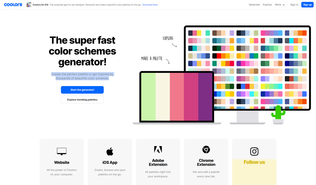
Coolors

Create the perfect palette or get inspired by thousands of beautiful color schemes, available in the browser, iOS app, Adobe extension, and Chrome extension.

Coolors - color palette generator

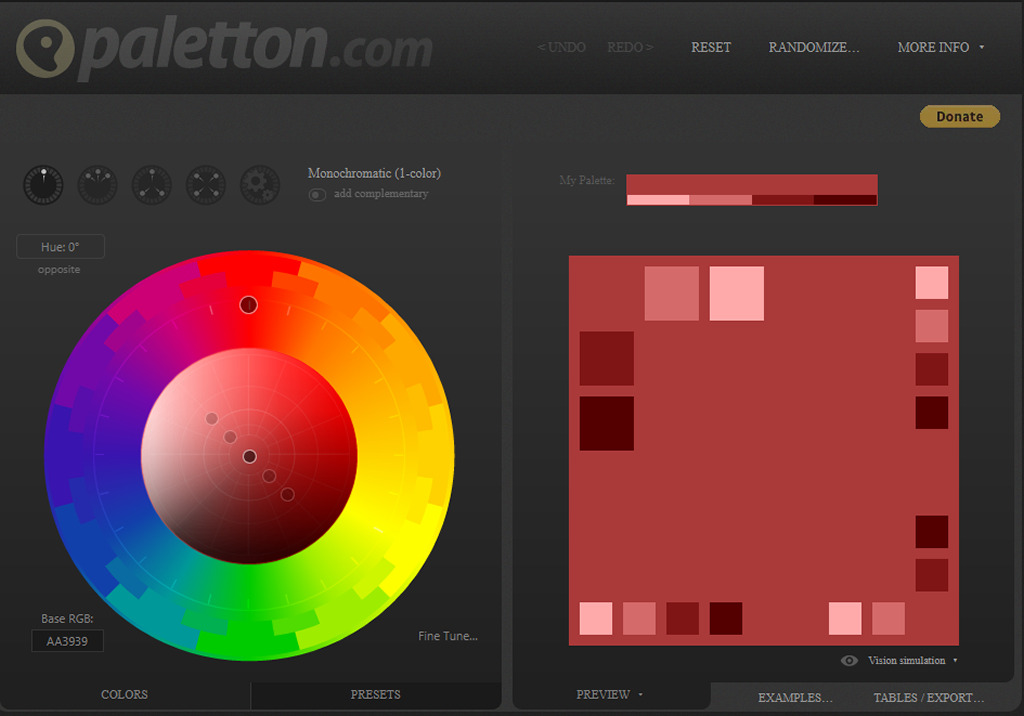
Paletton

Whether you’re a professional designer, a starting artist or just a curious beginner in the world of art and design, Paletton is here to help you with all your color palette needs. You don’t need to know the ins and outs of color theory in order to use Paletton’s unique and easy color wheel. All you need to do is choose the basic color you are interested in exploring, and get inspired.

Paletton - color palette generator

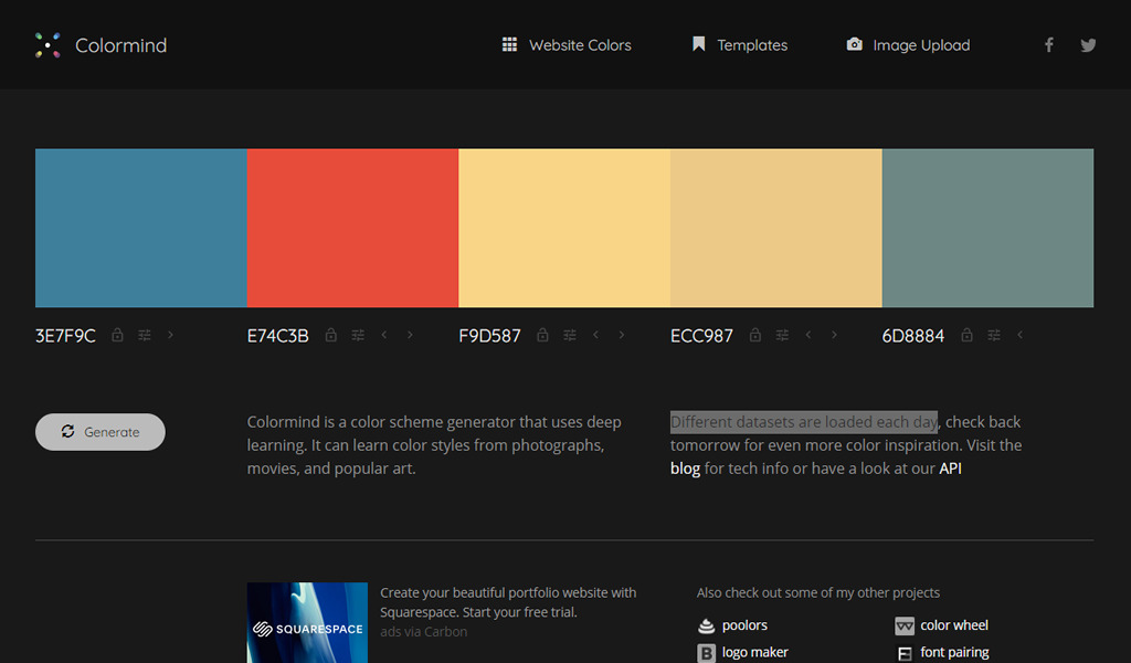
Colormind

Colormind is a color scheme generator that uses deep learning AI. It can learn color styles from photographs, movies, and popular art. Different datasets are loaded each day.

Colormind - color palette generator

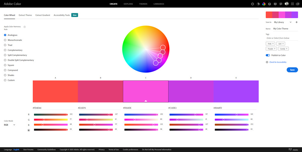
Adobe Color

With Adobe Color, you have access to the powerful harmonization engines for creating beautiful color themes to use in Adobe products. Start your color journey by exploring themes from the Color community. Be inspired by other creatives in curated Trend Galleries from Behance and Adobe Stock. Import photos and images to generate cohesive color palettes from your artwork.

Adobe Color - color palette generator

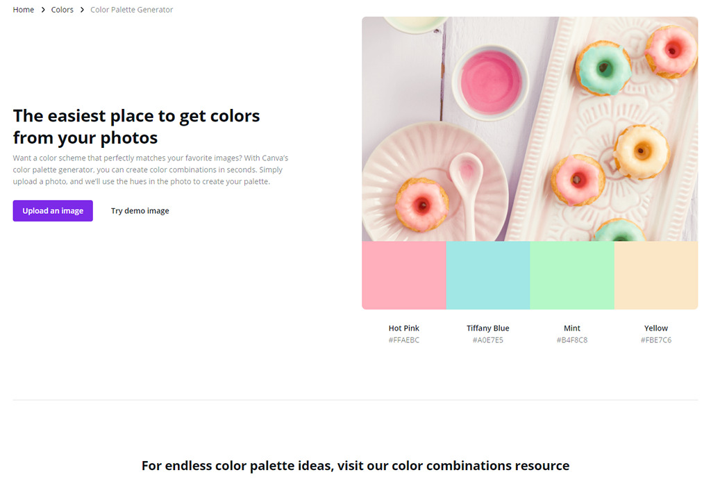
Canva Color Palette Generator

Want a color scheme that perfectly matches your favorite images? With Canva’s color palette generator, you can create color combinations in seconds. Simply upload a photo, and they’ll use the hues in the photo to create your palette.

Canva - color palette generator

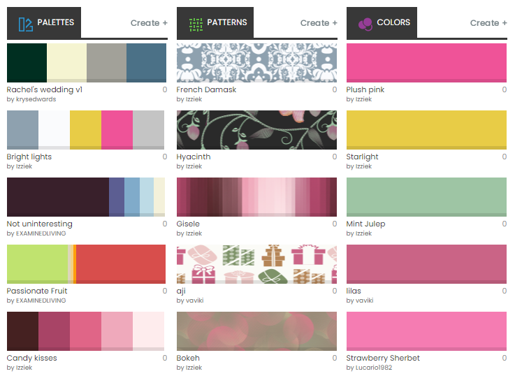
COLOURlovers

COLOURlovers is a creative community where people from around the world create and share colors, palettes and patterns, discuss the latest trends and explore colorful articles… All in the spirit of love.

COLOURlovers - color palette generator

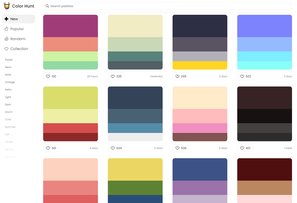
Color Hunt

Color Palettes for Designers and Artists. Discover the newest hand-picked palettes of Color Hunt, similar to Product Hunt, but for colors.

Color Hunt - color palette tool

Colordot

Colordot is “a color picker for humans”, using a unique interface. It also has an iOS app.

Colordot

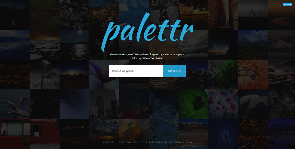
Palettr

Generate fresh, new color palettes inspired by a theme or a place.

Palettr

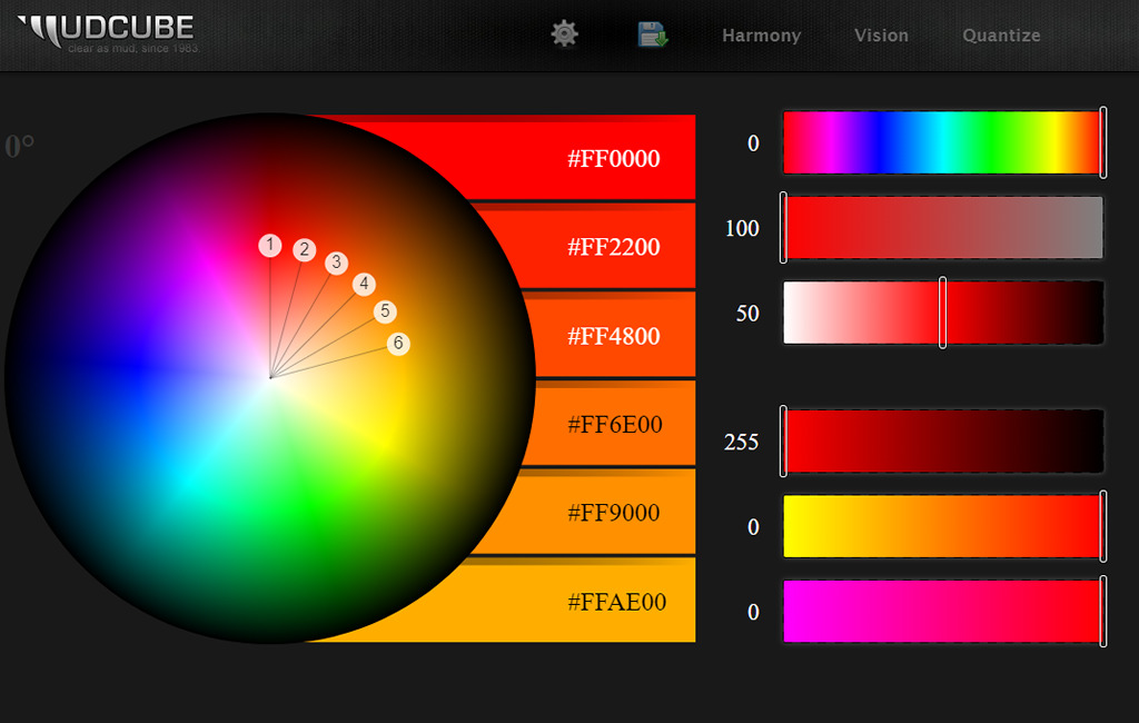
Mudcube

Last in our collection is Mucube, a color wheel to generate unique color palettes that are downloadable in .AI and .ACO file formats.

Mudcube