Lost Android Data? Here’s How to Recover It With DroidKit

Original Source: https://www.hongkiat.com/blog/recover-android-data-droidkit/

It may happen that some data on your Android device gets deleted either as a result of malware or a mere accident. Suddenly your contacts, memorable photos, videos, and files are lost. But instead of…

Visit hongkiat.com for full content.

10 Tips to Tighten Security on Your Android Device

Original Source: https://www.hongkiat.com/blog/protect-your-android-device/

Do you think Android is secure? According to a report, 30% of all Android devices are at the risk of only 20+ critical vulnerabilities. Then there are other risks like malicious apps, network…

Visit hongkiat.com for full content.

Magical Marbles in Three.js

Original Source: http://feedproxy.google.com/~r/tympanus/~3/nrI1eldXkN8/

In April 2019, Harry Alisavakis made a great write-up about the “magical marbles” effect he shared prior on Twitter. Check that out first to get a high level overview of the effect we’re after (while you’re at it, you should see some of his other excellent shader posts).

While his write-up provided a brief summary of the technique, the purpose of this tutorial is to offer a more concrete look at how you could implement code for this in Three.js to run on the web. There’s also some tweaks to the technique here and there that try to make things more straightforward.

⚠ This tutorial assumes intermediate familiarity with Three.js and GLSL

Overview

You should read Harry’s post first because he provides helpful visuals, but the gist of it is this:

Add fake depth to a material by offsetting the texture look-ups based on camera directionInstead of using the same texture at each iteration, let’s use depth-wise “slices” of a heightmap so that the shape of our volume is more dynamicAdd wavy motion by displacing the texture look-ups with scrolling noise

There were a couple parts of this write-up that weren’t totally clear to me, likely due to the difference in features available in Unity vs Three.js. One is the jump from parallax mapping on a plane to a sphere. Another is how to get vertex tangents for the transformation to tangent space. Finally, I wasn’t sure if the noise for the heightmap was evaluated as code inside the shader or pre-rendered. After some experimentation I came to my own conclusions for these, but I encourage you to come up with your own variations of this technique ?

Here’s the Pen I’ll be starting from, it sets up a boilerplate Three.js app with an init and tick lifecycle, color management, and an environment map from Poly Haven for lighting.

See the Pen
by Matt (@mattrossman)
on CodePen.0

Step 1: A Blank Marble

Marbles are made of glass, and Harry’s marbles definitely showed some specular shine. In order to make a truly beautiful glassy material it would take some pretty complex PBR shader code, which is too much work! Instead, let’s just take one of Three.js’s built-in PBR materials and hook our magical bits into that, like the shader parasite we are.

Enter onBeforeCompile, a callback property of the THREE.Material base class that lets you apply patches to built-in shaders before they get compiled by WebGL. This technique is very hacky and not well explained in the official docs, but a good place to learn more about it is Dusan Bosnjak’s post “Extending three.js materials with GLSL”. The hardest part about it is determining which part of the shaders you need to change exactly. Unfortunately, your best bet is to just read through the source code of the shader you want to modify, find a line or chunk that looks vaguely relevant, and try tweaking stuff until the property you want to modify shows visible changes. I’ve been writing personal notes of what I discover since it’s really hard to keep track of what the different chunks and variables do.

ℹ I recently discovered there’s a much more elegant way to extend the built-in materials using Three’s experimental Node Materials, but that deserves a whole tutorial of its own, so for this guide I’ll stick with the more common onBeforeCompile approach.

For our purposes, MeshStandardMaterial is a good base to start from. It has specular and environment reflections that will make out material look very glassy, plus it gives you the option to add a normal map later on if you want to add scratches onto the surface. The only part we want to change is the base color on which the lighting is applied. Luckily, this is easy to find. The fragment shader for MeshStandardMaterial is defined in meshphysical_frag.glsl.js (it’s a subset of MeshPhysicalMaterial, so they are both defined in the same file). Oftentimes you need to go digging through the shader chunks represented by each of the #include statements you’ll see in the file, however, this is a rare occasion where the variable we want to tweak is in plain sight.

It’s the line right near the top of the main() function that says:

vec4 diffuseColor = vec4( diffuse, opacity );

This line normally reads from the diffuse and opacity uniforms which you set via the .color and .opacity JavaScript properties of the material, and then all the chunks after that do the complicated lighting work. We are going to replace this line with our own assignment to diffuseColor so we can apply whatever pattern we want on the marble’s surface. You can do this using regular JavaScript string methods on the .fragmentShader field of the shader provided to the onBeforeCompile callback.

material.onBeforeCompile = shader => {
shader.fragmentShader = shader.fragmentShader.replace('/vec4 diffuseColor.*;/, `
// Assign whatever you want!
vec4 diffuseColor = vec4(1., 0., 0., 1.);
`)
}

By the way, the type definition for that mysterious callback argument is available here.

In the following Pen I swapped our geometry for a sphere, lowered the roughness, and filled the diffuseColor with the screen space normals which are available in the standard fragment shader on vNormal. The result looks like a shiny version of MeshNormalMaterial.

See the Pen
by Matt (@mattrossman)
on CodePen.0

Step 2: Fake Volume

Now comes the harder part — using the diffuse color to create the illusion of volume inside our marble. In Harry’s earlier parallax post, he talks about finding the camera direction in tangent space and using this to offset the UV coordinates. There’s a great explanation of how this general principle works for parallax effects on learnopengl.com and in this archived post.

However, converting stuff into tangent space in Three.js can be tricky. To the best of my knowledge, there’s not a built-in utility to help with this like there are for other space transformations, so it takes some legwork to both generate vertex tangents and then assemble a TBN matrix to perform the transformation. On top of that, spheres are not a nice shape for tangents due to the hairy ball theorem (yes, that’s a real thing), and Three’s computeTangents() function was producing discontinuities for me so you basically have to compute tangents manually. Yuck!

Luckily, we don’t really need to use tangent space if we frame this as a 3D raymarching problem. We have a ray pointing from the camera to the surface of our marble, and we want to march this through the sphere volume as well as down the slices of our height map. We just need to know how to convert a point in 3D space into a point on the surface of our sphere so we can perform texture lookups. In theory you could also just plug the 3D position right into your noise function of choice and skip using the texture, but this effect relies on lots of iterations and I’m operating under the assumption that a texture lookup is cheaper than all the number crunching happening in e.g. the 3D simplex noise function (shader gurus, please correct me if I’m wrong). The other benefit of reading from a texture is that it allows us to use a more art-oriented pipeline to craft our heightmaps, so we can make all sorts of interesting volumes without writing new code.

Originally I wrote a function to do this spherical XYZ→UV conversion based on some answers I saw online, but it turns out there’s already a function that does the same thing inside of common.glsl.js called equirectUv. We can reuse that as long as put our raymarching logic after the #include <common> line in the standard shader.

Creating our heightmap

For the heightmap, we want a texture that seamlessly projects on the surface of a UV sphere. It’s not hard to find seamless noise textures online, but the problem is that these flat projections of noise will look warped near the poles when applied to a sphere. To solve this, let’s craft our own texture using Blender. One way to do this is to bend a high resolution “Grid” mesh into a sphere using two instances of the “Simple Deform modifier”, plug the resulting “Object” texture coordinates into your procedural shader of choice, and then do an emissive bake with the Cycles renderer. I also added some loop cuts near the poles and a subdivision modifier to prevent any artifacts in the bake.

The resulting bake looks something like this:

Raymarching

Now the moment we’ve been waiting for (or dreading) — raymarching! It’s actually not so bad, the following is an abbreviated version of the code. For now there’s no animation, I’m just taking slices of the heightmap using smoothstep (note the smoothing factor which helps hide the sharp edges between layers), adding them up, and then using this to mix two colors.

uniform sampler2D heightMap;
uniform vec3 colorA;
uniform vec3 colorB;
uniform float iterations;
uniform float depth;
uniform float smoothing;

/**
* @param rayOrigin – Point on sphere
* @param rayDir – Normalized ray direction
* @returns Diffuse RGB color
*/
vec3 marchMarble(vec3 rayOrigin, vec3 rayDir) {
float perIteration = 1. / float(iterations);
vec3 deltaRay = rayDir * perIteration * depth;

// Start at point of intersection and accumulate volume
vec3 p = rayOrigin;
float totalVolume = 0.;

for (int i=0; i<iterations; ++i) {
// Read heightmap from current spherical direction
vec2 uv = equirectUv(p);
float heightMapVal = texture(heightMap, uv).r;

// Take a slice of the heightmap
float height = length(p); // 1 at surface, 0 at core, assuming radius = 1
float cutoff = 1. – float(i) * perIteration;
float slice = smoothstep(cutoff, cutoff + smoothing, heightMapVal);

// Accumulate the volume and advance the ray forward one step
totalVolume += slice * perIteration;
p += deltaRay;
}
return mix(colorA, colorB, totalVolume);
}

/**
* We can user this later like:
*
* vec4 diffuseColor = vec4(marchMarble(rayOrigin, rayDir), 1.0);
*/

ℹ This logic isn’t really physically accurate — taking slices of the heightmap based on the iteration index assumes that the ray is pointing towards the center of the sphere, but this isn’t true for most of the pixels. As a result, the marble appears to have some heavy refraction. However, I think this actually looks cool and further sells the effect of it being solid glass!

Injecting uniforms

One final note before we see the fruits of our labor — how do we include all these custom uniforms in our modified material? We can’t just stuck stuff onto material.uniforms like you would with THREE.ShaderMaterial. The trick is to create your own personal uniforms object and then wire up its contents onto the shader argument inside of onBeforeCompile. For instance:

const myUniforms = {
foo: { value: 0 }
}

material.onBeforeCompile = shader => {
shader.uniforms.foo = myUniforms.foo

// … (all your other patches)
}

When the shader tries to read its shader.uniforms.foo.value reference, it’s actually reading from your local myUniforms.foo.value, so any change to the values in your uniforms object will automatically be reflected in the shader.

I typically use the JavaScript spread operator to wire up all my uniforms at once:

const myUniforms = {
// …(lots of stuff)
}

material.onBeforeCompile = shader => {
shader.uniforms = { …shader.uniforms, …myUniforms }

// … (all your other patches)
}

Putting this all together, we get a gassy (and glassy) volume. I’ve added sliders to this Pen so you can play around with the iteration count, smoothing, max depth, and colors.

See the Pen
by Matt (@mattrossman)
on CodePen.0

ℹ Technically the ray origin and ray direction should be in local space so the effect doesn’t break when the marble moves. However, I’m skipping this transformation because we’re not moving the marble, so world space and local space are interchangeable. Work smarter not harder!

Step 3: Wavy Motion

Almost done! The final touch is to make this marble come alive by animating the volume. Harry’s waving displacement post explains how he accomplishes this using a 2D displacement texture. However, just like with the heightmap, a flat displacement texture warps near the poles of a sphere. So, we’ll make our own again. You can use the same Blender setup as before, but this time let’s bake a 3D noise texture to the RGB channels:

Then in our marchMarble function, we’ll read from this texture using the same equirectUv function as before, center the values, and then add a scaled version of that vector to the position used for the heightmap texture lookup. To animate the displacement, introduce a time uniform and use that to scroll the displacement texture horizontally. For an even better effect, we’ll sample the displacement map twice (once upright, then upside down so they never perfectly align), scroll them in opposite directions and add them together to produce noise that looks chaotic. This general strategy is often used in water shaders to create waves.

uniform float time;
uniform float strength;

// Lookup displacement texture
vec2 uv = equirectUv(normalize(p));
vec2 scrollX = vec2(time, 0.);
vec2 flipY = vec2(1., -1.);
vec3 displacementA = texture(displacementMap, uv + scrollX).rgb;
vec3 displacementB = texture(displacementMap, uv * flipY – scrollX).rgb;

// Center the noise
displacementA -= 0.5;
displacementB -= 0.5;

// Displace current ray position and lookup heightmap
vec3 displaced = p + strength * (displacementA + displacementB);
uv = equirectUv(normalize(displaced));
float heightMapVal = texture(heightMap, uv).r;

Behold, your magical marble!

See the Pen
by Matt (@mattrossman)
on CodePen.0

Extra Credit

Hard part’s over! This formula is a starting point from which there are endless possibilities for improvements and deviations. For instance, what happens if we swap out the noise texture we used earlier for something else like this:

This was created using the “Wave Texture” node in Blender

See the Pen
by Matt (@mattrossman)
on CodePen.0

Or how about something recognizable, like this map of the earth?

Try dragging the “displacement” slider and watch how the floating continents dance around!

See the Pen
by Matt (@mattrossman)
on CodePen.0

In that example I modified the shader to make the volume look less gaseous by boosting the rate of volume accumulation, breaking the loop once it reached a certain volume threshold, and tinting based on the final number of iterations rather than accumulated volume.

For my last trick, I’ll point back to Harry’s write-up where he suggests mixing between two HDR colors. This basically means mixing between colors whose RGB values exceed the typical [0, 1] range. If we plug such a color into our shader as-is, it’ll create color artifacts in the pixels where the lighting is blown out. There’s an easy solve for this by wrapping the color in a toneMapping() call as is done in tonemapping_fragment.glsl.js, which “tones down” the color range. I couldn’t find where that function is actually defined, but it works!

I’ve added some color multiplier sliders to this Pen so you can push the colors outside the [0, 1] range and observe how mixing these HDR colors creates pleasant color ramps.

See the Pen
by Matt (@mattrossman)
on CodePen.0

Conclusion

Thanks again to Harry for the great learning resources. I had a ton of fun trying to recreate this effect and I learned a lot along the way. Hopefully you learned something too!

Your challenge now is to take these examples and run with them. Change the code, the textures, the colors, and make your very own magical marble. Show me and Harry what you make on Twitter.

Surprise me!

The post Magical Marbles in Three.js appeared first on Codrops.

Hi atelier — Branding and Visual Identity

Original Source: http://feedproxy.google.com/~r/abduzeedo/~3/vZ4p0C2Ful0/hi-atelier-branding-and-visual-identity

Hi atelier — Branding and Visual Identity

abduzeedo08.03.21

Aleksandr Maksimov shared a branding project for Hi Atelier, a Kyiv-based studio of design founded in 2019 by Ihor Havrylenko and working within the fields of architecture, interior design, products, and art direction. Their vision of aesthetics is a timeless design made of pure and tactile materials with distinct shapes. 

architecture branding  design furniture identity Interior logo Logotype Minimalism Webarchitecture branding  design furniture identity Interior logo Logotype Minimalism Webarchitecture branding  design furniture identity Interior logo Logotype Minimalism Webarchitecture branding  design furniture identity Interior logo Logotype Minimalism Webarchitecture branding  design furniture identity Interior logo Logotype Minimalism Webarchitecture branding  design furniture identity Interior logo Logotype Minimalism Webarchitecture branding  design furniture identity Interior logo Logotype Minimalism Webarchitecture branding  design furniture identity Interior logo Logotype Minimalism Webarchitecture branding  design furniture identity Interior logo Logotype Minimalism Webarchitecture branding  design furniture identity Interior logo Logotype Minimalism Webarchitecture branding  design furniture identity Interior logo Logotype Minimalism Webarchitecture branding  design furniture identity Interior logo Logotype Minimalism Webarchitecture branding  design furniture identity Interior logo Logotype Minimalism Webarchitecture branding  design furniture identity Interior logo Logotype Minimalism Webarchitecture branding  design furniture identity Interior logo Logotype Minimalism Webarchitecture branding  design furniture identity Interior logo Logotype Minimalism Web

For more information make sure to check out Aleksandr on

Behance
Instagram


How To Build Resilient JavaScript UIs

Original Source: https://smashingmagazine.com/2021/08/build-resilient-javascript-ui/

Things on the web can break — the odds are stacked against us. Lots can go wrong: a network request fails, a third-party library breaks, a JavaScript feature is unsupported (assuming JavaScript is even available), a CDN goes down, a user behaves unexpectedly (they double-click a submit button), the list goes on.

Fortunately, we as engineers can avoid, or at least mitigate the impact of breakages in the web apps we build. This however requires a conscious effort and mindset shift towards thinking about unhappy scenarios just as much as happy ones.

The User Experience (UX) doesn’t need to be all or nothing — just what is usable. This premise, known as graceful degradation allows a system to continue working when parts of it are dysfunctional — much like an electric bike becomes a regular bike when its battery dies. If something fails only the functionality dependent on that should be impacted.

UIs should adapt to the functionality they can offer, whilst providing as much value to end-users as possible.

Why Be Resilient

Resilience is intrinsic to the web.

Browsers ignore invalid HTML tags and unsupported CSS properties. This liberal attitude is known as Postel’s Law, which is conveyed superbly by Jeremy Keith in Resilient Web Design:

“Even if there are errors in the HTML or CSS, the browser will still attempt to process the information, skipping over any pieces that it can’t parse.”

JavaScript is less forgiving. Resilience is extrinsic. We instruct JavaScript what to do if something unexpected happens. If an API request fails the onus falls on us to catch the error, and subsequently decide what to do. And that decision directly impacts users.

Resilience builds trust with users. A buggy experience reflects poorly on the brand. According to Kim and Mauborgne, convenience (availability, ease of consumption) is one of six characteristics associated with a successful brand, which makes graceful degradation synonymous with brand perception.

A robust and reliable UX is a signal of quality and trustworthiness, both of which feed into the brand. A user unable to perform a task because something is broken will naturally face disappointment they could associate with your brand.

Often system failures are chalked up as “corner cases” — things that rarely happen, however, the web has many corners. Different browsers running on different platforms and hardware, respecting our user preferences and browsing modes (Safari Reader/ assistive technologies), being served to geo-locations with varying latency and intermittency increase the likeness of something not working as intended.

Error Equality

Much like content on a webpage has hierarchy, failures — things going wrong — also follow a pecking order. Not all errors are equal, some are more important than others.

We can categorize errors by their impact. How does XYZ not working prevent a user from achieving their goal? The answer generally mirrors the content hierarchy.

For example, a dashboard overview of your bank account contains data of varying importance. The total value of your balance is more important than a notification prompting you to check in-app messages. MoSCoWs method of prioritization categorizes the former as a must-have, and the latter a nice to have.

If primary information is unavailable (i.e: network request fails) we should be transparent and let users know, usually via an error message. If secondary information is unavailable we can still provide the core (must have) experience whilst gracefully hiding the degraded component.

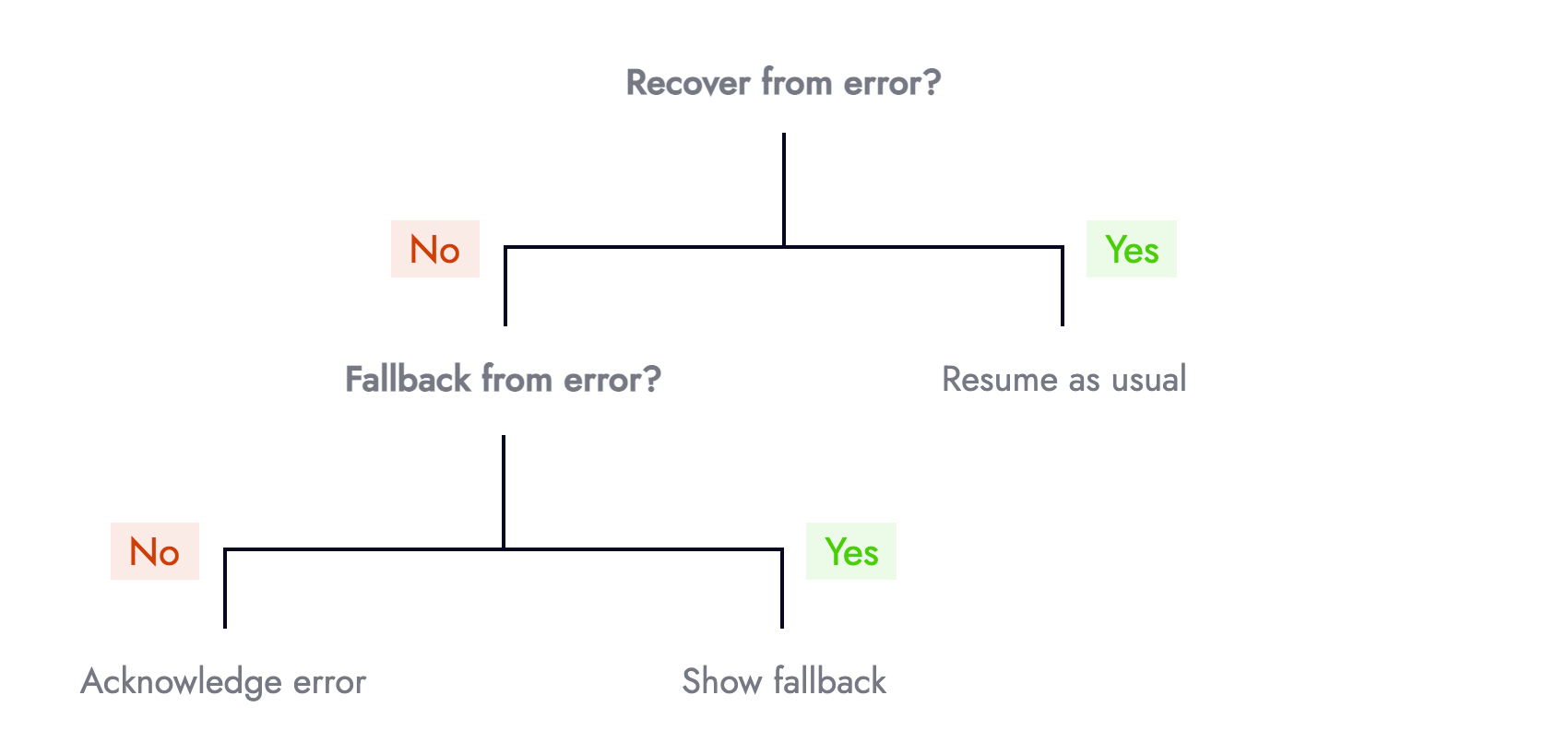
Knowing when to show an error message or not can be represented using a simple decision tree:

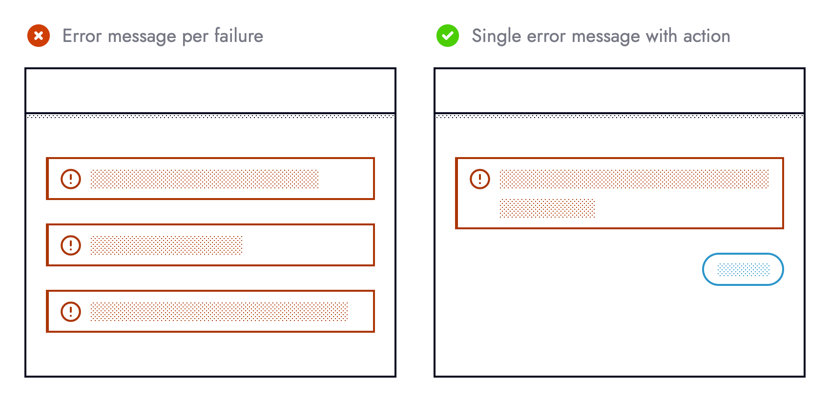
Categorization removes the 1-1 relationship between failures and error messages in the UI. Otherwise, we risk bombarding users and cluttering the UI with too many error messages. Guided by content hierarchy we can cherry-pick what failures are surfaced to the UI, and what happen unbeknownst to end-users.

Prevention is Better than Cure

Medicine has an adage that prevention is better than cure.

Applied to the context of building resilient UIs, preventing an error from happening in the first place is more desirable than needing to recover from one. The best type of error is one that doesn’t happen.

It’s safe to assume never to make assumptions, especially when consuming remote data, interacting with third-party libraries, or using newer language features. Outages or unplanned API changes alongside what browsers users choose or must use are outside of our control. Whilst we cannot stop breakages outside our control from occurring, we can protect ourselves against their (side) effects.

Taking a more defensive approach when writing code helps reduce programmer errors arising from making assumptions. Pessimism over optimism favours resilience. The code example below is too optimistic:

const debitCards = useDebitCards();

return (
<ul>
{debitCards.map(card => {
<li>{card.lastFourDigits}</li>
})}
</ul>
);

It assumes that debit cards exist, the endpoint returns an Array, the array contains objects, and each object has a property named lastFourDigits. The current implementation forces end-users to test our assumptions. It would be safer, and more user friendly if these assumptions were embedded in the code:

const debitCards = useDebitCards();

if (Array.isArray(debitCards) && debitCards.length) {
return (
<ul>
{debitCards.map(card => {
if (card.lastFourDigits) {
return <li>{card.lastFourDigits}</li>
}
})}
</ul>
);
}

return “Something else”;

Using a third-party method without first checking the method is available is equally optimistic:

stripe.handleCardPayment(/* … */);

The code snippet above assumes that the stripe object exists, it has a property named handleCardPayment, and that said property is a function. It would be safer, and therefore more defensive if these assumptions were verified by us beforehand:

if (
typeof stripe === ‘object’ &&
typeof stripe.handleCardPayment === ‘function’
) {
stripe.handleCardPayment(/* … */);
}

Both examples check something is available before using it. Those familiar with feature detection may recognize this pattern:

if (navigator.clipboard) {
/* … */
}

Simply asking the browser whether it supports the Clipboard API before attempting to cut, copy or paste is a simple yet effective example of resilience. The UI can adapt ahead of time by hiding clipboard functionality from unsupported browsers, or from users yet to grant permission.

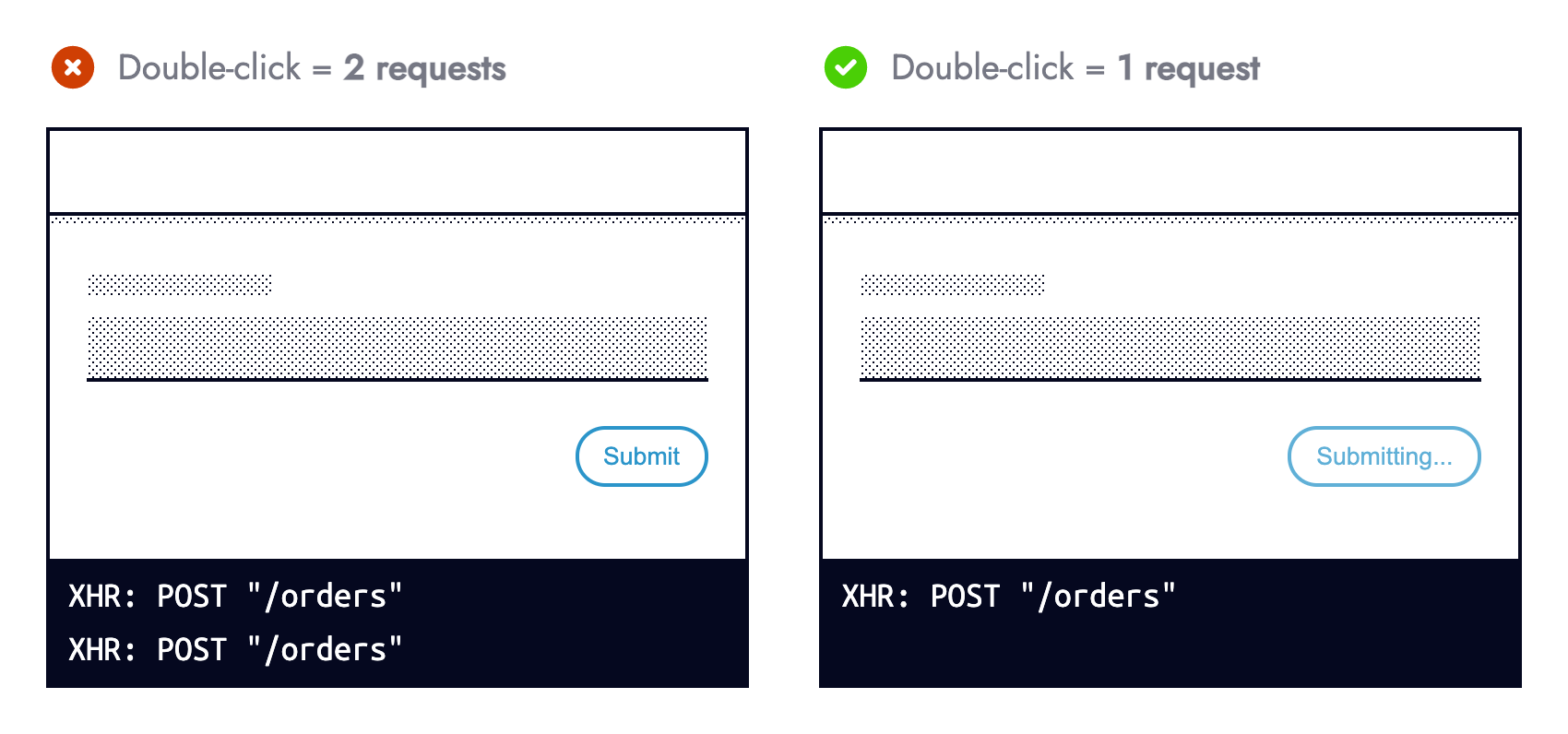
User browsing habits are another area living outside our control. Whilst we cannot dictate how our application is used, we can instill guardrails that prevent what we perceive as “misuse”. Some people double-click buttons — a behavior mostly redundant on the web, however not a punishable offense.

Double-clicking a button that submits a form should not submit the form twice, especially for non-idempotent HTTP methods. During form submission, prevent subsequent submissions to mitigate any fallout from multiple requests being made.

Preventing form resubmission in JavaScript alongside using aria-disabled=”true” is more usable and accessible than the disabled HTML attribute. Sandrina Pereira explains Making Disabled Buttons More Inclusive in great detail.

Responding to Errors

Not all errors are preventable via defensive programming. This means responding to an operational error (those occurring within correctly written programs) falls on us.

Responding to an error can be modelled using a decision tree. We can either recover, fallback or acknowledge the error:

When facing an error, the first question should be, “can we recover?” For example, does retrying a network request that failed for the first time succeed on subsequent attempts? Intermittent micro-services, unstable internet connections, or eventual consistency are all reasons to try again. Data fetching libraries such as SWR offer this functionality for free.

Risk appetite and surrounding context influence what HTTP methods you are comfortable retrying. At Nutmeg we retry failed reads (GET requests), but not writes (POST/ PUT/ PATCH/ DELETE). Multiple attempts to retrieve data (portfolio performance) is safer than mutating it (resubmitting a form).

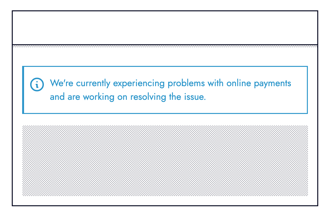
The second question should be: If we cannot recover, can we provide a fallback? For example, if an online card payment fails can we offer an alternative means of payment such as via PayPal or Open Banking.

Fallbacks don’t always need to be so elaborate, they can be subtle. Copy containing text dependant on remote data can fallback to less specific text when the request fails:

The third and final question should be: If we cannot recover, or fallback how important is this failure (which relates to “Error Equality”). The UI should acknowledge primary errors by informing users something went wrong, whilst providing actionable prompts such as contacting customer support or linking to relevant support articles.

Observability

UIs adapting to something going wrong is not the end. There is another side to the same coin.

Engineers need visibility on the root cause behind a degraded experience. Even errors not surfaced to end-users (secondary errors) must propagate to engineers. Real-time error monitoring services such as Sentry or Rollbar are invaluable tools for modern-day web development.

Most error monitoring providers capture all unhandled exceptions automatically. Setup requires minimal engineering effort that quickly pays dividends for an improved healthy production environment and MTTA (mean time to acknowledge).

The real power comes when explicitly logging errors ourselves. Whilst this involves more upfront effort it allows us to enrich logged errors with more meaning and context — both of which aid troubleshooting. Where possible aim for error messages that are understandable to non-technical members of the team.

Extending the earlier Stripe example with an else branch is the perfect contender for explicit error logging:

if (
typeof stripe === “object” &&
typeof stripe.handleCardPayment === “function”
) {
stripe.handleCardPayment(/* … */);
} else {
logger.capture(
“[Payment] Card charge — Unable to fulfill card payment because stripe.handleCardPayment was unavailable”
);
}

Note: This defensive style needn’t be bound to form submission (at the time of error), it can happen when a component first mounts (before the error) giving us and the UI more time to adapt.

Observability helps pinpoint weaknesses in code and areas that can be hardened. Once a weakness surfaces look at if/ how it can be hardened to prevent the same thing from happening again. Look at trends and risk areas such as third-party integrations to identify what could be wrapped in an operational feature flag (otherwise known as kill switches).

Users forewarned about something not working will be less frustrated than those without warning. Knowing about road works ahead of time helps manage expectations, allowing drivers to plan alternative routes. When dealing with an outage (hopefully discovered by monitoring and not reported by users) be transparent.

Retrospectives

It’s very tempting to gloss over errors.

However, they provide valuable learning opportunities for us and our current or future colleagues. Removing the stigma from the inevitability that things go wrong is crucial. In Black box thinking this is described as:

“In highly complex organizations, success can happen only when we confront our mistakes, learn from our own version of a black box, and create a climate where it’s safe to fail.”

Being analytical helps prevent or mitigate the same error from happening again. Much like black boxes in the aviation industry record incidents, we should document errors. At the very least documentation from prior incidents helps reduce the MTTR (mean time to repair) should the same error occur again.

Documentation often in the form of RCA (root cause analysis) reports should be honest, discoverable, and include: what the issue was, its impact, the technical details, how it was fixed, and actions that should follow the incident.

Closing Thoughts

Accepting the fragility of the web is a necessary step towards building resilient systems. A more reliable user experience is synonymous with happy customers. Being equipped for the worst (proactive) is better than putting out fires (reactive) from a business, customer, and developer standpoint (less bugs!).

Things to remember:

UIs should adapt to the functionality they can offer, whilst still providing value to users;
Always think what can wrong (never make assumptions);
Categorize errors based on their impact (not all errors are equal);
Preventing errors is better than responding to them (code defensively);
When facing an error, ask whether a recovery or fallback is available;
User facing error messages should provide actionable prompts;
Engineers must have visibility on errors (use error monitoring services);
Error messages for engineers/ colleagues should be meaningful and provide context;
Learn from errors to help our future selves and others.

Get 49% off top VPN plus 1 year unlimited storage for free in this unmissable deal

Original Source: http://feedproxy.google.com/~r/CreativeBloq/~3/qW5j20_NbqA/free-unlimited-storage-with-vpn

ExpressVPN and Backblaze have joined forces.

3 Essential Design Trends, August 2021

Original Source: https://www.webdesignerdepot.com/2021/08/3-essential-design-trends-august-2021/

Sometimes the designs that make the most impact do a lot of unexpected things and break some of the most tried and true rules of visual theory.

Sometimes these design elements work brilliantly, and other times they are fleeting or fall flat. This month all of the examples here seem to break some conventional design rules. Here’s what’s trending in design this month…

1. Alternative Homepage Image/Video Crops

This trend breaks some traditional standards and is pretty refreshing – alternative homepage crops for images and video.

The full screen or 16:9 aspect ratio is out the window with vertical and square options that prove you can do more with your photo collection.

What’s great about this trend is that it’s super attention-getting because of the interesting use of space and imagery. Almost any design without the full-width hero header will grab your attention because it is different. These examples prove that point, and each design does it differently.

Now here’s the challenge: You have to make sure that this style has a solid fallback for mobile so that the result is equally impressive.

Janmaat Fotografie does a great job accounting for interesting photo shapes and flips the script on mobile. (Rather than what you might expect with text then photos because of the desktop placement, the photo stack uses the same shape and layering and is above the text on mobile.) The result is phenomenal.

N3 uses a very vertical image in an almost split-screen style design. It’s a sharp contrast to many of the other split screens we are accustomed to with an equal divide. The distinct shape of the image is interesting and intriguing. It’s definitely not a shape we see in website design frequently.

Bounce uses a similar split-screen effect in the opposite manner as the example above, with the tall, vertical space as an “empty” area and the right side filled with a square video. The shapes help push and pull your eyes across the screen to look at all of the elements and take in the overall design. It’s one of those ideas that if you only talked about it, you might talk yourself out of it, but here, it’s pretty striking.


2. On-Screen “Stickers”

Stickers are a design trend that has made its way from social media to website design.

These website stickers break design rules because they cover content or seem to be put on the canvas haphazardly. And that’s why they are so attention-getting!

The benefit to these stickers is that they can highlight specific items or content or help focus a call to action.

Friesday uses stickers in conjunction with hover effects to keep users interacting with the design. Multiple stickers can even pop onto the screen in the same location. The animation is simple and fun and feels like a digital sticker book.

August Eighth uses a center sticker as a call to action. It’s a true focal point in the center of the screen with an almost three-dimensional effect that lifts it off the background video. It’s a borderline dark pattern since the only way to get the box off the screen is to click through to the shopping part of the website.

EasyGreen has a bright yellow sticker in the bottom corner that feels almost like the sticker on a piece of fruit. This style and placement work well for the content and product featured. It’s bringing the digital and real-world a little closer with this design element.


3. Breaking Design “Rules”

The third trend this month is kind of a catch-all for general rule-breaking. While the other trends show certain design elements that aren’t the norm, each of these examples really tosses everything you traditionally think about design out the window. (And that’s ok.)

The trick to a rule-breaking design is that it has to be focused and simple enough to keep users interested and provide intuitive elements that tell them how to interact with the design. It’s a delicate balance.

Here’s how these sites do just that.

Supercontinent has a lot going on. At least four typefaces on the screen at a time, movement (using different shapes and aspect ratios), overlapping elements, hidden navigation, and you may even find a few more broken rules if you look closely. And somehow, it still works.

What’s pulling this design together is a key unbroken rule – the chaos is rooted in a grid system that keeps it all somewhat organized. Plus, there’s plenty of white space to keep elements from feeling crowded and overwhelming.

Source of Plastic Waste combines elements in unexpected ways. There’s no real navigation; the site is just a continuous scroll. That’s a big website usability rule broken right out of the gate. There are other design elements as well, from the “header”/logo moving to the top right corner to the almost over-designed transparent box for text elements. There are a lot of scroll elements and actions happening and layers of text on text in some of the screens.

But here’s the thing about this design. As many rules as it breaks, the story is interesting enough to keep you scrolling. The question is, how long and how far do you go without getting lost or confused.

The Debris of Attention is designed to show “bad design” with elements that are frustrating and annoying on websites. The gamified design allows you to hover on each element to remove it and clean up the design.

While this site breaks the rules on purpose, it is still an experiment in how long a user will hang on with so many visual effects happening at once.


Conclusion

While most of the time, people think about “breaking the rules” as a bad thing, that’s not always true in the design space. Sometimes breaking the rules can result in an unexpected delight.

The challenge is to make sure that when you break the rules, the design is still usable, functional, and understandable. If so, you’ve found a winning combination.

Source

p img {display:inline-block; margin-right:10px;}
.alignleft {float:left;}
p.showcase {clear:both;}
body#browserfriendly p, body#podcast p, div#emailbody p{margin:0;}

The post 3 Essential Design Trends, August 2021 first appeared on Webdesigner Depot.

The best camera bags and cases in 2021

Original Source: http://feedproxy.google.com/~r/CreativeBloq/~3/6Kxsw70PkjY/best-camera-bags-and-cases

The best camera bags, from backpacks to hard cases.

Pagination: 10 Clever & Unique Examples

Original Source: http://feedproxy.google.com/~r/1stwebdesigner/~3/-9_R7eS8S_A/

Whether it’s a list of blog posts, a photo or video gallery, an image slider, or anything else on a website that has multiple pages, they all have something in common: pagination, or a way to navigate from page to page. While many websites use relatively common layouts and styles for page navigation, this is an area where designers and developers can add some creativity to enhance the user experience. In this post we have compiled 10 CodePen examples of creative page navigation for your inspiration. We hope these will inspire you to try out some new tricks of your own.

Your Designer Toolbox
Unlimited Downloads: 500,000+ Web Templates, Icon Sets, Themes & Design Assets


DOWNLOAD NOW


Responsive Flexbox Pagination

See the Pen
Responsive Flexbox Pagination by William H. (@iamjustaman)
on CodePen.0

Swiper

See the Pen
Swiper custom pagination by Pavel Zakharoff (@ncer)
on CodePen.0

Pacman

See the Pen
Pacman pagination by Mikael Ainalem (@ainalem)
on CodePen.0

Yeti Hand

See the Pen
Yeti Hand by Darin (@dsenneff)
on CodePen.0

Gooey

See the Pen
Gooey by Lucas Bebber (@lbebber)
on CodePen.0

Pure CSS3 Responsive Pagination

See the Pen
Pure CSS3 Responsive Pagination by Béla Varga (@netzzwerg)
on CodePen.0

Pagination Buttons

See the Pen
Pagination Buttons by Himalaya Singh (@himalayasingh)
on CodePen.0

AngularJS – Example with logic like Google

See the Pen
AngularJS – Example with logic like Google by Jason Watmore (@cornflourblue)
on CodePen.0

Flexing arrows

See the Pen
Flexing arrows by Hakim El Hattab (@hakimel)
on CodePen.0

Infinite

See the Pen
Infinite by Mariusz Dabrowski (@MarioD)
on CodePen.0


How Will You Spice Up Your Pagination?

Did these examples of page navigation give you some ideas? Did they spark your creativity and inspire you to try something different in your next project? Sure, you can stick with the basic, plain old page numbers, but why not kick it up a notch? Let us know if you try something new next time, and be sure to check out some of our other collections of code snippets while you’re at it.