Conceptual minimalist lighting collection — Industrial Design

Original Source: https://abduzeedo.com/conceptual-minimalist-lighting-collection-industrial-design

Conceptual minimalist lighting collection — Industrial Design
Conceptual minimalist lighting collection

abduzeedo1117—21

Dimi Litz shared a beautiful minimalist light collection inspired by the research of parallels between the Bauhaus movement and Constructivism. Untangling the tangle of historical threads reached the art of Kazimir Malevich where it became the starting point of a revolution of form, color and their relationship.

Suprematism is based on philosophic treatise with the main idea of search for the essential reality. Author denies serving the shape and color of secondary images and takes the characters off the canvas. — ”I was impressed. The simplicity and the accuracy of the artistic technique was exceptionally clear. I felt that I must transfer this idea to the world of material objects.”

Dot, ray, line, circle, triangle and square became the basis shapes. The shapes required a first-rate implementation in the material. Natural materials are the most noble and emphasize the philosophy of the collection. Steel and brass were complete with hand picked white marble and black granite.

The most difficult stage was bringing the design to perfection and optimizing production. We spent over 8 months making it as good as it has to be. Step  by step we cut off every false detail and made the idea shine.”

Credits

Dimi Litz – art direction, product design
Dmitry Beznosov – product design
Maksim Arbuzov – set design
Dmitry Saveliev – render
Anton Volodin – render
About atris

Atris is a lighting design studio from Russia.

Their passion for design and art came together in their projects. They strive to create designs that are closely related to the world of creativity and art in all its manifestations. — ”We hope to bring art into interiors and people’s lives because we believe that art is the key that opens the doors of elegance and sophistication in hearts.”

For more information make sure to check out atris.design  

How To Speed Up Your Bootstrap Development Process

Original Source: https://www.webdesignerdepot.com/2021/11/how-to-speed-up-your-bootstrap-development-process/

Currently, Bootstrap is among the most popular frameworks in the developer community. One of the most straightforward solutions for front-end development methods available, Bootstrap allows users to access convenient CSS and HTML components for forms, typography, sliders, navigation, and everything else you might need.

Bootstrap is naturally a pretty fast development solution, as it allows you to access everything you need to create your app in a straightforward environment. You can access premade classes, kits, and themes right out of the box and speed up your development without compromising on performance.

Still, this doesn’t mean there aren’t plenty of ways to enhance the speed of your Bootstrap strategy from time to time. So today, we’re going to look at some of the things you can do to speed up the development of your Bootstrap app.

Make The Most of the Tools Available

Let’s start with the basics: One of the things that makes Bootstrap so effective as a development tool is the ability to access specific tools and services to make building more efficient. The more you leverage these features, the better you’ll be at designing amazing apps quickly. 

For instance, a Task Runner is a fantastic addition to a Bootstrap development strategy. With these tools, you can automate tasks like compiling code or moving code from Typescript to JavaScript. In addition, many developers use these tools when they configure a job that runs every time a specific file is modified, so they don’t have to manually recompile all the time.

The most popular Task Runners available right now are Grunt JS and Gulp JS. Gulp is based on Node.jS, while Grunt works in line with its templating environment. 

Other helpful tools you can check out to accelerate your development process include Sass or Syntactically Awesome Style Sheets – a pre-processor scripting language compiled into CSS so that you can create better stylesheets with minimal effort. In addition, the Sass technology reduces the need for repetition by extending CSS through various methods like inline imports, variable, and nested maps. This means you can implement changes a lot quicker and take more risks in your designs.

Tools like BrowserSync JS will synchronize your browser testing process by performing as a middle man between your browser and server. Using this tool, you shouldn’t have to hit the refresh button on the browser over and over when editing your code to see updates.

Get Comfortable with Scaffolding and Kits

Bootstrap’s front-end framework relies heavily on the grid system within the technology, packed with features to help developers structure a responsive layout. Because of this grid system, it’s easier to scaffold responsive designs before you do any coding. This way, you get ahead of the coding process and better insight into where content should go. 

Bootstrap’s grid system is pretty flexible so that you can define a set of rows divided according to each of the sections in your site or app. The best part is that each column can adjust to suit the template perfectly. 

You can speed up your development process even more by simply accessing existing themes and UI kits from the Bootstrap ecosystem. 

Bootstrap kits are UI kits consisting of a collection of flexible, attractive, and easy-to-use Bootstrap-based components and assets. You can easily plug your solution into your website and customize it based on your required design output. UI components might include things like input forms, widgets, navigation menus, and testimonials. A few options include:

Pixel: A free Bootstrap 5 UI kit with over 80 coded UI components, example pages, and more to help you design and build a website that makes sense for your projects. 
Fabrx: A comprehensive Bootstrap 5 kit with access to more than 500 responsive components, 250+ wireframes, and a host of ready-made templates. This comes seamlessly coded with CSS and HTML.
Material Design: One of the most popular open-source UI kits based on Bootstrap 5, this solution makes it easy to create material design-based components with CSS, JS, and HTML. There are more than 700 UI components already available within the kit. 

Experiment with Bootstrap Themes

Like Bootstrap UI kits, Bootstrap themes are a ready-to-use bundle of JavaScript, HTML, and CSS code complete with UI components, style components, and page layouts. Usually, these themes are designed for a specific kind of app or website. However, everything is generally created for you, for the most part, so that you can modify elements with your requirements later. 

While Bootstrap UI kits give you multiple pieces of coding and technology you can use in your development and how you like, Bootstrap themes are intended to be plug-and-play solutions. You modify a few components and resources, and you’re ready to publish. 

Bootstrap has its own selection of themes available, though most are available for a premium cost, so it’s worth checking out what you get in advance. One good option is the Admin and Dashboard template designed for creating applications for tracking things like analytics and website information. 

The theme here comes with access to all of your crucial bootstrap components, as well as Brite charts, Apex charts, multiple widgets, and icons. A few alternatives to try include:

Space: A free Bootstrap 5 multi-purpose theme with access to a creative, clean, and high-quality design with three different homepage variations, more than 100 UI elements, and a fully responsive layout. 
Massive: A multi-purpose CSS, HTML, and JavaScript theme featuring a trending and creative design, built entirely with Bootstrap 5, as well as the Sass ecosystem. 
Front: A multi-purpose premium responsive template. You’ll get six pre-built demos, 16 landing pages, and a host of other different page types to sort through.

Use a Bootstrap Builder

Most developers prefer to code their application or website entirely from scratch with Bootstrap – mainly since it’s easy to do. However, there’s also a faster alternative route you can consider too. For instance, using a Bootstrap builder or studio will turn the design process from a hard-code configuration into a more visual and straightforward process. 

Page builders come in many shapes and sizes, designed for both the web and desktop. Popular options like the Bootstrap studio come with drag-and-drop functionality for grid-based content, component creation, and access to quick-add components. 

Another bonus of using a builder is you can usually expect to have the latest version of Bootstrap available, so you don’t have to update constantly. For example, some of the newest page builders offering access to Bootstrap 5 include:

Start-up: A simple bootstrap-based builder, Start-up allows designers and developers to create websites, applications, and landing pages with drag-and-drop functionality. The solution is compatible with all Retina devices and has easy exporting. 
Boostrap Build: This is a simple and effective bootstrap application for prototyping and designing all kinds of Bootstrap themes and templates. There are tons of theming capabilities built-in, as well as live preview, color picker, variable search, and size adjuster. 
Mobirise: A free and straightforward bootstrap builder, this solution focuses on building various Bootstrap websites. 

Keep Learning

Bootstrap, like many development and design tools today, is constantly evolving. As new versions and components continue to emerge, it’s essential to be confident with the options you have for your website, application, or whatever else you might be making. 

It is exhausting to continuously check out the latest tutorials and posts on the official Bootstrap website; it is much easier to get things done when you know how everything works. The good news is that many of the courses and guidelines available on the web today are free to use. For example, you can get a crash course for beginners on Bootstrap 5 or find a collection of some of the most popular crash courses here.

It’s also worth keeping an eye on the latest news released by the Bootstrap team, so you can get an idea of any new features or functionality you might need to learn as you’re working on your builds. If you’re using the tools we mentioned above, like Sass, make sure you check out the latest updates for those, too – many of the tools available for Bootstrap will get updates too. 

If you’re feeling really in the dark about your new Bootstrap features, you can check out sites like Udemy, which offer step-by-step guides for beginners.  Though the entire course does have a fee attached to it, you’ll learn how to build various projects within Bootstrap, which could make you more efficient at development later. 

As you’re learning how to master Bootstrap development, try not to pile too much on your plate at once. If you decide to work with the precompiled download package for Bootstrap, it’s worth accessing only the specific aspects of the library you need at any given time. 

Start by using simple tools like bootstrap-reboot.min.css for a simple CSS reset for your project, or access the easy-to-use grid system at bootstrap-grid.min.css. You don’t necessarily need to access and learn all the frameworks at once.

Remember the Basics

Finally, all aspects of Bootstrap development get a lot easier when you start thinking about becoming a better coder. Apart from the above points, optimizing a website in any landscape still means incorporating the right front-end performance techniques you would access for any website. 

Although focusing on getting the UX right with your bootstrap build might add more time to your development process initially, it also means you’re less likely to have to come back to your website and make changes in the future. This should mean that you can spend less time developing your project overall and more time optimizing the experience.

For instance, you should still:

Use lean JavaScript and CSS: Remember, every character in your code will contribute to the final weight of your webpage. Clean and concise JS and CSS can be difficult to master, but it’s something you need to strive for in most of your projects. Good CSS practices will usually involve getting rid of unused selectors where possible and duplicate code, overly nested rules, and disorganized content. Style guides can often be helpful here. You can also access features like JS Lint and CSS lint to clean up your code too. 
Minify your JS and CSS code: An essential step in optimizing your website is limiting the number of HTTP requests a website makes to render the content. Each trip to the server and back takes more time, harming user experience. Minifying the document will help you to keep file sizes small and reduce HTTP requests. 
Reduce image sizes: The weightiest part of your website is usually the image files. However, video and audio files will also play their role. Make sure you’re always using the right image or file type for each job and squeeze extra bytes from your images wherever you can with compression too. 

While it’s great to get a development project done quickly, don’t mistake rushing through and forgetting essential elements that influence the impact of your project. You still want your project to work perfectly – even if you’re developing it quickly. 

Speeding Up Development with Bootstrap

Bootstrap is a fantastic, fast-paced solution for developing all kinds of incredible websites, applications, and projects. However, learning how to use all the features and components of your Bootstrap environment correctly can ensure you’re more likely to speed up the development process. The tips above will allow you to discover all the benefits of the Bootstrap front-end framework. 

Remember, try to find the right balance between speeding up your development process, and maintaining a high level of quality. Time saved on initial development won’t do much good if you have to come back and make additional fixes later. So focus on getting things right the first time, but use tools and templates to help you whenever you can. The more you work on Bootstrap, the better your projects will become. 

Source

p img {display:inline-block; margin-right:10px;}
.alignleft {float:left;}
p.showcase {clear:both;}
body#browserfriendly p, body#podcast p, div#emailbody p{margin:0;}

The post How To Speed Up Your Bootstrap Development Process first appeared on Webdesigner Depot.

How to Draw a House

Original Source: https://designrfix.com/blog/how-to-draw-a-house

There are several meanings associated with houses. One can envisage them as places where one may live or imagine that one day one will reside there. Seeing houses every day is a common occurrence, and it is easy to imagine how it would feel to design and build your own home. It’s hard to draw…

The post How to Draw a House appeared first on .

Dell XPS 13 down to $650 in unmissable Black Friday deal

Original Source: https://www.creativebloq.com/news/dell-xps-13-bf-deal

Save $300 on this powerhouse of a laptop.

New 2021 M1 MacBook Pro gets shock price cut in Black Friday deal

Original Source: https://www.creativebloq.com/news/2021-macbook-pro-deal-bf

Surprise discount cuts $100 off Apple’s brand new 16-inch laptop.

A Guide To Modern CSS Colors

Original Source: https://smashingmagazine.com/2021/11/guide-modern-css-colors/

There’s more to color on the web than meets the eye, and it’s about to get a lot more interesting! Today, we’ll take a look at the best ways to use colors in a design system, and what we can expect from our colors in the not-too-distant future.

Well-Known Color Values

There are many different ways to define colors in CSS. CSS named colors are one of the simplest ways to color an element:

.my-element {
background-color: red;
}

These are very limited, and rarely fit the designs we are building! We could also use color hex (hexadecimal) values. This code gives our element a red background color:

.my-element {
background-color: #ff0000;
}

Unless you’re a color expert, hex values are very difficult to read. It’s unlikely you would be able to guess the color of an element by reading the hex value. When building a website we might be given a hex color value by a designer, but if they asked us to make it, say 20% darker, we would have a hard time doing that by adjusting the hex value, without a visual guide or color picker.

RGB

RGB (red, green, blue) notation is an alternative way of writing colors, giving us access to the same range of colors as hex values, in a much more readable form. We have an rgb() function in CSS for this. Colors on the web are additive, meaning the higher the proportion of red, green and blue, the lighter the resulting color will be. If we only use the red channel, the result is red:

.my-element {
background-color: rgb(255, 0, 0);
}

Setting the red, green and blue channels to the highest value will result in white:

.my-element {
background-color: rgb(255, 255, 255);
}

We can also add an alpha channel (for transparency), by using the rgba() function:

.my-element {
background-color: rgba(255, 0, 0, 0.5); // transparency of 50%
}

.my-element {
background-color: rgba(255, 0, 0, 1); // fully opaque
}

rgb() and rgba() allow us to “mix” colors in our code to some extent, but the results can be somewhat unpredictable.

HSL

More recently, we have been able to use HSL (hue, saturation, lightness) values, with the hsl() and hsla() color functions. As a developer, these are far more intuitive when it comes to adjusting color values. For example, we can get darker and lighter variants of the same color by adjusting the lightness parameter:

.my-element {
background-color: hsl(0deg, 100%, 20%); // dark red
}

.my-element {
background-color: hsl(0deg, 100%, 50%); // medium red
}

.my-element {
background-color: hsl(0deg, 100%, 80%); // light red
}

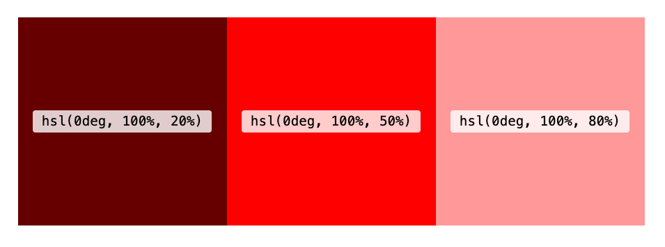
The hue parameter represents the position on a color wheel, and can be any value between 0 and 360deg. The function also accepts turn units (e.g. 0.5turn), and unitless values.

The following are all valid:

.my-element {
background-color: hsl(180deg, 50%, 50%);
}

.my-element {
background-color: hsl(0.5turn, 50%, 50%);
}

.my-element {
background-color: hsl(180, 50%, 50%);
}

Tip: Holding down SHIFT and clicking the color swatch in the inspector in Chrome and Firefox dev tools will toggle the color value between hex, RGB and HSL!

hsl() and hsla() lend themselves well to manipulation with custom properties, as we’ll see shortly.

currentColor

The currentColor keyword is worth a mention as another way of setting a color on an element that’s been around for a while. It effectively allows us to use the current text color of an element as a variable. It’s pretty limited when compared with custom properties, but it’s often used for setting the fill color of SVG icons, to ensure they match the text color of their parent. Read about it here.

Modern Color Syntax

The CSS Color Module Level 4 provides us with a more convenient syntax for our color functions, which is widely supported in browsers. We no longer need the values to be comma-separated, and the rgb() and hsl() functions can take an optional alpha parameter, separated with a forward slash:

.my-element {
/* optional alpha value gives us 50% opacity */
background-color: hsl(0 100% 50% / 0.5);
}

.my-element {
/* With no alpha value the background is fully opaque*/
background-color: hsl(0 100% 50%);
}

New CSS Color Functions
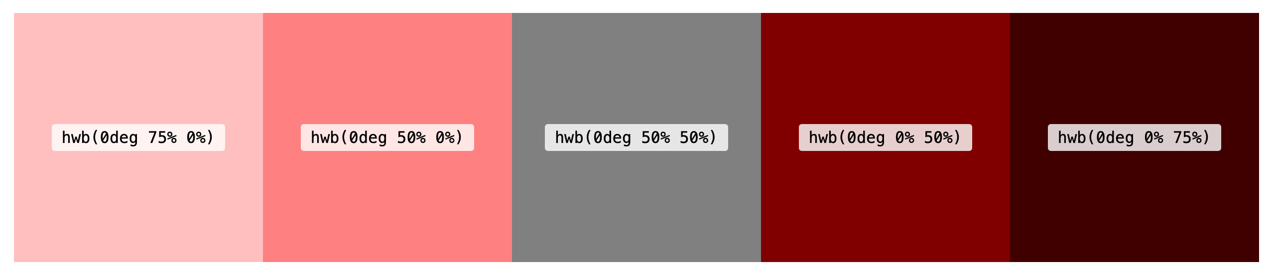
HWB

HWB stands for hue, whiteness and blackness. Like HSL, the hue can be anywhere within a range of 0 to 360. The other two arguments control how much white or black is mixed into that hue, up to 100% (which would result in a totally white or totally black color). If equal amounts of white and black are mixed in, the color becomes increasingly gray. We can think of this as being similar to mixing paint. It could be especially useful for creating monochrome color palettes

Try it out with this demo (works in Safari only):

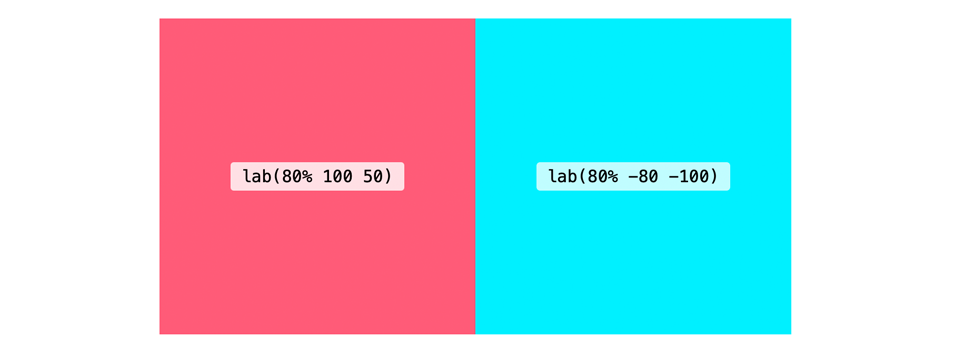
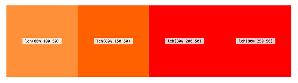
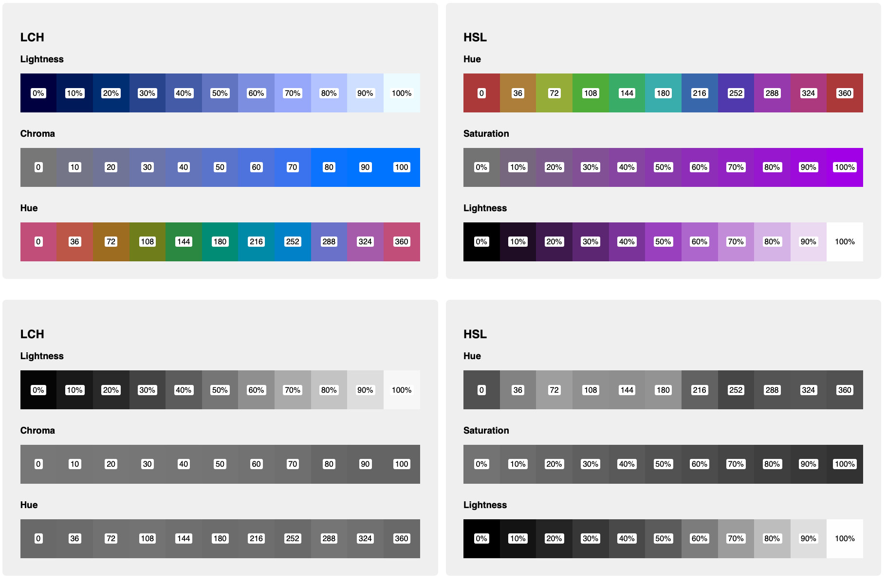
Why do we need LAB and LCH when we have HSL? One reason is that using LAB or LCH, gives us access to a much larger range of colors. LCH and LAB are designed to give us access to the entire spectrum of human vision. Furthermore, HSL and RGB have a few shortcomings: they are not perceptually uniform and, in HSL, increasing or decreasing the lightness has quite a different effect depending on the hue.

In this demo, we can see a stark contrast between LCH and HSL by hitting the grayscale toggle. For the HSL hue and saturation strips, there are clear differences in the perceptual lightness of each square, even though the “lightness” component of the HSL function is the same! Meanwhile, the chroma and hue strips on the LCH side have an almost-uniform perceptual lightness.

We can also see a big difference when using LCH color for gradients. Both these gradients start and end with the same color (with LCH values converted to the HSL equivalents using this converter). But the LCH gradient goes through vibrant shades of blue and purple in the middle, whereas the HSL gradient looks muddier and washed-out by comparison.

See the demo →

LAB and LCH, while perhaps being syntactically a little less intuitive, behave in a way that makes more sense to the human eye. In her article, LCH color in CSS: what, why, and how?, Lea Verou explains in detail the advantages of LCH color. She also built this LCH color picker.

As with other color functions, hwb(), lab() and lch() can also take an optional alpha parameter.

.my-element {
background-color: lch(80% 240 50 / 0.5); // Resulting color has 50% opacity
}

Browser Support And Color Spaces

hwb(), lab() and lch() are currently only supported in Safari. It’s possible to start using them straight away by providing a fallback for non-supporting browsers. Browsers that don’t support the color function will simple ignore the second rule:

.my-element {
background-color: lch(55% 102 360);

/* LCH color converted to RGB using Lea Verou’s tool: https://css.land/lch/ */
background-color: rgb(98.38% 0% 53.33%);
}

If other styles depend on newer color functions being supported, we could use a feature query:

.my-element {
display: none;
}

/* Only display this element if the browser supports lch() */
@supports (background-color: lch(55% 102 360)) {
.my-element {
display: block;
background-color: lch(55% 102 360);
}
}

It’s worth noting, as Lea explains in her article, that although modern screens are capable of displaying colors beyond RGB, most browsers currently only support colors within the sRGB color space. In the LAB color demo you might notice that moving the sliders beyond a certain point doesn’t actually affect the color, even in Safari where lab() and lch() are supported. Using values outside of the sRGB range will only have an effect when hardware and browsers advance sufficiently.

Safari now supports the color() function, which enables us to display colors in the P3 space, but these are limited to RGB colors for now, and don’t yet give us all the advantages of LAB and LCH.

.my-element {
background: rgb(98.38% 0% 53.33%); // bright pink
background: color(display-p3 0.947 0 0.5295); // equivalent in P3 color space
}

Recommended Reading: “Wide Gamut Color in CSS with Display-P3” by Nikita Vasilyev

Accessibility

Once they are widely supported, perhaps LAB and LCH can help us choose more accessible color combinations. Foreground text should have the same contrast ratio with background colors with different hue or chroma values, as long as their lightness value remains the same. That’s certainly not the case at the moment with HSL colors.

Color Management

A wider range of color functions means we have more options when it comes to managing colors in our application. Often we require several variants of a given color in our design system, ranging from dark to light.

Custom Properties

CSS custom properties allow us to store values for reuse in our stylesheets. As they allow partial property values, they can be especially useful for managing and manipulating color values. HSL lends itself particularly well to custom properties, due to its intuitiveness. In the previous demo, I’m using them to adjust the hue for each segment of the color strip by calculating a –hue value based on the element’s index (defined in another custom property).

li {
–hue: calc(var(–i) * (360 / 10));
background: hsl(var(–hue, 0) 50% 45%);
}

We can also do things like calculate complementary colors (colors from opposite sides of the color wheel). Plenty has been written about this, so I won’t cover old ground here, but if you’re curious then Sara Soueidan’s article on color management with HSL is a great place to start.

Migrating From Hex/RGB To HSL

RGB colors might serve your needs up to a point, but if you need the flexibility to be able to derive new shades from your base color palette then you might be better off switching to HSL (or LCH, once supported). I would recommend embracing custom properties for this.

Note: There are plenty of online resources for converting hex or RGB values to HSL (here’s one example).

Perhaps you have colors stored as Sass variables:

$primary: rgb(141 66 245);

When converting to HSL, we can assign custom properties for the hue, saturation and lightness values. This makes it easy to create darker or lighter, more or less saturated variants of the original color.

:root {
–h: 265;
–s: 70%;
–l: 50%;

–primary: hsl(var(–h) var(–s) var(–l));
–primaryDark: hsl(var(–h) var(–s) 35%);
–primaryLight: hsl(var(–h) var(–s) 75%);
}

HSL can be incredibly useful for creating color schemes, as detailed in the article Building a Color Scheme by Adam Argyle. In the article he creates light, dark and dim color schemes, using a brand color as a base. I like this approach because it allows for some fine-grained control over the color variant (for example, decreasing the saturation for colors in the “dark” scheme), but still retains the big advantage of custom properties: updating the brand color in just one place will be carried through to all the color schemes, so it could potentially save us a lot of work in the future.

Sass Color Functions

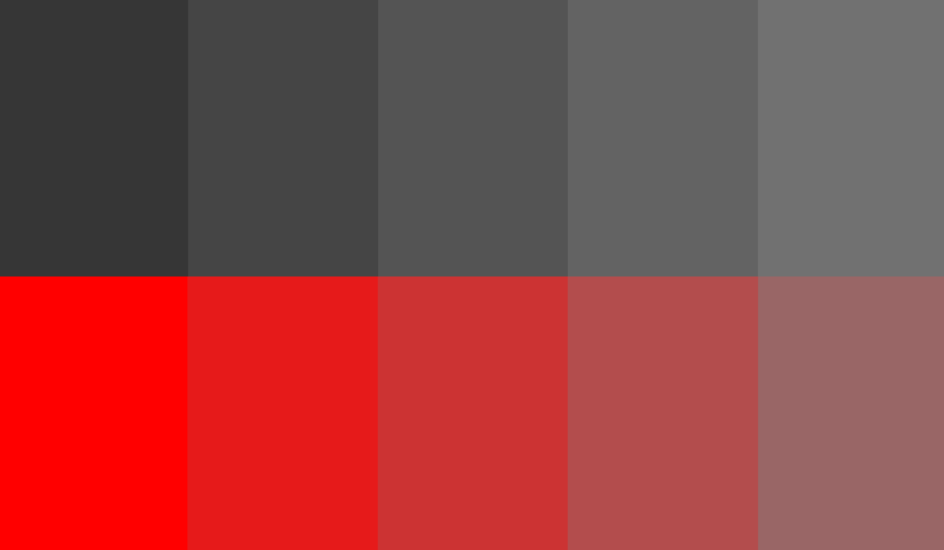
When it comes to mixing and adjusting colors, Sass has provided color functions to enable us to do just this for many years. We can saturate or desaturate, lighten or darken, even mix two colors together. These work great in some cases, but they have some limitations: firstly, we can only use them at compile-time, not for manipulating colors live in the browser. Secondly, they are limited to RGB and HSL, so they suffer from the same issues of perceptual uniformity, as we can see in this demo, where a color is increasingly desaturated yet appears increasingly lighter when converted to grayscale.

To ensure that the lightness remains uniform, we could use custom properties with LCH in a similar way to HSL above.

li {
–hue: calc(var(–i) * (360 / 10));
background: lch(50% 45 var(–hue, 0));
}

Color Mixing And Manipulation
Color Mixing

One thing CSS doesn’t yet allow us to do is mix colors in the browser. That’s all about to change: the Level 5 CSS Color Specification (working draft) contains proposals for color mixing functions that sound rather promising. The first is the color-mix() function, which mixes two colors much like Sass’s mix() function. But color-mix() in CSS allows us to specify a color space, and uses the LCH by default, with superior mixing as a result. The colors don’t have to be LCH when passed in as arguments either, but the interpolation will use the specified color space. We can specify how much of each color to mix, similar to gradient stops:

.my-element {
/* equal amounts of red and blue */
background-color: color-mix(in lch, red, blue);
}

.my-element {
/* 30% red, 70% blue */
background-color: color-mix(in lch, red 30%, blue);
}

Color Contrast And Accessibility

color-contrast() is another proposed function, which really does have huge implications for picking accessible colors. In fact, it’s designed with accessibility in mind first and foremost. It permits the browser to pick the most appropriate value from a list, by comparing it with another color. We can even specify the desired contrast ratio to ensure our color schemes meet WCAG guidelines. Colors are evaluated from left to right, and the browser picks the first color from the list that meets the desired ratio. If no colors meet the ratio, the chosen color will be the one with the highest contrast.

.my-element {
color: wheat;
background-color: color-contrast(wheat vs bisque, darkgoldenrod, olive, sienna, darkgreen, maroon to AA);
}

Because this isn’t supported in any browsers right now, I’ve borrowed this example directly from the spec. when the browser evaluates the expression the resulting color will be darkgreen, as it is the first one that meets the AA contrast ratio when compared to wheat, the color of the text.

Browser Support

The Level 5 Color Specification is currently in Working Draft, meaning no browsers yet support the color-contrast() and color-mix() functions and their syntax is subject to change. But it certainly looks like a bright future for color on the web!

Environmental Impact Of Colors

Did you know that your chosen color palette can have an impact on how much energy your website uses? On OLED screens (which account for most modern TVs and laptops), darker colors will use significantly less energy than light colors — with white using the most energy, and black the least. According to Tom Greenwood, author of Sustainable Web Design, blue is also more energy-intensive than colors in the red and green areas of the spectrum. To reduce the environmental impact of your applications, consider a darker color scheme, using less blue, or enabling a dark-mode option for your users. As an added bonus, a more environmentally friendly choice of colors can also reduce the impact on the battery life of mobile devices.

Tools

Hexplorer, Rob DiMarzo
Learn to understand hex colors with this interactive visualization.
LCH color picker, Lea Verou and Chris Lilley
Get LCH colors and their RGB counterparts.
HWB color picker
Visualize HWB colors and convert to HSL, RGB and hex.
Ally Color Tokens, Stephanie Eckles
An accessible color token generator.

Resources

“A Nerd’s Guide To Color On The Web,” Sarah Drasner, CSS-Tricks
“LCH Colors In CSS: What, Why, And How?,” Lea Verou
“The Best Color Functions In CSS?,” Chris Coyier, CSS-Tricks
“Building A Color Scheme,” Adam Argyle, Web.dev
“Using HSL Colors In CSS,” Ahmad Shaheed, Smashing Magazine
“On Switching From Hex And RGB To HSL,” Sara Soueidan
“Improving Color On The Web,” Dean Jackson, Webkit Blog

Powerful Terminal And Command-Line (CLI) Tools For Modern Web Development

Original Source: https://smashingmagazine.com/2021/11/powerful-terminal-commandline-tools-modern-web-development/

Many modern programmers, including front-end and full-stack developers, work daily with the command line. Even those who are relatively new to web development are picking up command-line skills early and finding practical tools and utilities to enhance their productivity in the terminal.

This post presents a categorized list of many command-line apps I’ve personally discovered over the past few years. Some of them are relatively new, others have been around for a while. So I hope something in this roundup will interest you and help you get stuff done when working in the terminal.

You can jump to a category using the navigation below:

Terminal Apps
Terminal Utilities and Enhancements
Command-line Scripting and Frameworks
Productivity Tools for the Terminal

Terminal Apps

This section features terminals, multiplexers, console emulators, mobile terminals, and command-line workspaces that you can use to replace the default terminal app on your system.

tmux

tmux is a popular terminal multiplexer for Unix-like operating systems that lets you easily switch among several programs in a single terminal, with the ability to “detach” a session (while still running in the background) or “reattach” it to a different terminal.

iTerm2

iTerm2, the successor to iTerm, is a replacement for your Terminal on macOS that includes features like split panes, robust search, autocomplete, instant replay, along with a whole slew of configuration options.

Mosh

Mosh is a remote terminal app (or mobile shell) for interactive SSH usage that includes several useful features for those who need to do terminal-based tasks over weak WiFi, cellular networks, or other less-reliable connections.

Zellij

Zellij is a terminal workspace that has the base functionality of a terminal multiplexer (similar to tmux) but includes features that allow users to extend it and create a personalized environment via panes/tabs and plugins.

Hyper

Hyper is an Electron-based terminal app for Mac, Windows, or Linux that’s built with web technologies (HTML/CSS/JS). Includes dozens of themes and plugins and is built on speed and stability.

cmder

cmder is a portable console emulator for Windows that was built due to the lack of a good option in this area for Windows users.

a-Shell

a-Shell is an iOS app that offers a ‘terminal in your pocket’ with files/directory control, compatibility with Apple Shortcuts, multiple windows, and lots more.

Eternal Terminal

Eternal Terminal is another remote terminal app inspired by other similar, popular projects.

Ten Hands

Ten Hands is a terminal app for Mac, Linux, and Windows that is billed as the simplest way to organize and run command-line tasks, useful for those who run similar daily tasks on multiple projects.

eDEX-UI

eDEX-UI is a fullscreen, cross-platform terminal emulator and system monitor heavily inspired by science fiction movie UIs, in particular, the Tron: Legacy film.

Tabby

Tabby, formerly “Terminus”, is a customizable cross-platform terminal app for local shells, SSH, serial, and Telnet connections that includes support for features like split panes, smart tabs, customizable hotkeys, and lots more.

Fish Shell

Fish Shell is another option for a command-line shell for Linux, macOS, and Windows that includes auto-suggest, tab completions, 24-bit color, web-based configuration, syntax highlighting, among other practical features.

Terminal Utilities And Enhancements

Once you’ve got your primary workspace, you’ll want to enhance it with various tools, utilities, themes, and so forth. This section includes some useful tools to make your terminal experience more enjoyable.

Oh My Zsh

Oh My Zsh is an open-source, community-driven framework for managing your configuration for Z Shell (or Zsh, a popular Unix shell). It comes bundled with thousands of helpful functions, helpers, 300+ plugins, 140+ themes, and more. Works best on macOS or Linux, but can also be used on Windows using something like Cygwin or WSL2.

Fig

Fig adds VSCode-style autocomplete to your existing terminal and includes support for existing CLI tools like Git, npm, Kubernetes, Docker, AWS, Google Cloud, and more.

fzf

fzf is a fast, portable, fuzzy finder for the command line that lets you run fuzzy search queries with a comprehensive feature set.

Shell History

Shell History (not free) is a macOS app that integrates with Bash, Zsh, or Fish and allows you to easily backup and sync via iCloud and organize your shell history in “notebooks”.

htop

htop is an interactive process viewer, originally Linux-only but now cross-platform, that aims to improve on the Linux top command by providing extra features when viewing running processes.

GitHub CLI

GitHub CLI, in case you missed it, is the official cross-platform command-line interface for GitHub, bringing pull requests, issues, and other GitHub-related tasks to your terminal.

Streamhut

Streamhut lets you share your terminal in real-time without installing anything. Simply run one of two commands (depending on your setup), useful for live terminal sessions in team collabs, interviews, or teaching.

icdiff

icdiff is a terminal-based file diff tool that makes good use of colors to present diffs in a more practical, visual manner.

>_TerminalSplash

TerminalSplash, as the name suggests, is like Unsplash, but for terminal themes. Choose from more than 200 user-submitted themes or submit your own.

Terminalizer

Terminalizer is a customizable and cross-platform terminal recorder that lets you record terminal sessions then share them as animated GIFs or via a web player.

Asciinema

Asciinema is another popular option for terminal recording and sharing, but not available for Windows. The cool thing about this one is that the recorded output is not a video but a plain text animation of the terminal session, meaning you can select and copy/paste items from recordings.

gtop

gtop is another enhancement on the top command that provides a system monitoring dashboard for your terminal. Require Node.js and includes partial support on Windows.

DevDash

DevDash is a highly configurable terminal dashboard for developers and creators. You can customize it to display information from sources like Google Analytics, GitHub, Feedly, shell command output, and more.

Honorable mentions:

ora
An elegant terminal spinner.
tiny-care-terminal
A little dashboard that tries to take care of you when you’re using your terminal.
theme.sh
A shell script that lets you set your terminal theme that includes 270+ preloaded themes.

Command-Line Scripting And Frameworks

Some numerous libraries and frameworks allow you to build and maintain your own command-line apps and utilities. Below you’ll find a few of those for Bash, JavaScript, and more.

Command And Conquer (cac)

Command And Conquer, also called cac, is a lightweight JavaScript framework for building command-line apps. For example, it’s been used to build several Node.js-based scaffolding tools.

zx

zx is a popular alternative to Bash from engineers at Google that allows you to write command-line apps using JavaScript with an easy-to-use API that allows you to call executables and get their output, handle errors, and more.

present

present is a Markdown-based presentation tool for the terminal that includes colors and effects and allows you to play pre-recorded playable code blocks as slides.

Bach

Bach is a Bash testing framework that can be used to test scripts that contain dangerous commands like rm -rf / and also includes APIs (e.g. @mock, @ignore, @mockallto, etc.) to mock commands.

CLUI

CLUI is a JavaScript API with utilities to allow you to build command-line interfaces with context-aware autocomplete into your apps (i.e. terminal-like applications that users interact with).

ShellCheck

ShellCheck is a shell extension to help you find bugs in your shell scripts.

Honorable Mentions

Bashō
Lets you write complex shell tasks using plain JavaScript and it mixes well with shell commands and scripts.
import
A fast and easy-to-use module system for Bash and other Unix shells.
Bash Infinity
A modular and lightweight library and boilerplate framework for writing tools using Bash.

Productivity Tools For The Terminal

Finally, this category puts together a small sampling of command-line utilities and programs that help with various productivity-related tasks like keeping stuff organized, sharing files, and more.

Dash Dash

Dash Dash is an online documentation site that presents the Unix man pages (i.e. manual pages) in a more palatable format, to help those less familiar with the terminal learn to use the command line.

nb

nb is a command-line tool with features that include local web note‑taking, bookmarking, archiving, and encryption. Storage is in plain text, includes Git-based versioning, wiki-style linking, color themes, and lots more.

Rclone

Rclone is an open-source command-line program that allows you to manage files on 40+ cloud storage services (Amazon S3, Dropbox, Google Drive, Azure, etc.). It includes cloud equivalents for familiar Unix commands and other features.

navi

navi is an interactive cheatsheet tool for your terminal. In addition to other features, you can browse through cheatsheet repositories, import cheatsheets, or add your own.

Taskbook

Taskbook is a fast command-line tool that lets you organize tasks, boards, and notes in your terminal, with features like search/filter, custom storage location, and a simple and user-friendly syntax.

Project Explorer

Project Explorer is a CLI tool that lets you build a tree visualization of any project. This would come in handy when bringing on new team members or when inheriting a new project.

transfer.sh

transfer.sh is a fast and easy-to-use app for sharing files via the command line. Includes support for services like Amazon S3, Google Drive, Storj, and the local file system.

Honorable Mentions

ack
A code-searching tool, similar to grep but optimized for programmers searching large trees of source code.
goto
A shell utility with auto-complete support to navigate to aliased directories.
bashupload
Upload files (up to 50GB) via the command line to easily share between servers, desktops, and mobile devices.
copyfiles
A command-line utility that adds extra features to copying files in your terminal.

What’s Your Favourite Command-Line Tool?

As mentioned, this wasn’t meant to be an exhaustive list, but merely a big collection of relevant command-line apps and utilities that I’ve personally come across in the past few years.

If you’ve built something yourself or if there’s one you use regularly that supercharges your terminal experience, feel free to drop it in the comments!

20+ Highly Addictive Mobile Games to Try

Original Source: https://www.hongkiat.com/blog/addictive-indie-mobile-games/

Every day we wake up to a gamescape that’s teeming with new entries, which makes that perfect-match game more and more elusive. If you haven’t tried gamifying your phone experience,…

Visit hongkiat.com for full content.

Image CDNs: How Edge Computing Provides a Faster Low Code Image Solution

Original Source: https://www.webdesignerdepot.com/2021/11/image-cdns-how-edge-computing-provides-a-faster-low-code-image-solution/

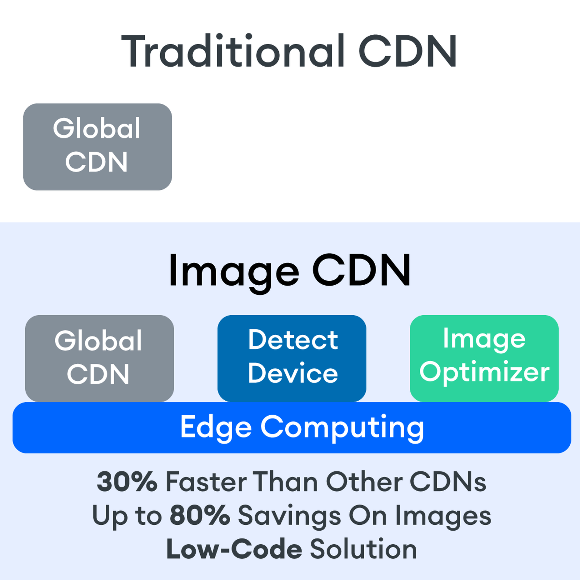
Many websites today use some type of traditional Content Delivery Network (CDN), which means improvements in website load times, decreases in bandwidth, and better redundancy and security. But not everything is optimized, specifically when it comes to images, and image CDNs can help with that! 

Traditional vs. Image CDNs

A traditional CDN treats images as static. If you want to tailor images to better match various mobile device types, then you need to create many variants of each image and upload them to your web server. It also means you must develop responsive code that will tell the server and CDN which image variant to deliver. This is clunky, time-consuming, and inefficient. For a large website, the amount of code needed can be astronomical. Using this static image model, there’s just no realistic way for each image to be effectively sized and compressed for every possible device model – at this point, there are thousands of them. The combination of these two unfortunate factors leads to potentially slow load times and poor UX caused by oversized images delivered to mobile devices.

So what is an image CDN? An image CDN builds on the traditional CDN model with the addition of device detection and image optimization. Instant detection of the device model and browser requesting the images is done right at the device-aware edge server (true edge computing!) Additional information, including screen resolution and dimension, pixels per inch, and support for next-gen image formats (such as WebP, JPEG 2000/JP2, and AVIF), provides even more details crucial for superior image optimization. Using this information derived from device-aware edge servers, the image CDN optimizes each image and serves the perfect version for each device and resolution, meaning users get the finest webpage experience faster.

A Bit About the Edge (Whoa, Living on the Edge?)

With a single server website, a web request would have to travel from the requestor, back to the origin server (wherever that was geographically located), be processed, and then travel back to the requestor. Depending on the physical distance between the requestor and the origin server, this could introduce a great deal of latency, which means lag time on page loads. 

A traditional content delivery network (CDN) is a global network of servers that optimizes web performance by using the node geographically closest to the user for faster delivery of assets. It takes static content like images and stores them on the edge. But usually, these edge servers are relatively simple in terms of their role in business processes. They mostly index, cache, and deliver content. And traditional CDNs like to keep edge servers simple because of concerns over CPU usage, storage, and scalability.

But what if these edge servers could also provide computing power that enhances performance and business processes? This is called edge computing. Slowly, CDNs are starting to open their edge servers to allow enterprises to deploy apps/services on the edge. Likewise, Cloud computing networks (e.g., AWS, Azure, Google Cloud) provide virtualized server capacity around the world for those who want to use geographically distributed servers. In a sense, Edge Computing is a marriage of the CDN (where edge servers synchronize/work with each other) and Cloud computing (where servers are open to applications). 

Edge computing is a fascinating concept, but what is the killer app that will enhance business processes and improve website performance? The addition of device detection to edge computing provides the ability to transform from delivery of static images to a new model where images are dynamic and tailored exactly to devices. 

Edge computing is computing that is done in a geographically distributed space, with many servers located at or near the source of the web request. This reduction in bandwidth and latency leads to fast processing times, increased site speed, and improved customer experience. And edge computing doesn’t require new infrastructure — it leverages the networks of existing providers to create Points of Presence (POP) around the globe. 

The Edge Servers are…Aware?

Device-aware edge servers, like those used by the ImageEngine image CDN, take edge computing to a new level. Device detection is actually one of the use cases where edge computing really shines. Normally, the edge server would have to send a Javascript query to the device to figure out any information about a requesting device’s model, browser, operating system. But with a device-aware edge server, the User Agent string is captured and decoded. This contains all of the information necessary for device detection without the need for any back and forth – a definite speed improvement. So you’re starting ahead of the game! 

Each time a new request comes to the device-aware edge server, the image is processed by that server (meaning optimized for that specific device parameters) and stored right there in cache, primed for future use. This is done in three stages: changing image size based on device resolution, compressing the image using an image optimization tool, and selecting the most efficient file format for the device. 

If the device-aware edge server has already processed a request from a similar device model before, then it can serve the device-optimized image from its edge cache, leading to a lightning-fast server response — and ImageEngine’s device-aware edge servers can serve up cached images 98% of the time! Not only is there geographical proximity because of the distributed global POP network, but the smaller size of the optimized image compared to the full-sized original cuts up to 80% off the image payload. This can cut up to several seconds off page load times. When almost 70% of people say that page speed influences their likelihood of making a purchase, every single second counts! 

Some image CDNs detect the device information and group the devices into “buckets” of similar types and serve an image based on that type. While this is certainly an advancement over a traditional CDN, and works passably well for some common devices, it still isn’t a truly optimal solution. There are so many variants of browser, screen size,  resolution, etc., even among very similar devices, that images are still often oversized (too large payloads) and lead to poor load speed. A true image CDN, such as ImageEngine, serves the perfect image for every device, every time.

So Now You Want To Get Started (Don’t Worry, It’s Really Simple)

One of the best things about the ImageEngine image CDN is the ease of integration – and it can integrate into any platform that supports a 3rd-party CDN. All you need is to sign up for an account and receive a delivery address during your two (yes, 2!) minute signup process. This delivery address is used to redirect image traffic for optimization and superior delivery performance. Next, you’ll have to make some slight adjustments to img tags on your website, but that’s really all the work you’ll need to do. There are no DNS changes during a standard (generic delivery address) integration. You read that right, none at all. Contrast that to a traditional CDN integration, where there is just no way around some messing around in the DNS – in fact, usually some fairly extensive DNS changes. 

This low-code, virtually no code, integration saves you time. It saves you money. It saves you the hassle of putting multiple team members on a new project. And it means that you can be up and running in about 15 minutes with a standard install. You can be serving optimized images to your site visitors at blazing fast speeds before lunch! And don’t worry, ImageEngine has an experienced integration support team available to answer any questions you might have. 

There’s also no issue with adding the ImageEngine image CDN on top of an existing CDN. Traditional CDNs may have security features that you may prefer to keep for your site. It requires slightly more integration but provides the same benefits of a solo ImageEngine implementation — screaming fast image load times and perfectly optimized images from device-aware edge servers. All that is recommended is that the ImageEngine image CDN actually serve the images directly, not simply process them, to get maximum benefits.

Adopt an Image CDN and See The Benefits

We’ve learned that image CDNs bring numerous benefits to your site AND your business. Using device-aware edge servers, image CDNs provide measurably better UX to your visitors. Pages load potentially seconds faster with perfectly optimized images, meaning your customers get to the heart of your message right away, and you don’t lose potential sales. 

Image CDNs are actually 30%+ faster than most traditional CDNs, improving site speed accordingly. From an SEO perspective, that’s huge! And your SEO gets an additional boost from the improvement to your Largest Contentful Paint scores (which can help you gain valuable rank on Google’s SERPs). Implementation is simple and fast. You get all this, plus cost savings: since you have smaller payloads because of the fully optimized images, you’re delivering fewer gigabytes of data.

Source

p img {display:inline-block; margin-right:10px;}
.alignleft {float:left;}
p.showcase {clear:both;}
body#browserfriendly p, body#podcast p, div#emailbody p{margin:0;}

The post Image CDNs: How Edge Computing Provides a Faster Low Code Image Solution first appeared on Webdesigner Depot.