10 Color Palette Generators & Tools For Your Web Design Projects

Original Source: http://feedproxy.google.com/~r/1stwebdesigner/~3/_bE29DwNgtI/

In today’s article we’ve rounded up ten of the best tools and websites to generate a color palette for your web design project. With some of these tools you can use a photo or image to generate your palette. Some use artificial intelligence. And some are completely unique, with communities that you can check out other designers’ submitted palettes as well as share your own. Let’s check them out!

Your Web Designer Toolbox
Unlimited Downloads: 500,000+ Web Templates, Icon Sets, Themes & Design Assets


DOWNLOAD NOW


Coolors

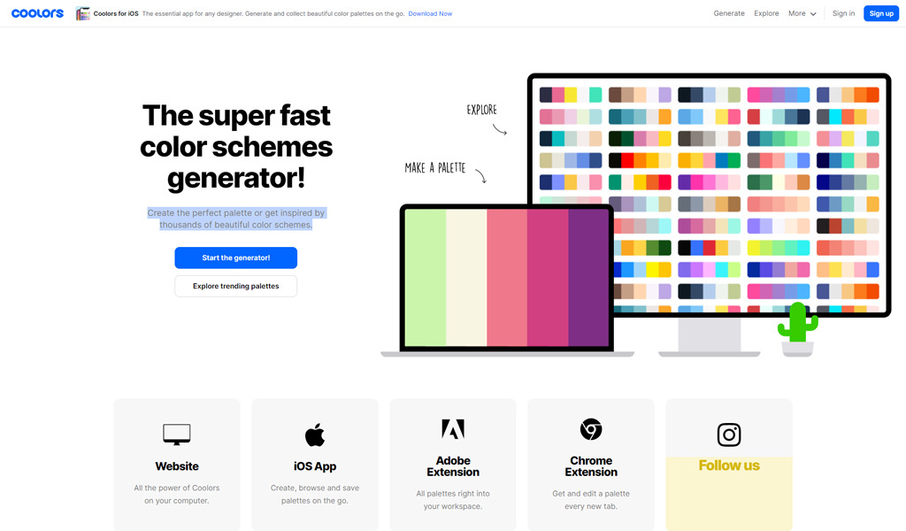
Create the perfect palette or get inspired by thousands of beautiful color schemes, available in the browser, iOS app, Adobe extension, and Chrome extension.

Coolors - color palette generator

Paletton

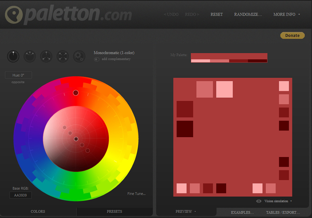
Whether you’re a professional designer, a starting artist or just a curious beginner in the world of art and design, Paletton is here to help you with all your color palette needs. You don’t need to know the ins and outs of color theory in order to use Paletton’s unique and easy color wheel. All you need to do is choose the basic color you are interested in exploring, and get inspired.

Paletton - color palette generator

Colormind

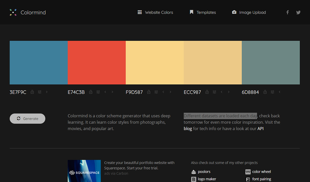
Colormind is a color scheme generator that uses deep learning AI. It can learn color styles from photographs, movies, and popular art. Different datasets are loaded each day.

Colormind - color palette generator

Adobe Color

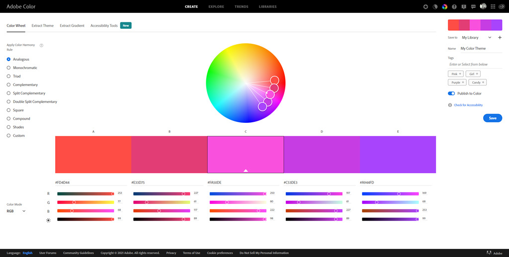
With Adobe Color, you have access to the powerful harmonization engines for creating beautiful color themes to use in Adobe products. Start your color journey by exploring themes from the Color community. Be inspired by other creatives in curated Trend Galleries from Behance and Adobe Stock. Import photos and images to generate cohesive color palettes from your artwork.

Adobe Color - color palette generator

Canva Color Palette Generator

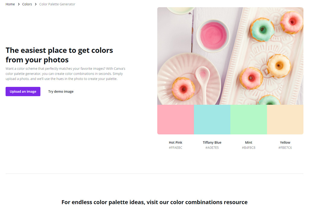
Want a color scheme that perfectly matches your favorite images? With Canva’s color palette generator, you can create color combinations in seconds. Simply upload a photo, and they’ll use the hues in the photo to create your palette.

Canva - color palette generator

COLOURlovers

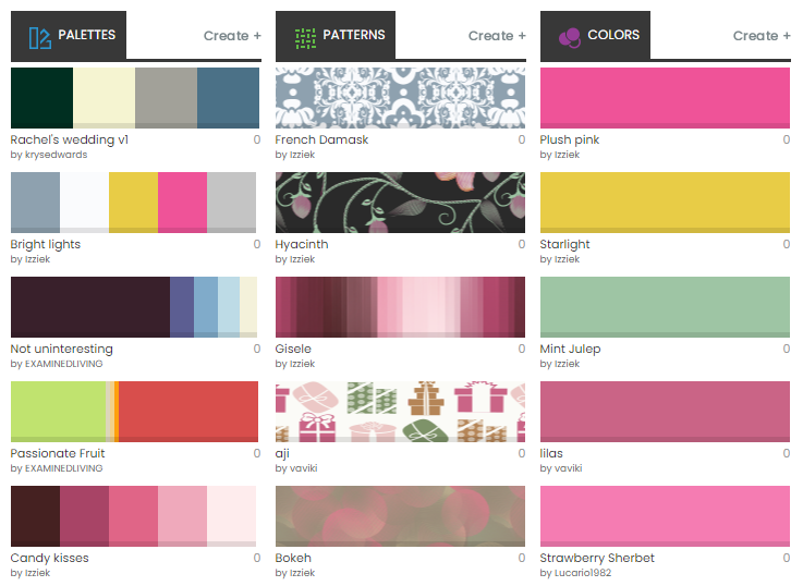
COLOURlovers is a creative community where people from around the world create and share colors, palettes and patterns, discuss the latest trends and explore colorful articles… All in the spirit of love.

COLOURlovers - color palette generator

Color Hunt

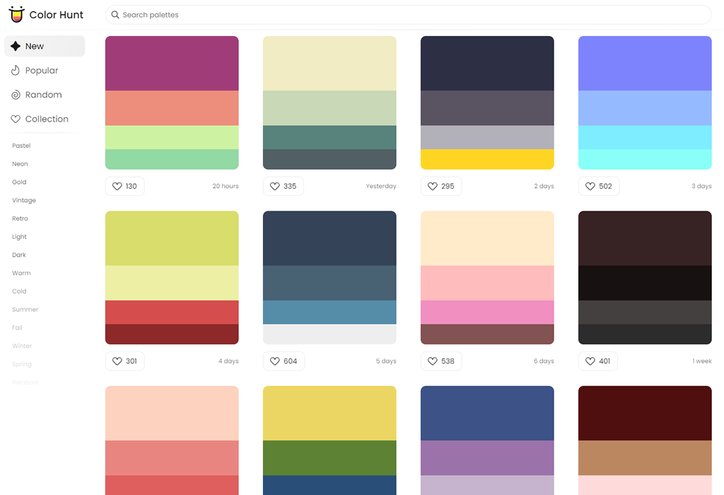
Color Palettes for Designers and Artists. Discover the newest hand-picked palettes of Color Hunt, similar to Product Hunt, but for colors.

Color Hunt - color palette tool

Colordot

Colordot is “a color picker for humans”, using a unique interface. It also has an iOS app.

Colordot

Palettr

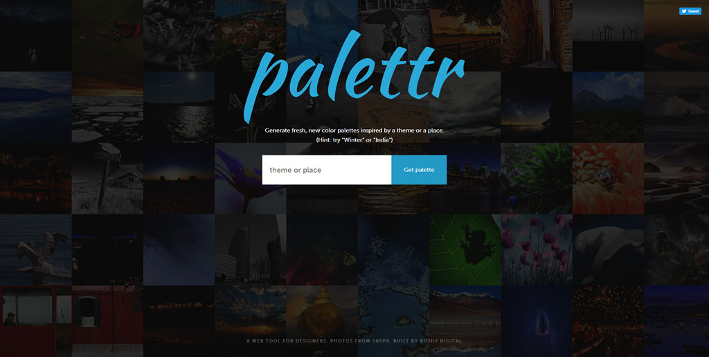
Generate fresh, new color palettes inspired by a theme or a place.

Palettr

Mudcube

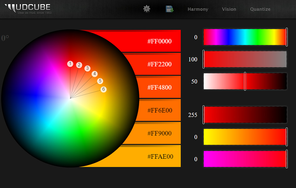
Last in our collection is Mucube, a color wheel to generate unique color palettes that are downloadable in .AI and .ACO file formats.

Mudcube


Making A Strong Case For Accessibility

Original Source: https://smashingmagazine.com/2021/07/strong-case-for-accessibility/

Imagine yourself as someone with a visual disability. Cataracts, or totally blind even. A site is not accessible because of many factors, willing and unwillingly. Accessibility may have been attended to at the end of the project or not in the budget, or maybe they just didn’t practice it. You can’t access the vital information on the site because it’s not accessible to people with visual disabilities.

Maybe you suffer from a motor skill disability and there is a part of the site that you cannot access because there is an issue that prevents you from obtaining that information you wish to on a site that you want to buy something on.

These are just a couple of examples of what disabled users face daily when they try and access a website that is inaccessible. The case for accessibility is this; we as stakeholders, managers, teams, designers and developers need to do better in not only practicing accessibility but advocating for it as well.

If you have ever read the WebAIM Million report, you can see where the breakdown is, and until 2021, there hasn’t been much in the way of improvement. Of the over 51 million home pages that were tested, 51.4 errors per page. While the number of errors decreased, home page complexity increased regarding the number of page elements that had detectable accessibility errors.

Inclusive design is a way of creating digital products that are accessible to a wide range of people regardless of who they are, disabled or not, where they are, and encapsulates a diverse spectrum of people. The British Standards Institution (2005) defines inclusive design as:

“The design of mainstream products and/or services that are accessible to, and usable by, as many people as reasonably possible … without the need for special adaptation or specialized design.”

Practicing accessibility in your workflows and methodologies ensures people — disabled or not — that they can access your product, your website, and your brands. Inclusive design and accessibility go hand-in-hand. Let’s look at some examples of accessibility.

Examples Of Practical Digital Accessibility

Your site has a color scheme that looks great after the designers are done with the mock-ups or the color scheme your brand uses is “perfect”’ in the eyes of people that do not have a visual disability. For people that have a visual disability like glaucoma, cataracts, or tritanopia (the deficiency of blue in one’s vision) they cannot make out that particular color and it does not meet WCAG standards.
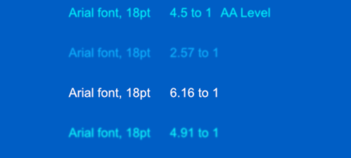
If your light blue font color on a darker blue background did not meet those guidelines set in WCAG, then it would be inaccessible. If you switched to a lighter blue or white font within the 4.5 to 1 ratio guideline that you can read about in (Success Criterion 1.4.3: Contrast (Minimum)), then it would be accessible.
You have a site that does not traverse well (or at all) when disabled users use assistive technologies such as a screen reader, keyboard, or voice recognition to navigate around the site because they lack the motor skills or dexterity to do so. An accessible site makes sure there is a way for those users to navigate through the site with no issues. Examples of keyboard navigation can be seen in this video and in this short video about voice recognition.
An accordion that uses items that when opened gives you some scrollable content, yet the content is not scrollable via keyboard. It is inaccessible to people that use the keyboard for navigation. An accessible site makes sure that the content is accessible via keyboard in that instance.
Images that do not have alternative text that describe to screen reader users what that image is or what message it is trying to convey is also important. If you have no alternative text, e.g.<img src=”” alt=”This is an image of my favorite kind of animal.”>

Users of newer technologies, people that live in metropolitan areas, or people that can afford to buy the latest tech, for example, have fewer barriers to break through than people that cannot afford a new phone or tablet, or are in very remote or rural areas.
The glare of the sun on your mobile device as you’re on the beach on a sunny day. You’re shielding the screen or squinting to see the screen to read what restaurant to go to after you’re day at the beach is done. That is a situational impairment.
A fussy child on your lap moving around while you are trying to read an email or an injured arm as you try to answer an email, hindering your ability to type as you normally would is a situational impairment.

There are a lot more examples of accessibility I could mention but that would take a very long time to write, so these are just a few examples.

Actionable Steps To Get Buy-In

Two of the most widely used reasons I hear as to why people or companies aren’t practicing accessibility are:

“The client has no budget for it.”
“My manager said we’ll get to it after launch.”

Buy-In And Support From Executives/Stakeholders

From the outset, advocating for accessibility starts at the top. Once you have stakeholder support, then you may see support trickle down to managers, then teams, and then individuals. It all starts with you first. Buy-in and support from executives will continuously be successful across the organization.

When the ethical approach doesn’t work, the approach I will take is the financial approach:

“You’ll be saving the company a lot of money when you do this from the start. When maintenance is needed, it won’t take the team as long to maintain the code because of accessibility and clean code.”

When, or if that fails, I’ll go for the legal ramifications and cite instances from the lawsuits that have been won against Target, Bank of America, Domino’s Pizza, and others. It’s amazing to see how fast executives and stakeholders do not want to get sued.

Keeping executives engaged and meeting with them regularly will ensure success with your accessibility initiatives, but will also provide support for when new accessibility initiatives need to be implemented or when there are disagreements among teams on the implementation or prioritization, you have the support of executives.

Being accessible is a good way for a company to differentiate itself from other companies, when you make a quality product, then the company buy-in becomes greater in some instances. Teams that push for accessibility usually lead the way to getting buy-in from other departments and executives. If the product is high quality and makes the company money, that’s when the company is swayed to adopt the practice.

Demonstrations of live testing with disabled users are also another way to get buy-in across the board. To humanize the decision-making process and get executives and colleagues on board by showing them what struggles are faced on a daily basis by disabled users using inaccessible products. Or one that I have used in the past, don’t ask, just do it.

Most of the time, however, it is how the practice of accessibility can make the company money or the legal consequences that a company can face, that sways an executive to adopt the practice. Then, in those instances, is when an executive or stakeholder starts learning about accessibility if they want to invest in that time.

Coordinating efforts across departments may be difficult and time-consuming at first so that support from the top will help alleviate the pressures and burnout that can happen when taking on the task of creating and implementing an accessibility strategy.

Have A Team Or Individual Who Is Your Accessibility Advocate(s)

Once you have buy-in from executives or stakeholders, having a person throughout each department or a team focused on accessibility. Throughout each department have an individual who is the liaison regarding accessibility.

Have someone that can answer questions and work with others to practice the guidelines and work with others to make accessible products. Help set up documentation and tooling, serve as an intermediary between departments.

Assess the Product and Proficiency Within the Company

Gauging the point where the product(s) are as far as how inclusive and accessible they are is a key priority. This ensures the team or individual that their efforts to make the product better and accessible are happening. What is the current state of the product? What is the current state of the website or mobile application?

Getting the general idea of the level of knowledge that teams and people in the company currently have is important going forward. How versed are they in accessibility guidelines and practices? Do they know anything about the Web Content Accessibility Guidelines (WCAG)? How much training do you have and will you need?

Maintaining a written record of all accessibility training done to meet the requirements that apply to your organization is a great way to keep data on all the training done within the organization. Recording the training and who and when it was completed. If there is no inter-organizational accessibility training available your organization can look into different methods of training like the kind WebAIM, the ADA, or Knowbility has to offer.

Establish Guidelines For The Company

Consistent implementation of the product greatly benefits the organization. It reduces the amount of work, which in turn can reduce the number of stress teams are under. Design systems should be used not only to ensure branding and consistency, but accessibility, inclusivity, and understanding of code better.

Accessible components help for obvious reasons and reduces the time it takes to implement, rather than start from nothing and try to re-invent something that has already been done. Testing procedures should be implemented so that departments do their jobs well and do them efficiently, especially QA and developers.

Documenting guidelines for your organization is as simple as creating a set of accessibility guidelines. You could internally document them in a collaborative software such as Notion or Dynalist; or an online documentation like Google Docs or Dropbox Paper. Somewhere that has a collaborative aspect where people can add to the documentation that the organization has.

Getting Fellow Colleagues To Buy-In

In this landscape of frameworks and libraries, “going fast and breaking things”, and overlooking and undervaluing accessibility, people need to be educated and that also needs to happen at the team level. The people that do not have voices, the “people on the other side of the glass” need YOU to be their voice.

As a freelancer, setting up meetings or training sessions to onboard organization members that you may be working with can be beneficial to all. Holding a workshop or webinar is also an option to training colleagues to buy-in as well.

Getting a team onboard because training brings the team together and people know the importance of accessibility, and they want to produce a quality product that people can use regardless of disability.

Pitching to those who do not or may not know that accessibility means less time spent working on what they work on, less stress and headaches, can sway a developer very fast from my experience.

Sharing The Importance Of The Rules

Whether you live in the EU, the UK, Canada, or the United States, most countries have rules regarding standards for accessibility. Familiarity with those rules and guidelines only ensures compliance on another level.

Whether it is the ADA (American Disabilities Act) or Section 508 (Government compliance) in the U.S., the ACT (Accessible Canada Act) in Canada, or EN 301 549 in the EU, sharing the importance of the guidelines can be crucial to getting departments, executives, and the organization as a whole on board.

Pick Examples From The Outside World As Use Cases

Test and record cases where a disabled user is trying to use the product, website, or mobile app. Showing colleagues and executives these tests and use cases will bolster the argument you have for implementing accessibility at your organization.

From there, you could get a source outside the organization that specializes in accessibility testing with disabled users, such as Applause, for instance. The organization and people within may turn around and embrace accessibility at the company and in the workflow.

Hire Disabled People

Whether it is internally or on a contract basis with an outside firm like Applause, there are the people with the lived experiences. They can benefit you and your company and team by having them aboard. These folks bring value to you and the organization.

Get executives and hiring managers on board to bring on people with disabilities to not only help with accessibility, but also teach and advocate for accessibility and inclusivity within the organization.

Best Practices For Maintaining Accessibility

Accessibility does not end at handoff or when the project is “finished” as is with the web, accessibility is ever-evolving and needs periodic checking when new features are implemented or changes are made to see if accessibility is still be practiced and adhered to.

Vigilance of the accessibility of the product(s) ensures a standard of accessibility. Automated testing of the product wherever possible that fits the strategy of the departments when it comes time to release new features or changes.

Any barriers that may arise (and they will) will be addressed and they can be handled in a manner that expedites the process and rolls out fixes for those barriers that take them down and makes the product accessible for those who need it.

Performing screen reader analysis before every release to ensure that users of screen readers and other assistive technologies can use the website or mobile app.

Annual audits and user testing is always important whether made internally by a team, or a third-party that specializes in accessibility auditing, especially with user testing by disabled users. What does that audit entail?

An executive summary for stakeholders that details the needs of the product so that it can become compliant as well as addressing the current state of affairs as well.
A developer report that details every possible path that can be taken through the website, mobile app, and product that addresses concerns and needs that will be encountered along the way.

Summary

Accessibility matters. It matters to those who are getting shut out on a daily basis from some form of digital creation they encounter. Whether it is by design or not, the fact that accessibility is an afterthought in most cases is a critical oversight we all have to correct.

Accessibility and accessible sites and apps make the web better, they make everyone feel included no matter what situation or disability. Inclusion and accessibility remove barriers for disabled people and accessibility and performance also make the web accessible for those that aren’t equipped with the latest and greatest phones or devices.

Getting on board with accessibility is something we should all do. Let’s remember the people on the other side of the glass. Accessibility is a right, not a privilege. Let’s make accessibility a priority.

10 Apps to Record Your Baby’s Milestones & Achievements

Original Source: https://www.hongkiat.com/blog/record-baby-daily-life/

Having a child is one of life’s great joys, or so I’m told. If you’re a new parent, it’s only natural that you’ll want to document and record your baby’s life….

Visit hongkiat.com for full content.

These might be the weirdest wireless headphones we've ever seen

Original Source: http://feedproxy.google.com/~r/CreativeBloq/~3/JqVzzeMQvnc/sony-neckband-headphones

Sony’s neckband is… interesting.

3 Essential Design Trends, July 2021

Original Source: https://www.webdesignerdepot.com/2021/07/3-essential-design-trends-july-2021/

This month, you will either love or hate the featured design trends.
The common theme among them is a strong design element that can create distinct emotional connections. They range from interesting monotone color choices to brutalist examples to AI-inspired faces and design elements.

Here’s what’s trending in design this month.

1. Interesting Monotone Color Palettes

Monotone color palettes aren’t something that we usually call a trending design theme because mono patterns are almost always in style. What makes these monotone website designs interesting is color choice.

The trend is to use a pretty unconventional color choice for monotone color palettes. For example, would you start the design process thinking of an all-mauve, canary yellow, or purple aesthetic?

For most designers, those probably aren’t the first choices. But, conversely, the outcome of those decisions is rather stunning in each of the examples below, whether you love the color choices or not.

What works (and what might fall short) with each of these trending examples:

Wookmama: This mauve color scheme might be the first one you’ve encountered? It uses varying hues that are pretty in-your-face. It works because the concept behind the website is to create custom color schemes. The challenge lies in contrast and that there’s not a lot of distinction between hues in the mono scheme.

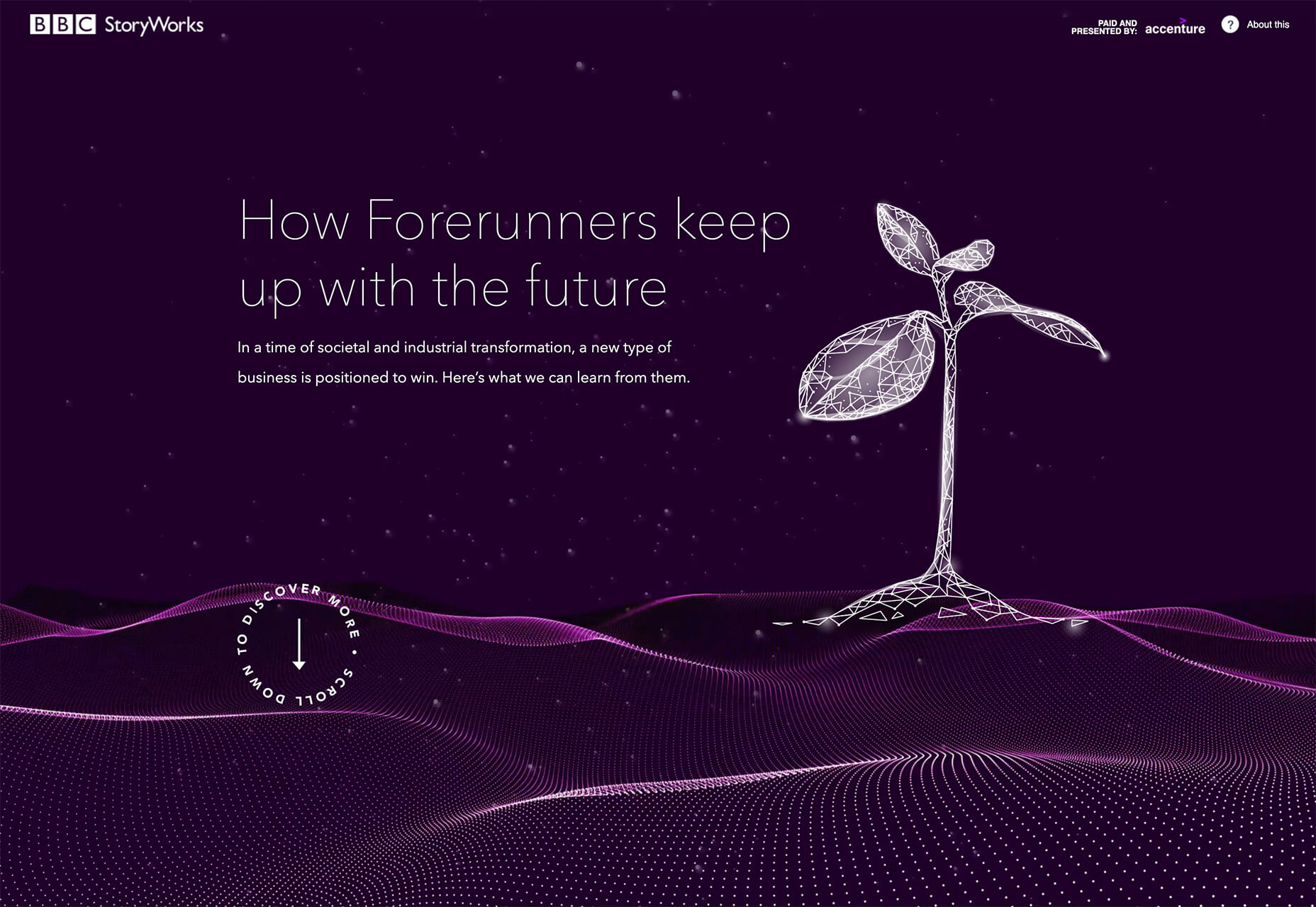
BBC Storyworks: The deep purple color palette with pinkish highlights is bright and readable, despite the dark background. White text and elements with smooth animation bring out the regality of the color choice. The challenge with this color is that purple often has strong emotional associations for individuals (good and bad), and you don’t know what “baggage” users might bring to the design.

Yellow Pony: This design is incredibly bright and has some brutalist undertones. What makes this color choice work is that it stops you in your tracks. You can’t help but look at the bright yellow and oddly-colored pony. The challenge, like with Wookmama, is contrast. There’s also a lot going on here with the bright color.


2. Fairly Brutal Black and White

Brutalism and brutalist design themes seem to keep ebbing and flowing. Understandably, it seems like, as a whole, designers can’t quite decide how they feel about this overall visual theme.

This trio of fairly brutal designs shares more than starkness in technique. They also feature distinct black and white color schemes and animation.

Put it all together, and the overall theme is maybe more “fairly brutal” than straight brutalist, re-emphasizing the hesitancy with the trend.

What’s nice about each of these designs is that they feel special and content-focused. This is a little in contrast with some other brutalist designs that are so stark and harsh that it can be hard to figure out what you are supposed to do with the website or what information is most important.

The other interesting thing here is that while all three websites have a similar design theme, they are nothing alike. (Personally, I find this type of brutalism and the included animation a lot easier to understand and digest. It uses the harsh feeling that you want to associate with the style but adds an element of comprehension that’s incredibly valuable.)

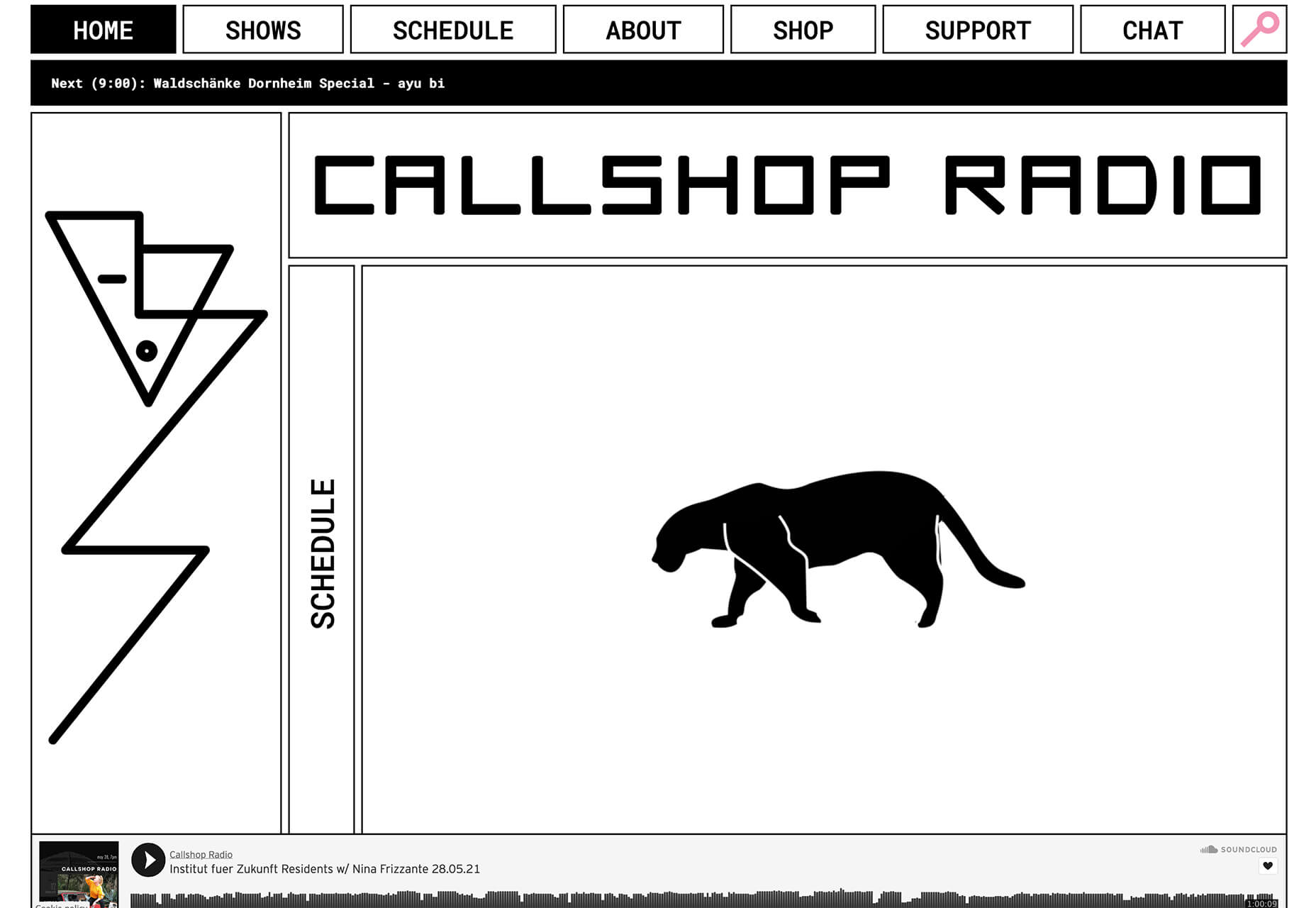
Callshop Radio uses an almost magazine theme style, block design with big buttons, a simple animation, and flash of color.

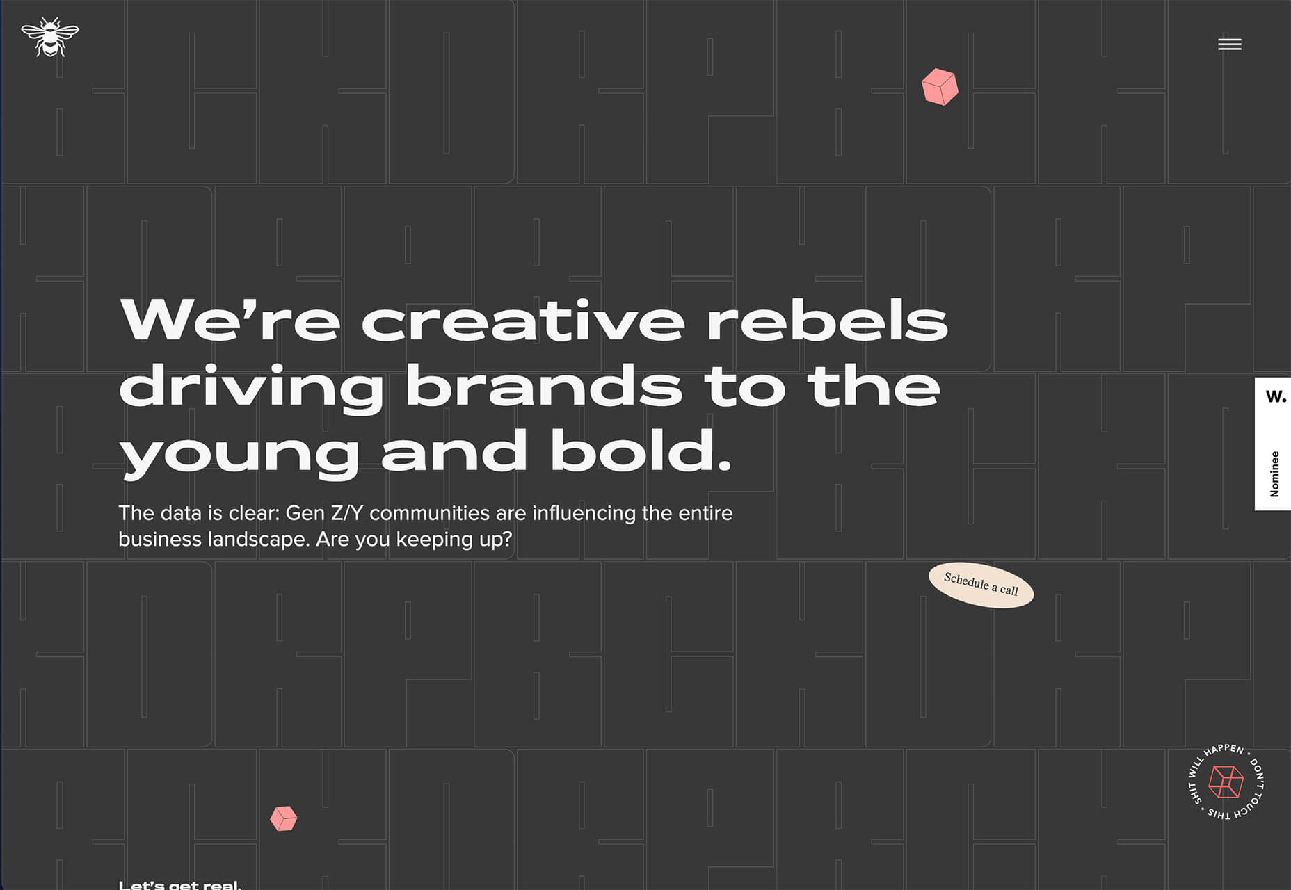
BCKDRP features a more subtle richer, almost black background with blocky type and accented color without the harshness often associated with brutal styles.

Vision Get Wild may be the closest to true brutalism, but the animated element in the center of the screen has a simple softness that lightens the entire feel.


3. Futuristic Faces

The final trending design element this month is a fun take on faces. There’s a movement happening with a futuristic or artificial intelligence/cyborg-inspired look to the people featured in the designs.

It’s hard to say where this design inspiration is coming from, but it is fun to look at with so many ways to play the style. The other commonality seems to be the dominant use of female faces.

These computer-generated images start with photos that are brightened and smoothed so that all imperfections are lost. The faces have no lines, color that might not look 100% natural, and enhanced features that may or may not be realistic.

You aren’t quite sure if you are looking at a face from a video game or image in many instances.

The types of websites that are using this design trend are similar in content and fashion, art, gaming, portfolios, and AI themes, among the most popular.

The true common thread is imagination. This type of design element can’t come to fruition without a strong vision and the ability to see the vision through creation.

These examples use progressively more futuristic variations of the trend:

HueLe Museum: The least AI-looking of the examples, has imagery with super bright light on faces to remove lines and imperfections so that the models almost the look of mannequins.

Jenny Lin: The portfolio design shows the designer in a style representing her work with a headshot that features an augmented reality, or digital design feel with an almost plastic-looking, on-the-verge of cartoon style.

Ruby9100m: The imagery here is full-on futuristic. From coloring to facial features to an almost Frankenstein-pieced-together look, nothing about this image insists on reality. (Did you notice the blue hand?)


Conclusion

This month’s design trends are a lesson in experimentation and evolution of other visual concepts. They also create an immediate impact on you in terms of emotion because of strong design choices.

Trends like these tend to come and go quickly; nevertheless, it will be interesting to see how they evolve.

Source

p img {display:inline-block; margin-right:10px;}
.alignleft {float:left;}
p.showcase {clear:both;}
body#browserfriendly p, body#podcast p, div#emailbody p{margin:0;}

The post 3 Essential Design Trends, July 2021 first appeared on Webdesigner Depot.

The controversial new BBC logo really isn't that controversial

Original Source: http://feedproxy.google.com/~r/CreativeBloq/~3/pVYQ5lO5KPg/bbc-logo-controversy

Why the online furore is off the mark.

The PlayStation logo from behind is the most cursed image online

Original Source: http://feedproxy.google.com/~r/CreativeBloq/~3/GThEMvIJEcM/playstation-logo-3d

Why, Sony, why?!

OCEAN BLUES Photography

Original Source: http://feedproxy.google.com/~r/abduzeedo/~3/_Z7Qvg-BPsE/ocean-blues-photography

OCEAN BLUES Photography

abduzeedo07.01.21

‘OCEAN BLUES’ is a fine art photography series by visual artist and landscape photographer Jan Erik Waider. All photos were taken during calm days on the Drake Passage on a voyage with the sailing ship Bark Europa from the Antarctic Peninsula back to Ushuaia. 

— Calm days on the Drake Passage

abstract background Landscape Nature Ocean sailing sea ship water wavesabstract background Landscape Nature Ocean sailing sea ship water wavesabstract background Landscape Nature Ocean sailing sea ship water wavesabstract background Landscape Nature Ocean sailing sea ship water wavesabstract background Landscape Nature Ocean sailing sea ship water wavesabstract background Landscape Nature Ocean sailing sea ship water wavesabstract background Landscape Nature Ocean sailing sea ship water waves

Credits

Fine Art Photography by Northlandscapes” Jan Erik Waider for more information check out

Photography Website
Image Licensing
Fine Art for Interior Designers
Purchase Fine Art Prints

Also make sure to connect with Erik on Instagram, Facebook, Twitter or LinkedIn

And if you are a photographers, Erik has some quite awesome and useful Lightroom Presets for Dark & Dramatic Landscape Photography


20 Best New Fonts, June 2021

Original Source: https://www.webdesignerdepot.com/2021/06/20-best-new-fonts-june-2021/

Welcome to a new series of articles, in which we round up the best new fonts released from some of the top designers on the Web.
In this inaugural edition, the collection includes fonts released or expanded over the last few months. Many of the fonts have free weights available. If you use any of them in your work, be sure to let us know!

Cedar

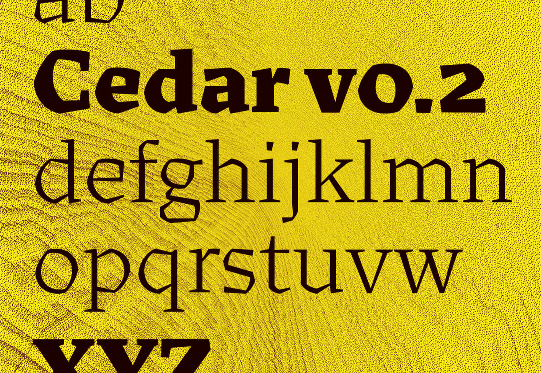
Cedar is a unique angular serif built by wrapping vector shapes around calligraphic structures. It has its roots in woodblock printing but creates a very modern aesthetic.

Tome Sans

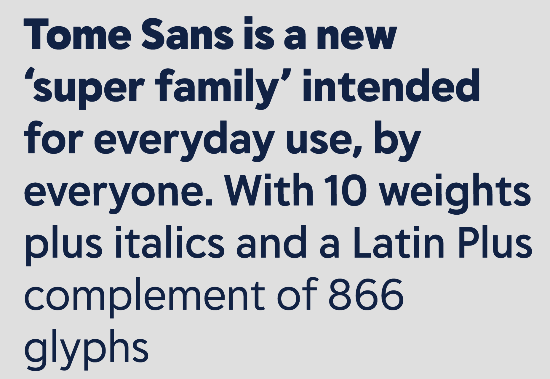
Tome Sans is a very usable business-like type family of ten weights, plus italics. It features some awesome ligatures that you don’t often find in a sans-serif.

Midnight Sans

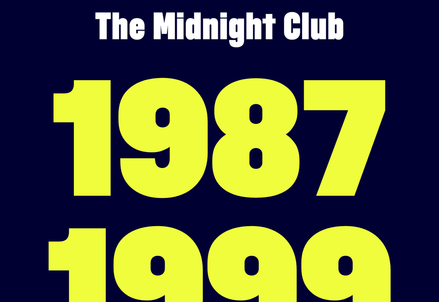
Midnight Sans is a chunky sans serif, suitable for display sizes. There’s a rounded variation for added warmth and dozens of OpenType features. It’s a good alternative to Impact.

Nouvelle Grotesk

Nouvelle Grotesk is a workhorse sans serif that you’ll come back to all the time. The humanist forms are a little more considered for digital usage than Akzidenz Grotesk or Helvetica.

Glaser Babyfat

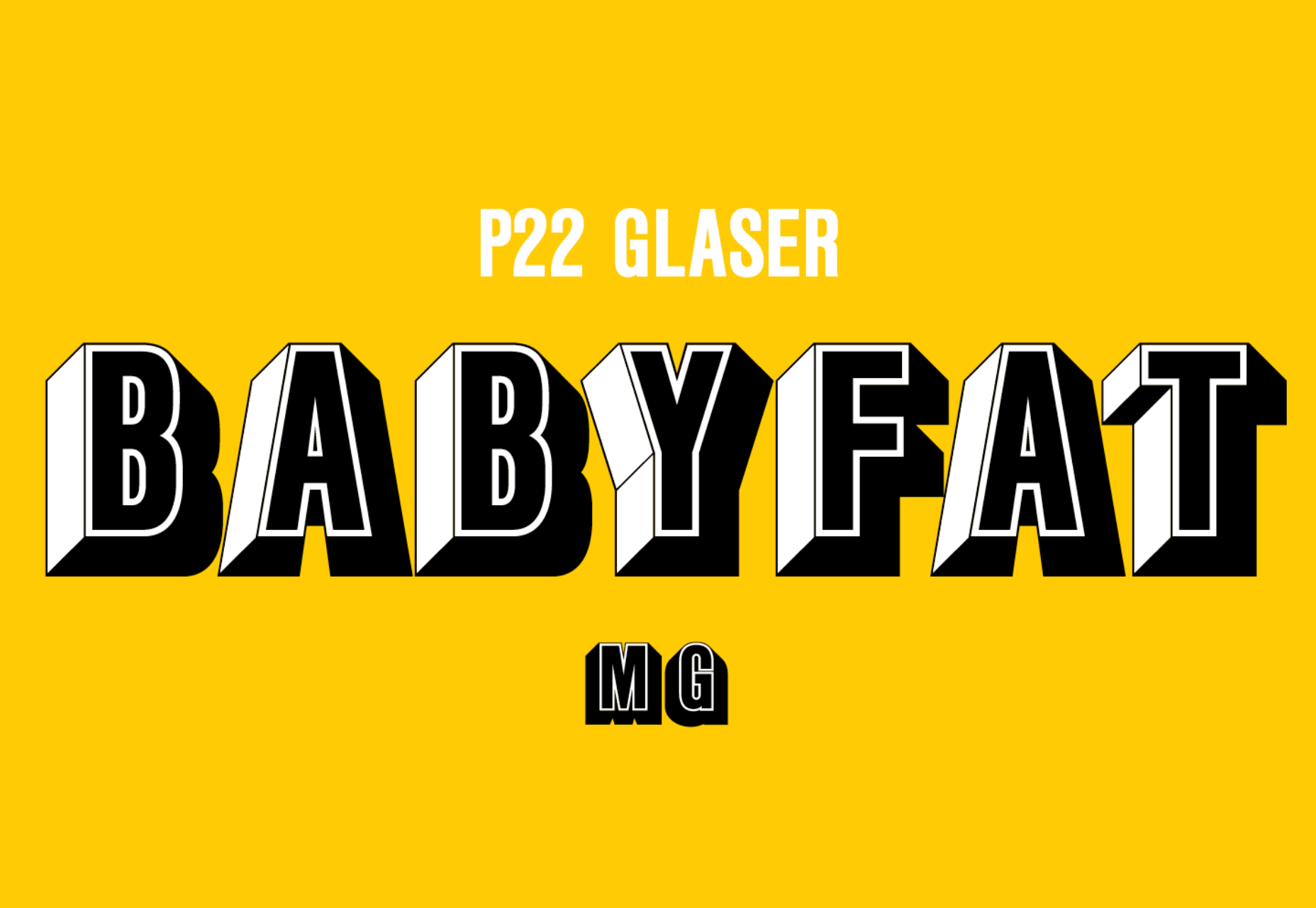
Glaser Babyfat is the first typeface designed by the late, great Milton Glaser. It has been released posthumously by P22 alongside three other fonts based on Glaser’s designs.

Kristal

Kristal is a flexible and highly readable serif, suitable for large blocks of text in small sizes. It has some beautiful details, including a selection of ligatures and a fine set of italics.

Lightbox 21

Lightbox 21 is a redesigned version of Lightbox; the original made use of the golden ratio for its geometry, the redesign completely abandons that resulting in a more readable typeface.

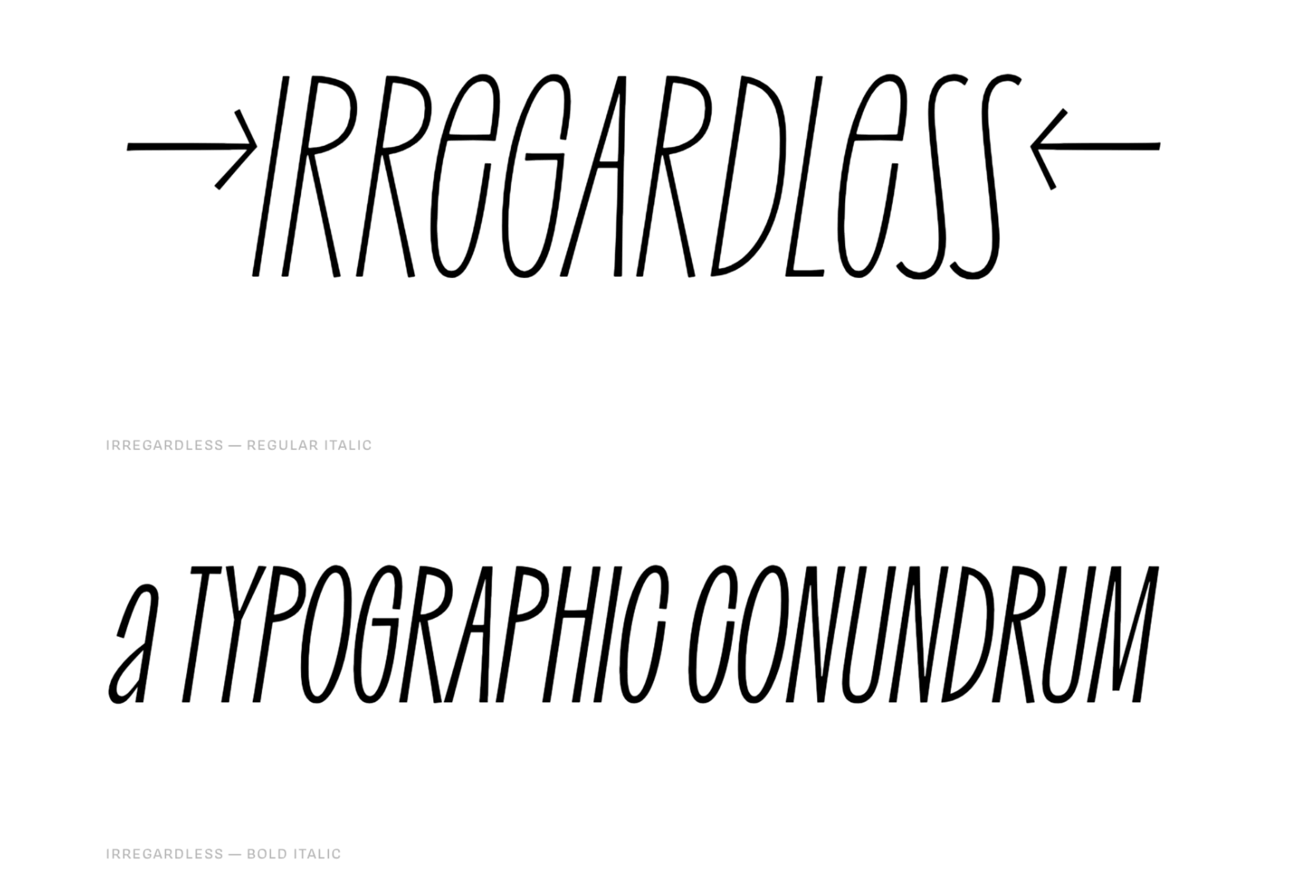
Irregardless

Irregardless is a tall sans serif with organic shapes that feels almost like lettering. Unusually for this style of typeface it has upper and lowercase letters. It’s perfect for a retro design.

Futura Now

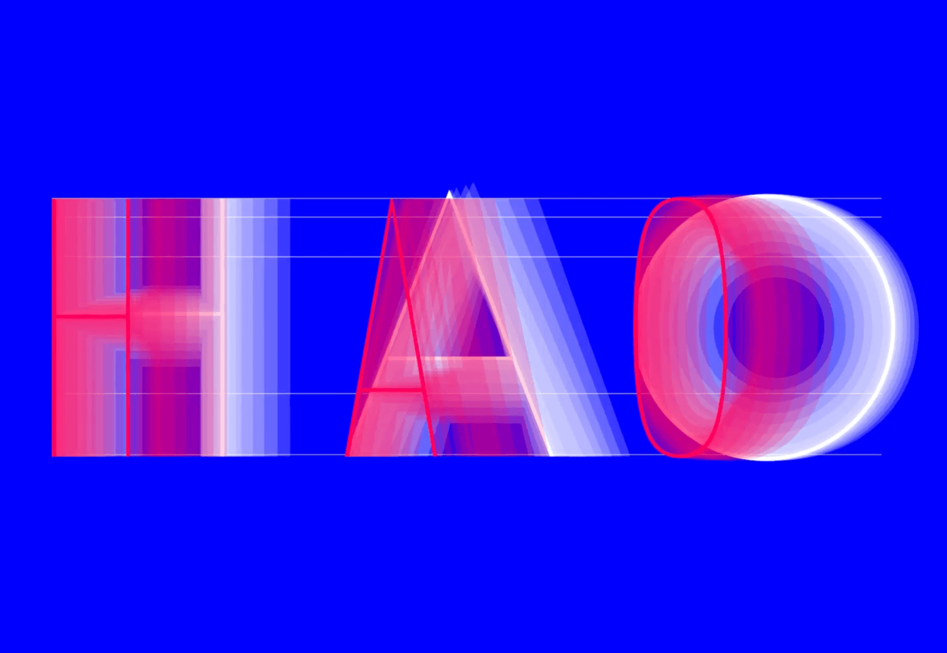
Futura Now is Monotype’s redrawn version of Paul Renner’s classic Futura. As well as being massaged for screens and expanded to cover more languages, it’s also now available as a variable font.

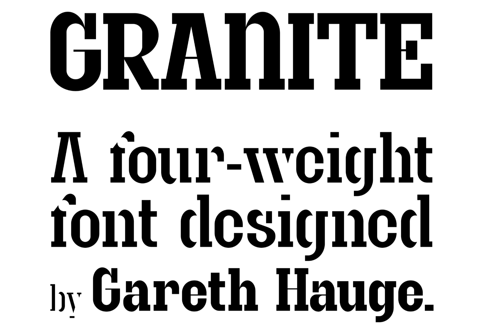
Granite

Granite is a slab serif with high-contrast strokes, giving it the feeling of an Old West woodblock font. There’s a stencil alternate set that adds to the rustic aesthetic.

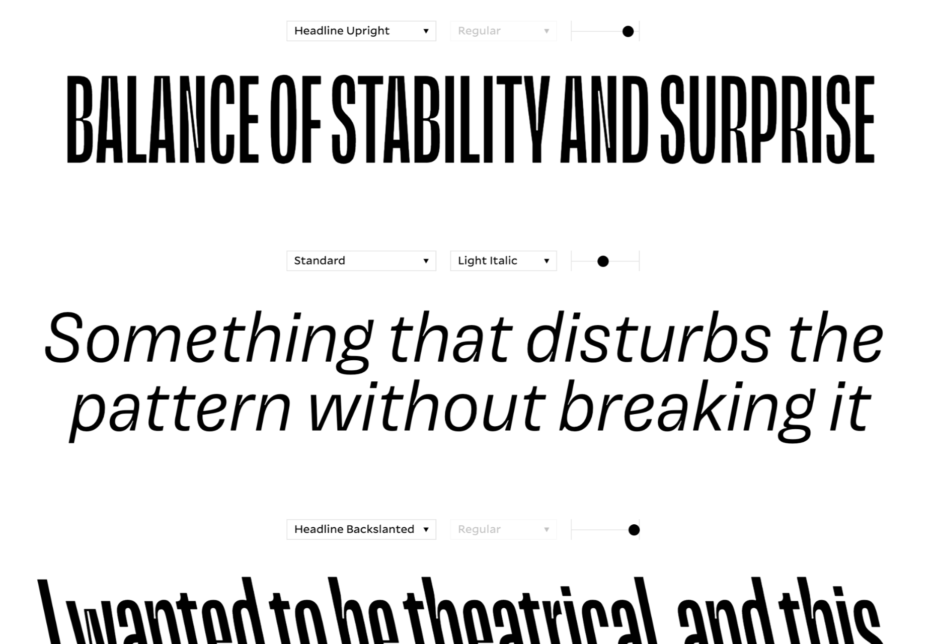
Magnet

Magnet is a sans-serif with heaps of character. There is a condensed headline variation that’s perfect for display purposes, but the real standout feature is the quirky ear on the lowercase g.

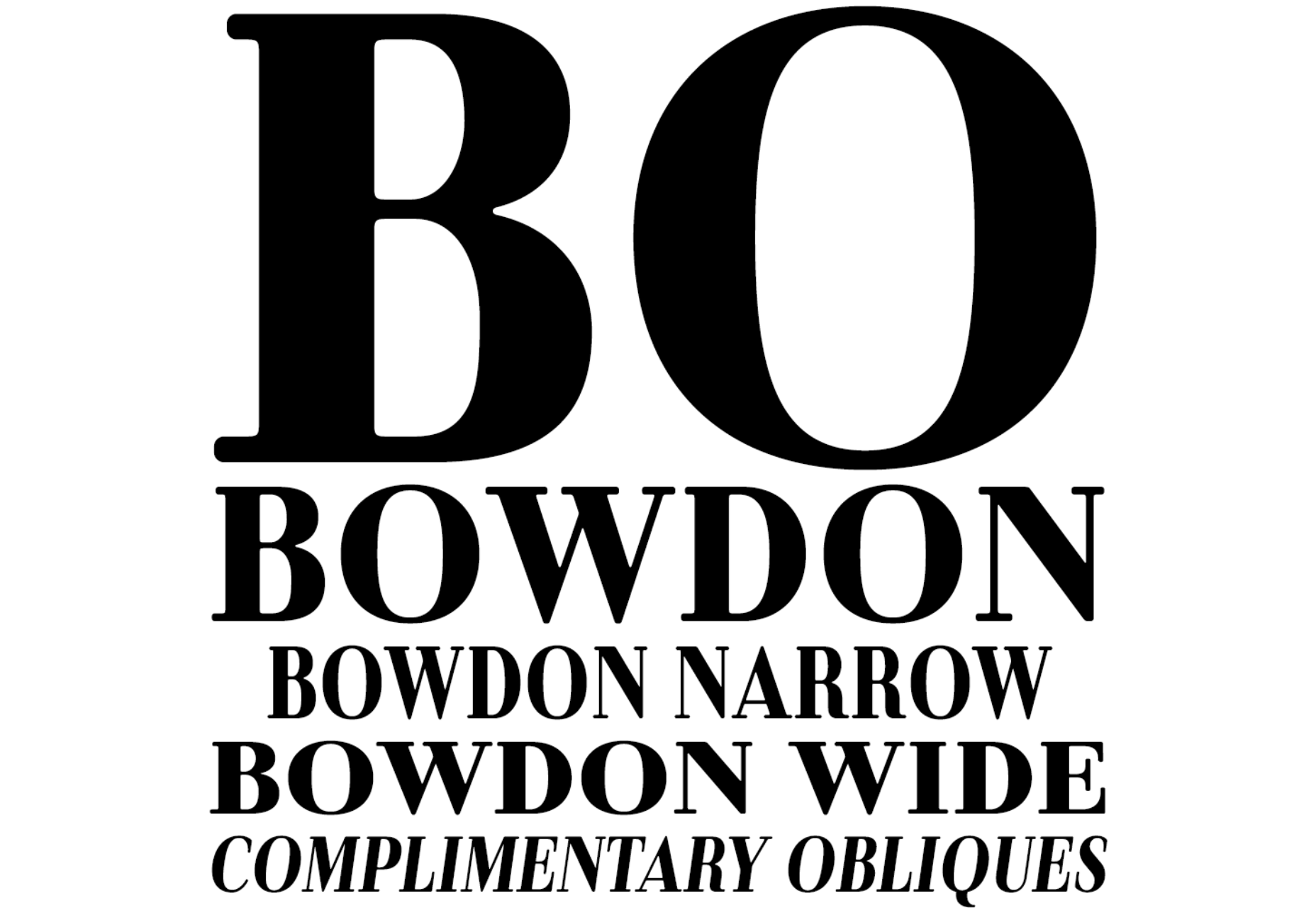
Bowdon

Bowdon is a warm serif in the Bodoni tradition. The contrast between serif and stroke creates a sense of luxury. It’s available in three weights: regular, narrow, and wide.

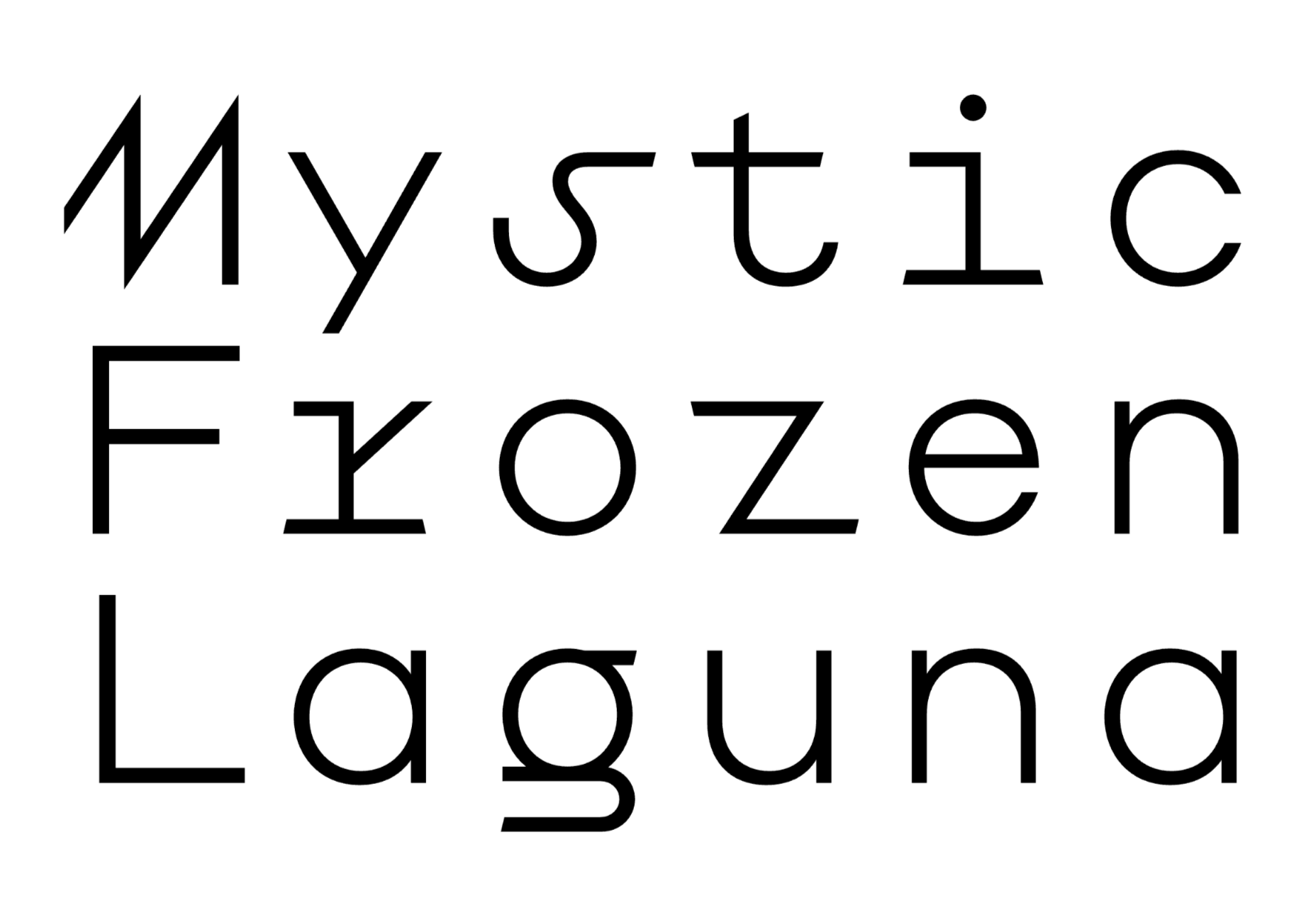
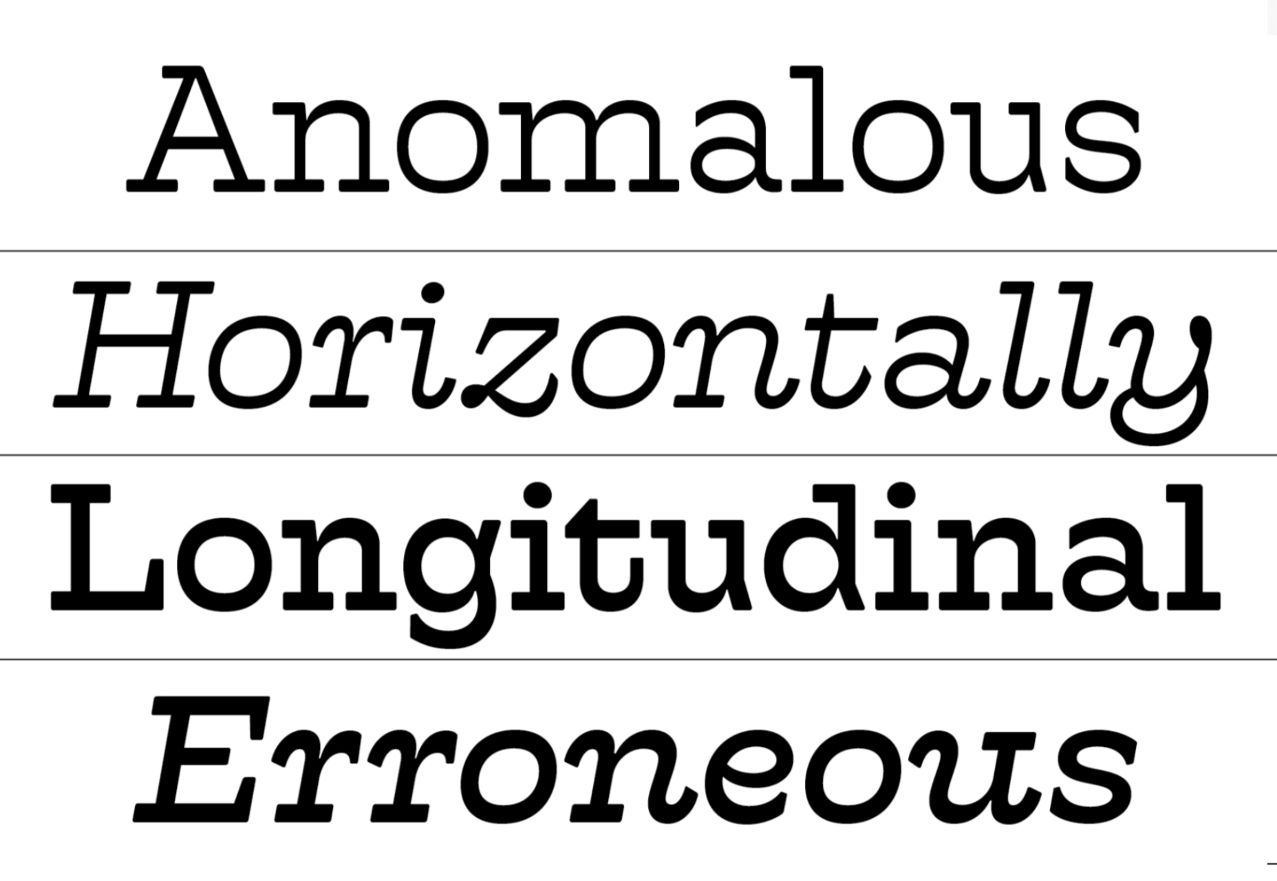
Euclid Mono

Euclid Mono is an attempt to design a monospaced font that doesn’t fit the traditional mold. The extended shapes create a dance-like composition with plenty of movement.

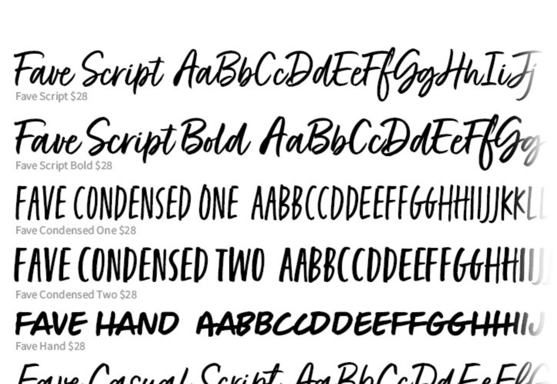
Fave Set

Fave Set is a collection of marker pen scripts that are always handy to have in your toolbox. There are ten fonts included in total, with condensed and extra casual styles adding to the number.

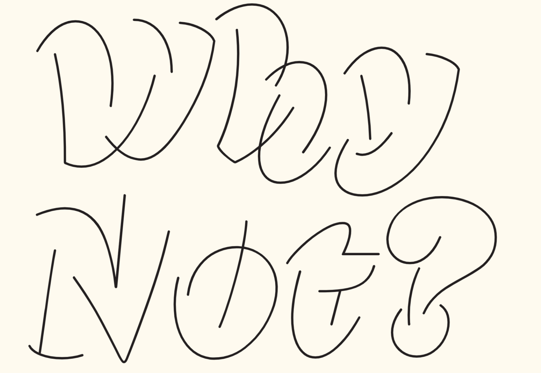
Saison

Saison is a wonderfully energetic outline font. It only works as a display option, but it’s perfect for editorial work or even branding.

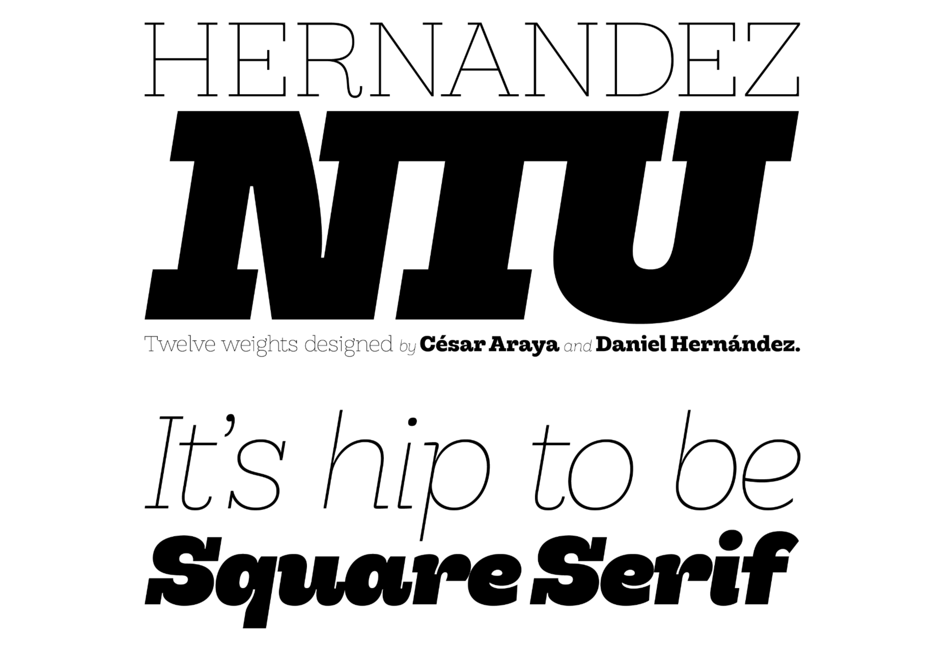
Hernandez Niu

Hernandez Niu is a slab serif that takes lots of character from its exaggerated ink traps in weightier sizes.

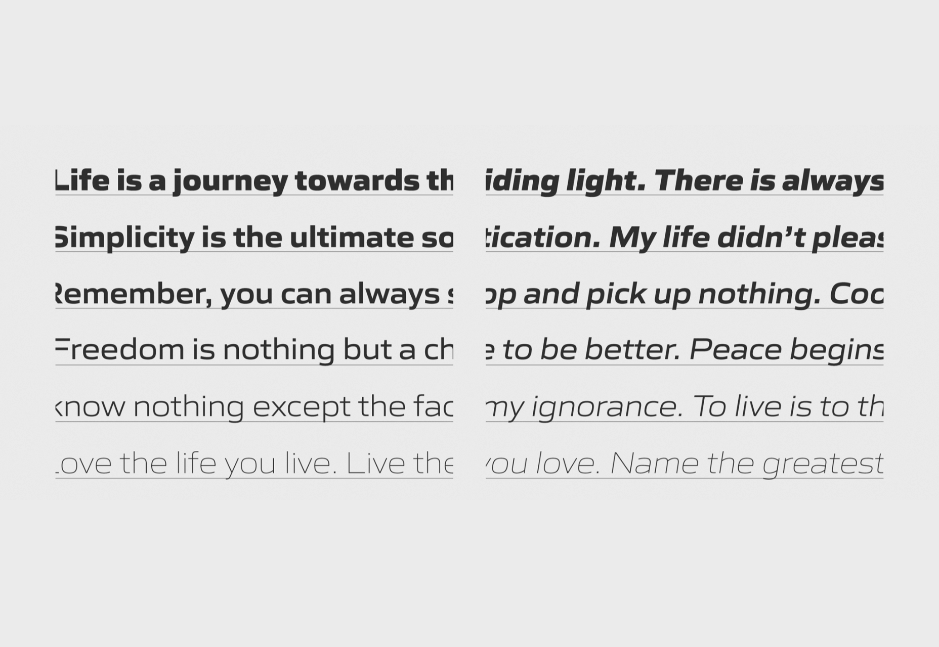
Gomme Sans

Gomme Sans is a typeface with 12 weights. The extended style creates a modern feel, and it’s suitable for display or short to medium amounts of text.

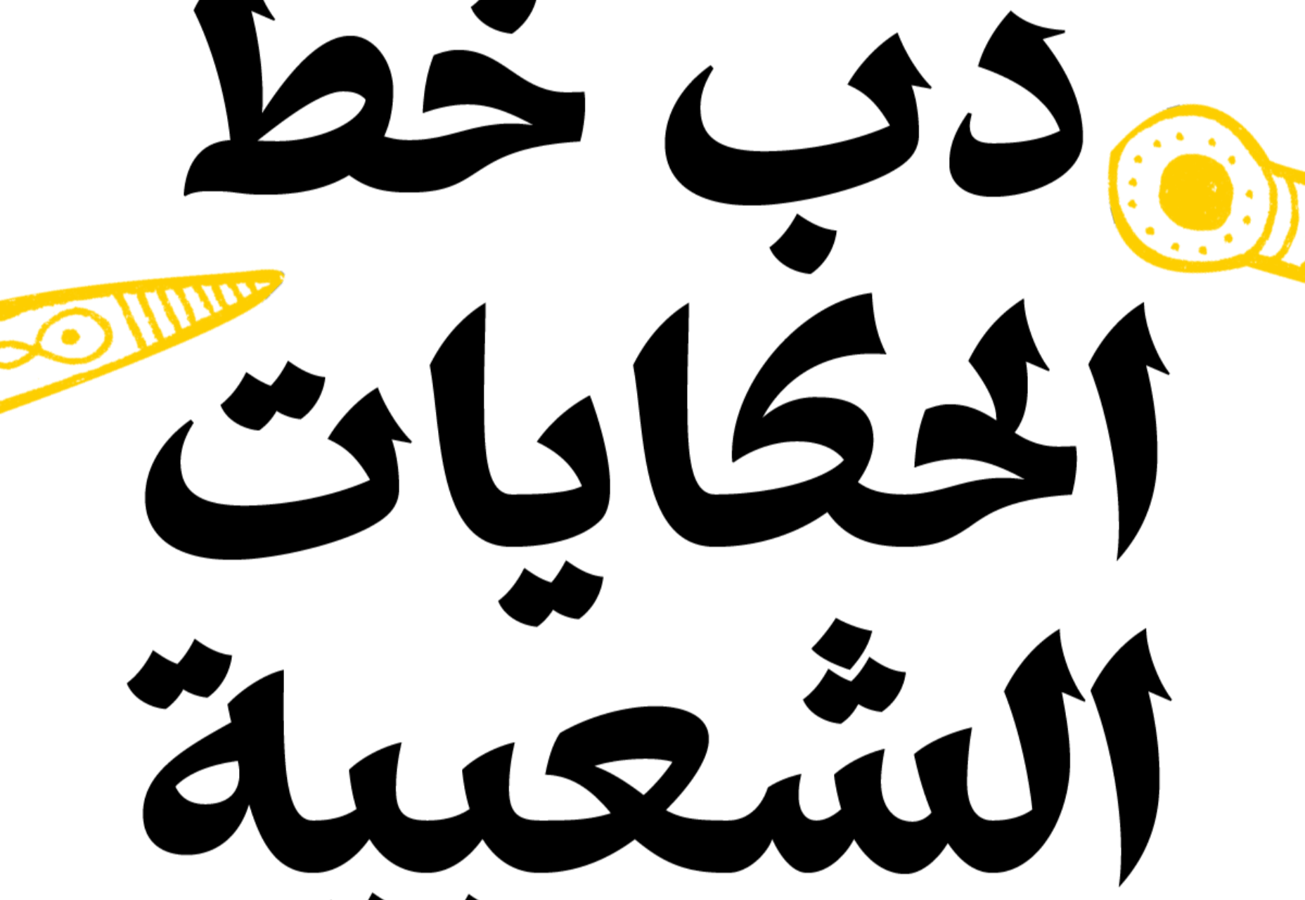
Dobb

Dobb is an Arabic typeface designed to offer a playful and expressive option for pairing with illustrations. It has a graphic novel feel in extended text blocks.

Hatch

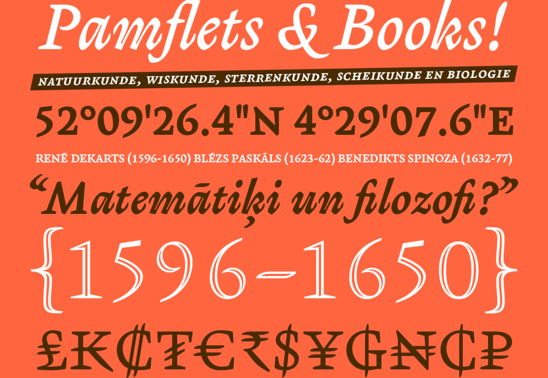
Hatch is a slab serif that has drawn inspiration from reverse stress typefaces of the nineteenth century. It has some quirky details that make it distinctly modern and a beautiful italic.

Sculpin

Sculpin is a sans serif with sharp strokes and corners, inspired by the sharp edges of tools like chisels. It comes in five weights with matching italics, and there is a variable font available.

Source

p img {display:inline-block; margin-right:10px;}
.alignleft {float:left;}
p.showcase {clear:both;}
body#browserfriendly p, body#podcast p, div#emailbody p{margin:0;}

The post 20 Best New Fonts, June 2021 first appeared on Webdesigner Depot.