Original Source: https://ecommerce-platforms.com/accounting-software/freshbooks-review
In this FreshBooks review, we’ll be looking at one of the most popular tools for small business accounting on the market and exploring whether it’s as valuable as it seems. When it first started, FreshBooks was a simple but effective invoicing solution. Over the years, the solution expanded, offering new features for business money management.
Today, FreshBooks helps business owners and freelancers from all walks of life to handle their ingoing and outgoing cash more effectively.
FreshBooks has evolved significantly recently and now adheres to double-entry accounting rules. While you can still do the same things as you could before, like creating invoices and tracking work time, you’ll have a more reliable framework for your record keeping.
How Does FreshBooks Work?
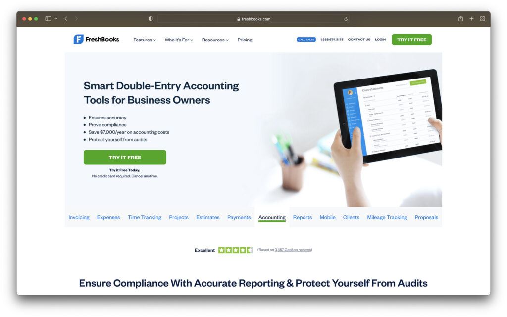
FreshBooks offers a 30-day free trial option for users, so you can jump in and get a sense of the services you’re going to get as quickly as possible. After your free trial, you’ll be able to choose one of the premium plans for your long-term setup.
FreshBooks upgraded its onboarding process quickly and has begun to ask more questions about each user’s business, contact information, and whether they want to invite team members to the service. Once you’re done entering details, FreshBooks will drop you into the intuitive user interface.
To begin, FreshBooks walks you through everything you need to get started, including customizing your invoices with logos. On the main dashboard, you’ll be able to see the basic details of your company’s financial health spreads across five charts. The charts cover things like outstanding revenue (who owes you money), Total profit for insights into your profit and loss, and more.
Links on the top right corner of the page will take you to a page where you can invite team members to join you or connect with an accountant. You’ll also have a comprehensive navigation menu for getting to various parts of the tool, like the client list, dashboard, expenses, estimates and time tracking tools.
You’ll also be able to link your financial accounts to your FreshBooks environment, so you can track incoming and outgoing expenses automatically. You’ll even be able to use tools like Stripe and FreshBooks payments to accept money within your app.
Though there are products with more advanced UIs out there, FreshBooks offers quite a convenient and straightforward solution for modern business owners. If you’ve ever used the old FreshBooks, you’re likely to feel a little confused about how much it’s changed.
Go to top
FreshBooks Review: Pricing
Let’s start our review by considering how much FreshBooks will cost your business. The first point to remember when choosing your pricing package is you can get a lot of accounting tools in one with FreshBooks, so make sure you consider the value in each package before making a choice.
Like many SaaS solutions for accounting, website building, email marketing, and more, FreshBooks also comes with discount options if you’re willing to pay for an entire year of your subscription up front. The available pricing options include:
Lite: $15 per month: Support for up to 5 billable clients, unlimited expense tracking, unlimited estimates, credit and debit card payment processing, reports and sales tax, mobile apps, and VAT return filing.
Plus: $25 per month: All the features of Lite, but you can send invoices up to 50 clients. You’ll also be able to invite your accountant to help with your double-entry accounting reports. There’s an ios and Android app, mobile mileage tracking and more.
Premium: $50 per month: Everything you get from Plus, but with unlimited invoices, bill tracking, accounts payable, profitability reports, custom email templates and signatures. Checkout links. Direct debit and recurring billing settings.
Select: Custom pricing: All the features of the Premium invoicing software, plus 2 member accounts, premium customer support, bank account connections, dedicated account manager and custom migration. Mobile app access, no branding on client emails, automate expense tracking and late payment reminders, plus access to business health reports.
If you need the most advanced service FreshBooks can offer, you’ll have to contact the team about the “Select” plan.
This package offers all the features of Premium, as well as a range of extras such as multiple member accounts, dedicated account managers, migration assistance if you’re already using another software and custom onboarding. You can also remove the branding on your FreshBooks emails.
If you’re not sure which features are going to be most important to you, FreshBooks offers a 30-day free trial, where you can access all the features, and see how everything works. Though not as inexpensive as some of the other alternatives on the market, FreshBooks is still a popular pick offering a decent level of value.
Go to top
FreshBooks Review: Invoicing
As mentioned above, FreshBooks started life as an invoicing brand, so it makes sense this should also be somewhere the company can perform well. If you head to the “Invoices” tab in your toolbar, you’ll get all the information you need to know about your accounts receivable. There’s also the option to dive into who owes what amount.
FreshBooks’ invoicing page provides plenty of details about historical and resent transactions. There are also a few additional transactions to track here: proposals and estimates. Both of these documents can be converted to invoices. With a proposal, you basically provide an in-depth estimate to your client explaining what you’re going to offer, and the client signs it to approve the transaction.
When you click on the button to create a new invoice, you’ll travel to the building page, where your billing data and invoice number will already be filled in. You can then work on the rest by selecting services and entering quantities for what you’re selling.
Crucially, FreshBooks allows companies to customize their invoices, which is a nice extra touch. You can create templates for your brand which are available to re-use as often as you like.
Go to top
FreshBooks Review: Accounting
The accounting tools provided with FreshBooks help to ensure accuracy in your records, maintain compliance, and give you a better understanding of your financial situation. You can connect with your accountant within FreshBooks, to get their help when it comes to calculating profits and losses, or submitting information for a tax return.
The extensive accounting environment comes with a host of helpful features intended to ensure business leaders can make decisions based on valuable information they have about their company. For instance, you can track how much money you’re setting aside for tax time, and how much you owe for other things, like VAT.
The accounting section of FreshBooks includes:
Journal entries
Chart of accounts
Accounts payable
Accountant access
Trial balance
VAT Return report
General ledger
Balance sheet
The best thing about the accounting features of FreshBooks for most companies will be the ability to invite your accountant to come and access crucial financial data. But you’ll also be able to unlock a range of other beneficial tools too, like categorized transactions, automated matching suggestions, and summary reports you can export to Excel.
There’s an “Accounts Payable” feature too, which means you can set up automated management of repeat purchases in your FreshBooks account, making it easier to track everything you owe over time. We’re also fans of the “credits” feature, which allows you to track prepayments, overpayments, and even credits you’d like to use to reward customers in future.
Go to top
FreshBooks Review: Projects and Time Tracking
Although FreshBooks is a solution for accounting first and foremost, it’s also a tool for keeping your business running as smoothly as possible. You can use FreshBooks to track the progress of projects within your workplace, and keep teams on the right page, enabling collaboration and growth.
FreshBooks’ solution is specially built for small business owners and teams, to help increase productivity levels. You can invite all your contracts, employees, business partners, and other professionals into the same project management environment, and decide which files they’re going to have access to as you go. With knowledge management no need for digging through email chains trying to find a single attachment. You can easily find everything located in one space.
FreshBooks’ project management solution also enables faster collaboration with clients – which is great if you need feedback for your strategy every step of the way. You’ll have access to a range of easy tracking tools to help you understand your business better, such as:
Project profitability: Detailed reports of each project’s performance
Profitability summaries: overviews of profitability across projects and clients
Profitability widget: Comprehensive insights into incomes, costs, and unbilled hours
The comprehensive project management section is packed full of features, so you can chat and collaborate on work, assign tasks to teams, and share files or images in the same place. You can even assign costs and billable hourly rates to specific projects, and control what your team has access to with in-depth permissions. Plus, there’s a simple duplication feature too, if you need to track a number of similar projects.
The project management functionality with FreshBooks is particularly valuable when paired with the company’s time-tracking software. You can start tracking time with a click and create easy-to-read reports with billable hours for your clients.
You don’t need to download anything if you don’t want to, either. Time tracking is available as a mobile app, but you can also use it as a Chrome plugin too. Or you can integrate your time tracker into the apps you use already, like Trello, Teamwork, and Asana. Easily keep your team on track with the same time tracking technology and view how well they’re using their time with reports.
Go to top
FreshBooks Review: Other Features
FreshBooks is pretty feature rich these days.
Outside of the features we’ve already covered, the solution includes a payment system which allows your customers to pay you using the FreshBooks payment processor. This costs around 2.9% plus 30 cents per transaction – which is about the same as most tools.
You can set up sales tax within your invoice to reduce the amount of time you spend figuring out the full cost a customer has to pay. There are also context-sensitive settings to consider, which is a unique feature just for FreshBooks. As you work on invoices, the software basically detects what kind of tools you’re going to need and makes sure you can access them.
Other features to be aware of include:
Client records: FreshBooks allows you to collect information about your customers over time. When you first add a client record to the system, you’ll basically only have contact information. However, client records gradually become more immersive over time. You can attach receipts and individual expenses to a client or use the relationship tab to see transaction histories.
Expenses: As part of your overall FreshBooks accounting experience, you’ll get a tab for tracking expenses. The software automatically categorizes these expenses with choices like meals, entertainment, and personal. At first you need to train the expenses system to recognize your payments, but over time it does become more accurate. You can attach files, drag and drop receipt images, and mark the expense as billable. There’s even the option to designate an expense as cost of goods sold (COGS).
Mobile apps: FreshBooks offers a set of mobile apps for Android and iOS. The two apps are easy enough to use, but they are somewhat limited compared to the full user experience you’ll get on the primary site. The FreshBooks app offers access to a dashboard with charts for outstanding revenue, total spending, total profit, and icons which take you to specific areas within the tool. There’s also automatic mileage tracking if you run the app with location services on, which can be very convenient.
Reporting: The ready-made financial reports from FreshBooks are extremely useful for learning more about your business. There are MTD ready reports, color-coded expenses breakdowns, VAT return reports, profit and loss reports, accounts aging reports, Recent activity reports, sales tax reports and more. You can even track expenses, payments collected, and invoices in the same place.
Estimates: Similar to other accounting software like Quickbooks, Freshbooks can also help with figuring out how much you need to charge a customer. The bookkeeping solution has estimates which you can automatically change into invoices when the time comes to get a credit card payment from a customer.
Payments: Crucially, business leaders can also get payment for one-off and recurring invoices through FreshBooks payments. The solution provides excellent ease of use for small businesses, so you can set up online payments in no time. The system also offers excellent security, and integration with the rest of your accounting solution.
Go to top
Who is FreshBooks For?
There are plenty of accounting software options out there where you can track time on projects, send invoices, and manage the growth of your business, from Xero to QuickBooks online. There are tools available for all kinds of business owners. In fact, FreshBooks recommends tools for advanced payments depending on the kind of business you want to run.
Self-employed freelancers can access bank reconciliation and set recurring invoices with different payment options without having to purchase a separate add-on. There are even tools for establishing late fees when customers don’t deliver cash on time.
Businesses with employees or contractors also have a range of tools available to them, ideal for improving cash flow, keeping track of due dates for projects, and accepting credit card payments. The FreshBooks help desk and FAQs will show you how to use various features, from late payment reminders to new FreshBooks tools as they arrive.
Go to top
FreshBooks Review: Customer Support
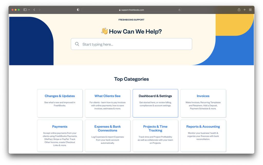
The best support for FreshBooks comes with access to the later, more expensive plans. However, you can still reach out for guidance for things like using invoice templates, PayPal payments, and tips on how to use the FreshBooks mobile app with the contact page.
FreshBooks has award-winning customer service, with both a phone number you can contact and an email address for help requests. There’s also plenty of guidance and tips available on the FAQ page and blog pages if you need extra DIY help with things like integrating Zoho or making the most of your accounting reports.
Go to top
FreshBooks Review: Verdict
FreshBooks is one of the most popular reporting, bookkeeping, and accounting tools on the market today. Offering exceptional customer support, advanced features, and genuine ease of use, it’s a great pick for a range of customers.
Although you might be a little restricted by the Lite plan, companies willing to pay a little more for accounting tools will generally do well with FreshBooks. Remember to examine your business needs carefully before you pick a plan, and make sure you’re getting the right level of technology. You can always reach out to the team if you’re not sure.
The post FreshBooks Review (Dec 2021): Easy Business Accounting? appeared first on Ecommerce Platforms.


 Maps are a fascinating method for delivering content. At their best, they can create an intuitive way of presenting information and interacting with it. This is the advantage that digital maps, through mobile apps and websites, have over print maps and images where no interactivity is possible.