Collective #544

Original Source: http://feedproxy.google.com/~r/tympanus/~3/6QfQA6j1XOQ/

C544_WOTW

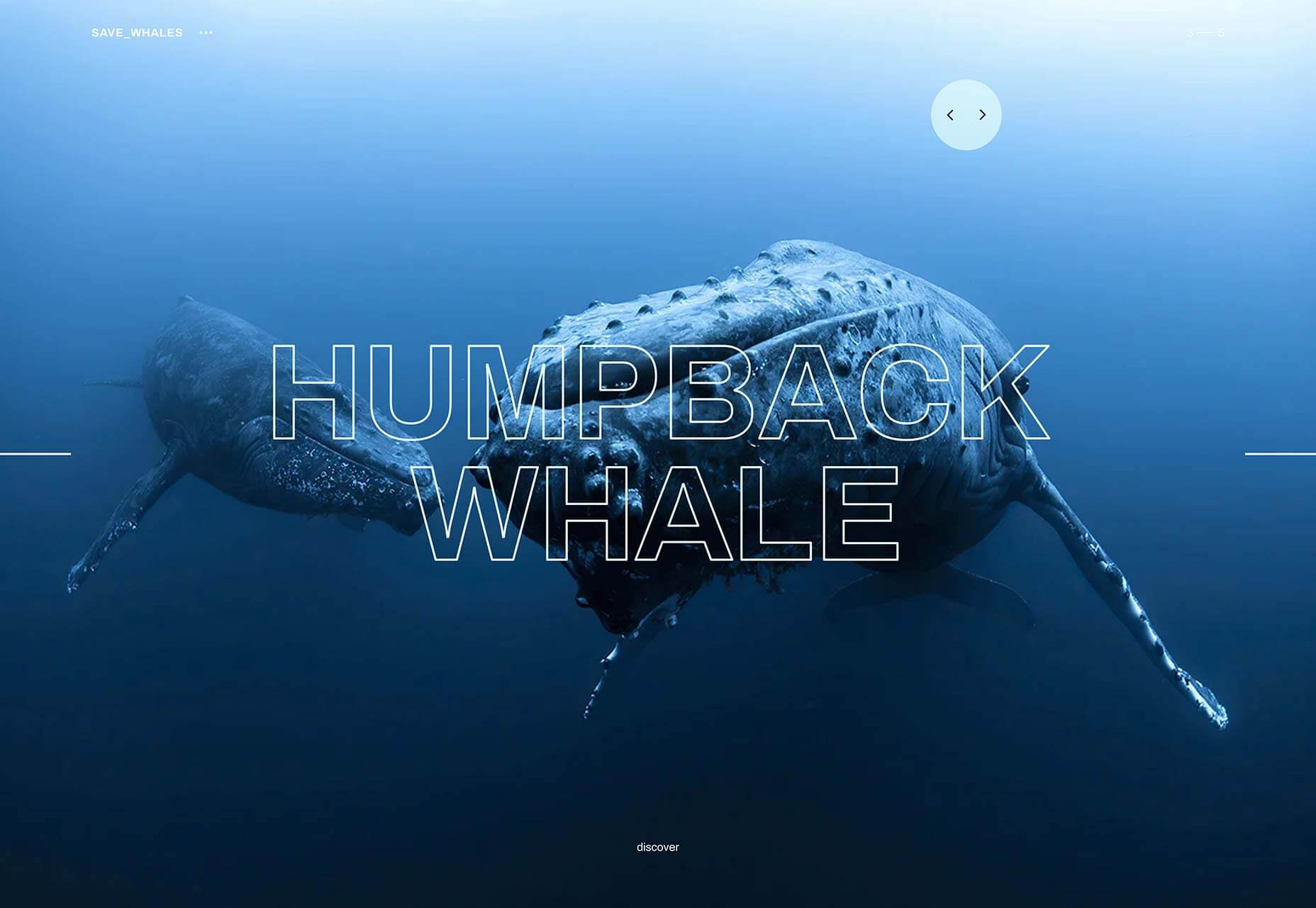
Inspirational Website of the Week: Save whales

A beautiful website dedicated to a wonderful creature. Lovely transitions and 3D models. Our pick this week.

Get inspired

C544_svgartista

SVG Artista

SVG Artista is a useful tool that helps you animate strokes and fills in your SVG image with CSS transitions.

Check it out

C537_divi

Our Sponsor
The Ultimate WordPress Page Builder

You’ve never built a WordPress website like this before. Divi is more than just a WordPress theme, it’s a completely new website building platform that replaces the standard WordPress post editor with a vastly superior visual editor.

Try it

C544_darkmode

Designing Dark Mode

Jon Friedman shares how Dark Mode experiences are being crafted across Microsoft 365.

Read it

C544_bottomnav

Bottom Navigation Pattern On Mobile Web Pages: A Better Alternative?

Arthur Leonov explores a better alternative to the mobile top navigation pattern with a hamburger menu.

Read it

C544_color

Color Palette Generator

A superb color palette generator that will create truly working color themes.

Check it out

C544_sorry

Sorry Not Sorry

A fantastic experiment that shows the magical power of variable fonts.

Check it out

C544_switch

3D Switch animation

A truly amazing little switch component with a 3D twist. By Aaron Iker.

Check it out

C544_icons

Creating a Maintainable Icon System with Sass

Tracy Rotton explains how to tackle the drawbacks of the data URL background image technique for including icons.

Read it

C544_api

Get started with GPU Compute on the Web

François Beaufort plays with the experimental WebGPU API and shares his journey with web developers interested in performing data-parallel computations using the GPU.

Read it

C544_dots

Color Collision

A really cool game made by Sikriti Dakua.

Check it out

C544_chaining

Optional chaining

Learn all about the optional chaining operator and what you can do with it.

Read it

C544_typescript

Announcing TypeScript 3.6

Learn about all the exciting new features of Typescript 3.6 in this article by Daniel Rosenwasser.

Read it

C544_splitting

How to Accessibly Split Text

Michelle Barker takes a look at why splitting a string of text can be problematic from an accessibility point of view, and what we can do to make sure that split text is accessible to everyone.

Read it

C544_labelstudio

Label Studio

Label Studio is a multi-type data labeling and annotation tool with standardized output format.

Check it out

C544_draggable

Drag & Drop Elements with Vanilla JavaScript and HTML

Jess Mitchell shows how to create a drag and drop feature using the HTML Drag and Drop API with a little vanilla JavaScript to set up the event handlers.

Read it

C544_alexa

Voice User Interface Design by Cheryl Platz

Jeremy Keith’s liveblog of Cheryl Platz’s An Event Apart presentation on voice interfaces.

Read it

C544_optional

Optional HTML: Everything You Need to Know

Jens Oliver Meiert gives an overview of what HTML code is optional.

Read it

C544__loops

Perfect loops in Processing

Some valuable tips on creating slick looping animations in Processing.

Read it

C544_sofa

Color this sofa! – SVG + Blend Mode trick

Kyle Wetton created this amazing demo where you can color a sofa using some smart SVG and blend mode trickery.

Check it out

C544_pi

Calculating PI Using Raindrops

A great demo by Mustafa Enes which is based on a real-life experiment that gives an approximation to PI.

Check it out

C544_css

CSS Can Do This… And It’s Terrifying!

Aaron Powell lists some interesting ways to “exploit” CSS.

Read it

Bear Illustration Process

Illustrator Pierre Kleinhouse shares some insight on his process and answers some interesting questions.

Watch it

C544_pattern

Delaunay

Johan Karlsson implemented the Bowyer-Watson algorithm to perform the Delaynay triangulation. Click to generate a new pattern.

Check it out

C544_tooltips

The problem with tooltips and what to do instead

Adam Silver lists the numerous problems that come with using tooltips to reveal more content.

Read it

C544_js13k

Js13kGames

A friendly reminder that the epic JavaScript coding competition for HTML5 Game Developers is still running for 2 weeks.

Check it out

Collective #544 was written by Pedro Botelho and published on Codrops.

Creative Essentials: Professional Tools That Make My Work Better

Original Source: https://www.webdesignerdepot.com/2019/08/creative-essentials-professional-tools-that-make-my-work-better/

My name is Suzanne Scacca and I am a tool snob. 

Before I became a writer, and before I entered the world of marketing and web design, I was a long-time project manager. And although I could’ve stepped into any of my project management jobs and simply executed the tasks employers asked of me, I was never happy with the status quo. 

We’re living in an amazing time for technology and I knew there would always be a better way to work, if only we could find the right tool for it. And that’s the key, isn’t it? Finding tools that are right for the job and that are right for you. 

Adopting the wrong-fit tools can do a lot of harm to one’s productivity and success, which is why we should all be picky about what we use. It’s also why we should be loyal to tools once we’ve found ones we know we can trust. 

There are 13 tools I’m 110% dedicated to and use on a daily basis. These tools help me write, optimize websites, and even create fake web pages in order to demonstrate points I’m trying to make or to show how tools work in my articles. I also rely on a number of communication and productivity apps to keep me on top of things without being overwhelmed or distracted by them. 

Curious to see how a tool junkie runs her day? Check these out:

1. Google Apps

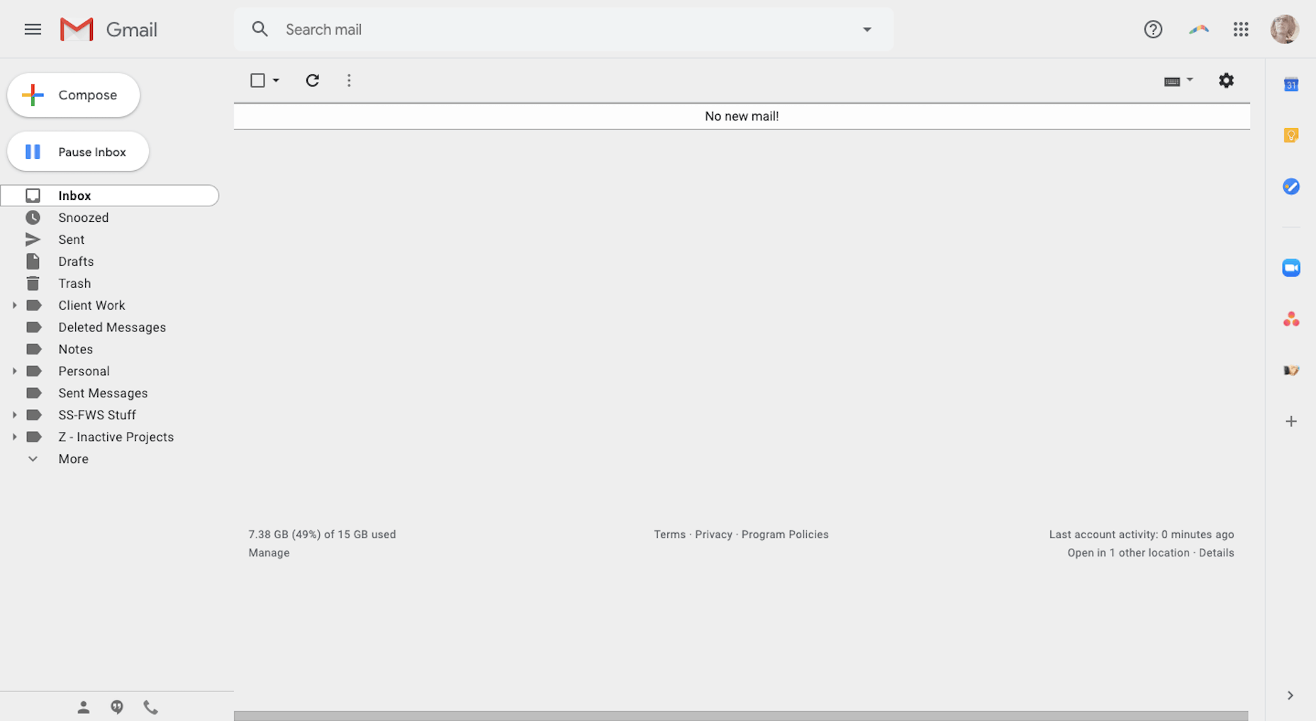
Google is pretty much the central hub of my business. I do all my major communicating through it with Gmail. 
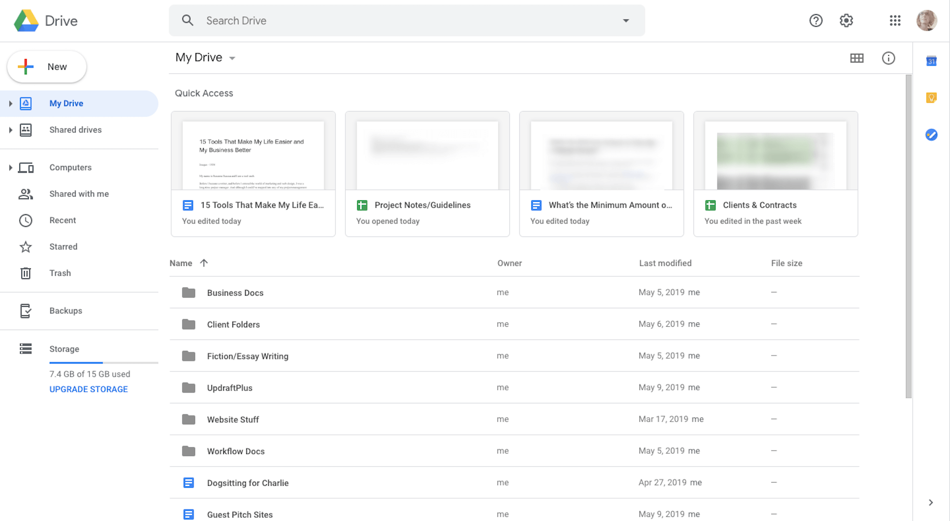
I do all my note-taking, brainstorming, writing, editing, and content collaboration in Google Drive. 
I’ve also integrated a number of my applications with Google (like Zoom, Asana, and Zoho), so I have fewer steps to take as I move things from one platform to another. 

2. Boomerang for Gmail

Because I worked as a project manager for so long, it’s my natural instinct to reply to messages and tackle new tasks the second they hit my inbox. This is a major problem for me as a writer because once I lose track of what I’m working on, it takes a couple minutes to get back into the swing of things.

That said, I can’t focus if my Gmail isn’t at Inbox Zero. It’s just how I operate. 

So, I fake it with Boomerang for Gmail. 
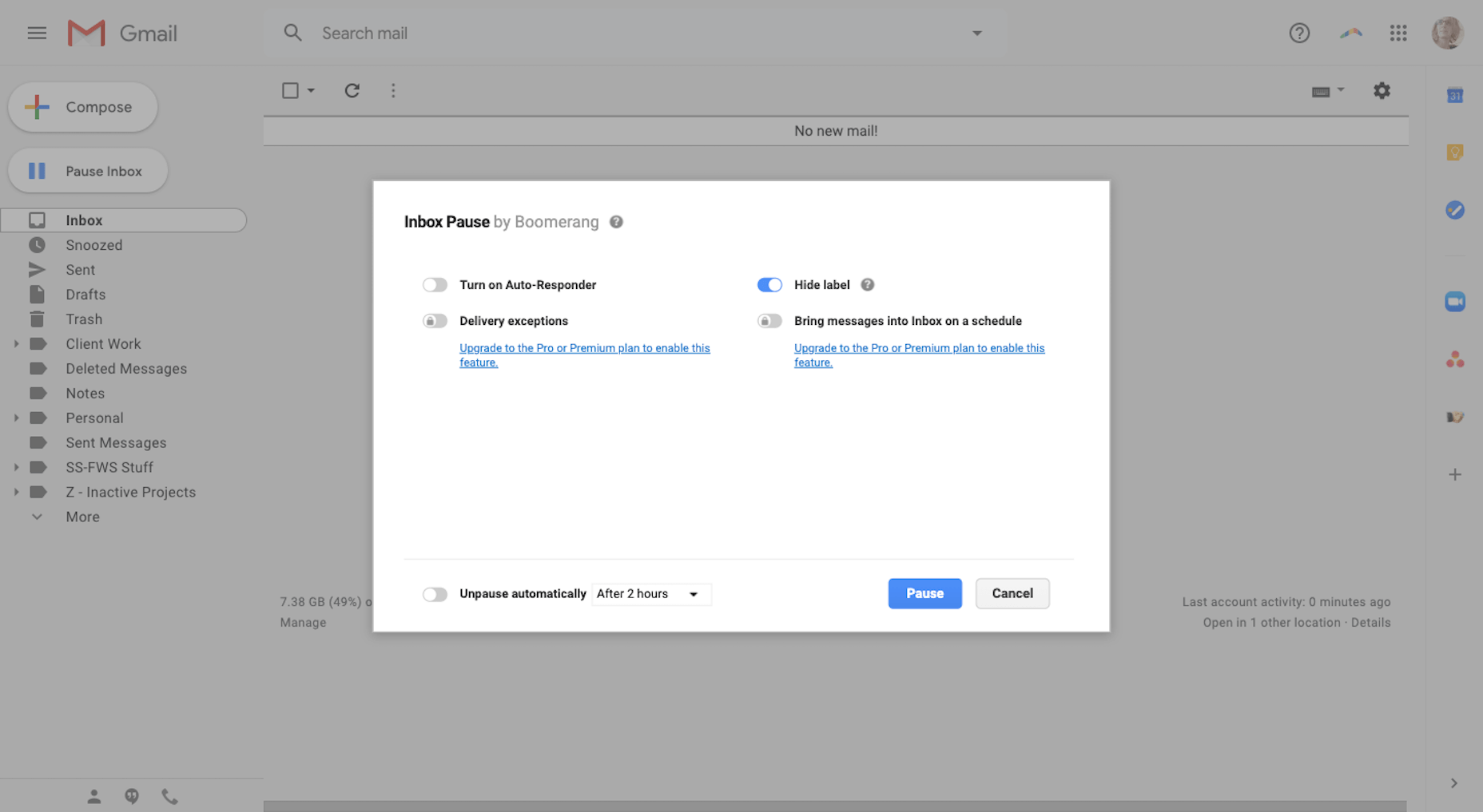
What it does is it prevents new messages from entering Gmail and holds them in a hidden queue for me. While it took some getting used to, it’s actually helped me become less dependent on email during the workday. I also use it at night and on the weekends when I really shouldn’t be working anyway. 

Another cool feature is that I can schedule my emails. That way, if I want to wait on sending something to a client or prospect, but don’t want to forget about it, I can schedule it to go out when I want it to.

3. Asana

I’ve used enough project management systems to know what works for me and what doesn’t. And Asana has nearly everything I need.
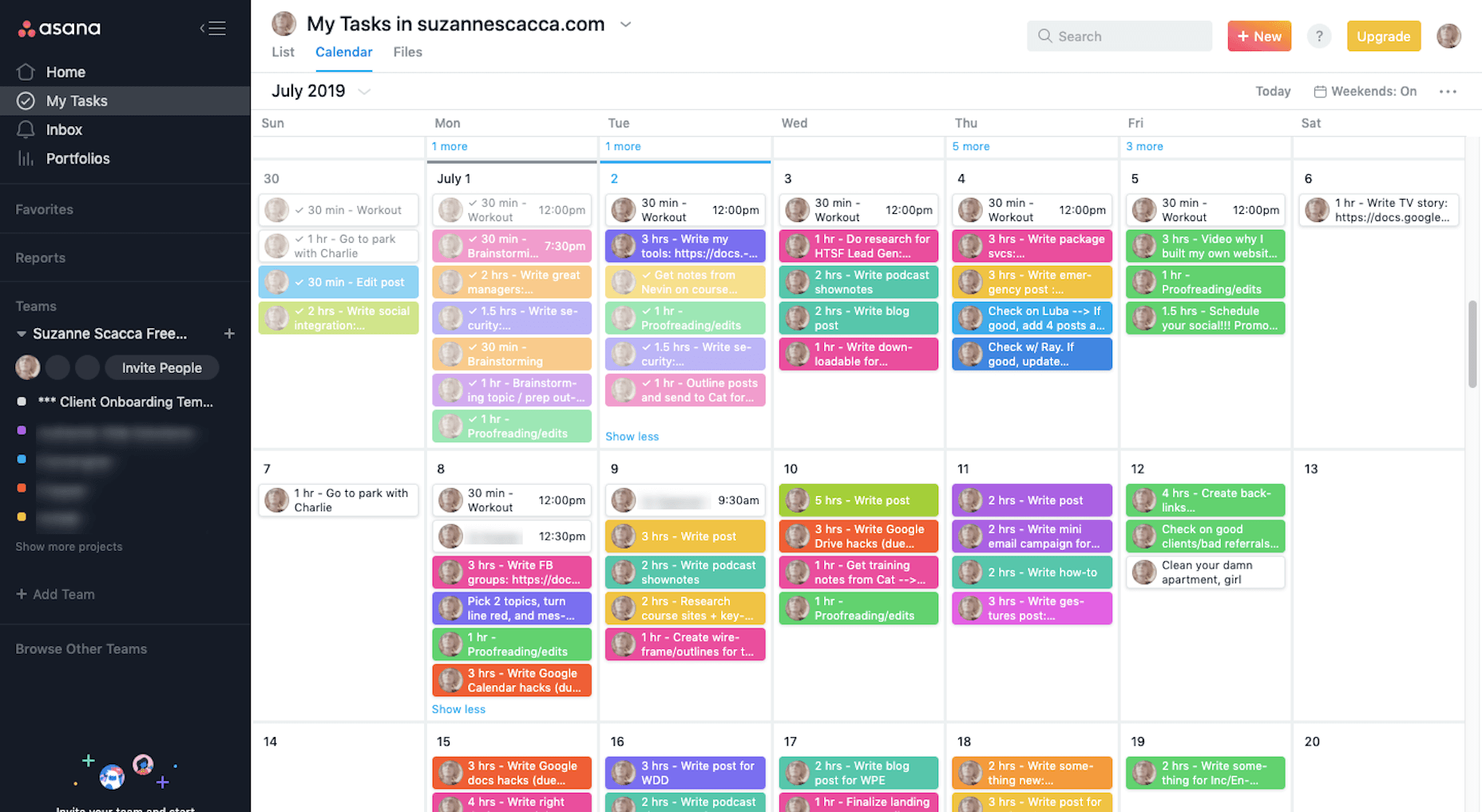
With color-coded “Teams” for each of my clients and an easy-to-use system of creating and completing tasks, Asana gives me great relief that I’ll never miss an assignment or deadline.

I also create templates for different parts of my workflow here, too.
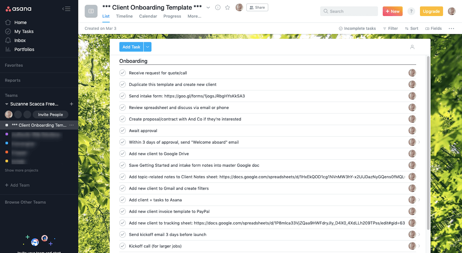
I don’t know what I’d do without Asana. As I’ve scaled my business, I’ve worried that something will inevitably fall through the cracks, but this tool always helps me keep my head on straight.

4. WordPress

I’ve been a WordPress user for almost 10 years. First, it was to create websites for myself. Then, I worked for an agency where I created, documented, and refined our processes inside and outside of WordPress. Now, I write guides on how to build websites, use plugins, and customize themes. 
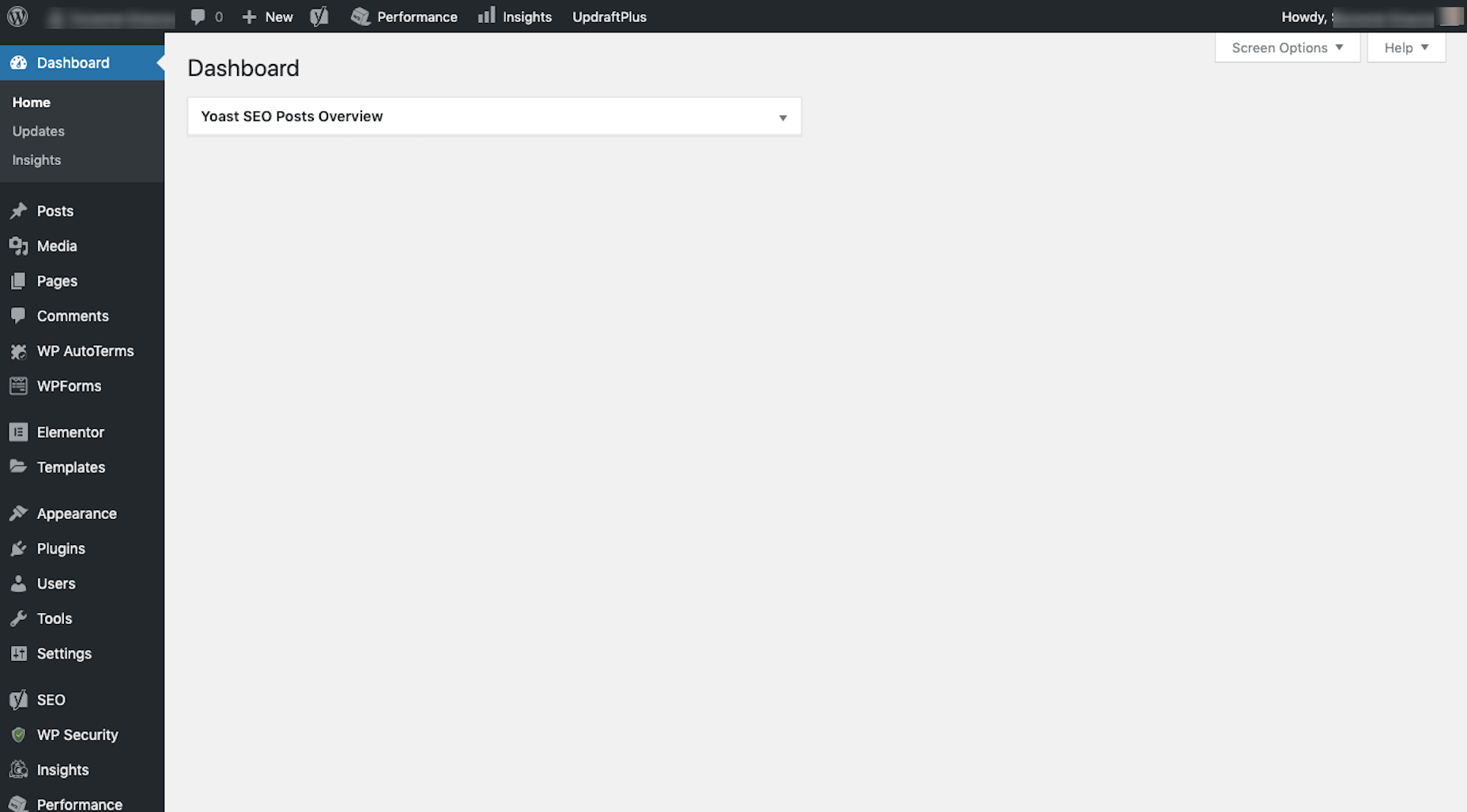
I occasionally help small business owners build WordPress websites, in addition to running my own. I also upload and optimize blog content I write for clients that have WordPress websites. 

5. Google Analytics & 6. Google Search Console

I use Google Analytics weekly to measure my website’s stability and overall reception with visitors. 
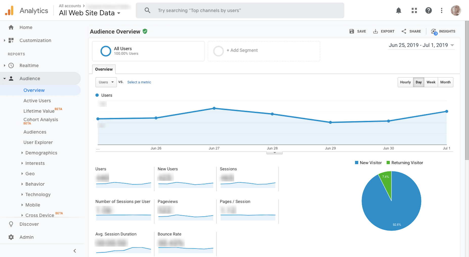
I also use Google Analytics to determine what kind of topics to write for my clients.

I use Google Search Console in conjunction with Google Analytics. (It’s very rare I’ll go into one without accessing the other.)
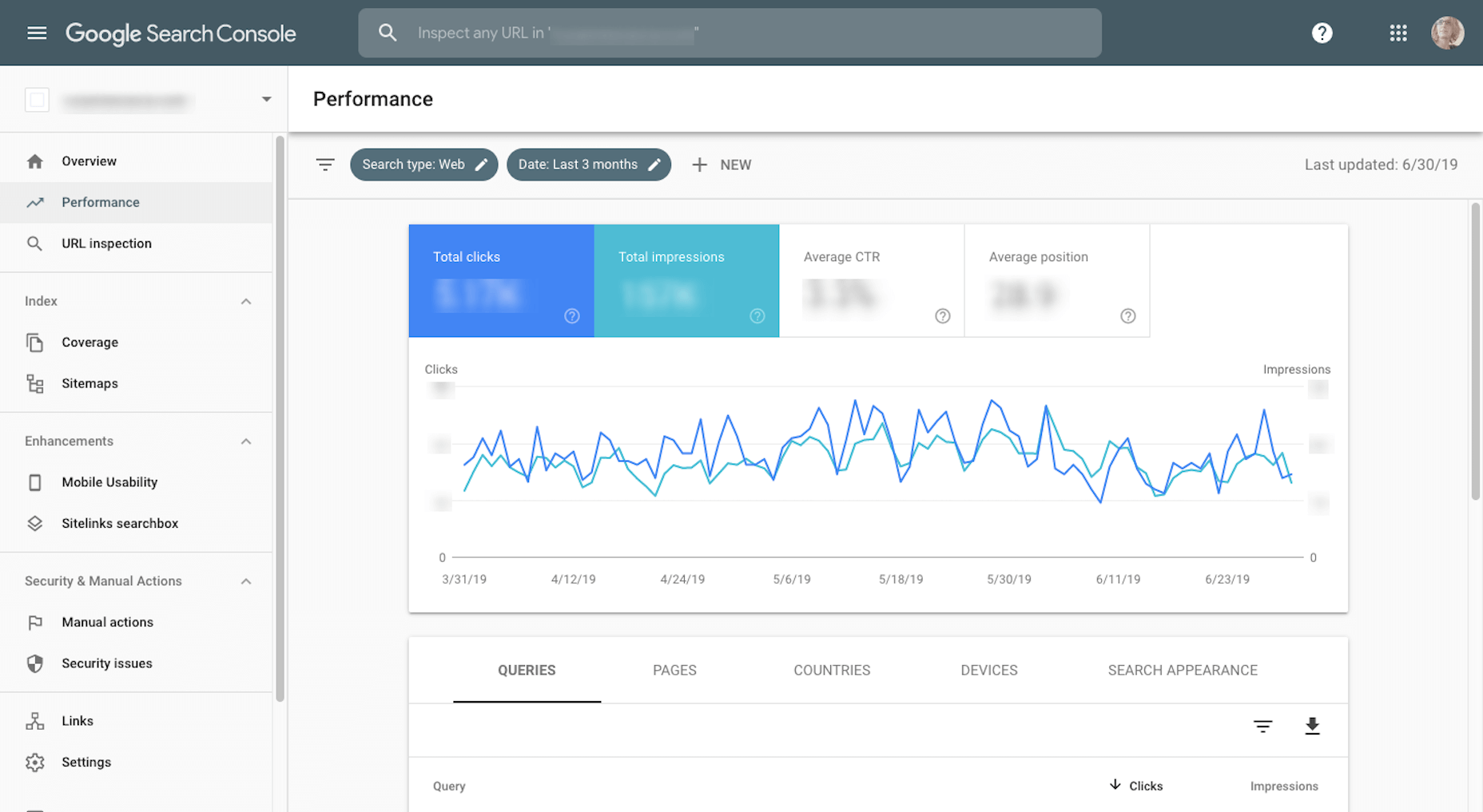
While Google Analytics tells me most of what I need to know about my website traffic and how they’re responding to my content, I need Google Search Console to help me fill in the searchability and ranking piece.

7. My iPhone

It’s very difficult for me to work without my iPhone since I’m constantly having to take screenshots of mobile websites or apps for articles. Because of this, I’m very easily tempted by distractions. 

But then I discovered the iPhone’s distraction free mode that makes my phone look like this: 
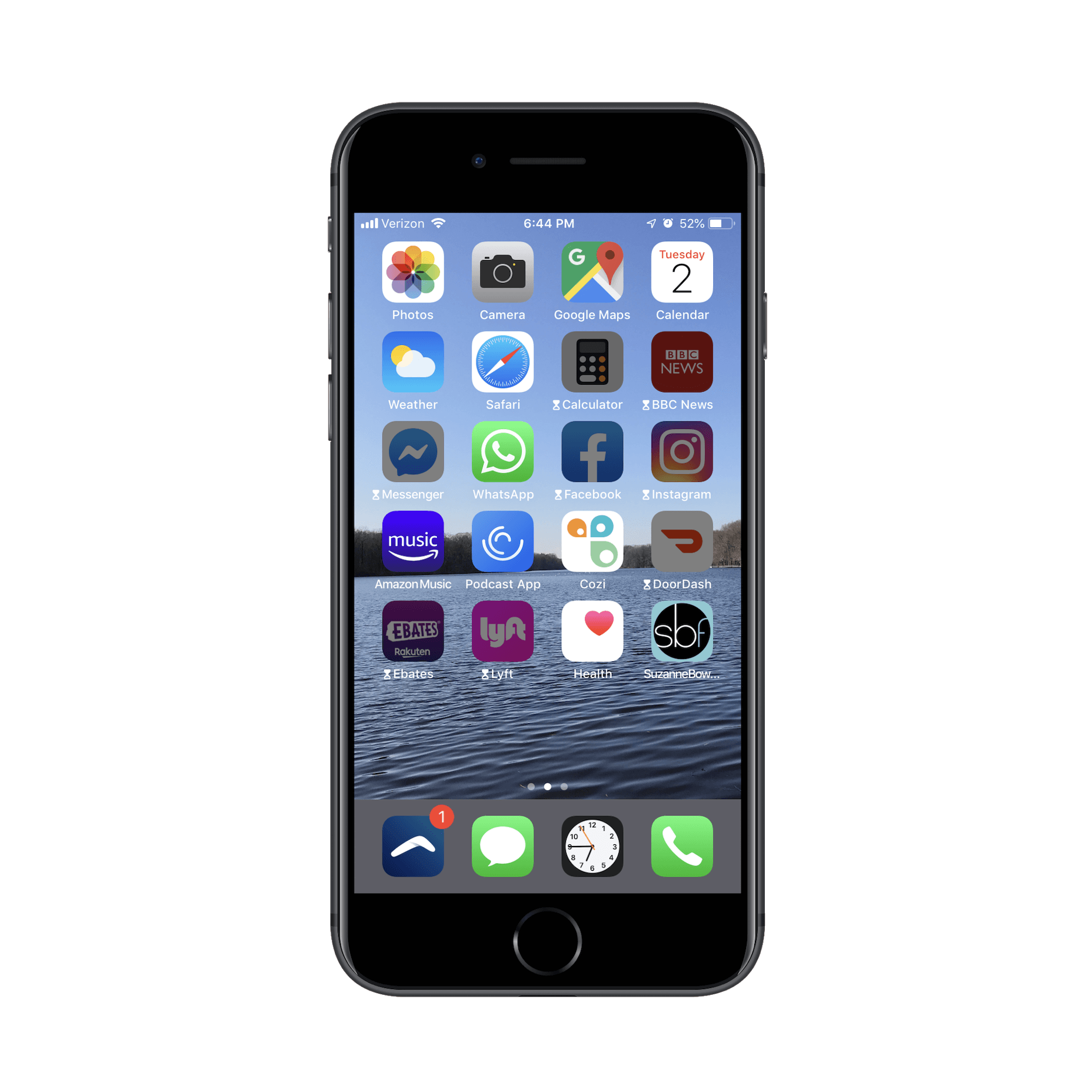
I’ve set limits on how long I’m allowed to access certain apps for and turn off all notifications on them until the workday is over. It’s been great for helping me focus on what I need to do in the browser and then encouraging me to put the phone away when I’m done.

8. Local by Flywheel

On occasion, I write articles or film videos that teach others how to use WordPress. Since I don’t want to use my own website to demonstrate these lessons, I use Local by Flywheel to create my simulations.
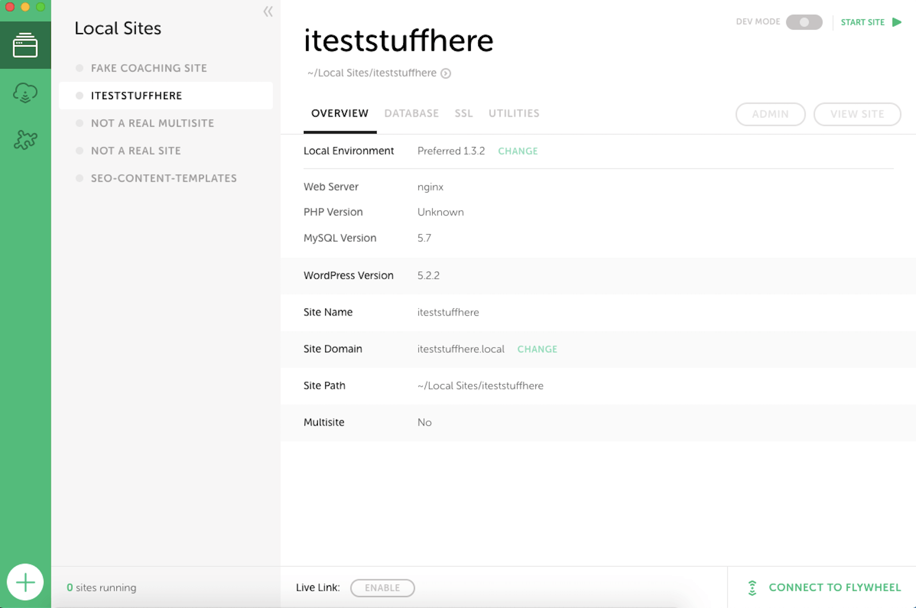
Essentially, it allows me to set up a local installation of WordPress so I can safely build anything I want. If I were still working on websites for clients, I’d be using this to safely handle updates and edits for their sites, too. For now, though, it’s just my playground.

9. KWFinder

As part of my writing services, I optimize the content I write for search. Now, there’s a lot more to SEO than just keywording. However, I do always use KWFinder to ensure that the keywords I’ve chosen will help my clients’ content rank well in search. 
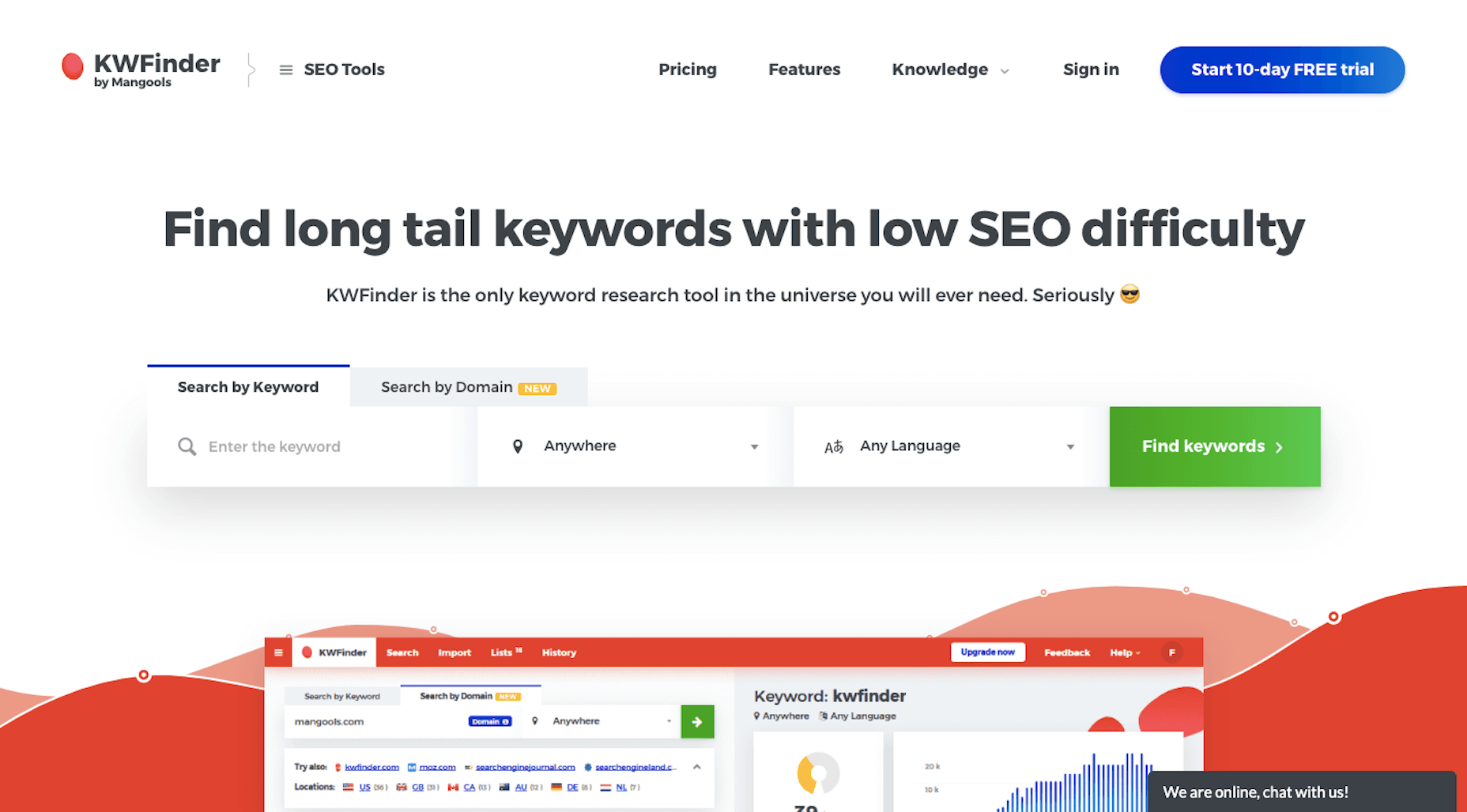
What’s more, because I write for a number of clients in Australia, I can filter my keyword lists for that specific audience. That way, my optimizations aren’t skewed to the wrong people, at least geographically speaking. 

10. CoSchedule Headline Analyzer

I like to think of blog titles as gatekeepers. They appear in search results on behalf of our pages and posts. They appear in social media, attached to said pages. And they appear in RSS feeds, easy to miss if they don’t stand out from the content all around them. 

So, whenever I write something new, I break out the CoSchedule Headline Analyzer and run a test.
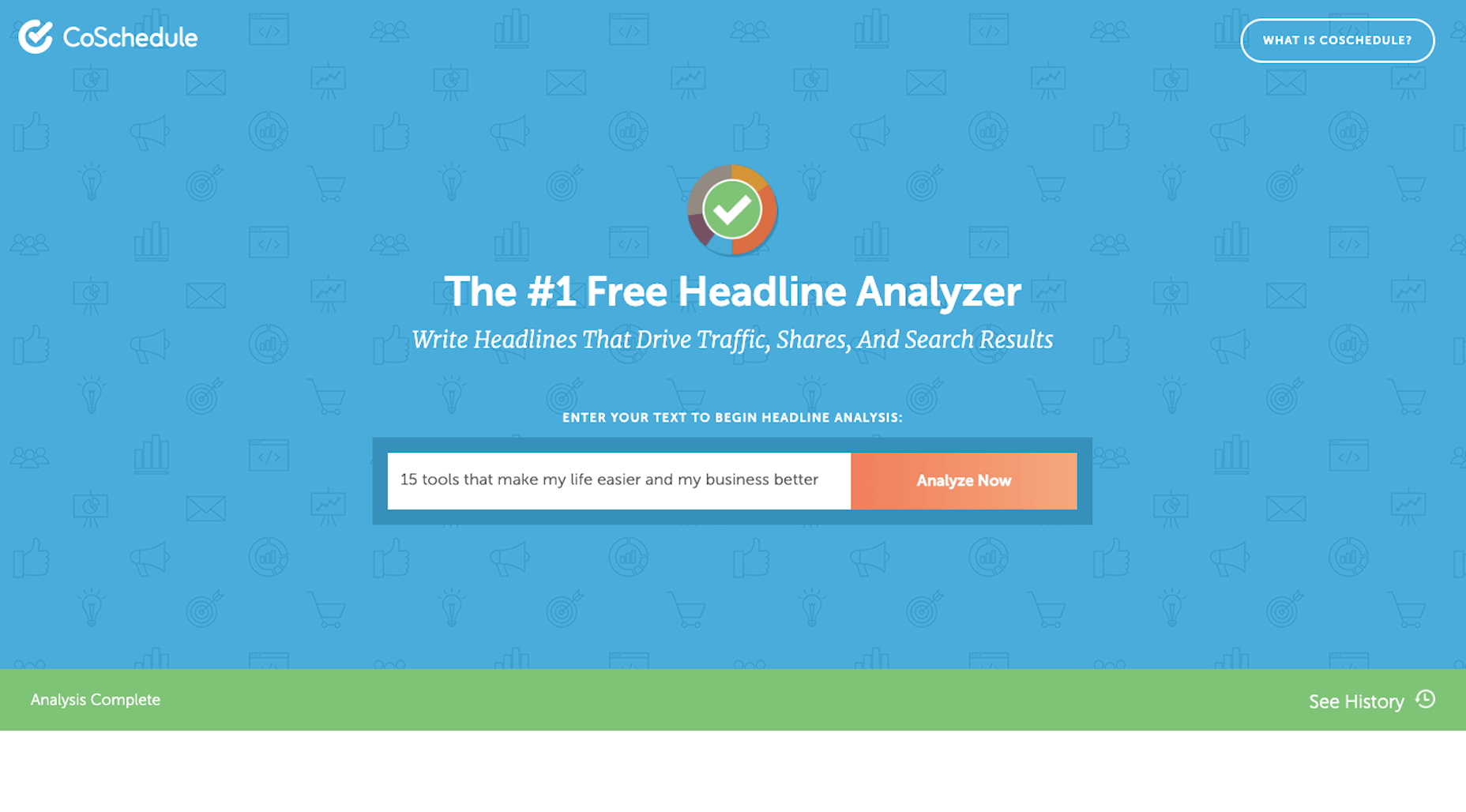
Every time I enter a new title, it saves and scores it for me. Red is bad, yellow is okay, and green is good.
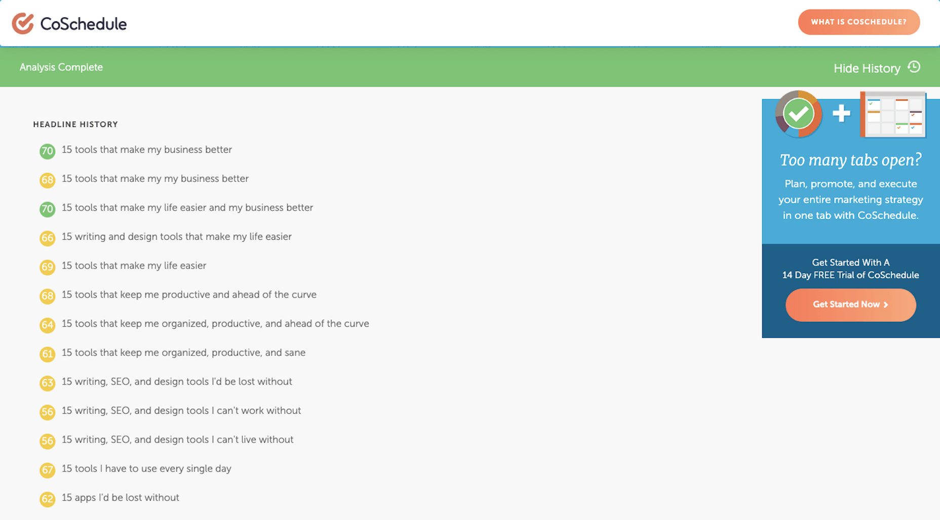
While it can take some time finding the perfect combination of power words and title structure to get it right, it’s worth it. Without a strong headline, I can’t help my clients get clicks or reads.

11. Zoho Vault

I’m not going to name names, but there was a different password manager I used for years before Zoho Vault. 

However, after they experienced a server outage last year, it corrupted all of the login and password records I had stored there (along with countless others). Because their customer support disappeared during and after the outage, and because I had to spend hours recreating passwords for all of my tools as a result, I decided to switch to a provider I knew and trusted: Zoho.
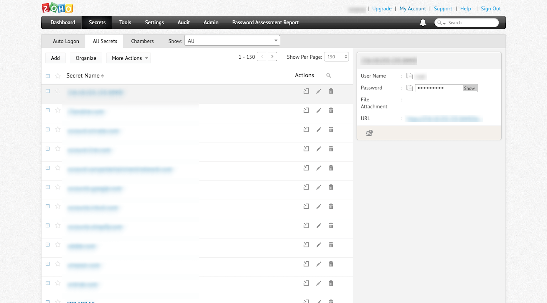
Since I log in and out of over a dozen tools every day, it’s absolutely critical that I have a way to quickly generate super-strong passwords and store them somewhere safe. Zoho Vault is the one that takes care of that for me now.

12. Nimbus Capture

Sometimes I feel like my job is “professional screenshot-taker”. As such, I need a tool that will take all kinds of screenshots for me: 

Selected areas of a screen
A full screen
An entire browser window
And video
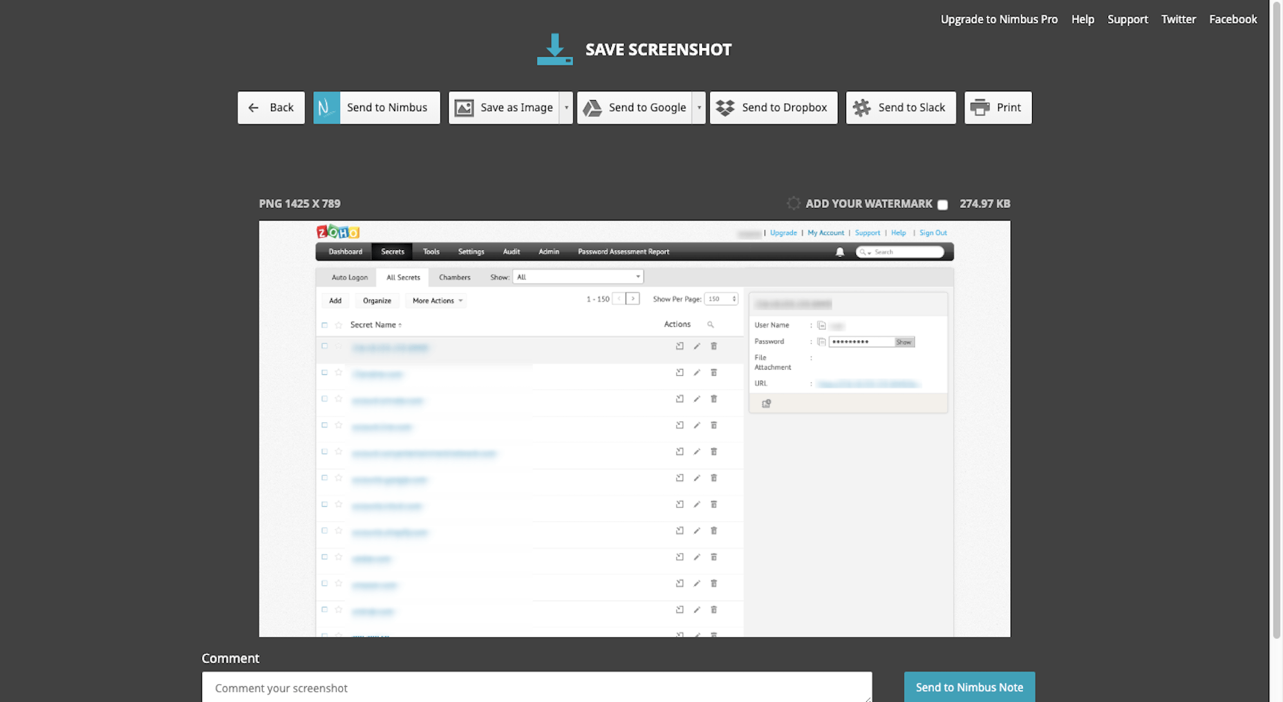
What I like even more about Nimbus Capture is that it allows me to edit and annotate my screenshots before I ever save them to the file type of my choice. 

13. MockUPhone 

When I do screenshoting from my mobile phone, I don’t really like to share the raw portrait files from it. It’s not that there’s anything wrong with them. It’s just that they’re usually too tall and force readers to scroll in order to view the entire image. 
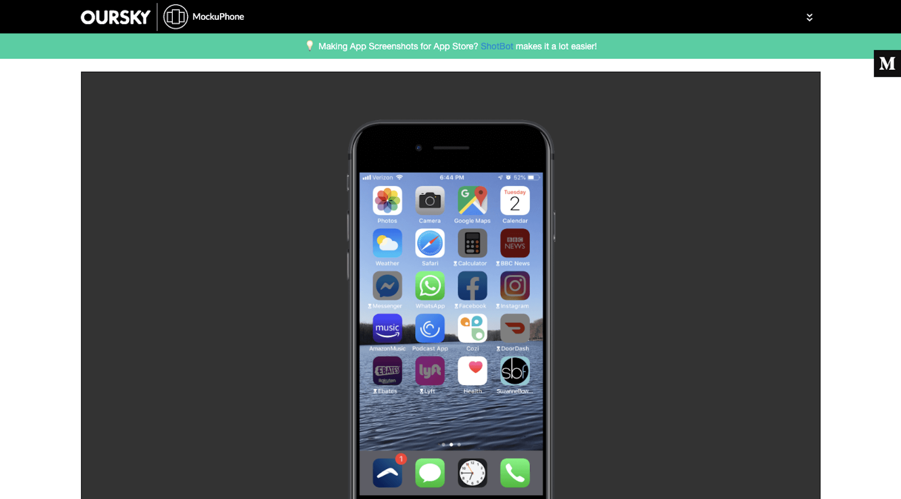
That’s why I use MockUPhone. It automatically places my screenshots into an iPhone UI. It also adds a horizontal buffer so it sits more comfortably within my content on a page. (You can see an example of this under “My iPhone” above.)

Wrap-Up

I remember a time when Excel spreadsheets and sticky notes were the best way to stay organized, productive, and sane. Needless to say, I’m really grateful for all of the tools that power my business and improve the work I do for clients on a daily basis. I can’t imagine being a freelancer and making any sort of profit without them.


Featured image via Unsplash.

Source

p img {display:inline-block; margin-right:10px;}
.alignleft {float:left;}
p.showcase {clear:both;}
body#browserfriendly p, body#podcast p, div#emailbody p{margin:0;}

How Prevalent is Dark UX?

Original Source: https://www.webdesignerdepot.com/2019/08/how-prevalent-is-dark-ux/

Iconic comedy duo Mitchell and Webb once asked a very important question: “Are we the baddies?” Given that, at the time, they were dressed in Nazi uniforms with skulls on their hats, and looked like rejected villains from a Wolfenstein game, the answer was something of a foregone conclusion.

But what about us? No, no web or UX designers that I know of have ever invaded Poland, or done any of the more horrifying things that Nazis are known for, thankfully. But then, we’ve got a whole field of design called “Dark UX”, and that’s… concerning.

It sure feels like dark UX is everywhere…

In other words: “Are we the baddies?” How bad is it these days? It sure feels like dark UX is everywhere, with companies trying to get their hands on your cash no matter the cost.

The generally accepted definition of dark UX is something along the lines of: Intentionally malicious, deceitful, or even just highly manipulative design patterns that try to trick you into doing something you otherwise wouldn’t. I think, to answer that question, we need to establish that the first bit—the intentional malice, deceit, or manipulation—is the defining characteristic of dark UX.

Just getting people to do something they might otherwise not… it’s not always a bad thing — doctors and especially dentists, try to do that all the time, to varying degrees of success. Marketing, even, introduces you to ideas and products you may not otherwise know about, and so would not otherwise buy. While marketing can very often feel scummy, I am forced to admit that there is technically nothing wrong with putting your brand out there.

But when designers (and the companies that hire them) flat-out disregard the will, and/or well-being of the users, that’s when we have a problem. Let’s look at some classic examples, several of which come courtesy of the Dark Patterns twitter feed, because websites never behave badly when you want to take screenshots:

Opt-Out Newletters (or Even Purchases!)

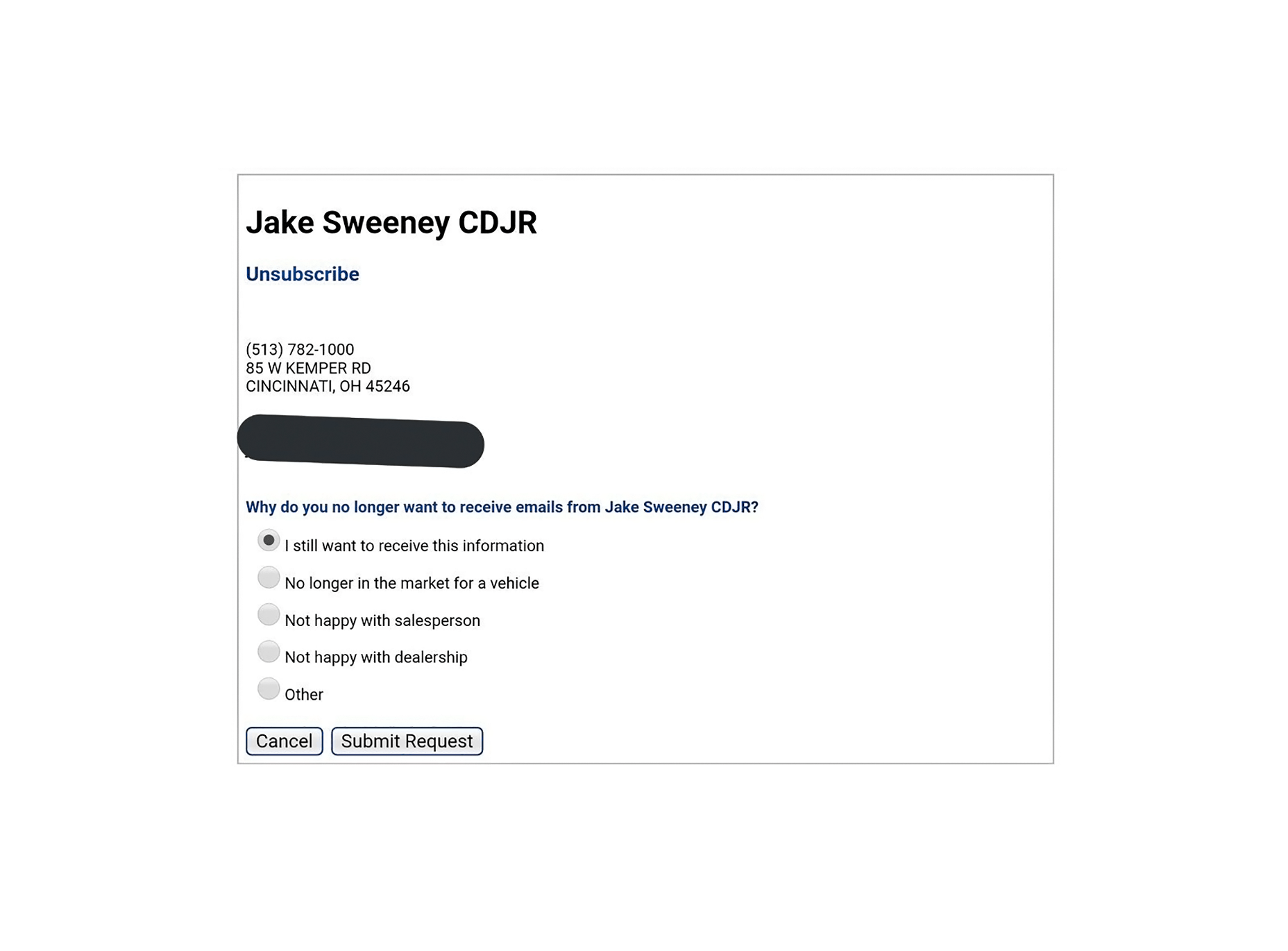
Sign-up forms often come with the option to get their newsletter pre-selected. I’ve also run into airlines that have some of their add-on services pre-selected during the ticket purchase process. Forgetting to unselect those is an expensive mistake to make. But then there’s this process for unsubscribing from an email newsletter, which is pretty flagrant:

Scummy “No” Buttons

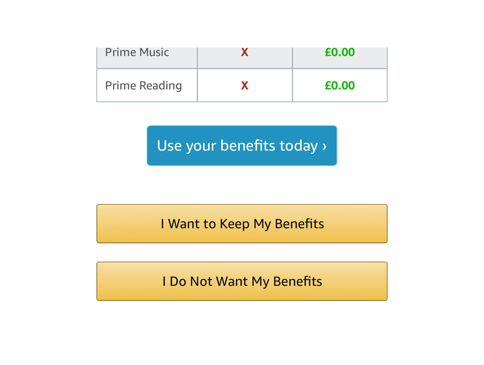
You know, the ones that say things like: “No, I don’t want to better my life immeasurably by receiving these product offers. By clicking this button, I acknowledge that my life is worthless, my children will be left homeless, and I am a terrible person.” Even Amazon is doing it:

The Complete Lack of “No” Buttons

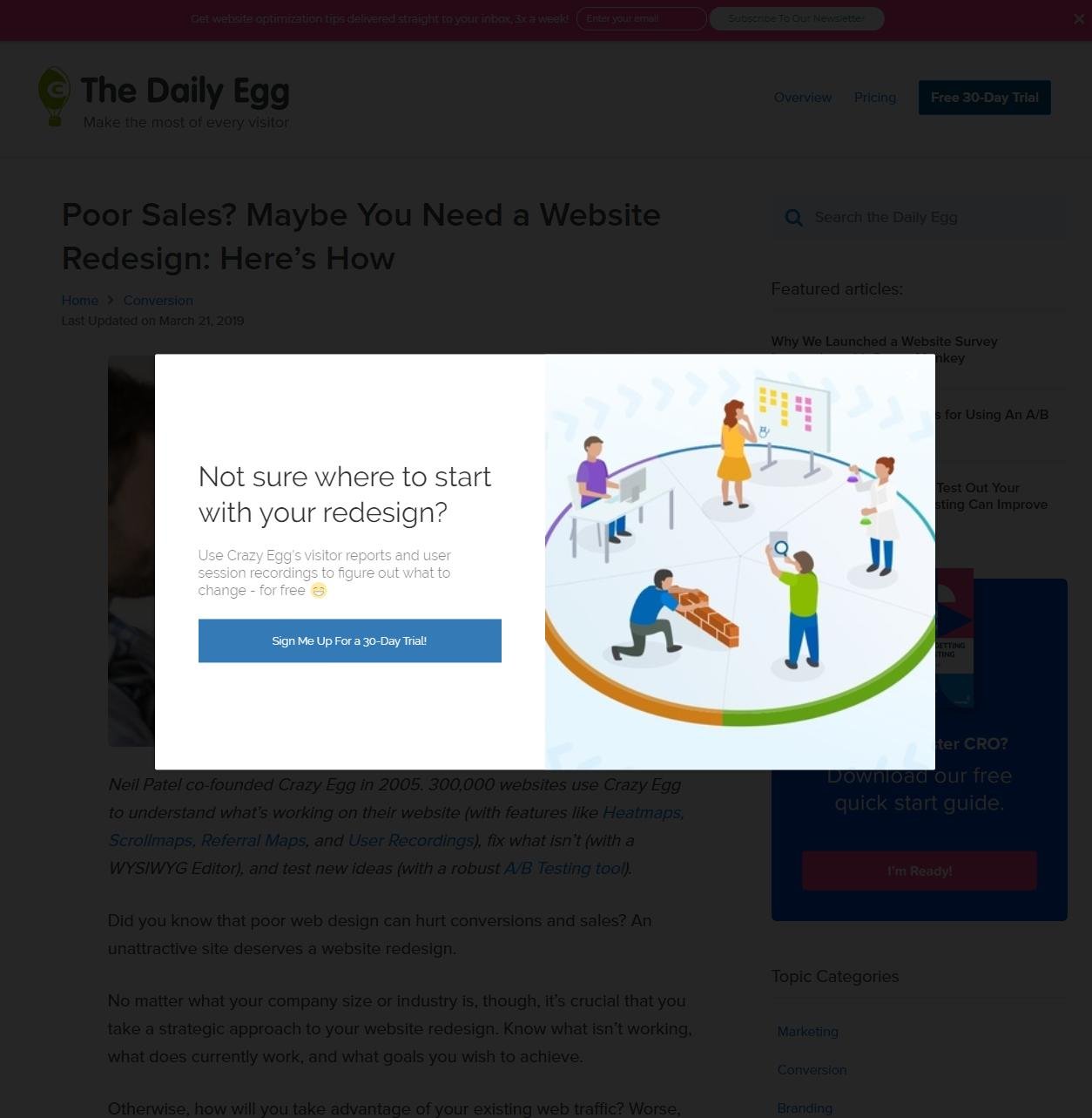
Then there are the people that don’t even include a “no” button, or an “exit” button. I’ve had it happen with Google Play Music sometimes giving me no way to listen to my music unless I either sign up for their family plan, or refresh the page. I couldn’t get a screenshot of that, so here’s one of CrazyEgg doing something similar:

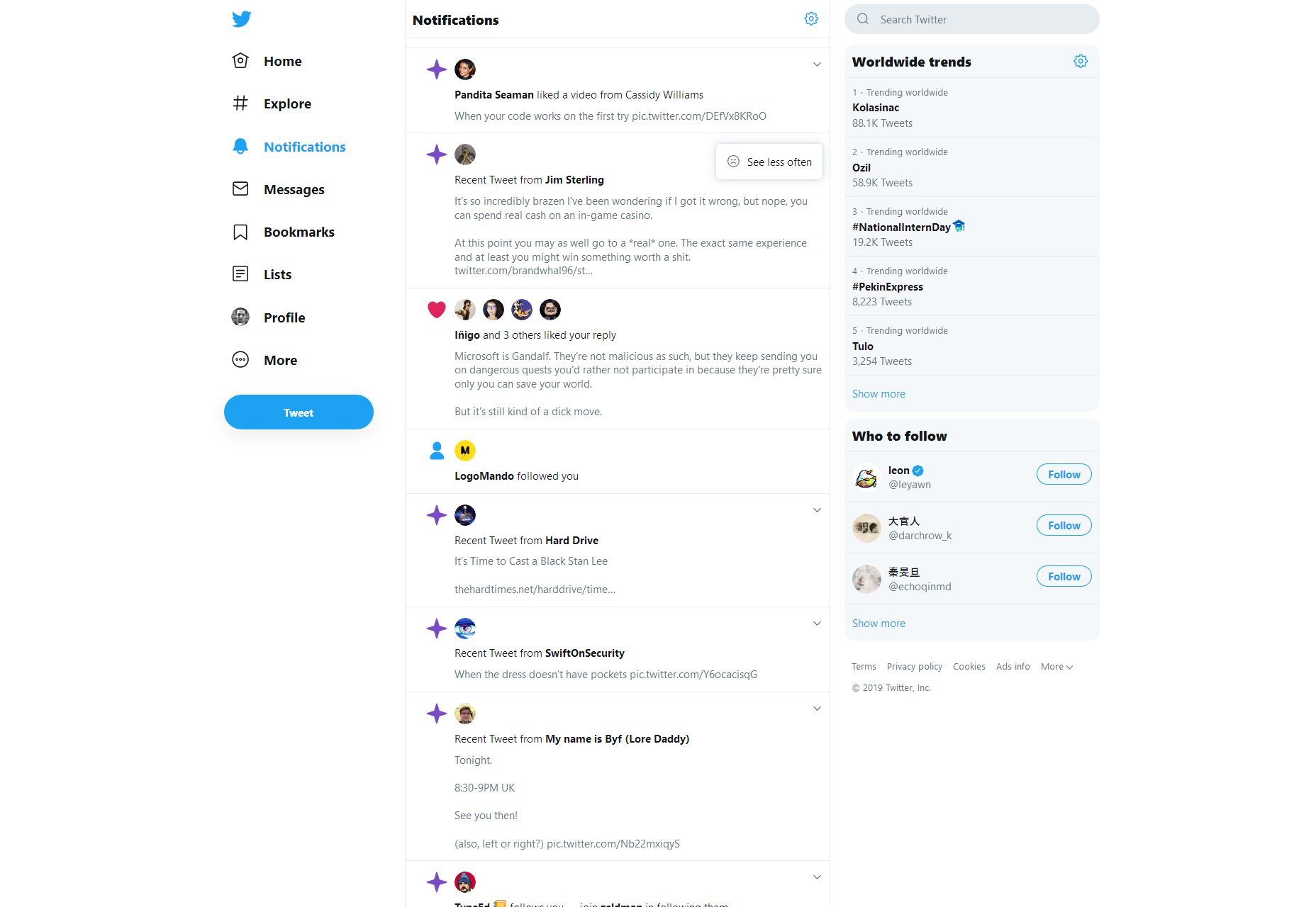
Also, Twitter won’t even let you turn off their more annoying features. There’s only a button to “see less” of them, and no one’s sure if it actually works.

Intentionally Frustrating Products

Recently, I reviewed a service named Smashinglogo (no relation) for another website. See how I’m not linking it? That’s for a reason.

It’s supposed to be an AI-based logo generator and… well it does that. But you have to depend almost entirely on the AI to randomly give you the logo you want. The customization features are minimal, and partially random too. But the site makes very sure to tell you that you can hire one of their professional designers to finish up your logo at any time. It just costs a bit more.

This sort of design is actually a notorious problem in the world of video games, and not just the mobile titles. Middle Earth: Shadow of War launched as a very grindy sort of game that took a long time to complete, but you could make it easier on yourself by purchasing “just a few, simple time savers” on top of buying the full-priced game. Assassin’s Creed: Odyssey took flak for pretty much the same reason. It wasn’t too bad if you like playing all the side quests in a game, but it was still a problem.

Predatory Features/Mechanics

We can look to video games for even more examples. Mobile games introduced the idea of the “loot box”, a purchase which will always grant you some sort of digital reward within the game. But what you get is randomized, so you can never be sure of getting what you want.

It used to be just an industry controversy, but now governments the world over are looking into this situation

They’ve made their way into 60 USD desktop titles as well, and they’re specifically designed to tap into the gambler’s instinct. It used to be just an industry controversy, but now governments the world over are looking into this situation, with UK Mainstream outlets like the BBC documenting what happens when someone who has compulsive gambling tendencies gets suckered in by video games, which are supposed to be comparatively “safe”.

Dark UX is Everywhere…Oops

I wish I had better news.

Look, it’s not that the majority of websites are necessarily using dark UX patterns. I frankly couldn’t find any hard data on that, but I doubt it. Is all their marketing honest? I don’t know about that, but I don’t think that most websites are trying to trick users into clicking stuff.

But not every website is Amazon, Twitter, or Google. While most sites may not have dark UX, a lot of the biggest sites and products do, affecting a number of people that is potentially in the billions.

I’d like to think designers are mostly good people, but the ones employed by bad companies have done a lot of damage. What can we do to correct this? Either we can burn it all down and try to develop a post-money society, or we can try to convince our corporate overlords that treating people right will net them more money in the long run.

I’ve always believed that true (brand) love is better than Stockholm Syndrome. Now we just need to convince everyone else.  


Featured image via DepositPhotos.


Source

p img {display:inline-block; margin-right:10px;}
.alignleft {float:left;}
p.showcase {clear:both;}
body#browserfriendly p, body#podcast p, div#emailbody p{margin:0;}

Top 4 DevOps Tools in 2019

Original Source: http://feedproxy.google.com/~r/Designrfix/~3/75zxQiJ6P3I/top-4-devops-tools-in-2019

The best DevOps tools this year can support your workflow and augment your organization’s ability to bring software products to market. In this post, we’ll talk about four practical DevOps platforms and tools your team can put to work now for a more streamlined project.  But first, let’s briefly talk about the value DevOps can […]

The post Top 4 DevOps Tools in 2019 appeared first on designrfix.com.

What Is Graphic Design: Our Complete Guide

Original Source: http://feedproxy.google.com/~r/Designrfix/~3/D6AUSMs5NvM/what-is-graphic-design

?Graphics are a visual way of communicating with someone. Billboard along highways try to sell us things or get us to stop at some location while images online work in much the same way. Somewhere at some point in time, a person designed everything we see that’s not part of nature. Quick Navigation A Deeper […]

The post What Is Graphic Design: Our Complete Guide appeared first on designrfix.com.

94% Off: Get the Fundamentals of Drawing Bundle for Only $39

Original Source: http://feedproxy.google.com/~r/Designrfix/~3/D-mb89qigLw/94-off-get-the-fundamentals-of-drawing-bundle-for-only-39

Most people believe that drawing is a natural talent. You’re either born with it or not. But the truth is that drawing is a skill that can be learned over time. If you’re considering taking a basic drawing class for the first time, be sure to check out the Fundamentals of Drawing Bundle. Fundamentals of […]

The post 94% Off: Get the Fundamentals of Drawing Bundle for Only $39 appeared first on designrfix.com.

Building Creative Websites Can Be Easy. Here’s How

Original Source: https://www.hongkiat.com/blog/building-creative-websites-can-be-easy/

Web designers, ready for some good news? We have some for you, and it involves designing creative websites. The ever-expanding global market is creating an equally expanding number of opportunities….

Visit hongkiat.com for full content.

Get Lifetime Access to the 2019 Interactive Coding Bootcamp for Only $39

Original Source: http://feedproxy.google.com/~r/Designrfix/~3/Ob0gQ5tZPME/get-lifetime-access-to-the-2019-interactive-coding-bootcamp-for-only-39

The demand for programmers is high and continues to increase. As the market for programmers grow, the buzz around coding bootcamps grow louder. If you want to get a quick dose of coding education, but you don’t have the luxury of time, then the 2019 Interactive Coding Bootcamp is for you. Here, you can learn […]

The post Get Lifetime Access to the 2019 Interactive Coding Bootcamp for Only $39 appeared first on designrfix.com.

92% Off: Enroll in the Complete Programming Language Bootcamp for Only $36

Original Source: http://feedproxy.google.com/~r/Designrfix/~3/1z8KfGxlahU/complete-programming-language-bootcamp

Learning is crucial for success. If you want to take your career to the next level, you need to invest in yourself. After all, an investment in knowledge pays the best interest. As such, we encourage you to enroll in short courses, attend some seminars or workshops. If you want to explore different programming languages […]

The post 92% Off: Enroll in the Complete Programming Language Bootcamp for Only $36 appeared first on designrfix.com.

20 Freshest Web Designs, August 2019

Original Source: https://www.webdesignerdepot.com/2019/08/20-freshest-web-designs-august-2019/

This month we leap back to the culture of America circa 1969, dive into the oceans with whales, discover multiple approaches to pitching a design agency, get invited to festivals, and shop online the right way. Enjoy!
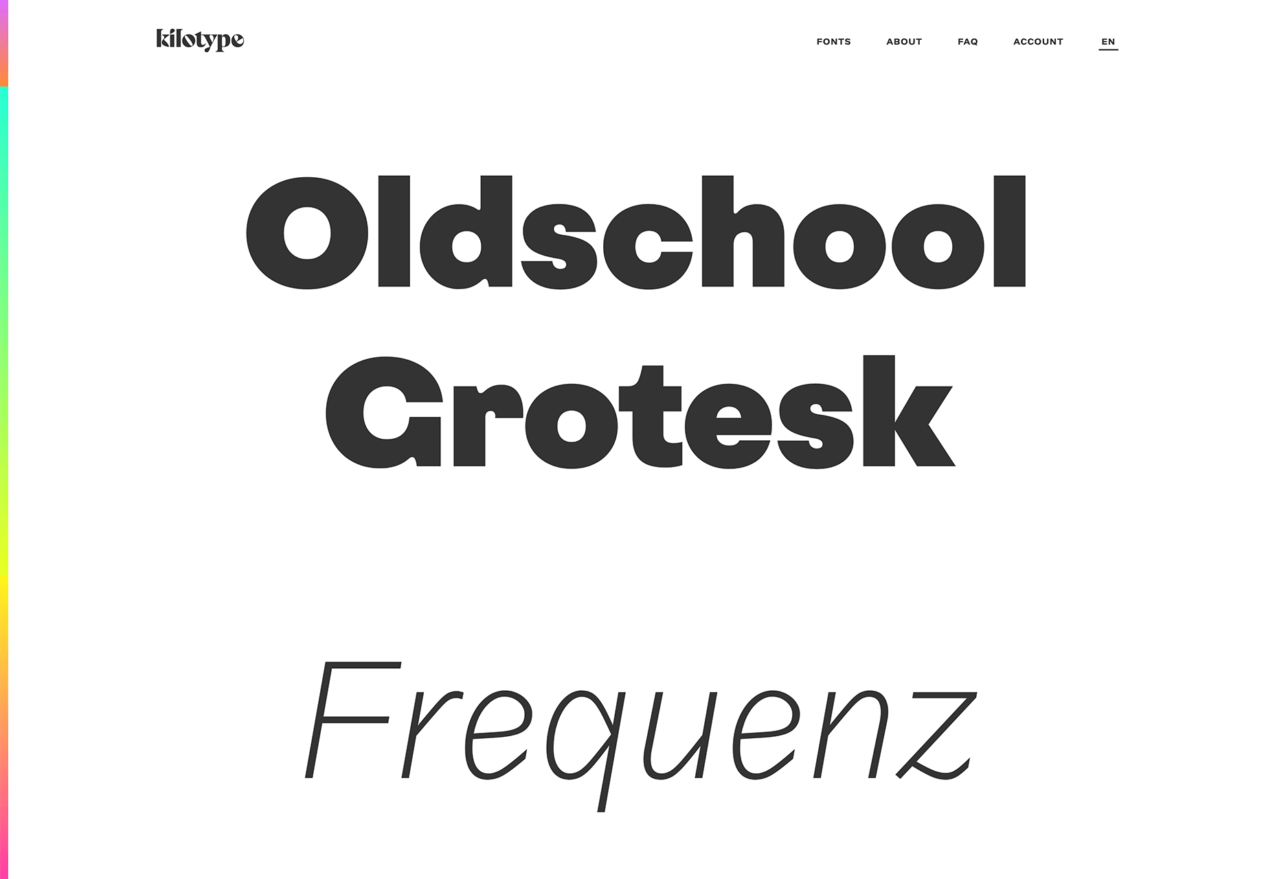
Kilotype

Kilotype’s awesome new site shows off its variable fonts with a clever mouse-track — move your cursor around the screen vertically and horizontally to see the full range of each family’s weight and italic.

Once Upon a Time in Hollywood

The latest film from Tarantino is steeped in the culture of 1969, from the moon landing to Woodstock. This amazing promo-site does an incredible job of transporting you to a different era.

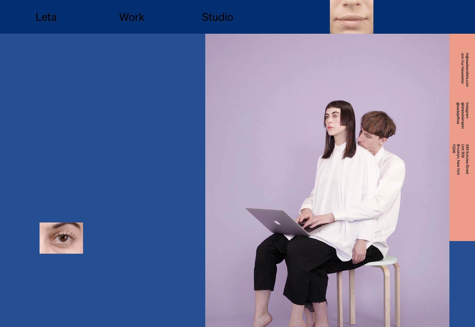
Wade and Leta

Wade and Leta are a partnership of talented art directors, whose offbeat sense of the absurd leads to some truly original and inspiring work. The homepage videos range from hilarious to bizarre.

Morenita

If there’s one place I’d like to be right now, it’s floating around the coast of Menorca on beautiful traditional fishing boat, and that’s all thanks to this inspiring site for Balearic boat hire.

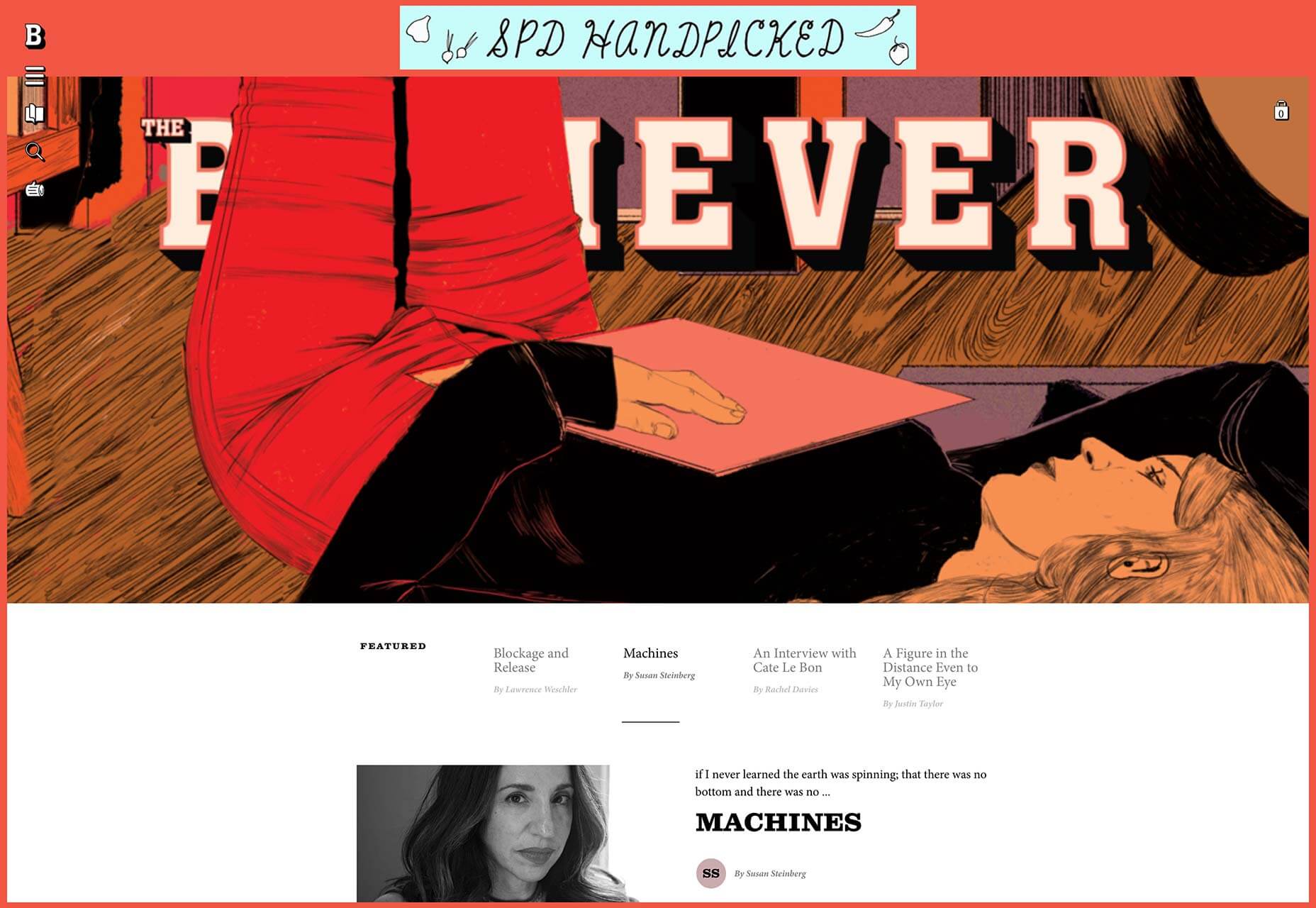
The Believer Magazine

The site for The Believer Magazine is charmingly counter-culture, with deceptively sophisticated typography and New Yorker-quality illustration. Exactly what you’d expect from a modern culture publication.

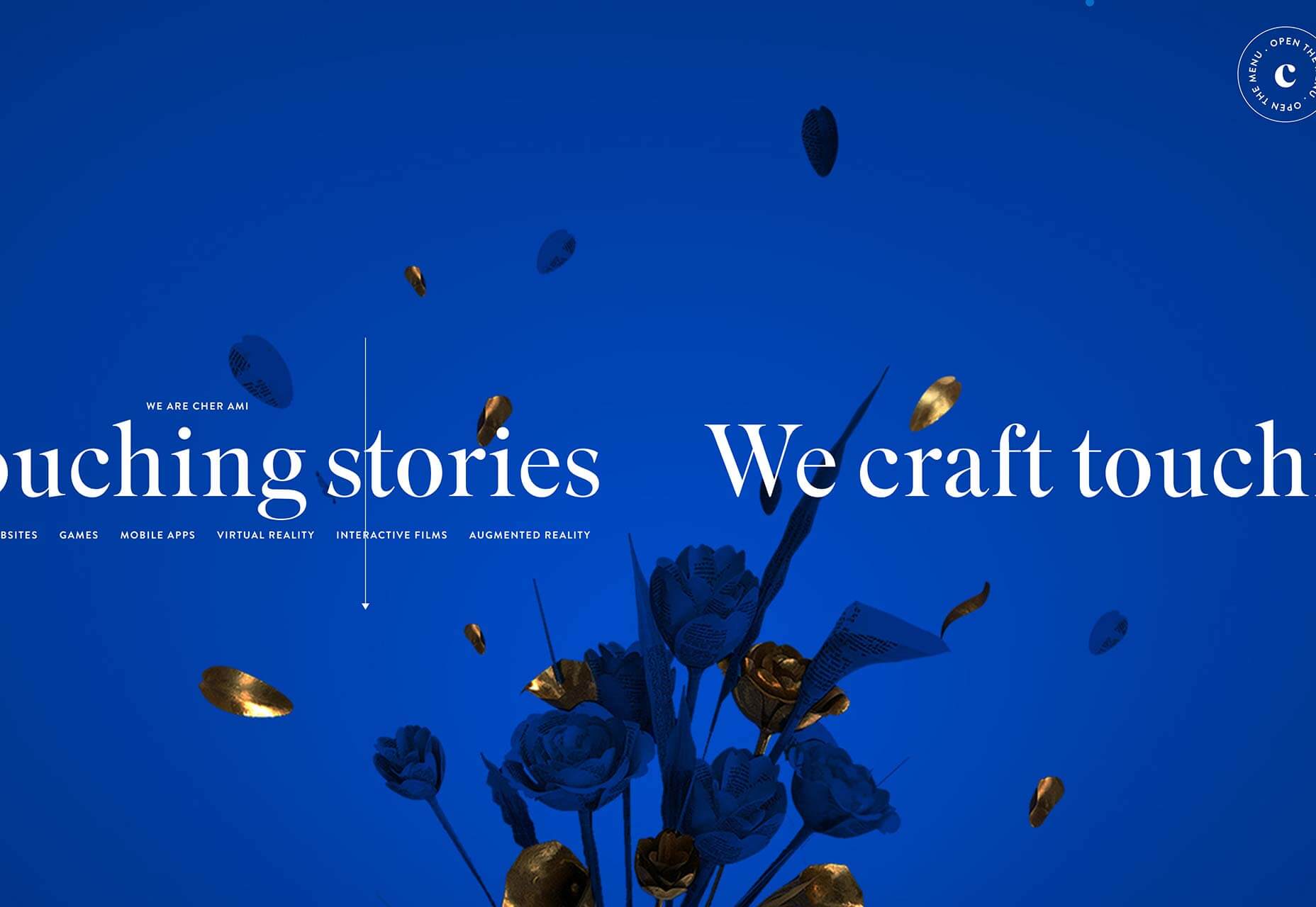
Cher Ami

Cher Ami’s site features plenty of engaging work, but it’s the little details that make this site special, like the way the menu flies out not-quite-square, and the hyperspace-style transitions.

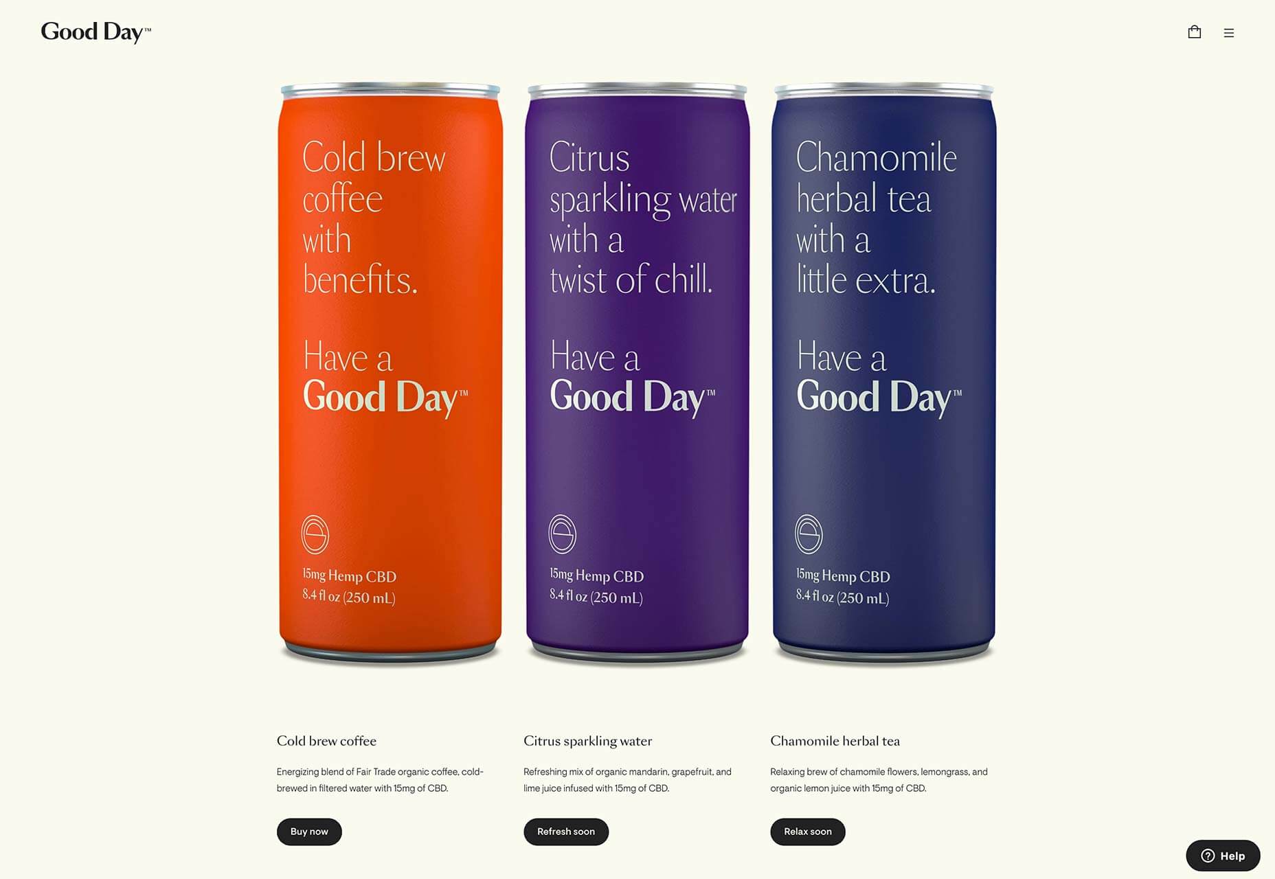
Good Day

Good Day sells CBD-infused beverages from a tastefully minimal site. At roughly $6/drink, it’s not cheap, and this sophisticated site is ideal for positioning the company in the luxury consumables market.

Dice

Dice is a German music and arts festival. Its site features some incredible, generated organic shapes, with animated gradients to match, and the seamless eternal scroll is a delight.

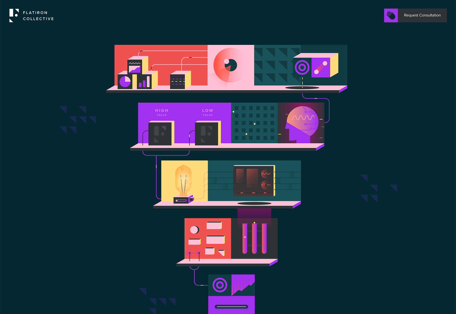
Flatiron Collective

The Flatiron Collective site opens with animated illustration. It’s an eye-catching pitch for business, far into left-field from the usual agency promotional site, and doesn’t even showcase previous work.

Save Whales

Whales are among the most intelligent, graceful, and magical creatures in the world. This inspiring site features extraordinary photography and facts about the magnificent creatures.

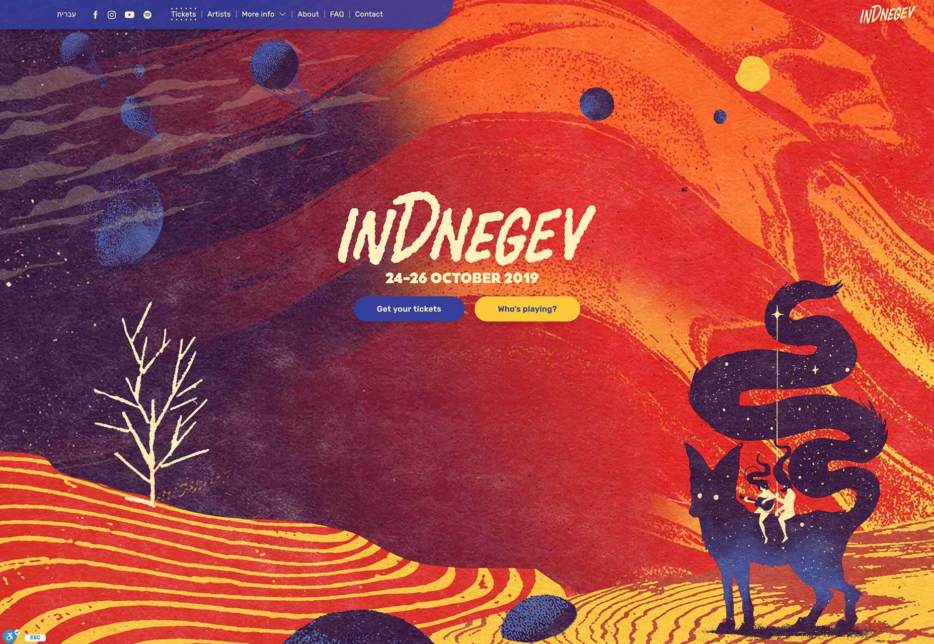
InDnegev

InDnegev is an Israeli music festival with a psychedelic animated site. The site features bold color choices, subtle animation, and two people riding a giant fox made out of stars, because why not.

Gucci Marmont

One of the big trends in online shopping is 3D, and Gucci’s Marmont collection jumps on this trend with a 17th-century inspired art exhibition featuring its latest purses. Scroll to browse.

Oust

Oust is a leading creative agency with tons of amazing work. Instead of pressing its portfolio, Oust’s site shows off the energy and ambition of the company’s professional culture.

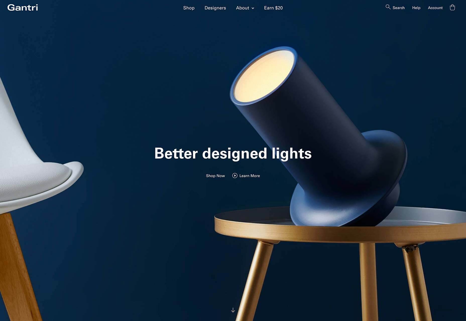
Gantri

Gantri designs better lights, and its site is a glorious collection of careful ecommerce best practices and stellar product photography. This is exactly how you should sell products online.

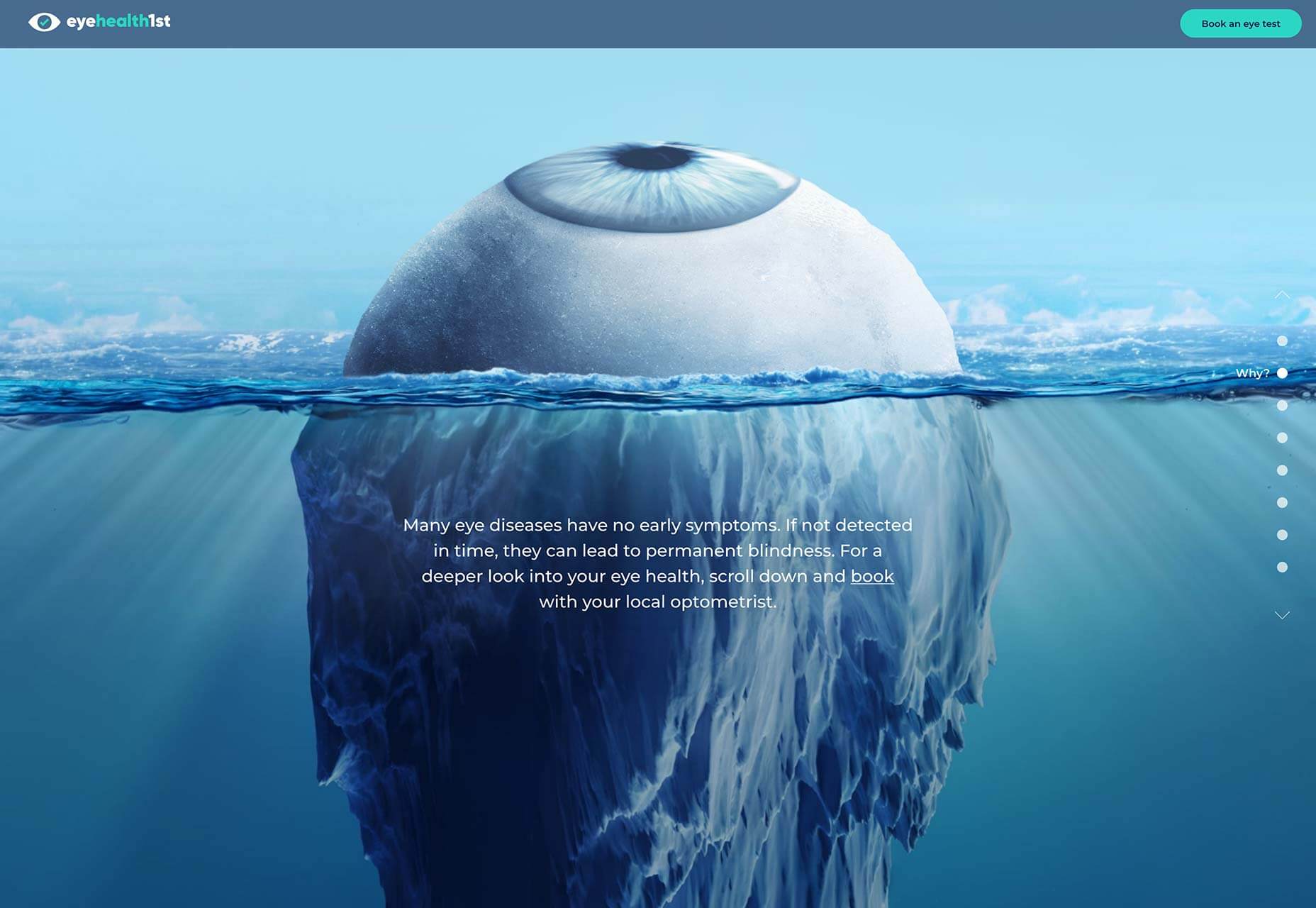
eyehealth1st

Look Deeper is an eye health campaign from Australia that wants to educate you about the dangers your eyes face, with an impactful infographic style site highlighting the various threats to your eyesight.

Ada Sokół

Ada Sokół’s portfolio is designed to focus entirely on her unique brand of futuristic, 3D artwork. Alongside commercial work you’ll also find some exceptional personal work.

Stuuudio

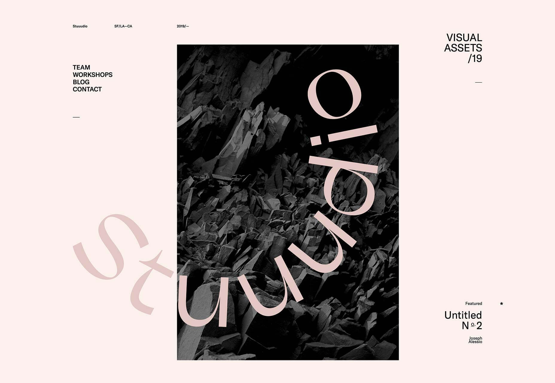
Embracing the www-ness of using three letters, where one would be too real-world, is Stuuudio, a design agency with a nice line in blobby-animated transitions. It’s a good take on the classic agency site.

Ocean Vagabond

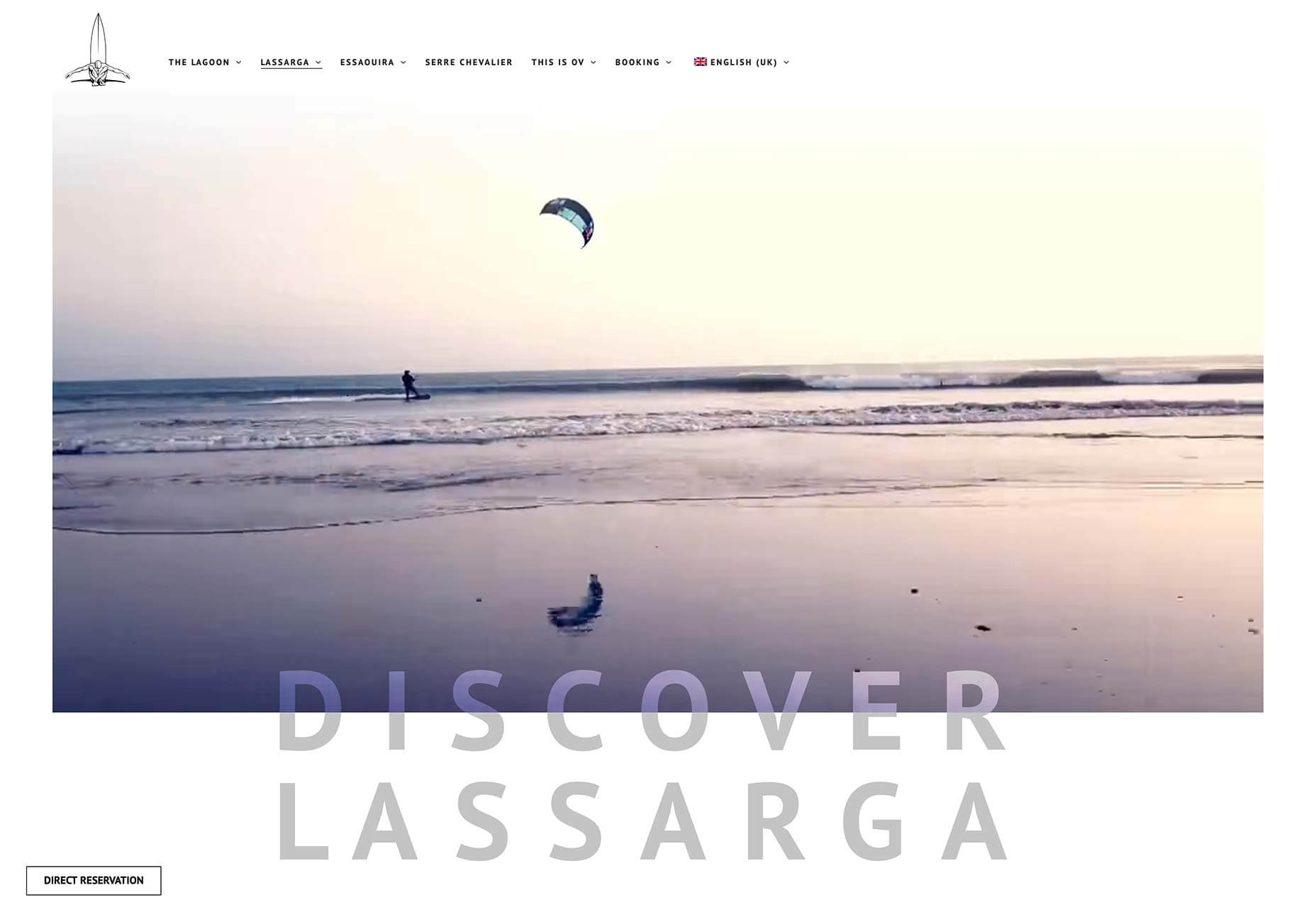
Ocean Vagabond is a watersports company in Morocco. Its homepage features some small-scale video, but navigate to one of the location pages for inspiring video and typography interaction.

Festival

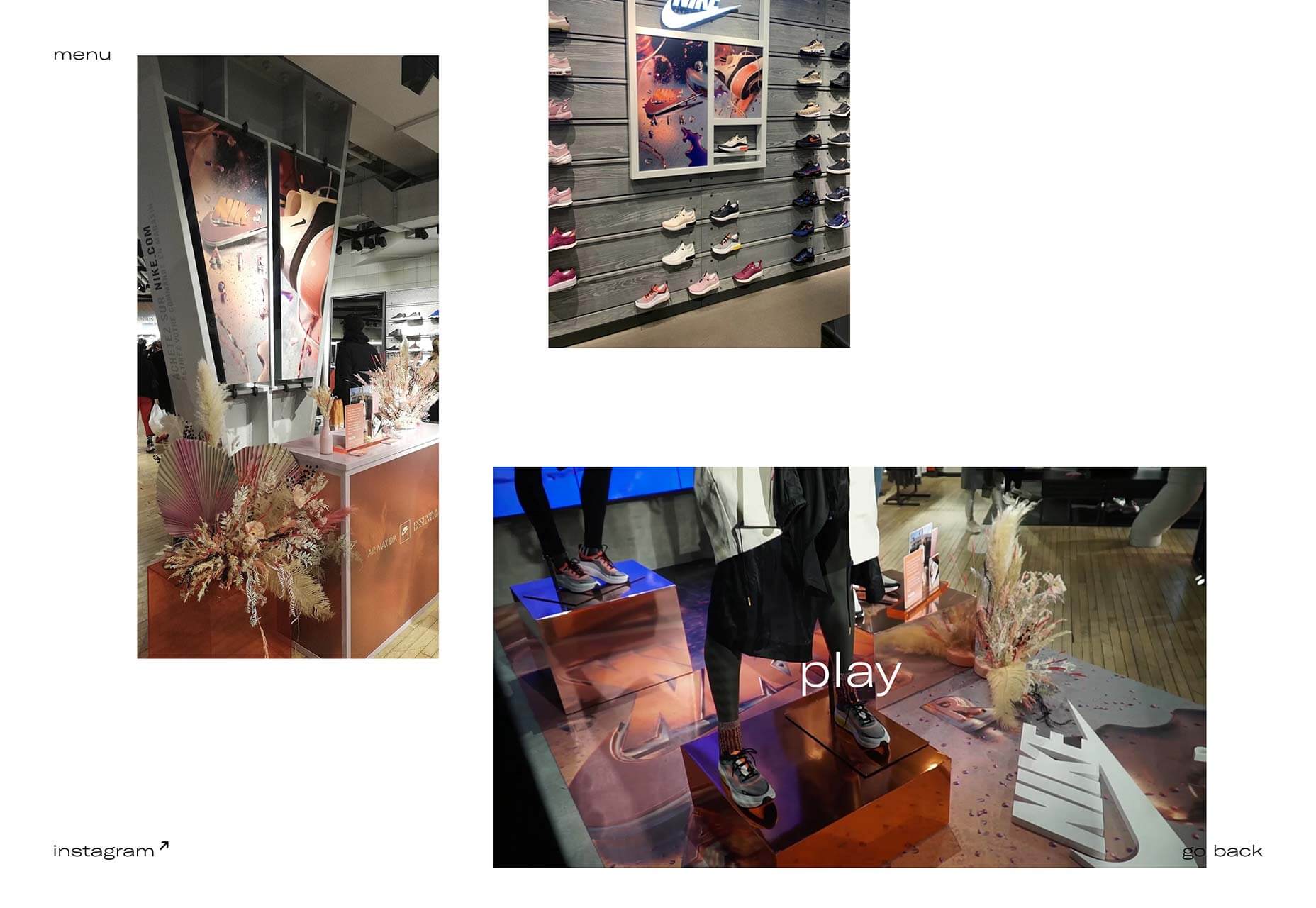
Festival is a vibrant and engaging one-pager for the Camberwell College of Art undergraduate degree show. With light-hearted typography and interactive confetti, it’s a great online invitation.

Neutral Works

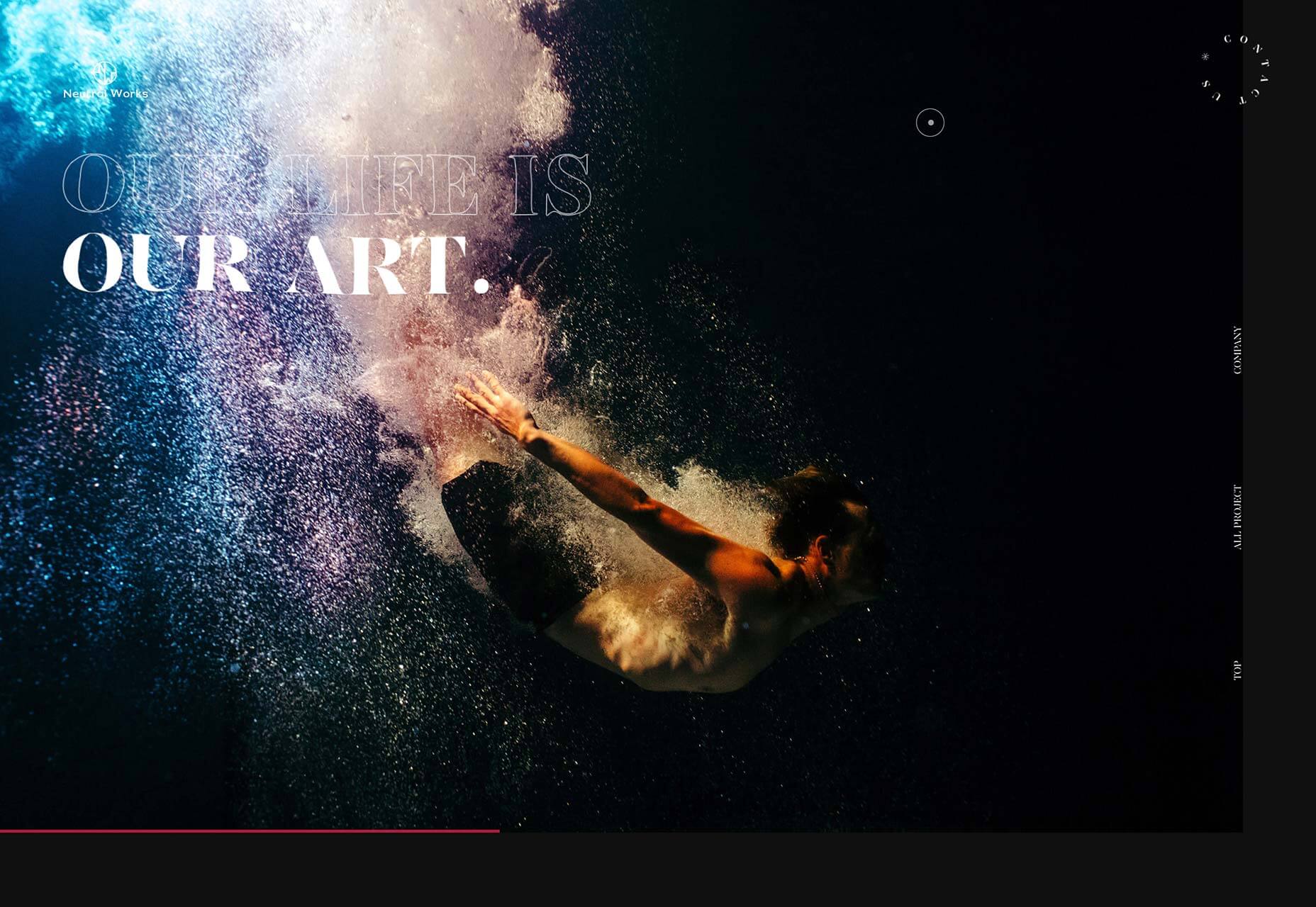
Neutral Works is another design agency with a penchant for interesting, liquid-style transitions. Based in Japan, it’s fascinating to see the different approach to familiar products in a foreign culture.

Source

p img {display:inline-block; margin-right:10px;}
.alignleft {float:left;}
p.showcase {clear:both;}
body#browserfriendly p, body#podcast p, div#emailbody p{margin:0;}