Updated sketching app helps you conquer creative block

Original Source: http://feedproxy.google.com/~r/CreativeBloq/~3/i1whsqLqXJg/paper-store

The hardest part of any creative endeavour can often be simply getting started. The fear of a blank page can be an overwhelming thing, but a new addition to popular iOS sketching app, Paper, aims to help get nervous artists past all that and start drawing.

We're big fans of Paper; it even made it to our list of top iPad apps for designers. Paper is a fun app that's suitable everything from note-taking and annotating pictures through to doodling and sketching, with quick and easy gesture-based navigation to help keep things flowing. But if you simply don't know what to draw then there's now a whole stack of inspiration available.

How to draw: the best drawing tutorials

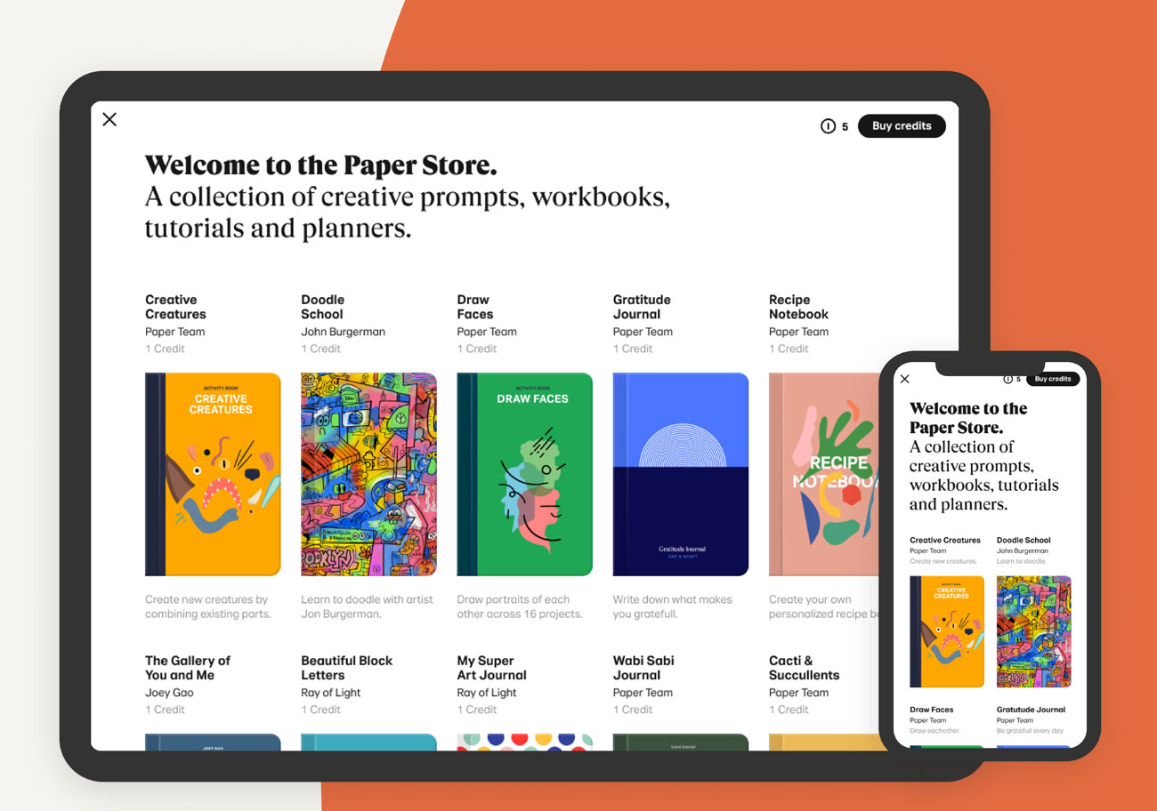
The new Paper Store features a collection of journals that are designed to encourage budding artists, make drawing, sketching and doodling more approachable, and help bring your ideas to life. 

There are three types of journals available: tutorials that'll teach you how to draw anything and everything, exercises to kick-start your creative thinking, and artist showcases that provide inspiration from some of the leading names in the business.

Paper Store

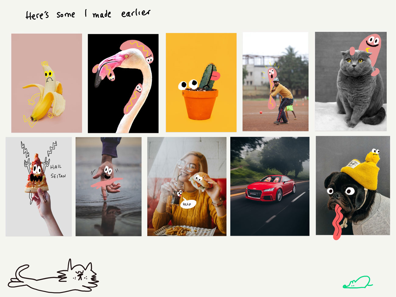
A few minutes with Jon Burgerman and you’ll be doodling all over everything

There are 28 journals available in the Paper Store right now, and one of them hooks you up with a free doodling lesson from the kind of doodles himself, Jon Burgerman. At his doodle school he wants you to have fun and feel creatively uninhibited, and he takes you on a step-by-step journey through the world of doodling using Paper's tools.

There are all manner of handy exercises designed to help you approach a blank page without fear, until finally you're rewarded with your own doodle school diploma proving that you've mastered doodle art.

Paper Store

Chuck out that silly Central Saint Martins diploma and stick this on your wall

As well as Burgerman's doodle school there are also showcases from other artists including Catherine Madden and Lucy Bellwood, and if you have a dig through the Paper Store you'll find guides to drawing creative creatures, faces, flowers, cacti and much more. Each journal is available as an in-app purchase from the Paper Store, at $1.99 a shot.

Paper Store

The Paper Store has plenty of journals to get you drawing

WeTransfer promises that there'll be more inspiring journals from top creatives and artists coming soon, as well as more journal categories to expand your talents even further. If you don't yet have Paper you can find out more about it here, or simply download it for free from the App Store.

Related articles:

Art techniques: top tutorials for painting and drawingCreate a fast and anatomically correct sketchBoost your creativity with daily sketching

Collective #560

Original Source: http://feedproxy.google.com/~r/tympanus/~3/a6irB74fu1o/

C560_WOTW

Inspirational Website of the Week: Spatzek Studio

With an explosive blend of bold typography and slick effects the website of Spatzek Studio gets its message across.

Get inspired

divi4-template-areas-FE

Our Sponsor
Divi 4.0 Has Arrived!

Divi 4.0 has arrived and the new fully-featured website templating system allows you to use the Divi Builder to structure your website and edit any part of the Divi Theme including headers, footers, post templates, category templates and more.

Check it out

C560_indie

The IndieWeb Movement: Owning Your Data and Being the Change You Want to See in the Web

A look at what the IndieWeb is, why you should care, and how to get started with it.

Check it out

C560_tools

Awesome Design Plugins

A collection of all the best design plugins for Sketch, Adobe XD, and Figma, gathered in one place.

Check it out

C560_tensor

Playing Beat Saber in the browser with body movements using PoseNet & Tensorflow.js

A great tutorial on how to use Tensorflow.js and PoseNet to interact with a 3D game using hand motion in the browser. By Charlie Gerard.

Read it

C560_plexis

Plexis.js

A production-ready string manipulation library that’s community driven. Read more about it in this article.

Check it out

C560_credicard

Credit Card Form – VueJs

A really nice Vue.js credit card form that comes with number formatting, validation and automatic card type detection. Made by Muhammed Erdem. Make sure to check out the GitHub repo.

Check it out

C560_firefox70

Firefox 70 — a bountiful release for all

Read about all the juicy new things that come with Firefox 70.

Read it

C560_webdevsong

It’s the end of web dev as we know it

Gregory Koberger wrote an awesome song about the history of web dev, as he remembers it.

Check it out

C560_portfolio

Bruno Simon

A wonderful portfolio site of creative developer Bruno Simon built with Three.js and Cannon.js.

Check it out

C560_regex

RegexGuide

The RegexGuide is a playground helping developers to start writing regular expressions.

Check it out

C560_fuzz

Jsfuzz

Jsfuzz is coverage-guided fuzzer for testing JavaScript/Node.js packages.

Check it out

C560_dropcaps

Accessible Drop Caps

Adrian Roselli’s advice on which pattern to use for accessible drop caps.

Read it

C560_hidde

Breaking barriers with your CMS

The written version of Hidde de Vries’ talk on how CMSes can bring accessibility benefits.

Read it

C560_platform

Using the Platform

Tim Kadlec on the incredible amount of thought and care that go into deciding the future of the web platform.

Read it

C560_accesstechniques

Fata Morganas in Accessibility

Marcus Herrmann on how some new accessibility techniques turn out to be solutions that are not yet ready for prime-time.

Read it

C560_display

The two-value syntax of the CSS Display property

Rachel Andrew explains what the two-value syntax of the display CSS property is all about.

Read it

C560_saturn

Saturn

A beautiful demo of the Spacekit.js library.

Check it out

C560_spooky

Spooky

A great flowy typography demo made by halvves.

Check it out

C560_hovergooey

From Our Blog
Making Gooey Image Hover Effects with Three.js

Learn how to create gooey reveal hover effects on images with Three.js using noise within a shader.

Read it

Collective #560 was written by Pedro Botelho and published on Codrops.

3 Most Successful Minimum Viable Products

Original Source: http://feedproxy.google.com/~r/Designrfix/~3/CHrqTvNK9jY/3-most-successful-minimum-viable-products

Looking through the list of tech giants, we rarely wonder how they all started. Still, most of them entered the market as small-scale applications that were not much like what we see today.  Minimal Viable Product, also known as MVP, is a development strategy that establishes apps’ functionality enough to give a trial group of […]

The post 3 Most Successful Minimum Viable Products appeared first on designrfix.com.

How to Add Sound to Your Site, Without Infuriating Users

Original Source: https://www.webdesignerdepot.com/2019/10/how-to-add-sound-to-your-site-without-infuriating-users/

Once in a while, every professional comes across a challenge so great, so ridiculous, that they just can’t help themselves. They just have to go for it. It’s like the story of David and Goliath… if David was just bored and Goliath wasn’t threatening his entire nation. As for me, I’m about to argue for putting sounds on a website, and discuss how to do it right.

Yeah, I know… I’m one of the “Never Ever Autoplay Sounds on Your Site” people. Even so, here we are. And I’m not going to cheat by talking about embedded video, podcasts, or Soundcloud wrappers. I’m also not going to talk about background music or even just ambient background sounds, because all of those are still evil, in my opinion.

Even looking for examples about sites with sound done right is nigh-impossible, because all of the search results are either music-focused examples, or articles about how you should never, ever use sound.

But as much as it rankles me to admit it, there are cases for adding sound to your websites and apps…on occasion…in very specific cases…look, I will not be held responsible for any customers you might lose, okay? This is an intellectual exercise, and it should go without saying that whatever you do, there should be a way to turn it off forever.

The Case for Adding Sound
Notifications and Alerts

Few things let you know that you should be paying attention like a fairly high-pitched noise. Teachers have their fingernails on the chalkboard, phones have their ringtones, and cats and babies use very similarly pitched sounds specifically to drive us mad/get what they need from you. Interface and product designers made use of this principle long before personal computers were even a thing. It’s effective.

I think these are only acceptable for chat conversations, or for notifications that users specifically request. When you’re waiting for information, and you need to pay attention the moment it arrives, an alert sound might well be appreciated.

Examples include everything from Facebook Messenger and Slack, to news aggregators, to dating apps of all kinds.

Success Alerts

One pattern we might use a little more in our web and app design is actually a little bit of sound to tell people things went right. Those of us gamers, at least, often have fond memories of victory music that played every time you won a battle, or completed a level. If you can find a short “success” sound that evokes nostalgia and a dopamine hit instead of just annoying people, you may have a winner.

Accessibility Enhancement

Alert sounds are all well and good, but what about using the power of audio to help people with, say, sight problems? Sure, there are screen readers and such, but if you know that a large portion of your user base have vision problems, you might consider giving them optional audio cues to make things easier.

Think of “clicking” sounds on buttons, a tone that changes pitch when you use click and drag on a slider, a general sense of haptic feedback that might usually be represented by animation. To people with poor vision, sound is a very useful form of skeuomorphism.

Artistic Experiments

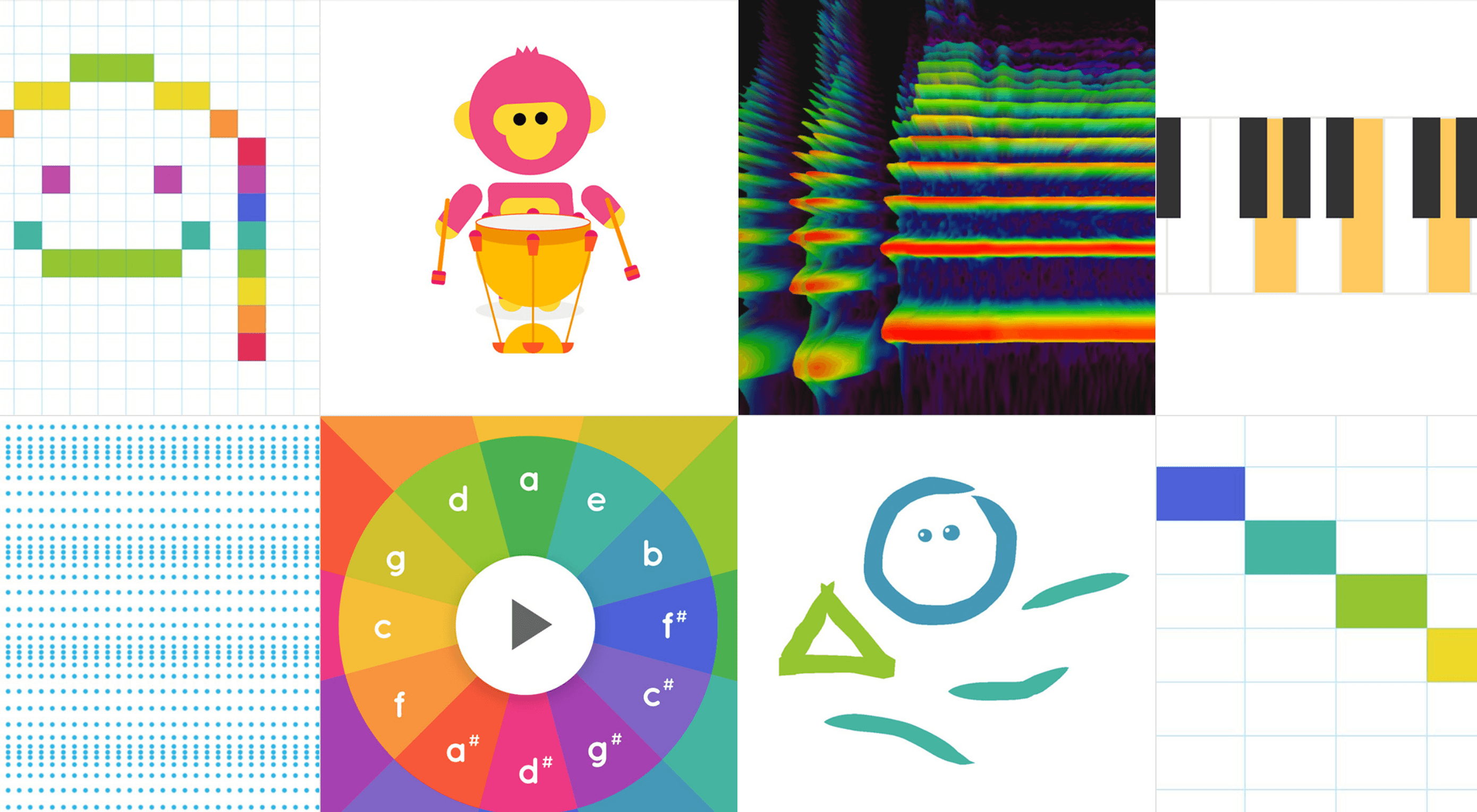
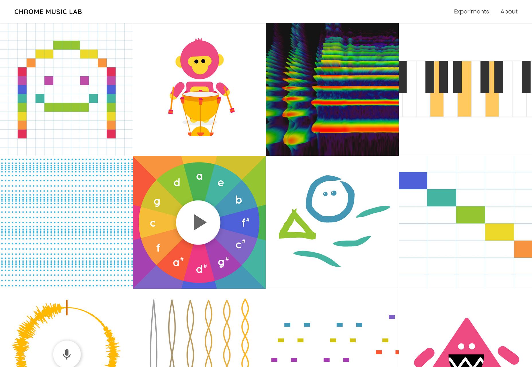
And then, of course, we have the sort of thing that might be in the “experimental” section of your portfolio, or on your CodePen profile. Here’s a site full of them: Chrome Music Lab.

General Tips for Implementing Sound
Actually Playing the Sounds

JavaScript is sort of the only way to do it. Sure, you can just embed a sound with HTML5, but that will only provide you with an audio player. If you’re trying to integrate sound into your UI in a more functional way, JS is the only way to do it. I mean, sure, technically we still have Silverlight, but who’s going to go back to using plugins?

If you’ve never intentionally added sound to your own page before, or just aren’t that familiar with JS, here’s how to play a sound on click. Now, that’s all well and good, but what if your users are having trouble finding the buttons to click on them in the first place? You might want to look at this tutorial from CSS-Tricks about how to play sound when someone hovers over an element.

You Still Have to Try Not to Annoy People

Always, always, always give people a way to shut sounds off, for good. The next question is, of course, whether you should have sound on by default. My vote? No… well, in most cases. Again, if you expect to have a lot of visually impaired people on your site, you might consider making sounds play by default, and putting in a big “You can turn these sounds off off, please don’t run away!” notice front and center.

And Lastly…

Sound files can, depending on their quality, hit people real hard, right in the bandwidth. Use a CDN for your bandwidth, and cache the heck out of any sound files for the sake of your users’ bandwidth. Next, have a look at at Aural style sheets, and think real hard about how your site is presented to screen readers.

And would you look at that? I’ve just about convinced myself that sound on the Internet is a good idea. I should probably stop, now.

Source

p img {display:inline-block; margin-right:10px;}
.alignleft {float:left;}
p.showcase {clear:both;}
body#browserfriendly p, body#podcast p, div#emailbody p{margin:0;}

6 of the best new portfolio sites

Original Source: http://feedproxy.google.com/~r/CreativeBloq/~3/YHOZbqHSNkM/6-of-the-best-new-portfolio-sites

Having a well-curated collection of your finest work on show is the surest way to impress people with your portfolio, but never underestimate the power of displaying it in the best possible way. To really turn heads, it pays to spend time – or money, if you're not that technically inclined – on building a portfolio website that takes full advantage of the latest trends and technology.

And if you're not sure what approach you should take with your site, you've come to the right place. We've found six of the most best new portfolio sites around, each of which do things in their own individual way and look stunning while they're doing it. Read on for a delicious helping of portfolio inspiration. You can also check out our general post of more inspirational design portfolios.

6 big portfolio trends of 2019
01. Hello Monday

6 of the best new portfolio sites: Hello Monday

We could play with these squishy thumbnails for hours

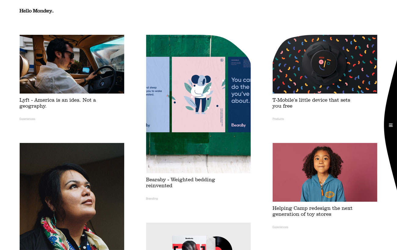
It's hard not to love Hello Monday's mission: to make Mondays better for everyone. This creative studio has an eight-point code of honour that starts off with the simple commitment to being nice, and its portfolio site is equally delightful. 

We love the squishy thumbnail images on the index page, and the way in which you can drag the edges inward until they finally snap back into place. Every project page is packed with detail and lovely big images, and if you need to know even more, many of them have a little 'In depth' link that makes an even more detailed case study slide into view.

02. Antidote

6 of the best new portfolio sites: Antidote

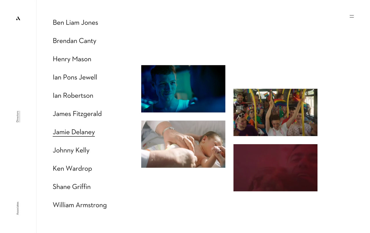
Antidote’s animated thumbnails tell you exactly what each director is about

Antidote is a Dublin-based agency that specialises in high-end commercials, and its portfolio site's designed for instant visual appeal. Rather than drop a big mission statement in front of you – the kind that every scrolls straight past to get to the good stuff – it puts its directors front and centre; a simple list of names, each one bringing up a set of animated thumbnails as you mouse over them. 

It's an effective way to get an instant taste of each director's style, and clicking through takes you a page of massive animated previews that you can click to see the full videos. Further written details are available, but overall Antidote's counting on showing, rather than telling, and it's a brilliant strategy.

03. Design Embraced

6 of the best new portfolio sites: Design Embraced

Design Embraced’s portfolio is full of lovey eye candy

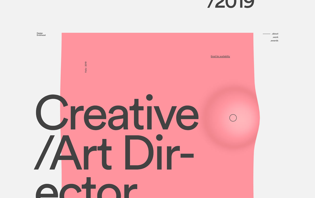
As seen on Hello Monday's portfolio site, getting some movement into your page designs by deforming the edges of images is a great, on-trend look, and it's one that freelancer Anthony Goodwin, under the name Design Embraced, uses to excellent effect. 

As you scroll through his portfolio the assorted images ripple gently and zoom in slightly as you mouse over them; clicking activates a transition in which the thumbnail expands into the centre of the screen and the page loads behind it. Mesmerising stuff.

04. Headless Horse

6 of the best new portfolio sites: Headless Horse

Come for the horses, stay for the massive portfolio gallery

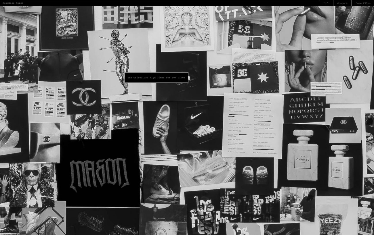
A glorious combination of cutting-edge technology and old-school styling, Headless Horse's portfolio site opens with full-screen video of a pack of horses, over which there's a simple text interface asking: Initiate system? Typing 'yes' takes you to the main portfolio, but there's fun to be had from typing 'no' and seeing what happens next. 

Once you've finished playing with the text interface, the portfolio itself takes the form of a massive black-and-white photo of pictures pinned to a wall; click on each one to see Headless Horse's various projects in depth.

05. Jamie Hunter

6 of the best new portfolio sites: Jamie Hunter

Jamie Hunter’s minimal portfolio makes a big impact with a light touch

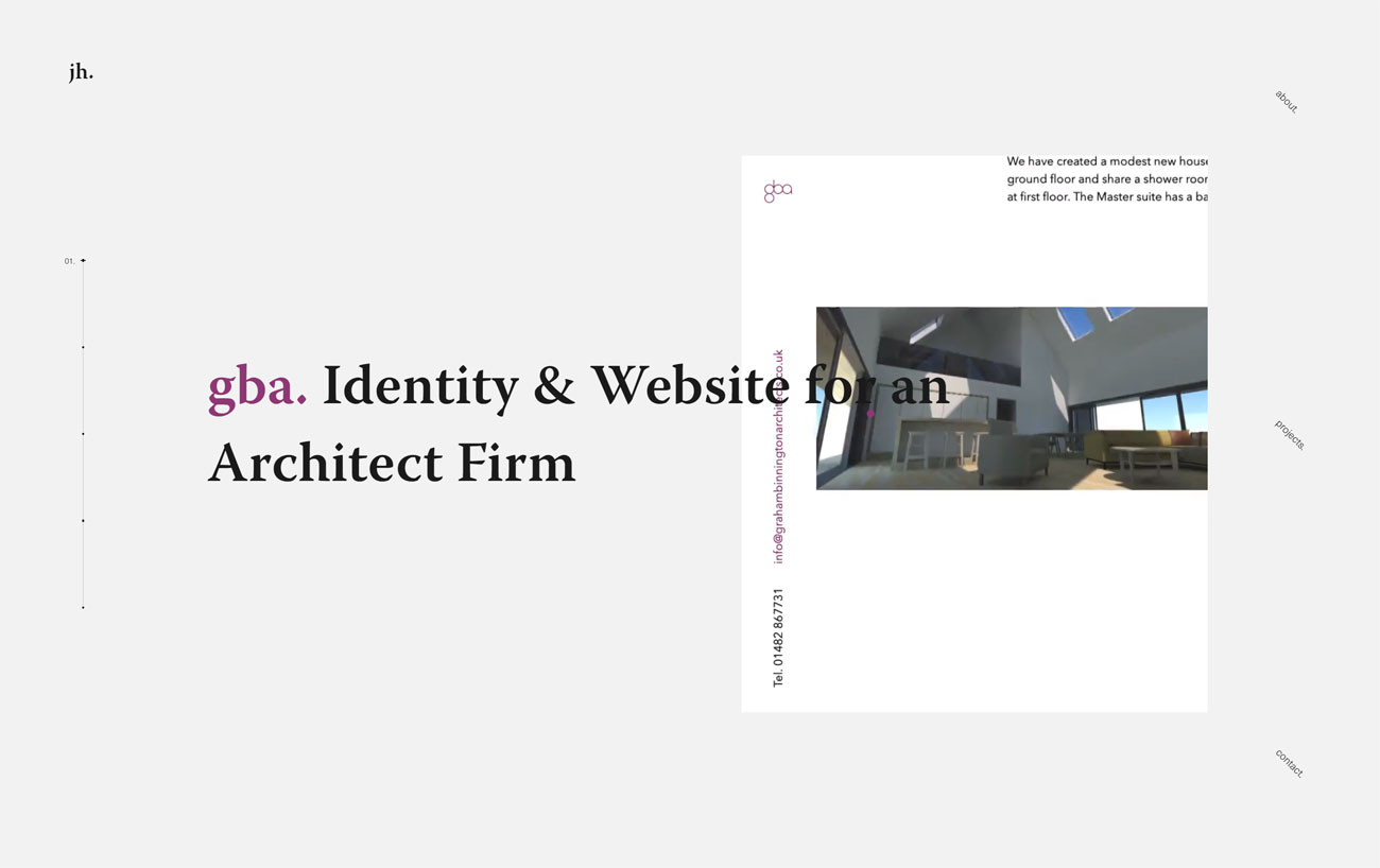
Berlin-based Jamie Hunter describes himself as a holistic design and development person, and his beautifully minimal portfolio site does a splendid job of showcasing his work. Its index page does the job with a combination of kinetic typography and animated video loops of each project – along with plenty of white space to let the work breathe.

While there are only a few non-agency projects on display (he notes that a most of freelancing is agency work covered by NDAs), each one is displayed thoughtfully, with a detailed case study and enough enticing browser effects to leave you in no doubt as to his abilities.

06. Tangent

6 of the best new portfolio sites: Tangent

Tangent takes a clever approach to luring you in to inspect its work

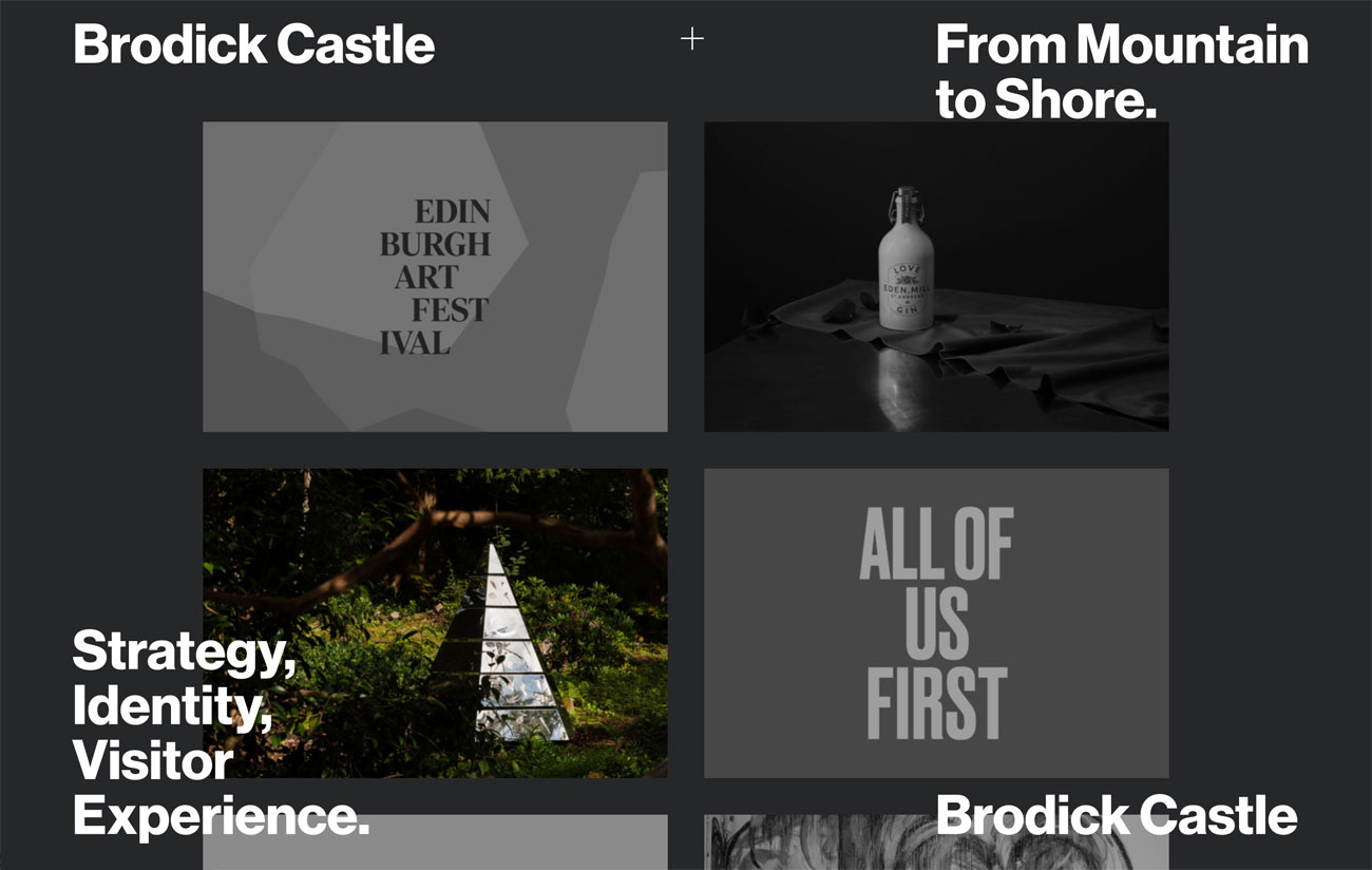
Finally, we absolutely adore Tangent's approach to showcasing its work on its portfolio site. An identity and art direction studio based in Glasgow, it lures you in with a gallery of big black and white thumbnails; mousing over the thumbnails turns them full colour, and the briefest details of the project – the client's name and the nature of their business, and the work that Tangent did for them – appear in the four corners of the window in big, bold Helvetica.

Clicking through takes you to long case studies that are all about the full-screen imagery laced with short chunks of explanatory text; the perfect way to get a feel for each piece of work.

Related articles:

The wrong way to build a portfolio7 free portfolio hosting options for designersHow to refine your design portfolio

How to Create Custom Textures in Photoshop

Original Source: http://feedproxy.google.com/~r/Designrfix/~3/WjinM7mEcy0/how-to-create-custom-textures-in-photoshop

What is the first thing that comes to your mind when the word “Photoshop” is mentioned? For most people, the first thing that comes to mind is retouched images of Justin Bieber or some model, or maybe adding a different background to your picture so it looks like you’re in Italy instead of standing in […]

The post How to Create Custom Textures in Photoshop appeared first on designrfix.com.

Making Gooey Image Hover Effects with Three.js

Original Source: http://feedproxy.google.com/~r/tympanus/~3/-PSOCyJKGIg/

Flash’s grandson, WebGL has become more and more popular over the last few years with libraries like Three.js, PIXI.js or the recent OGL.js. Those are very useful for easily creating a blank board where the only boundaries are your imagination. We see more and more, often subtle integration of WebGL in an interface for hover, scroll or reveal effects. Examples are the gallery of articles on Hello Monday or the effects seen on cobosrl.co.

In this tutorial, we’ll use Three.js to create a special gooey texture that we’ll use to reveal another image when hovering one. Head over to the demo to see the effect in action. For the demo itself, I’ve created a more practical example that shows a vertical scrollable layout with images, where each one has a variation of the effect. You can click on an image and it will expand to a larger version while some other content shows up (just a mock-up). We’ll go over the most interesting parts of the effect, so that you get an understanding of how it works and how to create your own.

I’ll assume that you are comfortable with JavaScript and have some knowledge of Three.js and shader logic. If you’re not, have a look at the Three.js documentation or The Book of Shaders, Three.js Fundamentals or Discover Three.js.

Attention: This tutorial covers many parts; if you prefer, you can skip the HTML/CSS/JavaScript part and go directly go to the shaders section.

Now that we are clear, let’s do this!

Create the scene in the DOM

Before we start making some magic, we are first going to mark up the images in the HTML. It will be easier to handle resizing our scene after we’ve set up the initial position and dimension in HTML/CSS rather than positioning everything in JavaScript. Moreover, the styling part should be only made with CSS, not JavaScript. For example, if our image has a ratio of 16:9 on desktop but a 4:3 ratio on mobile, we just want to handle this using CSS. JavaScript will only get the new values and do its stuff.

// index.html

<section class="container">
<article class="tile">
<figure class="tile__figure">
<img data-src="path/to/my/image.jpg" data-hover="path/to/my/hover-image.jpg" class="tile__image" alt="My image" width="400" height="300" />
</figure>
</article>
</section>

<canvas id="stage"></canvas>
// style.css

.container {
display: flex;
align-items: center;
justify-content: center;
width: 100%;
height: 100vh;
z-index: 10;
}

.tile {
width: 35vw;
flex: 0 0 auto;
}

.tile__image {
width: 100%;
height: 100%;
object-fit: cover;
object-position: center;
}

canvas {
position: fixed;
left: 0;
top: 0;
width: 100%;
height: 100vh;
z-index: 9;
}

As you can see above, we have create a single image that is centered in the middle of our screen. Did you notice the data-src and data-hover attributes on the image? These will be our reference images and we’ll load both of these later in our script with lazy loading.

Don’t forget the canvas. We’ll stack it below our main section to draw the images in the exact same place as we have placed them before.


Create the scene in JavaScript

Let’s get started with the less-easy-but-ok part! First, we’ll create the scene, the lights, and the renderer.

// Scene.js

import * as THREE from ‘three’

export default class Scene {
constructor() {
this.container = document.getElementById(‘stage’)

this.scene = new THREE.Scene()
this.renderer = new THREE.WebGLRenderer({
canvas: this.container,
alpha: true,
})

this.renderer.setSize(window.innerWidth, window.innerHeight)
this.renderer.setPixelRatio(window.devicePixelRatio)

this.initLights()
}

initLights() {
const ambientlight = new THREE.AmbientLight(0xffffff, 2)
this.scene.add(ambientlight)
}
}

This is a very basic scene. But we need one more essential thing in our scene: the camera. We have a choice between two types of cameras: orthographic or perspective. If we keep our image flat, we can use the first one. But for our rotation effect, we want some perspective as we move the mouse around.

In Three.js (and other libraries for WebGL) with a perspective camera, 10 unit values on our screen are not 10px. So the trick here is to use some math to transform 1 unit to 1 pixel and change the perspective to increase or decrease the distortion effect.

// Scene.js

const perspective = 800

constructor() {
// …
this.initCamera()
}

initCamera() {
const fov = (180 * (2 * Math.atan(window.innerHeight / 2 / perspective))) / Math.PI

this.camera = new THREE.PerspectiveCamera(fov, window.innerWidth / window.innerHeight, 1, 1000)
this.camera.position.set(0, 0, perspective)
}

We’ll set the perspective to 800 to have a not-so-strong distortion as we rotate the plane. The more we increase the perspective, the less we’ll perceive the distortion, and vice versa.

The last thing we need to do is to render our scene in each frame.

// Scene.js

constructor() {
// …
this.update()
}

update() {
requestAnimationFrame(this.update.bind(this))

this.renderer.render(this.scene, this.camera)
}

If your screen is not black, you are on the right way!

Build the plane with the correct sizes

As we mentioned above, we have to retrieve some additional information from the image in the DOM like its dimension and position on the page.

// Scene.js

import Figure from ‘./Figure’

constructor() {
// …
this.figure = new Figure(this.scene)
}
// Figure.js

export default class Figure {
constructor(scene) {
this.$image = document.querySelector(‘.tile__image’)
this.scene = scene

this.loader = new THREE.TextureLoader()

this.image = this.loader.load(this.$image.dataset.src)
this.hoverImage = this.loader.load(this.$image.dataset.hover)
this.sizes = new THREE.Vector2(0, 0)
this.offset = new THREE.Vector2(0, 0)

this.getSizes()

this.createMesh()
}
}

First, we create another class where we pass the scene as a property. We set two new vectors, dimension and offset, in which we’ll store the dimension and position of our DOM image.

Furthermore, we’ll use a TextureLoader to “load” our images and convert them into a texture. We need to do that as we want to use these pictures in our shaders.

We need to create a method in our class to handle the loading of our images and wait for a callback. We could achieve that with an async function but for this tutorial, let’s keep it simple. Just keep in mind that you’ll probably need to refactor this a bit for your own purposes.

// Figure.js

// …
getSizes() {
const { width, height, top, left } = this.$image.getBoundingClientRect()

this.sizes.set(width, height)
this.offset.set(left – window.innerWidth / 2 + width / 2, -top + window.innerHeight / 2 – height / 2)
}
// …

We get our image information in the getBoundingClientRect object. After that, we’ll pass these to our two variables. The offset is here to calculate the distance between the center of the screen and the object on the page.

// Figure.js

// …
createMesh() {
this.geometry = new THREE.PlaneBufferGeometry(1, 1, 1, 1)
this.material = new THREE.MeshBasicMaterial({
map: this.image
})

this.mesh = new THREE.Mesh(this.geometry, this.material)

this.mesh.position.set(this.offset.x, this.offset.y, 0)
this.mesh.scale.set(this.sizes.x, this.sizes.y, 1)

this.scene.add(this.mesh)
}
// …

After that, we’ll set our values on the plane we’re building. As you can notice, we have created a plane of 1 on 1px with 1 row and 1 column. As we don’t want to distort the plane, we don’t need a lot of faces or vertices. So let’s keep it simple.

But why scale it while we can set the size directly? Glad you asked.

Because of the resizing part. If we want to change the size of our mesh afterwards, there is no other proper way than this one. While it’s easier to change the scale of the mesh, it’s not for the dimension.

For the moment, we set a MeshBasicMaterial, just to see if everything is fine.

Get mouse coordinates

Now that we have built our scene with our mesh, we want to get our mouse coordinates and, to keep things easy, we’ll normalize them. Why normalize? Because of the coordinate system in shaders.

coordinate-system

As you can see in the figure above, we have normalized the values for both of our shaders. So to keep things simple, we’ll prepare our mouse coordinate to match the vertex shader coordinate.

If you’re lost at this point, I recommend you to read the Book of Shaders and the respective part of Three.js Fundamentals. Both have good advice and a lot of examples to help understand what’s going on.

// Figure.js

// …

this.mouse = new THREE.Vector2(0, 0)
window.addEventListener(‘mousemove’, (ev) => { this.onMouseMove(ev) })

// …

onMouseMove(event) {
TweenMax.to(this.mouse, 0.5, {
x: (event.clientX / window.innerWidth) * 2 – 1,
y: -(event.clientY / window.innerHeight) * 2 + 1,
})

TweenMax.to(this.mesh.rotation, 0.5, {
x: -this.mouse.y * 0.3,
y: this.mouse.x * (Math.PI / 6)
})
}

For the tween parts, I’m going to use TweenMax from GreenSock. This is the best library ever. EVER. And it’s perfect for our purpose. We don’t need to handle the transition between two states, TweenMax will do it for us. Each time we move our mouse, TweenMax will update the position and the rotation smoothly.

One last thing before we continue: we’ll update our material from MeshBasicMaterial to ShaderMaterial and pass some values (uniforms) and shaders.

// Figure.js

// …

this.uniforms = {
u_image: { type: ‘t’, value: this.image },
u_imagehover: { type: ‘t’, value: this.hover },
u_mouse: { value: this.mouse },
u_time: { value: 0 },
u_res: { value: new THREE.Vector2(window.innerWidth, window.innerHeight) }
}

this.material = new THREE.ShaderMaterial({
uniforms: this.uniforms,
vertexShader: vertexShader,
fragmentShader: fragmentShader
})

update() {
this.uniforms.u_time.value += 0.01
}

We passed our two textures, the mouse position, the size of our screen and a variable called u_time which we will increment each frame.

But keep in mind that it’s not the best way to do that. For example, we only need to increment when we are hovering the figure, not every frame. I’m not going into details, but performance-wise, it’s better to just update our shader only when we need it.

The logic behind the trick & how to use noise

Still here? Nice! Time for some magic tricks.

I will not explain what noise is and where it comes from. If you’re interested, be sure to read this page from The Book of Shaders. It’s well explained.

Long story short, Noise is a function that gives us a value between -1 and 1 based on values we pass through. It will output a random pattern but more organic.

Thanks to noise, we can generate a lot of different shapes, like maps, random patterns, etc.

noise-example1

noise-example2

Let’s start with a 2D noise result. Just by passing the coordinate of our texture, we’ll have something like a cloud texture.

noise-result1

But there are several kinds of noise functions. Let’s use a 3D noise by giving one more parameter like … the time? The noise pattern will evolve and change over time. By changing the frequency and the amplitude, we can give some movement and increase the contrast.

It will be our first base.

noise-result2

Second, we’ll create a circle. It’s quite easy to build a simple shape like a circle in the fragment shader. We just take the function from The Book of Shaders: Shapes to create a blurred circle, increase the contrast and voilà!

noise-result3

Last, we add these two together, play with some variables, cut a “slice” of this and tadaaa:

noise-result4

We finally mix our textures together based on this result and here we are, easy peasy lemon squeezy!

Let’s dive into the code.

Shaders

We won’t really need the vertex shader here so this is our code:

// vertexShader.glsl
varying vec2 v_uv;

void main() {
v_uv = uv;

gl_Position = projectionMatrix * modelViewMatrix * vec4(position, 1.0);
}

ShaderMaterial from Three.js provides some useful default variables when you’re a beginner:

position (vec3): the coordinates of each vertex of our mesh
uv (vec2): the coordinates of our texture
normals (vec3): normal of each vertex our mesh have.

Here we’re just passing the UV coordinates from the vertex shader to fragment shader.

Create the circle

Let’s use the function from The Book of Shaders to build our circle and add a variable to handle the blurriness of our edges.

Moreover, we’ll add the mouse position to the origin of our circle. This way, the circle will be moving as long as we move our mouse over our image.

// fragmentShader.glsl
uniform vec2 u_mouse;
uniform vec2 u_res;

float circle(in vec2 _st, in float _radius, in float blurriness){
vec2 dist = _st;
return 1.-smoothstep(_radius-(_radius*blurriness), _radius+(_radius*blurriness), dot(dist,dist)*4.0);
}

void main() {
vec2 st = gl_FragCoord.xy / u_res.xy – vec2(1.);
// tip: use the following formula to keep the good ratio of your coordinates
st.y *= u_res.y / u_res.x;

vec2 mouse = u_mouse;
// tip2: do the same for your mouse
mouse.y *= u_res.y / u_res.x;
mouse *= -1.;

vec2 circlePos = st + mouse;
float c = circle(circlePos, .03, 2.);

gl_FragColor = vec4(vec3(c), 1.);
}

Make some noooooise

As we saw above, the noise function has several parameters and gives us a smooth cloudy pattern. How could we have that? Glad you asked.

For this part, I’m using glslify and glsl-noise, and two npm packages to include other functions. It keeps our shader a little bit more readable and avoids having a lot of displayed functions that we will not use after all.

// fragmentShader.glsl
#pragma glslify: snoise2 = require(‘glsl-noise/simplex/2d’)

//…

varying vec2 v_uv;

uniform float u_time;

void main() {
// …

float n = snoise2(vec2(v_uv.x, v_uv.y));

gl_FragColor = vec4(vec3(n), 1.);
}

noise-result5

By changing the amplitude and the frequency of our noise (exactly like the sin/cos functions), we can change the render.

// fragmentShader.glsl

float offx = v_uv.x + sin(v_uv.y + u_time * .1);
float offy = v_uv.y – u_time * 0.1 – cos(u_time * .001) * .01;

float n = snoise2(vec2(offx, offy) * 5.) * 1.;

noise-result6

But it isn’t evolving through time! It is distorted but that’s it. We want more. So we will use noise3d instead and pass a 3rd parameter: the time.


float n = snoise3(vec3(offx, offy, u_time * .1) * 4.) * .5;

As you can see, I changed the amplitude and the frequency to have the render I desire.

Alright, let’s add them together!

Merging both textures

By just adding these together, we’ll already see an interesting shape changing through time.

noise-result7

To explain what’s happening, let’s imagine our noise is like a sea floating between -1 and 1. But our screen can’t display negative color or pixels more than 1 (pure white) so we are just seeing the values between 0 and 1.

explanation-noise1

And our circle is like a flan.

explanation-noise2

By adding these two shapes together it will give this very approximative result:

explanation-noise3

Our very white pixels are only pixels outside the visible spectrum.

If we scale down our noise and subtract a small number, it will be completely moving down your waves until it disappears above the surface of the ocean of visible colors.

noise-result8

float n = snoise(vec3(offx, offy, u_time * .1) * 4.) – 1.;

Our circle is still there but not enough visible to be displayed. If we multiply its value, it will be more contrasted.

float c = circle(circlePos, 0.3, 0.3) * 2.5;

noise-result9

We are almost there! But as you can see, there are still some details missing. And our edges aren’t sharp at all.

To avoid that, we’ll use the built-in smoothstep function.

float finalMask = smoothstep(0.4, 0.5, n + c);

gl_FragColor = vec4(vec3(finalMask), 1.);

Thanks to this function, we’ll cut a slice of our pattern between 0.4 et 0.5, for example. The shorter the space is between these values, the sharper the edges are.

Finally, we can mix our two textures to use them as a mask.

uniform sampler2D u_image;
uniform sampler2D u_imagehover;

// …

vec4 image = texture2D(u_image, uv);
vec4 hover = texture2D(u_imagehover, uv);

vec4 finalImage = mix(image, hover, finalMask);

gl_FragColor = finalImage;

We can change a few variables to have a more gooey effect:

// …

float c = circle(circlePos, 0.3, 2.) * 2.5;

float n = snoise3(vec3(offx, offy, u_time * .1) * 8.) – 1.;

float finalMask = smoothstep(0.4, 0.5, n + pow(c, 2.));

// …

And voilà!

Check out the full source here or take a look at the live demo.

Mic drop

Congratulations to those who came this far. I haven’t planned to explain this much. This isn’t perfect and I might have missed some details but I hope you’ve enjoyed this tutorial anyway. Don’t hesitate to play with variables, try other noise functions and try to implement other effects using the mouse direction or play with the scroll!

If you have any questions, let me know in the comments section! I also encourage you to download the demo, it’s a little bit more complex and shows the effects in action with hover and click effects ¯_(?)_/¯

References and Credits

Images from Unsplash
Three.js
GSAP from GreenSock
Smooth Scrollbar
glslify
glsl-noise

Making Gooey Image Hover Effects with Three.js was written by Arno Di Nunzio and published on Codrops.

10 Gmail Chrome Extensions You Should Know

Original Source: https://www.hongkiat.com/blog/gmail-extensions-for-chrome/

I have a love-hate relationship with the new, refreshed version of Gmail. Though I admire its material design interface, I’m not a fan of every design change that led to its modern interface;…

Visit hongkiat.com for full content.

Introducing 15 Best New Portfolios, October 2019

Original Source: https://www.webdesignerdepot.com/2019/10/introducing-15-best-new-portfolios-october-2019/

All the signs are that web design is entering a phase of exuberance, with clashing colors, rapidly changing graphics, and dense layouts replacing the minimalism that’s dominated digital design for the last decade. Portfolios are beginning to adopt this maximalist approach, but never fear, for those who aren’t quote ready for full-on retina burn on a Monday in late October, we’ve included a few beautifully minimal sites for you to enjoy.
Hello Monday

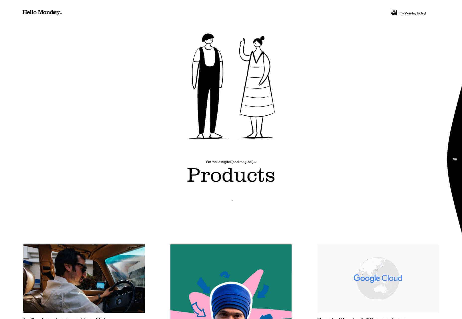
Hello Monday’s site is utterly charming, with a delightful animation that I could watch for hours. The work section of the site is a masonry-style vertical grid, which is less easy to browse than you would expect, thanks to the number of projects. The best parts of this site are the little details: I love that they tell you how many days it is until Monday, and the way that hamburger menu slips away as you scroll is super-slick.

Bold

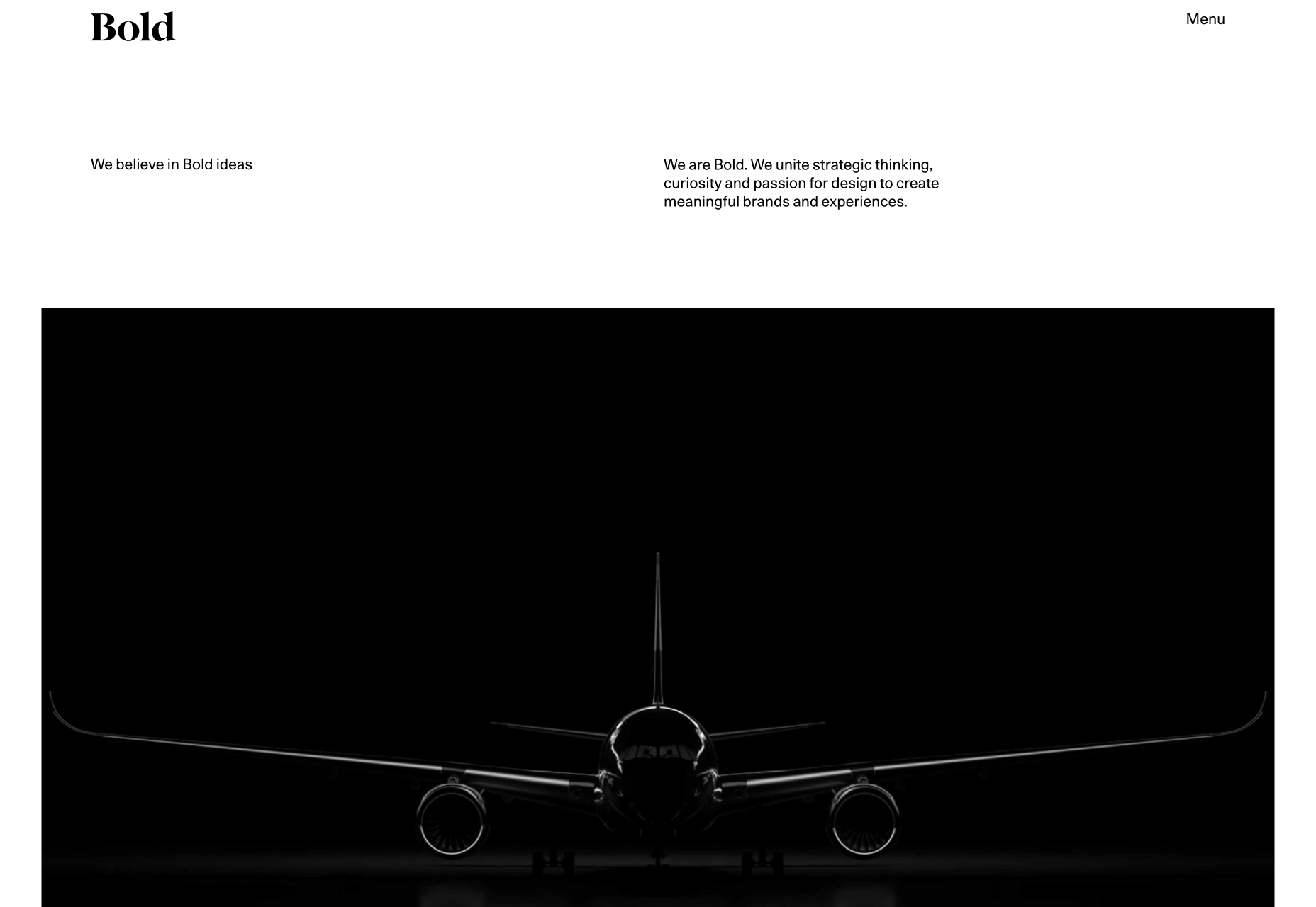
Bold’s portfolio is about sending a powerful message. It’s the website equivalent of huge shoulder pads, and an enormous, solid gold smartphone. The way the border expands from the featured images, giving you the sense of zooming into the project is inspired. It helps to have huge-name clients as social proof, but this site is excellent at inspiring confidence in the designers behind it.

Analog is Heavy

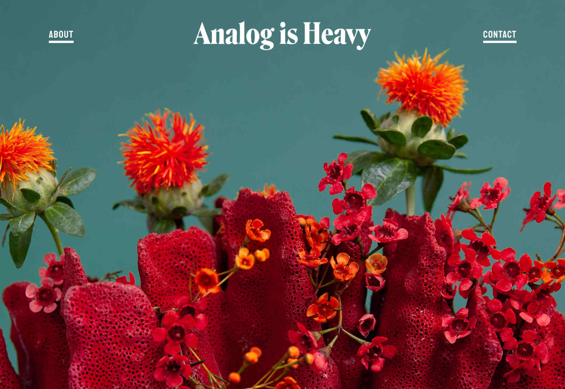
Analog is Heavy is a creative photography practice that works with design studios to hone brand messages with high-quality product photography. Its approach to a portfolio is a vertically aligned grid of images, and that’s it. Targeting design agencies means that they’re speaking to an audience of visually educated professionals, giving Analog is Heavy the freedom to let its work sell itself.

Athletics

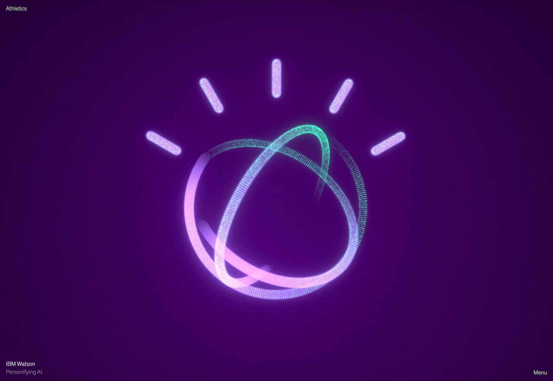
Another big agency, with a client list to kill for, Athletics jumps right into fullscreen video case studies of its work for clients like IBM. One trend with many of these portfolios is that work is cherry-picked to be showcased and then less-exciting work is linked to below the initial presentation. In Athletics’ case this means an interesting grid of lower-profile, but equally exciting work.

Brittany Chiang

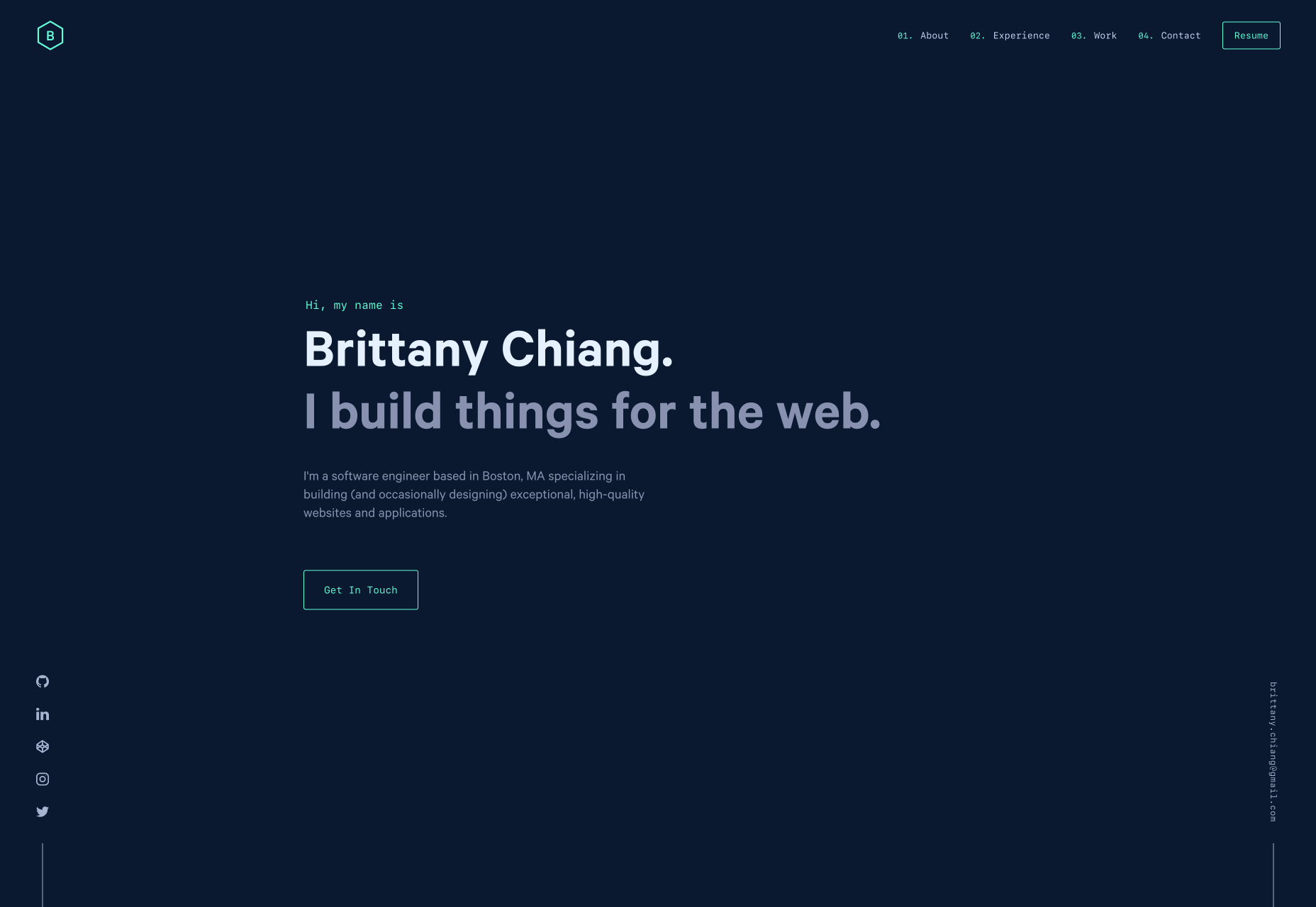
Brittany Chiang builds things for the web. How’s that for a no-nonsense approach? This great little site feels very app-orientated thanks to the dark-mode color palette and the monospaced typeface. Its a single-pager, which are increasingly rare these days, and the simplicity of it works really well. Brittany has out UXed plenty of dedicated UX designers, by being true to herself.

Shohei Takenaka

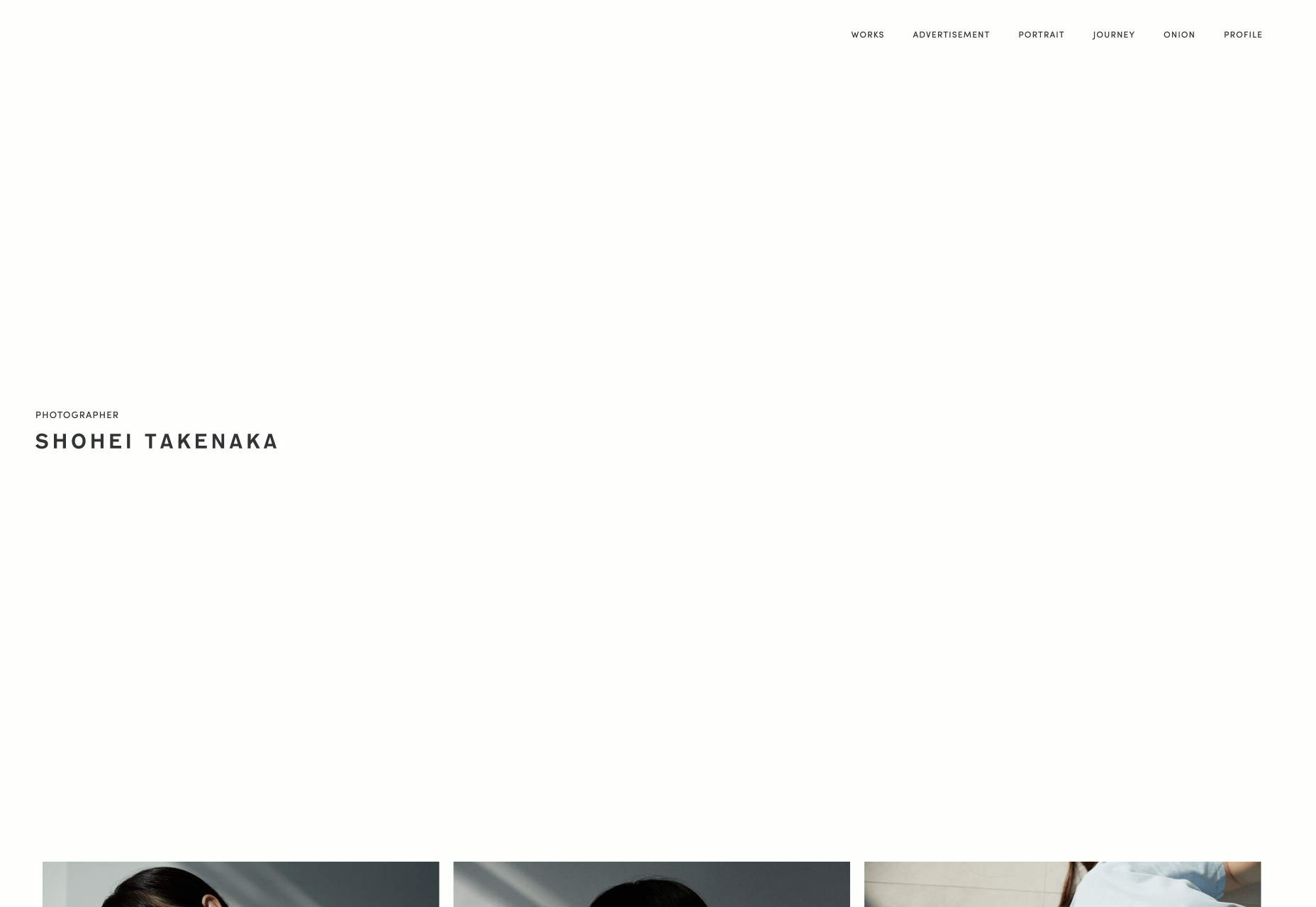
As the web drifts towards maximalism, it’s great that there are still calm, simple, minimalist masterpieces to admire. Shohei Takenaka’s site is beautiful, with restraint, attention to detail, and ample whitespace. The subtle underlines on the menu text, and the images protruding into the white space to encourage scrolling, as well as the way the color bands are grouped when you scroll, are all perfect examples of clever UI design.

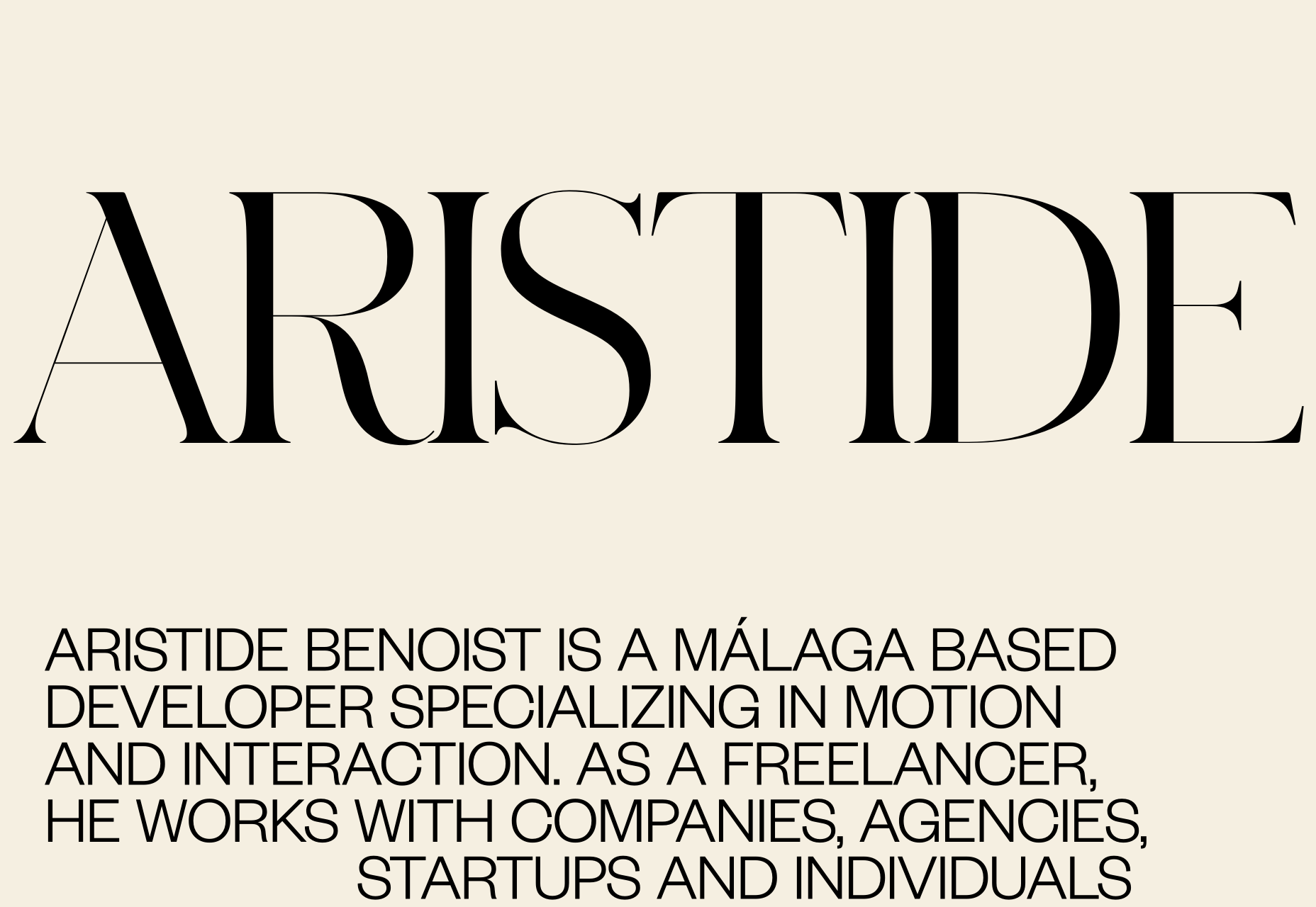
Aristide Benoist

Aristide Benoist’s portfolio features some beautiful typography. It’s great to see a developer take an interest in the finer points of design. The all-caps sans-serif text is a little too much to cope with in large amounts, but here it works just fine. My favourite part of the site is the transition from thumbnail to case study. Hover over the list of projects and a little flag-like ribbon will appear, click on it and it expands into a full project image, delightful!

WTF Studio

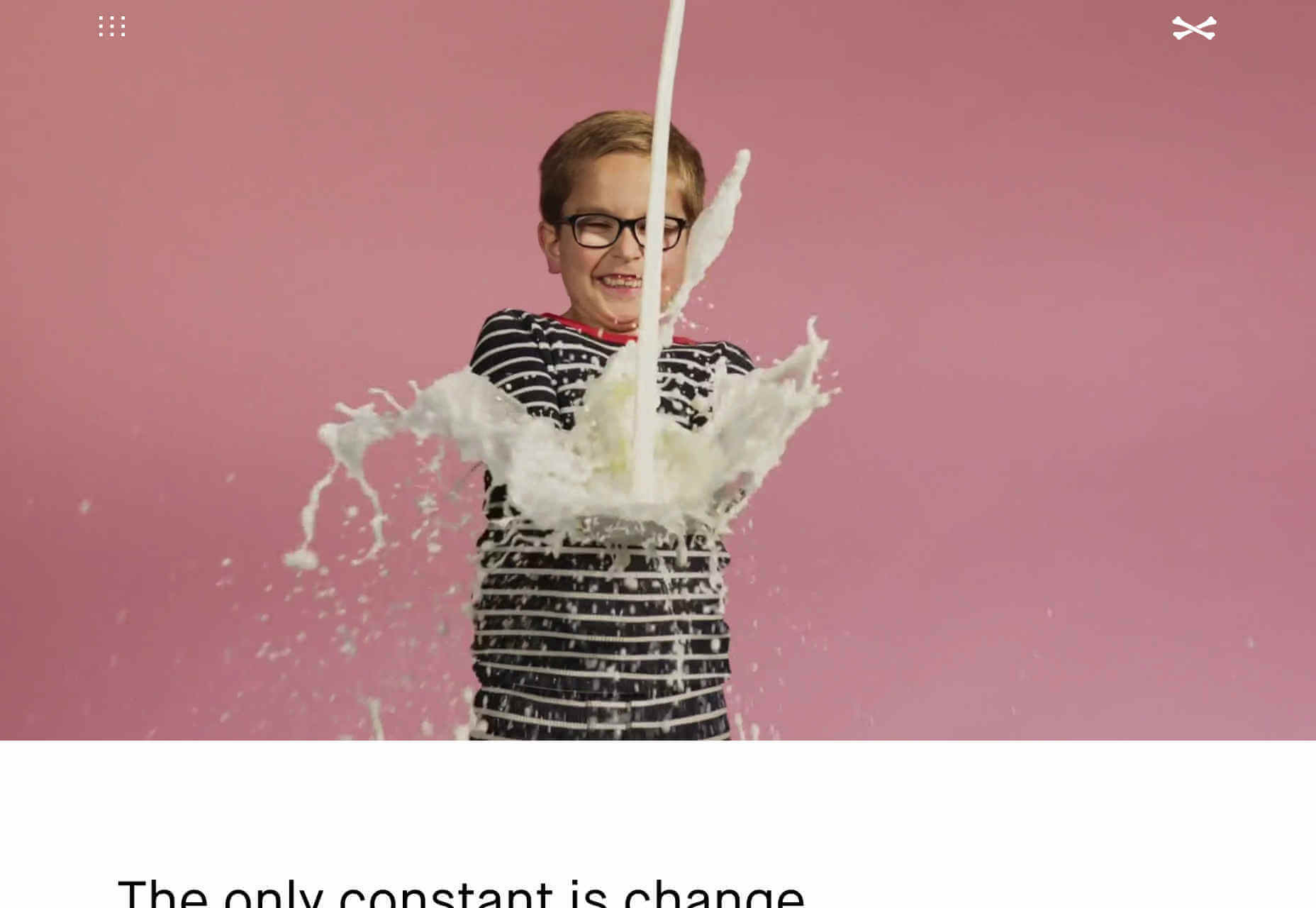
WTF Studio’s portfolio is as in-yer-face as the name suggests. A front for NYC-based creative director Able Parris, the site slaps you in the eyes with color and animation the moment it loads. But scroll down past the anarchic introduction and you’ll find a series of projects for household names presented as individual case studies. It’s exactly what big brands like to see: creativity and safe hands.

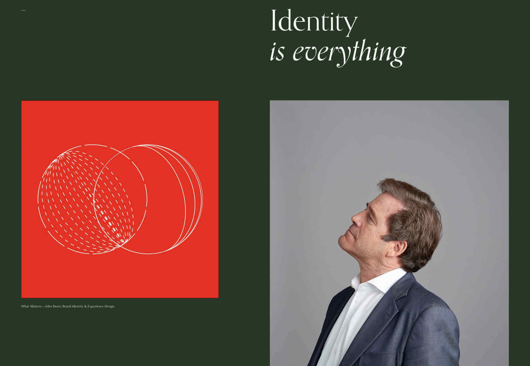
Jim Schachterle

Jim Schachterle’s site takes an approach that we don’t normally see: he’s opted for a dark green background. That simple choice, alongside the carefully paired project shots make for a sophisticated, and distinct style. Unfortunately the choice of typeface doesn’t work in places, at 12px the detail in the design is lost altogether, swapping it out for a simpler sans-serif whenever the font-size was under 18pt would have been a better choice.

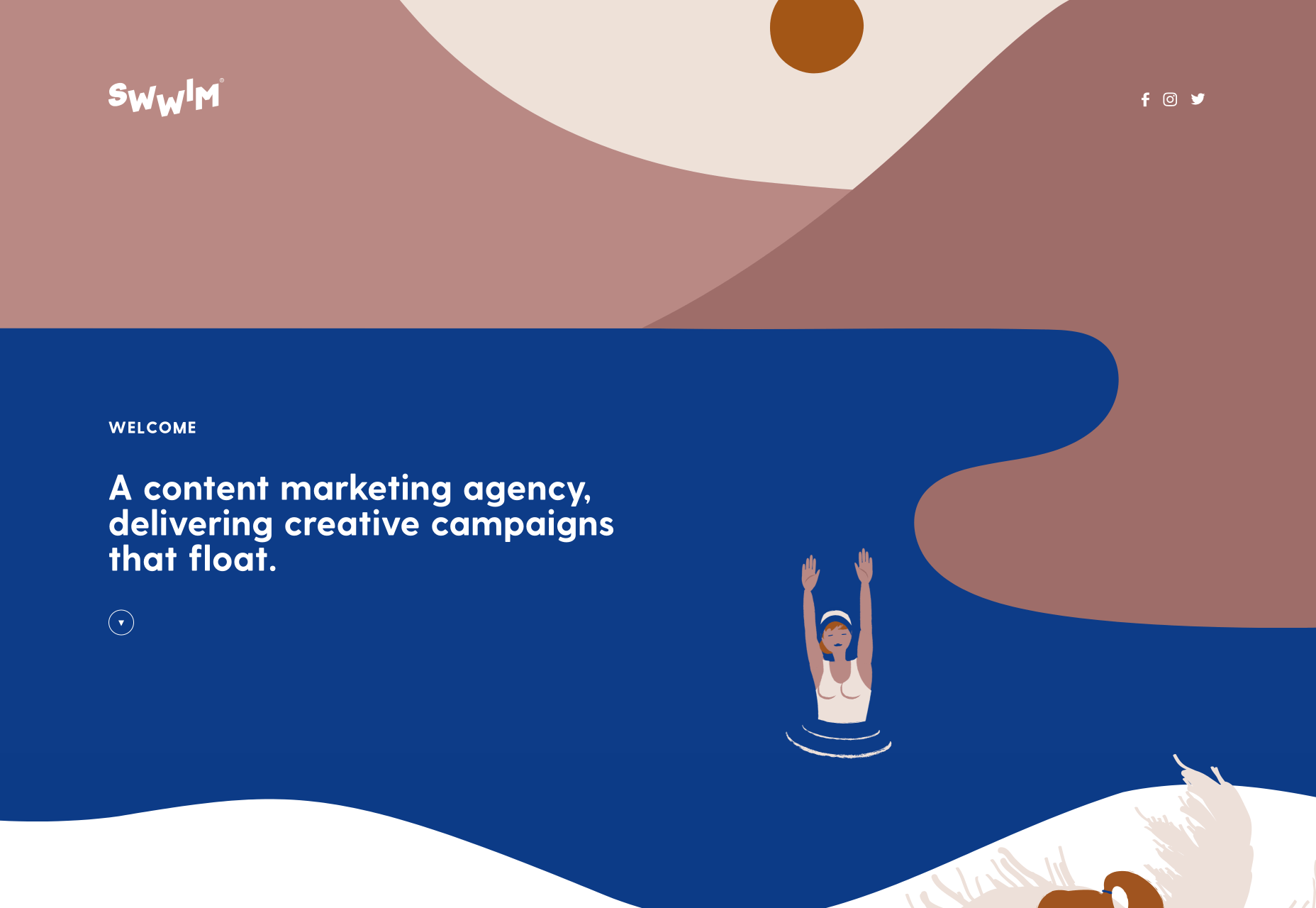
Swwim

Perhaps it’s the chilly Northern climate at this time of year, but this Saint-Tropez looking site for Swwim warms my heart. The rounded sans-serif is an interesting choice — most designers would aim for sharp lines to emphasize precision. I adore the logotype, and its frivolity is echoed throughout the site in section titles. The less-subtle animation feels a little forced, but the wave motion is enticing, and brand-appropriate.

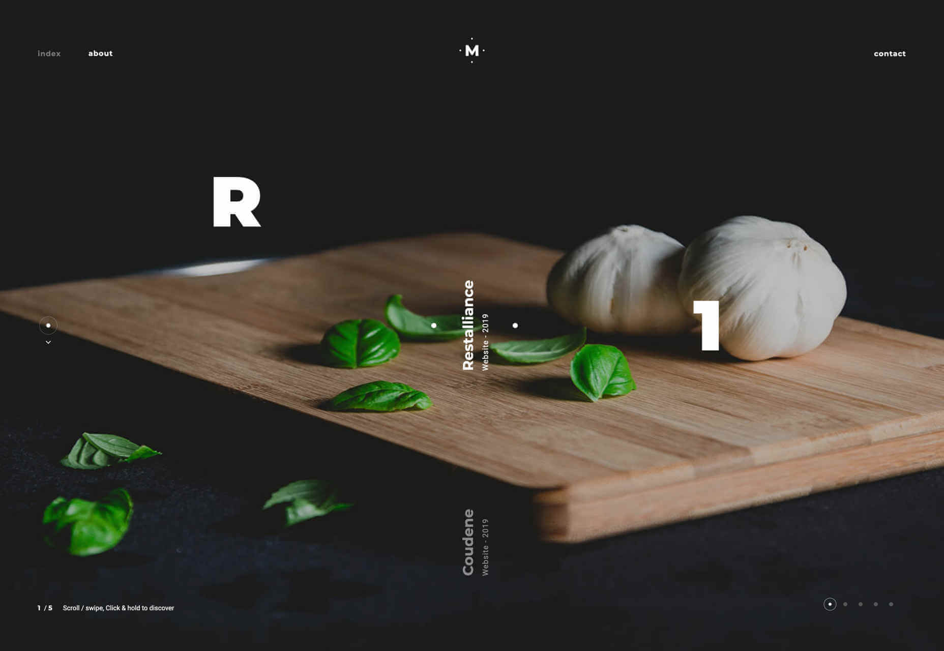
Hadrien Mongouachon

Hadrien Mongouachon is a freelance developer, so it makes perfect sense for him to demo his skills front and center on his site. He’s opted for a variation of the highly-trendy liquid effect, and it works really well. I’m not convinced by the sideways type — it only works in print because you can tilt the page — and the usability is a little compromised by the click-hold action. Once you’re accustomed to the site, it’s fun to traverse.

Butchershop

Butchershop is another design agency relying heavily on a video reel to sell its brand work. What’s really interesting about this site, is all the things it does “wrong”: the logo mark is positioned top right instead of top left, the title of its homepage is “Home”. It keeps breaking with received wisdom, so either they know something we don’t, or they didn’t get the memo about UX being a thing — you decide which.

Nikolas Type

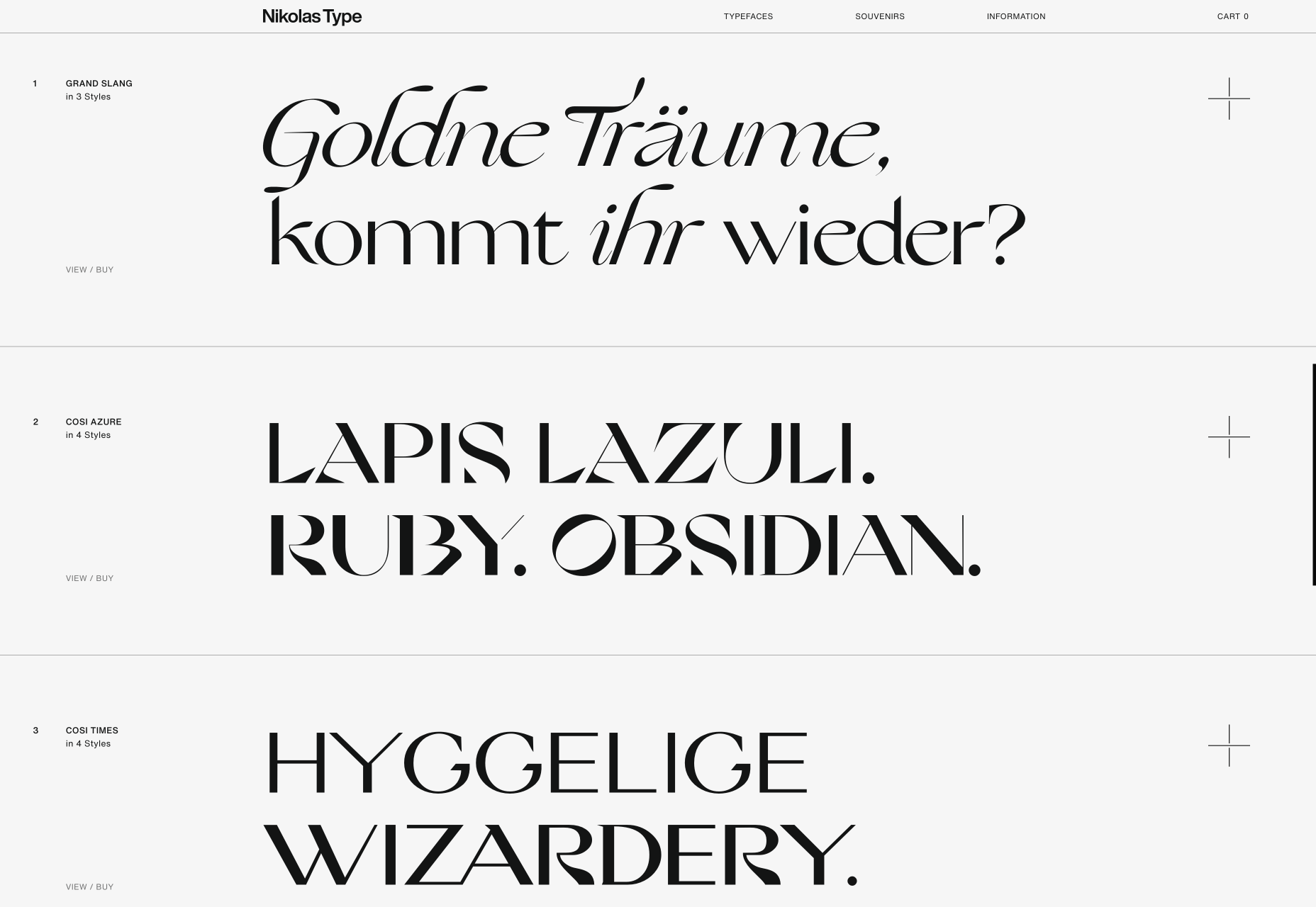
It’s rare that we get to enjoy a purely type-based portfolio, because design work is visual, but this minimal showcase is Nikolas Wrobel’s Type Foundry, Nikolas Type. Click through to the product pages and you can edit the preview text. Thanks to the foundry being a small independent, it’s able to show some lovely samples that bring the type to life, something that larger foundries often fail to do.

Jam3

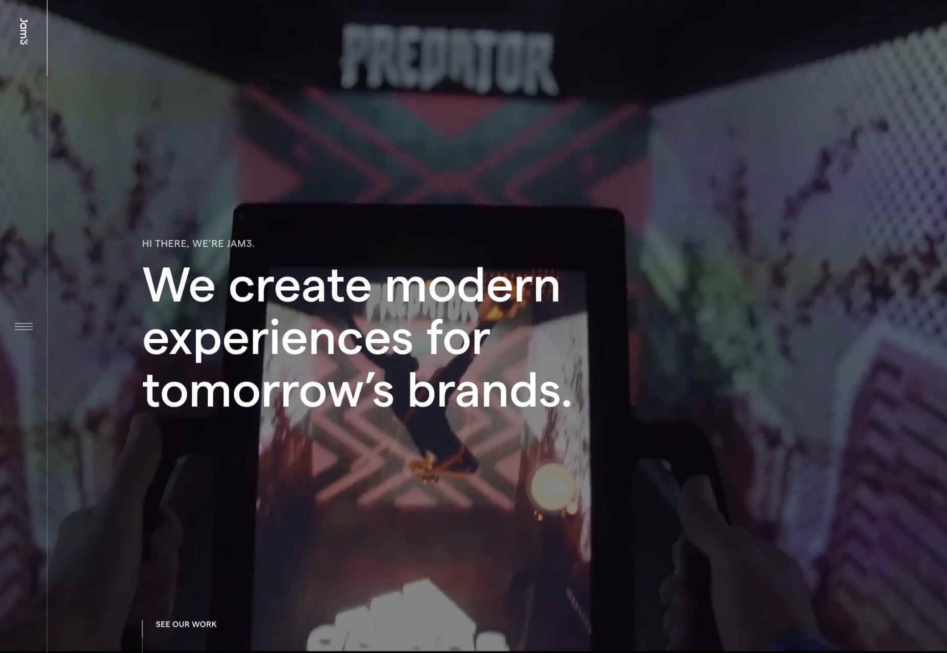
It seems video (not static images) are now a must for any portfolio site. Agencies want companies to see real-world experiences, and understand what the working relationship is like. Jam3 is no exception, but scroll past the looping video and you’ll find a rigorously organized set of projects. The menu isn’t easy to locate, but I do like agencies opening up about their approach, and culture. Plus there’s a cool bubble effect hovering over the menu items.

New Land

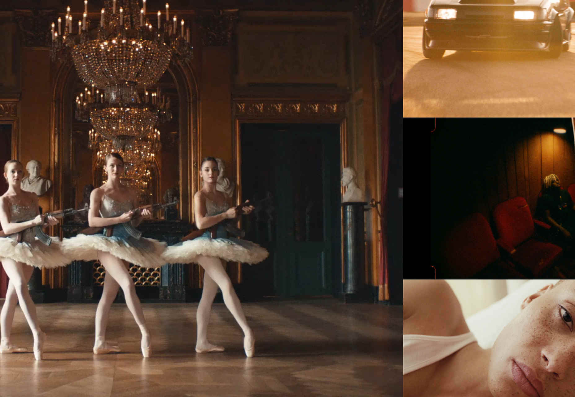
There’s a tendency among motion graphics and video firms to be slightly mysterious about who they are, and what they do — perhaps it comes from the high-concepts of advertising. New Land’s target audience probably do know who it is, because this is the kind of company that you don’t hire without some prior-knowledge. Interestingly the site is geared around tablet and mobile preferred interactions, as if intended to be passed around a meeting.

Source

p img {display:inline-block; margin-right:10px;}
.alignleft {float:left;}
p.showcase {clear:both;}
body#browserfriendly p, body#podcast p, div#emailbody p{margin:0;}

A Look Into Proper HTML5 Semantics

Original Source: https://www.hongkiat.com/blog/html-5-semantics/

If you carefully plan the structure of your HTML documents, you can help computers make sense of the meaning of your content. Proper syntax is important for sure, but it basically just provides…

Visit hongkiat.com for full content.