What’s New for Designers, August 2018

Original Source: https://www.webdesignerdepot.com/2018/08/whats-new-for-designers-august-2018/
What’s old is new again; that’s the theme this month with new tools for designers with a few new tools that are rooted in the “old” concepts of design theory. From working with typefaces, to a color wheel, this roundup is packed with goodies. And then there are some new “new” tools as well, including a couple of cool 3D elements.

If we’ve missed something that you think should have been on the list, let us know in the comments. And if you know of a new app or resource that should be featured next month, tweet it to @carriecousins to be considered!

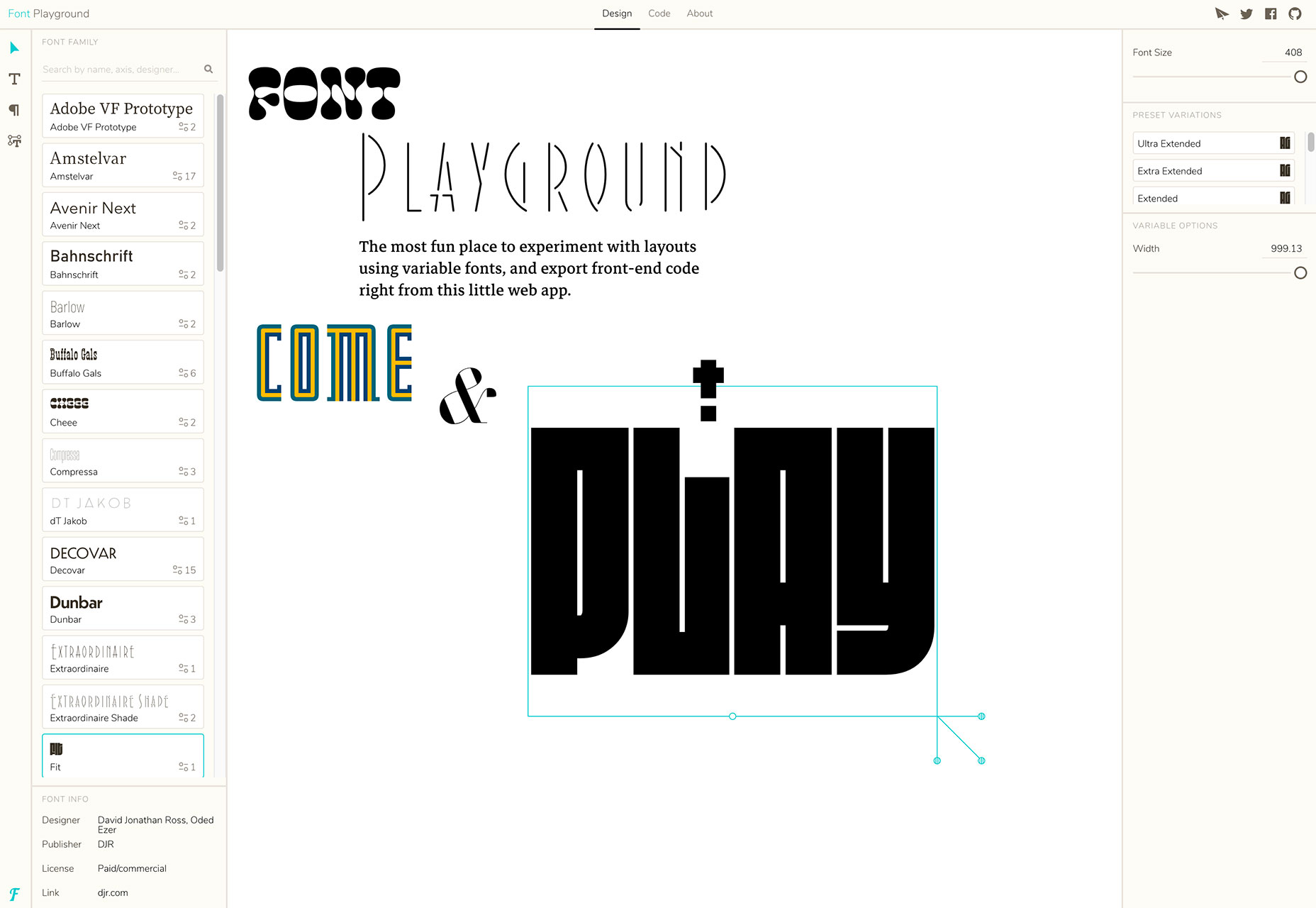
Font Playground

Font Playground is a tool to help you experiment with variable fonts and even export front-end code. Variable fonts, which are single font files that behave like multiple fonts, are gaining popularity, making this something you should probably experiment with.
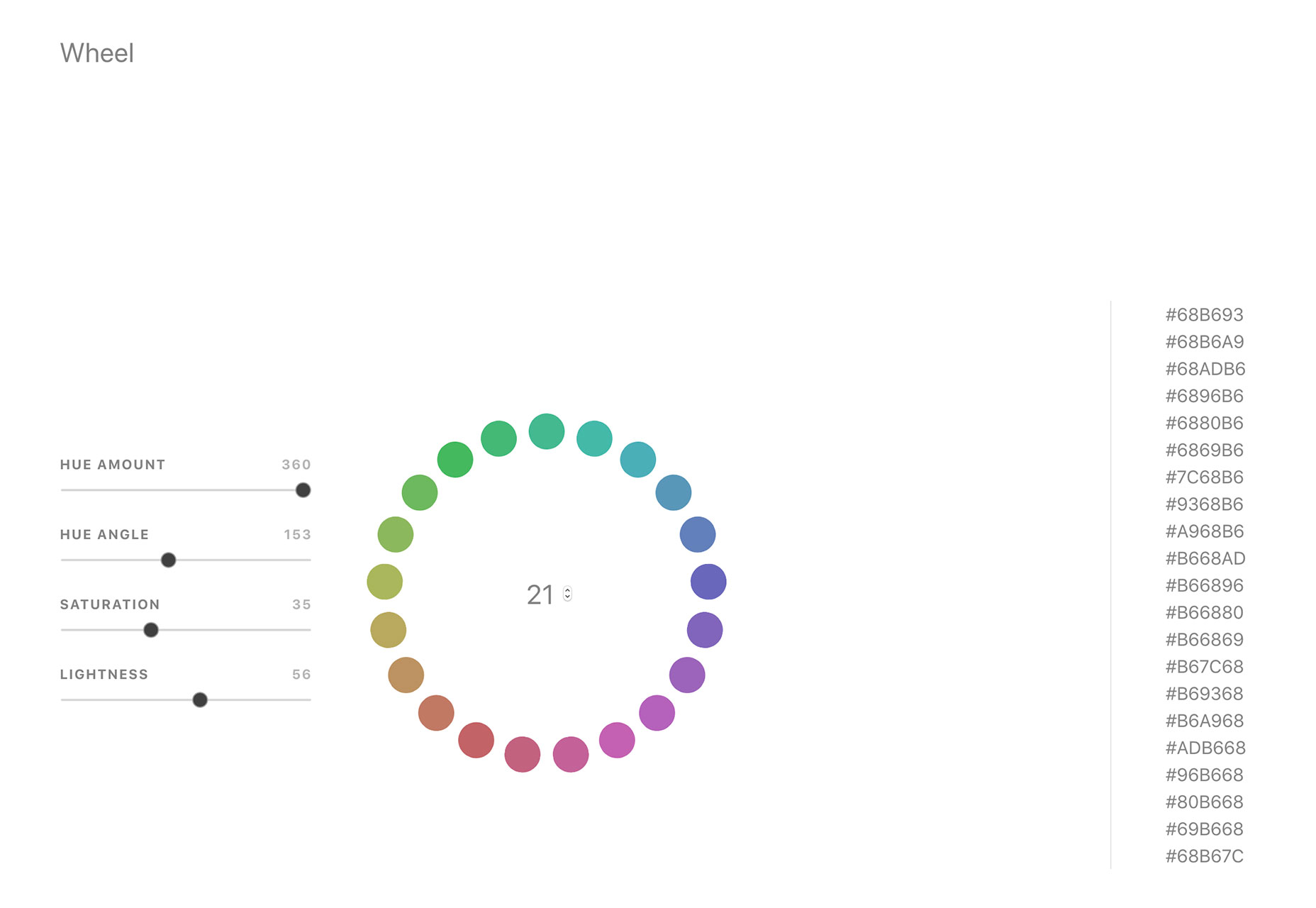
Color Wheel Generator

Color Wheel Generator provides color-perfect matches for all hues around the color wheel in HEX format. Adjust settings such as hue, angle, saturation and lightness to see perfect matches from every location on the wheel.
Scale

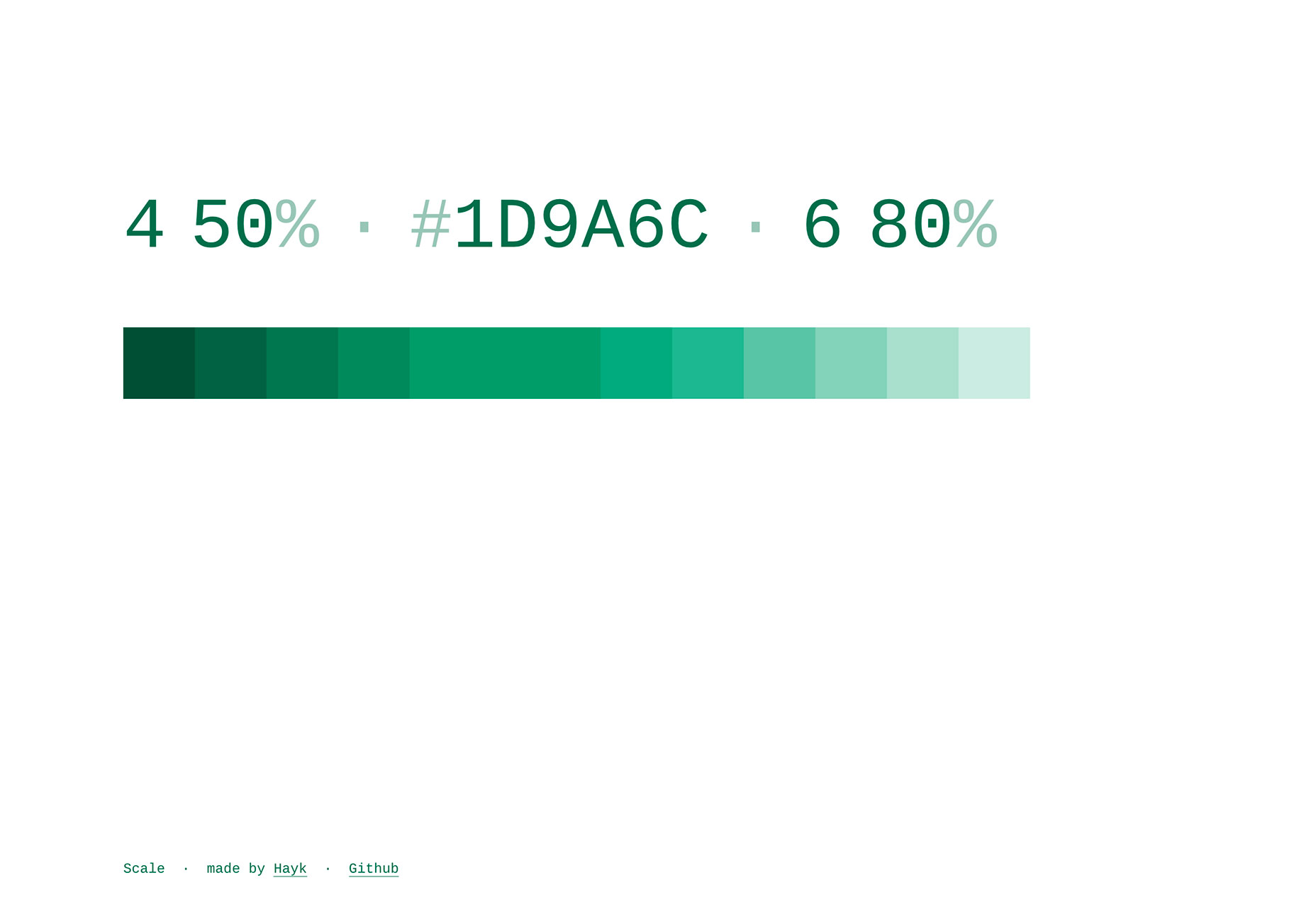
Scale is a tool to help you see a color scale for actual use. See tints of a color in steps so you know exactly what colors will look like.
Rockstar

Rockstar is a dynamically typed Turing-complete programming language. It is designed for creating computer programs that are also song lyrics, and is heavily influenced by the lyrical conventions of 1980s hard rock and power ballads. (So, it is a super-fun programming language to experiment with.)

Fondu

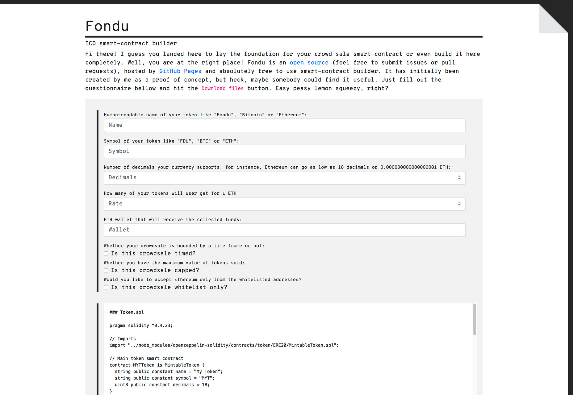
Fondu is a smart contract building tool. The open-source contract is designed for launching an initial coin offering or crowdfunding campaign. Fill out the questionnaire and download your contracts.
Font Memory Game

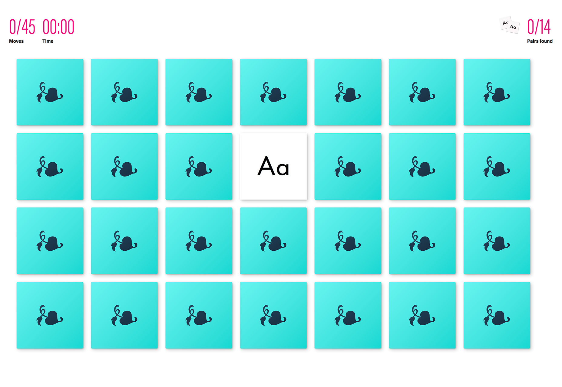
The Font Memory Game can help you train your eyes to notice details in typography and better identify different typefaces. (It’s harder than you think!)
Fusion.js

Fusion.js is now available for public use. The Uber project is described as “is a good choice for someone looking for an open source boilerplate to build a modern, non-trivial web app.” It is a MIT-licensed JavaScript framework that supports popular libraries like React and Redux, and comes with modern features like hot module reloading, data-aware server-side rendering, and bundle splitting support. It provides a flexible plugin based architecture.
StyleURL

StyleURL lets you export and share CSS changes directly from Chrome DevTools so you can use it with an existing workflow. It generates a link which loads CSS changes into existing webpages automatically so that you can share tweaks visually.
Keyframes

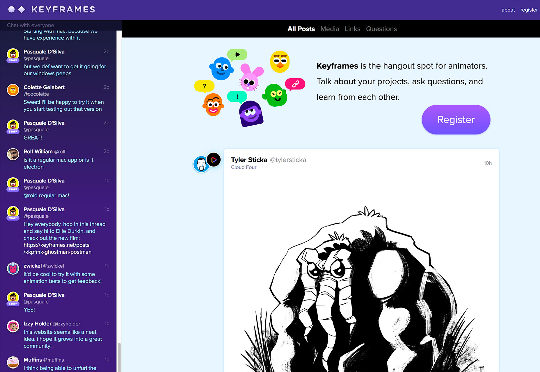
Keyframes is a new online hangout for animators. You can chat about and share projects, ask questions and use the community as a learning tool to up your animation game.
Brandcast Team Edition

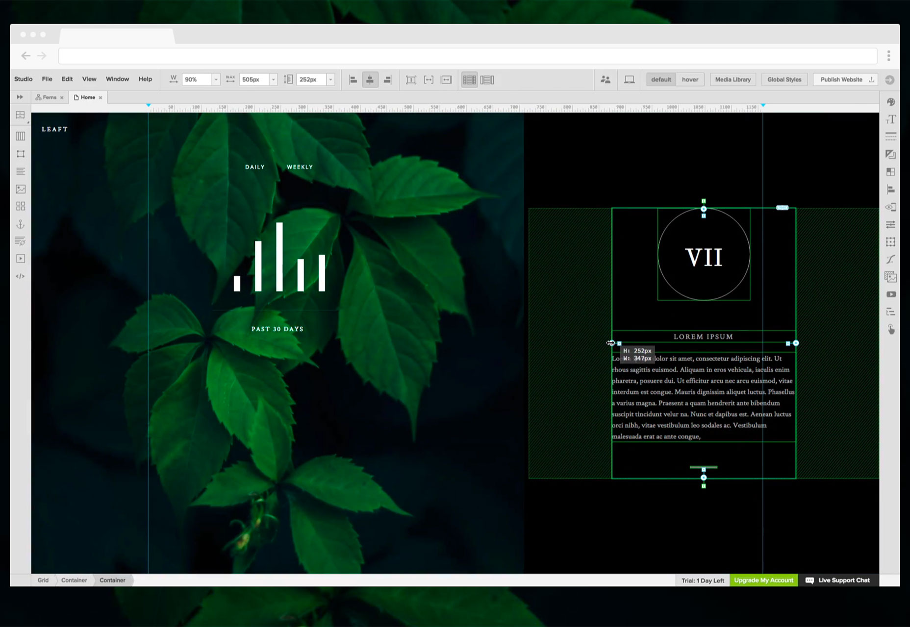
Brandcast Team Edition makes it easy for teams to work on code-free website design projects together. The tool allows marketing teams to create completely custom websites and interactive sales and marketing collateral without a single line of code. The release allows everyone – from designers to copywriters – to work on projects together within the interface.
Pair & Compare

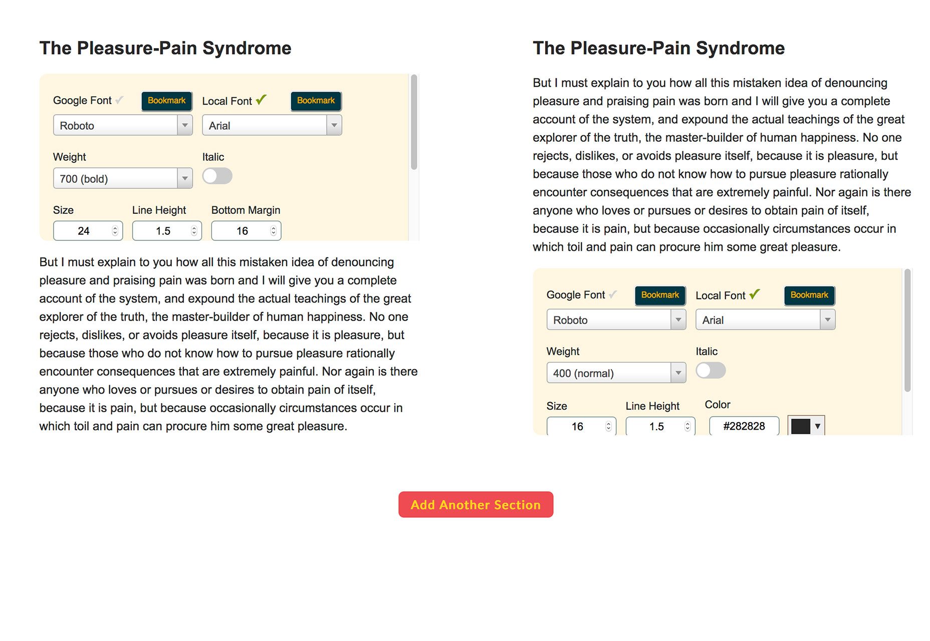
Pair & Compare lets you find and preview font pairs. Test Google fonts (and more) right on the screen and change settings to match your project needs — background, text width, font size, line height and more.
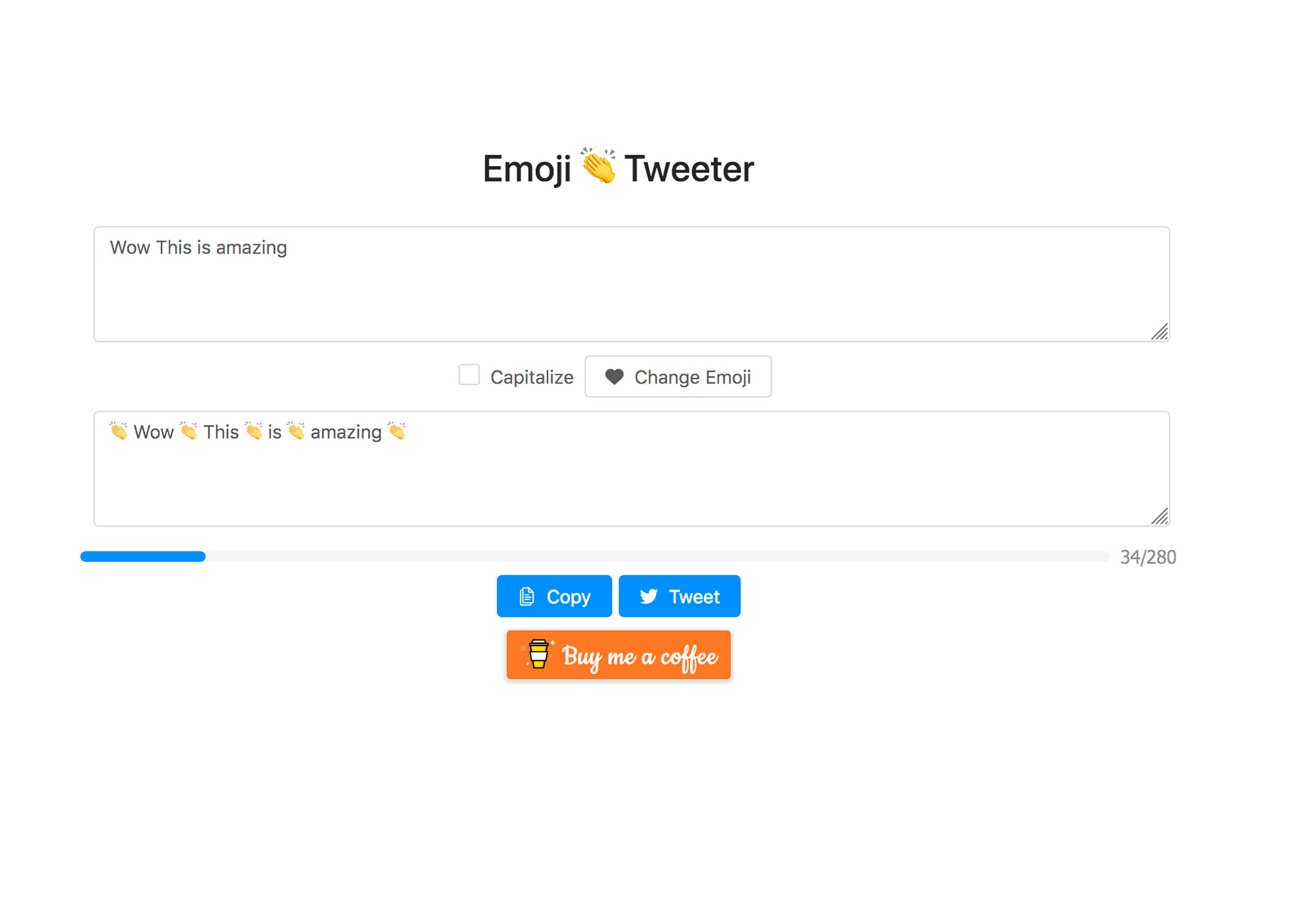
Emoji Tweeter

Emoji Tweeter lets you create tweets from a desktop computer complete with emojis. It’s basically an emoji keyboard.
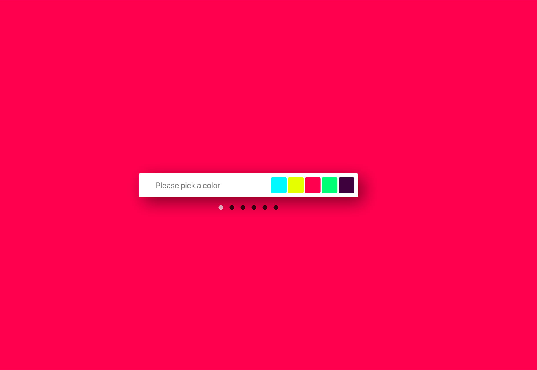
3D Cube Form

3D Cube Form makes you say “that’s cool.” The form tool is interactive and starts with a color picker — engaging, right? Then the user enters details based on form fields. It’s fun and different; it might not work for every project, but is definitely worth your time.
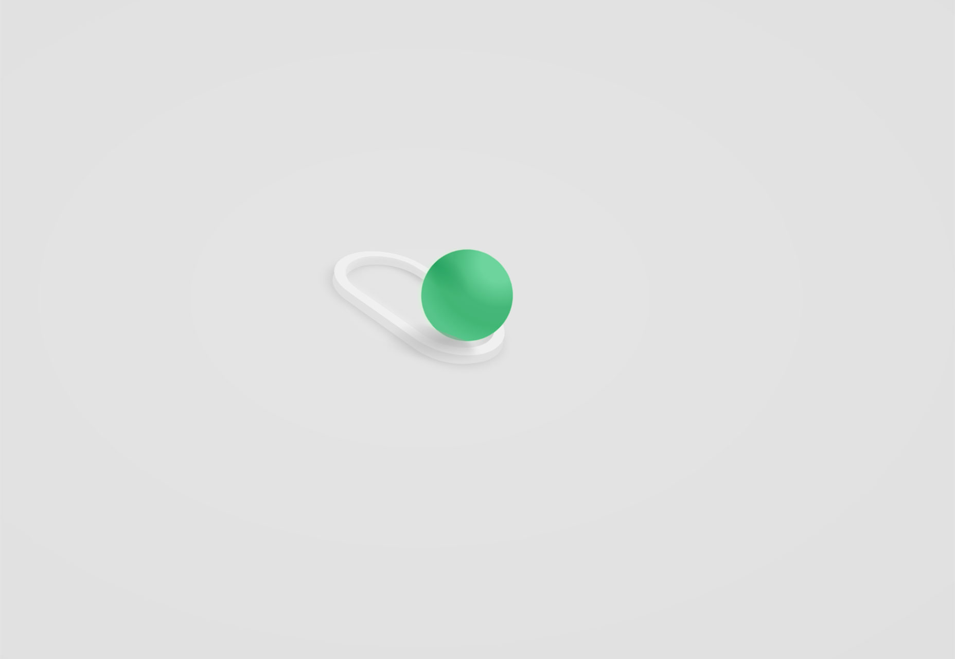
3D Toggle

3D Toggle is a cool animation that changes how you think about toggle actions. You’ll want to click it into action.
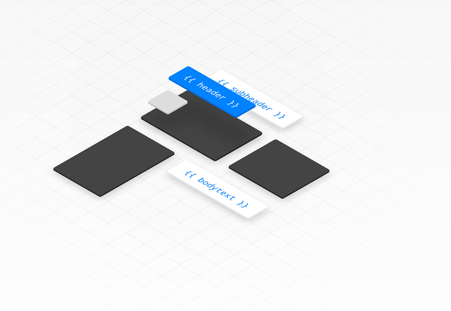
Malvid

Malvid is a tool to help you develop components with an interactive user interface so that you can preview and document web components as you create them. The tool analyzes your folder structure to turn files into a visual UI and it works using an API or CLI tool.
Podmap

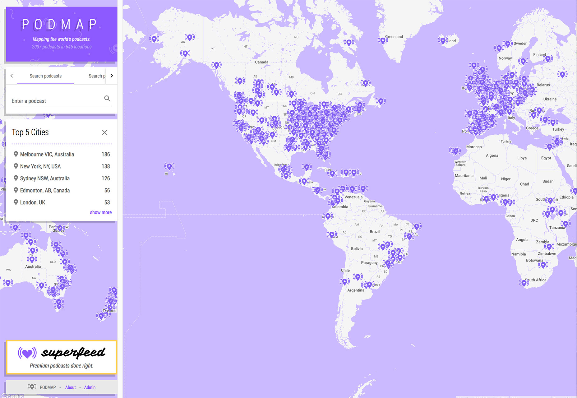
Podmap is a cool data visualization tool that maps the world’s podcasts so you can find something new to listen to near you. Search by geolocation, podcast name or filter by country.
CoolHue

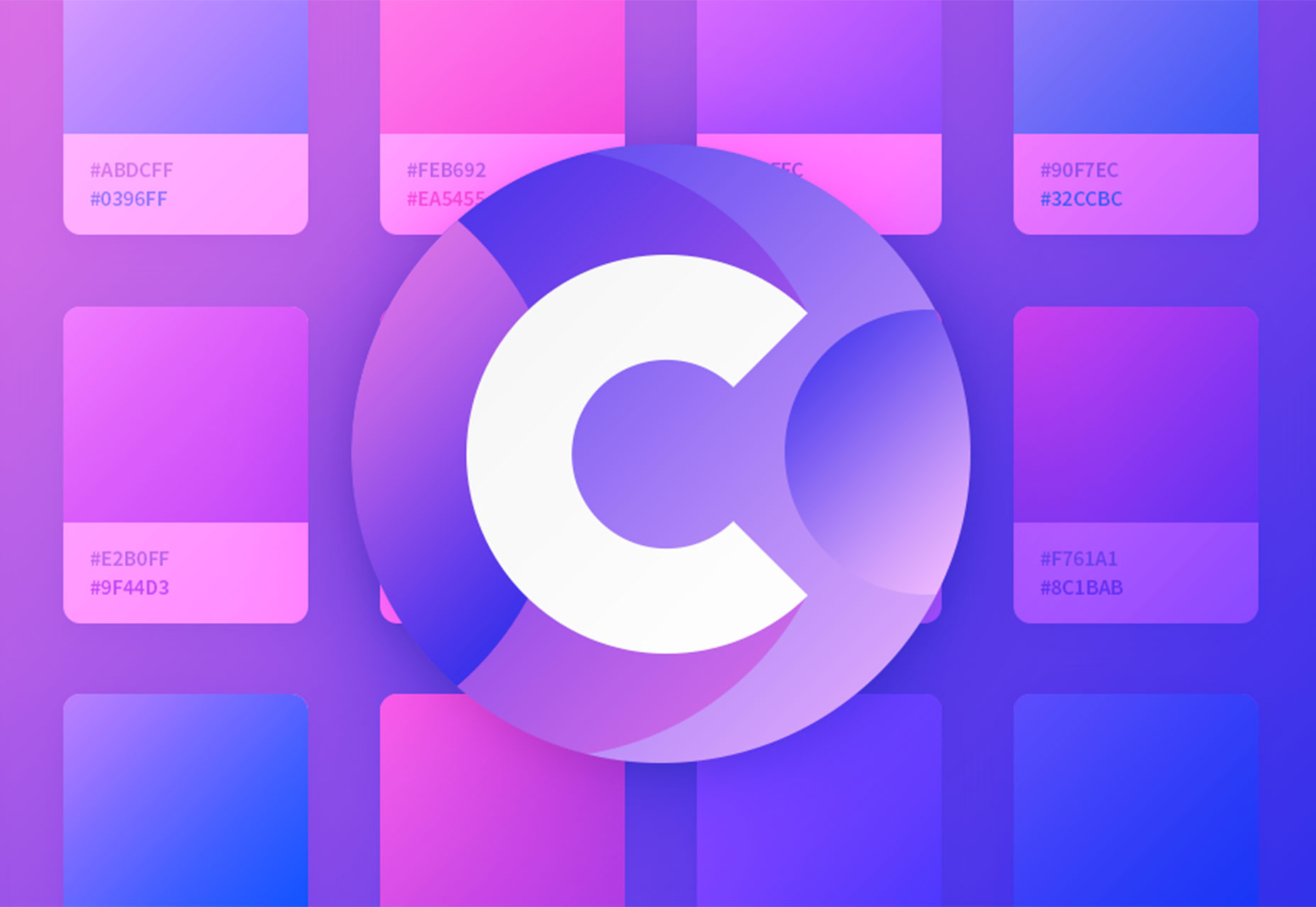
CoolHue is a JSON-rendered gradients palette. It includes 60 gradient options so you can add a trendy color effects to projects with ease. You can also grab CoolHue palettes for Photoshop or Sketch.
Tutorial: Animated SVG Neon Light Effect

The Animated SVG Neon Light Effect tutorial allows you to take a cool custom effect that you create in Adobe Illustrator and then move it to Sketch and export a sleek SVG image that is lightning fast for websites and apps. The step-by-step guide shows you how to do everything from creating the nifty effect to applying it for use (no more heavy gifs!). Plus, the tutorial includes downloadable project files to get you moving through the project with ease.

Aunofa Serif

Aunofa Serif is a tall and distinct serif typeface for display. The free version includes only uppercase characters. The paid version includes a script option as well.

Calibre

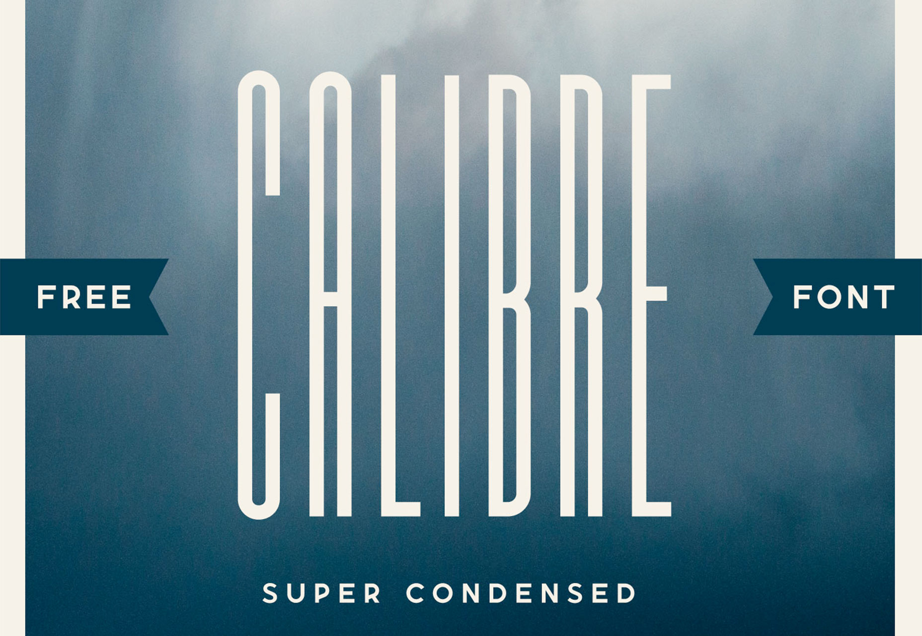
Calibre is a super-condense font that’s a fun choice for display with just a few words. The x-height is incredibly high in this uppercase font. It also includes numbers and a few glyphs.
Cleon

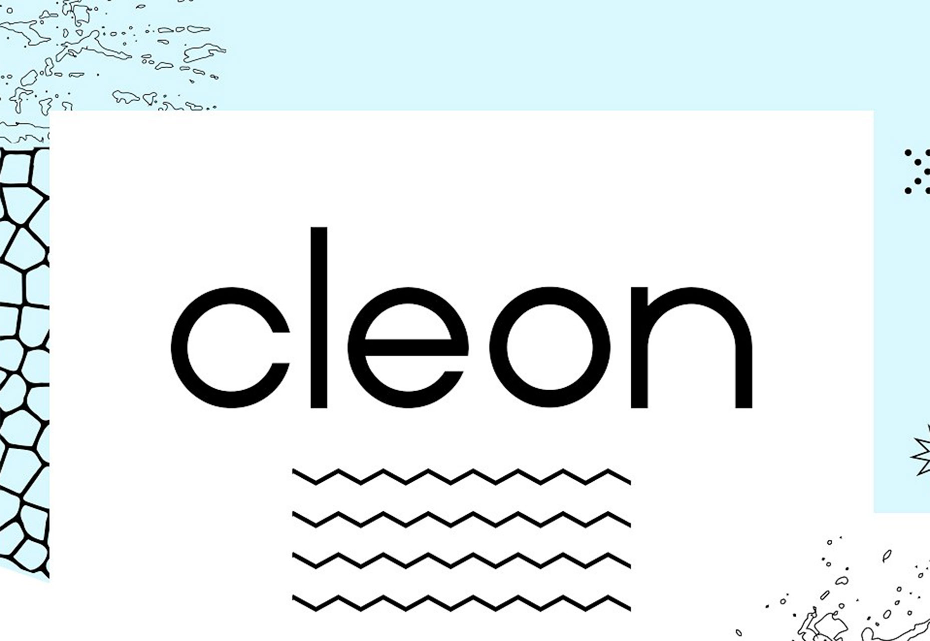
Cleon is a round sans serif appropriate for a variety of uses. It includes upper- and lowercase letters, numerals and some punctuation.
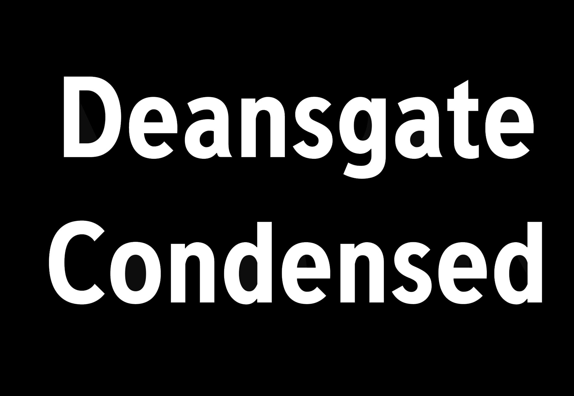
Deansgate Condensed

Deansgate Condensed is a clear and distinctive typeface that resembles the type used on street name signs in Manchester. Distinct characters include a point Z and points on the M and W.
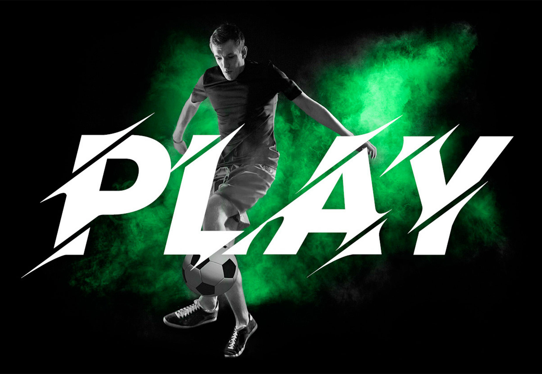
Facon

Facon is a trendy display font in a ragged style. The letterforms include distinctive cutouts. It is an uppercase font with numbers and some special characters.
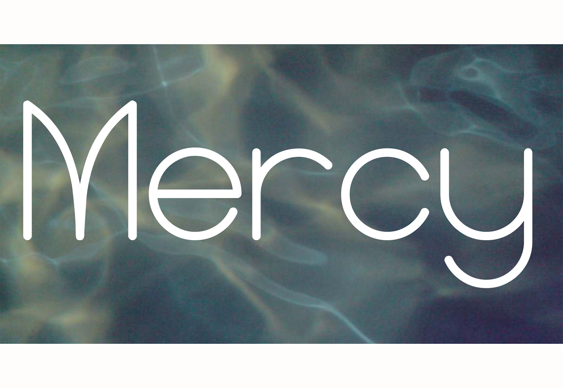
Mercy

Mercy is a highly readable sans serif with interesting curves for some of the letters – note the “M” in the image. It comes with a limited character set – just 69 elements – but does include italics of each.
Add Realistic Chalk and Sketch Lettering Effects with Sketch’it – only $5!

Source

p img {display:inline-block; margin-right:10px;}
.alignleft {float:left;}
p.showcase {clear:both;}
body#browserfriendly p, body#podcast p, div#emailbody p{margin:0;}

Web Performance For Third Party Scripts: SmashingConf Videos

Original Source: https://www.smashingmagazine.com/2018/08/smashingconf-scripts-videos/

Web Performance For Third Party Scripts: SmashingConf Videos

Web Performance For Third Party Scripts: SmashingConf Videos

The Smashing Editorial

2018-08-08T13:30:35+02:00
2018-08-10T21:02:53+00:00

We are continuing our exploration of video from Smashing Conferences this year with two videos that explore the impact of third party scripts. These scripts can add functionality, and give us valuable information, but what do they cost?

These two talks will help you to assess the third party scripts you might be considering adding to a site, and to be able to advise your clients or team members when the request comes in to add yet another script to a global include file!

Name That Script!

Recorded at the SmashingConf in San Francisco earlier this year, Trent Walton asks how can we objectively measure the value of third party scripts for advertising, A/B testing, or analytics? We need to consider their impact on web performance, user experience, as well as understand if they really help our business goals.

A/B Testing, Ads and Other Third Party Tags

At the SmashingConf in London, Andy Davies approached the same subject from a technical angle, showing us the impact that “just a snippet of JavaScript” can have.

Enjoyed watching these talks? There are many more SmashingConf videos on Vimeo. We’re also getting ready for the upcoming SmashingConf in New York — see you there? 😉

With so much happening on the web, what should we really pay attention to? At SmashingConf New York 2018 ?? we’ll explore everything from PWAs, font loading best practices, web performance and eCommerce UX optimization, to refactoring CSS, design workflows and convincing your clients. With Sarah Drasner, Dan Mall, Sara Soueidan, Jason Grigsby, and many other speakers. Oct 23–24.

Check the speakers →

SmashingConf New York 2018, with Dan Mall, Sara Soueidan, Sarah Drasner and many others.

Smashing Editorial
(ra)

Build a complex 3D sci-fi scene in Blender

Original Source: http://feedproxy.google.com/~r/CreativeBloq/~3/Y7zOuYEl0pY/build-a-complex-3d-sci-fi-scene

Creating an apocalyptic sci-fi city scene in 3D art is something artists might shy away from doing because of the vast complexity of the subject, 3D models and textures needed. But with smart ways to tackle it, it is certainly doable.

There are many different paths you can choose to achieve the final visualised image you have in mind. In this tutorial, I‘ll shed some light on the process I used to make this night-time scene. I try not to limit myself too much with a strict and predetermined workflow, or the software I use. My workflow may differ minimally to vastly depending on the project I’m working on. Software packages are just different tools that help you to get things done.

31 brilliant Blender tutorials

Most of my projects start with a concept sketching stage in 2D, but this time I started in 3D. If you’re interested in 3D concepting, I strongly recommend Jama Jurabaev‘s Intro to 3D Concept  Design course on Learn Squared.

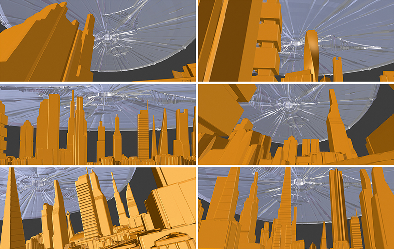
Procedurally generating a city can vastly speed up the initial stage of finding a good concept, camera position and composition. You don‘t need to worry about getting the perspective of your 2D buildings right; in 3D you can simply reposition your camera and instantly have a completely different picture.

01. Look for references

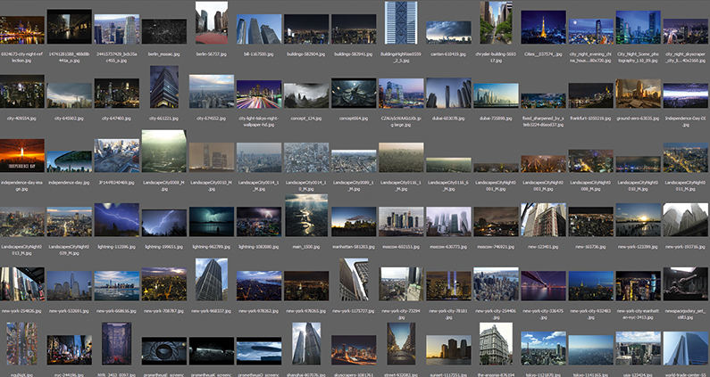
Look beyond Google for reference images

As I already have a pretty good picture in mind of what I wanted to do – an apocalyptic, Independence Day-inspired scene – I start with hunting for reference. If all you want is reference pictures, Google is a good place to start, but if you intend to use those references in some way or another in your picture (textures, and so on), you should look for royalty-free images. Pixabay and Textures.com are a big help there.

02. Create the assets

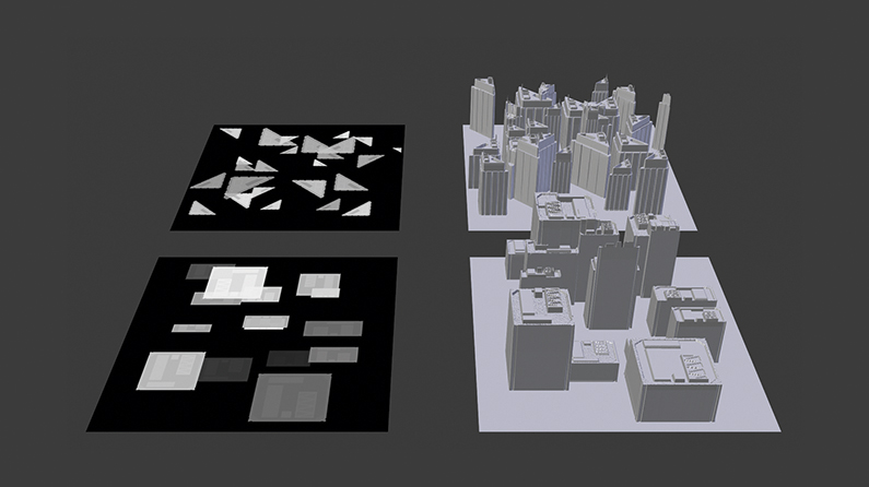
Photoshop brushes allow for the buildings to be painted quickly

I use a procedural approach to model the buildings. The lower buildings are all displaced planes. I hand-paint a few displacement maps of single buildings with Photoshop and convert them into brushes. This method allows me to quickly ‘paint’ displacement maps for entire city blocks. These blocks can then be instanced to give the illusion of a highly detailed city. The higher buildings are roughly modelled with no attention to topology. We will add details later.

03. Add textures and shading

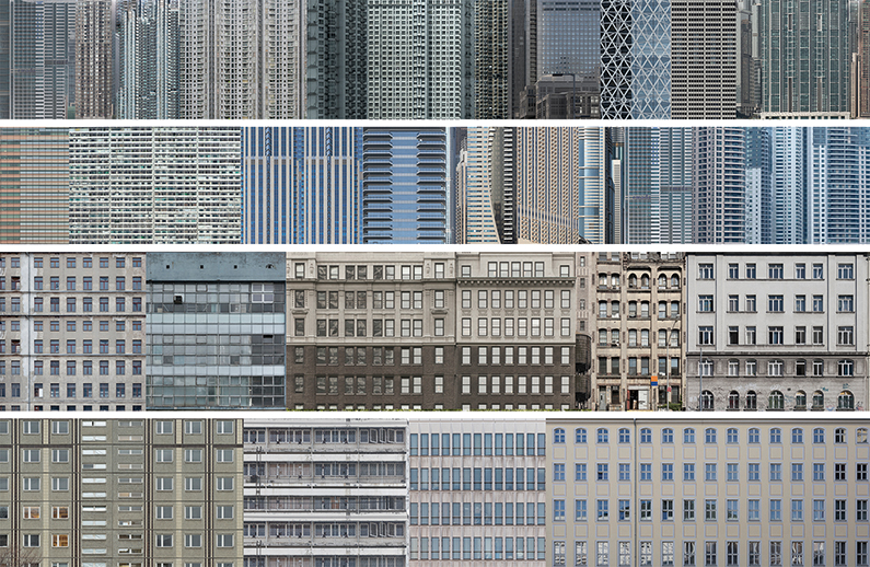
Blender randomly allocates the textures

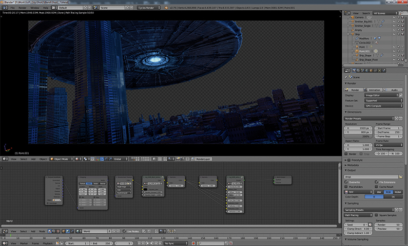
The texturing and shading is done (partially) procedurally. I compile several pictures of cities to texture atlases. I then map, shade, alter and randomly distribute those textures with Blender’s powerful node system. For every diffuse map I plug in, the shader network automatically generates a specular- and bump-map. Not a single building is manually UV-unwrapped – all are box-mapped with some random shifting of the coordinates.

04. Streamline your lighting

Lighting is mapped in a similar way to the textures

I compile light texture atlases the same way I did the diffuse textures of the buildings. The mapping is also done the same way except blocking the textures on faces, which point upwards to avoid having lights on the roof. Distributing them randomly means they often don‘t match up perfectly to the diffuse textures. There is definitely a trade-off between being fast and flexible, and probably having to fix some things in post-production.

05. Shift and scale UVs

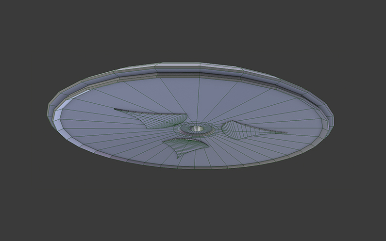
Displacement maps are modelled in real time

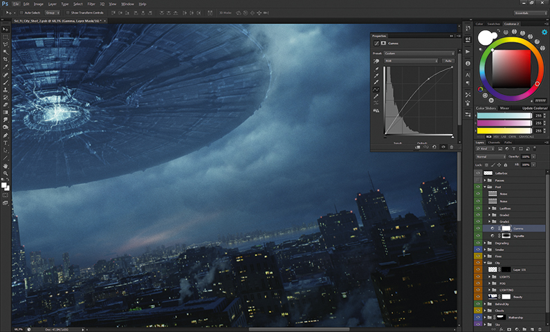
The base of the ship is a really simple model, which I then UV-unwrap, subdivide and displace with a displacement map I find in a Blender forum thread. The UVs are all rectangular and not rotated so the displacement follows the round form of the ship. With such a set up you can shift and scale the UVs to model the ship with displacement maps in real time. This is an extremely fast and intuitive way of doing greeble-like surfaces.

06. Experiment with building layouts

Different building layouts can be played with quickly

Now the fun part begins. This is where all the work comes together. First, bundle all the buildings into separate groups that feed particle systems. By doing this, you can change the random seed of a particle system and shuffle through randomly generated cities to find an arrangement that you like. This is the power of 3D concepting – you can generate several layouts in a really short amount of time.

07. Create lighting with HDR

HDRs produce true to life lighting quickly

The scene is lit entirely with a HDR image. There are numerous places on the internet that provide high-resolution HDRs these days. HDRs have two major advantages for 3D concepting; they render extremely fast and give you realistic lighting with a click of a button. I pick a few that I then import into Blender to quickly test out a few lighting scenarios. Cycles, Blender’s modern built-in viewport renderer, makes this a breeze.

08. Do render passes

Allow plenty of time for a beauty render

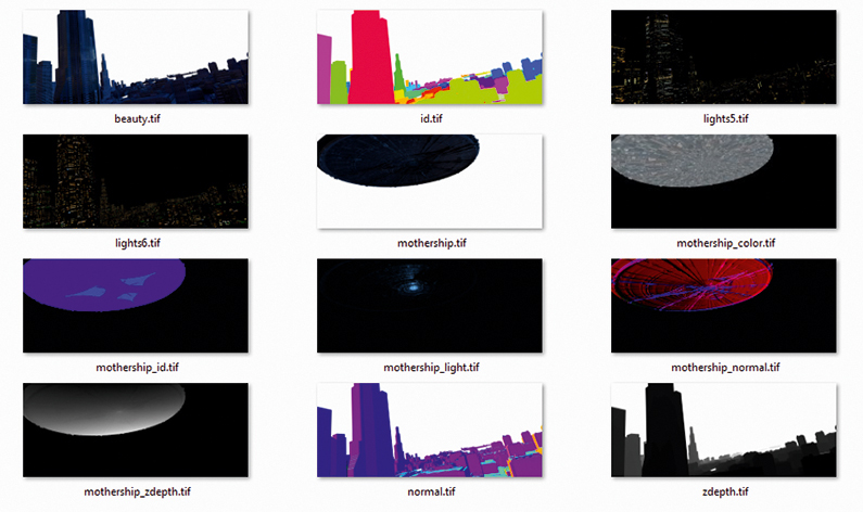
Beside doing a beauty render, I also render out several passes for compositing. These include, ID passes so I can quickly select individual buildings; Z-depth passes to simulate the atmosphere; Normal passes for eventual relighting; and, of course, several light passes. The beauty render needs around 20 minutes in 4K to be reasonably noise free. The additional passes are ready in a fraction of that time.

09. Create atmosphere 

Build the image up from the background to the foreground

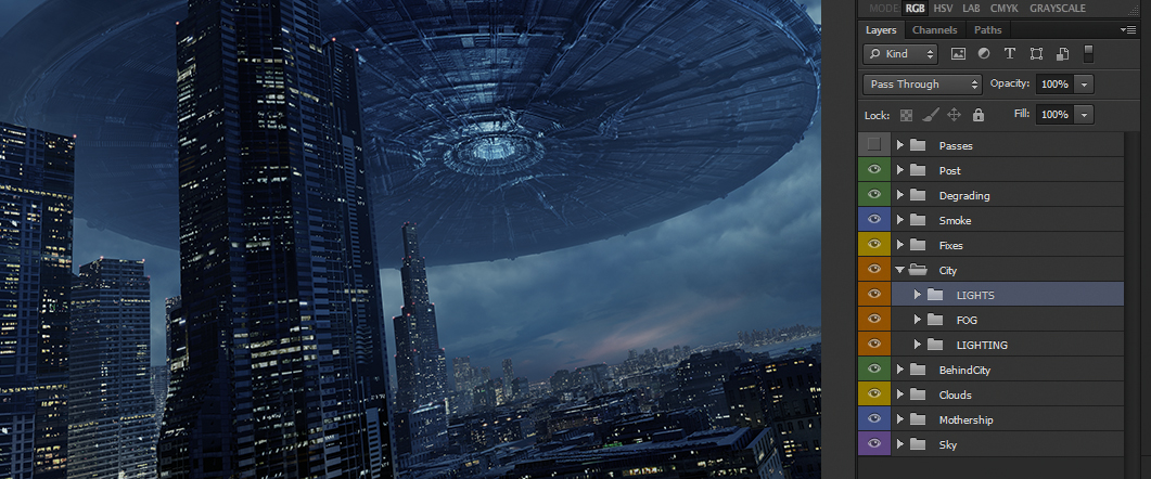
With the already prepared and rendered passes, the compositing is really straight forward. I usually work from the background to the foreground. The sky sets the mood. With the Z-depth pass I‘m able to give the image a nice atmosphere. The light passes are then added on top and blended between them, depending on which light pass looks best on the buildings.

10. Add details

cityscape image

Fixing is easier than adding every single detail

Now comes the payback for not doing things properly before rendering. But most of the time fixing things in post is far less work than having to model every little detail and care about every pixel in the render. In this stage, I blend the spaceship with the clouds, add red lights on the roofs, add cranes, chimneys, antennas, the electric lightning below  the ship and the smoke between the buildings. And generally fix everything that wasn‘t perfect!

11. Finalise the scene

cityscape image

Recreate a camera lens to finish off the image

The final step is to replicate the effects of a real camera’s lens and film; to make the scene look as it would have looked if it had been shot in the real world. So, I slightly blur the scene, add bloom, lens distortion, a slight chromatic aberration, vignetting, film grain, and finally give it a cinema-like colour grading. I love this part. This is when everything you worked on blends together to form something real. It‘s like magic.

This article was originally published in 3D World magazine. Subscribe here.

Read more:

How to create a photorealistic room sceneMaster procedural modellingCreate a tiles material in Substance Designer

The Intersection of Food + Design: A Thought Provoking Look

Original Source: http://feedproxy.google.com/~r/abduzeedo/~3/CZ7NnOqYnOA/intersection-food-design-thought-provoking-look

The Intersection of Food + Design: A Thought Provoking Look

The Intersection of Food + Design: A Thought Provoking Look

GisMullr
Aug 09, 2018

How empowering would it be to cause social impact with your design? Have you ever thought about mixing design, technology and food to transform the way we eat? I honestly haven’t thought about this before. At least not in this impactful fashion. I didn’t realize that food & design could be so interesting and important together. What comes to mind when you hear “food & design”? To me, I envision fancy, curated dishes perfectly shot on Instagram. You know, the ones that look too good to be true? Or how about those super exclusive and fancy restaurants you see on TV shows but can only dream about actually going? So it was a happy surprise to read that The Dutch Institute of Food and Design is a platform for designers working with food and its impacts on society. They instigate designers creativity to collaborate with specialists and develop alternative approaches to the food industry.

When Design meets Food to Change the way we see the Food System

We all eat. It doesn’t matter what you eat, when or how much. But that is something all of us have in common. Eating. Some see food as fuel for our body. Other see food as a ritual, as a reward. It doesn’t matter how you see the food industry, you do participate in it. So why not use your point of view and ability as a designer to disrupt the food sector? And don’t think about that beautiful dish that keeps popping into your head while you think about this. Think about the whole food industry, the whole process behind that food you are eating. Think about how important it is. From farming to transportation, healthcare to waste, there are a ton of steps involved in the process of creating our beloved food. Have you ever stopped to think about the societal and environmental challenges that surround food? Yes? No? Maybe? So this may be a good opportunity for an exercise. Next time you eat something, take a few minutes to think about it. Think about the process behind that particular morsel you are eating. Where was it produced? How was it transported to where you are? Did it cause any impact during its journey to your plate? And most importantly, do you have any ideas that could change one of those answers you asked yourself? I bet, at least once, it crossed your mind that a certain package could have been designed better. That this certain material would have made a much better to go box than the one in front of you. Or that we should be able to have a better use for some of the food waste we see. Maybe it crossed your mind that when we eat a banana and discard the peel, someone, somewhere, could have a brilliant idea for what to do with that peel. What about that little sucker peanut shell? Can we smash it and turn them into beautiful furniture? Maybe we can blend corn cobs and turn them into a natural dishware line? How about food transportation? If we could have some sort of Lyft service for trucks where rides could be shared to make transportation more cost effective and accessible? I don’t know. Is any of this possible? But this kind of exercise certainly provokes a lot of thinking and how great ideas come to life.

When Design meets Food to Change the way we see the Food System


Design is the creation of a plan or convention for the construction of an object, system or measurable human interaction. Design has different connotations in different fields. In some cases, the direct construction of an object (as in pottery, engineering, management, coding, and graphic design) is also considered to use design thinking.

Wikipedia


So you see, you don’t need to be a chef or a farmer or anyone directly working inside the food industry to change things. It all starts with an idea.

In case you have something related to food design in mind you can check out The Dutch Institute of Food and Design Future Food Design Awards. They are still accepting projects for the 2018 Awards. The deadline is August 12. They are looking for ideas that will change the way we see the food system. Take a look of last year’s winning project.

Winner 2017 – Fernando Laposse

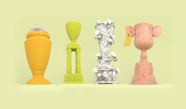
We were delighted to post about last year’s winner Fernando Laposse and his awe-inspiring project dubbed Totomoxtle. Totomoxtle is a project inspired by the relationship of Mexico with its maize by creating a surfacing material from naturally coloured, native corn husks. The process is simple, the husks are flattened and glued onto veneer or MDF which can be sawed and lasercut to create tiles or marquetry for interiors and furniture. Apart from creating a sustainable material, the project also aims to raise awareness about the uncertain future of heirloom maize and the people that harvest it using traditional methods in an increasingly globalised world. Read more about Totomoxtle.


When Design meets Food to Change the way we see the Food System

When Design meets Food to Change the way we see the Food System

food


Game Design for the Colorful Word Galaxy

Original Source: http://feedproxy.google.com/~r/abduzeedo/~3/LUsnlfowdQY/game-design-colorful-word-galaxy

Game Design for the Colorful Word Galaxy

Game Design for the Colorful Word Galaxy

abduzeedo
Aug 10, 2018

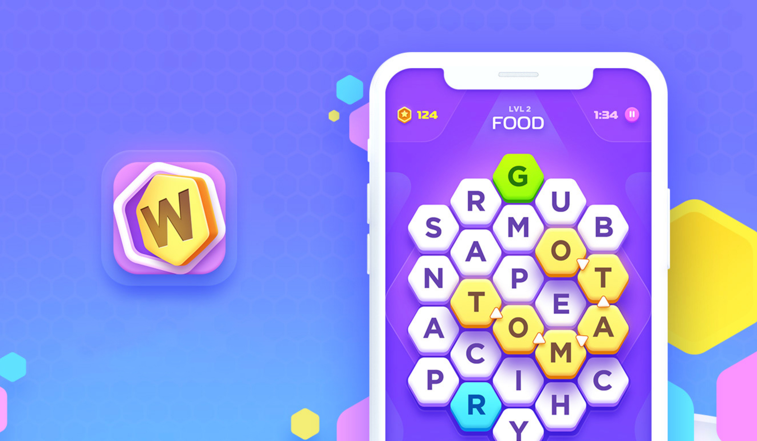
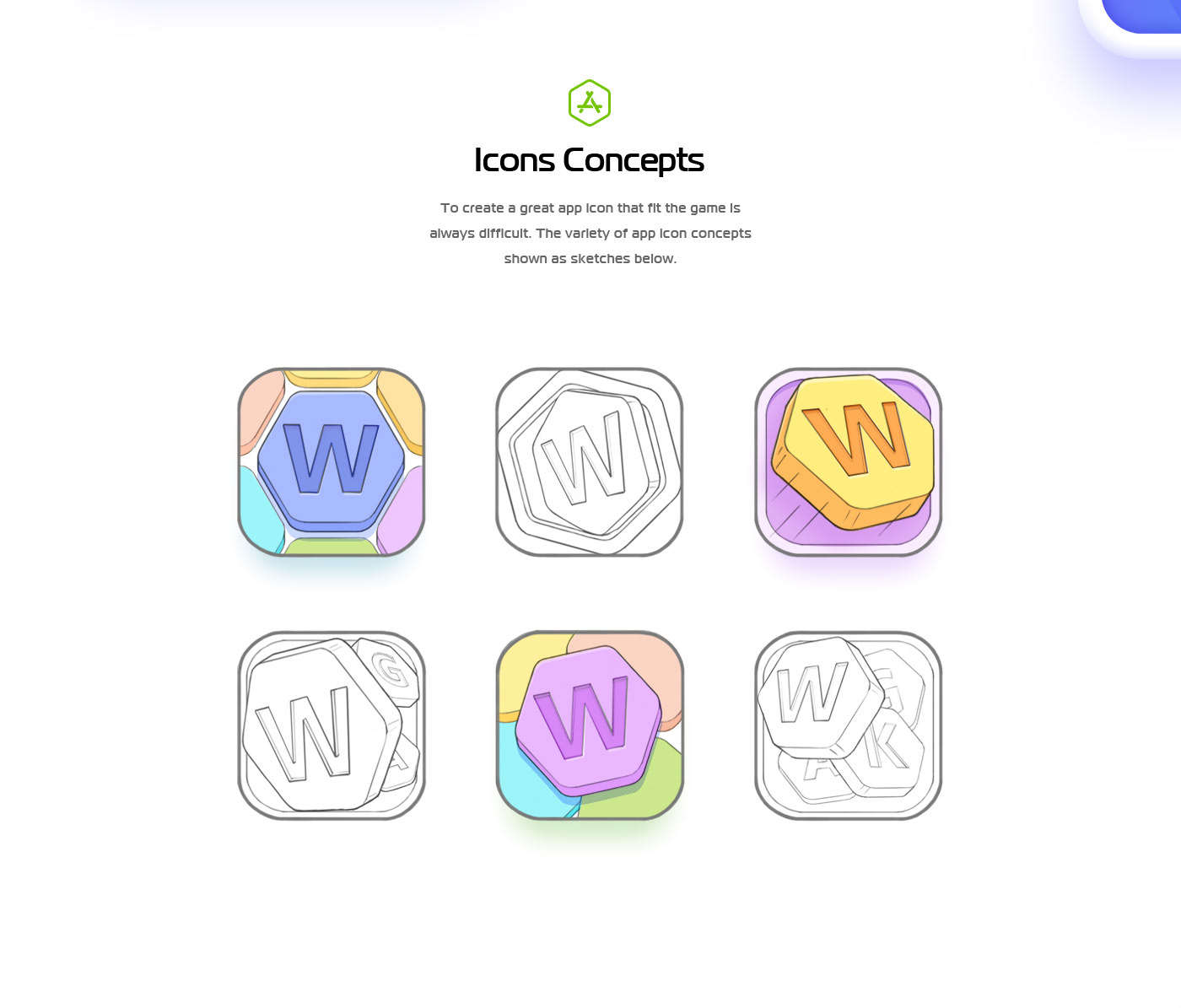
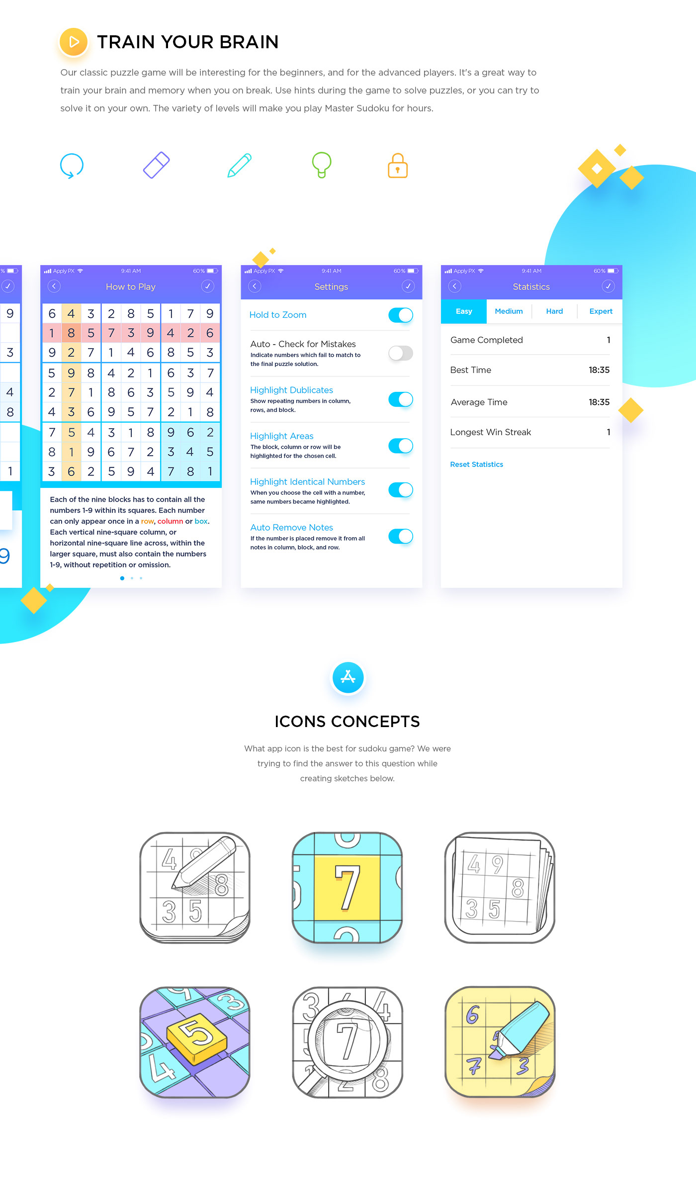
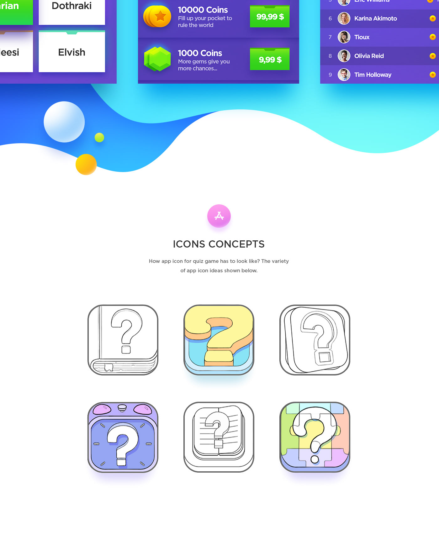
NestStrix Studio shared a beautiful game design project on their Behance profile. It is for three iOS games, Word Puzzle, Quiz, Sudoku. They were really nice to share a bit of the behind the scenes. You can see the evolution from the interaction design point of view, including wireframes, to the visual design with the style up to the iconography. I love the friendly look they achieved with a 3Dish cartoon look. Everything feels very inviting to touch and interact, and that’s one of the reasons I am a fan of this project and game design in general.

NestStrix studio is a team of illustrators with a lot of experience. They love to create game stuff especially game characters and game backgrounds. Their portfolio showcase work they’ve done with companies and organizations all over the world. For more information make sure to check out their website.

Game design

You can also follow them on:

Dribbble
Artstation
Instagram
Facebook


game design


Collective #440

Original Source: http://feedproxy.google.com/~r/tympanus/~3/CcOmj0pnvWA/

C440_WOTW

Inspirational Website of the Week: The Bewegen Bike Share System

A celebration of smoothness and subtle design details with wonderful transitions. Our pick this week.

Get inspired

C440_bugherd

This content is sponsored via Syndicate Ads
BugHerd makes client feedback visual, easy and pain free.

??Like sticky notes for your website, BugHerd turns client feedback into clear actionable tasks with all the data needed to resolve the issue.

Try for free

C440_mauerwerk

Mauerwerk

An animated masonry-like React grid with enter/exit transitions and maximizable cells.

Check it out

C440_regex

A Practical Guide to Regular Expressions (RegEx) In JavaScript

Sukhjinder Arora explains some useful regex JavaScript recipes.

Read it

C440_nav

Sticky, Smooth, Active Nav

Chris Coyier shares a very useful sticky navigation template.

Read it

C440_menu

Dot Menu Animations

Tamino Martinius created these four menu button animations.

Check it out

C440_logoanim

20+ Famous Animated Logos

A great collection of animated logos for your inspiration.

Check it out

C440_flexanima

Flexbox – The Animated Tutorial

Greg Sidelnikov’s fantastic visual animated guide to some flexbox properties.

Check it out

C440_spaceletter

Line-height Crop

Read about how you can use a simple CSS formula to remove top space from your text in this article by Claudia Romano.

Check it out

C440_dev

Dev.to is now Open Source

Read all about the release of dev.to to the community in this article by Ben Halpern.

Check it out

C440_https

Securing Web Sites Made Them Less Accessible

A very interesting article by Eric Meyer on the downsides of HTTPS.

Read it

C440_slider

Build An Image Slider With React & ES6

An easy to follow tutorial by Daniel Zuzevich on how to create a React image slider.

Read it

C440_fluid

Building Fluid Interfaces

Nathan Gitter provides the working code examples of every major topic in the WWDC 2018 “Designing Fluid Interfaces” presentation by Apple designers.

Read it

C440_dumper

Dumper.js

Dumper.js aims to be a better variable inspector for your Node.js applications.

Check it out

C440_slack

Sclack

A CLI client for Slack made by Marcelo Camargo.

Check it out

C440_sliderwest

Westworld Slider

A Westworld inspired slider made by Chris Gannon.

Check it out

C440_midi

BitMidi

BitMidi serves over a hundred thousand MIDI files curated by volunteers around the world.

Check it out

C440_Pts

Pts

A new version and a new homepage for the great Pts project by William Ngan.

Check it out

C440_vector

Drawser

A free vector graphics editor where you can share your ideas and create design.

Check it out

C440_font

Free Font: Sangha Kali

A special edition font for Google Fonts designed by Anna Seslavinskaya.

Check it out

C440_sketch

Flight App Freebie (Sketch)

A great Sketch freebie by Pixelz Studio.

Get it

Collective #440 was written by Pedro Botelho and published on Codrops.

YOOtheme Pro Review: Strong Theme and Page Builder for WordPress and Joomla

Original Source: https://inspiredm.com/yootheme-pro-review-powerful-theme-and-page-builder-for-wordpress-and-joomla/

Meta: This YOOtheme review focuses on YOOtheme Pro features, functionalities and the corresponding pricing, plus overall efficacy.

For now, forget about all the fancy sales language you know. Or your products’ amazing and exceptional features. There’s only one thing that will make your traffic stay immediately they land on your site.

Yes, you’re dead right. It all comes down to your web design.

And the numbers are astonishing. Basically, 94% of your traffic would not trust a site with poor design. Chances are, they’ll just leave to engage other businesses with better-designed sites.

That’s why I’ve always been extremely keen about the themes and templates I adopt for my sites, especially if they come from third-party providers.

Speaking of which, WordPress users have always been lucky when it comes to this. We have a wide range of options to choose from, including dedicated theme providers, and page-builders that also come with their own set of professionally-designed themes.

And you know what? The providers are not having it easy. Each additional tool means increased competition. So, of course, they have to keep reinventing themselves to provide better, well-optimized themes, layouts, and templates to survive.

Now, I’ve followed a couple of promising services through this journey, and I have to admit that YOOtheme has outstandingly improved its themes quite substantially over the years.

While I knew that the solution was in for the long haul, I never, not even once, predicted that they would ultimately go for the long ball.

Let’s face it. YOOtheme Pro caught many of us by surprise. Because although they are closely tied, themes and page building are two utterly different ballgames.

But guess what? That’s exactly what makes this move exceptionally intriguing. According to their team, YOOtheme Pro is the most powerful theme and page builder for WordPress and Joomla. They are not playing around here. They mean business.

So, let’s see how much of that they can actually deliver. This YOOtheme review focuses on YOOtheme Pro features, functionalities and the corresponding pricing, plus overall efficacy.

How good is it, really?

But first, let’s see what YOOtheme is all about.

YOOtheme Reviews: Overview

YOOtheme Pro might be new. But the company has been around for quite some time. For longer than a decade, to be precise.

Joomla and WordPress themes plus plugins might have been their principal focus all along. But you’d be mistaken to assume that that’s pretty much all they’ve been doing.

That said, have you ever heard of Ulkit?  It’s basically an open source front-end framework for web interface development.

If not, what about Pagekit? That’s another open source solution, which is essentially a modern intuitive CMS.

Well, YOOtheme is also the brains behind these two projects. Both of them created from their Hamburg, Germany headquarters. Quite a number of remarkable solutions to their name, to say the least.

In retrospect, the first move was made back in 2007 by Steffan and Sascha, in one of their basements. YOOtheme has since grown exponentially, to host more than 150,000 customers. Ulkit has also managed to attract an admirably extensive fan-base, going by the half a million sites it has helped build.

The experts and creatives at YOOtheme continue striving to develop what they call “most cutting-edge web software”. Hence the introduction of YOOtheme Pro to further empower users on WordPress and Joomla.

So, how about assessing just how powerful it actually is?

Well, let’s dive in.

YOOtheme Pro Reviews: Features
Page Builder

Let’s start off at the top. With what is considered the core offering on YOOtheme Pro.

To keep everything simple and intuitive, the page builder is built around the well-known drag-and-drop functionality. This makes the whole design interface clean and pleasantly ideal for both developers and inexperienced builders.

The subsequent editing process is equally straightforward. You can systematically structure your pages into grids, rows, and columns to create an attractive layout that visitors can easily follow through.

I’m particularly fond of the masonry effect option, which allows users to establish neat layouts with multiple columns. The resultant gap-free system even looks great on pages with varying grid cell lengths.

If you find this a bit too monotonous, you can throw in the parallax effect to come up with an extensively dynamic page outlook.

When you’re done with the general structure, you can shift to edit the finer details that ultimately determine a page’s functions and features. For this, thankfully, YOOtheme Pro provides not just the basic element options like “Image” and “Heading”, but also advanced ones like “Slideshow”.

YOOTheme Pro elements

The slideshow element, for instance, offers five different systems of animations, optimized for both PC and mobile. Plus, you can embed both videos and images to achieve a distinctively refreshing and modern website.

And guess what? Using all these tools doesn’t require any coding experience. You can have a website in just minutes without hiring a developer.

But, don’t get me wrong. While it’s possible to create a page in a couple of minutes, you should be extremely careful with the whole process. A perfect, well-optimized page is best created when you put your mind to it, thinking through all the possible options.

In the layout library, for example, it’s advisable to analyze all the premium layouts to select the most suitable one. Well, of course, this is easier said than done since YOOtheme has engaged a team of professional to churn out attractive and trendy templates. You’ll possibly be spoilt for choice here since most of them look like they can fit perfectly on any website.

YOOTheme Pro layouts

To help you sort through the entire heap, YOOtheme Pro allows you to filter by topic. Consequently, you’ll be able to conveniently select a layout that suits your preferences and business needs. And changing the general outlook of your WordPress site is as simple as a single click.

Now, even with a wide array of professionally designed layouts and templates, it’s impossible to address all possible user preferences. So, to work around this, YOOtheme pro also supports extensive customization. You can adjust pretty much anything- from colors, typography, element sizes, fonts, spacing, and position, to global settings for PC and mobile.

Local Google Fonts

And speaking of font customization, YOOtheme handles Google fonts locally. If you choose to proceed with any of the Google font styles, the corresponding files are automatically downloaded to your site’s server and embedded into the CSS.

YOOTheme Pro styles

But, why is this even a big deal?

Normally, introducing an extra font, admittedly, would be a good thing. And although this would be welcome, admit it.  It wouldn’t be exciting enough for a bottle of champagne.

But Google Fonts are different in every sense of the word. Storing them locally, for starters, drastically improves your Google page loading speed. The browser doesn’t have to make a roundtrip to the Google servers because everything is available locally.

Secondly, it sorts out the whole issue of GDPR-compliance. Your traffic’s privacy is adequately assured as a result.

Integrated Unsplash Library

It might seem like a small and negligible problem at first. But, when you come to think of it, finding ideal stock images has got to be one of the biggest challenges for website owners.

We’d all probably be walking around with digital cameras, looking for picturesque shots for our sites. Or maybe steal a couple of copyrighted ones, which would, of course, invite Google’s penalty whips. But then sites like Unsplash came to the rescue with an extensive array of stock images.

Now, sourcing for images from Unsplash, for most site owners, requires you to first download to your PC before uploading to the site. Not much of a problem for small sites. But it comes quite a hassle when you’re dealing with multiple pages.

Thankfully, YOOtheme Pro has made things much easier by bringing the library to you. Unsplash is now seamlessly integrated into the service’s media manager, allowing you to search and lift images directly. You can also filter the images and scan through the various collections.

YOOTheme Pro unsplash

Finally, instead of downloading the images to your PC, they are simply added to your site’s media folder when you save your layout. It really is that simple.

Developer Support

YOOtheme is simple, with a solid list of elements, and is universally customizable. Plus, of course, the drag-and-drop functionality is intuitive, and should go well with the range of layouts available.

Now, that pretty much covers everything standard users need to comfortably build a site without any coding experience. User-friendliness and flexibility.

But that’s not all that YOOtheme provides. One interesting fact about it is that it doesn’t lock out experienced coders.

Well, you could use the standard page building functionalities like regular users. Or alternatively, capitalize YOOtheme Pro’s expandable and modular framework to code your way to a well-customized site.

This provision essentially allows you to override all elements, and introduce your own custom themes and layouts.

And since it’s not always a smooth process, YOOtheme Pro provides comprehensive documentation with precise details on all the customization options. It should come in handy before you finally learn the ropes.

Overall Features

YOOtheme Pro also provides:

One-click updates
WooCommerce integration for ecommerce
Numerous blog options
Customized footers
Three mobile header layouts
16 header layout options
User-friendly color picker
More than 125 icons
Global user interface components
WebP image format
Automatically generated scrsets
Lazy-loading images
Max width breakpoint
Mobile optimization
Extensive style customizer
Modernized layouts
Thumbnail navigation

YOOtheme Pro Reviews: Pricing

Sadly, there is no free option here. You have to pay to use YOOtheme Pro.

And that brings us to another downside. For a service that doesn’t come with a free package, we expect at least a limited free-trial period. But YOOtheme is having none of that either.

The only thing you get is a 30 day money-back guarantee period. If you don’t like its offerings, you can request for a full refund.

That said, there are three standard packages:

Basic- € 49

Risk-free guarantee
Technical support
Regular updates
Access to all themes
Subscription for 3 months
Updates for 1 site

Standard- € 99

All Basic features
Subscription for 12 months
Updates for 3 sites

Developer- € 299

All Standard features
Unsplash integration
For WordPress and Joomla
Subscription for 12 months
Updates for unlimited sites

YOOTheme Pro pricing

Who Should Consider Using YOOtheme Pro

To recap, let’s first review the key takeaways:

Basically, 94% of your traffic would not trust a site with poor design.
YOOtheme has outstandingly improved its themes quite substantially over the years.
According to their team, YOOtheme Pro is the most powerful theme and page builder for WordPress and Joomla.
To keep everything simple and intuitive, the page builder is built around the well-known drag-and-drop functionality. This makes the whole design interface clean and pleasantly ideal for both developers and inexperienced builders.
YOOtheme Pro provides not just the basic element options like “Image” and “Heading”, but also advanced ones like “Slideshow”.
If you choose to proceed with any of the Google font styles, the corresponding files are automatically downloaded to your site’s server and embedded into the CSS.
Unsplash is now seamlessly integrated into YOOtheme Pro media manager, allowing you to search and lift images directly.
You could also capitalize YOOtheme Pro’s expandable and modular framework to code your way to a well-customized site. This provision essentially allows you to override all elements, and introduce your own custom themes and layouts.
YOOtheme Pro comes with a 30 day money-back guarantee period. If you don’t like its offerings, you can request for a full refund.

Evidently, YOOtheme Pro attempts to cater to both standard users and developers. It combines simplicity for non-coders with modular flexibility for experienced coders. Quite a tricky balance there, but so far so good for this solution.

At the moment, YOOtheme Pro is ideal for standard websites and blogs. Ecommerce blogs, on the other hand, are better off with services that come with specialized tools for building and managing stores.

All in all, I have to admit that YOOtheme is doing very well for a relatively new page builder, although it still has a couple of features to catch up on. But going by the frequency of new feature rollouts, I predict that YOOtheme could possibly be the next big thing in the WordPress page building space. For now, let’s wait and see.

The post YOOtheme Pro Review: Strong Theme and Page Builder for WordPress and Joomla appeared first on Inspired Magazine.

Tippy.js – Lightweight Vanilla Javascript Tooltip Library

Original Source: https://www.hongkiat.com/blog/tippyjs-tooltips-plugin/

Tooltips are useful for showing little bits of extra content. They save space on the page and give you a room to animate something that grabs people’s attention. In the past, we’ve…

Visit hongkiat.com for full content.

20 Best New Portfolios, August 2018

Original Source: https://www.webdesignerdepot.com/2018/08/20-best-new-portfolios-august-2018/

Ladies, Gentlemen, and Our Secret Reptilian Overlords, I asked for more color in last month’s article, and you have delivered. It’s August, now, and to distract myself from the oppressive heat, I have gathered some 20 of these more colorful designs together for your perusal.

So as you might guess, there’s a fair bit of variety this month. There’s still some good old monochromatic minimalism for those of you who like that, so never fear. There’s just a bit more balance, this time around.

Note: I’m judging these sites by how good they look to me. If they’re creative and original, or classic but really well-done, it’s all good to me. Sometimes, UX and accessibility suffer. For example, many of these sites depend on JavaScript to display their content at all; this is a Bad Idea™, kids. If you find an idea you like and want to adapt to your own site, remember to implement it responsibly.

karlssonwilker

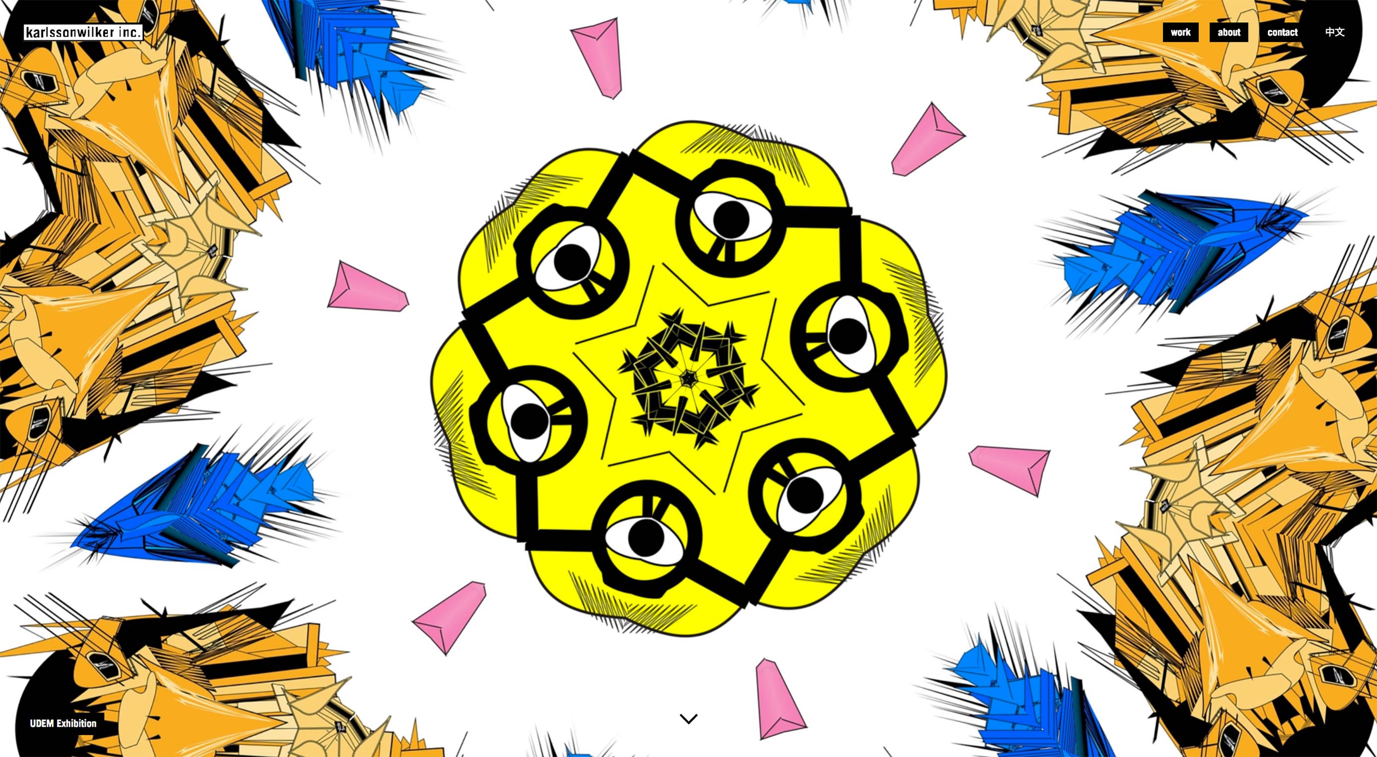
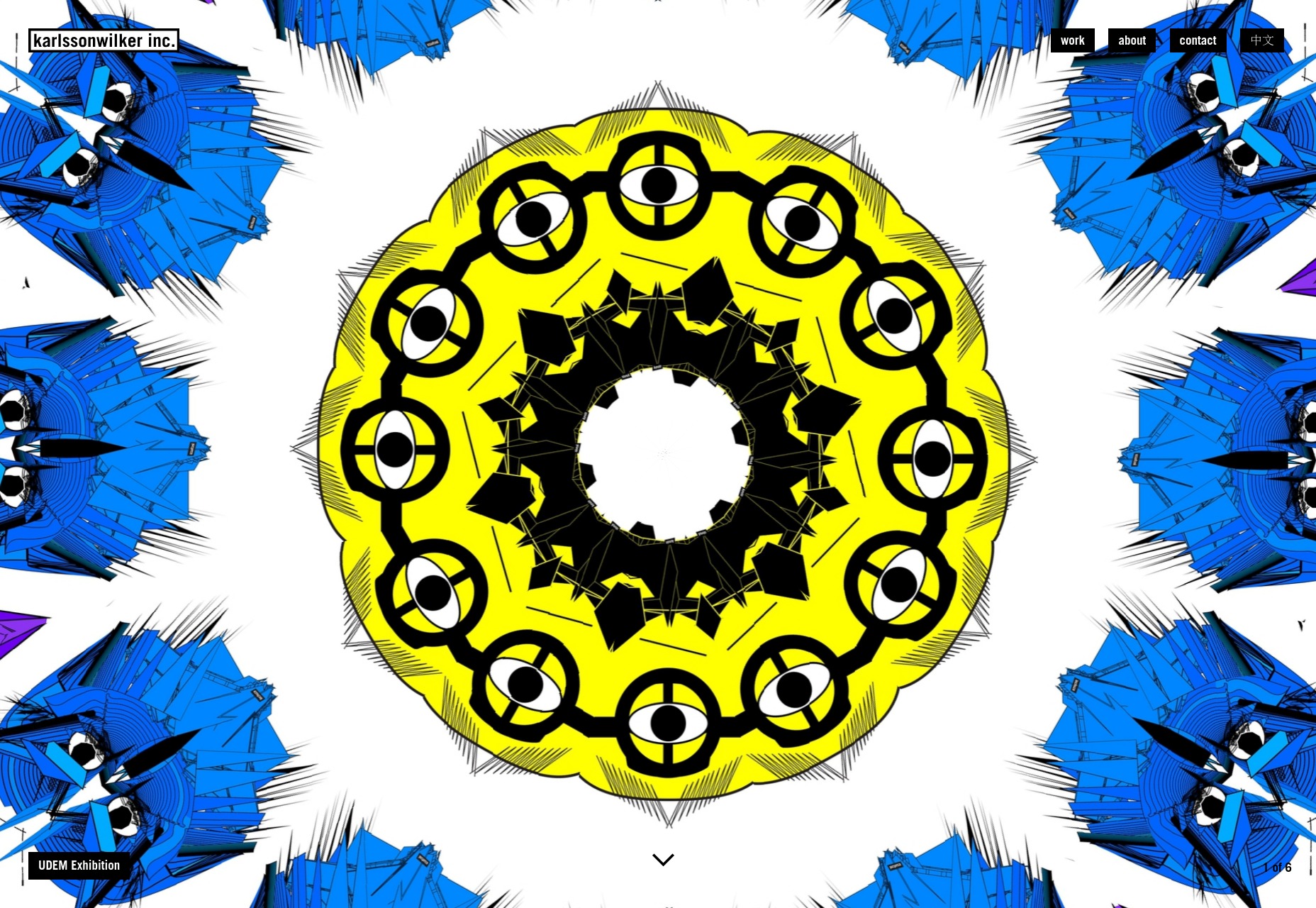
The karlssonwilker agency site is a blow to the eyeballs. Whether or not that’s a good thing is going to be down to personal taste; but I literally can’t remember the last time I saw an actual animated kaleidoscope effect used on the Web.

I definitely can’t remember the last time I saw one used this well. There’s also a rather interesting use of flowchart-style layout on the “About” page. Yeah. Flowcharts.

Platform: WordPress

iconwerk

iconwerk is the first icon designer portfolio that I’ve seen in a while. It’s a meta work of genius. Before you can click on individual projects, you’re given a grid of images that contain icons, clients lists, and other snapshots of their work, but also kind of look like icons in their own right.

That’s right, they put icons in your icons, so you can look at icons while you look at icons.

Platform: Static Site

Humbert & Poyet

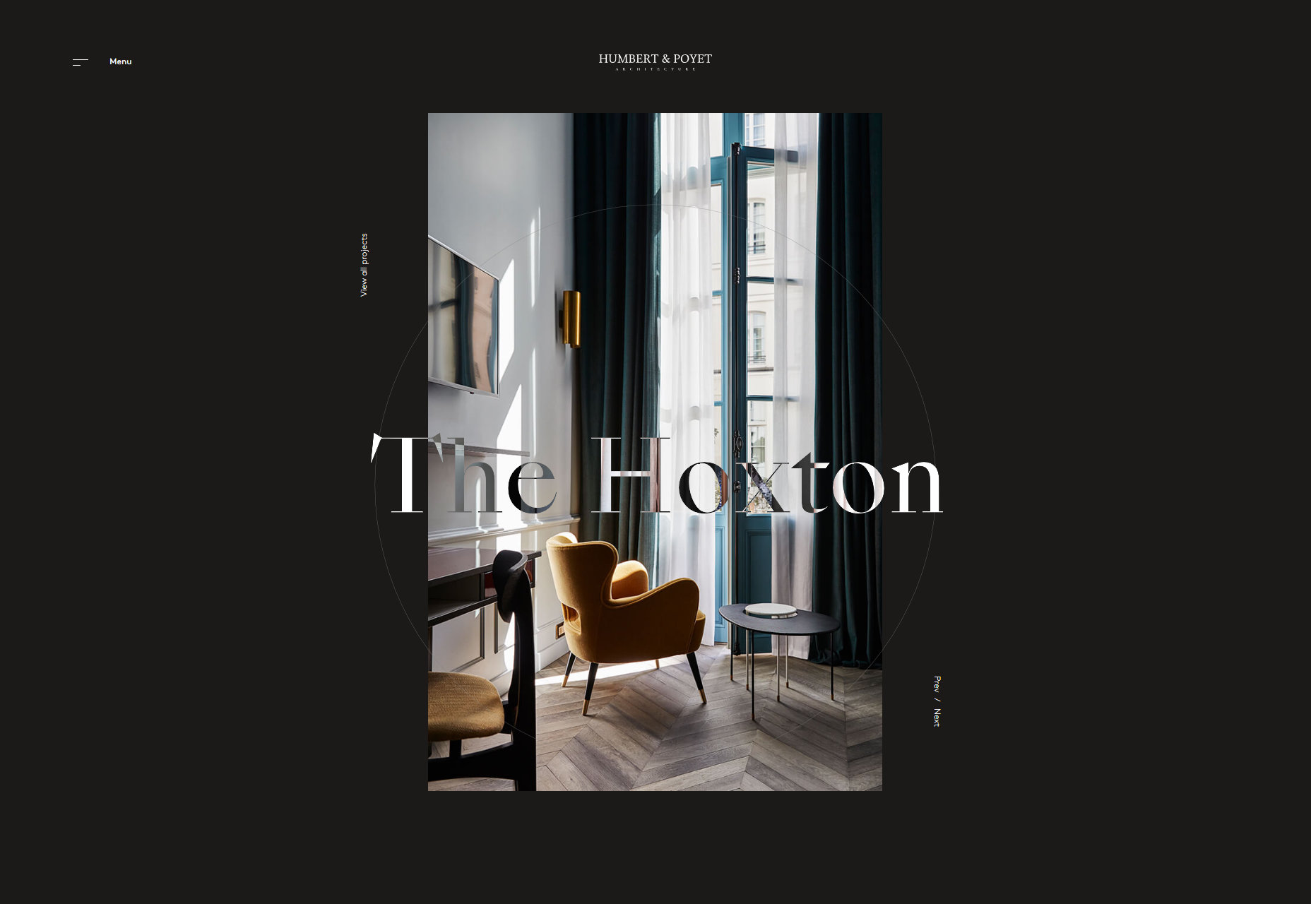
Humbert & Poyet is an architecture firm, so expect a lot of the usual: animation everywhere, elegant serif type, and text overlapping onto other elements. As is usual though, it’s all about how these elements are combined. In this case, the result is a visual treat that is greater than the sum of its parts.

Platform: Static Site

Juicymo

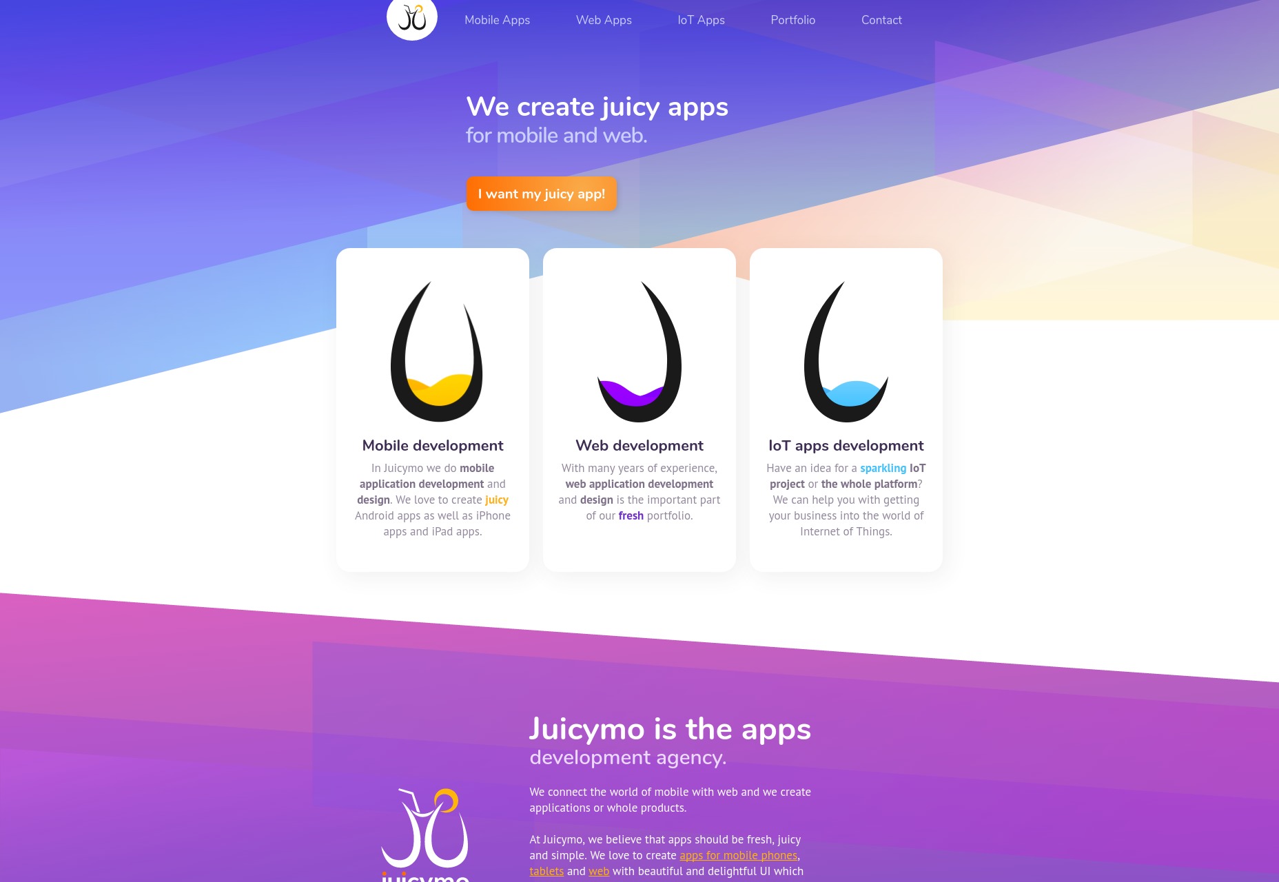
Juicymo is a mobile app developer, and their site goes all in on the flashy visuals you might expect from them. We get gradients galore, a lot of diagonal lines (a personal favorite of mine), rounded corners, and overall it’s just bright and colorful.

Really, it’s as if Web 2.0 and flat design had a baby. This makes it stand out, and I rather like it. Man, I never thought I’d miss rounded corners.

Platform: Static Site

Effectlab

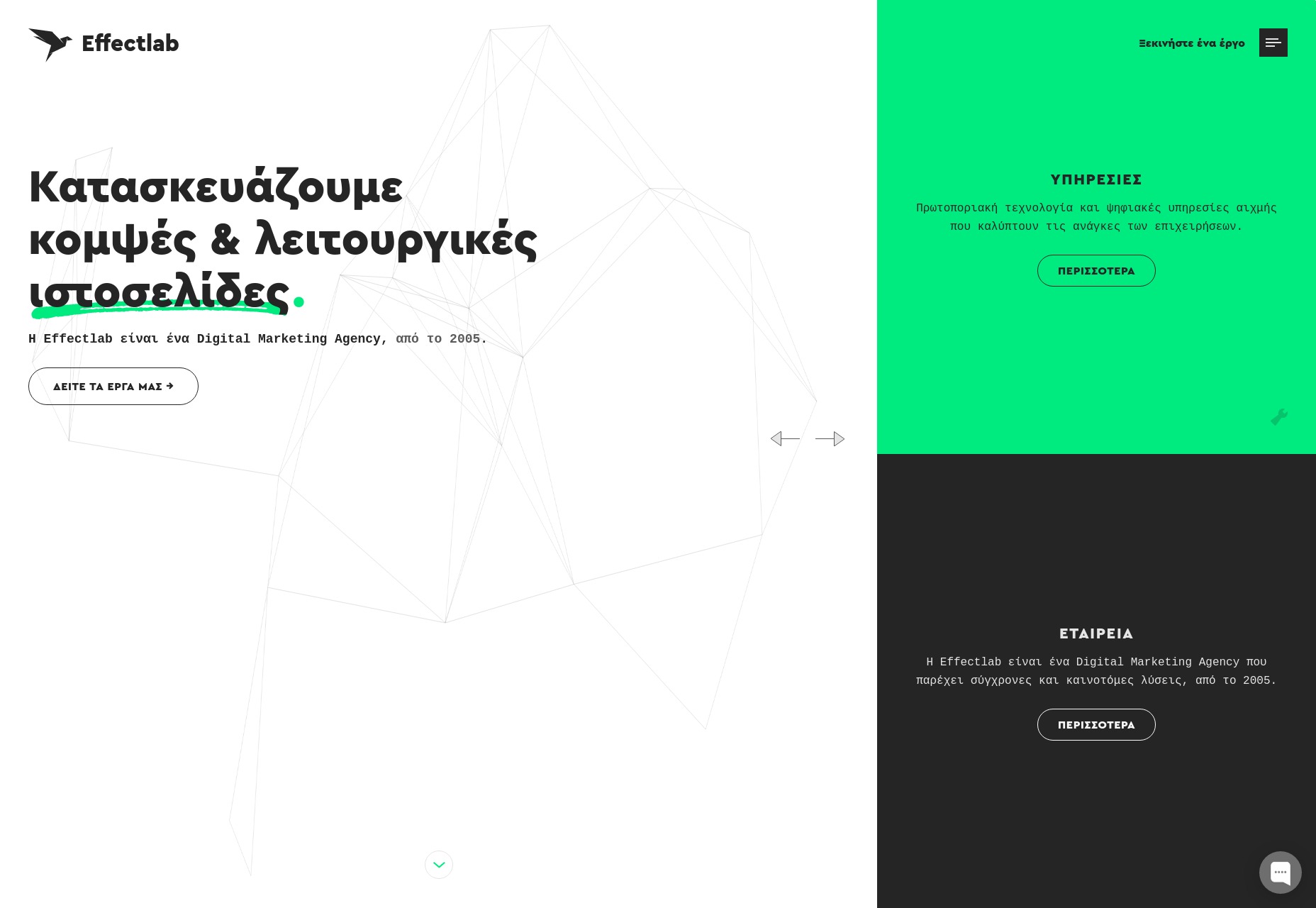
Effectlab brings us back to that good old flat design with strong type and animated geometry on the home page. Further in, we get some overlapping elements, and a strong use of their admittedly limited color scheme.

To bring us back to the typography, I haven’t seen a lot of Greek websites. But even so, the text feels beautifully rendered, and some of the more rune-like characters absolutely bring out the nerd in me.

Platform: Static Site

Jveb Studio

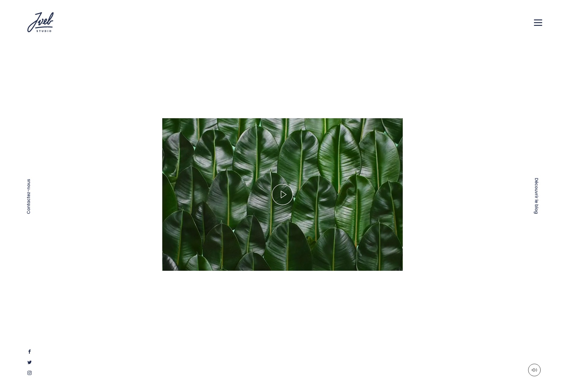
Jveb Studio uses light animation and background illustration to fantastic effect. With a clearly modern-yet-artistic style, this is a simple-looking site that nonetheless has a fair few moving parts under the hood. Give it a look.

Platform: WordPress

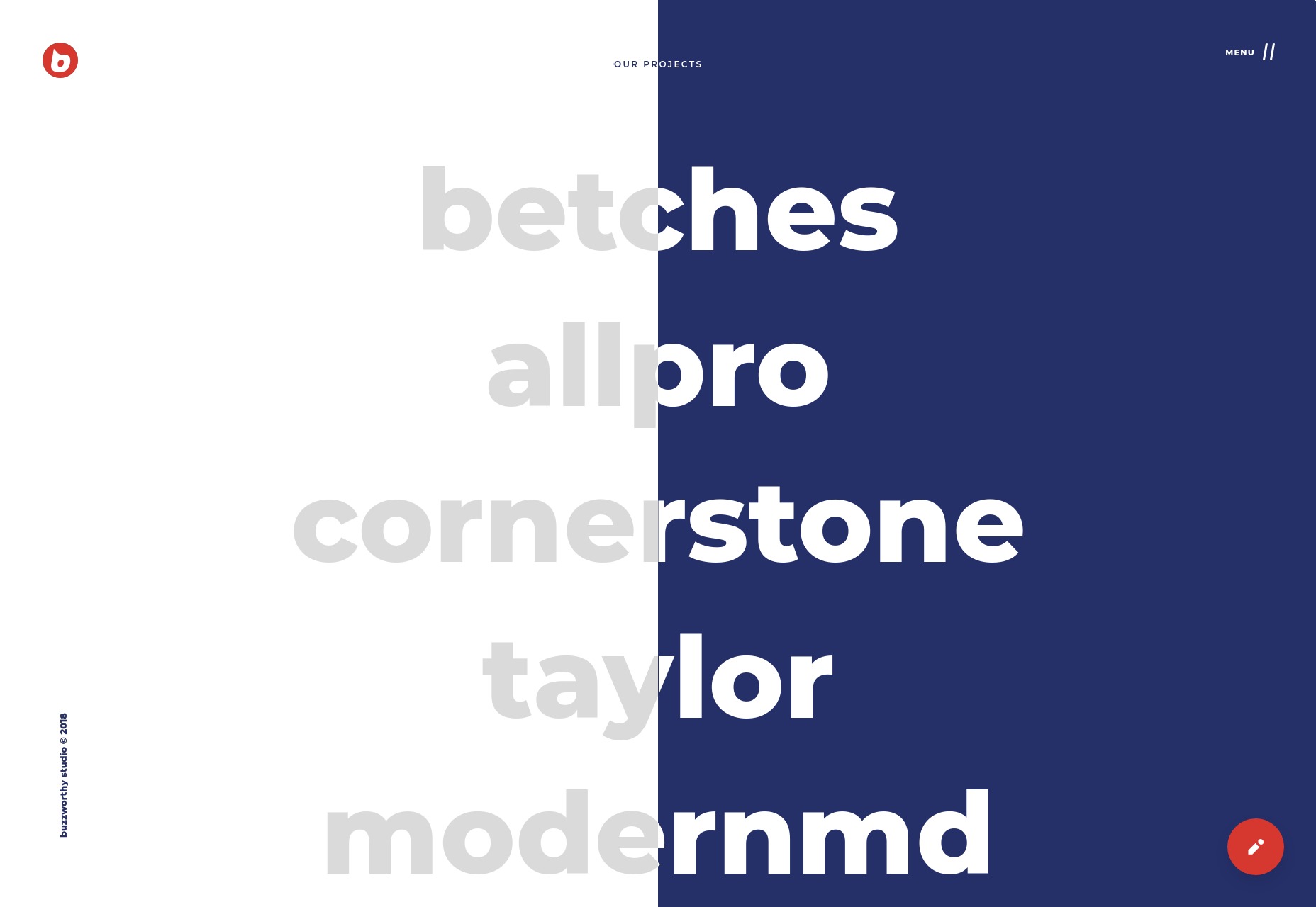
Buzzworthy Studio

Buzzworthy Studio showcases their projects with a list of names, like many sites do nowadays. Overall, their style is clean, playful, and very marketing-friendly, which works for them. Animations is clearly emphasized, but not overwhelming, and I particularly like the way they use color.

Platform: Static Site

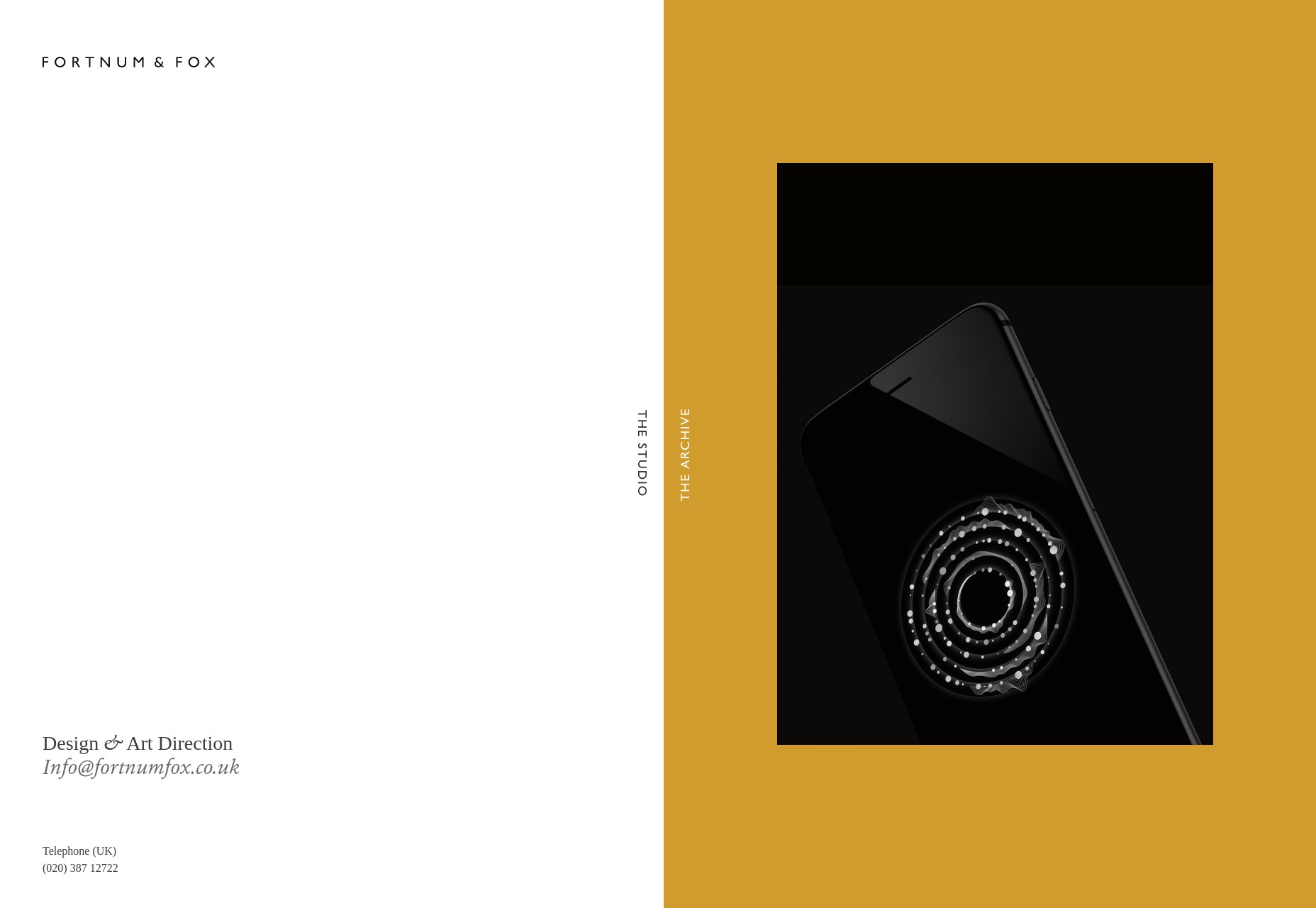
Fortnum & Fox

Fortnum & Fox also embrace the dual-color background, but takes more of an earth-tone approach for the most part. But instead of only using this theme on the home page, the site doubles down on the dual-background theme, featuring it prominently when displaying portfolio items.

As presentation sites go, it looks elegant and fancy. It takes some inspiration from print design, without feeling trapped by its inspiration.

Platform: WordPress

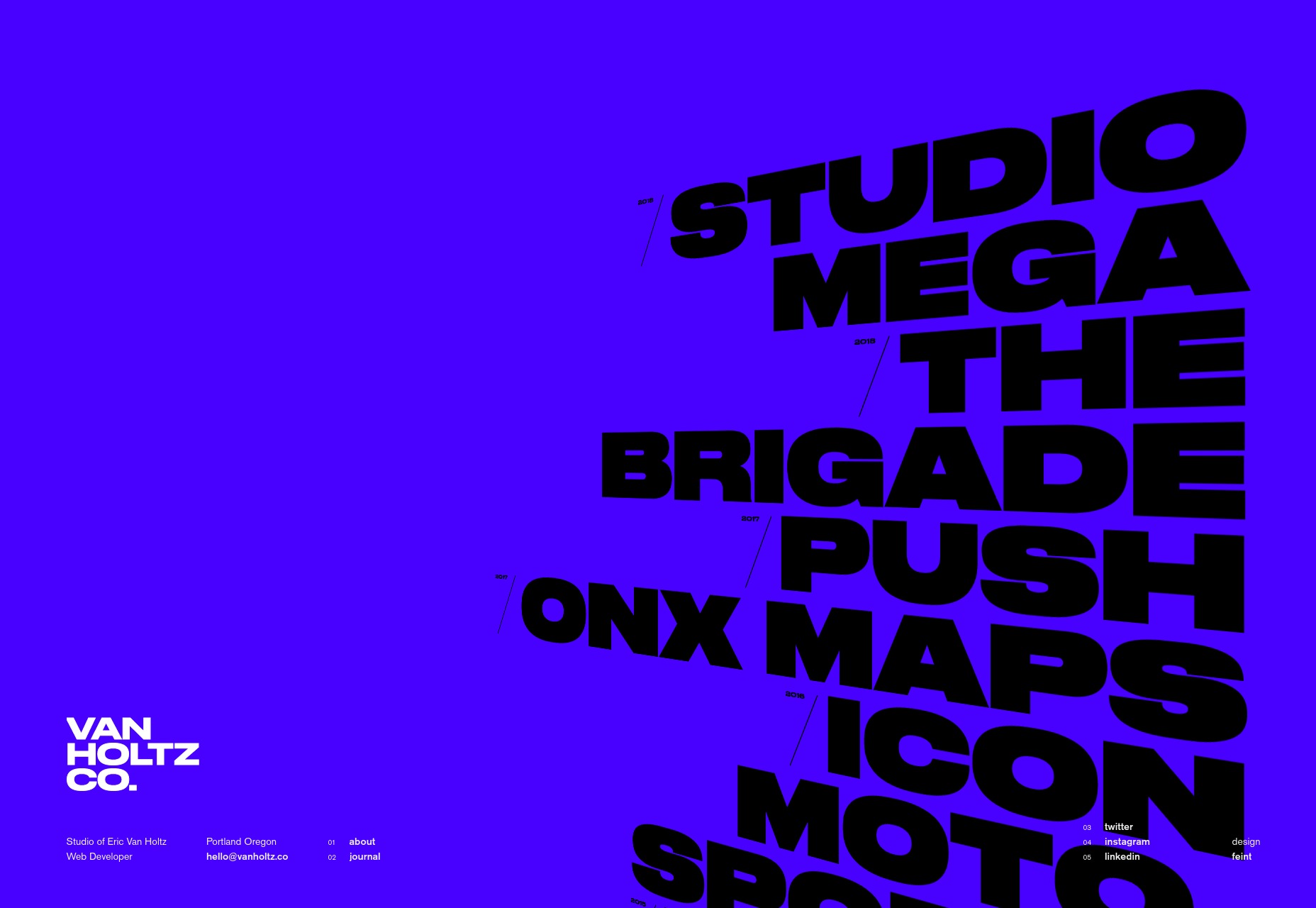
Eric Van Holtz

Eric Van Holtz’ portfolio goes big and bold with both color and type, combined with a light dash of animation, and a penchant for those diagonal lines I like so much. It’s a design that doesn’t hold back, and so is memorable.

Platform: Static Site

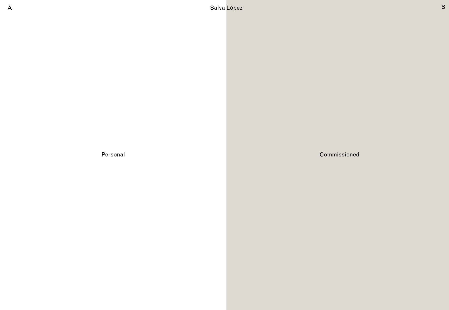
Salva Lopez

Salva Lopez’ portfolio seems to embrace the “split website” theme as well, with all of his photography organized in “personal” and “commissioned” categories. It’s a simple site with little text and lots of galleries, but that’s basically what you want from a photography portfolio, no?

Platform: WordPress

2xElliott

2xEllliott is a design consultancy, so their site’s aesthetic embraces that sort of corporate-elegant feel we’ve come to expect from that sort of agency. There’s a heavy emphasis on imagery, art direction, and not using more pages than you have to.

By that I mean that clicking on navigation items like “News” or “Contact” will open up a side panel to show that content, since there’s not enough of either to warrant their own pages. It’s a bit JS-dependent for my taste, but I otherwise like the approach.

Platform: WordPress

Canopy Films

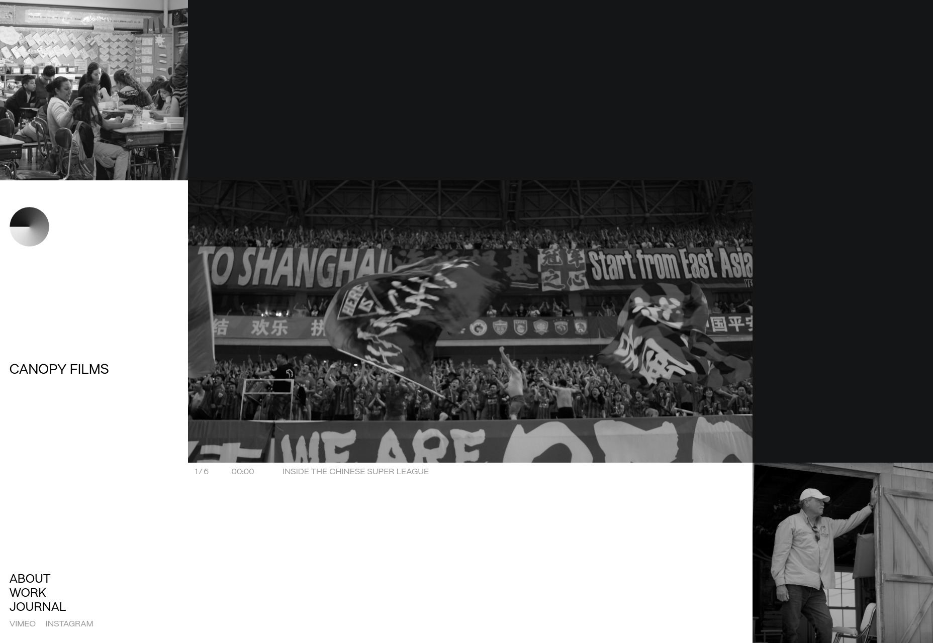
Canopy Films’ site takes a highly grid-based approach to showing off its videos, and the grid itself is… animated? I’ll be honest, I’m not sure how that’s done; but it’s actually a pretty cool effect. And that’s coming from Mr. I-wish-sites-depended-less-on-animation. The rest of the site is fairly clean and modern, and is just generally worth a look.

Platform: Static Site

JOJX

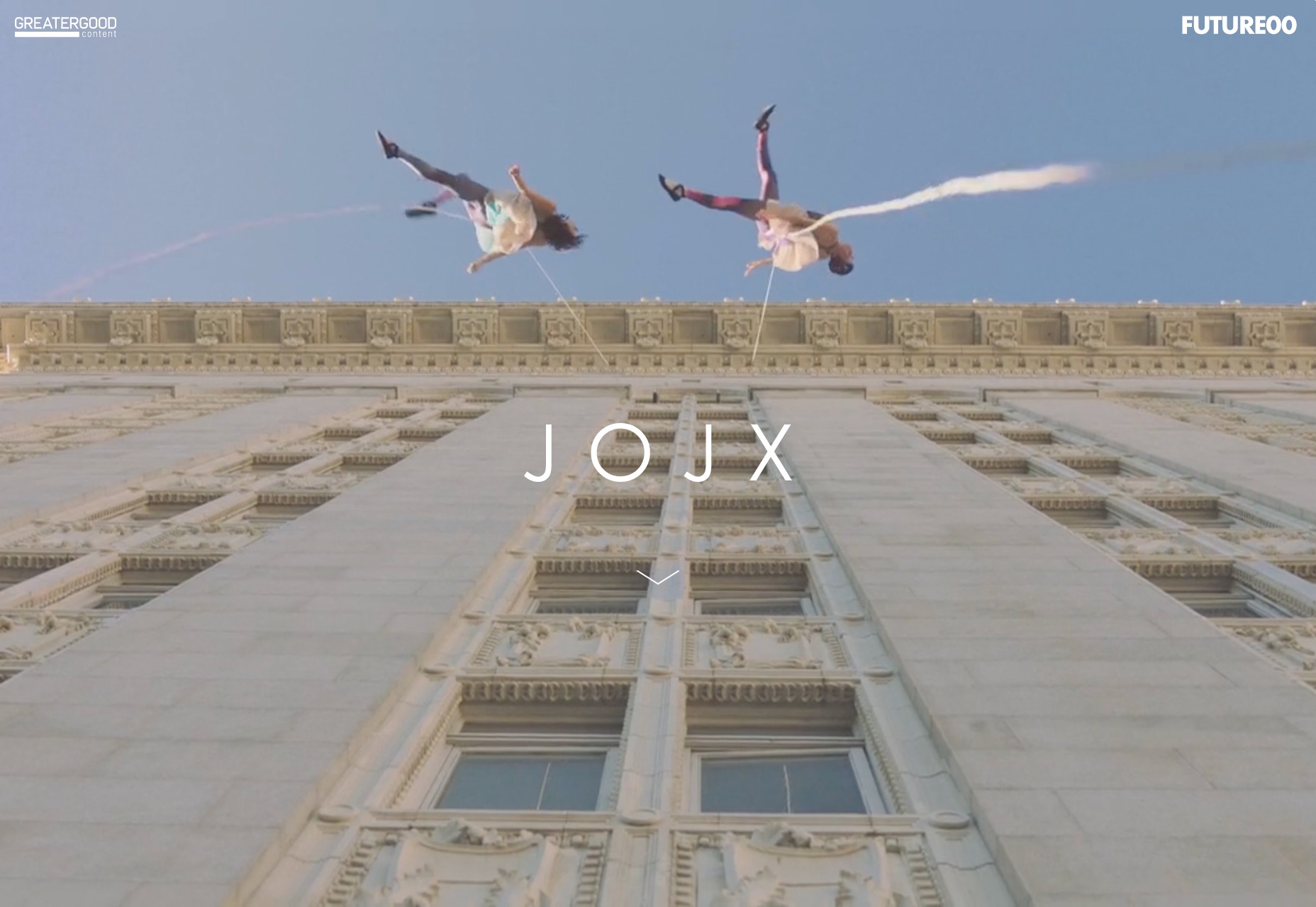
JOJX goes for that dead-simple minimalism that was everywhere in last month’s article. Since it’s a portfolio site for directors, that works just fine. It’s just you, some navigation, a video, and a title. What more do you need?

Platform: WordPress

Humble

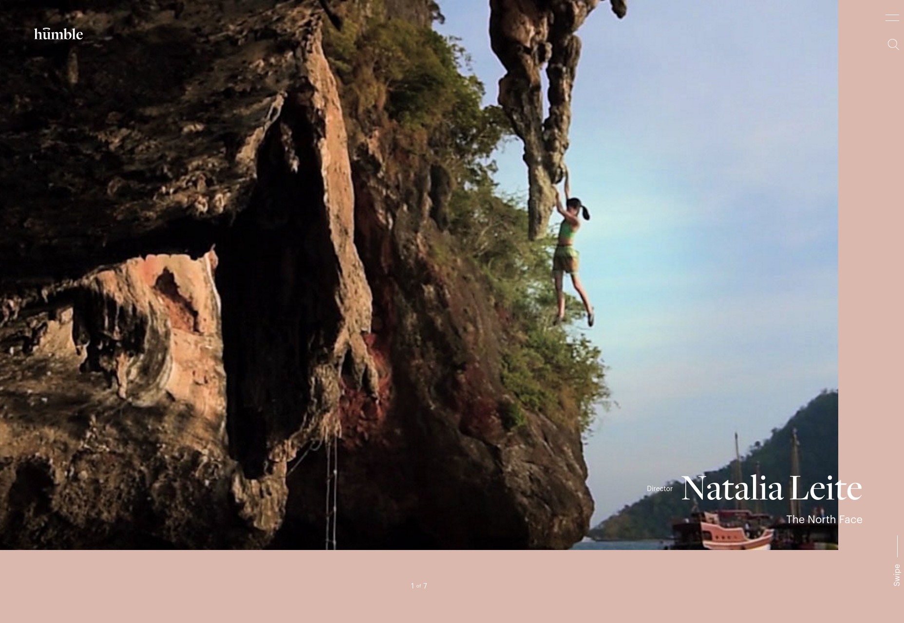
Humble takes much the same approach to showing off its video portfolio as JOJX, above. They use more color, though, with a bit of asymmetry and element overlap thrown in. It’s an excellent example of how two designs that are very similar on paper can have wildly different personalities.

Platform: WordPress

David Collins Studio

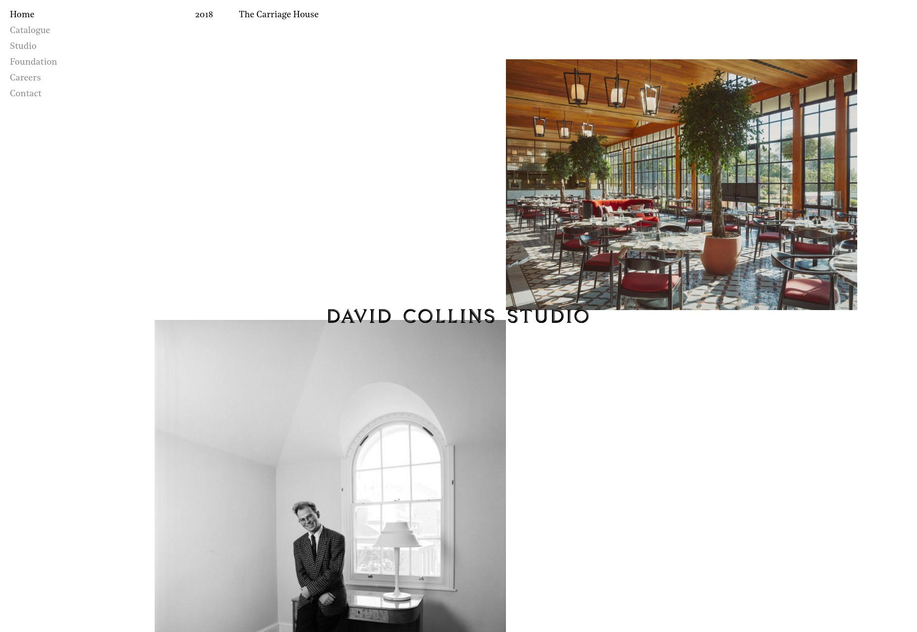
The David Collins Studio site takes me way back to like, a month or so ago, with its serif type, and minimalist collage approach to the art of the portfolio. It’s simple and elegant, and fairly effective.

Platform: Static Site (?)

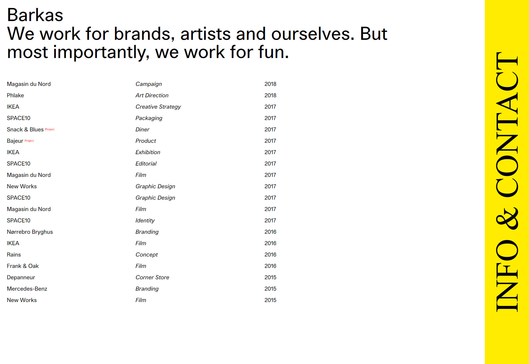
Barkas

When you first load this portfolio up, it kind of feels like a spreadsheet that’s much prettier than it ought to be. As someone who kind of likes spreadsheets to begin with, that’s actually a compliment.

I’m not a huge fan of the cursor change, but otherwise it’s a good-looking portfolio that gets straight to the point.

Platform: WordPress

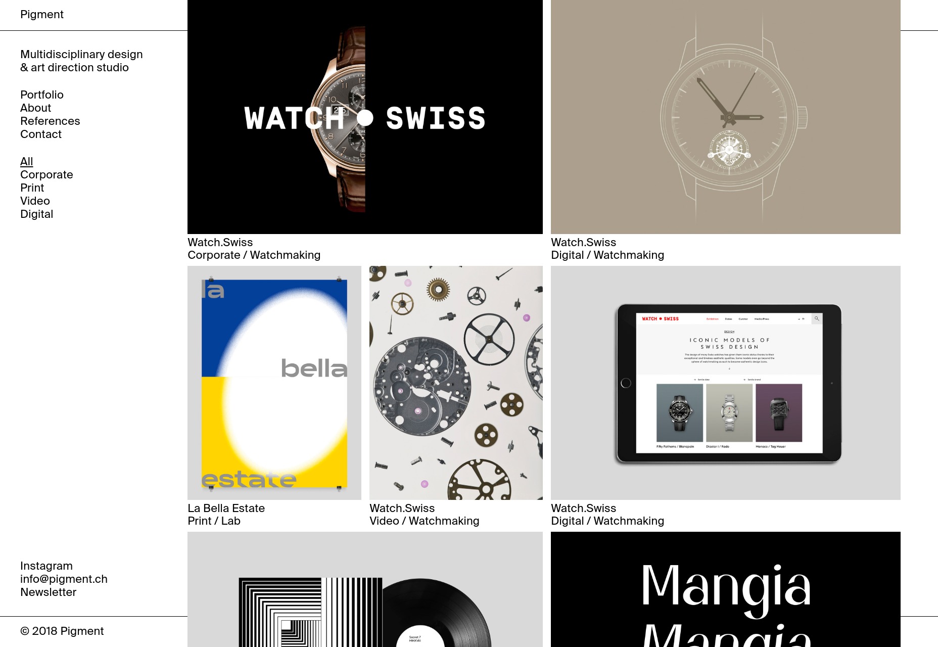
Pigment

Pigment shows off their work in a decidedly modernist fashion, with lots of white space and good old black borders. I do find their two-column approach to the actual portfolio items interesting. It looks like a good way to prioritize some of your work while not quite hiding the rest of it.

I also kind of like the way it looks like most of the content is “floating” above the rest of the page/background. It’s an effect you don’t often see in such a relatively flat design. It’s depth without any trace of skeuomorphism.

Platform: WordPress

Pierrick Calvez

Pierrick Calvez’ site is pretty much peak minimalism, but it’s good-looking for all that. I appreciate the way the zoom function works on individual portfolio images, and the typographical style of the whole thing.

Platform: Webflow

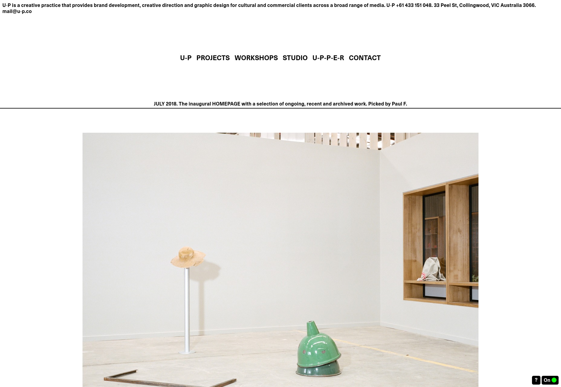
U-P

U-P is hard to classify. It’s so reminiscent of the Wild West days of the Internet that it’s almost brutalist. And yet, it looks good in a way that is sometimes a little cramped. Despite its design roots, it follows fairly modern usability conventions. It works, even if it sometimes seems like it shouldn’t.

That’s always impressive.

Platform: Static Site

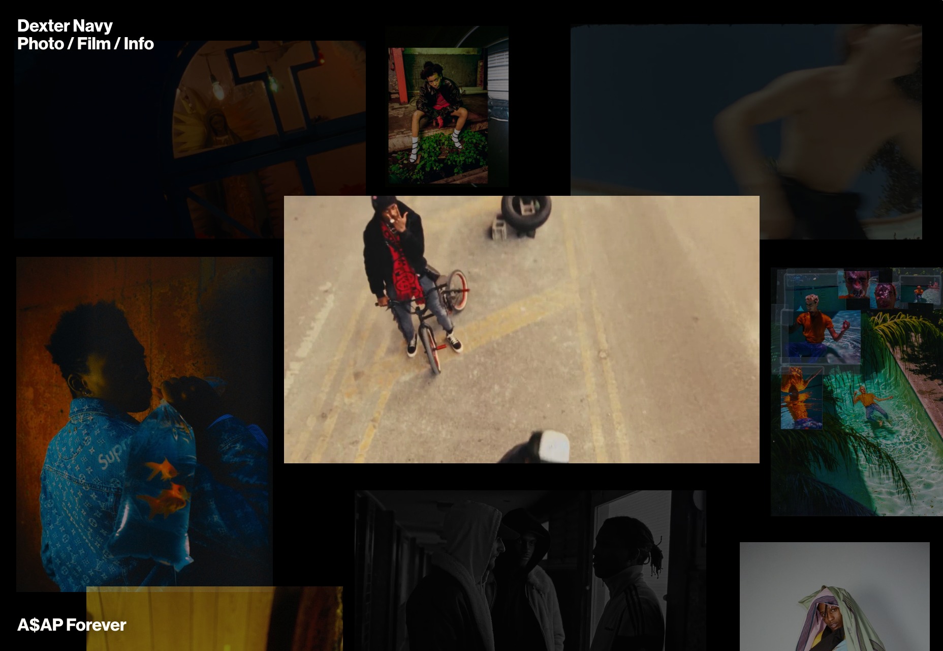
Dexter Navy

Dexter Navy’s site is an odd duck, and I quite like it. Some photographers and videographers have collage-style sites. Others do that “preview-on-hover-over-the-title” thing. This one manages to combine them both in a riot of color and movement that still manages to feel purposeful.

The photography and video are mixed together delightfully. I also quite like the horizintal-scrolling image galleries for each project.

Platform: Static Site

Add Realistic Chalk and Sketch Lettering Effects with Sketch’it – only $5!

Source

p img {display:inline-block; margin-right:10px;}
.alignleft {float:left;}
p.showcase {clear:both;}
body#browserfriendly p, body#podcast p, div#emailbody p{margin:0;}

40+ Excellent 3D Effects Photoshop Tutorials

Original Source: https://www.hongkiat.com/blog/40-excellent-3d-effects-photoshop-tutorials/

Comprehensive collection of high-quality 3D effects Photoshop tutorials.

The post 40+ Excellent 3D Effects Photoshop Tutorials appeared first on Hongkiat.

Visit hongkiat.com for full content.