Original Source: https://www.smashingmagazine.com/2018/08/efficient-distributed-product-teams/
Making Distributed Product Teams Work More Efficiently With monday.com
Making Distributed Product Teams Work More Efficiently With monday.com
Nick Babich
2018-08-23T14:00:26+02:00
2018-08-23T12:23:54+00:00
(This is a sponsored article.) The way that product teams work is changing: The software industry is quickly moving to remote work. In the US alone, 43% of employed Americans have spent at least some time working remotely, and that number has steadily increased in recent years. Many successful digital products on the market today were designed and developed by a distributed team. Such teams don’t have an office in the traditional sense. Everyone chooses to work from where they like, both geographically and functionally (in a coworking space, coffee shop, home office, etc.).
While a distributed product team might sound tempting to you, creating an effective design process on such a team requires a lot of effort. Collaboration and communication are two of the most significant challenges distributed teams face. Managing a distributed team requires an understanding of how the individuals on your team operate, as well as requires a digital toolset that makes the team’s operations as efficient as possible. That’s why investing in the right remote tools and technology is so critical for product managers.
If you’re a team manager who is looking to establish a robust design process for a distributed team, then this article for you. You’ll find seven of the most common challenges distributed product teams should overcome and learn how a team-management tool called monday.com (formerly dapulse) can help them with that.
1. Build A Shared Understanding Of A Project’s Goals
When it comes to organizing a work process on a remote team, one of the key goals is to keep the whole team on the same page. Management needs to set goals and make sure everyone on the team understands and accepts them. Building understanding is especially important on remote teams because interaction tend to be more sporadic. Ensure that everyone on the team knows the following:
What are the project’s overall goals? When a team clearly understand’s the product strategy (what they want to build and why), that understanding motivates engagement.
What is expected of them, and how do they fit in the bigger picture? People want to know their role in the process. Even though every team member will be deep in the details when working on a project, understanding the big picture will help them to focus on what’s really important.
What are other people involved in the project doing? Each team member should have visibility on what the other team members are working on.
The more everyone knows, the better they can work as a team.
Visualize The Product Development Process
Helping everyone on the team know what is expected of them and when is possible using monday.com’s feature named the “timeline.” The timeline makes tasks more visual — team members will be able to see when each task is scheduled for, how long it will take and how it fits in the entire project. The tool enables you to see not only what tasks your team members are working on, but also how those tasks are distributed over time. It is great for when some activities depend on others (for example, developers are waiting on mockups from designers).

The timeline enables team members to see a high-level roadmap. (Large preview)
2. Manage The Team’s Workload
As anyone who has ever worked on a remote team will tell you, remote working is quite different from working face to face. Many project managers find it hard to manage the team’s workload.
Most product teams use project-tracking software to plan and estimate their work. Usually, a team will prepare all of the work in a task list, in which each task has a text description and a time estimate. The biggest downside of this approach is that it’s not very representative. For example, Kanban boards, used by many product teams today, are not very representative — it’s almost impossible from a glance at the board to understand the order in which tasks should be completed, especially when they have dependencies.
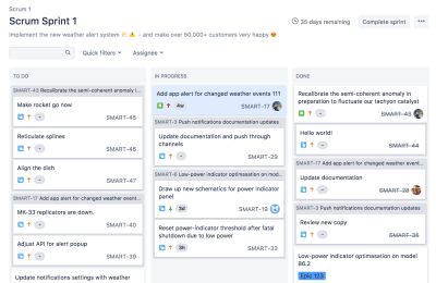
Using a Kanban board might make it hard to see how tasks should be distributed in time. (Image source) (Large preview)
Track Everything Your Team Is Working On
Interaction cost (i.e. the cognitive or physical effort required to complete an action) plays a vital role in the user experience of a product. The more effort required to complete an operation, the less usable the interface becomes for the end user. If the project manager has to switch to different products to see the team’s progress, that will create unnecessary friction and hinder the team from working efficiently.
monday.com assembles and displays progress data in a logical and understandable way. The tool has a feature called a board. The board is where all team members can track everything the team is working on. The main advantage of the board is that it enables product managers to monitor the team’s progress in real time and instantly see who is working on what and see where things stand.
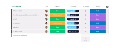
monday.com gives you a clear sense of what needs to get done and who is responsible for what. The board provides in-depth insight into a project and its tasks. (Large preview)
Communicate Current Status
Each team needs a mechanism that makes it easy to understand what’s going on at a glance.
One way to solve this problem is to use color coding for different elements. Color coding speeds up visual search because it allows users to quickly filter a particular object (or objects) by knowing the color associated with it. monday.com uses color coding to indicate the current status of a task. For example, it’s easy to see where things have gotten stuck just by looking at the board and finding all tasks colored in red.
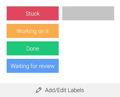
Status updates can be color coded. (Large preview)
Create, Modify And Assign Tasks In A Few Clicks
Adding tasks in a project-management tool doesn’t sound very exciting. Generally, the more time it takes, the less happy the product manager will be.
monday.com simplifies the process of data input. Managers can quickly add rows to the board — monday.com calls them pulses. Pulses can be tasks, projects, missions, to-do items, etc. Creating a pulse requires just a few clicks.

(Large preview)
After you create a pulse, simply assign it to a team member.

Assign teammates to particular tasks or projects. (Large preview)
Tailor The Platform To Your Needs
There’s no such thing as a universal design process. Every project is different and requires its own design process. A product-management tool should be very adaptive to change; the product team should be able to customize the process according to their needs, without having to put much effort into customization.
monday.com is extremely customizable and lets the user configure almost any option. You can customize monday.com to manage any workflow or process, to address any challenge and to manage basically anything.
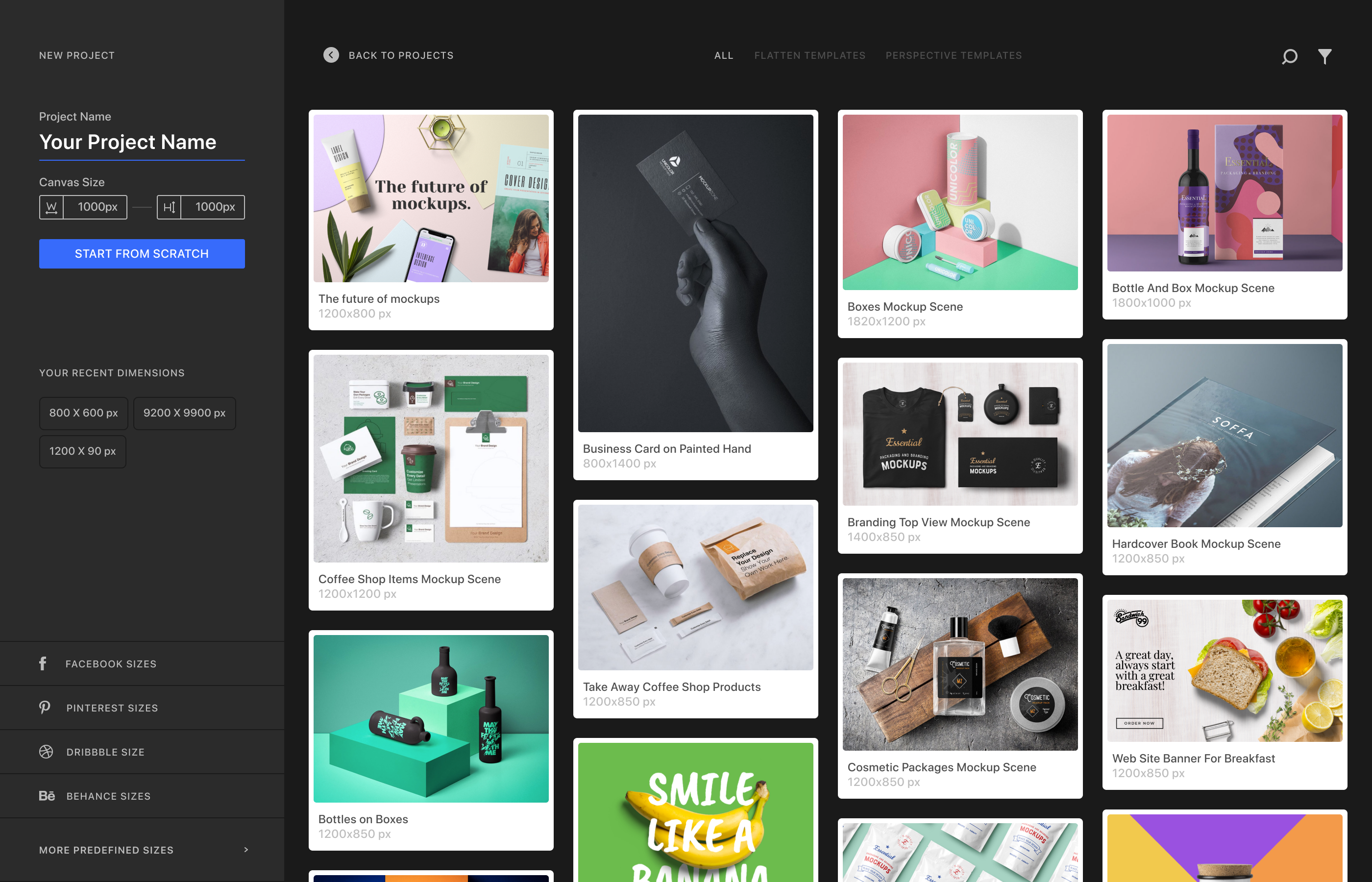
When it comes to creating a board, you don’t need to start from scratch. A multitude of templates allow you to start quickly. For example, the “Team Tasks” template would be very useful for product teams.
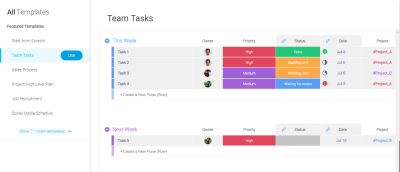
Finding the right template for your activity is really simple because all templates are visualized. (Large preview)
After selecting a template for your needs, you can customize it by manipulating different sections. Product teams often need to combine task into groups, whereby each group represents a milestone (for example, “Release 1”, “Release 2”, etc.). Doing this in monday.com is relatively simple. As a board owner, you can have as many groups as you want.
Easy to organize tasks. You can have as many groups as you want. (Large preview)
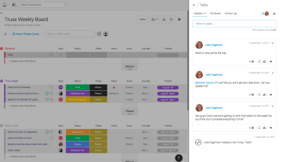
But it doesn’t stop there. You can use the checklist feature to break down tasks even further. For example, each task can be broken down into smaller to-do steps. This feature is handy when a few activities need to get done before the task can be completed — for example, if a product specification needs to be approved by a few designers before it can be handed over to the development team. The checklist sits within a pulse, in the “Updates” section, and can help create a structure for each pulse.
 The checklist sits within a pulse, in the “Updates” section. This feature can help create a structure for each pulse. (Large preview)
Plan The Team’s Workload Visually
Designers, developers and managers often work with compressed timeframes and simultaneous projects. A team must be able to respond quickly to feedback on their product from stakeholders and users. Following the build-measure-learn cycle, a product team should be really flexible; it should be ready to implement feedback from testing sessions and adjust the design process according to the new information. The same level of flexibility should be in all products the team uses.
Using monday.com’s timeline, it’s possible to make corrections and improve the team’s efficiency. The visual editor makes the process of managing tasks easy. The product manager can see where each project is at each point, and can see and focus on areas of struggle, quickly and effectively.
The timeline makes it possible to see each team member’s capacity over a set period of time (say, the next few weeks), seeing where they have room to take on more work and where they need to delegate tasks to others.
 Change the time range in the timeline. The time range is updated in real time. (Large preview)
3. Create Effective Internal Communications
Communication plays a critical role in the design process. When it comes to product design, it’s essential for all team members to be on the same page. Unlike colocated teams, a distributed team won’t have an opportunity to arrange regular face-to-face meetings. When you take out face-to-face interaction, you can’t expect things to just work the same way. Poorly established communication patterns can lead to some team members feeling like they’re working in a vacuum.
Tools matter more in remote work because they are the foundation for communication. The goal is to make sure everyone on the team feels connected.
Centralize All Communication
In today’s world, we communicate with a variety of tools: from traditional email to online messengers such as Skype, WhatsApp, Slack and Facebook Messenger. Having to switch from a task-management tool to another tool for communication can be stressful. Worse, some information can get lost during the transition (for example, an email inbox can fill up to the point that a team member can overlook a critical email).
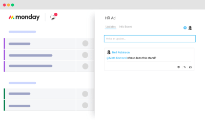
Product teams can use monday.com as a single communication platform for their workplace. And it would be a much better solution because it allows for communication in the context of each task. With monday.com, you no longer need to use email for internal communication. When a team member clicks on a pulse on any board, a box opens to the right of the screen, showing the “updates”. Simply mention a person’s username (“@johndoe”), and send your message. The great thing is that the chat thread stays with that task, so finding a conversation after a while is relatively easy.
Cut Down On Meetings And Optimize Required Meetings
Meetings are an essential part of the communication process. When it comes to reviewing plans and brainstorming on design decisions, there’s no substitute for a meeting. But for a distributed team, the number of potential hours available for real-time meetings can be limited, so it’s essential to make the best use of that time. A distributed team should continually try to reduce their number of meetings and maximize the effectiveness of the time that team members have together.
Take a weekly kickoff meeting as an example. This meeting happens on a Monday, and team members come together to discuss plans for the week. For many teams, such meetings are rarely productive. Quite often, the information shared in a weekly kickoff meeting becomes outdated shortly after the meeting, and team members need to reprioritize tasks.
monday.com saves the team vast amounts of time in meetings. Instead of discussing the plan for the week, the product manager can break down complex tasks into weekly achievable goals. This will help team members plan the week based on what they need to get done.
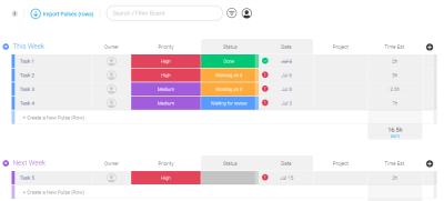
Create a weekly task board. (Large preview)
Share Valuable Resources With The Entire Team, Not Individual Members
Imagine you’ve found a really valuable resource and want to share it with your peers. You tweet about it and send a link to a group chat. You get feedback like, “Awesome resource! Thanks!” from some people in the chat. Shortly after, most of your peers forget about the resource, especially if they can’t use it in the work they’re doing right now. Sad, right? We can do better.
Instead of sending a link to a group chat, share all resources you find on a separate board. monday.com has a template named “Design Inspiration & Resources”. The great thing about this approach is that it’ll be much easier for team members to find a particular resource when they actually need it.

(Large preview)
Organize Better Planning And Brainstorming Sessions
Task prioritization is a typical activity in agile project management. Team members get together, discuss tasks and vote on what to implement in the next sprint.
monday.com incorporates voting. Team members can use the voting column when they want to decide on something together as a team. Simply add a voting column to a board, and team members will be able to cast their vote in one click.

Vote for ideas during brainstorming and planning sessions. (Large preview)
Notify Team Members In Real Time
Fear of missing out (FOMO) is a common problem on distributed teams. When working remotely, team members might be afraid to miss an important piece of information. As a result, they spend a lot of time in communication tools, checking mail and messengers. This can get really distracting. Team members should spend less time in communication tools and more time in tools they use to design (tools for prototyping and development). It’s all too easy to waste the day reading messages and replying.
A communication tool should serve vital information just when team members need it; it should have an effective mechanism of notification. monday.com notifies users via desktop and mobile in real time. The platform has an app for iOS and Android. The app allows team members to stay connected on their phone or tablet and to respond quickly from anywhere. It’s also possible to customize notification rules. For example, you can manage which activity triggers an email.
(Large preview)
Create A Work Schedule For Your Team
If your team is distributed across the globe and you need to arrange a meeting, you have to be sure that it won’t happen at awkward hours (such as in the middle of the night). It would be great to see the team members’ working hours.
The work schedule board is a cornerstone of your business operations. Team members in each time zone can commit to the times that work for them. This helps product managers schedule meetings at times that work for everybody.

The work schedule board shows when team members will be online and available for chat. (Large preview)
4. Involve Users In The Design Process
Most commercially successful products were created with a strong focus on the target audience. Designers know that if they want to release a successful product, they need to introduce real users to the design process. User involvement is most efficient and influential in the early stages of product development, because the cost of making changes increases as the system develops. Generally, the earlier you create a strong feedback loop, the better the final product will be.
Share Designs With Users And Gather A Valuable Feedback
The feedback that a product team gets from users is extremely valuable. It can validate that the design team is moving in the right direction.
On monday.com, users can create a board and choose whom to share it with. For example, if you are working with a client, you can set up a board for their project and invite them to work as a guest. The board could include key features you want to work on. As soon as you share the board, the client will get a notification and then can open the board, review the plan and request modifications.
5. Find All Required Information Easily
Documentation is another challenge. Distributed teams don’t have a physically shared space where they can share product documentation. Information might be stored in many different places: email, cloud drives, local computers, etc. It could lead to team members missing an important piece of information and being unaware of it. This leads to fragmented knowledge.
Centralize All Documents
Having all documents in one place is critical to success. monday.com syncs all information in a single accessible hub. All team members can store all relevant discussions in a searchable database. The platform provides an option to upload different types of files simply by dragging and dropping. The next time a designer needs to share a product’s specifications, all they need to do is upload a file to the platform.
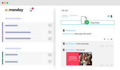
Upload all assets by dragging and dropping. (Large preview)
Search Anything And Everything
Anyone who has ever worked with a knowledge base will tell you how critical search functionality is. Without proper search, your chance of finding information decreases significantly.
monday.com allows you to quickly find anything your team has ever worked on, including images, updates, projects and assignments. Your work becomes a rich knowledge base.
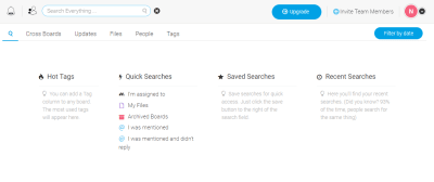
(Large preview)
For example, when you need to find the latest version of a product’s specification, all you need to do is click the search box, select the “Files” tab and enter the project’s name as a search query.
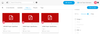
(Large preview)
6. Make The Collaboration Tool A Natural Part Of The Team
The platform you choose for team management should feel like second nature. Technology should work for you and your team, not the other way around.
Minimize The Time Required To Learn A Tool
When you introduce a new tool in the design process, one goal should be to have total agreement to work using this tool. This agreement is not always easy to come by because team members are usually skeptical about the next “magical tool that will solve all of their problems”. What’s worse is that they have to spend extra time learning how to use it. Nobody wants to learn new software.
One of the most significant advantages of monday.com is its intuitiveness. Regardless of whether you’ve used a similar app before, monday.com can be picked up with no training. Team members will be able to understand how to use the tool without preparation.
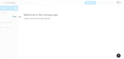
monday.com provides basic onboarding to help users get started. (Large preview)
Scalable
When companies select a collaboration tool, they often think of it as an investment. They want a tool that will scale with the business.
monday.com is suitable for any sized team, from two freelancers working together to thousands collaborating across the globe. The tool scales with you, from simplicity to complexity, with total ease. Also, as your business expands, monday.com makes it painless to shift to a premium version (Standard, Pro or Enterprise) and get more of the platform’s premium features.
Integrate The Platform With Existing Tools
A task-management tool is essential for any team hoping for good results. But the team’s toolbox also needs to support the design process (for prototyping and development) and the collection of design artifacts (for example, on Google Drive or Dropbox). It’s essential that the team-management tool integrates seamlessly with other tools the team uses.
When it comes to integration, monday.com does a lot to be part of the established software ecosystem. It can connect to Dropbox, Zapier, Google Drive and other sharing tools. As a team member, you can attach a mockup file to your updates, sharing it in the context of the tasks it relates to.
monday.com also comes with an open API architecture, which lets developers build their own integrations.
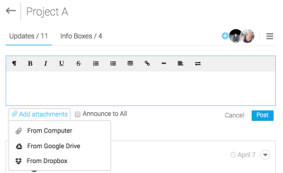
(Large preview)
7. Keep The Team Motivated
Having the right atmosphere is extremely important. Team leaders should not only be in tune with each person on the team, but should continually look for ways to increase engagement.
Celebrate Successes With Team Members
It’s natural for people to seek acknowledgment. The need for social approval drives us to look for confirmation from people we know (parents, friends, colleagues). When someone recognizes our results by saying something as simple as “Great job!”, we feel motivated to work towards our goals. It’s essential for team players to get acknowledged, especially when working remotely.
monday.com has a few features that help create a sense of acknowledgment. The first one is the thumb-up feature, which is basically a positive reaction to an activity. Most people are familiar with this from social networks. People are used to measuring the effect of a post by the number of likes they get. monday.com allows you to give a thumb up to your teammates’ work.
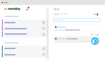
(Large preview)
Another nice feature are the animated GIFs. You can liven up comments with GIFs. monday.com lets you pick from thousands of GIFs when responding to teammates, which will add a bit of personality to your comments.
 (Large preview)
Last but not least, monday.com has a confetti feature. As soon as a designer completes their last “in progress” task on a board, they will see an animated confetti effect. This subtle detail adds a bit of delight and motivates team members to have an all-green board.
 (Large preview)
Conclusion
Establishing an effective process on a distributed team is hard. What works for a colocated team won’t necessarily work for a distributed team, and what works for one distributed team won’t necessarily work for another.
Build a remote-friendly work culture by focusing on following priorities:
Prioritize transparency.
Keep important information accessible to everyone.
Stay on top of the team’s activity.
Understand what every member of your team is doing and where the team is in the process at a glance.
Build an effective communication system.
The foundation of distributed teams is communication. Create a healthy system of meetings and habits to keep people communicating.
Lower the barrier to entry.
Choose a team-collaboration tool that will be the least painful for everyone to get on board with. It should be a reference point that brings everything together.

(ms, ra, il, al)


 What it actually looks like

 Look at that camera by Hasselblad





 The checklist sits within a pulse, in the “Updates” section. This feature can help create a structure for each pulse. (Large preview)
 Change the time range in the timeline. The time range is updated in real time. (Large preview)


 (Large preview)
 (Large preview)

