Original Source: https://www.smashingmagazine.com/2018/09/designing-a-textbox-unabridged/
Designing A Textbox, Unabridged
Designing A Textbox, Unabridged
Shane Hudson
2018-09-06T13:30:16+02:00
2018-09-06T11:42:22+00:00
Ever spent an hour (or even a day) working on something just to throw the whole lot away and redo it in five minutes? That isn’t just a beginner’s code mistake; it is a real-world situation that you can easily find yourself in especially if the problem you’re trying to solve isn’t well understood to begin with.
This is why I’m such a big proponent of upfront design, user research, and creating often multiple prototypes — also known as the old adage of “You don’t know what you don’t know.” At the same time, it is very easy to look at something someone else has made, which may have taken them quite a lot of time, and think it is extremely easy because you have the benefit of hindsight by seeing a finished product.
This idea that simple is easy was summed up nicely by Jen Simmons while speaking about CSS Grid and Piet Mondrian’s paintings:
“I feel like these paintings, you know, if you look at them with the sense of like ‘Why’s that important? I could have done that.’ It’s like, well yeah, you could paint that today because we’re so used to this kind of thinking, but would you have painted this when everything around you was Victorian — when everything around you was this other style?”
I feel this sums up the feeling I have about seeing websites and design systems that make complete sense; it’s almost as if the fact they make sense means they were easy to make. Of course, it is usually the opposite; writing the code is the simple bit, but it’s the thinking and process that goes into it that takes the most effort.
With that in mind, I’m going to explore building a text box, in an exaggeration of situations many of us often find ourselves in. Hopefully, by the end of this article, we can all feel more emphatic to how the journey from start to finish is rarely linear.
A Comprehensive Guide To User Testing
So you think you’ve designed something that’s perfect, but your test tells you otherwise. Let’s explore the importance of user testing. Read more →
Getting workflow just right ain’t an easy task. So are proper estimates. Or alignment among different departments. That’s why we’ve set up “this-is-how-I-work”-sessions — with smart cookies sharing what works well for them. A part of the Smashing Membership, of course.
Explore features →

Brief
We all know that careful planning and understanding of the user need is important to a successful project of any size. We also all know that all too often we feel to need to rush to quickly design and develop new features. That can often mean our common sense and best practices are forgotten as we slog away to quickly get onto the next task on the everlasting to-do list. Rinse and repeat.
Today our task is to build a text box. Simple enough, it needs to allow a user to type in some text. In fact, it is so simple that we leave the task to last because there is so much other important stuff to do. Then, just before we pack up to go home, we smirk and write:
<input type=”text”>
There we go!
Oh wait, we probably need to hook that up to send data to the backend when the form is submitted, like so:
<input type=”text” name=”our_textbox”>
That’s better. Done. Time to go home.
How Do You Add A New Line?
The issue with using a simple text box is it is pretty useless if you want to type a lot of text. For a name or title it works fine, but quite often a user will type more text than you expect. Trust me when I say if you leave a textbox for long enough without strict validation, someone will paste the entire of War and Peace. In many cases, this can be prevented by having a maximum amount of characters.
In this situation though, we have found out that our laziness (or bad prioritization) of leaving it to the last minute meant we didn’t consider the real requirements. We just wanted to do another task on that everlasting to-do list and get home. This text box needs to be reusable; examples of its usage include as a content entry box, a Twitter-style note box, and a user feedback box. In all of those cases, the user is likely to type a lot of text, and a basic text box would just scroll sideways. Sometimes that may be okay, but generally, that’s an awful experience.
Thankfully for us, that simple mistake doesn’t take long to fix:
<textarea name=”our_textbox”></textarea>
Now, let’s take a moment to consider that line. A <textarea>: as simple as it can get without removing the name. Isn’t it interesting, or is it just my pedantic mind that we need to use a completely different element to add a new line? It isn’t a type of input, or an attribute used to add multi-line to an input. Also, the <textarea> element is not self-closing but an input is? Strange.
This “moment to consider” sent me time traveling back to October 1993, trawling through the depths of the www-talk mailing list. There was clearly much discussion about the future of the web and what “HTML+” should contain. This was 1993 and they were discussing ideas such as <input type="range"> which wasn’t available until HTML5, and Jim Davis said:
“Well, it’s far-fetched I suppose, but you might use HTML forms as part of a game playing interface.”
This really does show that the web wasn’t just intended to be about documents as is widely believed. Marc Andreessen suggested to have <input type="textarea"> instead of allowing new lines in the single-line text type, [saying]: (http://1997.webhistory.org/www.lists/www-talk.1993q4/0200.html)
“Makes the browser code cleaner — they have to be handled differently internally.”
That’s a fair reason to have <textarea> separate to text, but that’s still not what we ended up with. So why is <textarea> its own element?
I didn’t find any decision in the mailing list archives, but by the following month, the HTML+ Discussion Document had the <textarea> element and a note saying:
“In the initial design for forms, multi-line text fields were supported by the INPUT element with TYPE=TEXT. Unfortunately, this causes problems for fields with long text values as SGML limits the length of attributea literals. The HTML+ DTD allows for up to 1024 characters (the SGML default is only 240 characters!)”
Ah, so that’s why the text goes within the element and cannot be self-closing; they were not able to use an attribute for long text. In 1994, the <textarea> element was included, along with many others from HTML+ such as <option> in the HTML 2 spec.
Okay, that’s enough. I could easily explore the archives further but back to the task.
Styling A <textarea>
So we’ve got a default <textarea>. If you rarely use them or haven’t seen the browser defaults in a long time, then you may be surprised. A <textarea> (made almost purely for multi-line text) looks very similar to a normal text input except most browser defaults style the border darker, the box slightly larger, and there are lines in the bottom right. Those lines are the resize handle; they aren’t actually part of the spec so browsers all handle (pun absolutely intended) it in their own way. That generally means that the resize handle cannot be restyled, though you can disable resizing by setting resize: none to the <textarea>. It is possible to create a custom handle or use browser specific pseudo elements such as ::-webkit-resizer.

A default textarea with no styling (Large preview)
It’s important to understand the defaults, especially because of the resizing ability. It’s a very unique behavior; the user is able to drag to change the size of the element by default. If you don’t override the minimum and maximum sizes then the size could be as small as 9px × 9px (when I checked Chrome) or as large as they have patience to drag it. That’s something that could cause mayhem with the rest of the site’s layout if it’s not considered. Imagine a grid where <textarea> is in one column and a blue box is in another; the size of the blue box is purely decided by the size of the <textarea>.
Other than that, we can approach styling a <textarea> much the same as any other input. Want to change the grey around the edge into thick green dashes? Sure here you go: border: 5px dashed green;. Want to restyle the focus in which a lot of browsers have a slightly blurred box shadow? Change the outline — responsibly though, you know, that’s important for accessibility. You can even add a background image to your <textarea> if that interests you (I can think of a few ideas that would have been popular when skeuomorphic design was more celebrated).
Scope Creep
We’ve all experienced scope creep in our work, whether it is a client that doesn’t think the final version matches their idea or you just try to squeeze in a tiny tweak and end up taking forever to finish it. So I ( enjoying creating the persona of an exaggerated project manager telling us what we need to build) have decided that our <textarea> just is not good enough. Yes, it is now multi-line, and that’s great, and yes it even ‘pops’ a bit more with its new styling. Yet, it just doesn’t fit the very vague user need that I’ve pretty much just thought of now after we thought we were almost done.
What happens if the user puts in thousands of words? Or drags the resize handle so far it breaks the layout? It needs to be reusable, as we have already mentioned, but in some of the situations (such as a ‘Twittereqsue’ note taking box), we will need a limit. So the next task is to add a character limit. The user needs to be able to see how many characters they have left.
In the same way we started with <input> instead of <textarea>, it is very easy to think that adding the maxlength attribute would solve our issue. That is one way to limit the amount of characters the user types, it uses the browser’s built-in validation, but it is not able to display how many characters are left.
We started with the HTML, then added the CSS, now it is time for some JavaScript. As we’ve seen, charging along like a bull in a china shop without stopping to consider the right approaches can really slow us down in the long run. Especially in situations where there is a large refactor required to change it. So let’s think about this counter; it needs to update as the user types, so we need to trigger an event when the user types. It then needs to check if the amount of text is already at the maximum length.
So which event handler should we choose?
change
Intuitively, it may make sense to choose the change event. It works on <textarea> and does what it says on the tin. Except, it only triggers when the element loses focus so it wouldn’t update while typing.
keypress
The keypress event is triggered when typing any character, which is a good start. But it does not trigger when characters are deleted, so the counter wouldn’t update after pressing backspace. It also doesn’t trigger after a copy/paste.
keyup
This one gets quite close, it is triggered whenever a key has been pressed (including the backspace button). So it does trigger when deleting characters, but still not after a copy/paste.
input
This is the one we want. This triggers whenever a character is added, deleted or pasted.
This is another good example of how using our intuition just isn’t enough sometimes. There are so many quirks (especially in JavaScript!) that are all important to consider before getting started. So the code to add a counter that updates needs to update a counter (which we’ve done with a span that has a class called counter) by adding an input event handler to the <textarea>. The maximum amount of characters is set in a variable called maxLength and added to the HTML, so if the value is changed it is changed in only one place.
var textEl = document.querySelector(‘textarea’)
var counterEl = document.querySelector(‘.counter’)
var maxLength = 200
textEl.setAttribute(‘maxlength’, maxLength)
textEl.addEventListener(‘input’, (val) => {
var count = textEl.value.length
counterEl.innerHTML = ${count}/${maxLength}
})
Browser Compatibility And Progressive Enhancement
Progressive enhancement is a mindset in which we understand that we have no control over what the user exactly sees on their screen, and instead, we try to guide the browser. Responsive Web Design is a good example, where we build a website that adjusts to suit the content on the particular size viewport without manually setting what each size would look like. It means that on the one hand, we strongly care that a website works across all browsers and devices, but on the other hand, we don’t care that they look exactly the same.
Currently, we are missing a trick. We haven’t set a sensible default for the counter. The default is currently “0/200” if 200 were the maximum length; this kind of makes sense but has two downsides. The first, it doesn’t really make sense at first glance. You need to start typing before it is obvious the 0 updates as you type. The other downside is that the 0 updates as you type, meaning if the JavaScript event doesn’t trigger properly (maybe the script did not download correctly or uses JavaScript that an old browser doesn’t support such as the double arrow in the code above) then it won’t do anything. A better way would be to think carefully beforehand. How would we go about making it useful when it is both working and when it isn’t?
In this case, we could make the default text be “200 character limit.” This would mean that without any JavaScript at all, the user would always see the character limit but it just wouldn’t feedback about how close they are to the limit. However, when the JavaScript is working, it would update as they type and could say “200 characters remaining” instead. It is a very subtle change but means that although two users could get different experiences, neither are getting an experience that feels broken.
Another default that we could set is the maxlength on the element itself rather than afterwards with JavaScript. Without doing this, the baseline version (the one without JS) would be able to type past the limit.
User Testing
It’s all very well testing on various browsers and thinking about the various permutations of how devices could serve the website in a different way, but are users able to use it?
Generally speaking, no. I’m consistently shocked by user testing; people never use a site how you expect them to. This means that user testing is crucial.
It’s quite hard to simulate a user test session in an article, so for the purposes of this article, I’m going to just focus on one point that I’ve seen users struggle with on various projects.
The user is happily writing away, gets to 0 characters remaining, and then gets stuck. They forget what they were writing, or they don’t notice that it had stopped typing.
This happens because there is nothing telling the user that something has changed; if they are typing away without paying much attention, then they can hit the maximum length without noticing. This is a frustrating experience.
One way to solve this issue is to allow overtyping, so the maximum length still counts for it to be valid when submitted but it allows the user to type as much as they want and then edit it before submission. This is a good solution as it gives the control back to the user.
Okay, so how do we implement overtyping? Instead of jumping into the code, let’s step through in theory. maxlength doesn’t allow overtyping, it just stops allowing input once it hits the limit. So we need to remove maxlength and write a JS equivalent. We can use the input event handler as we did before, as we know that works on paste, etc. So in that event, the handler would check if the user has typed more than the limit, and if so, the counter text could change to say “10 characters too many.” The baseline version (without the JS) would no longer have a limit at all, so a useful middle ground could be to add the maxlength to the element in the HTML and remove the attribute using JavaScript.
That way, the user would see that they are over the limit without being cut off while typing. There would still need to be validation to make sure it isn’t submitted, but that is worth the extra small bit of work to make the user experience far better.

Allowing the user to overtype (Large preview)
Designing The Overtype
This gets us to quite a solid position: the user is now able to use any device and get a decent experience. If they type too much it is not going to cut them off; instead, it will just allow it and encourage them to edit it down.
There’s a variety of ways this could be designed differently, so let’s look at how Twitter handles it:
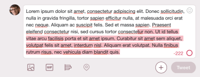
Twitter’s <textarea> (Large preview)
Twitter has been iterating its main tweet <textarea> since they started the company. The current version uses a lot of techniques that we could consider using.
As you type on Twitter, there is a circle that completes once you get to the character limit of 280. Interestingly, it doesn’t say how many characters are available until you are 20 characters away from the limit. At that point, the incomplete circle turns orange. Once you have 0 characters remaining, it turns red. After the 0 characters, the countdown goes negative; it doesn’t appear to have a limit on how far you can overtype (I tried as far as 4,000 characters remaining) but the tweet button is disabled while overtyping.
So this works the same way as our <textarea> does, with the main difference being the characters represented by a circle that updates and shows the number of characters remaining after 260 characters. We could implement this by removing the text and replacing it with an SVG circle.
The other thing that Twitter does is add a red background behind the overtyped text. This makes it completely obvious that the user is going to need to edit or remove some of the text to publish the tweet. It is a really nice part of the design. So how would we implement that? We would start again from the beginning.
You remember the part where we realized that a basic input text box would not give us multiline? And that a maxlength attribute would not give us the ability to overtype? This is one of those cases. As far as I know, there is nothing in CSS that gives us the ability to style parts of the text inside a <textarea>. This is the point where some people would suggest web components, as what we would need is a pretend <textarea>. We would need some kind of element — probably a div — with contenteditable on it and in JS we would need to wrap the overtyped text in a span that is styled with CSS.
What would the baseline non-JS version look like then? Well, it wouldn’t work at all because while contenteditable will work without JS, we would have no way to actually do anything with it. So we would need to have a <textarea> by default and remove that if JS is available. We would also need to do a lot of accessibility testing because while we can trust a <textarea> to be accessible relying on browser features is a much safer bet than building your own components. How does Twitter handle it? You may have seen it; if you are on a train and your JavaScript doesn’t load while going into a tunnel then you get chucked into a decade-old legacy version of Twitter where there is no character limit at all.
What happens then if you tweet over the character limit? Twitter reloads the page with an error message saying “Your Tweet was over the character limit. You’ll have to be more clever.” No, Twitter. You need to be more clever.
Retro
The only way to conclude this dramatization is a retrospective. What went well? What did we learn? What would we do differently next time or what would we change completely?
We started very simple with a basic textbox; in some ways, this is good because it can be all too easy to overcomplicate things from the beginning and an MVP approach is good. However, as time went on, we realized how important it is to have some critical thinking and to consider what we are doing. We should have known a basic textbox wouldn’t be enough and that a way of setting a maximum length would be useful. It is even possible that if we have conducted or sat in on user research sessions in the past that we could have anticipated the need to allow overtyping. As for the browser compatibility and user experiences across devices, considering progressive enhancement from the beginning would have caught most of those potential issues.
So one change we could make is to be much more proactive about the thinking process instead of jumping straight into the task, thinking that the code is easy when actually the code is the least important part.
On a similar vein to that, we had the “scope creep” of maxlength, and while we could possibly have anticipated that, we would rather not have any scope creep at all. So everybody involved from the beginning would be very useful, as a diverse multidisciplinary approach to even small tasks like this can seriously reduce the time it takes to figure out and fix all the unexpected tweaks.
Back To The Real World
Okay, so I can get quite deep into this made-up project, but I think it demonstrates well how complicated the most seemingly simple tasks can be. Being user-focussed, having a progressive enhancement mindset, and thinking things through from the beginning can have a real impact on both the speed and quality of delivery. And I didn’t even mention testing!
I went into some detail about the history of the <textarea> and which event listeners to use, some of this can seem overkill, but I find it fascinating to gain a real understanding of the subtleties of the web, and it can often help demystify issues we will face in the future.

(ra, il)


 Hello Readers. It’s September, so as soon as your kids are off to school, maybe you can finally have a five-minute power nap. Take that power nap with equal parts gusto and relief, dear Reader. You’ve earned it.
 , kids. If you find an idea you like and want to adapt to your own site, remember to implement it responsibly.