An Introduction to Variable Fonts for Web Designers

Original Source: http://feedproxy.google.com/~r/1stwebdesigner/~3/b2eFRgKqWeY/

Typography on the web has come a long way. We’ve gone from the days of just a few basic system-based fonts to now having nearly endless possibilities. But all of that choice leads to some challenges for designers.

Performance, for example, can be negatively impacted for every font we load on a page. Even the use of a single font family with multiple styles (bold, italic, etc.) requires multiple calls to the server. This can really start to add up in an industry when every millisecond matters.

Therein lies the great promise of variable fonts. Suddenly, there’s no need to load in half a dozen font files in order to retrieve the styles you want. Instead, everything you need for a font family is included in just a single file. It’s a great boost to efficiency and easy to implement.

Curious about this new addition to our typography toolbox? Here’s what you need to know:

More Flexibility

While potential performance gains may be the most obvious feature of variable fonts, there’s more to love. Another of the key selling-points is that they offer a greater level of flexibility than traditional fonts.

For instance, variable fonts allow designers to leverage CSS transitions. This could be used to create some ultra-smooth animation as a font changes from one style to another. Elements such as links and navigation can be made that much more interesting and unique. While it may sound like a small detail, this provides us with yet another way to improve user experience.

Under that same umbrella, it is also possible to create custom font styles when using a variable font. Because of how these fonts are built, you don’t have to settle for premade styles such as light or extra-bold. Instead, you can opt for virtually anything in-between, or adjust available font axes to tailor the type to your needs.

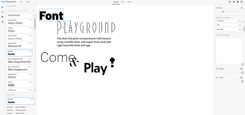
What’s really amazing is that a tool such as Font Playground makes these adjustments super easy. They offer a visual UI for tweaking things to your heart’s content. You won’t have to be an expert to get the results you want. And, it will even provide you with the necessary CSS code.

The overarching point is that typography becomes less rigid and more open to designer interpretation. Sure, you can use the standard styles if you like. But you also have the option of putting your own personal touch on a project, as well.

Customizing variable fonts with Font Playground.

Still in Its Infancy

As with just about all new technology, variable fonts have a few asterisks beside their name. However, these limitations are more a product of how early they are in their existence, rather than a fatal flaw.

Limited Selection

The number of variable fonts seems to be growing daily. Still, the available amount looks tiny compared to traditional fonts.

At this point, Google Fonts isn’t offering any variable fonts in their standard library. Although, the Amstelvar, Cabin and Nunito fonts are available via their Early Access program.

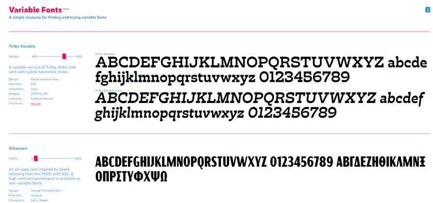
But there are a growing number of alternative resources. Places such as V-Fonts and Font Playground have enough selections to fit most project needs. And, a number of independent developers have begun publishing their own families.

Adjusting Variable fonts at V-Fonts.

Limited Support

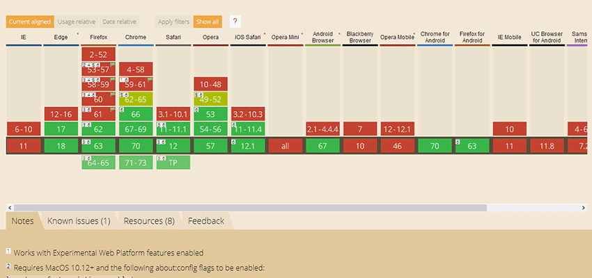
Browser support for variable fonts cover newer versions of most modern browsers. You won’t find support for legacy products such as Internet Explorer or even less-recent versions of Chrome, Edge, Firefox and Safari.

This may or may not be a deal breaker, depending on your intended audience. Of course, the more time that passes, the less worrisome legacy support becomes. And, the selection of available fonts will only continue to grow.

Browser support for variable fonts.

A Boon to Web Typography

Variable fonts look to bring web typography to a higher level. Rather than being forced into using only the available styles, designers will have the power to do more. Add this to simplified font management and increased performance and you have something that can benefit virtually any project.

It’s not hard to imagine a future where variable fonts become the standard. And the more we see variable fonts in action, the more difficult it is to see how more traditional offerings can stay relevant.


UI Trends That Will Shape 2019

Original Source: https://inspiredm.com/ui-trends-that-will-shape-2019/

Allow me to ask you something that might sound a little bit like science-fiction. Has it ever occurred to you that maybe planet Earth has been moving a little bit faster of late – but we’re yet to notice? Seems like it was only yesterday that we reviewed what we expected as we moved into 2018. Yet strangely, it’s almost 2019 already!

Come to think of it, however, 2018 has been one heck of a year for UI design. Things are now much simpler compared to previous years- thanks to the exponential growth design tools have experienced in recent times. You don’t even have to be a coding guru anymore to create a professional-looking site with great UI in just a matter of minutes.

And that barely covers the base. Changes in user preferences have also extensively impacted how we’ve been designing interfaces in 2018.

To put it into perspective, 94% of internet users stopped trusting sites with poor design- so there’s simply no room for compromises anymore.

Then since scrolling is now widely accepted, sites are no longer prioritizing on placing the best stuff at the top. You can spread them proportionately within the interface. But then again, we’ve learned to be extremely careful about that considering 40% of the visitors will leave if the overall layout turns out to be shabby.

And that’s not all they hate. Users have also grown tired of content sliders- only 1% will click on them. Interestingly, mitigating that by eliminating content would also be a wrong move since 86% of site visitors want to see critical product and service info as soon as the land on the homepage.

Fascinating, right?

So, let’s be honest- UI design has never been this exciting. Users are morphing, device tech is developing astronomically, internet speed is now at Formula 1 level, and we’re backed by a wide range of design tools on the web. Combine all that with the modern UI designer skillsets, and you’ll certainly agree that 2019 is bound to be even more impactful.

So, what trends are we looking forward to?

Mobile First

Mobile optimization is a buzzword that is seemingly not retiring any time soon. The trend has been around for a couple of years now, to say the least. And you’d be right to predict that we’ll see increased adoption of mobile-based UI designs in 2019.

You might also assume that apart from the corresponding tech, there’s nothing new that might be forthcoming in this space- at least for the next 12 months or so. Fair enough, but get this…

You see, for quite some time now, we’ve been using the same old approach- designing for PC first, before shifting to mobile. Retrospectively, desktop UI was the principal focus because the bulk of the traffic came from PC users.

Then something interesting occurred in late 2016- mobile traffic ultimately surpassed PC traffic. By the end of that year, mobile phones had hit 50.31% of the market share, while tablets added up to 4.9%.

mobile market share

However, that notwithstanding, we still prioritized on the desktop interface because it so happened that PC users maintained the lead in the cumulative amount of time spent online. In North America, for instance, mobile phone surfing was still lagging behind in 2017, accounting for 33% of the surfing time.

surfing time

Well, come to think of it, we all knew that it was only time before mobile ultimately caught up with PCs in this too. And by 2018, tables had completely turned, with mobile taking up 52.2% of all global web pages.

traffic share

What does this mean for UI?

For starters, we expect a shift in UI design approach. Developers will start changing their priorities by focusing on mobile UI first before designing for PC. Mobile users will take precedence over PC users.

Use of Shadows and Depth

There’s no denying that flat UI designs have their benefits. But let’s face it. They’ve now become too monotonous and, admittedly, quite boring.

Unfortunately, using 3D designs was challenging because of the resultant cumbersome graphics. Loading a webpage with a 3D interface, for instance, typically took longer than one with a flat design.

Well, until web browsers started improving substantially. And designers, on the other hand, developed an exceptional technique of taking advantage of shadows to introduce the illusion of depth.

shadows and depth

In 2019, therefore, we expect to see progressive use of shadow variations to achieve different 3D interface outlooks.

For example- designers seeking to draw attention to specific elements can create false shadows with varying degrees of softness and intensity. The end result is an element that might appear to hover over the rest in 3D.

Another popular technique is placing shadows in patterns to create various levels of textures, and subsequently bring the interface elements to life.

Then guess what? Recent advancements in UI design tools have further extended the dynamics that come with these design approaches. You can now easily combine shadows with grids and parallax layouts to systematically extend the corresponding depth, and consequently achieve more realistic 3D illusions.

In other words, advanced use of shadows will continue to achieve more refined depth on 2D display. And in so doing, eliminate the need for special 3D screens.

Minimalism

In the year 2000, the average human attention span, at least according to a study by Microsoft, was 12 seconds. Then guess what? By 2015, it had surprisingly dropped to 8 seconds- amusingly shorter than a standard goldfish.

Well, just when we thought it couldn’t possibly get any worse, the internet made people more impatient- 47% of your site visitors now expect your pages to load in less than 2 seconds. They simply can’t stand waiting for longer. As a matter of fact, 40% of them will leave if it takes longer than 3 seconds.

Surprisingly enough, many web designers haven’t been taking this seriously. The current average page loading speed is 8.66 seconds– despite Google’s recommendation of fewer than 3 seconds for 2018.

page loading times

And that’s not all. It turns out the situation is considerably poorer for mobile sites since they take an average of 22 seconds to load. Yet, regrettably, 53% of mobile page visitors do not hang around for more than three seconds.

But, how does this relate to UI?

While page loading speeds are usually determined by several factors, the overall design of the user interface is particularly extremely critical. That’s where the chain reaction begins.

So, what does this mean for 2019?

Well, Google’s speed update in July 2018 was the beginning of the end of complex, graphics-heavy UIs that substantially compromise loading speeds. We are now increasingly shifting towards well-streamlined lean minimalistic UIs that load much faster.

In essence, minimalism entails achieving an ideal balance between simplicity, convenience, and functionality. This manages to not only improve overall speeds and search engine ranking but also decrease the corresponding traffic bounce rate.

Overlapping Effects

The modern era of graphical design introduced overlapping effects to combine multiple layers, create a sense of space, and most importantly, make interfaces more captivating.

But hold on. What is an overlapping effect in the first place?

Generally, this involves placing elements like images, text, and colors to stylishly overlap each other. I bet you’ve already come across overlapping graphics on several websites by now.

overlapping effects

Well, admittedly, the design trend has been picking up considerably well over the past couple of years. But, with modern devices now coming with much better color gradient reproduction, it’s expected that 2019 will trigger extensive adoption of overlapping effects on both PC and mobile UIs.

Samsung Mobile, for example, switched from LCD displays to the much-advanced OLED technology when they released the Galaxy S7 two years ago. Then Apple joined the bandwagon with the iPhone X, which now has a greater display contrast than its LCD predecessors. The company even has plans of maintaining this on all iPhone models scheduled for 2019.

And who stands to benefit the most?

As expected, the graphical design world is exceedingly taking advantage of this to create overlaps with sharper, crispier gradients that look more natural. We love how OLED displays have substantially mitigated the biggest problem with overlapping elements- users getting distracted by the underlying secondary elements due to poor contrast.

This trend will also trigger the development of transparency in UI designs. We’ll see increased use of “glass-like” textures on UIs as designers capitalize on transparency to bring out both primary and secondary graphics simultaneously, without necessarily interfering with the intended emphasis.

Frameless Designs

And still on modern devices, you’ve certainly noticed the most outstanding thing about their overall exterior design nowadays. No, I’m not talking about how they are now overusing glass on pretty much every surface.

Ok, I admit it might have something to do with that. For some strange reason, everyone now seemingly hates display frames. Major smartphone and TV screen makers are gradually decreasing the space between the display outline and their corresponding device edges. Then to complete the look, they choose to combine that with rounded device edges.

Samsung has even gone ahead to eliminate edge frames altogether by extending some of their smartphone screens past the edges. Apple, on the other hand, has decided to cover the entire iPhone face with the display screen, leaving room for only the earpiece.

frameless edge

Come to think of it, I guess it has everything to do with the infinity illusion- the need to make the screen seem like a part of the natural environment. And, to be honest, it’s working quite well for users, who are reportedly finding the displays to be more immersive.

Perhaps unsurprisingly, this trend has spilled over to the app industry. The UIs are progressively shifting from framed outlines to smooth lines combined with rounded edges. Consequently, this has helped interfaces to seamlessly integrate with the device screens, and subsequently create a full-screen frameless outlook.

As device manufacturers continue this trend into 2019, we expect UIs to progressively drop the old generation sharp edges for smooth, rounded, frameless designs.

Micro-Animations

They are subtle and might seem insignificant at times. But, the simple truth is this- micro-animations in UIs have proven to be extremely powerful at engaging and helping users as they navigate.

Have you seen those buttons that change color when you scroll over or click on them? You’ve definitely also come across menu layouts that pop to display additional options as soon as the pointer lands on them. Well, they are all examples of micro-animations that create small visual effects to enrich user experience.

micro-animations

Since moving elements are particularly effectual at capturing attention, many designers are already leveraging them to drive users towards various conversion points. This trend is so prevalent by now that I’d be willing to bet a fortune that you can’t find more than five sites that haven’t yet implemented some form of micro-animations.

Then get this. All the dominant web browsers currently support micro-animations satisfyingly well on both PC and mobile. So I’d say that the trend is here to stay as we approach 2019- expect UIs to come with systematically structured visual hierarchies.

Conclusion

All in all, we’ve only covered some of the most notable trends. We’re bound to see more exciting stuff coming up as time goes by, and we can’t wait for 2019 to set the ball rolling.

That said, what exactly do you think might turn out to be the most impactful UI design trend? And what other notable trends would you add to this list?

header image courtesy of Walid Beno

The post UI Trends That Will Shape 2019 appeared first on Inspired Magazine.

You Can Design Websites from Scratch or Use Pre-Built Websites – Is One Way Better than the Other?

Original Source: http://feedproxy.google.com/~r/1stwebdesigner/~3/gQydlqTDusE/

There’s been a debate going on for some time regarding whether it is best to design websites from scratch. Others believe it is better to rely on pre-built websites to help the process along.

This debate can get somewhat heated at times. Especially when the argument comes up that using templates is not professional. One argument is related to the highly-respected senior designers. It is that they would be expected to create their designs from scratch. They should put their originality, creativity, and professionalism on display in the process.

A counterargument is that even the most gifted designers won’t hesitate to use tools. This included also pre-built websites. Doing so makes their work easier and yields superior outcomes.

As you might expect, neither side is completely right or wrong. As we shall see, the answer lies somewhere in the middle.

Designing from scratch gives you creative freedom & pre-built websites rob you of your creative mark

Designing from scratch is not synonymous with creativity. They’re two different animals. If you’re convinced designing from scratch will make you more creative, you have a long, tough row to hoe.

Experience can certainly help you become better at your trade. However, you have to build up a foundation of knowledge to become more creative. Properly channeled creativity addresses what clients want and need. Not gimmicky websites filled with eye-candy.

That’s a mistake all too many web designers are guilty of.

A creative design has to align with a given industry’s or business sector’s standards. A pre-built website can provide the foundation you need to avoid false starts. You can get a project off the ground.

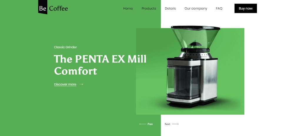
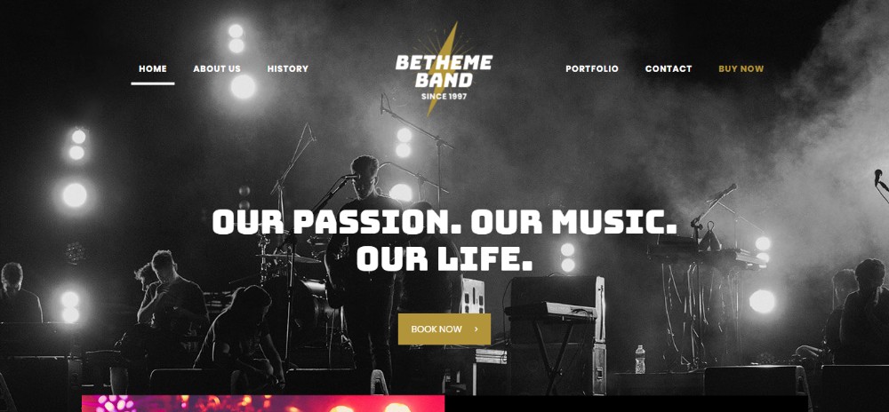
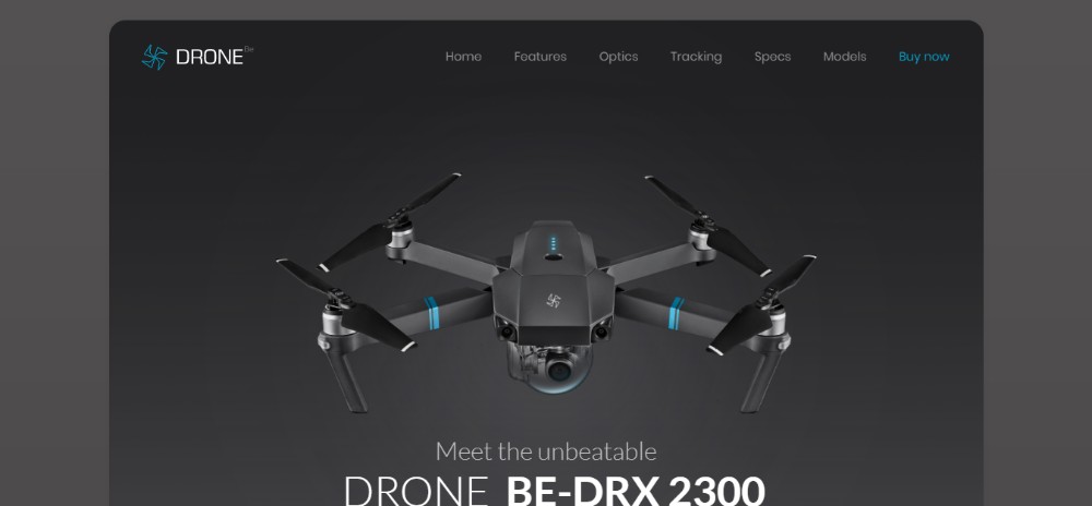
Be Theme has the largest library of pre-built websites on the market; more than 400 of them.

They’re organized by industry and/or content type. As demonstrated in the following examples.

How much experience have you had working with clients that own a gun range? Or, offer a product line of exotic coffee beans, lead a band or design drones?

BeGunRange
BeGunRange

BeCoffee3
BeCoffee3

BeBand3
BeBand3

BeDrone
BeDrone

You’re only professional if you design from scratch & pre-built websites are for beginners

Follow that argument and you’ll find yourself in all kinds of trouble. The reason? Do you design from scratch with the objective of becoming more professional? Then, you’re going about it backward.

You’ll risk setting standards for yourself that are difficult if not impossible to meet. This can lead to frustration, stress, and burnout. Plus, you’ll be sorely tempted to copy what true professionals are doing. That’s the exact opposite of creativity.

Write down “You’re only professional if …” on a piece of paper, light a match to it, and never give it another thought.

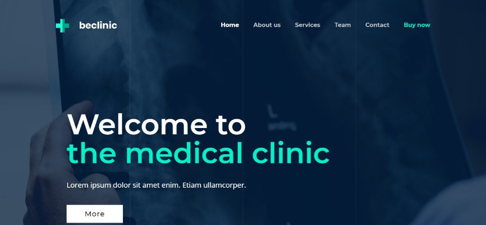
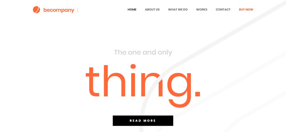
Being professional means delivering exactly what your clients need. Do that, and you’ll do fine. Learn what your clients are looking for and make that your number 1 priority. Creativity will follow.

Why wander outside the envelope to create an awesome special effect design? Especially, when your client wants something that’s a little understated.

BeClinic3
BeClinic3

BeCompany3
BeCompany3

BeSimple2
BeSimple2

Or even rather simple!

You have to put 110% effort into every project & if you can’t treat each client equally, you shouldn’t take clients at all

If as a student, you put 110% effort into a given area of study you should get a good grade. You can make a habit of trying to give 110% to every homework assignment from every class. Then, your grade point average is likely to plummet.

Calculus, English Lit, and Thermodynamics are different breeds of cat. So are your clients with their individual needs.

Yes, you can give a client a 110% effort; but you can’t do so for multiple clients. One may assign an easy task, and the next one may give you a back-breaker.

There are two things that can smooth things out a bit or a lot. One is teamwork, the other is pre-built websites. You can hand work over to a team member to lighten your load. You can use a pre-built website to get a project that addresses an unfamiliar topic off to a rousing start.

If you’re short on time, the budget you need isn’t all there. Or, you need to build a website for a beauty parlor client, but your talents lie in the home improvement area. Then, a pre-built website will see you through – and often in just a few hours.

Give 75% and let a pre-built website provide the additional 35%!

BeTailor2
BeTailor2

BeRenovate3
BeRenovate3

BeEcoBeef
BeEcoBeef

BeCakes
BeCakes

Conclusion

There’s absolutely nothing wrong with wanting to create designs from scratch. When you can do so and do so successfully, you’re going to feel very good about it.

Just don’t make the mistake that doing so is the best or only way to become more creative. That simply isn’t true, and you’ll only make things harder for yourself.

Don’t let others tell you that “You’re only professional if – blah, blah, blah – either. Give your clients what they want. Professionalism and enhanced creativity will follow as surely as night follows day.

As far as treating all jobs and all clients equally is concerned, it can’t be done. Pick your battles, design from scratch if an opportunity presents itself. Use pre-built websites (and use them freely). The latter is especially important any time you have an unusual project.

Browse Be’s pre-built website library and you quickly discover why all of this makes sense.


Best Christmas deal: Apple's 2018 iPad is now cheaper than on Black Friday

Original Source: http://feedproxy.google.com/~r/CreativeBloq/~3/2jns4LtboQc/best-christmas-deal-apples-2018-ipad-is-now-cheaper-than-on-black-friday

Fantastic Christmas iPad deal alert: if you missed out on picking up an iPad deal on Black Friday or Cyber Monday, it looks like your indecision (we can call if patience, if you like) has paid off. That's because the iPad 9.7 (2018) is on sale once again – and this time it's even cheaper than it was over the peak shopping period.

Right now, you can save up to $149 when you buy the iPad 2018 through Walmart. The same deal can also be found on Amazon, with both offering devices in a range of colours from $229. Earlier in the year we saw the price of these tablets slashed by $80, so with even more money off they're sure to be snapped up fast.

In the UK? There are some Christmas iPad deals to be found below, too.

Choose from iPads with 32GB or 128GB of storage. If you're hoping to have these before Christmas, make sure you check Amazon's delivery policies to avoid disappointment.

Check out the iPads and special deal prices below.

UK: Christmas iPad deals

Related articles:

The best cheap iPad deals in 201822 best painting and drawing apps for iPadThe best iPad stylus in 2018

Should You Use Gutenberg on Existing WordPress Websites?

Original Source: http://feedproxy.google.com/~r/1stwebdesigner/~3/TKFIU19ppys/

With the impending release of WordPress 5.0, the new Gutenberg editor will make its way onto millions of websites. It’s a big change in how content is created, stored and managed. Not to mention the potential compatibility issues that could crop up with some themes and plugins.

As the new editor prepares for full release, we should note that the “Classic” Editor will remain available as a plugin. Activating it will enable site owners to use it in conjunction with Gutenberg or bypass it completely.

Because the Classic Editor affords us a second path, it’s worth considering whether or not to take it. Gutenberg represents a big shift in how WordPress operates. The question becomes, is it really worth utilizing the new editor on an existing site, or is it better to stick with the tried-and-true Classic version?

To answer that question, there are several factors to consider. So, before you take the plunge and switch to Gutenberg, here are a few items you’ll want to think about.

The Past and Future of Your Content

The content on your existing website, along with the way you manage it, has already been established. Odds are that your pages and blog posts follow a specific format that was created long before Gutenberg came onto the scene.

With that in mind, consider whether or not you want to change things to reflect the new capabilities Gutenberg brings. For instance, you might have interest in refactoring your existing content to utilize features like full-width images or multi-column layouts.

However, sites that are heavy in content may require a lot of work to bring up to speed. It might consist of going through every piece of content and laying it out in the new block-based format. Gutenberg can automatically convert legacy posts to blocks, though you’re ultimately the one who will need integrate any customizations.

The other option would be to perhaps refactor some existing content, while focusing more on using Gutenberg for new items. In this case, maybe a few key pages could be formatted with the new editor. Then, all future blog posts would also be block-based.

Gutenberg shouldn’t harm or break any existing content, so you can use it in conjunction with the Classic Editor to format just the content you choose.

WordPress new post menu.

Is Your Site Customized?

When you built your website, you may very well have set things up to take advantage of the Classic Editor. Or, perhaps you used custom fields or a page builder plugin to allow for more complex layouts, etc.

If your site already sports custom methods for creating content, switching to Gutenberg could lead to some issues. Turning off a page builder, for example, may break custom layouts that were created with it. That again means refactoring everything to use the new editor.

Some page builder plugins are pledging Gutenberg compatibility and custom fields will still work as they always have. Even so, it may make sense to just stick with your current setup.

If you do decide to go with Gutenberg, make sure to test everything in a staging environment beforehand. You won’t want to encounter any unpleasant surprises on a production site.

Code editor

Workflow and Client Education

Gutenberg is a fairly intuitive tool, but it still has a learning curve. Think of a busy news site that has multiple authors. They probably have an existing content creation and editorial process. Throwing a completely different type of editor into mix could hurt efficiency in the short term.

Likewise, even a small brochure-style website can run into some detours. If your client is typically the one who manages content, they may also struggle to adapt to a different workflow. Blog posts that previously took just a few minutes could take significantly longer to create.

This is where web designers need to step in and provide a crash course on using Gutenberg. It can help to ensure that everyone is on the same page and has a basic understanding of how things work. The other potential bright side (for you) is that educating clients can result in some extra revenue.

Still, the adaptation content creators will need to make isn’t going to be seamless – even with education. Thus, you’ll need to weigh the benefits of using Gutenberg against those of keeping things as-is.

Sign that reads "New Skills Training".

Time for a Redesign?

Because Gutenberg presents such a fundamental change to using WordPress, you may lean towards holding off on implementing it on your existing site. However, if your site is also due for a redesign, it might offer the perfect opportunity to knock both items off of your to-do list.

Since this new tool is the future of the platform, optimizing your redesign to utilize it makes plenty of sense. It provides you with the chance to refactor content and educate clients. Even better is that you can implement these changes on a staging environment. This allows you to experiment and identify any pain points.

When the new site launches, you can be confident that everything is working as it should. Clients will have an understanding of their new workflow and the website will be better prepared for the future.

Making the Right Decision

Deciding whether or not to enable Gutenberg on your existing website takes some serious thought. In the end, it’s about whether or not the switch is going to benefit your particular site. If you’re really keen on the flexibility the editor offers, then it may be worth your while to use it right from the get-go.

However, there are situations where rolling with the changes may not be ideal. If content creation on your site is highly-customized or a change to your workflow isn’t in your plans, using the Classic Editor for the time being could be your best bet.

The Classic Editor plugin should be supported for “years to come”, meaning that you don’t have to rush into anything when it comes to Gutenberg. Knowing this, you may consider a plan to start fresh and utilize Gutenberg on both new and newly redesigned websites.

Regardless, it all comes down to making the right choice for your specific situation. Thankfully, WordPress enables us to easily go in either direction.


When to Use Old Code

Original Source: https://www.webdesignerdepot.com/2018/12/when-to-use-old-code/

COBOL is a programming language that was originally designed in 1959, an era that many people might think of as being “before computers”. That’s not true, of course; they just didn’t have computers at home. The language is still being used by some businesses on giant mainframe computers. It’s a bit like Linux: people interact with it every day, they just don’t know it.

The point here is simple: the world more or less runs on old code, and that’s not always a bad thing. We, as designers and front end developers, could learn a thing or two.

We generally think of older code as being slower and less secure. This actually varies greatly depending on the system in question. Hey, how many script kiddies do you know that could hack into anything running on COBOL, when they might not even know what it is? Sometimes old code is just more dependable.

All that work to get rounded corners into the spec, and we started using Metro-inspired flat design practically the next day

Now on the Front End, this is an issue of compatibility. IT departments around the world are doing a better job of updating their software, and most individuals use browsers that update themselves. Even so, there are some use cases when you can’t afford to let any potential user fall through the cracks. There will be times when certain bits of CSS3 just aren’t available to you, when you might have to go back to a float-based layout, or even—God forbid—back to XHTML. Pushing the envelope is fun, but there will be times when old code is just plain better better than a polyfill.

Hey, it’s not like we use rounded corners nearly as often as we used to, anyway. All that work to get rounded corners into the spec, and we started using Metro-inspired flat design practically the next day.

Government

Governments should ideally be using the latest, greatest, and most secure back end code, but they don’t. I mean, governments are known for being out of touch, and out of date. It’s sort of what they do. While this approach is often terrible for policy and backend code, it’s ironically kind of a boon to compatibility on the front end.

Anyone working in the government sector has a moral responsibility to make sure everything they make is backwards compatible enough for every single one of their constituents to access it. This includes people with aging family computers, even people whose only contact with the Internet happens in libraries, people who only have a smartphone, or what-have-you.

I mean, it’s government. When people cannot access the services a government provides, then government may as well not exist. In a case like this, a site that can be used on old browsers is literally a matter of public welfare.

Side Note: Internal Web Apps in Government and Publicly-funded Services

Have you ever seen a library’s online catalog that wasn’t a little ancient? Publicly-funded services like libraries wish they got the IT budgets that even stingy corporations are willing to front. Working on ten-year-old (or older) hardware is not at all uncommon. This happens in constituencies all over first world countries and the developing world alike, in small towns and big fancy states.

Don’t even get me started on federal agencies worldwide. If the department doesn’t generate massive revenue or bundles of good PR, chances are that they’ll get stiffed in the budget meetings. When it comes right down to it, politics affects UX. If you’re making something for internal use by a public service or governmental department, ask them what hardware they’re using. Ask to see their worst and oldest machines, because your website/app has to work on them.

Health Services

Whether it’s a site for a health insurance provider, a hospital’s internal management application, or just an app that helps you get to a health provider faster, backwards compatibility is an imperative. While doctors might get paid plenty, that’s not necessarily a guarantee for the IT departments, and people of every economic class get sick at some point.

It’s just that, not to put too fine a point on it, any hiccup in these systems in this context could literally kill people. It might be a rare thing, but what developer or designer wants even one death on their conscience? It puts a whole new kind of pressure on cross-browser layout testing.

Ecommerce and Other Generally Massive Sites

Thankfully, a site that doesn’t load for everyone in the wonderful world of ecommerce isn’t going to kill people… probably. All you have to lose is money. Of course, no one likes that.

Now small sites in general, and niche or luxury-focused ecommerce sites can get away with targeting a smaller number of browsers to maintain compatibility with. Any design researcher worth their salt will figure out what browsers their users prefer, and go with that.

The bigger your audience, though, the larger the number of people who use “non-standard” browsers. It’s just kind of how that goes. When the numbers get bigger like that, even if it’s only a few percentage points, it becomes less forgivable to ignore those users. This is especially true for publicly traded companies. Shareholders may not respond well to excuses like, “But who cares about Edge?”

Anywhere People Don’t Upgrade Their Hardware Often

Governments, public services, and hospitals aren’t the only places that get stuck with old hardware and software. It happens in companies all around the world. Administrators everywhere really seem to like their standardized systems, even when those systems might be a little out of date.

Companies big and small can end up feeling very afraid of change. In the big ones especially, one single day of having their systems out of commission represents a loss that, even if it would be a justified short-term sacrifice, feels too risky. Old hardware just comes with the territory.

You will, as always, have to assess each job as it comes. Some days you’ll be living in the future, and on others, well… 2009 was a simpler time. Enjoy the nostalgia.

Add Realistic Chalk and Sketch Lettering Effects with Sketch’it – only $5!

Source

p img {display:inline-block; margin-right:10px;}
.alignleft {float:left;}
p.showcase {clear:both;}
body#browserfriendly p, body#podcast p, div#emailbody p{margin:0;}

Use Placeit to Easily Create Professional-Quality Logos and More

Original Source: http://feedproxy.google.com/~r/1stwebdesigner/~3/rLCh30exjAA/

Your logo is the single most important design asset for your business. It has to immediately show the world who you are and what you do. That one image carries a lot of responsibility. That’s why it’s so important to get it right.

As a business owner, you have a couple of options for creating a great logo. You can choose to design it yourself from scratch – incredibly difficult if you aren’t already well-versed in graphics software. Or, you can hire a graphic designer – which can be expensive and requires a lot of back-and-forth. Either way, it’s unlikely that you’ll get something satisfactory without spending large amounts of time and money.

Thankfully, there’s now a better way. Using Placeit, you can create a stunning, custom logo for your business in just minutes. Their online logo maker makes the entire process fast, easy and incredibly affordable.

The Perfect Logo, Without the Hassle

The process for creating a logo is super simple. In fact, you don’t need to have any experience with professional software or techniques. Just how easy is it? The whole process can be completed in three quick steps:

Step #1: Choose Your Industry and Style

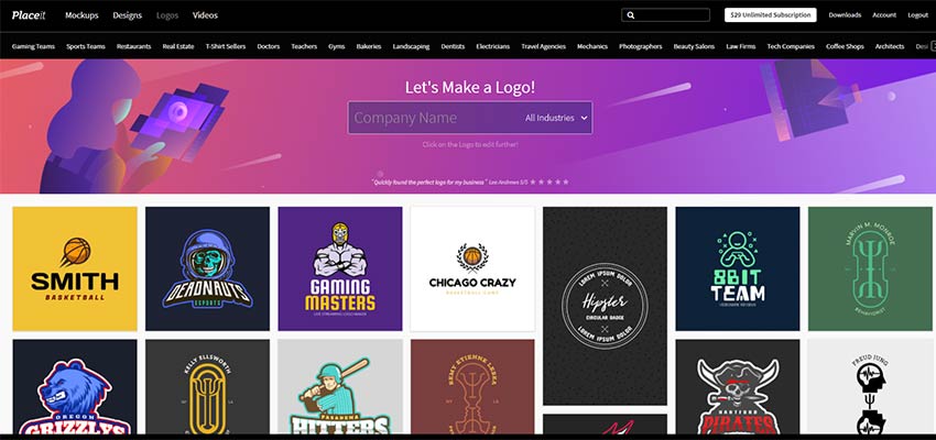
With Placeit, you not only have a tool that makes logo creation a breeze. You also have access to an enormous variety of styles and industries to choose from. So, whether you’re building a logo for a fitness studio, a restaurant or a sports team – you have the resources to make it happen. Pick the industry and style that suits your business and start creating!

Placeit logos cover a variety of industries and styles.

Step #2: Make It Your Own

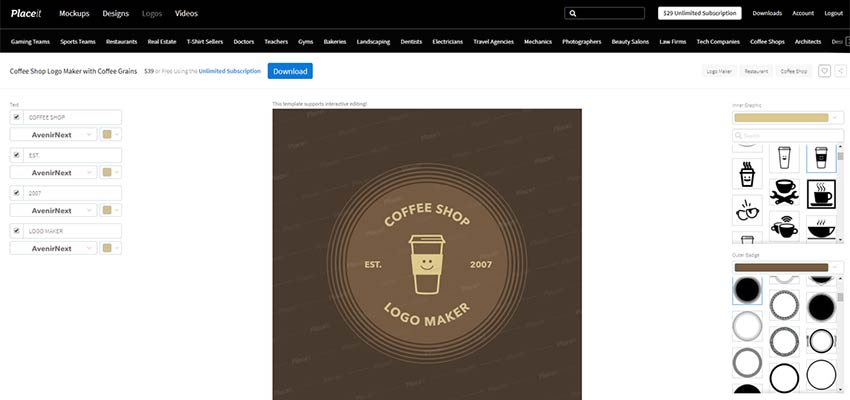
Once you find the right logo, click on it and you’ll be taken into the online logo maker. Virtually every aspect of your logo can be edited. Colors, borders, typography, imagery and content can all be changed with point-and-click ease. Want to adjust the sizing of an object? Click on it and use your mouse to expand or contract.

A Placeit logo concept for a coffee shop.

Feel free to tweak things as much as you want. You may even be surprised at how quickly everything comes together. You can literally go from a basic concept to a fully-customized logo within minutes.

A customized coffee shop logo.

Step #3: Download!

Once you’re satisfied with your creation, you can download your new logo. Just click on the blue “Download” button to get started. Placeit generates your custom image and emails you a download link when everything is ready to go.

The image you receive is very flexible. Since it’s 300 DPI, your logo will be perfect for both print and web use. That means you can show it off on a full range of branding materials, such as business cards, brochures and even t-shirts. And, of course, it will also look stunning on your website.

That’s all there is to it! With three easy steps, your business will have its own unique identity that reflects who you are. From there, you can focus on what you do best.

The final result: A custom coffee shop logo.

Build Your Brand with Placeit

Placeit puts you in the driver’s seat when it comes to logo creation. Their easy-to-use tools and professional results mean that you won’t have to invest an exorbitant amount of time and money. Instead, you’ll have the brand identity you need without the hassle.

You can build and download your own logo for just $39. Or, choose Placeit’s unlimited subscription plan for just $29 per month. You’ll have unlimited access to the online logo maker, along with a full suite of creative tools. Create product mockups, social media images and even video presentations with ease. All of your branding needs will be covered for one affordable price.

What are you waiting for? Start using Placeit today and build your brand to the fullest.


What Happened to Visual Composer? The Brain-Twisting Story of Our Confusing Name Change

Original Source: https://www.webdesignerdepot.com/2018/12/what-happened-to-visual-composer-the-brain-twisting-story-of-our-confusing-name-change/

If you’re familiar with Visual Composer, you may have witnessed a few big changes going on.

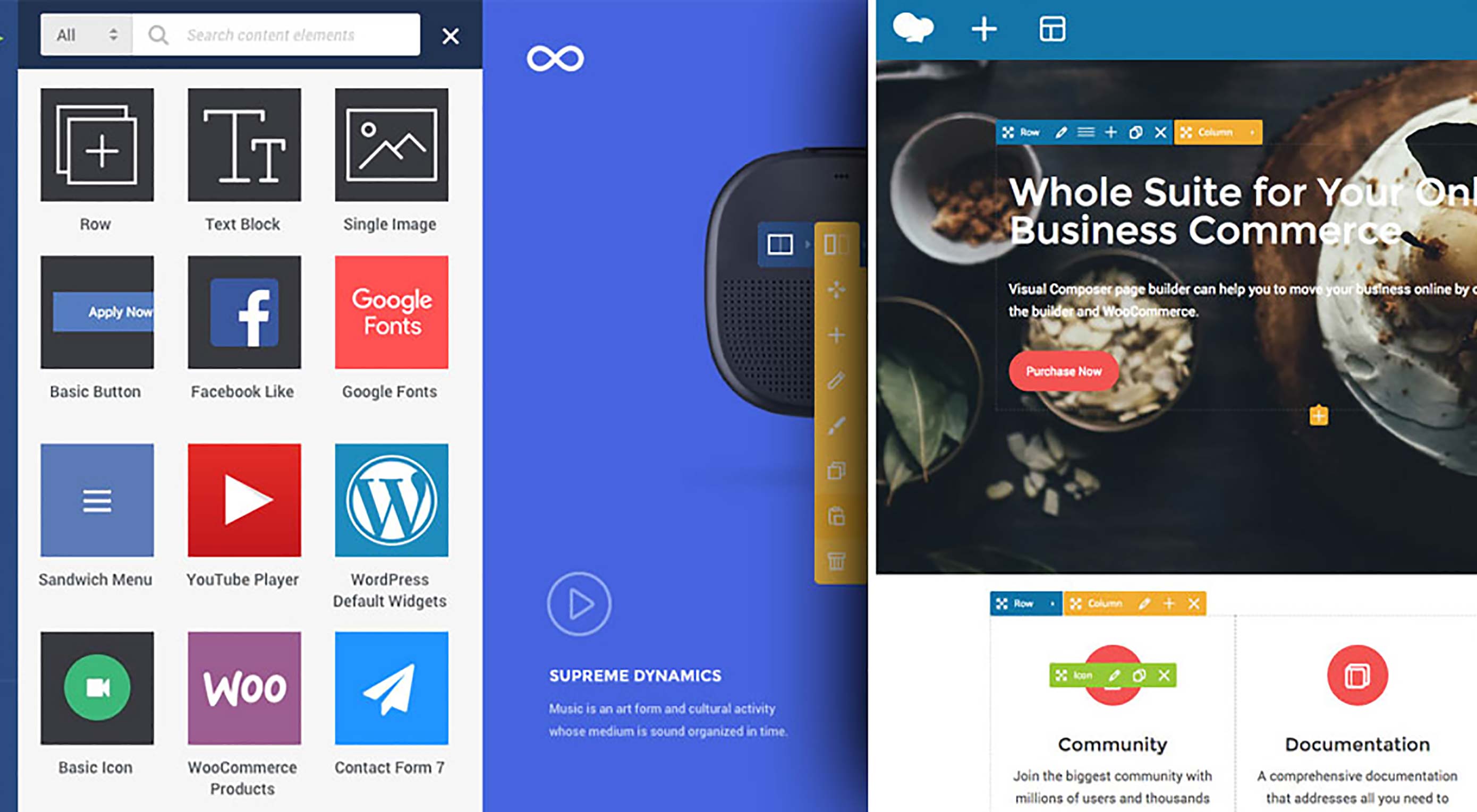
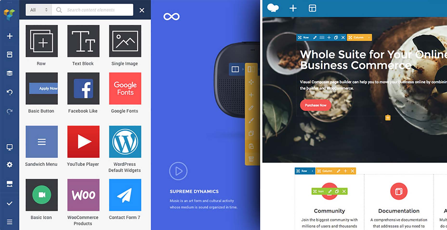
First, we changed the name of our Visual Composer Page Builder to WP Bakery. Then we launched a new product that’s called Visual Composer Website Builder.

And you’re probably wondering…

“What is going on? Which one is which?”

Is the Visual Composer Website Builder the same as the old Visual Composer? Is it a 2.0? Is WP Bakery a new product? Is it just rebranding (cause if it is, it’s a damn poor one)?

This confusion has upset many of our users, as well as our long-term partners.

And for good reasons.

What started as a minor problem quickly snowballed into a confusing mess that we did not handle right. Partly, because we got swallowed whole into the snowball and had to roll down with it. But also because we naively believed we could “fix it” (spoiler alert: we could not.)

So we decided to write this post for two big reasons.

First and foremost, we wanted to apologize for making an already messy situation worse. Ok, much worse.

We’re Deeply Sorry for the Confusion Created Around Visual Composer

And, most important, we’re sorry for not explaining what caused this mess from the very beginning.

Secondly, we wrote this post to finally explain what caused it from the very beginning.

As you’ll see, it’s quite a brain-twisting journey that led us onto this path. Things happened gradually, and the more we tried to “fix” problems along the way, the deeper they got.

Where It All Started: Changing the Name of Visual Composer Page Builder

You’ve probably seen that name dozens of times, on every major WP theme page. It was included as a premium plugin in many of your favorite themes.

So why would we decide all of the sudden to change the name our best-known product?

Short answer – we didn’t have a choice.

As for the long answer, you can watch the story unfold in the video or you can read it below.


It all began with our new product, the Visual Composer Website Builder.

This is a different tool from the Visual Composer Page Builder and we wanted to make that crystal clear to our users (clearly, that did NOT go according to plan).

The Page Builder was an Envato-exclusive product with lifetime license (like all products sold with Envato).

The Website Builder, our new product, was meant to go in a different direction.

We tried to move away from the lifetime license model, because our new product was more complex in features, and built for a growing part of our users whose website building needs have rapidly evolved.

All this and the new React.JS technical stack meant much higher development costs that could only be sustained with a yearly license model.

We also wanted to be directly in touch with our users to offer them stronger, faster support.

But what happened next was anything but what we had planned:

We Missed One Key Detail That Forced Us Into a Difficult Decision

And that “detail” was our contractual limitations with Envato. In short, we couldn’t sell another product under the name of Visual Composer outside their platform.

So we had to choose between 2 options:

1. We tone down our new product to fit the lifetime license model and put it up on the marketplace, or…

2. We change the name of the product we already had on Envato, Visual Composer Page Builder, so we could lift our contractual limitations.

So we thought long and hard about this, and eventually decided to change the name of the Visual Composer Page Builder, the plugin we had on the marketplace, to WP Bakery.

It was a tough decision, but it was the only way we could maintain the quality of our new product.

And That’s How the Visual Composer Page Builder Became WP Bakery

At this point, we were swamped with work on our new product and overwhelmed with all the unplanned changes.

We were in the eye of the storm and couldn’t see the big picture:

The massive confusion we had created for Visual Composer users.

People were not only confused about the name change from Visual Composer Page Builder to WP Bakery.

But they were completely puzzled about our new product, Visual Composer Website Builder.

They didn’t understand whether this was a rebranding of the old Page Builder or a totally new product.

And it’s 120% our fault.

That’s why we decided to walk you through the whole journey, in an effort to make things as clear as possible.

What is Visual Composer Website Builder and What Does it Do?

The Visual Composer Website Builder is a live-preview editor with drag-and-drop features.

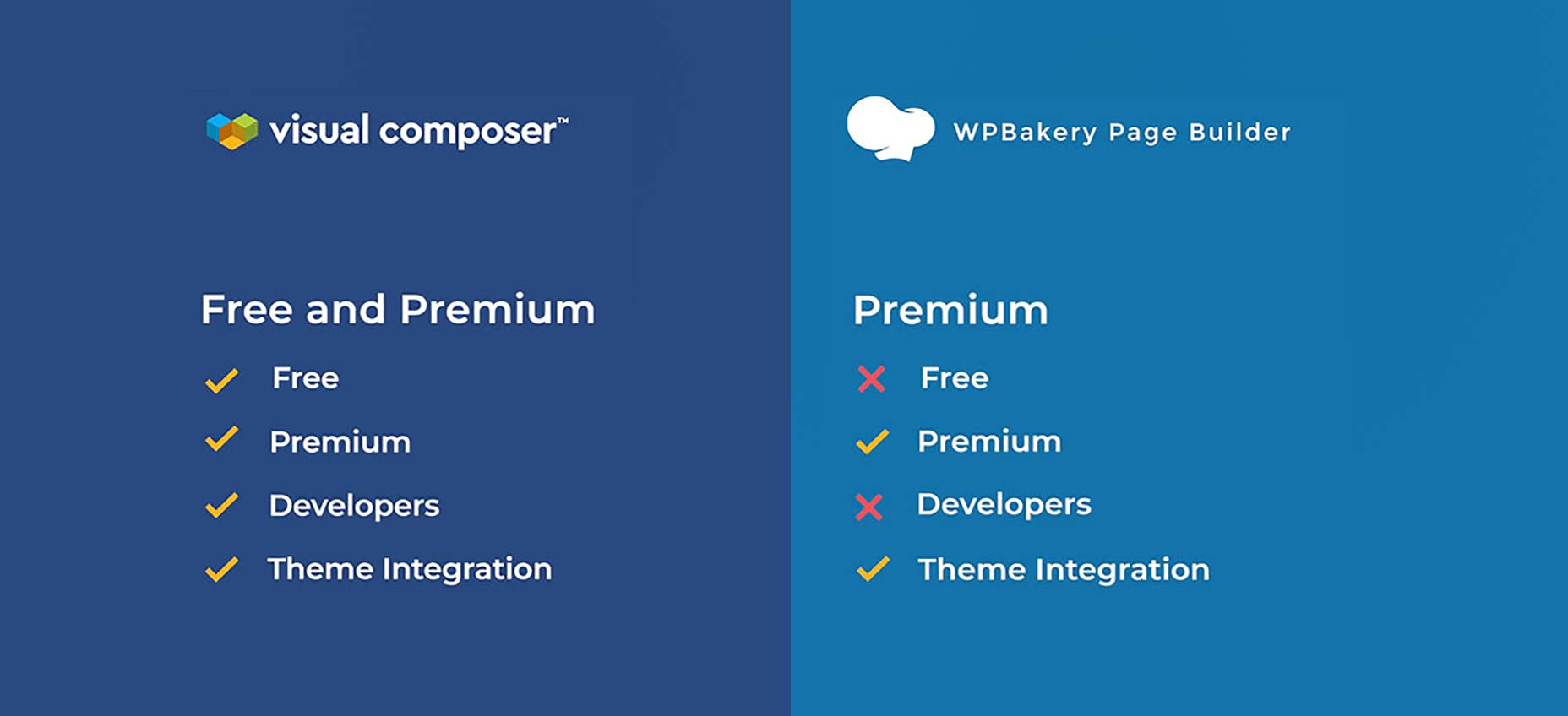
You have a free version and a Premium version with extra features (and more to be added next year).

There are hundreds of ready-to-use content elements to choose from, so you’ve got extra freedom to implement your vision.

You can play around with the drag-and-drop block and see your changes instantly (no more time wasted going back and forth).

You can use Visual Composer Website Builder with any theme, which means you can integrate it into your existing themes.

You can also choose from a handful of ready-to-use WordPress templates for different types of pages (landing pages, portfolios, corporate websites, product pages and many more).

We’ve set up two types of page editing: frontend editor and tree view. If you use the tree view, you’ll be able to navigate through the elements available on a page which speeds up the process.

A big plus: there’s a header, footer, and sidebar editor available in the Premium version of the product. You’ll also have access to a wide variety of add-ons (you can get them from the Visual Composer’s dedicated Hub or get them from third-party developers).

So What Exactly Are the Differences Between Visual Composer Website Builder and WP Bakery?

We got this question a lot lately, so I’d like to take an extra minute to explain these differences here.

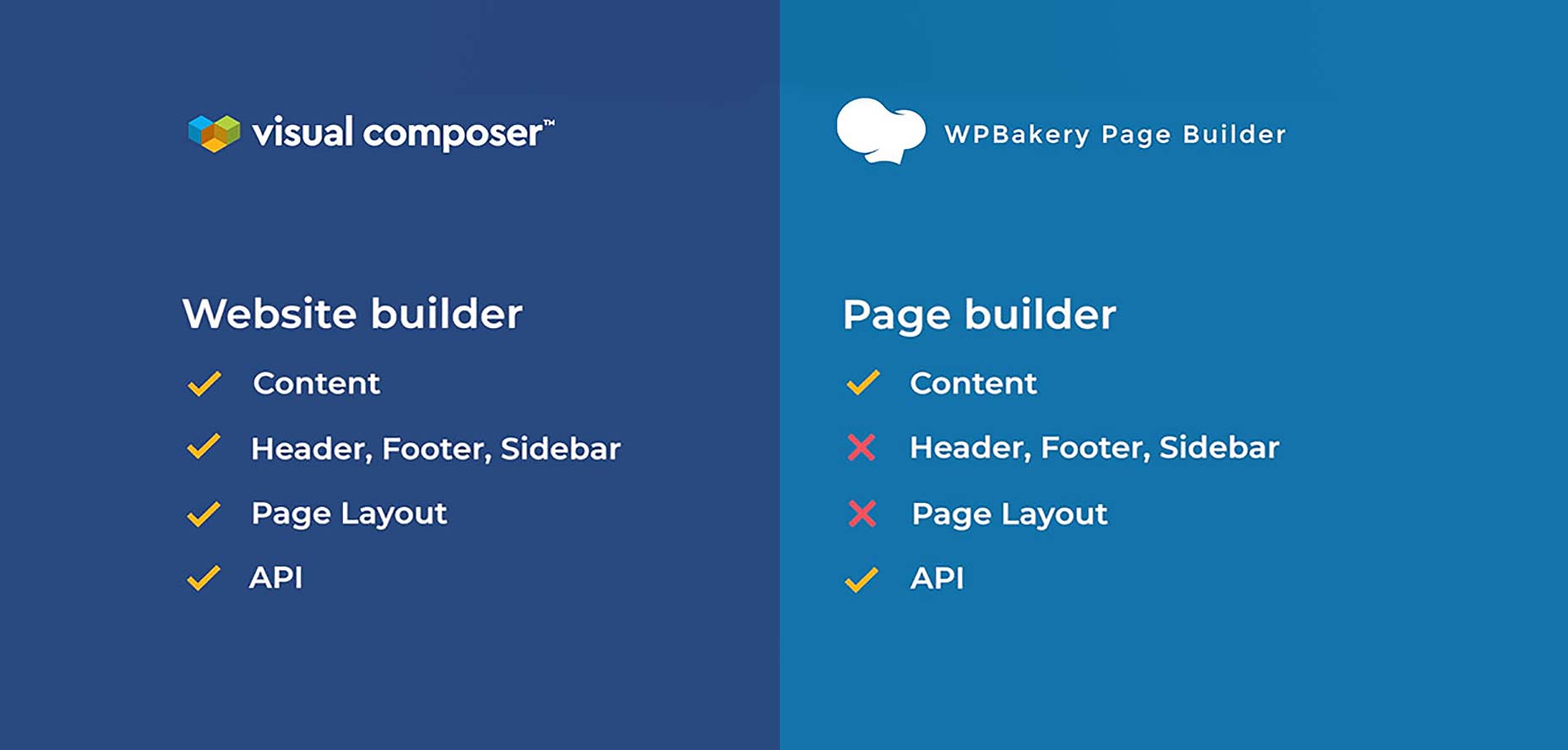
First of all, Visual Composer Website Builder is not the ‘premium’ version of WPBakery. It is a completely different product that incorporates the feedback we received from users in the past few years.

We wanted to help them achieve more with one single product, so we created the new product as a platform that can easily be extended according to the users’ needs and desires.

Visual Composer Website Builder’s code was built from zero with React.Js. It doesn’t use any of the WordPress shortcodes. This helps to achieve better performance.

A key difference between the two products is that WP Bakery is only for the content part, while Visual Composer Website Builder allows you to build a complete website (with Headers and Footers).

Another thing that sets the two apart is that WP Bakery is shortcode based, while Visual Composer Website Builder is not.

This helps you in two ways:

it allows you to generate clean code;
it doesn’t get messy if you disable the plugin (like it happens with shortcode-based plugins).

Finally, Visual Composer Website Builder comes with a cloud-based Hub. From which you can download only the elements you need. As a result, you don’t bloat your website with unwanted assets.

There’s a full list of the difference between the two products that you can check right here.

And if you have any questions, please leave a comment and we’ll try to clarify things for you as well as possible.

Thank you for reading this – we really appreciate you taking the time to walk through this journey with us.


[– This is a sponsored post on behalf of Visual Composer –]

Add Realistic Chalk and Sketch Lettering Effects with Sketch’it – only $5!

Source

p img {display:inline-block; margin-right:10px;}
.alignleft {float:left;}
p.showcase {clear:both;}
body#browserfriendly p, body#podcast p, div#emailbody p{margin:0;}

Don’t Pay To Speak At Commercial Events

Original Source: https://www.smashingmagazine.com/2018/12/state-of-commercial-web-conferences-events/

Don’t Pay To Speak At Commercial Events

Don’t Pay To Speak At Commercial Events

Vitaly Friedman

2018-12-17T14:15:00+01:00
2018-12-17T15:36:31+00:00

Setting up a conference isn’t an easy undertaking. It takes time, effort, patience, and attention to all the little details that make up a truly memorable experience. It’s not something one can take lightly, and it’s often a major personal and financial commitment. After all, somebody has to build a good team and make all those arrangements: flights, catering, parties, badges, and everything in between.

The work that takes place behind the scenes often goes unnoticed and, to an extent, that’s an indication that the planning went well. There are hundreds of accessible and affordable meet-ups, community events, nonprofit events, and small local groups — all fueled by incredible personal efforts of humble, kind, generous people donating their time on the weekends to create an environment for people to share and learn together. I love these events, and I have utter respect and admiration for the work they are doing, and I’d be happy to speak at these events and support these people every day and night, with all the resources and energy I have. These are incredible people doing incredible work; their efforts deserve to be supported and applauded.

Unlike these events, commercial and corporate conferences usually target companies’ employees and organizations with training budgets to send their employees for continuing education. There is nothing wrong with commercial conferences per se and there is, of course, a wide spectrum of such events — ranging from single-day, single-track gatherings with a few speakers, all the way to week-long multi-track festivals with a bigger line-up of speakers. The latter tend to have a higher ticket price, and often a much broader scope. Depending on the size and the reputation of the event, some of them have more or less weight in the industry, so some are perceived to be more important to attend or more prestigious to speak at.

Both commercial and non-commercial events tend to have the so-called Call For Papers (CFPs), inviting speakers from all over the world to submit applications for speaking, with a chance of being selected to present at the event. CFPs are widely accepted and established in the industry; however, the idea of CFPs is sometimes challenged and discussed, and not always kept in a positive light. While some organizers and speakers consider them to lower the barrier for speaking to new talent, for others CFPs are an easy way out for filling in speaking slots. The argument is that CFPs push diversity and inclusion to a review phase, rather than actively seeking it up front. As a result, accepted speakers might feel like they have been “chosen” which nudges them into accepting low-value compensation.

The key to a fair, diverse and interesting line-up probably lies somewhere in the middle. It should be the organizer’s job to actively seek, review, and invite speakers that would fit the theme and the scope of the event. Admittedly, as an organizer, unless you are fine with the same speakers appearing at your event throughout the years, it’s much harder to do than just setting up a call for speakers and wait for incoming emails to start showing up. Combining thorough curation with a phase of active CFPs submission probably works best, but it’s up to the organizer how the speakers are “distributed” among both. Luckily, many resources are highlighting new voices in the industry, such as WomenWhoDesign which is a good starting point to move away from “usual suspects” from the conference circuit.

Web forms are such an important part of the web, but we design them poorly all the time. The brand new Form Design Patterns book is our new practical guide for people who design, prototype and build all sorts of forms for digital services, products and websites. The eBook is free for Smashing Members.

Check the table of contents ↬
Form Design Patterns — a practical guide for anyone who needs to design and code web forms

Many events strongly and publicly commit to creating an inclusive and diverse environment for attendees and speakers with a Code of Conduct. The Code of Conduct explains the values and the principles of conference organizers as well as contact details in case any conflict or violation appears. The sheer presence of such a code on a conference website sends a signal to attendees, speakers, sponsors, and the team that there had been given some thought to creating an inclusive, safe, and friendly environment for everybody at the event. However, too often at commercial events, the Code of Conduct is considered an unnecessary novelty and hence is either neglected or forgotten.

Now, there are wonderful, friendly, professional, well-designed and well-curated commercial events with a stellar reputation. These events are committed to diverse and inclusive line-ups and they always at least cover speaker’s expenses, flights, and accommodation. The reason why they’ve gained reputation over years is because organizers can afford to continuously put their heart and soul into running these events year after year — mostly because their time and efforts are remunerated by the profit the conference makes.

Many non-commercial events, fueled by great ideas and hard work, may succeed the first, second, and third time, but unfortunately, it’s not uncommon for them to fade away just a few years later. Mostly because setting up and maintaining the quality of such events takes a lot of personal time, effort and motivation beyond regular work times, and it’s just really hard to keep it up without a backbone of a strong, stable team or company behind you.

Some conferences aren’t quite like that. In fact, I’d argue that some conferences are pretty much the exact opposite. It’s more likely for them to allocate resources in outstanding catering and lighting and video production on site rather than the core of the event: the speaker’s experience. What lurks behind the scenes of such events is a toxic, broken conference culture despite the hefty ticket price. And more often than not, speakers bear the burden of all of their conference-related expenses, flights, and accommodation (to say nothing of the personal and professional time they are already donating to prepare, rehearse, and travel to and from the event) from their own pockets. This isn’t right, and it shouldn’t be acceptable in our industry.

The Broken State Of Commercial Conferences

Personally, I’ve been privileged to speak at many events over the years and, more often than not, there was a fundamental mismatch between how organizers see speaking engagements and how I perceive them. Don’t get me wrong: speaking at tech conferences has tremendous benefits, and it’s a rewarding experience, full of adventures, networking, traveling, and learning; but it also takes time and effort, usually away from your family, your friends, and your company. For a given talk, it might easily take over 80 hours of work just to get all the research and content prepared, not to mention rehearsal and traveling time. That’s a massive commitment and time investment.

But many conference organizers don’t see it this way. The size of the event, with hundreds and thousands of people attending the conference, is seen as a fair justification for the lack of speaker/training budgets or diversity/student scholarships. It’s remarkably painful to face the same conversations over and over and over again: the general expectation is that speakers should speak for free as they’ve been given a unique opportunity to speak and that neither flights nor expenses should be covered for the very same reason.

It’s sad to see invitation emails delicately avoiding or downplaying the topics of diversity, honorarium, and expenses. Instead, they tend to focus on the size of the event, the brands represented there, the big names that have spoken in the past, and the opportunities such a conference provides. In fact, a good number of CFPs gently avoid mentioning how the conference deals with expenses at all. As a result, an applicant who needs their costs to be covered is often discriminated against, because an applicant, whose expenses will be covered by their company is preferred. Some events explicitly require unique content for the talk, while not covering any speaker expenses, essentially asking speakers to work for free.

Speaker stage at BTConf

Preparing for a talk is a massive commitment and time investment. Taking care of the fine details such as the confidence monitor and countdown on stage is one of those little things. (Large preview) (Image source: beyond tellerrand)

It’s disappointing (upon request) to receive quick-paced replies explaining that there isn’t really any budget for speakers, as employers are expected to cover flights and accommodation. Sometimes, as a sign of good faith, the organizers are happy to provide a free platinum pass which would grant exclusive access to all conference talks across all tracks (“worth $2500” or so). And sometimes it goes so far as to be exploitative when organizers offer a “generous” 50% discount off the regular ticket price, including access to the speakers’ lounge area where one could possibly meet “decision makers” with the opportunity and hope of creating unique and advantageous connections.

It’s both sad and frustrating to read that “most” speakers were “happy to settle for only a slot at the conference.” After all, they are getting an “incredible amount of exposure to decision makers.” Apparently, according to the track record of the conference, it “reliably” helped dozens of speakers in the past to find new work and connect with new C-level clients. Once organizers are asked again (in a slightly more serious tone), suddenly a speaker budget materializes. This basically means that the organizers are willing to pay an honorarium only to speakers that are actually confident enough to repeatedly ask for it.

And then, a few months later, it’s hurtful to see the same organizers who chose not to cover speaker expenses, publishing recordings of conference talks behind a paywall, further profiting from speakers’ work without any thought of reimbursing or subsidizing speakers’ content they are repackaging and reselling. It’s not uncommon to run it all under the premise of legal formalities, asking the speaker to sign a speaker’s contract upon arrival.

As an industry, we should and can be better than that. Such treatment of speakers shows a fundamental lack of respect for time, effort, and work done by knowledgeable and experienced experts in our industry. It’s also a sign of a very broken state of affairs that dominates many tech events. It’s not surprising, then, that web conferences don’t have a particularly good reputation, often criticized for being unfair, dull, a scam, full of sponsored sessions, lacking diversity or a waste of money.

Speakers, Make Organizers Want To Invite You

On a personal note, throughout all these years, I have rarely received consultancy projects from “exposure” on stage. More often than not, the time away from family and company costs much more than any honorarium provided. Neither did I meet many “decision-makers” in the speaker lounge as they tend to delicately avoid large gatherings and public spaces to avoid endless pitches and questions. One thing that large conferences do lead to is getting invitations to more conferences; however, expecting a big client from a speaking engagement at corporate events has proved to be quite unrealistic for me. In fact, I tend to get way more work from smaller events and meet-ups where you actually get a chance to have a conversation with people located in a smaller, intimate space.

Of course, everybody has their own experiences and decides for themselves what’s acceptable for them, yet my personal experience taught me to drastically lower my expectations. That’s why after a few years of speaking I started running workshops alongside the speaking engagements. With a large group of people attending a commercial event, full-day workshops can indeed bring a reasonable revenue, with a fair 50% / 50% profit split between the workshop coach and the conference organizer.

Admittedly, during the review of this article, I was approached by some speakers who have had very different experiences; they ended up with big projects and clients only after an active phase of speaking at large events. So your experience may vary, but the one thing I learned over the years is that it’s absolutely critical to keep reoccurring in industry conversations, so organizers will seize an opportunity to invite you to speak. For speakers, that’s a much better position to be in.

If you’re a new speaker, consider speaking for free at local meet-ups; it’s fair and honorable — and great training for larger events; the smaller group size and more informal setting allows you seek valuable feedback about what the audience enjoyed and where you can improve. You can also gain visibility through articles, webinars, and open-source projects. And an email to an organizer, featuring an interesting topic alongside a recorded talk, articles and open source projects can bring you and your work to their attention. Organizers are looking for knowledgeable and excited speakers who love and live what they are doing and can communicate that energy and expertise to the audience.

Of course, there may be times when it is reasonable to accept conditions to get an opportunity to reach potential clients, but this decision has to be carefully considered and measured in light of the effort and time investment it requires. After all, it’s you doing them a favor, not the other way around. When speaking at large commercial conferences without any remuneration, basically you are trading your name, your time and your money for the promise of gaining exposure while helping the conference sell tickets along the way.

Organizers, Allocate The Speaking Budget First

I don’t believe for a second that most organizers have bad intentions; nor do I believe that they mean to cut corners at all costs to maximize profit. From my conversations with organizers, I clearly see that they share the same goals that community events have, as they do their best to create a wonderful and memorable event for everybody involved, while also paying the bills for all the hard-working people who make the event happen. After all, the conference business isn’t an easy one, and you hardly ever know how ticket sales will go next year. Still, there seems to be a fundamental mismatch of priorities and expectations.

Setting up a conference is an honorable thought, but you need a comprehensive financial plan of what it costs and how much you can spend. As mentioned above, too many promising events fade away because they are powered by the motivation of a small group of people who also need to earn money with their regular job. Conference organizers deserve to get revenue to share across the team, as working on a voluntary basis is often not sustainable.

Sarah Drasner presenting on stage at ColdFront 2018

All organizers have the same goal: to create wonderful, memorable events for everybody involved. (Large preview) (Image source: ColdFront)

To get a better understanding of how to get there, I can only recommend the fantastic Conference Organizer’s Handbook by Peter-Paul Koch, which covers a general strategy for setting up a truly professional event from planning to pricing to running it — without burning out. Bruce Lawson also has prepared a comprehensive list of questions that could be addressed in the welcome email to speakers, too. Plus, Lara Hogan has written an insightful book on Demystifying Public Speaking which I can only highly encourage to look at as well.

Yes, venues are expensive, and yes, so is catering, and yes, so is AV and technical setup. But before allocating thousands on food, roll-ups, t-shirts, and an open bar, allocate decent budgets for speakers first, especially for new voices in the industry — they are the ones who are likely to spend dozens or hundreds of hours preparing that one talk.

Jared Spool noted while reviewing this article:

“The speaking budget should come before the venue and the catering. After all, the attendees are paying to see the speakers. You can have a middling venue and mediocre catering, but if you have an excellent program, it’s a fabulous event. In contrast, you can have a great venue and fantastic food, but if the speakers are boring or off topic, the event will not be successful. Speaking budgets are an investment in the value of the program. Every penny invested is one that pays back in multiples. You certainly can’t say the same for venue or food.”

No fancy bells and whistles are required; speaker dinners or speaker gifts are a wonderful token of attention and appreciation but they can’t be a replacement for covering expenses. It’s neither fair nor honest to push the costs over to speakers, and it’s simply not acceptable to expect them to cover these costs for exposure, especially if a conference charges attendees several hundred Euros (or Dollars) per ticket. By not covering expenses, you’re depriving the industry of hearing from those groups who can’t easily fund their own conference travel — people who care for children or other relatives; people with disabilities who can’t travel without their carer, or people from remote areas or low-income countries where a flight might represent a significant portion of even multiple months of their income.

Jared continues:

“The formula is:

Break_Even = Fixed_Costs/(Ticket_Price – Variable_Costs)

Costs, such as speakers and venue are the biggest for break-even numbers. Catering costs are mostly variable costs and should be calculated on a per-attendee basis, to then subtract them from the price. To calculate the speaker budget, determine what the ticket price and variable per-attendee costs are up front, then use the net margin from that to figure out how many speakers you can afford, by diving net margin into the total speaker budget. That will tell you how many tickets you must sell to make a profit. (If you follow the same strategy for the venue, you’ll know your overall break even and when you start making profit.) Consider paying a bonus to speakers who the audience rates as delivering the best value. Hence, you’re rewarding exactly what benefits the attendees.”

That’s a great framework to work within. Instead of leaving the speaker budget dependent on the ticket sales and variable costs, set the speaker budget first. What would be a fair honorarium for speakers? Well, there is no general rule of how to establish this. However, for smaller commercial events in Europe, it’s common to allocate the price of 3–5 tickets on each speaker. For a large conference with hundreds and thousands of attendees, three tickets should probably be a minimum, but it would also have to be distributed among simultaneous talks and hence depend on the number of tracks and how many attendees are expected per talk.

Attendees at the performance.now() conference in Amsterdam, 2018

Dear organizers, options matter. Keep in mind to label food (e.g. vegan/vegetarian, and so on). It’s the little details that matter most. (Large preview) (Image source: performance.now())

Provide an honorarium, even if it isn’t much. Also, ask speakers to collect all receipts, so you can cover them later, or provide a per diem (flat daily expenses coverage) to avoid the hassle with receipts. As a standard operating procedure, suggest buying the flight tickets for the speaker unless they’d love to do it on their own. Some speakers might not have the privilege to spend hundreds of dollars for a ticket and have to wait months for reimbursement. Also, it’s a nice gesture to organize pre-paid transport from and to the airport, so drivers with a sign will be waiting for a speaker at the arrival area. (There is nothing more frustrating than realizing that your cabbie accepts only local cash to pay for the trip — and that after a frustrating flight delay arriving late at night.)

Once all of these costs are covered, consider providing a mentor to help newcomers draft, refine, adjust, review and iterate the talk a few times, and set aside a separate time when they could visit the venue and run through their slides, just to get a feeling of what it’s going to be like on stage.

On a positive side, if you’ve ever wondered about a high speakers’ drop-out rate at your event, not covering expenses might be a good reason for it. If speakers are paying on their own, you shouldn’t expect them to treat the speaking engagement as a priority.

As Laurie Barth noted when reviewing this article:

“If you aren’t paid for your time, then you likely have less unpaid time to give to preparing your talk and/or have less incentive to prioritize the travel and time for the talk.”

The time, work, effort, and commitment of your speakers are what make the conference a success.

Organizer’s Checklist

Cover all speaker’s expenses by default, and outline what’s included from the very start (in invitation letters) and before someone invests their time in completing a CFP form;
Avoid hassle with receipts, and offer at least a flat per diem;
Suggest buying the flight tickets for the speaker rather than reimbursing later, and organize pre-paid transport pick-up if applicable,
Allocate budgets and honorarium for speakers, coaching and mentoring early on. Good content is expensive, and if your ticket prices can’t cover it, refine the conference format to make it viable;
Provide an option to donate an honorarium and expenses covered by companies towards diversity/student scholarship;
As a principle, never accept voiding the honorarium. If the speaker can’t be paid or their expenses can’t be covered, dedicate the funds to the scholarship or a charity, and be public about it;
Be honest and sincere about your expectations, and explain which expenses you cover and which not up front in the CFP or in the speaking invitation.

Speakers, Ask Around Before Agreeing To Speak

Think twice before submitting a proposal to conferences that don’t cover at least your costs despite a high ticket price. It’s not acceptable to be asked to pay for your own travel and accommodation. If an event isn’t covering your expenses, then you are paying to speak at their event. It might seem not to matter much if your time and expenses are covered by your employer but it puts freelancers and new speakers at a disadvantage. If your company is willing to pay for your speaking engagement, ask the organizers to donate the same amount to a charity of your choice, or sponsor a diversity/student scholarships to enable newcomers to speak at the event.

Come up with a fair honorarium for your time given your interest and the opportunity, and if possible, make exceptions for nonprofits, community events, or whenever you see a unique value for yourself. Be very thorough and selective with conferences you speak at, and feel free to ask around about how other speakers have been treated in the past. Look at past editions of the event and ask speakers who attended or spoke there about their experience as well as about the reputation of the conference altogether.

If you are new to the industry, asking around could be quite uncomfortable, but it’s actually a common practice among speakers, so they should be receptive to the idea. I’m very confident that most speakers would be happy to help, and I know that our entire team — Rachel, Bruce, me and the entire Smashing Crew would love to help, anytime.

Before committing to speak at a conference, ask questions. Ethan Marcotte has prepared a useful little template with questions about compensation and general treatment of speakers (thanks to Jared for the tip!). Ask about the capacity and expected attendance of the conference, and what the regular price of the ticket is. Ask what audience is expected, and what profile they have. Ask about conference accessibility, i.e. whether there will be talk captioning/transcripts available to the audience, or even sign language interpreters. Ask if there is a commitment to a diverse line-up of speakers. Ask if other speakers get paid, and if yes, how much. Ask if traveling and accommodation are covered for all speakers, by default. Ask if there is a way to increase honorarium by running a workshop, a review session or any other activities. Since you are dedicating your time, talents, and expertise to the event, think of it as your project, and value the time and effort you will spend preparing. Decide what’s acceptable to you and make exceptions when they matter.

Speaker presenting on stage at the ColdFront conference in 2018

Dear speakers, feel free to ask how other speakers have been treated in the past. It’s your right; don’t feel uncomfortable for asking what is important to you and want to know beforehand. (Large preview) (Image source: ColdFront)

As you expect a fair treatment by organizers, also treat organizers the same way. Respect organizers’ time and efforts. They are covering your expenses, but it doesn’t mean that it’s acceptable to spend a significant amount without asking for permission first. Obviously, unexpected costs might come up, and personal issues might appear, and most organizers will fully understand that. But don’t use the opportunity as a carte blanche for upscale cocktails or fancy meals — you probably won’t be invited again. Also, if you can’t come to speak due to occurring circumstances, suggest a speaker that could replace your session, and inform the organizer as soon as you are able to upfront.

Speaker’s Checklist

Think twice before applying to a large commercial event that doesn’t cover your expenses;
If your company is covering expenses, consider asking organizers to donate the same amount to a charity of your choice, or sponsor a diversity/student scholarship;
Be very thorough and selective with conferences you speak at, and ask how other speakers have been treated in the past;
Prepare a little template of questions to ask an organizer before confirming a speaking engagement;
Support nonprofits and local events if you can dedicate your time to speak for free;
Choose a fair honorarium for a talk, and decide on case-by-case basis;
Ask whether videos will be publicly available,
Ask about conference accessibility, i.e. whether there will be talk captioning/transcripts, or sign language interpreters,
Treat organizers with respect when you have to cancel your engagement or modify your arrangements.

Our Industry Deserves Better

As an attendee, you always have a choice. Of course, you want to learn and get better, and you want to connect with wonderful like-minded people like yourself. However, be selective choosing the conference to attend next. More often than not, all the incredible catering and free alcohol all night long might be carried on the shoulders of speakers speaking for free and paying their expenses from their own pockets. Naturally, conferences that respect speakers’ time and professional skills compensate them and cover their expenses.

So support conferences that support and enable tech speakers. There are plenty of them out there — it just requires a bit more effort to explore and decide which event to attend next. Web conferences can be great, wonderful, inspirational, and friendly — regardless of whether they are large commercial conferences of small community-driven conferences — but first and foremost they have to be fair and respectful while covering the very basics first. Treating speakers well is one of these basics.

Editorial’s recommended reading:

Getting Started In Public Speaking, by Rachel Andrew,
Conference Organizer’s Handbook, by Peter-Paul Koch,
My Questions For Event Organizers by Ethan Marcotte,
How To Invite A Conference Speaker, by Bruce Lawson,
Demystifying Public Speaking, a book by Lara Hogan,
Respect Always Comes First by yours truly.

I’d like to kindly thank Rachel Andrew, Bruce Lawson, Jesse Hernandez, Amanda Annandale, Mariona Ciller, Sebastian Golasch, Jared Spool, Peter-Paul Koch, Artem Denysov, Markus Gebka, Stephen Hay, Matthias Meier, Samuel Snopko, Val Head, Rian Kinney, Jenny Shen, Luc Poupard, Toni Iordanova, Lea Verou, Niels Leenheer, Cristiano Rastelli, Sara Soueidan, Heydon Pickering, David Bates, Mariona C. Miller, Vadim Gorbachev, David Pich, Patima Tantiprasut, Laurie Barth, Nathan Curtis, Ujjwal Sharma, Lea Verou, Jesse Hernandez, Amanda Annandale, Benjamin Hong, Bruce Lawson, Matthias Ott, Scott Gould, Charis Rooda, Zach Leatherman, Marcy Sutton, Bertrand Lirette, Roman Kuba, Eva Ferreira, Sara Soueidan, Joe Leech, Yoav Weiss, Markus Seyfferth and Bastian Widmer for reviewing the article.

Smashing Editorial
(ra, il)

Why More Web Designers Should Give Pre-built Websites a Try

Original Source: https://www.sitepoint.com/why-more-web-designers-should-give-pre-built-websites-a-try/

This sponsored article was created by our content partner, BAW Media. Thank you for supporting the partners who make SitePoint possible. There’s a heated and seemingly never-ending debate in the web design industry about whether web designers should always start their design work from scratch or not. Another option comprises taking advantage of what pre-built […]

The post Why More Web Designers Should Give Pre-built Websites a Try appeared first on SitePoint.