Using the WordPress Settings API to Build a Custom Admin Page

Original Source: https://www.sitepoint.com/wordpress-settings-api-build-custom-admin-page/

In this guide, we’ll introduce the WordPress Settings API, and create a WordPress administration page where we demonstrate the use of this API.

For the purposes of this tutorial, we’ll wrap this functionality into a plugin, but this can also be a part of a WordPress theme.

As the WordPress Codex says, the Settings API was added in WordPress 2.7 to streamline adding different settings fields and sections in administration pages.

Creating the Plugin

To start, we’ll create and activate a plugin to encapsulate our options page. We’ll use WP CLI to simplify the creation, although this leaves us with way more files than this guide needs.

<!–

Creating and activating a plugin in the command line to encapsulate our options page
–>

As we can see, we use wp scaffold plugin pluginname to create the plugin. Once it’s created, we activate it — optionally also using WP CLI, with wp plugin activate pluginname.

Once it’s activated, we open the main plugin file — in this case sitepoint-settings-api.php.

Creating the Admin Page

It isn’t necessary to use WP CLI for this plugin. We could have simply created a directory with the name of the plugin, and the PHP file inside it with the same name. Anyhow, the creation of the plugin has left us with a sitepoint-settings-api.php which looks like this:

<?php
/**
* Plugin Name: Sitepoint Settings Api
* Plugin URI: PLUGIN SITE HERE
* Description: PLUGIN DESCRIPTION HERE
* Author: YOUR NAME HERE
* Author URI: YOUR SITE HERE
* Text Domain: sitepoint-settings-api
* Domain Path: /languages
* Version: 0.1.0
*
* @package Sitepoint_Settings_Api
*/
~

Now we can simply add code after the comment end.

To add our options page, we’ll use add_options_page() (more details about it here). This function takes arguments as follows:

add_options_page( $page_title, $menu_title, $capability,
$menu_slug, $function );

All the arguments are self-explanatory. $menu_slug must be a unique string that WordPress will use internally, but will also be reflected in the URL. $function is a string with a name of the function that will provide HTML output for our admin page.

We will, therefore, add the following code to our plugin file:

add_action( ‘admin_menu’, ‘sitepoint_settings_page’ );

function sitepoint_settings_page() {
add_options_page( ‘Settings API Page’, ‘Settings API Page’, ‘manage_options’, ‘settings-api-page’, ‘settings_api_page’ );
}

After we’ve saved the file (presuming we activated our plugin), we’ll open our administration dashboard, and we’ll find our Settings API Page under Settings in the left side menu.

We can control, to a degree, the order or position of the submenu item by adding a priority argument to our add_action() function:

add_action( ‘admin_menu’, ‘sitepoint_settings_page’, 1 );

If we want to have our menu item to be in the root menu — rather than the Settings submenu — we’ll use add_menu_page(), which takes similar arguments.

Now, if we open the page in our browser, all we’ll see is an empty page, because we still haven’t created the settings_api_page() function that we specified:

Currently our admin page is empty

The Settings API

The WordPress Settings API is an intricate mechanism that attempts to provide an easy way for developers to create settings pages.

Before we go into a full-fledged example of the settings page displaying and saving a setting to the WordPress database, we’ll explain couple of crucial functions that WordPress provides as part of its Settings API.

register_setting() is a function we use to register a setting, which equals a row in wp_options table. Before we can create actual field (or fields, as setting can be an array of values), we need to register it. This way we’ll leverage the WordPress CRUD mechanism for settings. Function arguments are as follows:

register_setting( string $option_group, string $option_name, array $args = array() )

The first two arguments are mandatory, the first one allowing us to assign fields to it, and $option_name, as we’ll see, is the actual option name in the WordPress database.

add_settings_section() defines/adds a section to an admin page. Its arguments are as follows:

add_settings_section( string $id, string $title, callable $callback, string $page )

$callback is a function that outputs an HTL header of the section (it can be empty), and $page is the slug of the admin page we’ll display it on.

add_settings_field() defines a settings field within a settings section in an admin options page. Arguments for it are:

add_settings_field( string $id, string $title, callable $callback, string $page, string $section = ‘default’, array $args = array()

Of these, $id, $title, $callback and $page are required. The $callback function should output the HTML of the input field.

The Settings API provides $page argument for add_settings_section and add_settings_field as a means to add sections and fields to existing settings pages. We’ll use stpPlugin for both our option group — in register_setting() — and for attaching the settings section and settings fields to a ‘stpPlugin’ page in the add_settings_section() and add_settings_field() functions. We’ll then “quote it” in the next two functions in our example, to output relevant HTML.

settings_fields() outputs “nonce, action, and option_page fields for a settings page”. It takes the $option_group argument, used in register_setting().

do_settings_sections() outputs all the sections, with their respective fields, registered for a specific $page.

$page is the only argument here.

The post Using the WordPress Settings API to Build a Custom Admin Page appeared first on SitePoint.

Improve Animated GIF Performance With HTML5 video

Original Source: https://www.smashingmagazine.com/2018/11/gif-to-video/

Improve Animated GIF Performance With HTML5 video

Improve Animated GIF Performance With HTML5 video

Ayo Isaiah

2018-11-05T14:30:14+01:00
2018-11-06T12:34:07+00:00

Animated GIFs have a lot going for them; they’re easy to make and work well enough in literally all browsers. But the GIF format was not originally intended for animation. The original design of the GIF format was to provide a way to compress multiple images inside a single file using a lossless compression algorithm (called LZW compression) which meant they could be downloaded in a reasonably short space of time, even on slow connections.

Later, basic animation capabilities were added which allowed the various images (frames) in the file to be painted with time delays. By default, the series of frames that constitute the animation was displayed only once, stopping after the last frame was shown. Netscape Navigator 2.0 was the first browser to added the ability for animated GIFs to loop, which lead to the rise of animated GIFs as we know them today.

As an animation platform, the GIF format is incredibly limited. Each frame in the animation is restricted to a palette of just 256 colors, and over the years, advances in compression technology has made leading to several improvements the way animations and video files are compressed and used. Unlike proper video formats, the GIF format does not take advantage of any of the new technology meaning that even a few seconds of content can lead to tremendously large file sizes since a lot of repetitive information is stored.

Even if you try to tweak the quality and length of a GIF with a tool like Gifsicle, it can be difficult to cut it down to a reasonable file size. This is the reason why GIF heavy websites like Giphy, Imgur and the likes do not use the actual GIF format, but rather convert it to HTML5 video and serve those to users instead. As the Pinterest Engineering team found, converting animated GIFs to video can decrease load times and improve playback smoothness leading to a more pleasant user experience.

Hence, we’re going to look at some techniques that enable us use HTML5 video as a drop in replacement for animated GIFs. We’ll learn how to convert animated GIFs to video files and examine how to properly embed these video files on the web so that they act just like a GIF would. Finally, we’ll consider a few potential drawbacks that you need to ponder before using this solution.

Convert Animated GIFs To Video

The first step is to convert GIF files to a video format. MP4 is the most widely supported format in browsers with almost 94% of all browsers enjoying support, so that’s a safe default.

Support table on caniuse.com showing browser support for the MP4 video format

94% of all browsers support the MP4 format (Large preview)

Another option is the WebM format which offers high quality videos, often comparable to an MP4, but usually at a reduced file size. However, at this time, browser support is not as widespread so you can’t just go replacing MP4 files with their WebM equivalents.

Support table on caniuse.com showing browser support for the WebM video format

Internet Explorer and Safari are notable browsers without WebM support (Large preview)

However, because the <video> tag supports multiple <source> files, we can serve WebM videos to browsers that support them while falling back to MP4 everywhere else.

Let’s go ahead and convert an animated GIF to both MP4 and WebM. There are several online tools that can help you do this, but many of them use ffmpeg under the hood so we’ll skip the middle man and just use that instead. ffmpeg is a free and open source command line tool that is designed for the processing of video and audio files. It can also be used to convert an animated GIF to video formats.

To find out if you have ffmpeg on your machine, fire up a terminal and run the ffmpeg command. This should display some diagnostic information, otherwise, you’ll need to install it. Installation instructions for Windows, macOS and Linux can be found on this page. Since we’ll be converting to is WebM, you need to make sure that whatever ffmpeg build you install is compiled with libvpx.

Getting workflow just right ain’t an easy task. So are proper estimates. Or alignment among different departments. That’s why we’ve set up “this-is-how-I-work”-sessions — with smart cookies sharing what works well for them. A part of the Smashing Membership, of course.

Explore Smashing Membership ↬

Smashing TV, with live sessions for professional designers and developers.

To follow along with the commands that are included in this article, you can use any animated GIF file lying around on your computer or grab this one which is just over 28MB. Let’s begin by converting a GIF to MP4 in the next section.

Convert GIF To MP4

Open up a terminal instance and navigate to the directory where the test gif is located then run the command below to convert it to an MP4 video file:

ffmpeg -i animated.gif video.mp4

This should output a new video file in the current directory after a few seconds depending on the size of the GIF file you’re converting. The -i flag specifies the path to the input GIF file and the output file is specified afterwards (video.mp4 in this instance). Running this command on my 28MB GIF produces an MP4 file that is just 536KB in size, a 98% reduction in file size with roughly the same visual quality.

But we can go even further than that. ffmpeg has so many options that you can use to regulate the video output even further. One way is to employ an encoding method known as Constant Rate Factor (CRF) to trim the size of the MP4 output even further. Here’s the command you need to run:

ffmpeg -i animated.gif -b:v 0 -crf 25 video.mp4

As you can see, there are a couple of new flags in above command compared to the previous one. -b:v is normally used to limit the output bitrate, but when using CRF mode, it must be set to 0. The -crf flag controls the quality of the video output. It accepts a value between 0 and 51; the lower the value, the higher the video quality and file size.

Running the above command on the test GIF, trims down the video output to just 386KB with no discernable difference in quality. If you want to trim the size even further, you could increase the CRF value. Just keep in mind that higher values will lower the quality of the video file.

Convert GIF To WebM

You can convert your GIF file to WebM by running the command below in the terminal:

ffmpeg -i animated.gif -c vp9 -b:v 0 -crf 41 video.webm

This command is almost the same as the previous one, with the exception of a new -c flag which is used to specify the codec that should be used for this conversion. We are using the vp9 codec which succeeds the vp8 codec.

In addition, I’ve adjusted the CRF value to 41 in this case since CRF values don’t necessarily yield the same quality across video formats. This particular value results in a WebM file that is 16KB smaller than the MP4 with roughly the same visual quality.

Now that we know how to convert animated GIFs to video files, let’s look at how we can imitate their behavior in the browser with the HTML5 <video> tag.

Replace Animated GIFs With Video In The Browser

Making a video act like a GIF on a webpage is not as easy as dropping the file in an <img> tag, but it’s not so difficult either. The major qualities of animated GIFs to keep in mind are as follows:

They play automatically
They loop continuously
They are silent

While you get these qualities by default with GIF files, we can cause a video file to act the exact same way using a handful of attributes. Here’s how you’ll embed a video file to behave like a GIF:

<video autoplay loop muted playsinline src=”video.mp4″></video>

This markup instructs the browser to automatically start the video, loop it continuously, play no sound, and play inline without displaying any video controls. This gives the same experience as an animated GIF but with better performance.

To specify more that once source for a video, you can use the <source> element within the <video> tag like this:

<video autoplay loop muted playsinline>
<source src=”video.webm” type=”video/webm”>
<source src=”video.mp4″ type=”video/mp4″>
</video>

This tells the browser to choose from the provided video files depending on format support. In this case, the WebM video will be downloaded and played if it’s supported, otherwise the MP4 file is used instead.

To make this more robust for older browsers which do not support HTML5 video, you could add some HTML content linking to the original GIF file as a fallback.

<video autoplay loop muted playsinline>
<source src=”video.webm” type=”video/webm”>
<source src=”video.mp4″ type=”video/mp4″>

Your browser does not support HTML5 video.
<a href=”/animated.gif”>Click here to view original GIF</a>
</video>

Or you could just add the GIF file directly in an <img> tag:

<video autoplay loop muted playsinline>
<source src=”video.webm” type=”video/webm”>
<source src=”video.mp4″ type=”video/mp4″>
<img src=”animated.gif”>
</video>

Now that we’ve examined how to emulate animated GIFs in the browser with HTML5 video, let’s consider a few potential drawbacks to doing so in the next section.

Potential Drawbacks

There are a couple of drawbacks you need to consider before adopting HTML5 video as a GIF replacement. It’s clearly not as convenient as simply uploading a GIF to a page and watch it just work everywhere. You need to encode it first, and it may be difficult to implement an automated solution that works well in all scenarios.

The safest thing would be to convert each GIF manually and check the result of the output to ensure a good balance between visual quality and file size. But on large projects, this may not be practical. In that case, it may be better to look to a service like Cloudinary to do the heavy lifting for you.

Another problem is that unlike images, browsers do not preload video content. Because video files can be of any length, they’re often skipped until the main thread is ready to parse their content. This could delay the loading of a video file by several hundreds of milliseconds.

Additionally, there are quite a few restrictions on autoplaying videos especially on mobile. The muted attribute is actually required for videos to autoplay in Chrome for Android and iOS Safari even if the video does not contain an audio track, and where autoplay is disallowed, the user will only see a blank space where the video should have been. An example is Data Saver mode in Chrome for Android where autoplaying videos will not work even if you set up everything correctly.

To account for any of these scenarios, you should consider setting a placeholder image for the video using the poster attribute so that the video area is still populated with meaningful content if the video does not autoplay for some reason. Also consider using the controls attribute which allows the user to initiate playback even if video autoplay is disallowed.

Wrap Up

By replacing animated GIFs with HTML5 video, we can provide awesome GIF-like experiences without the performance and quality drawbacks associated with GIF files. Doing away with animated GIFs is worth serious consideration especially if your site is GIF-heavy.

There are websites already doing this:

Twitter converts animated GIFs to MP4 files on upload
GIF performance was improved on Pinterest by converting them to videos
Imgur, a GIF heavy website, converts all GIF uploads to HTML5 video

Taking the time to convert the GIF files on your site to video can lead to a massive improvement in page load times. Provided your website is not too complex, it is fairly easy to implement and you can be up and running within a very short amount of time.

Smashing Editorial
(ra,dm)

Editorial Design: A Brief Story About Everything

Original Source: http://feedproxy.google.com/~r/abduzeedo/~3/jzk_IQoaFf0/editorial-design-brief-story-about-everything

Editorial Design: A Brief Story About Everything

Editorial Design: A Brief Story About Everything

abduzeedo
Nov 05, 2018

I love checking out old project published on sites like Behance and Dribbble. I think it’s a great testament of good design if they can stand the test of time. There are some areas that are more prone to survive the painful effect of time. Editorial Design is one of them and this project  that Mane Tatoulian is a great example. It was originally published in 2015 and still feels fresh, at least from my point of view.

The subject of the editorial design is, coincidentally, time. And it’s basically a brief story of about everything. Space, time and non-time as Mane mentioned in the post. 

For more information about Mane make sure to check out her website at http://manetatoulian.com/

Editorial design

editorial design


Collective #465

Original Source: http://feedproxy.google.com/~r/tympanus/~3/BjGx1h9Vmzo/

C465_room250

Room 250

A very inspiring article by Haraldur Thorleifsson on the paramount importance of inclusion.

Read it

C465_Hotjar

This content is sponsored via Syndicate Ads
4 ways to uncover the reasons why people leave your website

Why do people leave your website? The answer lies with your ‘Undecided Explorers’!

Read more

C465_404

The 101 Course on Crafting 404 Pages

Shelby Rogers explains why making an effort with a 404 page could better your website’s chances of people coming back despite the inconvenience, and how to track those errors to reduce how often people see it.

Read it

C465_amelia

Building A Game With SVG and JavaScript with Amelia Bellamy-Royds

Amelia Bellamy-Royds walks through a demo of her great book Using SVG with CSS3 and HTML5.

Check it out

C465_webpack

An Annotated webpack 4 Config for Frontend Web Development

Andrew Welch shares a complete real-world production example of a sophisticated web­pack 4 config.

Read it

C465_async

The Evolution of Async JavaScript: From Callbacks, to Promises, to Async/Await

Great article and video on Async JavaScript as part of Tyler McGinnis’ Advanced JavaScript course.

Read it

C465_deoldify

DeOldify

A fantastic Deep Learning based project for colorizing and restoring old images.

Check it out

C465_icons

Eva Icons

Eva Icons is a pack of more than 480 beautifully crafted Open Source icons for common actions and items.

Get it

C465_carrot

#codevember 3/2018 – Flying Carrot

Noel Delgado’s adorable contribution to the #codevember challenge.

Check it out

C465_Gdemo

Glorious Demo

With this library you can create animations to show your code in action.

Check it out

C465_gutenberg

The Guten, the Berg, and the Ugly

Samuel Levy’s witty article where he shares his thoughts on the WordPress Gutenberg editor.

Read it

C465_Waveguide

Waveguide

In case you didn’t know about it yet: Waveguide is a curated design knowledge base with thousands of UI UX patterns, mobile patterns examples, landing page inspiration and more.

Check it out

C465_rebirth

Re:Birth

Thomas Ollivier’s wonderful project that portraits current internet technology as pre-internet technology.

Check it out

C465_scroll

SimpleBar

The cross-browser custom scrollbars library with native scroll got a major update.

Check it out

C465_logos

80s Action Figure Logos

Some great old-school logo inspiration from the 80s compiled by FigureRealm.

Check it out

C465_darkmode

Redesigning your product and website for dark mode

Andy Clarke shares some tips for designing a dark mode version of your product or website to ensure you maintain accessibility and readability.

Read it

C465_prot

Enforcing Accessibility Best Practices with Component PropTypes

Brad Frost writes about how React’s PropTypes and isRequired gives us an opportunity to enforce accessibility best practices.

Read it

C465_gameoff

The 6th annual GitHub game jam has started – get involved and check out our Phaser resources.

Richard Davey reminds us of GitHub’s Game Off challenge and shares some resources on using Phaser for building a game.

Check it out

C465_applemaps

Apple’s New Map

Justin O’Beirne’s essay on how Apple might have just closed the gap with Google’s map.

Read it

C465_lonely

Have you ever been lonely?

Gerard Ferrandez and Angelo Plessas created this artsy dancing robot demo.

Check it out

C465_jam

Algojammer

Algojammer is an experimental, proof-of-concept code editor for writing algorithms in Python. By Chris Knott.

Check it out

C465_faces

Generating custom photo-realistic faces using AI

Shaobo Guan’s fantastic project of controlled image synthesis and editing using a novel method to control the generation process of a unsupervisedly-trained generative model. Check out the repo.

Check it out

C465_infinity

#codevember – 1 – Infinity

Johan Karlsson “Infinity” contribution to the first day of the #codevember challenge.

Check it out

C465_notepad

HTML-Notepad

A WYSIWYG editor for creating and editing formatted texts in HTML files.

Check it out

C465_halloween

Halloween

A fantastic Halloween demo by Karim Maaloul.

Check it out

C465_AnimatedGridPreviews

From Our Blog
Animated Grid Previews

A template where one can switch between little image previews that are scattered around the page. The images animate to a grid once an “explore” link is clicked.

Check it out

Collective #465 was written by Pedro Botelho and published on Codrops.

Statically Compiled Go on Alibaba Cloud Container Service

Original Source: https://www.sitepoint.com/statically-compiled-go-on-alibaba-cloud-container-service/

The third prize of the Alibaba Cloud competition goes to David Banham. His winning entry is a succinct tutorial on statically compiling a Go program, and using Docker to containerize and distribute it.

Alibaba Cloud’s Container Service is a great example of how Docker and Kubernetes are revolutionising the cloud landscape. The curmudgeons will rail that it’s all still just some software running on someone else’s computer, but the transformative difference is that k8s and Docker provide what is effectively a platform-agnostic management API. If you build your DevOps pipelines against k8s you have the lowest possible switching friction between AWS, Google Cloud, Azure and Alibaba. The closer we can get to the dream of write once, run anywhere, the better!

Another tool I love for enhancing software portability is the Go language. Cross compilation in Go is as easy as falling off a log. I develop software on my Linux laptop and in the blink of an eye I can have binaries built for Windows, OSX, WASM, etc! Here’s the Makefile snippet I use to do it:

name = demo

PLATFORMS := linux/amd64 windows/amd64 linux/arm darwin/amd64

temp = $(subst /, ,$@)
os = $(word 1, $(temp))
arch = $(word 2, $(temp))

release:

make -l inner_release

inner_release: $(PLATFORMS)

$(PLATFORMS):
@-mkdir -p ../web/api/clients/$(os)-$(arch)
@-rm ../web/api/clients/$(os)-$(arch)/*
GOOS=$(os) GOARCH=$(arch) go build -o ‘../web/api/clients/$(os)-$(arch)/$(name) .
@chmod +x ../web/api/clients/$(os)-$(arch)/$(name)
@if [ $(os) = windows ]; then mv ../web/api/clients/$(os)-$(arch)/$(name) ../web/api/clients/$(os)-$(arch)/$(name).exe; fi
zip –junk-paths ../web/api/clients/$(os)-$(arch)/$(name)$(os)-$(arch).zip ../web/api/clients/$(os)-$(arch)/*
@if [ $(os) = windows ]; then cp ../web/api/clients/$(os)-$(arch)/$(name).exe ../web/api/clients/$(os)-$(arch)/$(name); fi

Neat! That will get you a tidy little binary that will run on your target operating systems. Even that is overkill if you’re targeting a Docker host like Cloud Container Service. All you need to do there is just GOOS=linux GOARCH=amd64 go build and you’re done! Then, you just need to choose your favorite Linux distribution and build that into the Dockerfile.

What if we wanted to simplify our lives even further, though? What if we could do away with the Linux distribution entirely?

Go supports the compilation of statically linked binaries. That means we can write code that doesn’t rely on any external DLLs at all. Observe this magic Dockerfile:

The post Statically Compiled Go on Alibaba Cloud Container Service appeared first on SitePoint.

Three Ways to Create Your Own WordPress Theme

Original Source: https://www.sitepoint.com/creating-wordpress-themes-overview/

It’s common for WordPress users to pick a ready-made theme. But you can also create a theme of your own. This article covers various ways to go about this.

Options range from making edits to an existing theme, to creating your own WordPress theme completely from scratch. In between these extremes are various other options that include duplicating and modifying themes, and using a range of tools to help you build your own theme.

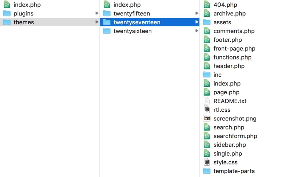
WordPress themes are made up of a collection of files, all contained within a single folder that lives within the /themes/ folder: wp-content/themes/.

An example of the files contained within a WordPress theme

Option 1: Modify an Existing Theme

Modifying an existing theme is perhaps the easiest option. You may just want to make some minor changes, like colors, font sizes, or simple layout changes.

In this case your best option is to create a child theme. A child theme references an existing theme, just modifying the bits you want to change. Using a child theme has the advantage that, if the parent theme is updated when you update WordPress, your changes won’t be wiped away.

To create a child theme, create a new folder inside your /themes/ folder. A handy tip is to use the name of the parent theme with -child appended, as this makes it clear what the child theme is. So, if you’re creating a child theme of the Twenty Seventeen theme, your child theme folder might be called /twentyseventeen-child/.

Minimum default files for a child theme

In this child folder, you need at a minimum a style.css file and a functions.php file. In these files you need to add certain code to tell WordPress which is the parent theme, where the stylesheets are, and any other new functionality you want in your child theme.

The last step for getting your child theme up and running is to enter the WordPress admin panel and go to Appearance > Themes to activate your child theme.

For a complete guide to this process, visit the WordPress Codex. For help with setting up a child theme, you can also use the WordPress Child Theme Configurator utility.

Option 2: Adapt an Existing Theme

If you’re keen to dig into WordPress code a bit more, you can duplicate an existing theme and bend it to your will.

That might involve things like deleting all of the current styles and creating your own. You can also dig into the other theme files and remove elements you don’t need and add others. For example, you might want to alter the HTML structure of the theme. To do so, you’ll need to open various files such as header.php, index.php and footer.php and update the HTML parts with your own template elements.

A new folder containing files to be edited

Along the way, you might decide there are lots of features in the copied theme you no longer need, such as post comments and various sidebar elements such as categories and bookmarks. You’ll find PHP snippets for these elements in the various theme files, and you can simply delete them or move them around to other locations.

It can take a bit of searching around to work out which files contain the elements you want to delete or move, but it’s a good way to get familiar with your WordPress theme to dig in to the files like this.

Another option here, rather than duplicating an existing theme, is to start with a “starter theme”, which we look at below.

Option 3: Building a Theme from Scratch

A more daunting option — but more fun, too! — is to create your own theme completely from scratch. This is actually simpler than it sounds, because at a minimum you only need two files — style.css and index.php.

The minimum required files for building your own theme

That, however, would result in a pretty limited theme! At a minimum, you’d probably want a functions.php file for custom functions, and perhaps several other template files for the various sections of the site, such as a 404.php template file for showing 404 pages.

In this example, we’ve created a folder in our themes directory called /scratch-theme/. (You’ll want to choose a spiffier name than that, of course.) The style.css file will serve as the main stylesheet of our WordPress theme. In that CSS file, we first need to add some header text. This is a basic example:

/*
Theme Name: My Scratch Theme
Theme URI: https://sitepoint.com
Author: Sufyan bin Uzayr
Author URI: http://sufyanism.com
Description: Just a fancy starter theme for SitePoint
Version: 1
License: GNU General Public License v2 or later
License URI: http://www.gnu.org/licenses/gpl-2.0.html
Tags: clean, starter
*/

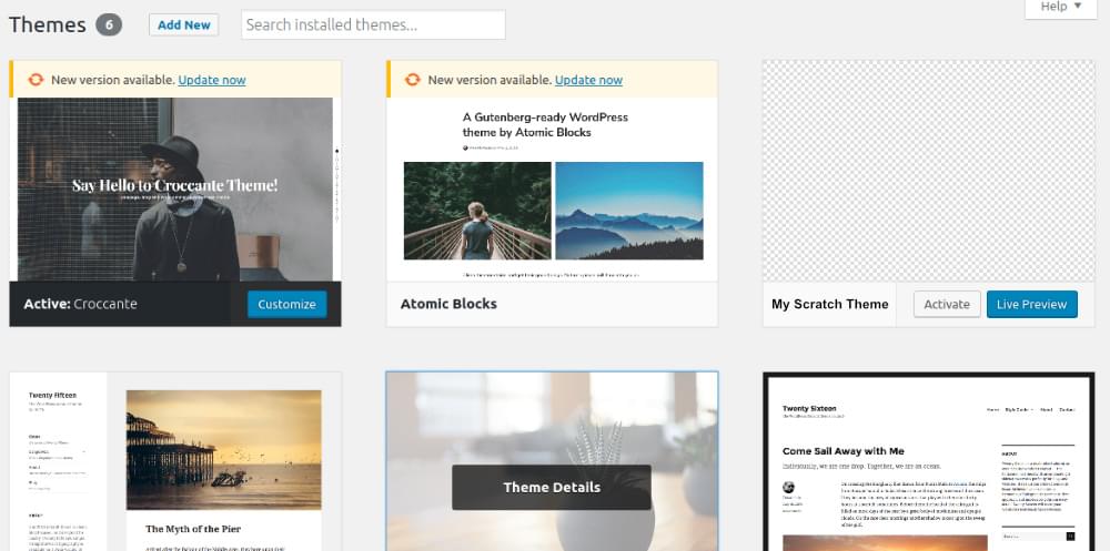
You can now head to the WordPress admin Themes section, where we’ll see our now theme listed.

Our new theme listed as an option

At this point, it doesn’t offer any custom styles and layouts, but can still be activated and used nonetheless. (You can add a thumbnail image for the theme by uploading an image file named “screenshot” to the theme’s root folder, preferably 880 x 660px.)

For more in-depth guidance of WordPress theme development, check out the WordPress Codex theme development guide.

It’s fairly straightforward to create a very basic WordPress theme from scratch, but going beyond that is more challenging. Before deciding this is a bit outside your wheelhouse, let’s check out some of the tools that are available to help you along.

The post Three Ways to Create Your Own WordPress Theme appeared first on SitePoint.

Tailor Brands Review: Instant Custom-Made Logos for Small Business Owners and Startups

Original Source: https://inspiredm.com/tailor-brands-review-instant-custom-made-logos-for-small-business-owners-and-startups/

Meta: This Tailor Brands review delves into all the details about its features, functionalities, pricing, and possible drawbacks.

Apple. Undoubtedly one of the biggest brands today. And in case you haven’t seen the news yet, it’s the first U.S. Company to hit the $1 trillion market cap.

Well-deserved, I bet. And not just because it develops innovative phones and PC. Not at all. Many companies are doing that already. And some are launching more revolutionary products. But still, Apple somehow managed to maneuver its way to the $1 trillion value ahead of the pack.

How, you ask?

Call it what you want, but the fact is- getting their branding right laid the foundation for everything. “iMac” essentially converted a regular PC into a special product with a name of its own. And the same applies to “iPhones”.

Now that’s clever branding. However, the most impressive element overall is the Apple logo. Isaac Newton’s light bulb moment, after getting hit by a falling apple,  basically inspired one of the most captivating logos of both the 20th and 21st century.

So, you think you can beat that branding strategy?

Technically, you should be able to, considering all the branding tools available on the web. In fact, allow me to walk you through one of the seemingly dominant solutions today.

Tailor Brands Review: Overview

Of course, you completely understand the importance of business branding. Sadly, you’re too busy to enroll yourself in a graphic design course.

Besides, there are many professional and freelance graphic designers out there. Hiring someone to handle the whole branding thing might seem like the most convenient option, right?

Now, I don’t know about you. But, I believe that branding is best designed when business owners passionately commit to the entire process.

Let’s face it. You’re the only person who comprehensively understands your business inside out. In other words, you are the best asset to the brand design process.

And that’s one of the reasons why co-founders Nadav Shatz, Tom Lahat, and Yali Saar established Tailor Brands in 2014- to make it easier for business owners to design and manage their brands.

Admittedly, by then, there were numerous logo makers on the web. But, here’s the thing- none of them had implemented a holistically automated system.

Until Tailor Brands came along. It was the first solution to leverage artificial intelligence to facilitate automated logo design. And this has seen it attract more than 3 million users over the years, who’ve collectively produced over 100 million designs.

Tailor Brands

Today, Tailor Brands is much more than just a logo design engine. It sells itself as an all-in-one branding solution that combines logo design with critical tools for driving branding campaigns.

Sounds like something you’d want to check out?

Well, I handled that for you. And quite comprehensively to be precise. So, I’ll give you the truth and nothing but the truth- this Tailor Brands review delves into all the details about its features, functionalities, pricing, and possible drawbacks.

Now let’s get to it…

Tailor Brands Review: Features
Logo Design Process

Ok. I’ll admit that quite a number of the design solutions I’ve tested out use a drag-and-drop editor. While this method is arguably considered user-friendly, let’s face it. It’s only simple when you compare it with complex alternatives like coding.

If you’ve tried one before, it probably took you some time to learn the ropes. It typically takes several rounds of edits to ultimately make up your mind about a good final design.

So, of course, I was fairly excited to see a different approach on Tailor Brands.

First off, you’ll be required to enter your brand’s name, followed by the industry. A drop-down list of suggestions comes in handy here to help you get it over and done with as fast as possible.

Then comes the preference stage. The system basically presents you with three options for your logo- either develop it from your brand name’s initials, or go with the entire name altogether, or proceed with an icon logo.

logo design

Let me guess. Since initials seem too boring, and a brand name logo is essentially a fancy replication of what you already have, I bet you’d choose the icon. Or you might as well skip the step and let the system run its algorithms to pick out an ideal design for your business.

Well, of course, I decided to proceed with the popular option here. And for my icon-logo, the system requested me to upload an image from my gallery, or have one developed from an abstract shape.

Neat and pleasantly straightforward, to say the least. But, what happens when you choose a name-based logo?

Good thing I’m a curious cat. So I went back and gave the name-based option a try. It turns out the system conducts about five to six steps of requesting you to pick out a favorite from a set of images.

The whole idea behind this, as I came to establish, is helping Tailor Brand’s algorithm get a feel of your overall aesthetic preferences. Quite a fine touch, as opposed to simply generating random logos based on popular favorites.

Now, I know what you’re thinking. Heck, doesn’t the system proceed to generate random guesses when you skip the logo type stage?

Oddly enough, it doesn’t. It actually does the same thing as the name-based logo process. You’ll still get numerous sets of logos, from where you should select the ones that feel like your cup of tea. Subsequently, the system runs structured assessments based on the underlying algorithms to comprehend what you like most.

Then it generates a wide range of possible logos for your brand, complete with corresponding previews of how they’d actually look like on mobile view, letterheads, T-shirts, business cards, social media, and other relevant platforms.

It’s like hiring a designer who keenly reviews your business, studies your overall preferences, then generates corresponding brand concepts, before helping you make a final decision.

But, is that all? There’s no editing at all?

The good news is- you can edit several elements of your logo, including spacing, font, color, and more. The bad news is- this is not open to trial users. You have to pay to edit the logo.

logo editing

Well, all things considered, it goes without saying that the entire process is exceedingly user-friendly. Although it doesn’t guarantee you a logo that’s unique all around, everything is simple and straightforward. Because otherwise, you obviously wouldn’t want to spend days figuring your way around a complicated graphic-design software just to create a simple logo.

Social Media Tools

Now, guess what? It doesn’t end with logo creation. Come to think of it, plenty of tools can do that. What sets Tailor Brands apart from them is the fact that it’s not just about logos. It seemingly takes the whole concept of branding pretty seriously.

That’s why it goes ahead to provide a range of social media tools to further empower your branding strategy. And it all makes sense since social media is currently the principal platform businesses are leveraging to hunt for prospects. In fact, 98% of small businesses have already tried social media marketing.

Good enough? Now, let’s dive into the details.

Tailor Brand’s Social Posts tool, for starters, helps you customize branded images to post on social media. This strategy alone has been proven to engage twice as many social media users as posts without images.

And speaking of strategy, another tool you get is the Social Strategy. This helps you organize and streamline your entire social media framework. In addition to an automated post scheduler, it comes with features for curating posts, saving pre-made posts, keeping track of all your campaigns, and more.

Then, when it comes to impressions, Tailor Brands offers you a tool called Social Cover Banners. This is exceptionally critical because the fundamental objective behind branding has always been trying to make solid impressions on the target market.

And when it comes to social media, your profile has got to be outstanding enough to leave a lasting impression. Social Cover Banners helps you achieve this by providing branded customized banners to place at the top of your LinkedIn, Twitter, and Facebook pages.

Online Brand Book

Using algorithms to develop a logo based on your overall preferences is impressive. But, let’s be honest here. Even when you’re fully satisfied with the outcome, the truth is- you’re just one element in an extensive network of audiences.

In other words, your target market does not participate in the initial design process. And that should be enough to get you worried, especially when you consider the fact that design is more of a subjective matter. So, in essence, your audience might not share the same sentiments about the brand as you.

Thankfully, Tailor Brand’s professional designers swing into action to help you avoid such a disaster. And they do so through an online brand book, which is offered as along with your branding package.

Quite simply, the online brand book is like a Magna Carta of sorts. It contains valuable pointers about branding, which you can use to further refine your design. Some of the elements it delves into include primary and complementary colors, spacing, fonts, logo placement, plus sizes.

tailor brands online brand book

Over time, you’ll be able to maintain a consistent branding strategy even when you hire new members to join your team.

Analytics

By now, you’re probably already used to the standard business metrics you get on most web-based solutions. I’m talking about things like conversion rate, bounce rate, traffic size, etc.

Now, get this. Analytics on Tailor Brands are a bit different. Instead of monitoring your web traffic, the system assesses how the market is responding to your branding strategy.

And you know what? It goes beyond typical social media indicators like the number of post likes. To adequately establish how your audience is warming up to the brand, Tailor Brands maintains a keen eye on the engagement patterns, plus events happening around your brand- on both social media and the web.

Tailor Brands Review: Pricing

Tailor Brands has seemingly extended its simplicity concept to the pricing structure. There are only two plans for all types of users.

Well, you can proceed with the logo design process without paying a dime. But, unfortunately, that’s all you can do. You need an active subscription to buy a logo. And the best thing is- you’ll retain all the rights to your logo after purchasing.

That said, here are the subscriptions options

Dynamic Logo– Costs $9.99 per month, while annual prepay subscribers end up paying $2.99 per month.

Unlimited Backup
Weebly Website Builder
Social Strategy
Seasonal logos
Social Analytics
Commercial Use License
Transparent PNG
High-Resolution Logo

Premium– Costs $49.99 per month, while annual prepay subscribers end up paying $10.99 per month.

Unlimited Backup
Weebly Website Builder
Facebook Ads
Branded Watermark Tool
Branded Business Deck
Branded Presentation
Online Brand Guidelines
Social Covers Design Tool
Weekly Facebook Posts
Business Card Design Tool
Logo Resize Tool
Make Changes and Re-Download
Social Strategy
Seasonal Logos
Social Analytics
Commercial Use License
Transparent PNG & Vector EPS Files
High-Resolution Logo

tailor brands pricing

Who Should Consider Using Tailor Brands?

Going by all the features we’ve covered, Tailor Brands’ primary strong point is simplicity and user-friendliness. Users who’ve never spent even a single second of their life on any graphics design software can generate a decent logo in just a couple of minutes. All things considered, it’s ridiculously straightforward.

But then again, and rather ironically, that might also be its principal drawback to a couple of users. I’m talking about designers who prefer dynamic graphics editing solutions that can customize everything.

So, let’s agree on one thing- Tailor Brands is best for small business owners and startups seeking a simple and straightforward platform, which can systematically convert their ideas into logos and power their branding campaigns.

The post Tailor Brands Review: Instant Custom-Made Logos for Small Business Owners and Startups appeared first on Inspired Magazine.

My Best Practices for Deploying a Web Application on Alibaba Cloud

Original Source: https://www.sitepoint.com/my-best-practices-for-deploying-a-web-application-on-alibaba-cloud/

This article was originally published on Alibaba Cloud. Thank you for supporting the partners who make SitePoint possible.

In this article, I want to share the best practices I use when deploying a web application to Alibaba Cloud. I work as a freelancer and recently one of my clients asked me to setup SuiteCRM for his small organization. Since I frequently write tutorials for Alibaba Cloud, I recommended that the client use the same cloud platform. For nearly 100 users and at least 30 concurrent users, here's the configuration I recommended.

ECS instance of 2 vCPUs and 4GB RAM to install Nginx with PHP-FPM.
ApsaraDB for RDS instance for MySQL with 1GB core, 1 GB RAM, and 10 GB storage.
Direct Mail for sending emails.

The steps I followed are very simple and can be adopted for nearly all PHP based applications.

If you are new to Alibaba Cloud, you can use this link to sign up to Alibaba Cloud. You will get new user credit worth US$300 for free, which you can use to try out different Alibaba Cloud products.

Creating an ECS Instance

Alibaba Cloud has documented nearly everything you will require to get started with the cloud platform. You can use the Getting Started Tutorials or the Tech Share Blog to learn how to start using Alibaba Cloud. You can find the most obvious steps in the Quick Start Guide and let me walk you through the best practices to use when creating the ECS instance.

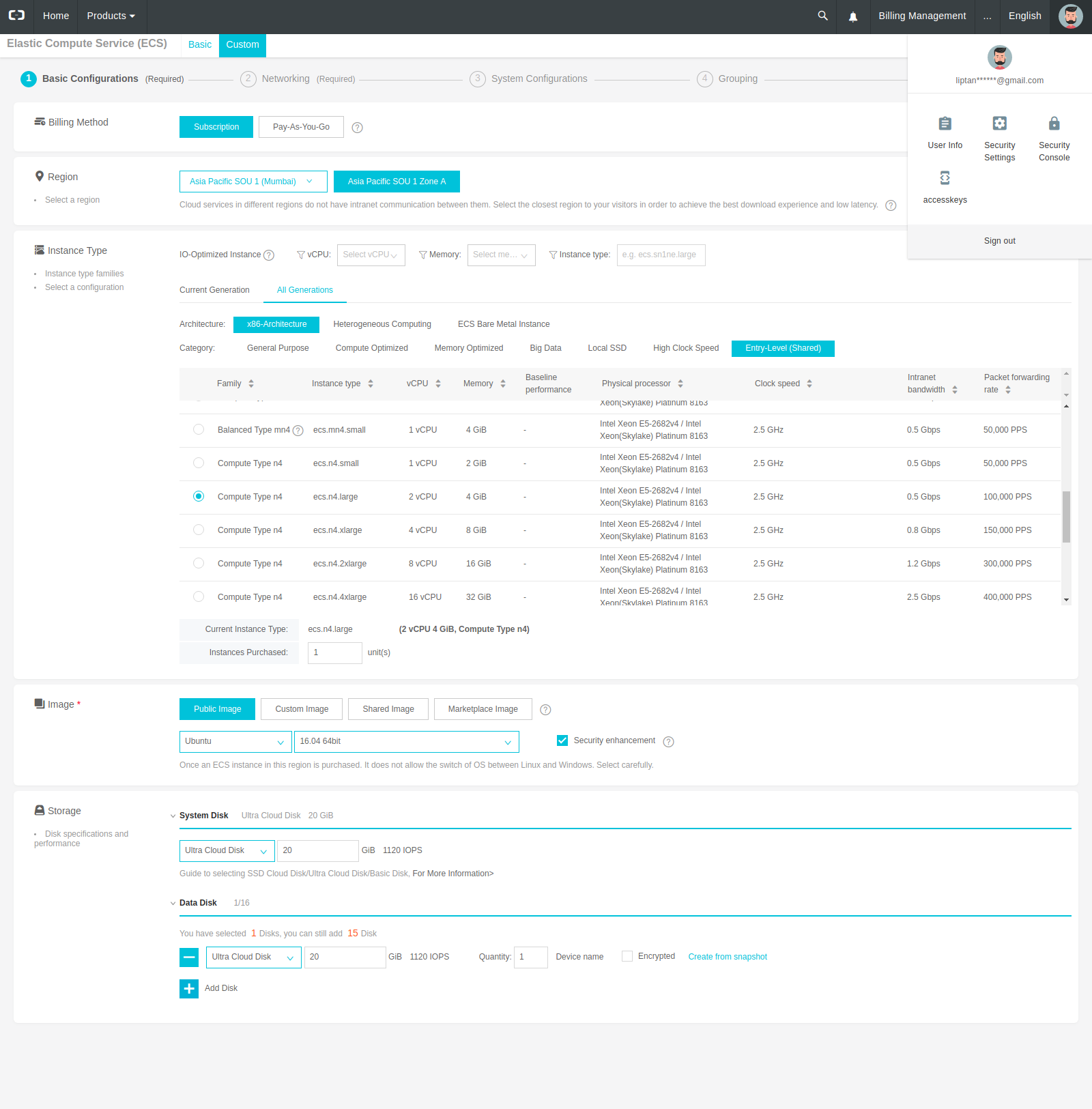
Log in to your Alibaba Cloud console and go to Elastic Compute Service interface. You can easily create the instance by clicking the Create Instance button. Things to keep in mind are:

Region: Since Alibaba Cloud has data centers all around the globe, always choose the region which is geographically closer to the users of the application. As the data center is closer to the user, the website will load very fast due to the low latency of the network. In my case, I chose Mumbai region, as the organization was based in Mumbai itself.
Billing Method: If you are planning to continuously run the instance 24/7, you should always choose the monthly subscription as it will cut down the price to less than half compared to Pay-As-You-Go. For example, the monthly subscription cost of a shared type ECS instance of 2 vCPUs and 4GB RAM is $23 USD but the same instance in Pay-As-You-Go costs $0.103 USD per Hour. Monthly cost becomes $0.103*24*30 = $74.16 USD.
Instance Type: Choose the instance type according to your requirements. Resources can be increased later on demand.
Image: You may find the application you wish to install on your ECS instance on a Marketplace image but it is always recommended to install it yourself in a clean official image. Later, if your application encounters some error, you will know where to look.
Storage: System disks are deleted when the ECS instance is released. Use data disk when possible as your disk will be retained even after the instance is accidentally deleted.

Here's the configuration I used.

You can choose the VPC which is created by default. You can add as many as 4092 instances in it. I use a different security group for each ECS instance so that I can configure individually and make sure that no unused port is opened.

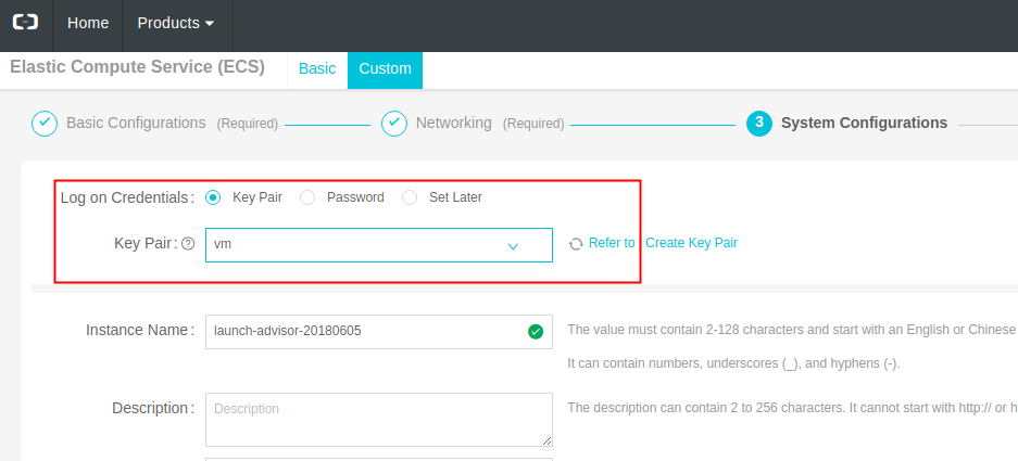
Another important thing is to use key-based authentication rather than using passwords. If you already have a key-pair, you can add the public key to Alibaba Cloud. If not, you can use Alibaba Cloud to create one. Make sure that key is stored in a very secure place, and the key itself is encrypted by a passphrase.

That's all the things to keep in mind while creating the ECS instance.

Setting Up the ECS Instance

Once you have created your instance and logged into the terminal, there are few things I suggest you should consider before you set up your website.

Rather than using the root account for executing the commands, set up a sudo user on the first connection and always use the sudo user for running the commands. You can also set key based authentication for the sudo user, and disable root login entirely.
Always keep your base image updated.
Alibaba base images do not have any extra package which is not required. Do not install any package that’s not required.
If things go bad during installation, you can always reset the instance by changing the system disk. You don't need to delete the instance and recreate it.

I created the sudo user and configured key based auth in it. I updated the base image and set up unattended system upgrades. I followed a tutorial to install Nginx web server, which is a lightweight production-grade web server. Further, I installed PHP 7.2 with PHP-FPM. PHP 7.2 is the latest available version of PHP as of now. Using the latest software will ensure that the system is free from all the bugs and we will also get a faster processing and more stability. Finally, I downloaded the SuiteCRM archive from its official website and deployed the files into Nginx.

You can use the getting started tutorials or the tutorials written by Tech Share authors to install the applications.

Configuring Security Group Rules

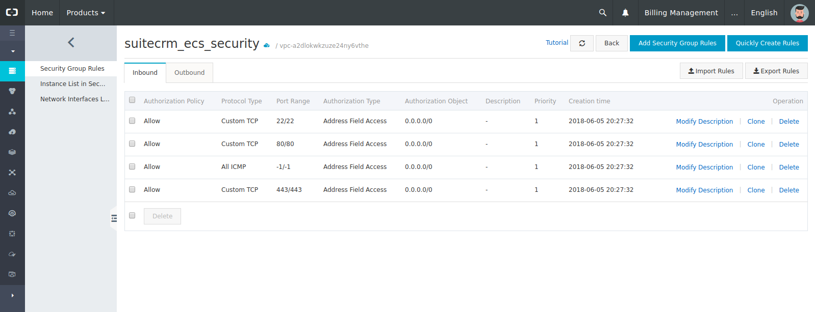
It is very important to leave no unused port open in the security group of the ECS instance. Have a look at the security group rules I used for the SuiteCRM instance.

You can see that I have allowed only the ports 22, 80 and 443 along with all ICMP packets. Port 22 is used for SSH connection. Port 80 is the unsecured HTTP port, which in my case just redirects to the port 443 on HTTPS. ICMP packets are used to ping the host to check if it is alive or not. It's perfectly okay if you want to drop the ICMP packets as well — you just won't be able to ping your instance.

Creating the RDS Instance

The first question to ask before we create the RDS instance is why exactly we need it. We could install any open source database server such as MySQL, MariaDB, PostgreSQL or MongoDB server on the ECS instance itself.

The answer to the question is that ApsaraDB for RDS is optimized for speed and security. By default, the instance we create is only accessible to the whitelisted instances only.

Let's look at the things to keep in mind when we create the ECS instance.

Region: Always choose the same region for the database instance and the ECS instance. Also, make sure that they both are in the same VPC. This will enable you to leverage the free intranet data transfer between the hosts in the same network. Another advantage is that you will need to whitelist only the private IP address of the ECS instance. This increases the security of the database to a great extent.
Billing: Again, the cost of monthly subscription is less than that of the Pay-As-You-Go method. Choose according to your needs.
Capacity: You can start with a low-end configuration such as 1 Core, 1 GB instance, and 5 GB storage. Later on you can increase resources.
Accounts: Never create the Master account for the MySQL 5.6 instance unless required. You can create a database and a database user for each database.

Here's the RDS configuration I used for SuiteCRM.

The post My Best Practices for Deploying a Web Application on Alibaba Cloud appeared first on SitePoint.

Space Escape Illustration Series

Original Source: http://feedproxy.google.com/~r/abduzeedo/~3/TR_Ss0zT4zQ/space-escape-illustration-series

Space Escape Illustration Series

Space Escape Illustration Series

AoiroStudio
Oct 30, 2018

Prateek Vatash is a graphic artist based in Bangalore, India. He shared on his Behance, an illustration series entitled: Space Escape. It’s a beautiful series with a true inspiration from the 80s but added with a flair of a broad range of vibrant colors. I published the entire collection since every single piece has something special and unique of its kind. Make sure to check out more of his work, enjoy!

More Links
Personal Site
Behance
Illustration
Space Escape Illustration SeriesSpace Escape Illustration SeriesSpace Escape Illustration SeriesSpace Escape Illustration SeriesSpace Escape Illustration SeriesSpace Escape Illustration SeriesSpace Escape Illustration SeriesSpace Escape Illustration SeriesSpace Escape Illustration SeriesSpace Escape Illustration SeriesSpace Escape Illustration SeriesSpace Escape Illustration SeriesSpace Escape Illustration SeriesSpace Escape Illustration Series

illustration
digital art


50 Clean, Simple and Minimalist Website Designs

Original Source: https://www.hongkiat.com/blog/clean-simple-minimalist-website-design/

Minimalism has gained popularity in the past few years and has been among the top web design trends in 2017. Minimalist sites load faster, take fewer server resources, and are often faster to develop…

Visit hongkiat.com for full content.