Fonts and Colors Used by Facebook, Twitter, Instagram + More

Original Source: https://www.sitepoint.com/fonts-colors-used-facebook-twitter-google/

This article was updated in November 2018 to reflect the most recent colors and fonts used by social networks such as Facebook, Twitter, and Instagram. For the first time this doesn’t include Google Plus, which is now defunct. Was it ever really alive anyway?

Social login buttons, links to social media channels — in 2018 this is still a thing in web design and app design. I mean, what business isn’t on social media these days?

Having a collection of brand assets used social networks, so that we can incorporate them into our own designs, is quite handy. It’s something we Google every time we build an app or website (What is the color used by Facebook?, What is the Facebook color code?, or simply, Facebook blue). In fact, I bet that’s how you found this article!

Well, I won’t keep you waiting. Let’s take a look at the colors and fonts used by Facebook, Twitter, Pinterest, Instagram, Snapchat, LinkedIn, Facebook Messenger, YouTube, and Google Material Design. If I’ve missed something, hit me up on Twitter.

Just show me the main colors (Facebook, Twitter, Instagram, YouTube, Pinterest).

Facebook

Fonts and colors used by Facebook

“Facebook Blue” Color Codes

Hex: #4267b2
RGB: 66,103,178

Facebook Fonts

Windows: Segoe UI
macOS: San Francisco
iOS: San Francisco
Android: Roboto

Facebook uses the Segoe UI font for the Windows version of their desktop website, and the Apple-made San Francisco font for the macOS version (both are the default system font). For iOS and Android, it’s San Francisco and Roboto respectively (again, both system fonts, for readability and familiarity. These fonts are becoming a standard.

Read more about Facebook’s Branding Guidelines here.

Twitter

Fonts and colors used by Twitter

Twitter Color Codes

Hex: #38A1F3
RGB: 56,161,243

Combined with variants of “Twitter Grey” (which contains a mix of blue, black and white tones), Twitter blue (#38A1F3) is used as the primary brand color throughout.

Read more about Twitter’s Brand Guidelines here.

Twitter Fonts

Windows: Helvetica
macOS: Helvetica Neue
iOS: San Francisco
Android: Roboto

While Twitter has also defaulted to system fonts for their mobile apps (as most social networks do), the Windows version of the website uses Helvetica, and the macOS version Helvetica Neue — somewhat outdated but I’m sure they have their reasons.

Remember when Twitter randomly trialed Gotham Narrow?

Pinterest

Fonts and colors used by Pinterest

Pinterest Color Codes

Hex: #BD081C
RGB: 189,8,28

Pinterest’s classic red color has never changed!

Pinterest Fonts

Windows: Segoe UI
macOS: San Francisco
iOS: San Francisco
Android: Roboto

Fun fact: while Pinterest uses roughly the same fonts that are standard with other social networks, Pinterest uses the Hiragino font for Japanese and other oriental languages, which reads better in comparison to the fonts used with Roman languages.

Read more about Pinterest’s Brand Guidelines here.

Instagram

Fonts and colors used by Instagram

“Instagram Grey” Color Codes

Hex: #231F20
RGB: 35,31,32

Instagram also uses a combination of different gradients. It’s difficult to understand what the individual colors are and in which scenario they should be used, but you can find all of Instagram’s brand assets here. To be honest, it’s rare to see these colors in the wild — those referencing their social media channels tend to use “Instagram Grey.”

Instagram Fonts

Windows: Segoe UI
macOS: San Francisco
iOS: San Francisco
Android: Roboto

Nothing out of the ordinary here. As you can, Segoe UI, San Francisco, and Roboto are sort of becoming a standard with social networks, with Instagram being no different.

The post Fonts and Colors Used by Facebook, Twitter, Instagram + More appeared first on SitePoint.

Stand Out with These Free Resume Templates

Original Source: http://feedproxy.google.com/~r/1stwebdesigner/~3/24vpfh8BSxM/

Creating the perfect resume isn’t easy, but a great one is all but required to land a job. While your skills and experiences are what really counts, if you fail to exhibit them well, it won’t matter. It’s all in the presentation! And if your experience is lacking in some areas, a well-crafted resume can make a huge difference. So, it’s important to craft a something that will help you nail that dream job.

But it’s not that easy to just make a great resume from scratch. So, we’ve compiled some amazing resume templates – great whether you want to add your own unique touch or use them as-is.

Your Web Designer Toolbox
Unlimited Downloads: 500,000+ Web Templates, Icon Sets, Themes & Design Assets


DOWNLOAD NOW

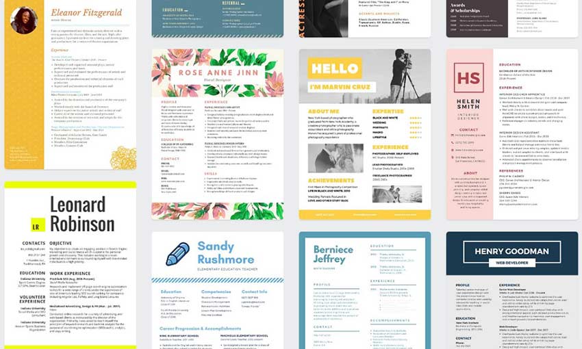
Hloom

Hloom

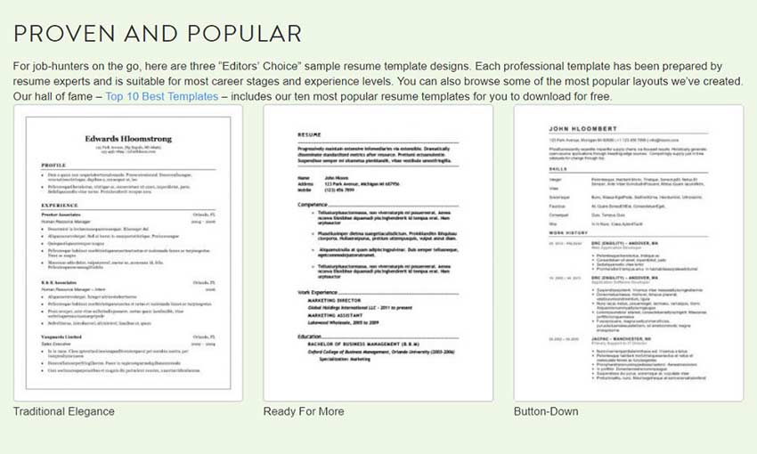
Tired of resume templates that don’t work in the program you like? Hloom has templates for Word, OpenOffice, Google Docs, Photoshop, Adobe InDesign and LaTex! Whether you like the old-fashioned Microsoft Word or do your resumes in an art program, Hloom has something for you. Each type of resume (simple, modern, portfolio) has its own library, too. There are hundreds of templates to try, so start browsing!

Freesumes

Freesumes

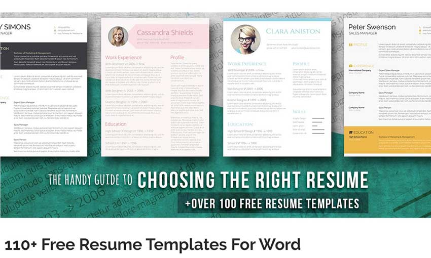
There are all sorts of Word resumes available on this website. There are resumes with stylish dark themes, bold colors, room for a portrait, icons, interesting layouts and more! And of course, you have your typical basic resume with just enough design flair to make it interesting to look at. Hand in one of these resumes if you want to stand out from the crowd, even if subtly!

26+ Best Resume Formats

26+ Best Resume Formats

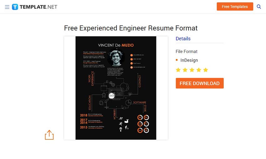
Here’s a sweet list of unique resumes that can suit just about any situation. They’re in all sorts of formats including Adobe InDesign, PDF, Doc and more! Teachers, engineers, students and anyone can find a template they love in this list.

Resume Genius Templates

Resume Genius Templates

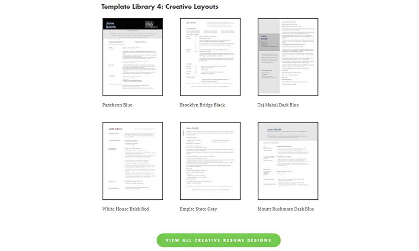
These simple but effective templates really pack a punch. Each one follows this core principle: A resume’s job is to convey information efficiently. A few colors, easy-to-read sections, and perfectly formatted text makes for elegant resumes. There are even Mac OS X optimized versions in each bundle! In short, these templates get the job done (and get you the job).

Canva Templates

Canva Templates

Canva has thousands of templates for just about anything, and job resumes are no exception. Just use Canva’s extensive online editor to easily replace text and add sections. Then, export to PNG, JPG or PDF for printing. These resume templates are creative, colorful, and beautiful – sure to catch anyone’s eye.

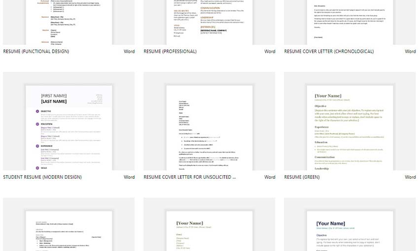
Office Templates

Office Templates

Where better to get your templates than from Microsoft itself? These resumes are simple and functional – they do exactly what they need to do, many of them with little fanfare. If you don’t want your information hidden by unnecessary design, or just don’t want to wrangle with third-party templates, use one of these.

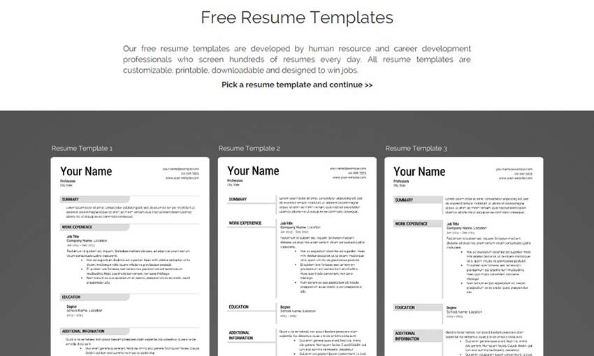
Super Resume

Super Resume

There’s no wasting time here. Pick from twelve clean resumes, hand-crafted from professional resume screeners. Fill out the template online, do some simple formatting and download it in PDF, Word Doc or even HTML format. And you’re finished! No premium nags or online editors with hundreds of confusing buttons. Just fill out each section and download.

Behance

Behance

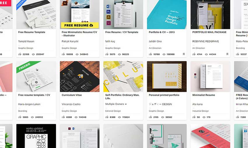
Behance is an Adobe-run website that offers a variety of user-made graphics – including resumes. Because the website’s content is entirely controlled by users, what you’ll find (as well as its quality) is highly variable. What’s for certain is that there are a lot of resumes to find – more than any other kind of website could possibly offer. Somewhere in there is your dream resume!

Get That Job!

A good resume greatly improves your chances of getting a job, so make sure you pick one that suits you! Use them as they are or build on them to create something that represents you. Either way, your shot at getting a job interview is much higher with a well-crafted resume.


10 Beautifully Designed Web Design Agency Sites

Original Source: http://feedproxy.google.com/~r/1stwebdesigner/~3/T4g-mL7POWk/

Web design agencies are tasked with the tough assignment of producing a site design that communicates their skill levels through various visuals and elements. They are often judged as much on their website design as they are on their portfolio of work. It’s a critical aspect of generating work and conveying a high level of design skill.

As such, agency sites are often meticulously designed with even the very smallest of details being paid considerable attention to. This, in turn, means that the sites present some of the most forward-thinking and exciting designs in the web design industry.

In this article, we are going to round up ten of the most beautifully designed and polished web design agency sites around today.

Your Web Designer Toolbox
Unlimited Downloads: 500,000+ Web Templates, Icon Sets, Themes & Design Assets


DOWNLOAD NOW

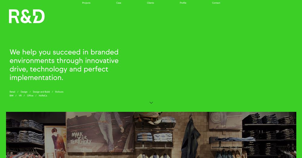
R&D

 Web Design Agency Sites Inspiration

R&D’s agency website combines a spacious layout with a unique and vibrant green background. This contributes to the visual impact and makes for a memorable website design.

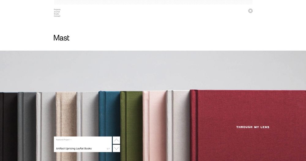
Mast

 Web Design Agency Sites Inspiration

Mast’s website is very minimal but uses beautifully composed imagery and overlapping navigation elements.

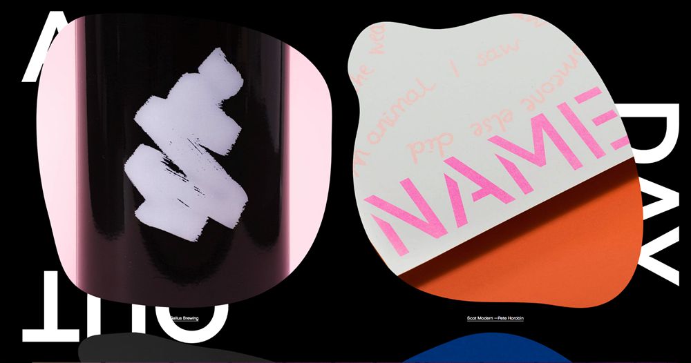
A Day Out

 Web Design Agency Sites Inspiration

This agency website by A Day Out is incredibly unique and impactful. It uses large cutouts with plenty of imagery and large capitalized typographic elements.

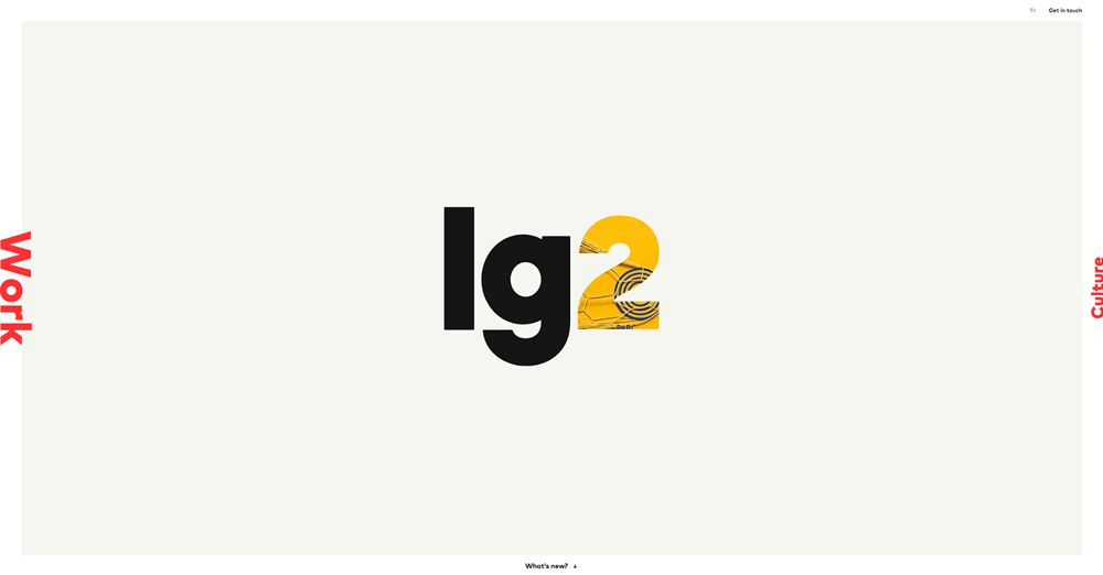
Lg2

 Web Design Agency Sites Inspiration

Lg2’s website implements an unusual navigation layout which spans the border of the central content area. The animated visuals within the ‘2’ are an eye-catching addition.

Mathematic

 Web Design Agency Sites Inspiration

Mathematic’s website is highly-focused on visuals. The slider spans the entirety of the hero section, creating an immersive experience perfect for showcasing their work.

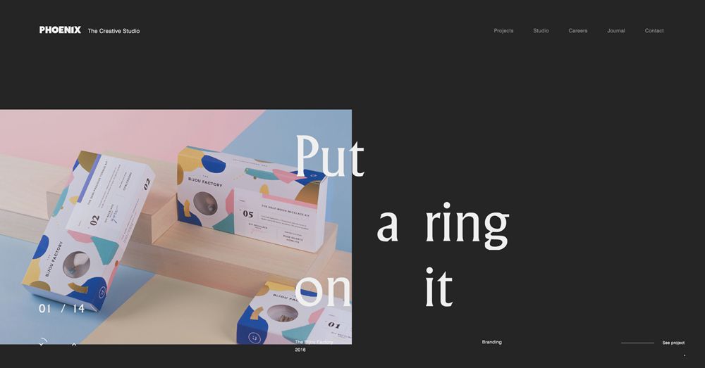
Phoenix

 Web Design Agency Sites Inspiration

This website from Phoenix offers one of the most unique layout directions of all. The typography is seemingly sporadic but provides great effect as it overlaps the rotating imagery.

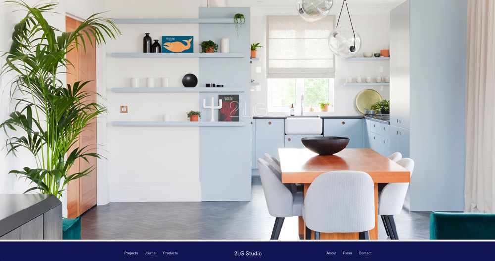
2LG

 Web Design Agency Sites Inspiration

2LG’s agency website uses an immersive loading graphic which consists of their logo overlaying a colorful image. The site then transitions seamlessly into a refined homepage with minimal graphics and typography.

Designgoat

 Web Design Agency Sites Inspiration

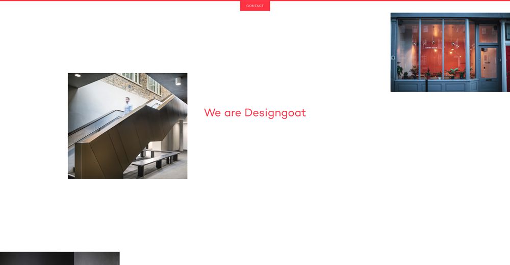
This agency site design from Designgoat is similarly sporadic in the way it has approached its laying out of imagery. The result has a brutalist-style feel to it and offers a beautifully unique look when combined with the red highlights and text.

Gin Lane

 Web Design Agency Sites Inspiration

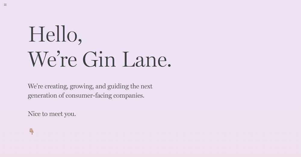
Gin Lane’s simple website uses beautiful serif type against a muted gradient background. The hero leads perfectly into the rest of the homepage design.

P22

 Web Design Agency Sites Inspiration

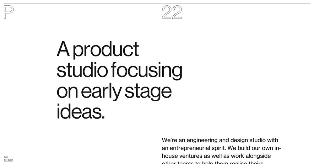
P22 has approached its agency web design with a combination of minimalism and brutalism. The bordered logo text is attractive and counters the filled typography used in the remainder of the monochrome design.


Freelancers: How to Get Motivated When You Are Running Low

Original Source: https://www.hongkiat.com/blog/freelancers-motivation-tips/

As freelance designers, self-discipline is one essential characteristic to cultivate. Granted that you have the benefits of a flexible timetable, it is highly critical for you to be firm in your…

Visit hongkiat.com for full content.

92% Off: Get the Complete Facebook Ads Course for Only $15

Original Source: http://feedproxy.google.com/~r/Designrfix/~3/fCGdl7qRszc/complete-facebook-ads-course

It seems like a new social media platform is being launched every year. Despite the competition, Facebook remains to be the world’s largest social media platform, with over 2 billion daily active users. Your customers, clients, and target audience are likely among them. If you are running a small business, you may not be able […]

The post 92% Off: Get the Complete Facebook Ads Course for Only $15 appeared first on designrfix.com.

Collective #467

Original Source: http://feedproxy.google.com/~r/tympanus/~3/5f2yFY_cT2I/

C467_gridorframework

CSS Frameworks Or CSS Grid: What Should I Use For My Project?

Rachel Andrew takes a look at the often asked question if one should use CSS Frameworks or CSS Grid.

Read it

C467_Bugsnag

This content is sponsored via Syndicate Ads
Level up your JavaScript error monitoring

Automatically detect JS errors impacting your users. Get comprehensive diagnostic reports, know instantly which errors are worth fixing, & debug in minutes.

Try it free

C467_Perfcss

CSS and Network Performance

A great article by Harry Roberts on the best network performance practices for loading CSS.

Read it

C467_pwa

Designing a progressive web app

An article by Mustafa Kurtuldu that covers the process and the lessons learned when designing a PWA.

Read it

C467_float

Editorial Layouts, Floats, and CSS Grid

Rob Weychert writes how aligning floated elements to an established grid can be a real headache.

Read it

C467_colorpalette

Building Your Color Palette

A great, systematic approach to building a solid color palette. Check out the fruitful comments on HN.

Read it

C467_babelplugn

babel-plugin-rawact

A babel plugin which compiles React.js components into native DOM instructions to eliminate the need for the react library at runtime. A proof-of-concept by Tobias Koppers.

Check it out

C467_emojibuilder

Emoji builder

Philipp Antoni made this superfun Emoji builder. So many possibilities!

Check it out

C467_game

The Adventure of Detective Moustachio

A fantastic pixelart web game made by Renaud Rohlinger, Lucas Fiorella and Sofiane Hocine.

Play it

C467_write

Write Freely

Write Freely is free and open source software for starting a minimalist blog, or an entire community.

Check it out

C467_light

Flashlight effect at haunted house

Anya Melnyk created this lovely demo.

Check it out

C467_XSS

XSStrike

An advanced Cross Site Scripting (XSS) detection suite.

Check it out

C467_custom

A Guide to Custom Elements for React Developers

Charles Peters shows how Custom elements can offer the same general benefits of React components without being tied to a specific framework implementation.

Read it

C467_visualizer

Web Audio Visualizations

A nice collection of experimental audio visualizations with Audio WebGL (three.js) and Canvas. By Ion D. Filho.

Check it out

C467_cubes

Cubes Dance

A mesmerizing demo by Ion D. Filho.

Check it out

C467_pixelfont

Free Font: Game Over

A free retro pixel font created by Mariano Diez.

Get it

C467_icons

Virtual and Augmented Reality Icons

A set of 48 virtual reality-themed icons free for a subscription. Made by the folks from Vexels for InVision.

Check it out

C467_now2

Now 2.0

The library that makes serverless application deployment easy just got a major update.

Check it out

C467_demohall

Codevember 10 – Night-time #6

Great demo for the Codevember challenge by Mathijs.

Check it out

C467_3dnetworks

TensorSpace.js

An interactive 3D visualization framework for Neural Networks.

Check it out

C467_switch

Checkbox Toggle Switches Are Confusing UI

Marcus Connor shares his thoughts on checkbox toggle switches and offers the rocker switch as an alternative.

Read it

C467_clock

#Codevember 02 – Time

A realistic looking clock demo by David Lyons.

Check it out

Collective #467 was written by Pedro Botelho and published on Codrops.

Five Techniques to Lazy Load Images for Website Performance

Original Source: https://www.sitepoint.com/five-techniques-lazy-load-images-website-performance/

Five Techniques to Lazy Load Images for Website Performance

This article is part of a series created in partnership with SiteGround. Thank you for supporting the partners who make SitePoint possible.

With images making up a whopping 65% of all web content, page load time on websites can easily become an issue.

Even when properly optimized, images can weigh quite a bit. This can have a negative impact on the time visitors have to wait before they can access content on your website. Chances are, they get impatient and navigate somewhere else, unless you come up with a solution to image loading that doesn’t interfere with the perception of speed.

In this article, you will learn about five approaches to lazy loading images that you can add to your web optimization toolkit to improve user experience on your website.

What Is Lazy Loading?

Lazy loading images consists in loading images on websites asynchronously, that is, after the above-the-fold content is fully loaded, or even conditionally, only when they appear in the browser’s viewport. This means that, if users don’t scroll all the way down, images placed at the bottom of the page won’t even be loaded.

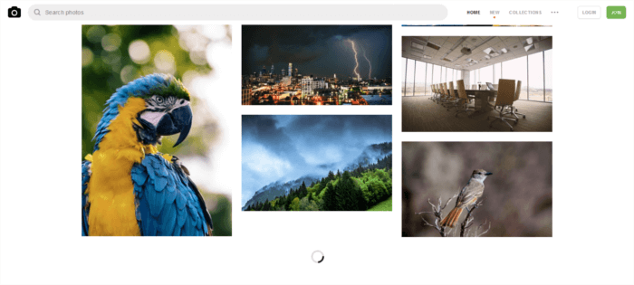
A number of websites use this approach, but it’s especially noticeable on image-heavy sites. Try browsing your favorite online hunting ground for high-res photos, and you’ll soon realize how the website loads just a limited number of images. As you scroll down the page, you’ll see placeholder images quickly filling up with real images for preview. For instance, notice the loader on Unsplash.com: scrolling that portion of the page into view triggers the replacement of a placeholder with a full-res photo:

Lazy loading in action on Unsplash.com

Why Should You Care About Lazy Loading Images?

There are at least a couple of excellent reasons why you should consider lazy loading images for your website:

If your website uses JavaScript to display content or provide some kind of functionality to users, loading the DOM quickly becomes critical. It’s in fact common for scripts to wait until the DOM has completely loaded before they start running. On a site with a significant number of images lazy loading, or loading images asynchronously, could make the difference between users staying or leaving your website

Since most lazy loading solutions consist in loading images only if the user has scrolled to the location where images would be visible inside the viewport, if users never get to that point, those images will never be loaded. This means considerable savings in bandwidth, for which most users, especially those accessing the web on mobile devices and slow-connections, will be thanking you.

Well, lazy loading images helps with website performance, but what’s the best way to go about it?

There is no perfect way.

If you live and breath JavaScript, implementing your own lazy loading solution shouldn’t be an issue. Nothing gives you more control than coding something yourself.

Alternatively, you can browse the web for viable approaches and start experimenting with them. I did just that and came across these five interesting techniques.

#1 David Walsh’s Simple Image Lazy Load and Fade

David Walsh has proposed his own custom script for lazy loading images. Here’s a simplified version:

The src attribute of the img tag is replaced with a data-src attribute in the markup:

[code language=”html”]
<img data-src=”image.jpg” alt=”test image”>
[/code]

In the CSS, img elements with a data-src attribute are hidden. Once loaded, images will appear with a nice fade-in effect using CSS transitions:

[code language=”css”]
img {
opacity: 1;
transition: opacity 0.3s;
}

img[data-src] {
opacity: 0;
}
[/code]

JavaScript then adds the src attribute to each img element and gives it the value of their respective data-src attributes. Once images have finished loading, the script removes the data-src attribute from img elements altogether:

[code language=”js”]
[].forEach.call(document.querySelectorAll(‘img[data-src]’), function(img) {
img.setAttribute(‘src’, img.getAttribute(‘data-src’));
img.onload = function() {
img.removeAttribute(‘data-src’);
};
});
[/code]

David Walsh also offers a fallback solution to cover cases where JavaScript fails, which you can find out more about on his blog.

The merit of this solution: it’s a breeze to implement and it’s effective.

On the flip side, this method doesn’t include loading on scroll functionality. In other words, all images are loaded by the browser, whether users have scrolled them into view or not. Therefore, you get the advantage of a fast loading page because images are loaded after the HTML content. However, you don’t get the saving on bandwidth that comes with preventing unnecessary image data from being loaded when visitors don’t view the entire page content.

#2 Robin Osborne’s Progressively Enhanced Lazy Loading

The post Five Techniques to Lazy Load Images for Website Performance appeared first on SitePoint.
Page Flip Layout

Original Source: http://feedproxy.google.com/~r/tympanus/~3/DrqIsKILhiE/

Today we’d like to share a flat take on a magazine-like layout with a “page flip” animation. When navigating, the content gets covered and then the next “pages” show. Depending on how far the pages are apart (when choosing a page from the menu), we show multiple elements to cover the content, creating a flat page flip look. We’ve added a little visual indicator on each page side, representing a book cover. The indicator will grow, depending on which page we’re currently at.

The animations are powered by TweenMax.

PageFlipLayout_featured

Attention: Note that we use modern CSS properties like CSS Grid and CSS Custom Properties that are not supported in older browsers.

The layout consists of a custom CSS grid setting for every “page”. We don’t really divide the two sides, but simulate it by adding a middle line. To make a custom grid, we use a 20×20 cell structure and add a custom position for every figure using the grid-area property.

PageFlipLayout_first

The menu allows us to jump between pages. The blue lines on each side of the screen serve as a decorative indicator, resembling a book cover (viewed from inside of a book):

PageFlipLayout_menu

The flat “page flip” animation is made up of several layers if we go to a page that is “further away”.

PageFlipLayout_all

We hope you enjoy this layout and find it useful!

References and Credits

Images from Unsplash.com
TweenMax by Greensock
imagesLoaded by Dave DeSandro

Page Flip Layout was written by Mary Lou and published on Codrops.

How to Deploy and Host a Joomla Website on Alibaba Cloud ECS

Original Source: https://www.sitepoint.com/how-to-deploy-and-host-a-joomla-website-on-alibaba-cloud-ecs/

This article was originally published on Alibaba Cloud. Thank you for supporting the partners who make SitePoint possible.

Joomla! is a free and open source content management system (CMS), and is one of the most popular among them. According to the official website, Joomla! is built on a model-view-controller web application framework that can be used independently of the CMS, allowing you to build powerful online applications.

One of my personal favorite features of Joomla! is the multi-language support with its large library of language packs. You can also translate the website admin backend with language extensions, helping you to easily localize your website.

This step-by-step guide will walk you through setting up and deploying a Joomla! website on an Alibaba Cloud Elastic Compute Service (ECS) instance with Ubuntu 16.04.

Requirements and Prerequisites

Before we deploy our Joomla! instance, we need to fulfill the following requirements. We need to set up an Alibaba Cloud Elastic Compute Service (ECS) Linux server (Ubuntu 16.04) with basic configurations. You should also allocate administrator (sudo) privileges to a non-root user.

You can refer to this guide for setting up your Alibaba Cloud ECS instance. If you don't have an Alibaba Cloud account, you can sign up for free and enjoy $300 of Free Trial credit.

Installing Joomla on an Ubuntu 16.04 ECS Instance

To install Joomla on our server, we need to first install a LAMP (Linux, Apache, MySQL, PHP) stack.

Step 1: Connect to Your Server

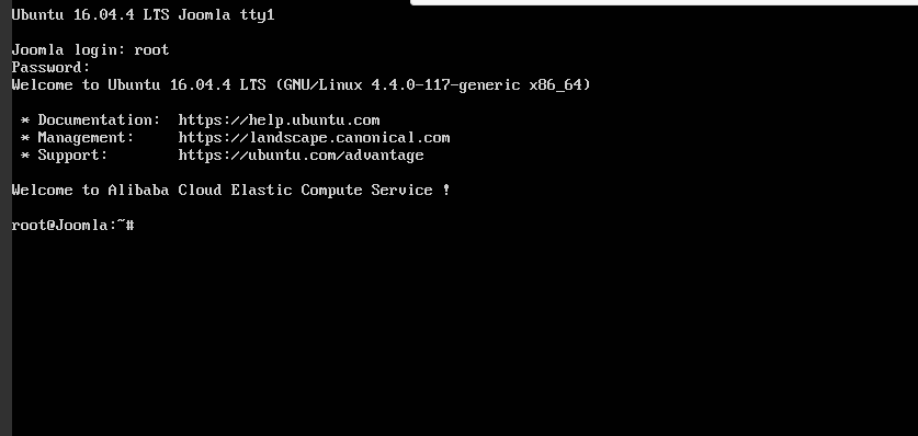
There are many ways to connect to your server, but I will be using the Alibaba Cloud console for simplicity. To do this, go to your instance section and click connect from your created instance. You will be redirected to the Terminal.

Enter username as Root and the password you created. If you didn't create a password, just continue by hitting enter. You are logged in to your server as system administrator.

All the commands in the following sections should be typed in this terminal.

Step 2: Install Apache

To install Apache, update your server repository list by typing command below.

sudo apt-get update

Then install the Apache web server.

sudo apt-get install apache2

Step 3: Install MySQL

Joomla, like most other content management systems, requires MySQL for its backend. So we need to install MySQL and link it to PHP.

To do this, add the following command.

sudo apt-get install mysql-server php7.0-mysql

You'll be asked to enter a MySQL password. Keep the password secure because you will need it later.

Complete the installation process of MySQL with the command below.

/usr/bin/mysql_secure_installation

You'll be asked to enter the MySQL password you just created. Continue with the installation process by making the following selections.

Would you like to setup VALIDATE password plugin ? [Y/N] N
Change the root password ? [ Y/N ] N
Remove anonymous users ? [Y/N] Y
Disallow root login remotely ? [Y/N] Y
Remove test database and access to it ? [Y/N] Y
Reload privilege tables now ? [Y/N] Y

Step 4: Install PHP

Joomla! requires PHP to be installed. Execute the following command to install PHP 7.0 and other required PHP modules.

sudo apt-get install php7.0 libapache2-mod-php7.0 php7.0-mcrypt php7.0-xml php7.0-curl php7.0-json php7.0-cgi

Step 5: Confirm LAMP Installation

To confirm LAMP stack has been installed on your Ubuntu 16.04 server, follow the procedures below.

Open the web browser and navigate to your server's IP address. You'll see the Apache2 Ubuntu Default page.

Note: To check your server’s public IP address, check your ECS Instance dashboard. You'll see both private and public IP addresses. Use the public IP address to access your website. If you don't see the public IP address consider setting up an Elastic IP address.

In order to confirm the PHP installation on your server, remove the default page and replace it with the PHP code below. To do this use the commands below.

rm /var/www/html/index.html

Replace with a new file:

touch /var/www/html/index.php
nano /var/www/html/index.php

Enter a sample PHP code below:

<?php
phpinfo();
?>

To check your page, navigate to your web browser and enter the public IP address. You should see information about PHP installation if the LAMP stack is correctly installed on your server.

The post How to Deploy and Host a Joomla Website on Alibaba Cloud ECS appeared first on SitePoint.
Reebok #BeMoreHuman Hand-Drawn Typeface

Original Source: http://feedproxy.google.com/~r/abduzeedo/~3/aOqzjIUhN1A/reebok-bemorehuman-hand-drawn-typeface

Reebok #BeMoreHuman Hand-Drawn Typeface

Reebok #BeMoreHuman Hand-Drawn Typeface

AoiroStudio
Nov 09, 2018

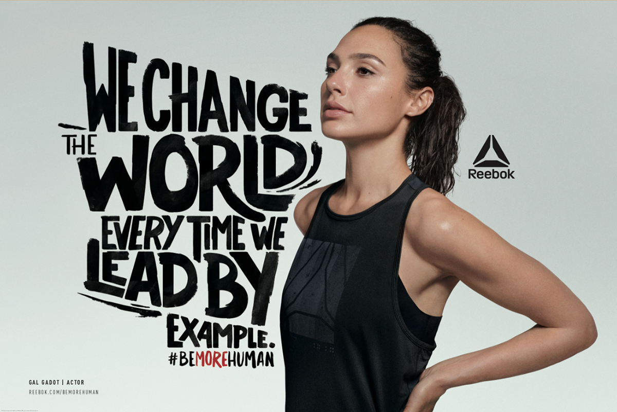
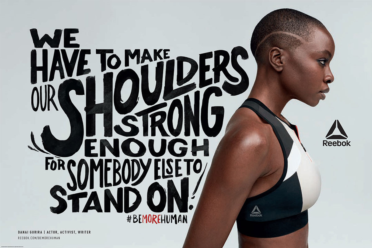
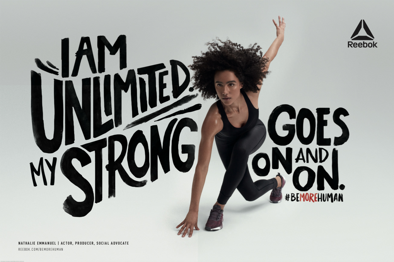
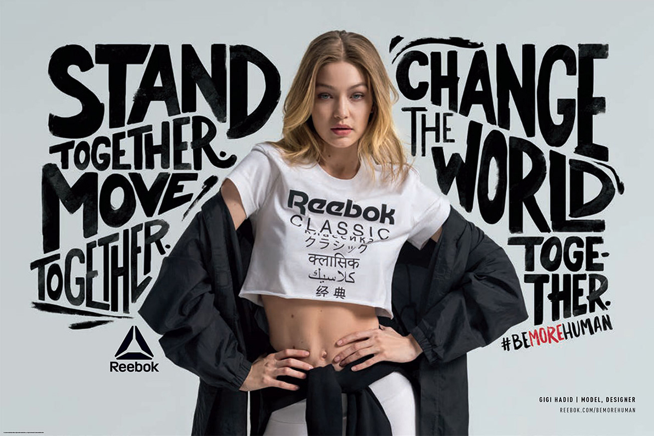
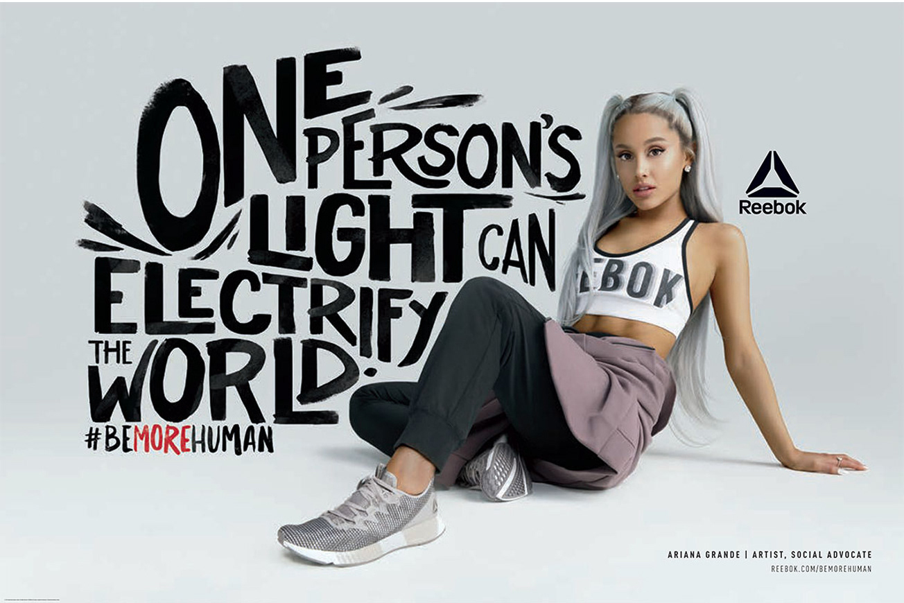
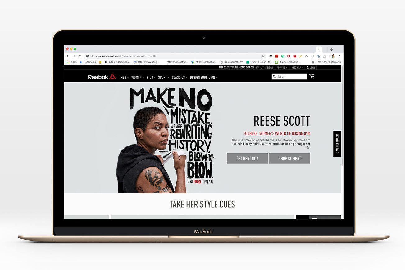
I was surfing on Behance for an inspiration related to fonts for ABDZ. I stumbled across the work of Simon Stratford who is a designer based in London, UK. He published a project for Reebok #BeMoreHuman Typeface fully hand-drawed. It’s just a beautiful and yet powerful campaign featuring popular celebrities like Gal Gadot (Wonder Woman, Danai Gurira (from Black Panther) and more. I would totally advise you to check out the videos as well, it’s great to see Simon’s work animated and represented by strong women.

Reebok #BeMoreHuman—Working with Venables Bell + Partners I created a hand-drawn typeface that could be adapted by other designers to form distinctive lettering work for their new Reebok #BeMoreHuman campaign. I only created the typeface with many alternatives Venables Bell + Partners created the photography, layouts, lettering and other adaptations.

More Links
Personal Site
Behance
Typography
Reebok #BeMoreHuman Hand-Drawn TypefaceReebok #BeMoreHuman Hand-Drawn TypefaceReebok #BeMoreHuman Hand-Drawn TypefaceReebok #BeMoreHuman Hand-Drawn TypefaceReebok #BeMoreHuman Hand-Drawn TypefaceReebok #BeMoreHuman Hand-Drawn Typeface
Videos
Gal Gadot

Danai Gurira

Natjalie Emmanuel

Gigi Hadid

Typography
typeface
hand-lettering
lettering