Playing with Shadow DOM

Original Source: https://css-tricks.com/playing-shadow-dom/

About a year ago, Twitter announced it would start displaying embedded tweets with the shadow DOM rather than an <iframe>, if the browser supports shadom DOM?

Why? Well, speed is one reason.

They say:

Much lower memory utilization in the browser, and much faster render times. Tweets will appear faster and pages will scroll more smoothly, even when displaying multiple Tweets on the same page.

Why the choice? Why is it necessary to use either iframes or shadow DOM? Why not just inject the content onto the page?


It’s a totally understandable need for control. An embedded Tweet should look and behave just exactly like an embedded Tweet. They don’t want to worry about the styles of the page bleeding in and messing that up.

An <iframe> makes style scoping very easy. Point the src of the iframe at a URL that displays what you want an embedded tweet to look like, and you’re good. The only styles used will be those you include in that document.

Twitter does this iframe-injection in a progressive enhancement and syndication-friendly way. They provide a <blockquote> with the Tweet and a <script>. The script does the iframe-injection. If the script doesn’t run, no matter, a happy blockquote. If the script does run, a fully functional embedded Tweet.

That script is the key here. Scripts can do just about anything, and they host it, so they can change it up anytime. That’s what they use to detect shadow DOM support and go that route instead. And as we covered, shadow DOM is faster to render and has lower memory needs. Shadow DOM can also help with the style scoping thing, which we’ll look at in a moment.

Height flexibility

There’s another thing too, that happens to be near and dear to my heart. An <iframe> doesn’t adjust in height to fit its contents like you expect other elements to do. You set a height and that’s that. It will have scrollbars, if you allow it and the content needs it. Back in the Wufoo days, we had to jump quite a few hoops to get embedded forms (in frames) to be as tall as they needed to be. Today, at CodePen, our Embedded Pens have adjustable heights, but there isn’t any option for just “as tall as they need to be”. (I’m exactly sure if that makes sense for CodePen Embeds or not, but anyway, you can’t do it right now.)

An element with a shadow DOM is just like any other element and that it will expand to the content naturally. I’m sure that is appealing to Twitter as well. If they calculate the height wrong, they run the risk of cutting of content or at least having the embedded Tweet look busted.

Most Basic Usage

Here’s the bare minimum of how you establish a shadow DOM and put stuff in it:

See the Pen Most basic shadow DOM by Chris Coyier (@chriscoyier) on CodePen.

Notice how the styling within the Shadow DOM doesn’t leak out to the regular paragraph element? Both paragraphs would be red if they did.

And notice how the paragraph inside the shadow DOM isn’t sans-serif like the one outside? Well, normally that would be. Inherited styles still inherit through the shadow DOM (so in that way it’s not quite as strong a barrier as an iframe). But, we’re forcing it back to the initial state on purpose like this:

:host {
all: initial;
}
Handling that fallback

My first thought for dealing with a fallback for browsers that don’t support shadow DOM was that you could chuck the same exact content you were stuffing into the shadow DOM into an iframe with srcdoc, like…

<iframe srcdoc=”the same content”>

Or more likely this is something you’re doing in JavaScript, so you’d test for support first, then either do the shadow DOM stuff or dynamically create the iframe:

See the Pen Shadow DOM Basic by Chris Coyier (@chriscoyier) on CodePen.

Turns out srcdoc isn’t the best choice (alone) for a fallback as there is no IE or Edge support for it. But also that it’s not too big of a deal to just use a data URL for the regular src. Here’s a fork by Šime Vidas where he fixes that up:

let content = `
<style>
body { /* for fallback iframe */
margin: 0;
}
p {
border: 1px solid #ccc;
padding: 1rem;
color: red;
font-family: sans-serif;
}
</style>

<p>Element with Shadow DOM</p>
`;

let el = document.querySelector(‘.my-element’);

if (document.body.attachShadow) {

let shadow = el.attachShadow({ mode: ‘open’ }); // Allows JS access inside
shadow.innerHTML = content;

} else {

let newiframe = document.createElement(‘iframe’);
‘srcdoc’ in newiframe ?
newiframe.srcdoc = content :
newiframe.src = ‘data:text/html;charset=UTF-8,’ + content;

let parent = el.parentNode;
parent.replaceChild(newiframe, el);

}
TL;DR

Shadow DOM is pretty cool.
It’s comparable to an iframe in many ways, including style encapsulation. Embedded third-party content is a pretty good use case.
It’s possible to use it while falling back to an iframe pretty easily.
It’s a part of the larger world of web components, but you don’t have to go all-in on all that if you don’t want to.

Here’s another simple demo (this one using a custom element), but instead of rolling our own back support, it’s polyfilled.

Playing with Shadow DOM is a post from CSS-Tricks

Find Your Five Minute Culture

Original Source: http://feedproxy.google.com/~r/buildinternet/~3/hfH7-EFy3JA/

If I spent five minutes alone with a random person in your company, would I get the right impression?

Earlier this week I spoke on a panel about company culture. Culture is a whale of a topic, but this panel’s common thread was how to grow something that works. Once you hit your stride, how do you actually explain it to others? More importantly, how do you know when the culture works?

Good culture shows up in results instead of manifestos. At One Mighty Roar we use a five minute culture metric. If I leave you alone with anyone on the team for five minutes, three things will happen by the time I return.

You laugh at least once.
You learn something.
You have something to look up later.

Do you know what kind of people would fit?

The three items above have little to do with personality, and more how you approach the world. We don’t take ourselves too seriously and extend the same courtesy to others. We also spend a lot of time experimenting with new things. I could explain our culture like that, but the five minute impression is a showcase to how we live those beliefs.

Plenty of folks spend time writing down lists of things they believe. They’ll have culture manifestos with nebulous statements like “We’re always learning” and “We challenge the status quo”. What do those look like in action? Manifestos have their place, but knowing what it looks like in the wild is different. We like our approach because it’s a simple way to introduce how our team works. Your list will almost definitely be different. For example, a customer focused organization might have “You shared something you’re interested in.” This is just what makes sense for us right now.

What would happen in your team’s five minutes?


Best Email Marketing Tips to Increase Engagement & Subscribers

Original Source: http://webdesignerwall.com/general/best-email-marketing-tips-increase-engagement-subscribers

Email is your post powerful marketing channel when used well. Your visitor’s inbox is a perfect opportunity for you to capture attention, communicate important updates and invite readers back to your site for increased visibility. The stats on email marketing effectiveness say it all – top marketing specialists and service providers tell us that email […]

The post Best Email Marketing Tips to Increase Engagement & Subscribers appeared first on Web Designer Wall – Design Trends and Tutorials.

Themify Shoppe – The Ultimate WooCommerce WordPress Theme

Original Source: http://webdesignerwall.com/general/themify-shoppe-ultimate-woocommerce-wordpress-theme

I’m excited to announce that Themify has released another awesome theme – Themify Shoppe. Designed by Liam McKay and coded by Themify team, Shoppe works hand-in-hand with WooCommerce, making it the ultimate multi-purposed eCommerce theme. It features the popular drag and drop Themify Builder that can help you design and build your online store to […]

The post Themify Shoppe – The Ultimate WooCommerce WordPress Theme appeared first on Web Designer Wall – Design Trends and Tutorials.

10 Responsive Slider jQuery Plugins

Original Source: http://feedproxy.google.com/~r/visualswirl/~3/j2wM6SsTPq0/

We’ve all heard about why we should be using responsive design (beyond the fact that it’s current design trend). But the decision to go responsive raises a number of development questions. One of the biggest issues is handling media. And one of the most common features on a media-heavy website is a featured content carousel (or image slider, image rotator, etc). This post will help you find a solution for your responsive slider needs. We’ve gathered a number of the best  jQuery responsive image sliders to compare and share.

10 Responsive jQuery Image Sliders
Flexslider 2 – Free

flexlslider responsive slider

I use Flexslider more than any other image slider (responsive or not) so it’s a great place to start. Flexslider offers a fullly skin-able and customizable slider that works great across all screen sizes. I  use it with both images and images with text/calls to action. It also offers both horizontal and vertical sliding as well as multiple slider support so you can have multiple image sliders on a single page. Definitely gets my vote!

Royal Slider – Premium

Royal Slider responsive jQuery plugin

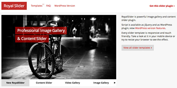
Another great slider that I have personal experience with. Royal Slider has a myriad of configuration options (my favorites being the “Gallery with Visible Nearby Images” or the “Video Slider”). The only thing keeping this plugin from the top spot is that it isn’t free (Flexslider is).  However, a very affordable and super-powerful plugin awaits. There’s also a great wordpress version.

Camera – Free

Camera - a free responsive slider

Camera slideshow is an open source project, based on Diapo slideshow and offers a variety of skin and customizable options. I’ve never personally used Camera but the documentation looks thorough and the sampel they provide in the demo looks really nice and clean.

Elastic – Free

Elastic responsive slider

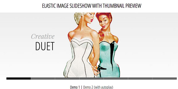
Elastic is presented in a tutorial fashion and includes the downloadable code to get you started using it on your site. This plugin has a much more specific look than some of the other plugins mentioned but there are some cool javascript animations being used.

Advanced Slider – Premium

Advanced Slider - customizable jQuery slider

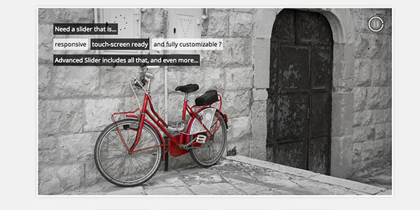
Another premium slider, Advanced Slider is fully responsive, mobile-ready, and can be used with either HTML markup or XML. The plugin also provides an easy to use API to customize it to your specific site. It comes with various pre-built styles that look nice out of the box.

All in One Responsive Slider – Premium

All in One responsive slider

All In One is an Advanced Jquery Slider which comes in 5 flavors: Banner Rotator, Thumbnails Banner, Banner with Playlist, Content Slider, Carousel. It allows you to easily create powerful sliders with animated text using HTML standard tags, making the slider very easy to setup and maintain.

Responsive Image Gallery – Free

responsive image gallery plugin

Another tutorial by Codrops on how to create a responsive image gallery with a thumbnail carousel using Elastislide. This slider is inspired by Twitter’s “user gallery” and is more useful for image galleries than a featured content carousel. But a free and great plugin nonetheless.

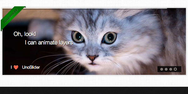
UnoSlider – Premium

Unoslider - responsive slider for jQuery

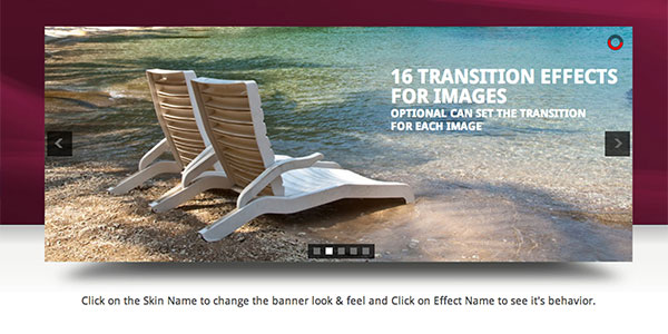
UnoSlider is a premium jQuery content slider plugin that’s core feature is the number of transition animations offered (the plugin developer claims “unlimited transition animations”). It’s also touch enabled, and offers a variety of other features similar to what’s been mentioned before.

Fluid CSS3 Slideshow with Parallax Effect – Free

parallax and responsive slider

Another great freebie by Codrops (sensing a trend here?). This responsive slider mixes in a little parallax effect (another popular trend). A parallax and responsive site? This plugin is for the ambitious designers out there.

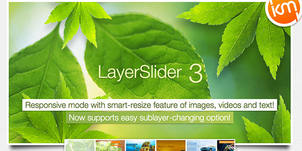
Layer Slider – Premium

parallax and responsive image slider

We’ll end with another parallax/responsive combo (this time a premium plugin). Layer Slider offers something really cool and unique: the ability to control an unlimited number of layers with individual animations. Combing this cool functionality with the responsive aspect and you have yourself a pretty powerful and extensible tool. I’ve had quite a bit of fun playing around with this on a few websites.

What other plugins do you use?

I’m sure I’ve left off some really great plugins and tutorials. But that’s where you come in. Let me know what I’ve missed and what plugins are your favorites. Feel free to post links to examples of these plugins in action. We’d love to see your great work!

The post 10 Responsive Slider jQuery Plugins appeared first on Visual Swirl Design Resources.

​Edit your website, from your website

Original Source: http://synd.co/2ueBpPd

Stuck making “a few easy changes” to the website for someone? Component IO makes it quick and simple for you or your team to make edits (even for non-technical users).

You can manage content with a WYSIWYG editor or instantly update HTML, CSS, and JavaScript right from your website. Make changes faster, empower your team, and avoid redeployment bugs. Works with every web technology, from WordPress to Rails to React.

Join hundreds of projects already using Component IO, with a free tier and plans from $7.95/mo. It’s built to make web development easier for everyone.

Try it free

Direct Link to Article — Permalink

​Edit your website, from your website is a post from CSS-Tricks

How to Add an HTML5 Video Player with Lightbox in Adobe Muse

Original Source: https://webdesignledger.com/how-to-add-an-html5-video-player-with-lightbox-in-adobe-muse/

HTML5 Video Player with Lightbox Widget - Adobe Muse CC - Muse For You
How to Add an HTML5 Video Player with Lightbox in Adobe Muse. No Coding Skills Required.

 Muse For You - Adobe Muse CC Adobe Muse CC Logo

Video is becoming our main way of consuming information. It is most evident with YouTube as 300 hours of video are uploaded to YouTube every minute and almost 5 billion videos are watched on YouTube everyday! That is a staggering number, and it is no wonder I often get requests for video widgets.

YouTube makes it really easy to add video from YouTube to your website and Muse even has a built-in widget that allows you to do this, but what if you wanted to add your own video without going through YouTube?

That is where the HTML5 Video Player with Lightbox widget comes into play. With this widget you can upload your own mp4 video to your website without having to go through third party video hosting like YouTube or Vimeo. The video can be watched directly from your server. Not only that you can also open the video in a Lightbox display giving the user a more direct experience of watching the video without any information surrounding the video. Many users prefer hosting their own video as this means no ads or related videos at the end. The HTML5 Video Player with Lightbox also comes with a YouTube player in case you wanted to add YouTube video as well.

Here are the steps to adding the HTML5 Video Player with Lightbox to your Adobe Muse website:

1. Double click the .mulib file to install.

2. Drag and drop an “Add First” widget from the Library Panel and place at the top of your Adobe Muse website. If you do not see the Library Panel go to Window > Library.

You can choose from the following “Add First” widgets:

– HTML5 Video Player – Add First – For Video Players.

– HTML5 Video Player – Add First – With Lightbox – For Video Players and Video Players within a Lightbox. You can add a color with an opacity or an image for the Lightbox background.

– HTML5 Video Player – Add First – With Gradient Lightbox – For Video Player and Video Players within a Lightbox. You can add a gradient with 2 colors for the Lightbox background.

3. Place a video player widget onto your website. You can choose from the following video player widgets:

– HTML5 Video Player Widget

– HTML5 Video Player Widget – Lightbox

– YouTube Video Player Widget

– YouTube Video Player Widget – Lightbox

The Lightbox widgets open the video within a Lightbox. Depending on the “Add First” widget added you can set the Lightbox background to be a color, image, or gradient. You can set the opacity of the color and image with the Lightbox background.

HTML5 Video Player with Lightbox Widget - Adobe Muse CC - Muse For You

4. For the HTML5 Video Players it is recommended to add at least a .mp4 file for video. You can add a .webm and .ogv file for fallback support on browsers that do not support .mp4. Most browsers support .mp4.

5. Add a poster image so when the video is not playing an image will show, and then the user can press the play button.

6. Set the theme of the video player to default, dark, or light.

7. You can set the width and height of the video within the widget options. There is a 16:9 Aspect Ratio calculator within the widget. You can also set the video to autoplay, loop, and the initial volume. You can set the video to overscale within the Lightbox, meaning the video will get larger then the size set within the widget when the browser is resized.

8. Done!


For more video tutorials and widgets for Adobe Muse visit http://museforyoushop.com.

Happy Musing!

Read More at How to Add an HTML5 Video Player with Lightbox in Adobe Muse

Best Practices For Minimalism In Web Design

Original Source: https://webdesignledger.com/best-practices-for-minimalism-in-web-design/

minimalist web design

Nowadays, when target audiences formulate their own opinions related to a specific brand or a company, a website is a focal point of exposure for all organizations. With so many website styles and trends to choose from, knowing which layout will be the most effective could be an overwhelming and daunting task.

Minimalism is one of those lasting design concepts that are always on top, no matter how trends come and go. Within the span of the last few years, it has become increasingly popular not just thanks to the many websites showcasing this basic philosophy, but also because of the growing use of mobile devices.

In the same time, just because minimalist web design principles and rules sound simple, that doesn’t mean they actually are. Despite the fact there are not so many elements in a minimalist website, you still have to provide the same amount of usability (or even better) with less interface.

If in the first article about minimalism in web design we displayed the main reasons for which it is loved by both designers and customers and has become such a popular trend, in this piece we’ll review the best practices for using it effectively.

In order to balance the aesthetics and functionality, minimalist web designs are defined by few core elements:

overall focus on content
fearless usage of space
stunning visuals
simple navigation style

HOW TO ACHIEVE MINIMALISM?

The easiest way to answer this question is the following: the best way to achieve minimalism is by reducing your design only to the elements that are absolutely essential for it. We can find various minimalistic expressions in many industries and art forms. Still, in terms of web design, minimalism could be something very hard to accomplish.        

At the same time, it’s very easy for anyone to master and use properly this concept. All you need to do is to learn how to break things down and take them away until there is nothing left to eliminate. All these, while not disturbing the design’s overall purpose and functionality in any way. We call these techniques the pillar of minimalism – and it’s no surprise that minimalism has become so popular in the last years. It makes the most complex things simple, being directly related to many of the latest web design trends. You will recognize many of them here, although we have already written about modern website design trends.

HOW DO YOU BEGIN THE DESIGN PROCESS OF A MINIMALIST WEBSITE?

The first step is to define very clearly your website’s general purpose, in order to avoid any unintended confusion. In other words, you should determine exactly few aspects, such as: What your website will be used for the most?; Do you want to open an online store? Do you want a portfolio website? Do you also want to add a blog? Who is your target audience?; What is the message you want to convey? And so on.

No matter what your intention is, the purpose of this website must be very clearly defined. This is the ground base for any website, but especially for the minimalist one.

Always remember: “Less is more”. At some point in your lifetime, you’ve certainly heard the phrase “Less is more”.  It may mean many things and is applicable to many industries, but it is absolutely essential when it comes to web design. Especially now, when responsive design is one of the most important trends.

As I mentioned before, the best way to accomplish this is to use just elements that are absolutely necessary to your overall design concept and the message you want to convey to your users.

Fearless usage of negative space

Fearless usage of space is a positive thing. Space is the first element that people associate with minimalist design. Mainly, the negative space… a lot of it.

Anyway, minimalist design is not just about using the negative space in neutral colors. This style also encourages the use of any full-color space in order to attract the user’s attention. Even if the white, black, gray or very dark backgrounds are the most popular, some designers also explore and use the negative space through colorful backgrounds.

For example, Design Co.Mission (link to http://plus63.org) uses a bright orange background along with simple navigation and other minimalist elements to delight and attract the users.    

As you see in the examples listed above, the negative space also helps to organize the space better, manipulate the visual flow and gives a sense of luxury. As a rule, as more negative space is used around an element, the more attention will draw to it. This, combined with strong visual elements, is one of the most powerful tools that define minimalism.

Stunning Visuals

Stunning visuals represent some of the most powerful tools used in minimalist web, being defined by a few elements:

visual harmony
beautiful contrast
big, bold and vivid photography
effective typography

Visual Harmony is a solid backbone of any minimal design framework. The key components of any efficient visual organization include a solid grid, visual balance and a close attention paid to alignment.  

A strong grid – built using a large negative space – lets you place and arrange all the visual elements in a way that conveys the best your message and also sets the purpose of the website. I’ve seen many websites aligning the content in the center of the layout and I think it’s important to remind you this is not the only solution. The visual elements included in a minimalist design can be aligned anywhere in the layout (center, right or left), as long as they keep the balance and form a unified design.   


For example, Arko and Mercer Warehouse make a very good job mixing and matching different alignment styles and a very large white space, for getting visual interest and balance.

When it comes to minimalist website design, most of the designers use just visuals having the same size, centered and aligned symmetrically. But you will create the same visual effect if you use elements of different sizes that perfectly balance each other.   

Big, Bold and Vivid Photography

For some designers, minimalist style could seem pretty distant. In order to avoid this and have a comfortable feeling of familiarity without dominating the foreground, you can use oversized and vivid photos, both for the homepage and the inside pages. When selecting the photos, you should choose high-resolution pictures that have ample negative space.

Minimalistic layouts are the best visual solutions for photographers who want to build a clean and modern portfolio, letting the photos to speak for themselves. (www.shopify.com/blog/how-to-sell-photos-online#DisqusComments – here you find more information related to transforming your passion into a profitable business).

Beautiful contrast

Using contrast will bring attention to certain design elements and will help create a recognizable visual hierarchy. Because they are a perfect canvas for contrast, white, black and dark backgrounds are very popular choices among minimalist graphic designers. Using contrasting typography and pictures is a distinctive sign of this style.  

Effective Typography

Designing a clean and simple website that includes just very few images is not so difficult; but creating an effective one, that looks good and grabs the attention, could be a challenge. Because typography brings immediate focus on the words and content while crafting a much more intriguing and interesting visual, it is even more critical in a minimalist design.

minimalist web design

Therefore, beautiful, sharp and even custom typography is a perfect focal point in a minimal framework. For getting a more impressive visual, you could include in your design bold typography styles (with thick strokes) and interesting letterforms (such as a dominant typeface for headlines paired with a neutral typeface for other content).

Simple Navigation

As a drop down menu would be considered too complex for a minimal design, it must be paired with the simplest navigation tools. In order to simplify your UI design, you may use a simple horizontal top-level menu and no right sidebar or centered menus. Also, the hidden menu works very well for minimalist designs, the hamburger menu being very popular among the website designers.

Before deciding which navigation menu makes sense, remember you should always know your users and the context. You shouldn’t use one or other navigation tool just because it looks trendy, but because it integrates perfectly in your design and gives the best UX to your users.

The Art of Taking Away

Minimalism is obviously defined by the lack of anything that isn’t necessary. In other words, don’t include needless elements in your design. You should think what’s absolutely necessary to the content and function of your website. Focus just on those things and take away anything that doesn’t contribute directly either to content or function. This way, what’s left has more impact on your users.  

Bottom line

To conclude, minimalist design is all about creativity and the use of all those elements that have blended in well enough not to make the design busy, but rather minimal and modern. It requires a sharp eye and expertise, and if it is handled properly, you will have a stunning content-focused website.

Read More at Best Practices For Minimalism In Web Design

Importing SQL – 520 ci-error

If you are exporting a database from an older MySQL server such as 5.5.3 and are importing it to a newer MySQL server, you might receive 520 ci-error that appears such as:

#1273 – unknown collation ‘utf8mb4_unicode_520_ci’

There is an easy way to fix this error. Simply open your favorite notepad, and find:

utf8mb4_unicode_520_ci

and replace with:

utf8mb4_unicode_ci

That’s it!. Hope someone finds this simple guide useful.