How to Win at Email Design

Original Source: http://justcreative.com/2017/12/04/how-to-win-at-email-design/

Below is an interview with Mike Smith, the art director for Aweber (the email marketing service I use for JUST Creative) and he has answered a few common questions on email design.

On a side note, if you’ve designed a great email newsletter, enter it into EmailMonks’ free newsletter competition and win your share of $10k in prizes.

1. How can using a consistent template build brand trust?

Templates are beneficial for many reasons, but specific to your customers, a consistent template design helps to establish expectations. A consistent template makes the cognitive load on subscribers lighter because they see a recognizable structure and aesthetic. This minor mental trigger builds a subconscious trust with readers which goes a long way to making your brand stronger.

2. What are the best colors and placements for CTAs in emails?

The best way to know how subscribers will respond is through testing, but here are some tips we’ve learned with our own testing. If you can place a link or button just under a header image or headline we’ve seen marked increases in the click through.

When it comes to color, matching your brand is important but so is contrast. The higher the contrast between a button and the background it sits on the more actionable it will appear.

3. How much do I really need to change on the template to make it unique?

Aweber Email Template

The templates in your email provider have been designed to make your life easier. If you only change the colors and logo that is sufficient enough to make a well designed email. No need to go crazy with changing all the elements just to “make it your own”.

The templates are also created to be flexible so adding additional images and content should be easy to make work within the constraints the email designer created for that specific template.

4. Should my template match my website?

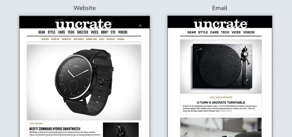
Aweber Website vs Email

It’s a big challenge to match an email and web experience 1 to 1. The use cases for each are quite different so there isn’t a point in beating yourself up to make it perfectly match. The important elements of your site–fonts, colors, logos, image styles– are enough to make the two coexist.

Think about your email in the way that old school correspondence kits were designed. Your business card and letterhead don’t look identical, because they have different purposes. But they did obviously live as part of the same brand. That is the same logic that applies to a website and email template, similar but designed with the medium’s intent in mind.

5. Should design or content come first when thinking about creating an email newsletter?

A flexible email template design should allow for all types of content.

6. What are fun and unique ways to make your email stand out from other brands?

Let your personality shine! This doesn’t have to be through witty copy or flashy GIFs but it could be. Whatever you do make it true to you. Every person and brand are a unique mix of their history, their convictions, and their personality. Allow that to come through in your design decision making, don’t focus on “being different”.

7. What’s the number one mistake you see marketers make in email designs?

Don't be fancy

Trying to be fancy. Clip art images, crazy fonts or font colors, or whacky layouts aren’t necessary. Drive home the value every time you send an email and subscribers will want to hear from you. Don’t put a bunch of silly distractions in the way of getting to the value!

Win at Email Design: Video Series

Mike Smith has been working on a series of videos about email design. Below is the first video which teaches you how to design an awesome welcome email, focusing on the principles of brand aesthetics, setting expectations and showing humanity.

Enjoy!

A Front End Developer’s Guide to GraphQL

Original Source: https://css-tricks.com/front-end-developers-guide-graphql/

No matter how large or small your application is, you’ll have to deal with fetching data from a remote server at some point. On the front end, this usually involves hitting a REST endpoint, transforming the response, caching it, and updating your UI. For years, REST has been the status quo for APIs, but over the past year, a new API technology called GraphQL has exploded in popularity due to its excellent developer experience and declarative approach to data fetching.

In this post, we’ll walk through a couple of hands-on examples to show you how integrating GraphQL into your application will solve many pain points working with remote data. If you’re new to GraphQL, don’t panic! I’ll also highlight some resources to help you learn GraphQL using the Apollo stack, so you can start off 2018 ahead of the curve.

GraphQL 101

Before we dive into how GraphQL makes your life as a front end developer easier, we should first clarify what it is. When we talk about GraphQL, we’re either referring to the language itself or its rich ecosystem of tools. At its core, GraphQL is a typed query language developed by Facebook that allows you to describe your data requirements in a declarative way. The shape of your result matches the shape of your query: in the example below, we can expect to receive back an object with a currency property and a rates property containing an array of objects with both currency and rate keys.

{
rates(currency: “USD”) {
currency
rates {
currency
rate
}
}
}

When we talk about GraphQL in a broader sense, we’re often referring to the ecosystem of tools that help you implement GraphQL in your application. On the backend, you’ll use Apollo Server to create a GraphQL server, which is a single endpoint that parses a GraphQL request and returns data. How does the server know which data to return? You’ll use GraphQL Tools to build a schema (like a blueprint for your data) and a resolver map (just a series of functions that retrieve your data from a REST endpoint, database, or wherever else you choose).

This all sounds more complicated than it actually is — with Apollo Launchpad, a GraphQL server playground, you can create a working GraphQL server in your browser in less than 60 lines of code! 😮 We’ll reference this Launchpad I created that wraps the Coinbase API throughout this post.

You’ll connect your GraphQL server to your application with Apollo Client, a fast and flexible client that fetches, caches, and updates your data for you. Since Apollo Client isn’t coupled to your view layer, you can use it with React, Angular, Vue, or plain JavaScript. Not only is Apollo cross-framework, it’s also cross-platform, with React Native & Ionic supported out of the box.

Let’s give it a try! 🚀

Now that you’re well-versed in what GraphQL is, let’s get our hands dirty with a couple of practical examples that illustrate what it’s like to develop your front end with Apollo. By the end, I think you’ll be convinced that a GraphQL-based architecture with Apollo can help you ship features faster than before.

1. Add new data requirements without adding a new endpoint

We’ve all been here before: You spend hours building a perfect UI component when suddenly, product requirements change. You quickly realize that the data you need to fulfill these new requirements would either require a complicated waterfall of API requests or worse, a new REST endpoint. Now blocked on your work, you ask the backend team to build you a new endpoint just to satisfy the data needs for one component.

This common frustration no longer exists with GraphQL because the data you consume on the client is no longer coupled to an endpoint’s resource. Instead, you always hit the same endpoint for your GraphQL server. Your server specifies all of the resources it has available via your schema and lets your query determine the shape of the result. Let’s illustrate these concepts using our Launchpad from before:

In our schema, look at lines 22–26 where we define our ExchangeRate type. These fields list out all the available resources we can query in our application.

type ExchangeRate {
currency: String
rate: String
name: String
}

With REST, you’re limited to the data your resource provides. If your /exchange-rates endpoint doesn’t include name, then you’ll need to either hit a different endpoint like /currency for the data or create it if it doesn’t exist.

With GraphQL, we know that name is already available to us by inspecting our schema, so we can query for it in our application. Try running this example in Launchpad by adding the name field on the right side panel!

{
rates(currency: “USD”) {
currency
rates {
currency
rate
name
}
}
}

Now, remove the name field and run the same query. See how the shape of our result changes?

the data changes as you describe your query differently

Your GraphQL server always gives you back exactly the data you ask for. Nothing more. This differs significantly from REST, where you often have to filter and transform the data you get back from the server into the shape your UI components need. Not only does this save you time, it also results in smaller network payloads and CPU savings from loading and parsing the response.

2. Reduce your state management boilerplate

Fetching data almost always involves updating your application’s state. Typically, you’ll write code to track at least three actions: one for when the data is loading, one if the data successfully arrives, and one if the data errors out. Once the data arrives, you have to transform it into the shape your UI components expect, normalize it, cache it, and update your UI. This process can be repetitive, requiring countless lines of boilerplate to execute one request.

Let’s see how Apollo Client eliminates this tiresome process altogether by looking at an example React app in CodeSandbox. Navigate to `list.js` and scroll to the bottom.

export default graphql(ExchangeRateQuery, {
props: ({ data }) => {
if (data.loading) {
return { loading: data.loading };
}
if (data.error) {
return { error: data.error };
}
return {
loading: false,
rates: data.rates.rates
};
}
})(ExchangeRateList);

In this example, React Apollo, Apollo Client’s React integration, is binding our exchange rate query to our ExchangeRateList component. Once Apollo Client executes that query, it tracks loading and error state automatically and adds it to the data prop. When Apollo Client receives the result, it will update the data prop with the result of the query, which will update your UI with the rates it needs to render.

Under the hood, Apollo Client normalizes and caches your data for you. Try clicking some of the currencies in the panel on the right to watch the data refresh. Now, select a currency a second time. Notice how the data appears instantaneously? That’s the Apollo cache at work! You get all of this for free just by setting up Apollo Client with no additional configuration. 😍 To see the code where we initialize Apollo Client, check out `index.js`.

3. Debug quickly & painlessly with Apollo DevTools & GraphiQL

It looks like Apollo Client does a lot for you! How do we peek inside to understand what’s going on? With features like store inspection and full visibility into your queries & mutations, Apollo DevTools not only answers that question, but also makes debugging painless and, dare I say it, fun! 🎉 It’s available as an extension for both Chrome and Firefox, with React Native coming soon.

If you want to follow along, install Apollo DevTools for your preferred browser and navigate to our CodeSandbox from the previous example. You’ll need to run the example locally by clicking Download in the top nav bar, unzipping the file, running npm install, and finally npm start. Once you open up your browser’s dev tools panel, you should see a tab that says Apollo.

First, let’s check out our store inspector. This tab mirrors what’s currently in your Apollo Client cache, making it easy to confirm your data is stored on the client properly.

store inspector

Apollo DevTools also enables you to test your queries & mutations in GraphiQL, an interactive query editor and documentation explorer. In fact, you already used GraphiQL in the first example where we experimented with adding fields to our query. To recap, GraphiQL features auto-complete as you type your query into the editor and automatically generated documentation based on GraphQL’s type system. It’s extremely useful for exploring your schema, with zero maintenance burden for developers.

Apollo Devtools

Try executing queries with GraphiQL in the right side panel of our Launchpad. To show the documentation explorer, you can hover over fields in the query editor and click on the tooltip. If your query runs successfully in GraphiQL, you can be 100% positive that the same query will run successfully in your application.

Level up your GraphQL skills

If you made it to this point, awesome job! 👏 I hope you enjoyed the exercises and got a taste of what it would be like to work with GraphQL on the front end.

Hungry for more? 🌮 Make it your 2018 New Year’s resolution to learn more about GraphQL, as I expect its popularity to grow even more in the upcoming year. Here’s an example app to get you started featuring the concepts we learned today:

React: https://codesandbox.io/s/jvlrl98xw3
Angular (Ionic): https://github.com/aaronksaunders/ionicLaunchpadApp
Vue: https://codesandbox.io/s/3vm8vq6kwq

Go forth and GraphQL (and be sure to tag us on Twitter @apollographql along the way)! 🚀

A Front End Developer’s Guide to GraphQL is a post from CSS-Tricks

20 Famous Animated Logos for Your Inspiration

Original Source: http://justcreative.com/2017/10/15/20-famous-animated-logos-for-your-inspiration/

This article was contributed by Anil Parmar.

Looking for logo animation ideas? You’ve come to the right place.

Animated logos have the power to draw attention and communicate messages in ways that a static logo can not. Get inspired by these 20 famous animated logo designs.

Amazon

Amazon Logo Animation

The Amazon logo not only delivers a smile but it also depicts that they sell everything from A to Z.

Takeaway

Define the services you provide in the logo itself.

Mozilla Firefox

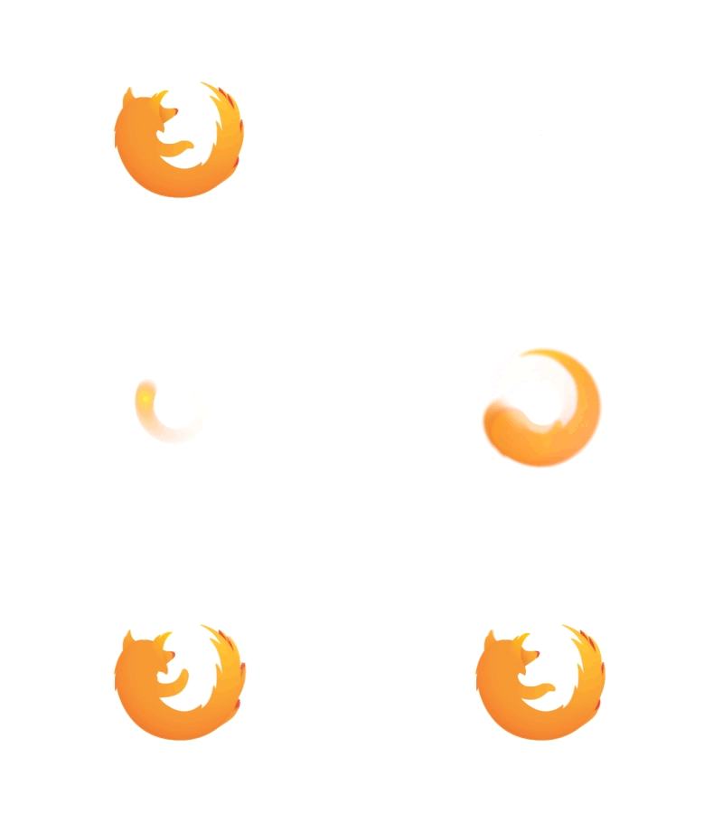
Firefox Logo Animation

The well-known browser shows a fiery fox encircling the earth conveying its global reach around the entire world. The fox represents the blazing speed of the browser.

Takeaway

Convey your brand’s values within the logo. eg. speed

Google

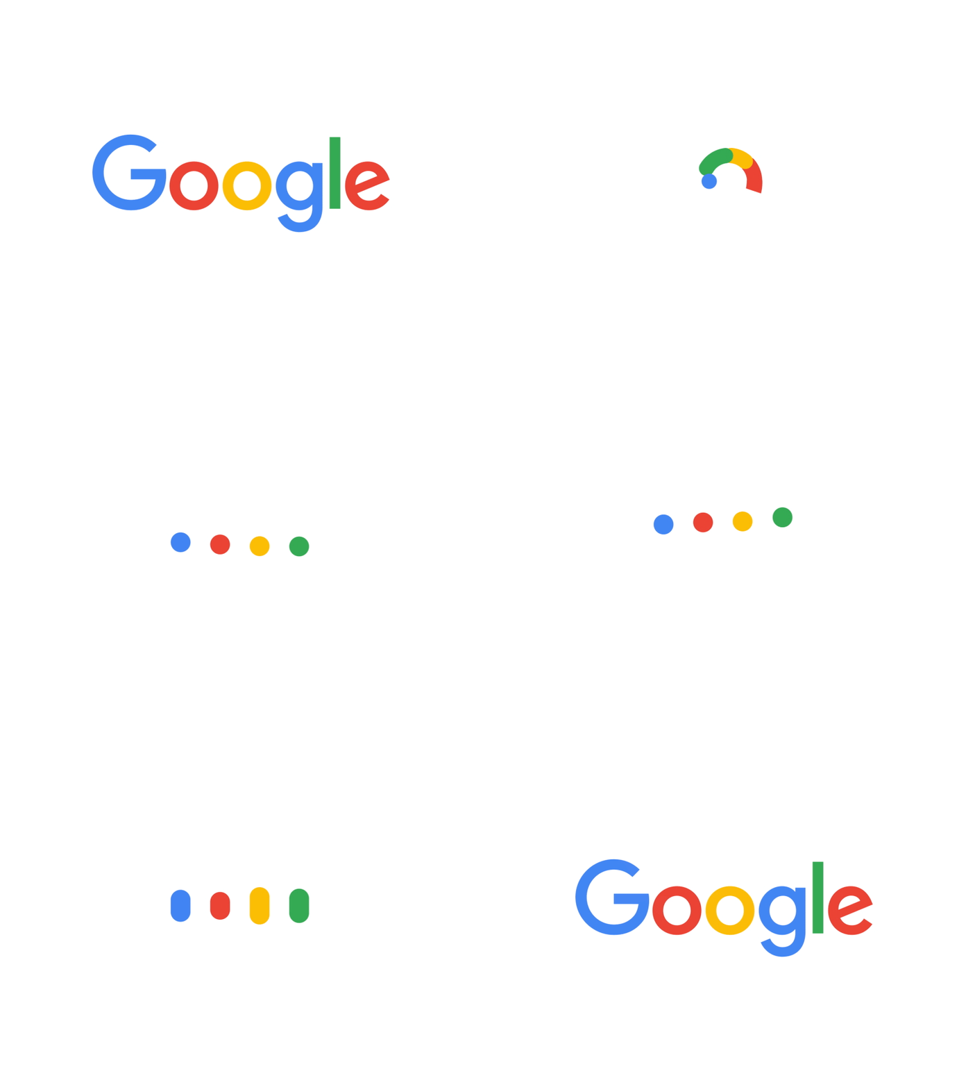
Google Logo Animation

This name needs no introduction. The animation demonstrates the Google Speak Now functionality in the brand’s colors.

Takeaway

Use color and motion to convey your brand in its simplest form.

Intel

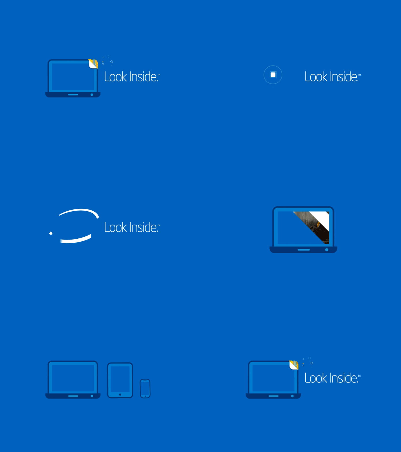
Intel Logo Animation

Intel is the world’s best commercial microprocessor chip making company. The logo conveys this, showing that it makes processors for tablets, computers and mobile phones.

Takeaway

Make your animation show your unique selling point, such as Intel’s chips.

Burger-King

Burger King Logo Animation

The Burger King logo is animated in piece by piece, in a 3D manner.

Takeaway

Consider giving dimension to your logo animation.

FedEx

FedEx Logo Animation

A well known courier delivery service uses the arrow for demonstrating its service.

Takeaway

Use your logo’s key feature / negative space to convey motion.

Hype Film

Hype Logo Animation

Hype film is a production company and camera film revolves around a loudspeaker to spell HYPE.

Takeaway

Don’t be afraid to add new elements to the logo animation sequence such as how HYPE uses film to build their loudspeaker.

Pixate

Pixate Logo Animation 

Pixate runs mobile app prototypes and the black background with four colorful leaves shows the creative side of the app.

Takeaway

Speed is crucial in animation, making for a smooth animation.

Nat Geo

National Geographic Logo Animation

The National Geographic’s famous yellow border is broken up and brought in piece by piece.

Takeaway

Don’t be afraid to split your logo into separate pieces for the animation.

Mail Chimp Snap

Mailchimp Snap Logo Animation

Send simple email newsletters from your mobile. (now discontinued)

Takeaway

Build your logo up, with dimension.

Fanta

Fanta Animated Logo

The bubbly fun nature of the type and orange circle shape is brought to life with animation.

Takeaway

Use your logo’s key attritbutes for the animation such as the type and orange circle in this case.

Uber

Uber Animated Logo

Building on the line ways points of a map, it creates a nice sequence to reveal the logo.

Takeaway

Use elements from your app or brand for the animation.

LinkedIn

LinkedIn

The professional network connects business people all over the world, which is conveyed by the bouncy man and case.

Takeaway

Business can also be fun!

Instagram

Instagram Animated Logo

The photo sharing app owned by Facebook combines the traditional camera and polaroid to form their text based logo.

Takeaway

Illustrate your brand’s key features and then the logo itself.

Vimeo

Vimeo Animated Logo

Vimeo’s video sharing platform uses video buttons such as play, pause to illustrate their service.

Takeaway

Make the logo functional and leave subtle hints to the brand.

Master Card

Mastercard Animated Logo

Mastercard illustrate’s its multifaceted uses such as experiences, travel and food. Priceless.

Takeaway

Show how diverse your product is by illustrating various elements.

Dell

Dell Animated Logo

Dell’s high-performance laptops  and PCS are illustrated by 4 icons coming together. The ultimate collaboration of security, handling documents, analytics and cloud storage.

Takeaway

Depict the most effective characteristics of the product you supply to your customers.

Spotify

Spotify Animated Logo

Get instant access to millions of songs with Spotify.

Takeaway

Pick the logical part from the service/product and give it motion.

Pinterest

Pinterest Animated Logo

The logo in the animation shows a pin / P followed by written text ‘Pinterest’, a platform to discover information globally, by images.

Takeaway

A single symbol can show the entire motive of the brand and its identity.

Flickr

Flickr is one of the most significant platforms for sharing videos and photos. The logo conveys a world of creativity and inspiration.

Takeaway

A simple idea is often the most effective. Two dots can evolve into something so large!

Nike

Nike Animated Logo

The Nike Swoosh animated with bright vivid paint, highlighting the active nature of the swoosh.

Takeaway

If your logo already has motion, use it to its advantage.

Do you have any other favorite famous animated logos? Let us know!

Anil Parmar is the co-founder of Glorywebs that aims to help clients with professional web design services, app design & development, digital marketing and more. Find him on Twitter @abparmar99.

20 Free Portfolio Themes for WordPress to Download

Original Source: https://webdesignledger.com/20-free-portfolio-themes-for-wordpress-to-download/

As a designer, the best way to showcase your work is an online portfolio. An online portfolio is a proof of your expertise, experience, and skills. A portfolio site helps your potential clients to look at your advantages over other creatives out there.

The best and the easiest way to create a portfolio today is to use a creative free portfolio theme for WordPress. We decided to make this task more comfortable for you and collected 20 amazing free portfolio themes which you can customize and use.

1. Portfolio Gallery theme

portfolio-gallery-theme

2. Minimalist Portfolio

minimalist-portfolio-theme

3. Adventure Lite

adventure-lite-theme

4. TheMoments

the-moments-theme

5. panoply theme

panoply-theme

6. Hestia theme

hestia-theme

7. Zyloplus

zyloplus-theme

8. Shapely

shapely-theme

9. Eight Sec

eight-sec-theme

10. Seguente

seguente-theme

11. Business Press

business-press-theme

12. Vega

revolve-theme

13. Revolve

coral-drive-theme

14. Coral Drive

vega-theme

15. Hitchcock

hitchcock-theme

16. Coral Dark

coral-dark-theme

17. Pinnacle

pinnacle-theme

18. AccessPress Parallax

access-press-parallax-theme

19. Pure & Simple

pure-simple-theme

20. Innovation Lite

innovation-lite-theme

Read More at 20 Free Portfolio Themes for WordPress to Download

Designing a Great Logo: Tips & Mistakes to Avoid

Original Source: http://justcreative.com/2017/10/22/logo-design-tips-mistakes/

This article was contributed by Krzysztof Gilowski.

Although the recipe for a perfect logo does not exist, the knowledge of the features that distinguish legendary designs from the average ones, will allow you to get closer to greatness.

In this article you will get to know the rules that underlie the designs of some of the most valuable brands in the world.

Recognizability is everything

The best logo designs communicate the whole brand image in no time. Lego embodies the joy of children playing with toys. The Mercedes’ logo expresses luxury with an elegant typeface and a geometric abstract symbol.

lego mercedes logo

The most famous logos have a story to tell and that makes them unique.

Simplicity is the key to success

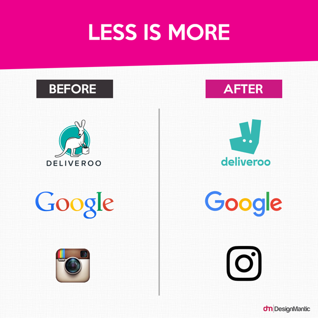
Less is more

What do the  world’s most recognizable logos have in common? The McDonald’s “M”, Nike’s swoosh, or the Apple’s apple with a bite (or byte) taken out of it? They are all extremely simple.

“The only mandate in logo design is that they be distinctive, memorable and clear.”

-Paul Rand

A good logo is original, but it is not exaggerated. An extremely complex logotype will not make your brand look sophisticated. It will only mean that the designer did not understand the meaning of simplicity.

Versatility – saving your nerves and money

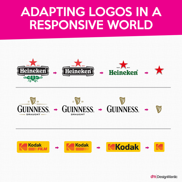
Adapting Logos

A logo should present itself well in every possible format: small and large; in black and white (positive / negative); vertically and horizontally. It must be equally effective displayed on a variety of media – smartphones, tablets, computer screens and printed advertising.

Make sure the logo is recognizable after reversing the colors and decreasing the size. Check out how it looks on a stamp and on a truck. Don’t be afraid to make different versions of your logo (aka responsive logos).

A good logo must be timeless

The most beautiful and effective logo is not based on the current trends in the market. These are timeless pieces of work. Their authors, thanks to their experience in design, can predict whether the logo will still be valid in 10, 20 or 50 years.

The BMW’s logo is an example of such a graphic sign. The original logo was designed in 1916 and has changed very little ever since. The style keeps being altered according to the era but the concept remains the same. See more logo evolutions here.

BMW Logo Evolution

6 rules followed by logo designers

Start with black and white

Fitucci Custom Windows Doors Logo

In the early stages of the design the colors are of secondary importance. Moreover, they can draw people’s attention away from the logo itself. Most of the recognizable logos start with black and white drawings and sketches.

Use three colors at most

Examples of valuable logos that would break this rule are rare. Do not try to make an exception here – reality shows that it does not pay off. Paradoxically, a timeless logo that would be memorable is very simple and minimal colors.

Use the right colors depending on the mood you want to create. Learn color psychology.

Color in Logos

Use one or two fonts

To keep your logo clear and transparent, you may want to limit your design to one or two types of fonts. Depending on the nature of your business, use fonts with sharp or soft lines. See here for great font combinations.

Choose practicality over originality

Your logo has to be easily remembered. Accept the principle that a graphic design should be easy to describe on the phone.

A good logo should be easy to describe on the phone.

Something that will stay in someone’s memory should not be very complicated. Always choose practicality over originality.

Below you can see a case study of 1500 people attempting to draw logos from memory. It’s difficult!

Hand drawn logos from memory

Avoid unnecessary details

Remove anything that is unnecessary from your design. The ideal logo is not the one that cannot have anything added to it. The best one is the one that cannot have a single element removed from it.

Do not use ready-made graphics

Under no circumstances, create a logo with ready-made items (stock graphics, cliparts, pre-made designs). Creating your logo from ready-made templates and pictures makes your logo non-unique and replicable. Not to mention that a part of your logo may be legally used in your competitors’ graphics.

Stock Logos No

4 major characteristics of projects that lack professionalism

If you are looking for a logo design, the following tips will help you evaluate the effectiveness of your designer’s work.

Materials full of defects

The files with logo designs that you receive from your designer should not contain any technical imperfections. The curves should not overlap and should be as smooth as possible and the nodal points should be minimized. If the logo is symmetrical, then the symmetry should be perfect such as below.

Remember that the presentation of a logotype in a different scale, such as zooming and placing it on a truck, will expose all of its possible errors and defects.

Below is a logo by that has been designed by Jeroen van Eerden with a grid system to avoid these defects.

Zen Logo

Monogram as a starting point

An inexperienced designer often cannot resist the temptation to create a logo based on the company’s initials (for example, the name “Great Company” would create the logo form ‘G’ and ‘C’).

While this seems like a good idea, it’s hard to build company’s credibility or convey branding information with that kind of logo. It’s quite common in the fashion industry although they have huge marketing budgets. Monograms do not work for all industries.

Monogram Logos

Shortening the name to acronym

It is often a mistake to try to shorten the name of a new company to acronym size. Yes, this is an effective strategy, as demonstrated by the IBM’s, KFC’s, or AOL’s logos. However, the names of these companies became acronyms only after many years of market presence and costly exposure.

Using graphics programs does not guarantee quality

A logo created in Photoshop or Gimp may not be usable when you want to engrave it or significantly enlarge it. A professional logo should look just as good on different devices, but a raster logo (presenting the image with a pixel grid) does not assure that effect.

A vector logo (which defines points mathematically) created in software such as Adobe Illustrator or Corel Draw will provide appropriate image reproduction on any scale – without the loss of quality.

Do you have any further logo design tips or mistakes to avoid?

About the author: Krzysztof Gilowski is CEO at Juicy – a company that creates memorable brands for small companies. Check out their guide on designing a restaurant logo on their blog.