Our 10 Favorite Open Source Resources From 2017

Original Source: http://feedproxy.google.com/~r/1stwebdesigner/~3/2ivqzei80og/

So many new projects are released every year and it’s tough to keep track. This is great for developers who benefit from the open source community. But it makes searching a lot more difficult.

I’ve scoured GitHub, organizing the best projects I could find that were released in 2017. These are my personal favorites and they’re likely to be around for quite a while.

Note that these are projects that were originally created during 2017. They each show tons of value and potential for growth. There may be other existing projects that grew a lot over 2017, but I’m hoping to focus on newer resources that have been gaining traction.

1. Vivify
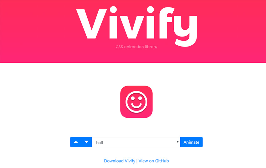
Vivify css framework

The Vivify CSS library was first published to GitHub in late August 2017. It’s been updated a few times but the core goal of the library is pretty clear: awesome CSS effects.

Have a look at the current homepage and see what you think. It works much like the Animate.css library – except the features are somewhat limited. Yet, they also feel easier to customize.

There are a bunch of custom animations in here that I’ve never seen anywhere else. Things like paper folding animations, rolling out with fades and fast dives/swoops from all directions.

One of the best new libraries to use for modern CSS3 animations.

2. jQuery Steps
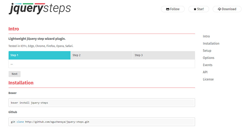
jquery steps plugin

With the right plugins you can extend your forms with a bunch of handy UX features. Some of these may be aesthetic-only, while others can radically improve your form’s usability.

The jQuery Steps plugin is one such example. It was first released on April 19th and perhaps the coolest progress step plugin out there.

It’s super lightweight and runs with just a few lines of JS code (plus a CSS stylesheet).

Take a look at their GitHub repo for a full setup guide. It’s a lot easier than you might think and the final result looks fantastic.

Plus, the plugin comes with several options to customize the progress bar’s design.

3. Petal CSS
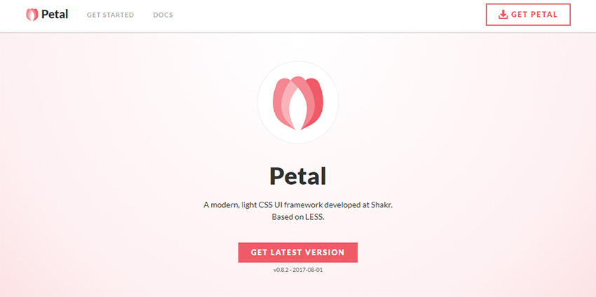
Petal css framework

There’s a heavy debate on whether frontend frameworks are must-haves in the current web space. You certainly have a lot to pick from and they all vary so much. But one of my newest favorites is Petal CSS.

No doubt one of the better frameworks released in 2017, I’ve recommended this many times over the past year. I think it’s a powerful choice for minimalist designers.

It doesn’t force any certain type of interface and it gives you so much control over which features you want to use.

This can’t compete with the likes of Bootstrap…but thankfully it wasn’t designed to! For a small minimalist framework, Petal is a real treat.

4. Flex UI
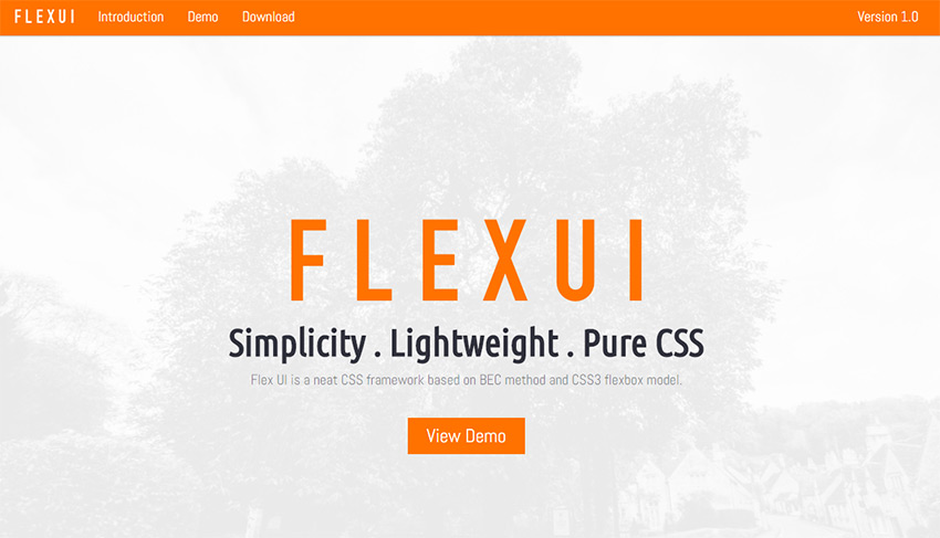
Flex ui framework

The Flex UI Kit is another CSS framework released in 2017. This one’s a bit newer so it doesn’t have as many updates. But it’s still usable in real-world projects.

Flex UI stands out because it runs the entire framework on the flexbox property. This means that all of the responsive codes, layout grids and typography is structured using flexbox. No more floated elements and clearfix hacks with this framework.

I do find this a little more generic than the Petal framework, but it’s also a reliable choice. Have a look at the demo page for sample UI elements.

5. Sticky Sidebar

Sticky Sidebar plugin

You can add sticky sidebars onto any site to increase ad views, keep featured stories while scrolling or even increase email signups through your opt-in form.

In May 2017, developer Ahmed Bouhuolia released this Sticky Sidebar plugin. It runs on pure JavaScript and uses custom functions to auto-calculate where the last item should appear, based on the viewer’s browser width.

The demo page has plenty of examples, along with guides for getting started. Anyone who’s into vanilla JS should give this a shot.

6. rFramework
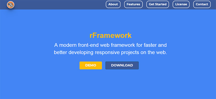
rFramework plugin

Looking for another awesome startup framework for the web? rFramework might be worth your time since it’s fully semantic and plays nice with other libraries such as Angular.

To get started all you need are the two CSS & JS files – both of which you can pull from the GitHub repo. All the styles are pretty basic which makes this a great starting point for building websites without reworking your own code base.

Also take a look at their live page showcasing all of the core features that rFramework has to offer.

It may not seem like much now, but this has the potential to grow into a solid minimalist framework in the coming years.

7. NoobScroll
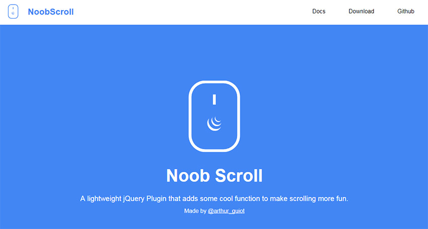
NoobScroll plugin

In mid-April 2017 NoobScroll was released. It’s a scrolling library in JavaScript that lets you create some pretty wacky effects with user scroll behaviors.

Have a look over the main page for some live demos and documentation. With this library you can disable certain scrollbars, create smooth scroll animations or even add a custom scroll bar into any element.

This is perfect for creating long flyout navigation on mobile screens. With this approach, you can have lengthy dropdown menus without having them grow too large.

8. jQuery Gantt
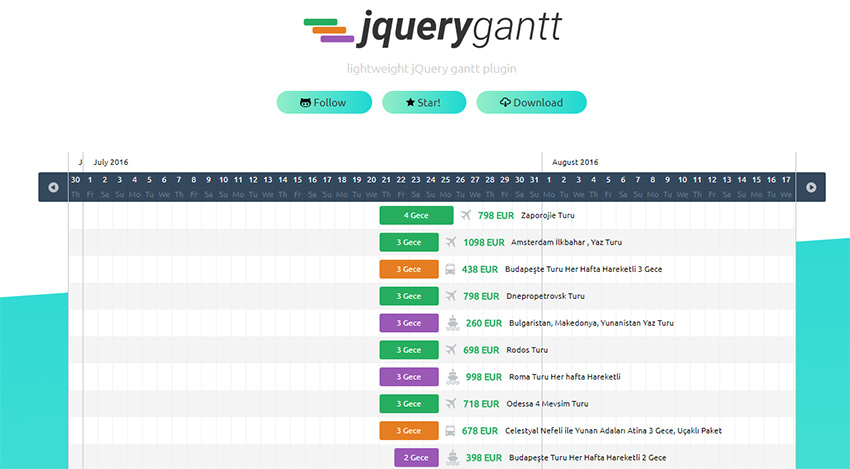
jquery Gantt plugin

Tech enthusiasts and data scientists likely know about gantt charts – although they’re less common to the general public. This is typically a graphical representation of scheduling and it’s not something you usually find on the web.

jQuery Gantt is the first plugin of its kind, released on April 24, 2017. This has so many uses for booking, managing teams or even with SaaS apps that rely heavily on scheduling (ex: social media management tools).

It works in all modern browsers with legacy support for IE 11. You can learn more on their GitHub page, which also has setup docs for getting started.

9. Paroller.js
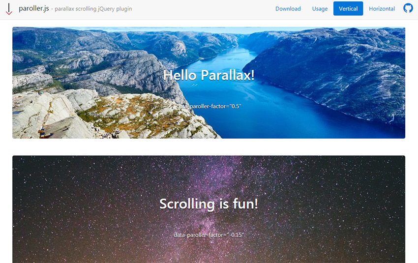
Paroller.js plugin

Building your own parallax site is easier now than ever before. And thanks to plugins like Paroller.js, you can do it in record time.

This free jQuery plugin lets you add custom parallax scrolling features onto any page element. You can target specific background photos, change the scroll speed, and even alter the direction between horizontal and vertical.

It’s a pretty solid plugin that still gets frequent updates. Have a look at their GitHub repo for more details.

10. Password Strength Meter

Password Strength Meter plugin

Last, but certainly not least on my list is this password strength plugin, created March 11, 2017. It’s built on jQuery and gets frequent updates for new features & bug fixes.

With this plugin you can change the difficulty rating for password complexity. Plus, you can define certain parameters like the total number of required uppercase letters or special characters.

If you’re interested in adding this to your own site, the GitHub repo is a nice place to start. The main demo page also has some cool examples you can test out.

But if you’re looking for more new open source projects, try searching GitHub to see what you find. The best resources often find a way of accruing stars, forks and social shares pretty fast.


Making The Transition From After Effects To CSS Transitions And Keyframes

Original Source: https://www.smashingmagazine.com/2017/12/after-effects-css-transitions-keyframes/

Websites are looking more and more like mobile apps. Users are also increasingly expecting a more app-like experience. From push notifications to offline mode, native web apps are getting there.
Once web apps function like native apps, the design interactions would also change to address the use case — namely, the ubiquity of animations. Animations drive interactions in all of our favourite apps, from Uber to Lyft and Snapchat to Instagram.

Presentator – A 100% Free Design Collaboration Platform

Original Source: https://www.hongkiat.com/blog/presentator-design-workflow-tool/

A quick Google search yields dozens of results for collaboration tools. But, most of them cost money and very few are geared towards web design or visual work. Presentator is different. It’s a…

Visit hongkiat.com for full content.

How to Improve Windows 10’s Battery Life

Original Source: https://www.hongkiat.com/blog/improve-windows-10-battery-life/

Like its predecessors, Windows 10 also comes with a bunch of features to increase battery timing, including a completely new Battery Saver option. On top of that, the Anniversary update and the new…

Visit hongkiat.com for full content.

8 iPhone & Android Apps To Create Cinemagraph

Original Source: https://www.hongkiat.com/blog/cinemagraph-iphone-android-apps/

Cinemagraphs create GIF animations with small elements that move while the rest of the picture stays static. Being neither a static picture nor a proper animated GIF, a cinemagraph mesmerizes its…

Visit hongkiat.com for full content.

3 Things to Consider Before Switching Hosting

Original Source: http://inspiredm.com/3-things-consider-switching-hosting/

Inspired Magazine
Inspired Magazine – creativity & inspiration daily

Are you fed up with your current host and now you’re looking for a different provider?

Maybe you found a cheaper host or a faster one or a host that offers some sort of benefit like a website builder.

These are all valid reasons to switch hosting companies, but it’s essential to consider a few things before making the big change.

First of all, no matter how much the host tells you that they’ll do everything for you, some of the work is going to be completed by you. Most notably, your email address transfer.

Some companies don’t have email addresses provided through their host, so those people won’t have to worry about anything. However, it takes some reading, understanding, and frustration to configure your Outlook or other inboxes with the new hosting credentials.

So, start by understanding that moving hosts doesn’t mean you sit back and watch the experts take care of everything. It’s a collaborative process that’ll most likely take a significant amount of time out of your day. After all, you have to communicate all of the logins to your hosting company and walk through the process of setting up your emails.

Some other considerations come into play during your switch from one host to another. If you’re thinking about jumping ship, take a good look at these thoughts so as not to make a rash decision. You may discover a great deal, but if you find out that the new host stinks, it’s a whole separate process trying to get your money back and moving the files to the old host again.

Therefore, keep reading to learn about the things to consider before switching hosting.

1. Is the Host You’re Switching to Considered One of the Best?

Your entire website setup relies on the hosting. The speed, security, management, and control over your site depends on getting a good host. Therefore, it’s extremely important to consider whether or not the world is talking about the new host.

If you can’t find anything on blogs or other online publications, it’s probably not a good idea to risk your website with the host.

The best hosting companies get mentioned all the time on “best of” lists, where the articles break down why they’re so good, based on criteria like speed, uptime, and customer support.

You’ll also learn more details about the hosts, considering most hosting company websites have extremely salesy and confusing information. So, instead of looking through hosting website sales copy, you’re at an extreme advantage checking out reputable blogs that talk about hosting, blogging, and building website.

As you peruse the internet for reviews, seek out articles that reveal critical, unbiased information about those hosts. If you start seeing your prospective host in these lists as quality options, you’ll most likely have enough information to pull the trigger.

For instance, I like to see some of the following in the articles:

The cost – It’s great when the author showcases all hosting plans from each company. We also like to see how long you have to prepay in order to get a certain rate. The reason for this is because most hosts market their lowest price on the website, but then you’ll discover you have to pay for something like two or three years in advance to get that monthly rate.
Money back guarantees – Although the goal is to locate a great host so that you don’t have to leave again, it’s important to find articles that highlight money back guarantees. This way, you know how long you have to get a full refund.
Load time – If the author didn’t at least complete a little research on load time I’d skip the article altogether. Why? Because hosting has a strong effect on how fast your website loads up to customers. The speed affects SEO and how often users leave your site without looking at anything.
Uptime – This is in the same category as load time, but it’s more about whether or not your site is going to randomly crash because of server problems. Most often the uptime for a host is close to 100%, but it’s good to check in the hosting reviews to see if anyone else has experience uptime problems.

2. Are You Getting Swindled?

Let’s face it, most brands and individuals looking into hosting think about pricing before security or speed. It’s not the way it should be, but budgets are a real thing.

Therefore, it’s ideal to find some of the cheapest pricing you can for a host. The only problem is that when you see hosts selling for less than a dollar, or somewhere around that, there’s a chance you’re getting swindled out of your money and placed on an easily hacked, unsafe server.

In addition, you might find that these super cheap hosts operate in a bad IP neighborhood, and this means that Google will most likely punish your site in return.

Along with rough downtime and bad support, your best bet is to avoid situations like these.

For example, some of the cheapest Aussie Hosting options are pretty bad. However, you can find quality shared and VPS hosting in that region without having to spend too much money. This is especially the case if you’re a blogger or small business owner who doesn’t initially expect to see much traffic coming to the site.

3. How’s the Customer Support?

When transferring from one host to another, the customer support comes into play quite often.

It’s also essential to have a phone line, live chat, and email address to contact the host after everything has been moved over. After all, you’re bound to encounter troubles with your site files. When that happens, you need someone to talk to.

Are You Ready to Switch Hosting?

Okay, so you’ve evaluated whether or not your future host is considered one of the best, checked to make sure you’re not getting swindled, and made sure that the customer support is pretty good.

Once you’ve walked through those steps you should have no problem switching over to the new host. Good luck!

header image courtesy of Alexey Kuvaldin

This post 3 Things to Consider Before Switching Hosting was written by Inspired Mag Team and first appearedon Inspired Magazine.

Getting Ready for Web Video

Original Source: http://inspiredm.com/getting-ready-web-video/

Inspired Magazine
Inspired Magazine – creativity & inspiration daily

Video is one of those really contentious points about web design. There are some people who feel like web pages should not have embedded video at all. These people are wrong.

Like any technology, however, we should respect it and not abuse it. The two worst things you can do are:

AutoPlay videos, without express consent from the user
Embed too many videos in one page

Both of these things are likely to cause annoyance to users and should be avoided unless you have a very good reason.

Knowing what not to do will only get you so far. The rest of your online video success story will depend on knowing the things you ought to do, which is what we’ll cover in the rest of this article.

Video categories

There are six different types of videos that are commonly used on sites. These are:

Regular video – you point a camera at something and record it
Live stream – you point a camera at something and don’t record it
Slide show – composed from a series of still images, often with voice over plus added descriptive text
Animation – various methods, but more commonly 3D rendered animations made with Maya3D or Blender.
Screencast – software records images from your computer, normally used for tutorials, usually with text overlays and voice narration.
Hybrid screencast – a screen cast with regular video segments, and possibly also slideshow segments.

Knowing which type of video you want to produce is a good start. Actually that brings us neatly to the next topic.

Plan your video

Good video doesn’t normally happen by accident. Meticulous planning pays off, and that means you know what kind of video you’re going to produce, how you’re going to produce it, and (very importantly) why.

Don’t fail to plan. For a start, your video should be scripted. This is true even if there is no dialog or narration. The script gives you a clear impression of how the video is supposed to unfold. You can also optionally story board the video, but a crew that can’t work straight from a script is not a very visionary crew.

If you’re making a bigger production, you’ll also benefit from budget planning, scene breakdown, shooting sequence (shot list), location scouting, etc. The more time you invest into planning, the better your video is likely to be. Professional preparation leads to professional results.

Software that can help you with script writing and planning includes Trelby and CeltX.

Invest in quality equipment

The equipment you use will have a big impact on the result. It may be difficult to believe, but the camera is not the most important part of your equipment investment.

That’s because for web video (in 2018, at least) it’s rarely sensible to shoot video above normal HD (1920px wide), and in fact it’s better to shoot in SD (1280px wide) or lower, and the aspect ratio should always be 16:9.

One source of confusion with these resolutions, by the way, is the slightly misleading standard names used, which references the vertical height (720p / 1080p) rather than the width, which is the most natural thing people think about.

In thinking about this, bear in mind that a video with a frame height of 720px will not fit on the screen real estate of most users, so it is easy to see why shooting above 720p will not give superior results for web video.

The larger your video frame is, the more resources it will hog on the user’s device, including in some cases failing to play at all, or playing very poorly. Your goal really should be to get the highest image quality and the lowest file size (in bytes).

The reason all this is mentioned is because cameras up to HD will be quite inexpensive compared to cameras that can shoot at higher resolutions, and you’ll just be wasting your money if you invest in them, because most users in 2018:

Do not have screens large enough to support the enormous frame size
Do not have connections fast enough to stream anything above HD smoothly
Do not have connections able to stream anything above SD smoothly either
Are not overly concerned about quality as long as it is reasonable

Quality of your content is the more important thing. So cameras for web video are cheap. What matters a lot more is the audio, and that is where you should invest sensibly.

Cheap audio solutions are likely to result in poor results, so avoid cheap audio and invest in quality. What you save on your camera can be reinvested into sound. Literally what you’d regard as a sound investment.

The main microphone types are shotgun, boom, and wireless. The top brands include Rode, Senheiser, Shure, and Audio-Technica.

Shotgun microphones will do the job if the camera is reasonably near and there is no wind. A boom mic can be made from a shotgun mic mounted on a pole with an extension cable. Wireless is the most expensive and the most likely to give you trouble.

You should invest in a good quality tripod as well, with the generally accepted best brand on the market being Manfrotto. What you should invest in lighting depends on the location. Other items you’ll need could include reflectors and shaders.

Completely optional items that can be useful include sliders, dollies, jibs, and lens filters. Don’t invest in these items unless your production warrants their purchase.

Set the scene

The best idea with online video is to keep it short whenever possible, and when it’s not possible, break it down into segments. This is far better than one long continuous narrative, and makes your video look more professional.

For each segment, think about what will be in the frame. If the camera will pan, track, or otherwise follow your movement between two or more points, think about what will be in the frame at each point. Rehearse it and mark the spots where you will stand if you’re in an on-camera role.

How you can mark ground spots is with chalk, tape, small bean bags, or stones. The camera operator should use a tripod or Steadicam for best results. Shaky video is truly horrible.

For screen casts and slideshows, think about how well the user can see what you’re showing. Zoom in on key elements if necessary, and be willing to switch betweeen different zoomed and unzoomed views, as the situation requires.

Make your own green screen

If you are presenting from behind a desk, a green screen can be a big improvement to your presentation. Simply get yourself a large, flat, solid surface, which should be smooth and unblemished, and paint it a bright shade of green.

For ultimate compatibility, also create magenta and cyan screens that can be swapped in if you need to show anything green colored in your frame.

With a green screen (or magenta, or cyan) you can use a technology called chroma key to replace the solid color with any image, including another video.

Obviously there’s not much point in making a video if nobody wants to watch it, so try to keep things interesting. Beware, however, not to be insincere or act out of character, because poor acting is worse than no acting at all.

Humor can be powerful if it is done well, and used only where it is appropriate. Likewise solemn, somber, and scandalous tones can also create interest when used appropriately.

Product videos and testimonials should be delivered enthusiastically and highlight the best features, however product reviews should be brutally honest in order to boost your credibility and win the trust of your viewers. Nothing is more valuable than trust.

Editing

Editing your video is the biggest task of all. For this, you’ll need software, and that software must be a nonlinear video editor (NLE). With this you can put mix and match the various clips you’ve shot to make a coherent narrative.

Not all editing software is equal. The best video editors are Cinlerra, Adobe Premiere Pro, Blender, and Sony Vegas Pro.

Rendering

Rendering is usually done, at least on the first pass, by the video editing software. When rendering for DVD, your goal is to get maximum video quality, regardless of the file size. Rendering for the web is a whole different thing.

The only formats worth considering are MP4 and WEBM, and while the latter will give you a better file size, it is not currently universally supported by all browsers. It is worth keeping in mind for the future.

Although your sound capture needs to be first rate, your rendered audio definitely should not be. In fact this is where most people go wrong, leaving their sound at ridiculously high fidelity when it’s not necessary. Reducing the audio quality will go a long way towards reducing file size while not noticeably affecting the outcome.

Codecs are a hotly debated topic, but the general consensus of professionals is to use the H.264 codec (or equivalent), because this will ensure maximum compatibility and a good balance between quality and file size.

Finally, consider shrinking the physical dimensions of the video if it is going to be viewed within a pre-defined space, and the user would not be expected to view it in full screen mode (doing so will work, but results in pixelation… their problem, not yours).

You can also use video transcoders such as Handbrake for your final render to fine tune the resulting file and ensure maximum compatibility. In some regions ISPs have restricted access to Handbrake downloads, but that’s just a testament to how good it is.

Captioning

Don’t under-estimate the power of captioning. Investing the time to create proper closed captions (subtitles) for your video production will be a very good investment. At the very least, allow auto-captions, but creating your own, especially if you allow a choice of languages, is always a good idea except when your video contains no speech.

Hosting

Considering how many mobile users there are and the prevalence of 3G connections, with 4G still being a (slowly growing) minority, HD video is not the best of ideas, and since Vimeo’s support for captioning is not on a par with Google’s, this makes Google the better choice for online video hosting at present.

Notice, however, that it was Google, not YouTube, that got the mention there. For numerous reasons, YouTube is not the best way to host your video, however there is nothing to prevent you uploading multiple versions of your video, one you host on a private Google account and one you host on YouTube.

The version embedded on your site should be the version hosted on your Google account.

The one exception to the rule is if you’re producing feature content, where you are showing off your film making prowess. In this case, Vimeo may have the edge.

For low bandwidth sites (those that attract less traffic than the bandwidth they have available), you could consider hosting the video on your own server. This can provide some advantages, especially in terms of loading time.

This post Getting Ready for Web Video was written by Inspired Mag Team and first appearedon Inspired Magazine.

Brand Identity & Motion Design: Animated Logofolio

Original Source: http://feedproxy.google.com/~r/abduzeedo/~3/osGlGqhWWZc/brand-identity-motion-design-animated-logofolio

Brand Identity & Motion Design: Animated Logofolio

Brand Identity & Motion Design: Animated Logofolio

abduzeedo
Dec 21, 2017

The folks over at Iteo, a digital agency from Poland shared a quite interesting project on their Behance profile. It is titled Animated Logofolio and it’s basically a portfolio of logos and all the pieces are animated. It’s definitely beautiful and it does give much more value to the work in addition to adding yet another dimension to the complicated task that is to design a brand identity. I love the idea of adding motion to brand identity, most of the modern design work in this field tries to add the idea of movement and nothing better than seeing that as a way to preview the work. Well done Iteo!

Iteo is a design and development agency from Katowice, Poland. For more information make sure to check out www.iteo.co

Brand identity and motion design


branding


7 Dependable Ways to Boost WordPress Loading Speed

Original Source: https://www.hongkiat.com/blog/dependable-ways-boost-wordpress-speeds/

The first thing a user experiences about your website, even before the design or content, is its loading speed. A typical web user expects a page to load between 500 ms (quick) and 2 seconds (slow,…

Visit hongkiat.com for full content.

5 A/B Testing Tools for Making Data-driven Design Decisions

Original Source: https://www.sitepoint.com/ab-testing-tools/

A/B testing is becoming more and more common as teams realize how important it is for a website’s success. The Web is a huge, competitive marketplace with very few (if any) untapped markets, meaning that being successful by offering something unique is rare. Much more common is that you’re competing for the business of your customers with several other websites, so attempting to convert every visitor into a customer or upselling/cross-selling your services better could make all the difference to your bottom line.

Due to this, the market for A/B testing tools and CRO (conversion rate optimization) tools is growing exponentially. But choosing one can be quite a time-consuming challenge, so in this article I’ll compare the best A/B testing tools to help you decide which is most suitable for you or your team. If you want to get up to speed with A/B testing and CRO, check out our recent Introduction to A/B Testing article.

TL;DR: A/B testing is about experimenting with visual and content changes to see which results in more conversions. A/B testing often follows usability testing as a means of testing a solution to a flaw in the user experience identified using metrics like bounce rate in an analytics tool like Google Analytics, and thanks to the depth and quality of A/B testing tools available now, A/B testing is accessible to designers as well as marketers and developers.

1. Optimizely

Summary: the leading A/B testing tool in 2017
Price: contact sales team
Who it’s for: designers, marketers and developers collaborating

Optimizely

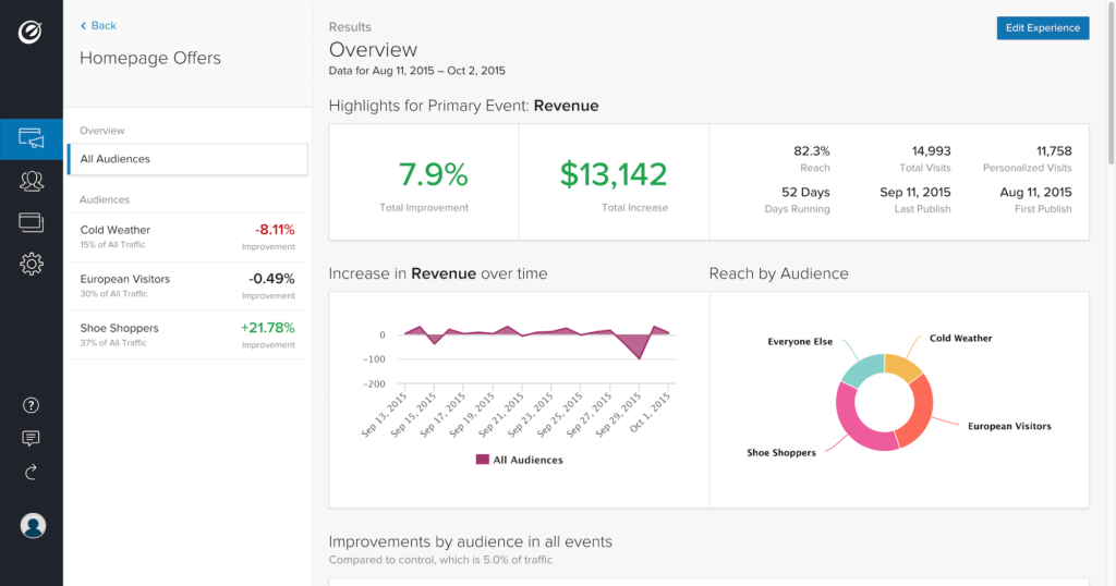
Optimizely is one of the leading — if not the leading — A/B testing and CRO tools on the market today. It offers analytics tools to suit users of all levels, and a multitude of A/B testing tools. (You could think of it as the Google Analytics of A/B testing, with a much simpler user interface.)

Consider this scenario: You have an ecommerce store built with Magento. You’re aware that in certain cases it may benefit stores to add a one-step checkout solution instead of the standard multi-page checkout, but you’re not sure if your store fits that use case. You need to test both options and compare the results with/without the one-step checkout experience. You know that running two versions of the checkout simultaneously requires changes to the code, which is a complex matter.

With Optimizely, you can send a certain amount of your users to a totally separate checkout experience to collect conversion data. If the experiment yields negative results, you delete the experiment and the original checkout web page still exists and works fine. No harm done.

With their Web Experimentation tool, which offers an easy-to-use visual editor to create A/B tests without requiring a developer (optional), the ability to target specific user types and segments, and create experiments on any device, Optimizely has all your bases covered.

Although you can run A/B tests without a developer, your variations can be more targeted (for example, your variations can go beyond color, layout and content changes) if you have the skills and/or resources to develop custom experiments with code. By integrating your A/B tests into your code, you can serve different logic and test major changes before pushing them live.

Also, if your product extends beyond the web, Optimizely works with iOS, tvOS and Android apps. Optimizely’s Full Stack integrations makes it possible to integrate A/B tests into virtually any codebase, including Python, Java, ruby, Node, PHP, C#, Swift and Android.

2. Google Optimize

Summary: A/B testing that seamlessly integrates with Google Analytics
Price: free
Who it’s for: anyone, being the easiest to learn of the bunch

Google Optimize

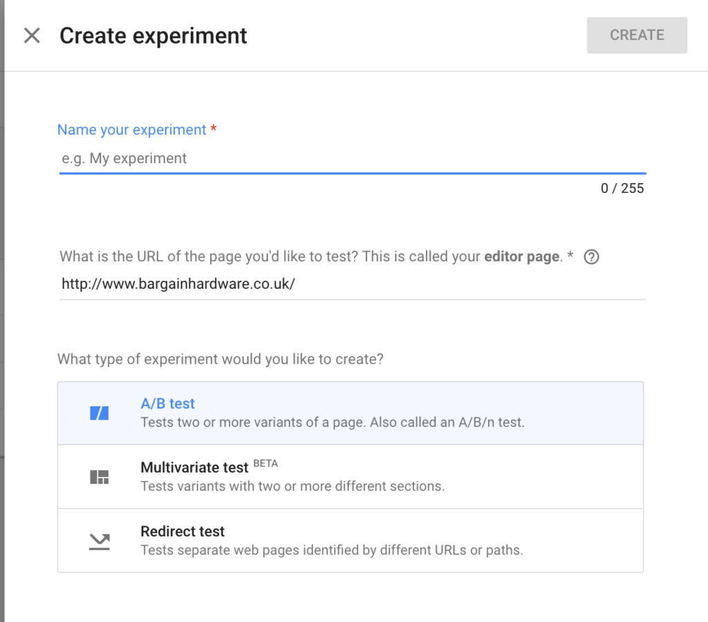
Google Optimize is a free, easy-to-use tool that integrates directly with your Google Analytics Events and Goals to make A/B testing quick and easy! It’s ideal for traditional A/B testing, focusing on comparing different CTA (call to action) elements, colors and content.

Developers aren’t required for implementing Google Optimize, since it’s as simple as adding a line of JavaScript to your website and then customising your layout with the visual editor. With this you can change the content, layout, colors, classes and HTML of any element within your page.

It’s not as sophisticated as Optimizely, since it doesn’t allow you to create custom experiments with code/developers, but it’s free. It’s great for those starting out with A/B testing.

For each Google Optimize experiment, you’ll need to specify which Google Analytics Goals or Events will be the baseline for your A/B tests. For example, if you were A/B testing a product page, you could use an “Add To Basket” event that you’ve defined in Google Analytics to evaluate which of your variations converts the best. The Google Analytics report then gives you a clear indication of which variation converts best. It’s ideal for those on a low budget!

Just don’t get carried away, as Google famously once did, by testing 40 different shades of blue to see which converted best!

Continue reading %5 A/B Testing Tools for Making Data-driven Design Decisions%