Free Graphic Design Vector Icon Pack

Original Source: http://justcreative.com/2017/07/19/free-graphic-design-icon-pack/

Get your hands on these 15 design themed icons, including the pen tool, Venn diagram, Pantone color book, paint brush, eraser, magic wand, scalpel, ruler, spray can, camera and printer.

They are available in color and black and white for easily editing, in AI, EPS, PNG and SVG formats.

» Download Free Graphic Design Icon Pack (5.5mb)

Free Graphic Design Icons EPS Vector Pack

» Download Free Graphic Design Icon Pack (5.5mb)

This pack was exclusively designed for JUST Creative by Vecteezy. Check out their site for more awesome free & premium resources.

8 Winning Instagram Tips for Your Business

Original Source: http://justcreative.com/2017/07/31/8-winning-instagram-tips-for-your-business/

This article was contributed by Mark Velarga.

You have an amazing brand, and you want to maximize your customer engagement via Instagram. But how should you go about doing it?

With over 700 million monthly users, Instagram is a veritable gold mine for engagement, helping businesses to connect with their customers and increase sales without having to fork over a fortune for travel and paid advertising. But how?

The task may seem daunting at first, but with the right plan of attack, anyone can get results. If you’re looking to increase your following, engagement and customer base on Instagram, check out the following 8 steps to build a roadmap for Insta-success!

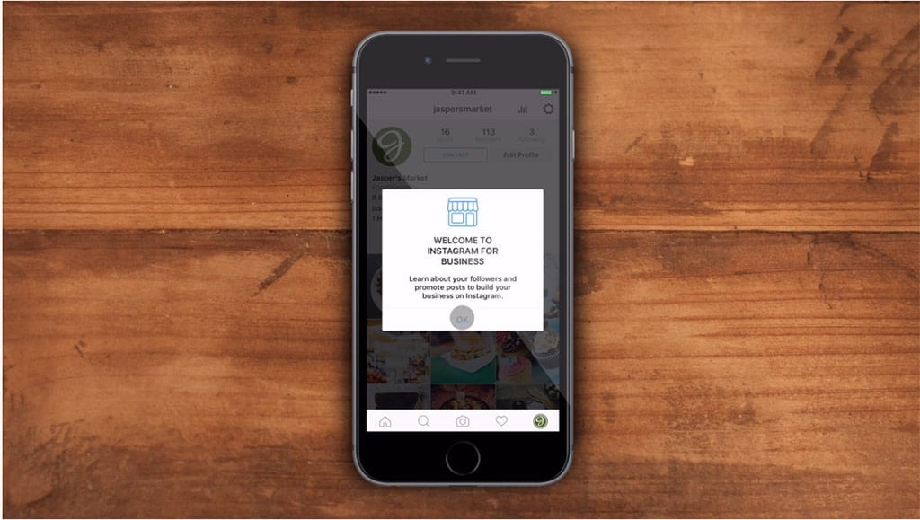
Create an Instagram Business Account
Phone on Desk

Did you know that Instagram’s engagement rate is about 2.26%? That’s over 2% higher than both Twitter and Facebook! Obviously, there’s tremendous potential on the platform that growing businesses would be foolish to ignore.

So where to start? Like any other successful endeavor, it begins with building a solid foundation, and the first step involves creating a business account.

You have two options: either convert an existing personal account or start from scratch. With a business account, you’ll be privy to business features and free analytics through Instagram Insights (more on metrics later).

Here are some helpful tips for creating a business profile:

Complete your profile (Don’t leave unfinished!)
Make sure it is public
Use business name
Upload branded profile image
Include a compelling bio statement (update frequently!)
Provide a link to your website

Consistency and recognizability are key to success. You’ll want to ensure that your brand’s name, image, products, services, etc. are presented with clarity in purpose and focus.

Make sure that your message is clear and consistent. The last thing you want to do is confuse viewers and lose potential customers.

Remember: This is not about you personally.

Focus on an approach that showcases your company and save the selfies for your personal account.

Establish your business goals from the beginning, and your experience will be much smoother!

Take Followers on a Journey

Phone in Hand Bushes

For most product-based companies, the general practice is to turn to generic product content. Don’t do it!

It’s important to add a bit of personality to your Instagram account. When you know your audience, it can help you develop a narrative, style and tone — this is your chance to share your brand story.

Instead of uploading dry or disconnected content, think of it like a scrapbook. By adding interesting photos and videos periodically, you paint an ever-growing picture your followers can connect with and be part of the journey.

This is not limited to images and video. You can also provide dynamic and engaging captions that appeal to your viewers. This will not only enhance their experience but will increase the chances of them becoming loyal customers.

People are also interested in how products are made. To satiate this curiosity, take them behind the scenes. This can be done through factory tour videos, sketches and diagrams, and anything that you think would be interesting to share. Remember to tell a story that’s fun, informative and provides a glimpse into your company’s inner workings.

By sharing everyday moments in a candid (and sometimes quirky) way, your company will appear more approachable to your followers. This is what separates winning businesses from the rest. 

Provide Quality Content

Strawberry Pancakes 

A poor image or video can be a big turn-off. If your content is not high-res and interesting, don’t upload it! Great content should be the cornerstone of your strategy. (Of course, if you’re going for a more lo-fi aesthetic, incorporate what best serves your vision.)

Quality, for example, can be developed through thoughtful direction of content, editing apps and positioning. Whether service-oriented or product-based, your content should be relevant to your viewers and convey the focus of your business. Also try experimenting with videos and creative captions.

Another good tip is to vary your product content creatively. This will ensure that your followers won’t get bored. Your audience will thank you!

Whatever approach you plan on implementing, make sure it’s consistent and attracts your intended audience. And don’t go for the hard sell. Ultimately, this will lead to followers who embrace your brand and purchase your products.

Inspire, Connect & Follow Back

Woman Playing with Hair

Many Instagram users love to be inspired. And who doesn’t? When viewers connect with your content emotionally, they will keep coming back for more. Leave behind the cut-and-dry and offer your followers images, videos and captions that truly resonate.

Engage with your customers through commenting and liking other pages, especially when you are starting out. It shows you aren’t just trying to get them to follow you. Go that extra mile, and you we’ll be rewarded with a loyal fan!

The focus doesn’t always have to be on products or services. For example, you can showcase employees, company activities and fun events. Creating this type of environment will help cement your bond and gain trust even more.

Another good practice is updating your bio section. A mistake many users make is to put up a boring blurb, add the company link and leave it at that. What you need to do is update it frequently. It provides the only clickable link, so get creative with its use. Think about how you can drive traffic to promotional events, registration, sales, etc.

The value of the Instagram page is typically measured by the number of followers versus those you are following — the more followers, the better. However, it is essential that you also follow back influencers and others who provide value for your business. This could lead to some great opportunities and collaborations in the future.

Build a Following

Chess People

So, the all-important question: How do you get more followers?

The process is not exactly easy, but with patience and creativity, you can create a buzz that will lead to greater click-through rates and amazing sales growth. Put in the work, and it will be well worth the effort!

Here’s a list of things you can do to build a massive following:

Use Hashtags: Makes it easier for people to find and follow you. Use a mixture of company-specific and universally popular hashtags.

Content Marketing; According to PakFactory, a custom packaging company, one way you can enhance your business’s brand is by creating valuable & quality content. Elevate your expertise and become a guest contributor for other related blogs.

Make sure to have a link to your instagram because if that particular content gets noticed and becomes viral, you might be receiving more followers than you imagined.

Get Mentioned: Instagram offers one of the best ways to spotlight collaborators and customers alike. Share your photos with other notable instagram accounts and get them to mention you. You can also give shout-outs through tagging (@tags).

Host Contests: Everyone loves a giveaway, right? Be creative and have fun with how you present your contests. They will come in droves if executed properly.

Offer Exclusivity and Create Anticipation: Keeping viewers interested is important. Upload teasers and offer your loyal followers rewards in the form of exclusive content.

Collaborate: We all can’t do this on our own. Search out for companies or individuals that align with your mission and create a project together that will help each one’s brand.

Explore Instagram Stories

Typewriter on Desk

What’s better than one powerful image? How about a slideshow filled with dynamic content?

Instagram Stories allows you to string together your images and videos to create even more immersive content that your followers can experience at their own pace throughout the day (all content disappears after 24 hours).

Since this has become a prominent feature, more and more businesses have started experimenting with it. Other than its sheer engagement potential, the feature offers several benefits:

Share as much as you want (displays in chronological sequence)
Offers text, face filters and drawing tools
Provides more dynamic value to your followers
Higher discoverability through Story Search
Showcase a more comprehensive story
Stories are displayed at top of follower timelines

Go ahead, get creative and see what you can do with Instagram Stories! Your followers will be more enthusiastic and want more. It’s an addiction that we can all get on board with. 

Post on a Regular Basis

Instagram on Phone

You may one day come up with the perfect Instagram post that garners thousands of likes, but if you aren’t posting regularly, it won’t make a difference.

Consistent content is the name of the game. If you want to grab and hold your audience’s attention, you need to employ content scheduling.

Fortunately, there are several tools that can help keep track of your visual campaigns. These include Schedugram, Autogrammer, Later and Planoly, among others. If you decide to forgo these options and go old school, make sure that you use a method (calendar, notebook, etc.) that keeps everything organized and easy to work with.

Harness the Power of Metrics

Man on Computer

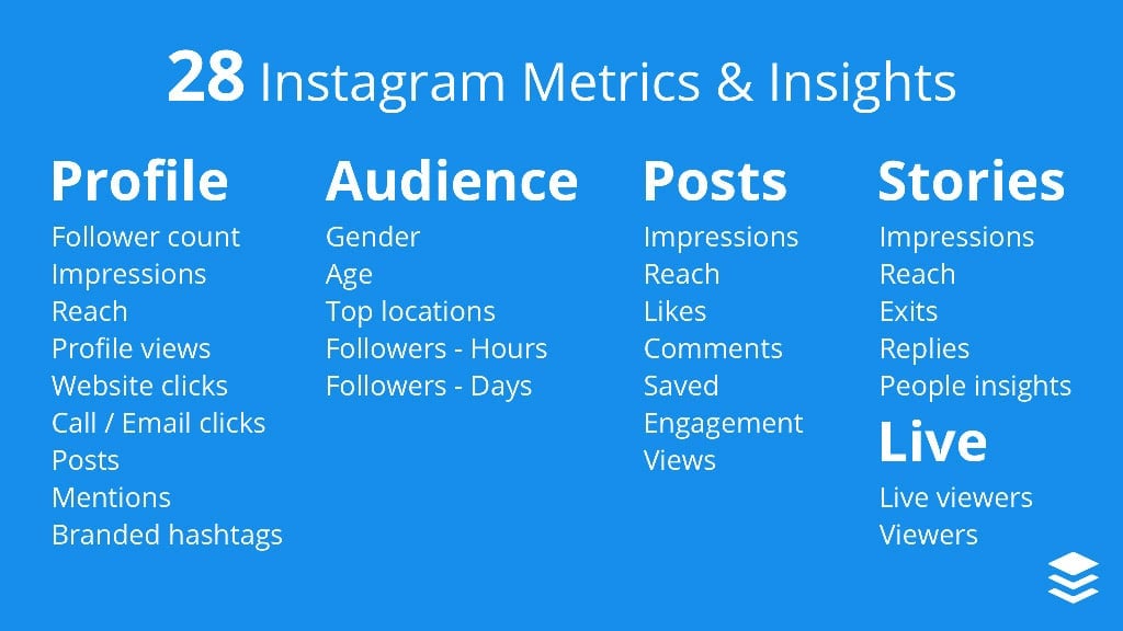
Let’s face it, if you are using Instagram and want to capture as much value as possible, you need to embrace metrics. Relative to other social media platforms, it can seem like there aren’t as many options in this department. But don’t worry. Thankfully, there are several instagram metrics that can help you figure out what’s performing well and what’s not.
Instagram Metrics

Most people would assume that the number of likes would be the most important metric, but once you delve into the data, you’ll find that comments received is a better signifier of overall engagement. Once you get a feel for analytics, you’ll be able to focus on the information that gets you results.

There are some handy (and free) analytics tools to assist you, including Instagram Insights (through Instagram business account), Socialbakers, Simply Measured, Union Metrics and SquareLovin.

With these tools, you’ll be able to analyze essential data, not only from yourself but from your competition as well, and improve the performance of your business account.

And there you have it!

By establishing these steps from the beginning, you will greatly increase your chances of success and limit the headaches associated with shoddy strategy. As you become more comfortable with the basics, stretch out creatively and experiment a little. Remember to also have fun while your posting. Good luck!

My Journey Of Learning Programming Through Flatiron School #34

Original Source: https://webdesignledger.com/my-journey-of-learning-programming-through-flatiron-school-34/

My name is Mason Ellwood, and I’m currently working on Flatiron School’s Online Full Stack Web Development Program. Each week, I’ll be writing about my experience, what I’m learning, and tips on learning to code.

Today I would like to deviate from code review and talk about something a little more important, time management, and how I have been able to envision an end point with the school. The Flatiron school, in a simple sense, is huge especially the online course that I am involved in. It is very expensive and you have to be very involved in the school to really be invested and take full advantage of the extent of knowledge that is available to you. I did not realize this until I officially began working full time in the school.

With this understanding of what was to come, I was able to provide myself with safe goals to complete per day to view an endpoint in the future. This was going well, I did not set goals that were too high, but were tangible to compete with everything else going on with work and so forth. Upon finishing the material that was mandatory to enter into the full school lesson program I was ready financially to begin working through the course material full time, all day every day. But then, as it always does, life happens….

Around this time, I had received a phone call from my mom and she told me she was diagnosed with cancer. Because of the severity of this cancer that she was diagnosed with, they said they would begin chemo that night. So off to Tucson I went, scratching all my study plans. For the next week, I stayed at the hospital with her, all day for roughly 15 hours per day. Only leaving to eat and sleep at my parent’s house. Through this time, it was hard…. And if anyone of you has had this happen to you I know from a viewer standpoint of how nasty cancer and treatment really is. Once the initial shock of the stark turn my life just took, I began thinking about school again. I began taking my laptop to the hospital every day with me.

My mom was unable to really talk through this time, it gave me a large window to make real progress with the coursework provided by The Flatiron School while being able to be there for the family to do whatever they needed me to do for them to help in any way I could. So this was my new normal, living in Tucson, Arizona hanging out at a hospital all day, helping with my mom and setting aside anytime I could to be there for her.

This was the next 5 months of my life, working and caretaking. Being there for my mom, while working through this cancer together and working through school when I had the time. This set me back in school quite a bit. I was not making the progress that I had, but still slowly inching my way forward.

During this time we got connected with M.D. Anderson in Houston, Texas. So off to Texas we went. This past month and a half I have spent in Houston, preparing for the stem cell transplant that was approaching.

Every day in Houston I would wake up, pack a lunch, be at the hospital from nine o’clock to three o’clock. Then head to the gym, eat supper, and head back to the hospital until 12 o’clock. My time spent at the hospital I would work on school, it being really the only time I had. On July 4th, 2017 was the big day, my mom was ready for her stem cell transplant, her new birthday. If any of you know this is a big deal. Basically, it is a restart of her immune system, so when she gets to come out of the hospital she will have the immune system of a child, no vaccinations, and susceptible to anything that the average person would be able to fight off with a built up immune system.

For the next 15 day, she was unable to eat and could not leave her bed. So I sat with her, day after day, working on school, and helping with mundane things like plugging in her phone or ordering food on the phone. Things that you don’t think about until you are unable to do them. As well as making sure she was all caught up on the new season of The Bachelorette, which I hate to say, but it’s actually pretty addictive haha.

Though this time, I completed Ruby, built my first gem, ran business meetings, as well as had interviews with the school upon completing a major portion of the class work all from a hospital room at M.D. Anderson in Houston, Texas.

On July 20th we found out that is could be the cure, and she could possibly be cancer free and was released from the hospital.

We were headed home!

I do not mean to write a post about how I was able to complete all this school work, how I am this great guy, or a sob story. And I hope you don’t take it that way because that is not how I intended it. But things happen in life and you have to adjust. I set aside this time for myself to really progress in school, and with one phone call that all changed. I did not plan on moving to Houston for a couple months, nor spending long extended time in Tucson, but life goes on. This time with my mom has given me the strength to push through emotionally, has created a closer bond with my family than I have ever had. It has given me the time management skills to always know that I actually do have time to get what i needed done, even though it’s not quite the way you wanted that time to look.

My mom is cancer free, and I am more than halfway done with school. Which in a warped way, feels pretty good.

Read More at My Journey Of Learning Programming Through Flatiron School #34

Web Typography Fundamentals with Jason Santa Maria

Original Source: http://justcreative.com/2017/07/21/web-typography-fundamentals-with-jason-santa-maria/

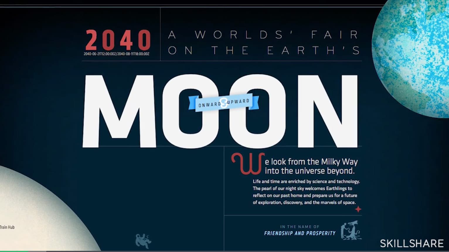
In this brand new Skillshare course from award-winning designer, author, and type expert Jason Santa Maria, you will learn what makes a great online typeface, how to know when a font works and other advice for how to design with fonts.

This is a perfect class for designers, marketers, and everyone writing on the web!

In 9 clear lessons, Jason breaks down every aspect of online type, from practical design considerations to cultivating a discerning, artistic eye. Packed with examples and inspiration, this class is a rich introduction to the limitless world of typography.

» Watch Introduction Video for Free

Web Type Fundamentals

Key lessons include:

Understanding key terms and typographic elements
Choosing specific typefaces for different projects
Pairing typefaces to create a personal webpage
Layout basics: sizing, spacing, and proportions

Whether you use typography in professional designs, meeting presentations, or personal projects, this class will change the way you interact with type.

By the end, you’ll have a new arsenal of skills to help you see type in a whole new way — empowering you to use type intentionally, better communicate your ideas, and bring your words to life.

2 Free Months of Skillshare Premium!

Get unlimited access to this class and 16,000+ more with Skillshare Premium.

» Click here to get started

10 Best Free Online Web Development Courses: Learn, Design, Earn!

Original Source: http://justcreative.com/2017/07/24/best-courses-to-learn-code-online/

This article is written by Henry Rise, the CEO of ThemeRex, Power Elite Author on Themeforest, with 140+ WP themes.

When newbies ask about the best places to learn code online, the correct answer is… it depends. It depends on many different factors.

Your background is important, what you want to get out of the experience, and what your end goals are, make different resources better or worse fit for you.

But what skills to learn? We suggest learning HTML and CSS first. You should also pick a programming language. Any programming language works, most people choose JavaScript, but we think Ruby is a better idea for a first programming language to learn. Don’t overanalyze, just pick stuff and learn it. And have fun!

10 Best Free Online Web Development Courses

We don’t necessarily suggest using all of these resources. Pick some of them and give them a whirl. Some you may love, others you may hate. Worst case scenario, you’ll waste a bit of time and learn what doesn’t work for you.

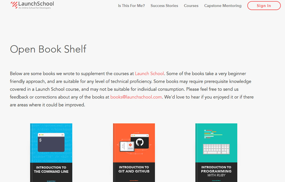
Launch School

Launch-School

This program isn’t for everyone. That’s why you can take their free prep courses and then make a decision. No matter your experience, you should start with the free prep courses, and get a feel for the format. If you are able to finish the prep courses and enjoy that experience, you may consider registering for paid courses. If you can’t finish the prep courses or didn’t enjoy the experience, then you probably shouldn’t take the Launch School program.

In order to really understand any tool – Rails, Angular, React, etc – you have to start with the first principles. First, you have to learn basic problem solving with a programming language. Next, you have to learn the intricacies of that language. Then, you have to learn web development, which includes HTTP, front-end vs back-end, SQL, relational databases, etc. Finally, you can start to peel back the conventions in a library or framework.

In short, this school program is geared towards those who are serious about getting a job with a time horizon of 12-14 months for the transformation.

Visit Website

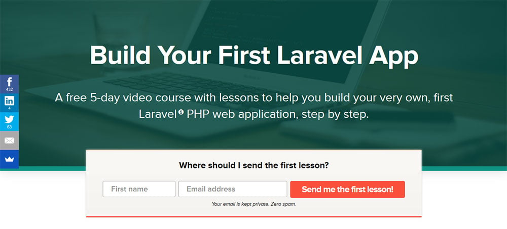
Build Your First Laravel App

Build-Your-First-Laravel-App

This is a free 5-day video course with lessons that will teach you how to build your very own, first Laravel PHP web application, step by step. They will walk you through the process and show you how to code everything. There’s no guesswork for you, and each lesson is short and easily-digestible.

Visit Website

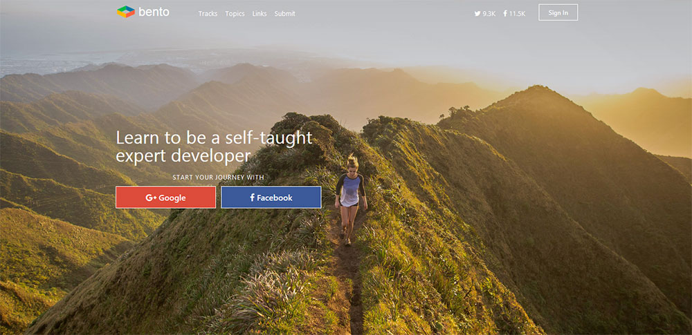
Bento

Bento

If you don’t know where to start, Bento offers a free full stack web development curriculum created by top engineers. Deep dive into the tech you’re passionate about. Bento found the best tutorials on over 200 different web technology topics. Share your own finds and tutorials on learning the newest technologies and see what other engineers are excited about.

Visit Website

Code4Startup

Code4Startup

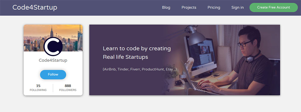
Leo Trieu designed and coded the Code4Startup platform with Ruby on Rails in 3 days only but it took him almost 2 and half months to create just 5 hours of video for his very first two educational courses ever, Zero and Ninja. Why? Because he is not a native English speaker and he had to practice and repeat hundreds of times. But he kept trying and never gave up. He bootstrapped this startup with a dream of educating millions people from around the world. Code4Startup is not just about learning how to code, it’s also about inspiring people to create something meaningful, something they are excited about.

Visit Website

CodeAvengers

CodeAvengers

Code Avengers offers classes for web designers, web developers and software engineers. At Code Avengers you learn by doing. Learn from step-by-step instructions combined with 1000s of code challenges, videos and quizzes with support from expert educators and an enthusiastic community of learners. You also build your portfolio. You’ll start off learning to build simple apps and websites, but quickly progress to building real-world applications you can show-off to friends and future employers. Whether you want to land your dream job, start your own tech company, or build technology that changes the world, the Code Avengers team are dedicated to helping you get there faster.

Visit Website

Codecademy

Codecademy

Codecademy is an education company. They’re committed to building the best learning experience inside and out, making Codecademy the best place for their team to learn, teach, and create the online learning experience of the future. The company is rethinking education from the bottom up. The web has rethought nearly everything – commerce, social networking, healthcare, and more. They are building the education the world needs – the first truly net native education. They take more cues from Facebook and Zynga in creating an engaging educational experience than they do from the classroom.

Visit Website

CodeCombat

CodeCombat

CodeCombat was created to give learners the feeling of wizardly power at their fingertips by using typed code. As it turns out, that enables them to learn faster too. It’s like having a conversation instead of reading a manual. They want to bring that conversation to every school and to every student, because everyone should have the chance to learn the magic of programming.

Visit Website

Codementor Learning Center

Codementor-Learning-Center

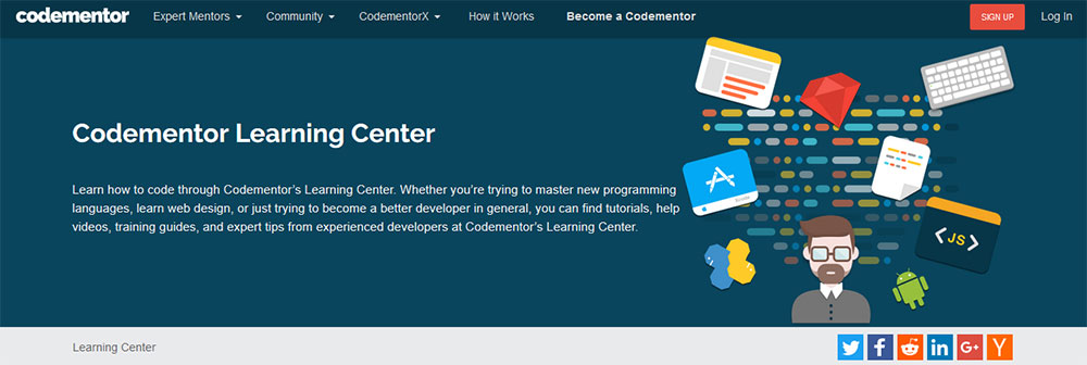
Codementor connects you with expert developers for live 1:1 help. At first you post your request. Get help for 800+ categories including JavaScript, Ruby, PHP, CSS/HTML, iOS, Android. Advanced topics include big data, machine learning, and more. Then you connect with a Codementor. Instantly connect with an online expert or schedule for a later time. Mentor’s rate starts at $10 for a 15min session. Get 1:1 expert help. Work 1:1 with an expert mentor for debugging help, code review and pair programming via screen sharing, video, and text chat.

Visit Website

Coder Camps Free HTML/CSS

Coder-Camps-Free-HTML-CSS

Since 2013, Coder Camps has been preparing students for successful, rewarding careers in the field of software engineering. Through accelerated and immersive courses led by expert instructors, their students become accustomed to thinking like a developer and adapting to the dynamics of working on an Agile software team. As technology continues to evolve at an increasingly rapid rate, students need more than a kick-start to a good job, they need a persistent career development partner. That’s why Coder Camps graduates are encouraged to return as often as needed, free of charge, to refresh their knowledge, learn new technologies and find new opportunities. Their coding bootcamp centers on the needs of today’s hard working software teams and hiring managers. From learning to code, creating a fully-functional web application, interview readiness training and so much more, their focus is preparing students to meet the demands of employers.

Visit Website

iLoveCoding

iLoveCoding

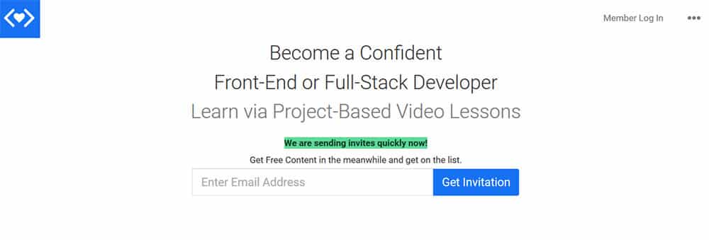
iLoveCoding provides the simplest path to becoming a Front-End and Full-Stack Developer, they provide Video Based Training + Mentorship for their programs. They focus on Javascript Stack and its related technologies. Training is self-paced, and mentorship is available online via Student Area + Office Hours. iLoveCoding is a coding bootcamp alternative but better in value (cost), in effectiveness (they keep it real, vs hype or pushing things down your throat).

Visit Website

Summary

I hope you will pick out the resource that will teach you all necessary skills to start developing your templates, websites, applications and making money on your passion. Have you already tried any of them? Do you have any additions to this list? Please share them as well as your success stories with us at the comments section. If you have any additional questions, please don’t hesitate to reach out and ask.

More? Browse 35,000+ Courses on Udemy

From programming to photography, Udemy has it all! Check out their online courses.

Udemy Courses

Have any other free (or paid) online web development courses you recommend? Let us know!

10 Business and Startup WordPress Themes For A Better Website

Original Source: https://webdesignledger.com/10-business-startup-wordpress-themes-better-website/

Today, we live in a highly competitive world. Thus, it is very important for your business to have the advantage to survive.

How to make your startup or small business stand out from the competition? One sure way is to have an award-winning website to promote your goods or services.

Building a business takes careful planning in many different areas. Moreover, executing those plans can take time. Yet, once a content of a company’s website has been determined, building the website can be done in short order. This is quite easy when the right tools for the job are at your fingertips.

Whether you’re simply looking for inspiration, or ready to get started, you are in the right place. You’re sure to find one or more out of the following collection of WordPress themes to be helpful.

If you need to have a quality website up and running in nothing flat, you need to look no further.

Be Theme

How is Be Theme good for building startup or small business websites?

Being the biggest has its advantages, and Be Theme is the biggest WordPress theme to date. Bigger means having more tools (features), ideas, and concepts than the other guy.

One of the things that makes Be Theme ideal for startups and small business is its selection of 260+ pre-built websites that address every nook and cranny of the business world. Most pre-built websites are multi-page affairs, all are customizable, and it’s not at all difficult to find one that has the functionality you want your website to exhibit.

Be’s Muffin Builder and Options Panelmake building a website a piece of cake, and having more than 200 shortcodesto work with means there’s no need for coding. A pre-built website can also be used to rapidly create a prototype to share with a client for feedback.

If the thought of being able to start from scratch, and get a website up and running in 4 hours appeals to you, give Be Theme a look.


Cribs

Why is The Core a good choice for startups and small businesses?

The Core is a multipurpose WordPress theme that promotes different themes or website examples for different uses. One of these themes, Cribs, is dedicated to creating small business websites. Thus, if you or your client is a small business owner, it makes good sense to invest in a theme that focuses on providing the basic layouts and functionality your business’s website requires.

The Core comes with a visual page builder, and tons of design options. Your website will be fully responsive, WooCommerce ready, and via a WPML plugin, translatable into the most commonly used languages. Discounted purchase plans are available for building a single website, or an unlimited number of websites. For the latter, you can pay either a one-time fee or an annual fee. Either way, you can expect dedicated support along with free updates.

Oshine

What makes Oshine a good choice for small businesses and startups.

Oshine is a creative, multi-layout WordPress theme that comes with 27 striking demos featuring clean and modern designs that are applicable to building any type or style of website. The demos are customizable, and since they can be installed with a single click, you can get started immediately.

Oshine has its own, unique visual page builder, Tatsu. Since it’s a front-end builder, building and editing pages is a snap. The powerful options panel gives you total control over the layout design process, plus you’ll have more than a dozen menu and header options to work with.

For creatives, Oshine offers unlimited ways to create a stunning portfolio, and if you have products to sell, or a service to provide, the theme is WooCommerce and WPML compatible.

Uncode

Why would Uncode be a good choice for small businesses and startups?

Uncode is a popular creative WordPress theme that was handcrafted by an experienced and award-winning team of designers and developers. Uncode is pixel perfect and ultra-professional in its presentation. It’s clean, modern layouts will satisfy almost any need.

Whether your intent is to produce a highly qualified e-commerce website, a magazine-style website, a corporate website, or simply a portfolio, Uncode will be an excellent choice.

Ultra

What makes Ultra by Themify a great choice for startups?

Whether it’s to create a rapid prototype layout, or to build the final product, Themify’sdrag and drop pre-made row designs provides a super-fast and efficient way to build your pages. This modular approach also provides an easy way to update a page in an existing website. There are currently 34 editable pre-designed rows to select from, including FAQ, Banner, and Testimonial sections.

Houzez

How is Houzez good for small businesses?

Houzez may not be the best fit for some small businesses, but this specialized WordPress theme is the best possible choice for creating a realtor’s or real estate agency’s website. The functionality most agencies need is already there, including property search, rate, and review, custom workflows, private messaging, and more.

Add content, and you can have a website up and running in hours, or even sooner.


KLEO – Ready To Go Theme For Your Business

How is KLEO a good choice for small startups?

KLEO is a community-focused, multipurpose BuddyPress theme. This is exactly the type of theme for creating websites that many startups, and more than a few businesses, could put into play to grow their customer or user base.

KLEO has plenty of demos, and it’s easy to install the plugins you may need. You can try KLEO for free, and test its options before you buy.

Kallyas

What does Kallyas have that startup and small business websites need?

Kallyas’s reputation speaks for itself. This nearly 5-year-old responsive theme, created by an experienced, customer oriented team, has been a top 15 best-selling WordPress theme since day one.

Kallyas is loaded with features, including 50+ pre-built websites, a simply amazing visual website builder, adaptive images, video tutorials, and dedicated support. Kallyas is a WordPress theme you can have fun with!

Infinite

What makes Infinite the right choice for a small business or startup?

Infinite is a multi-purpose WordPress theme. It was created with a goal of providing a website solution for everyone. All the needed tools are there, so it’s simply a matter of checking out the pre-built website demos.

The demos fall in 4 categories: WooCommerce, Creative, Corporate, and Niche Retail and Services; one of which should fit a small business or startup nicely.


TheGem

How is TheGem good for small businesses and startups?

Equipped with flexible features focusing on business, corporate and startup websites, delivered with outstanding designs for 50+ business concepts, and carefully developed by the best designers of the Behance network, TheGem will make your online brands stand out, and take your business to the next level.

The best thing is, it’s extremely easy in use. No coding is required. You can freely combine the pre-made demos per drag’n’drop with one another to create your own unique layouts. The 250+ content element styles, designed to cover the goals of any business or startup website make TheGem a reasonable investment.

To Wrap It Up

Finding the right theme for your small business or startup project can be difficult. However, no with this list of winning WordPress Themes. If there is a problem, it’s that of having to choose among several themes that are obviously just right for the job.

The good news is, you’re unlikely to make a poor choice. We’d like to hear what you have to say, or if you feel we’ve left something out. Happy website building!

Read More at 10 Business and Startup WordPress Themes For A Better Website

13 Beautiful 2013 Desktop Wallpapers for New Years

Original Source: http://feedproxy.google.com/~r/visualswirl/~3/a-1sIRSLVX8/

Welcome to 2013! To kick off another great  year I’ve rounded up 13 of the best 2013 wallpapers. Start off the new year by making a plan to clean up your desktop. Once it’s clean, you’ll want to decorate with one of these great wallpaper designs. And if you’re looking for monthly calendars for January, head over to Smashing Magazine to see some really great January 2013 calendars. So find the wallpaper that fits your resolutions (pun intended) and here’s to a happy and productive New Years!

2013 Wallpapers for a Happy New Years
Wallpaper by Upwallpapers.net

2013 Sparks New Years Wallpaper

Wallpaper by demeters

Snowflakes 2013 desktop wallpaper

Wallpaper by paha13

crazy colorful 2013 desktop wallpaper

Wallpaper by GuilleBot

Jungle Wallpaper for 2013 desktop

Wallpaper by paha13

Purple desktop wallpaper for 2013

Wallpaper by PSDRoman

cloud rainbow 2013 desktop wallpaper

Wallpaper by Jenova89

hope and darkness 2013 wallpaper desktop

Wallpaper by Zakzak008

2013 wallpapers balloon new year

Wallpaper by tajio

purple bokeh new years 2013 wallpaper

Wallpaper by Concrete Love

Bright wrapping paper 2013 desktop wallpaper

Wallpaper by danishprakash

2013 New Years Wallpaper

Wallpaper by photonica

January 2013 Desktop Wallaper calendar

Wallpaper by ravirajcoomar

Futuristic 2013 wallpaper

The post 13 Beautiful 2013 Desktop Wallpapers for New Years appeared first on Visual Swirl Design Resources.

How to be evil (but please don’t!) – the modals & overlays edition

Original Source: https://css-tricks.com/evil-please-dont-modals-overlays-edition/

We’ve all been there. Landed on a website only to be slapped with a modal that looked something like the one below:

Hello darkness, my old friend.

For me that triggers a knee-jerk reaction: curse for giving them a pageview, close the tab, and never return. But there’s also that off case when we might actually try to get to the info behind that modal. So the next step in this situation is to bring up DevTools in order to delete the modal and overlay, and maybe some other useless things that clutter up the page while we’re at it.

This is where that page starts to dabble in evil.

We may not be able to get to the DevTools via “Inspect Element” because the context menu might be disabled. That one is easy, it only takes them one line of code:

addEventListener(‘contextmenu’, e => e.preventDefault(), false);

But hey, no problem, that’s what keyboard shortcuts are for, right? Right… unless there’s a bit of JavaScript in the vein of the one below running:

addEventListener(‘keydown’, e => {
if(e.keyCode === 123 /* F12: Chrome, Edge dev tools */ ||
(e.shiftKey && e.ctrlKey && (
e.keyCode === 73 /* + I: Chrome, FF dev tools */ ||
e.keyCode === 67 /* + C: Chrome, FF inspect el */ ||
e.keyCode === 74 /* + J: Chrome, FF console */ ||
e.keyCode === 75 /* + K: FF web console */ ||
e.keyCode === 83 /* + S: FF debugger */ ||
e.keyCode === 69 /* + E: FF network */ ||
e.keyCode === 77 /* + M: FF responsive design mode */)) ||
(e.shiftKey && (
e.keyCode === 118 /* + F5: Firefox style editor */ ||
e.keyCode === 116 /* + F5: Firefox performance */)) ||
(e.ctrlKey && e.keyCode === 85 /* + U: Chrome, FF view source */)) {
e.preventDefault();
}
}, false);

Still, nothing can be done about the browser menus. That will finally bring up DevTools for us! Hooray! Delete those awful nodes and… see how the page refreshes because there’s a mutation observer watching out for such actions. Something like the bit of code below:

addEventListener(‘DOMContentLoaded’, e => {
let observer = new MutationObserver((records) => {
let reload = false;

records.forEach((record) => {
record.removedNodes.forEach((node) => {
if(node.id === ‘overlay’ && !validCustomer())
reload = true;
});

if(reload)
window.location.reload(true);
});
});

observer.observe(
document.documentElement, {
attributes: true,
childList: true,
subtree: true,
attributeOldValue: true,
characterData: true
}
);
});

“This is war!” mode activated! Alright, just change the modal and overlay styles then! Except, all the styles are inline, with !important on top of that, so there’s no way we can override it all without touching that style attribute.

Screenshot of developer tools showing elements with a lot of inline styles with !important on the tail of the values.Oh, the !importance of it all…

Some people might remember about how 256 classes override an id, but this has changed in WebKit browsers in the meanwhile (still happens in Edge and Firefox though) and 256 IDs never could override an inline style anyway.

Well, just change the style attribute then. However, another “surprise” awaits: there’s also a bit of JavaScript watching out for attribute changes:

if(record.type === ‘attributes’ &&
(record.target.matches &&
record.target.matches(‘body, #content, #overlay’)) &&
record.attributeName === ‘style’ && !validCustomer())
reload = true;

So unless there are some styles that could help us get the overlay out of the way that the person coding this awful thing missed setting inline, we can’t get past this by modifying style attributes.

The first thing to look for is the display property as setting that to none on the overlay solves all problems. Then there’s the combo of position and z-index. Even if these are set inline on the actual overlay, if they’re not set inline on the actual content below the overlay, then we have the option of setting an even higher z-index value rule for the content and bring it above the overlay. However, it’s highly unlikely anyone would miss setting these.

If offsets (top, right, bottom, left) aren’t set inline, they could help us shift the overlay off the page and the same goes for margin or translate properties. In a similar fashion, even if they’re set inline on the overlay, but not on the actual content and on the parent of both the overlay and the content, then we can shift this parent laterally by something like 100vw and then shift just the content back into view.

At the end of the day, even a combination of opacity and pointer-events could work.

However, if the person coding the annoying overlay didn’t miss setting any of these inline and we have that bit of JS… we cannot mess with the inline styles without making the page reload.

But wait! There’s something that can override inline values with !important, something that’s likely to be missed by many… and that’s @keyframe animations! Adding the following bit of CSS in a new or already existing style element brings the overlay and modal behind the actual content:

#overlay { animation: a 1s infinite }

@keyframes a { { 0%, to { z-index: -1 } } }

However, there might be a bit of JavaScript that prevents us from adding new style or link elements (to reference an external stylesheet) or modifying already existing ones to include the above bit of CSS, as it can be seen here.

if(record.type === ‘characterData’ &&
record.target.parentNode.tagName.toLowerCase() === ‘style’)
reload = true;
record.addedNodes.forEach((node) => {
if(node.matches &&
node.matches(‘style:not([data-href]), link[rel=”stylesheet”]’))
reload = true;
});

See the Pen How to be evil (but please don’t) by Ana Tudor (@thebabydino) on CodePen.

But if there already is an external stylesheet, we could add our bit of CSS there and, save for checking for changes in a requestAnimationFrame loop, there is no way of detecting such a change (there have been talks about a style mutation observer, but currently, we don’t yet have anything of the kind).

Of course, the animation property could also be set inline to none, which would prevent us from using this workaround.

But in that case, we could still disable JavaScript and remove the overlay and modal. Or just view the page source via the browser menu. The bottom line is: if the content is already there, behind the overlay, there is absolutely no sure way of preventing access to it. But trying to anyway is a sure way to get people to curse you.

I wrote this article because I actually experienced something similar recently. I eventually got to the content. It just took more time and it made me hate whoever coded that thing.

It could be argued that these overlays are pretty efficient when it comes to stopping non-technical people, which make up the vast majority of a website’s visitors, but when they go to the trouble of trying to prevent bringing up DevTools, node deletions, style changes and the like, and pack the whole JavaScript that does this into hex on top of it all, they’re not trying to stop just non-technical people.

How to be evil (but please don’t!) – the modals & overlays edition is a post from CSS-Tricks

25 Web Designs with a Clear and Concise Elevator Pitch

Original Source: https://line25.com/articles/25-web-designs-with-a-clear-and-concise-elevator-pitch

The concept of the elevator pitch has become a popular feature in web design. Bold statements that introduce and describe a company or individual now dominate the mastheads of agency and portfolio sites.

In today’s web design showcase, we present 25 great examples of websites that successfully explain what they’re all about in a clear and concise statement. See how they use white space, typography, and color to ensure their message gets across.

Get inspired by these web designs with a clear and concise elevator pitch and see what new things you can learn and then apply in your own projects.

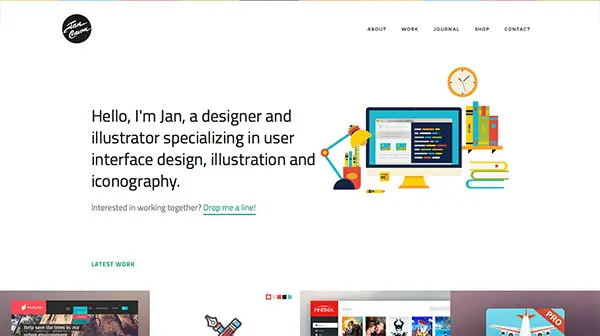
Jan Cavan

Saying as little as possible and not leaving anything to wonder, this artist combines useful information with a short portfolio to make everyone interested in their work.

Jan Cavan Website Design

Boomerang

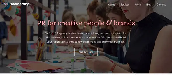
Another great example of elevator pitch translated into a stunning website. This design uses the first page to make a resume about the company, who they are and what services they provide and also their best clients, to give credibility and to build up trust.

Boomerang Creative Website

Blocks

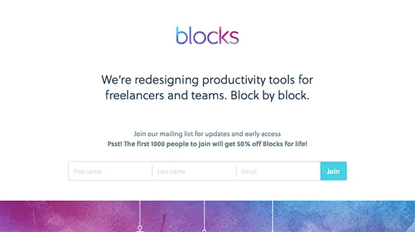
Get inspired by this website which uses the concept of elevator pitch along with some funny creative animated graphics!

Blocks Website Concept

Talk PR

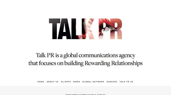
This website incorporates the elevator pitch concept into every topic in their menu. You can grasp at a glance their message by browsing rapidly through the contents.

Talk PR Website Concept

A Collective

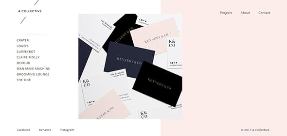
This creative studio’s website has a simple but very effective design which allows you to quickly get the information. Also, this design includes a creative side menu which is within reach at all times, for easy navigation.

A Collective Website Concept

Matt Carvalho

Take a look at the combination between large and small fonts with expressive images which were used to attract site visitor’s attention.

Matt Carvalho Creative Website

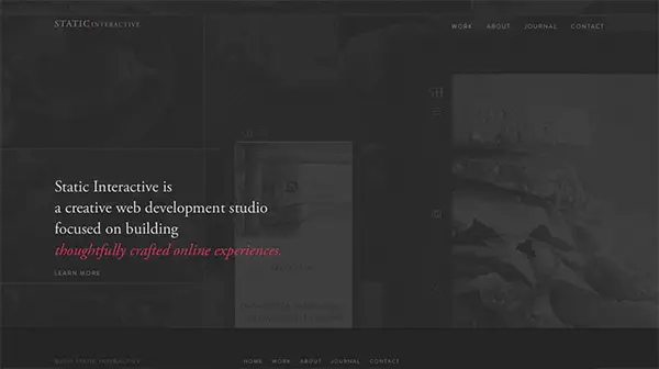
Static Interactive

The semi-transparent overlay gives the website a sense of mystery. You can take a glimpse at what lays behind it but you need to take further action to completely see the design.

Static Interactive Website Concept Design

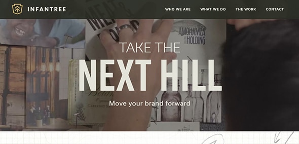
The Infantree

This creative website design will definitely get your attention with its looks and features. Neat features like the video background, full-screen layout make it more appealing and user-friendly.

The Infantree Website Concept Design

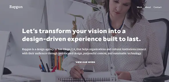
Raygun

A beautiful parallax effect has always helped to improve the overall design. This elegant characteristic makes any website look modern. Moreover, the responsive design assures you that the website will display perfectly on any screen size.

Raygun Creative Website

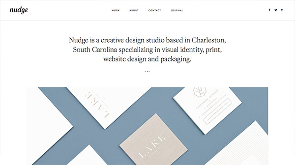
Nudge

This minimalistic website has a creative layout with a grid organization. Also, on hover, the images get a semi-transparent color overlay which displays further information about each item.

Nudge Website Concept

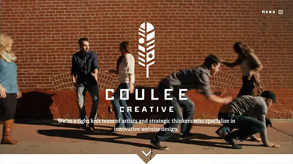
Coulee Creative

This website design will definitely get your attention. With the stunning video background from the homepage, parallax effect on different sections, beautiful typography, etc. there’s a lot to handle with this design.

Coulee Creative Website Concept elevator pitch

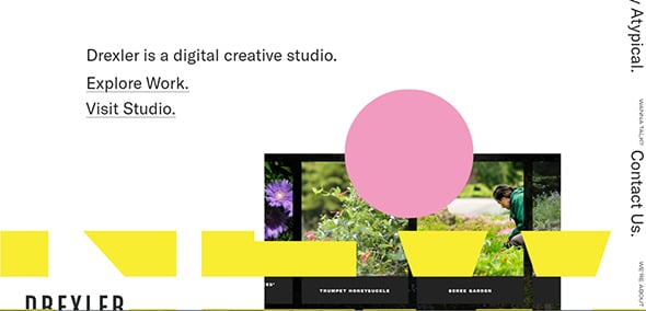
Drexler

This website stands out thanks to the unique menu which is displayed in a continuous movement on the right side of the layout. This creative agency also includes animated elements, a complex design with overlay items which you can see when your begin to scroll down.

Drexler Website Concept elevator pitch

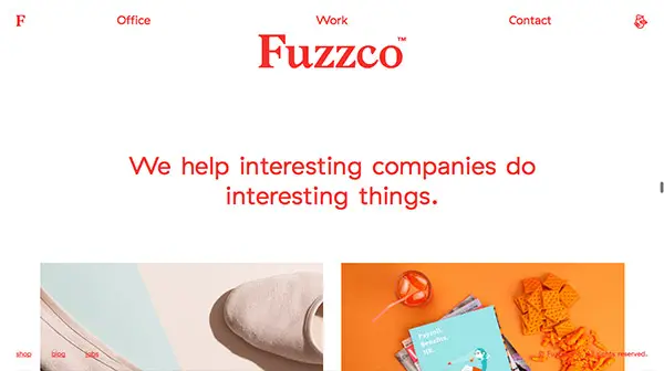
Fuzzco

This is an outstanding website design which has a very creative manner to showcase its content. Even without taking any action, the design continuously moves from bottom-up. You can select which area you want to view by using the scroll.

Fuzzco Creative Website Design elevator pitch

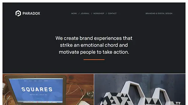
Paradox Design Studio

Here you have a lovely website with a well-thought design. The information is organized and everything is accessible, with some animated effects that will get your attention.

Paradox Design Studio Design

Romsey Web Design

This website includes many great features that help improve the overall design. For instance, there’s a beautiful video background, animated effects, neat overlays, lovely fonts, and more.

Romsey Web Design
RGB MEDIA

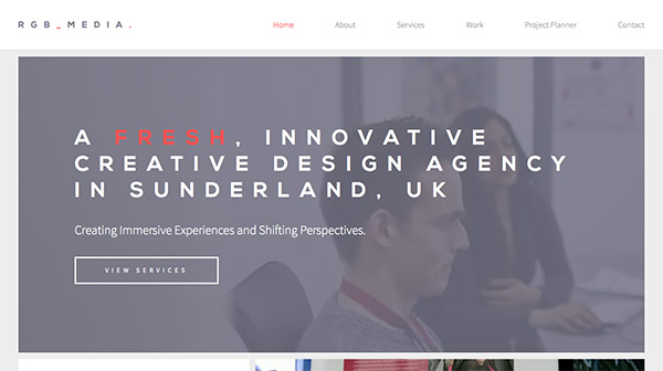
There’s much to say about this website design. It includes lots of user-friendly features that make it more accessible. The fixed menu design, big headings, concise information, organized layout, responsive design, etc. are some of its features.

RGB MEDIA WEBSITE CONCEPT

Simple Focus

This is a minimalistic website with a well-organized structure in clear sections. It includes beautiful animations which unveil when scrolling down.

Simple Focus Website Design elevator pitch

Navy Design

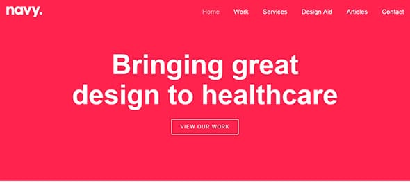
This bold design will definitely get your attention with the help of the colored background and the big heading. The overall design has a clear organization, everything is within reach, accessible.

Navy Design Creative Website

Hatch

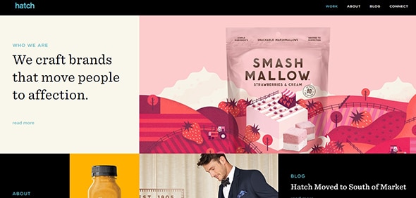
This is a creative website design which has a lovely grid organization. This full-screen layout will surely get your attention with the stunning high-quality graphics and subtle animations.

Hatch Website Concept Design

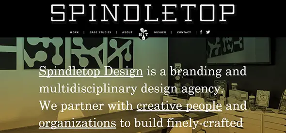
Spindletop

A parallax effect will definitely make a website stand out. Also, the responsive layout makes it display perfectly, regardless of the screen size.

Spindletop Creative Website

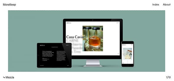
MoreSleep

This is a one-page layout design which has a creative slider gallery. Have a look and see what new things you can learn and use in your future designs.

MoreSleep Website Concept elevator pitch

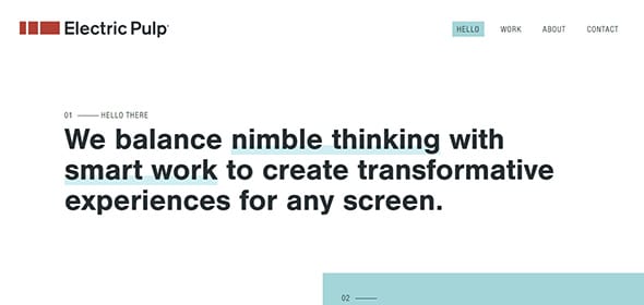
Electric Pulp

The designer used lots of overlayed elements to create a special design. This includes text, colors, images, etc. Also, the fixed header design makes your navigation accessible at all times.

Electric Pulp Creative Website

Finely

This is a minimalistic website which makes good use of the white space, in order to get the message across.

Finely Website Concept Design

Startup X – Perfect Pitch Deck PowerPoint Template

This stunning template can be used to create your own website with a clear pitch design. This pre-designed layout will assure you that your message will definitely get across.

Startup X Concept Design

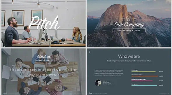
Pitch – Modern PowerPoint Presentation Template

This is an excellent presentation template which you can quickly customize and showcase it to your clients.

Pitch Presentation Concept Design

The post 25 Web Designs with a Clear and Concise Elevator Pitch appeared first on Line25.

Minimalist Web Design – More Effective Than Any Other Design Style In The Web Design Industry

Original Source: https://webdesignledger.com/minimalist-web-design-effective-design-style-web-design-industry/

This article is the third in a series devoted to the understanding of minimalism in web design. During the time, this trend has become very popular among the graphic designers and it will still be on top for the years that will come, regardless the influences it will have.

You might assume minimalism is easy – after all, fewer elements mean less work, right? In fact, the opposite is more accurate. Because you are restricted to a usage of few elements, they must be chosen and used with care and thoroughness, having a specific purpose as a starting point. If it’s done properly, minimalist design can be a stunning masterpiece, in terms of UI, visual design, UX and conveying your message to the users.

It may seem ironic, but in the context of web design, simplicity is a little more complex to define. It’s not just the site looks like; it’s about the user’s overall experience while interacting with the site. From this perspective, minimal design is not made by mistake. It is intentional. It is an approach that strips the unnecessary elements from a framework to leave only what is required. Most minimalist websites will not include a lot of colors, textures, shapes or accents. They are defined by fearless usage of negative space in neutral colors, dramatic typography, large and vivid photography, very simple navigation tools and visual balance.           

Minimalism works because it does what all design should do – it puts the emphasis on content.

The advantages of minimalism in web design and the reasons for its popularity include:

It’s a natural fit with responsive design frameworks;
It reduces the information for browsers to process, causing faster site load times and better site performance; this leads to a better usability and user experience;
It needs less CSS and Html rules and elements;
The concept is content-driven, which coincides impeccably with the growth of content-first design processes and trends;
It is suitable for a variety of businesses, from architecture, interior design, fashion, photography, creative studios, to e-commerce, web app development, furniture, HoReCa and so on.

Using the minimalist concept in web design represents modern design. By only focusing on the content and branding, the web design will reflect its main goal and mission without any other distracting elements. 

Below are listed some websites from different industries, which use minimalist design concept for conveying their message and provide a great UX:

Minimalism in photography portfolios

Running a photography business is not common. Beyond stunning photos, it requires much creativity and refinement when it comes to communication with the potential customers. If you want to learn more about running a photography business, you may find more information in Braveen Kumar’s article (link to www.shopify.com/blog/how-to-sell-photos-online)

In terms of web design, minimalism is the preferred choice for the photographers who want to let their work speaking for itself. The style gives an air of elegance and sophistication that lends itself to this industry.

Christine Szczupak Photography

The stylized arrows and subtle drop-shadow are important details that increase the visual appeal of this website.

Ryan Willms

The spacing and arrangement of content here, along with the elegant typography and simple lines, give the feeling of a fresh design.

Caitlin Worthington Photography 

The white background is the perfect canvas for the large and vivid photographs that are perfectly balanced by the typography. A classic example of minimalist design.

Jonathan Glynn Smith


A dramatic splash screen and beautifully minimalist design.

Bruce Percy


A very simple design that leaves the viewer no doubt what he’s seeing. A quick glance is enough to see what the photographer does. Navigation is again clear and simple. The black background works well with the minimalist design.

Minimalism in the creative industry
Exponent PR


To highlight their video montage (and photos as you scroll), Exponent’s site features simple colors and fonts that make everything pop.

Bark PR

Like Exponent PR, the previous PR company on our list, you’ll see flat UI and bold colors. But in Bark PR’s case, the yellow is much more than a simple accent.

Oh My! Digital Design Studio

Oh My!  uses a large white background for some high-contrast effect and a very simple navigation to provide a great UX.

Brave Little Tank

Like Oh My!, Brave Little Tank also uses a large white background for getting a high-contrast effect with the website content. The accents of colors are given by pictures and the green color of highlighted text. The navigation is simple, letting the users dive in quick and easy through the whole site. With its website, Brave Little Tank has created a simple, impactful solution (what they also have promised to their clients).

Brian Danaher

Another website that opts for a single column and bold typography. If you take a closer look, you will notice the classic mix for the minimalist concept: a lot of negative space, large and vivid photos, typography that perfectly balances the images.  

Callens 

Minimalism is the preferred choice for fashion websites and those selling luxury items, like Italian brand Callens. This design concept gives an air of elegance and sophistication that lends itself to certain industries.

Leen Heyne
 

Besides its jewelry, Leen Heyne‘s monochrome logo and company name are the only significant visual elements on its homepage. The surrounding expanse of gray space and white texts make it a safe bet, the user’s eyes going back and forth between the two core visual elements.

 Bulgari

Italian luxury goods brand Bulgari is another company that uses creative techniques to keep its site interesting within its minimal framework. Side-to-side scrolling combines with an ingenious page-turning animation and high-quality photos.

Yield

Lots of space, soft pastels, middle to dark gray colors for text, large photos and keeping buttons to a minimum make Yield’s site delicate and easy to navigate.

 Conspiracy

Conspiracy’s homepage bundles necessary buttons on top then puts the product on a clean canvas.

NTN

This site is traditionally minimal. Design brand NTN uses the abundant white space, personality-infused typography, and a reduced number of elements that the minimalist style is known for.

Minimalism in website and app development
Squarespace

This screenshot from website-building service Squarespace illustrates the idea of one focal point per screen. The site explains everything it needs in screen-by-screen images, and groups together relevant blurbs on the same screen.

Scytale

Scytale is another defining website for the concept of minimalism in web design. They use very large white and light gray background and big and bold typography, helping the user to focus on the main message. The red color used for some flat design and typography are the only color accents used here.

Thrive

Simple design on a subtle grid. Garnished with flat design and simple bright blue color via scrolling. A fun, clean, good interaction!

iPad mini 4

Apple is no stranger to minimalism. The web page for the iPad mini 4 uses lots of literal white space to draw attention to the product’s sleek design. The clear top bar, also featuring an abundance of space, helps the user to navigate.

Château d’Yquem

Winemaker Château d’Yquem combines minimalism and subdivision in its site. Each section follows the minimalist philosophy with only a few elements revolving around a single concept. When combined, the sections’ size and location on screen create a visual hierarchy.

Maemo 

The website for double-Michelin-starred Norwegian restaurant Maaemo uses minimalism to create a sense of class. The visual treatment is perfect for storytelling, as the site demonstrates with HD photos used for each page.

Bottom line

We know you have a lot of information to offer to your visitors and you’d like to feature all of them on your website, but you should keep in mind that will also throw your visitors into an information overload.

Before anything else, make sure your website features only the most important information and link the additional stuff. And don’t worry, if people are interested in learning more about your company, they will look for links or they will contact you.

Most of all, make sure your brand and your target audience fit the concept of minimalism before going for this website design concept. Because unfitting use of colors, typography, and visuals will not bring the same results for your business.

Even if it’s not suitable for all business websites, minimalist design style comes with plenty of great advantages that make it more effective than any other design style in the web design industry.

Read More at Minimalist Web Design – More Effective Than Any Other Design Style In The Web Design Industry