20 Great Examples of the Flat Trend in Web Design
Original Source: https://line25.com/articles/20-great-examples-of-the-flat-trend-in-web-design
The flat trend in web design has recently gained a lot of popularity and we started noticing lots of website and interface designs springing up with this design style.
Flat design is a label the community has adopted for designs leaving behind drop shadows, subtle textures, and gradients in favor of solid colors, clean layouts and sharp typography, somewhat similar to the design of Windows 8 and the Metro UI.
This post showcases 20 great website designs that all exhibit popular traits of the flat trend in web design.
Want more? Check out these flat design freebies you can download!
Hell’o Baby
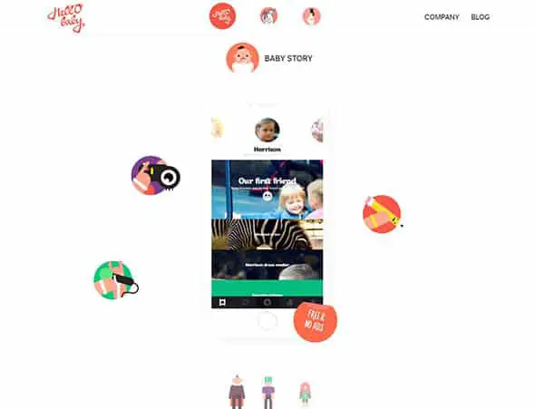
This is an interactive cross-platform baby album with additional services such as measurements, stickers, video stories, printed albums, postcards. They use a dynamic, flat design on their website, which we love!
It’s a Shape Christmas
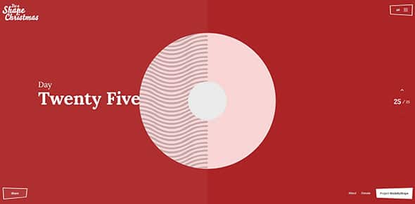
Shape Christmas is an Interactive Advent Calendar themed raising money for charity. They use a dynamic flat style design for their website, with lots of subtle animations and transitions.
Buffalo
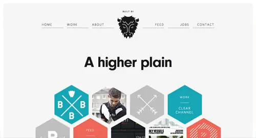
Buffalo is a small web design & development agency based in Brighton, UK. They use flat design elements on their website and a beautiful color palette.
Lorenzo Verzini
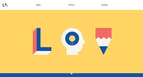
Lorenzo Verzini is an Italian designer & art director living in London, working in the field for more than 9 years and this is his portfolio website.
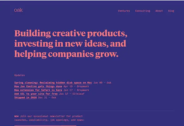
oak.is
This is a studio that helps to build creative products, investing in new ideas, and helping companies grow. They use a bold color palette, nice typography effects, and almost no images!
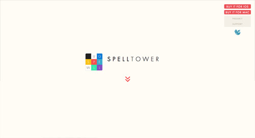
SpellTower
This is the presentation website of a game that lets you find as many words as you can in a jumble of letters. It uses flat design elements and beautiful transitions.
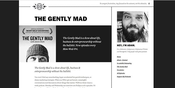
The Gently Mad Podcast
The Gently Mad is a podcast about life, business & entrepreneurship. This monochromatic blog has a simple, minimalist, flat layout.
Brewery
This website combines illustrations with the flat design trend. It is beautifully created and will surely inspire you.

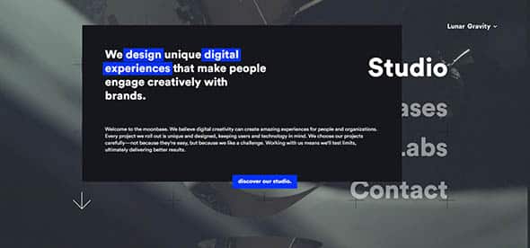
Lunar
This is another flat presentation website, this time for a digital-minded studio focused on designing high-end experiences. What we liked about this is the combo between the flat style and the dynamic video background.
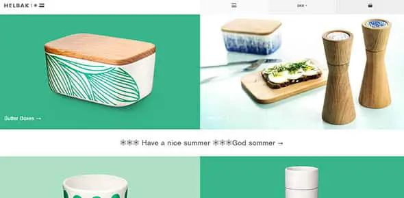
Helbak Ceramics
This is the combined brand site and web shop for the Danish ceramist Malene Helbak. Bold, flat colors blend beautifully with high-quality images in this website design.
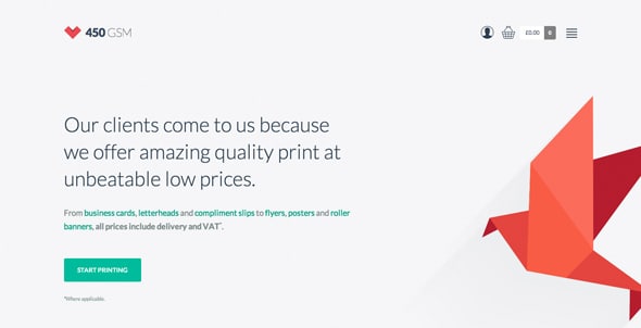
450 GSM
This website helps you print online 450gsm business cards, flyers, leaflets, greeting cards, stickers, postcards, pull-up banners, and posters. It is a perfect example of how flat style can be used in web design.
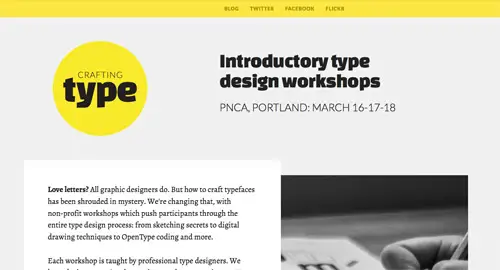
Crafting Type
Crafting Type workshops teach font design beginners how to create their own original typefaces. This is their presentation website.
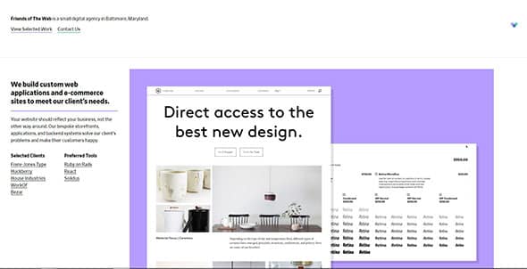
Friends of the Web
Friends of The Web designs and develops custom web and mobile applications with Ruby on Rails, React, Solidus, and Swift. They use a simple, clean, minimalist flat design for their website.
Dropbox Guide
This website helps you learn how to sync, share, and manage your files with Dropbox Business. It uses a simple but effective flat design with beautiful illustrations.

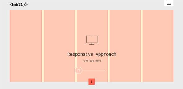
Lab21
This website has a simple, responsive design with lots of flat design elements added to it.
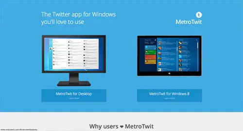
MetroTwit
This is a made-for-Windows software to access Twitter with simple Metro-style design and features. While the software itself is no longer available, the website can still be used as flat design inspiration.
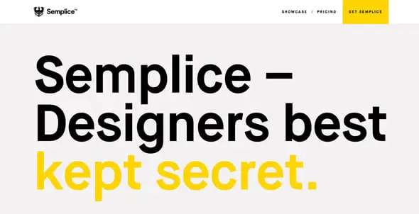
Semplicelabs
This website design combines large typography with flat colors and flat design elements. Check it out!
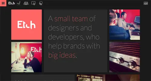
Etch
This is the website of a small team of Designers and Developers who help startups build new products.
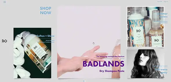
R+Co
R+Co is a collective of some of the most forward-thinking, rule-bending hairstylists in the business and this is their awesome website.
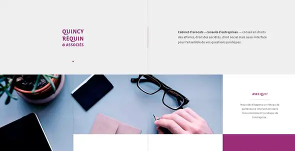
Quincy Réquin & Associates, lawyers
This is the presentation website of an independent lawyers office based in Lyon and Paris.
The post 20 Great Examples of the Flat Trend in Web Design appeared first on Line25.

Leave a Reply
Want to join the discussion?Feel free to contribute!