20 Best New Websites, May 2021
Original Source: https://www.webdesignerdepot.com/2021/05/20-best-new-websites-may-2021/
 This month we have several examples of brutalism used to good effect as a foil to showcase products and/or work. By contrast, at the other end of the scale, we have brands who have chosen to go more of an immersive experience route, using full-screen images, sound, animation, and even VR.
Both are valid approaches, depending on the content. The former tends to work better as a backdrop for artwork, photography, and artisanal craft goods — acting as a virtual gallery space — while the latter is better for consumer goods and experiences, particularly food, drink, and accommodation.
There is, of course, a whole range in between these extremes, and we’ve got that covered too. Enjoy!
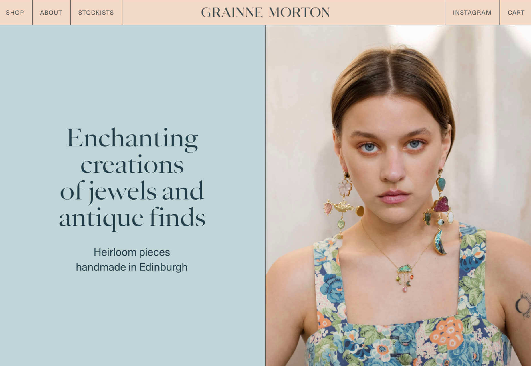
Grainne Morton
A simple layout, soft pastel colors, and clear navigation provide an excellent backdrop for Grainne Morton’s handmade jewelry creations.
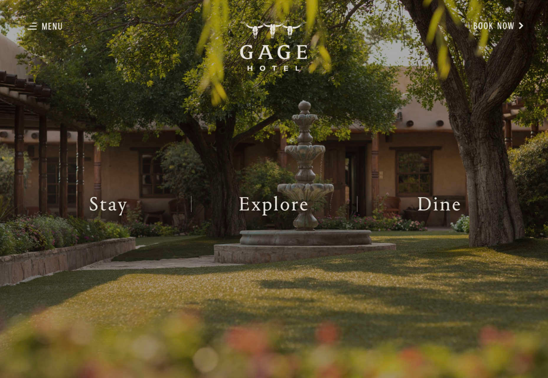
Gage Hotel
Good photography and a heritage-inspired color scheme give the Gage Hotel’s site a luxury feel.
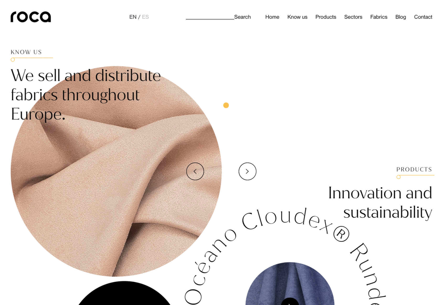
Tejidos Roca
Tejidos Roca is a fabric manufacturer, and the design of their site uses a circle motif to bring rolls of fabric to mind.
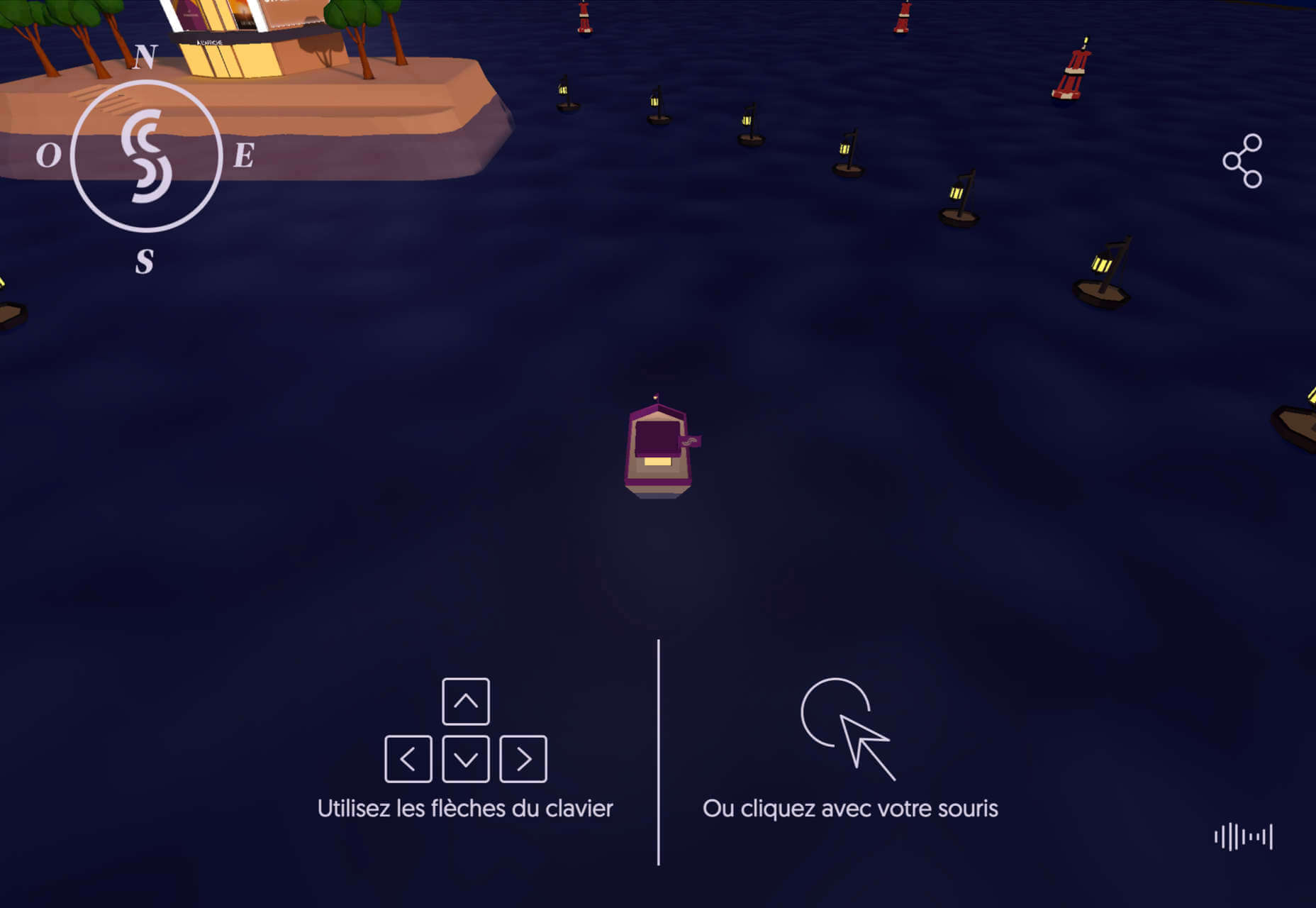
La Passation Synerghetic 2021
Synerghetic is part of the Junior Enterprises Europe scheme – a network of businesses run by students. This year they are not holding the usual handover ceremony, so Synerghetic created this rather fun little digital celebration instead.
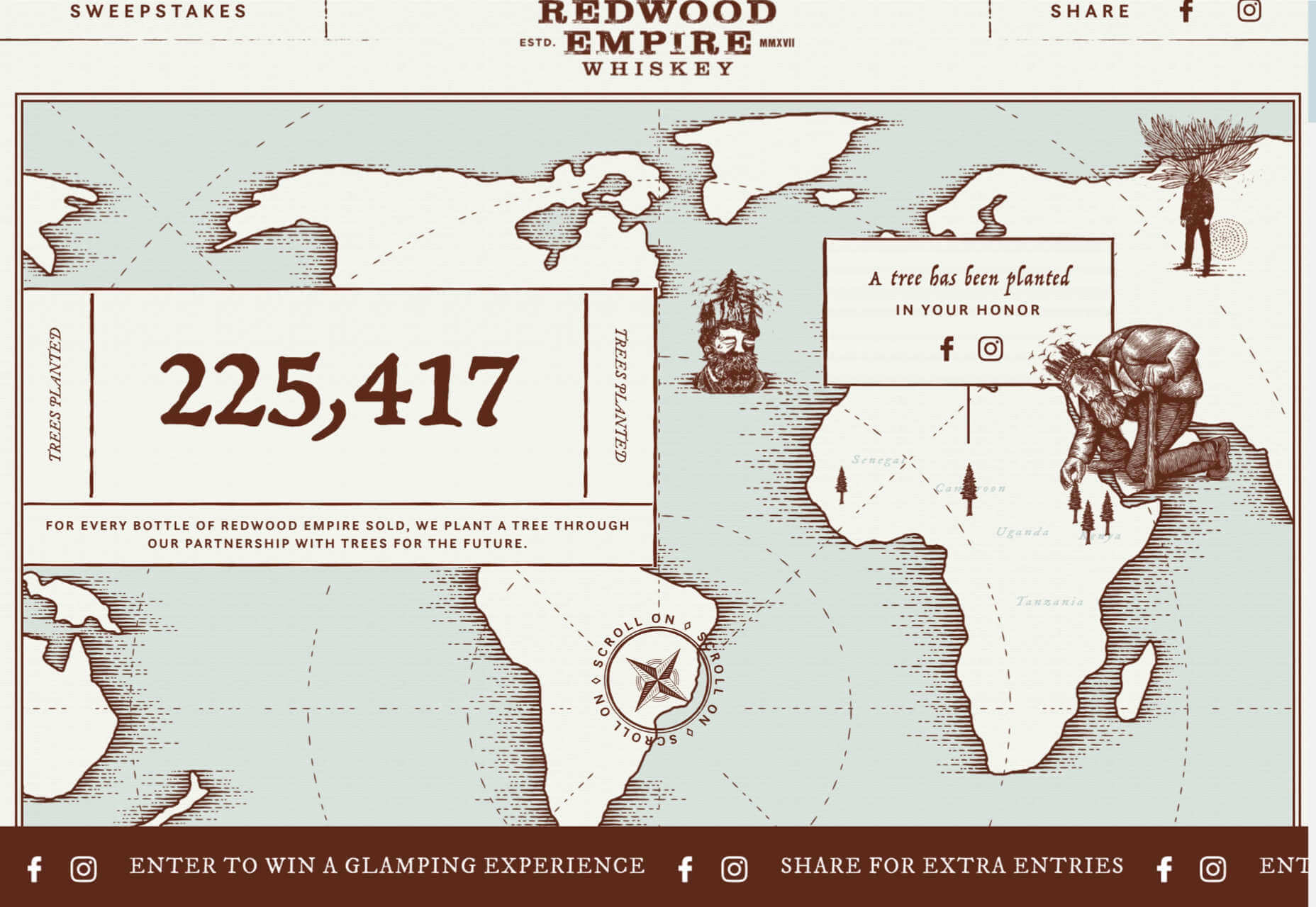
Redwood Empire
For Earth Month, Redwood Empire Whiskey has created a microsite promoting a competition styled to match their bottle labels.
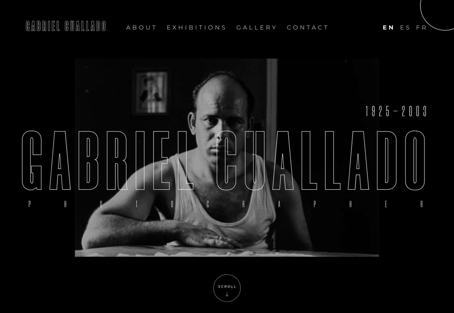
Gabriel Cuallado
This site focusing on Spanish photographer Gabriel Cullado’s life and work features some great transitions and good use of horizontal scrolling.
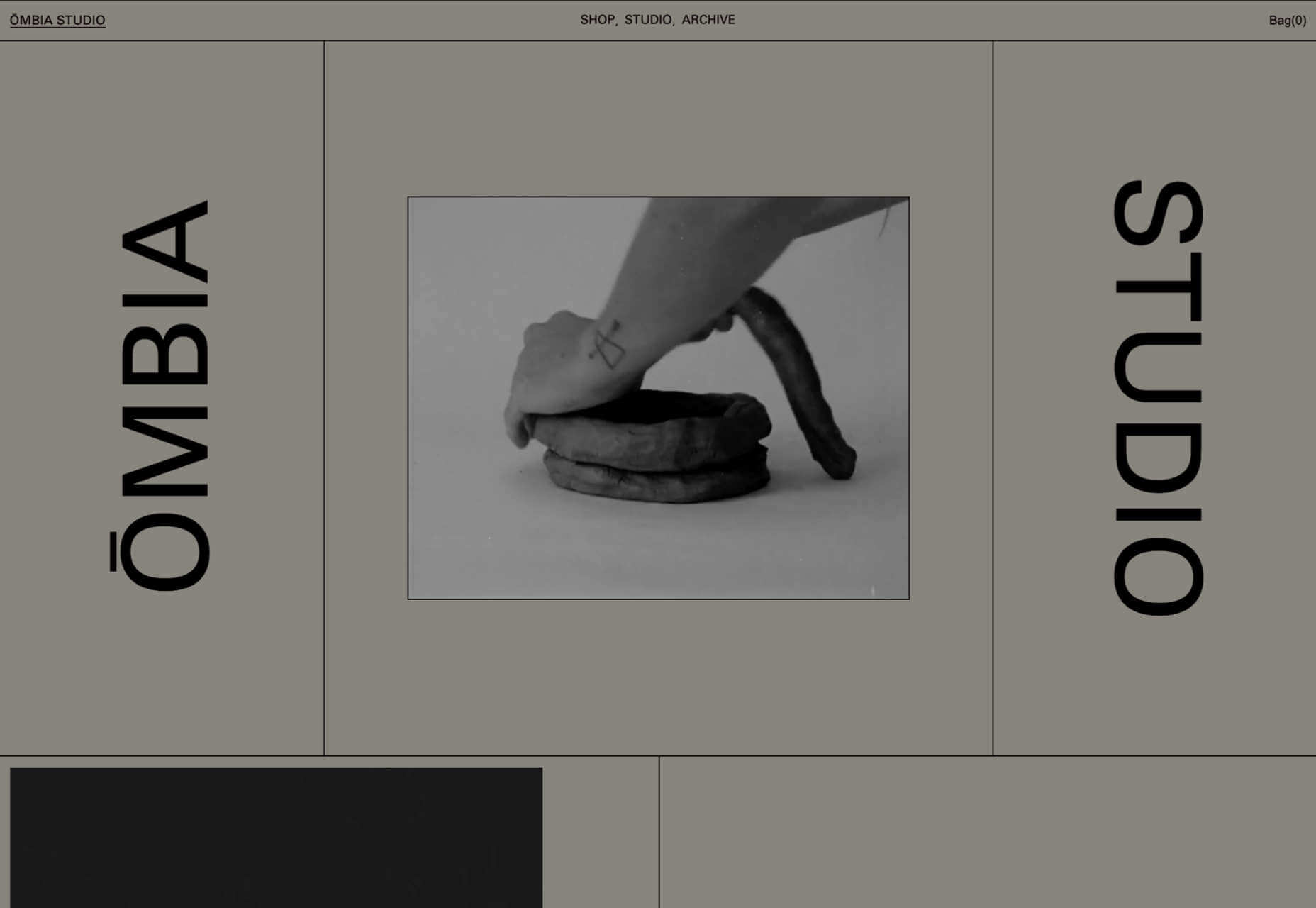
Ombia Studio
In Ombia Studio’s site, atmospheric photographs stand out in a minimal layout. There is a sense of almost gallery curation here.
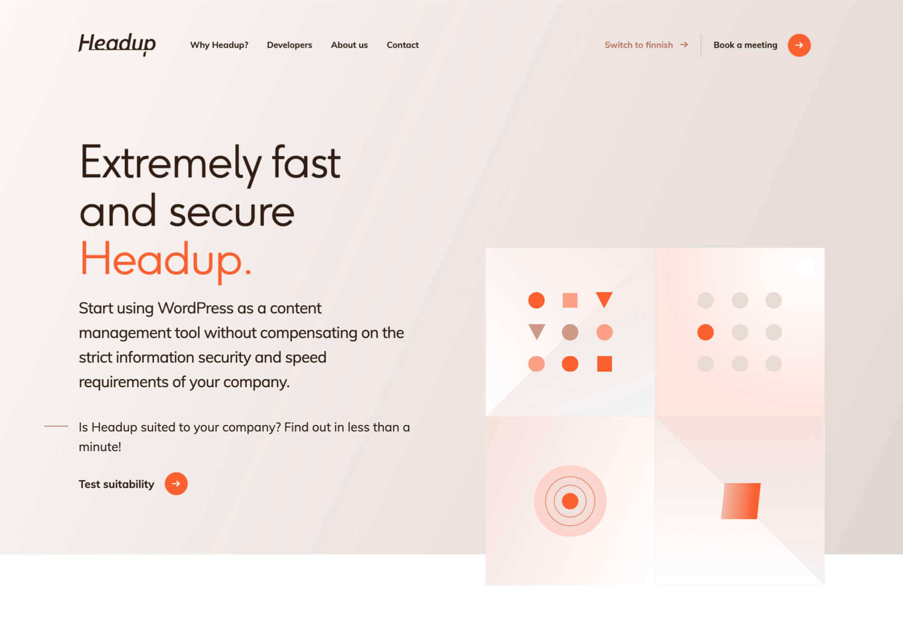
Headup
Headup uses a pleasing color scheme and geometric graphics to create a welcoming but businesslike approach.
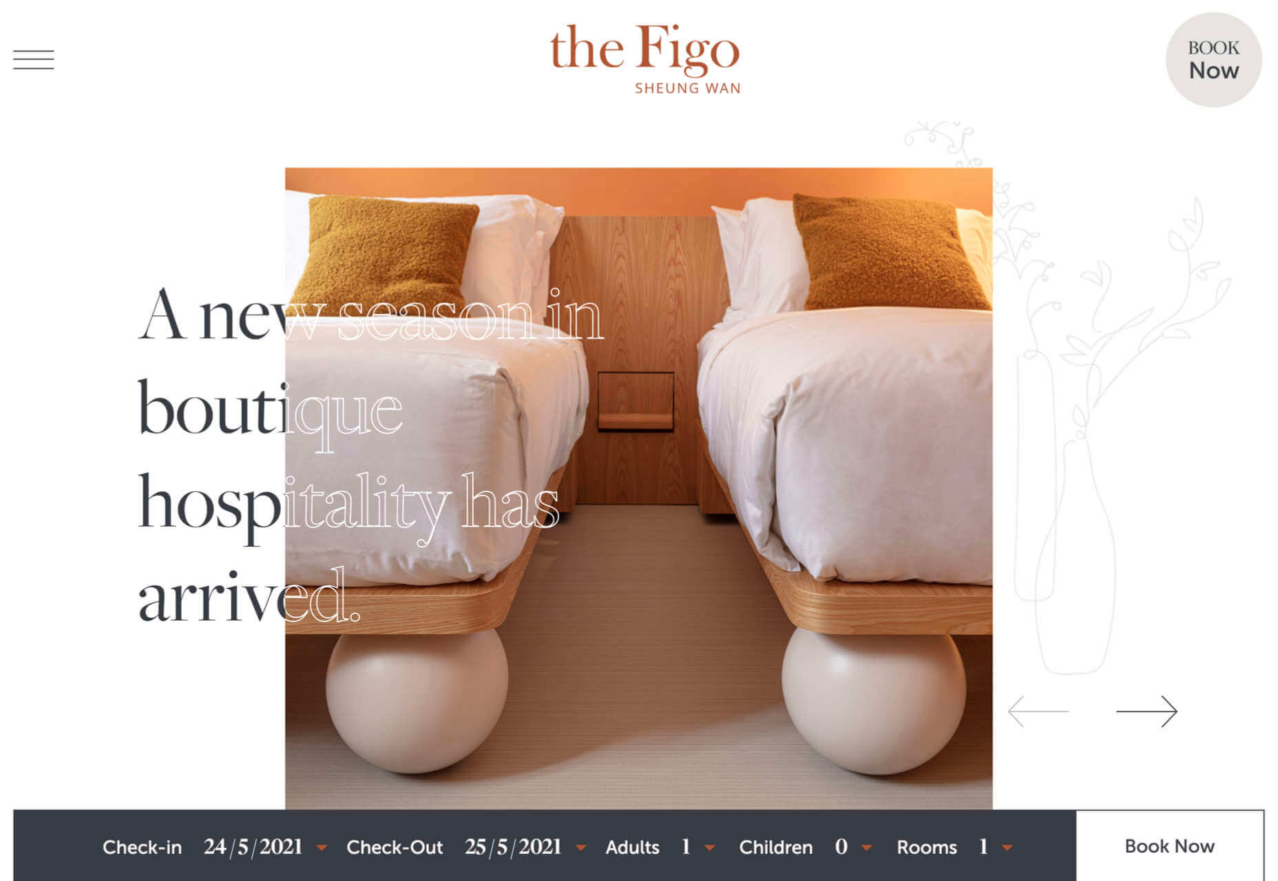
the Figo
Spherical curves and line animations create interest in this site for boutique hotel, the Figo.
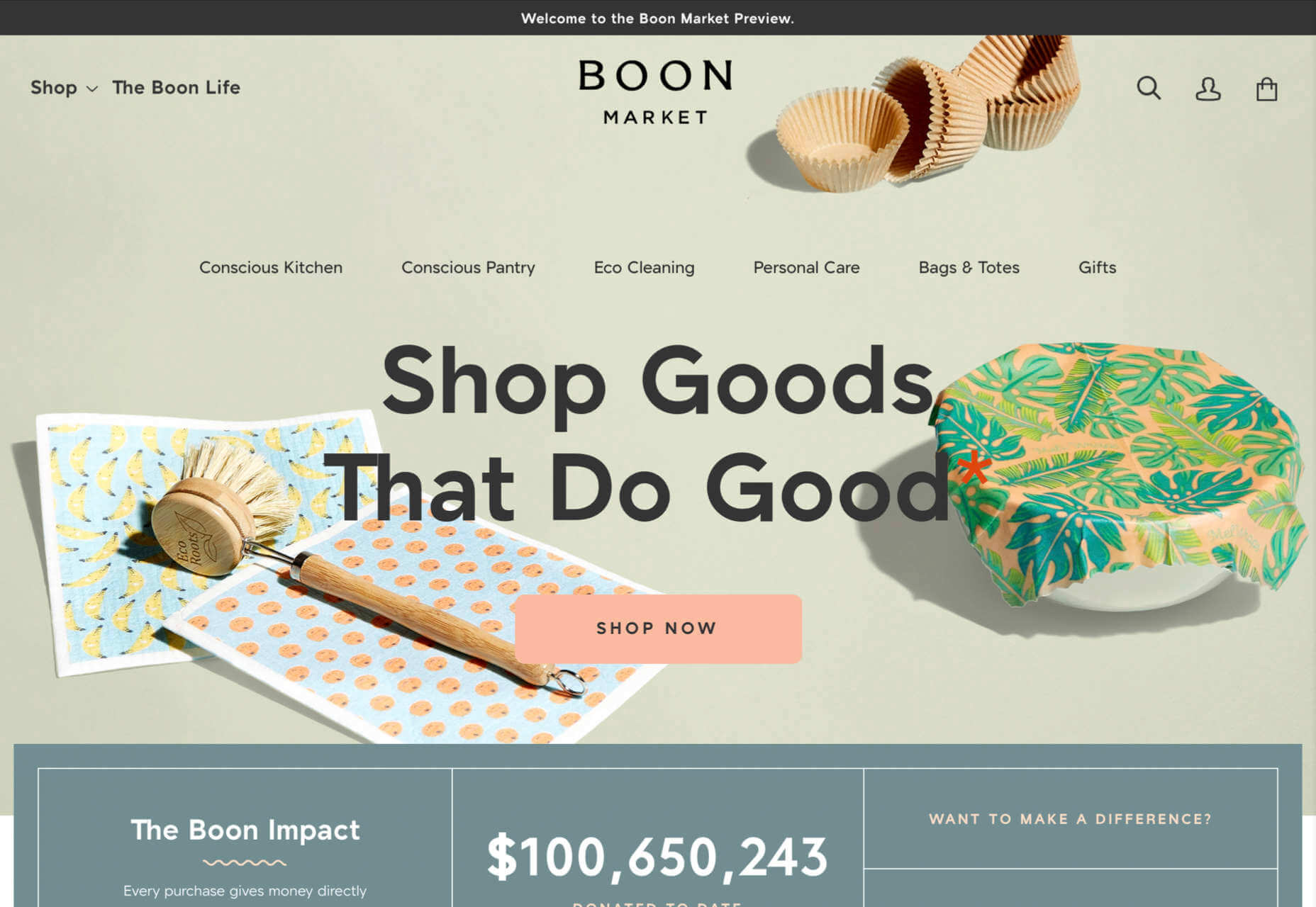
Boon Market
Boon Market is about promoting a toxin-free and waste-free lifestyle, and their site reflects this with its use of simple type and soft colors.
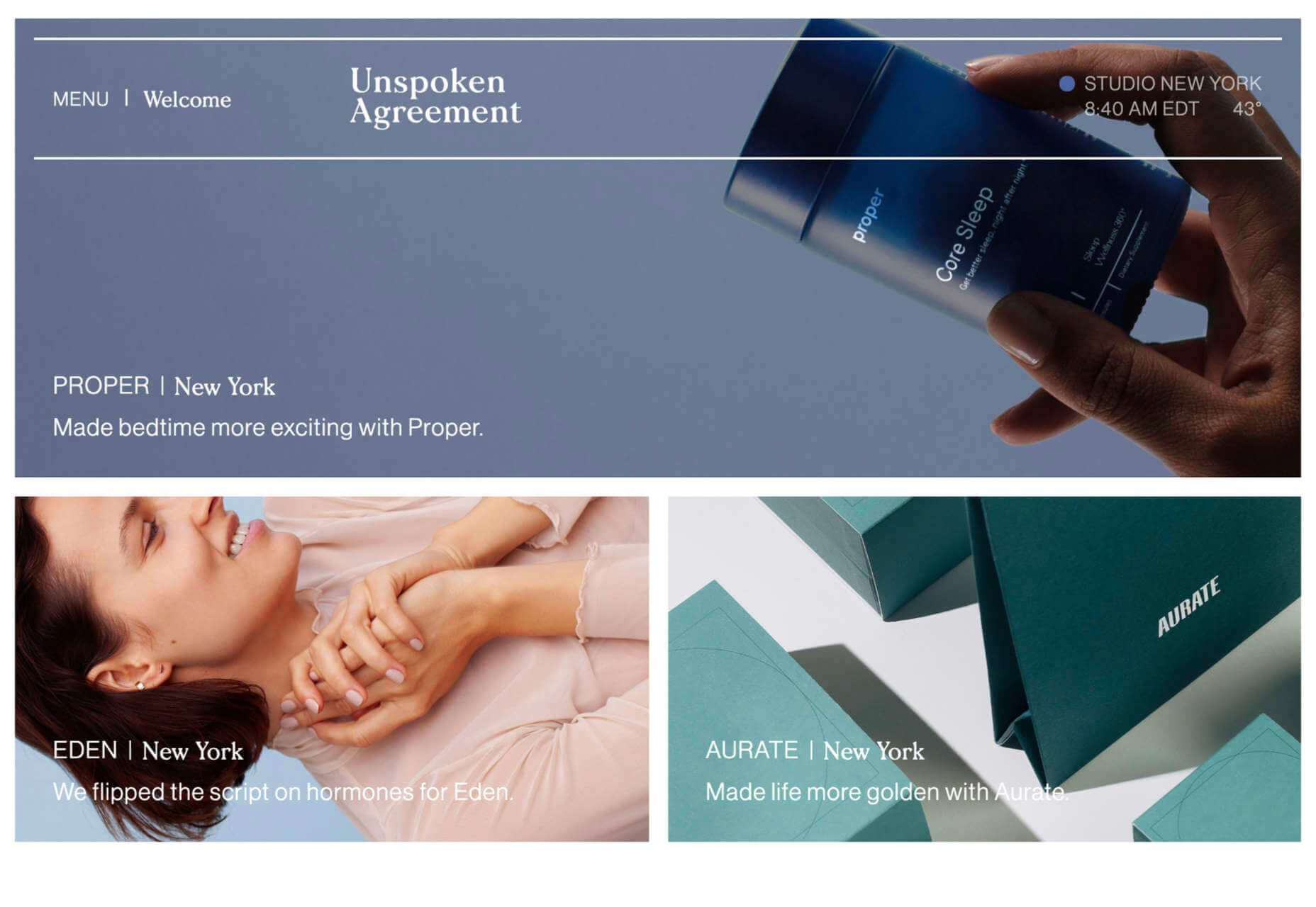
Unspoken Agreement
Unspoken Agreement’s website has a quietly confident feel, with clean lines and some pleasing type.
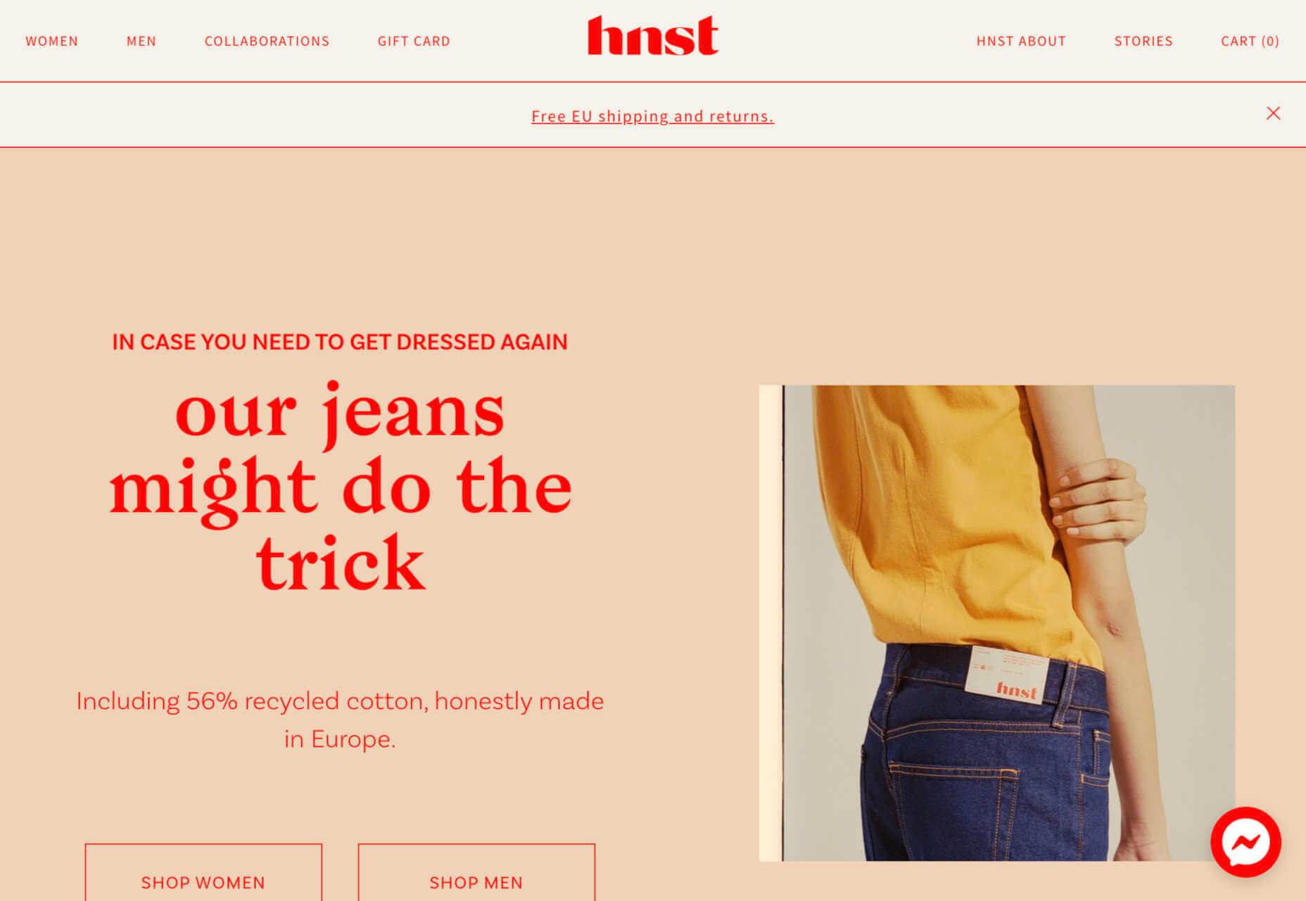
hnst
Another brutalist-inspired design here, but the use of bright red makes it fresh in hnst’s take on the style.
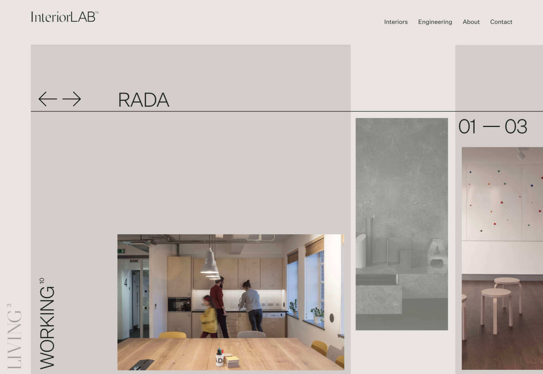
InteriorLAB
Part minimalist, part glossy magazine, InteriorLAB have succeeded in making the simple feel luxurious.
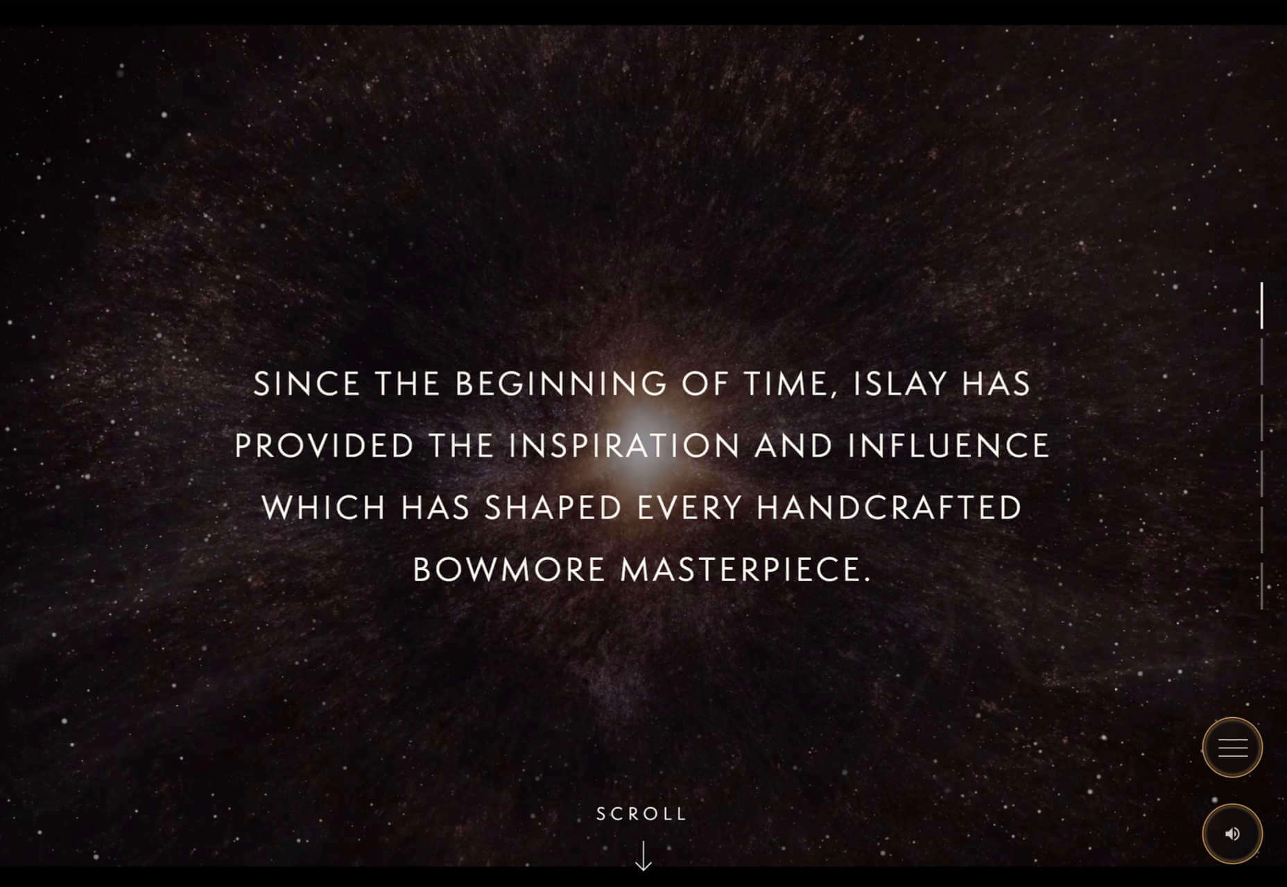
Bowmore Experience
Bowmore has opted for immersive video and visually beautiful images to present their limited-edition Timeless whisky range.
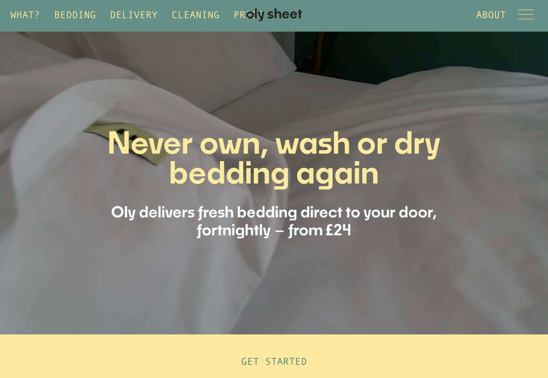
Oly Sheet
There is a slightly old-school start-up feel to Oly Sheet’s website, but it is still appealing with fresh, spring colors and well-organized content.
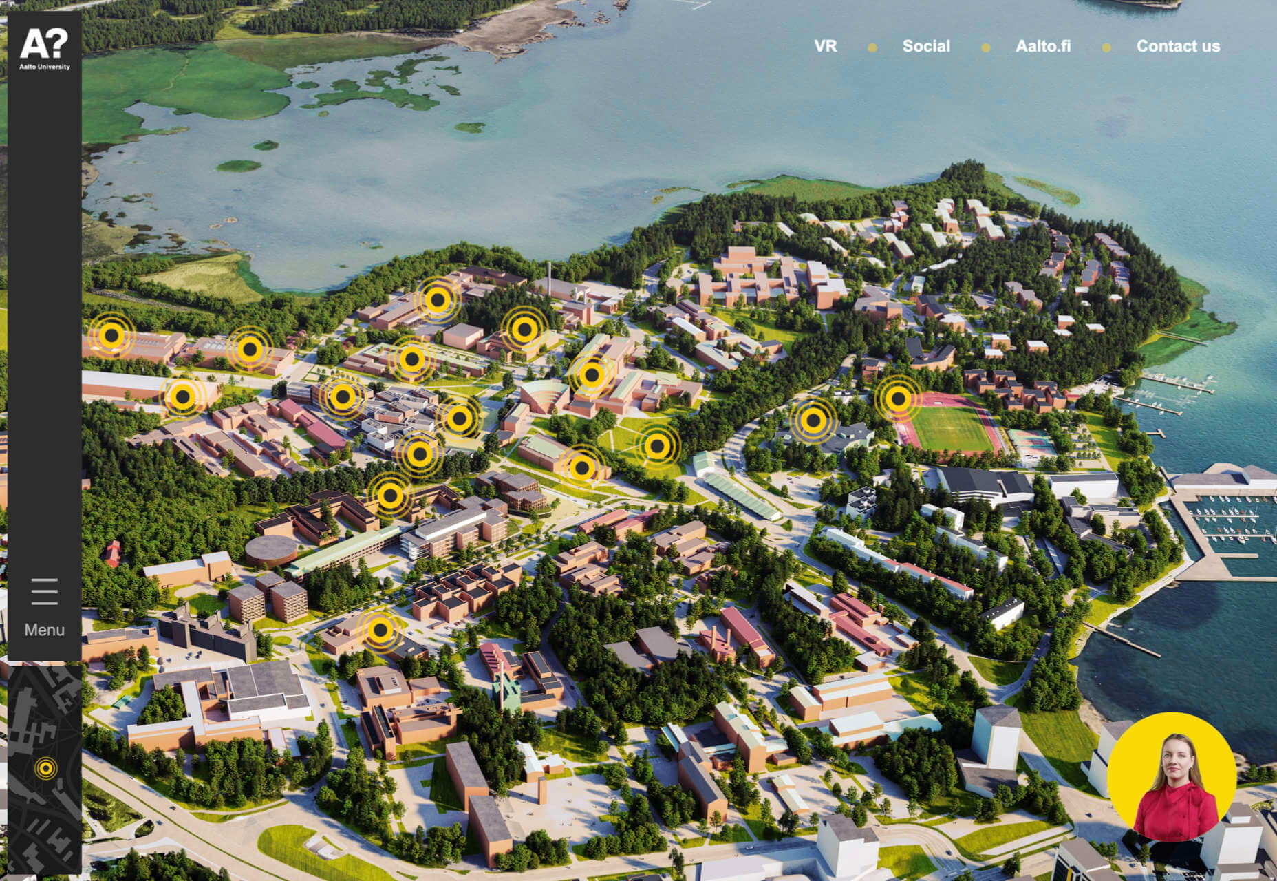
Aalto University
Aalto University has provided a pretty in-depth tour of its campus here. The navigation is clear, and the information is presented in ideal-sized chunks — enough detail, but not too much at once.
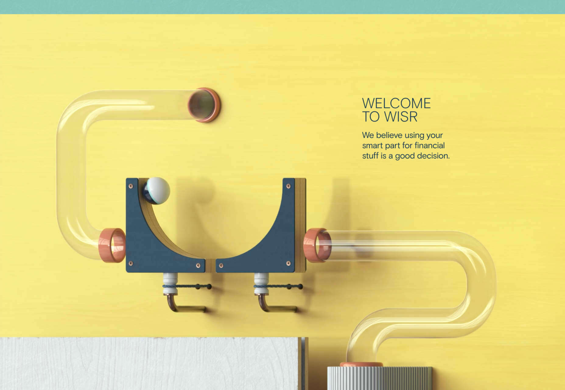
Wisr
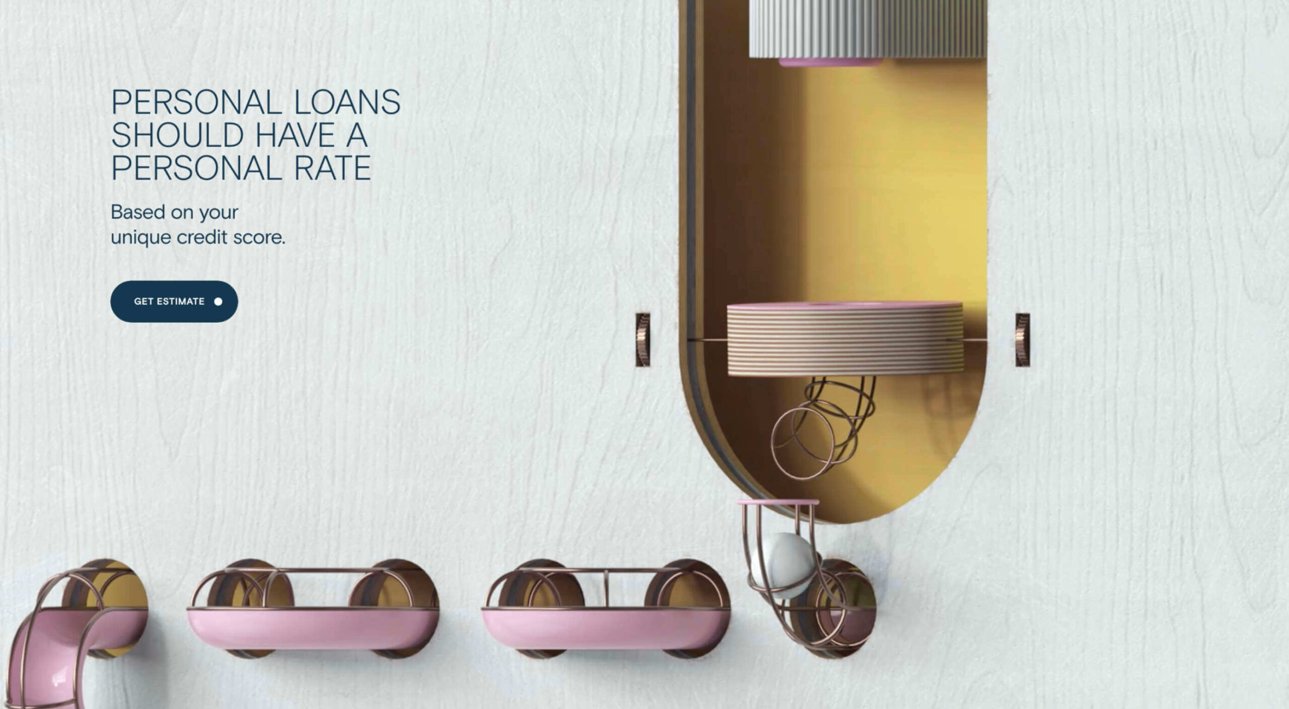
Wisr features a Heath Robinson style machine that ‘runs’ as the user scrolls down the page. It provides a bit of interest (no pun intended) to the not very exciting subject of personal loans.
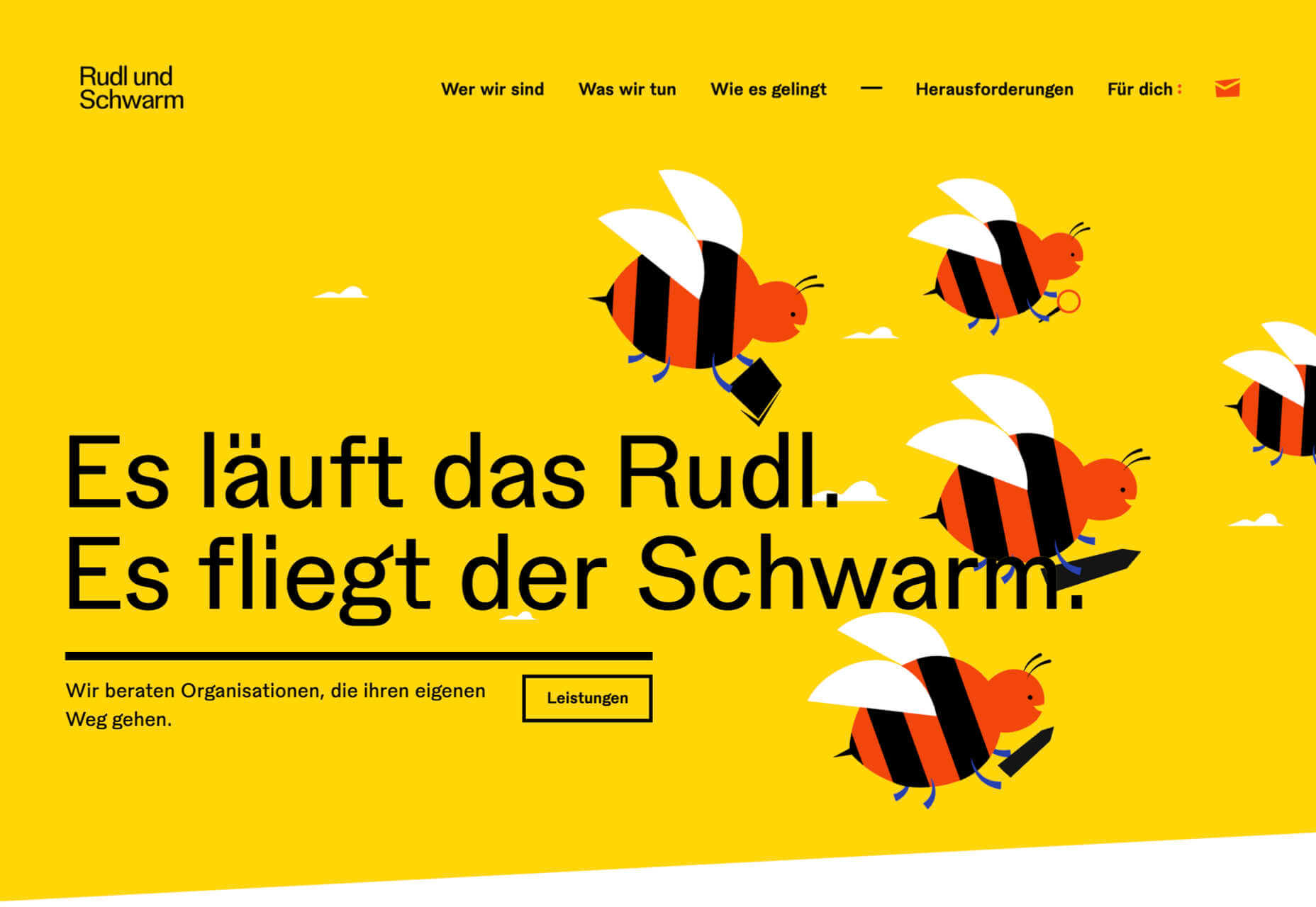
Rudl und Schwarm
Bright colors, cute, but not too cutesy, illustration, some nice scrolling, and transition effects are used really well on Rudl und Schwarm. And it’s got bees; bees are good.
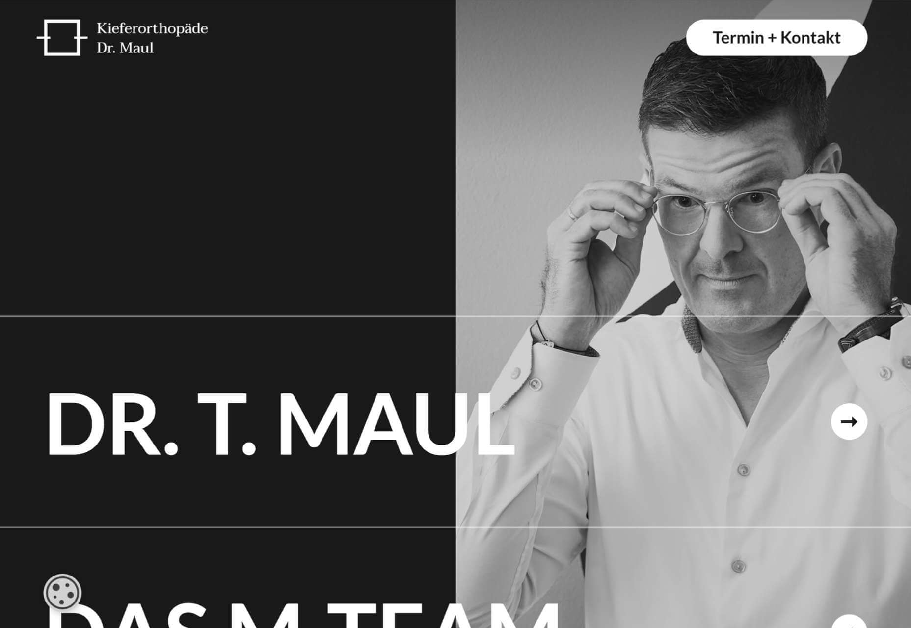
Dr. Maul
This site for Dr. T. Maul manages to take orthodontistry past the usual image of uncomfortable wiring, elastic bands, and ‘train tracks and make it seem just a little more glamorous.
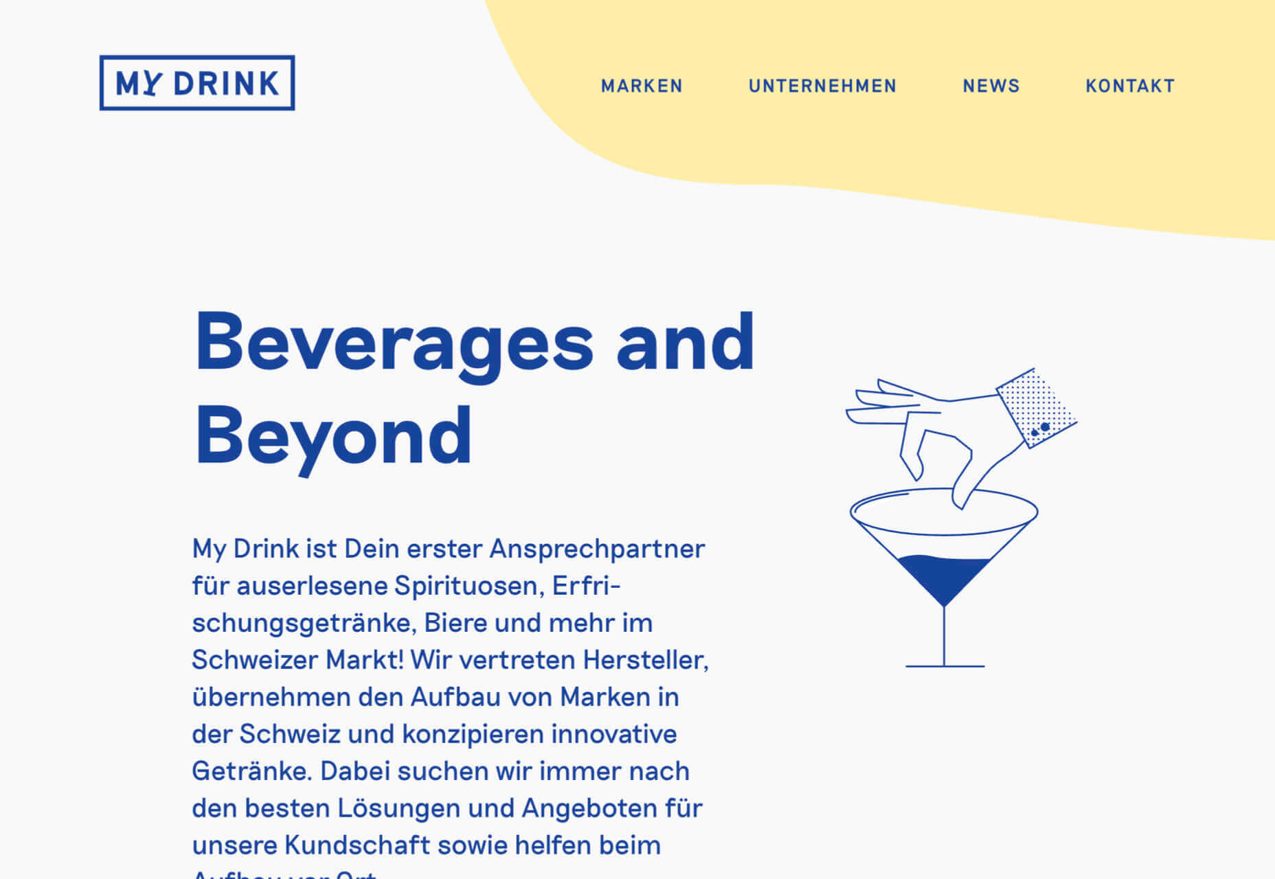
My Drink
There is a slightly vintage feel to this site for My Drink with its cocktail illustration. The blue text on grey is soothing without being bland.
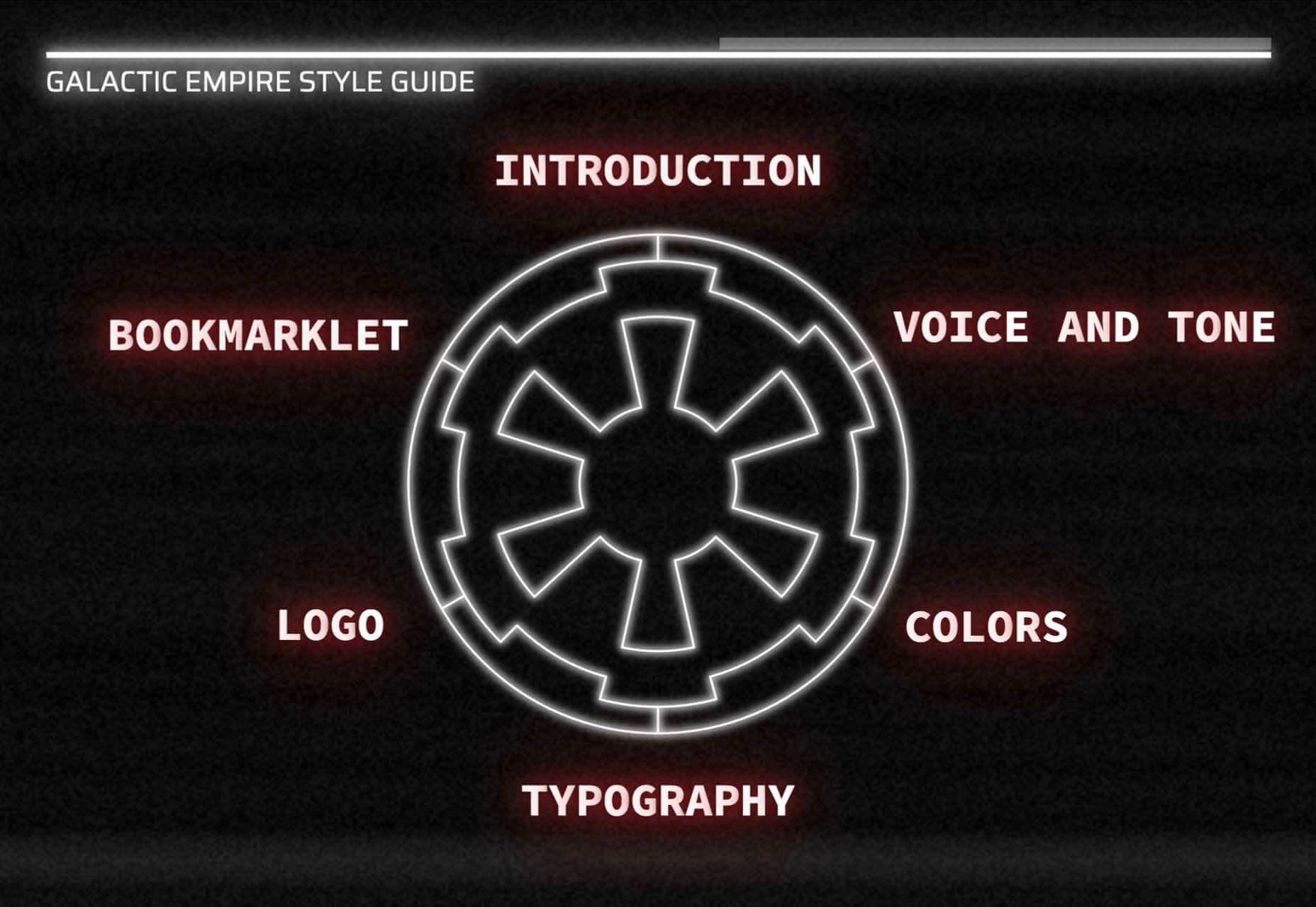
Bonus Site: Imperial Style Guide
And finally not new, but a bonus in honor of May 4th, the Imperial style guide. Well, the Web would get boring if it was serious all the time.
Source
p img {display:inline-block; margin-right:10px;}
.alignleft {float:left;}
p.showcase {clear:both;}
body#browserfriendly p, body#podcast p, div#emailbody p{margin:0;}
The post 20 Best New Websites, May 2021 first appeared on Webdesigner Depot.

Leave a Reply
Want to join the discussion?Feel free to contribute!